FVG ATRFVG ATR — Fair Value Gap Size Measured in ATR Units
This Pine Script v6 indicator detects Fair Value Gaps and displays their size as a ratio of the Average True Range, providing traders with a normalized measurement of gap significance across different market conditions and timeframes.
Key Features
Automatic FVG Detection
The indicator identifies bullish and bearish Fair Value Gaps using the standard three-candle pattern. Bullish FVGs occur when the current low exceeds the high from two bars ago, while bearish FVGs occur when the current high falls below the low from two bars ago.
ATR Ratio Calculation
Each detected FVG is measured against the current Average True Range at the moment of detection. The ratio is displayed as a compact label next to the gap, showing values like "ATR: 0.75" or "ATR: 1.41". This normalization allows comparison of gap significance across volatile and calm market periods.
Minimal Visual Footprint
Labels are displayed directly on the chart without boxes or lines, using customizable text sizes from tiny to large. The default tiny size ensures the chart remains uncluttered while providing essential information at a glance.
Highly Customizable Display
All visual aspects are configurable through input parameters, including label position (top, middle, or bottom of gap), text size, text color, optional background, and horizontal offset from the detection candle.
Customizable Parameters
Detection Settings
Detect Bullish FVG: Enable or disable detection of bullish gaps. Default is enabled.
Detect Bearish FVG: Enable or disable detection of bearish gaps. Default is enabled.
Min Size (pips): Filter out small gaps below the specified threshold. One pip equals 10 ticks for most Forex pairs. Default is 10 pips.
ATR Calculation
ATR Period: Period length for Average True Range calculation. Default is 14, adjustable to match your trading strategy.
Label Settings
Label Position: Vertical placement of the text label relative to the FVG zone. Options are Top, Middle, or Bottom. Default is Middle.
Label Size: Text size from Tiny (smallest), Small, Normal, to Large. Default is Tiny for minimal chart clutter.
Text Color: Custom color for label text. Default is white for visibility on dark themes.
Show Background: Toggle to display labels with a colored background box or as transparent text only. Default is disabled for cleaner appearance.
Background Color: Custom color for label background when enabled. Default is semi-transparent gray.
Label Offset (bars): Horizontal distance in bars between the detection candle and the label. Set to 0 for labels directly on the candle, or increase for separation. Default is 0.
Recommended Use Cases
Multi-Timeframe Analysis
Compare FVG significance across different timeframes by observing ATR ratios. A 1.5 ATR gap on the 1-hour chart may indicate different significance than the same ratio on the daily chart.
Volatility-Adjusted Trading
Use ATR ratios to filter for only the most significant gaps. For example, only trade FVGs with ratios above 1.0 to focus on gaps larger than typical price movement.
Risk Management
Size positions based on gap magnitude relative to current volatility. Larger ATR ratios may warrant tighter stops or smaller position sizes.
Market Efficiency Analysis
Track how quickly and completely different-sized gaps get filled. Gaps with higher ATR ratios may take longer to fill or act as stronger support and resistance zones.
Technical Details
This indicator is written in Pine Script v6 and follows all recommended coding standards including strict 4-space indentation, lazy boolean evaluation, and proper type declarations. The script uses array-based storage to maintain up to 500 labels simultaneously.
The ATR ratio is calculated at the moment of FVG detection and remains fixed, never repainting. The calculation divides the FVG height (distance between gap boundaries) by the current ATR value using the specified period. Division by zero is protected with conditional logic.
Label positioning uses the xloc.bar_index and yloc.price system for precise placement. The horizontal offset parameter allows traders to adjust label spacing based on chart zoom level and personal preference. Text formatting uses str.tostring with two decimal places for clear ratio display.
Important Notes
The indicator never repaints as all FVG detections and ATR calculations are fixed upon bar confirmation. Labels persist on the chart until the maximum label count is reached, at which point the oldest labels are automatically removed by TradingView.
For optimal performance on charts with many FVGs, consider increasing the minimum pip size filter or using smaller label sizes. The tiny size option provides the smallest possible text for maximum chart clarity.
Installation and Usage
Copy the source code into the TradingView Pine Editor and add the indicator to your chart. The overlay parameter is set to true, allowing labels to display directly on price candles. Configure all parameters through the indicator settings panel to match your trading style and visual preferences.
100% Pine Script v6 indicator — No repaint — Open source
Zmienność

IPO AVWAP with LabelThis indicator calculates the IPO Anchored Volume-Weighted Average Price (AVWAP) from the first bar of the chart and plots it as a line. It highlights when the price crosses above, crosses below, or touches the IPO VWAP with visual shapes and provides alert conditions for each event. Perfect for traders looking to track the initial trading benchmark of a stock and identify key intraday or swing trading levels.
Features:
Plots the IPO AVWAP line on the chart
Shows labels at the last bar with IPO AVWAP value
Detects price crosses and touches with markers
Supports custom alerts for cross/touch events

McMillan Volatility Bands (MVB) – with Entry Logic// McMillan Volatility Bands (MVB) with signal + entry logic
// Author: ChatGPT for OneRyanAlexander
// Notes:
// - Bands are computed using percentage volatility (log returns), per the Black‑Scholes framing.
// - Inner band (default 3σ) and outer band (default 4σ) are configurable.
// - A setup occurs when price closes outside the outer band, then closes back within the inner band.
// The bar that re‑enters is the "signal bar." We then require price to trade beyond the signal bar's
// extreme by a user‑defined cushion (default 0.34 * signal bar range) to confirm entry.
// - Includes alertconditions for both setups and confirmed entries.

% Levels from previous Daily Close % Levels from Previous Close
This indicator plots up to three customizable percentage bands above and below the previous day's close, providing a clear visual reference for intraday price action relative to yesterday’s session.
Concept
Inspired by volatility studies (such as the SqueezeMetrics research showing that most SPX sessions close within ±1%), this tool helps traders visualize statistically relevant daily ranges.
The levels remain fixed for the entire day — they only update once a new daily session begins — allowing for consistent reference points throughout intraday trading.
Features
Up to three percentage levels (configurable in settings)
Static daily bands anchored to the previous close
Optional shaded zones between upper and lower levels
Optional midline showing the exact previous close
Works on any symbol and timeframe
Use cases
Identify high-probability daily range boundaries
Combine with VWAP or volume profile to locate confluence zones
Define structured intraday risk/reward targets
Analyze volatility expansion versus mean reversion
Note
Some CFD symbols may use a different daily session close compared to the underlying cash index.
For best accuracy, use the same session settings as the instrument you trade.

War Room – Combined HUD v3.4 (Cap T+1, RTH+ON H/L)War Room Combined HUD — Futures / Flow Command Panel
Purpose:
A high-performance multi-layer heads-up display (HUD) designed for intraday futures trading (optimized for NQ/ES). It merges market flow, volume delta, session structure, and directional bias models into a single at-a-glance command panel.
Core Features:
Score / Bias Engine: Aggregates VWAP positioning, delta slope, and CVD structure to produce a live bias score (–5 → +5 scale) and simplified bias label (SBear → SBull).
State Monitor: Detects alignment or conflict between intraday bias and real-time flow. Highlights counter-trend conditions (“Use magnets / half size”) vs. aligned continuation.
Trap Detection (Dual):
Trap Short (shorts trapped, squeeze-up risk)
Trap Long (longs trapped, flush-down risk)
Color-coded strength meter indicates WATCH / TRAPPED / SQUEEZE.
Session CVD Table: Displays cumulative volume delta (CVD) and block delta by region — Asia / London / New York / Global — with auto-classified modes: Initiative Buy, Initiative Sell, Absorption, Distribution, or Neutral.
Flow Dominance Gauge: Tracks Global vs. Local momentum; signals when session flow diverges from the global CVD vector.
Price Anchors: Displays ON (overnight) high/low, RTH (regular trading hours) high/low, and prior session reference points (POC, VAH, VAL, HVN, LVN).
Capitulation T+1 Forecast: Computes early warning probability for next-day capitulation or squeeze events using volatility stretch, CVD intensity, control %, and score extremes. Direction marked with ↑ / ↓ arrow.
Futures / Flow Lower HUD (Optional): A cadence-based flow log showing Time, Px, VWAP, Δ, CVD, Bias, and Trap for the most recent 15-minute blocks — a micro-tape of intraday flow behavior.
Usage:
Primary HUD (top panel) → Real-time decision layer (bias, traps, state, cap-forecast).
Lower HUD (optional) → Historical flow context and confirmation.
Designed for use on 1m–15m charts, tuned for New York RTH bias detection.
Visual Key:
🟩 Green → Bullish continuation or trapped shorts
🟥 Red → Bearish continuation or trapped longs
🟧 Orange → Countertrend / Watch zone
⚫ Gray/Black → Neutral or no signal

RSI ExtremesRSI Extremes — Educational Indicator (Pine v5)
Per-Tick Dual-RSI Extremes · Real-Time Visualization · Cooldown Logic
Overview
RSI Extremes is a real-time educational indicator built to show where the Relative Strength Index (RSI) reaches its most extreme levels during every tick of live price action.
Instead of using only the candle close, it continuously tracks both RSI(low) and RSI(high) to reveal how deeply each bar stretches into demand or supply extremes.
This tool is meant solely for study and visualization, helping you understand how RSI behaves intrabar when price wicks expand. It produces no signals, no alerts, and no trade suggestions — it’s a microscope for momentum pressure.
Core Idea
Standard RSI hides a lot of the wick-based stress in price because it calculates from close values only.
RSI Extremes solves this by splitting the measurement into two perspectives:
RSI of LOW (green) → shows how far momentum falls into potential demand exhaustion.
RSI of HIGH (red) → shows how far momentum extends into potential supply exhaustion.
Seeing both together exposes the full oscillation envelope — what RSI looks like between candle opens and closes, not just after the fact.
What Gets Plotted
RSI (Low) — green line representing intrabar downside pressure.
RSI (High) — red line representing intrabar upside pressure.
RSI Ghost (Smoothed) — gray line for soft context only.
Bands: 30 / 50 / 70 visual guides with a shaded 30–70 region.
Markers:
Enter marker when RSI(low) ≤ levelEnter (default 15).
Exit marker when RSI(high) ≥ levelExit (default 85).
Markers appear in real time as soon as a touch occurs and are locked per bar to avoid duplicates.
Inputs & Educational Purpose
Input Description Learning Focus
Source (for ghost smoother) Data used for the ghost RSI. Observe RSI smoothing lag.
RSI Length Period for both RSI(high) and RSI(low). Shorter = faster reaction; longer = smoother.
RSI-based MA Length (ghost) Smoothing for the ghost line. Compare sharp vs smoothed RSI rhythm.
levelEnter (touch or below) Default 15. Study how deep RSI(low) falls during market stress.
levelExit (touch or above) Default 85. Study how high RSI(high) rises during momentum bursts.
Rest period (bars) Cooldown after any event. Encourages post-event observation and prevents overlap.
Real-Time Behavior
Evaluates conditions per tick, not only at bar close.
Uses both real-time detection and bar-close backup for reliability.
Employs per-bar locks to prevent duplicate markers.
Integrates a cooldown so new markers only appear after the rest period.
The result is a clean, stable display of RSI stress points in live price motion — no flicker, no repaint.
How to Study with RSI Extremes
Watch how Enter markers form during sharp sell wicks — these highlight where intrabar RSI(low) dives into extreme territory.
Watch how Exit markers appear during aggressive tops — these show when RSI(high) surges beyond its upper boundary.
Compare both lines to the gray ghost: if the ghost is rising while Enter markers print, you’re seeing a temporary overshoot within strengthening momentum; if it’s falling while Exit markers print, you’re seeing supply exhaustion in weakening momentum.
Use cooldown spacing to examine how long markets take to recover or consolidate after an extreme tick.
Educational Value
Learn how RSI behaves inside a candle rather than only at its close.
Visualize how volatility affects the amplitude of RSI swings.
Understand that extremes don’t mean reversal — they measure intensity, not direction.
Build intuition for momentum saturation and liquidity hunts.
This indicator turns RSI into a real-time stress monitor rather than a delayed oscillator.
Category & Tags
Category: Indicator → Momentum (or Indicator → Educational / Research)
Tags: indicator, rsi, momentum, extremes, enter-exit, levelenter, levelexit, realtime, educational, research, visualization, pine-v5
Disclaimer
This indicator is intended exclusively for educational and research purposes.
It does not issue trade signals or financial advice.
All market activity carries risk; use this tool to learn, not to predict or execute trades.

Squeeze Go Momentum Pro [KingThies] █ OVERVIEW
The Squeeze Momentum Pro indicator identifies volatility compression phases and breakout opportunities by comparing Bollinger Bands to Keltner Channels. When price consolidates (squeeze), the bands contract inside the channels, signaling an imminent breakout. The momentum histogram shows directional bias, helping traders anticipate which way price will move when the squeeze releases.
This indicator displays in a separate panel below the price chart, providing clear visual signals without cluttering price action.
█ KEY FEATURES
Momentum Histogram
The histogram is the primary visual element, displaying momentum strength and direction with four distinct color states:
• Dark Green (#00C853) — Strong bullish momentum that is increasing. This signals strengthening upward pressure and potential continuation.
• Light Green (#26A69A) — Bullish momentum that is decreasing. Price remains in bullish territory but upward force is weakening.
• Dark Red (#D32F2F) — Strong bearish momentum that is increasing. This signals strengthening downward pressure and potential continuation.
• Light Red (#EF5350) — Bearish momentum that is decreasing. Price remains in bearish territory but downward force is weakening.
The color intensity provides immediate feedback on momentum strength and trend health.
Squeeze State Indicator
Colored dots on the zero line communicate the current volatility state:
• Orange Dots — Squeeze is ON. Bollinger Bands have contracted inside Keltner Channels, indicating consolidation and low volatility.
A breakout is building and traders should prepare for directional movement.
• Green Dots — Squeeze is OFF. Bollinger Bands have expanded outside Keltner Channels, indicating active momentum and higher volatility.
Price is moving with conviction in the current direction.
• Gray Dots — Neutral state. The bands are transitioning between squeeze states.
Release Triangles
Triangle shapes mark the exact bar when a squeeze releases, providing precise entry timing:
• Green Triangle Up — Bullish squeeze release. The squeeze has ended with positive momentum, suggesting a long setup opportunity.
• Red Triangle Down — Bearish squeeze release. The squeeze has ended with negative momentum, suggesting a short setup opportunity.
Information Panel
A compact dashboard in the top-right corner displays real-time trading intelligence:
• Squeeze Status — Current state: ON, OFF, or NEUTRAL with color coding
• Momentum Direction — Current bias: BULL or BEAR
• Momentum Value — Precise numerical reading of momentum strength
• Trading Signal — Actionable status: LONG SETUP, SHORT SETUP, WAIT, or MONITOR
Configurable Parameters
All calculation inputs are adjustable to match your trading style and timeframe:
• BB Length — Bollinger Bands period (default: 20)
• BB StdDev — Bollinger Bands standard deviation multiplier (default: 2.0)
• KC Length — Keltner Channels period (default: 20)
• KC ATR Multiplier — Keltner Channels range multiplier (default: 1.5)
• Momentum Length — Linear regression period for momentum calculation (default: 20)
Alert System
Four alert conditions notify you of critical trading opportunities:
• Bullish Squeeze Release — Squeeze has released with bullish momentum, indicating a potential long entry
• Bearish Squeeze Release — Squeeze has released with bearish momentum, indicating a potential short entry
• Squeeze Started — Volatility compression detected, prepare for upcoming breakout
• Squeeze Ended — Volatility expansion confirmed, breakout is active
█ TRADING METHODOLOGY
The indicator follows a clear four-step process for identifying and trading squeeze breakouts:
1 - Wait for Orange Dots . When orange dots appear on the zero line, a squeeze is building. This indicates price consolidation and declining volatility.
Do not enter trades during this phase. Instead, prepare by identifying key support and resistance levels and potential breakout directions.
2 - Watch for Release Triangle . When a triangle appears, the squeeze has released and a breakout is beginning. This is your entry signal.
The triangle color (green up or red down) combined with the histogram direction indicates the breakout direction.
3 - Confirm with Histogram Direction . Check the momentum histogram for directional confirmation:
• Green histogram + green triangle up = Go long. Bullish momentum supports upward breakout.
• Red histogram + red triangle down = Go short. Bearish momentum supports downward breakout.
4 - Monitor Momentum Intensity . Stay in the trade while histogram bars maintain their dark, intense color.
When colors lighten (dark green to light green, or dark red to light red), momentum is weakening and you should consider taking profits or tightening stops.
█ INTERPRETATION GUIDE
Squeeze Detection Logic
A squeeze occurs when Bollinger Bands contract inside Keltner Channels. This happens when:
• Standard deviation of price decreases (BB narrows)
• Price consolidates within a tight range
• Volatility compresses to unsustainable levels
The orange dots signal this condition, warning traders that explosive movement is imminent.
Squeeze Release Logic
A squeeze releases when Bollinger Bands expand outside Keltner Channels. This happens when:
• Price volatility increases sharply
• Price breaks out of consolidation
• Volume typically expands (check volume separately)
The green dots and release triangles signal this condition, indicating the direction and timing of the breakout.
Momentum Reading
The histogram uses linear regression to calculate momentum relative to the midpoint of the recent range:
• Above Zero : Price is trading above the range midpoint with bullish pressure
• Below Zero : Price is trading below the range midpoint with bearish pressure
• Increasing Bars : Momentum is strengthening in the current direction (darker color)
• Decreasing Bars : Momentum is weakening in the current direction (lighter color)
█ BEST PRACTICES
• Timeframe Selection — The indicator works on all timeframes but performs best on 15-minute to daily charts.
Lower timeframes may produce more false signals due to noise.
• Confluence Trading — Combine squeeze releases with support/resistance levels, trend lines, or other indicators for higher probability setups.
• Volume Confirmation — Check that squeeze releases occur with increasing volume. Low volume breakouts are more likely to fail.
• Multiple Timeframe Analysis — Check higher timeframes for overall trend direction. Trade squeeze releases that align with the larger trend.
• Parameter Adjustment — Increase BB and KC lengths for smoother signals on higher timeframes. Decrease for more sensitive signals on lower timeframes.
█ LIMITATIONS
• The indicator does not predict breakout direction before the squeeze releases. The momentum histogram provides bias but is not definitive until the breakout occurs.
• False breakouts can occur, particularly in choppy or low-volume market conditions. Always use proper risk management and stop losses.
• The indicator works best in trending markets. In deeply ranging markets with no clear direction, squeeze signals may be less reliable.
• Momentum calculations use linear regression which can lag during extremely fast price movements. Confirm signals with price action.
█ NOTES
This implementation uses linear regression for momentum calculation rather than simple moving averages, providing more responsive and accurate directional signals. The four-color histogram system gives traders nuanced feedback on momentum strength that binary color schemes cannot provide.
The indicator automatically adjusts to any symbol and timeframe without modification, making it suitable for stocks, forex, crypto, and futures markets.
█ CREDITS
Squeeze methodology inspired by John Carter's TTM Squeeze indicator. Momentum calculation and visual design optimized for modern trading workflows.

SuperTrend Dual RMAOverview
The SuperTrend Dual RMA is a hybrid volatility-based trend-following system that merges two Relative Moving Averages (RMAs) with an Average True Range (ATR)–anchored SuperTrend framework. The primary purpose of this indicator is to offer a smoother and more reliable depiction of directional bias while maintaining sensitivity to price volatility and market volume.
Traditional SuperTrend implementations typically rely on a single moving average and a fixed volatility envelope. This dual RMA structure introduces an adaptive central tendency line that reacts proportionally to both price and volume, allowing for more nuanced identification of trend reversals and continuation patterns.
**Core Concept**
The indicator is built around two key principles — smoothing and volatility adaptation.
1. **Smoothing:** The use of two separate RMAs with configurable lengths creates a dynamic equilibrium between short-term responsiveness and long-term stability. The first RMA captures near-term directional shifts, while the second provides broader market context. The average of both becomes the foundation of the SuperTrend bands.
2. **Volatility Adaptation:** The ATR multiplier and period define the distance between upper and lower bands relative to recent volatility. This ensures that the SuperTrend line remains flexible across varying market conditions — expanding during high volatility and contracting during calm phases.
**Calculation Steps**
* The indicator first computes two volume-weighted RMAs based on the typical price (`hlc3`) multiplied by trading volume.
* Each RMA is normalized by the smoothed volume to maintain proportional weighting.
* These two RMAs are averaged to produce a “basis line” that reflects the current market consensus price.
* The ATR is calculated over a user-defined period, then multiplied by a volatility factor (ATR multiplier).
* The resulting ATR value defines dynamic upper and lower thresholds around the basis line.
* Trend direction is determined by price closing behavior relative to these thresholds:
* When the closing price exceeds the upper band, the trend is considered bullish.
* When it drops below the lower band, the trend turns bearish.
* If price remains within the bands, the prior trend direction is maintained for consistency.
**Visual Structure**
The SuperTrend Dual RMA provides multiple layers of visual feedback for enhanced interpretation:
* Two distinct RMA lines (short and long) are plotted with complementary colors for contrast and clarity.
* A soft fill between the RMA lines highlights the interaction between short- and medium-term momentum.
* The ATR-based SuperTrend bands are drawn above and below the basis, with adaptive coloring that corresponds to the prevailing trend direction.
* Bar colors automatically adjust to reflect bullish or bearish bias, making it easy to identify trend shifts without relying solely on crossovers.
* Optional triangle markers appear below or above bars to signal potential buy or sell opportunities based on crossover logic.
**Signals and Alerts**
The indicator provides real-time crossover detection:
* **Buy Signal:** Triggered when the closing price moves above the SuperTrend line, confirming potential bullish continuation or reversal.
* **Sell Signal:** Triggered when the closing price drops below the SuperTrend line, indicating possible bearish momentum or reversal.
Both conditions have built-in `alertcondition()` functions, allowing users to set automated alerts for trading or monitoring purposes. This enables integration with TradingView’s alert system for push notifications, emails, or webhook connections.
**Usage Guidelines**
* **Trend Identification:** Use the color-coded trend line and bar color as a visual guide to the current directional bias.
* **Entry and Exit Timing:** Consider entering trades when a new crossover alert appears, preferably in the direction of the overall higher-timeframe trend.
* **Parameter Tuning:** Adjust the RMA lengths and ATR parameters based on asset volatility. Shorter RMA and ATR settings provide faster reactions, suitable for intraday or high-frequency trading, while longer configurations better fit swing or position strategies.
* **Risk Management:** Because the SuperTrend inherently acts as a dynamic stop level, traders can use the opposite band or SuperTrend line as a trailing stop or exit signal.
**Practical Applications**
* Trend confirmation in multi-timeframe strategies.
* Adaptive trailing stop placement using the lower or upper band.
* Visual comparison of volume-weighted price movement against volatility envelopes.
* Integration into algorithmic trading systems as a signal filter or trend bias component.
* Identification of overextended conditions when price significantly diverges from the SuperTrend basis.
**Originality and Advantages**
The SuperTrend Dual RMA differentiates itself from conventional SuperTrend scripts through three innovative design choices:
1. **Dual Volume-Weighted RMAs:** By incorporating two RMAs weighted by trading volume, the indicator accounts for liquidity dynamics, producing smoother and more reliable averages compared to price-only calculations.
2. **Anchored SuperTrend Framework:** The SuperTrend bands are not derived from a fixed source (such as a single close or median price) but from a blended RMA basis, making them more adaptable to varying market behaviors.
3. **Integrated Multi-Layer Visualization:** The inclusion of filled regions between RMAs, dynamic band coloring, and bar tinting enhances readability and analytical depth without overwhelming the chart.
These improvements collectively create a more balanced and data-rich representation of market structure, offering a higher degree of analytical precision. It’s suitable for traders seeking both discretionary and systematic use, as the indicator’s logic is transparent and compatible with alert-based or automated workflows.
**Summary**
The SuperTrend Dual RMA is a refined evolution of the classic SuperTrend, optimized for traders who value smoother directional tracking and more intelligent volatility adaptation. It blends two time-sensitive, volume-aware moving averages with an ATR-derived volatility system to deliver reliable, actionable trend information. Its visual design, adaptive responsiveness, and integrated alert functionality make it a complete solution for identifying and managing trends across multiple asset classes and timeframes.

VWAP Trend
**Overview**
The VWAP Trend indicator is a volume-weighted price analysis tool that visualizes the relationship between price and the anchored Volume Weighted Average Price (VWAP) over different timeframes. This script is designed to reveal when the market is trending above or below its volume-weighted equilibrium point, providing a clear framework for identifying directional bias, trend strength, and potential reversals.
By combining an anchored VWAP with exponential smoothing and a secondary trend EMA, the indicator helps traders distinguish between short-term price fluctuations and genuine volume-supported directional moves.
**Core Concept**
VWAP (Volume Weighted Average Price) represents the average price of an asset weighted by traded volume. It reflects where the majority of trading activity has taken place within a chosen period, serving as a critical reference level for institutions and professional traders.
This indicator extends the traditional VWAP concept by:
1. Allowing users to **anchor VWAP to different timeframes** (Daily, Weekly, or Monthly).
2. Applying **smoothing** to create a stable reference curve less prone to noise.
3. Overlaying a **trend EMA** to identify whether current price momentum aligns with or diverges from VWAP equilibrium.
The combination of these elements produces a visual representation of price’s relationship to its fair value across time, helping to identify accumulation and distribution phases.
**Calculation Methodology**
1. **Anchored VWAP Calculation:**
The script resets cumulative volume and cumulative volume–price data at the start of each new VWAP session (based on the selected anchor timeframe). It continuously accumulates the product of price and volume, dividing this by total volume to compute the current VWAP value.
2. **Smoothing Process:**
The raw VWAP line is smoothed using an Exponential Moving Average (EMA) of user-defined length, producing a cleaner, more stable trend curve that minimizes intraperiod noise.
3. **Trend Determination:**
An additional EMA is calculated on the closing price. By comparing the position of this EMA to the smoothed VWAP, the indicator determines the prevailing market bias:
* When the trend EMA is above the smoothed VWAP, the market is considered to be in an **uptrend**.
* When the trend EMA is below the smoothed VWAP, the market is classified as a **downtrend**.
**Visual Structure**
The indicator uses color dynamics and chart overlays to make interpretation intuitive:
* **Smoothed VWAP Line:** The main trend reference, colored blue during bullish conditions and orange during bearish conditions.
* **Price Fill Region:** The area between the smoothed VWAP and price is filled with a translucent color matching the current trend, visually representing whether price is trading above or below equilibrium.
* **Trend EMA (implicit):** Although not separately plotted, it drives the color state of the VWAP, ensuring seamless visual transitions between bullish and bearish conditions.
**Inputs and Parameters**
* **VWAP Timeframe:** Choose between Daily, Weekly, or Monthly anchoring. This determines the reset frequency for cumulative volume and price data.
* **VWAP Smoothing Length:** Defines how many periods are used to smooth the VWAP line. Shorter values produce a more reactive line; longer values create smoother, steadier signals.
* **Trend EMA Length:** Sets the period for the trend detection EMA applied to price. Adjust this to calibrate how quickly the indicator reacts to directional changes.
**Interpretation and Use Cases**
* **Trend Confirmation:** When price and the trend EMA both remain above the smoothed VWAP, the market is showing strong bullish control. Conversely, consistent price action below the VWAP suggests sustained bearish sentiment.
* **Fair Value Assessment:** VWAP serves as a dynamic equilibrium level. Price repeatedly reverting to this line indicates consolidation or fair value zones, while strong directional moves away from VWAP highlight momentum phases.
* **Institutional Benchmarking:** Because large market participants often benchmark entries and exits relative to VWAP, this indicator helps align retail analysis with institutional logic.
* **Reversal Detection:** Sudden crossovers of the trend EMA relative to the VWAP can signal potential reversals or shifts in momentum strength.
**Trading Applications**
* **Trend Following:** Use VWAP’s direction and color state to determine trade bias. Long entries are favored when the VWAP turns blue, while short entries align with orange phases.
* **Mean Reversion:** In ranging conditions, traders may look for price deviations far above or below VWAP as potential reversion opportunities.
* **Multi-Timeframe Confluence:** Combine the Daily VWAP Trend with higher anchor periods (e.g., Weekly or Monthly) to confirm larger trend structure.
* **Support and Resistance Mapping:** VWAP often acts as a strong intraday or session-level support/resistance zone. The smoothed version refines this behavior into a cleaner, more reliable reference.
**Originality and Innovation**
The VWAP Trend indicator stands apart from conventional VWAP scripts through several original features:
1. **Anchor Flexibility:** Most VWAP indicators fix the anchor to a specific session (like daily). This version allows switching between Daily, Weekly, and Monthly anchors dynamically, adapting to various trading styles and time horizons.
2. **Volume-Weighted Smoothing:** The use of an EMA smoothing layer over the raw VWAP provides enhanced stability without compromising responsiveness, delivering a more analytically consistent signal.
3. **EMA-Based Trend Comparison:** By introducing a second trend EMA, the indicator creates a comparative framework that merges volume-weighted price analysis with classical momentum tracking — a rare and powerful combination.
4. **Adaptive Visual System:** The color-shifting and shaded fill between VWAP and price are integrated into a single, lightweight structure, giving traders immediate insight into market bias without the clutter of multiple overlapping indicators.
**Advantages**
* Adaptable to any market, timeframe, or trading style.
* Provides both equilibrium (VWAP) and momentum (EMA) perspectives.
* Smooths out noise while retaining the integrity of volume-based price dynamics.
* Enhances situational awareness through intuitive color-coded visualization.
* Ideal for professional, swing, and intraday traders seeking context-driven market direction.
**Summary**
The VWAP Trend indicator is a modern enhancement of the classical VWAP methodology. By merging anchored volume-weighted analysis with smoothed trend detection and visual state feedback, it provides a comprehensive perspective on market equilibrium and directional strength. It is built for traders who seek more than static price references — offering an adaptive, volume-aware framework for identifying market trends, reversals, and fair-value zones with precision and clarity.

52 Week High/Low with Custom Levels by VivekBajajStockEdge 52Week high/Low Zone which identtifies stocks that are showing strength and weakness.

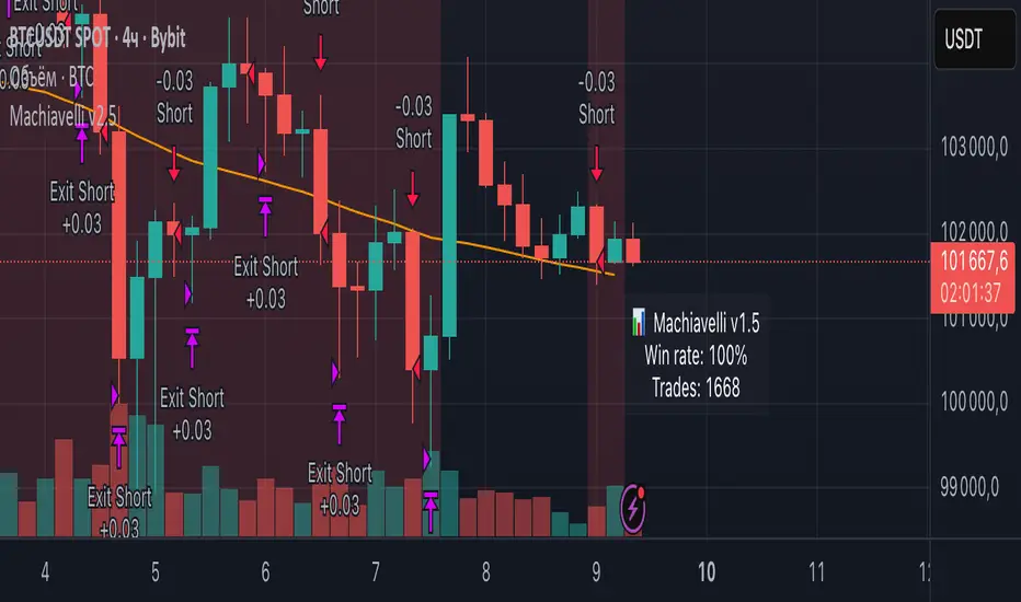
Machiavelli v2.5The purpose of this script is straightforward — to provide a reliable source of passive income.
Results speak for themselves.
Whale Hunter🇬🇧 English Description
Whale Hunt is a simple yet powerful indicator designed to detect unusually large candles in the market.
It identifies candles exceeding a set volatility threshold based on ATR (Average True Range), marking them as “Whale Candles.”
📈 Features:
Option to include/exclude wicks in calculations
Separate color customization for bullish and bearish candles
Midpoint lines projected forward based on candle size
Adjustable ATR period and multiplier
💡 Use Cases:
Detecting strong market moves
Observing volatility spikes
Identifying liquidity grabs
⚠️ Disclaimer:
This indicator is for educational purposes only and does not constitute financial advice.

WMAX-D-TPS1 (USD setup)Here I show you a strategy that I have been developing for years based on breakouts of maximum and minimum price levels.This work good in 1d

kapanış yüzdeleri Closing percentage indicator was created to trade with closing percentage, you can increase the historical data by changing the input

PipGuard – FlashLevelsPipGuard – FlashLevels. Reactive Lines on New Local Highs and Lows
Indicator published by PipGuard.
PipGuard – FlashLevels automatically draws reactive lines every time a new high or low is formed within a user-defined bar range .
Each level consists of a dual-line setup (a main line plus a thicker, softer second line) and a price label for quick readability.
Lines can dynamically extend to the current candle and are automatically deleted once price breaks through them.
How it Works
• Level Detection:
When the price reaches the highest high or lowest low of the last *N* bars, the indicator marks a BuyStop (red) or SellStop (green) level.
• Dual-Line Design:
Each level features two synchronized lines the main one and a second, thicker and slightly faded one, for a clear and elegant visual style.
• Dynamic Management:
Lines can either extend to the current candle (live update) or remain fixed-length , depending on your preference.
Once price breaks a level , both lines and labels are automatically removed to keep the chart clean and accurate.
How to Use
1. Add the script to your chart.
2. Set the FlashLevels LENGTH (number of bars used for detection).
3. Choose whether to extend lines to the current candle or keep a fixed length .
4. Use the color coding and labels to distinguish BuyStop/SellStop and their exact price levels .
5. Integrate these reactive levels into your risk-management or trade trigger framework.
HOW TO USE
HOW TO USE
Settings
• FlashLevels LENGTH → Window used to detect new highs/lows.
• Length of Half-Line → Line length when live extension is disabled.
• Extend lines to the current candle? → Enables or disables dynamic extension.
• BuyStop/SellStop Color → Main line colors.
• Second Line Color → Thicker overlay line colors.
• Price Label Color → Text color for the price label.
Note: Both lines are synchronized in position and length to ensure visual consistency .
Limitations
• Levels are purely technical and depend on the selected bar range : shorter ranges can produce frequent updates .
• Lines are horizontal segments ; if you prefer levels that persist beyond the visible range, enable line extension.
• Past performance does not guarantee future results .
Access
This script is designed for chart use and is free.
Technical analysis tool designed to map dynamic price levels on new local extremes. Not financial advice.
Indicator published by PipGuard.

Dynamic Momentum Scalper | Gold & Volatility Strategy V1.0This is a high-frequency trading strategy optimized for volatile instruments, specifically XAUUSD (Gold). It utilizes a proprietary blend of momentum, volume, and volatility metrics to identify minor market reversal points and trend exhaustion.
The system employs a sophisticated, dynamic stop-loss mechanism based on Average True Range (ATR) to adjust risk automatically to current market conditions. It manages trades via a two-tiered Take-Profit system to secure partial profits quickly and let the remaining position run to a secondary target, effectively locking in gains and achieving an optimal risk-reward balance.
Best suited for the 1-Minute (M1) timeframe.
Visibility: Invite-Only Script.

ATR Support LineOverview
ATR Support Line is a higher-timeframe-aware overlay that builds a single dynamic support line by anchoring a smoothed price baseline and offsetting it with an Average True Range (ATR) multiple. It is designed to track constructive trends while adapting to current volatility. The tool can render using higher-timeframe (HTF) data with optional closed-bar confirmation to avoid repainting, or live interpolation for more responsive visuals.
Core logic (concepts, not implementation)
• Compute an anchor from price using a selectable moving-average family (SMA / EMA / ZLEMA).
• Measure volatility using ATR and apply a configurable multiplier.
• Form the support line by offsetting the anchor downward by the ATR multiple.
• Timeframe handling: either use the chart timeframe or request an explicit HTF for calculation.
• Rendering modes:
– Closed-bar mode : interpolate inside the previous HTF bar for non-repainting behavior.
– Live mode : interpolate inside the current HTF bar for more timely responsiveness (can visually “breathe” intrabar).
Inputs
• Anchor smoothing: MA type (SMA / EMA / ZLEMA) and anchor length.
• Volatility: ATR length and multiplier.
• Timeframe: optional calculation timeframe (HTF) distinct from the chart timeframe.
• Confirmation: toggle to use closed HTF values (non-repainting) vs. live interpolation.
How to read it
• Price holding above the ATR Support Line indicates constructive conditions; orderly pullbacks toward the line can be normal trend behavior.
• Persistent closes above the line indicate strength; reactions into the line often resolve higher in constructive regimes.
• Persistent closes below the line warn of deterioration; consider reducing risk until price reclaims the level.
• On HTF rendering with closed-bar confirmation, use closes on that HTF for signal confirmation.
• In live mode, treat intrabar pierces as potential noise until confirmed by the close.
Practical use cases
• Trend context: define a trailing “line in the sand” for long-bias frameworks.
• Risk framing: size down or tighten exposure when price loses the support line.
• Confluence: combine with structure (HH/HL vs. LH/LL), volume, or market-wide risk gauges.
• Multi-TF workflow: calculate on HTF for bias, execute on lower TFs for entries/exits.
Best practices
• Align confirmations with the timeframe used for calculation (especially in closed-bar mode).
• Pair with clear invalidation rules (e.g., daily/weekly closes below the line).
• Start with conservative multipliers on noisier assets; adjust ATR length/multiplier to match instrument volatility.
Technical notes
• Non-repainting option : closed-bar HTF mode finalizes values on HTF close; lower-TF plotting uses interpolation only for continuity (no look-ahead).
• Live option : interpolates within the current HTF bar for responsiveness; expect intrabar breathing.
• Works on any time-based chart; results are most interpretable on liquid instruments.
Who it is for
• Traders who want a single, disciplined, volatility-adjusted support line with HTF awareness.
• Systematic users who prefer clear, reproducible rules for trend context and risk boundaries.
Limitations & disclosures
• Closed-source; for educational and analytical use only.
• Not financial advice. Markets involve risk; past performance does not guarantee future results.
Release notes
• Added selectable anchor MA (SMA / EMA / ZLEMA) and explicit HTF calculation with two rendering modes (closed-bar non-repainting vs. live).
• Interpolation refined for smooth visuals while respecting HTF closes in confirmation mode.
Originality & why closed-source
This is not a reimplementation of public open-source scripts. The integration of anchor smoothing choices, volatility offset, HTF calculation, and dual rendering modes (closed-bar non-repainting vs. live interpolation) is designed to maintain trend fidelity with practical control over responsiveness. The interaction of these components is proprietary and the source is closed to protect the implementation.
Integration, not a mashup
ATR Support Line is a single, self-contained framework. It does not merely merge indicators; its components are purpose-built to produce one coherent, volatility-aware, single-line support with a clear reading protocol (hold above = constructive; loss = caution).
Indicator, not a strategy
This publication is an indicator overlay, not a trading strategy. It includes no backtests, position logic, performance claims, or risk assumptions. Use it as analytical context within your own risk management.
Comparison to common tools
Compared to static moving-average baselines or classic volatility bands, ATR Support Line emphasizes (1) a single actionable support level, (2) explicit volatility adjustment via ATR, and (3) HTF-aware rendering with an optional non-repainting confirmation mode.

Adaptive CE-VWAP Breakout Framework [KedArc Quant]Description
A structured framework that unites three complementary systems into one charting engine:
Chandelier Exit (CE) – ATR-based trailing logic that defines trend direction, stop placement, and risk/reward overlays.
Swing-Anchored VWAP (SWAV) – a dynamically anchored VWAP that re-starts from each confirmed swing and adapts its smoothness to volatility.
Pivot S/R with Volume Breaks – confirmed horizontal levels with alerts when broken on expanding volume.
This script builds a single workflow for bias → trigger → managementwithout mixing unrelated indicators. Each module is internally linked rather than layered cosmetically, making it a true analytical framework—not.
Acknowledgment
Special thanks to Dynamic Swing Anchored VWAP by Zeiierman, whose swing-anchoring concept inspired a part of the SWAV module’s implementation and adaptation logic.
Support and Resistance Levels with Breaks by LuxAlgo for S/R breakout logic.
How this helps traders
Trend clarity – CE color-codes direction and provides evolving stops.
Context value – SWAV traces adaptive mean paths so traders see where price is heavy or light.
Action filter – Pivot+volume logic highlights true structural breaks, filtering false moves.
Discipline tool – Optional R:R boxes visualize risk and target zones to enforce planning.
Entry / Exit guidelines (for study purposes only)
Bias Use CE direction: green = long bias red = short bias
Entry
1. Breakout method– Trade in CE direction when a pivot level breaks on valid volume.
2. VWAP confirmation– Prefer breaks occurring around the nearest SWAV path (fair-value cross or re-test).
Exit
Stop = CE line / recent swing HL / ATR × (multiplier)
Target = R-multiple × risk (default 2 R)
Optional live update keeps SL/TP aligned with current CE state.
Core formula concepts
ATR Stop: Stop = High/Low – ATR × multiplier
VWAP calc: Σ(price × vol) / Σ(vol) anchored at swing pivot, adapted by APT (Adaptive Price Tracking) ratio ∝ ATR volatility.
Volume oscillator: 100 × (EMA₅ – EMA₁₀)/EMA₁₀; valid break when threshold %.
Input configuration (high-level)
Master Controls
Show CE / SWAV modules Theme & Fill opacity
CE Section
ATR period & multiplier Use Close for extremums
Show buy/sell labels Await bar confirmation
Risk-Reward overlay: R-multiple, Stop basis (CE/Swing/ATR×), Live update toggle
SWAV Section
Swing period Adaptive Price Tracking length Volatility bias (ATR-based adaptation) Line width
Pivot & Volume Breaks
Left/Right bar windows Volume threshold % Show Break labels and alerts
Best timeframes
Intraday: 5 m – 30 m for breakout confirmation
Swing: 1 h – 4 h for trend context
Settings scale with instrument volatility—adjust ATR period and volume threshold to match liquidity.
Glossary
ATR: Average True Range (volatility metric)
CE: Chandelier Exit (trailing stop/trend filter)
SWAV: Swing-Anchored VWAP (anchored mean price path)
Pivot H/L: Confirmed local extrema using left/right bar windows
R-multiple: Profit target as a multiple of initial risk
FAQ
Q: Does it repaint? A: No—pivots wait for confirmation and VWAP updates forward-only.
Q: Can modules be disabled? A: Yes—each section has its own toggle.
Q: Can it trade automatically? A: This is an indicator/study, not an auto-strategy.
Q: Is this financial advice? A: No—educational use only.
Disclaimer
This script is for educational and analytical purposes only.
It is not financial advice. Trading involves risk of loss. Past performance does not guarantee future results. Always apply sound risk management.

Doctor Analytics – EMERSON >🜂 Doctor Analytics – EMERSON >
“Where probability replaces emotion.”
Doctor Analytics – EMERSON > isn’t a tool — it’s a behavioral correction system for traders who refuse to gamble.
Built on the Kulture Metrics / Emerson Moss framework, it combines the raw aggression of momentum with the cold precision of mathematical expectancy.
This isn’t signal-hunting; it’s surgical probability alignment.
Inside every calculation beats the Path-Integral Engine — Linetsky-inspired stochastic modeling that measures the expected payoff of all recent price paths, weighted by volatility and discounted through time. It watches volatility breathe, measures it, and only moves when mathematics agrees with momentum.
The Kulture Metrics Dashboard transforms trading discipline into data:
Tracks your live balance, dynamic risk %, and target %.
Computes exact dollar risk and payoff values in real time.
Enforces drawdown protection with an automatic Loss Halt Flag after two consecutive hits.
Embeds compliance awareness through a Trust Bank audit watermark.
While others chase trends, EMERSON > calculates the probability of continuation.
Each signal passes through layered verification — trend integrity, volatility gate, and path-integral confirmation — filtering out emotional noise until only certainty remains.
Benefits that dominate the screen:
⚙️ Real-time equity evolution and risk-to-reward feedback.
⚙️ Path-integral logic that aligns with professional option-pricing models.
⚙️ Adaptive volatility gating for ultra-clean confirmations.
⚙️ Visual dashboard — no spreadsheets, no hesitation, no excuses.
Doctor Analytics – EMERSON > is more than an indicator; it’s a trading philosophy encoded in Pine v6.
For those who understand that discipline and mathematics are the last forms of rebellion.
Kulture Metrics | EMERSON — When logic meets inevitability.

ROC & Momentum FusionROC & Momentum Fusion
(by HabibiTrades ©)
Purpose:
“ROC & Momentum Fusion” combines the Rate of Change (ROC) with a MACD-style signal engine to identify early momentum reversals, confirmed trend shifts, and low-volatility choppy zones.
It’s built for traders who want early momentum detection with the clarity of trend persistence — adaptable to any instrument and timeframe.
⚙️ How It Works
Rate of Change (ROC):
Measures the percentage speed of price change over time, showing the raw momentum strength.
Signal Line (EMA):
A short EMA of the ROC — responds faster to new directional shifts, similar to a MACD signal line.
Histogram:
Displays acceleration and deceleration between the ROC and its signal line.
Persistent Trend States:
When the ROC crosses the signal line or zero, the indicator enters a new momentum regime
(bullish or bearish) and stays in that color until another flip occurs.
Dynamic Choppy Zone:
When ROC momentum fades within the zero buffer zone, the indicator turns orange, signaling a sideways or indecisive market.
🟢 Visual Regimes
Regime Description Color
Bullish Momentum ROC above zero or signal line 🟢 Neon Green
Bearish Momentum ROC below zero or signal line 🔴 Neon Red
Choppy / Neutral ROC hovering within ±threshold range 🟠 Neon Orange
This color system makes it visually effortless to see whether the market is trending, reversing, or consolidating.
🧭 Adaptive Intelligence
The script automatically adjusts to market type and session for consistent accuracy:
Session Adaptive: Adjusts smoothing based on global sessions (Asian, London, New York, Sydney).
Instrument Adaptive: Fine-tunes sensitivity automatically for major assets — NASDAQ (NQ), S&P 500 (ES), Gold (GC), Oil (CL), Bitcoin (BTC).
Volatility Normalization: Optionally divides ROC by its own standard deviation to stabilize noisy assets and maintain consistent scaling.
🔔 Signals & Alerts
Bullish Reversal:
ROC crosses above its signal or zero line — early momentum flip.
Bearish Reversal:
ROC crosses below its signal or zero line — downward momentum flip.
Alerts:
Both reversal conditions include built-in alert triggers for automation and notifications.
🎨 Visual Features
Main ROC Line: Adaptive EMA of ROC, color-coded by trend regime.
Signal Line: Optional white EMA overlay for MACD-style crossovers.
Histogram: Visual burst display of acceleration (green/red).
Reversal Markers: Optional triangles marking exact crossover points.
Threshold Lines: Highlight the zero and buffer zones for visual clarity.
🧩 Best Use Cases
Identify early momentum shifts before price confirms them.
Confirm trend continuation or exhaustion with color persistence.
Detect choppy / low-volatility periods instantly.
Works across all timeframes — from 1-minute scalping to weekly swings.
Combine with structure, EMAs, or volume for confirmation.
⚙️ Recommended Settings
Setting Default Description
ROC Period 6 Core momentum length (lower = faster response).
Signal EMA Length 3 MACD-style responsiveness (lower = more reactive).
Zero Buffer Threshold 0.15 Defines the width of the neutral zone around zero.
Choppy Zone Multiplier 1.0 Expands or tightens the orange zone sensitivity.
These defaults have been optimized through real-market testing to balance responsiveness and smoothness across different asset classes.
⚠️ Notes
The color regime is persistent, meaning once the line turns bullish or bearish, it remains in that state until momentum structurally flips.
The orange zone represents momentum uncertainty and helps avoid false entries in range-bound markets.
Works seamlessly on any timeframe and with any asset.
Emerson v8.4 – Kulture Metrics🜂 Emerson v8.4 – Kulture Metrics
“When volatility breathes, probability answers.”
The Emerson Engine isn’t another indicator—it’s a precision instrument built to exploit the hidden mathematics of motion.
Born from Kulture Metrics’ Nosreme lineage, this model fuses trend architecture, volatility anatomy, and Linetsky’s path-integral weighting into one living signal core. It doesn’t predict — it quantifies belief.
Each trigger passes through three unforgiving filters:
Classical Trend & Momentum Logic — directional strength, pure and unadulterated.
Squeeze Regime Anticipation — volatility compression before the break.
Path-Integral Confirmation — stochastic payoffs weighted by risk-free discounting and volatility density.
The result?
Only signals where the math, the market, and the moment all align — Absolute Confirmations.
No noise. No guessing. No emotion.
In practice, Emerson waits. It calculates. Then it strikes with surgical precision — entries that respect volatility, discount rates, and expected path contributions like a derivatives desk built into your chart.
Each decision point carries the full weight of stochastic probability theory — the same principles driving modern option pricing — yet distilled into something you can read at a glance.
Benefits that separate you from the herd:
✅ Trades filtered by volatility percentile and expected payoff distribution — not gut feel.
✅ Dotted bias line reveals the “probabilistic current” beneath price itself.
✅ Alerts trigger only when logic, momentum, and probability form a unanimous verdict.
✅ Dynamic macro-window shading adapts to volatility pressure in real time.
✅ Every entry inherently respects your risk, target, and discounting horizon.
Emerson v8.4 doesn’t ask the market what’s happening — it tells it what must happen next, given the probabilities.
It’s not designed to comfort. It’s designed to confirm.
Kulture Metrics. Built for traders who understand that randomness is just order not yet resolved.

Michie Breakout 1.0A precision breakout indicator built with adaptive machine learning logic and price action principles.
Designed specifically for TSLA, it detects key volatility shifts and directional momentum zones to capture high-probability breakout setups while filtering noise.
Focuses on clarity, adaptability, and accuracy — optimized for real-time intraday trading.

BB SPY Mean Reversion Investment StrategySummary
Mean reversion first, continuation second. This strategy targets equities and ETFs on daily timeframes. It waits for price to revert from a Bollinger location with candle and EMA agreement, then manages risk with ATR based exits. Uniqueness comes from two elements working together. One, an adaptive band multiplier driven by volatility of volatility that expands or contracts the envelope as conditions change. Two, a bias memory that re arms the same direction after any stop, target, or time exit until a true opposite signal appears. Add it to a clean chart, use the markers and levels, and select on bar close for conservative alerts. Shapes can move while the bar is open and settle on close.
Scope and intent
• Markets. Currently adapted for SPY, needs to be optimized for other assets
• Timeframes. Daily primary. Other frames are possible but not the default
• Default demo. SPY on daily
• Purpose. Trade mean reversion entries that can chain into a longer swing by splitting holds into ATR or time segments
Originality and usefulness
• Novelty. Adaptive band width from volatility of volatility plus a persistent bias array that keeps the original direction alive across sequential entries until an opposite setup is confirmed
• Failure modes mitigated. False starts in chop are reduced by candle color and EMA location. Missed continuation after a take profit or stop is addressed by the re arm engine. Oversized envelopes during quiet regimes are avoided by the adaptive multiplier
• Testability. Every module has Inputs and visible levels so users can see why a suggestion appears
• Portable yardstick. All risk and targets are expressed in ATR units
Method overview in plain language
The engine measures where price sits relative to Bollinger bands, confirms with candle color and EMA location, requires ADX for shorts(in our case long close since we use it currently as long only), and optionally requires a trend or mean reversion regime using band width percent rank and basis slope. Risk uses ATR for stop, target, and optional breakeven. A small array stores the last confirmed direction. While flat, the engine keeps a pending order in that direction. The array flips only when a true opposite setup appears.
Base measures
• Range basis. True Range smoothed over a user defined ATR Length
• Return basis. Not required
Components
• Bollinger envelope. SMA length and standard deviation multiplier. Entry is based on cross of close through the band with location bias
• Candle and EMA filter. Close relative to open and close relative to EMA align direction
• ADX gate for shorts. Requires minimum trend strength for short trades
• Adaptive multiplier. Band width scales using volatility of volatility so envelopes breathe with conditions
• Regime gate optional. Band width percent rank and basis slope identify trend or mean reversion regimes
• Risk manager. ATR stop, ATR target, optional breakeven, optional time exit
• Bias memory. Array stores last confirmed direction and re arms entries while flat
Fusion rule
Minimum satisfied gates count style. All required gates must be true. Optional gates are controlled in Inputs. Bias memory never overrides an opposite confirmed setup.
Signal rule
• Long setup when close crosses up through the lower band, the bar closes green, and close is above the long EMA
• Short setup when close crosses down through the upper band, the bar closes red, close is below the short EMA, and ADX is above the minimum
• While flat the model keeps a pending order in the stored direction until a true opposite setup appears
• IN LONG or IN SHORT describes states between entry and exit
What you will see on the chart
• Markers for Long and Short setups
• Exit markers from ATR or time rules
• Reference levels for entry, stop, and target
• Bollinger bands and optional adaptive bands
Inputs with guidance
Setup
• Signal timeframe. Uses the chart timeframe
• Invert direction optional. Flips long and short
Logic
• BB Length. Typical 10 to 50. Higher smooths more
• BB Mult. Typical 1.0 to 2.5. Higher widens entries
• EMA Length long. Typical 10 to 50
• EMA Length short. Typical 5 to 30
• ADX Minimum for short. Typical 15 to 35
Filters
• Regime Type. none or trend or mean reversion
• Rank Lookback. Typical 100 to 300
• Basis Slope Length and Threshold. Larger values reduce false trends
Risk
• ATR Length. Typical 10 to 21
• ATR Stop Mult. Typical 1.0 to 3.0
• ATR Take Profit Mult. Typical 2.0 to 5.0
• Breakeven Trigger R. Move stop to entry after the chosen multiple
• Time Exit. Minimum bars and extension when profit exceeds a fraction of ATR
Bias and rearm
• Bias flips kept. Array depth
• Keep rearm when flat. Maintain a pending order while flat
UI
• Show markers and levels. Clean defaults
Usage recipes
Alerts update in real time and can change while the bar forms. Select on bar close for conservative workflows.
Properties visible in this publication
• Initial capital 25000
• Base currency USD
• If any higher timeframe calls are enabled, request.security uses lookahead off
• Commission 0.03 percent
• Slippage 3 ticks
• Default order size method Percent of equity with value 5
• Pyramiding 0
• Process orders on close On
• Bar magnifier Off
• Recalculate after order is filled Off
• Calc on every tick Off
Realism and responsible publication
No performance claims. Costs and fills vary by venue. Shapes can move intrabar and settle on close. Strategies use standard candles only.
Honest limitations and failure modes
High impact releases and thin liquidity can break assumptions. Gap heavy symbols may require larger ATR. Very quiet regimes can reduce contrast in the mean reversion signal. If stop and target can both be touched inside one bar, outcome follows the TradingView order model for that bar path.
Regimes with extreme one sided trend and very low volatility can reduce mean reversion edges. Results vary by symbol and venue. Past results never guarantee future outcomes.
Open source reuse and credits
None.
Backtest realism
Costs are realistic for liquid equities. Sizing does not exceed five percent per trade by default. Any departure should be justified by the user.
If you got any questions please le me know
