High-Probability Scalper (Market Open)Market open is where volatility is real, spreads are tight, and momentum shows itself early. This scalping strategy is built specifically to operate during that window, filtering out low-quality signals that usually appear later in the session.
Instead of trading all day, the logic is restricted to the first 90 minutes after market open, where continuation moves and fast pullbacks are more reliable.
What This Strategy Does
This script looks for short-term momentum alignment using:
Fast vs slow EMA structure
RSI confirmation to avoid chasing extremes
ATR-based risk control
Session-based filtering to trade only when volume matters
It’s designed for intraday scalping, not swing trading.
Core Trading Logic
1. Market Open Filter
Trades are allowed only between 09:30 – 11:00 exchange time.
This avoids low-liquidity chop and focuses on the period where most breakouts and reversals form.
2. Trend Confirmation
Bullish bias: 9 EMA crosses above 21 EMA
Bearish bias: 9 EMA crosses below 21 EMA
This keeps trades aligned with short-term direction instead of random entries.
3. Momentum Check (RSI)
RSI is used as a quality filter, not as an overbought/oversold signal.
Long trades only when RSI is strong but not extended
Short trades only when RSI shows weakness without exhaustion
This removes late entries and reduces whipsaws.
Entries & Exits
Entries
Executed only on confirmed candles
No intrabar repainting
One position at a time
Risk Management
Stop-loss based on ATR
Take-profit calculated using a fixed risk–reward ratio
Same structure for both long and short trades
This keeps risk consistent across different symbols and volatility levels.
Why This Strategy Works Better at Market Open
Volume is highest
False breakouts are fewer
EMA crosses have follow-through
RSI behaves more cleanly
By not trading all day, the strategy avoids most of the noise that kills scalpers.
Best Use Cases
Index futures
High-liquidity stocks
Major crypto pairs during active sessions
1m to 5m timeframes
What This Strategy Is NOT
Not a martingale
Not grid-based
Not designed for ranging markets
Not a “set and forget” system
It’s a controlled scalping template meant for disciplined execution.
How to Use It Properly
Test on multiple symbols
Adjust ATR length for volatility
Tune RSI ranges per market
Always forward-test before live alerts
Final Note
This strategy focuses on structure, timing, and risk, not indicator stacking.
If you trade the open, this gives you a clear framework instead of emotional entries.
If you want:
Alerts
Session customization
News filters
Partial exits
You can extend this logic without breaking the core system.
Zmienność

TradeAxis Trendlines [ETHUSD]TradeAxis Trendlines is a rule-based trendline analysis indicator for TradingView. It automatically detects and plots filtered trendlines to help you monitor evolving structure on ETHUSD without manual drawing.
What it plots
Automatically mapped trendlines (with filtering to reduce noise)
Optional higher-timeframe structure overlays (if enabled)
Optional Position Tools
Recommended baseline
Designed/tuned for ETHUSD the 30-minute timeframe as the baseline setup
Alerts
Built-in alert conditions are provided (configured in TradingView), including:
New trendline created
Trendline touch / interaction
Additional structure/tool events (when enabled in settings)
Inputs
Line filtering controls (e.g., slope/steepness constraints)
Visibility toggles for structure overlays
Additional parameters to help adapt the display to your workflow

SD-Range Oscillator | QuantEdgeBSD-Range Oscillator | QuantEdgeB
🔍 Overview
SD-Range Oscillator | QuantEdgeB (SDRO) is a normalized momentum oscillator that compresses a low-lag trend core into a 0–100 style range using standard-deviation (SD) bands. It builds a smooth baseline from a fast triple-smoothed average, wraps it with ±2×SD volatility bounds, then normalizes the core value inside that envelope. Clear Long/Short regimes trigger when the normalized value crosses user-defined thresholds, with optional labels, regime-colored candles, and intuitive filled zones.
✨ Key Features
1.⚡ Low-Lag Core (Triple-Smooth Engine)
- Uses a fast, low-lag triple-smoothed average as the oscillator’s primary signal input.
- Helps keep momentum readings responsive while filtering noise.
2. 📏 SD Volatility Envelope (±2×SD)
- Builds a volatility channel around a smoothed baseline using standard deviation.
- Automatically adapts to changing market turbulence.
3. 🧮 Normalized Range Output
- Converts the core signal into a normalized value by mapping it between the upper/lower SD bounds.
- Makes readings consistent across assets and timeframes.
4. 🎯 Threshold-Based Regimes
- Long when the normalized value exceeds the Long threshold.
- Short when it falls below the Short threshold.
- Includes an additional safety filter to reduce “forced” longs when price is already extended near the upper envelope.
5. 🎨 Visual Clarity & Zones
- Regime-colored oscillator line and candles.
- Filled SD bands around the baseline for quick volatility context.
- Optional highlight fills between the oscillator and thresholds to show active long/short phases.
- Extra OB/OS background zones for quick overextension awareness.
6. 🔔 Signals & Alerts
- Optional “Long/Short” labels on confirmed regime flips.
- Alert conditions fire on long/short regime crossovers.
💼 Use Cases
• Momentum Confirmation: Validate breakouts by requiring SDRO to hold above the Long threshold.
• Mean-Reversion Awareness: Watch for extreme normalized readings near upper/lower bounds.
• Regime Filtering: Use SDRO state (Long/Short/Neutral) to filter trades from other systems.
• Cross-Market Comparison: Normalization makes it easier to compare momentum across different tickers.
🎯 For Who
• Trend traders who want a clean momentum filter with adaptive volatility context.
• System builders needing a simple regime variable (1 / -1 / neutral) to gate entries.
• Discretionary traders who like visual confirmation (fills, candle coloring, threshold zones).
• Multi-asset traders who benefit from normalized, comparable oscillator readings.
⚙️ Default Settings
• TEMA Period: 7
• Base Length (SMMA): 25
• Long Threshold: 55
• Short Threshold: 45
• SD Multiplier: 2× (fixed in code)
• Color Mode: Alpha
• Color Transparency: 60
• Labels: Off by default
📌 Conclusion
SD-Range Oscillator | QuantEdgeB blends a low-lag triple-smoothed core with an adaptive SD envelope to produce a normalized, easy-to-read momentum signal. With clear threshold regimes, volatility-aware context, and strong visuals (fills + candle coloring), SDRO helps separate meaningful momentum shifts from noise across any asset or timeframe.
🔹 Disclaimer: Past performance is not indicative of future results. Always backtest and align settings with your risk tolerance and objectives before live trading.
🔹 Strategic Advice: Always backtest, optimize, and align parameters with your trading objectives and risk tolerance before live trading.

TradeAxis Trendlines [UKOIL]TradeAxis Trendlines is a rule-based trendline analysis indicator for TradingView. It automatically detects and plots filtered trendlines to help you monitor evolving structure on UKOIL without manual drawing.
What it plots
Automatically mapped trendlines (with filtering to reduce noise)
Optional higher-timeframe structure overlays (if enabled)
Optional Position Tools
Recommended baseline
Designed/tuned for UKOIL on the 15-minute timeframe as the baseline setup
Alerts
Built-in alert conditions are provided (configured in TradingView), including:
New trendline created
Trendline touch / interaction
Additional structure/tool events (when enabled in settings)
Inputs
Line filtering controls (e.g., slope/steepness constraints)
Visibility toggles for structure overlays
Additional parameters to help adapt the display to your workflow

TradeAxis Trendlines [XAUUSD]TradeAxis Trendlines is a rule-based trendline analysis indicator for TradingView. It automatically detects and plots filtered trendlines to help you monitor evolving structure on XAUUSD without manual drawing.
What it plots
Automatically mapped trendlines (with filtering to reduce noise)
Optional higher-timeframe structure overlays (if enabled)
Optional Position Tools
Recommended baseline
Designed/tuned for XAUUSD on the 15-minute timeframe as the baseline setup
Alerts
Built-in alert conditions are provided (configured in TradingView), including:
New trendline created
Trendline touch / interaction
Additional structure/tool events (when enabled in settings)
Inputs
Line filtering controls (e.g., slope/steepness constraints)
Visibility toggles for structure overlays
Additional parameters to help adapt the display to your workflow

Momentum Echo Oscillator [Community Edition]Concept: The Momentum Echo Oscillator (MEO) is a modern take on classical momentum oscillators. Most indicators only look at the "now". MEO introduces the concept of Momentum Echoes—historical momentum harmonics that are weighted and blended back into the current price velocity.
Why use MEO? Standard momentum tools (like ROC or RSI) can be very "jittery" or noisy. By integrating historical echoes, MEO provides a smoother, more rhythmic representation of price flow, making it easier to spot genuine trend reversals.
Key Elements:
Primary Momentum: The immediate speed of price.
Echo Harmonics: Two adjustable lookback points that act as a "memory" for the indicator, filtering out false breakouts.
Dynamic Histogram: Visualizes the gap between the Echo Engine and the Trigger Line, highlighting acceleration and deceleration.
Settings:
Echo Weight: Adjust how much "memory" you want the indicator to have.
Smoothing: Clean up the signals for higher timeframes.
This is an open-source tool for the TradingView community. Enjoy!

Hybrid Market Score Suite - Impulse Monitor🔬 HYBRID MARKET SCORE SUITE - Impulse Monitor — Algorithmic Imbalance Scoring & Compact 28-Indicator Dashboard
Monitoring regular divergences, OB/OS zones, statistical deviations, and 28 metrics simultaneously is impractical to do manually. HMSS - Impulse Monitor updates them every tick in one compact dashboard, with an optional scoring layer.
━━━━━━━━━━━━━━━━━━━━━━━━━━━━━━━━━
🎯 WHAT IS THIS
HMSS - Impulse Monitor
Performs **Real-Time Monitoring** of 28 technical metrics across 3 fixed timeframes ( 5m / 15m / 30m ) simultaneously.
It processes market data on a **tick-by-tick** basis without lookahead, designed to detect developing market imbalances and local exhaustion points as they happen.
Since the indicator analyzes fixed multi-timeframe streams, it is chart TF-independent : switching your main chart timeframe does not affect the internal logic or scoring.
━━━━━━━━━━━━━━━━━━━━━━━━━━━━━━━━━
🔧 "SWISS ARMY KNIFE" — Daily Monitoring Tool
A compact table with extensive data that you use every day :
28 indicators across 3 timeframes (5m / 15m / 30m):
Divergences (9): RSI DIV, MFI DIV, CCI DIV, CMF DIV, MACD DIV, CVD DIV, DELTA RSI (DRSI) DIV, Elder DIV, STOCH DIV
OB/OS (5): RSI OB/OS, MFI OB/OS, CCI OB/OS, DRSI OB/OS, STOCH OB/OS
Z-Score (8): RSI Z-Score, MFI Z-Score, CCI Z-Score, STOCH Z-Score, DRSI Z-Score, CMF Zone, CVD Z-Score, MACD Z-Score
Special (6): Elder Force, Volume Climax, ZMO EXT, (Nadaraya Watson Envelope) NW ENV, ATR Spikes, VWAP Dev
A few "Special" metrics may be less familiar than classic oscillators, so here are quick notes on what they flag (not "better" indicators — just more niche tools):
NW ENV (Nadaraya–Watson Envelope): A kernel-smoothed price envelope (period 8) with deviation multipliers 2.25 (inner) and 7.75 (extreme). Labels reflect band breaches: !! = price outside the inner band (strong extension), !!! = outside the upper extreme band (rare upside extension), !!!! = outside the lower extreme band (rare downside extension). These are context tags for extension/mean-reversion risk, not trade commands.
ATR Spikes: Compares the current candle range (High–Low) to the recent average ATR(14) over the last 10 bars. A spike triggers when the candle is ≥ 2.0× larger than the average — often seen during climax-like moments (sharp expansion), useful as a “caution marker” for late-move entries.
Volume Climax: A Z-Score of volume over 20 periods. Flags unusually high volume above about 1.9σ . In practice, it helps highlight “crowd intensity” moments: heavy volume on a down candle can resemble panic-like supply; heavy volume on an up candle can resemble aggressive chasing. Treat it as context, not a directional guarantee.
normalized via Z-Score over a 100 -bar history. It highlights statistically stretched momentum when it deviates beyond roughly 2.0σ from its mean — a way to spot overheated acceleration.
All of this — across multiple timeframes simultaneously, in one compact table, without cluttering your chart with a dozen oscillators below. Works on any chart TF — your timeframe selection does not affect calculations.
Each block can be toggled in settings:
Divergence Block — forming regular divergences across oscillators/flows
OB/OS Block — overbought/oversold zones (RSI/MFI/CCI/Stoch etc.)
Z-Score Block — statistical deviations in sigmas (σ)
Special Indicators Block — special indicators and regime filters
Scoring Block — Hybrid Engine (Score, Pattern, Breakdown, Attention, Trade Type, Veto)
Use it as a dashboard for quick market assessment — like a Geiger counter for market anomalies.
━━━━━━━━━━━━━━━━━━━━━━━━━━━━━━━━━
🧠 SCORING SYSTEM — For Extreme Imbalances
An innovative data-driven engine that activates during moments of extreme imbalance :
• Calibrated using 380,000+ historical market data records
• Compares current indicator combinations with historical patterns
• Assigns a Score when significant combinations are detected
Think of the scoring system as a Storm Radar — it doesn't predict volatility explosions, but it "lights up" during storms and shows when the turbulence reaches its peak and begins to subside.
It is designed to assist in identifying potential impulse reversals during liquidation events, if that aligns with your approach.
The system is calibrated on a multi-month historical dataset of 380,000+ records collected minute-by-minute from cryptocurrency markets (BTC, ETH, SOL). During this period, the market showed both multi-month lows and several ATH (All-Time High) events. Statistical dependencies and indicator combination patterns were identified from this data.
━━━━━━━━━━━━━━━━━━━━━━━━━━━━━━━━━
🧠 SCORING ENGINE ARCHITECTURE
Concept & Logic:
This system utilizes a hybrid approach, combining classical technical analysis with statistical profiling. Instead of simply summing up indicator signals, the algorithm compares the current market state against a proprietary database of historical patterns ("Profiles") collected for specific assets.
The calculation logic is layered:
1. Base Layer (Indicator Analysis):
The system monitors 28 metrics (RSI, MFI, Z-Scores, CVD, ATR Spikes, VWAP DEV, etc.).
Standard Deviation (25 pts, Dim Cell): Occurs when an indicator exceeds a standard volatility threshold (e.g., Z-Score > 1.5). This registers as a common local anomaly.
Profile Alignment (50 pts, Bright Cell): Occurs when a value hits specific historical thresholds recorded in the Asset Profile. These are values where impulses or structural shifts occurred in the past data samples.
2. The Core Pattern Recognition (compressed historical scenarios):
The system scans for ~14 compressed market scenarios (Patterns). A pattern becomes active only when its specific "Kernel" of indicators fires simultaneously with a Coverage Ratio > 70%.
3. Confluence & Weighting:
The final score reflects the density of these matches. It identifies the "Winning Side" (Long vs. Short bias) based on the accumulated weight of base and profile scores.
Score Breakdown (The "X-Ray" Row):
The dashboard displays a breakdown row ( L:… S:… C:… A:… K:… ) to visualize the components of the Total Score:
L / S (Baseline): Cumulative weight of active indicators for Long or Short bias.
C (Core Multiplier): A dynamic coefficient applied when the match with a historical pattern "Kernel" is high.
A (AddSig): Points for secondary confirming factors that reinforce the active pattern.
K (Key Features): Internal code for High-Impact Anomalies . These are rare statistical outliers (e.g., extreme Z-Scores > 3.0) that carry significant weight due to their historical correlation with volatility expansion.
System States (Dashboard Output):
The text labels on the UI represent the statistical context of the market, not direct trade commands:
NEUTRAL: Balanced market, no dominant patterns.
SIGNAL FORMING: Early detection of potential accumulation or distribution structures.
TREND — WAIT: Market is in a directional phase; algorithm is monitoring for exhaustion or pivot points.
ON WATCH: High statistical confluence detected.
MAYBE LONG/SHORT: Directional statistical bias is present.
MAX SCORE: Indicates an "Extreme Score" condition. Historically, such values appear during significant market extensions (Global Lows/Highs) where pattern coverage can approach 100% alongside statistical anomalies.
BREAKOUT: Context suggests impulse continuation or level breach.
Disclaimer: This tool provides a statistical context assessment based on historical pattern matching. "Global Lows/Highs" / "New Low/High" are dataset-derived pattern names, not a directional claim. "Max Score" and "Key Features" describe rarity levels, not guaranteed outcomes. Past market behavior is not indicative of future performance.
━━━━━━━━━━━━━━━━━━━━━━━━━━━━━━━━━
🛡️ DRSI VETO — SAFETY MECHANISM
Sometimes "the setup exists by score", but the market is overextended — which can make timing riskier. This is where DRSI Veto comes in:
If the system indicates LONG , but DRSI Z-Score shows extreme overbought conditions (or vice versa for SHORT), the VETO activates, significantly reducing the final Score.
This helps filter out overextended "exhaustion" setups — technically valid by score, but stretched enough to increase mean-reversion risk without proper context. A clear VETO label appears in the table.
━━━━━━━━━━━━━━━━━━━━━━━━━━━━━━━━━
🎯 USE CASES — WHEN IT WORKS BEST
Dual Purpose: Efficiency & Detection
While the Scoring Engine hunts for invisible imbalances, the dashboard serves as your primary daily workstation . It replaces the need for multiple oscillator panes, keeping your charts clean while providing a "Heads-Up Display" for Oscillators, Money Flow, and Statistical Anomalies across three timeframes at once.
Identifying Liquidation-Driven Reversals:
The scoring system is most effective during high-impulse market movements — large liquidation cascades, stop-loss hunts, sharp imbalances. HMSS - Impulse Monitor helps spot potential exhaustion points within seconds or minutes, highlighting reaction zones during high-impulse moves.
When NOT to expect detections:
Markets can and often WILL reverse without the indicator firing. This tool is designed for high-volatility moments with significant liquidations . Reversals in low-volatility, "quiet" markets will likely occur without elevated readings.
This is intentional: higher-score conditions are designed to be relatively rare, not a daily occurrence. If your approach values selectivity, it may help to treat elevated readings as “patient-wait” moments — markets often reward waiting for cleaner, high-confluence regimes rather than forcing a setup every session.
Think of the scoring system as an airbag — most of the time you don't need it, but when it activates, its informational value is high. It's your storm radar: particularly useful when markets enter rare and dangerous regimes.
━━━━━━━━━━━━━━━━━━━━━━━━━━━━━━━━━
💡 FORMING DIVERGENCES — Real-Time Monitoring
Important note for experienced traders:
The indicator shows divergences that are CURRENTLY FORMING , not confirmed ones. This is Real-Time Monitoring mode — scoring updates every tick , allowing you to see the situation as it develops.
⚠️ No lookahead / no future leak: This script strictly uses lookahead=barmerge.lookahead_off (no future data is used in calculations).
On historical data, scores are always displayed based on closed candles. For better historical detail, use candles down to 1-10 seconds.
If a "forming" pattern disappears — this is a normal part of real-time monitoring: the market changes, and the assessment/confluence recalculates accordingly.
━━━━━━━━━━━━━━━━━━━━━━━━━━━━━━━━━
📈 DIVERGENCE PERCENTAGES — WHAT THEY MEAN
Percentages next to divergences show "Divergence Intensity" — how strongly price and oscillator have diverged between points.
Note: The presence of a divergence itself is factored into the scoring system. However, the percentage values (intensity) are currently NOT included in Score calculation. We may add them in the future if we accumulate sufficient data confirming their statistical significance. For now, percentages serve as a visual hint for your own analysis — an additional confirmation filter.
Note: The indicator also draws forming divergence lines directly on the price chart — for 6 key oscillators (RSI, MACD, MFI, CCI, DRSI, CVD).
━━━━━━━━━━━━━━━━━━━━━━━━━━━━━━━━━
🔧 SCORING SYSTEM COMPATIBILITY
Statistical data profiles are available for: BTC, ETH, and SOL
- Default mode is AUTO : BTC/ETH/SOL detected automatically; all other assets use 'ALTS' (ETH-based) profile
- Manual Override: You can select a specific profile in settings if Bar Replay testing shows it tracks your asset's volatility better
- Indicator readings as tools work on ANY assets and markets
- For non-crypto instruments (Forex, Stocks): if alerts trigger too often or too rarely, adjust MAX SCORE Thresholds in settings
Note: Alert threshold settings (Base, Total, MAX SCORE) also affect "Attention Level" and "Trade Type" display in the UI.
━━━━━━━━━━━━━━━━━━━━━━━━━━━━━━━━━
🔔 ALERT SYSTEM (4-STEP)
The alert system is tiered (each step can be toggled on/off):
Step 1: Base Score — Triggers when mathematical confluence reaches base threshold
Step 2: Core Pattern — Triggers when algorithmic pattern is detected (Breakout/Formation)
Step 3: Total Score — Triggers when total Score reaches threshold
Step 4: MAX SCORE Alert — Final high-score alert (individual thresholds for BTC/ETH/SOL/ALT)
Important: Alert thresholds simultaneously calibrate Attention and Trade Type in the UI.
For automation (bots / webhook-based tools): use Webhook URL. Keep in mind that maximum score is often reached at the wick tip, not at candle close — backtesting on longer TFs may show delayed data.
━━━━━━━━━━━━━━━━━━━━━━━━━━━━━━━━━
🧩 HMSS ECOSYSTEM: HMSS - Impulse Monitor vs. HMSS - Context Engine
This script (HMSS - Impulse Monitor) is one half of a specialized two-module system. It is designed to work either as a standalone tool or alongside its companion, HMSS - Context Engine.
Why separate scripts? To maximize responsiveness and detail without hitting Pine Script resource limits (memory/execution time), the ecosystem is split into two specialized engines. Merging them would compromise real-time performance.
Note: HMSS - Context Engine is not a different preset of the same script — it is a separate engine with its own indicator set, pattern library, and calibration profiles designed for a different purpose and a different analytical scope.
Key Differences & Synergy:
Distinct Purpose (Micro vs. Macro): HMSS - Impulse Monitor (This Script): Designed for "Market Reaction." It monitors 5m/15m/30m specifically to detect local exhaustion, liquidation wicks, and immediate imbalances. HMSS - Context Engine (Companion): Designed for "Market Context." It analyzes 1h/4h/1D/1W structures to identify global trends and major structural pivots.
Distinct Indicator Sets: Each engine includes components better suited for its timeframe domain. HMSS - Impulse Monitor features VWAP Deviation and ATR Spikes — metrics more relevant for intraday dynamics. HMSS - Context Engine incorporates structure-oriented indicators not present here: ADX Exhaustion, OBV Divergence & Z-Score, Delta Histograms, VixFix (WVF), Basis, Williams A/D, and Pivot Distances.
Distinct Calibration Profiles: While both engines are developed using historical market observations, their pattern libraries and threshold values are calibrated independently for their respective metric sets and use-cases. The same market event may register as "Extreme" on HMSS - Impulse Monitor while appearing "Neutral" on HMSS - Context Engine if the broader trend structure remains intact — and vice versa.
💡 Synergy Scenarios (How to use them together): Experienced traders often combine both modules to refine market context and decision-making:
• Trend Pullback (Scalp): If HMSS - Context Engine indicates a strong Trend, but HMSS - Impulse Monitor shows "Extreme Overbought/Oversold" (correction against trend) — this often highlights a short-term counter-trend opportunity or a re-entry point.
• Major Reversal Risk: If BOTH HMSS - Impulse Monitor and HMSS - Context Engine indicate "Max Score" / "Extreme Imbalance" simultaneously — this is a rare statistical event (confluence of micro and macro exhaustion) that historically correlates with significant structural reversals.
━━━━━━━━━━━━━━━━━━━━━━━━━━━━━━━━━
⚙️ TECHNICAL NOTES
🕰️ Real-Time Monitor (No Past Labels):
Crucial Concept: This tool is a Real-Time Monitor , not a "signal painter." It shows the market state HERE AND NOW — it does NOT draw historical Buy/Sell arrows or preserve past dashboard states. The only elements drawn on the chart are currently forming divergence lines.
Calculation Heavy:
We utilize maximum Pine Script limits for calculations. Initial loading may take up to 12-15 seconds — this reflects the precision and volume of processed data. After loading, the indicator operates without noticeable delays, processing data every tick .
Chart TF Independence:
The indicator analyzes fixed MTF streams, so your chart timeframe selection does not affect results. For reduced load and faster response, 5-60 minute charts are preferred.
Recommended Chart Timeframe:
For speed and lower load: 5–60 minutes (optimal)
For super-detailed history, you can go down to second-level candles, but this is a performance/memory tradeoff
Bar Replay — How to See Past Performance:
To understand how the Scoring Engine reacted to specific market moves (e.g., a past crash or pump), use Bar Replay Mode :
1s to 30s: Best accuracy (precise tick-emulation)
1 min: Acceptable (if your plan lacks seconds-based intervals)
> 5 min: Not recommended — accuracy drops as intrabar price action is lost
⚠️ > 15 min: Not recommended — may exceed memory limits (TradingView constraint)
To manage the extensive database of pattern weights and profiles while maintaining high performance, this engine utilizes a custom optimized data structure. This ensures the script operates smoothly within Pine Script's resource limits without compromising the depth of historical analysis.
━━━━━━━━━━━━━━━━━━━━━━━━━━━━━━━━━
🔬 TECHNICAL APPROACH (for the curious)
The indicator uses a proprietary compact data encoding system that allows transmitting information about divergences, their type, length, and intensity in a single numeric value. This enables efficient aggregation of data from multiple timeframes without exceeding Pine Script limits.
The scoring system is built on the Statistical Pattern Matching principle: current indicator combinations are compared against a library of statistically significant patterns, each with its own weight and type (Formation/Breakout).
━━━━━━━━━━━━━━━━━━━━━━━━━━━━━━━━━
🚀 QUICK START
Add HYBRID MARKET SCORE SUITE - Impulse Monitor to your chart.
Position table (recommended: bottom-right ) and adjust Offset / Spacer so it doesn't overlap price action.
In settings, toggle blocks by groups: Divergences / OB-OS / Z-Score / Special / Scoring — to match your trading style and load preferences.
For comfortable operation, use chart TF 5–60m .
━━━━━━━━━━━━━━━━━━━━━━━━━━━━━━━━━
🔄 DEVELOPMENT
The indicator receives periodic updates, including statistical pattern refinements as new market data is accumulated, to maintain relevance with current market conditions. Update schedule is not guaranteed.
━━━━━━━━━━━━━━━━━━━━━━━━━━━━━━━━━
🛡️ DISCLAIMER
This script is provided for informational and educational purposes only and does NOT constitute financial advice, investment advice, or a recommendation to buy/sell any asset.
All examples, descriptions, and statistics are based on historical observations. Market conditions can change, patterns can fail, and signals/labels may disappear or update in real time. No results are guaranteed.
Use this tool as one input among many. Always apply your own judgment, risk management, and independent verification (DYOR). Trading — especially with leverage — involves substantial risk, including the risk of total loss. You are solely responsible for your decisions and outcomes.

Quantum Elasticity Overview: Quantum Elasticity is a sophisticated Mean Reversion Engine based on the law of statistical probability. It models market price action as an elastic system that revolves around a dynamic equilibrium point (Linear Regression).
The Core Logic: Markets are rarely efficient. When price deviates significantly from its historical mean, it creates "Statistical Tension." This script measures that tension using dynamic standard deviation envelopes (Sigma Bands).
Equilibrium: The center line represents the fair value of the asset.
Elasticity Zones: When price enters the "Extreme" bands, the probability of a snap-back towards the mean increases exponentially.
Unique Features:
Non-Lagging Linear Regression: Unlike SMA/EMA, our equilibrium line adapts to the slope of the trend without the heavy lag of traditional indicators.
Dynamic Tension Index: The built-in HUD displays the real-time elasticity of the market, helping traders identify exhaustion points.
Reversion Alerts: "REVERT" signals appear when the market reaches a 1.5x Sigma deviation, indicating a critical oversold/overbought state.
How to obtain access: This is an "Invite-only" script. To gain access, please visit my profile or send a private message for subscription details.

TradeAxis TrendlinesTradeAxis Trendlines is a rule-based trendline analysis indicator for TradingView. It automatically detects and plots filtered trendlines to help you monitor evolving structure without manual drawing.
What it plots
Automatically mapped trendlines (with filtering to reduce noise)
Optional higher-timeframe structure overlays (if enabled)
Optional Position Tools
Alerts
Built-in alert conditions are provided (configured in TradingView), including:
New trendline created
Trendline touch / interaction
Additional structure/tool events (when enabled in settings)
Inputs
Line filtering controls (e.g., slope/steepness constraints)
Visibility toggles for structure overlays
Additional parameters to help adapt the display to your workflow

TwinSmooth ATR Bands | QuantEdgeBTwinSmooth ATR Bands | QuantEdgeB
🔍 Overview
TwinSmooth ATR Bands | QuantEdgeB is a dual-smoothing, ATR-adaptive trend filter that blends two complementary smoothing engines into a single baseline, then builds dynamic ATR bands around it to detect decisive breakouts. When price closes above the upper band it triggers a Long regime; when it closes below the lower band it flips to Short—otherwise it stays neutral. The script enhances clarity with regime-colored candles, an active-band fill, and an optional on-chart backtest table.
✨ Key Features
1. 🧠 Twin-Smooth Baseline (Dual Engine Blend)
- Computes two separate smoothed baselines (a slower “smooth” leg + a faster “responsive” leg).
- Blends them into a single midpoint baseline for balanced stability + speed.
- Applies an extra EMA smoothing pass to produce a clean trend_base.
2. 📏 ATR Volatility Bands
- Builds upper/lower bands using ATR × multiplier around the trend_base.
- Bands expand in volatile conditions and contract when markets quiet down—auto-adapting without manual tweaks.
3. ⚡ Clear Breakout Regime Logic
- Long when close > upperBand.
- Short when close < lowerBand.
- Neutral otherwise (no forced signals inside the band zone).
4. 🎨 Visual Clarity
- Plots only the active band (lower band in long regime, upper band in short regime).
- Fills between active band and price for instant regime context.
- Colors candles to match the current state (bullish / bearish / neutral).
- Multiple color palettes + transparency control.
💼 Use Cases
• Trend Confirmation Filter: Use the regime as a higher-confidence trend gate for entries from other indicators.
• Breakout/Breakdown Trigger: Trade closes outside ATR bands to catch momentum expansions.
• Volatility-Aware Stops/Targets: Bands naturally reflect volatility, making them useful as adaptive reference levels.
• Multi-Timeframe Alignment: Confirm higher-timeframe regime before executing on lower timeframes.
🎯 For Who
• Trend Traders who want clean regime shifts without constant whipsaw.
• Breakout Traders who prefer confirmation via ATR expansion rather than raw MA crossovers.
• System Builders needing a simple, robust “state engine” (Long / Short / Neutral) to plug into larger strategies.
• Analysts who want quick on-chart validation with a backtest table.
⚙️ Default Settings
• SMMA Length (Base Smooth Leg): 24
• TEMA Length (Base Responsive Leg): 8
• EMA Extra Smoothing: 14
• ATR Length: 14
• ATR Multiplier: 1.1
• Color Mode: Alpha
• Color Transparency: 30
• Backtest Table: On (toggleable)
• Backtest Start Date: 09 Oct 2017
• Labels: Off by default
📌 Conclusion
TwinSmooth ATR Bands | QuantEdgeB merges a dual-speed smoothing core into a single trend baseline, then wraps it with ATR-based bands to deliver clean, volatility-adjusted breakout signals. With regime coloring, active-band plotting, and optional backtest stats, it’s a compact, readable tool for spotting momentum shifts and trend continuation across any market and timeframe.
🔹 Disclaimer: Past performance is not indicative of future results. Always backtest and align settings with your risk tolerance and objectives before live trading.
🔹 Strategic Advice: Always backtest, optimize, and align parameters with your trading objectives and risk tolerance before live trading.

Next-Gen Market Signal Dashboard Key Features:
Trend Detection: EMA50 and EMA200 highlight bullish and bearish trends with subtle background coloring.
Momentum Indicators: RSI, MACD, and Stochastic Oscillator confirm signal strength and market momentum.
Volatility Filter: ATR ensures signals are only triggered during active market conditions.
Visual Signals: Animated triangles and colored backgrounds for LONG (green) and SHORT (red) signals.
Take Profit / Stop Loss: Automatic, elegant TP and SL lines to guide trades.
Compact Multi-Indicator Panel: Displays RSI, MACD, Stochastic, and ATR with color-coded strength indicators.
Mini-Guide: Integrated panel explanations help quickly interpret signals without confusion.
Alerts: Built-in alerts for all LONG and SHORT signals.

ParetoCapital Volatility AlgorithmParetoCapital Volatility Algorithm — Strategy Description
This strategy is a volatility-driven breakout system designed to participate only in markets that exhibit sufficient price activity and structural clarity. All signals are evaluated on candle close to ensure stable, non-repainting behavior.
The strategy adapts its execution logic based on long-term market context while maintaining consistent risk exposure across changing volatility regimes.
Volatility Filter
Trades are taken only when current market volatility exceeds a defined baseline. This filter is intended to suppress signals during low-activity or range-bound conditions and to focus execution on periods where directional movement is more likely to persist.
Market Regime Assessment
A long-term reference is used to classify the prevailing market environment:
When price is positioned above the long-term reference, the market is treated as trend-favorable.
When price is below the reference, the market is treated as non-trend or transitional.
This classification determines how entries are structured but does not attempt to forecast direction.
Entry Logic
In trend-favorable conditions, the strategy seeks continuation trades in the direction of the prevailing trend. Entries are triggered only after price confirms strength through a breakout beyond recent levels.
In non-trend conditions, the strategy prepares for volatility expansion in either direction. Trades are initiated only when price breaks decisively beyond recent boundaries, allowing the market to determine direction.
All entries are confirmation-based and are not executed at market without prior price expansion.
Position Sizing and Risk Control
Position size is dynamically adjusted according to current market volatility. Risk per trade is kept proportional and consistent, while overall capital usage is constrained to prevent overexposure.
This approach allows the strategy to remain risk-controlled during both high- and low-volatility environments.
Exit Logic
Positions are exited when price action indicates a material loss of momentum relative to recent market structure. The exit logic is designed to tolerate minor counter-moves while responding decisively to structural weakness.
Key Characteristics
Candle-close confirmation
Non-repainting behavior
Volatility-adaptive execution
Regime-aware trade logic
Systematic risk management
Strategy Objective
The objective of this strategy is to capture a limited number of structurally strong price movements while minimizing exposure during non-productive market conditions. It prioritizes selectivity, confirmation, and risk discipline over trade frequency.
Usage Notes
The strategy is optimized for major cryptocurrencys, where volatility expansion and momentum continuation are more prevalent.
Best results have been observed on BTCUSD using the 15-minute and 30-minute timeframes.
Performance on other assets or timeframes may vary and should be evaluated through independent testing.

Volume-Based Candle ColoringDisable your Candle Borders, Body and Wicks from the Symbols Settings of your Chart to properly use this Indicator
You can Customize colors and use it to trade as per your Volume preference (Eg. You can turn all the other candles to white if you want to only Trade around breakout of Strong Volume Candles)
Comment Below to request changes
🐍🐢

kamonosukeThe stop loss is always set at the short-term resistance zone.
If there is no clear resistance level nearby, we zoom out to a higher timeframe and set the target at a key mid-to-long-term level.
Once the setup is complete, we simply wait to see if price moves as expected.
When the target is reached and broken, we take profit and close the trade.

DDDDD : EMA Pack (Matched Colors + MTF)📌 DDDDD : EMA Pack (Matched Colors + MTF)
🔹 Concept
DDDDD : EMA Pack is a clean and minimal Exponential Moving Average (EMA) overlay designed for trend structure analysis and multi-timeframe context.
This indicator focuses on visual clarity, consistent color mapping, and optional MTF EMA projection, allowing traders to read market structure without clutter or signal noise.
It is not an entry or signal generator, but a trend and regime visualization tool.
🔹 Logic
The script plots a fixed set of EMAs commonly used to define short-term momentum, intermediate trend, and long-term bias:
EMA 5
EMA 10
EMA 25
EMA 50
EMA 75
EMA 200
Each EMA is calculated using the standard exponential moving average formula.
If a higher timeframe is selected, the EMA is calculated on that timeframe and projected onto the current chart using request.security().
🔹 Methodology
Users may select:
Source price (default: close)
EMA timeframe
Empty = current chart timeframe
Any higher timeframe = true MTF EMA projection
All EMA colors are manually matched and fixed to maintain visual consistency across markets and timeframes.
Line thickness is kept uniform to avoid visual hierarchy bias.
This design ensures the indicator remains purely structural, without repainting logic, smoothing tricks, or adaptive parameters.
🔹 How to Use
Use EMA alignment and spacing to assess:
Trend direction
Trend strength
Compression vs expansion
Higher-timeframe EMA projection can be used as:
Dynamic support/resistance
Trend filter
Regime context for lower-timeframe execution
This indicator works best when combined with:
Price action
Market structure
Separate entry/exit logic of your own system
⚠️ This indicator does not provide buy/sell signals and should not be used alone for trade execution.
🔹 Notes
No repainting beyond standard MTF behavior
No performance or profitability claims
Designed for discretionary and systematic traders
Suitable for stocks, crypto, forex, and indices

ATR 0.5x & 1x Distance (Horizontal)What this version does (no ambiguity)
Plots true horizontal dashed lines
One at ±0.5 × ATR
One at ±1.0 × ATR
Lines extend to the right (proper levels, not floating spaghetti)
ATR is calculated from the active chart timeframe
30m chart → 30m ATR
1H chart → 1H ATR
Clean, stable, no repainting tricks
Important detail (this matters for your strategy)
The lines are anchored to a reference price, which is currently configurable:
Default: close
You can change it to:
VAH
VAL
POC
Any plotted level
This is exactly what you want for:
“How far beyond value has price gone in ATR terms?”
How you’ll likely use this in practice
For your mean-reversion framework:
Anchor Reference Price = VAH or VAL
Treat:
0.5× ATR → probabilistic rejection zone
1.0× ATR → acceptance / thesis failure
No more eyeballing. No more dragging stops because “the candle looked angry.”

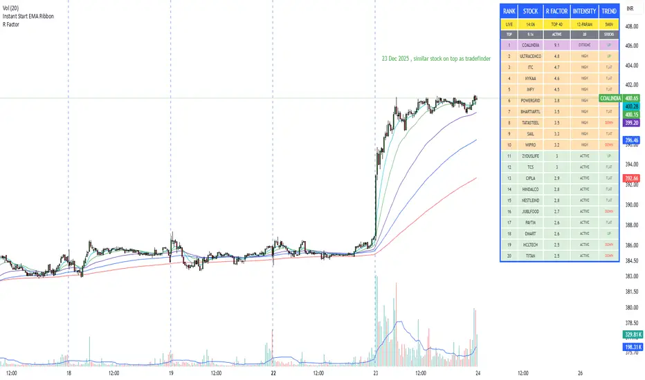
R Factor Advanced Stock Activity Ranking (Experimental) R Factor (relative factor) is a custom logic based 'momentum ranking' parameter, which measures intensity of intraday momentum and volatility. This parameter compared today's activity from last 20 days activity and ranks the stocks according to the intensity of the momentum.
Why momentum ranker?
Because traditional %change sorts intraday stock which show momentum in ascending order of value of % change, for example 3%, 2.5 %, 1% etc. But momentum ranker does not use % change as a sorting parameter for top gainers, or losers. It ranks the stocks, regardless of the direction, according to the intensity it is showing. The value of the momentum ranking has no meaning of itself, just understand that higher the value of momentum ranker, the more intensity the stock is showing.
In this indicator we can only scan 40 F&O stock of Indian Stock Market. This indicator is to be used only on 5 min timeframe.
Tip: Do not change any values in the settings otherwise, the indicator won't work as expected.
Also after applying the indicator, your canvas will shrink, manually fix it by stretching from Y axis, a table will appear showing top 20 stocks. Some times the indicator will glitch & show incorrect names of stocks, refresh the Tradingview website to fix this. Best used on a PC.
Disclaimer/Warning:
This parameter is inspired by TradeFinder and is an attempt to study the momentum of the stocks. This indicator in no way attempts to copy features of the TradeFinder software, this is purely an experimental Indicator, for the people who cannot afford to buy a trading software. This indicator does not provide Buy/Sell signals or nor is an investment advice. This indicator solely for the purpose of study of price and its momentum. Users are responsible for their own actions, profit/loss of the users is not the liability of author.
SMC Post-Analysis Lab [PhenLabs]📊 SMC Post-Analysis Lab
Version: PineScript™ v6
📌 Description
The SMC Post-Analysis Lab is a dedicated hindsight analysis tool built for traders who want to understand what really happened during any historical trading period. Unlike forward-looking indicators, this tool lets you scroll back through time and instantly receive algorithmic classification of market states using Smart Money Concepts methodology.
Whether you’re reviewing a losing trade, studying a successful session, or building your pattern recognition skills, this indicator provides immediate context. The expansion-aware algorithm processes price action within your selected window and outputs clear, actionable classifications ranging from Parabolic Expansion to Consolidation Inducements.
Stop relying on subjective post-trade analysis. Let the algorithm objectively tell you whether institutional players were accumulating, distributing, or running inducements during your trades.
🚀 Points of Innovation
First indicator specifically designed for SMC-based post-trade review rather than live signal generation
Dual-mode analysis system allowing both dynamic scrollback and precise date selection
Expansion-aware classification algorithm that weighs range position against net displacement
Real-time efficiency metrics calculating directional quality of price movement
Integrated visual FVG detection within the analysis window only
Interactive table with clickable date range adjustment via chart interface
🔧 Core Components
Pivot Detection Engine: Uses configurable pivot length to identify significant swing highs and lows for structure break detection
Window Calculator: Determines active analysis zone based on either bar offset or timestamp boundaries
Data Aggregator: Tracks window open, high, low, close and counts bullish/bearish structure break events
State Classification Algorithm: Applies hierarchical logic to determine market state from six possible classifications
Visual Renderer: Draws structure breaks, FVG boxes, and window highlighting within the active zone
🔥 Key Features
Sliding Window Mode: Use the Scroll Back slider to dynamically move your analysis zone backwards through history bar-by-bar
Date Range Mode: Select specific start and end timestamps for precise session or trade review
Six Market State Classifications: Parabolic Expansion (Bull/Bear), Bullish/Bearish Order Flow, Accumulation/Distribution Reversal, and Consolidation/Inducement
Range Position Percentile: See exactly where price closed relative to the window’s high-low range as a percentage
Bull/Bear Event Counter: Quantified count of structure breaks in each direction during the analysis period
Efficiency Calculation: Net move divided by total range reveals trending quality versus chop
🎨 Visualization
Blue Window Highlight: Active analysis zone is clearly marked with blue background shading on the chart
Structure Break Lines: Dashed lines appear at each bullish or bearish structure break within the window
FVG Boxes: Fair Value Gaps automatically render as semi-transparent boxes in bullish or bearish colors
Dashboard Table: Top-right positioned table displays State, Analysis description, and Metrics in real-time
Color-Coded States: Each classification uses distinct coloring for immediate visual recognition
Interactive Tip Row: Optional help text guides users on clicking the table to adjust date range
📖 Usage Guidelines
General Configuration
Analysis Mode: Default is Sliding Window. Choose Date Range for specific timestamp analysis.
Sliding Window Settings
Scroll Back (Bars): Default 0. Increase to move window backwards into history.
Window Width (Bars): Default 100. Range 20-50 for scalping, 100+ for swing analysis.
Date Range Settings
Start Date: Select the beginning timestamp for your analysis period.
End Date: Select the ending timestamp for your analysis period.
Visual Settings
Show Help Tip: Default true. Toggle to hide instructional row in dashboard.
Bullish Color: Default teal. Customize for bullish elements.
Bearish Color: Default red. Customize for bearish elements.
SMC Parameters
Pivot Length: Default 5. Lower values (3-5) catch minor breaks. Higher values (10+) focus on major swings.
✅ Best Use Cases
Post-trade review to understand why entries succeeded or failed
Session analysis to identify institutional activity patterns
Trade journaling with objective algorithmic classifications
Pattern recognition training through historical scrollback
Identifying whether stop hunts were inducements or legitimate breaks
Comparing your real-time read versus what the algorithm detected
⚠️ Limitations
Designed for historical analysis only, not live trade signals
Classification accuracy depends on appropriate pivot length for the timeframe
FVG detection uses simple gap logic without mitigation tracking
State classification is based on window data only, not broader context
Requires manual scrolling or date input to review different periods
💡 What Makes This Unique
Purpose-Built for Review: Unlike most indicators focused on live signals, this is designed specifically for post-trade analysis
Expansion-Aware Logic: Algorithm weighs both position in range AND directional efficiency for accurate state detection
Interactive Date Control: Click the dashboard table to reveal draggable anchors for window adjustment directly on chart
🔬 How It Works
1. Window Definition:
User selects either Sliding Window or Date Range mode
System calculates which bars fall within the active analysis zone
Active zone receives blue background highlighting
2. Data Collection:
Algorithm captures window open, running high, running low, and current close
Structure breaks are detected when price crosses above last pivot high or below last pivot low
Bullish and bearish events are counted separately
3. State Classification:
Range Position calculates where close sits as percentage of high-low range
Efficiency calculates net move divided by total range
Hierarchical logic applies priority rules from Parabolic states down to Consolidation
4. Output Rendering:
Dashboard table updates with State title, Analysis description, and Metrics
Visual elements render within window only to keep chart clean
Colors reflect bullish, bearish, or neutral classification
💡 Note:
This indicator is intended for educational and review purposes. Use it to develop your understanding of Smart Money Concepts by analyzing what institutional order flow looked like during historical periods. Combine insights with your own analysis methodology for best results.

TCI Time Oracle - Intraday
🟢 Green Zone — Opening & Closing Liquidity Window
Time:
Opening Green: ~9:15 – 9:30 AM
Closing Green: ~3:15 – 3:30 PM
Market Character:
Highest liquidity of the day
Overnight positions unwind / fresh positions initiate
Strong directional intent often revealed
Smart money sets the day’s bias
Trading Insight:
Best zone for trend bias identification
Option premiums react fastest here
Not ideal for late entries, but excellent for confirmation
🔵 Blue Zone — Midday Compression / Algo Control
Time: ~11:15 AM – 12:00 PM
Market Character:
Volatility contraction
Algo-driven price control
Time decay dominates options
Fake breakouts and mean reversion
Trading Insight
Worst zone for aggressive option buying
Best for range scalping or staying flat
Institutions wait, retailers get chopped
🔴 Red Zone — Institutional Expansion / Trap Zone
Time: ~1:15 PM – 2:00 PM
Market Character:
Sudden volatility expansion
Institutional orders hit the market
Trend acceleration or sharp reversal
Options see rapid delta & gamma shift
Trading Insight:
High probability trend continuation or trap creation
Strong zone for directional option trades
Requires strict risk management
Big Picture Takeaway
Green sets the intent
Blue compresses and traps
Red expands and delivers the real move
This time-zone behavior is exactly why one strategy cannot work all day. Edge comes from trading the right setup in the right time window.

ZeroDegen Mega Pro Pack v2═══════════════════════════════════════════════════════════════════════════════
ZERODEGEN MEGA PRO PACK v2 — Multi-Mode Trading System
═══════════════════════════════════════════════════════════════════════════════
Professional trading indicator with 11 modes for crypto markets. Clear BUY/SELL signals, real-time market analysis, and institutional-grade filters.
🎯 WHAT IT DOES
Analyzes price action using multi-factor confirmation:
- EMA crossovers (9/21) for trend direction
- RSI momentum filtering
- ADX trend strength validation
- Volume confirmation
- Higher timeframe bias (1H trend filter)
- Institutional concepts: Liquidity sweeps, Fair Value Gaps
Generates clear BUY and SELL signals directly on your chart with a real-time status panel showing all market conditions at a glance.
📊 11 TRADING MODES
SCALP (15m): Standard, Aggressive, Conservative
TREND (1H-4H): Standard, Cloud, Institutional
INSTITUTIONAL: Liquidity Engine
MIXED: Pro, Reversal, Auto Engine, Automation + Confidence
Switch modes with one click to match market conditions.
⚡ KEY FEATURES
✓ Clear visual BUY/SELL/EXIT signals
✓ Real-time status panel with all indicators
✓ Smart filters (Volume, ADX, ATR, Range)
✓ HTF Bias display (1H trend direction)
✓ Institutional Confidence score
✓ Works on any crypto pair
✓ TradingView alert-ready
📈 RECOMMENDED USAGE
Timeframes: 15m (scalp), 1H (swing), 4H (trend)
Markets: BTC, ETH, SOL, and other liquid crypto pairs
🔐 HOW TO GET ACCESS
Visit: xeroc00l.org
- Monthly: $59/mo
- Quarterly: $149 (save 15%)
- Lifetime: $497 (one-time)
After payment, send your TradingView username to zerocool@xeroc00l.org — access granted within 24 hours.
🚀 COMING SOON
We're actively developing additional features including bot integration, automated execution, and a private trading community. Subscribe now and get access to all future updates.
Learn more: xeroc00l.org
⚠️ LEGAL DISCLAIMER
This indicator is provided for educational and entertainment purposes only. It is not financial advice and should not be construed as a recommendation to buy, sell, or hold any cryptocurrency or financial instrument.
Trading cryptocurrencies and leveraged products involves substantial risk of loss and is not suitable for all investors. Past performance is not indicative of future results. You should not trade with money you cannot afford to lose.
The creators of ZeroDegen are not licensed financial advisors, brokers, or dealers. By using this indicator, you acknowledge that all trading decisions are your own responsibility and you agree that ZeroDegen and its creators are not liable for any losses incurred.
Always do your own research and consider consulting a licensed financial professional before making investment decisions.
© 2025 ZeroDegen | For entertainment purposes only

Impulsive Trend Detector [dtAlgo]This advanced Pine Script indicator identifies and tracks impulsive price movements based on Break of Structure (BOS) and Change of Character (CHoCH) concepts from Smart Money trading methodology.
The indicator automatically detects pivot highs and lows, then monitors when price breaks these key levels to signal potential impulsive moves. BOS indicates continuation in the current trend direction, while CHoCH signals potential trend reversals. Each detected move is measured from the break point to the next opposing pivot, providing accurate percentage calculations that match TradingView's measuring tool.
Impulsive moves are categorized into four levels based on magnitude (Level 1: 5-10%, Level 2: 10-15%, Level 3: 15-20%, Level 4: 20%+), with color-coded visual labels and connecting lines displayed directly on the chart.
Comprehensive Session Analysis:
Track moves across 11 distinct trading sessions in Eastern Time: Pre-London/NY, London/NY overlap, NY (with Power Hour and End subdivisions), Sydney, Asia, Sake Time, Asia/London overlap, London, Weekend, and No Session periods.
Three Dynamic Tables provide:
Real-time statistics (bullish/bearish, BOS/CHoCH, levels)
Session breakdown with move counts and average percentages
Event log showing last 10 moves with date, day, session, direction, type, level, percentage, duration, and bar count
Perfect for Smart Money traders seeking data-driven insights into market structure behavior across global trading sessions.

ITAS - Institutional Triggered Alpha SystemConcept & Originality: Standard breakout strategies often fail in the crypto market due to "fakeouts" driven by retail FOMO. ITAS (Institutional Triggered Alpha System) is a specialized quantitative system designed for SOL (Solana). Its core innovation is not the breakout itself, but the "Institutional Confirmation Layer." The script calculates the real-time arbitrage spread (Premium) between Coinbase (USD pair) and Binance (USDT pair). A trade is ONLY executed when this proprietary "Whale Monitor" confirms that US institutions are aggressively accumulating Bitcoin, which historically precedes an "Alpha Run" in high-beta assets like SOL.
Key Features & Logic:
Cross-Exchange Arbitrage Filter: The script runs a background algorithm that smooths the Coinbase-Binance price gap using a proprietary window.
Green Background: Indicates the "Institutional Bullish Zone" (Current Premium > Historical Baseline).
Logic: It filters out retail-driven pumps. We only trade when Smart Money is leading the charge.
Alpha Trigger (Volatility Breakout): Utilizes optimized Keltner Channels (tuned specifically for SOL's volatility profile) to time the entry. The system waits for a volatility expansion inside an Institutional Bullish Zone.
Dynamic Trailing Management: Features a hard-coded, ATR-based trailing stop mechanism designed to capture extended trends while protecting capital against sudden reversals.
Usage:
Target Asset: SOL/USDT (Parameters are strictly locked and optimized for Solana).
Visuals:
Green Background: Institutional Accumulation Zone (Safe to trade).
Blue/Gray Lines: Volatility Bands.
策略核心與原創性: 標準的突破策略常因散戶 FOMO 導致的假突破而虧損。ITAS (機構啟動 Alpha 系統) 是一套專為 SOL (Solana) 設計的量化交易系統。 本策略的核心創新不在於突破本身,而在於內建的**「機構確認層 (Institutional Confirmation Layer)」**。程式會即時計算 Coinbase (USD 交易對) 與 Binance (USDT 交易對) 之間的套利價差(溢價)。只有當獨家的「巨鯨監測算法」確認美國機構正在積極吸籌比特幣時,系統才會允許執行 SOL 的突破交易。
主要功能與邏輯:
跨交易所套利濾網: 程式在背景運作一套獨家演算法,對 Coinbase-Binance 的價差進行平滑處理。
綠色背景: 代表「機構看漲區域」(當前溢價 > 歷史基準線)。
邏輯: 過濾掉散戶推動的虛假拉升,我們只在聰明錢 (Smart Money) 領頭時進場。
Alpha 啟動 (波動率突破): 使用針對 SOL 波動特性優化過的肯特納通道 (Keltner Channels) 作為進場板機。系統僅在「機構看漲區域」內等待波動率爆發。
動態追蹤管理: 內建硬編碼的 ATR 動態追蹤止損機制,旨在抓取 SOL 的長波段趨勢,同時防止利潤回吐。
用法:
適用標的: SOL/USDT (參數已針對 Solana 進行嚴格鎖定與優化)。
視覺呈現:
綠色背景: 機構吸籌區 (適合交易)。
藍/灰線: 波動率通道。
Swing HelperThis script, titled "Swing helper", is a multi-metric dashboard designed to provide a comprehensive snapshot of a security's volatility, relative volume, and price action health directly on the chart. It focuses on Average Daily Range (ADR) relationship and key performance indicators to help traders identify setups like volatility contractions or trend strength.
Key Features
Dual-ADR Analysis: Calculates and compares Long-Term (LT) and Short-Term (ST) ADR percentages. The ADR Ratio helps identify when volatility is expanding or contracting relative to historical norms.
Relative Volume (RVol): Compares current volume to a 20-day moving average, highlighting institutional participation.
Dynamic Closing Range: Visualizes where the price is closing relative to the day's true range (the "Closing Range %"), indicating buying or selling pressure.
SMA 50 Distance: A unique metric that measures the price's distance from the 50-day Simple Moving Average in "ADR units," helping to gauge how overextended a stock is.
Automated Price Projections: Dynamically plots -1x and -2x ADR levels from the current price to provide immediate downside targets or support levels.
Custom Bar Coloring: Highlights specific price action patterns:
Inside Days (Blue)
Upside Reversals (Green)
Downside Reversals (Red)
Visual Customization
The script includes a highly flexible Summary Table with customizable positions, sizes, and colors (including borders and headers), allowing it to fit into any dark or light mode chart layout without obstructing price action.
How to Use
Volatility Contraction: Watch for the ADR Ratio to drop, indicating a tightening range before a potential breakout.
Relative Strength: Look for high RVol combined with a high Closing Range % (e.g., >75%) to confirm strong demand.
Mean Reversion: Use the SMA50 Dist metric to identify when a stock is "stretched" too far from its moving average relative to its daily volatility.
