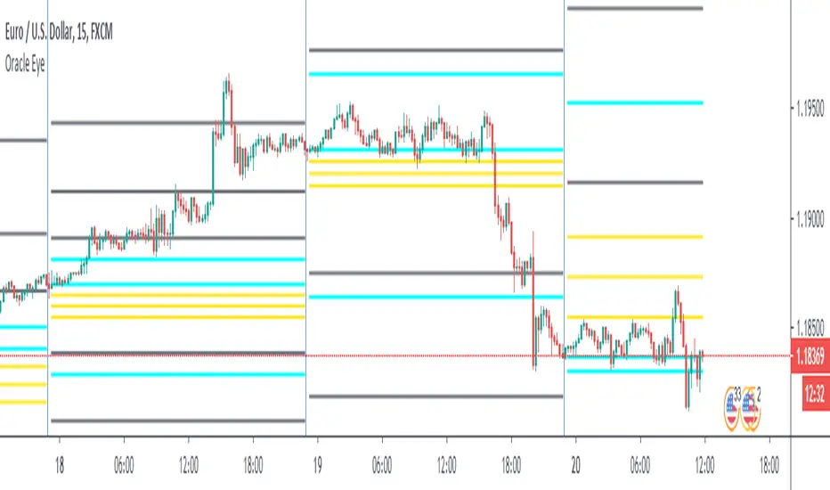
Weekly opening targets +-5%## Summary
This indicator automatically plots key percentage-based price levels above and below the current week's opening price. It is designed to provide traders with a clear map of potential intra-week support, resistance, and target zones based on clean, mathematical levels.
The script is lightweight and focuses on providing a clutter-free visual guide, making it easy to identify significant price areas at a glance.
## Features
Weekly Open Pivot: A central blue line clearly marks the opening price for the current week, acting as the primary baseline for all calculations.
Precise 1% Levels: The indicator calculates and draws horizontal lines at exact 1% increments away from the weekly open, covering a range from +/- 1% up to +/- 5%.
Color-Coded Zones: Levels above the weekly open are colored green (representing potential resistance or target zones), while levels below are colored red (representing potential support).
Real-Time Price Labels: To ensure clarity, clean labels are displayed on the right-hand side of the chart. Each label shows both its percentage deviation and the exact price, updating automatically with the latest data.
## How to Use
This tool is versatile, but here are a few common applications:
Identifying Support & Resistance: The primary use is to watch for price reactions at these calculated levels. A bounce off a lower (red) level could signal support, while a rejection from an upper (green) level could signal resistance.
Setting Profit Targets: The levels serve as excellent, non-subjective price targets. For example, if you enter a long position near the weekly open, the +1% and +2% levels are logical areas to consider taking profit.
Gauging Weekly Momentum: The distance price travels between these levels can help gauge the strength of the weekly trend. Consistently breaking through levels indicates strong momentum, while failing to do so may suggest consolidation.
This indicator is particularly useful for day traders and swing traders who use the weekly open as a key reference point for market sentiment and direction.
Wyszukaj w skryptach "pivot"

GTrader-ICT All In One-Comumnity VersionMeet the **GTrader-ICT All In One **, a comprehensive toolkit designed to integrate key Inner Circle Trader (ICT) concepts directly onto your chart. This powerful overlay indicator consolidates multiple essential tools, streamlining your technical analysis and helping you identify key temporal and price-based events.
📚 References & Inspiration
This indicator stands on the shoulders of giants. With the help of **tradeforopp** and **LuxAlgo**. The concepts and some implementation details were referenced from the following excellent, publicly available scripts:
ICT Killzones: The session drawing and pivot logic is adapted from tradeforopp
ICT Macros: The macro detection and plotting functionality is inspired by the work of Lux Algo , particularly their widely-used indicators covering ICT concepts.
🎯 Core Features
* **ICT Killzones:** Visualize critical trading sessions with customizable boxes. You can easily toggle and style the **Asia**, **London**, and **New York (AM, Lunch, PM)** sessions to focus on the liquidity and volatility that matter most to your strategy.
* Fully customizable session times and colors.
* Timezone support to align sessions with your local or preferred trading time (defaults to `America/New_York`).
* **ICT Macros:** Automatically identify and plot specific, short-duration time windows where institutional algorithms are known to be active (e.g., `09:50-10:10`, `14:50-15:10`, etc.).
* Plots the high/low range of the macro, providing clear levels of interest.
* Utilizes 1-minute data for precision, even when viewing on 3-minute or 5-minute charts.
📚 Optimization over the other original indicators
We add the custom input for macros session, users just need to input the from/to hour: minute format, and they will be converted into session objects in pinescript
The macro draws function is optimized, removing redundant draws, leading to better performance
Add "Distance from Macro Line to Chart" option
Add "Session Drawings Limit" for better performance
⚠️ Notes on TradingView Warnings
You may encounter some warnings from TradingView when using this script. These are generally expected due to the script's advanced, event-driven nature:
1. **Function Call Consistency:** The function 'box.new' should be called on each calculation for consistency, which may appear. This happens because drawing elements (like session boxes) are intentionally created only on the *first bar* of a new session, not on every single bar. This is a necessary design choice for performance and to prevent duplicate drawings.
2. **Potential for Repainting/Slow Load:** The **Macro** feature uses the `request.security_lower_tf()` function to get accurate 1-minute data. This can trigger warnings about performance or slow loading times. This is a known trade-off for achieving the precision required for the feature.

Daily Reference Points for Intra-hour ChartsI worked with pivot script which I believe was created by @HPotter but somehow, I can't look it up.
This script fixes one issue I have with several pivot points script I had honour to see. When the new day starts, sometimes, there is a line connecting old pivot points and new ones. I managed to remove it.
Compared to the script I worked with, I converted the code from v.1 to v.4, added middle pivots and added previous day's close, high and low which are superior levels compared to any pivot calculation.
This script will show only on the 1m, 5m, 15m and 30m charts, so you don't need to turn it off when you check higher timeframe for macroanalysis.
CAMZONECamrilla Pivot with Targets. Existing built in standard pivot does not calculate Target levels. This goes back only 5 periods compared to standard pivots where we can provide the input.
Some color coding have been added to give me added clarity.

CPR AB
Pivots are extremely powerful price based support and resistance levels that are calculated using a prior period's high, low and close. Camarilla Pivots are a set of 8 intraday support/resistance levels developed by Nick Scott (1989). They help traders forecast intraday reversals, breakouts, and trend continuation with high accuracy.
Levels Defined
• S1, S2, S3, S4 → Support levels
• R1, R2, R3, R4 → Resistance levels
Most important levels for trading:
• S3 – Buy zone (supports reversal)
• R3 – Sell zone (resistance reversal)
• S4 – Breakdown zone
• R4 – Breakout zone
CPR TREND CONTINUATION PATTERN
Bullish Continuation:
1. Yesterday closed above CPR
2. Today CPR shifts upward
3. S3 also rises above previous value
4. Price holds above CPR
5. R3 breaks → R4 likely
This is a multi-day institutional trend signal.
Bearish Continuation: Opposite logic.
In this Indicator you have the following:
1. CPR with traditional support and resistance levels (S1-S4 & R1-R4).
2. Developing camarilla CPR for next trading day, week, and month.
3. Customizable lookback period, line width.
4. Option to show/hide labels, prices, SR levels, developing CPR
5. Previous period High, Close and Open Levels

RKY MAGIC Levels (Daily Fixed)This Pine Script indicator generates one fixed Buy Pivot Point and one fixed Sell Pivot Point every day, exclusively for intraday trading. These pivot points remain unchanged throughout the session and act as key decision zones for traders.
Traders can set their Stop Loss and Targets based on their individual risk capacity, and once the trade moves into profit, they can trail the Stop Loss to protect gains.
A powerful feature of this indicator is its built-in trend continuation logic:
👉 If the Buy Pivot Point or Sell Pivot Point is broken and the price sustains above or below that level for 30 minutes, it signals a high-probability trend continuation.
This makes the indicator highly effective for identifying breakout strength and avoiding false signals. It is suitable for all types of intraday trading styles—scalping, momentum, and trend-following.

Nifty CPR by Foresight Trading📌 Indicator Name:
Nifty CPR by Foresight Trading
📖 Description:
This indicator plots the Central Pivot Range (CPR) along with the first resistance (R1) and first support (S1) levels, calculated from the previous day’s OHLC values.
Pivot (P) = (High + Low + Close) ÷ 3
BC (Bottom Central Pivot) = (High + Low) ÷ 2
TC (Top Central Pivot) = P + (P – BC)
R1 = (2 × Pivot) – Low
S1 = (2 × Pivot) – High
✅ The CPR and pivot levels are locked for the entire trading day, so they do not repaint intraday.
✅ Plotted as colored circles (dots) across the day for clear visibility.
✅ New levels are generated only at the start of a new session.
🎯 Usage:
Traders use CPR as a trend bias tool:
Narrow CPR → higher probability of trending day.
Wide CPR → higher probability of sideways/consolidation day.
R1 and S1 act as key intraday support & resistance zones.
⚡ Best For:
Intraday traders & scalpers
Index traders (Nifty, BankNifty, Stocks etc.)
Anyone who uses Pivot Point + CPR trading strategies

The Traders Support & Resistance LevelsThis script automatically detects pivot-based support and resistance levels and draws dynamic trendlines based on recent price action.
🔹 Support & Resistance Levels
Pivot points are calculated using customizable left/right bar logic. A pivot high (or low) is confirmed when leftBars candles to the left and rightBars candles to the right are lower (or higher).
Triangles are plotted when a level is confirmed:
🔻 🟡 Yellow Down Triangle = Confirmed Resistance
🔺 🟣 Purple Up Triangle = Confirmed Support
Lines are drawn at confirmed levels.
If enough lines are confirmed, the oldest one is converted into a zone using a thick, semi-transparent line.
🔹 Trendline Logic
Trendlines are drawn between the last two support points (for uptrend) and last two resistance points (for downtrend).
The slope and price relationship determine trend strength, visualized by color:
Condition Color Meaning
Uptrend + Price Above + Steep 🟨 Yellow Strong Uptrend
Uptrend + Price Above 🔷 Blue Weak Uptrend
Downtrend + Price Below + Steep 💗 Fuchsia Strong Downtrend
Downtrend + Price Below 🟣 Purple Weak Downtrend
Otherwise ⚪️ Gray Neutral / No Trend
⚙️ Customizable Inputs
leftBars, rightBars: Adjust sensitivity of pivot detection
previewBars: Show early "draft" lines before confirmation
volumeThresh: Reserved for future enhancements

SMT Divergences By RootkitHow It Works:
Heikin Ashi Smoothing
Instead of using raw OHLC price data, the script applies Heikin Ashi smoothing to reduce noise and better identify pivot highs and lows.
Pivot Detection
It looks for local swing highs and lows using a user-defined lookback period (Pivot Lookback). These are used to detect potential divergences.
SMT Divergence Logic
An SMT divergence is identified when:
A pivot low occurs on the main chart.
But one or more of the comparison symbols makes a higher low instead (or lower high for bearish SMT).
This signals a disagreement between instruments, often attributed to smart money accumulation or distribution.
Trend Filter
To reduce false signals, the script only allows:
Buy signals during an uptrend
Sell signals during a downtrend
The trend is determined by comparing Heikin Ashi highs/lows to previous bars.
Signal Markers
BUY labels appear below bars at valid bullish SMT divergences.
SELL labels appear above bars at valid bearish SMT divergences.
Optional trend lines visually connect the last significant pivot to the current one.
⚙️ Inputs:
Pivot Lookback – Number of bars for swing high/low detection.
Symbol A/B/C – Up to 3 comparison symbols (futures, indices, etc.).
Toggle Each Symbol – Enable or disable any comparison ticker.
Custom Colors – Choose your own line colors for buy/sell signals.
🧠 Why It Matters:
SMT divergence is used by professional traders to spot early signs of accumulation/distribution, often before price reverses. This script helps you detect these signals automatically while keeping them filtered by overall market trend.

NomNomNomThis indicator shows potential leveraged liquidation levels based on pivots. The theory behind this indicator is that price revisits high-lev liquidation levels of sufficient quantity.
By default liquidation ranges from 2x to 100x (selectable) are color coded via gradient. There are two distinctions in colors: high-lev (10x-100x) and low-lev (2x-5x). A midpoint between shorts and longs is considered mid range. consistent closes above would indicate movement towards short liquidity, and consistent closes below would indicate movement towards long liquidity
Additionally, there is a histogram which shows bin grouping for short and long liquidations using Freedman-Diaconis Rule. This will give an idea of the amount of levels for a given range along the distribution curve.
Furthermore, there is a custom candle option. To color a candle based on it's approach to the highest configured lev, and a close. If enabled, I would recommend setting max transparency on your current chart bar type.

Ultimate ZonesThe story is simple: I didn't find a support/resistance zones indicator that I actually liked, so I made my own.
Features:
Independent of the chart timeframe (zones don't change if you switch timeframes) - very important for practical use
Live mode (repainting) plus historic mode (non-repainting)
Selectable timeframe for zone calculation (default: daily)
Can adjust how far the indicator looks back into the past (default: 500 days)
Can adjust pivot period to find more or fewer zones
Zone heights are based on long-term ATR (to adapt to the asset's volatility automatically)
Price tolerance multiplier is adjustable
Option to merge zones which are close together into one ("fat zones")
I find that together these options (especially those in the "sensitivity" section) allow me to automatically generate almost all the zones I want to see. Occasionally, I do draw some additional zones to get the perfect image I'm looking for on the chart.
Explanation
We detect pivot points on the selected zone timeframe (taking pivot period and lookback limit into account). Then we combine these pivot points into a zone if they are close enough together in price (here the tolerance parameter comes into play). If "fat zones" is selected, we perform these merges more aggressively even if the resulting zone becomes taller than the standard tolerance.
The ATR used for the tolerance is a 500 period ATR, but if there are less than 500 bars available, we use the average of the bars available so far, so we always have a value to work with.
In order for a zone to be displayed, it must have been touched by at least 2 separate pivot points. We do not distinguish between pivot highs and pivot lows because support is known to turn into resistance and vice versa.
In live mode, we draw the currently active zones as boxes.
In historic mode, we plot the active zones at each bar using "plot" and "fill", so there is no repainting or erasing, and you can see which zones were active at any past date. For practical reasons, we draw a maximum of 15 zones around the current price (i.e. 7-8 zones above and 7-8 zones below the price).

Quarterly H/L [Dango]Introducing the Quarterly High and Low Indicator, a powerful and original tool designed to enhance your understanding of price action by identifying key turning points within quarterly cycles. This innovative script accurately determines the most significant highs and lows in each quarter, providing valuable insights for traders.
Key Features:
- Identifies and displays quarterly highs and lows on 90-minute, daily, weekly, monthly, and yearly timeframes
- Employs advanced algorithms and a deep understanding of cycle theory to precisely pinpoint key turning points
- Accounts for subtle nuances in price action and market dynamics
- Intended to be used in conjunction with the Quarterly Cycles Indicator for further confluence
How It Works:
The Quarterly High and Low Indicator utilizes a proprietary algorithm to meticulously analyze price action within each quarter. This advanced formula takes into account multiple factors, such as price momentum, volatility, and volume, to accurately identify the most significant high and low points.
The script employs a multi-step process to determine the quarterly highs and lows:
1. Cycle Isolation: The indicator first isolates the price action within each quarter, focusing on the specific time frame being analyzed (90-minute, daily, weekly, monthly, or yearly).
2. Momentum Analysis: The script then analyzes the price momentum within each quarter, identifying periods of strong bullish or bearish sentiment. This helps to narrow down potential high and low points.
3. Volatility and Volume Confirmation: To further refine the identification of key turning points, the indicator assesses the volatility and volume characteristics surrounding potential highs and lows. Significant changes in volatility and volume often accompany important price reversals.
4. Proprietary Scoring System: The algorithm assigns scores to each potential high and low point based on a proprietary scoring system. This system takes into account the confluence of momentum, volatility, and volume factors to determine the most significant turning points within each quarter.
The Quarterly High and Low Indicator visually represents these key turning points on the chart, enabling traders to easily identify potential support and resistance levels, trend reversals, and optimal entry and exit points. By focusing on the most significant price levels within each quarter, the indicator helps traders cut through the noise and make more informed trading decisions.
Expected Usage:
The Quarterly High and Low Indicator is designed to be a valuable tool for traders seeking to gain a deeper understanding of price action and market dynamics. By mapping out the most significant high and low points within each quarter, the indicator provides users with key levels to watch for potential trend reversals, support, and resistance.
1. Identifying Pivots and Reversals: The quarterly highs and lows identified by the indicator serve as critical levels where price is more likely to pivot or reverse. Traders can use these levels to anticipate potential trend changes and adjust their trading strategies accordingly.
2. Backtesting and Historical Analysis: The indicator enables traders to analyze historical price action and assess how the market has reacted to quarterly high and low levels in the past. By backtesting their strategies using these key levels, traders can gain valuable insights into the effectiveness of their approach and make data-driven refinements.
3. Support and Resistance: Quarterly highs and lows often act as significant support and resistance levels. Traders can use the indicator to identify these key areas and plan their trades around them. For example, if price approaches a quarterly high, traders may watch for potential selling pressure and consider taking profits or initiating short positions.
4. Confirmation and Confluence: The Quarterly High and Low Indicator can be used in conjunction with other technical analysis tools to confirm trade setups and increase confidence in trading decisions. When multiple indicators or analysis techniques align with the quarterly highs and lows, it provides a stronger signal for potential trade entry or exit points.
5. Risk Management: By understanding the location of quarterly highs and lows, traders can make more informed decisions about stop-loss placement and position sizing. Setting stop-losses beyond these key levels can help mitigate the risk of getting stopped out prematurely due to short-term price fluctuations.
6. Combining with the Quarterly Cycles Indicator: The Quarterly High and Low Indicator is intended to be used alongside the Quarterly Cycles Indicator for further confluence and validation. By analyzing the relationship between the identified quarterly highs and lows and the underlying quarterly cycles, traders can gain a more comprehensive understanding of market dynamics and potential turning points. When the quarterly highs and lows align with the key phases of the quarterly cycles, it provides a stronger signal for potential trend changes and trading opportunities.
Incorporating the Quarterly High and Low Indicator into a trading strategy, along with the Quarterly Cycles Indicator, allows traders to develop a more comprehensive understanding of price action and make better-informed decisions. By backtesting and analyzing how price reacts around these key levels and cycles, traders can refine their approach and potentially improve their trading outcomes.
Limitations and Disclaimer:
While the Quarterly High and Low Indicator is a powerful tool, it should not be used in isolation. Traders should combine the insights gained from this indicator with other forms of analysis, such as the Quarterly Cycles Indicator, fundamental analysis, risk management, and sound trading psychology, to develop a well-rounded and effective trading approach.
Please note that the indicator's accuracy may be impacted by extreme market volatility or unusual events, and quarterly highs and lows should not be relied upon in isolation. As with any trading tool, individual results may vary, and past performance does not guarantee future outcomes. Traders should always exercise caution, use appropriate risk management techniques, and continuously educate themselves to adapt to changing market conditions.
This indicator is provided for educational purposes only and should not be considered financial advice. Always conduct your own due diligence and consult with a financial professional before making any trading decisions.
Privacy of Code:
The underlying logic and specific calculations used in the proprietary algorithm are not disclosed to protect the intellectual property of the script. The advanced formula and scoring system used to identify quarterly highs and lows are the result of extensive research, testing, and refinement. By keeping these details confidential, the script maintains its competitive edge and ensures the protection of its intellectual property.

DWM S/R levels (blockFlow)What the script does:
This script dynamically identifies and displays support and resistance levels for daily, weekly and monthly timeframes. These levels are untapped , meaning the respective candle (daily/weekly/monthly) did not close below the support or above the resistance level. They serve as potential liquidity pools due to positions accumulated by traders around these points.
How It works:
The script calculates the levels based on historical price data. It uses a sophisticated algorithm to detect pivot points in the price action, which are then classified as either support or resistance levels. These levels are determined for daily (D), weekly (W), and monthly (M) timeframes and are drawn on the chart as horizontal rays. The script is configurable, allowing users to show or hide levels for each timeframe, adjust the sensitivity of level detection, and limit the lookback period to minimize clutter.
The algorithm works as follows:
* Pivot Point Detection and Integrity Check: The algorithm begins by identifying pivot points, which are potential turning points in price action across daily, weekly, and monthly timeframes. A critical part of this process is ensuring that these levels have not been breached - meaning, for support levels, the price has not closed below them, and for resistance levels, the price has not closed above them. This integrity check helps filter out levels that might have lost their significance for future price movements.
* Classification Based on Price Movement and Level Integrity: After identifying a pivot point, the script classifies it based on the direction of price movement and confirms that the level still holds, indicating it hasn't been breached. This approach ensures that the levels marked are current and relevant, reflecting areas where the market sentiment might shift, leading to potential entry or exit points for traders.
* Drawing and Adjusting Levels on the Chart: The script then draws horizontal rays to represent these levels of support or resistance that have maintained their integrity. It offers customization options for these lines and ensures they are dynamically updated with new market data.
* Minimizing Chart Clutter with Relevant Levels: To keep the chart focused and useful, the script includes features to hide levels that are no longer relevant or are significantly far from the current price. This decluttering is based on user-defined settings that allow traders to focus on the most actionable levels—those that have not been breached and are in close proximity to the current price.
* Efficiency in Handling Data and Levels: Through the use of efficient data structures and matrices, the script ensures that only levels that are currently valid and have not been breached are maintained and displayed. This efficiency is crucial for the script's performance, particularly when dealing with large volumes of historical data across multiple timeframes.
How to use It:
* Interpreting Levels: Once the script is active, it will display the calculated support and resistance levels on the overlay of your chart. These levels can guide entry and exit points, set stop-loss orders, or identify potential breakout or breakdown areas.
* Configure Settings: The out-of-box settings are usually fine but there are options to choose which levels to display (daily, weekly, monthly), set colors for each level, and define how far back in time the script should look to identify these levels. You can also hide distant levels to reduce clutter
What makes It original:
The originality of this script lies in its multifaceted approach to identifying support and resistance levels across different timeframes, all within a single indicator. It combines the practical utility of daily, weekly, and monthly levels with advanced customization options, such as the ability to minimize chart clutter through a percentage-based visibility threshold. Moreover, its built-in functionality to adjust the sensitivity of level detection and the capacity to limit historical lookback provide users with a highly tailored tool, making it a unique addition to any trader's arsenal.

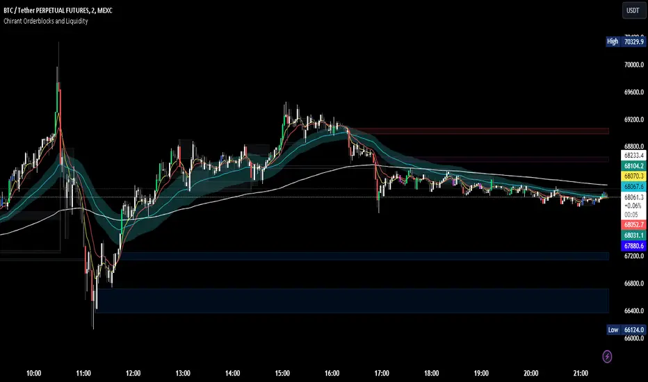
Chirant Orderblocks and LiquidityIntroduction
Our Pivot-Based Order Block Indicator is a cutting-edge trading tool designed to offer traders an unparalleled edge in the markets. This unique indicator combines pivot-based order blocks, fair value gaps, exponential moving averages (EMAs), and vector candles into a cohesive strategy. Unlike traditional indicators, this tool leverages the synergistic effects of these components to identify high-probability trading setups.
How It Works
Pivot-Based Order Blocks: At the heart of our indicator are pivot-based order blocks. These are price levels or ranges that are significant due to past market activity. Our algorithm identifies these blocks based on historical pivot points, considering both the price's reaction to these levels and their recurrence over time. This method helps in pinpointing areas where institutional orders are likely to be placed.
Fair Value Gaps: Alongside, our indicator detects fair value gaps - regions where price has moved too swiftly, leaving a gap in the market's valuation. By identifying these gaps, the tool helps traders anticipate areas where price might return to fill the gap, offering strategic entry and exit points.
EMAs and Vector Candles: To refine our signals, the indicator utilizes a combination of exponential moving averages and vector candles. EMAs help in determining the market's trend direction, while vector candles offer insights into the momentum and strength of price movements. The integration of these elements enables our tool to filter out lower probability setups, focusing on those with higher chances of success.
Originality and Usefulness
Our Pivot-Based Order Block Indicator is not merely a combination of existing tools. It represents a novel approach to market analysis, integrating various components into a single, comprehensive trading strategy. The methodology behind combining pivot-based order blocks with fair value gaps and EMAs, supplemented by the unique use of vector candles, is proprietary and designed to offer original insights into market dynamics.
This tool is invaluable for traders looking to enhance their market analysis, providing a deeper understanding of price movements and potential reversal points. Whether for scalping, day trading, or swing trading, our indicator offers versatile applications, helping traders to navigate the complexities of various market conditions with greater confidence.
How to Use
To make the most of our Pivot-Based Order Block Indicator:
Setup: Apply the indicator to any chart or time frame, tailoring the EMA settings according to your trading style.
Interpretation: Look for confluences between pivot-based order blocks and fair value gaps as high-probability entry points. EMAs will guide you on the trend's direction, while vector candles highlight momentum strength.
Application: Use the indicator to identify potential reversal zones, entry, and exit points. Combine it with your risk management strategy to optimize your trading performance.
Conclusion
Our Pivot-Based Order Block Indicator is crafted for traders who demand depth, precision, and originality in their tools. It stands out by providing a multifaceted approach to market analysis, backed by a proprietary integration of critical trading concepts. This tool is not just an indicator; it's a comprehensive strategy designed to elevate your trading journey.
CPR Weekly Variable Weekday SellerGood afternoon traders,
This is a script I built for option selling, in attempt to have a high success rate. This is pretty much the same as my other one titled "CPR Option Selling Strategy." The difference is this one is strictly for Weeklies, with a variable weekday to expiry. I've had many requests to have a weekly that would end on Thursday, so here it is. Just select the date for expiry of the option, then it will calculate a "weekly" option set, using the the same set up as the traditional M-F weekly CPR information, except for offset for the weekday in question.
So for expiry dates for options on Thursday, you would choose "Thursday" in the parameters and it will calculate using Fri through Thu data for the pivot timeframes.
The rest is like this...
The gist of how it works:
It uses the opening or close of the current chart's timeframe opening bar when referenced against a "weekly" timeframe determined by the week ending weekday chosen for the central pivot range ( CPR ).
Using that comparison, this script calculates an option to sell: put, call, or iron condor. It will calculate a call value using an average of the CPR central pivot and the max value of the prior higher timeframe's high or R1 (whichever is higher.)
It does the same for the put side, but uses the higher timeframe's low or S1 (whichever is lower.)
It will use the option on the other side of the source (open or close) of the CPR as the "option in play."
Settings:
There are many settings, most are simply "viewable" settings, and probably self explanatory, others, not so much:
"Source for Trigger" - this is the value used on the "opening bar," such as the close. This value is the one compared to the Central Pivot Range in determining whether to sell a call (if the source is lower,) sell a put (if the source is higher,) or an iron condor if it's in the CPR .
"Show Historical Win/Loss Percentages" - this shows a table in the bottom right of the W/L percentages for the current ticker and settings. Used for a quick glance at historical success rates.
Example use (OLD EXAMPLE):
An example use (which I completed last week) on the chart referenced in this share: I sold a put-spread for $0.90, selling a 590 and buying a 570 strike in the middle of the week. I was looking at an hourly timeframe chart with a weekly pivot timeframe for the strategy.
Obviously, making only $0.90 on a $20 spread, there is a lot more to lose than to make, but I did some other analysis to go with it, so I felt safe, and I had a stop set for $1.50. So it worked, along with 3 other plays I did, very similar, and if that "Historical Win/Loss Percentage" is accurate, which I am fairly certain it is, I felt good about it.
The key all comes down to what you sell it for, right? That piece only you can determine. :)
Happy trading and enjoy,
Deuce

PPnextDayHello,
Representation of the pivot points of the day and next
Only M1,5,15,30,60,240
Bonjour,
Représentation des points pivots du jour et du jour d'après
L'indicateur fonctionne sur 1,5,15,30,60,240 min uniquement

Next Day CPR LevelsThis indicator plots the next trading day’s Central Pivot Range (CPR) levels in advance, allowing traders to prepare key reference levels before the market opens.
CPR is a widely used market structure tool that helps traders identify intraday bias, balance vs expansion, and potential support–resistance zones. By projecting tomorrow’s CPR levels today, traders can plan entries, exits, and risk more effectively instead of reacting during live market movement.
The indicator derives structured reference levels based on prior market behavior and established pivot-based principles. These levels are projected onto the chart to provide a stable framework for analyzing price action during the trading session.
Rather than reacting to live price fluctuations, the indicator focuses on pre-defined market structure, allowing traders to evaluate price acceptance, rejection, and momentum around key zones.
The spacing and positioning of these levels offer insight into prevailing market conditions, helping traders distinguish between balance, expansion, and directional movement.
The plotted levels remain consistent throughout the session, providing a reliable context for decision-making.
Important : You have to toggle on Next day levels in settings for Next days projection. Better you turn off during live market to clear noise and toggle on again once the market closes or You can use it post market close for analysis.
This works for Nifty, Banknifty, other Indian stocks and Indices as well.

The Rumers - Magic LinesThe Rumers Magic Lines identify key pivotal price points commonly used by institutional traders as liquidity areas to fill positions.
These levels highlight zones where large players are most active — areas where price tends to pause, reverse, or accelerate as liquidity is absorbed.
I personally use Magic Lines to:
Buy near the lower lines
Sell near the upper lines
Combine them with Pitchfork structure and candlestick confirmation for precise entries and exits
This indicator is not a signal by itself. It provides context and structure, allowing you to align with institutional activity and let price action confirm the trade.
Clean levels. Institutional logic. No noise.
by Silvia Rumer
Trade Live with The Rumers:
course.therumers.com

Clean Projected Camarilla (No History)Here is a professional description you can use for the indicator settings or if you publish this script on TradingView.Indicator Name: Clean Projected Camarilla Levels (Dynamic)Description:This indicator calculates and projects future Camarilla Pivot points based on the current, developing market data. Unlike standard pivot indicators that show past levels, this tool is designed for forward-looking analysis, showing you where the next period's Support and Resistance levels will be if the market closed at the current price.Key Features:Zero Clutter: Utilizes line.new drawing functions to ensure only the current projected levels are visible. No historical trails or "ghost lines" are left on the chart.Dynamic Updates: The levels (R4, R3, S3, S4) update in real-time with every tick as the current High, Low, and Close change.Multi-Timeframe Capable: By default, it projects the Next Quarter's levels (using 3M data), but can be customized to project Next Day, Next Week, or Next Month levels via the settings menu.Visual Aid: Lines automatically extend to the right for easy visibility against current price action.Formulas Used:R4 / S4 (Breakout Levels): Calculated using the $1.1/2$ range multiplier. A break beyond these often signals a trend continuation.R3 / S3 (Reversal Levels): Calculated using the $1.1/4$ range multiplier. These are the primary zones for mean reversion or "fade" trades.How to Use:Use this tool to anticipate future boundaries before the current period closes.Scenario A: If the Projected R4 moves significantly away from the current price, volatility is expanding.Scenario B: If price is approaching the Projected R3, be aware that this level might act as resistance in the upcoming session.

Weekly Institutional Fib Pivots v1These Fibonacci levels act as institutional order zones, meaning price reacts more powerfully when it originates from them. Use them as a weekly roadmap to anticipate where price is likely to travel each day, including during overnight or automated trading sessions.
How to trade them:
• Take the previous weeks levels and use those levels to trade the current week.
• Enter and exit around the major fib levels
• Use the 50% midpoint between levels as your first take-profit or stop-loss zone
These levels provide structure, targets, and precision for both intraday and multi-session trading.
Strategy:
Place your order at one level, and exit before it reaches the next level or at the 50% area of the zone

period separator highs lowsTaken from ICT Killzones & Pivots indicator I customise the previous day, week, month levels and separators

DWMCOverview
Welcome to the OmniPivot Range Analyzer: DWM, an exclusive PineScript tool crafted for traders who utilize Central Pivot Range (CPR) analysis. This indicator delivers precise Daily, Weekly, and Monthly CPR levels, complete with support/resistance zones, historical CPR width tracking, and a powerful trading strategy. Designed for traders seeking an edge, this script offers unparalleled flexibility and insight for intraday, swing, or long-term trading.
Key Features
Multi-Timeframe CPR: Seamlessly plots CPR (Pivot, BC, TC) for Daily, Weekly, Monthly, or custom timeframes on any chart.
Support/Resistance Levels: Visualizes up to three levels of support (S1-S3) and resistance (R1-R3) for robust price analysis.
CPR Width: Tracks CPR width as a percentage in a table, revealing market volatility and breakout potential.
How to Use
Trading: Use CPR levels as key support/resistance zones. Leverage the breakout strategy for automated signals or manual confirmation.
Best Practices: Combine with other indicators (e.g., RSI, volume) and backtest the strategy thoroughly.
Get Started
To use the OmniPivot Range Analyzer: DWM, apply the script to your chart and explore its settings. For questions or support, contact the creator directly via TradingView. Thank you for being part of this exclusive release!
Disclaimer
This script is for educational and informational purposes only. Trading carries risks, and past performance does not guarantee future results. Always perform your own analysis and consult a financial advisor before trading.
