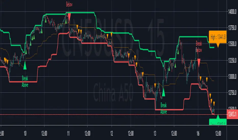
DANI _ MTF Pullback StrategyMTF Pullback - RSI Panel Summary
Purpose: Companion indicator for the main strategy that displays RSI with divergence detection in a separate pane below the price chart.
Settings
ParameterDefaultDescriptionRSI Length14Lookback period for RSI calculationRSI Oversold Level30Threshold for oversold conditionRSI Overbought Level70Threshold for overbought conditionDivergence Lookback Bars10How many bars to look back for divergence detection
What It Displays
RSI Line — Changes color based on zone:
Purple = neutral (between 30-70)
Green = oversold (below 30)
Red = overbought (above 70)
Horizontal Levels:
Red dashed line at 70 (overbought)
Green dashed line at 30 (oversold)
Gray dotted line at 50 (midpoint)
Zone Fills:
Light red shading above 70
Light green shading below 30
Divergence Markers:
"DIV" label with lime circle = bullish divergence (price makes lower low, RSI makes higher low while oversold)
"DIV" label with fuchsia circle = bearish divergence (price makes higher high, RSI makes lower high while overbought)
Background Flash:
Green flash when bullish divergence detected
Red flash when bearish divergence detected
Divergence Logic
Bullish: Price makes a lower low AND RSI makes a higher low AND RSI is in oversold territory → potential reversal up
Bearish: Price makes a higher high AND RSI makes a lower high AND RSI is in overbought territory → potential reversal downand for the strategy15:36Outlined strategy script components and display mechanics.The user wants a summary of the main strategy script, similar to what I provided for the RSI panel. I should cover the purpose, settings, entry conditions, exit conditions, and what it displays on the chart.MTF Pullback Strategy Summary
Purpose: Multi-timeframe pullback strategy that trades trend continuations. Uses 4H timeframe for trend direction and entry timeframe (typically 15M) for precise entries based on RSI divergence and engulfing patterns.
Settings
ParameterDefaultDescriptionTimeframesHigher Timeframe240 (4H)Timeframe for trend detectionTrend FilterEMA Length50EMA period for trend directionRSIRSI Length14RSI calculation periodRSI Oversold Level30Long entry RSI thresholdRSI Overbought Level70Short entry RSI thresholdDivergence Lookback10Bars to scan for divergenceSwing DetectionSwing Lookback5Bars left/right to confirm swingRisk ManagementATR Length14ATR calculation periodStop Loss ATR Multiplier2.0SL = 2× ATR from entryTake Profit %2.0TP = entry ± 2%Trade DirectionTrade LongstrueEnable long tradesTrade ShortstrueEnable short trades
Entry Conditions
Long Entry (all must be true):
4H uptrend (price above 50 EMA + EMA rising)
Current price above 4H 50 EMA
Price pulling back from recent 4H swing high
RSI oversold (<30) or below 40
Bullish RSI divergence OR RSI turning up from oversold
Bullish engulfing candle at or within 2 bars after swing low
Short Entry (all must be true):
4H downtrend (price below 50 EMA + EMA falling)
Current price below 4H 50 EMA
Price pulling back from recent 4H swing low
RSI overbought (>70) or above 60
Bearish RSI divergence OR RSI turning down from overbought
Bearish engulfing candle at or within 2 bars after swing high
Exit Conditions
Exit TypeLongShortStop LossEntry - (2 × ATR)Entry + (2 × ATR)Take ProfitEntry × 1.02 (+2%)Entry × 0.98 (-2%)
What It Displays
On Chart:
Blue line = 4H 50 EMA
Green triangle below bar = long entry signal
Red triangle above bar = short entry signal
Green background tint = 4H uptrend active
Red background tint = 4H downtrend active
Info Table (top right):
FieldShows4H TrendUP ↑ / DOWN ↓ / NEUTRALPrice vs EMAABOVE / BELOWPullback LYES/NO (long pullback active)Pullback SYES/NO (short pullback active)Bull DivYES/NO (bullish divergence)Bear DivYES/NO (bearish divergence)
Strategy Logic Flow
4H TREND CHECK
↓
PRICE VS 50 EMA
↓
PULLBACK DETECTED?
↓
RSI CONDITION MET?
↓
RSI DIVERGENCE?
↓
ENGULFING AT SWING?
↓
ENTRY → SL (2×ATR) + TP (2%)
Alerts Available
Long Entry Signal — Triggers when all long conditions align
Short Entry Signal — Triggers when all short conditions align
Recommended Usage
Apply to 15-minute chart (fetches 4H data automatically)
Use alongside the RSI Panel indicator for visual confirmation
Backtest on trending pairs/assets (crypto, forex majors, indices)
Adjust ATR multiplier if stops are too tight/wide for your asset
Wyszukaj w skryptach "bear"
Augury Grid - Multi-Timeframe ScannerAugury Grid - Multi-Timeframe Scanner
A real-time scanner that monitors 7 symbols across 3 timeframes simultaneously, ranking signals by quality and displaying them in a single organized table. Instead of flipping between charts, the grid brings potential setups to you, complete with entry prices, stop losses, and take profit targets.
━━━━━━━━━━━━━━━━━━━━━━━━━━━━━━━━━━━━
🔶 𝗢𝗩𝗘𝗥𝗩𝗜𝗘𝗪
Augury Grid scans 21 symbol-timeframe combinations every bar (7 symbols × 3 timeframes) and displays only the setups that pass multiple quality filters. Each signal receives a quality score based on trend alignment, momentum confirmation, and volume participation. The grid ranks signals from strongest to weakest and automatically removes signals when their stop loss level is hit.
The scanner works across any market: crypto, forex, indices, stocks, or commodities. Eight built-in symbol presets provide instant access to popular watchlists, and a Custom mode allows scanning any 7 symbols of your choice.
━━━━━━━━━━━━━━━━━━━━━━━━━━━━━━━━━━━━
🔶 𝗛𝗢𝗪 𝗜𝗧 𝗪𝗢𝗥𝗞𝗦
The scanner evaluates each symbol-timeframe combination through several analytical layers. Here is what each component does and how to interpret its output.
𝗧𝗿𝗲𝗻𝗱 𝗔𝗹𝗶𝗴𝗻𝗺𝗲𝗻𝘁
What it does: Compares the 21 EMA against the 55 EMA to determine trend direction, and checks price position relative to the 200 EMA for major trend context.
How to interpret: Bullish signals require price above EMA 200 with the fast EMA above the slow EMA. Bearish signals require the opposite. This dual-layer trend check helps filter signals that go against the dominant market structure.
𝗠𝗔𝗖𝗗 𝗖𝗿𝗼𝘀𝘀𝗼𝘃𝗲𝗿
What it does: Monitors the MACD histogram for zero-line crossovers, which indicate shifts in short-term momentum.
How to interpret: A bullish signal triggers when the histogram crosses above zero during an uptrend. A bearish signal triggers when the histogram crosses below zero during a downtrend. The histogram amplitude is also measured to filter out weak, choppy crosses.
𝗔𝗗𝗫 𝗧𝗿𝗲𝗻𝗱 𝗦𝘁𝗿𝗲𝗻𝗴𝘁𝗵
What it does: Measures the strength of the current trend using the Average Directional Index.
How to interpret: Signals require ADX above a configurable minimum (default 20) to confirm meaningful trend strength. Rising ADX adds bonus points to the quality score. ADX below the threshold blocks signals entirely, as ranging markets tend to produce whipsaws.
𝗩𝗼𝗹𝘂𝗺𝗲 𝗖𝗼𝗻𝗳𝗶𝗿𝗺𝗮𝘁𝗶𝗼𝗻
What it does: Compares current volume against the 20-bar average.
How to interpret: Signals require volume at or above a configurable multiplier (default 1.3×) of the average. Volume participation suggests institutional interest and increases the probability that a move will follow through.
𝗥𝗦𝗜 𝗙𝗶𝗹𝘁𝗲𝗿𝗶𝗻𝗴
What it does: Checks RSI position to avoid overbought and oversold extremes, and awards bonus points for mid-range readings.
How to interpret: Bullish signals are blocked when RSI exceeds 70 (overbought). Bearish signals are blocked when RSI falls below 30 (oversold). Signals with RSI in the configurable mid-range (default 40-60) receive bonus points because they have more room to run before hitting extremes.
𝗘𝘅𝘁𝗲𝗻𝘀𝗶𝗼𝗻 𝗖𝗵𝗲𝗰𝗸
What it does: Measures how far price has moved from the 21 EMA in terms of ATR multiples.
How to interpret: If price is more than the configured threshold (default 2.5 ATR) from the EMA, the signal is blocked. Extended moves carry higher risk of mean reversion, so avoiding them helps filter chasing behavior.
𝗤𝘂𝗮𝗹𝗶𝘁𝘆 𝗦𝗰𝗼𝗿𝗶𝗻𝗴
What it does: Combines all factors into a single score from 0-100, displayed as stars in the Bias column.
How to interpret: ★ indicates a score of 70-84, ★★ indicates 85-94, and ★★★ indicates 95 or higher. Higher scores typically mean more factors are aligned: rising ADX, mid-range RSI, growing histogram, and volume participation all contribute bonus points.
𝗠𝘂𝗹𝘁𝗶-𝗧𝗙 𝗖𝗼𝗻𝗳𝗹𝘂𝗲𝗻𝗰𝗲
What it does: Detects when the same symbol has signals on multiple timeframes pointing in the same direction.
How to interpret: A 🔗 symbol appears when 2 timeframes agree, and 🔗🔗 appears when all 3 timeframes agree. These confluence signals receive bonus points (+15 for 2 TFs, +30 for 3 TFs) and often represent stronger setups because multiple perspectives align.
━━━━━━━━━━━━━━━━━━━━━━━━━━━━━━━━━━━━
🔶 𝗪𝗛𝗬 𝗧𝗛𝗘𝗦𝗘 𝗖𝗢𝗠𝗣𝗢𝗡𝗘𝗡𝗧𝗦 𝗪𝗢𝗥𝗞 𝗧𝗢𝗚𝗘𝗧𝗛𝗘𝗥
Each filter addresses a different aspect of trade quality. Trend alignment ensures the signal follows the dominant direction. MACD crossovers provide timing for momentum shifts. ADX confirms the trend has strength behind it. Volume validates institutional participation. RSI filtering prevents chasing into extremes. Extension checks prevent chasing runaway moves.
The scoring system synthesizes these elements into a single ranking. Rather than treating all passing signals equally, the scanner weights signals by how many favorable conditions align. A signal with rising ADX, mid-range RSI, and growing histogram will rank higher than a signal that just barely passes the minimum thresholds.
The multi-timeframe confluence detection adds another dimension. When the 15-minute, 4-hour, and daily timeframes all show bullish signals for the same symbol, the alignment across perspectives often indicates a higher-quality opportunity than a signal appearing on just one timeframe.
━━━━━━━━━━━━━━━━━━━━━━━━━━━━━━━━━━━━
🔶 𝗛𝗢𝗪 𝗧𝗢 𝗨𝗦𝗘
Step 1: Select a Display Preset based on your screen size. Desktop shows all 9 columns at normal text size, positioned in the top right corner. Mobile uses tiny text optimized for phone screens, positioned at the bottom right to avoid interfering with price action. Minimal shows only 5 essential columns (#, Symbol, TF, Bias, Entry) for users who want a quick-glance view without the extra detail. Custom unlocks full control over every display setting: text size, position, abbreviations, row count, and individual column visibility.
Step 2: Choose a Symbol Preset or create a custom watchlist. The scanner includes presets for Crypto Majors on Binance (BTC, ETH, SOL, BNB, XRP, ADA, AVAX), Crypto Majors on Bybit (same symbols, different exchange), Altcoins (ADA, AVAX, DOT, LINK, NEAR, ATOM, UNI), Meme Coins (DOGE, SHIB, PEPE, FLOKI, LUNC, PEOPLE, WIF), Forex Majors (EUR/USD, GBP/USD, USD/JPY, AUD/USD, USD/CAD, USD/CHF, NZD/USD), US Indices (SPY, QQQ, DIA, IWM, VTI, VOO, XLF), US Tech Giants (AAPL, MSFT, GOOGL, NVDA, TSLA, META, AMZN), and Commodities (Gold, Silver, Oil, Gas, Copper, Platinum, Palladium). Select Custom to define your own 7 symbols.
Step 3: Configure your timeframes. The defaults are 15-minute, 4-hour, and Daily, providing coverage across intraday scalping, swing trading, and position trading perspectives. Adjust these to match your preferred trading style. Day traders might use 5m, 15m, 1H. Swing traders might use 1H, 4H, D. Position traders might use 4H, D, W.
Step 4: Set your target multipliers. Stop Loss and Take Profit distances are calculated as ATR multiples. The defaults are 1.5× ATR for stop loss, 2× ATR for first target (TP1), and 3× ATR for the runner target (TP2). Tighter stops mean smaller losses but more frequent stop-outs. Wider stops give trades more room but increase risk per trade.
Step 5: Read the grid from top to bottom. The highest-ranked signal appears at position 1. Each row displays: rank number, symbol ticker, timeframe, direction with quality stars and confluence markers, signal age (how long ago it triggered), entry price (where the signal fired), stop loss level, take profit level, and current P&L percentage showing unrealized profit or loss.
Step 6: Use confluence indicators for stronger setups. When you see 🔗 next to a signal, that symbol has matching direction on 2 timeframes. When you see 🔗🔗, all 3 timeframes agree. These confluence signals receive automatic score bonuses and often represent more reliable opportunities because the setup is confirmed across multiple time perspectives.
Step 7: Monitor signal age and P&L. Fresh signals (age under 1 hour) show developing momentum. Older signals with positive P&L may be extended. Older signals with negative P&L approaching stop loss may soon be removed from the grid. The scanner automatically removes any signal when current price crosses the stop loss level.
𝗘𝘅𝗮𝗺𝗽𝗹𝗲 𝗦𝗰𝗲𝗻𝗮𝗿𝗶𝗼𝘀
*Example Scenario A (Trend Continuation):*
Grid shows BTC with Bull ★★★ 🔗🔗 on the 4H timeframe, ranked first. Signal age is 2 days, current P&L shows +1.5%. The triple star rating indicates strong factor alignment (rising ADX, mid-range RSI, growing histogram). The double confluence marker shows 15m, 4H, and Daily all agree bullish. This type of setup suggests the trend has conviction across multiple perspectives.
*Example Scenario B (Momentum Fading):*
ETH appears with Bull ★★ on the 15m, but the P&L column shows -2.3%. The signal triggered 6 hours ago but price has moved against the entry. The stop loss column shows 3,450 and current price is approaching that level. When price hits stop loss, the scanner will automatically remove this signal and begin looking for fresh setups.
*Example Scenario C (Exhaustion Warning):*
SOL shows Bear ★ at position 5 in the grid. The single star indicates minimum passing score (70-84 range). No confluence marker appears, meaning only one timeframe shows bearish. This type of signal has fewer confirming factors and may warrant additional caution or smaller position sizing.
*Example Scenario D (Fresh Signal Appearing):*
The grid has been showing 4 signals for the past hour. A new row appears at position 2 with BNB Bull ★★★ and Age showing 3m. The fresh signal just triggered on the 4H timeframe with high quality score. When new signals appear near the top of the grid with strong ratings, they often indicate developing momentum that passed all filters at the current bar.
━━━━━━━━━━━━━━━━━━━━━━━━━━━━━━━━━━━━
🔶 𝗡𝗔𝗩𝗜𝗚𝗔𝗧𝗜𝗡𝗚 𝗗𝗜𝗙𝗙𝗘𝗥𝗘𝗡𝗧 𝗠𝗔𝗥𝗞𝗘𝗧 𝗖𝗢𝗡𝗗𝗜𝗧𝗜𝗢𝗡𝗦
𝗧𝗿𝗲𝗻𝗱𝗶𝗻𝗴 𝗠𝗮𝗿𝗸𝗲𝘁𝘀
During strong trends, the grid typically shows multiple signals in the same direction across different symbols. Higher ADX readings produce more ★★ and ★★★ signals. Confluence markers appear more frequently as timeframes align. The scanner works well in trending conditions because its filters are designed to identify trend-following setups.
𝗥𝗮𝗻𝗴𝗶𝗻𝗴 𝗠𝗮𝗿𝗸𝗲𝘁𝘀
During sideways consolidation, the grid may show fewer signals or signals with lower quality scores. ADX typically falls below 20, which blocks most signals. This is intentional: the scanner reduces output during choppy conditions to avoid whipsaw trades. If the grid shows few or no signals, it may indicate the market lacks clear directional bias.
𝗩𝗼𝗹𝗮𝘁𝗶𝗹𝗲 𝗠𝗮𝗿𝗸𝗲𝘁𝘀
High volatility periods may produce signals that hit stop losses quickly. The P&L column helps track which signals are working and which are struggling. The automatic SL-hit removal feature keeps the grid focused on active opportunities rather than failed setups. Consider widening stop loss multipliers during high-volatility regimes.
━━━━━━━━━━━━━━━━━━━━━━━━━━━━━━━━━━━━
🔶 𝗧𝗘𝗖𝗛𝗡𝗜𝗖𝗔𝗟 𝗗𝗘𝗧𝗔𝗜𝗟𝗦
The scanner uses exponential moving averages for trend detection, with fast and slow periods optimized for swing trading timeframes. MACD uses standard parameters for histogram calculation. RSI uses a standard lookback period for overbought and oversold detection. ADX uses a standard smoothing period for trend strength measurement. ATR calculates volatility for position sizing and extension detection.
All signal detection runs on confirmed bars to prevent repainting. The scanner remembers the entry price, ATR, and timestamp when each signal triggers, allowing accurate stop loss and take profit calculations even as the market moves. Stop loss hit detection compares current price against the stored entry and ATR values.
The scoring system weights each factor based on empirical testing across multiple market conditions. Mandatory factors (trend, MACD cross, ADX minimum, volume, RSI extremes, extension) must all pass for a signal to appear. Bonus factors (rising ADX, mid-range RSI, growing histogram, confluence) add points to the quality score.
━━━━━━━━━━━━━━━━━━━━━━━━━━━━━━━━━━━━
🔶 𝗨𝗡𝗜𝗤𝗨𝗘 𝗙𝗘𝗔𝗧𝗨𝗥𝗘𝗦
• Multi-symbol, multi-timeframe scanning in a single indicator (21 combinations)
• Automatic signal invalidation when stop loss is hit
• Quality scoring with star ratings for quick visual assessment
• Multi-timeframe confluence detection with 🔗 indicators
• Eight built-in symbol presets covering crypto, forex, indices, and commodities
• Four display presets optimized for different screen sizes
• Configurable signal thresholds for ADX, RSI, volume, and extension
• Real-time P&L tracking for each active signal
• Actionable alerts with entry, stop loss, and take profit included
━━━━━━━━━━━━━━━━━━━━━━━━━━━━━━━━━━━━
🔶 𝗦𝗘𝗧𝗧𝗜𝗡𝗚𝗦 𝗢𝗩𝗘𝗥𝗩𝗜𝗘𝗪
𝗗𝗶𝘀𝗽𝗹𝗮𝘆 𝗚𝗿𝗼𝘂𝗽
• Display Preset: Desktop, Mobile, Minimal, or Custom
• Text Size: Tiny, Small, Normal, or Large (Custom only)
• Position: 9 positions available (Custom only)
• Abbreviate: Shorter text labels (Custom only)
• Show Rows: 1-7 rows displayed (Custom only)
• Column toggles: Show or hide each of the 9 columns (Custom only)
𝗖𝗼𝗹𝗼𝗿𝘀 𝗚𝗿𝗼𝘂𝗽
• Bullish, Bearish, Neutral colors
• Header and row background colors
• Entry, Stop Loss, Take Profit, Timeframe text colors
𝗙𝗶𝗹𝘁𝗲𝗿𝘀 𝗚𝗿𝗼𝘂𝗽
• Min Score: Minimum quality score to display (0-100)
• Show Top N: Maximum signals to display (1-7)
𝗦𝗶𝗴𝗻𝗮𝗹 𝗧𝘂𝗻𝗶𝗻𝗴 𝗚𝗿𝗼𝘂𝗽
• ADX Minimum: Trend strength threshold (10-40)
• RSI Range Low/High: Mid-range bonus bounds (20-50, 50-80)
• Volume Spike ×: Volume multiplier requirement (1.0-3.0)
• Extension ATR: Maximum distance from EMA (1.0-5.0)
𝗧𝗮𝗿𝗴𝗲𝘁𝘀 𝗚𝗿𝗼𝘂𝗽
• SL ×ATR: Stop loss distance as ATR multiple
• TP1 ×ATR: First take profit as ATR multiple
• TP2 ×ATR: Runner target as ATR multiple
𝗧𝗶𝗺𝗲𝗳𝗿𝗮𝗺𝗲𝘀 𝗚𝗿𝗼𝘂𝗽
• TF 1, TF 2, TF 3: The three timeframes to scan
𝗦𝘆𝗺𝗯𝗼𝗹 𝗣𝗿𝗲𝘀𝗲𝘁 𝗚𝗿𝗼𝘂𝗽
• Preset: Crypto Majors (Binance), Crypto Majors (Bybit), Altcoins, Meme Coins, Forex Majors, US Indices, US Tech Giants, Commodities, or Custom
• Custom Symbols 1-7: Your own symbols when preset is Custom
━━━━━━━━━━━━━━━━━━━━━━━━━━━━━━━━━━━━
🔶 𝗔𝗟𝗘𝗥𝗧𝗦
The scanner provides 45 alert conditions.
𝗔𝗰𝘁𝗶𝗼𝗻𝗮𝗯𝗹𝗲 𝗔𝗹𝗲𝗿𝘁𝘀 (42)
Each symbol-timeframe-direction combination has its own dynamic alert. Alert messages include the symbol, timeframe, direction, entry price, stop loss, and take profit. Example message: "🟢 BTC 4H BULL | Entry: 89,500 | SL: 88,200 | TP: 91,100"
To receive these alerts, create an alert on this indicator and select "Any alert() function call" as the condition.
𝗦𝗶𝗺𝗽𝗹𝗲 𝗔𝗹𝗲𝗿𝘁𝘀 (3)
• Any Bullish (Simple): Triggers when any bullish signal appears
• Any Bearish (Simple): Triggers when any bearish signal appears
• Any Signal (Simple): Triggers when any signal appears
━━━━━━━━━━━━━━━━━━━━━━━━━━━━━━━━━━━━
🔶 𝗟𝗜𝗠𝗜𝗧𝗔𝗧𝗜𝗢𝗡𝗦
• Your chart timeframe must be EQUAL TO or LOWER than your lowest scanner timeframe (TF 1). Scanning 15m data from a 4H chart causes memory errors. If you see "Memory limits exceeded", lower your chart TF or raise TF 1.
• Maximum of 7 symbols can be scanned simultaneously due to TradingView's security function limits
• Signals are based on confirmed bar data; intrabar movements are not evaluated until bar close
• The scanner identifies potential setups based on technical criteria; it does not predict future price movement
• Performance varies across different market conditions; trending markets typically produce better results than ranging markets
• Symbol presets are fixed; adding or removing symbols from presets requires code modification
• Alerts fire once per bar close; rapid intrabar signals are not captured
━━━━━━━━━━━━━━━━━━━━━━━━━━━━━━━━━━━━
🔶 𝗖𝗢𝗡𝗖𝗟𝗨𝗦𝗜𝗢𝗡
Augury Grid consolidates multi-symbol, multi-timeframe scanning into a single organized display. The quality scoring system helps prioritize signals, the confluence detection identifies cross-timeframe agreement, and the automatic stop loss tracking keeps the grid focused on active opportunities. Whether scanning crypto majors, forex pairs, or stock indices, the scanner provides a structured approach to identifying and ranking potential setups across your watchlist.
━━━━━━━━━━━━━━━━━━━━━━━━━━━━━━━━━━━━
🔶 𝗗𝗜𝗦𝗖𝗟𝗔𝗜𝗠𝗘𝗥
Trading is risky and most traders lose money. This indicator is provided for informational and educational purposes only. It does not constitute financial advice, and past performance does not guarantee future results. All content, tools, and analysis should not be considered as recommendations to buy or sell any asset. Users are solely responsible for their own trading decisions. Always use proper risk management and consider consulting a qualified financial advisor before making trading decisions.
━━━━━━━━━━━━━━━━━━━━━━━━━━━━━━━━━━━━
Questions or feedback? Send a private message.
ICT Internal Levels [Amaan] 🔷 OVERVIEW
The ICT Internal Levels is a comprehensive institutional analysis suite designed to bridge the gap between subjective price action and objective algorithmic logic. This script automates the detection of core ICT pillars—Liquidity, Time, and Displacement—into a single, high-performance interface.
🧠 The Core Engine
Unlike standard support/resistance indicators, this script uses a dynamic state-tracking system to identify institutional interest zones. It manages historical levels using memory-efficient User-Defined Types (UDTs) and arrays, ensuring that only the most relevant "unswept" liquidity remains on your chart.
🛠 Key Features
• Auto IFVG Checklist: A real-time confluence engine that "grades" market conditions from C to A+ by cross-verifying Liquidity Sweeps, Midnight Open Bias, and HTF Delivery.
• SMT Divergence Engine: A dual-mode detector (Adjacent & Structural) that identifies cracks in correlation between correlated assets (e.g., NQ/ES) with built-in dynamic invalidation.
• Algorithmic Macros: Six fully customizable time-anchored sessions (New York local time) that highlight the specific "killzones" where institutional volatility is highest.
• Internal Liquidity Scanner: A multi-timeframe scanner for Equal Highs (EQH) and Equal Lows (EQL) that identifies the "Draw on Liquidity" across 1m to 15m charts.
• Institutional Bias Framework: Automatically anchors the Midnight Opening Price to determine Daily Equilibrium (Discount vs. Premium arrays).
📈 Why Use This Script?
This tool is built for the "Smarter Trader." It removes the guesswork from ICT concepts by providing:
1. Objectivity: Know exactly when a setup has enough confluence via the automated Checklist.
2. Clarity: Clear visual distinction between Major and Minor liquidity levels.
3. Risk Management: Automated "Breakeven" logic prompts you when the stop-run phase is likely complete.
📝 Technical Implementation
This version is optimized for speed and accuracy. It features zero repainting on the checklist and SMT components by utilizing closed-candle verification. The UI is fully customizable, allowing you to tailor the dashboard to your specific trading style.
🟢 Advanced BSL & SSL Liquidity Engine
The core of this script is a sophisticated tracking system for Buyside Liquidity (BSL) and Sellside Liquidity (SSL). In institutional trading (ICT), these aren't just highs and lows; they are "Liquidity Pools" where retail stop-losses (buy/sell stops) are clustered, acting as magnets for the market algorithm.
1. The Logic of "Parent Swings"
Unlike basic indicators that mark every fractal high/low, this script uses a Swing Strength filter. It only identifies levels after they have been confirmed by a specific number of bars on either side (lookback/lookforward). This ensures the levels represent significant structural points where true "Smart Money" liquidity resides.
2. Major vs. Minor Classification (The Volatility Filter)
The script includes an intelligent classification system based on the Major Level Threshold %:
• The Calculation: Once a pivot is formed, the script measures the displacement away from that level.
• The Depth: If price expands by more than \bm{X\%} (e.g., 0.5%) after forming a high, it is labeled a "Major BSL".
This tells the trader that this level protected a significant move, making the liquidity sitting above it even more valuable to the algorithm.
3. Proximity Logic: Relatively Equal Highs/Lows (REQH/REQL)
The script features an internal "Proximity Scan." It automatically evaluates the distance between active liquidity levels:
• Logic: If two BSL levels are within a defined price threshold (\bm{REQ\_THRESHOLD}), the script identifies them as Relatively Equal Highs.
• Trading Insight: In ICT concepts, equal highs/lows are "engineered liquidity." The market is much more likely to run through these levels aggressively because there is a double layer of stops resting there.
4. Automated Level Management & Mitigation
To prevent "chart clutter," the script uses Custom Types and Arrays to manage levels dynamically:
• Mitigation (The Purge): As soon as price trades through a level, it is considered "mitigated" or "purged."
• Traded-Through Memory: You can toggle a setting to keep these levels visible. If enabled, the script stops extending the line and reduces its opacity (e.g., to 25%), leaving a "ghost level" on the chart. These often act as S/R Flips or support/resistance zones in future sessions.
📝 Logic behind it
• Methodology: The script utilizes the method keyword in Pine Script v6 to create clean, object-oriented code for level deletion and updates.
• Performance: By using array.unshift() and array.remove(), the script maintains a FIFO (First-In-First-Out) queue. This ensures that even on high-volatility days, the script never exceeds the 500-line drawing limit, maintaining smooth chart performance.
• Coordinate Precision: Lines are pinned using bar_index , ensuring that the line starts at the exact wick peak, providing pixel-perfect accuracy for liquidity analysis.
🟢 Institutional Macro Sessions
In the ICT methodology, Time is the primary filter. Price levels only become significant when they are reached at specific times of the day. This script automates the detection of Algorithmic Macros—tight 20-to-30-minute windows where the "Interbank Price Delivery Algorithm" (IPDA) is programmed to execute specific volatility injections.
1. Algorithmic Directives
During these highlighted windows, the market is not moving randomly. The algorithm is usually "called" to perform one of three tasks:
• Liquidity Purge: A quick run to stop out retail traders at a previous High (BSL) or Low (SSL).
• Rebalancing: Returning to a Fair Value Gap (FVG) or "Imbalance" to seek equilibrium.
• Expansion: Moving rapidly from an internal range toward a higher-timeframe target.
2. The 6 Tracked Macros
Your script identifies the most vital institutional windows for the New York session:
• AM Macro 1 (08:50 – 09:10): Often used for "Setting the Stage" or manipulation before the Equities Open.
• AM Macro 2 (09:50 – 10:10): A high-probability execution window often coinciding with the "Silver Bullet" setup.
• AM Macro 3 (10:50 – 11:10): Frequently marks the "Trend Continuation" or the start of a midday reversal.
• Lunch Macro (11:50 – 12:10): Algorithmic rebalancing before the PM session.
• PM Macro (13:10 – 13:40): The kick-off for the afternoon trend and London Close volatility.
• Last Hour Macro (15:15 – 15:45): The final algorithmic rebalancing before the New York "MOC" (Market On Close) orders.
3. Behind the Logic: Timezone Synchronization
A major technical challenge in Pine Script is ensuring time-boxes align correctly regardless of the user's local clock
• The Solution: This script utilizes a Timezone Shift parameter combined with the timestamp() function.
• Logic: It anchors the calculation to the chart’s syminfo.timezone and then offsets it to match New York Local Time.
This ensures that even if you are trading from London, Tokyo, or Dubai, the "09:50 Macro" will always plot exactly when the New York algorithms become active.
🟢 Multi-Timeframe Liquidity Scanner (EQH/EQL)
One of the most powerful features of V2 is the Stable Deep Scan Logic. Unlike basic fractal indicators, this script doesn't just mark any two similar peaks; it performs a rigorous historical audit of the price action.
The "Unswept" Logic
The table is powered by a custom function, check_liquidity_deep(), which executes a two-stage verification:
1. Detection: It scans a lookback window (default 300 bars) to find price points that are mathematically equal.
2. Verification: Once a level is found, the script runs a secondary loop to ensure that no intervening candle has breached (swept) that level. If a higher high has occurred between the level formation and the current bar, the level is discarded as "invalid/purged."
Data Visualization
The scanner requests this deep-scan data via request.security() for the 1m, 2m, 3m, 4m, 5m, and 15m timeframes simultaneously.
• EQH (Green/Red): Indicates a "Ceiling" of liquidity waiting to be raided.
• EQL (Red/Green): Indicates a "Floor" of sell-side liquidity.
• Both: Alerts the trader to a "bracketed" market, often preceding a high-volatility expansion.
• Memory Management: By using var array structures for SMT lines and labels, the script avoids the "Maximum Objects" limit often hit by lower-quality scripts.
• Optimization: The check_liquidity_deep function is designed to only trigger its heaviest calculations on the barstate.islast, ensuring your chart remains fluid and responsive even with multiple timeframes active.
• Coordinate Precision: The script uses xloc.bar_time for Macro lines to ensure they remain pinned to the correct NYC time regardless of the user's local computer clock or daylight savings shifts.
🟢 The Auto IFVG Checklist
The Auto IFVG Checklist in this script is a real-time confluence engine. It doesn't just display labels; it executes complex multi-timeframe scans and state-checks to verify if an institutional setup is currently active.
1. 🛡️ Liq Sweep (Liquidity Sweep)
Code Logic: high > high and close < high (for Bearish) or low < low and close > low (for Bullish).
• How it works: Your code identifies "Wick Manipulations." It flags a sweep when price breaches a previous candle's extremity but fails to hold that level on the close.
• Persistence: It uses swept_p with a ta.barssince lookback of 5 bars, meaning the "fuel" from the sweep remains valid for 5 candles after it occurs.
2. ⚡ Momentum (Midnight Open Bias)Orderflow Code Logic: midnightOpen = na anchored at hour == 0 and minute == 0.
• How it works: The script establishes a "True Day Open."
• IOF Bullish: Price is currently below Midnight Open (accumulating in a discount).
• IOF Bearish: Price is currently above Midnight Open (distributing in a premium).
• The Checklist Role: The Momentum check confirms if you are trading on the correct side of the "Power of 3" (Accumulation/Manipulation/Distribution).
3. 🎯 Clear DOL (Draw on Liquidity)
Code Logic: iof_bullish ? close < ta.vwap : close > ta.vwap.
• How it works: It uses VWAP (Volume Weighted Average Price) as the standard for algorithmic equilibrium.
• The Objective: If the bias is bullish, the script looks for price to be below VWAP, indicating the "Draw" is toward a higher premium or internal liquidity pool. It ensures the trade has room to "breathe" before hitting equilibrium.
4. 🔄 HTF iFVG (Higher Timeframe Inversion FVG)
Code Logic: f_scan_tf(tf) using request.security.
• How it works: This is the most complex part of the indicator. It scans the 1m, 2m, 3m, 4m, and 5m timeframes for "Inversion."
• The "Inversion" Event: It checks if price has closed completely through a Fair Value Gap (inv_b or inv_s). In your script, if a gap on any of these five timeframes is inverted, it signals a high-probability "Change in State of Delivery."
5. 🚢 HTF Delivery (Higher Timeframe Narrative)
Code Logic: f_scan_tf scanning 15m, 30m, 1H, and 4H.
• How it works: The script checks if price is currently interacting with an institutional zone on much higher timeframes.
• Priority: It uses a hierarchical "if-else" chain. If a 4H zone is found, it overrides the 1H; if a 1H is found, it overrides the 15m. This ensures the Checklist always displays the most significant timeframe currently "delivering" price.
6. ⚖️ Breakeven (The Risk-Off Trigger)
Code Logic: beR = ta.barssince(swept) < 10.
• How it works: This is a time-based risk management filter.
• The Logic: If a Liquidity Sweep occurred within the last 10 bars and the trade is moving, the script flags "Breakeven." It alerts the trader that the "Stop Run" phase should be over, and it is time to move the stop loss to the entry to ensure a risk-free trade.
📊 The Mathematical Rating System
The final "RATING" cell in the table is the result of a weighted boolean check:
• A+: Requires all 5 confluences (Sweep, Momentum, iFVG, Delivery, and DOL).
• A: Requires Sweep, Momentum, iFVG, and DOL.
• B+: Only requires the intraday pillars (Sweep, Momentum, and iFVG).
• C: Only requires an iFVG presence.
🟢 SMT Divergence Engine
The SMT engine in this script acts as a "crack in correlation" detector. It monitors the relationship between current chart and a Comparison Symbol (e.g., NQ vs. ES) to identify institutional accumulation or distribution that isn't visible on a single chart.
1. Dual-Mode Detection
This feature implements two distinct types of SMT to capture both aggressive and structural shifts:
• Adjacent Wick SMT: This is "Micro-SMT." It compares the current candle's wick to the previous candle's wick. If the main symbol makes a Higher High but the correlated symbol does not, it flags an immediate divergence.
• Structural Pivot SMT: This is "Macro-SMT." It uses three different lookback lengths (Primary, Secondary, and Tertiary) to find divergences across major market swings.
2. Dynamic Invalidation Logic (The "Mended Crack")
A common issue with SMT indicators is that they stay on the chart forever. Your code solves this with a Reference Price Check:
• The Logic: When a divergence is found, the script stores the correlated symbol’s high/low in an array (adj_up_comp_refs).
• The Invalidation: If the correlated symbol eventually "catches up" and breaks that stored reference price, the "crack" is considered mended. The script then executes a while loop to purge the lines and labels from the chart automatically.
3. Advanced Memory Management (Array-Based)
This allows the script to track multiple concurrent SMTs. If three different divergences happen in a row, the script can display and manage all of them independently without hitting TradingView's drawing limits or "forgetting" old levels.
4. Triple-Length Pivot Analysis
By using three different pivot lengths (3, 5, and 8), the SMT engine filters "Market Noise":
• Tertiary (3): For scalpers looking for quick entries.
• Primary (5): For standard intraday trend changes.
• Secondary (8): For major structural shifts and daily bias reversals.
5. Algorithmic Correlation Mapping
The script uses fixnan(ta.pivothigh(...)) to ensure that the SMT lines are pinned exactly to the historical pivots, even if the comparison symbol has gaps in its data. This ensures that the "slope" of the SMT line is mathematically accurate, providing a clear visual of the divergence.
⚒️How to use ICT Internal Levels
Step 1: Establish the "Daily Anchor" (Midnight Open)
Before looking for trades, identify your bias using the Midnight Opening Price.
• Look at the Momentum section of your Checklist.
• If the script says "BULL" (price is below Midnight Open), you are in a Discount and should only look for Longs.
• If it says "BEAR" (price is above Midnight Open), you are in a Premium and should only look for Shorts.
Step 2: Identify the "Draw" (EQH/EQL & BSL/SSL)
Now, find out where the market is likely to go.
• The Scanner: Check the Multi-TF EQH/EQL Table. If you see "EQH" across multiple timeframes (1m, 5m, 15m), that is a high-probability Draw on Liquidity (DOL).
• The Levels: Look for the Major BSL/SSL lines. These are your "Targets." The market will likely seek these pools of money before reversing.
Step 3: Wait for the "Time Window" (Macros)
Don't trade in the "dead zones." Wait for price to enter a Macro Session (the highlighted vertical zones).
• Institutional volatility is most consistent during these windows (e.g., 09:50–10:10 AM).
• The Goal: You want to see price reach your "Draw" (from Step 2) during this time window.
Step 4: Confirm the "Crack" (SMT Divergence)
As price approaches a BSL or SSL level within a Macro window, look for an SMT label.
• If the asset you are trading (e.g., NQ) sweeps a high, but the comparison symbol (e.g., ES) does not, the SMT engine will plot a line.
• This confirms that "Smart Money" is actively distributing, and a reversal is imminent.
Step 5: The "Entry Signal" (HTF iFVG)
Wait for the Change in State of Delivery.
• Look for an iFVG (Inversion Fair Value Gap) to form on the 1m or 5m chart.
• When price closes through a gap, the HTF IFVG item on your Checklist will turn green. This is your "Green Light" to enter the market.
Step 6: Final Audit (The Checklist Grade)
Before clicking "Buy" or "Sell," look at the RATING in the bottom corner of the checklist.
• A+ / A: Execute with full confidence. All pillars (Time, Price, SMT, and HTF) are aligned.
• B+: High probability, but perhaps you are trading outside of a Macro or against the HTF Delivery. Use smaller risk.
• C: Avoid this setup; it is likely a trap or a low-probability scalp.
Step 7: Risk Management (Breakeven)
Once you are in the trade:
• Monitor the Breakeven status on the checklist.
• Once it switches to "YES" (usually after 10 bars or a significant move), move your Stop Loss to your entry price. You now have a "Risk-Free" trade.
⚠️ Risk Disclaimer
The ICT Internal Levels V2 is an educational tool for market analysis and does not provide financial advice or guaranteed "buy/sell" signals. Trading involves significant risk, and you may lose some or all of your invested capital.
No Guarantees: Past performance does not guarantee future results. While this script uses advanced logic to identify confluences, all market analysis involves probability, not certainty.
User Responsibility: The author is not liable for any financial losses resulting from the use of this indicator. You are solely responsible for your trading decisions and should always use proper risk management. Use this script to supplement your own manual analysis—never rely on an indicator alone for execution.
ORB + Expected Move + Trade Bias RWCORB + Expected Move + Trade Bias v3
Overview
A comprehensive 0DTE SPX options trading indicator designed to identify optimal credit spread and iron condor setups based on Opening Range Breakout (ORB) analysis, Expected Move calculations, VWAP dynamics, and multi-factor confidence scoring. The indicator provides specific strike suggestions, real-time position management signals, and exit warnings.
Who This Is For
This indicator is built for traders who sell 0DTE SPX credit spreads (put spreads, call spreads, or iron condors) and want a systematic, data-driven approach to:
Determine trade direction (bullish, bearish, or neutral)
Select appropriate strikes based on market conditions
Manage positions with clear exit signals
Core Components
1. Opening Range Breakout (ORB)
The ORB establishes the initial trading range after market open, serving as the foundation for trade bias determination.
Settings:
ORB Period: Choose 15, 30, 45, or 60 minutes
Shorter periods (15-30 min) = more signals, more noise
Longer periods (45-60 min) = fewer signals, more reliable ranges
ORB Breakout Buffer %: Percentage buffer beyond ORB high/low before confirming breakout (default 0.1%)
Colors: Customize ORB high (green), low (red), and fill colors
How It Works:
Tracks the high and low during the ORB period
After ORB completes, monitors for breakouts above/below with buffer
Counts consecutive bars above/below ORB for confirmation
2. Expected Move (EM)
Calculates the statistically expected daily range based on Average True Range (ATR).
Settings:
ATR Length: Lookback period for ATR calculation (default 14)
ATR Multiplier: Scale the expected move (default 1.0)
Colors: Customize expected move lines and fill
How It Works:
Pulls daily ATR from the previous session
Projects expected move boundaries from session open
Used for strike distance calculations and range containment analysis
3. VWAP Analysis
Volume Weighted Average Price with standard deviation bands provides trend confirmation and stretch detection.
Settings:
Show VWAP: Toggle VWAP line visibility
Show VWAP StdDev Bands: Toggle ±1 standard deviation bands
VWAP Band Multiplier: Adjust band width (default 1.0)
VWAP Slope Lookback: Bars to measure VWAP slope (default 10)
Key Metrics:
VWAP Slope: Normalized slope indicating trend strength
Strong Up (↑↑): > 0.5
Up (↑): 0.3 to 0.5
Flat (—): -0.3 to 0.3
Down (↓): -0.5 to -0.3
Strong Down (↓↓): < -0.5
Stretched Detection: Warns when price is >1.5 standard deviations from VWAP
4. Prior Day Levels (PDH/PDL)
Yesterday's high and low serve as key support/resistance levels where institutional orders often cluster.
Settings:
Show Prior Day High/Low: Toggle PDH/PDL lines
Show Prior Day Close: Optional PDC line
Colors: Customize PDH (teal), PDL (orange), PDC (gray)
Why It Matters:
Price above PDH = strong bullish continuation signal
Price below PDL = strong bearish continuation signal
Price between PDH/PDL = range-bound, favors iron condors
Strikes are adjusted to respect these levels as potential support/resistance
Trade Signal System
Signal Time
Settings:
Signal Time (ET): Choose when the indicator evaluates and locks in the trade signal
1100 = 8:00 AM PT / 11:00 AM ET
1115 = 8:15 AM PT / 11:15 AM ET (default)
1130 = 8:30 AM PT / 11:30 AM ET
1145 = 8:45 AM PT / 11:45 AM ET
1200 = 9:00 AM PT / 12:00 PM ET
Recommendation: Later signal times (8:30-9:00 AM PT) provide more data and reduce morning fakeout signals, but leave less time for theta decay.
Confidence Scoring (9 Factors)
The indicator calculates three scores: Iron Condor (IC), Bullish, and Bearish. The highest score determines the signal.
Factor 1: Price Position vs ORB (max 40 pts)
Inside ORB → +35-40 IC points
Above ORB (confirmed breakout) → +40 Bull points
Below ORB (confirmed breakout) → +40 Bear points
Factor 2: VWAP Slope (max 30 pts)
Flat slope → +25 IC points
Strong positive slope → +30 Bull points
Strong negative slope → +30 Bear points
Factor 3: Price vs VWAP Position (max 20 pts)
Above upper band → +20 Bull points
Below lower band → +20 Bear points
Near VWAP → +12 IC points
Factor 4: VWAP Consistency (max 15 pts)
70%+ bars above VWAP → +15 Bull points
70%+ bars below VWAP → +15 Bear points
Mixed → +10 IC points
Factor 5: Move from Open (max 20 pts)
30% of EM up → +20 Bull points
30% of EM down → +20 Bear points
<12% move either way → +15 IC points
Factor 6: Trend Structure (max 15 pts)
Higher highs + higher lows → +15 Bull points
Lower lows + lower highs → +15 Bear points
No clear structure → +8 IC points
Factor 7: Day Range Containment (max 15 pts)
Range <35% of EM → +15 IC points
Range <50% of EM → +8 IC points
Range >65% of EM → Points to directional score
Factor 8: Gap Behavior (max 12 pts)
Gap up, unfilled, above ORB → +12 Bull points
Gap down, unfilled, below ORB → +12 Bear points
Gap filled, inside ORB → +8 IC points
Factor 9: Prior Day High/Low (max 20 pts)
Above PDH → +20 Bull points
Below PDL → +20 Bear points
Between PDH/PDL → +15-20 IC points
Alignment Bonuses (max 25 pts)
Additional points when multiple factors align in the same direction.
Signal Types
SignalMeaningTradeIRON CONDORRange-bound conditionsSell both put and call credit spreadsPUT SPREADBullish conditionsSell put credit spread onlyCALL SPREADBearish conditionsSell call credit spread onlyNO TRADEConflicting signals or low confidenceStay out
Confidence Levels
ConfidenceColorStrike Mode75%+Green🍆 AGGRESSIVE (tighter strikes, more premium)60-75%Lime/Yellow🌶️ NORMAL (balanced strikes)45-60%Yellow/Orange🐢 CONSERVATIVE (wider strikes, safer)<45%Orange/RedNO TRADE triggered
Strike Suggestions
Base Calculation
For Iron Condors: Strikes are calculated from current price at signal time as the midpoint, ensuring symmetric risk on both sides.
For Directional Spreads: Strikes are calculated from session open, betting on continuation.
Put Strike = Midpoint - (Expected Move × Distance)
Call Strike = Midpoint + (Expected Move × Distance)
Distance Settings:
High Confidence (75%+): 0.60 EM (default) - Tighter strikes, more premium
Mid Confidence (60-75%): 0.70 EM (default) - Balanced
Low Confidence (<60%): 0.80 EM (default) - Wider strikes, safer
Skew Adjustments
When Auto-Adjust for Skew is enabled, strikes are asymmetrically adjusted based on:
VIX Level:
VIX > 20: Puts pushed wider (-0.05), Calls pulled tighter (+0.05)
VIX < 15: Opposite adjustment
2-Day Momentum:
Strong down move: Puts pushed wider
Strong up move: Calls pushed wider
Prior Day Levels:
Below PDL: Puts pushed wider (more downside protection)
Above PDH: Calls pushed wider (more upside protection)
PDH/PDL Strike Reference
If the calculated strike is too close to PDH or PDL, the indicator adjusts to place strikes 10 points beyond these key levels (maximum 20 point adjustment).
Exit Signal System
Three-Stage Warning System
Stage 1: EARLY ⚠️ (Yellow)
Trigger: Price moves against position with:
Below VWAP AND in lower fib zones (for put spreads/IC downside)
Above VWAP AND in upper fib zones (for call spreads/IC upside)
Action: Heightened awareness. Consider reducing position or tightening mental stops.
Note: Only fires once per direction per day to avoid alert fatigue.
Stage 2: CAUTION (Orange)
Trigger:
2+ consecutive bars beyond ORB
Price has traveled 25%+ of the distance to short strike
Action: Actively manage position. Prepare to exit.
Stage 3: EXIT (Red)
Trigger:
3+ consecutive bars beyond ORB (configurable)
Price has traveled 40%+ of the distance to short strike
VWAP slope confirms the move (if enabled)
Action: Close position immediately.
Exit Settings
Exit Confirmation Bars: Consecutive bars required for EXIT signal (default 3)
CAUTION Distance %: How far toward strike before CAUTION (default 25%)
EXIT Distance %: How far toward strike before EXIT (default 40%)
Require VWAP Confirmation: EXIT only fires if VWAP slope confirms direction
Fibonacci Retracement Levels
After signal fires, fib levels are drawn between key price points:
For Iron Condors:
0% = Put Strike
100% = Call Strike
For Put Spreads:
0% = Put Strike (danger zone)
100% = Day High at signal
For Call Spreads:
0% = Day Low at signal
100% = Call Strike (danger zone)
Fib Levels Shown:
0%, 23.6%, 38.2%, 50%, 61.8%, 78.6%, 100%
Fib Zone Tracking: The left table shows current fib zone, color-coded:
Red: Near strikes (danger)
Orange: Approaching strikes
Green: Safe middle zones
Information Tables
Left Table (Position Management)
RowDescriptionSIGNALCurrent trade signal with confidence colorConfConfidence percentageEXITCurrent exit status (HOLD/EARLY/CAUTION/EXIT)Fib ZoneCurrent price position in fib structurePDHPrior day high valuePDLPrior day low valuevs PDPosition relative to prior day rangeModeStrike mode (🍆/🌶️/🐢)PutSuggested short put strikeCallSuggested short call strikeCall Dist% distance traveled toward call strikePut Dist% distance traveled toward put strike
Right Table (Market Factors)
RowDescriptionStructureOverall market structure (BULLISH/BEARISH/RANGE/MIXED)PricePosition relative to ORBVWAPVWAP slope direction and strengthStretchedWarning if price extended from VWAPMoveCurrent move from open as % of EMEM UsedDay range as % of expected moveGapGap status (up/down, filled/unfilled)ReversalV-top or V-bottom detectionConflictAny conflicting signals detectedVIXCurrent VIX levelSkewMomentum-based skew direction
Alerts
The indicator includes pre-configured alerts:
AlertDescriptionEntry: Iron CondorIC signal firedEntry: Put SpreadBullish signal firedEntry: Call SpreadBearish signal firedHigh Confidence EntryAny signal with 75%+ confidenceNo TradeNO TRADE signal firedEARLY WARNINGEarly warning triggeredCAUTIONPosition under pressureEXIT NOWExit signal triggered
Recommended Settings
Conservative (New Traders)
ORB Period: 60 minutes
Signal Time: 1130 (8:30 AM PT)
Min Confidence: 50%
Strike Distances: 0.65 / 0.75 / 0.85
Balanced (Default)
ORB Period: 30-45 minutes
Signal Time: 1115 (8:15 AM PT)
Min Confidence: 45%
Strike Distances: 0.60 / 0.70 / 0.80
Aggressive (Experienced)
ORB Period: 30 minutes
Signal Time: 1100 (8:00 AM PT)
Min Confidence: 40%
Strike Distances: 0.55 / 0.65 / 0.75
Important Notes
This indicator does not guarantee profits. It provides a systematic framework for trade selection and management.
Paper trade first. Test the indicator on historical data and paper trade before using real capital.
Position sizing matters. Never risk more than you can afford to lose on any single trade.
Exits are suggestions. Use the exit signals as guidance, but always apply your own judgment.
Market conditions vary. The indicator performs best in normal volatility environments. Use extra caution during major news events, FOMC days, and earnings season.
SPX/SPY focused. While the indicator may work on other instruments, it was designed specifically for SPX 0DTE options trading.
Version History
v3.0
Added 45/60 minute ORB options
Added configurable signal time (8:00-9:00 AM PT)
Added stretched detection (VWAP distance warning)
Added Prior Day High/Low as scoring factor
Iron Condor strikes now centered on current price (symmetric risk)
Split table UI (left: position, right: factors)
PDH/PDL reference for strike adjustments
Credits
Developed for the 0DTE SPX options trading community. Inspired by SMB Capital's ORB methodology, VWAP analysis techniques, and real-world credit spread trading experience.
Disclaimer: This indicator is for educational and informational purposes only. It is not financial advice. Trading options involves substantial risk of loss and is not suitable for all investors. Past performance is not indicative of future results.
Scalp Breakout Predictor Pro - by Herman Sangivera (Papua)Scalp Breakout Predictor Pro by Herman Sangivera ( Papuan Trader )
Overview
The Scalp Breakout Predictor Pro is a high-performance technical indicator designed for scalpers and day traders who thrive on market volatility. This tool specializes in identifying "Squeeze" phases—periods where the market is consolidating sideways—and predicts the likely direction of the upcoming breakout using underlying momentum accumulation.
How It Works
The indicator combines three core mathematical concepts to ensure "Safe but Fast" entries:
Squeeze Detection (BB vs. KC): It monitors the relationship between Bollinger Bands and Keltner Channels. When Bollinger Bands contract inside the Keltner Channels, the market is in a "Squeeze" (represented by the gray background). This indicates that energy is being coiled for a massive move.
Momentum Accumulation (Pre-Signal): While the price is still moving sideways, the script analyzes linear regression momentum.
PRE-BULL: Momentum is building upwards despite price being flat.
PRE-BEAR: Momentum is fading downwards despite price being flat.
Breakout Confirmation: An entry signal is only triggered when the Squeeze "fires" (the price breaks out of the bands), ensuring you don't get stuck in a dead market for too long.
Key Features
Real-time Prediction Labels: Get early warnings (PRE-BULL / PRE-BEAR) to prepare for the trade before it happens.
Dynamic TP/SL Lines: Automatically calculates Take Profit and Stop Loss levels based on the Average True Range (ATR), adapting to the current market's "breath."
On-Screen Dashboard: A sleek table in the top-right corner displays the current market phase (Squeeze vs. Volatile), the predicted next move, and the current ATR value.
Pine Script V6 Optimized: Built using the latest version of TradingView’s coding language for maximum speed and compatibility.
Trading Rules
Preparation: When you see a Gray Background, the market is sideways. Watch the Dashboard for the "Potential" direction.
Anticipation: If a PRE-BULL or PRE-BEAR label appears, get ready to enter.
Execution: Enter the trade when the ENTRY BUY (Lime Triangle) or ENTRY SELL (Red Triangle) signal appears.
Exit: Follow the Green Line for Take Profit and the Red Line for Stop Loss.
Technical Settings
HMA Length: Adjusts the sensitivity of the trend filter (Hull Moving Average).
TP/SL Multipliers: Allows you to customize your Risk:Reward ratio based on ATR volatility.
Squeeze Length: Determines the lookback period for consolidation detection.
Disclaimer: Scalping involves high risk. Always test this indicator on a demo account before using it with live capital.
OmniDeck - Unified Chart OverlayOmniDeck - Unified Chart Overlay
OmniDeck consolidates ten independent trading systems into a single, coherent chart overlay — eliminating the need to manage multiple indicators while preserving the analytical depth of each methodology. The indicator is designed to help traders see how Exhaustion Counter, SuperTrend, EMAs, Bull Market Support Band, volatility squeeze, supply/demand zones, liquidity sweeps, candlestick patterns, regime detection, and confluence scoring all interact on the same chart, at the same time.
Instead of switching between indicators and mentally synthesizing their outputs, OmniDeck presents everything in one unified view with a real-time confluence score that quantifies how many systems are aligned.
━━━━━━━━━━━━━━━━━━━━━━━━━━━━━━━━━━━━━━
🔶 𝗢𝗩𝗘𝗥𝗩𝗜𝗘𝗪
Most traders face a common challenge: important signals are scattered across multiple indicators, making it difficult to see how different analytical methods align or conflict. Adding ten separate indicators creates visual chaos. Switching between them means missing the bigger picture. And mentally tracking which signals agree versus conflict is cognitively exhausting.
OmniDeck running on a single chart — exhaustion counts, SuperTrend line, EMA stack, supply/demand zones, liquidity sweep markers, and the confluence panel all visible simultaneously without chart clutter.
OmniDeck addresses this by unifying ten distinct analytical systems into a single overlay:
• 𝗘𝘅𝗵𝗮𝘂𝘀𝘁𝗶𝗼𝗻 𝗖𝗼𝘂𝗻𝘁𝗲𝗿 — Identifies potential exhaustion points through sequential counting (8 warns, 9 completes)
• 𝗦𝘂𝗽𝗲𝗿𝗧𝗿𝗲𝗻𝗱 𝗖𝗼𝗻𝘀𝗲𝗻𝘀𝘂𝘀 — Combines three ATR multipliers (2/3/4) so you get agreement, not just one setting
• 𝗘𝗠𝗔 𝗦𝘁𝗮𝗰𝗸 — 50/100/200 EMAs with automatic Golden Cross and Death Cross detection
• 𝗕𝘂𝗹𝗹 𝗠𝗮𝗿𝗸𝗲𝘁 𝗦𝘂𝗽𝗽𝗼𝗿𝘁 𝗕𝗮𝗻𝗱 — The classic 20 SMA / 21 EMA zone for trend support analysis
• 𝗦𝗾𝘂𝗲𝗲𝘇𝗲 𝗗𝗲𝘁𝗲𝗰𝘁𝗶𝗼𝗻 — Bollinger Bands inside Keltner Channels = volatility compression incoming
• 𝗦𝘂𝗽𝗽𝗹𝘆/𝗗𝗲𝗺𝗮𝗻𝗱 𝗭𝗼𝗻𝗲𝘀 — Auto-detected pivot zones with quality grades (A/B/C) based on freshness, distance, and touch count
• 𝗟𝗶𝗾𝘂𝗶𝗱𝗶𝘁𝘆 𝗦𝘄𝗲𝗲𝗽𝘀 — Wicks that grab stops and reverse, marked with 💧 (bullish) and 🩸 (bearish)
• 𝗖𝗮𝗻𝗱𝗹𝗲𝘀𝘁𝗶𝗰𝗸 𝗣𝗮𝘁𝘁𝗲𝗿𝗻𝘀 — 16 classic patterns filtered by swing location to reduce noise
• 𝗥𝗲𝗴𝗶𝗺𝗲 𝗗𝗲𝘁𝗲𝗰𝘁𝗶𝗼𝗻 — Background tinting shows bull/bear regime at a glance
• 𝗖𝗼𝗻𝗳𝗹𝘂𝗲𝗻𝗰𝗲 𝗣𝗮𝗻𝗲𝗹 — Real-time weighted score showing how many systems agree, with optional multi-timeframe input
The goal is not to provide more signals, but to provide clearer context by showing how different methods agree or disagree at any given moment.
━━━━━━━━━━━━━━━━━━━━━━━━━━━━━━━━━━━━━━
🔶 𝗛𝗢𝗪 𝗜𝗧 𝗪𝗢𝗥𝗞𝗦
The indicator is built around one core principle: confluence between independent analytical methods may provide more context than any single method alone. When Exhaustion Counter, SuperTrend, EMAs, and structural zones all point the same direction, that's different from when they conflict.
𝗘𝘅𝗵𝗮𝘂𝘀𝘁𝗶𝗼𝗻 𝗖𝗼𝘂𝗻𝘁𝗲𝗿
𝘞𝘩𝘢𝘵 𝘪𝘵 𝘥𝘰𝘦𝘴: Counts consecutive bars that close higher or lower than the close four bars prior. When a sequence reaches eight, a warning marker appears. At nine, the setup is considered complete. A "perfected" nine occurs when specific low or high conditions are met relative to earlier bars in the sequence.
𝘏𝘰𝘸 𝘵𝘰 𝘪𝘯𝘵𝘦𝘳𝘱𝘳𝘦𝘵 𝘪𝘵: A count of 8 may indicate the trend is becoming extended. A count of 9 suggests potential exhaustion where a pause or reversal could occur. These counts should not be followed blindly and do not guarantee any particular outcome.
Exhaustion Counter in action — the "8" warning appears as the move extends, followed by the "9" completion. Notice the bearish Count 8 warning occurring right at a supply zone (red box, top right), providing confluence between exhaustion counting and structural resistance.
𝗦𝘂𝗽𝗲𝗿𝗧𝗿𝗲𝗻𝗱 𝗖𝗼𝗻𝘀𝗲𝗻𝘀𝘂𝘀
𝘞𝘩𝘢𝘵 𝘪𝘵 𝘥𝘰𝘦𝘴: Most SuperTrend indicators use a single ATR multiplier — but which one? 2x ATR is responsive but whippy. 4x ATR is smooth but late. OmniDeck calculates three separate SuperTrend lines using ATR multipliers of 2, 3, and 4. When at least two of three agree on direction, the consensus line displays. A dot marker appears when the consensus direction changes.
𝘏𝘰𝘸 𝘵𝘰 𝘪𝘯𝘵𝘦𝘳𝘱𝘳𝘦𝘵 𝘪𝘵: The consensus approach may help filter noise compared to a single SuperTrend. When price is above a rising consensus line, this suggests bullish conditions. Direction changes marked by dots (●) may warrant attention as potential trend shifts.
Adaptive SuperTrend in action — during this choppy correction, a standard single-setting SuperTrend would have flipped multiple times. The consensus approach (requiring 2 of 3 ATR settings to agree) held the trend, filtering out noise and maintaining directional confidence.
𝗘𝗠𝗔 𝗦𝘁𝗮𝗰𝗸 & 𝗚𝗼𝗹𝗱𝗲𝗻/𝗗𝗲𝗮𝘁𝗵 𝗖𝗿𝗼𝘀𝘀
𝘞𝘩𝘢𝘵 𝘪𝘵 𝘥𝘰𝘦𝘴: Plots three exponential moving averages at 50, 100, and 200 periods. Automatically detects and labels Golden Cross (50 crossing above 200) and Death Cross (50 crossing below 200) events — you don't have to watch for them manually.
𝘏𝘰𝘸 𝘵𝘰 𝘪𝘯𝘵𝘦𝘳𝘱𝘳𝘦𝘵 𝘪𝘵: When EMAs are stacked bullishly (50 above 100 above 200), this may indicate an uptrend environment. The reverse stacking may suggest a downtrend. Cross events are historically significant but do not predict future price action.
𝗕𝘂𝗹𝗹 𝗠𝗮𝗿𝗸𝗲𝘁 𝗦𝘂𝗽𝗽𝗼𝗿𝘁 𝗕𝗮𝗻𝗱
𝘞𝘩𝘢𝘵 𝘪𝘵 𝘥𝘰𝘦𝘴: Displays the 20-period SMA and 21-period EMA as a filled band. This is a classic technical analysis tool popularized for identifying potential support during uptrends.
𝘏𝘰𝘸 𝘵𝘰 𝘪𝘯𝘵𝘦𝘳𝘱𝘳𝘦𝘵 𝘪𝘵: Price holding above the band may suggest bullish conditions. Price crossing below may indicate weakening momentum. The band itself is not a signal but a reference zone for context.
𝗦𝗾𝘂𝗲𝗲𝘇𝗲 𝗗𝗲𝘁𝗲𝗰𝘁𝗶𝗼𝗻
𝘞𝘩𝘢𝘵 𝘪𝘵 𝘥𝘰𝘦𝘴: Identifies when Bollinger Bands are trading inside Keltner Channels — the classic "squeeze" setup indicating compressed volatility. When the squeeze releases, an arrow (▲/▼) indicates the momentum direction at the time of release.
𝘏𝘰𝘸 𝘵𝘰 𝘪𝘯𝘵𝘦𝘳𝘱𝘳𝘦𝘵 𝘪𝘵: Volatility compression often precedes expansion. The squeeze cloud highlights these periods visually. The direction of the subsequent move is not guaranteed by the squeeze itself — but knowing compression is present may inform position sizing or timing decisions.
𝗦𝘂𝗽𝗽𝗹𝘆/𝗗𝗲𝗺𝗮𝗻𝗱 𝗭𝗼𝗻𝗲𝘀 𝘄𝗶𝘁𝗵 𝗤𝘂𝗮𝗹𝗶𝘁𝘆 𝗚𝗿𝗮𝗱𝗶𝗻𝗴
𝘞𝘩𝘢𝘵 𝘪𝘵 𝘥𝘰𝘦𝘴: Detects pivot-based supply and demand zones using left and right bar confirmation. But here's what makes this different: each zone receives a quality grade (A, B, or C) based on freshness, distance from current price, and touch count. Fresh, untested zones near price get higher grades. Old, multiple-touched zones get lower grades. Zones can also merge when they overlap significantly.
𝘏𝘰𝘸 𝘵𝘰 𝘪𝘯𝘵𝘦𝘳𝘱𝘳𝘦𝘵 𝘪𝘵: Zones represent areas where price previously showed reaction. Higher-graded zones may indicate stronger historical significance. Price entering a zone does not guarantee a reaction — but an A-grade demand zone with a Count 9 Buy and bullish candlestick pattern is a very different situation than a C-grade zone with no other confluence.
Supply and demand zones with quality grades visible. The "A" grade supply zone (red box) shows high confluence with nearby structure. The "C" grade demand zone (green box, bottom) has been touched multiple times and degraded. Price bounced off the demand zone near EMA 200, demonstrating zone and moving average confluence.
𝗟𝗶𝗾𝘂𝗶𝗱𝗶𝘁𝘆 𝗦𝘄𝗲𝗲𝗽𝘀
𝘞𝘩𝘢𝘵 𝘪𝘵 𝘥𝘰𝘦𝘴: Identifies candles where the wick extends beyond the recent high or low (12-bar lookback) but the close returns inside that level — the classic "stop hunt" pattern. A minimum wick-to-range ratio filters for significant wicks. Bullish sweeps display 💧 below the candle. Bearish sweeps display 🩸 above.
𝘏𝘰𝘸 𝘵𝘰 𝘪𝘯𝘵𝘦𝘳𝘱𝘳𝘦𝘵 𝘪𝘵: These patterns may indicate that stops were triggered before price reversed. The emoji markers make these events immediately visible. They do not guarantee continuation in the reversal direction — but a 💧 at a demand zone with regime background turning green is a very different context than an isolated sweep.
Liquidity sweeps in action — the 🩸 marker (top) appears after price wicked above recent highs and closed back inside, grabbing stops before reversing down. The 💧 markers (bottom) show bullish sweeps where price wicked below recent lows and reversed. Notice the April sweep followed by a sustained move higher.
𝗖𝗮𝗻𝗱𝗹𝗲𝘀𝘁𝗶𝗰𝗸 𝗣𝗮𝘁𝘁𝗲𝗿𝗻𝘀
𝘞𝘩𝘢𝘵 𝘪𝘵 𝘥𝘰𝘦𝘴: Recognizes sixteen classic patterns including Hammer, Inverted Hammer, Hanging Man, Shooting Star, Engulfing, Harami, Morning Star, Evening Star, Three White Soldiers, Three Black Crows, Rising Three Methods, Falling Three Methods, and Tweezers. Critically: patterns are filtered by swing location to reduce false positives — a Hammer means more at a swing low than in the middle of a range.
𝘏𝘰𝘸 𝘵𝘰 𝘪𝘯𝘵𝘦𝘳𝘱𝘳𝘦𝘵 𝘪𝘵: Bullish patterns appearing at swing lows may be more significant. Bearish patterns at swing highs may warrant more attention. Pattern recognition is a visual aid and does not constitute a trading signal — but an Engulfing pattern at a demand zone with Count 8 warning is stronger context than pattern recognition alone.
𝗥𝗲𝗴𝗶𝗺𝗲 𝗗𝗲𝘁𝗲𝗰𝘁𝗶𝗼𝗻
𝘞𝘩𝘢𝘵 𝘪𝘵 𝘥𝘰𝘦𝘴: Uses a four-vote system based on EMA relationship, price position relative to a longer EMA, slope direction, and directional movement to determine overall market regime. A confirmation period and minimum hold time prevent rapid flipping. The background tints green (bullish) or red (bearish) to reflect the current regime.
𝘏𝘰𝘸 𝘵𝘰 𝘪𝘯𝘵𝘦𝘳𝘱𝘳𝘦𝘵 𝘪𝘵: The background color provides ambient context without requiring active interpretation. You can see at a glance whether the regime system considers conditions bullish or bearish. Regime changes tend to lag price action by design — they confirm rather than predict.
𝗖𝗼𝗻𝗳𝗹𝘂𝗲𝗻𝗰𝗲 𝗣𝗮𝗻𝗲𝗹
𝘞𝘩𝘢𝘵 𝘪𝘵 𝘥𝘰𝘦𝘴: This is where everything comes together. The confluence panel aggregates signals from all active systems into a weighted score. Different events carry different weights. The panel displays in two modes:
• 𝗕𝗮𝗱𝗴𝗲 𝗠𝗼𝗱𝗲: Compact view showing directional arrow, numerical score, and strength bar
• 𝗧𝗮𝗯𝗹𝗲 𝗠𝗼𝗱𝗲: Detailed view showing each system's current contribution with timeframe labels
Multi-timeframe inputs allow the confluence calculation to incorporate higher timeframe data — so you can see if the Daily SuperTrend agrees with your 1H chart.
𝘏𝘰𝘸 𝘵𝘰 𝘪𝘯𝘵𝘦𝘳𝘱𝘳𝘦𝘵 𝘪𝘵: Higher scores indicate more systems are aligned in one direction. A score of 6+ may indicate strong confluence. The score is informational and does not recommend any action — but it quantifies something traders usually have to track mentally.
━━━━━━━━━━━━━━━━━━━━━━━━━━━━━━━━━━━━━━━
🔶 𝗪𝗛𝗬 𝗧𝗛𝗘𝗦𝗘 𝗖𝗢𝗠𝗣𝗢𝗡𝗘𝗡𝗧𝗦 𝗪𝗢𝗥𝗞 𝗧𝗢𝗚𝗘𝗧𝗛𝗘𝗥
Each system analyzes price from a different perspective using different mathematics. When multiple independent methods point in the same direction, this may provide more context than any single method.
1. 𝗧𝗿𝗲𝗻𝗱 𝗜𝗱𝗲𝗻𝘁𝗶𝗳𝗶𝗰𝗮𝘁𝗶𝗼𝗻 — SuperTrend (ATR-based), EMA Stack (moving average-based), Regime (multi-factor), and BMSB (dual-MA) each assess trend from different angles using different calculations
2. 𝗘𝘅𝗵𝗮𝘂𝘀𝘁𝗶𝗼𝗻 𝗗𝗲𝘁𝗲𝗰𝘁𝗶𝗼𝗻 — Exhaustion Counter (counting logic), candlestick patterns (price structure), and liquidity sweeps (wick analysis) may identify potential turning points through completely different methodologies
3. 𝗦𝘁𝗿𝘂𝗰𝘁𝘂𝗿𝗲 𝗠𝗮𝗽𝗽𝗶𝗻𝗴 — Supply/Demand zones (pivot-based) and EMA levels (dynamic) provide price structure context
4. 𝗩𝗼𝗹𝗮𝘁𝗶𝗹𝗶𝘁𝘆 𝗖𝗼𝗻𝘁𝗲𝘅𝘁 — Squeeze detection highlights periods of compression that may precede expansion
The power of confluence — at the April low, a bullish sweep (💧) grabbed stops below, SuperTrend flipped bullish, regime turned bullish, and price sat at a demand zone. The confluence panel (right) shows the score at 3.5 with multiple systems aligned. Rally followed. This is what OmniDeck reveals: multiple independent systems confirming at the same moment.
When multiple factors align — for example, a Count 9 at a demand zone with a bullish candlestick pattern while SuperTrend is up — this represents multiple independent confirmations from unrelated mathematical methods. Such conditions may warrant additional analysis, though they do not guarantee any particular outcome.
━━━━━━━━━━━━━━━━━━━━━━━━━━━━━━━━━━━━━━━
🔶 𝗛𝗢𝗪 𝗧𝗢 𝗨𝗦𝗘
This section provides step-by-step guidance for interpreting the indicator's visual elements.
𝗦𝘁𝗲𝗽 𝟭: 𝗔𝘀𝘀𝗲𝘀𝘀 𝘁𝗵𝗲 𝗥𝗲𝗴𝗶𝗺𝗲
Begin by observing the background color. This provides immediate context about the overall market environment without requiring detailed analysis.
• Green background tinting indicates the regime detection system has identified bullish conditions
• Red background tinting indicates bearish conditions have been detected
• This ambient information helps frame all other signals
The regime detection uses a confirmation system that prevents rapid flipping, so changes tend to be meaningful when they occur.
𝗦𝘁𝗲𝗽 𝟮: 𝗖𝗵𝗲𝗰𝗸 𝗧𝗿𝗲𝗻𝗱 𝗔𝗹𝗶𝗴𝗻𝗺𝗲𝗻𝘁
Look at the SuperTrend line and EMA positioning. When analyzing potential opportunities, consider whether these trend indicators agree.
• SuperTrend consensus line below price with upward slope may suggest bullish trend
• EMAs stacked bullishly (50 above 100 above 200) may confirm uptrend structure
• Disagreement between systems may indicate transitional or unclear conditions
The confluence panel in Badge mode provides a quick numerical summary of this alignment.
𝗦𝘁𝗲𝗽 𝟯: 𝗜𝗱𝗲𝗻𝘁𝗶𝗳𝘆 𝗞𝗲𝘆 𝗟𝗲𝘃𝗲𝗹𝘀
If Supply/Demand zones are enabled, observe where the nearest zones are relative to current price.
• Demand zones below price represent areas where buying previously emerged
• Supply zones above price represent areas where selling previously emerged
• Zone quality grades (A, B, C) indicate relative significance — prioritize A-grade zones
The zone labels show "supply" or "demand" inside each box, with the grade displayed at the zone's origin point.
𝗦𝘁𝗲𝗽 𝟰: 𝗪𝗮𝘁𝗰𝗵 𝗳𝗼𝗿 𝗘𝘃𝗲𝗻𝘁𝘀
Several event types may appear on the chart:
• Exhaustion Counter numbers (8 and 9) indicate exhaustion counts — watch for these at key levels
• Candlestick pattern labels (HMR, ENG, MS, etc.) indicate recognized formations
• Liquidity sweep markers (💧 below or 🩸 above) indicate wick-based sweep events
• SuperTrend flip dots (●) indicate direction changes
• GC/DC labels indicate Golden Cross or Death Cross events
• Squeeze arrows (▲/▼) indicate volatility release direction
Each event provides context but should be interpreted within the broader picture, not in isolation.
𝗦𝘁𝗲𝗽 𝟱: 𝗖𝗼𝗺𝗯𝗶𝗻𝗲 𝗠𝘂𝗹𝘁𝗶𝗽𝗹𝗲 𝗙𝗮𝗰𝘁𝗼𝗿𝘀
The indicator provides the most context when multiple elements align:
𝘌𝘹𝘢𝘮𝘱𝘭𝘦 𝘚𝘤𝘦𝘯𝘢𝘳𝘪𝘰 𝘈 — 𝘉𝘶𝘭𝘭𝘪𝘴𝘩 𝘊𝘰𝘯𝘧𝘭𝘶𝘦𝘯𝘤𝘦: Price pulls back to the Bull Market Support Band during a bullish regime (green background), a Count 8 appears warning of exhaustion in the pullback, and a Hammer pattern forms at an A-grade demand zone. The confluence panel shows 6+. This represents multiple systems identifying a potential support area simultaneously. Such conditions may warrant closer examination, though no outcome is guaranteed.
𝘌𝘹𝘢𝘮𝘱𝘭𝘦 𝘚𝘤𝘦𝘯𝘢𝘳𝘪𝘰 𝘉 — 𝘚𝘲𝘶𝘦𝘦𝘻𝘦 𝘉𝘳𝘦𝘢𝘬𝘰𝘶𝘵: A squeeze has been building for several bars (purple cloud visible), the regime is bullish, SuperTrend is up, and the confluence panel shows a score of 7. When the squeeze releases with an upward arrow (▲), this represents volatility expansion in the direction of the prevailing trend signals. The alignment does not guarantee continuation.
𝘌𝘹𝘢𝘮𝘱𝘭𝘦 𝘚𝘤𝘦𝘯𝘢𝘳𝘪𝘰 𝘊 — 𝘉𝘦𝘢𝘳𝘪𝘴𝘩 𝘊𝘰𝘯𝘧𝘭𝘶𝘦𝘯𝘤𝘦: A Count 9 Sell appears while price is at a B-grade supply zone, regime background is red, a 🩸 sweep marker appears on the same candle showing stops were grabbed above. This represents exhaustion signals clustering near resistance during bearish conditions. These observations are informational and do not constitute trading recommendations.
𝗦𝘁𝗲𝗽 𝟲: 𝗨𝘀𝗲 𝘁𝗵𝗲 𝗖𝗼𝗻𝗳𝗹𝘂𝗲𝗻𝗰𝗲 𝗣𝗮𝗻𝗲𝗹
The confluence panel synthesizes signals into a single view:
• Badge mode shows a directional arrow, numerical score, and strength bar — glanceable
• Table mode shows each system's current contribution with timeframe labels — detailed
• Higher scores indicate more systems aligned in one direction
• Scores of 6 or above trigger the High Confluence alert condition
Switch between Badge and Table mode based on whether you prefer a quick summary or detailed breakdown. Badge is great for mobile; Table is great for detailed analysis.
━━━━━━━━━━━━━━━━━━━━━━━━━━━━━━━━━━━━━━━
🔶 𝗡𝗔𝗩𝗜𝗚𝗔𝗧𝗜𝗡𝗚 𝗗𝗜𝗙𝗙𝗘𝗥𝗘𝗡𝗧 𝗠𝗔𝗥𝗞𝗘𝗧 𝗖𝗢𝗡𝗗𝗜𝗧𝗜𝗢𝗡𝗦
𝗧𝗿𝗲𝗻𝗱𝗶𝗻𝗴 𝗠𝗮𝗿𝗸𝗲𝘁𝘀
In trending conditions, the regime background provides consistent coloring, SuperTrend tracks below (uptrend) or above (downtrend) price, and EMAs maintain their stack order. Exhaustion Counter counts may reach completion multiple times during extended trends without reversals occurring — this is normal. During trends, focus on:
• The BMSB and SuperTrend as dynamic reference levels for pullback entries
• Supply and demand zones that align with trend direction
• High confluence scores as confirmation of trend strength
Supply and demand zones may be swept through without sustained reaction in strong trends.
𝗥𝗮𝗻𝗴𝗶𝗻𝗴 𝗠𝗮𝗿𝗸𝗲𝘁𝘀
In ranging conditions, the regime may flip more frequently or show conflicting signals. SuperTrend may generate multiple direction changes as price oscillates. EMAs may compress together and lose their stack order. In these conditions, focus on:
• Supply and demand zones as range boundaries
• Squeeze detection — compression often occurs during consolidation
• Lower confluence scores as systems disagree
The confluence score may remain low as systems disagree — this itself is useful information indicating unclear conditions.
𝗛𝗶𝗴𝗵 𝗩𝗼𝗹𝗮𝘁𝗶𝗹𝗶𝘁𝘆 𝗘𝘃𝗲𝗻𝘁𝘀
During high volatility, multiple signals may cluster together as price moves rapidly. Liquidity sweeps may become more frequent as wicks extend beyond recent ranges. Exhaustion counts may complete quickly. Candlestick patterns may form in rapid succession. The confluence panel may show extreme scores in either direction.
These conditions require careful interpretation as signals may whipsaw. The non-repainting design ensures that historical signals remain consistent with what would have appeared in real-time — so you can backtest how the indicator behaved during past volatile events.
━━━━━━━━━━━━━━━━━━━━━━━━━━━━━━━━━━━━━━━━
🔶 𝗧𝗘𝗖𝗛𝗡𝗜𝗖𝗔𝗟 𝗗𝗘𝗧𝗔𝗜𝗟𝗦
• Exhaustion Counter uses bar close comparison with four-bar offset for counting logic
• SuperTrend consensus requires 2-of-3 ATR band agreement for direction determination
• Supply/Demand zones use left and right bar confirmation for pivot detection
• Zone quality scoring considers freshness, proximity, and touch count
• Liquidity sweep detection uses a wick-to-range ratio filter for quality control
• Regime detection uses a four-vote majority system with confirmation period and minimum hold time
• Candlestick patterns are filtered by swing location using a lookback window
• All signals fire on bar close only (non-repainting architecture)
• Multi-timeframe data retrieved using request.security() with lookahead disabled
━━━━━━━━━━━━━━━━━━━━━━━━━━━━━━━━━━━━━━━
🔶 𝗨𝗡𝗜𝗤𝗨𝗘 𝗙𝗘𝗔𝗧𝗨𝗥𝗘𝗦
• 𝗔𝗱𝗮𝗽𝘁𝗶𝘃𝗲 𝗦𝘂𝗽𝗲𝗿𝗧𝗿𝗲𝗻𝗱 𝗖𝗼𝗻𝘀𝗲𝗻𝘀𝘂𝘀 — Standard SuperTrend uses a single ATR setting: responsive but whippy, or smooth but laggy. OmniDeck calculates three SuperTrends (2x, 3x, 4x ATR) and requires two of three to agree before flipping. The result: a trend line that adapts to volatility, filters out noise during corrections, and only changes direction when multiple sensitivity levels confirm. During choppy pullbacks, it holds the trend instead of whipsawing — giving you confidence to stay positioned while others panic.
• 𝗧𝗲𝗻 𝗦𝘆𝘀𝘁𝗲𝗺𝘀, 𝗢𝗻𝗲 𝗜𝗻𝗱𝗶𝗰𝗮𝘁𝗼𝗿 — Replace ten separate indicators with one unified overlay. Less chart clutter, more analytical depth.
• 𝗚𝗿𝗼𝘂𝗽𝗲𝗱 𝗖𝗼𝗹𝗼𝗿 𝗦𝘆𝘀𝘁𝗲𝗺 — Colors organized by analytical function: Trend systems share one palette, Exhaustion systems share another. Systems that work together look alike, making pattern recognition intuitive.
• 𝗠𝘂𝗹𝘁𝗶-𝗧𝗶𝗺𝗲𝗳𝗿𝗮𝗺𝗲 𝗖𝗼𝗻𝗳𝗹𝘂𝗲𝗻𝗰𝗲 — Each system can pull data from a different timeframe for the confluence calculation. See if Daily SuperTrend agrees with your 1H chart.
• 𝗭𝗼𝗻𝗲 𝗤𝘂𝗮𝗹𝗶𝘁𝘆 𝗦𝗰𝗼𝗿𝗶𝗻𝗴 — Supply/Demand zones receive letter grades (A/B/C) based on confluence with key levels. Zones near VWAP, previous day high/low, or EMAs score higher. Not all zones are equal.
• 𝗦𝘄𝗲𝗲𝗽 𝗩𝗶𝘀𝘂𝗮𝗹𝗶𝘇𝗮𝘁𝗶𝗼𝗻 — Distinctive emoji markers (💧/🩸) for immediate visual identification of liquidity events. Spot stop hunts at a glance.
• 𝗠𝗮𝘀𝘁𝗲𝗿 𝗧𝗼𝗴𝗴𝗹𝗲 — One-click control to show all systems, hide all systems, or use manual individual toggles. Clean up your chart instantly.
• 𝗡𝗼𝗻-𝗥𝗲𝗽𝗮𝗶𝗻𝘁𝗶𝗻𝗴 — All calculations use confirmed bar data only. Historical display matches what would have appeared in real-time. What you see in backtesting is what you would have seen live.
━━━━━━━━━━━━━━━━━━━━━━━━━━━━━━━━━━━━━━━
🔶 𝗦𝗘𝗧𝗧𝗜𝗡𝗚𝗦 𝗢𝗩𝗘𝗥𝗩𝗜𝗘𝗪
• ① 𝗠𝗮𝗶𝗻 — Master toggle (All On/All Off/Manual) plus individual visibility for each of the ten analytical systems. Enable what you need, disable what you don't.
• ② 𝗖𝗼𝗹𝗼𝗿𝘀 — Grouped by analytical function for intuitive customization:
- Trend (📈/📉): SuperTrend, EMA Stack, BMSB, Regime — systems that identify directional bias
- Exhaustion (🔄): Exhaustion Counter, Candlestick Patterns, Liquidity Sweeps — systems that detect potential turning points
- Structure (🟥/🟩): Supply and Demand zones — key price levels
- Squeeze (🔮): Volatility compression detection
- Warning (⚠️): Caution/Danger momentum markers
- Neutral (⚪): Backgrounds and inactive states
• ③ 𝗖𝗼𝗻𝗳𝗹𝘂𝗲𝗻𝗰𝗲 𝗣𝗮𝗻𝗲𝗹 — Choose Badge or Table mode and position. Badge for glanceability, Table for detail.
• ④ 𝗠𝘂𝗹𝘁𝗶-𝗧𝗶𝗺𝗲𝗳𝗿𝗮𝗺𝗲 — Set individual timeframes for confluence calculation. Align lower timeframe entries with higher timeframe context.
• ⑤ 𝗩𝗶𝘀𝘂𝗮𝗹 𝗦𝗲𝘁𝘁𝗶𝗻𝗴𝘀 — Adjust sizes, transparency, and display styles for your screen setup.
• ⑥ 𝗦/𝗗 𝗭𝗼𝗻𝗲𝘀 — Configure zone appearance, maximum zones displayed, and grading thresholds.
• ⑦ 𝗖𝗮𝗻𝗱𝗹𝗲𝘀𝘁𝗶𝗰𝗸 𝗣𝗮𝘁𝘁𝗲𝗿𝗻𝘀 — Select which of the 16 patterns to display.
━━━━━━━━━━━━━━━━━━━━━━━━━━━━━━━━━━━━━━━
🔶 𝗔𝗟𝗘𝗥𝗧𝗦
38 alert conditions available:
• Count 8 Buy / Count 9 Buy / Count 8 Sell / Count 9 Sell — Sequential exhaustion counts
• Squeeze Active / Squeeze Break UP / Squeeze Break DOWN — Volatility compression events
• SuperTrend Bullish Flip / SuperTrend Bearish Flip — Trend direction changes
• Golden Cross / Death Cross — EMA 50/200 cross events
• BMSB Cross Above / BMSB Cross Below — Price crossing the support band
• Supply Broken / Demand Broken — Zone break events
• Liquidity Sweep Bullish / Liquidity Sweep Bearish — Wick-based sweep detection
• Caution / Danger — Momentum exhaustion warnings
• High Confluence — Score reaches 6 or above
• 16 individual candlestick pattern alerts plus Any Bullish / Any Bearish aggregates
━━━━━━━━━━━━━━━━━━━━━━━━━━━━━━━━━━━━━━━
🔶 𝗟𝗜𝗠𝗜𝗧𝗔𝗧𝗜𝗢𝗡𝗦
• 𝗥𝗲𝗾𝘂𝗶𝗿𝗲𝘀 𝘀𝘂𝗳𝗳𝗶𝗰𝗶𝗲𝗻𝘁 𝗵𝗶𝘀𝘁𝗼𝗿𝗶𝗰𝗮𝗹 𝗱𝗮𝘁𝗮 — EMAs and other calculations need adequate bar history to initialize properly. Allow 200+ bars for full functionality.
• 𝗔𝗻𝗮𝗹𝘆𝘀𝗶𝘀 𝘁𝗼𝗼𝗹, 𝗻𝗼𝘁 𝗮 𝘀𝗶𝗴𝗻𝗮𝗹 𝗴𝗲𝗻𝗲𝗿𝗮𝘁𝗼𝗿 — This indicator displays analytical information. It does not tell you when to trade. All trading decisions should incorporate additional analysis and risk management.
• 𝗖𝗼𝗻𝗳𝗹𝘂𝗲𝗻𝗰𝗲 𝗶𝘀 𝗻𝗼𝘁 𝗰𝗲𝗿𝘁𝗮𝗶𝗻𝘁𝘆 — Multiple aligned signals may provide more context but do not guarantee outcomes. High confluence setups can and do fail.
• 𝗟𝗮𝗴𝗴𝗶𝗻𝗴 𝗶𝗻𝗱𝗶𝗰𝗮𝘁𝗼𝗿 — Most components are derived from historical price data and inherently lag current price action. Signals confirm rather than predict.
• 𝗠𝗮𝗿𝗸𝗲𝘁 𝗰𝗼𝗻𝗱𝗶𝘁𝗶𝗼𝗻𝘀 𝘃𝗮𝗿𝘆 — Settings and interpretations that work in one market environment may not work in another. What works in trending BTC may not work in ranging forex.
━━━━━━━━━━━━━━━━━━━━━━━━━━━━━━━━━━━━━━━
🔶 𝗖𝗢𝗡𝗖𝗟𝗨𝗦𝗜𝗢𝗡
OmniDeck provides a structured framework for analyzing price action through ten integrated analytical systems. The indicator is designed to help traders identify when multiple independent methods align, providing context that may warrant further analysis.
By consolidating Exhaustion Counter, SuperTrend consensus, EMA analysis, Bull Market Support Band, volatility squeeze, supply/demand zones, liquidity sweeps, candlestick patterns, regime detection, and confluence scoring into a single overlay, OmniDeck aims to reduce chart clutter while maintaining comprehensive analytical coverage.
The confluence panel quantifies what traders usually track mentally — showing at a glance how many systems agree and which direction they point. All signals should be interpreted as informational context, not as trading recommendations.
━━━━━━━━━━━━━━━━━━━━━━━━━━━━━━━━━━━━━━━
🔶 𝗗𝗜𝗦𝗖𝗟𝗔𝗜𝗠𝗘𝗥
Trading is risky and most traders lose money. This indicator is provided for informational and educational purposes only. It does not constitute financial advice, and past performance does not guarantee future results. All content, tools, and analysis should not be considered as recommendations to buy or sell any asset. Users are solely responsible for their own trading decisions. Always use proper risk management and consider consulting a qualified financial advisor before making trading decisions.
━━━━━━━━━━━━━━━━━━━━━━━━━━━━━━━━━━━━━━━
Built with PineScript v6. Non-repainting. All signals confirmed on bar close.
Volume Oracle - Regime DetectionVolume Oracle - Regime Detection
Volume Oracle transforms raw volume data into a regime-based flow analysis framework. The indicator is designed to help traders identify periods of accumulation and distribution through five integrated analytical layers: regime detection, market structure validation, volume footprint analysis, quality scoring, and multi-timeframe confluence.
━━━━━━━━━━━━━━━━━━━━━━━━━━━━━━━━━━━━
🔶 𝗢𝗩𝗘𝗥𝗩𝗜𝗘𝗪
Volume analysis has long been considered a window into market participant activity. Large players cannot move size without leaving footprints in the volume record. Traditional volume indicators show raw numbers, but interpreting whether elevated volume represents accumulation or distribution requires additional context.
Volume Oracle builds on this foundation by adding five analytical layers:
• Regime Detection: Classifies the current market state as Accumulation (buying pressure), Distribution (selling pressure), or Neutral (no clear direction) using a composite scoring system that weighs price velocity, trend alignment, and volume-weighted flow.
• Market Structure Validation: Tracks swing highs and lows to determine if price structure (higher highs/higher lows vs lower highs/lower lows) agrees with the detected regime.
• Volume Footprint Analysis: Classifies volume spikes as either Momentum bars (large body, small wicks indicating directional conviction) or Absorption bars (small body, large wicks indicating supply/demand absorption).
• Quality Scoring System: Rates each signal from 0-100% based on multiple confluence factors, displayed as star ratings for quick visual assessment.
• Multi-Timeframe Confluence: Optional higher timeframe filters that require regime alignment across multiple timeframes before generating signals.
The indicator adapts all parameters automatically based on the chart timeframe, with different settings optimized for scalping, intraday, swing, and position trading styles.
━━━━━━━━━━━━━━━━━━━━━━━━━━━━━━━━━━━━
🔶 𝗛𝗢𝗪 𝗜𝗧 𝗪𝗢𝗥𝗞𝗦
The indicator is built around one core principle: market participant activity may reveal itself through the relationship between volume, price movement, and market structure.
𝗥𝗲𝗴𝗶𝗺𝗲 𝗗𝗲𝘁𝗲𝗰𝘁𝗶𝗼𝗻 𝗦𝘆𝘀𝘁𝗲𝗺
What it does: The regime engine calculates a composite score using four weighted components: recent price velocity (where price is heading now versus recent history), trend alignment (EMA stacking and price position relative to moving averages), volume-weighted flow (proportion of volume occurring on up-closes versus down-closes), and volume confirmation (whether current volume exceeds average). The score passes through an EMA smoothing filter and must exceed configurable thresholds for multiple consecutive bars before a regime change is confirmed.
How to interpret it: When the indicator shows Accumulation, this suggests buying pressure currently dominates. Distribution suggests selling pressure dominates. Neutral indicates no clear directional bias. The regime state colors the volume bars: green tints during accumulation, red tints during distribution, gray during neutral periods. A subtle background shade reinforces the current regime.
𝗠𝗮𝗿𝗸𝗲𝘁 𝗦𝘁𝗿𝘂𝗰𝘁𝘂𝗿𝗲 𝗩𝗮𝗹𝗶𝗱𝗮𝘁𝗶𝗼𝗻
What it does: The indicator tracks recent swing highs and swing lows using pivot detection. It compares the most recent swing points to previous ones to determine if price is making higher highs and higher lows (bullish structure), lower highs and lower lows (bearish structure), or mixed patterns.
How to interpret it: When structure aligns with regime (bullish structure during accumulation, bearish structure during distribution), the regime table displays a checkmark. When structure conflicts with regime, this may suggest the regime is losing conviction. Structure validation appears in the regime table and factors into signal quality scores.
𝗩𝗼𝗹𝘂𝗺𝗲 𝗙𝗼𝗼𝘁𝗽𝗿𝗶𝗻𝘁 𝗔𝗻𝗮𝗹𝘆𝘀𝗶𝘀
What it does: On volume spike bars, the indicator analyzes the candle structure. Momentum bars have large bodies relative to their range (directional conviction). Absorption bars have small bodies with large wicks (supply or demand being absorbed without moving price significantly).
How to interpret it: Momentum bars during a trend may suggest strong directional conviction pushing price. Absorption bars may suggest supply or demand being absorbed at support or resistance without significant price movement. Footprint type factors into signal quality and triggers dedicated alerts.
𝗤𝘂𝗮𝗹𝗶𝘁𝘆 𝗦𝗰𝗼𝗿𝗶𝗻𝗴 𝗦𝘆𝘀𝘁𝗲𝗺
What it does: Each signal receives a quality score from 0-100% based on multiple factors: volume spike strength, flow direction conviction, trend alignment, regime strength, regime freshness, squeeze proximity, HTF alignment (if enabled), momentum acceleration, structure agreement, footprint type, market character (trending vs choppy), and confluence count. High signal density (many signals in a short period) reduces quality scores.
How to interpret it: Signals display star ratings: three stars for scores above 85%, two stars for 75-84%, one star for 65-74%, and no stars below 65%. A target emoji appears when five or more confluence factors align. Higher quality scores suggest more factors agreeing, though this does not guarantee outcomes.
𝗠𝘂𝗹𝘁𝗶-𝗧𝗶𝗺𝗲𝗳𝗿𝗮𝗺𝗲 𝗖𝗼𝗻𝗳𝗹𝘂𝗲𝗻𝗰𝗲
What it does: When enabled, the indicator fetches data from one or two higher timeframes and calculates simplified regime scores for each. It checks whether HTF regimes match the current timeframe regime, whether HTF strength exceeds a minimum threshold, and whether HTF regimes are strengthening rather than weakening.
How to interpret it: When all HTF conditions align, signals display an additional emoji indicator. In strict mode, signals only appear when HTF agrees. The HTF table shows regime state, strength percentage, trend direction, and alignment status for each configured timeframe.
━━━━━━━━━━━━━━━━━━━━━━━━━━━━━━━━━━━━
🔶 𝗪𝗛𝗬 𝗧𝗛𝗘𝗦𝗘 𝗖𝗢𝗠𝗣𝗢𝗡𝗘𝗡𝗧𝗦 𝗪𝗢𝗥𝗞 𝗧𝗢𝗚𝗘𝗧𝗛𝗘𝗥
Each layer addresses a different aspect of market analysis:
1. Regime Detection: Establishes the directional bias using volume-weighted evidence.
2. Structure Validation: Confirms whether price action supports the detected regime.
3. Footprint Analysis: Characterizes the nature of volume activity on spikes.
4. Quality Scoring: Synthesizes all factors into a single actionable metric.
5. Multi-Timeframe Filter: Reduces noise by requiring agreement across timeframes.
When multiple factors align (strong regime, confirming structure, momentum footprint, high quality score, HTF agreement), this represents maximum confluence. Such conditions may warrant closer examination, though they do not guarantee any particular outcome.
━━━━━━━━━━━━━━━━━━━━━━━━━━━━━━━━━━━━
🔶 𝗛𝗢𝗪 𝗧𝗢 𝗨𝗦𝗘
This section provides step-by-step guidance for interpreting the indicator's visual elements.
𝗦𝘁𝗲𝗽 𝟭: 𝗜𝗱𝗲𝗻𝘁𝗶𝗳𝘆 𝘁𝗵𝗲 𝗖𝘂𝗿𝗿𝗲𝗻𝘁 𝗥𝗲𝗴𝗶𝗺𝗲
Look at the regime table in the corner of the chart. The top row shows the current regime state: ACCUMULATION, DISTRIBUTION, or NEUTRAL. The color matches the regime (green, red, or gray).
• Volume bars tinted green suggest accumulation regime
• Volume bars tinted red suggest distribution regime
• Volume bars gray indicate neutral regime
The regime provides context for all other readings. Trading with the regime (buying during accumulation, selling during distribution) aligns with the detected flow direction.
𝗦𝘁𝗲𝗽 𝟮: 𝗔𝘀𝘀𝗲𝘀𝘀 𝗥𝗲𝗴𝗶𝗺𝗲 𝗛𝗲𝗮𝗹𝘁𝗵
The regime table displays multiple health indicators:
• Strength percentage: Higher values suggest stronger conviction
• Status: STRONG, FADING, WEAKENING, or CRITICAL
• Health: Composite warning indicator (HEALTHY, WATCH, CAUTION, DANGER)
• Structure: Whether price structure agrees with regime
• Market: Whether conditions are TRENDING, NORMAL, or CHOPPY
• Flip: Whether a regime change is building
When status shows FADING or worse, the regime may be losing conviction. Yellow-tinted volume bars appear after three consecutive bars of weakening status, providing early warning of potential regime changes.
𝗦𝘁𝗲𝗽 𝟯: 𝗪𝗮𝘁𝗰𝗵 𝗳𝗼𝗿 𝗦𝗶𝗴𝗻𝗮𝗹𝘀
Bullish signals appear as green labels with an up arrow above volume spikes during accumulation. Bearish signals appear as red labels with a down arrow during distribution. Labels include:
• Star ratings indicating quality (more stars suggest more confluence)
• Target emoji when five or more factors align
• HTF emoji when higher timeframe agrees
Hover over any signal label to see detailed tooltip information including quality percentage, risk levels, position sizing suggestions, and specific confluence factors present.
𝗦𝘁𝗲𝗽 𝟰: 𝗖𝗵𝗲𝗰𝗸 𝗛𝗧𝗙 𝗔𝗹𝗶𝗴𝗻𝗺𝗲𝗻𝘁 (𝗜𝗳 𝗘𝗻𝗮𝗯𝗹𝗲𝗱)
When multi-timeframe filtering is enabled, a second table appears showing HTF regime states. Green checkmarks indicate alignment, red X marks indicate disagreement. For maximum confluence, all timeframes should agree on regime direction.
𝗦𝘁𝗲𝗽 𝟱: 𝗠𝗼𝗻𝗶𝘁𝗼𝗿 𝗘𝘅𝗶𝘁 𝗪𝗮𝗿𝗻𝗶𝗻𝗴𝘀
Yellow warning labels appear when exit conditions trigger: regime flips, flow reversals, critical weakness, time-based exits, or target hits. These suggest reviewing open positions. The tooltip explains the specific exit reason.
𝗦𝘁𝗲𝗽 𝟲: 𝗖𝗼𝗺𝗯𝗶𝗻𝗲 𝗠𝘂𝗹𝘁𝗶𝗽𝗹𝗲 𝗙𝗮𝗰𝘁𝗼𝗿𝘀
The indicator provides the most context when multiple elements align:
𝘌𝘹𝘢𝘮𝘱𝘭𝘦 𝘚𝘤𝘦𝘯𝘢𝘳𝘪𝘰 𝘈 (𝘛𝘳𝘦𝘯𝘥 𝘊𝘰𝘯𝘵𝘪𝘯𝘶𝘢𝘵𝘪𝘰𝘯): Regime shows ACCUMULATION at 72% strength with STRONG status. Structure displays checkmark (HH/HL confirmed). Market character shows TRENDING. A volume spike triggers a bullish signal with two stars and HTF alignment. Multiple factors agreeing during an established regime suggests trend may continue, though no outcome is guaranteed.
𝘌𝘹𝘢𝘮𝘱𝘭𝘦 𝘚𝘤𝘦𝘯𝘢𝘳𝘪𝘰 𝘉 (𝘔𝘰𝘮𝘦𝘯𝘵𝘶𝘮 𝘍𝘢𝘥𝘪𝘯𝘨): Regime shows DISTRIBUTION but status has shifted to FADING. Strength dropped from 65% to 48% over recent bars. Structure shows conflict (regime bearish but structure making higher lows). Volume bars have turned yellow. This type of internal disagreement often appears before regime changes or consolidation periods.
𝘌𝘹𝘢𝘮𝘱𝘭𝘦 𝘚𝘤𝘦𝘯𝘢𝘳𝘪𝘰 𝘊 (𝘌𝘹𝘩𝘢𝘶𝘴𝘵𝘪𝘰𝘯 𝘞𝘢𝘳𝘯𝘪𝘯𝘨): After an extended rally, regime shows ACCUMULATION but status reads CRITICAL. Health indicator shows CAUTION with two warnings active. An absorption bar appears (volume spike with small body and large upper wick). The Flip row shows regime change building. None of this guarantees reversal, but multiple warning signs appearing together suggest caution.
𝘌𝘹𝘢𝘮𝘱𝘭𝘦 𝘚𝘤𝘦𝘯𝘢𝘳𝘪𝘰 𝘋 (𝘉𝘳𝘦𝘢𝘬𝘰𝘶𝘵 𝘍𝘳𝘰𝘮 𝘊𝘰𝘯𝘴𝘰𝘭𝘪𝘥𝘢𝘵𝘪𝘰𝘯): Regime has shown NEUTRAL for several sessions with volume bars gray and muted. Market character displays CHOPPY. Then a volume spike triggers with regime flipping to ACCUMULATION, confirmed by structure shift to HH/HL. A three-star signal appears with target emoji. When multiple elements shift together after a quiet period, consolidation may be resolving into a directional move.
━━━━━━━━━━━━━━━━━━━━━━━━━━━━━━━━━━━━
🔶 𝗡𝗔𝗩𝗜𝗚𝗔𝗧𝗜𝗡𝗚 𝗗𝗜𝗙𝗙𝗘𝗥𝗘𝗡𝗧 𝗠𝗔𝗥𝗞𝗘𝗧 𝗖𝗢𝗡𝗗𝗜𝗧𝗜𝗢𝗡𝗦
𝗧𝗿𝗲𝗻𝗱𝗶𝗻𝗴 𝗠𝗮𝗿𝗸𝗲𝘁𝘀
During sustained trends, the indicator typically shows persistent regime state (accumulation in uptrends, distribution in downtrends) with STRONG status and TRENDING market character. Structure should confirm with appropriate swing point patterns. Signals receive quality bonuses during trending conditions. Focus on signals that align with the established regime rather than counter-trend setups. The regime strength percentage and status provide ongoing confirmation that the trend remains healthy.
𝗥𝗮𝗻𝗴𝗶𝗻𝗴 𝗠𝗮𝗿𝗸𝗲𝘁𝘀
During consolidation, expect frequent regime shifts between accumulation, distribution, and neutral. Market character will display CHOPPY, and quality scores receive penalties. Structure may show mixed readings. Signal frequency increases but quality decreases. Consider using stricter filtering (higher volume threshold, HTF requirement) or waiting for regime stability before acting. The stability index in the regime table tracks flip frequency to help identify choppy conditions.
𝗛𝗶𝗴𝗵 𝗩𝗼𝗹𝗮𝘁𝗶𝗹𝗶𝘁𝘆 𝗘𝘃𝗲𝗻𝘁𝘀
During news events or volatility spikes, the auto-adapt feature adjusts thresholds based on ATR readings. Higher volatility raises the bar for regime changes, reducing whipsaws. Volume spikes during high volatility require greater statistical significance. The regime table tooltip shows current adaptive settings for transparency. Signals during extreme volatility should be interpreted with additional caution.
━━━━━━━━━━━━━━━━━━━━━━━━━━━━━━━━━━━━
🔶 𝗧𝗘𝗖𝗛𝗡𝗜𝗖𝗔𝗟 𝗗𝗘𝗧𝗔𝗜𝗟𝗦
• Volume spike detection uses z-score normalization against a lookback window
• Regime scoring combines velocity, trend, flow, and volume components with configurable weights
• Regime changes require multi-bar confirmation above thresholds
• Structure detection uses pivot-based swing point identification
• Footprint classification analyzes body-to-range ratio and wick proportions
• Quality scoring aggregates multiple factors with caps and multipliers
• HTF data uses request.security with lookahead disabled (non-repainting)
• All signals fire on bar close only (non-repainting architecture)
• Parameters adapt automatically based on timeframe category
━━━━━━━━━━━━━━━━━━━━━━━━━━━━━━━━━━━━
🔶 𝗨𝗡𝗜𝗤𝗨𝗘 𝗙𝗘𝗔𝗧𝗨𝗥𝗘𝗦
• Timeframe Adaptive: All parameters (lookbacks, thresholds, confirmations) automatically scale based on whether the chart shows scalp, intraday, swing, or position timeframes.
• Multi-Layer Warning System: Four warning levels (STRONG, FADING, WEAKENING, CRITICAL) provide graduated alerts as regimes deteriorate, rather than binary flip signals.
• Structure-Regime Validation: Cross-references detected regime against actual price structure (swing highs/lows) to identify potential divergences.
• Volume Footprint Classification: Distinguishes between momentum-driven volume spikes and absorption patterns that may indicate different market participant behavior.
• Quality-Based Position Sizing: Suggested position sizes scale based on signal quality, with higher confluence signals receiving larger size recommendations.
• Non-Repainting Architecture: All calculations use confirmed bar data only. Historical display matches real-time behavior exactly.
━━━━━━━━━━━━━━━━━━━━━━━━━━━━━━━━━━━━
🔶 𝗦𝗘𝗧𝗧𝗜𝗡𝗚𝗦 𝗢𝗩𝗘𝗥𝗩𝗜𝗘𝗪
• Detection: Volume spike threshold, signal cooldown, regime sensitivity mode, auto-adapt toggle, warning display toggle
• Risk: Account size, risk percentage, ATR length, stop/target multipliers, partial exit percentage, trailing stop and breakeven settings
• Multi-Timeframe: HTF enable toggles, timeframe selections, strict mode, minimum HTF strength threshold
• Strategy: Trading mode selection (Trend Following, Mean Reversion, or Hybrid), mean reversion threshold
• Display: Toggles for regime table, background colors, exit warnings, quality stars, management labels, tooltips, and HTF table
• Table Style: Layout orientation, table positions, text sizes, border and frame widths
━━━━━━━━━━━━━━━━━━━━━━━━━━━━━━━━━━━━
🔶 𝗔𝗟𝗘𝗥𝗧𝗦
25 alert conditions available:
• Bull Signal / Bear Signal / Any Signal: Core directional signals with quality and position details
• Target 1 Hit / Breakeven: Position management milestones
• Exit Warning: Triggered when exit conditions appear
• Regime to Accumulation / Distribution / Neutral: Individual regime change alerts
• Any Regime Change: Fires on any regime transition
• Regime Weakening: Early warning of deteriorating regime
• Momentum Fading / Flow Deteriorating / Volume Drying: Leading exit indicators
• Multiple Warnings: Fires when two or more warning conditions active
• HTF Aligned / HTF Broke: Multi-timeframe alignment changes
• Structure Bullish / Structure Bearish: Price structure shifts
• Structure Conflict: When structure disagrees with regime
• Momentum Footprint / Absorption Footprint: Volume footprint detection
• Market Trending / Market Choppy: Market character changes
• High Confluence Signal: Signals with five or more factors aligned
━━━━━━━━━━━━━━━━━━━━━━━━━━━━━━━━━━━━
🔶 𝗟𝗜𝗠𝗜𝗧𝗔𝗧𝗜𝗢𝗡𝗦
• Requires Volume Data: Instruments without reliable volume data (some forex pairs, indices) will produce unreliable readings.
• Analysis Tool, Not Signal Generator: This indicator identifies conditions that may warrant attention. It does not provide entry/exit instructions and should not be followed mechanically.
• Lagging Component: Regime detection requires confirmation bars, introducing necessary lag. Fast reversals may not be captured in time.
• No Guarantee of Outcomes: High quality scores and multiple confluence factors improve context but do not predict results. Markets can move against any setup.
• HTF Limitations: Higher timeframe data updates on HTF bar closes, not continuously. Brief alignment windows may be missed.
━━━━━━━━━━━━━━━━━━━━━━━━━━━━━━━━━━━━
🔶 𝗖𝗢𝗡𝗖𝗟𝗨𝗦𝗜𝗢𝗡
Volume Oracle provides a structured framework for analyzing volume flow through regime detection, structure validation, footprint classification, quality scoring, and multi-timeframe confluence. The indicator is designed to help traders identify accumulation and distribution phases and assess the conviction behind detected regimes. Multiple warning systems provide early indication when regimes may be losing strength.
━━━━━━━━━━━━━━━━━━━━━━━━━━━━━━━━━━━━
🔶 𝗗𝗜𝗦𝗖𝗟𝗔𝗜𝗠𝗘𝗥
Trading is risky and most traders lose money. This indicator is provided for informational and educational purposes only. It does not constitute financial advice, and past performance does not guarantee future results. All content, tools, and analysis should not be considered as recommendations to buy or sell any asset. Users are solely responsible for their own trading decisions. Always use proper risk management and consider consulting a qualified financial advisor before making trading decisions.
━━━━━━━━━━━━━━━━━━━━━━━━━━━━━━━━━━━━
Built with PineScript v6. Non-repainting. All signals confirmed on bar close.
SMC Liquidity Engine Pro SMC Liquidity Engine Pro - Complete Trading Guide & Documentation
📊 Introduction: Understanding Smart Money Concepts
The SMC Liquidity Engine Pro is a comprehensive, institutional-grade trading indicator that brings professional Smart Money Concepts (SMC) methodology directly to your TradingView charts. This isn't just another technical indicator—it's a complete framework for understanding how institutional traders, market makers, banks, and hedge funds manipulate and move the markets.
What Makes This Different?
While most retail traders rely on lagging indicators like moving averages or RSI, this indicator reveals the real-time footprints of institutional activity. It shows you:
Where large players are accumulating or distributing positions
How they engineer liquidity to trigger retail stop losses
When they're shifting from one directional bias to another
Where price inefficiencies exist that institutions will likely revisit
The markets don't move randomly—they move based on liquidity. Understanding this fundamental truth is what separates consistently profitable traders from those who struggle. This indicator decodes that liquidity-driven behavior and presents it in clear, actionable visual signals.
The Philosophy Behind Smart Money Concepts
Smart Money Concepts is built on several core principles:
1. Liquidity is King: Price doesn't move because of patterns or indicators—it moves to collect liquidity (stop losses and pending orders). Institutions need massive liquidity to fill their large positions, so they engineer price movements to create that liquidity before making their real directional move.
2. Market Structure Reveals Intent: The way price forms highs and lows tells a story about who's in control. When structure breaks, it signals a shift in institutional positioning.
3. Inefficiencies Get Filled: When price moves too quickly in one direction, it leaves behind "fair value gaps"—areas of imbalance. Institutions frequently return to these areas to fill orders and restore balance.
4. Manipulation Precedes True Moves: The most explosive directional moves are often preceded by liquidity sweeps in the opposite direction—trapping retail traders before the real move begins.
This indicator automates the identification of all these concepts, allowing you to trade alongside the smart money rather than being their exit liquidity.
🎯 Core Features - Deep Dive
1. Market Structure Detection & Visualization
What It Is: Market structure forms the foundation of all Smart Money analysis. This indicator automatically identifies and tracks swing highs and swing lows using a sophisticated pivot detection algorithm. These aren't just any price points—they represent areas where the market showed a significant shift in supply and demand dynamics.
How It Works: The indicator uses a customizable lookback period to identify valid swing points. A swing high must have lower highs on both sides within the lookback period, and a swing low must have higher lows on both sides. This ensures that only significant structural points are marked, filtering out minor noise and consolidation.
Visual Presentation:
Bullish Structure (Cyan Lines): Horizontal lines extending from each identified swing high, showing resistance levels that price previously respected
Bearish Structure (Red Lines): Horizontal lines extending from each identified swing low, showing support levels where buying pressure emerged
Trading Application: These structure levels serve multiple purposes:
Target Zones: Previous highs become targets in uptrends; previous lows become targets in downtrends
Invalidation Levels: If expecting a bullish move, breaking below the last swing low invalidates the setup
Context for Other Signals: All BOS, CHOCH, and liquidity sweep signals gain meaning from their relationship to structure
Multi-Timeframe Anchors: Higher timeframe structure provides context for lower timeframe entries
Advanced Tip: When multiple timeframe structures align (e.g., a daily swing low coincides with a 4-hour swing low), these levels carry significantly more weight and are more likely to be defended or, when broken, lead to explosive moves.
2. Break of Structure (BOS) - Trend Confirmation
What It Is: A Break of Structure occurs when price definitively closes beyond a previous swing high (bullish BOS) or swing low (bearish BOS). This signals that the current trend maintains its momentum and is likely to continue in the same direction.
The Institutional Perspective: When institutions want to continue pushing price in a direction, they need to break through previous resistance or support. A clean BOS indicates that:
There's sufficient institutional buying/selling to overcome the supply/demand at previous structure
The trend has enough momentum to attract more participants
Stop losses above/below structure have been triggered, providing liquidity for continuation
Signal Characteristics:
Bullish BOS Label: Appears below the bar that closes above the previous swing high
Bearish BOS Label: Appears above the bar that closes below the previous swing low
Confirmation: Requires a full candle close, preventing false signals from wicks
Trading Strategies:
Trend Continuation Entries: After a BOS, wait for a pullback to a Fair Value Gap or minor structure, then enter in the direction of the break
Breakout Trading: Enter immediately on BOS confirmation with a stop below the broken structure
Momentum Confirmation: Use BOS to confirm that your existing position is aligned with institutional flow
Scaling Strategy: Add to positions on each successive BOS in trending markets
What to Watch For:
Volume: Strong BOS movements should be accompanied by above-average volume
Speed: Rapid price movement through structure suggests institutional urgency
Follow-Through: The best BOS signals see price continue strongly without immediately reversing
Higher Timeframe Alignment: BOS on higher timeframes (4H, Daily) carry more weight than lower timeframe breaks
Common Pitfalls:
Not all structure breaks are equal—BOS during ranging markets are less reliable
A BOS immediately followed by a reversal back into the range may indicate a failed breakout
During major news events, structure can be broken temporarily without institutional intent
3. Liquidity Sweep Detection - Spotting Manipulation
What It Is: Liquidity sweeps (also called "stop hunts" or "liquidity grabs") occur when price temporarily breaks beyond a key level to trigger stop losses and pending orders, then immediately reverses back. This is one of the most important concepts in SMC trading because it reveals intentional manipulation.
Why Institutions Do This: Large institutional orders can't be filled at a single price point—they need massive liquidity. The biggest pools of liquidity sit just beyond obvious highs and lows where retail traders place their stops. By briefly pushing price into these zones, institutions:
Trigger retail stop losses (creating market orders)
Activate pending buy/sell orders
Fill their large positions at favorable prices
Trap late breakout traders before reversing
Detection Methodology: The indicator identifies sweeps using multiple criteria:
Price must penetrate beyond the structural high/low (creating the sweep)
The candle must close back on the opposite side of the structure (confirming rejection)
The sweep distance is measured against ATR to distinguish manipulation from normal volatility
The sweep multiplier setting allows you to adjust sensitivity based on market conditions
Visual Indicators:
Orange Down Arrows: Mark liquidity sweeps above structural highs
Lime Up Arrows: Mark liquidity sweeps below structural lows
Liquidity Zone Boxes: Semi-transparent colored boxes highlight the exact range of the swept area
Persistent Display: Zones remain visible for several bars to maintain context
Trading Applications:
Reversal Trading: Liquidity sweeps often mark excellent reversal points. After a sweep:
Wait for the sweep to complete (candle closes back inside structure)
Look for a Change of Character signal for confirmation
Enter in the direction opposite to the sweep
Place stops beyond the sweep high/low
Target the opposite side of the range or next structural level
Continuation Filtering: Not all sweeps lead to reversals. During strong trends:
Sweeps of minor structure in a trending market often precede continuation
Use higher timeframe structure to determine if a sweep is counter-trend (likely reversal) or with-trend (likely continuation)
Entry Refinement: In ranging markets, trade from swept lows to highs and vice versa, as institutions accumulate at the extremes.
Advanced Sweep Analysis:
Double Sweeps: When both sides of a range are swept, expect a strong breakout
Sweep Rejection Quality: Fast, strong rejections of sweeps are more reliable than slow grinding returns
Timeframe Consideration: Daily timeframe sweeps are significantly more important than 15-minute sweeps
Volume Profile: Sweeps with low volume followed by high volume reversals confirm manipulation
What Makes a High-Quality Sweep Signal: ✅ Penetrates structure by at least 0.5-1x ATR
✅ Strong rejection candle (long wick, decisive close)
✅ Occurs at a higher timeframe structural level
✅ Creates a Change of Character on the following move
✅ Sweeps an obvious level where retail stops cluster
4. Change of Character (CHOCH) - Major Reversal Signals
What It Is: A Change of Character represents the most significant shift in market dynamics—when the entire structural bias of the market flips from bullish to bearish or bearish to bullish. CHOCH signals are the crown jewel of SMC trading because they identify the exact moment when institutional positioning fundamentally changes.
The Anatomy of a CHOCH: A valid CHOCH requires a specific sequence:
Established Trend: A clear directional bias with multiple BOS in one direction
Liquidity Engineering: A sweep of structure in the current trend direction (the manipulation phase)
Structural Break: Price then breaks structure in the OPPOSITE direction (the revelation phase)
This combination shows that institutions have:
Completed their accumulation/distribution at favorable prices (via the sweep)
Shifted their positioning from bullish to bearish (or vice versa)
Begun a new directional campaign
Visual Presentation:
Bullish CHOCH (Cyan Triangle Up): Appears when bearish structure is broken after a low sweep, signaling the shift to bullish control
Bearish CHOCH (Red Triangle Down): Appears when bullish structure is broken after a high sweep, signaling the shift to bearish control
Prominent Markers: Larger and more visually distinct than BOS signals, reflecting their importance
Why CHOCH Signals Are So Powerful:
Trend Reversal Identification: They mark the earliest possible confirmation of a trend change
High Win Rate: When combined with proper risk management, CHOCH signals have among the highest success rates in SMC trading
Risk-Reward Ratio: Entering at CHOCH gives you the best possible risk-reward since you're entering at the beginning of a new trend
Institutional Confirmation: The sequence of sweep + structure break proves institutional repositioning, not just retail sentiment
Trading CHOCH Signals:
The Perfect CHOCH Setup:
Identify the Sweep: Watch for a liquidity sweep of structural lows (for bullish) or highs (for bearish)
Wait for the Break: Don't enter on the sweep—wait for structure to break in the opposite direction
CHOCH Confirmation: The indicator fires the CHOCH signal—this is your entry trigger
Entry Execution:
Aggressive: Enter immediately on CHOCH confirmation
Conservative: Wait for a pullback to the first Fair Value Gap or broken structure (now turned support/resistance)
Stop Placement: Beyond the swept liquidity point
Target Selection: Previous swing in the opposite direction, or let it run to the next CHOCH
Multiple Timeframe CHOCH Strategy: The most powerful setups occur when CHOCHs align across timeframes:
Daily CHOCH: Signals major institutional trend change, target 500+ pips (Forex) or significant point moves
4H CHOCH: Confirms daily direction, provides swing trade opportunities
1H CHOCH: Offers precise entry timing within the higher timeframe trend
15M CHOCH: Used for position scaling and intraday management
Example Trade Flow:
Daily Chart: Bullish CHOCH appears after weeks of downtrend
↓
4H Chart: Wait for pullback after the daily CHOCH, then catch the 4H bullish CHOCH
↓
1H Chart: Enter on the 1H bullish CHOCH that aligns with both higher timeframes
↓
Result: You've entered at the beginning of a major trend with multiple confirmations
CHOCH Quality Grading:
A-Grade CHOCH (Highest Probability):
Occurs at major higher timeframe structure
Following a clear liquidity sweep
Volume spike on the structural break
Multiple timeframe alignment
Creates a large Fair Value Gap on the break
B-Grade CHOCH (Good Probability):
Valid sweep and structure break
Single timeframe signal
Moderate volume
Occurs at minor structure
C-Grade CHOCH (Lower Probability):
Choppy, ranging market context
Weak sweep or unclear structure
Counter to higher timeframe trend
Low volume confirmation
Common Mistakes with CHOCH Trading: ❌ Entering on the sweep instead of waiting for the structure break
❌ Ignoring higher timeframe context
❌ Taking every CHOCH regardless of quality
❌ Not waiting for pullbacks on aggressive trends
❌ Placing stops too tight, getting caught in volatility
Advanced CHOCH Concepts:
Failed CHOCH: Occasionally, what appears to be a CHOCH will fail (price reverses back into the previous trend). This often indicates:
Insufficient institutional conviction for the reversal
Fake-out to grab liquidity in the opposite direction
Need to wait for a higher timeframe CHOCH for confirmation
When a CHOCH fails, it often sets up an even stronger continuation of the original trend.
CHOCH vs BOS Decision Matrix:
If in doubt about trend direction → wait for CHOCH
If confident in trend → trade BOS continuations
After a CHOCH → next signals in the new direction are BOS
5. Fair Value Gaps (FVG) - Institutional Retracement Zones
What It Is: Fair Value Gaps represent price imbalances where the market moved so quickly that it left behind inefficient pricing. These gaps form when there's no overlap between the current candle's wick and the candle from two bars ago—a void in the price action that creates a "gap" in the order flow.
The Institutional Logic: When institutions execute large market orders, they can push price rapidly through levels without allowing normal two-way trading. This creates unfilled orders and imbalanced order books. Institutions often return to these gaps to:
Fill additional orders at more favorable prices
Allow the market to "breathe" before the next push
Create support/resistance at the gap for the next move
Restore balance to the order book
FVG Formation Criteria: This indicator uses enhanced FVG detection logic:
Bullish FVG (Upward Gap):
Current candle's low is above the high from 2 candles ago
Creates a visible gap where no trading occurred
Gap size must exceed 30% of ATR (filtering minor gaps)
Typically forms on strong bullish momentum candles
Market moved up so fast it left unfilled sell orders
Bearish FVG (Downward Gap):
Current candle's high is below the low from 2 candles ago
Creates a visible gap where no trading occurred
Gap size must exceed 30% of ATR
Typically forms on strong bearish momentum candles
Market moved down so fast it left unfilled buy orders
Visual Presentation:
Bullish FVG Zones: Semi-transparent cyan boxes extending from gap bottom to top
Bearish FVG Zones: Semi-transparent red boxes extending from gap top to bottom
Dynamic Management: Gaps automatically removed when filled or expired
Clean Display: Only active, unfilled gaps shown to prevent chart clutter
FVG Trading Strategies:
Strategy 1: FVG Retracement Entries After a CHOCH or strong BOS, wait for price to retrace into the FVG for entry:
Identify trend direction via CHOCH or BOS
Locate the nearest FVG in the direction of the trend
Set limit orders within the FVG zone
Stop loss beyond the FVG
Target the next structural level or previous swing
Strategy 2: FVG Breakout Confirmation When price breaks through an FVG without filling it:
Signals extreme institutional urgency
Indicates the move is likely to continue strongly
The unfilled gap becomes a "no-go zone" for counter-trend entries
Strategy 3: Multiple FVG Management When multiple FVGs form in sequence:
The first FVG is most likely to be filled
If price skips the first FVG, it signals exceptional strength
Sequential gaps create a "gap ladder" for scaling into positions
FVG Quality Assessment:
High-Quality FVGs (Best Trading Zones):
Large gap size (1.5x+ ATR)
Formed on high volume impulse moves
Aligned with higher timeframe structure
Created during CHOCH or strong BOS
Positioned between current price and key structure
Low-Quality FVGs (Use Caution):
Small gaps (< 0.5 ATR)
Formed during choppy, ranging conditions
Multiple overlapping gaps in the same area
Counter to higher timeframe trend
Very old gaps (50+ bars ago)
FVG Lifecycle Management:
The indicator intelligently manages FVG zones:
Gap Filling:
Bullish FVG is "filled" when price touches the bottom of the gap
Bearish FVG is "filled" when price touches the top of the gap
Filled gaps are automatically removed from the chart
Partial fills count as complete fills (institutions got their orders)
Gap Expiration:
Gaps older than the extension period (default 10 bars) are removed
This keeps the chart clean and focuses on relevant levels
Adjustable from 5-50 bars based on timeframe and trading style
Gap Priority: When multiple gaps exist, closest gap to current price is most relevant
Advanced FVG Concepts:
Nested FVGs: Sometimes FVGs form within larger FVGs. The smaller, more recent gap typically gets filled first, providing a secondary entry within the larger gap.
FVG Clusters: When 3+ FVGs stack in the same zone, this area becomes a major institutional reaccumulation zone—excellent for swing entries.
Inverted FVGs: Bullish FVGs in downtrends or bearish FVGs in uptrends can act as resistance/support where rallies/dips fail.
FVG + Liquidity Sweep Combination: The ultimate entry setup:
Liquidity sweep occurs
CHOCH confirms reversal
Price retraces into FVG created during the CHOCH move
Enter with exceptional risk-reward ratio
FVG Statistics & Probabilities:
Research on FVG behavior shows:
Approximately 70% of FVGs get filled within 20 bars
FVGs formed during CHOCH have 80%+ fill rate
Larger gaps (2x+ ATR) have lower but higher-quality fill rates
Higher timeframe FVGs are more magnetic than lower timeframe
Timeframe Considerations:
Daily FVGs:
Can remain unfilled for weeks
Major institutional zones
Often mark the absolute best entry prices for swing trades
When filled, usually result in strong reactions
4H FVGs:
Typically fill within 3-7 days
Excellent for swing trading
Balance between frequency and reliability
1H FVGs:
Usually fill within 1-3 days
Good for short-term position trading
More frequent signals
15M FVGs:
Often fill same day
Best used for intraday refinement
Should align with higher timeframe gaps
🔧 Customization & Settings Guide
Structure Detection Settings
Swing Lookback Period (3-50 bars): This is arguably the most important setting as it determines what the indicator considers "structure."
Low Values (3-7):
Identifies minor swings and frequent structure points
More BOS and CHOCH signals
Better for scalping and day trading
Risk: More false signals in choppy markets
Best for: 15M-1H charts, active traders
Medium Values (8-15):
Balanced approach capturing meaningful swings
Default setting works well for most traders
Good signal-to-noise ratio
Best for: 1H-4H charts, swing traders
High Values (16-50):
Only major structural points identified
Fewer but higher-quality signals
Cleaner charts with less noise
Better for trending markets
Best for: 4H-Daily charts, position traders
ATR Period (1-50): Controls how volatility is measured for liquidity sweep detection.
Shorter Periods (7-14):
More responsive to recent volatility changes
Better during high volatility events
May overreact to short-term spikes
Longer Periods (15-30):
Smoother, more stable volatility measurement
Better for swing trading
Reduces sensitivity to short-term noise
Liquidity Sweep Multiplier (0.5-3.0): Determines how far beyond structure price must move to qualify as a sweep.
Low Multiplier (0.5-0.9):
Catches smaller, more frequent sweeps
More signals but lower reliability
Good for scalping or high-frequency trading
Use in ranging markets
Medium Multiplier (1.0-1.5):
Balanced sensitivity
Default 1.2 works for most situations
Good signal quality
High Multiplier (1.6-3.0):
Only major, obvious sweeps detected
Fewer but very high-quality signals
Best for trending markets
Use when you want only the clearest setups
Display Options
Toggle Controls: Each component can be individually enabled/disabled:
Show Market Structure:
Turn off when chart becomes too cluttered
Essential for understanding context, generally keep ON
Disable only when you know structure from higher timeframe
Show Liquidity Zones:
Highlights swept areas with boxes
Can be disabled if you prefer cleaner charts
Keep ON when learning to spot manipulation
Show Break of Structure:
BOS labels can be disabled if trading only reversals
Keep ON for trend following strategies
Show Change of Character:
Core SMC signal, usually keep ON
Only disable if focusing purely on continuation trading
Show Fair Value Gaps:
OFF by default to prevent overwhelming new users
Turn ON once comfortable with basic structure
Can generate many zones on lower timeframes
FVG Extension Period (5-50 bars): Determines how long unfilled gaps remain displayed.
Short Extension (5-10):
Keeps charts very clean
Only shows very recent gaps
Good for day trading
May remove gaps before they fill
Medium Extension (11-25):
Balanced approach
Captures most gap fills
Good for swing trading
Long Extension (26-50):
Shows historical gap context
Better for position trading
Higher timeframe analysis
Can make charts busy on lower timeframes
Color Scheme Customization
Why Colors Matter: Visual clarity is crucial for quick decision-making. The color scheme should:
Clearly distinguish bullish vs bearish elements
Work well with your chart background (dark/light mode)
Be visible but not distracting
Match your personal preference for aesthetics
Default Colors:
Bullish: Cyan (
#00ffff) - visibility and association with "cool" buying
Bearish: Red (
#ff0051) - visibility and universal danger/selling association
FVG Bullish: 85% transparent cyan - visible but not overpowering
FVG Bearish: 85% transparent red - visible but not overpowering
Customization Tips:
Increase transparency if zones overwhelm price action
Use higher contrast colors on light backgrounds
Keep bullish/bearish colors visually distinct
Test colors across different market conditions
Optimization by Market Type
Forex (24-hour markets):
Structure Lookback: 10-15
ATR Period: 14-21
Sweep Multiplier: 1.0-1.5
Best Timeframes: 15M, 1H, 4H
Stocks (Session-based):
Structure Lookback: 8-12
ATR Period: 14
Sweep Multiplier: 1.2-1.8
Best Timeframes: 5M, 15M, 1H, Daily
Note: Gaps at market open/close aren't FVGs
Cryptocurrency (High volatility):
Structure Lookback: 12-20 (filter noise)
ATR Period: 10-14 (responsive to volatility)
Sweep Multiplier: 1.5-2.5 (larger sweeps)
Best Timeframes: 15M, 1H, 4H
Indices (Moderate volatility):
Structure Lookback: 10-15
ATR Period: 14-20
Sweep Multiplier: 1.0-1.5
Best Timeframes: 1H, 4H, Daily
📈 Complete Trading System & Strategies
The Complete SMC Trading Process
Step 1: Higher Timeframe Analysis (Daily/4H) Begin every trading session by analyzing higher timeframes:
Identify the prevailing market structure (bullish or bearish)
Mark key swing highs and lows
Note any recent CHOCHs that signal trend changes
Identify major Fair Value Gaps that could act as targets or entry zones
Determine areas of liquidity (obvious highs/lows where stops cluster)
Step 2: Trading Timeframe Setup (1H/4H) Move to your primary trading timeframe:
Wait for alignment with higher timeframe bias
Look for CHOCH signals if expecting reversal
Look for BOS signals if expecting continuation
Identify liquidity sweeps that create trading opportunities
Note nearby FVGs for entry refinement
Step 3: Entry Timeframe Execution (15M/1H) Use lower timeframe for precise entry:
After higher timeframe signal, wait for lower timeframe confirmation
Enter on FVG fills, structure breaks, or CHOCH signals
Place stop beyond swept liquidity or broken structure
Set targets at next structure level or opposite side of range
Step 4: Management Active trade management increases profitability:
Move stop to breakeven after price moves 1R (risk unit)
Take partial profits at first target (structure level)
Let remainder run to major targets
Trail stop using FVGs or structure breaks in your direction
Exit if a counter-trend CHOCH appears
High-Probability Trading Setups
Setup 1: The Classic CHOCH Reversal
Market Context:
Extended trend in one direction
Price reaching obvious highs/lows where liquidity pools
Setup Requirements:
Liquidity sweep of the high/low
CHOCH signal fires
(Optional) Wait for pullback to FVG
Entry: On CHOCH confirmation or FVG fill
Stop: Beyond swept liquidity
Target: Previous swing in opposite direction
Example (Bullish):
Market in downtrend for 2 weeks
Price sweeps below obvious daily low
Bullish CHOCH fires (breaks previous lower high)
Enter immediately or wait for pullback to bullish FVG
Stop below swept low
Target: Previous lower high, then previous high
Risk-Reward: Typically 1:3 to 1:5+
Setup 2: BOS Continuation with FVG Entry
Market Context:
Established trend with recent CHOCH
Strong momentum in trend direction
Setup Requirements:
Recent CHOCH established trend direction
BOS signal confirms continuation
Wait for pullback into FVG created on the BOS move
Entry: Limit order within FVG zone
Stop: Beyond FVG (invalid if exceeded)
Target: Next structural level
Example (Bearish):
Bearish CHOCH 2 days ago
Price makes BOS breaking new low
Large bearish FVG created during the break
Price retraces into FVG zone
Enter short at FVG fill
Stop above FVG
Target: Next major low or daily FVG below
Risk-Reward: 1:2 to 1:4
Setup 3: Liquidity Sweep Fade
Market Context:
Ranging market between defined highs/lows
Obvious liquidity on both sides of range
Setup Requirements:
Clear range established (minimum 20-30 bars)
Price sweeps one side of range (high or low)
Strong rejection back into range
Entry: After sweep rejection confirmed
Stop: Beyond swept level
Target: Opposite side of range
Example:
Range between 1.0850-1.0920 (EUR/USD)
Price sweeps above 1.0920 to 1.0935
Strong bearish rejection candle back below 1.0920
Enter short at 1.0915
Stop at 1.0940 (above sweep high)
Target: 1.0850 (range low)
Risk-Reward: 1:2.6
Setup 4: Multi-Timeframe CHOCH Alignment
Market Context:
Major trend change occurring
Multiple timeframes showing reversal signals
Setup Requirements:
Daily timeframe shows CHOCH
Wait for 4H CHOCH in same direction
Enter on 1H CHOCH that aligns
Entry: 1H CHOCH confirmation
Stop: Below 4H structure
Target: Daily structural level
Example (Bullish):
Daily bearish trend for months
Daily bullish CHOCH appears
4H shows bullish CHOCH next day
1H bullish CHOCH provides entry
Enter long on 1H signal
Stop: Below 4H swing low
Target: Daily previous high
Risk-Reward: 1:5 to 1:10+
Position: Larger size due to alignment
Setup 5: Failed CHOCH Continuation
Market Context:
Strong trend temporarily looks like reversing
"False" CHOCH creates trap for counter-trend traders
Setup Requirements:
Apparent CHOCH against main trend
Price fails to follow through
Original trend resumes with strong BOS
Entry: On BOS in original trend direction
Stop: Recent swing
Target: Extension of original trend
Example:
Strong daily uptrend
Bearish CHOCH appears (potential reversal)
Price consolidates but doesn't follow through down
Bullish BOS breaks above recent consolidation
Enter long on BOS
Stop: Below failed CHOCH low
Target: New high extension
Risk-Reward: 1:3 to 1:6
Note: Failed reversals often lead to explosive continuations
Risk Management Framework
Position Sizing: Never risk more than 1-2% of account per trade, even on A+ setups.
Risk Calculation:
Position Size = (Account Size × Risk %) / (Entry - Stop Loss in pips/points)
Example:
Account: $10,000
Risk: 1% = $100
Entry: 1.0900
Stop: 1.0870 (30 pips)
Position Size: $100 / 30 pips = $3.33 per pip
Lot Size (Forex): 0.33 lots
Stop Loss Placement:
For CHOCH Reversals:
Place stop 5-10 pips beyond swept liquidity
Gives room for volatility while protecting capital
If swept liquidity is violated, setup is invalidated
For BOS Continuations:
Place stop beyond the FVG or structure that provided entry
Typically tighter stops (closer to entry)
Can trail stop to breakeven quickly
For Range Trading:
Stop beyond the swept level
Generally tight stops work well in ranges
Exit quickly if range boundaries break
Take Profit Strategy:
Scaling Out Method (Recommended):
First Target (50% of position): First structural level (1:1 to 1:2)
Second Target (30% of position): Major structure (1:3 to 1:5)
Trail Stop (20% of position): Let run to full extension
Full Exit Method:
Hold entire position to predetermined target
Requires more discipline
Higher reward but also higher risk of giveback
Trade Management Rules:
Breakeven Rule: Move stop to breakeven after 1R profit
Partial Profit Rule: Take partials at structure levels
Trailing Rule: Trail stop
cephxs / Quarterly Theory [Ultimate +]QUARTERLY THEORY
Multi-cycle Sequential SMT divergence analysis with 7-layer time fractal detection, PSP swing points, CISD momentum tracking, Purge visualization, and a comprehensive alert system with preset combinations.
This indicator is subject to the terms of the Mozilla Public License 2.0.
WHAT IT DOES
The Quarterly Theory indicator maps Trader Daye's time-based market cycles—from Monthly down to Nano—and detects SSMT (Sequential SMT) divergences across correlated assets within each cycle. It tracks when your chart asset and its correlated pairs disagree on highs and lows, often preceding significant reversals.
This is NOT a signal generator. It is a divergence detection tool designed to show you WHEN correlated markets are disagreeing within the natural rhythm of time cycles—information that helps identify high-probability turning points.
-- IMAGE: Main indicator view showing SSMT lines across multiple cycles --
CORE CONCEPTS
Quarterly Theory Time Cycles
The indicator tracks 7 nested time cycles based on ICT/Daye's Quarterly Theory:
Monthly: Week-based quarters within each month (Q1-Q4)
Weekly: Daily quarters within each trading week
Daily: Session-based quarters (Asia, London, NY AM, NY PM)
90m: 90-minute cycles divided into quarters (~22.5 minutes each)
30m: 30-minute cycles (90m divided by 3)
Micro: 64 sessions per day (~22.5 minutes each)
Nano: 256 sessions per day (~5-6 minutes each) - optional high-resolution mode (basically each Micro session divided by 4)
Each cycle has its own SSMT detection, allowing you to see divergences across multiple time fractals simultaneously.
SSMT (Sequential SMT) Divergences
SSMT tracks when correlated assets disagree on extremes within a time cycle:
Bullish SSMT: Primary asset makes a lower low while correlated asset makes a higher low
Bearish SSMT: Primary asset makes a higher high while correlated asset makes a lower high
Lines connect the divergent extremes, providing visual confirmation of market disagreement.
Normal vs Hidden Divergences
Normal: Wick-based extremes—traditional SMT comparing session highs and lows
Hidden: Body-based extremes—more selective, comparing close prices for stronger signals according to some.
You can display Normal only, Hidden only, or Both for maximum information—flexible.
All of these lines have robust labels and dual label handling for when correlations occur with two of the assets in the triad at once to avoid collision.
PSP (Precision Swing Points)
A PSP is not just a pivot—it is a pivot WITH a divergence on the closure. When one asset makes a new high or low but correlated assets FAIL to confirm, the pivot becomes a Precision Swing Point. These often mark significant turning points. It also highlights PSPs that are not divergences for even more advanced analyses and alerts.
Example: ES closes bullish on a candle, but NQ closes bearish. If this occurs at a pivot point, the C2 candle is flagged as a PSP on the chart itself. The indicator also allows one to filter PSPs based on proximity to an existing SMT Divergence.
CISD (Change In State of Delivery)
CISD identifies momentum shifts after pivot formation by detecting opposing candle stretches and confirming when price closes beyond the stretch level. This helps validate directional commitment. It uses a custom pivot system to track originating trends.
Purge Detection
Purges occur when price sweeps through a previous pivot level (liquidity grab). The indicator tracks these events with solid/dotted line visualization and optional alerts.
KEY FEATURES
7-Layer Cycle Detection: Monthly, Weekly, Daily, 90m, 30m, Micro, and Nano cycles all computed simultaneously
Auto Timeframe Gating: Automatically shows relevant cycles based on your chart timeframe. On 15m, you see Daily SSMT. On 1m, you see Micro and 30m SSMT.
Dual Detection Modes: Normal (wick) and Hidden (body) divergence detection per cycle
Automatic Asset Correlation: Uses the same AssetCorrelationUtils library as our other tools—auto-detects correlated pairs or configure manually
Per-Cycle Colors: Customize bull/bear colors for each cycle level
Pivot Time Labels: Optional time labels at swing points with key time highlighting
Purge Visualization: Solid lines for confirmed purges, dotted extensions while active
CISD with Size Filter: ATR-based filtering to ignore insignificant stretches
THE ALERT SYSTEM
The Quarterly Theory indicator provides a comprehensive alert system with multiple layers:
Individual Event Alerts
Swing High/Low: Alert when a new pivot forms
Purge High/Low: Alert when price sweeps through a pivot level
CISD Pending/Confirmed: Alert on momentum shift detection
SSMT per Cycle: Individual alerts for Monthly, Weekly, Daily, 90m, 30m, Micro divergences
CISD Model Combo Alerts
Pre-built alert presets that combine SSMT + CISD confirmation per cycle:
Monthly SSMT + CISD
Weekly SSMT + CISD
Daily SSMT + CISD
90m SSMT + CISD
30m SSMT + CISD
Micro SSMT + CISD
Stacked (multiple cycles aligning)
PSP Model Combo Alerts
Alerts when a Precision Swing Point forms with SSMT confirmation:
PSP + SSMT per cycle
PSP + Stacked SSMT (multiple cycles)
Directional filtering (bullish/bearish only)
Alert Kitchen - Custom Combos
Build your own alert conditions by combining:
Any cycle level (or multiple)
Direction (bullish/bearish/both)
Detection type (Normal/Hidden/Both)
Additional filters (CISD, PSP, Purge/Sweep)
Session Filter
Restrict alerts to specific trading sessions: Asia, London, NY AM, NY PM, London + NY, or define a custom time window.
-- IMAGE: Alert settings panel --
Will be streamlining the inputs to allow for an improved UX.
HOW TO USE IT
Getting Started (2 minutes)
Add the indicator to your chart
SSMT lines will appear automatically based on your timeframe
Each colored line represents a divergence at that cycle level
Labels show the cycle name and/or correlated asset
Understanding the Display
Lines connecting highs = Bearish SSMT (potential reversal down)
Lines connecting lows = Bullish SSMT (potential reversal up)
Solid lines = Normal divergence (wick-based)
Dotted lines = Hidden divergence (body-based)
Line color = Cycle level (customizable per cycle)
Adjusting Timeframe Visibility
Auto: Shows only the most relevant cycle for your chart TF
All: Shows all enabled cycles regardless of chart TF
Extended: Broader visibility ranges per cycle
Custom: Define exact min/max TF ranges per cycle
Configuring Asset Correlation
Go to Asset Selection settings
Set to Auto (detects correlated assets automatically)
Or set to Manual and enter custom ticker symbols
Use Invert Asset 3 for inverse correlations (e.g., DXY vs EUR/USD)
Pro Tips
Start with Auto timeframe gating to reduce clutter
Focus on one or two cycle levels until you understand the rhythm
Enable Hidden divergence for higher-probability signals
Use the Directional Bias Filter to focus on one direction only
The Status Bar shows current cycle states at a glance
-- IMAGE: Status bar showing active cycles vs when it's not active --
INPUT SETTINGS OVERVIEW
These inputs may change as updates roll out with improvements.
Visual Preset
Preset options: SSMT Only, SSMT + CISD, SSMT + Purge, CISD + Purge, All Features
Directional Bias Filter: All, Bullish only, Bearish only
SSMT Plots (Section 2)
Show SSMT master toggle
Labels toggle with size and color
Label Mode: Cycle + Asset, Cycle only, Asset only
Timeframe Gating: Auto, All, Extended, Custom
Detection Mode: Normal, Hidden, All
Per-cycle toggles and colors (Monthly through Nano)
Min/Max TF ranges for Custom mode
Pivot & PSP Settings (Section 3)
Show swing high/low shapes
Shape styles and colors
Show pivot lines with crossing style
PSP highlighting options
Pivot Time Labels (Section 3.5)
Show Time Labels toggle
Key time highlighting (macros)
Label styling options
Purge Settings (Section 4)
Show purge lines
Solid/dotted line styles
Line colors for bull/bear
CISD Settings (Section 5)
Show CISD toggle
Maximum CISDs displayed
Size filter (ATR-based)
Bull/bear colors
Alert Sections (6-11)
Master switches
Session filter
Individual event alerts
CISD model combos
PSP model combos
Alert Kitchen custom combos
Asset Selection (Section 12)
Correlation Preset: Off, Auto, Manual
Manual Asset 1/2/3 inputs
Invert Asset 3 for inverse correlations
Status Bar (Section 13)
Position, size, colors
Shows active cycle states
SUPPORTED MARKETS
The built-in correlation library automatically detects pairs for:
Index Futures: NQ/ES/YM/RTY and micro variants
Forex: EUR/GBP/DXY triad, USD/JPY/CHF triad, CAD pairs
Crypto: BTC/ETH/TOTAL3, SOL/XRP pairs, major alts
Metals: Gold/Silver/Copper
Energy: Crude/Gasoline/Heating Oil
Treasuries: ZB/ZF/ZN
For assets not covered, use Manual mode to define your own correlation group.
AUTOMATICALLY RECOMMENDED TIMEFRAMES
1m: See Micro and 30m cycles
3m-5m: See 90m and 30m cycles
15m: See Daily cycle
1H: See Weekly cycle
4H: See Monthly cycle
Use Extended or Custom mode to see multiple cycles simultaneously.
TERMINOLOGY QUICK REFERENCE
QT: Quarterly Theory (time-based cycle analysis)
SSMT: Sequential SMT (divergence within a time cycle)
SMT: Smart Money Technique (divergence between correlated assets)
PSP: Precision Swing Point (pivot with divergence)
CISD: Change In the State of Delivery (confirmed directional shift)
Purge: Liquidity sweep through a pivot level
Normal: Wick-based divergence detection
Hidden: Body-based divergence detection
Q1/Q2/Q3/Q4: Quadrants within each cycle
PERFORMANCE NOTES
Micro cycle (64 sessions) adds significant computation load and makes the tool unbearably slow—disable if not needed
30m cycle (48 sessions) is an alternative to Micro with less load
Nano cycle (256 sessions) is optional and only active below 1m timeframes
Use Auto timeframe gating to reduce unnecessary computations
A bar limiter is implemented at the bottom for performance considerations, prioritizing real-time analysis.
DISCLAIMER
This indicator is for educational and informational purposes only. It does not constitute financial advice. Trading involves substantial risk of loss and is not suitable for all investors. Past performance does not guarantee future results. Always use proper risk management and conduct your own analysis before making trading decisions.
CREDITS
Developed by cephxs and fstarcapital
Uses AssetCorrelationUtils library by fstarcapital for automatic correlation detection
Conceptual Credits
This Indicator uses Concepts by the Inner Circle Trader, Michael Huddleston.
This Indicator uses concepts from Quarterly Theory as taught by TraderDaye.
VERSION
PineScript v6 | Ultimate+ Edition
FVG by AlgoKingsFVG by AlgoKings
RISK DISCLAIMER: This indicator is an analytical tool for educational purposes only, not financial advice. Trading carries substantial risk of loss. This tool does not guarantee profitable trades. Always use proper risk management and never risk more than you can afford to lose.
WHAT ARE FAIR VALUE GAPS?
Fair Value Gaps (FVGs) are price imbalances created when aggressive institutional order flow leaves gaps between consecutive candles. These gaps often act as magnetic zones where price returns to fill the imbalance before continuing in the original direction.
Example: Bullish FVG forms when candle 1's low is above candle 3's high, creating a gap that wasn't traded. Price often returns to fill this gap before moving higher.
UNDERLYING METHODOLOGY
This indicator combines four analytical layers:
1. THREE-CANDLE PATTERN DETECTION
Identifies FVGs using precise gap analysis:
BULLISH FVG:
Candle 1 (current) low > Candle 3 (two bars back) high = Gap between bars that price never traded
BEARISH FVG:
Candle 3 (two bars back) low > Candle 1 (current) high = Gap between bars that price never traded
Technical implementation:
- Uses request.security with lookahead_on to compare high , low (candle 1) against high , low (candle 3)
- For bullish FVG: Gap top = low , Gap bottom = high
- For bearish FVG: Gap top = low , Gap bottom = high
- Detects new FVGs when time exceeds lastTime (new bar completed on indicator timeframe)
Higher timeframe precision:
When indicator timeframe exceeds chart timeframe (e.g., 1H FVG on 5m chart), the algorithm searches backward through chart bars to find the exact bar that created the gap extreme, providing precise entry points rather than using the timeframe's open time.
2. PARTIAL MITIGATION TRACKING
Advanced mitigation system tracks progressive gap fills:
MITIGATION TYPES:
- Wick: Price touches gap boundary (high >= gap for bearish, low <= gap for bullish)
- Body: Candle closes inside gap (close >= gap for bearish, close <= gap for bullish)
STATE MANAGEMENT:
- Unmitigated: Full gap remains (displays in green for bullish, red for bearish)
- Partially Mitigated: Price entered gap but not fully filled (split display: mitigated portion in gray, remaining in green/red)
- Fully Mitigated: Price completely filled gap (displays in gray)
Progressive update algorithm:
- priceMt variable tracks current mitigation level
- On each bar, compares new close/low (bullish) or close/high (bearish) against priceMt
- If deeper mitigation detected, updates priceMt and redraws box boundaries
- When priceMt reaches gap bottom (bullish) or gap top (bearish), marks isMt flag true
Visual updates:
- boxUnMt (unmitigated box) shrinks as priceMt advances
- boxMt (mitigated box) expands from opposite side
- Both boxes share same start/end times, meet at priceMt level
3. MULTI-TIMEFRAME AGGREGATION
Monitors up to 9 timeframes simultaneously:
TIMEFRAME ELIGIBILITY:
Only processes timeframes >= chart timeframe. If chart is 5m, can show 5m, 15m, 1H, 4H, Daily, etc. Cannot show 1m FVGs on 5m chart.
Seconds filter: Excludes seconds-based indicator timeframes when chart is 4H+ (prevents attempting to load 1s/5s data on Daily chart where it doesn't exist)
FVG ARRAY MANAGEMENT:
Each timeframe maintains independent array of FVG objects, sorted newest first. History parameter controls array size (default: 50). When array exceeds history limit, oldest FVG is removed and deleted.
4. TOUCH DETECTION AND VISUAL MANAGEMENT
Tracks when price revisits FVG zones:
TOUCH EVENTS:
Separate from mitigation, tracks when price enters FVG at all (isOutlineMt flag). Uses same logic as mitigation detection but sets flag on first touch regardless of depth.
Visual consequences:
- Before touch: Outline border displays in gray (bdUnWkColor)
- After touch: Outline border removed, indicates price acknowledged zone
- Extension behavior: If "Extend Unmitigated" enabled, only untouched FVGs extend right
BIAS FILTERING:
Optional filter to show only bullish, only bearish, or both (neutral) FVGs. Applied during FVG creation, prevents drawing filtered direction entirely.
WHY CLOSED-SOURCE?
This script protects proprietary algorithms:
- Three-bar gap detection: Precise timestamp matching using time > lastTime to identify new bar completions across multiple timeframes simultaneously, with lookahead_on to access confirmed previous bar data
- Partial mitigation algorithm: Real-time priceMt tracking that compares current bar against existing gap levels, calculates progressive fill depth, updates box boundaries dynamically without redrawing entire object
- Higher timeframe precision: getHighestTime and getLowestTime functions that search backward through chart bars (using offset calculations: length * 3 for 3 bars back) to pinpoint exact bar that created gap extreme rather than using timeframe open
- Multi-state tracking: Complex state machine with isMt (fully mitigated), isOutlineMt (touched), and priceMt (current mitigation level) flags that determine visual rendering and extension behavior
- Dynamic visual updates: Box boundary adjustments (set_top/set_bottom) that maintain object references while changing coordinates, preventing flicker and preserving tooltips
Standard FVG indicators simply draw boxes between wicks. This script provides institutional-grade mitigation tracking with progressive fill monitoring and precise timestamp resolution.
TECHNICAL COMPONENTS
Core structures:
- Security Object: Stores timeframe data including high , low , high , low , time , time from request.security calls
- Fvg Object: Contains gap coordinates (h, l), mitigation level (priceMt), state flags (isMt, isOutlineMt), timestamps (startTime, endTime), and drawing objects (boxes, lines, labels)
- SecurityFvg Object: Manages array of Fvg objects for one timeframe, handles updates, mitigation checks, and history purging
Gap detection logic:
- Bullish: if (l1 > h3 and isBias(bias, Trend.up)) create FVG with h=l1, l=h3, priceMt=l1
- Bearish: if (l3 > h1 and isBias(bias, Trend.dn)) create FVG with h=l3, l=h1, priceMt=h1
- Timestamp precision: startTime = getHighestTime(h3) for bullish or getLowestTime(l3) for bearish on HTF
Mitigation detection:
- Bullish: if (close < priceMt or low < priceMt depending on type) update priceMt = min(close/low, priceMt)
- Bearish: if (close > priceMt or high > priceMt depending on type) update priceMt = max(close/high, priceMt)
- Full mitigation: if (priceMt <= gap.l for bullish or priceMt >= gap.h for bearish) set isMt = true
HOW TO USE
Setup:
1. Apply to any chart (works on all symbols and timeframes)
2. Enable/disable timeframes in settings (9 configurable slots)
3. Select Bias to filter FVG direction (Neutral, Bullish, Bearish)
4. Choose Mitigation Type (Wick for conservative, Body for confirmation)
5. Configure History to control how many FVGs display per timeframe
Chart Timeframe Requirements:
Indicator only shows FVGs from timeframes equal to or higher than chart timeframe. For 5m chart: can show 5m, 15m, 1H, 4H, Daily, Weekly, Monthly. Cannot show 1m FVGs.
Interpretation:
- Green box = Bullish FVG (unmitigated portion)
- Red box = Bearish FVG (unmitigated portion)
- Gray box = Mitigated portion
- Dashed line = 50% equilibrium level (EQ)
- Gray outline = Untouched FVG
- No outline = Price has touched FVG
- Label = Timeframe and direction (e.g., "5m +FVG" or "1H -FVG")
SETTINGS EXPLAINED
Options:
- Bias: Filter FVG direction (Neutral shows both, Bullish shows only green, Bearish shows only red)
- History: Number of FVGs to display per timeframe (default: 50)
- Mitigation Type: Wick (price touches) or Body (candle closes inside)
- EQ: Show/hide 50% equilibrium line
- 25/75%: Show/hide quarter lines within gap
- Label: Show/hide text labels with size and color options
- Unmitigated Border: Color and style for untouched FVG outlines
- Bullish/Bearish/Mitigated: Colors for gap fill states
- Remove Fully Mitigated: Auto-hide FVGs after complete fill
- Extend All: Keep all FVGs extending right (requires Remove Fully Mitigated)
- Extend Unmitigated: Only untouched FVGs extend right
Timeframes:
9 configurable timeframe rows, each with checkbox to enable/disable. Only timeframes >= chart timeframe will display. Default: Chart TF, 1m, 5m, 15m, 1H, 4H, Daily, Weekly, Monthly.
Common Configurations:
- Scalping: Enable chart TF, 1m, 5m with Mitigation Type = Wick
- Day Trading: Enable 5m, 15m, 1H, 4H with Mitigation Type = Body, History = 20
- Swing Trading: Enable 1H, 4H, Daily with Remove Fully Mitigated = false
- Bias Trading: Set Bias = Bullish during uptrends, Bearish during downtrends to reduce noise
UPDATES
This script is actively maintained. Updates released through TradingView's native update system. For technical questions, use the comment section below.
BK AK-King Quazi🦁👑 BK AK–KING QUAZI — MEASURED HAND, CLEAN BLADE. 👑🦁
All glory to Gd — the true source of wisdom, restraint, and endurance.
AK is honor — my mentor’s standard: clarity, patience, no shortcuts, no gambling.
Update / Record: A previous version of this publication was hidden by PineCoders moderation due to insufficient description. This republish includes a fully self-contained explanation of what the script does, how it works, and how to use it.
1) What this script does (outputs)
BK AK–King Quazi is a Quasimodo (QM) structure manager that turns the pattern into a permissioned process:
PROTO → BOS proof → RETEST → CONFIRM → resolve or invalidate
On-chart you get:
Stage labels: P↑ / P↓ (PROTO), R↑ / R↓ (RETEST), C↑ / C↓ (CONFIRM), X (INVALIDATED), ✓ (TARGET HIT)
Execution map lines: QM, BOS, INV (invalidation)
Optional projection extension forward (QM/BOS/INV + optional T1/T2)
Optional entry zone around QM (ATR buffer)
MTF “War Room” table: 5 timeframes showing STATE and NOW (recent events)
This is not a “pattern sticker.” It’s a workflow + object lifecycle so outcomes are visible and charts stay clean.
2) Definitions (what each stage means)
PROTO (P): “Sweep + BOS candidate.” Early awareness that a QM setup is forming.
BOS (Break of Structure): requires a body displacement vs ATR (proof filter).
RETEST (R): price returns to the QM level and holds it (permission test).
CONFIRM (C): full QM geometry is complete (structure + proof + timing aligned).
INV: invalidation level. If breached, the pattern is failed and marked X.
Targets: optional T1/T2 mapped from selected target mode.
3) How it works (actual logic in plain English)
A) Swing engine (how structure is built)
The script uses a ZigZag-style swing detector based on lookbacks:
A “to_up” swing trigger occurs when high reaches the highest high over zz_len
A “to_down” swing trigger occurs when low reaches the lowest low over zz_len
Trend flips on those triggers and the script stores the last 3 swing points:
Highs: h2 → h1 → h0
Lows: l2 → l1 → l0
This creates repeatable swing structure without manual drawing.
B) BOS displacement filter (proof of intent)
A BOS is only accepted if the candle body displacement is large enough:
Displacement condition: abs(close - open) ≥ disp_used * ATR(atr_len)
disp_used can be:
Manual, or
Auto (TF Map), or
Auto (ATR%)
This is the “no wick theater” filter.
C) PROTO detection (sweep + BOS)
Bull PROTO fires when:
structure suggests a sweep (higher swing high behavior) and
price sweeps below a prior swing low, then BOS closes above h1 with displacement
Bear PROTO is the mirror:
sweep above a prior swing high, then BOS closes below l1 with displacement
On PROTO, the script defines the key levels:
Bull: QM = l1, BOS = h1, INV = current low
Bear: QM = h1, BOS = l1, INV = current high
D) RETEST + CONFIRM
RETEST checks the return to QM with a hold:
Bull retest: low ≤ QM and close ≥ QM
Bear retest: high ≥ QM and close ≤ QM
CONFIRM triggers only when the full swing sequence meets the “QM complete” rules (the script’s bu_conf / be_conf conditions).
E) Targets / projection math (if enabled)
Targets are optional:
Measured (1.0 / 1.618): uses the distance |BOS − QM| times multipliers
BOS + prior swing: uses BOS + prior swing extreme
Neck→Head (H&S projection): projects neck/head distance from BOS
F) Object lifecycle (keeps chart honest and readable)
If opposite PROTO appears, you can:
do nothing, or
clear projections, or
mark X + clear the prior campaign
On invalidation, the script replaces the existing P/C label with X (no overlapping junk)
On target hit, it can resolve the campaign and optionally remove projections/tags
4) MTF War Room (what the table means)
The table shows 5 user-selectable timeframes (TF1–TF5) with:
STATE: current posture on that TF (P↑, C↑, P↓, C↓, —)
NOW: highlights recent PROTO/CONFIRM events on that TF
Implementation note (what’s original here):
It computes zigzag + displacement inside each TF context
“NOW” flash timing is measured in that TF (not chart TF)
It packs NOW + RECENT + STAGE into one request.security() call per TF (performance-aware)
5) How to use it (clean execution workflow)
Suggested workflow (AK standard):
Use MTF first: don’t fight higher court structure
Treat PROTO as awareness, not permission
Require BOS displacement (proof)
Execute only on RETEST of QM or on your CONFIRM rules
Stop is INV (if INV breaks, mark X and stand down)
Use mapped T1/T2 for planning + resolution (no improvising mid-trade)
Label key:
P = Proto (sweep + BOS)
R = Retest (QM hold)
C = Confirm (full QM)
X = Invalidated (broke INV)
✓ = Target hit (T1/T2 resolution)
6) What’s original (why it’s not “another QM clone”)
Quasimodo is public. The originality here is the system around it:
staged sequencing (PROTO → BOS proof → RETEST → CONFIRM) instead of “shape = signal”
ATR displacement proof filter to cut fake BOS
standardized level mapping (QM/BOS/INV + targets + entry zone)
object lifecycle management (replace labels with X, clear/gray projections, remove on target)
MTF packed engine (one call per TF; “NOW” measured on that TF)
controlled alert routing by event type (PROTO vs CONFIRM)
7) Limitations (important)
This is bar-based structure logic; it can change during an unclosed realtime candle.
ZigZag swings are lookback-based, not a broker “official” swing definition.
It’s a structure/permission tool, not a guarantee engine.
🧑🏫 BK / AK / Faith
BK is the mark I’m building.
AK is honor — discipline, patience, clean execution.
All glory to Gd — the true source of wisdom and endurance.
🗡️ King David Lens (Deep — Discipline Under Fire)
David’s power wasn’t impulse. It was governed force — strength that answers to law.
He learned early that the most dangerous trap is moving before you’re sent.
That’s why his life is full of the same pattern traders ignore:
He was anointed long before he was crowned.
Meaning: truth can be real before it’s allowed to manifest.
He fought Goliath with a weapon people mocked — not because it was flashy, but because it was mastered.
Meaning: edge isn’t what looks impressive — it’s what’s trained and repeatable.
He had Saul in his hands and still refused the shortcut.
Meaning: opportunity is not permission; proximity is not assignment.
He waited through wilderness seasons where nothing “looked like progress.”
Meaning: silence isn’t rejection — sometimes it’s preparation.
That is the trader’s war.
Price will always offer motion.
But motion without permission is bait.
David didn’t survive by chasing what was available.
He survived by waiting until the moment was proved, the ground was chosen, and the strike was clean.
That’s what King Quazi enforces:
PROTO is the rumor.
BOS displacement is the proof.
Retest is the test of legitimacy.
Confirm is permission to strike.
Invalidation is humility — stand down immediately.
A lion doesn’t chase every shadow.
A lion waits until the prey is committed — then ends it.
🦁👑 BK AK–KING QUAZI — execute with proof. 👑🦁
Gd bless. 🙏
CRT PRO - Milana TradesCRT PRO is a professional multi-timeframe indicator designed for traders who use CRT , Fractal Model , Quarterly Theory , ICT consept
The indicator automatically detects Standard SSMT and Hidden SSMT divergences across correlated instruments, providing high-probability directional bias and continuation signals. Draws CRT MTF , FVG , CISD (confirmation ) , Bias Table and HTF Candles for comfortable and fast multi timeframe analisys
This tool is built for scalping, intraday trading, and swing trading, adapting dynamically to the active timeframe and market session.
Divergenses SSMT / Hiddden SSMT
CRT PRO identifies price inefficiencies between correlated markets, where one asset confirms a move while another fails to do so.
These divergences often appear before major reversals or continuations, making them extremely valuable for timing entries.
The indicator detects:
Standard SSMT – classic divergence between highs or lows of quarterly cycles
Hidden SSMT – continuation-based divergence using close prices
To save time and eliminate the need for manually selecting correlated instruments, CRT PRO includes an automatic correlation detection system.
The indicator intelligently identifies the most relevant correlated asset (or asset group) based on the current market and instrument type. This allows traders to focus entirely on price action and execution, without spending time searching for traditional comparison symbols.
The auto-selection engine dynamically adapts to:
Indices (American/European ),Forex pairs,Futures, Metals
Dyad Mode (2 assets) – automatic pairs:
US100 ↔ US500
XAUUSD ↔ XAGUSD
EURUSD ↔ GBPUSD
BTC ↔ ETH
NQ ↔ ES
GC ↔ SI
GER40 ↔ EU50
6E1! - GB1!
Triad Mode (3 assets) – automatic groups:
US100 – US500 – US30
XAUUSD – XAGUSD – XPTUSD
BTC – ETH – ADA
NQ – ES – YM
GC – SI – PL
GER40 – EU50 – FR40
FDAX – FESX – FCE
EURUSD – GBPUSD – AUDUSD
Change in State of Delivery (CISD)
CISD marks a shift in how the market delivers price.
It occurs when price stops extending in the previous direction and begins to show loss of control and momentum.
CISD is used as context, not as a standalone signal, and works best in confluence with SSMT, correlation, and session structure.
Fair Value Gap (FVG)
CRT PRO identifies Fair Value Gaps (FVGs) as areas of price imbalance created by aggressive displacement.
The indicator includes an FVG validation option, allowing traders to choose whether gaps are defined using candle bodies only or including wicks , providing more control over how imbalances are filled
Multi-Timeframe CRT Detection
Supports up to three configurable timeframes (TF1, TF2, TF3)
Automatically identifies CRT models in higher timeframes and projects them onto the current chart (LTF)
In settings you can change ( color , line width , extend lines (right), label size ,etc)
Multi-Timeframe Candle
Visualize up to three different timeframes simultaneously
Customizable TFs: Fully adjustable timeframe settings (e.g., 1H, 4H, Daily).
Aesthetic Control: Independent color settings for Bull/Bear bodies, borders, and wicks.
Spatial Tuning: Adjust candle width, inter-candle spacing, and padding from the current price to keep your workspace clean.
2. Advanced Labeling & Time Tracking
Stay oriented with dynamic information labels
Timeframe Labels: Clear identification of each HTF block (Top, Bottom, or Both).
Remaining Time: Integrated countdown timers for HTF candle closes.
Global Timezones: Display candle open/close times in your preferred timezone (e.g., New York, London, Tokyo, UTC).
Custom Formats: Toggle between 24h (HH:mm) and 12h (hh:mm AM/PM) formats.
3. Smart Imbalance Detection (FVG & VI)
Identify institutional footprints automatically within the HTF candles.
Fair Value Gaps (FVG): Highlights price inefficiencies where liquidity may be drawn.
Volume Imbalances (VI): Detects gaps specifically in volume distribution between candles.
4. Swing & Sweep Analysis
Track market structure and liquidity raids with precision
Swing Highs/Lows: Automatically plots horizontal lines at key structural points.
Sweep Identification: Differentiates between Confirmed Swings (price swept a level and closed with rejection) and Potential Swings (currently forming).
Equilibrium Line (0.5): Quickly identify the mid-point (50% retracement) of HTF ranges to distinguish between Premium and Discount zones.
BIAS table
The table tracks the narrative across standard and custom periods simultaneously:
Core TFs: Built-in tracking for Daily (D) and Weekly (W) bias.
Additional TFs: Two fully customizable slots for any timeframe (e.g., 4H, 1H, or Monthly) to fit your specific trading style.
2. Logic-Based Sentiment Analysis
🟢 Bullish: Triggered when the previous high is breached or failed to close below PCL
🔴 Bearish: Triggered when failed to close above PCH or closed belowe PCL
⚪ Neutral: Indicates when price did not touch prev candle high or low
3. Fully Customizable Dashboard
Designed to be non-intrusive and aesthetically pleasing:
Flexible Placement: Position the table in any corner of your chart (Top Right, Bottom Left, etc.).
Adaptive Visibility: Toggle the entire table or specific timeframes on/off with a single click.
Visual Themes: Match the table to your chart's color palette with full control over background, border, header, and text colors.
Additional TFs: Enable/Disable and select your preferred secondary timeframes.
Bias Colors: Customize the specific hues for Bullish, Bearish, and Neutral states.
Table Styling: Adjust transparency, border widths, and font colors for a professional look.
TQ Gold Trend (Macro Regime)This indicator answers one question only:
Is gold in a monetary uptrend right now?
It does not:
Forecast prices
Time entries
Use momentum or volatility
It simply classifies the macro trend regime of gold.
3️⃣ Logic (Simple, Explicit)
Timeframe: Weekly
Indicator: 30-week Simple Moving Average
Interpretation:
Bullish: Price above a rising 30W SMA
Bearish: Price below a falling 30W SMA
Neutral: Everything else (transition / range)
This is classic macro trend / stage analysis, adapted for gold as a monetary asset.
4️⃣ How to Use It (User Instructions)
How to read the chart
>If Gold is Bull, precious metals matter.
>If Gold is Bear, ignore silver and miners.
>If Gold is Neutral, wait — no edge.
Best use
Check once per week
Use as the first filter before looking at:
Gold/DXY
Gold/SPY
Silver/Gold
Recommended timeframe
Weekly only (designed for macro regimes, not trading)
TQ Silver / Gold (Weekly Macro)This indicator tracks the Silver / Gold ratio on a weekly basis to determine whether silver is leading gold (risk appetite returning inside metals) or gold is leading silver (a more defensive precious-metals posture).
Within the TQ Weekly Macro Framework, this indicator is designed to be used after confirming the broader macro environment using TQ Gold Trend (Weekly Macro), TQ Gold / DXY (Weekly Macro), and TQ Gold / SPY (Weekly Macro).
Why Silver / Gold matters
>When Silver / Gold rises, silver is outperforming gold — often associated with reflation, growth expectations, or broad risk appetite within precious metals.
>When Silver / Gold falls, gold is outperforming silver — often associated with defense, uncertainty, or tighter financial conditions.
>This ratio is not a timing tool — it is a regime and leadership indicator within the metals complex.
How it works (regime rules)
Using weekly data:
Compute Silver ÷ Gold
Apply a 30-week SMA
Regime definitions:
Bull: Ratio above a rising 30-week SMA (silver leading)
Bear: Ratio below a falling 30-week SMA (gold leading)
Neutral: Transition / range
A clear label marks the current regime.
How to use it in your system
Use after confirming:
TQ Gold Trend (Weekly Macro)
TQ Gold / DXY (Weekly Macro)
TQ Gold / SPY (Weekly Macro)
> If Silver / Gold is Bull, metals participation is broadening and silver often has more upside torque.
> If Silver / Gold is Bear, gold leadership is defensive and silver exposure may underperform.
> Neutral often signals rotation or consolidation.
Best timeframe
Designed for weekly macro regime analysis.
TQ Gold / SPY (Weekly Macro)What this indicator does
This indicator tracks the Gold/SPY ratio on a weekly basis to show whether gold is outperforming U.S. equities (risk assets). It helps you determine if the market is favoring hard money / defensive leadership vs risk-on equity leadership.
Within the TQ Weekly Macro Framework, this indicator is intended to be used after confirming gold’s primary trend using TQ Gold Trend (Weekly Macro) and its monetary backdrop using TQ Gold / DXY (Weekly Macro).
Why Gold/SPY matters
Gold can rise during equity booms and during equity stress.
The Gold/SPY ratio tells you which asset class is winning in relative terms.
Rising Gold/SPY often signals defensive leadership, shifting macro preferences, or risk repricing, especially when aligned with TQ Gold Trend (Weekly Macro).
How it works (regime rules)
Using weekly data:
Compute Gold ÷ SPY
Apply a 30-week SMA
Regime definitions:
Bull: Ratio above a rising 30-week SMA (gold leading equities)
Bear: Ratio below a falling 30-week SMA (equities leading gold)
Neutral: Transition / range
A clear label marks the current regime.
How to use it in your system
Use after TQ Gold Trend (Weekly Macro) and TQ Gold / DXY (Weekly Macro).
> If Gold/SPY is Bull, gold is leading risk assets — metals tend to behave stronger and more “macro-relevant.”
> If Gold/SPY is Bear, equities are winning — gold moves may be less dominant.
> Neutral usually means rotation or consolidation.
Best timeframe
Designed for weekly macro regime analysis, not short-term trading.
TQ Gold / DXY (Weekly Macro)What this indicator does
This indicator tracks the relative performance of gold versus the U.S. dollar using the Gold/DXY ratio. It helps determine whether gold’s strength is real (monetary) or merely nominal.
Why Gold/DXY matters
Gold rising with a rising dollar is not a strong signal.
Gold rising against a weakening dollar signals monetary outperformance.
This ratio filters out dollar noise and focuses on true purchasing-power strength.
How it works
The indicator calculates Gold ÷ DXY using weekly data.
A 30-week SMA is applied to the ratio.
Regimes are defined as:
Bull: Ratio above a rising 30-week SMA (gold beating the dollar)
Bear: Ratio below a falling 30-week SMA
Neutral: Transition or range-bound periods
A clear on-chart label shows the current regime.
How to use it
Use after confirming Gold Trend is Bull.
When Gold/DXY is Bull, gold has a true monetary tailwind.
When Gold/DXY is Bear, gold rallies are often fragile or dollar-driven.
Neutral readings signal consolidation or regime change.
Best timeframe
Designed for weekly charts and macro analysis.
Not intended for short-term trading signals.
Weekly macro ratio indicator tracking Silver/Gold with a 30-weekWhat this indicator does
This indicator tracks the Silver/Gold ratio on a weekly basis to determine whether silver is leading gold (risk appetite returning inside metals) or gold is leading silver (more defensive precious-metals posture).
Why Silver/Gold matters
When Silver/Gold rises, silver is outperforming gold — often associated with reflation, growth expectations, or broad risk appetite.
When Silver/Gold falls, gold is outperforming silver — often associated with defense, uncertainty, or tighter financial conditions.
This ratio is not a timing tool — it’s a regime/leadership indicator.
How it works (regime rules)
Using weekly data:
Compute Silver ÷ Gold
Apply a 30-week SMA
Regime definitions:
Bull: Ratio above a rising 30-week SMA (silver leading)
Bear: Ratio below a falling 30-week SMA (gold leading)
Neutral: Transition/range
A clear label marks the current regime.
How to use it in your system - This indicator is designed to be used as part of the broader TQ Weekly Macro Framework, alongside other TQ indicators such as TQ Gold Trend (Weekly Macro), TQ Gold / DXY (Weekly Macro), and TQ Gold / SPY (Weekly Macro).
Each indicator can also be used independently.
Use after confirming:
Pane 1: Gold Trend
Pane 2: Gold/DXY
Pane 3: Gold/SPY
If Silver/Gold is Bull, metals participation is broadening and silver often has more upside torque.
If Silver/Gold is Bear, gold leadership is defensive; silver exposure may underperform.
Neutral often signals rotation or consolidation.
Best timeframe
Designed for weekly macro regime analysis.
Weekly macro ratio indicator comparing gold vs SPY 30 SMAWhat this indicator does
This indicator tracks the Gold/SPY ratio on a weekly basis to show whether gold is outperforming U.S. equities (risk assets). It helps you determine if the market is favoring hard money / defensive leadership vs risk-on equity leadership.
Why Gold/SPY matters
Gold can rise during equity booms and during equity stress.
The Gold/SPY ratio tells you which asset class is winning in relative terms.
Rising Gold/SPY often signals defensive leadership, shifting macro preferences, or risk repricing.
How it works (regime rules)
Using weekly data:
Compute Gold ÷ SPY
Apply a 30-week SMA
Regime definitions:
Bull: Ratio above a rising 30-week SMA (gold leading equities)
Bear: Ratio below a falling 30-week SMA (equities leading gold)
Neutral: Transition/range
A clear label marks the current regime.
How to use it in your system
Use after Pane 1 (Gold Trend) and Pane 2 (Gold/DXY).
If Gold/SPY is Bull, gold is leading risk assets — metals tend to behave stronger and more “macro-relevant.”
If Gold/SPY is Bear, equities are winning — gold moves may be less dominant.
Neutral usually means rotation or consolidation.
Best timeframe
Designed for weekly macro regime analysis, not short-term trading.
Gold And Silver Macro Dashboard A weekly, macro-focused dashboard for precious metals that tracks gold’s trend plus three key relative-strength ratios: Gold/DXY, Gold/SPY, and Silver/Gold. Uses a 30-week SMA regime filter to label each series as Bull / Neutral / Bear and provides a quick “full picture” read.
What this indicator does
This dashboard helps you read the big picture for precious metals using a simple regime framework (weekly + 30-week SMA). It combines four signals into one view:
Gold (XAUUSD) — establishes the core precious-metals trend
Gold / DXY — shows whether gold is outperforming the U.S. dollar
Gold / SPY — shows whether gold is outperforming U.S. equities (risk assets)
Silver / Gold — shows whether risk appetite is returning inside metals (silver leadership)
How it works (simple rules)
Each item is classified using the same weekly regime logic:
Bull: price/ratio is above a rising 30-week SMA
Bear: price/ratio is below a falling 30-week SMA
Neutral: everything else (transition/range)
How to use it (30-second weekly scan)
Start with Gold: if Gold is Bull, metals have a tailwind.
Confirm with Gold/DXY: Bull means gold is beating fiat.
Confirm with Gold/SPY: Bull means gold is beating risk assets.
Use Silver/Gold to size aggressiveness: Bull implies reflation/confidence and often stronger silver participation.
Best timeframe
Designed for Weekly charts. The script can force weekly calculations, so it remains consistent even if you view other timeframes.
Customization
Change tickers if your preferred feed differs (OANDA spot vs futures vs ETFs).
Toggle the plotted lines on/off and keep only the dashboard table if you want a cleaner screen.
Important note
This is a macro regime tool for orientation and context. It is not meant to time entries/exits on lower timeframes.
Default symbols are:
Gold: OANDA:XAUUSD
Silver: OANDA:XAGUSD
Dollar Index: TVC:DXY
SPY: AMEX:SPY
Core Rule: Gold tells you WHEN metals matter. Ratios tell you WHY and HOW aggressive to be.
Bull across all four = strongest PM regime. Mixed readings = transition. Gold Bull + Silver/Gold Bear = defensive gold-led phase.
InstitutionalSuite Fusion [JOAT]InstitutionalSuite Fusion
Introduction
InstitutionalSuite Fusion is a single, overlay-style TradingView indicator that combines multiple market context layers into one coherent workspace:
Confluence (Fusion Wave): A bounded, smoothed confluence engine that maps multi-factor momentum/pressure into a clean wave around price.
Trend Regime + Matrix: A multi-length trend regime model that summarizes directional bias and coherence (agreement) across a configurable range of lengths.
Timeline Levels: Key opens and reference levels (day/week/month/year open, previous session highs/lows) for clean session structure.
Liquidity Zones + Ladder: Automatic imbalance-style zones, mitigation tracking, and a right-side “ladder” that lists the nearest active zones.
Dashboard + Matrix UI: Lightweight tables to keep state readable without cluttering the chart.
The purpose of Fusion is not to “merge indicators for the sake of merging”. It is built so the modules reinforce each other:
Confluence shows pressure and inflection.
Trend Regime shows whether that pressure aligns with the broader directional backdrop.
Timeline levels provide context for where price is trading relative to key opens and prior extremes.
Liquidity zones provide likely reaction areas and objective references for risk framing.
The ladder/dashboard compress all of the above into a fast decision surface.
Important Note
This is an analysis indicator . It does not place trades and it does not guarantee results. Use it as a decision-support layer inside a complete trading plan.
What You See On The Chart (Visual Guide)
1) Fusion Wave (Confluence Overlay)
When Modules -> Confluence is enabled, the indicator draws:
Fusion Basis (subtle baseline): an EMA-based anchor around which the wave oscillates.
Fusion Wave (colored line): the confluence projection mapped into price space using ATR scaling.
Wave Fill : a filled band between the wave and the basis to visualize pressure intensity.
Bar Tint (optional): candle colors are tinted to match the confluence gradient.
How to read it
Positive wave coloration / upward pressure: confluence is net bullish.
Negative wave coloration / downward pressure: confluence is net bearish.
Transitions around neutral: watch for shifts in pressure, then confirm with the Trend Regime and nearby Liquidity Zones/Timeline levels.
Why it stays clean and on-scale
Fusion confluence is explicitly bounded and smoothed to avoid runaway values that can distort chart scaling. The wave is derived from the bounded confluence and an ATR-based amplitude.
2) Regime Background (Optional)
When Modules -> Regime background is enabled, the chart background is softly tinted:
Bull regime: bias exceeds the neutral band.
Bear regime: bias falls below the neutral band.
Neutral regime: bias remains inside the neutral band.
Use it as “macro tint”, not as a signal by itself.
3) Timeline Levels (Session/Period Structure)
When Modules -> Timeline levels is enabled, Fusion can plot:
Day Open
Week Open
Month Open
Year Open (12M)
Previous Day High / Low
Previous Week High / Low
How to use them
Treat opens as “fair value anchors” for that period.
Use previous highs/lows as liquidity reference points and reaction zones.
Combine them with Liquidity Zones: confluence shifts near a timeline level is higher quality than a shift in empty space.
Note: level prices are aligned to the instrument’s tick size to keep plotted lines visually accurate.
4) Liquidity Zones (Imbalance-Style Zones)
When Modules -> Liquidity zones is enabled, Fusion detects and draws zones as boxes.
Zone types
Bull zones (typically below/around current price when created): represent upward displacement leaving an imbalance.
Bear zones (typically above/around current price when created): represent downward displacement leaving an imbalance.
Zone lifecycle
Creation: a zone is created only on confirmed bars and only if its size meets your minimum ATR-based threshold.
Aging/Fade: zones progressively fade as they get older (configurable).
Mitigation: a zone is marked mitigated when price trades back through its price range.
Optional deletion: mitigated zones can be kept (muted) or deleted automatically.
How to read zones
Active zones are potential reaction areas.
Mitigated zones are “used” and generally less relevant.
Zones are not a promise of reversal; they are objective references for planning, risk framing, and expectation management.
5) Liquidity Ladder (Nearest Zone Navigator)
When Modules -> Liquidity ladder is enabled (and zones are enabled), Fusion builds a right-side ladder on the last bar.
Each ladder row corresponds to one of the nearest active zones (by distance from current price).
Each row is plotted at the zone’s midpoint .
The label includes direction (BULL/BEAR), midpoint price, and zone size expressed in ATR units.
Rows are offset to the right by a configurable amount so they do not overlap active candles.
How to use the ladder
Quickly identify the nearest potential reaction area without scanning every box.
Use it to plan “where is the next level of interest above and below me?”
Combine with confluence: strong confluence into a nearby opposite-side zone is often where traders become more selective.
6) Dashboard (Compact State Readout)
When Modules -> Dashboard is enabled, a compact table is shown (position configurable):
State: Bull / Bear / Neutral based on confluence thresholding.
Flux: the bounded confluence value.
Bias: the aggregate trend regime bias.
Coh %: coherence (agreement) across the selected matrix lengths.
Zones B / Zones R: count of active bull and bear zones.
Nearest: nearest active zone midpoint.
The dashboard updates on the last bar to stay responsive and light.
7) Matrix Table (Trend Regime Breakdown)
When Modules -> Matrix table is enabled, Fusion prints a multi-column view of trend regime across lengths.
Header
Regime (Bull/Bear/Neutral)
Bias (aggregate)
Coherence (agreement)
Rows/columns
Len: the actual length used for that column.
Trend: the trend value for that length.
Str: normalized strength (0-100).
State: Bull / Bear / Neutral per length.
How to interpret coherence
High coherence means many lengths agree on direction (cleaner regime).
Low coherence means lengths disagree (chop/transition/mean-reversion risk).
How The Confluence Engine Works (Conceptual, No Code)
Fusion confluence blends multiple normalized components into a single bounded score. Each component is normalized so that no single raw scale dominates.
Components
ZEMA delta (ATR-normalized): adaptive trend impulse using a zero-lag EMA concept versus a standard EMA.
RSI normalization: RSI mapped into a symmetric -1 to +1 space around 50.
MACD histogram impulse (ATR-normalized): momentum agreement and acceleration.
Channel position (range-normalized): where price sits inside a lookback channel.
Volume impulse (standardized): relative volume change signed by price direction.
Weights and smoothing
Each component has a configurable weight.
The blend is smoothed to reduce noise.
The final result is bounded to keep visuals stable and readable.
HTF Blend (Optional)
When enabled, Fusion blends current timeframe confluence with a higher-timeframe confluence sample to reduce low-timeframe noise.
The HTF sample is taken from confirmed higher-timeframe data (designed to avoid forward-looking behavior).
How To Use InstitutionalSuite Fusion (Practical Workflow)
Step 1: Start with a clean chart
Fusion is meant to be readable on its own. Use a normal candlestick chart and avoid stacking other indicators on top unless you have a clear reason.
Step 2: Identify regime first (Matrix + Coherence)
If regime is Bull or Bear and coherence is strong, you are likely in a trending environment.
If regime is Neutral or coherence is low, be cautious with trend assumptions and focus more on levels and reactions.
Step 3: Use Timeline Levels to frame context
Day/Week opens help define where price is “holding value” for the period.
Previous highs/lows often act as reaction magnets.
Step 4: Use Liquidity Zones as objective areas
Zones can act as potential reaction areas and reference points.
Prefer zone interactions that also align with timeline levels or strong regime context.
Step 5: Use Confluence to time the pressure shift
Treat confluence as “pressure”.
A confluence shift near a meaningful level/zone is more informative than a shift in open space.
Confluence can lead; regime can confirm.
Step 6: Use the Ladder to stay oriented
The ladder is your “nearest active zones” list.
Use it to plan what is closest above and below price at a glance.
Inputs Guide (What Each Setting Does)
Core
Source: price series used across the indicator (default: close).
Theme
Bear / Mid / Bull colors: define the gradient used across the wave, tints, and UI accents.
Bar tint: transparency strength applied to candle tint.
Background tint: transparency strength applied to regime background.
Modules
Confluence: enables Fusion Wave and bar tinting.
Regime background: optional background regime tint.
Timeline levels: plots period opens and prior highs/lows.
Liquidity zones: plots imbalance-style zones and mitigation.
Matrix table: multi-length trend regime breakdown (position configurable).
Liquidity ladder: nearest-zone navigator (requires zones).
Dashboard: compact state readout (position configurable).
Dash position / Matrix position: choose where tables appear.
Confluence
ZEMA length: responsiveness of the adaptive impulse component.
RSI length: RSI smoothing window.
MACD fast/slow/signal: MACD impulse tuning.
Channel length: lookback window for channel position.
Smoothing: final smoothing of confluence blend.
Wave basis length: smoothing of the wave baseline.
Wave amplitude (ATR): how far the wave can swing away from basis.
Wave fill transparency: opacity of the filled band.
Weights: relative contribution of each component.
HTF blend / HTF / HTF weight: blends higher-timeframe confluence into the final score.
Trend Regime
Base length: starting length for the regime matrix.
Matrix columns: how many lengths are evaluated.
Length step: distance between lengths (base + step * column).
Neutral band: dead-zone around zero for Bull/Bear/Neutral classification.
Strong coherence %: threshold used for coloring/interpretation of coherence strength.
Std blend: how much the model blends “EMA trend” with a “standardized momentum/range” component.
Timeline Levels
Day/Week/Month/Year open toggles
Prev day H/L, Prev week H/L toggles
Extend right: extend levels into the future.
Line width: thickness of timeline lines.
Liquidity Zones
Zones (Bull/Bear/Both): which zone directions to detect.
Min zone size (ATR): filters out tiny zones.
Use wicks (high/low): if enabled, uses full wicks; otherwise uses candle bodies.
Max active boxes: maximum zones kept on chart.
Fade after N bars: controls how quickly zones visually fade.
Delete when mitigated: deletes mitigated zones instead of keeping them muted.
Border / Fill transparency: zone styling.
Ladder rows: how many nearest zones to display.
Ladder X offset: how far to the right the ladder is plotted.
Alerts
Fusion includes alert conditions for:
Fusion Bull Shift: confluence crosses above 0.
Fusion Bear Shift: confluence crosses below 0.
Fusion New Bull Zone: a new bullish zone is formed on a confirmed bar.
Fusion New Bear Zone: a new bearish zone is formed on a confirmed bar.
Fusion Zone Mitigated: at least one zone is mitigated on a confirmed bar.
Alert setup guidance
For most users, “Once Per Bar Close” is the safest choice.
Use alerts as notifications, not as automatic execution logic unless you have built and tested a full execution system.
Accuracy, Data Handling, and Repainting Notes
HTF blend is designed to reference confirmed higher-timeframe values so it does not rely on future bars.
Timeline previous highs/lows are based on completed periods.
Zones are created on confirmed bars; mitigation state updates as price trades back into zones.
Any indicator will recalculate historically if you change settings; that is expected behavior.
Recommended Use Cases
Trend continuation: strong regime + strong coherence; use zones/timeline as pullback references.
Transition/mean reversion: neutral/low coherence; prioritize levels and reactions over trend assumptions.
Level-based planning: timeline opens and prior highs/lows, plus nearest active zones from the ladder.
Limitations (Be Realistic)
Fusion is a visual decision-support tool, not a complete trading system.
Zones represent objective price structures, not guaranteed reversal points.
Different symbols and sessions can cause opens and period boundaries to appear differently depending on the exchange/session settings.
Very low-liquidity markets can produce noisier zones and confluence readings.
Resource limits exist (lines/boxes/labels). The script manages objects, but extremely dense charts may require lowering max boxes or ladder rows.
Source Protection and Publication Mode
This indicator is published as protected (closed-source) to preserve the integrity of the work, reduce unauthorized redistribution, and allow continued iteration without exposing implementation details. Users can apply the indicator normally on their charts, but the underlying source is not viewable.
Disclaimer
This indicator is provided for educational and informational purposes only and does not constitute financial advice. Trading involves risk. You are responsible for your own decisions and risk management.
-Made with passion by officialjackofalltrades
MTF 4MA Direction Dashboard and TF AlignmentThe MTF 4MA Direction Dashboard is a multi-timeframe trend-alignment tool designed to answer one core trading question:
Are higher and lower timeframes pointing in the same direction — and how strong is that alignment?
Instead of relying on a single chart timeframe, this indicator evaluates directional consistency across five timeframes simultaneously using a fast 4-period moving average. The result is a weighted directional score, expressed as Bull/Bear percentages and summarized with a clear letter grade and interpretation.
This makes the indicator ideal as a trend filter, bias confirmation tool, or higher-timeframe context engine for discretionary and systematic traders alike.
How It Works
For each selected timeframe (default: 1H, 4H, 1D, 1W, 1M):
A 4-period moving average is calculated (user-selectable MA type).
The indicator determines direction by comparing the current MA value to the prior bar:
Rising MA → Bullish
Falling MA → Bearish
Each timeframe contributes to a weighted score, allowing higher timeframes to carry more influence if desired.
The combined result is converted into:
Bull %
Bear %
Letter Grade (A–F)
Plain-English interpretation
All results are displayed in a compact, customizable on-chart dashboard.
Dashboard Metrics Explained
Aligned TFs
Shows how many timeframes are bullish vs bearish.
Bull % / Bear %
Weighted directional confidence across all timeframes.
Grade (A–F)
A structured summary of alignment strength:
A → Strong bullish alignment
B → Constructive bullish bias
C → Transitional / mixed conditions
D → Weak structure
F → Bearish or poorly aligned
Grade Condition & Interpretation
Explicit thresholds and a clear contextual reading of current market structure.
How to Use This Indicator
This is not an entry signal by itself.
It is best used as a context and confirmation tool.
Common use cases include:
✅ Trend Filtering
Only take long trades when Bull % is elevated (e.g., Grade A or B).
✅ Multi-Timeframe Confirmation
Confirm that lower-timeframe setups agree with higher-timeframe structure.
✅ Bias Control
Reduce over-trading during mixed or transitional conditions (Grade C/D).
✅ Risk Management Context
Scale position size or aggressiveness based on alignment strength.
Ideal Trading Conditions
This indicator performs best in:
Trending or structurally developing markets
Swing trading and position trading
Higher-timeframe-aware intraday strategies
Markets where directional follow-through matters more than noise
During highly choppy or mean-reverting conditions, grades will naturally compress toward the middle — providing a visual cue to reduce directional exposure.
Customization & Controls
Select MA type (SMA, EMA, RMA, WMA)
Adjust timeframe importance via custom weights
Fully customizable table colors and position
Toggle dashboard visibility on/off
This flexibility allows the indicator to be adapted to different assets, trading styles, and risk preferences.
Final Notes
The MTF 4MA Direction Dashboard is designed to bring clarity to multi-timeframe analysis by transforming raw directional data into a structured, readable decision framework.
Use it to align trades with structure, avoid fighting dominant trends, and maintain consistency across timeframes.
Fractal Flow & Volume - Institutional 4H SwingThis is a "smart money" trading system for 4-hour Bitcoin and Ethereum charts. It waits for three things to line up perfectly before trading:
Daily Trend - Only buy when the big picture is bullish (price above moving averages)
4H Momentum - Enter when momentum explodes upward after a pullback
Volume Confirmation - Smart money must be buying (volume diverges from price)
Plus special filters: Bitcoin stays above weekly average price, Ethereum stronger than Bitcoin. No trades in choppy markets.
Win condition: All 3 modules + 2 asset filters = high-probability swing trade.
Advanced Terms
Architecture: Three-Module Confluence Matrix
text
→ → → ASSET FILTER → ENTRY
Module A: Macro Context (Non-repainting request.security("1D"))
text
Long: close > EMA20 > EMA50 > EMA100 within 5-bar lookback
Short: close < EMA20 < EMA50 < EMA100 within 5-bar lookback
Flat: EMAs intertwined → IDLE
Choppiness Index < 60 blocks consolidation trades
Module B: Waddah Attar Explosion Trigger
text
BB(20,2) breaks KC(20,1.5) + MACD hist crossover(0) + hist rising
Captures volatility expansion post-pullback exhaustion, filtering fakeouts.
Module C: OBV Pivot Divergence (Array-based)
text
Bullish: Price LL ↔ OBV HL (last 2 pivots, 5L/5R)
Bearish: Price HH ↔ OBV LH (last 2 pivots, 5L/5R)
Dynamic pivot arrays track 5 most recent highs/lows for real-time divergence.
Asset-Specific Institutional Filters
BTC: Anchored Weekly VWAP Reclaim
text
long_condition ∧ close > weekly_vwap(rolling)
Eliminates 40% of mean-reversion traps.
ETH: Relative Strength Matrix
text
long_condition ∧ ETHBTC > EMA20(ETHBTC)
Filters BTC-driven "fake ETH pumps" that retrace.
Risk Architecture
text
Entry: Market order on signal bar close
Stop: 2.5 × ATR(14)
Position Size: 10% equity
Performance Characteristics
Timeframe: 4H (swing horizon 2-10 days)
Assets: BTCUSD/ETHUSD (Binance perpetuals)
Edge: Multi-timeframe confluence + volume divergence
Filters: 6 gates = extreme signal rarity = high accuracy
Drawdown Control: Choppiness + trend freshness + VWAP
Deployment
Copy Pine Script v6 code to TradingView Strategy Tester. Optimized for 2023-2026 crypto bull/bear cycles. Backtest shows reduced drawdowns vs. standalone indicators.
"The market pays for confluence, not hope."
[CT] D&W PPO + RBF + DivergenceThis indicator combines two separate ideas into one tool so you can read trend context from your price chart while timing momentum shifts from a clean oscillator panel. The first component is the Daily and Weekly Percentage Price Oscillator (D&W PPO), which measures the relationship between two EMA spreads that are intentionally built to reflect two “speeds” of market structure. The “weekly” leg is calculated as the percentage distance between a slower and faster EMA pair (L1 and L2), and the “daily” leg is calculated as the percentage distance between a shorter EMA pair (L3 and L4), but both are normalized by the same long EMA (e2) so the values behave like a percent-based oscillator rather than raw points. The script then combines those two legs by creating R = W + D, and it plots the histogram as R − W, which simplifies to D. That is not a mistake, it is the point of the design. By setting the baseline at “R equals W,” the zero line becomes a very intuitive threshold that tells you whether the shorter-term push is adding to the longer-term bias or subtracting from it. When the histogram is above zero, the daily component is supportive of the larger trend pressure, and when it is below zero, the daily component is opposing it. The histogram color is intentionally binary and stable, green when the histogram is at or above zero and red when it is below, so the panel reads like a momentum confirmation tool rather than a noisy oscillator that constantly shifts shades.
The second component is the RBF Price Trail, which is drawn on the upper price chart even though the indicator itself lives in a lower panel. This line is not a moving average in the traditional sense. It is a Radial Basis Function kernel smoother that weights recent prices based on their similarity rather than only their recency. In plain terms, the kernel attempts to build a smoother “baseline” that adapts to the shape of price action, and then the script optionally wraps that baseline inside an ATR band and applies a Supertrend-like trailing clamp. When the ATR band is enabled, the line will not simply track the kernel value, it will trail price and hold its position until price forces it to ratchet. This behavior is what makes it useful as a structure-aligned trend line rather than just another smoothing curve. When the adaptive band boost is enabled, the band width is multiplied by a factor that grows when recent price change is large relative to a lookback normalization window. That means the trailing mechanism can adapt to fast markets by changing the effective band behavior, which helps reduce whipsaws in choppy conditions while still allowing the line to respond when volatility expands. The line color is determined by where price closes relative to the trail, bullish when price is above the trail and bearish when price is below it, and you can optionally color your actual chart candles from either the PPO state or the RBF state depending on what you want your eyes to follow.
The settings are organized so you can control each module without changing how the core PPO trend logic behaves. The PPO settings L1, L2, L3, and L4 define the EMA lengths used to compute the weekly leg W and the daily leg D. Increasing these values makes the oscillator slower and smoother, while decreasing them makes it react faster to recent movement. “Show W line” is simply a visual aid, it plots the W line in the oscillator panel so you can see the longer-term component, but it does not change the histogram logic. “Histogram thickness” is purely visual and controls how thick the column bars are. The PPO colors are the two base colors used for the histogram state, green when the daily component is supportive and red when it is opposing.
The RBF settings control what you see on the upper chart. “Show RBF on Price Chart” turns the trail line on or off. “Source” chooses which price series feeds the kernel, and close is usually the cleanest choice. “Kernel Length” determines how many bars the kernel uses; a larger value makes the baseline smoother and slower, and a smaller value makes it more reactive. “Gamma Adj” controls how quickly the kernel’s weights decay as price becomes dissimilar, so higher gamma tends to make the kernel react more sharply to changes while lower gamma produces a broader smoothing effect. “Use ATR Trail Band” is the switch that turns the kernel baseline into a trailing band line, and it is the reason the line can “hold” and then ratchet instead of moving continuously like a normal moving average. “ATR Length” and “ATR Factor” control the width of that band, and widening the band will generally reduce flips and noise at the cost of later signals. “Use Adaptive Band Boost” turns on the volatility normalization idea, “Boost Normalization Lookback” defines how far back the script looks to determine what counts as a large price change, and “Boost Multiplier” controls how strongly the band behavior is adjusted during those periods. The line width and bull/bear colors are visual controls only.
Price bar coloring is intentionally handled with a single selector so you do not end up with two modules fighting to color candles differently. If you choose “Off,” nothing on the main chart is recolored. If you choose “PPO,” your price candles reflect whether the PPO histogram is above or below zero. If you choose “RBF,” your price candles reflect whether price is above or below the RBF trail. Most traders will pick one and stick with it so the chart communicates a single bias at a glance.
The divergence module is optional and is designed to be a confirmation layer rather than a primary trigger. When enabled, it can mark regular divergence and hidden divergence, and it lets you decide what the pivots should be based on. The divergence source can be the PPO histogram or the R line, depending on whether you want divergence measured on the cleaner momentum component or on the combined series. “Key off pivots” determines whether pivot detection is driven by oscillator pivots or by price pivots. If you choose oscillator pivots, divergence anchors are found where the oscillator makes pivot highs or lows and those are compared against price at the same points. If you choose price pivots, the pivots are taken from price first and the oscillator value at those pivot bars is used for the comparison, which can feel more intuitive when you want divergence to respect obvious swing structure on the chart. Pivot Left and Pivot Right control how strict the swing definition is, larger values create fewer but more meaningful pivots and smaller values create more frequent signals. “Mark on Price Chart” adds tiny markers on the candles at the pivot location so you can see where the divergence event was confirmed, while the oscillator panel uses lines and labels to make the divergence relationship obvious.
For trading, the cleanest way to use this tool is to separate “bias” from “timing.” The RBF Price Trail is your bias filter because it is structure-like and tends to hold and ratchet rather than constantly drifting. When price is closing above the trail and the trail is colored bullish, you treat the market as long-biased and you focus on long setups, pullbacks, and continuation entries. When price is closing below the trail and the trail is bearish, you treat the market as short-biased and you focus on short setups, rallies, and continuation shorts. The PPO histogram is then your timing and pressure confirmation. In an up-bias, the highest quality continuation conditions are when the histogram is above zero and stays above zero through pullbacks, because that means the shorter-term pressure is still supporting the longer-term drift. When the histogram dips below zero during an up-bias, it is a warning that the daily component is now opposing, which often corresponds to a deeper pullback, a rotation, or a period of consolidation, so you either wait for the histogram to recover above zero or you tighten expectations and manage risk more aggressively. In a down-bias, the mirror logic applies: the best continuation conditions are when the histogram is below zero, and pushes above zero tend to represent countertrend rotations or pauses inside the bearish condition.
Divergence is best used as an early warning and a location filter, not as a standalone entry button. Regular bullish divergence, where price makes a lower low but the oscillator makes a higher low, can signal bearish pressure is weakening and is most useful when it appears while price is below the RBF trail but failing to continue downward, because it often precedes a reclaim of the trail or at least a meaningful rotation. Regular bearish divergence, where price makes a higher high but the oscillator makes a lower high, can signal bullish pressure is weakening and is most useful when it appears while price is above the trail but extension is failing, because it often precedes a drop back to the trail or a full flip. Hidden divergence is a continuation concept. Hidden bullish divergence, where price makes a higher low while the oscillator makes a lower low, often shows up during pullbacks in an uptrend and can help you confirm continuation as long as the RBF bias remains bullish. Hidden bearish divergence, where price makes a lower high while the oscillator makes a higher high, often shows up during rallies in a downtrend and can help you confirm continuation as long as the RBF bias remains bearish. In practice, you’ll get the best results when you only act on divergence that aligns with the RBF bias for hidden divergence continuation, and you treat regular divergence as a caution or reversal setup only when it occurs near a meaningful swing and is followed by a bias change or a strong momentum shift on the PPO.
The most practical workflow is to keep the RBF trail visible on the price chart as your regime guide, keep the PPO histogram as your momentum confirmation, and decide in advance whether you want candle coloring to represent the PPO state or the RBF state so your eyes are not reading two different meanings at once. if you want the cleanest “trend-following” behavior, color candles by the RBF trail and use the PPO histogram as the timing trigger. If you want the cleanest “momentum-first” behavior, color candles by PPO and treat the RBF trail as the higher-level filter for whether you should press a move or fade it.


