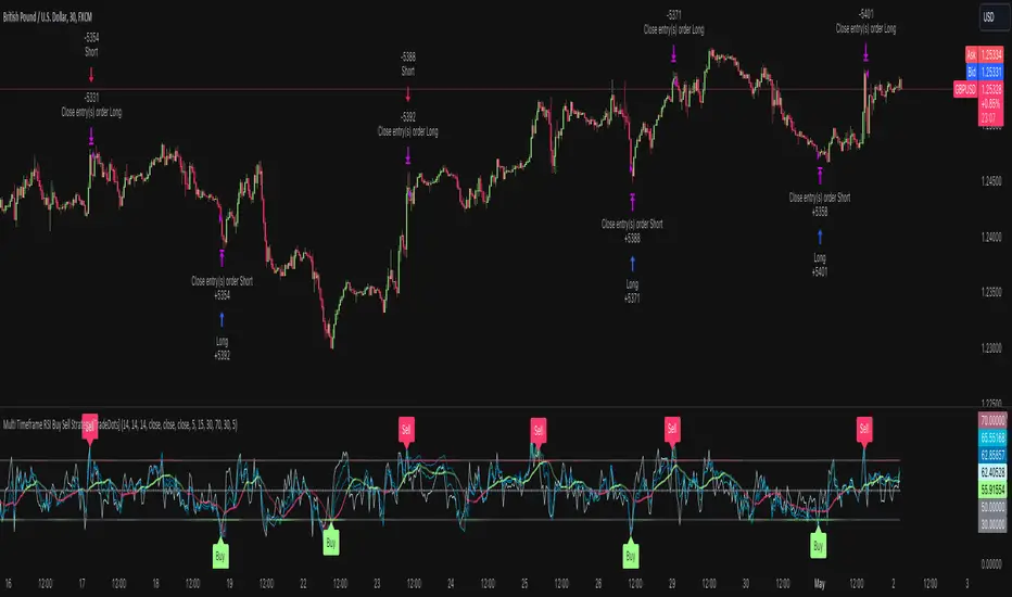
Smart Momentum Relative StrengthSmart Momentum Relative Strength
Creator Journey
The Smart Momentum Relative Strength indicator is
created by Vishal R. Janjire , inspired by BharatTrader sir, and parameters guided by mentor stockedge founder Vivek Bajaj sir.
Reason? ...Why choose Smart Momentum Relative Strength.
1.Simple to Trade: This indicator simplifies trading decisions. You just need to follow the background color displayed on the chart. When the background is green, it signals a bullish trend, and when it turns red, it signals a bearish trend. For an even cleaner experience, you can untick the Relative Strength (RS) toggle in the indicator settings and focus purely on trading based on these background colors, making the process straightforward and efficient.
2.Unlock the power to compare any stock, share, commodity, forex or cryptocurrency against major indices like Nasdaq Composite, NYSE Composite, Bitcoin, NG, Gold, Silver, Crude oil, Nasdaq-100, Nifty 50, Hang Seng Index, FTSE 100, and many more! With the Comparative Relative Strength (RS) indicator,
You can easily change the default Nifty 50 comparative symbol to any index or asset of your choice, such as Gold, Silver, Crude Oil, or global benchmarks like the Dow Jones Industrial Average, DAX, Euronext 100, and SSE Composite.
This versatile tool allows traders to measure how well a base symbol (e.g., stock or crypto) performs relative to a chosen benchmark over a specified period. Whether you're analyzing the relative strength of Bitcoin against the Nasdaq-100 or comparing stocks to the S&P 500, this indicator provides valuable insights into market trends and outperforming assets.
The Smart Momentum Relative Strength combines several advanced technical analysis tools into one comprehensive Pine Script indicator designed to provide a nuanced view of market strength and trends. This script integrates Relative Strength (RS), Commodity Channel Index (CCI), and additional trend confirmation mechanisms to deliver actionable insights for traders.
Below are key points to understand before using this indicator:
Important Parameters:
1. Green Line: Represents stocks outperforming the comparative index, which is Nifty 50. However, do not apply this result directly to Nifty 50 itself, as it will not work exclusively on the Nifty 50 index.
2. Red Line: Indicates that the stock is underperforming relative to the Nifty 50 index.
3. Green Background: Signifies that both the current time momentum and higher time momentum are aligned, indicating an upward trend.
4. Red Background: Signifies that both the current time momentum and higher time momentum are aligned, indicating a downward trend.
5. Blank Space: This occurs when the two timeframes are not aligned, indicating market uncertainty and signaling a potential change in market direction, it means short time frame or current time frame changed its direction to opposite side.
Multi-Time Frame (MTF) Settings:
This indicator incorporates a default multi-time frame setup, as follows:
1 and 2 Minute chart = 5 Minute higher time frame
3 Minute chart = 15 Minute higher time frame
5 Minute chart = 15 Minute higher time frame
10 Minute chart = 60 Minute higher time frame
15 Minute chart = 60 Minute higher time frame
20 and 30 Minute chart = 120 Minute higher time frame
1 Hour chart = 4 Hour higher time frame
2 Hour chart = 4 Hour higher time frame
4 Hour chart = 1 Day higher time frame
1 Day chart = 1 Week higher time frame
1 Week chart = 1 Month higher time frame
1 Month chart = 12 Month higher time frame
For any other chart time frame = Day time is default time frame
1. Relative Strength (RS) Analysis:
Calculation: Measures the performance of the base symbol relative to a comparative symbol over a specified period.
Visualization: The RS value is plotted with color-coded lines to indicate bullish (green) or bearish (red) conditions based on crossovers. Users can customize the color based on value or trend direction.
Trend Analysis: A simple moving average (SMA) of RS is displayed to visualize trend strength and direction, with color changes to reflect rising or falling trends.
2. Commodity Channel Index (CCI):
- Current Timeframe CCI: Calculates the CCI for the current timeframe to assess price momentum.
- Higher Timeframe CCI: Computes the CCI for a higher timeframe to provide a broader market perspective.
- Background Color: Highlights the chart background in green or red based on whether both current and higher timeframe CCIs are above or below zero, respectively.
-Blank Space: This occurs when the two timeframes are not aligned, indicating market uncertainty and signaling a potential change in market direction, it means short time frame or current time frame changed its direction to opposite side.
Multitimeframeanalysis

Larry Williams Valuation Index [tradeviZion]Larry Williams Valuation Index
Welcome to the Larry Williams Valuation Index by tradeviZion! This script is an interpretation of Larry Williams' famous WillVal (Valuation) Index, originally developed in 1990 to help traders determine whether a market or asset is overvalued or undervalued. We've extended it to support multiple securities and offer alerts for different valuation levels, helping you make more informed trading decisions.
What is the Valuation Index?
The Valuation Index measures how a security's current price compares to its historical price action. It helps identify whether the security is overvalued (priced too high), undervalued (priced too low), or in a normal range.
This version supports multiple securities and uses valuation parameters to help you assess the relative valuation of three securities simultaneously. It can help you determine the best times to enter (buy) or exit (sell) the market.
Key Features
Multi-Security Analysis: Analyze up to three securities simultaneously to get a broader view of market conditions.
Valuation Levels: Automatically calculate overvaluation and undervaluation levels or set manual levels for consistent analysis.
Custom Alerts: Create custom alerts when securities move between overvalued, undervalued, or normal ranges.
Customizable Table Display: Display a table with valuation values and their status on the chart.
Getting Started
Step 1: Adding the Script to Your Chart
First, add the Larry Williams Valuation Index script to your chart on TradingView. The script is designed to work with any timeframe, but for best results, use weekly or daily timeframes for a longer-term perspective.
Step 2: Configuring Securities
The script allows you to analyze up to three different securities :
Security 1 (Default: DXY)
Security 2 (Default: GC1!)
Security 3 (Default: ZB1!)
You can enable or disable each security individually.
Custom Timeframe Option: You have the option to select a custom timeframe for analysis. This allows you to see whether the security is overvalued or undervalued in lower or higher timeframes. Note that this feature is experimental and has not been extensively tested. Larry Williams originally used the weekly timeframe to determine if a stock was overvalued or undervalued. By default, the indicator compares the current price with the security based on the selected timeframe, except if you choose to use a custom timeframe.
Pro Tip : New users can start with the default securities to understand the concept before using other assets.
Step 3: Valuation Index Settings
Short EMA Length : This is the short-term average used for calculations. A lower value makes it more responsive to recent price changes.
Long EMA Length : This is the long-term average, used to smooth the valuation over time.
Valuation Length (Default: 156) : Represents approximately three years of daily bars (as recommended by Larry Williams).
How is the Valuation Index Calculated?
The valuation calculation is done using a method called WVI (WillVal Index), which compares the current price of a security to the price of another correlated security. Here’s a step-by-step explanation:
1. Data Collection: The script takes the closing price of the security you are analyzing and the closing price of the correlated security.
2. Ratio Calculation : The ratio of the two prices is calculated:
Price Ratio = (Price of your security) / (Price of correlated security) * 100.
This ratio helps determine how expensive or cheap your security is compared to the correlated one.
3. Exponential Moving Averages (EMAs) : The price ratio is used to calculate short-term and long-term EMAs (Exponential Moving Averages). EMAs are used to create smooth lines that represent the average price of a security over a specific period of time, with more weight given to recent data. By calculating both short-term and long-term EMAs, we can identify the trend direction and how the security is performing compared to its historical averages.
4. Valuation Index Calculation:
The Valuation Index is calculated as the difference between the short-term EMA and the long-term EMA. This difference helps to determine if the security is currently overvalued or undervalued:
A positive value indicates that the price is above its longer-term trend, suggesting potential overvaluation.
A negative value indicates that the price is below its longer-term trend, suggesting potential undervaluation.
5. Normalization:
To make the valuation easier to interpret, the calculated valuation index is then normalized using the highest and lowest values over the selected valuation length (e.g., 156 bars).
This normalization process converts the index into a percentage between 0 and 100, where higher values indicate overvaluation and lower values indicate undervaluation.
Step 4: Understanding Valuation Levels
The valuation levels indicate whether a security is currently undervalued, overvalued, or in a normal range.
Manual Levels : You can manually set the overvaluation and undervaluation thresholds (default is 85 for overvalued and 15 for undervalued).
Auto Levels : The script can automatically calculate these levels based on recent price action, allowing you to adapt to changing market conditions.
Auto Levels Calculation Explained:
The Auto Levels are calculated by taking the average of the valuation indices for all three securities (e.g., index1, index2, and index3).
The script then looks at the highest and lowest values of this average over a selected number of recent bars (e.g., 50 bars).
The overvaluation level is determined by taking the highest value and multiplying it by a multiplier (e.g., 5). Similarly, the undervaluation level is calculated using the lowest value and the multiplier.
These dynamic levels adjust according to recent price action, providing an adaptive approach to identifying overvalued and undervalued conditions.
Step 5: How to Use the Script to Make Trading Decisions
For new users, here's a step-by-step trading strategy you can use with the Valuation Index:
1. Identify Undervalued Opportunities
When two or more securities are in the undervalued range (below 15 for manual or below automatically calculated undervalue levels), wait for at least two of these securities to turn from undervalued to normal .
This transition indicates a potential buy opportunity .
2. Buying Signal
When at least two securities transition from undervalued to normal, you can consider buying the asset.
This indicates that the market may be recovering from undervalued conditions and could be moving into a growth phase.
3. Selling Signal
Exit when the price high closes below the EMA 21 (21-day exponential moving average).
Alternatively, if the valuation index reaches overvalued levels (above 85 manually or auto-calculated), wait for it to drop back to normal . This can be another point to exit the trade .
You can also use any other sell condition based on your r isk management strategy .
Alerts for Valuation Levels
The script includes alerts to notify you of changing market conditions:
To activate these alerts, follow these steps, referring to the provided screenshot with detailed steps:
1. Enable Alerts : Click on the settings gear icon on the script title in your chart. In the settings menu, scroll to the section labeled Alerts Settings .
Enable Alerts by checking the Enable Alerts box.
Set the Required Securities for Alert (default is 2 securities).
Choose the Alert Frequency : Selecting Once Per Bar Close will trigger alerts only at the close of each bar, ensuring you receive confirmed signals rather than potentially noisy intermediate signals.
2. Select Alert Type : Choose the type of alert you want to activate, such as Alert on Overvalued, Alert on Undervalued, Alert on Over to Normal , or Alert on Under to Normal .
3. Save Settings : Click OK to save your alert settings.
4. Add Alert on Indicator : Click the "..." (More button) next to the indicator name on the chart and select " Add alert on tradeviZion - WillVal ".
5. Create Alert : In the Create Alert window:
Set Condition to tradeviZion - WillVal .
Ensure Any alert() function call is selected.
Set the Alert Name and select your Expiration preferences.
6. Set Notification Preferences : Go to the Notifications tab and select how you want to receive notifications, such as via app notification, toast notification, email , or sound alert . Adjust these preferences to best suit your needs.
7. Click Create : Finally, click Create to activate the alert.
These alerts will help you stay informed about key market conditions and take action accordingly, ensuring you do not miss critical trading opportunities.
Understanding the Table Display
The script includes an interactive table on the chart to show the valuation status of each security:
Security : The name of the security being analyzed.
Value : The current valuation index value.
Status : Indicates whether the security is overvalued, undervalued , or in a normal range.
Color: Displays a color code for easy identification of status:
Red for overvalued.
Green for undervalued.
Other colors represent normal valuation levels.
Empowering Messages : Motivational messages are displayed to encourage disciplined trading. These messages will change periodically, helping keep a positive trading mindset.
Acknowledgment
This tool builds upon the foundational work of Larry Williams, who developed the WillVal (Valuation) Index concept. It also incorporates enhancements to extend multi-security analysis, valuation normalization, and advanced alerting features, providing a more versatile and powerful indicator. The Larry Williams Valuation Index [ tradeviZion ] helps traders make informed decisions by assessing overvalued and undervalued conditions for multiple securities simultaneously.
Note : Always practice proper risk management and thoroughly test the indicator to ensure it aligns with your trading strategy. Past performance is not indicative of future results.
Trade smarter with TradeVizion—unlock your trading potential today!

HTF Inversion Fair Value Gap | Flux Charts💎 GENERAL OVERVIEW
Introducing our new Higher Timeframe Inversion Fair Value Gaps (IFVG) indicator! Inversion Fair Value Gaps occur when a Fair Value Gap becomes invalidated. They reverse the role of the original Fair Value Gap, making a bullish zone bearish and vice versa. This indicator finds the latest IFVG in a higher timeframe and renders it in the current chart with it's divergence. For more information about the process, read the "HOW DOES IT WORK" section of the description.
Features of the new Higher Timeframe IFVG Indicator :
Renders The Higher Timeframe IFVG
Invalidation Borders
Variety Of Zone Detection / Sensitivity / Filtering / Invalidation Settings
High Customizability
🚩 UNIQUENESS
This indicator lets you take a look at the bigger picture by rendering the latest IFVG in a higher timeframe. You can see the current IFVG divergence to see how is the price action acting around the IFVG. You also can customize the FVG Filtering method, FVG & IFVG Zone Invalidation, Detection Sensitivity etc. according to your needs to get the best performance from the indicator.
📌 HOW DOES IT WORK ?
A Fair Value Gap generally occur when there is an imbalance in the market. They can be detected by specific formations within the chart. An Inversion Fair Value Gap is when a FVG becomes invalidated, thus reversing the direction of the FVG.
This indicator then renders the IFVG in a higher timeframe in your chart like this :
The opaque dashed lines at the top and the bottom of the IFVG indicate the bars that formed the original FVG. The middle dashed line that is semi-transparent shows the candlestick that invalidated the original FVG, thus created the current IFVG. The vertical solid top & bottom wicks indicate the current divergence of the highest & lowest points to the current IFVG.
The IFVGs can act as strong support & resistance points, depending on their creation volume and invalidation volume. Traders can use them for confirmation signals to their positions.
⚙️ SETTINGS
1. General Configuration
Higher Timeframe -> The higher timeframe to detect latest IFVG from. Keep in mind that his setting must be higher than the current timeframe.
IFVG Zone Invalidation -> Select between Wick & Close price for IFVG Zone Invalidation.
2. Fair Value Gaps
FVG Zone Invalidation -> Select between Wick & Close price for FVG Zone Invalidation.
Zone Filtering -> With "Average Range" selected, algorithm will find FVG zones in comparison with average range of last bars in the chart. With the "Volume Threshold" option, you may select a Volume Threshold % to spot FVGs with a larger total volume than average.
FVG Detection -> With the "Same Type" option, all 3 bars that formed the FVG should be the same type. (Bullish / Bearish). If the "All" option is selected, bar types may vary between Bullish / Bearish.
Detection Sensitivity -> You may select between Low, Normal or High FVG detection sensitivity. This will essentially determine the size of the spotted FVGs, with lower sensitivities resulting in spotting bigger FVGs, and higher sensitivities resulting in spotting all sizes of FVGs.
3. Dasboard
You can enable / disable the mitigation dashboard and customize it here.
4. Customization
Offset -> The number of candlesticks the IFVG will be rendered to the right of the latest bar.
Width -> The width of the rendered IFVG in candlesticks.

MTF SqzMom [tradeviZion]Credits:
John Carter for creating the TTM Squeeze and TTM Squeeze Pro.
Lazybear for the original interpretation of the TTM Squeeze: Squeeze Momentum Indicator.
Makit0 for evolving Lazybear's script by incorporating TTM Squeeze Pro upgrades – Squeeze PRO Arrows.
MTF SqzMom - Multi-Timeframe Squeeze & Momentum Tool
MTF SqzMom is a tool designed to help traders easily monitor squeeze and momentum signals across multiple timeframes in a simple, organized format. Built using Pine Script 5, it ensures that data remains consistent, even when switching between different time intervals on the chart.
Key Features:
Multi-Timeframe Monitoring: Track squeeze and momentum signals across various timeframes, all in one view. This includes key timeframes like 1-minute, 5-minute, hourly, and daily.
Dynamic Table Display: A color-coded table that automatically adjusts based on the selected timeframes, offering a clear view of market conditions.
Alerts for Key Market Events: Get notifications when a squeeze starts or fires across your chosen timeframes, so you can stay informed without needing to monitor the chart continuously.
Customizable Appearance: Tailor the look of the table by selecting colors for squeeze levels and momentum shifts, and choose the best position on your chart for easy access.
How It Works:
MTF SqzMom is based on the concept of the squeeze, which signals periods of lower volatility where price breakouts may occur. The tool tracks this by monitoring the contraction of Bollinger Bands within Keltner Channels. Along with this, it provides momentum analysis to help you gauge the potential direction of the market after a squeeze.
Squeeze Conditions: The script tracks four levels of squeeze conditions (no squeeze, low, mid, and high), each represented by a different color in the table.
Momentum Analysis: Momentum is visually represented by colors indicating four stages: up increasing, up decreasing, down increasing, and down decreasing. This color coding helps you quickly assess whether the market is gaining or losing momentum.
Using Alerts:
You can enable two types of alerts: when a squeeze starts (indicating consolidation) and when a squeeze fires (indicating a breakout). These alerts cover all timeframes you’ve selected, so you never miss important signals.
How to Set It Up:
1. Enable Alerts in Settings: Turn on "Alert for Squeeze Start" and "Alert for Squeeze Fire" in the settings.
2. Add Alerts to Your Chart:
Click the three dots next to the indicator name.
Select "Add alert on tradeviZion - MTF SqzMom."
3. Customize and Save: Adjust alert options, choose your notification type, and click "Create."
Why Use MTF SqzMom ?
Consistent Data: The tool ensures that squeeze and momentum data remain consistent, even when you switch between chart intervals.
Real-Time Alerts: Stay updated with alerts for squeeze conditions without needing to constantly watch the chart.
Simple to Use, Customizable to Fit: You can easily adjust the table’s look and choose the timeframes and colors that best suit your trading style.
Acknowledgment:
While this tool builds on the TTM Squeeze concept developed by John Carter of Simpler Trading, it offers added flexibility through multi-timeframe analysis, alerts, and customizability to make monitoring market conditions more accessible.

Essa's Indicator 2.0Essa's Indicator V2: Beginner's Guide
This custom TradingView indicator has been designed to help you identify key trading opportunities based on session highs/lows, volatility, and moving averages. Below is a breakdown of the main features:
1. Exponential Moving Averages (EMAs)
Fast EMA (Blue Line): Tracks the short-term market trend (default: 9-period EMA).
Slow EMA (Red Line): Tracks the longer-term market trend (default: 21-period EMA).
You can turn on/off the EMAs using the "Show EMAs" option in the settings.
EMAs help smooth out price action and give a clearer picture of trends. A crossover of the fast EMA above the slow EMA can signal an upward trend, while the reverse may indicate a downward trend.
2. Session Highs and Lows
The indicator tracks price highs and lows for three major trading sessions:
London Session (Red): Highlighted in red. Active between 08:00 and 17:00 (LDN timezone) or 03:00 and 12:00 (NY timezone).
New York Session (Blue): Highlighted in blue. Active between 12:00 and 21:00 (LDN timezone) or 07:00 and 16:00 (NY timezone).
Asia Session (Yellow): Highlighted in yellow. Active between 22:00 and 08:00 (LDN timezone) or 18:00 and 03:00 (NY timezone).
Highs and lows for each session are plotted on the chart as lines. Breakouts from these levels can signal important trading opportunities:
London High/Low: Red lines.
New York High/Low: Blue lines.
Asia High/Low: Yellow lines.
The background color also changes depending on the active session:
London: Light red background.
New York: Light blue background.
Asia: Light yellow background.
3. Breakout Alerts
You can set alerts when the price breaks above or below session highs/lows:
Break Above London High: Alert triggered when the price crosses the London session high.
Break Below London Low: Alert triggered when the price falls below the London session low.
Similar alerts exist for the New York and Asia sessions as well.
4. Volatility-Adjusted EMA
The EMAs in this indicator are adjusted based on volatility (ATR - Average True Range). This allows the EMAs to respond to market conditions more dynamically, giving you more accurate trend readings in volatile markets.
5. ZigZag Feature (Optional)
You can enable the ZigZag feature to help visualize the price action's highs and lows:
ZigZag Lines: Highlight major peaks and troughs in price movements, helping you spot trends more easily.
This is helpful for identifying reversals or trend continuations.
6. Fractal Markers
This indicator uses fractals to mark potential turning points in the market:
Green Triangles (Above the Price): Indicate up fractals (potential reversal points where the price could move upwards).
Red Triangles (Below the Price): Indicate down fractals (potential reversal points where the price could move downwards).
Fractals can be a helpful confirmation tool when identifying entry and exit points.
7. Custom Timezone Options
You can choose between London (LDN) and New York (NY) timezones in the settings to adapt the session times to your trading location. This ensures the session high/low markers are displayed correctly for your trading region.
By default, the New York (NY) timezone is enabled for FXCM charts in the UK.
For BTC charts, you will need to switch to the appropriate time zone manually.
Thanks
Essa

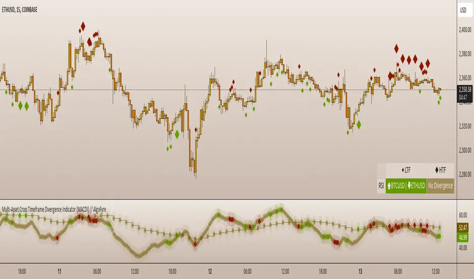
Multi-Asset Cross Timeframe Divergence Ind. (MACDI) // AlgoFyreThe Multi-Asset Cross Timeframe Divergence Indicator (MACDI) identifies divergences in momentum like RSI across multiple assets and timeframes. It visually highlights lagging correlated asset momentum divergences, helping traders spot inefficiencies and potential trade opportunities in the following asset.
🔶 KEY FEATURES
🔸Average Momentum Trendline for Each Timeframe
The Average Momentum Trendline feature calculates the average momentum of multiple assets over specified timeframes. It uses smoothed values to determine the momentum trend for each timeframe on the average aggregated momentum of both assets. This trendline helps traders identify the overall direction of the market momentum, providing a clearer picture of potential price movements.
🔸Real-time Divergence Indication and Alert Table
The Real-time Divergence Indications and Alert Table feature visualizes detected divergences between the momentum values of the two assets across different timeframes. It identifies both bullish and bearish divergences, signaling lagging reversals in the the following asset and potential trading opportunities. When a divergence is detected, the system generates real-time visual indications on the chart and in an overview table for traders to act promptly. The alert table provides a comprehensive overview of all detected divergences, making it easier for traders to monitor and respond to market changes.
🔸Color and Size Based Labels on Price Chart based on Divergence Type
The Color and Size Based Labels feature visually represents divergences directly on the price chart. Bullish and bearish divergences are marked with distinct colors and sizes, making them easily identifiable at a glance. Larger labels indicate higher timeframes and thus generally more significance.
🔶 INSTRUCTION GUIDELINES
🔸Identify Divergence Clusters
The more divergences align, the higher the probability of a potential trend reversal in the asset. When multiple multi-timeframe divergences occur in both lower and higher timeframes within a local cluster, the probability of a reversal increases. This is valid for both for bullish and bearish divergences.
🔸Spot Low Probability Divergences
To further increase the probability, analyze the current state of the average momentum trendline. For a bullish reversal, a relatively low level of the average momentum trendline is preferred, whereas for a bearish reversal, a relatively high level is preferred.
🔶 INDIVIDUAL CONFIGURATION
🔸Leading Asset
This input allows the user to select the leading asset for the divergence analysis.
🔸Following Asset
This input allows the user to select the following asset for the divergence analysis.
🔸Higher Timeframe
This input sets the higher timeframe for the analysis.
🔸Lower Timeframe
This input sets the lower timeframe for the analysis.
🔸Show RSI Divergence
This input enables or disables the display of RSI divergence signals.
🔸RSI Length
This input sets the length of the RSI calculation.
🔸RSI Source
This input sets the source data for the RSI calculation (e.g., close price).
🔸RSI Smoothing Length
This input sets the length of the smoothing applied to the RSI values.
🔸Smoothing Method
This input sets the method used for smoothing the RSI values.
🔶 CONCLUSION
The Multi-Asset Cross Timeframe Divergence Indicator (MACDI) is a powerful tool for identifying momentum divergences across multiple assets and timeframes. Its visual cues and customizable table make it easy to use and interpret, providing valuable insights for trading decisions.
VWAP Periodic Close [LuxAlgo]The VWAP Periodic Close script offers an advanced tool for analyzing the Volume Weighted Average Price (VWAP) across various timeframes.
This tool enables traders to visualize VWAP close levels for daily, weekly, monthly, quarterly, and yearly periods, offering a comprehensive view of price behavior across different time frames. It helps in identifying key levels where the VWAP closes at the end of each specified period.
🔶 USAGE
This script is designed to enhance your trading strategy by plotting VWAP close levels on your chart for different time periods. This helps traders easily identify historical VWAP levels and analyze price action relative to these levels, particularly useful for identifying key support and resistance levels providing insights into potential future price behavior.
Supports VWAP closes for multiple timeframes, including historical periods (e.g., 3 months back, 3 quarters back, 3 years back). The labels provide context and detailed information about the VWAP close at a specific point in time and enhance the clarity and usefulness of the VWAP data presented on the chart.
Users can toggle the display of VWAP lines for different periods and customize the colors for each timeframe (e.g., distinct colors for monthly, quarterly, and yearly closes).
🔶 SETTINGS
The script offers a range of customizable settings to tailor the analysis to your trading needs.
🔹 Volume Weighted Average Price (VWAP)
VWAP Close Level: Toggle the display of VWAP levels at the end of each period (daily, weekly, monthly, quarterly, yearly).
VWAP Origin: Toggle the display of the VWAP line for each period.
VWAP Source: Choose the data source for VWAP calculations (default is HLC3).
Historical Closes: Define the number of historical VWAP levels to plot.
Line/Label Offset: Adjust the offset for positioning lines and labels on the chart.
🔹 Themes
Theme Selection: Choose between "Day," "Night," or "Custom" themes to adjust the color scheme of VWAP lines and labels.

Stock Strength IndexScript Title: Stock Strength Index made by Vishal R Janjire
Description:
The Stock Strength Index combines several advanced technical analysis tools into one comprehensive Pine Script indicator designed to provide a nuanced view of market strength and trends. This script integrates Relative Strength (RS), Commodity Channel Index (CCI), and additional trend confirmation mechanisms to deliver actionable insights for traders.
( Must Read )
Important parameter read before use this indicator
0. Zero line green means stock is in up trend and if it is red means down trending.
1. Zero line is green it means stocks is outperforming its index that is Nifty 50 ( but dont consider its results on nifty itself that is it will not work only on nifty 50)
2. Zero line is red it means stocks is underperforming its index that is Nifty 50
3. bubble is confirmation tool when it show green bubble on zero line it means on short time frame it want go up trending and vise versa
4. Always remember higher time frame is greater than chart time frame like day vs hour
Key Features:
5. Best suitable time when higher time frame is 15 minutes and chart time is 5 minute for intraday trading. for short swing use HTF 1 Day and chart time is 1 hour or 2 hour.
1. Relative Strength (RS) Analysis:
- Calculation: Measures the performance of the base symbol relative to a comparative symbol over a specified period.
- Visualization: Plots the RS value with color-coded lines to indicate bullish (green) or bearish (red) conditions based on crossovers. Users can toggle the RS color based on its value or trend direction.
- Trend Analysis: Displays a simple moving average (SMA) of RS to visualize trend strength and direction. The SMA’s color changes to indicate rising or falling trends.
2. Commodity Channel Index (CCI):
- Current Timeframe CCI: Calculates the CCI for the current timeframe to assess price momentum.
- Higher Timeframe CCI: Computes the CCI for a higher timeframe to provide a broader market perspective.
- Background Color: Highlights the chart background in green or red based on whether both current and higher timeframe CCIs are above or below zero, respectively.
3. Alerts:
- CCI Alerts: Set up alerts for key CCI crossovers, including when both CCIs are above or below zero, or when CCI crosses key levels (100 and -100) on either timeframe.
4. Trend Confirmation:
- Price Confirmation: Uses price and its moving average to identify bullish or bearish divergence, with visual bubbles plotted on the chart to confirm potential trade signals.
5. Customization Options:
- RS Parameters: Adjust settings for RS period, comparative symbol, and whether to display reference labels or the zero line.
- CCI Parameters: Configure CCI lengths for both current and higher timeframes and select the source of the CCI calculation.
Concepts Underlying Calculations:
- Relative Strength (RS): Measures the relative performance of the base symbol compared to another symbol, adjusted over a specified period to capture momentum and trend strength.
- Commodity Channel Index (CCI): Calculates the deviation of the price from its average to identify overbought or oversold conditions and potential reversal points.
- Simple Moving Average (SMA): Smooths the RS values to highlight trends and potential trend reversals.
This indicator is designed for traders seeking a comprehensive tool that combines multiple analytical methods into one cohesive system. It aims to offer a clearer view of market trends, strengths, and potential trade opportunities based on a blend of relative strength and momentum indicators.
---
This description provides a detailed overview of the script's functionality and customization options while ensuring clarity and compliance with the publishing rules.

OrderFlow [Adjustable] | FractalystWhat's the indicator's purpose and functionality?
This indicator is designed to assist traders in identifying real-time probabilities of buyside and sellside liquidity .
It allows for an adjustable pivot level , enabling traders to customize the level they want to use for their entries.
By doing so, traders can evaluate whether their chosen entry point would yield a positive expected value over a large sample size, optimizing their strategy for long-term profitability.
For advanced traders looking to enhance their analysis, the indicator supports the incorporation of up to 7 higher timeframe biases .
Additionally, the higher timeframe pivot level can be adjusted according to the trader's preferences,
Offering maximum adaptability to different strategies and needs, further helping to maximize positive EV.
EV=(P(Win)×R(Win))−(P(Loss)×R(Loss))
-----
What's the purpose of these levels? What are the underlying calculations?
1. Understanding Swing highs and Swing Lows
Swing High: A Swing High is formed when there is a high with 2 lower highs to the left and right.
Swing Low: A Swing Low is formed when there is a low with 2 higher lows to the left and right.
2. Understanding the purpose and the underlying calculations behind Buyside, Sellside and Pivot levels.
3. Identifying Discount and Premium Zones.
4. Importance of Risk-Reward in Premium and Discount Ranges
----
How does the script calculate probabilities?
The script calculates the probability of each liquidity level individually. Here's the breakdown:
1. Upon the formation of a new range, the script waits for the price to reach and tap into pivot level level. Status: "⏸" - Inactive
2. Once pivot level is tapped into, the pivot status becomes activated and it waits for either liquidity side to be hit. Status: "▶" - Active
3. If the buyside liquidity is hit, the script adds to the count of successful buyside liquidity occurrences. Similarly, if the sellside is tapped, it records successful sellside liquidity occurrences.
4. Finally, the number of successful occurrences for each side is divided by the overall count individually to calculate the range probabilities.
Note: The calculations are performed independently for each directional range. A range is considered bearish if the previous breakout was through a sellside liquidity. Conversely, a range is considered bullish if the most recent breakout was through a buyside liquidity.
----
What does the multi-timeframe functionality offer?
In the adjustable version of the orderflow indicator, you can incorporate up to 7 higher timeframe probabilities directly into the table.
This feature allows you to analyze the probabilities of buyside and sellside liquidity across multiple timeframes, without the need to manually switch between them.
By viewing these higher timeframe probabilities in one place, traders can spot larger market trends and refine their entries and exits with a better understanding of the overall market context.
This multi-timeframe functionality helps traders:
1. Simplify decision-making by offering a comprehensive view of multiple timeframes at once.
2. Identify confluence between timeframes, enhancing the confidence in trade setups.
3. Adapt strategies more effectively, as the higher timeframe pivot levels can be customized to meet individual preferences and goals.
----
What are the multi-timeframe underlying calculations?
The script uses the same calculations (mentioned above) and uses security function to request the data such as price levels, bar time, probabilities and booleans from the user-input timeframe.
----
How does the Indicator Identifies Positive Expected Values?
OrderFlow indicator instantly calculates whether a trade setup has the potential for positive expected value (EV) in the long run.
To determine a positive EV setup, the indicator uses the formula:
EV=(P(Win)×R(Win))−(P(Loss)×R(Loss))
where:
P(Win) is the probability of a winning trade.
R(Win) is the reward or return for a winning trade, determined by the current risk-to-reward ratio (RR).
P(Loss) is the probability of a losing trade.
R(Loss) is the loss incurred per losing trade, typically assumed to be -1.
By calculating these values based on historical data and the current trading setup, the indicator helps you understand whether your trade has a positive expected value over a large sample size.
----
How can I know that the setup I'm going to trade with has a postive EV?
If the indicator detects that the adjusted pivot and buy/sell side probabilities have generated positive expected value (EV) in historical data, the risk-to-reward (RR) label within the range box will be colored blue and red .
If the setup does not produce positive EV, the RR label will appear gray.
This indicates that even the risk-to-reward ratio is greater than 1:1, the setup is not likely to yield a positive EV because, according to historical data, the number of losses outweighs the number of wins relative to the RR gain per winning trade.
----
What is the confidence level in the indicator, and how is it determined?
The confidence level in the indicator reflects the reliability of the probabilities calculated based on historical data. It is determined by the sample size of the probabilities used in the calculations. A larger sample size generally increases the confidence level, indicating that the probabilities are more reliable and consistent with past performance.
----
How does the confidence level affect the risk-to-reward (RR) label?
The confidence level (★) is visually represented alongside the probability label. A higher confidence level indicates that the probabilities used to determine the RR label are based on a larger and more reliable sample size.
----
How can traders use the confidence level to make better trading decisions?
Traders can use the confidence level to gauge the reliability of the probabilities and expected value (EV) calculations provided by the indicator. A confidence level above 95% is considered statistically significant and indicates that the historical data supporting the probabilities is robust. This high confidence level suggests that the probabilities are reliable and that the indicator’s recommendations are more likely to be accurate.
In data science and statistics, a confidence level above 95% generally means that there is less than a 5% chance that the observed results are due to random variation. This threshold is widely accepted in research and industry as a marker of statistical significance. Studies such as those published in the Journal of Statistical Software and the American Statistical Association support this threshold, emphasizing that a confidence level above 95% provides a strong assurance of data reliability and validity.
Conversely, a confidence level below 95% indicates that the sample size may be insufficient and that the data might be less reliable . In such cases, traders should approach the indicator’s recommendations with caution and consider additional factors or further analysis before making trading decisions.
----
How does the sample size affect the confidence level, and how does it relate to my TradingView plan?
The sample size for calculating the confidence level is directly influenced by the amount of historical data available on your charts. A larger sample size typically leads to more reliable probabilities and higher confidence levels.
Here’s how the TradingView plans affect your data access:
Essential Plan
The Essential Plan provides basic data access with a limited amount of historical data. This can lead to smaller sample sizes and lower confidence levels, which may weaken the robustness of your probability calculations. Suitable for casual traders who do not require extensive historical analysis.
Plus Plan
The Plus Plan offers more historical data than the Essential Plan, allowing for larger sample sizes and more accurate confidence levels. This enhancement improves the reliability of indicator calculations. This plan is ideal for more active traders looking to refine their strategies with better data.
Premium Plan
The Premium Plan grants access to extensive historical data, enabling the largest sample sizes and the highest confidence levels. This plan provides the most reliable data for accurate calculations, with up to 20,000 historical bars available for analysis. It is designed for serious traders who need comprehensive data for in-depth market analysis.
PRO+ Plans
The PRO+ Plans offer the most extensive historical data, allowing for the largest sample sizes and the highest confidence levels. These plans are tailored for professional traders who require advanced features and significant historical data to support their trading strategies effectively.
For many traders, the Premium Plan offers a good balance of affordability and sufficient sample size for accurate confidence levels.
----
What is the HTF probability table and how does it work?
The HTF (Higher Time Frame) probability table is a feature that allows you to view buy and sellside probabilities and their status from timeframes higher than your current chart timeframe.
Here’s how it works:
Data Request : The table requests and retrieves data from user-defined higher timeframes (HTFs) that you select.
Probability Display: It displays the buy and sellside probabilities for each of these HTFs, providing insights into the likelihood of price movements based on higher timeframe data.
Detailed Tooltips: The table includes detailed tooltips for each timeframe, offering additional context and explanations to help you understand the data better.
----
What do the different colors in the HTF probability table indicate?
The colors in the HTF probability table provide visual cues about the expected value (EV) of trading setups based on higher timeframe probabilities:
Blue: Suggests that entering a long position from the HTF user-defined pivot point, targeting buyside liquidity, is likely to result in a positive expected value (EV) based on historical data and sample size.
Red: Indicates that entering a short position from the HTF user-defined pivot point, targeting sellside liquidity, is likely to result in a positive expected value (EV) based on historical data and sample size.
Gray: Shows that neither long nor short trades from the HTF user-defined pivot point are expected to generate positive EV, suggesting that trading these setups may not be favorable.
----
How to use the indicator effectively?
For Amateur Traders:
Start Simple: Begin by focusing on one timeframe at a time with the pivot level set to the default (50%). This helps you understand the basic functionality of the indicator.
Entry and Exit Strategy: Focus on entering trades at the pivot level while targeting the higher probability side for take profit and the lower probability side for stop loss.
Use simulation or paper trading to practice this strategy.
Adjustments: Once you have a solid understanding of how the indicator works, you can start adjusting the pivot level to other values that suit your strategy.
Ensure that the RR labels are colored (blue or red) to indicate positive EV setups before executing trades.
For Advanced Traders:
1. Select Higher Timeframe Bias: Choose a higher timeframe (HTF) as your main bias. Start with the default pivot level and ensure the confidence level is above 95% to validate the probabilities.
2. Align Lower Timeframes: Switch between lower timeframes to identify which ones align with your predefined HTF bias. This helps in synchronizing your trading decisions across different timeframes.
3. Set Entries with Current Pivot Level: Use the current pivot level for trade entries. Ensure the HTF status label is active, indicating that the probabilities are valid and in play.
4. Target HTF Liquidity Level: Aim for liquidity levels that correspond to the higher timeframe, as these levels are likely to offer better trading opportunities.
5. Adjust Pivot Levels: As you gain experience, adjust the pivot levels to further optimize your strategy for high EV. Fine-tune these levels based on the aggregated data from multiple timeframes.
6. Practice on Paper Trading: Test your strategies through paper trading to eliminate discretion and refine your approach without financial risk.
7. Focus on Trade Management: Ultimately, effective trade management is crucial. Concentrate on managing your trades well to ensure long-term success. By aiming for setups that produce positive EV, you can position yourself similarly to how a casino operates.
----
🎲 Becoming the House (Gaining Edge Over the Market):
In American roulette, the house has a 5.26% edge due to the 0 and 00. This means that while players have a 47.37% chance of winning on even-money bets, the true odds are 50%. The discrepancy between the true odds and the payout ensures that, statistically, the casino will win over time.
From the Trader's Perspective: In trading, you gain an edge by focusing on setups with positive expected value (EV). If you have a 55.48% chance of winning with a 1:1 risk-to-reward ratio, your setup has a higher probability of profitability than the losing side. By consistently targeting such setups and managing your trades effectively, you create a statistical advantage, similar to the casino’s edge.
----
🎰 Applying the Concept to Trading:
Just as casinos rely on their mathematical edge, you can achieve long-term success in trading by focusing on setups with positive EV. By ensuring that your probabilities and risk-to-reward (RR) ratios are in your favor, you create an edge similar to that of the house.
And by systematically targeting trades with favorable probabilities and managing your trades effectively, you improve your chances of profitability over the long run. Which is going to help you “become the house” in your trading, leveraging statistical advantages to enhance your overall performance.
----
What makes this indicator original?
Real-Time Probability Calculations: The indicator provides real-time calculations of buy and sell probabilities based on historical data, allowing traders to assess the likelihood of positive expected value (EV) setups instantly.
Adjustable Pivot Levels: It features an adjustable pivot level that traders can modify according to their preferences, enhancing the flexibility to align with different trading strategies.
Multi-Timeframe Integration: The indicator supports up to 7 higher timeframes, displaying their probabilities and biases in a single view, which helps traders make informed decisions without switching timeframes.
Confidence Levels: It includes confidence levels based on sample sizes, offering insights into the reliability of the probabilities. Traders can gauge the strength of the data before making trades.
Dynamic EV Labels: The indicator provides color-coded EV labels that change based on the validity of the setup. Blue indicates positive EV in a long bias, red indicates positive EV in a short bias and gray signals caution, making it easier for traders to identify high-quality setups.
HTF Probability Table: The HTF probability table displays buy and sell probabilities from user-defined higher timeframes, helping traders integrate broader market context into their decision-making process.
----
Terms and Conditions | Disclaimer
Our charting tools are provided for informational and educational purposes only and should not be construed as financial, investment, or trading advice. They are not intended to forecast market movements or offer specific recommendations. Users should understand that past performance does not guarantee future results and should not base financial decisions solely on historical data.
Built-in components, features, and functionalities of our charting tools are the intellectual property of @Fractalyst use, reproduction, or distribution of these proprietary elements is prohibited.
By continuing to use our charting tools, the user acknowledges and accepts the Terms and Conditions outlined in this legal disclaimer and agrees to respect our intellectual property rights and comply with all applicable laws and regulations.

Screener | FractalystWhat’s the purpose of this indicator?
This indicator is part of the Optirange suite , which analyzes all timeframes using a mechanical top-down approach to determine the overall market bias. It helps you identify the specific timeframes and exact levels for positioning in longs, shorts, or guiding you on whether to stay away from trading a particular market condition.
The purpose of the Screener indicator is to track the contextual bias of multiple markets simultaneously on the charts without the need to switch between pairs. This allows traders to monitor various assets in real-time, enhancing decision-making efficiency and identifying potential trading opportunities more effectively.
-----
How does this indicator identify the overall market bias?
This indicator employs a systematic top-down approach, analyzing market structure, fractal blocks, and their mitigations from the 12M timeframe down to the 1D timeframe to uncover the story behind the market. This method helps identify the overall market bias, whether it’s bullish, bearish, or in consolidating conditions.
Below is a flowchart that illustrates the calculation behind the market context identification, demonstrating the systematic approach:
-----
According to the above trade plan, why do we only look for mitigations within Fractal Blocks of X1/X2?
In this context, "X" stands for a break in the market's structure, and the numbers (1 and 2) indicate the sequence of these breaks within the same trend direction, either up or down.
We focus on mitigations within Fractal Blocks during the X1/X2 stages because these points mark the early phase (X1) and the continuation (X2) of a trend. By doing so, we align our trades with the market's main direction and avoid getting stopped out in the middle of trends.
-----
How does this indicator identify ranges in a mechanical way?
Since the indicator is part of the Optirange suite , it follows the exact rules that Optirange utilizes to identify breaks of market structures in a mechanical manner.
Let’s take a closer look at how the ranges are calculated:
1- First, we need to understand the importance of following a set of mechanical rules in identifying market structure:
The image above illustrates the difference between a subjective and a mechanical approach to analyzing market structure. The subjective method often leads to uncertainty, where traders might struggle to pinpoint exact breaks in structure, resulting in inconsistent decision-making. Questions like “Is this a break?” or “Maybe this one...?” reflect the ambiguity of manual interpretation, which can cause confusion and errors in trading.
On the other hand, the mechanical approach depicted on the right side of the image follows a clear, rule-based method to define breaks in market structure. This systematic approach eliminates guesswork by providing precise criteria for identifying structural changes, such as marking structural invalidation levels where market bias shifts from bullish to bearish or vice versa. The mechanical method not only offers consistency but also integrates statistical probabilities , enhancing the trader's ability to make data-driven decisions.
By adhering to these mechanical rules, the Screener indicator ensures that ranges are identified consistently, allowing traders to rely on objective analysis rather than subjective interpretation . This approach is crucial for accurately defining market structures and making informed trading decisions.
2- Now let's take a look at a practical example of how the indicator utilizes Pivot points with a period of 2 to identify ranges:
In this image, we see a Bearish Scenario on the left and a Bullish Scenario on the right. The indicator starts by identifying the first significant swing on the chart. It then validates this swing by checking if there is a preceding swing high (for a bearish scenario) or swing low (for a bullish scenario). Once validated, the indicator confirms a break of structure when price closes below or above these points, respectively.
For instance, in the Bearish Scenario:
The first significant swing is identified.
The script checks for a preceding swing high before confirming any structural break.
A candle closure below the swing low confirms the first bearish break of structure.
This results in a confirmed market bias towards bearishness, with structural liquidity levels indicated for potential price targets.
In the Bullish Scenario:
The process is mirrored, identifying the first swing low and validating it with a preceding swing low.
A closure above this swing confirms the bullish break of structure.
This leads to a market bias towards bullishness, with invalidation levels to watch if the trend shifts.
This practical example demonstrates how the indicator systematically identifies market ranges, ensuring that traders can make informed decisions based on clear, rule-based criteria.
-----
How does this indicator identify ranges in a mechanical way, What are the underlying calculations?
Fractal blocks refer to the most extreme swing candle within the latest break. They can serve as significant levels for price rejection and may guide movements toward the next break, often in confluence with topdown analysis for added confirmation.
-----
What are mitigations, What are the underlying calculations?
Mitigations refer to specific price action occurrences identified by the script:
1- When the price reaches the most recent fractal block and confirms a swing candle, the script automatically draws a line from the swing to the fractal block bar and labels it with a checkmark.
2- If the price wicks through the invalidation level and then retraces back to the fractal block while forming a swing candle, the script labels this as a double mitigation on the chart.
This level will serve as the next potential invalidation level if a break occurs in the same direction.
-----
What does the right table display?
The table located at the right of your chart displays five colored symbols that represent the contextual market bias:
Green: The market is in a bullish condition.
Red: The market is in a bearish condition.
White: The market condition is uncertain, and it is advisable to stay away from trading.
-----
What does the bottom table display?
The bottom table can be turned on in the Optirange indicator and serves multiple purposes:
Range Counts and Mitigations: It shows the range counts and their mitigations across multiple timeframes, providing a comprehensive view of market dynamics.
Hourly Timeframe Probabilities: The bottom row of the bias table displays the probabilities for various hourly timeframes, helping to identify potential entry levels based on the multi-timeframe bias determined by the Screener.
In a bullish market context, you should look for long positions by focusing on hourly timeframes where buy-side probability exceeds 50%.
In a bearish market context, you should look for short positions by focusing on hourly timeframes where the sell-side probability exceeds 50%.
When the symbol is white within the Screener table, it signals that the market bias is unclear, and it's recommended to stay away from trading in such conditions.
-----
How the range probabilities are calculated?
Each break of market structure, denoted as X, is assigned a unique ID, starting from X1 for the first break, X2 for the second, and so on.
The probabilities are calculated based on breaks holding, meaning price closing through the liquidity level, rather than invalidation. This probability is then divided by the total count of similar numeric breaks.
For example, if 75 out of 100 bullish X1s become X2, then the probability of X1 becoming X2 on your charts will be displayed as 75% in the following format: ⬆ 75%
-----
What does the top table display?
The top table on the charts displays the current market context, offering insights into the underlying bias. It highlights the high-timeframe (HTF) bias and guides you on which timeframes you should use to enter long or short positions, based on the probability of success.
Additionally, when the market bias is unclear, the table clearly signals that it's best to avoid trading that specific market until the context or market story becomes clearer. This helps traders make informed decisions and avoid uncertain market conditions.
-----
How does the Screener indicator identify the market bias/context/story ?
- Market Structure: The Optirange indicator analyzes market structure across multiple timeframes, from a top-down perspective, including 12M, 6M, 3M, 1M, 2W, 1W, 3D, and 1D.
- Fractal Blocks: Once the market structure or current range is identified, the indicator automatically identifies the last push before the break and draws it as a box. These zones acts as a key area where the price often rejects from.
- Mitigations: After identifying the Fractal Block, the indicator checks for price mitigation or rejection within this zone. If mitigation occurs, meaning the price has reacted or rejected from the Fractal Block, the indicator draws a checkmark from the deepest candle within the Fractal Block to the initial candle that has created the zone.
- Bias Table: After identifying the three key elements—market structure, Fractal Blocks, and price mitigations—the indicator compiles this information into a multi-timeframe table. This table provides a comprehensive top-down perspective, showing what is happening from a structural standpoint across all timeframes. The Bias Table presents raw data, including identified Fractal Blocks and mitigations, to help traders understand the overall market trend. This data is crucial for the screener, which uses it to determine the current market bias based on a top-down analysis.
- Screener: Once all higher timeframes (HTF) and lower timeframes (LTF) are calculated using the indicator, it follows the exact rules outlined in the flowchart to determine the market bias. This systematic approach not only helps identify the current market trend but also suggests the exact timeframes to use for finding entry, particularly on hourly timeframes.
Example:
12M Timeframe:
OANDA:EURUSD
6M Timeframe :
OANDA:EURUSD
3M Timeframe :
OANDA:EURUSD
1M Timeframe :
OANDA:EURUSD
2W Timeframe :
OANDA:EURUSD
1W Timeframe :
OANDA:EURUSD
-----
User-input settings and customizations
Terms and Conditions | Disclaimer
Our charting tools are provided for informational and educational purposes only and should not be construed as financial, investment, or trading advice. They are not intended to forecast market movements or offer specific recommendations. Users should understand that past performance does not guarantee future results and should not base financial decisions solely on historical data. By utilizing our charting tools, the buyer acknowledges that neither the seller nor the creator assumes responsibility for decisions made using the information provided. The buyer assumes full responsibility and liability for any actions taken and their consequences, including potential financial losses. Therefore, by purchasing these charting tools, the customer acknowledges that neither the seller nor the creator is liable for any unfavorable outcomes resulting from the development, sale, or use of the products.
The buyer is responsible for canceling their subscription if they no longer wish to continue at the full retail price. Our policy does not include reimbursement, refunds, or chargebacks once the Terms and Conditions are accepted before purchase.
By continuing to use our charting tools, the user acknowledges and accepts the Terms and Conditions outlined in this legal disclaimer.
Custom Supertrend Multi-Timeframe Indicator [Pineify]Supertrend Multi-Timeframe Indicator
Introduction
The Supertrend Multi-Timeframe Indicator is an advanced trading tool designed to help traders identify trend directions and potential buy/sell signals by combining Supertrend indicators from multiple timeframes. This script is original in its approach to integrating Supertrend calculations across different timeframes, providing a more comprehensive view of market trends.
Concepts and Calculations
The indicator utilizes the Supertrend algorithm, which is based on the Average True Range (ATR). The Supertrend is a popular tool for trend-following strategies, and this script enhances its capabilities by incorporating data from a larger timeframe.
Supertrend Factor: Determines the sensitivity of the Supertrend line.
ATR Length: Defines the period for calculating the Average True Range.
Larger Supertrend Factor and ATR Length: Applied to the larger timeframe for a broader trend perspective.
Larger Timeframe: The higher timeframe from which the secondary Supertrend data is sourced.
How It Works
The script calculates the Supertrend for the current timeframe using the specified factor and ATR length.
Simultaneously, it requests Supertrend data from a larger timeframe.
Buy and sell signals are generated based on crossovers and crossunders of the Supertrend lines from both timeframes.
Visual cues (up and down arrows) are plotted on the chart to indicate buy and sell signals.
Background colors change to reflect the trend direction: green for an uptrend and red for a downtrend.
Usage
Add the indicator to your TradingView chart.
Customize the Supertrend factors, ATR lengths, and larger timeframe according to your trading strategy.
Enable or disable buy and sell alerts as needed.
Monitor the chart for visual signals and background color changes to make informed trading decisions.
Note: The indicator is best used in conjunction with other technical analysis tools and should not be relied upon as the sole basis for trading decisions.
Conclusion
The Supertrend Multi-Timeframe Indicator offers a unique and powerful way to analyze market trends by leveraging the strengths of the Supertrend algorithm across multiple timeframes. Its customizable settings and clear visual signals make it a valuable addition to any trader's toolkit.

LTF Inducement Levels [QuantVue]Inducement refers to a market manipulation tactic where large institutions or "smart money" create price movements that induce or lure retail traders into taking positions that are ultimately unfavorable. This concept is based on the idea that the market is moved by institutional traders who have the power and capital to manipulate prices to their advantage.
Within a dominant trend, there are frequently movements that go against the prevailing direction. These opposing moves are often driven by liquidity hunting on lower time frames. The price will experience a bounce or rejection, then aim for a previous short-term high or low before resuming its movement in alignment with the longer-term trend. Inducement involves specifically targeting these short-term highs or lows, which are potential zones where stop-loss orders may be located.
The LTF Inducement Levels indicator is designed to identify and display potential lower time frame (LTF) inducement levels on your chart. This indicator helps traders recognize price points where market manipulation might occur without needing multiple charts open.
Once a lower time frame pivot has been crossed, the level is removed from the current chart.
Multi-Timeframe Analysis:
The indicator uses a lower timeframe (LTF) to identify pivot highs and pivot lows, providing a granular view of potential inducement levels.
Configurable Parameters:
Lower Timeframe (LTF): The user can select the lower timeframe for analysis.
Pivot Length: The length used for identifying pivots.
Number of Pivots to Show: Limits the number of pivots displayed on the chart to avoid clutter.
Dynamic Pivot Management:
The indicator dynamically manages the pivots, adding new ones and removing old ones based on the configured maximum number of pivots to show.
It creates lines and labels for each pivot, which are updated as new pivots are formed or crossed.
Inducement Levels:
Pivot Highs: Marked with red lines and labeled with the price value.
Pivot Lows: Marked with green lines and labeled with the price value.
Cross Detection:
The indicator checks if the current price has crossed any of the identified pivots.
Once a pivot is crossed, the corresponding line and label are deleted.
Give this indicator a BOOST and COMMENT your thoughts below!
We hope you enjoy.
Cheers!

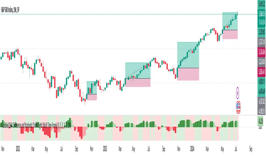
MTF-Colored EMA Difference and Stochastic indicatorThis indicator combines two popular technical analysis tools: the Exponential Moving Average (EMA) and the Stochastic Oscillator, with the added flexibility of analyzing them across multiple time frames. It visually represents the difference between two EMAs and the crossover signals from the Stochastic Oscillator, providing a comprehensive view of the market conditions.
Components:
EMA Difference Histogram :
EMA Calculation : The indicator calculates two EMAs (EMA1 and EMA2) for the selected time frame.
EMA Difference : The difference between EMA1 and EMA2 is plotted as a 4 coloured histogram.
Stochastic Oscillato r:
Calculation : The %K and %D lines of the Stochastic Oscillator are calculated for the selected time frame.
Additional Confirmation via Colors :
Green: %K is above %D, indicating a bullish signal.
Red: %K is below %D, indicating a bearish signal.
Entry and Exit Strategies
Entry Strategy :
Bullish Entry :
Condition 1: The histogram is Dark green (indicating a strong upward trend).
Condition 2: The Stochastic colour is green (%K is above %D).
Bearish Entry :
Condition 1: The histogram is Dark Red (indicating a strong downward trend).
Condition 2: The Stochastic colour is red (%K is below %D).
Exit Strategy:
Bullish Exit:
Condition: The Stochastic colour turns red (%K crosses below %D).
Bearish Exit:
Condition: The Stochastic colour turns green (%K crosses above %D).
Additional Considerations:
Time Frame Selection : The chosen time frame for both the EMA and Stochastic calculations should align with the trader’s strategy (e.g., daily for swing trading, hourly for intraday trading).
Risk Management : Implement stop-loss orders to manage risk effectively. The stop-loss can be placed below the recent swing low for long positions and above the recent swing high for short positions.
Confirmation : Consider using this indicator in conjunction with other technical analysis tools to confirm signals and reduce the likelihood of false entries and exits.
[GYTS-Pro] Flux Composer🧬 Flux Composer (Professional Edition)
🌸 Confluence indicator in GoemonYae Trading System (GYTS) 🌸
The Flux Composer is a powerful tool in the GYTS suite that is designed to aggregate signals from multiple Signal Providers, apply advanced decaying functions, and offer customisable and advanced confluence mechanisms. This allows making informed decisions by considering the strength and agreement ("when all stars align") of various input signals.
🌸 --------- TABLE OF CONTENTS --------- 🌸
1️⃣ Main Highlights
2️⃣ Flux Composer’s Features
Multi Signal Provider support
Advanced decaying functions
Customisable Flux confluence mechanisms
Actionable trading experience
Filtering options
User-friendly experience
Upgrades compared to Community Edition
3️⃣ User Guide
Selecting Signal Providers
Connecting Signal Providers to the Flux Composer
Understanding the Flux
Tuning the decaying functions
Choosing Flux confluence mechanism
Choosing sensitivity
Utilising the filtering options
Interpreting the Flux for trading signals
4️⃣ Limitations
🌸 ------ 1️⃣ --- MAIN HIGHLIGHTS --- 1️⃣ ------ 🌸
- Signal aggregation : Combines signals from multiple different 📡 Signal Providers, each of which can be tuned and adjusted independently.
- Decaying function : Utilises advanced decaying functions to model the diminishing effect of signals over time, ensuring that recent signals have more weight. In addition to the decaying effect, the "quality" of the original signals (e.g. a "strong" GDM from WaveTrend 4D ) are accounted for as well.
- Flux confluence mechanism : The aggregation of all decaying functions form the "Flux", which is the core signal measurement of the Flux Composer. Multiple mechanisms are available for creating the Flux and effectively using it for actionable trading signals.
- Visualisation : Provides detailed visualisation options to help users understand and tune the contributions of individual Signal Providers and their decaying functions.
- Backtesting : The 🧬 Flux Composer is a core component of the TradingView suite of the 🌸 GoemonYae Trading System (GYTS) 🌸. It connects multiple 📡 Signal Providers, such as the WaveTrend 4D, and processes their signals to produce a unified "Flux". This Flux can then be used by the GYTS "🎼 Order Orchestrator" for backtesting and trade automation.
🌸 ------ 2️⃣ --- FLUX COMPOSER'S FEATURES --- 2️⃣ ------ 🌸
Let's delve into more details...
💮 1. Multi Signal Provider support
Using the name of the GYTS "🎼 Order Orchestrator" as an analogy: Imagine a symphony where each instrument plays its own unique part, contributing to the overall harmony. The Flux Composer operates similarly, integrating multiple Signal Providers to create a comprehensive and robust trading signal -- the "Flux". Currently, it supports up to four streams from the WaveTrend 4D's ’s Gradient Divergence Measure (GDM) and another four streams from the Quantile Median Cross (QMC). These can be either four "Professional Edition" Signal Providers or eight "Community Editions".
Note that the GDM includes 2 different continuous signals and the QMC 3 different continuous signals (from different frequencies). This means that the Community Edition can handle 2*2 + 2*3 = 10 different continuous signals and the Professional Edition as much as 20.
As GYTS evolves, more Signal Providers will be added; at the moment of releasing the Flux Composer, only WaveTrend 4D is publicly available.
💮 2. Advanced decaying functions
A trading signal can be relevant today, less relevant tomorrow, and irrelevant in a week's time. In other words, its relevance diminishes, or decays , over time. The Flux Composer utilises decaying functions that ensure that recent signals carry more weight, while older signals fade away. This is crucial for accurate signal processing. The intensity and decay settings allow for precise control, allowing emphasising certain signals based on their strength and relevance over time. On top of that, unlike binary signals ("buy now"), the Flux Composer utilises the actual values from the Signal Providers, differentiating between the exact quality of signals, and thus offering a detailed representation of the trading landscape. We will illustrate this in a further section.
💮 3. Customisable Flux confluence mechanisms
Another core component of the Flux Composer is the ability of intelligently combining the decaying functions. It offers four sophisticated confluence mechanisms: Amplitude Compression, Accentuated Amplitude Compression, Trigonometric, and GYTSynthesis. Each mechanism has its unique way of processing the Flux, tailored to different trading needs. For instance, the Amplitude Compression method scales the Flux based on recent values, much like the Stochastic Oscillator, while the Trigonometric method uses smooth functions to reduce outliers’ impact. The GYTSynthesis is a proprietary method, striking a balance between signal strength and discriminative power.
We'll discuss this in more detail in the User Guide section.
💮 4. Actionable trading experience
While the mathematical abilities might seem overwhelming, the goal of the Flux Composer is to transform complex signal data into actionable trading signals. When the Flux reaches certain thresholds, it generates clear bullish or bearish signals, making it easy for traders to interpret. The inclusion of upper and lower thresholds (UT and LT) helps in identifying strong signals visually and should be a familiar behaviour similar to how many other indicators operate. Furthermore, the Flux Composer can plot trading signals directly on the oscillator, showing triangle shapes for buy or sell signals. This visual aid is complemented by the possibility to setup TradingView alerts.
💮 5. Filtering options
The Professional Edition also offers filtering options to possibly further improve the quality of Flux signals. Signal streams can be divided into “Signal Flux” and “Filter Flux.” The Filter Flux acts as a gatekeeper, ensuring that only signals meeting the Filter's criteria (which consist of similar UT/LT thresholds) are considered for trading. This dual-layer approach enhances the reliability of trading signals, reducing the chances of false positives.
💮 6. User-friendly experience
GYTS is all about sophisticated, robust methods but also "elegance". One of the interpretations of the latter, is that the users' experience is very important. Despite the Flux Composer's mathematical underpinnings, it offers intuitive settings that with omprehensive tooltips to help with a smooth setup process. For those looking to fine-tune their signals, the Flux Composer allows the visualisation of individual decaying functions. This feature helps users understand the impact of each setting and make informed adjustments. Additionally, the background of the chart can be coloured to indicate the trading direction suggested by the Filter Flux, providing an at-a-glance overview of market conditions.
💮 7. Upgrades compared to Community Edition
Number of signal streams -- At the moment of writing, the Professional Edition works with 4x GDM and 4x QMC signal streams from WaveTrend 4D Signal Provider , while Community Edition (CE) Flux Composer (FC) only works with 2x GDM and 2x QMC signal streams.
Flux confluence mechanism -- CE includes the Amplitude Compression and Trigonometric confluence mechanisms, while the Pro Edition also includes the Accentuated Amplitude Compression and the GYTSynthesis mechanisms.
Signal streams as filters -- The Pro Edition can use Signal Providers as filters.
🌸 ------ 3️⃣ --- USER GUIDE --- 3️⃣ ------ 🌸
💮 1. Selecting Signal Providers
The Flux Composer’s foundation lies in its Signal Providers. When starting with the Flux Composer, using a single Signal Provider can already provide significant value due to the nature of decaying functions. For instance, the WaveTrend 4D signal provider includes up to 5 signal types (GDM and QMC in different frequencies) in a single direction (long/short). Moreover, the various confluence mechanisms that enhance the resulting Flux result in improved discrimination between weak and strong signals. This approach is akin to ensemble learning in machine learning, where multiple models are combined to improve predictive performance.
While using a single Signal Provider is beneficial, the true power of the Flux Composer is realised with multiple Signal Providers. Here are two general approaches to selecting Signal Providers:
Diverse Behaviours
Use Signal Providers with different behaviours, such as WaveTrend 4D on various assets/timeframes or entirely different Signal Providers. This approach leverages diversification to achieve robustness, rooted in the principle that varied sources enhance the overall signal quality. To explain this with an analogy, this strategy aligns with the theory of diversification in portfolio management, where combining uncorrelated assets reduces overall risk. Similarly, combining uncorrelated signals can mitigate the risk of signal failure. A practical example can be integrating a mean-reversion signal with a trend-following signal -- these can balance each other out, providing more stable outputs over different market conditions.
Enhancing a Single Provider
If you consider a particular Signal Provider highly effective, you could improve its robustness by using multiple instances with slight variations. These variations could include different sources (e.g., close, HL2, HLC3), data providers (same asset across different brokers/exchanges), or parameter adjustments. This method mirrors Monte Carlo simulations, often used in risk management and derivative pricing, which involve running many simulations with varied inputs to estimate the probability of different outcomes. By applying similar principles, the strategy becomes less susceptible to overfitting, ensuring the signals are not overly dependent on specific data conditions.
💮 2. Connecting Signal Providers to the Flux Composer
Moving on to practicalities: how do you connect Signal Providers with the Flux Composer? You may have noticed that when you open the drawdown of a data source in a TradingView indicator (with "open", "high", "low", etc.), you also see names from other indicators on your chart. We call these "streams", and the Signal Providers are designed such that they output this stream in a way that the Flux Composer can interpret it. Thus, to connect a Signal Provider with the Flux Composer, you should first have that Signal Provider on your chart. Obviously you should set it up an a way that it seems to provide good signals. After that, in the Data Stream dropdown in the Flux Composer, you can select the stream that is outputted by your Signal Provider. This will always be with a prefix of "🔗 STREAM" (after the Signal Provider's indicator name). See the chart below.
There is one important nuance: when you have multiple (similar) Signal Providers on your chart, it may be hard to select the correct data stream in the Flux Composer as the names of the streams keep repeating when you use identical indicators. So be sure to be attentive as you might end up using the same signals multiple times.
Also, the Signal Providers have an "Indicator name" parameter (and another parameter to repeat this name) that is handy to use when you have multiple Signal Providers on your screen. It is handy to give names that describe the unique settings of that Signal Provider so you can better differentiate what you are looking at on your screen.
💮 3. Understanding the Flux
Let's understand how the Signal Provider's signals are processed. In the chart below, you see we have one Signal Provider (WaveTrend 4D) connected to the Flux Composer and that it gives a bearish QMC signal. The Flux Composer converts this into a decaying function. You can show these functions per Signal Provider when the option "Show decaying function of Signal Provider" is enabled (as it is in the chart).
In our opinion, of crucial importance is the ability to process the quality of signals, rather than just any signal. In mathematical terms, we are interested in continuous signals as these provide a spectrum of values. These signals can reflect varying degrees of market sentiment or trend strength, offering richer information than binary signals, which offer only two states (e.g., buy/sell). Especially in the context of the Flux Composer, where you aggregate multiple signals, it makes a big difference whether you combine 10 weak signals or 10 strong signals. To illustrate this principle, look at the chart below where there are 4 signals of different strengths. As you can see, each of the signals affects the Flux with different intensities.
💮 4. Tuning the decaying functions
As previously mentioned, the decaying functions are a way to give more importance to recent signals while allowing older ones to fade away gradually. This mimics the natural way we assess information, giving more weight to recent events. The decaying functions in the Flux Composer are highly customisable while remaining easy to use. You can adjust the initial intensity , which sets the starting strength of a signal, and the decay rate, which determines how quickly this signal diminishes over time. Let's look at specific examples.
If we add 3 Flux Composers on the chart, connect the same Signal Provider, keep all settings the same with one exception, we get the chart below. Here we have changed the "intensity" parameter of the specific signal. As you can see, the decaying functions are different. The intensity determines the initial strength of the decayed function. Adjusting the intensity allows you to emphasise certain signal types based on their perceived reliability or importance.
Let's now keep the intensity the same ("normal"), but change the "decay" parameter. As you can see in the image below, the decay controls how quickly the signal’s strength diminishes over time. By adjusting the decay, you can model the longevity of the signal’s impact. A faster decay means the signal loses its influence quickly, while a slower decay means it remains relevant for a longer period.
So how do multiple signals interact? You can see this as a simple "stacking of decaying functions" (although there is more to it, see next section). In the chart below we different strenghts of signals and different decay rates to illustrate how the Flux is constructed.
Hopefully this helps with developing some intuition how signals are converted to decaying functions, how you can control them, and how the Flux is constructed. When tuning these parameters, use the visualisation options to see how individual decaying functions contribute to the overall Flux. This helps in understanding and refining the parameters to achieve the desired trading signal behaviour.
💮 5. Choosing Flux confluence mechanism
While we mentioned that the Flux is a "stacking of individual decaying functions", in the back-end, that is not exactly that simple. Like previously mentioned, for GYTS, "elegance" is very important. One of the interpretations is "user friendliness" and the Flux confluence mechanism is one of the essential developments for this characteristic. The Flux confluence mechanism is critical in synthesising the aggregated signals into the Flux. The choice of mechanism affects how the signals are combined and the resulting trading signals. The Professional Edition offers four distinct mechanisms, each with its strengths.
The Amplitude Compression mechanism is intuitive, scaling the Flux based on recent values, intuitively not unlike the method of the well-known Stochastic Oscillator. The Accentuated Amplitude Compression method takes this a step further, giving more weight to strong Flux values. The Trigonometric mechanism smooths the Flux and reduces the impact of outliers, providing a balanced approach. Finally, the GYTSynthesis mechanism, a proprietary approach, balances signal strength and discriminative power, making it easier to tune and generalise.
It's difficult to convey the workings of the Flux confluence mechanism in a chart, but let's take the opportunity to show how the Flux would look like when connecting both one WaveTrend 4D Signal Provider signals to four Flux Composers with default settings, except the Flux confluence mechanism:
You may notice subtle differences between the four methods. They react differently to different values and their overall shape is slightly be different. The Amplitude Compression is more "pointy" and GYTSynthesis doesn't react to low values. There are many nuances, especially in combination with tuning the sensitivity and upper/lower threshold (UT/LT) parameters.
💮 6. Choosing sensitivity
Speaking of the sensitivity , this parameters fine-tunes how responsive the Flux is to the input signals. Higher sensitivity results in more pronounced responses, leading to more frequent trading signals. Lower sensitivity makes the Flux less responsive, resulting in fewer but potentially more reliable signals.
You might think that changing the upper/lower threshold (UT/LT) parameters would be equivalent, but that's not the case. The sensitivity In case of the Amplitude Compression mechanisms, changing the sensitivity would change the relative Flux shape over time, and with the Trigonometric and GYTSynthesis mechanisms, the Flux shape itself (independent of time) would change. In other words, these are all good parameters for tuning.
💮 7. Utilising the filtering options
When choosing the signal stream of a Signal Provider, you can also change the default "Signal" category of that Signal Provider to a "Filter". In the example below, two Signal Providers are connected; the second is set as a filter. You can see that a second row of a Flux is shown in the Flux Composer (this visualisation can be disabled), corresponding with the signals of the second Signal Provider.
Logically, only when the Filter Flux gives a signal in a certain direction, signals from the regular Signal Flux are registered. Generally speaking, for this use case it is handy to set the thresholds for the Filter Flux low and possibly to decrease the decay rate so that the filtering is active for a long enough time.
💮 8. Interpreting the Flux for trading signals
Lastly, the Signal Flux gives buy and sell signals when it crosses the upper/lower thresholds (UT/LT), when the filter allows it (if enabled). This can be visualised with the triangles as you may have seen in the charts in the previous sections. For people using TradingView's alerts -- these would work too out of the box. And finally, for backtesting and possibly trade automation, we will have the GYTS "🎼 Order Orchestrator" that connects with the Flux Composer.
🌸 ------ 4️⃣ --- LIMITATIONS --- 4️⃣ ------ 🌸
Only 🌸 GYTS 📡 Signal Providers are supported, as there is a specific method to pass continuous (non-binary) data in the data stream
At the moment of release, only the WaveTrend 4D Signal Provider is available. Other Signal Providers will be gradually released.

[GYTS-CE] Flux Composer🧬 Flux Composer (Community Edition)
🌸 Confluence indicator in GoemonYae Trading System (GYTS) 🌸
The Flux Composer is a powerful tool in the GYTS suite that is designed to aggregate signals from multiple Signal Providers, apply customisable decaying functions, and offer customisable and advanced confluence mechanisms. This allows making informed decisions by considering the strength and agreement ("when all stars align") of various input signals.
🌸 --------- TABLE OF CONTENTS --------- 🌸
1️⃣ Main Highlights
2️⃣ Flux Composer’s Features
Multi Signal Provider support
Advanced decaying functions
Customisable Flux confluence mechanisms
Actionable trading experience
User-friendly experience
3️⃣ User Guide
Selecting Signal Providers
Connecting Signal Providers to the Flux Composer
Understanding the Flux
Tuning the decaying functions
Choosing Flux confluence mechanism
Choosing sensitivity
Interpreting the Flux for trading signals
4️⃣ Limitations
🌸 ------ 1️⃣ --- MAIN HIGHLIGHTS --- 1️⃣ ------ 🌸
- Signal aggregation : Combines signals from multiple different 📡 Signal Providers, each of which can be tuned and adjusted independently.
- Decaying function : Utilises advanced decaying functions to model the diminishing effect of signals over time, ensuring that recent signals have more weight. In addition to the decaying effect, the "quality" of the original signals (e.g. a "strong" GDM from WaveTrend 4D with GDM ) are accounted for as well.
- Flux confluence mechanism : The aggregation of all decaying functions form the "Flux", which is the core signal measurement of the Flux Composer. Multiple mechanisms are available for creating the Flux and effectively using it for actionable trading signals.
- Visualisation : Provides detailed visualisation options to help users understand and tune the contributions of individual Signal Providers and their decaying functions.
- Backtesting : The 🧬 Flux Composer is a core component of the TradingView suite of the 🌸 GoemonYae Trading System (GYTS) 🌸. It connects multiple 📡 Signal Providers, such as the WaveTrend 4D, and processes their signals to produce a unified "Flux". This Flux can then be used by the GYTS "🎼 Order Orchestrator" for backtesting and trade automation.
🌸 ------ 2️⃣ --- FLUX COMPOSER'S FEATURES --- 2️⃣ ------ 🌸
Let's delve into more details...
💮 1. Multi Signal Provider support
Using the name of the GYTS "🎼 Order Orchestrator" as an analogy: Imagine a symphony where each instrument plays its own unique part, contributing to the overall harmony. The Flux Composer operates similarly, integrating multiple Signal Providers to create a comprehensive and robust trading signal -- the "Flux". Currently, it supports up to two streams from the WaveTrend 4D’s Gradient Divergence Measure (GDM) and another two streams from the WaveTrend 4D's Quantile Median Cross (QMC) .
Note that the GDM includes 2 different continuous signals and the QMC 3 different continuous signals (from different frequencies). This means that the Community Edition can handle 2*2 + 2*3 = 10 different continuous signals.
As GYTS evolves, more Signal Providers will be added; at the moment of releasing the Flux Composer, only WaveTrend 4D with GDM and with QMC are publicly available.
💮 2. Advanced decaying functions
A trading signal can be relevant today, less relevant tomorrow, and irrelevant in a week's time. In other words, its relevance diminishes, or decays , over time. The Flux Composer utilises decaying functions that ensure that recent signals carry more weight, while older signals fade away. This is crucial for accurate signal processing. The intensity and decay settings allow for precise control, allowing emphasising certain signals based on their strength and relevance over time. On top of that, unlike binary signals ("buy now"), the Flux Composer utilises the actual values from the Signal Providers, differentiating between the exact quality of signals, and thus offering a detailed representation of the trading landscape. We will illustrate this in a further section.
💮 3. Customisable Flux confluence mechanisms
Another core component of the Flux Composer is the ability of intelligently combining the decaying functions. It offers two sophisticated confluence mechanisms: Amplitude Compression and Trigonometric. Each mechanism has its unique way of processing the Flux, tailored to different trading needs. The Amplitude Compression method scales the Flux based on recent values, much like the Stochastic Oscillator, while the Trigonometric method uses smooth functions to reduce outliers’ impact We'll discuss this in more detail in the User Guide section.
💮 4. Actionable trading experience
While the mathematical abilities might seem overwhelming, the goal of the Flux Composer is to transform complex signal data into actionable trading signals. When the Flux reaches certain thresholds, it generates clear bullish or bearish signals, making it easy for traders to interpret. The inclusion of upper and lower thresholds (UT and LT) helps in identifying strong signals visually and should be a familiar behaviour similar to how many other indicators operate. Furthermore, the Flux Composer can plot trading signals directly on the oscillator, showing triangle shapes for buy or sell signals. This visual aid is complemented by the possibility to setup TradingView alerts.
💮 5. User-friendly experience
GYTS is all about sophisticated, robust methods but also "elegance". One of the interpretations of the latter, is that the users' experience is very important. Despite the Flux Composer's mathematical underpinnings, it offers intuitive settings that with omprehensive tooltips to help with a smooth setup process. For those looking to fine-tune their signals, the Flux Composer allows the visualisation of individual decaying functions. This feature helps users understand the impact of each setting and make informed adjustments.
🌸 ------ 3️⃣ --- USER GUIDE --- 3️⃣ ------ 🌸
💮 1. Selecting Signal Providers
The Flux Composer’s foundation lies in its Signal Providers. When starting with the Flux Composer, using a single Signal Provider can already provide significant value due to the nature of decaying functions. For instance, the WaveTrend 4D signal provider includes up to two GDM and three QMC signals in a single direction (long/short). Moreover, the various confluence mechanisms that enhance the resulting Flux result in improved discrimination between weak and strong signals. This approach is akin to ensemble learning in machine learning, where multiple models are combined to improve predictive performance.
While using a single Signal Provider is beneficial, the true power of the Flux Composer is realised with multiple Signal Providers. Here are two general approaches to selecting Signal Providers:
Diverse Behaviours
Use Signal Providers with different behaviours, such as WaveTrend 4D on various assets/timeframes or entirely different Signal Providers. This approach leverages diversification to achieve robustness, rooted in the principle that varied sources enhance the overall signal quality. To explain this with an analogy, this strategy aligns with the theory of diversification in portfolio management, where combining uncorrelated assets reduces overall risk. Similarly, combining uncorrelated signals can mitigate the risk of signal failure. A practical example can be integrating a mean-reversion signal with a trend-following signal -- these can balance each other out, providing more stable outputs over different market conditions.
Enhancing a Single Provider
If you consider a particular Signal Provider highly effective, you could improve its robustness by using multiple instances with slight variations. These variations could include different sources (e.g., close, HL2, HLC3), data providers (same asset across different brokers/exchanges), or parameter adjustments. This method mirrors Monte Carlo simulations, often used in risk management and derivative pricing, which involve running many simulations with varied inputs to estimate the probability of different outcomes. By applying similar principles, the strategy becomes less susceptible to overfitting, ensuring the signals are not overly dependent on specific data conditions.
💮 2. Connecting Signal Providers to the Flux Composer
Moving on to practicalities: how do you connect Signal Providers with the Flux Composer? You may have noticed that when you open the drawdown of a data source in a TradingView indicator (with "open", "high", "low", etc.), you also see names from other indicators on your chart. We call these "streams", and the Signal Providers are designed such that they output this stream in a way that the Flux Composer can interpret it. Thus, to connect a Signal Provider with the Flux Composer, you should first have that Signal Provider on your chart. Obviously you should set it up an a way that it seems to provide good signals. After that, in the Data Stream dropdown in the Flux Composer, you can select the stream that is outputted by your Signal Provider. This will always be with a prefix of "🔗 STREAM" (after the Signal Provider's indicator name). See the chart below.
There is one important nuance: when you have multiple (similar) Signal Providers on your chart, it may be hard to select the correct data stream in the Flux Composer as the names of the streams keep repeating when you use identical indicators. So be sure to be attentive as you might end up using the same signals multiple times.
Also, the Signal Providers have an "Indicator name" parameter (and another parameter to repeat this name) that is handy to use when you have multiple Signal Providers on your screen. It is handy to give names that describe the unique settings of that Signal Provider so you can better differentiate what you are looking at on your screen.
💮 3. Understanding the Flux
Let's understand how the Signal Provider's signals are processed. In the chart below, you see we have one Signal Provider (WaveTrend 4D) connected to the Flux Composer and that it gives a bearish QMC signal. The Flux Composer converts this into a decaying function. You can show these functions per Signal Provider when the option "Show decaying function of Signal Provider" is enabled (as it is in the chart).
In our opinion, of crucial importance is the ability to process the quality of signals, rather than just any signal. In mathematical terms, we are interested in continuous signals as these provide a spectrum of values. These signals can reflect varying degrees of market sentiment or trend strength, offering richer information than binary signals, which offer only two states (e.g., buy/sell). Especially in the context of the Flux Composer, where you aggregate multiple signals, it makes a big difference whether you combine 10 weak signals or 10 strong signals. To illustrate this principle, look at the chart below where there are 4 signals of different strengths. As you can see, each of the signals affects the Flux with different intensities.
💮 4. Tuning the decaying functions
As previously mentioned, the decaying functions are a way to give more importance to recent signals while allowing older ones to fade away gradually. This mimics the natural way we assess information, giving more weight to recent events. The decaying functions in the Flux Composer are highly customisable while remaining easy to use. You can adjust the initial intensity , which sets the starting strength of a signal, and the decay rate, which determines how quickly this signal diminishes over time. Let's look at specific examples.
If we add 3 Flux Composers on the chart, connect the same Signal Provider, keep all settings the same with one exception, we get the chart below. Here we have changed the "intensity" parameter of the specific signal. As you can see, the decaying functions are different. The intensity determines the initial strength of the decayed function. Adjusting the intensity allows you to emphasise certain signal types based on their perceived reliability or importance.
Let's now keep the intensity the same ("normal"), but change the "decay" parameter. As you can see in the image below, the decay controls how quickly the signal’s strength diminishes over time. By adjusting the decay, you can model the longevity of the signal’s impact. A faster decay means the signal loses its influence quickly, while a slower decay means it remains relevant for a longer period.
So how do multiple signals interact? You can see this as a simple "stacking of decaying functions" (although there is more to it, see next section). In the chart below we use different "intensity" and "decay" parameters to discuss how the Flux is created.
Hopefully this helps with developing some intuition how signals are converted to decaying functions, how you can control them, and how the Flux is constructed. When tuning these parameters, use the visualisation options to see how individual decaying functions contribute to the overall Flux. This helps in understanding and refining the parameters to achieve the desired trading signal behaviour.
💮 5. Choosing Flux confluence mechanism
While we mentioned that the Flux is a "stacking of individual decaying functions", in the back-end, that is not exactly that simple. Like previously mentioned, for GYTS, "elegance" is very important. One of the interpretations is "user friendliness" and the Flux confluence mechanism is one of the essential developments for this characteristic. The Flux confluence mechanism is critical in synthesising the aggregated signals into the Flux. The choice of mechanism affects how the signals are combined and the resulting trading signals. The Community Edition offers two distinct mechanisms, each with its strengths.
The Amplitude Compression mechanism is intuitive, scaling the Flux based on recent values, intuitively not unlike the method of the well-known Stochastic Oscillator. On the other hand, the Trigonometric mechanism smooths the Flux and reduces the impact of outliers, providing a balanced approach. It's difficult to convey the workings of the Flux confluence mechanism in a chart, but let's take the opportunity to show how the Flux would look like when connecting both GDM and QMC signals to two Flux Composers with default settings, except the Flux confluence mechanism:
You can notice that the upper Flux Converter (FC) triggered two signals while the other FC triggered only one. There are more nuances, especially in combination with tuning the sensitivity and upper/lower threshold (UT/LT) parameters.
💮 6. Choosing sensitivity
Speaking of the sensitivity , this parameters fine-tunes how responsive the Flux is to the input signals. Higher sensitivity results in more pronounced responses, leading to more frequent trading signals. Lower sensitivity makes the Flux less responsive, resulting in fewer but potentially more reliable signals.
You might think that changing the upper/lower threshold (UT/LT) parameters would be equivalent, but that's not the case. The sensitivity In case of the Amplitude Compression mechanism, changing the sensitivity would change the relative Flux shape over time, and with the Trigonometric mechanism, the Flux shape itself (independent of time) would change. In other words, these are all good parameters for tuning.
💮 8. Interpreting the Flux for trading signals
Lastly, the Signal Flux gives buy and sell signals when it crosses the upper/lower thresholds (UT/LT) This can be visualised with the triangles as you may have seen in the charts in the previous sections. For people using TradingView's alerts -- these would work out of the box. And finally, for backtesting and possibly trade automation, we will have the GYTS "🎼 Order Orchestrator" that connects with the Flux Composer.
🌸 ------ 4️⃣ --- LIMITATIONS --- 4️⃣ ------ 🌸
Only 🌸 GYTS 📡 Signal Providers are supported, as there is a specific method to pass continuous (non-binary) data in the data stream
At the moment of release, only WaveTrend 4D with GDM and with QMC are available. Other Signal Providers will be gradually released.

Market Sentiment Technicals [LuxAlgo]The Market Sentiment Technicals indicator synthesizes insights from diverse technical analysis techniques, including price action market structures, trend indicators, volatility indicators, momentum oscillators, and more.
The indicator consolidates the evaluated outputs from these techniques into a singular value and presents the combined data through an oscillator format, technical rating, and a histogram panel featuring the sentiment of each component alongside the overall sentiment.
🔶 USAGE
The Market Sentiment Technicals indicator is a tool able to swiftly and easily gauge market sentiment by consolidating the individual sentiment from multiple technical analysis techniques applied to market data into a single value, allowing users to asses if the market is uptrending, consolidating, or downtrending.
The tool includes various components and presentation formats, each described in the sub-sections below.
🔹Indicators Sentiment Panel
The indicators sentiment panel provides normalized sentiment scores for each supported indicator, along with a synthesized representation derived from the average of all individual normalized sentiments.
🔹Market Sentiment Meter
The market sentiment meter is obtained from the synthesized representation derived from the average of all individual normalized sentiments. It allows users to quickly and easily gauge the overall market sentiment.
🔹Market Sentiment Oscillator
The market sentiment oscillator provides a visual means to monitor the current and historical strength of the market. It assists in identifying the trend direction, trend momentum, and overbought and oversold conditions, aiding in the anticipation of potential trend reversals.
Divergence occurs when there is a difference between what the price action is indicating and what the market sentiment oscillator is indicating, helping traders assess changes in the price trend.
🔶 DETAILS
The indicator employs a range of technical analysis techniques to interpret market data. Each group of indicators provides valuable insights into different aspects of market behavior.
🔹Momentum Indicators
Momentum indicators assess the speed and change of price movements, often indicating whether a trend is strengthening or weakening.
Relative Strength Index (RSI): Measures the magnitude of recent price changes to evaluate overbought or oversold conditions.
Stochastic %K: Compares the closing price to the range over a specified period to identify potential reversal points.
Stochastic RSI Fast: Combines features of Stochastic oscillators and RSI to gauge both momentum and overbought/oversold levels efficiently.
Commodity Channel Index (CCI): Measures the deviation of an asset's price from its statistical average to determine trend strength and overbought and oversold conditions.
Bull Bear Power: Evaluates the strength of buying and selling pressure in the market.
🔹Trend Indicators
Trend indicators help traders identify the direction of a market trend.
Moving Averages: Provides a smoothed representation of the underlying price data, aiding in trend identification and analysis.
Bollinger Bands: Consists of a middle band (typically a simple moving average) and upper and lower bands, which represent volatility levels of the market.
Supertrend: A trailing stop able to identify the current direction of the trend.
Linear Regression: Fits a straight line to past data points to predict future price movements and identify trend direction.
🔹Market Structures
Market Structures: Analyzes the overall pattern of price movements, including Break of Structure (BOS), Market Structure Shifts (MSS), also referred to as Change of Character (CHoCH), aiding in identifying potential market turning and continuation points.
🔹The Normalization Technique
The normalization technique employed for trend indicators relies on buy-sell signals. The script tracks price movements and normalizes them based on these signals.
normalize(buy, sell, smooth)=>
var os = 0
var float max = na
var float min = na
os := buy ? 1 : sell ? -1 : os
max := os > os ? close : os < os ? max : math.max(close, max)
min := os < os ? close : os > os ? min : math.min(close, min)
ta.sma((close - min)/(max - min), smooth) * 100
In this Pine Script snippet:
The variable os tracks market sentiment, taking a value of 1 for buy signals and -1 for sell signals, indicating bullish and bearish sentiments, respectively.
max and min are used to identify extremes in sentiment and are updated based on changes in os . When market sentiment shifts from buying to selling (or vice versa), max and min adjust accordingly.
Normalization is achieved by comparing current price levels to historical extremes in sentiment. The result is smoothed by default using a 3-period simple moving average. Users have the option to customize the smoothing period via the script settings input menu.
🔶 SETTINGS
🔹Generic Settings
Timeframe: This option selects the timeframe for calculating sentiment. If a timeframe lower than the chart's is chosen, calculations will be based on the chart's timeframe.
Horizontal Offset: Determines the distance at which the visual components of the indicator will be displayed from the primary chart.
Gradient Colors: Allows customization of gradient colors.
🔹Indicators Sentiment Panel
Indicators Sentiment Panel: Toggle the visibility of the indicators sentiment panel.
Panel Height: Determines the height of the panel.
🔹Market Sentiment Meter
Market Sentiment Meter: Toggle the visibility of the market sentiment meter (technical ratings in the shape of a speedometer).
🔹Market Sentiment Oscillator
Market Sentiment Oscillator: Toggle the visibility of the market sentiment oscillator.
Show Divergence: Enables detection of divergences based on the selected option.
Oscillator Line Width: Customization option for the line width.
Oscillator Height: Determines the height of the oscillator.
🔹Settings for Individual Components
In general,
Source: Determines the data source for calculations.
Length: The period to be used in calculations.
Smoothing: Degree of smoothness of the evaluated values.
🔹Normalization Settings - Trend Indicators
Smoothing: The period used in smoothing normalized values, where normalization is applied to moving averages, Bollinger Bands, Supertrend, VWAP bands, and market structures.
🔶 LIMITATIONS
Like any technical analysis tool, the Market Sentiment Technicals indicator has limitations. It's based on historical data and patterns, which may not always accurately predict future market movements. Additionally, market sentiment can be influenced by various factors, including economic news, geopolitical events, and market psychology, which may not be fully captured by technical analysis alone.

Multi-Chart Widget [LuxAlgo]The Multi-Chart Widget tool is a comprehensive solution crafted for traders and investors looking to analyze multiple financial instruments simultaneously. With the capability to showcase up to three additional charts, users can customize each chart by selecting different financial instruments, and timeframes.
Users can add various widely used technical indicators to the charts such as the relative strength index, Supertrend, moving averages, Bollinger Bands...etc.
🔶 USAGE
The tool offers traders and investors a comprehensive view of multiple charts simultaneously. By displaying up to three additional charts alongside the primary chart, users can analyze assets across different timeframes, compare their performance, and make informed decisions.
Users have the flexibility to choose from various customizable chart types, including the recently added "Volume Candles" option.
This tool allows adding to the chart some of the most widely used technical indicators, such as the Supertrend, Bollinger Bands, and various moving averages.
In addition to the charting capabilities, the tool also features a dynamic statistic panel that provides essential metrics and key insights into the selected assets. Users can track performance indicators such as relative strength, trend, and volatility, enabling them to identify trends, patterns, and trading opportunities efficiently.
🔶 DETAILS
A brief overview of the indicators featured in the statistic panel is given in the sub-section below:
🔹Dual Supertrend
The Dual Supertrend is a modified version of the Supertrend indicator, which is based on the concept of trend following. It generates buy or sell signals by analyzing the asset's price movement. The Dual Supertrend incorporates two Supertrend indicators with different parameters to provide potentially more accurate signals. It helps traders identify trend reversals and establish trend direction in a more responsive manner compared to a single Supertrend.
🔹Relative Strength Index
The Relative Strength Index is a momentum oscillator that measures the speed and change of price movements. RSI oscillates between 0 and 100 and is typically used to identify overbought or oversold conditions in a market. Traditionally, RSI values above 70 are considered overbought, suggesting that the asset may be due for a reversal or correction, while RSI values below 30 are considered oversold, indicating potential buying opportunities.
🔹Volatility
Volatility in trading refers to the degree of variation or fluctuation in the price of a financial instrument, such as a stock, currency pair, or commodity, over a certain period of time. It is a measure of the speed and magnitude of price changes and reflects the level of uncertainty or risk in the market. High volatility implies that prices are experiencing rapid and significant movements, while low volatility suggests that prices are relatively stable and are not changing much. Traders often use volatility as an indicator to assess the potential risk and return of an investment and to make informed decisions about when to enter or exit trades.
🔹R-Squared (R²)
R-squared, also known as the coefficient of determination, is a statistical measure that indicates the proportion of the variance in the dependent variable that is predictable from the independent variable(s). In other words, it quantifies the goodness of fit of a regression model to the observed data. R-squared values range from %0 to %100, with higher values indicating a better fit of the model to the data. An R-squared of 100% means that all movements of a security are completely explained by movements in the index, while an R-squared value of %0 indicates that the model does not explain any of the variability in the dependent variable.
In simpler terms, in investing, a high R-squared, from 85% to 100%, indicates that the stock’s or fund’s performance moves relatively in line with the index. Conversely, a low R-squared (around 70% or less) indicates that the fund's performance tends to deviate significantly from the movements of the index.
🔶 SETTINGS
🔹Mini Chart(s) Generic Settings
Mini Charts Separator: This option toggles the visibility of the separator lines.
Number Of Bars: Specifies the number of bars to be displayed for each mini chart.
Horizontal Offset: Determines the distance at which the mini charts will be displayed from the primary chart.
🔹Mini Chart Settings: Top - Middle - Bottom
Mini Chart Top/Middle/Bottom: Toggle the visibility of the selected mini chart.
Symbol: Choose the financial instrument to be displayed in the mini chart. If left as an empty string, it will default to the current chart instrument.
Timeframe: This option determines the timeframe used for calculating the mini charts. If a timeframe lower than the chart's timeframe is selected, the calculations will be based on the chart's timeframe.
Chart Type: Selection from various chart types for the mini charts, including candles, volume candles, line, area, columns, high-low, and Heikin Ashi.
Chart Size: Determines the size of the mini chart.
Technical Indicator: Selection from various technical indicators to be displayed on top of the mini charts.
Note : Chart sizing is relative to other mini charts. For example, If all the mini charts are sized to x5 relative to each other, the result will be the same as if they were all sized as x1. This is because the relative proportions between the mini charts remain consistent regardless of their absolute sizes. Therefore, their positions and sizes relative to each other remain unchanged, resulting in the same visual representation despite the differences in absolute scale.
🔹Supertrend Settings
ATR Length: is the lookback length for the ATR calculation.
Factor: is what the ATR is multiplied by to offset the bands from price.
Color: color customization option.
🔹Moving Average Settings
Type: is the type of the moving average, available types of moving averages include SMA (Simple Moving Average), EMA (Exponential Moving Average), RMA (Root Mean Square Moving Average), HMA (Hull Moving Average), WMA (Weighted Moving Average), and VWMA (Volume Weighted Moving Average).
Source: Determines what data from each bar will be used in calculations.
Length: The time period to be used in calculating the Moving Average.
Color: Color customization option.
🔹Bollinger Bands Settings
Basis Type: Determines the type of Moving Average that is applied to the basis plot line.
Source: Determines what data from each bar will be used in calculations.
Length: The time period to be used in calculating the Moving Average which creates the base for the Upper and Lower Bands.
StdDev: The number of Standard Deviations away from the Moving Average that the Upper and Lower Bands should be.
Color: Color customization options for basis, upper and lower bands.
🔹Mini Chart(s) Panel Settings
Mini Chart(s) Panel: Controls the visibility of the panel containing the mini charts.
Dual Supertrend: Toggles the display of the evaluated dual super trend, based on the super trend settings provided below the option. The definitions for the options are the same as stated above for the super trend.
Relative Strength Index: Toggles the display of the evaluated RSI, based on the source and length settings provided below the option.
Volatility: Toggles the display of the calculated Volatility, based on the length settings provided below the option.
R-Squared: Toggles the display of the calculated R-Squared (R²), based on the length settings provided below the option.
🔶 LIMITATIONS
The tool allows users to display mini charts featuring various types of instruments alongside the primary chart instrument. However, there's a limitation: the selected primary chart instrument must have an ACTIVE market status. Alternatively, if the primary chart instrument is not active, the mini chart instruments must belong to the same exchange and have the same type as the primary chart instrument.

[GYTS-CE] Signal Provider | WaveTrend 4D with GDMWaveTrend 4D with Gradient Divergence Measure (Community Edition)
🌸 " 📡 Signal Provider" in GoemonYae Trading System (GYTS) 🌸
WaveTrend 4D (WT4D) is an extension of the incredible WaveTrend 3D (2022, Justin Dehorty) . This oscillator elevates the classic WaveTrend by integrating advanced mathematical models for a multi-dimensional view of market momentum, capturing subtle shifts and trends that traditional indicators might miss. Each oscillator layer uses a combination of normalised derivatives, hyperbolic tangent transformations, and dual-pole filtering (John Ehlers' SuperSmoother), providing normalised and smooth signals with minimised lag.
The name "WaveTrend 4D" is derived from the usage of 4 dimensions, representing different frequencies or timeframes. Next to the "fast", "normal" and "slow" frequency, the fourth frequency is called "lethargic" (very slow). This gives the opportunity utilise more dimensions without having abundant signals, since we quantify and filter the quality of signals.
WT4D strives to help discriminating high-quality signals from the indicator by introducing the Gradient Divergence Measure (GDM) and Quantile Median Crosses (QMC). For simplicity, speed and focus, this particular indicator includes only the GDM part. Check the other 🤲Community Edition of this indicator that focuses on the QMC. For GDM, see below for more information.
🌸 --- GRADIENT DIVERGENCE MEASURE (GDM) --- 🌸
💮 Introduction
--
The GDM dynamically calculates a composite measure based on multiple factors. Unlike traditional binary divergence indicators, GDM employs a continuous value system to capture the nuanced dynamics of market behaviour. This methodology allows traders and analysts to assess the potency of divergence signals with greater precision, facilitating more informed decision-making processes.
💮 Methodology
--
The GDM is calculated using a composite formula that integrates various market dynamics. At its core, it consists of six components listed below, each weighted to optimize the indicator's responsiveness to market conditions:
The magnitude of relative change between waves -- A larger difference between the waves, i.e. lower high or higher low could signify a stronger divergence.
The absolute value of the latest wave -- The strength of the latest wave provides insight into the extremity of the market conditions.
Slope of the divergence -- The slope between the two points of divergence essentially measures the rate of change in the frequency\'s value over time. It captures both the direction and the steepness of the indicator’s move between two waves.
The magnitude of relative change of the price -- A divergence means that the oscillator shows an opposite pattern than price action. Thus, if the price makes a significantly higher high or lower low, but the indicator does not, this discrepancy can be used to measure the divergence strength. This components measures the price's extrema during the crosses of the indicator's waves.
Higher timeframe's frequency trend -- Similarly, instead of looking at the price directly, this component measures the more general trend of the price by using the higher timeframe frequency (i.e. the slow frequency when looking at divergences of the normal frequency).
Time duration -- Lastly, the time duration between the two points of a divergence can also be an important factor. A divergence that spans over a longer period might indicate a more significant market sentiment shift.
💮 Tuning the GDM
--
The 6 components discussed above are not independent, e.g. the slope is actually the result of the magnitude between waves, the absolute value and time duration. However, the default GDM is carefully tuned to include all these features without being too sensitive to outliers.
This makes this indicator very user-friendly. The only core parameter is the the "sensitivity". This controls the extent of normalisation between signals, and essentially affects how often strong GDMs appear. At the conservative end (higher sensitivity), the strong GDMs are less frequent but are relatively significant, while with a lower sensitivity the strong GDMs appear more frequent.
💮 GDM on the Oscillator
--
The GDMs are represented by triangles and their value represents the strength. A value close to `1` signifies a strong bearish divergence and thus a possible reversal of continuation of a downtrend. Similarly, a value close to `-1` signifies a strong bullish divergence.
Note that there are two colour sets which can be enabled and disabled. One uses crosses between the fast and normal frequencies (with the slow frequency acting as the price trend with which there should be an opposite interaction -- hence a "divergence"). Similarly, crosses between the normal and slow frequencies (with the lethargic (the most slow) frequency acting as the price trend) are used to find divergences on a higher timeframe.
Another handy feature is a threshold to more strikingly visualise "strong" GDMs.
🌸 --- GOEMONYAE TRADING SYSTEM --- 🌸
As previously mentioned, this indicator is a 📡 Signal Provider, part of the suite of the GoemonYae Trading System (🤲 Community Edition). The greatest value comes from connecting multiple 📡 Signal Providers to the 🧬 Flux Composer to find confluence between signals. Contrary to most other indicators that connect with each other, the signals that are passed are not just binary signals ("buy" or "sell") but pass the actual GDM and QMC values. This gives the opportunity in the 🧬 Flux Composer to more accurately use multiple signals with different strengths to finally give an overall signal. On its turn, the Flux Composer can be connected to the GYTS "🎼 Order Orchestrator" for backtesting and trade automation.
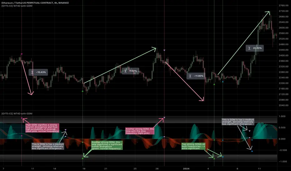
[GYTS-CE] Signal Provider | WaveTrend 4D with QMCWaveTrend 4D with Quantile Median Crosses (Community Edition)
🌸 " 📡 Signal Provider" in GoemonYae Trading System (GYTS) 🌸
WaveTrend 4D (WT4D) is an extension of the incredible WaveTrend 3D (2022, Justin Dehorty) . This oscillator elevates the classic WaveTrend by integrating advanced mathematical models for a multi-dimensional view of market momentum, capturing subtle shifts and trends that traditional indicators might miss. Each oscillator layer uses a combination of normalised derivatives, hyperbolic tangent transformations, and dual-pole filtering (John Ehlers' SuperSmoother), providing normalised and smooth signals with minimised lag.
The name "WaveTrend 4D" is derived from the usage of 4 dimensions, representing different frequencies or timeframes. Next to the "fast", "normal" and "slow" frequency, the fourth frequency is called "lethargic" (very slow). This gives the opportunity utilise more dimensions without having abundant signals, since we quantify and filter the quality of signals.
WT4D strives to help discriminating high-quality signals from the indicator by introducing the Gradient Divergence Measure (GDM) and Quantile Median Crosses (QMC). For simplicity, speed and focus, this particular indicator includes only the QMC part. Check the other 🤲Community Edition of this indicator that focuses on the GDM. For QMC, see below for more information.
🌸 --- QUANTILE MEDIAN CROSSES (QMC) --- 🌸
💮 Introduction
--
A powerful approach when working with WaveTrend is to use the frequencies' crossings of the median (zero) line. This would signify a continuation of the reversal. However, not all of those crossings would be trades with a high probability of success. For this reason, we strive to only consider reversals after the most strong trends start to show weakness. We call these reversals the "Quantile Median Crosses" (QMC), deriving the name from the used methodology.
💮 Methodology
--
To find these "most strong trends", we calculate the integral ("the area") of a frequency between all historical median crosses, and take an upper quantile of those integrals. This means that when the frequency is crossing the median in a period of consolidation, the areas between those crosses would be small. But if there was a strong momentum, and the frequency would separate itself significantly from the median and would do so for a long time, its area would be large.
So after considering all the past integrals, we take the upper quantile of those (i.e. sort all integrals and for example take the top 5%) and if the latest trend's integral was in this upper quantile, it is considered "significant". Hence, the name "quantile" in the name "Quantile Median Cross".
💮 QMC on the Oscillator
--
The QMC is shown as a label "🔴" above the median or with "🟢" below the median. The normal frequency has a "bronze" colour, the slow frequency "silver" and the lethargic is "gold". In addition to the labels, there are also diamond shapes in the same colour drawn on the median in the oscillator. This represents the previous median crossing, and helps the user to see between which two points the integral is calculated.
🌸 --- GOEMONYAE TRADING SYSTEM --- 🌸
As previously mentioned, this indicator is a 📡 Signal Provider, part of the suite of the GoemonYae Trading System (🤲 Community Edition). The greatest value comes from connecting multiple 📡 Signal Providers to the 🧬 Flux Composer to find confluence between signals. Contrary to most other indicators that connect with each other, the signals that are passed are not just binary signals ("buy" or "sell") but pass the actual GDM and QMC values. This gives the opportunity in the 🧬 Flux Composer to more accurately use multiple signals with different strengths to finally give an overall signal. On its turn, the Flux Composer can be connected to the GYTS "🎼 Order Orchestrator" for backtesting and trade automation.

MTF Williams Vix Market Bottoms [CryptoSea]MTF Williams Vix Fix Indicator is a dynamic tool tailored for traders looking to capture market extremes with high precision. This multi-timeframe indicator leverages the concept of the Williams Vix Fix to spot potential reversals before they occur.
Key Features
Multi-Timeframe Analysis: Provides simultaneous visibility across multiple timeframes, enabling traders to assess market conditions comprehensively from a single chart.
Advanced Volatility Detection: Utilizes a modified Vix Fix formula to highlight extreme price deviations, which often precede significant market reversals.
Customizable Settings: Offers extensive input options to tweak the lookback periods, percentile thresholds, and visibility settings, aligning with various trading strategies.
Visual Band Indicators: Features upper bands and range highs that signal potential overbought and oversold conditions, enhancing trading decision-making.
Below, you can see how the indicator performs across different timeframes, providing valuable insights into market behavior.
How it Works
Vix Fix Calculation: Determines the worst-case 'panic' sell-offs in price as a percentage of the high, capturing the emotional extremes of the market.
Statistical Bands: Employs Bollinger bands over the Vix Fix values to define normal and extreme volatility conditions.
Color-Coded Indicators: Uses color differentiation to instantly highlight when readings surpass critical upper band or range high thresholds, signaling key trading opportunities.
For instance, in the analysis provided below, notice how the indicator flags significant market moves, allowing traders to anticipate potential entry or exit points.
Application
Risk Management: Aids in identifying extreme market conditions where prices may revert, helping in effective position sizing and risk management.
Strategic Planning: Enhances strategic trading plans by identifying not only when but also where market extremes may occur, considering multiple timeframes.
Customization: Adapts seamlessly to different market environments with adjustable settings for volatility thresholds and visual display preferences.
The MTF Williams Vix Fix Indicator by is an essential tool for traders aiming to leverage market volatility for optimal entry and exit, ensuring they are well-equipped to handle market extremes with confidence.
HTF Candle Consistency [LuxAlgo]The HTF Candle Consistency indicator tracks the most recent candle sentiment in up to 10 Higher Timeframe (HTF) and colors the user chart candle bodies based on the dominating sentiment. Users can weigh specific timeframes more significantly.
Additionally, the script provides an HTF dashboard that displays the current directional readouts for each selected timeframe to allow for an independent HTF analysis.
🔶 USAGE
Analyzing the movement and direction of higher timeframe candles can help filter out noisy variation from the price, and could be utilized to time trades better. When the majority of recent candles from the selected timeframes are bullish, the candle body will be colored in green, if this majority is bearish it will be colored in red.
Using the "Tricolor" coloring mode introduces a third coloring option, and is used when there isn't a clear sentiment majority across the selected timeframes, this option effectively allows for filtering out unwanted trends.
Users can control the variations to be filtered out depending on their chart timeframe and the enabled HTF's in the settings. Using low timeframes with higher HTF's will gray out a larger amount of candles, disabling these timeframes, changing them, or giving higher weighting to lower HTF's will allow for obtaining more dominance detection, and as such less grayed-out candles.
As seen above, the weight function allows for precise control over the specific elements being analyzed.
This indicator also features a dashboard for viewing each timeframe's direction at the same time. By doing so, it allows for better judgment on the specific elements composing the current HTF majority.
🔶 DETAILS
This indicator is only intended for Higher Timeframe Analysis, all the input timeframes should be kept equal to or lower than your current chart timeframe.
NOTE: This is necessary for data accuracy in most multi-timeframe indicators, and is generally a good practice to keep in mind.
As a reminder, the dashboard will display the timeframe in red text if a lower timeframe is detected. It is recommended to change or disable this timeframe for your analysis.
This indicator can support up to 10 timeframes, each with independent weightings.
NOTE: When a timeframe is disabled, the dashboard will no longer display that timeframe, and it will not be used in calculations.
🔹 Candle Coloring
Candle color can be selected between 3 modes.
Tricolor (Default): Changes the color based on a 3-part split of the possible data sum range.
Bicolor: Changes the color based on the sum being greater than or less than 0.
Gradient: Uses a 3-color gradient to determine the candle color based on the possible data sum range.
🔶 SETTINGS
🔹 Higher Timeframes
Toggle: Enable/Disable the timeframe from analysis.
Timeframe: Select which timeframe to use for analysis. <- NOTE: This input reflects any custom intervals you have created on Tradingview.
Weight: Determines the Weighting (Multiplier) for the timeframe's direction.
🔹 Style
Color Mode: (More details above) Determines the color mode in use for coloring candles.
🔹 Dashboard
General Settings: Control Toggle, Location, & Size of Dashboard on your chart.
Orientation: Choose to display the dashboard in a "Vertical (default)" or "Horizontal" orientation to fit your style.

Multi Timeframe Trend Screener [TradeDots]The "Multi Timeframe Trend Screener" is a trading indicator designed to assist traders in identifying the market trends of multiple assets within a single panel. This tool is invaluable for detecting shifts in trends, enabling traders to easily adjust their strategies under different market conditions.
HOW DOES IT WORK
Upon initialization, the indicator requires users to input two key pieces of information:
The assets to be monitored.
The timeframes to be analyzed.
The tool is capable of simultaneously tracking up to four assets across five distinct timeframes.
By specifying the type and length of the moving average, the indicator uses this data as a baseline to determine the current market trend.
A price movement below the moving average triggers a downward trend symbol (📉), indicating bearish conditions.
Conversely, a movement above the moving average displays an upward trend symbol (📈), signaling bullish conditions.
The aggregation of moving averages across various timeframes provides a comprehensive view of the overall market sentiment.
APPLICATION
In scenarios where the market consistently demonstrates an upward trend, each timeframe will display a bullish symbol. Shifts in market sentiment typically start in the shorter timeframes and can progressively affect longer ones if the trend continues.
This cascading effect allows the indicator to show all timeframes transitioning to a bearish orientation when the trend reverses.
The indicator also facilitates comparison between different assets. For assets with high correlation, a trend shift in one can often predict similar movements in correlated assets, thus allowing traders to swiftly adapt their strategies to align with new market conditions.
RISK DISCLAIMER
Trading entails substantial risk, and most day traders incur losses. All content, tools, scripts, articles, and education provided by TradeDots serve purely informational and educational purposes. Past performances are not definitive predictors of future results.

Multi Timeframe RSI Buy Sell Strategy [TradeDots]The "Multi Timeframe RSI Buy/Sell Strategy" is a trading strategy that utilizes Relative Strength Index (RSI) indicators from multiple timeframes to provide buy and sell signals.
This strategy allows for extensive customization, supporting up to three distinct RSIs, each configurable with its own timeframe, length, and data source.
HOW DOES IT WORK
This strategy integrates up to three RSIs, each selectable from different timeframes and customizable in terms of length and source. Users have the flexibility to define the number of active RSIs. These selections visualize as plotted lines on the chart, enhancing interpretability.
Users can also manage the moving average of the selected RSI lines. When multiple RSIs are active, the moving average is calculated based on these active lines' average value.
The color intensity of the moving average line changes as it approaches predefined buying or selling thresholds, alerting users to potential signal generation.
A buy or sell signal is generated when all active RSI lines simultaneously cross their respective threshold lines. Concurrently, a label will appear on the chart to signify the order placement.
For those preferring not to display order information or activate the strategy, an "Enable backtest" option is provided in the settings for toggling activation.
APPLICATION
The strategy leverages multiple RSIs to detect extreme market conditions across various timeframes without the need for manual timeframe switching.
This feature is invaluable for identifying divergences across timeframes, such as detecting potential short-term reversals within broader trends, thereby aiding traders in making better trading decisions and potentially avoiding losses.
DEFAULT SETUP
Commission: 0.01%
Initial Capital: $10,000
Equity per Trade: 60%
RISK DISCLAIMER
Trading entails substantial risk, and most day traders incur losses. All content, tools, scripts, articles, and education provided by TradeDots serve purely informational and educational purposes. Past performances are not definitive predictors of future results.
TradeDots Stochastic Z-Score