I4I Inside Vortex Strike RateThis indicator identifies what I call an "Inside Vortex": It's similar to a Doji but more strict in having to be inside a keltner and also have a lower ATR than a blended average.
The bar itself is not that special. But it indicates that a potential big move might come in the next 2 periods.
After the patter: It then looks at what I call the Market Maker High and Low: A % of a blended ATR. It then looks back 100-200 or more bars and calculates the overall strike % in history for the High and low after the pattern happens.
This allows us to know how often these levels are hit within the next 2 periods to find if we have any edge on spread, call or put prices or use them as targets.
So its:
Pattern:
Levels
Strike Rate.
Very unique and EXTREME useful. Especially for options traders.
Spreads

Yield Curve InversionThe Yield Curve Inversion indicator is a tool designed to help traders and analysts visualize and interpret the dynamics between the US 10-year and 2-year Treasury yields. This indicator is particularly useful for identifying yield curve inversions, often seen as a precursor to economic recessions.
Features and Interpretations
Display Modes: Choose between "Spread Mode" to visualize the yield spread indicating normal (green) or inverted (red) curves, or "Both Yields Mode" to view both yields.
Yield Spread: A plotted difference between 10-year and 2-year yields, with a zero line marking inversion. A negative spread suggests potential economic downturns.
Color Coding: Green for a normal yield curve (10Y > 2Y) and red for an inverted curve (2Y > 10Y).
Legend: Provides quick reference to yield curve states for easier interpretation.
This indicator is for educational and informational purposes only. It should not be considered financial advice or a recommendation to buy or sell any financial instruments. Users should conduct their own research and consult with a financial advisor before making investment decisions. The creator of this indicator is not responsible for any financial losses incurred through its use.

Cuban's Pair Trading IndexThe purpose of this indicator is to visually simplify the relationship between two assets when searching for pair trades or higher beta opportunities.
With highly correlated pairs, it can be a blessing or a curse during volatility when you're somehow stuck in the only lower beta pairs, or maybe you're market neutral and the wrong leg starts nuking.
This indicator was built as a visual way to track pair relationships.
Fundamentally, this script does the following:
Plots the relative performance of the relationship between two assets across multiple time horizons
Uses a consistent measurement of historical performance, regardless of asset -- currently standard deviations, may add log difference in the future
Plots a custom Average Directional Index on the current chart ticker for current asset contextual momentum
Plots the average 'rotation' of both the ADX and Pair Delta independently, over n numbers of rotations -- able to be specified using the 'Rotation Lookback' variable
If you've never pair traded crypto before (i.e. long $DYDX, short $ETH), you might not be aware that most highly correlated alt asset returns tend to oscillate on a low timeframe rolling basis around the performance of the majors -- and more recently, predominantly $ETH. With this in mind and using this oscillator, we can track that relationship.
Users are given the ability to adjust the following:
Comparison Asset
Fast and Slow Delta Lookbacks
Whether to wait for one bar delay during security calls
Rotation Lookback
Rotation Threshold for Pair Delta and ADX independently
ADX Lookback
Whether to utilize the ADX on the current chart ticker or also net that off against the ADX of the comparison asset
TO DO:
Aesthetic update to Pair Delta plot
Permanent fix for security call forced delay

Spread ChartThis script lets you chart a spread of a maximum of 3 tickers (one of them being the ticker in the main chart).
Y axis is the currency amount of the spread, that is calculated by this formula:
Y = PnL = quantity * price * handleValue
Y is calculated for each ticker specified, and the sum of Ys obtained is plotted.
this way it is possible to view the PnL of the spread directly.
It is necessary to specify the handle value (point value) in the script inputs (not for the main chart ticker).
A table summarizes the spread configuration, containing all inputs.

two_leg_spread_diffThis script helps you discern the relative change of each leg in a two-legged spread over a given period. The main plot is a difference in log return over the number of bars identified by the "lag" parameter. E.g. if "lag" is 10 and leg one has increased 3% over the past ten bars, while leg two has only increased 1%, the plot value is 2%. The main plot is also colored blue when leg one increases while leg two decreases on a given bar, and red if the opposite is true. This feature identifies periods where the correlation between the two legs diminishes. The one and two standard deviation of the main plot is also plotted in faint background lines. Additionally, a table indicates the percentage in which the main plot is within one standard deviation (acc 1) and two standard deviations (acc 2). Note that the standard deviation updates on each bar, so the current standard deviation is not the one used to calculate the accuracy. Rather, if there are N bars, N different standard deviation readings have been used to compute the accuracy statistics.
The inputs are:
- timeframe: the timeframe of the chart
- leg1_sym: the symbol of the first leg
- leg2_sym: the symbol of the second leg
- lag: the number of bars back to reference for computing the log return of each leg
- anchor_to_session_start: for intraday charts only, this overwrites the "lag" input so that the "lag" always sets the point of comparison to the session start. This setting is used to compute the relative change over a single session.

Plot the close-spread relationship between two price seriesThis indicator plots the close-spread relationship between two price series by calculating the change across two price series as a spread for each. Each spread is the rate of change in yesterday's closing price and the prior day's closing price. By default, weekend prices are defined to be 0.0 but can be included as user-definable input, if required.
User input:
Symbol for price series 1 - defaults to BITFINEX:BTCUSD
Symbol for price series 2 - defaults to NASDAQ:NDX
Market session time (string) - defaults to 00:00 to 23:59
Timezone - defaults to UTC-4

Spread CRYPTO USDT VS PERPSimple spread script.
Calculate the difference between USDT and USDTPERP for major exchanges.
For use only with USDT charts
Works with all crypto if a future contract exists.
Upcoming updates

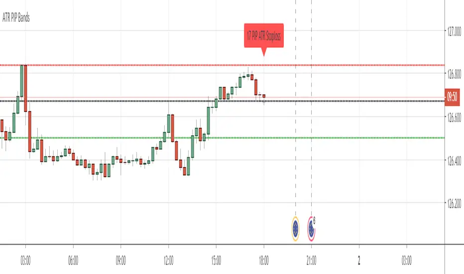
PIP BandsGot a little board due to the lock-down so I have written this little script.
It allows you to set PIP Bands at levels on the chart.
The Back Line is Close plus Spread, the Red Line is PIPs below and the Green Lines are spaced at PIPs above at equal distance.
The top four lines can be toggled off. Set off as default.
There is a toggle for JPY Currencies and also for Puts and Calls.
You can change the Spread and also the distance between bands by a set amount of PIP's.
You can either let it run at current close price or set price.
Hope you enjoy. Be safe.
Comments appreciated.
Spread PercentThis indicator shows the percent change between the highs and the lows (or optionally the open and close) of each candle. You may also set a low and a high percent threshold to better highlight the candles that exceed your desired spread percent. Red signifies low spread, green is high spread - these are unrelated to the color of the candle body. There is also the option to display a moving average of the spread percent at your desired length which is a representation of volatility over time.
This is not only helpful for historical analysis over time, but this can also be a time saver if you are trying to calculate the measured distance of a move. Save clicks - no more needing to use the measuring tool.
The settings of the indicator on the chart above are:
- Measure Candle Body Only? - No
- Highlight Thresholds? - Yes
- Thresholds Based on Moving Averages? - Yes
- Low Percent Threshold - 3.0
- High Percent Threshold - 7.0
- Show Moving Average? - Yes
- Moving Average Length - 5

Institucional VolumeAccording to Anna Colling, we should analyze the spreads together with the volume "VSA", the work in this script was to make the study of the volume of visual form, in this way we focus only on the candle spread, since the volume is represented by colors and their respective activities
Red Candles = Ultra High Volume
Orange Candles = Very Hight Volume
Candles Yellow = Volume Hight
White Candles = normal volume
Aqua Candle = Low Volume
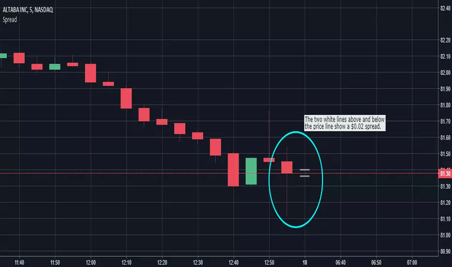
Spread VisualizerRelatively simple indicator to help you visualize your spreads with two white lines on the chart. You can input up to ten symbol-specific presets along with one other that will be applied to all unspecified symbols. "Spread Visualizer" will only be helpful for those trading with fixed spreads. So, if your broker uses variable spreads, do not use this script.
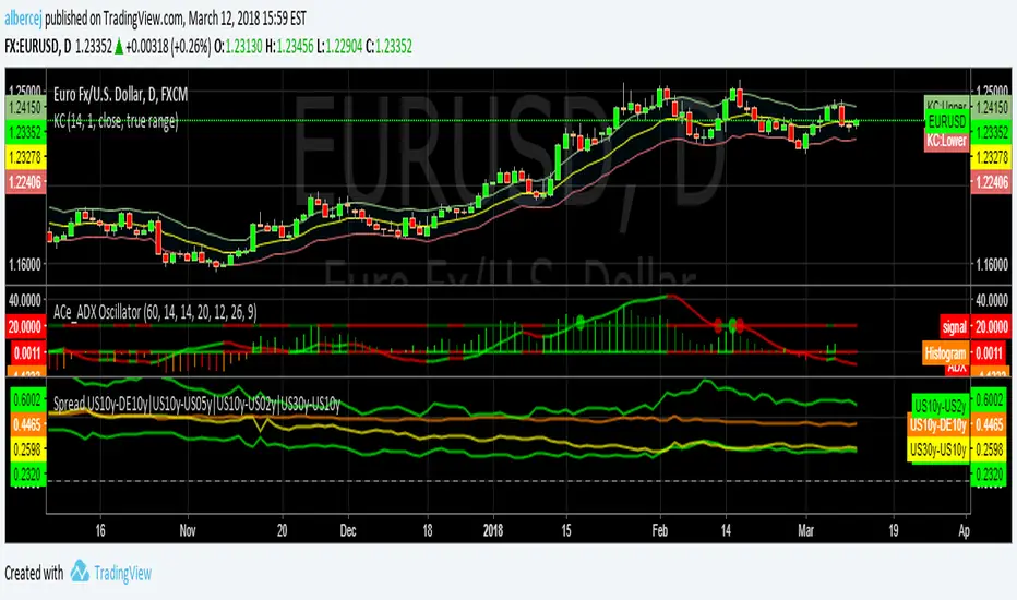
Spread US10y-DE10y|US10y-US05y|US10y-US02y|US30y-US10ySpread of different rates:
US 10y vs DE 10y
US 10y vs US 05y
US 10y vs US 02y
US 30y vs US 10y
Simple Spread Simple spread between two tickers. Click format to set inputs for tickers. ex: "COINBASE:BTC:USD"

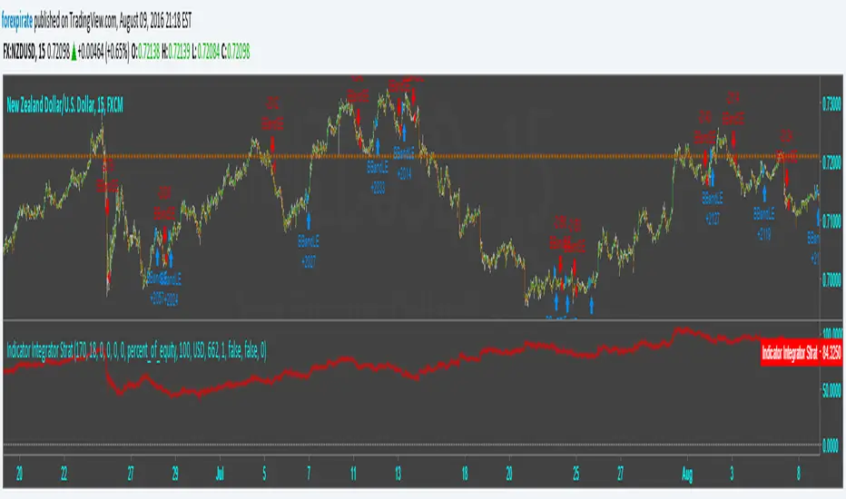
Indicator Integrator Strat <<<<<< UPDATED with CorrectionFound an error in the orders. Script was making double orders at times. I fixed it. It is tuned as such:
NZDUSD
15 min chart
starting $USD to show 1000 contracts for minicontract with FXCM (start date 3-18 $633 with 1:50 leverage)
Indicator plots ==> Starting equity - (trade gain and loses) - (number of trades) * (spread) = true balance estimate