Solar Movement Gradient-AYNETSummary of the Solar Movement Gradient Indicator
This Pine Script creates a dynamic, colorful indicator inspired by solar movements. It uses a sinusoidal wave to plot oscillations over time with a rainbow-like gradient that changes based on the wave's position.
Key Features
Sinusoidal Wave:
A wave oscillates smoothly based on the bar index (time) or optionally influenced by price movements.
The wave’s amplitude, baseline, and wavelength can be customized.
Dynamic Colors:
A spectrum of seven colors (red, orange, yellow, green, blue, purple, pink) is used.
The color changes smoothly along with the wave, emulating a solar gradient.
Background Gradient:
An optional gradient fills the background with colors matching the wave, adding a visually pleasing effect.
Customizable Inputs
Gradient Speed:
Adjusts how fast the wave and colors change over time.
Amplitude & Wavelength:
Controls the height and smoothness of the wave.
Price Influence:
Allows the wave to react dynamically to price movements.
Background Gradient:
Toggles a colorful gradient in the chart’s background.
Use Case
This indicator is designed for visual appeal rather than trading signals. It enhances the chart with a dynamic and colorful representation, making it perfect for aesthetic customization.
Let me know if you need further refinements! 🌈✨
Wyszukaj w skryptach "wave"

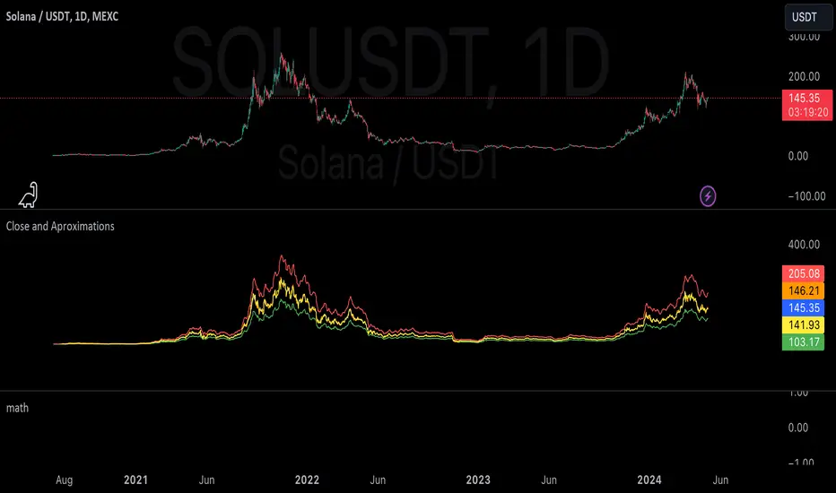
aproxLibrary "aprox"
It's a library of the aproximations of a price or Series float it uses Fourier transform and
Euler's Theoreum for Homogenus White noice operations. Calling functions without source value it automatically take close as the default source value.
Copy this indicator to see how each approximations interact between each other.
import Celje_2300/aprox/1 as aprox
//@version=5
indicator("Close Price with Aproximations", shorttitle="Close and Aproximations", overlay=false)
// Sample input data (replace this with your own data)
inputData = close
// Plot Close Price
plot(inputData, color=color.blue, title="Close Price")
dtf32_result = aprox.DTF32()
plot(dtf32_result, color=color.green, title="DTF32 Aproximation")
fft_result = aprox.FFT()
plot(fft_result, color=color.red, title="DTF32 Aproximation")
wavelet_result = aprox.Wavelet()
plot(wavelet_result, color=color.orange, title="Wavelet Aproximation")
wavelet_std_result = aprox.Wavelet_std()
plot(wavelet_std_result, color=color.yellow, title="Wavelet_std Aproximation")
DFT3(xval, _dir)
Parameters:
xval (float)
_dir (int)
//@version=5
import Celje_2300/aprox/1 as aprox
indicator("Example - DFT3", shorttitle="DFT3 Example", overlay=true)
// Sample input data (replace this with your own data)
inputData = close
// Apply DFT3
result = aprox.DFT3(inputData, 2)
// Plot the result
plot(result, color=color.blue, title="DFT3 Result")
DFT2(xval, _dir)
Parameters:
xval (float)
_dir (int)
//@version=5
import Celje_2300/aprox/1 as aprox
indicator("Example - DFT2", shorttitle="DFT2 Example", overlay=true)
// Sample input data (replace this with your own data)
inputData = close
// Apply DFT2
result = aprox.DFT2(inputData, inputData, 1)
// Plot the result
plot(result, color=color.green, title="DFT2 Result")
//@version=5
import Celje_2300/aprox/1 as aprox
indicator("Example - DFT2", shorttitle="DFT2 Example", overlay=true)
// Sample input data (replace this with your own data)
inputData = close
// Apply DFT2
result = aprox.DFT2(inputData, 1)
// Plot the result
plot(result, color=color.green, title="DFT2 Result")
FFT(xval)
FFT: Fast Fourier Transform
Parameters:
xval (float)
Returns: Aproxiated source value
//@version=5
import Celje_2300/aprox/1 as aprox
indicator("Example - FFT", shorttitle="FFT Example", overlay=true)
// Sample input data (replace this with your own data)
inputData = close
// Apply FFT
result = aprox.FFT(inputData)
// Plot the result
plot(result, color=color.red, title="FFT Result")
DTF32(xval)
DTF32: Combined Discrete Fourier Transforms
Parameters:
xval (float)
Returns: Aproxiated source value
//@version=5
import Celje_2300/aprox/1 as aprox
indicator("Example - DTF32", shorttitle="DTF32 Example", overlay=true)
// Sample input data (replace this with your own data)
inputData = close
// Apply DTF32
result = aprox.DTF32(inputData)
// Plot the result
plot(result, color=color.purple, title="DTF32 Result")
whitenoise(indic_, _devided, minEmaLength, maxEmaLength, src)
whitenoise: Ehler's Universal Oscillator with White Noise, without extra aproximated src
Parameters:
indic_ (float)
_devided (int)
minEmaLength (int)
maxEmaLength (int)
src (float)
Returns: Smoothed indicator value
//@version=5
import Celje_2300/aprox/1 as aprox
indicator("Example - whitenoise", shorttitle="whitenoise Example", overlay=true)
// Sample input data (replace this with your own data)
inputData = close
// Apply whitenoise
result = aprox.whitenoise(aprox.FFT(inputData))
// Plot the result
plot(result, color=color.orange, title="whitenoise Result")
whitenoise(indic_, dft1, _devided, minEmaLength, maxEmaLength, src)
whitenoise: Ehler's Universal Oscillator with White Noise and DFT1
Parameters:
indic_ (float)
dft1 (float)
_devided (int)
minEmaLength (int)
maxEmaLength (int)
src (float)
Returns: Smoothed indicator value
//@version=5
import Celje_2300/aprox/1 as aprox
indicator("Example - whitenoise with DFT1", shorttitle="whitenoise-DFT1 Example", overlay=true)
// Sample input data (replace this with your own data)
inputData = close
// Apply whitenoise with DFT1
result = aprox.whitenoise(inputData, aprox.DFT1(inputData))
// Plot the result
plot(result, color=color.yellow, title="whitenoise-DFT1 Result")
smooth(dft1, indic__, _devided, minEmaLength, maxEmaLength, src)
smooth: Smoothing source value with help of indicator series and aproximated source value
Parameters:
dft1 (float)
indic__ (float)
_devided (int)
minEmaLength (int)
maxEmaLength (int)
src (float)
Returns: Smoothed source series
//@version=5
import Celje_2300/aprox/1 as aprox
indicator("Example - smooth", shorttitle="smooth Example", overlay=true)
// Sample input data (replace this with your own data)
inputData = close
// Apply smooth
result = aprox.smooth(inputData, aprox.FFT(inputData))
// Plot the result
plot(result, color=color.gray, title="smooth Result")
smooth(indic__, _devided, minEmaLength, maxEmaLength, src)
smooth: Smoothing source value with help of indicator series
Parameters:
indic__ (float)
_devided (int)
minEmaLength (int)
maxEmaLength (int)
src (float)
Returns: Smoothed source series
//@version=5
import Celje_2300/aprox/1 as aprox
indicator("Example - smooth without DFT1", shorttitle="smooth-NoDFT1 Example", overlay=true)
// Sample input data (replace this with your own data)
inputData = close
// Apply smooth without DFT1
result = aprox.smooth(aprox.FFT(inputData))
// Plot the result
plot(result, color=color.teal, title="smooth-NoDFT1 Result")
vzo_ema(src, len)
vzo_ema: Volume Zone Oscillator with EMA smoothing
Parameters:
src (float)
len (simple int)
Returns: VZO value
vzo_sma(src, len)
vzo_sma: Volume Zone Oscillator with SMA smoothing
Parameters:
src (float)
len (int)
Returns: VZO value
vzo_wma(src, len)
vzo_wma: Volume Zone Oscillator with WMA smoothing
Parameters:
src (float)
len (int)
Returns: VZO value
alma2(series, windowsize, offset, sigma)
alma2: Arnaud Legoux Moving Average 2 accepts sigma as series float
Parameters:
series (float)
windowsize (int)
offset (float)
sigma (float)
Returns: ALMA value
Wavelet(src, len, offset, sigma)
Wavelet: Wavelet Transform
Parameters:
src (float)
len (int)
offset (simple float)
sigma (simple float)
Returns: Wavelet-transformed series
//@version=5
import Celje_2300/aprox/1 as aprox
indicator("Example - Wavelet", shorttitle="Wavelet Example", overlay=true)
// Sample input data (replace this with your own data)
inputData = close
// Apply Wavelet
result = aprox.Wavelet(inputData)
// Plot the result
plot(result, color=color.blue, title="Wavelet Result")
Wavelet_std(src, len, offset, mag)
Wavelet_std: Wavelet Transform with Standard Deviation
Parameters:
src (float)
len (int)
offset (float)
mag (int)
Returns: Wavelet-transformed series
//@version=5
import Celje_2300/aprox/1 as aprox
indicator("Example - Wavelet_std", shorttitle="Wavelet_std Example", overlay=true)
// Sample input data (replace this with your own data)
inputData = close
// Apply Wavelet_std
result = aprox.Wavelet_std(inputData)
// Plot the result
plot(result, color=color.green, title="Wavelet_std Result")

Visual ProwessVisual Prowess: Ultimate Visual of Price Action Indicator
Overview
Visual Prowess is a Pine Script indicator that integrates Trend, Momentum, Strength/Weakness, Money Flow, and Volatility into a single, intuitive interface. Scaled from 0 to 100, it provides traders with clear bullish (>50) and bearish (<50) zones. Visual Prowess is made up of several data components which will be explained below. All these components have custom thresholds that lead to Green Dot Buy Signals and Red Dot sell signals. Designed for multi-timeframe analysis, it helps traders anticipate market moves with precision seeing behind the scenes of price action.
The fundamental inputs of price action are made up of different variables -- the components of Trend Strength, Volatility, Momentum, Money Flow/Volume and Overbought/Oversold. These are very important inputs market makers use. From what I've learned in my trading journey (always still learning), this is the data I value most important. This is why I combined all these components into one indicator.....to be an ultimate visual—this extrapolation of different pieces of data is the Visual Prowess.
What It Does
Visual Prowess combines five key market factors into a unified score (0-100) to assess market conditions by examining the price action like an x-ray aka Visual Prowess:
• Trend Direction & Strength (Green and Red Wave) : Identifies bullish (green clouds) or bearish (red clouds) trend. This data is designed to illustrate the trend by the color, and its strength by the height (score).
How it is Calculated = Data is derived from price action-- comparing the current and previous price highs and lows to measure the strength of upward (+) or downward (-) price movements, smoothed over a period and expressed as a percentage of the price range.
• Momentum (Blue and White Wave): Tracks price acceleration via a custom momentum oscillator, displayed as blue (positive) or white (negative) waves.
How it is Calculated = Data is calculated by subtracting a longer-term exponential moving average from a shorter-term exponential moving average to measure momentum and trend direction. Momentum strength is measured by height on 0-100 score, and color dictates the trend-- Blue up, White down.
• Strength Index (Purple Line): Measures overbought/oversold conditions with a normalized index, derived from price deviation.
How it is Calculated = Strength Index is calculated by comparing the average of price gains to the average of price losses over a specified period, expressed as a value between 0 and 100 to measure momentum and identify overbought or oversold conditions.
• Money Flow: Monitors capital inflows and outflows using a modified Money Flow Index, shown as green (buying) or red (selling) circles.
How it is Calculated = The Money Flow is calculated by using price and volume data to measure buying and selling pressure, comparing positive and negative money flow over a specified period to produce a value between 0 and 100, indicating overbought or oversold conditions and more importantly where the money is moving, + or -.
• Volatility: Gauges market volatility, marked by colored crosses (blue for low, red for high). Blue illustrates low volatility which is key for big moves either + or -; red to illustrate when price action is extremely overheated either + or -.
How it is Calculated = The volatility is calculated by the creator of the BBWP The_Caretaker. This excellent work is calculated using the width of the iconic indicator the Bollinger Bands (the difference between the upper and lower bands divided by the middle band (the moving average), expressed as a percentage to show how volatile the price is relative to its recent average.
Originality
Unlike traditional multi-indicator dashboards, Visual Prowess uses a combination of specific open-source indicators which I believe to be the most important inputs in price action-- trend, momentum, strength, money flow, and volatility into an all-in-one visual ratioed on a 0-100 scale. This unique synthesis of data reduces noise, prioritizes signal alignment, and a look behind the scenes of price action to see deeper into the movement – This combination of indicators has custom thresholds, when these components in alignment with each other hit certain parameters; it leads to key custom price action signals -- Green Dot Buy and Red Dot Sell signals.
There is also a bonus indicator….. a Yellow Triangle. When you see this, it is rare and strong. It only prints when strength index reaches extreme lows at the same time volatility reaches extreme highs…. It then waits to print the yellow triangle upon a third condition= which is price action is back in bullish/positive zone. This Yellow triangle is meant to be strong reversals of Macro Trend lows.
How to Use the Visual Prowess Components:
• Add to Chart: Apply Visual Prowess to any timeframe (recommended: higher timeframes 12H, 1D, 2D, 3D for optimal signals).
• Interpret Zones: Values >50 indicate bullish conditions (green background); <50 signal bearish conditions (red background).
Wait for Green Dot Buy signal for buys and Red Dot Sell signals for sells. One can read each component individually to gauge the price action and predict before the buy signal prints; all of those components merged together is what leads to the buy and sell signals. The story of what’s to come can be seen at lower timeframes before the higher timeframes print, that is a key way to gauge projections of bull or bear prints to come.
HOW TO READ EACH DATA COMPONENT
TREND CLOUDS: Green/red clouds show trend direction; vivid colors tied to number/ score on the 0-100 scale indicate strength of the trend.
Bull Conditions
Green cloud illustrates the trend is bullish. The height is correlated to the trend’s strength—this height is also aligned with colors, more transparent green is weak, then it gets more opaque being medium strength, and the most vibrant is the strongest. How to ride the bull condition is by seeing this transformation of trend get from weak to strong, until it tops out and the wave points down losing strength which alludes to the bear condition.
Bear Conditions
Vice versa with the bear condition. Different shades of red tie into the strength of the bear trend. How to read when things are about to get bearish, is by seeing bull trend shift levels of strength (Example- medium to weak). This transition of bull strength getting weaker is the start, once it gets to weak bear it has commenced until bearish strength tops out before it begins to get weaker leading to the next bull phase.
MOMENTUM WAVES: Blue waves above 50 suggest bullish momentum; white waves below 50 warn of bearish shifts.
Bull Conditions
Good to look at flips of white wave to blue in bearish zones to see the tide turning= guaranteed bullish when safely gets above and holds above 50 zone.
Bear Conditions
Vice versa for Bearish side of this momentum wave being blue wave turning white in bullish zone aiming down to break below 50 zone to confirm bearish descent.
STRENGTH INDEX: Values >80 indicate overbought; <20 suggest oversold. Look for “Bull” or “Bear” labels for divergences.
Bull Conditions
Above 50 level is key, so seeing price action break from below 50 to above 50 is strong buy condition until it gets overbought.
Bear Conditions
Once conditions are too overbought and falling making lower lows (especially when price action is climbing or staying sideways) it is indicating strength is getting weaker. When this indicator fights 50 level and breaks down below 50 level bearish conditions are coming until it gets to an oversold level.
MONEYFLOW: Green circles signal buying pressure; red circles indicate selling.
Bull Conditions
Green circles show money flow is positive so that’s a good sign of upward price action to come, and again above 50 level is bullish conditions
Bear Conditions
Red circles show money flow is negative so that’s a bad sign of price action to come, pointing down and breaking below 50 level is no good. It can have corrections in bullish scenario keep in mind seeing red doesn’t mean trend is over z9could be in higher low scenario).
VOLATILITY: Blue crosses (<25% volatility) suggest breakout potential; red crosses (>75%) warn of overheated markets.
Bull Conditions
This is a very important indication. Big volatile moves can move either direction + or -. When all other components look positive/bullish and this is signalling blue crosses it means a big move is coming and will most likely be in the upward direction –If all other components align/lean bullish.
Another bullish scenario is when price action is down large and red crosses are forming. This indicates that the downward move is overheated (red x’s are rare). This extremely oversold condition can be great buying opportunities when volatility is hot printing red x’s.
Bear Conditions
When all other components look negative/bearish and this is signalling blue crosses it means a big move is coming and will most likely be in the downward direction –If all other components align/lean bearish.
Another bearish scenario is when price action is up large and red crosses are forming. This indicates that the upward move is overheated (red x’s are rare). This extremely overbought condition can be great selling opportunities when volatility is hot printing red x’s.
*****All these components in alignment of hitting each pertaining important threshold--is what prints the green dot and sell signals to trade by. It is not black and white; each component has a sweet spot fine tuned to be triggered through analysis of what is happening individually to each component and how it is reacting to the price action data.
EXAMPLE= Taking a look at the screenshot (Perfect Scenario)
Bullish Examination
- Taking a look at the 2-D timeframe on BTC
x>50
x= all components traveling to the bullish zone. Blue wave, Strength Index with bullish divergence accumulation, Money Flow Positive with Green Trend Wave starting, with teal low volatility cross→→→ leads to Green Dot Buy Signal print…. And the big rise speaks for itself with price action and the big mountain wave of the Green Trend Wave.
This rise leads to
↓↓↓↓
Bearish Examination
Strength Index gets really high at 80 scale, Red X’s showing extremely heated Volatility, Money Flow turning red and sloping down, Trend Wave peaking starting to roll over, Blue Momentum Wave transitioning to white, bearish divergence of price action related to Strength Index→→→ leads to Red Dot Sell Signal print… and the flush speaks for itself when all components fall below 50 level with Trend wave turning red
All this is forecasted in the data, showing weakness before weakness and showing strength before strength. It works because every single piece of important elements in data of price action is incorporated in this all-in-one indicator…. Which leads to the reasoning of me calling this indicator the Visual Prowess, for its unprecedent sharpness of visual observation.
****This is a passion script incorporating every piece of data I value important when reading a chart — to see current perspective of a chart and to help foresee future projection of direction Up or Down. Any community feedback is greatly appreciated. Ongoing work will be done on this script as new thoughts and fine tuning will continuously be done for infinity, as this is my personal go to model for data on the markets.

Awesome Oscillator (AO) with Signals [AIBitcoinTrend]👽 Multi-Scale Awesome Oscillator (AO) with Signals (AIBitcoinTrend)
The Multi-Scale Awesome Oscillator transforms the traditional Awesome Oscillator (AO) by integrating multi-scale wavelet filtering, enhancing its ability to detect momentum shifts while maintaining responsiveness across different market conditions.
Unlike conventional AO calculations, this advanced version refines trend structures using high-frequency, medium-frequency, and low-frequency wavelet components, providing traders with superior clarity and adaptability.
Additionally, it features real-time divergence detection and an ATR-based dynamic trailing stop, making it a powerful tool for momentum analysis, reversals, and breakout strategies.
👽 What Makes the Multi-Scale AO – Wavelet-Enhanced Momentum Unique?
Unlike traditional AO indicators, this enhanced version leverages wavelet-based decomposition and volatility-adjusted normalization, ensuring improved signal consistency across various timeframes and assets.
✅ Wavelet Smoothing – Multi-Scale Extraction – Captures short-term fluctuations while preserving broader trend structures.
✅ Frequency-Based Detail Weights – Separates high, medium, and low-frequency components to reduce noise and improve trend clarity.
✅ Real-Time Divergence Detection – Identifies bullish and bearish divergences for early trend reversals.
✅ Crossovers & ATR-Based Trailing Stops – Implements intelligent trade management with adaptive stop-loss levels.
👽 The Math Behind the Indicator
👾 Wavelet-Based AO Smoothing
The indicator applies multi-scale wavelet decomposition to extract high-frequency, medium-frequency, and low-frequency trend components, ensuring an optimal balance between reactivity and smoothness.
sma1 = ta.sma(signal, waveletPeriod1)
sma2 = ta.sma(signal, waveletPeriod2)
sma3 = ta.sma(signal, waveletPeriod3)
detail1 = signal - sma1 // High-frequency detail
detail2 = sma1 - sma2 // Intermediate detail
detail3 = sma2 - sma3 // Low-frequency detail
advancedAO = weightDetail1 * detail1 + weightDetail2 * detail2 + weightDetail3 * detail3
Why It Works:
Short-Term Smoothing: Captures rapid fluctuations while minimizing noise.
Medium-Term Smoothing: Balances short-term and long-term trends.
Long-Term Smoothing: Enhances trend stability and reduces false signals.
👾 Z-Score Normalization
To ensure consistency across different markets, the Awesome Oscillator is normalized using a Z-score transformation, making overbought and oversold levels stable across all assets.
normFactor = ta.stdev(advancedAO, normPeriod)
normalizedAO = advancedAO / nz(normFactor, 1)
Why It Works:
Standardizes AO values for comparison across assets.
Enhances signal reliability, preventing misleading spikes.
👽 How Traders Can Use This Indicator
👾 Divergence Trading Strategy
Bullish Divergence
Price makes a lower low, while AO forms a higher low.
A buy signal is confirmed when AO starts rising.
Bearish Divergence
Price makes a higher high, while AO forms a lower high.
A sell signal is confirmed when AO starts declining.
👾 Buy & Sell Signals with Trailing Stop
Bullish Setup:
✅AO crosses above the bullish trigger level → Buy Signal.
✅Trailing stop placed at Low - (ATR × Multiplier).
✅Exit if price crosses below the stop.
Bearish Setup:
✅AO crosses below the bearish trigger level → Sell Signal.
✅Trailing stop placed at High + (ATR × Multiplier).
✅Exit if price crosses above the stop.
👽 Why It’s Useful for Traders
Wavelet-Enhanced Filtering – Retains essential trend details while eliminating excessive noise.
Multi-Scale Momentum Analysis – Separates different trend frequencies for enhanced clarity.
Real-Time Divergence Alerts – Identifies early reversal signals for better entries and exits.
ATR-Based Risk Management – Ensures stops dynamically adapt to market conditions.
Works Across Markets & Timeframes – Suitable for stocks, forex, crypto, and futures trading.
👽 Indicator Settings
AO Short Period – Defines the short-term moving average for AO calculation.
AO Long Period – Defines the long-term moving average for AO smoothing.
Wavelet Smoothing – Adjusts multi-scale decomposition for different market conditions.
Divergence Detection – Enables or disables real-time divergence analysis. Normalization Period – Sets the lookback period for standard deviation-based AO normalization.
Cross Signals Sensitivity – Controls crossover signal strength for buy/sell signals.
ATR Trailing Stop Multiplier – Adjusts the sensitivity of the trailing stop.
Disclaimer: This indicator is designed for educational purposes and does not constitute financial advice. Please consult a qualified financial advisor before making investment decisions.
mathLibrary "math"
It's a library of discrete aproximations of a price or Series float it uses Fourier Discrete transform, Laplace Discrete Original and Modified transform and Euler's Theoreum for Homogenus White noice operations. Calling functions without source value it automatically take close as the default source value.
Here is a picture of Laplace and Fourier approximated close prices from this library:
Copy this indicator and try it yourself:
import AutomatedTradingAlgorithms/math/1 as math
//@version=5
indicator("Close Price with Aproximations", shorttitle="Close and Aproximations", overlay=false)
// Sample input data (replace this with your own data)
inputData = close
// Plot Close Price
plot(inputData, color=color.blue, title="Close Price")
ltf32_result = math.LTF32(a=0.01)
plot(ltf32_result, color=color.green, title="LTF32 Aproximation")
fft_result = math.FFT()
plot(fft_result, color=color.red, title="Fourier Aproximation")
wavelet_result = math.Wavelet()
plot(wavelet_result, color=color.orange, title="Wavelet Aproximation")
wavelet_std_result = math.Wavelet_std()
plot(wavelet_std_result, color=color.yellow, title="Wavelet_std Aproximation")
DFT3(xval, _dir)
Discrete Fourier Transform with last 3 points
Parameters:
xval (float) : Source series
_dir (int) : Direction parameter
Returns: Aproxiated source value
DFT2(xval, _dir)
Discrete Fourier Transform with last 2 points
Parameters:
xval (float) : Source series
_dir (int) : Direction parameter
Returns: Aproxiated source value
FFT(xval)
Fast Fourier Transform once. It aproximates usig last 3 points.
Parameters:
xval (float) : Source series
Returns: Aproxiated source value
DFT32(xval)
Combined Discrete Fourier Transforms of DFT3 and DTF2 it aproximates last point by first
aproximating last 3 ponts and than using last 2 points of the previus.
Parameters:
xval (float) : Source series
Returns: Aproxiated source value
DTF32(xval)
Combined Discrete Fourier Transforms of DFT3 and DTF2 it aproximates last point by first
aproximating last 3 ponts and than using last 2 points of the previus.
Parameters:
xval (float) : Source series
Returns: Aproxiated source value
LFT3(xval, _dir, a)
Discrete Laplace Transform with last 3 points
Parameters:
xval (float) : Source series
_dir (int) : Direction parameter
a (float) : laplace coeficient
Returns: Aproxiated source value
LFT2(xval, _dir, a)
Discrete Laplace Transform with last 2 points
Parameters:
xval (float) : Source series
_dir (int) : Direction parameter
a (float) : laplace coeficient
Returns: Aproxiated source value
LFT(xval, a)
Fast Laplace Transform once. It aproximates usig last 3 points.
Parameters:
xval (float) : Source series
a (float) : laplace coeficient
Returns: Aproxiated source value
LFT32(xval, a)
Combined Discrete Laplace Transforms of LFT3 and LTF2 it aproximates last point by first
aproximating last 3 ponts and than using last 2 points of the previus.
Parameters:
xval (float) : Source series
a (float) : laplace coeficient
Returns: Aproxiated source value
LTF32(xval, a)
Combined Discrete Laplace Transforms of LFT3 and LTF2 it aproximates last point by first
aproximating last 3 ponts and than using last 2 points of the previus.
Parameters:
xval (float) : Source series
a (float) : laplace coeficient
Returns: Aproxiated source value
whitenoise(indic_, _devided, minEmaLength, maxEmaLength, src)
Ehler's Universal Oscillator with White Noise, without extra aproximated src.
It uses dinamic EMA to aproximate indicator and thus reducing noise.
Parameters:
indic_ (float) : Input series for the indicator values to be smoothed
_devided (int) : Divisor for oscillator calculations
minEmaLength (int) : Minimum EMA length
maxEmaLength (int) : Maximum EMA length
src (float) : Source series
Returns: Smoothed indicator value
whitenoise(indic_, dft1, _devided, minEmaLength, maxEmaLength, src)
Ehler's Universal Oscillator with White Noise and DFT1.
It uses src and sproxiated src (dft1) to clearly define white noice.
It uses dinamic EMA to aproximate indicator and thus reducing noise.
Parameters:
indic_ (float) : Input series for the indicator values to be smoothed
dft1 (float) : Aproximated src value for white noice calculation
_devided (int) : Divisor for oscillator calculations
minEmaLength (int) : Minimum EMA length
maxEmaLength (int) : Maximum EMA length
src (float) : Source series
Returns: Smoothed indicator value
smooth(dft1, indic__, _devided, minEmaLength, maxEmaLength, src)
Smoothing source value with help of indicator series and aproximated source value
It uses src and sproxiated src (dft1) to clearly define white noice.
It uses dinamic EMA to aproximate src and thus reducing noise.
Parameters:
dft1 (float) : Value to be smoothed.
indic__ (float) : Optional input for indicator to help smooth dft1 (default is FFT)
_devided (int) : Divisor for smoothing calculations
minEmaLength (int) : Minimum EMA length
maxEmaLength (int) : Maximum EMA length
src (float) : Source series
Returns: Smoothed source (src) series
smooth(indic__, _devided, minEmaLength, maxEmaLength, src)
Smoothing source value with help of indicator series
It uses dinamic EMA to aproximate src and thus reducing noise.
Parameters:
indic__ (float) : Optional input for indicator to help smooth dft1 (default is FFT)
_devided (int) : Divisor for smoothing calculations
minEmaLength (int) : Minimum EMA length
maxEmaLength (int) : Maximum EMA length
src (float) : Source series
Returns: Smoothed src series
vzo_ema(src, len)
Volume Zone Oscillator with EMA smoothing
Parameters:
src (float) : Source series
len (simple int) : Length parameter for EMA
Returns: VZO value
vzo_sma(src, len)
Volume Zone Oscillator with SMA smoothing
Parameters:
src (float) : Source series
len (int) : Length parameter for SMA
Returns: VZO value
vzo_wma(src, len)
Volume Zone Oscillator with WMA smoothing
Parameters:
src (float) : Source series
len (int) : Length parameter for WMA
Returns: VZO value
alma2(series, windowsize, offset, sigma)
Arnaud Legoux Moving Average 2 accepts sigma as series float
Parameters:
series (float) : Input series
windowsize (int) : Size of the moving average window
offset (float) : Offset parameter
sigma (float) : Sigma parameter
Returns: ALMA value
Wavelet(src, len, offset, sigma)
Aproxiates srt using Discrete wavelet transform.
Parameters:
src (float) : Source series
len (int) : Length parameter for ALMA
offset (simple float)
sigma (simple float)
Returns: Wavelet-transformed series
Wavelet_std(src, len, offset, mag)
Aproxiates srt using Discrete wavelet transform with standard deviation as a magnitude.
Parameters:
src (float) : Source series
len (int) : Length parameter for ALMA
offset (float) : Offset parameter for ALMA
mag (int) : Magnitude parameter for standard deviation
Returns: Wavelet-transformed series
LaplaceTransform(xval, N, a)
Original Laplace Transform over N set of close prices
Parameters:
xval (float) : series to aproximate
N (int) : number of close prices in calculations
a (float) : laplace coeficient
Returns: Aproxiated source value
NLaplaceTransform(xval, N, a, repeat)
Y repetirions on Original Laplace Transform over N set of close prices, each time N-k set of close prices
Parameters:
xval (float) : series to aproximate
N (int) : number of close prices in calculations
a (float) : laplace coeficient
repeat (int) : number of repetitions
Returns: Aproxiated source value
LaplaceTransformsum(xval, N, a, b)
Sum of 2 exponent coeficient of Laplace Transform over N set of close prices
Parameters:
xval (float) : series to aproximate
N (int) : number of close prices in calculations
a (float) : laplace coeficient
b (float) : second laplace coeficient
Returns: Aproxiated source value
NLaplaceTransformdiff(xval, N, a, b, repeat)
Difference of 2 exponent coeficient of Laplace Transform over N set of close prices
Parameters:
xval (float) : series to aproximate
N (int) : number of close prices in calculations
a (float) : laplace coeficient
b (float) : second laplace coeficient
repeat (int) : number of repetitions
Returns: Aproxiated source value
N_divLaplaceTransformdiff(xval, N, a, b, repeat)
N repetitions of Difference of 2 exponent coeficient of Laplace Transform over N set of close prices, with dynamic rotation
Parameters:
xval (float) : series to aproximate
N (int) : number of close prices in calculations
a (float) : laplace coeficient
b (float) : second laplace coeficient
repeat (int) : number of repetitions
Returns: Aproxiated source value
LaplaceTransformdiff(xval, N, a, b)
Difference of 2 exponent coeficient of Laplace Transform over N set of close prices
Parameters:
xval (float) : series to aproximate
N (int) : number of close prices in calculations
a (float) : laplace coeficient
b (float) : second laplace coeficient
Returns: Aproxiated source value
NLaplaceTransformdiffFrom2(xval, N, a, b, repeat)
N repetitions of Difference of 2 exponent coeficient of Laplace Transform over N set of close prices, second element has for 1 higher exponent factor
Parameters:
xval (float) : series to aproximate
N (int) : number of close prices in calculations
a (float) : laplace coeficient
b (float) : second laplace coeficient
repeat (int) : number of repetitions
Returns: Aproxiated source value
N_divLaplaceTransformdiffFrom2(xval, N, a, b, repeat)
N repetitions of Difference of 2 exponent coeficient of Laplace Transform over N set of close prices, second element has for 1 higher exponent factor, dynamic rotation
Parameters:
xval (float) : series to aproximate
N (int) : number of close prices in calculations
a (float) : laplace coeficient
b (float) : second laplace coeficient
repeat (int) : number of repetitions
Returns: Aproxiated source value
LaplaceTransformdiffFrom2(xval, N, a, b)
Difference of 2 exponent coeficient of Laplace Transform over N set of close prices, second element has for 1 higher exponent factor
Parameters:
xval (float) : series to aproximate
N (int) : number of close prices in calculations
a (float) : laplace coeficient
b (float) : second laplace coeficient
Returns: Aproxiated source value
Stochastic Zone Strength Trend [wbburgin](This script was originally invite-only, but I'd vastly prefer contributing to the TradingView community more than anything else, so I am making it public :) I'd much rather share my ideas with you all.)
The Stochastic Zone Strength Trend indicator is a very powerful momentum and trend indicator that 1) identifies trend direction and strength, 2) determines pullbacks and reversals (including oversold and overbought conditions), 3) identifies divergences, and 4) can filter out ranges. I have some examples below on how to use it to its full effectiveness. It is composed of two components: Stochastic Zone Strength and Stochastic Trend Strength.
Stochastic Zone Strength
At its most basic level, the stochastic Zone Strength plots the momentum of the price action of the instrument, and identifies bearish and bullish changes with a high degree of accuracy. Think of the stochastic Zone Strength as a much more robust equivalent of the RSI. Momentum-change thresholds are demonstrated by the "20" and "80" levels on the indicator (see below image).
Stochastic Trend Strength
The stochastic Trend Strength component of the script uses resistance in each candlestick to calculate the trend strength of the instrument. I'll go more into detail about the settings after my description of how to use the indicator, but there are two forms of the stochastic Trend Strength:
Anchored at 50 (directional stochastic Trend Strength):
The directional stochastic Trend Strength can be used similarly to the MACD difference or other histogram-like indicators : a rising plot indicates an upward trend, while a falling plot indicates a downward trend.
Anchored at 0 (nondirectional stochastic Trend Strength):
The nondirectional stochastic Trend Strength can be used similarly to the ADX or other non-directional indicators : a rising plot indicates increasing trend strength, and look at the stochastic Zone Strength component and your instrument to determine if this indicates increasing bullish strength or increasing bearish strength (see photo below):
(In the above photo, a bearish divergence indicated that the high Trend Strength predicted a strong downwards move, which was confirmed shortly after. Later, a bullish move upward by the Zone Strength while the Trend Strength was elevated predicated a strong upwards move, which was also confirmed. Note the period where the Trend Strength never reached above 80, which indicated a ranging period (and thus unprofitable to enter or exit)).
How to Use the Indicator
The above image is a good example on how to use the indicator to determine divergences and possible pivot points (lines and circles, respectively). I recommend using both the stochastic Zone Strength and the stochastic Trend Strength at the same time, as it can give you a robust picture of where momentum is in relation to the price action and its trajectory. Every color is changeable in the settings.
Settings
The Amplitude of the indicator is essentially the high-low lookback for both components.
The Wavelength of the indicator is how stretched-out you want the indicator to be: how many amplitudes do you want the indicator to process in one given bar.
A useful analogy that I use (and that I derived the names from) is from traditional physics. In wave motion, the Amplitude is the up-down sensitivity of the wave, and the Wavelength is the side-side stretch of the wave.
The Smoothing Factor of the settings is simply how smoothed you want the stochastic to be. It's not that important in most circumstances.
Trend Anchor was covered above (see my description of Trend Strength). The "Trend Transform MA Length" is the EMA length of the Trend Strength that you use to transform it into the directional oscillator. Think of the EMA being transformed onto the 50 line and then the Trend Strength being dragged relative to that.
Trend Transform MA Length is the EMA length you want to use for transforming the nondirectional Trend Strength (anchored at 0) into the directional Trend Strength (anchored at 50). I suggest this be the same as the wavelength.
Trend Plot Type can transform the Nondirectional Trend Strength into a line plot so that it doesn't murk up the background.
Finally, the colors are changeable on the bottom.
Explanation of Zone Strength
If you're knowledgeable in Pine Script, I encourage you to look at the code to try to understand the concept, as it's a little complicated. The theory behind my Zone Strength concept is that the wicks in every bar can be used create an index of bullish and bearish resistance, as a wick signifies that the price crossed above a threshold before returning to its origin. This distance metric is unique because most indicators/formulas for calculating relative strength use a displacement metric (such as close - open) instead of measuring how far the price actually moved (up and down) within a candlestick. This is what the Zone Strength concept represents - the hesitation within the bar that is not typically represented in typical momentum indicators.
In the script's code I have step by step explanations of how the formula is calculated and why it is calculated as such. I encourage you to play around with the amplitude and wavelength inputs as they can make the zone strength look very different and perform differently depending on your interests.
Enjoy!
Walker

MFx Radar (Money Flow x-Radar)Description:
MFx Radar is a precision-built multi-timeframe analysis tool designed to identify high-probability trend shifts and accumulation/distribution events using a combination of WaveTrend dynamics, normalized money flow, RSI, BBWP, and OBV-based trend biasing.
Multi-Timeframe Trend Scanner
Analyze trend direction across 5 customizable timeframes using WaveTrend logic to produce a clear trend consensus.
Smart Money Flow Detection
Adaptive hybrid money flow combines CMF and MFI, normalized across lookback periods, to pinpoint shifts in accumulation or distribution with high sensitivity.
Event-Based Labels & Alerts
Minimalist "Accum" and "Distr" text labels appear at key inflection points, based on hybrid flow flips — designed to highlight smart money moves without clutter.
Trigger & Pattern Recognition
Built-in logic detects anchor points, trigger confirmations, and rare "Snake Eye" formations directly on WaveTrend, enhancing trade timing accuracy.
Visual Dashboard Table
A real-time table provides score-based insight into signal quality, trend direction, and volume behavior, giving you a full picture at a glance.
MFx Radar helps streamline discretionary and system-based trading decisions by surfacing key confluences across price, volume, and momentum all while staying out of your way visually.
How to Use MFx Radar
MFx Radar is a multi-timeframe market intelligence tool designed to help you spot trend direction, momentum shifts, volume strength, and high-probability trade setups using confluence across price, flow, and timeframes.
Where to find settings To see the full visual setup:
After adding the script, open the Settings gear. Go to the Inputs tab and enable:
Show Trigger Diamonds
Show WT Cross Circles
Show Anchor/Trigger/Snake Eye Labels
Show Table
Show OBV Divergence
Show Multi-TF Confluence
Show Signal Score
Then, go to the Style tab to adjust colors and fills for the wave plots and hybrid money flow. (Use published chart as a reference.)
What the Waves and Colors Mean
Blue WaveTrend (WT1 / WT2). These are the main momentum waves.
WT1 > WT2 = bullish momentum
WT1 < WT2 = bearish momentum
Above zero = bullish bias
Below zero = bearish bias
When WT1 crosses above WT2, it often marks the beginning of a move — these are shown as green trigger diamonds.
VWAP-MACD Line
The yellow fill helps spot volume-based momentum.
Rising = trend acceleration
Use together with BBWP (bollinger band width percentile) and hybrid money flow for confirmation.
Hybrid Money Flow
Combines CMF and MFI, normalized and smoothed.
Green = accumulation
Red = distribution
Transitions are key — especially when price moves up, but money flow stays red (a divergence warning).
This is useful for spotting fakeouts or confirming smart money shifts.
Orange Vertical Highlights
Shows when price is rising, but money flow is still red.
Often a sign of hidden distribution or "exit pump" behavior.
Table Dashboard (Bottom-Right)
BBWP (Volatility Pulse)
When BBWP is low (<20), it signals consolidation — a breakout is likely to follow.
Use this with ADX and WaveTrend position to anticipate directional breakouts.
Trend by ADX
Shows whether the market is trending and in which direction.
Combined with money flow and RSI, this gives strong confirmation on breakouts.
OBV HTF Bias
Gives higher timeframe pressure (bullish/bearish/neutral).
Helps avoid taking counter-trend trades.
Pattern Labels (WT-Based)
A = Anchor Wave — WT hitting oversold
T = Trigger Wave — WT turning back up after anchor
👀 = Snake Eyes — Rare pattern, usually signaling strong reversal potential
These help in timing entries, especially when they align with other signals like BBWP breakouts, confluence, or smart money flow flips.
Multi-Timeframe (MTF) Consensus
The system checks WaveTrend on 5 different timeframes and gives:
Color-coded signals on each TF
A final score: “Mostly Up,” “Mostly Down,” or “Mixed”
When MTFs align with wave crosses, BBWP expansion, and hybrid money flow shifts, the probability of sustained move is higher.
Divergence Spotting (Advanced Tip)
Watch for:Price rising while money flow is red → Possible trap / early exit
Price dropping while money flow is green → Early accumulation
Combine this with anchor-trigger patterns and MTF trend support for spotting bottoms or tops early.
Final Tips
Use WT trigger crosses as initial signal. Confirm with money flow direction + color flip
Look at BBWP for breakout timing. Use table as your decision dashboard
Favor trades that align with MTF consensus

TASC 2025.06 Cybernetic Oscillator█ OVERVIEW
This script implements the Cybernetic Oscillator introduced by John F. Ehlers in his article "The Cybernetic Oscillator For More Flexibility, Making A Better Oscillator" from the June 2025 edition of the TASC Traders' Tips . It cascades two-pole highpass and lowpass filters, then scales the result by its root mean square (RMS) to create a flexible normalized oscillator that responds to a customizable frequency range for different trading styles.
█ CONCEPTS
Oscillators are indicators widely used by technical traders. These indicators swing above and below a center value, emphasizing cyclic movements within a frequency range. In his article, Ehlers explains that all oscillators share a common characteristic: their calculations involve computing differences . The reliance on differences is what causes these indicators to oscillate about a central point.
The difference between two data points in a series acts as a highpass filter — it allows high frequencies (short wavelengths) to pass through while significantly attenuating low frequencies (long wavelengths). Ehlers demonstrates that a simple difference calculation attenuates lower-frequency cycles at a rate of 6 dB per octave. However, the difference also significantly amplifies cycles near the shortest observable wavelength, making the result appear noisier than the original series. To mitigate the effects of noise in a differenced series, oscillators typically smooth the series with a lowpass filter, such as a moving average.
Ehlers highlights an underlying issue with smoothing differenced data to create oscillators. He postulates that market data statistically follows a pink spectrum , where the amplitudes of cyclic components in the data are approximately directly proportional to the underlying periods. Specifically, he suggests that cyclic amplitude increases by 6 dB per octave of wavelength.
Because some conventional oscillators, such as RSI, use differencing calculations that attenuate cycles by only 6 dB per octave, and market cycles increase in amplitude by 6 dB per octave, such calculations do not have a tangible net effect on larger wavelengths in the analyzed data. The influence of larger wavelengths can be especially problematic when using these oscillators for mean reversion or swing signals. For instance, an expected reversion to the mean might be erroneous because oscillator's mean might significantly deviate from its center over time.
To address the issues with conventional oscillator responses, Ehlers created a new indicator dubbed the Cybernetic Oscillator. It uses a simple combination of highpass and lowpass filters to emphasize a specific range of frequencies in the market data, then normalizes the result based on RMS. The process is as follows:
Apply a two-pole highpass filter to the data. This filter's critical period defines the longest wavelength in the oscillator's passband.
Apply a two-pole SuperSmoother (lowpass filter) to the highpass-filtered data. This filter's critical period defines the shortest wavelength in the passband.
Scale the resulting waveform by its RMS. If the filtered waveform follows a normal distribution, the scaled result represents amplitude in standard deviations.
The oscillator's two-pole filters attenuate cycles outside the desired frequency range by 12 dB per octave. This rate outweighs the apparent rate of amplitude increase for successively longer market cycles (6 dB per octave). Therefore, the Cybernetic Oscillator provides a more robust isolation of cyclic content than conventional oscillators. Best of all, traders can set the periods of the highpass and lowpass filters separately, enabling fine-tuning of the frequency range for different trading styles.
█ USAGE
The "Highpass period" input in the "Settings/Inputs" tab specifies the longest wavelength in the oscillator's passband, and the "Lowpass period" input defines the shortest wavelength. The oscillator becomes more responsive to rapid movements with a smaller lowpass period. Conversely, it becomes more sensitive to trends with a larger highpass period. Ehlers recommends setting the smallest period to a value above 8 to avoid aliasing. The highpass period must not be smaller than the lowpass period. Otherwise, it causes a runtime error.
The "RMS length" input determines the number of bars in the RMS calculation that the indicator uses to normalize the filtered result.
This indicator also features two distinct display styles, which users can toggle with the "Display style" input. With the "Trend" style enabled, the indicator plots the oscillator with one of two colors based on whether its value is above or below zero. With the "Threshold" style enabled, it plots the oscillator as a gray line and highlights overbought and oversold areas based on the user-specified threshold.
Below, we show two instances of the script with different settings on an equities chart. The first uses the "Threshold" style with default settings to pass cycles between 20 and 30 bars for mean reversion signals. The second uses a larger highpass period of 250 bars and the "Trend" style to visualize trends based on cycles spanning less than one year:

Infinity Market Grid -AynetConcept
Imagine viewing the market as a dynamic grid where price, time, and momentum intersect to reveal infinite possibilities. This indicator leverages:
Grid-Based Market Flow: Visualizes price action as a grid with zones for:
Accumulation
Distribution
Breakout Expansion
Volatility Compression
Predictive Dynamic Layers:
Forecasts future price zones using historical volatility and momentum.
Tracks event probabilities like breakout, fakeout, and trend reversals.
Data Science Visuals:
Uses heatmap-style layers, moving waveforms, and price trajectory paths.
Interactive Alerts:
Real-time alerts for high-probability market events.
Marks critical zones for "buy," "sell," or "wait."
Key Features
Market Layers Grid:
Creates dynamic "boxes" around price using fractals and ATR-based volatility.
These boxes show potential future price zones and probabilities.
Volatility and Momentum Waves:
Overlay volatility oscillators and momentum bands for directional context.
Dynamic Heatmap Zones:
Colors the chart dynamically based on breakout probabilities and risk.
Price Path Prediction:
Tracks price trajectory as a moving "wave" across the grid.
How It Works
Grid Box Structure:
Upper and lower price levels are based on ATR (volatility) and plotted dynamically.
Dashed green/red lines show the grid for potential price expansion zones.
Heatmap Zones:
Colors the background based on probabilities:
Green: High breakout probability.
Blue: High consolidation probability.
Price Path Prediction:
Forecasts future price movements using momentum.
Plots these as a dynamic "wave" on the chart.
Momentum and Volatility Waves:
Shows the relationship between momentum and volatility as oscillating waves.
Helps identify when momentum exceeds volatility (potential breakouts).
Buy/Sell Signals:
Triggers when price approaches grid edges with strong momentum.
Provides alerts and visual markers.
Why Is It Revolutionary?
Grid and Wave Synergy:
Combines structural price zones (grid boxes) with real-time momentum and volatility waves.
Predictive Analytics:
Uses momentum-based forecasting to visualize what’s next, not just what’s happening.
Dynamic Heatmap:
Creates a living map of breakout/consolidation zones in real-time.
Scalable for Any Market:
Works seamlessly with forex, crypto, and stocks by adjusting the ATR multiplier and box length.
This indicator is not just a tool but a framework for understanding market dynamics at a deeper level. Let me know if you'd like to take it even further — for example, adding machine learning-inspired probability models or multi-timeframe analysis! 🚀
MathConstantsAtomicLibrary "MathConstantsAtomic"
Mathematical Constants
FineStructureConstant() Fine Structure Constant: alpha = e^2/4*Pi*e_0*h_bar*c_0 (2007 CODATA)
RydbergConstant() Rydberg Constant: R_infty = alpha^2*m_e*c_0/2*h (2007 CODATA)
BohrRadius() Bor Radius: a_0 = alpha/4*Pi*R_infty (2007 CODATA)
HartreeEnergy() Hartree Energy: E_h = 2*R_infty*h*c_0 (2007 CODATA)
QuantumOfCirculation() Quantum of Circulation: h/2*m_e (2007 CODATA)
FermiCouplingConstant() Fermi Coupling Constant: G_F/(h_bar*c_0)^3 (2007 CODATA)
WeakMixingAngle() Weak Mixin Angle: sin^2(theta_W) (2007 CODATA)
ElectronMass() Electron Mass: (2007 CODATA)
ElectronMassEnergyEquivalent() Electron Mass Energy Equivalent: (2007 CODATA)
ElectronMolarMass() Electron Molar Mass: (2007 CODATA)
ComptonWavelength() Electron Compton Wavelength: (2007 CODATA)
ClassicalElectronRadius() Classical Electron Radius: (2007 CODATA)
ThomsonCrossSection() Thomson Cross Section: (2002 CODATA)
ElectronMagneticMoment() Electron Magnetic Moment: (2007 CODATA)
ElectronGFactor() Electon G-Factor: (2007 CODATA)
MuonMass() Muon Mass: (2007 CODATA)
MuonMassEnegryEquivalent() Muon Mass Energy Equivalent: (2007 CODATA)
MuonMolarMass() Muon Molar Mass: (2007 CODATA)
MuonComptonWavelength() Muon Compton Wavelength: (2007 CODATA)
MuonMagneticMoment() Muon Magnetic Moment: (2007 CODATA)
MuonGFactor() Muon G-Factor: (2007 CODATA)
TauMass() Tau Mass: (2007 CODATA)
TauMassEnergyEquivalent() Tau Mass Energy Equivalent: (2007 CODATA)
TauMolarMass() Tau Molar Mass: (2007 CODATA)
TauComptonWavelength() Tau Compton Wavelength: (2007 CODATA)
ProtonMass() Proton Mass: (2007 CODATA)
ProtonMassEnergyEquivalent() Proton Mass Energy Equivalent: (2007 CODATA)
ProtonMolarMass() Proton Molar Mass: (2007 CODATA)
ProtonComptonWavelength() Proton Compton Wavelength: (2007 CODATA)
ProtonMagneticMoment() Proton Magnetic Moment: (2007 CODATA)
ProtonGFactor() Proton G-Factor: (2007 CODATA)
ShieldedProtonMagneticMoment() Proton Shielded Magnetic Moment: (2007 CODATA)
ProtonGyromagneticRatio() Proton Gyro-Magnetic Ratio: (2007 CODATA)
ShieldedProtonGyromagneticRatio() Proton Shielded Gyro-Magnetic Ratio: (2007 CODATA)
NeutronMass() Neutron Mass: (2007 CODATA)
NeutronMassEnegryEquivalent() Neutron Mass Energy Equivalent: (2007 CODATA)
NeutronMolarMass() Neutron Molar Mass: (2007 CODATA)
NeutronComptonWavelength() Neuron Compton Wavelength: (2007 CODATA)
NeutronMagneticMoment() Neutron Magnetic Moment: (2007 CODATA)
NeutronGFactor() Neutron G-Factor: (2007 CODATA)
NeutronGyromagneticRatio() Neutron Gyro-Magnetic Ratio: (2007 CODATA)
DeuteronMass() Deuteron Mass: (2007 CODATA)
DeuteronMassEnegryEquivalent() Deuteron Mass Energy Equivalent: (2007 CODATA)
DeuteronMolarMass() Deuteron Molar Mass: (2007 CODATA)
DeuteronMagneticMoment() Deuteron Magnetic Moment: (2007 CODATA)
HelionMass() Helion Mass: (2007 CODATA)
HelionMassEnegryEquivalent() Helion Mass Energy Equivalent: (2007 CODATA)
HelionMolarMass() Helion Molar Mass: (2007 CODATA)
Avogadro() Avogadro constant: (2010 CODATA)
Aetherium Institutional Market Resonance EngineAetherium Institutional Market Resonance Engine (AIMRE)
A Three-Pillar Framework for Decoding Institutional Activity
🎓 THEORETICAL FOUNDATION
The Aetherium Institutional Market Resonance Engine (AIMRE) is a multi-faceted analysis system designed to move beyond conventional indicators and decode the market's underlying structure as dictated by institutional capital flow. Its philosophy is built on a singular premise: significant market moves are preceded by a convergence of context , location , and timing . Aetherium quantifies these three dimensions through a revolutionary three-pillar architecture.
This system is not a simple combination of indicators; it is an integrated engine where each pillar's analysis feeds into a central logic core. A signal is only generated when all three pillars achieve a state of resonance, indicating a high-probability alignment between market organization, key liquidity levels, and cyclical momentum.
⚡ THE THREE-PILLAR ARCHITECTURE
1. 🌌 PILLAR I: THE COHERENCE ENGINE (THE 'CONTEXT')
Purpose: To measure the degree of organization within the market. This pillar answers the question: " Is the market acting with a unified purpose, or is it chaotic and random? "
Conceptual Framework: Institutional campaigns (accumulation or distribution) create a non-random, organized market environment. Retail-driven or directionless markets are characterized by "noise" and chaos. The Coherence Engine acts as a filter to ensure we only engage when institutional players are actively steering the market.
Formulaic Concept:
Coherence = f(Dominance, Synchronization)
Dominance Factor: Calculates the absolute difference between smoothed buying pressure (volume-weighted bullish candles) and smoothed selling pressure (volume-weighted bearish candles), normalized by total pressure. A high value signifies a clear winner between buyers and sellers.
Synchronization Factor: Measures the correlation between the streams of buying and selling pressure over the analysis window. A high positive correlation indicates synchronized, directional activity, while a negative correlation suggests choppy, conflicting action.
The final Coherence score (0-100) represents the percentage of market organization. A high score is a prerequisite for any signal, filtering out unpredictable market conditions.
2. 💎 PILLAR II: HARMONIC LIQUIDITY MATRIX (THE 'LOCATION')
Purpose: To identify and map high-impact institutional footprints. This pillar answers the question: " Where have institutions previously committed significant capital? "
Conceptual Framework: Large institutional orders leave indelible marks on the market in the form of anomalous volume spikes at specific price levels. These are not random occurrences but are areas of intense historical interest. The Harmonic Liquidity Matrix finds these footprints and consolidates them into actionable support and resistance zones called "Harmonic Nodes."
Algorithmic Process:
Footprint Identification: The engine scans the historical lookback period for candles where volume > average_volume * Institutional_Volume_Filter. This identifies statistically significant volume events.
Node Creation: A raw node is created at the mean price of the identified candle.
Dynamic Clustering: The engine uses an ATR-based proximity algorithm. If a new footprint is identified within Node_Clustering_Distance (ATR) of an existing Harmonic Node, it is merged. The node's price is volume-weighted, and its magnitude is increased. This prevents chart clutter and consolidates nearby institutional orders into a single, more significant level.
Node Decay: Nodes that are older than the Institutional_Liquidity_Scanback period are automatically removed from the chart, ensuring the analysis remains relevant to recent market dynamics.
3. 🌊 PILLAR III: CYCLICAL RESONANCE MATRIX (THE 'TIMING')
Purpose: To identify the market's dominant rhythm and its current phase. This pillar answers the question: " Is the market's immediate energy flowing up or down? "
Conceptual Framework: Markets move in waves and cycles of varying lengths. Trading in harmony with the current cyclical phase dramatically increases the probability of success. Aetherium employs a simplified wavelet analysis concept to decompose price action into short, medium, and long-term cycles.
Algorithmic Process:
Cycle Decomposition: The engine calculates three oscillators based on the difference between pairs of Exponential Moving Averages (e.g., EMA8-EMA13 for short cycle, EMA21-EMA34 for medium cycle).
Energy Measurement: The 'energy' of each cycle is determined by its recent volatility (standard deviation). The cycle with the highest energy is designated as the "Dominant Cycle."
Phase Analysis: The engine determines if the dominant cycles are in a bullish phase (rising from a trough) or a bearish phase (falling from a peak).
Cycle Sync: The highest conviction timing signals occur when multiple cycles (e.g., short and medium) are synchronized in the same direction, indicating broad-based momentum.
🔧 COMPREHENSIVE INPUT SYSTEM
Pillar I: Market Coherence Engine
Coherence Analysis Window (10-50, Default: 21): The lookback period for the Coherence Engine.
Lower Values (10-15): Highly responsive to rapid shifts in market control. Ideal for scalping but can be sensitive to noise.
Balanced (20-30): Excellent for day trading, capturing the ebb and flow of institutional sessions.
Higher Values (35-50): Smoother, more stable reading. Best for swing trading and identifying long-term institutional campaigns.
Coherence Activation Level (50-90%, Default: 70%): The minimum market organization required to enable signal generation.
Strict (80-90%): Only allows signals in extremely clear, powerful trends. Fewer, but potentially higher quality signals.
Standard (65-75%): A robust filter that effectively removes choppy conditions while capturing most valid institutional moves.
Lenient (50-60%): Allows signals in less-organized markets. Can be useful in ranging markets but may increase false signals.
Pillar II: Harmonic Liquidity Matrix
Institutional Liquidity Scanback (100-400, Default: 200): How far back the engine looks for institutional footprints.
Short (100-150): Focuses on recent institutional activity, providing highly relevant, immediate levels.
Long (300-400): Identifies major, long-term structural levels. These nodes are often extremely powerful but may be less frequent.
Institutional Volume Filter (1.3-3.0, Default: 1.8): The multiplier for detecting a volume spike.
High (2.5-3.0): Only registers climactic, undeniable institutional volume. Fewer, but more significant nodes.
Low (1.3-1.7): More sensitive, identifying smaller but still relevant institutional interest.
Node Clustering Distance (0.2-0.8 ATR, Default: 0.4): The ATR-based distance for merging nearby nodes.
High (0.6-0.8): Creates wider, more consolidated zones of liquidity.
Low (0.2-0.3): Creates more numerous, precise, and distinct levels.
Pillar III: Cyclical Resonance Matrix
Cycle Resonance Analysis (30-100, Default: 50): The lookback for determining cycle energy and dominance.
Short (30-40): Tunes the engine to faster, shorter-term market rhythms. Best for scalping.
Long (70-100): Aligns the timing component with the larger primary trend. Best for swing trading.
Institutional Signal Architecture
Signal Quality Mode (Professional, Elite, Supreme): Controls the strictness of the three-pillar confluence.
Professional: Loosest setting. May generate signals if two of the three pillars are in strong alignment. Increases signal frequency.
Elite: Balanced setting. Requires a clear, unambiguous resonance of all three pillars. The recommended default.
Supreme: Most stringent. Requires perfect alignment of all three pillars, with each pillar exhibiting exceptionally strong readings (e.g., coherence > 85%). The highest conviction signals.
Signal Spacing Control (5-25, Default: 10): The minimum bars between signals to prevent clutter and redundant alerts.
🎨 ADVANCED VISUAL SYSTEM
The visual architecture of Aetherium is designed not merely for aesthetics, but to provide an intuitive, at-a-glance understanding of the complex data being processed.
Harmonic Liquidity Nodes: The core visual element. Displayed as multi-layered, semi-transparent horizontal boxes.
Magnitude Visualization: The height and opacity of a node's "glow" are proportional to its volume magnitude. More significant nodes appear brighter and larger, instantly drawing the eye to key levels.
Color Coding: Standard nodes are blue/purple, while exceptionally high-magnitude nodes are highlighted in an accent color to denote critical importance.
🌌 Quantum Resonance Field: A dynamic background gradient that visualizes the overall market environment.
Color: Shifts from cool blues/purples (low coherence) to energetic greens/cyans (high coherence and organization), providing instant context.
Intensity: The brightness and opacity of the field are influenced by total market energy (a composite of coherence, momentum, and volume), making powerful market states visually apparent.
💎 Crystalline Lattice Matrix: A geometric web of lines projected from a central moving average.
Mathematical Basis: Levels are projected using multiples of the Golden Ratio (Phi ≈ 1.618) and the ATR. This visualizes the natural harmonic and fractal structure of the market. It is not arbitrary but is based on mathematical principles of market geometry.
🧠 Synaptic Flow Network: A dynamic particle system visualizing the engine's "thought process."
Node Density & Activation: The number of particles and their brightness/color are tied directly to the Market Coherence score. In high-coherence states, the network becomes a dense, bright, and organized web. In chaotic states, it becomes sparse and dim.
⚡ Institutional Energy Waves: Flowing sine waves that visualize market volatility and rhythm.
Amplitude & Speed: The height and speed of the waves are directly influenced by the ATR and volume, providing a feel for market energy.
📊 INSTITUTIONAL CONTROL MATRIX (DASHBOARD)
The dashboard is the central command console, providing a real-time, quantitative summary of each pillar's status.
Header: Displays the script title and version.
Coherence Engine Section:
State: Displays a qualitative assessment of market organization: ◉ PHASE LOCK (High Coherence), ◎ ORGANIZING (Moderate Coherence), or ○ CHAOTIC (Low Coherence). Color-coded for immediate recognition.
Power: Shows the precise Coherence percentage and a directional arrow (↗ or ↘) indicating if organization is increasing or decreasing.
Liquidity Matrix Section:
Nodes: Displays the total number of active Harmonic Liquidity Nodes currently being tracked.
Target: Shows the price level of the nearest significant Harmonic Node to the current price, representing the most immediate institutional level of interest.
Cycle Matrix Section:
Cycle: Identifies the currently dominant market cycle (e.g., "MID ") based on cycle energy.
Sync: Indicates the alignment of the cyclical forces: ▲ BULLISH , ▼ BEARISH , or ◆ DIVERGENT . This is the core timing confirmation.
Signal Status Section:
A unified status bar that provides the final verdict of the engine. It will display "QUANTUM SCAN" during neutral periods, or announce the tier and direction of an active signal (e.g., "◉ TIER 1 BUY ◉" ), highlighted with the appropriate color.
🎯 SIGNAL GENERATION LOGIC
Aetherium's signal logic is built on the principle of strict, non-negotiable confluence.
Condition 1: Context (Coherence Filter): The Market Coherence must be above the Coherence Activation Level. No signals can be generated in a chaotic market.
Condition 2: Location (Liquidity Node Interaction): Price must be actively interacting with a significant Harmonic Liquidity Node.
For a Buy Signal: Price must be rejecting the Node from below (testing it as support).
For a Sell Signal: Price must be rejecting the Node from above (testing it as resistance).
Condition 3: Timing (Cycle Alignment): The Cyclical Resonance Matrix must confirm that the dominant cycles are synchronized with the intended trade direction.
Signal Tiering: The Signal Quality Mode input determines how strictly these three conditions must be met. 'Supreme' mode, for example, might require not only that the conditions are met, but that the Market Coherence is exceptionally high and the interaction with the Node is accompanied by a significant volume spike.
Signal Spacing: A final filter ensures that signals are spaced by a minimum number of bars, preventing over-alerting in a single move.
🚀 ADVANCED TRADING STRATEGIES
The Primary Confluence Strategy: The intended use of the system. Wait for a Tier 1 (Elite/Supreme) or Tier 2 (Professional/Elite) signal to appear on the chart. This represents the alignment of all three pillars. Enter after the signal bar closes, with a stop-loss placed logically on the other side of the Harmonic Node that triggered the signal.
The Coherence Context Strategy: Use the Coherence Engine as a standalone market filter. When Coherence is high (>70%), favor trend-following strategies. When Coherence is low (<50%), avoid new directional trades or favor range-bound strategies. A sharp drop in Coherence during a trend can be an early warning of a trend's exhaustion.
Node-to-Node Trading: In a high-coherence environment, use the Harmonic Liquidity Nodes as both entry points and profit targets. For example, after a BUY signal is generated at one Node, the next Node above it becomes a logical first profit target.
⚖️ RESPONSIBLE USAGE AND LIMITATIONS
Decision Support, Not a Crystal Ball: Aetherium is an advanced decision-support tool. It is designed to identify high-probability conditions based on a model of institutional behavior. It does not predict the future.
Risk Management is Paramount: No indicator can replace a sound risk management plan. Always use appropriate position sizing and stop-losses. The signals provided are probabilistic, not certainties.
Past Performance Disclaimer: The market models used in this script are based on historical data. While robust, there is no guarantee that these patterns will persist in the future. Market conditions can and do change.
Not a "Set and Forget" System: The indicator performs best when its user understands the concepts behind the three pillars. Use the dashboard and visual cues to build a comprehensive view of the market before acting on a signal.
Backtesting is Essential: Before applying this tool to live trading, it is crucial to backtest and forward-test it on your preferred instruments and timeframes to understand its unique behavior and characteristics.
🔮 CONCLUSION
The Aetherium Institutional Market Resonance Engine represents a paradigm shift from single-variable analysis to a holistic, multi-pillar framework. By quantifying the abstract concepts of market context, location, and timing into a unified, logical system, it provides traders with an unprecedented lens into the mechanics of institutional market operations.
It is not merely an indicator, but a complete analytical engine designed to foster a deeper understanding of market dynamics. By focusing on the core principles of institutional order flow, Aetherium empowers traders to filter out market noise, identify key structural levels, and time their entries in harmony with the market's underlying rhythm.
"In all chaos there is a cosmos, in all disorder a secret order." - Carl Jung
— Dskyz, Trade with insight. Trade with confluence. Trade with Aetherium.

Sentient FLDOverview of the FLD
The Future Line of Demarcation (FLD) was first proposed by JM Hurst in the 1970s as a cycle analysis tool. It is a smoothed median price plotted on a time-based chart, and displaced into the future (to the right on the chart). The amount of displacement is determined by performing a cycle analysis, the line then plotted to extend beyond the right hand edge of the chart by half a cycle wavelength.
Interactions between price and the FLD
As price action unfolds, price interacts with the FLD line, either by crossing over the line, or by finding support or resistance at the line.
Targets
When price crosses an FLD a target for the price move is generated. The target consists of a price level and also expected time.
When price reaches that target it is an indication that the cycle influencing price to move up or down has completed that action and is about to turn around.
If price fails to reach a target by the expected time, it indicates bullish or bearish pressure from longer cycles, and a change in mood of the market.
Sequence of interactions
Price interacts with the FLD in a regular sequence of 8 interactions which are labelled using the letters A - H, in alphabetical order. This sequence of interactions occurs between price and a cycle called the Signal cycle. The full sequence plays out over a single wave of a longer cycle, called the Sequence cycle. The interactions are:
A category interaction is where price crosses above the FLD as it rises out of a trough of the Sequence cycle.
B & C category interactions often occur together as a pair, where price comes back to the FLD line and finds support at the level of the FLD as the first trough of the Signal cycle forms.
D category interaction is where price crosses below the FLD as it falls towards the second trough of the Signal cycle.
E category interaction is where price crosses above the FLD again as it rises out of the second trough of the Signal cycle.
F category interaction is where price crosses below the FLD as it falls towards the next trough of the Sequence cycle.
G & H category interactions often occur together as a pair, where price comes back to the FLD line and finds resistance at the level of the FLD before a final move down into the next Sequence cycle trough.
Trading Opportunities
This sequence of interactions provides the trader with trading opportunities:
A and E category interactions involve price crossing over the FLD line, for a long trading opportunity.
D and F category interactions involve price crossing below the FLD line, for a short trading opportunity.
B and C category interactions occur where price finds support at the FLD, another long trading opportunity.
G and H category interactions occur where price finds resistance at the FLD, another short trading opportunity.
3 FLD Lines Plotted
The Sentient FLD indicator plots three FLD lines, for three primary cycles on your time-based charts:
The Signal cycle (pink color, can be changed in the settings), which is used to generate trading signals on the basis of the sequence of interactions between price and the FLD
The Mid cycle (orange color, can be changed in the settings), which is used for confirmation of the signals from the signal cycle FLD.
The Sequence cycle (green color, can be changed in the settings) which is the cycle over which the entire A - H sequence of interactions plays out.
Cycle Analysis
In addition to plotting the three FLD lines, the Sentient FLD indicator performs a cycle phasing analysis and identifies the positions of the troughs of five cycles on your chart (The Signal, Mid & Sequence cycles and two longer cycles for determining the underlying trend).
The results of this analysis are plotted by using diamond symbols to mark the timing of past troughs of the cycles, and circles to mark the timing of the next expected troughs, with lines extending to each side to represent the range of time in which the trough is expected to form. These are called circles-and-whiskers. The diamonds are stacked vertically because the troughs are synchronized in time. The circles-and-whiskers therefore are also stacked, creating a nest-of-lows which is a high probability period for a trough to form.
Identifying the Interactions
The Sentient FLD also identifies the interactions between price and each one of the three FLDs plotted on your chart, and those interactions are labelled so that you can keep track of the unfolding A - H sequence.
Next Expected Interaction
Because the Sentient FLD is able to identify the sequence of interactions, it is also able to identify the next expected interaction between price and the FLD. This enables you to anticipate levels of support or resistance, or acceleration levels where price is expected to cross through the FLD.
Cycle Table
A cycle table is displayed on the chart (position can be changed in settings). The cycle table comprises 6 columns:
The Cycle Name (CYCLE): the name of the cycle which is its nominal wavelength in words.
The Nominal Wavelength (NM): The nominal wavelength of the cycle measured in bars.
The Current Wavelength (CR): The current recent wavelength of the cycle measured in bars.
The Variation (VAR): The variation between the nominal wavelength and current wavelength as a percentage (%).
The relevant Sequence Cycle (SEQ): The cycle over which the sequence of interactions with this FLD plays out.
The Mode (MODE): Whether the cycle is currently Bearish, Neutral or Bullish.
Benefits of using the Sentient FLD
The cycle analysis shown with diamonds and circles marking the troughs, and next expected troughs of the cycles enable you to anticipate the timing of market turns (troughs and peaks in the price), because of the fact that cycles, by definition, repeat with some regularity.
The results of the cycle analysis are also displayed on your chart in a table, and enable you to understand at a glance what the current mode of each cycle is, whether bullish, bearish or neutral.
The identification of the sequence of interactions between price and the FLD enables you to anticipate the next interaction, and thereby expect either a price cross of the FLD or dynamic levels of support and resistance at the levels of the FLD lines, only visible to the FLD trader.
When the next expected interaction between price and the FLD is an acceleration point (price is expected to cross over the FLD), that level can be used as a signal for entry into a trade.
Similarly when the next expected interaction between price and the FLD is either support or resistance, that level can be used as a signal for entry into a trade when price reacts as expected, finding support or resistance.
The targets that are generated as a result of price crossing the FLD represent cycle exhaustion levels and times, and can be used as take profit exits, or as levels after which stops should be tightened.
The indicator optionally also calculates targets for longer timeframes, and displays them on your chart providing useful context for the influence of longer cycles without needing to change timeframe.
Example
In this image you can see an example of the different aspects of the indicator working on a 5 minute chart (details below):
This is what the indicator shows:
The 3 FLD lines are for the 100 minute (pink), 3 hour (orange) and 6 hour (green) cycles (refer to the cycle table for the cycle names).
Previous targets can be seen, shown as pointed labels, with the same colors.
The cycle table at the bottom left of the chart is colour coded, and indicates that the cycles are all currently running a bit long, by about 14%.
Note also the grey-colored 6 hour target generated by the 15 x minute timeframe at 12:20. When targets are close together their accuracy is enhanced.
At the foot of the chart we can see a collection of circles-and-whiskers in a nest-of-lows, indicating that a 12 hour cycle trough has been due to form in the past hour.
The past interactions between price and the signal cycle are labelled and we can see the sequence of E (with some +E post-interaction taps), F and then G-H.
The next interaction between price and the signal is the A category interaction - a long trading opportunity as price bounces out of the 12 hour cycle trough.
Notice the green upward pointing triangles on the FLD lines, indicating that they are expected to provide acceleration points, where price will cross over the FLD and move towards a target above the FLD.
The cycle table shows that the cycles of 6 hours and longer are all expected to be bullish (with the 12 hour cycle neutral to bullish).
On the basis that we are expecting a 12 hour trough to form, and the 6 hour cycle targets have been reached, and the next interaction with the signal cycle is an A category acceleration point, we can plan to enter into a long trade.
Two hours later
This screenshot shows the situation almost 2 hours later:
Notes:
The expected 12 hour cycle trough has been confirmed in the cycle analysis, and now displayed as a stack of diamonds at 12:25
Price did cross over the signal cycle FLD (the 100 minute cycle, pink FLD line) as expected. That price cross is labelled as an A category interaction at 13:00.
A 100 minute target was generated. That target was almost, but not quite reached in terms of price, indicating that the move out of the 12 hour cycle trough is not quite as bullish as would be expected (remember the 12 hour cycle is expected to be neutral-bullish). The time element of the target proved accurate however with a peak forming at the expected time. Stops could have been tightened at that time.
Notice that price then came back to the signal FLD (100 minute) line at the time that the next 100 minute cycle trough was expected (see the pink circle-and-whiskers between 13:40 and 14:25, with the circle at 14:05.
Price found support (as was expected) when it touched the signal FLD at 13:55 and 14:00, and that interaction has been labelled as a B-C category interaction pair.
We also have a 3 hour target above us at about 6,005. That could be a good target for the move.
Another 2 hours later
This screenshot shows the situation another 2 hours later:
Notes:
We can see that the 100 minute cycle trough has been confirmed at 13:45
The nest-of-lows marking the time the 3 hour cycle trough was expected is between 15:00 and 15:45, with a probable trough in price at 15:00
The sequence of interactions is labelled: A at 13:00; B-C at 14:00; another B-C (double B-C interactions are common) at 14:30; E at 15:10; +E (a post E tap) at 16:20
Price has just reached a cluster of targets at 6005 - 6006. The 3 hour target we noted before, as well as a 6 hour target and a 12 hour target from the 15 x minute timeframe.
Notice how after those targets were achieved, price has exhausted its upward move, and has turned down.
The next expected interaction with the signal cycle FLD is an F category interaction. The downward pointing red triangles on the line indicate that the interaction is expected to be a price cross down, as price moves down into the next 6 hour cycle trough.
Other Details
The Sentient FLD indicator works on all time-based charts from 10 seconds up to monthly.
The indicator works on all actively traded instruments, including forex, stocks, indices, commodities, metals and crypto.
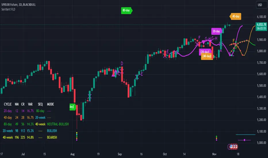
ASE Additionals v1ASE Additionals is a statistics-driven indicator that combines multiple features to provide traders with valuable statistics to help their trading. This indicator offers a customizable table that includes statistics for VWAP with customizable standard deviation waves.
Per the empirical rule, the following is a schedule for what percent of volume should be traded between the standard deviation range:
+/- 1 standard deviation: 68.26% of volume should be trading within this range
+/- 2 standard deviation: 95.44% of volume should be trading within this range
+/- 3 standard deviation: 99.73% of volume should be trading within this range
+/- 4 standard deviation: 99.9937% of volume should be trading within this range
+/- 5 standard deviation: 99.999943% of volume should be trading within this range
+/- 6 standard deviation: 99.9999998% of volume should be trading within this range
The statistics table presents five different pieces of data
Volume Analyzed: Amount of contracts analyzed for the statistics
Volume Traded Inside Upper Extreme: Calculated by taking the amount of volume traded inside the Upper Extreme band divided by the total amount of contracts analyzed
Volume Traded Inside Lower Extreme: Calculated by taking the amount of volume traded inside the Lower Extreme band divided by the total amount of contracts analyzed
Given the user’s inputs, they will see the upper and lower extremes of the day. For example, if the user changed the inner st. dev input to 2, 95.44% of the volume should be traded within the inner band. If the user changed the outer st. dev input to 3, 99.73% of the volume should be traded within the outer band. Thus, statistically, 2.145% ((99.73%-95.44%)/2) of volume should be traded between the upper and lower band fill.
In the chart above, the bands are the 2nd and 3rd standard deviation inputs. We notice that out of the 151 Million Contracts , the actual percentage of volume traded in the upper extreme was 2.7% , and the actual percentage of the volume traded in the lower extreme was 3.3% . Given the empirical rule, about 2.145% of the volume should be traded in the upper extreme band, and 2.145% of the volume should be traded in the lower extreme band. Based on the statistics table, the empirical rule is true when applied to the volume-weighted average price.
The trader should recognize that statistics is all about probability and there is a margin for error, so the bands should be used as a bias, not an entry. For example, given the +/-2 and 3 standard deviations, statistically, if 2.145% of the volume is traded within the upper band extreme, you shouldn’t look for a long trade if the current price is in the band. Likewise, if 2.145% of the volume is traded within the lower band extreme, you shouldn’t look for a short trade if the current price is in the band.
Additionally, we provide traders with the Daily, Weekly, and Monthly OHLC levels. Open, High, Low, and Close are significant levels, especially on major timeframes. Once price has touched the level, the line changes from dashed/dotted to solid.
Features
VWAP Price line and standard deviation waves to analyze the equilibrium and extremes of the sessions trend
Previous Day/WEEK/Month OHLC levels provide Major timeframe key levels
Settings
VWAP Equilibrium: Turn on the VWAP line
VWAP Waves: Turn on the VWAP standard deviation waves
Inner St. Dev: Changes the inner band standard deviation to show the percentage of volume traded within
Outer St. Dev: Changes the outer band standard deviation to show the percentage of volume traded within
Upper Extreme: Change the color of the upper VWAP wave
Lower Extreme: Change the color of the lower VWAP wave
Wave Opacity: Change the opacity of the waves (0= completely transparent, 100=completely solid)
Statistics Table: Turn on or off the statistics table
Statistics Table Settings: Change the Table Color, Text Color, Text Size, and Table Position
Previous Day/Week/Month OHLC: Choose; All, Open, Close, High, Low, and the color of the levels
OHLC Level Settings: Change the OHLC label color, line style, and line width
How to Use
The VWAP price line acts as the 'Fair Value' or the 'Equilibrium' of the price session. Just as the VWAP Waves show the session's upper and lower extreme possibilities. While we can find entries from VWAP , our analysis uses it more as confirmation. OHLC levels are to be used as support and resistance levels. These levels provide us with great entry and target opportunities as they are essential and can show pivots in price action.
EWO Breaking Bands & XTLElliott Wave Principle, developed by Ralph Nelson Elliott , proposes that the seemingly chaotic behaviour of the different financial markets isn’t actually chaotic. In fact the markets moves in predictable, repetitive cycles or waves and can be measured and forecast using Fibonacci numbers. These waves are a result of influence on investors from outside sources primarily the current psychology of the masses at that given time. Elliott wave predicts that the prices of the a traded currency pair will evolve in waves: five impulsive waves and three corrective waves. Impulsive waves give the main direction of the market expansion and the corrective waves are in the opposite direction (corrective wave occurrences and combination corrective wave occurrences are much higher comparing to impulsive waves)
The Elliott Wave Oscillator ( EWO ) helps identifying where you are in the 5 / 3 Elliott Waves , mainly the highest/lowest values of the oscillator might indicate a potential bullish / bearish Wave 3. Mathematically expressed, EWO is the difference between a 5 period and 35 period moving average. In this study instead 35-period, Fibonacci number 34 is implemented for the slow moving average and formula becomes ewo = sma (HL2, 5) - sma (HL2, 34)
The Elliott Wave Oscillator enables traders to track Elliott Wave counts and divergences. It allows traders to observe when an existing wave ends and when a new one begins. Included with the EWO are the breakout bands that help identify strong impulses.
The Expert Trend Locator ( XTL ) was developed by Tom Joseph (in his book Applying Technical Analysis) to identify major trends, similar to Elliott Wave 3 type swings.
Blue bars are bullish and indicate a potential upwards impulse.
Red bars are bearish and indicate a potential downwards impulse.
White bars indicate no trend is detected at the moment.
Added "TSI Arrows". The arrows is intended to help the viewer identify potential turning points. The presence of arrows indicates that the TSI indicator is either "curling" up under the signal line, or "curling" down over the signal line. This can help to anticipate reversals, or moves in favor of trend direction.

Harmonic Patterns ProHello All,
We need to make things better & better to solve the puzzle and I try to do my best on this way for the community. now I am here with my Harmonic Patterns Pro script.
Harmonic Pattern recognition is the basic and primary ability any trader develops in technical analysis. Harmonic pattern recognition takes extensive practice and repetitive exposure. in general chart patterns are categorized into “continuous” and “reversal” patterns. Harmonic patterns construct geometric pattern structures using Fibonacci sequences. These harmonic structures identified as specified harmonic patterns provide unique opportunities for traders, such as potential price movements and key turning or trend reversal points. This script is developed to find following patterns by using the options you set. I have to say that this is not a strategy and you should not use this script blindly, instead, I strongly recommend you to create your own strategy using this script with other tools/indicators, such moving averages, Support/Resistance levels, volume indicators, sentiment indicators etc.
- Following Harmonic Patterns are available in this version:
-->Gartley
-->Butterfly
-->Bat
-->Crab
-->Shark
-->Cypher
-->Alternate Bat
-->Deep Crab
-->5-0
-->3-Drive
-->AB=CD
-->Descending Triangle
-->Ascending Triangle
-->Symmetrical Triangle
-->Double Top
-->Double Bottom
How the script works and finds harmonic patterns:
- It uses zigzag like other harmonic pattern script but there is a difference. this scripts searches up to 200 bars, finds/creates up to 200 XABCD using zigzag waves and searches predefined harmonic patterns
- It can find multiple harmonic patterns on a candles with different sizes and lengths
- Each pattern is shown using its own color (you can set 8 different colors)
- it shows Entry, Target1, Target2 and Stop-loss levels for each found Patterns
- It shows pattern validation zones for each found pattern
- it has all-in-one alerts. you set the alerts you want in the indicator options and you create only 1 alert for each symbol.
- it has prediction future and it can show many predicted patterns at the same time, each predicted patterns validations zones are shown separately
- While on real-time bar it searches and shows patterns for the visible area
it has followng alerts: . these in all-in-one alerts. it means that you choose the alerts in the options and enables any of them and then create only one for each symbol. and you get eany alert you choose. (" Any alert() function call "). in this version "Any alert() function call" alert is only alert you can use, if I get some requests I can try to other alerts as well.
New Pattern Found
Pattern Updated
Entered Position
Reached Target
Stop-loss
Validation zone is calculated using XABC points any pattern by using Y-Axis error rate. so if you increase Y-Axis error rate then the script can find much more Harmonic patterns.
X-Axis Error Rate is used for a few pattern such AB=CD for the distance of AB wave and CD wave.
The script can show Recommended Entry, Target 1, Target 2 and stop-loss levels for each active patterns. of course you can use these levels or you can set your own levels. you can see the screenshot below.
The script can show statistics panel. when statistic panel is enabled then no pattern is shown on the chart, the script shows ONLY statistics panel. This was done because of complexity of the script.
If you enables Prediction then pattern checks all possible XABC formations in the last 200 bars and finds/shows predicted patterns if there is any.
if you "replaying" then the script searches patterns only for last bar (if any update on zigzag on last bar), not for historical ones. you should take care while you use "Replay" feature of Tradingview
Now lets see the options:
Minimum ZigZag Period: this is minimum Zigzag Period to create new Zigzag wave. default value is 10 and minimum value is 4
Y-Axis Error Rate %: this is the error rate to create validation zones for each pattern, there is almost no perfect pattern, so we try to create a zone using error rate
X-Axis Error Rate % : this is used for a few pattern (such AB=CD) to check wave lengths on time basis
Minimum Pattern Length: This is Minimum Length for the Patterns to be searched. in Number of Bars
Maximum Pattern Length : This is Maximum Lengths for the Patterns to be searched. in Number of Bars
Max Number of XABCD to search: Maximum Number of ABCD to search pattern on each move, there are many possible XABCDs on the chart, this limitation is the number for how many of them will be searched
Find Patterns for: is the option about taking position. there are three options: "Long and Short", "Only Long", "Only Short"
Max Patterns on Each Bar: Maximum Number of Patterns that can be found on each bar, by default it's 3
Keep Pattern Until: you have two option "Target1" and "Target2". when a pattern found and if it reach any of these targets it is accepted as it's reached target and removed. this is also used inthe statictics panel!
Show Recommended Entries & Targets: if enabled then the script can show "Recommended" Entry, target1, target2 and stop-loss leves. you can use these levels or you can use your own calculation for each pattern
Entry = % of Target 2 : Entry Level for each pattern is calculated using the distance between D positon of the pattern and target 2. by default it's 16%, you can set it as you wish
Entry&Target Line Style: you can set line style for entry/target/stop-loss levels
Show Pattern Validation Zones: as explained above, for each pattern validation zone is created using error rate (Y-axis error rate). you can see it for each pattern
Source for Invalidation: this source is used for validation zones. there is two options: Close or High/Low. this source is used while invalidated the pattern. by default it used "close" price as source
Line Style: this is line style for validation zones, solid, dashed or dotted
Pattern Prediction/Possible Patterns: if you enable this option then the script calculates/searches possbile patterns and shows their levels in a label if there is one or more
Show Label & Zone: this is about how you want to see predictions, there are two choices: "Show Only Label", "Show Label & Zone"
Show Statistics Panel : if you enable this option then the script starts searching all harmonic patterns from the first bar for the last bar and keeps statistics for all of them and the shows in a table. you can see screenshot below
Panel Position: you can set panel location of statistics panel using this option
Show Rates Between Waves: if you enable this option then rate between the waves are shown. by default it's enabled
Keep Last Pattern on the Chart : if you enable this option then even if pattern is invalidated/reach target/stop-loss it stays on the chart until new pattern is found. by default it's enabled
Line Style : line style for the last pattern on the chart
Patterns to Search: you have options to enable/disable the patterns listed above to find&show, you can enable/disable any pattern in the list. by default all patterns are enabled except AB=CD pattern
in the ALERTS menu you have many options to enable/disable the alerts you want. Alerts contain Symbol name, Pattern name, Direction as Long/Short, Recommended Entry, Targets, SL levels.
- New Pattern Found
- Pattern Updated
- Entered Position
- Reached Target
- Stop-loss
Show Zig Zag: if you want to see Zig Zag then you should enable this option, and you can set the colors for the Zig zag. by default it's disabled.
and some other options for coloring and line styles of the patterns..
This is how XABCD points found using zigzag waves, I tried to explain it in the video below:
Validation zones and Entry, Target1, Target2 and Stop-loss levels:
Each pattern has its own color, you can see which levels, letters, lines etc belongs to which pattern:
Pattern prediction: you can enable it and change its background color:
How Statistics panel looks like. if there is active pattern then it's shown in different color in the table
This screenshot shows how the script finds and shows multiple patterns on a candle:
And some examples for triangles and Double top/bottom patterns:
Symmetrical triangle:
Ascending triangle:
Double bottom
and many others..
While using different time frames the script can find same patterns, in the following screenshots you can see how same patterns found on 5 and 10 min chart. of course this depends on the Zigzag Period
in this video, the idea and the indicator options is explained:
I can say that this is very complex script and it takes very long time to develop. I used my all programming ability and Pine ability to develop it. I hope you like it and make a lot of profit.
DISCLAIMER: No sharing, copying, reselling, modifying, or any other forms of use are authorized for the documents, script / strategy, and the information published with them. This informational planning script / strategy is strictly for individual use and educational purposes only. This is not financial or investment advice. Investments are always made at your own risk and are based on your personal judgement. I am not responsible for any losses you may incur. Please invest wisely.
Enjoy!
Płatny skrypt

Ichimoku Kinkō HyōThe Ichimoku Kinko Hyo is an trading system developed by the late Goichi Hosoda (pen name "Ichimokusanjin") when he was the general manager of the business conditions department of Miyako Shinbun, the predecessor of the Tokyo Shimbun. Currently, it is a registered trademark of Economic Fluctuation Research Institute Co., Ltd., which is run by the bereaved family of Hosoda as a private research institute.
The Ichimoku Kinko Hyo is composed of time theory, price range theory (target price theory) and wave movement theory. Ichimoku means "At One Glace". The equilibrium table is famous for its span, but the first in the equilibrium table is the time relationship.
In the theory of time, the change date is the day after the number of periods classified into the basic numerical value such as 9, 17, 26, etc., the equal numerical value that takes the number of periods of the past wave motion, and the habit numerical value that appears for each issue is there. The market is based on the idea that the buying and selling equilibrium will move in the wrong direction. Another feature is that time is emphasized in order to estimate when changes will occur.
In the price range theory, there are E・V・N・NT calculated values and multiple values of 4 to 8E as target values. In addition, in order to determine the momentum and direction of the market, we will consider other price ranges and ying and yang numbers.
If the calculated value is realized on the change date calculated by each numerical value, the market price is likely to reverse.
転換線 (Tenkansen) (Conversion Line) = (highest price in the past 9 periods + lowest price) ÷ 2
基準線 (Kijunsen) (Base Line) = (highest price in the past 26 periods + lowest price) ÷ 2
It represents Support/Resistance for 16 bars. It is a 50% Fibonacci Retracement. The Kijun sen is knows as the "container" of the trend. It is prefect to use as an initial stop and/or trailing stop.
先行スパン1 (Senkou span 1) (Lagging Span 1) = {(conversion value + reference value) ÷ 2} 25 periods ahead (26 periods ahead including the current day, that is)
先行スパン2 (Senkou span 2) (Lagging Span 2) = {(highest price in the past 52 periods + lowest price) ÷ 2} 25 periods ahead (26 periods ahead including the current day, that is)
遅行スパン (Chikou span) (Lagging Span) = (current candle closing price) plotted 26 periods before (that is, including the current day) 25 periods ago
It is the only Ichimoku indicator that uses the closing price. It is used for momentum of the trend.
The area surrounded by the two lagging span lines is called a cloud. This is the foundation of the system. It determines the sentiment (Bull/Bear) for the insrument. If price is above the cloud, the instrument is bullish. If price is below the cloud, the instrument is bearish.
-
The wave theory of the Ichimoku Kinko Hyo has the following waves.
All about the rising market. If it is the falling market, the opposite is true.
I wave rise one market price.
V wave the market price that raises and lowers.
N wave the market price for raising, lowering, and raising.
P wave the high price depreciates and the low price rises with the passage of time. Leave either.
Y wave the high price rises and the low price falls with the passage of time. Leave either.
S wave A market in which the lowered market rebounds and rises at the previous high level.
There are the above 6 types but the basis of the Ichimoku Kinko Hyo is the N wave of 3 waves.
In Elliott wave theory and similar theories, basically there are 5 waves but 5 waves are a series of 2 and 3 waves N, 3 for 7 waves, 4 for 9 waves and so on.
Even if it keep continuing, it will be based on N wave. In addition, since the P wave and the Y wave are separated from each other, they can be seen as N waves from a large perspective.
-
There are basic E・V・N・NT calculated values and several other calculation methods for the Ichimoku Kinko Hyo. It is the only calculated value that gives a concrete value in the Ichimoku Kinko Hyo, which is difficult to understand, but since we focus only on the price difference and do not consider the supply and demand, it is forbidden to stick to the calculated value alone.
(The calculation method of the following five calculated values is based on the rising market price, which is raised from the low price A to the high price B and lowered from the high price B to the low price C. Therefore, the low price C is higher than the low price A)
E calculated value The amount of increase from the low price A to the high price B is added to the high price B. = B + (BA)
V calculated value Adds the amount of decline from the high price B to the low price C to the high price B. = B + (BC)
N calculated value The amount of increase from the low price A to the high price B is added to the low price C. = C + (BA)
NT calculated value Adds the amount of increase from the low price A to the low price C to the low price C. = C + (CA)
4E calculated value (four-layer double / quadruple value) Adds three times the amount of increase from the low price A to the high price B to the high price B. = B + 3 × (BA)
Calculated value of P wave The upper price is devalued and the lower price is rounded up, and the price range of both is the same.
Calculated value of Y wave The upper price is rounded up and the lower price is rounded down, and the price range of both is the same.

[blackcat] L2 Ehlers Even Better SinwaveLevel: 2
Background
John F. Ehlers introduced Even Better sinwave Indicator in his "Cycle Analytics for Traders" chapter 12 on 2013.
Function
The original Sinewave Indicator was created by seeking the dominant cycle phase angle that had the best correlation between the price data and a theoretical dominant cycle sine wave. The Even Better Sinewave Indicator skips all the cycle measurements completely and relies on a strong normalization of the waveform at the output of a modified roofing filter. The modified roofing filter uses a single-pole high-pass filter to deliberately retain the longer-period trend components. The single-pole high-pass filter basically levels the amplitude of all the cycle components that would otherwise be larger with longer wavelengths due to Spectral Dilation. Therefore, when the waveform is normalized to the power in the waveform over a short period of time, the longer wavelength contributions tend to be an indication to stay in a trade when the market is in a trend.
The Even Better Sinewave Indicator works extraordinarily well when the market is in a trend mode. This means that the spectacular failures of most swing wave indicators are mitigated when the expected price turning point does not occur.
Although Dr. Ehlers admitted he had not studied it extensively, it appears that the Even Better Sinewave Indicator works well on futures intraday data. It takes a position in the correct direction and tends to stay with the good trades without excessive whipsawing.
Key Signal
Wave --> Even Better sinwave Indicator fast line
Trigger --> Even Better sinwave Indicator slow line
Pros and Cons
100% John F. Ehlers definition translation of original work, even variable names are the same. This help readers who would like to use pine to read his book. If you had read his works, then you will be quite familiar with my code style.
Remarks
The 55th script for Blackcat1402 John F. Ehlers Week publication.
Readme
In real life, I am a prolific inventor. I have successfully applied for more than 60 international and regional patents in the past 12 years. But in the past two years or so, I have tried to transfer my creativity to the development of trading strategies. Tradingview is the ideal platform for me. I am selecting and contributing some of the hundreds of scripts to publish in Tradingview community. Welcome everyone to interact with me to discuss these interesting pine scripts.
The scripts posted are categorized into 5 levels according to my efforts or manhours put into these works.
Level 1 : interesting script snippets or distinctive improvement from classic indicators or strategy. Level 1 scripts can usually appear in more complex indicators as a function module or element.
Level 2 : composite indicator/strategy. By selecting or combining several independent or dependent functions or sub indicators in proper way, the composite script exhibits a resonance phenomenon which can filter out noise or fake trading signal to enhance trading confidence level.
Level 3 : comprehensive indicator/strategy. They are simple trading systems based on my strategies. They are commonly containing several or all of entry signal, close signal, stop loss, take profit, re-entry, risk management, and position sizing techniques. Even some interesting fundamental and mass psychological aspects are incorporated.
Level 4 : script snippets or functions that do not disclose source code. Interesting element that can reveal market laws and work as raw material for indicators and strategies. If you find Level 1~2 scripts are helpful, Level 4 is a private version that took me far more efforts to develop.
Level 5 : indicator/strategy that do not disclose source code. private version of Level 3 script with my accumulated script processing skills or a large number of custom functions. I had a private function library built in past two years. Level 5 scripts use many of them to achieve private trading strategy.

Right Sided Ricker Moving Average And The Gaussian DerivativesIn general gaussian related indicators are built by using the gaussian function in one way or another, for example a gaussian filter is built by using a truncated gaussian function as filter kernel (kernel refer to the set weights) and has many great properties, note that i say truncated because the gaussian function is not supposed to be finite. In general the gaussian function is represented by a symmetrical bell shaped curve, however the gaussian function is parametric, and the user might adjust the position of the peak as well as the width of the curve, an indicator using this parametric approach is the Arnaud Legoux moving average (ALMA) who posses a length parameter controlling the filter length, a peak parameter controlling the position of the peak of the gaussian function as well as a width parameter, those parameters can increase/decrease the lag and smoothness of the moving average output.
However what about the derivatives of the gaussian function ? We don't talk much about them and thats a pity because they are extremely interesting and have many great properties as well, therefore in this post i'll present a low lag moving average based on the modification of the 2nd order derivative of the gaussian function, i believe this post will be extremely informative and i hope you will enjoy reading it, if you are not a math person you can skip the introduction on gaussian derivatives and their properties used as filter kernel.
Gaussian Derivatives And The Ricker Wavelet
The notion of derivative is continuous, so we will stick with the term discrete derivative instead, which just refer to the rate of change in the function, we have a change function in pinescript, and we will be using it to show an approximation of the gaussian function derivatives.
Earlier i used the term 2nd order derivative, here the derivative order refer to the order of differentiation, that is the number of time we apply the change function. For example the 0 (zeroth) order derivative mean no differentiation, the 1st order derivative mean we use differentiation 1 time, that is change(f) , 2nd order mean we use differentiation 2 times, that is change(change(f)) , derivates based on multiple differentiation are called "higher derivative". It will be easier to show a graphic :
Here we can see a normal gaussian function in blue, its scaled 1st order derivative in orange, and its scaled 2nd derivative in green, note that i use scaled because i used multiplication in order for you to see each curve, else it would have been less easy to observe them. The number of time a gaussian function derivative cross 0 is based on the order of differentiation, that is 2nd order = the function crossing 0 two times.
Now we can explain what is the Ricker wavelet, the Ricker wavelet is just the normalized 2nd order derivative of a gaussian function with inverted sign, and unlike the gaussian function the only thing you can change is the width parameter. The formula of the Ricker wavelet is show'n here en.wikipedia.org , where sigma is the width parameter.
The Ricker wavelet has this look :
Because she is shaped like a sombrero the Ricker wavelet is also called "mexican hat wavelet", now what would happen if we used a Ricker wavelet as filter kernel ? The response is that we would end-up with a bandpass filter, in fact the derivatives of the gaussian function would all give the kernel of a bandpass filter, with higher order derivatives making the frequency response of the filter approximate a symmetrical gaussian function, if i recall a filter using the first order derivative of a gaussian function would give a frequency response that is left skewed, this skewness is removed when using higher order derivatives.
The Indicator
I didn't wanted to make a bandpass filter, as lately i'am more interested in low-lag filters, so how can we use the Ricker wavelet to make a low-lag low-pass filter ? The response is by taking the right side of the Ricker wavelet, and since values of the wavelets are negatives near the border we know that the filter passband is non-monotonic, that is we know that the filter will have low-lag as frequencies in the passband will be amplified.
So taking the right side of the Ricker wavelet only mean that t has to be greater than 0 and linearly increasing, thats easy, however the width parameter can be tricky to use, this was already the case with ALMA, so how can we work with it ? First it can be seen that values of width needs to be adjusted based on the filter length.
In red width = 14, in green width = 5. We can see that an higher values of width would give really low weights, when the number of negative weights is too important the filter can have a negative group delay thus becoming predictive, this simply mean that the overshoots/undershoots will be crazy wild and that a great fit will be impossible.
Here two moving averages using the previous described kernels, they don't fit the price well at all ! In order to fix this we can simply define width as a function of the filter length, therefore the parameter "Percentage Width" was introduced, and simply set the width of the Ricker wavelet as p percent of the filter length. Lower values of percent width reduce the lag of the moving average, but lets see precisely how this parameter influence the filter output :
Here the filter length is equal to 100, and the percent width is equal to 60, the fit is quite great, lower values of percent width will increase overshoots, in fact the filter become predictive once the percent width is equal or lower to 50.
Here the percent width is equal to 50. Higher values of percent width reduce the overshoots, and a value of 100 return a filter with no overshoots that is suited to act as a lagging moving average.
Above percent width is set to 100. In order to make use of the predictive side of the filter, it would be great to introduce a forecast option, however this require to find the best forecast horizon period based on length and width, this is no easy task.
Finally lets estimate a least squares moving average with the proposed moving average, you know me...a percent width set to 63 will return a relatively good estimate of the LSMA.
LSMA in green and the proposed moving in red with percent width = 63 and both length = 100.
Conclusion
A new low-lag moving average using a right sided Ricker wavelet as filter kernel has been introduced, we have also seen some properties of gaussian derivatives. You can see that lately i published more moving averages where the user can adjust certain properties of the filter kernel such as curve width for example, if you like those moving averages you can check the Parametric Corrective Linear Moving Averages indicator published last month :
I don't exclude working with pure forms of gaussian derivatives in the future, as i didn't published much oscillators lately.
Thx for reading !

Ord Volume [LucF]Tim Ord came up with the Ord Volume concept. The idea is similar to Weis Wave , except that where Weis Wave keeps a cumulative tab of each wave’s successive volume columns, Ord Volume tracks the wave's average volume .
Features
You can choose to distinguish the area’s colors when the average is rising/falling (default).
You can show an EMA of the wave averages, which is different than an EMA on raw volume.
You can show (default) the last wave’s ending average over the current wave, to help in comparing relative levels.
You can change the length of the trend that needs to be broken for a new wave to start, as well as the price used in trend detection.
Use Cases
As with Weis Wave, what I look at first are three characteristics of the waves: their length, height and slope. I then compare those to the corresponding price movements, looking for discrepancies. For example, consecutive bearish waves of equal strength associated with lesser and lesser price movements are often a good indication of an impeding reversal.
Because Ord Volume uses average rather than cumulative volume, I find it is often easier to distinguish what is going on during waves, especially exhaustion at the end of waves.
Tim Ord has a method for entries and exits where he uses Ord Volume in conjunction with tests of support and resistance levels. Here are two articles published in 2004 where Ord explains his technique:
pr.b5z.net
n.b5z.net
Note
Being dependent on volume information as it is currently available in Pine, which does not include a practical way to retrieve delta volume information, the indicator suffers the same lack of precision as most other Pine-built volume indicators. For those not aware of the issue, the problem is that there is no way to distinguish the buying and selling volume (delta volume) in a bar, other than by looping through inside intervals using the security() function, which for me makes performance unsustainable in day to day use, while only providing an approximation of delta volume.
Adaptive Alligator - Asymmetric MH (Entry Only)
Adaptive Alligator – Asymmetric Mexican Hat (Entry Only)
This strategy combines adaptive cycle detection (wavelet + autocorrelation), directional entropy, and a Mexican Hat filter to generate highly selective LONG entry signals. Exits are based solely on the Alligator structure. The system is designed to detect asymmetric, strong, and accelerating bullish phases while filtering out market noise.
1. Adaptive Cycle Detection: The strategy analyzes the median price using wavelet decomposition (Haar, Daubechies D4/D6, Symlet 4), wavelet detail energy, and autocorrelation. It also incorporates the ratio of short-term to long-term ATR volatility. Based on these components, it computes a dominant_cycle value, which dynamically controls the lengths of the Alligator lines (Jaw, Teeth, Lips). This adaptive behavior allows the Alligator to speed up during trending phases and slow down during noise or consolidation.
2. Directional Entropy: Entropy is measured separately for upward and downward movements within the selected lookback window. The entropy difference: e_diff = entropy_down - entropy_up represents the directional bias of the market. When e_diff > 0, the market shows an organized bullish pressure; when < 0, bearish dominance.
3. Mexican Hat Filter: The Mexican Hat (Ricker Wavelet) acts as a second-derivative filter, detecting local maxima in the acceleration of directional entropy. The filtered output (mh_out) is compared against an adaptive noise level computed as SMA(|mh_out|). A signal is considered strong only when: – mh_out exceeds the adaptive noise level, – mh_out is rising relative to the previous bar. This step is critical for eliminating false signals produced by random fluctuations.
4. Entry Logic: A LONG entry requires all three layers: (1) Alligator structure: Lips > Teeth > Jaw. (2) Directional entropy bias: e_diff > 0. (3) A strong, accelerating Mexican Hat signal confirmed by a user-defined number of bars. Once all conditions are satisfied, a buy_final entry is triggered.
5. Exit Logic: Exits are intentionally simple and rely solely on the Alligator: crossunder(lips, teeth) This clean separation ensures precise, adaptive entries and stable, consistent exits.
6. Visual Components: – Alligator lines: Jaw (blue), Teeth (red), Lips (green), plotted with their characteristic offsets. – Background coloring reflects signal strength: dark green (STRONG BUY), lime (acceleration), yellow (weak bias), transparent otherwise. – A dedicated panel displays e_diff (entropy difference), mh_out (Mexican Hat output), and the adaptive noise band.
7. Diagnostic Table: A compact diagnostic dashboard shows: – MH Value, – Noise Level, – MH Acceleration (YES/NO), – Signal Status (STRONG BUY / ACCELERATING / WEAK / BEARISH). It updates on the last bar, making it suitable for live monitoring.
8. Use Case: This strategy is highly selective and ideal as an entry module within trend-following systems. By combining wavelets, entropy, and adaptive noise modeling, it effectively filters out consolidation periods and focuses only on statistically significant bullish transitions. It can be integrated with various exit frameworks such as ATR stops, channel-based exits, range boxes, or trailing logic.

Gann Levels (Auto) by RRR📌 Gann Levels (Auto) — Intraday, Swing & Elliott Wave Precision Tool
Gann Levels (Auto) is a high-accuracy price-reaction indicator designed for intraday scalpers, swing traders, and Elliott Wave traders who want clean, auto-updating support and resistance levels without manually drawing anything.
The indicator automatically detects the latest swing high & swing low and plots the 8 Gann Octave Levels between them. These levels act as a complete price map—showing equilibrium, structure, trend continuation zones, and reversal points with extreme precision.
🔥 Why This Indicator Stands Out
✔ Fully automatic swing detection
Levels update as structure evolves — no manual adjustments.
✔ All Gann Octave levels
Plots 1/8 through 8/8 including the critical 4/8 midpoint.
✔ Intraday-optimized
Exceptional on 1m, 3m, 5m, and 15m charts.
✔ Ultra-clean support & resistance
Levels act as reliable barriers and breakout zones.
⭐ MOST IMPORTANT LEVELS FOR INTRADAY
4/8 – Midpoint (Major Decision Pivot)
Strongest Gann level.
Controls trend or reversal for the session.
Breakout → Trend Day
Rejection → Reversal Day
8/8 & 0/8 – Extreme Structure Edges
Most likely zones for intraday reversals.
Perfect for scalp entries when combined with volume exhaustion.
🎯 How to Trade ELLIOTT WAVE Using Gann Levels
This indicator is exceptionally powerful when combined with Elliott Wave Theory.
Here is how to use it wave-by-wave:
🔵 Wave 2 → Identify Bottom Using 0/8 or 1/8 Levels
Wave 2 typically retraces deep but remains above key structure.
Gann confirmation:
Price stops at 0/8 or 1/8 zone
Rejection wick + low volume breakdown attempt
Bullish intent starts forming
This gives a perfect Wave 3 entry zone.
🔴 Wave 3 → Breakout Above 4/8 Midpoint
Wave 3 is the strongest impulsive wave.
The 4/8 level works like a force-field.
Wave 3 confirmation:
Price breaks and retests 4/8
Strong volume
No deep pullbacks after break
This is one of the most reliable Elliott + Gann trades.
🟡 Wave 4 → Uses 3/8 or 5/8 as Support/Resistance
Wave 4 is corrective and shallow compared to Wave 2.
Gann alignment:
Wave 4 often consolidates between 3/8 and 5/8
Levels act like range boundaries
Avoid trading inside chop; wait for breakout
This gives perfect continuation entries for Wave 5.
🟣 Wave 5 → Ends Near 7/8 or 8/8 Extreme Zone
Wave 5 usually ends in overbought territory.
Gann confirmation:
Price hits 7/8 or 8/8
Momentum weakens
Divergence builds (RSI/MACD optional)
Last push = exhaustion
This is where reversals or major pullbacks begin.
💥 BONUS: Corrective Waves (A-B-C)
Wave A:
Often rejects from 4/8 or 5/8.
Wave B:
Typically trapped between 3/8–5/8.
Wave C:
Usually ends around 0/8 (for bullish trend)
or 8/8 (for bearish trend).
These zones give ultra-high confidence entries.
⚙️ Who This Indicator Is Perfect For
Elliott Wave traders
Intraday scalpers
Swing traders
Price action & structure traders
Traders who want automatic support-resistance levels
Traders who want clean, non-cluttered levels
⚠️ Disclaimer
This indicator is for educational purposes only.
Trading involves risk. Always use proper risk management.

Aethix Cipher DivergencesAethix Cipher Divergences v6
Core Hook: Custom indicator inspired by VuManChu B, Grok-enhanced for crypto intel—blends WaveTrend (WT) oscillator with multi-divergences for buy/sell circles (green/teal buys #00FFFF, red sells) and dots (divs, gold overbought alerts).
Key Features:
WaveTrend Waves: Dual waves (teal WT1, darker teal WT2) with VWAP (purple for neon vibe), overbought/oversold lines, crosses for signals.
Divergences: Regular/hidden for WT, RSI, Stoch—red bearish, green bullish dots; extra range for deeper insights.
RSI + MFI Area: Colored area (green positive, red negative) for sentiment/volume flow.
Stochastic RSI: K/D lines with fill for overbought/oversold trends.
Schaff Trend Cycle: Purple line for cycle smoothing.
Sommi Patterns: Flags (pink bearish, blue bullish) and diamonds for HTF patterns, purple higher VWAP.
MACD Colors on WT: Dynamic WT shading based on MACD for enhanced reads.

Information-Geometric Market DynamicsInformation-Geometric Market Dynamics
The Information Field: A Geometric Approach to Market Dynamics
By: DskyzInvestments
Foreword: Beyond the Shadows on the Wall
If you have traded for any length of time, you know " the feeling ." It is the frustration of a perfect setup that fails, the whipsaw that stops you out just before the real move, the nagging sense that the chart is telling you only half the story. For decades, technical analysis has relied on interpreting the shadows—the patterns left behind by price. We draw lines on these shadows, apply indicators to them, and hope they reveal the future.
But what if we could stop looking at the shadows and, instead, analyze the object casting them?
This script introduces a new paradigm for market analysis: Information-Geometric Market Dynamics (IGMD) . The core premise of IGMD is that the price chart is merely a one-dimensional projection of a much richer, higher-dimensional reality—an " information field " generated by the collective actions and beliefs of all market participants.
This is not just another collection of indicators. It is a unified framework for measuring the geometry of the market's information field—its memory, its complexity, its uncertainty, its causal flows—and making high-probability decisions based on that deeper reality. By fusing advanced mathematical and informational concepts, IGMD provides a multi-faceted lens through which to view market behavior, moving beyond simple price action into the very structure of market information itself.
Prepare to move beyond the flatland of the price chart. Welcome to the information field.
The IGMD Framework: A Multi-Kernel Approach
What is a Kernel? The Heart of Transformation
In mathematics and data science, a kernel is a powerful and elegant concept. At its core, a kernel is a function that takes complex, often inscrutable data and transforms it into a more useful format. Think of it as a specialized lens or a mathematical "probe." You cannot directly measure abstract concepts like "market memory" or "trend quality" by looking at a price number. First, you must process the raw price data through a specific mathematical machine—a kernel—that is designed to output a measurement of that specific property. Kernels operate by performing a sort of "similarity test," projecting data into a higher-dimensional space where hidden patterns and relationships become visible and measurable.
Why do creators use them? We use kernels to extract features —meaningful pieces of information—that are not explicitly present in the raw data. They are the essential tools for moving beyond surface-level analysis into the very DNA of market behavior. A simple moving average can tell you the average price; a suite of well-chosen kernels can tell you about the character of the price action itself.
The Alchemist's Challenge: The Art of Fusion
Using a single kernel is a challenge. Using five distinct, computationally demanding mathematical engines in unison is an immense undertaking. The true difficulty—and artistry—lies not just in using one kernel, but in fusing the outputs of many . Each kernel provides a different perspective, and they can often give conflicting signals. One kernel might detect a strong trend, while another signals rising chaos and uncertainty. The IGMD script's greatest strength is its ability to act as this alchemist, synthesizing these disparate viewpoints through a weighted fusion process to produce a single, coherent picture of the market's state. It required countless hours of testing and calibration to balance the influence of these five distinct analytical engines so they work in harmony rather than cacophony.
The Five Kernels of Market Dynamics
The IGMD script is built upon a foundation of five distinct kernels, each chosen to probe a unique and critical dimension of the market's information field.
1. The Wavelet Kernel (The "Microscope")
What it is: The Wavelet Kernel is a signal processing function designed to decompose a signal into different frequency scales. Unlike a Fourier Transform that analyzes the entire signal at once, the wavelet slides across the data, providing information about both what frequencies are present and when they occurred.
The Kernels I Use:
Haar Kernel: The simplest wavelet, a square-wave shape defined by the coefficients . It excels at detecting sharp, sudden changes.
Daubechies 2 (db2) Kernel: A more complex and smoother wavelet shape that provides a better balance for analyzing the nuanced ebb and flow of typical market trends.
How it Works in the Script: This kernel is applied iteratively. It first separates the finest "noise" (detail d1) from the first level of trend (approximation a1). It then takes the trend a1 and repeats the process, extracting the next level of cycle (d2) and trend (a2), and so on. This hierarchical decomposition allows us to separate short-term noise from the long-term market "thesis."
2. The Hurst Exponent Kernel (The "Memory Gauge")
What it is: The Hurst Exponent is derived from a statistical analysis kernel that measures the "long-term memory" or persistence of a time series. It is the definitive measure of whether a series is trending (H > 0.5), mean-reverting (H < 0.5), or random (H = 0.5).
How it Works in the Script: The script employs a method based on Rescaled Range (R/S) analysis. It calculates the average range of price movements over increasingly larger time lags (m1, m2, m4, m8...). The slope of the line plotting log(range) vs. log(lag) is the Hurst Exponent. Applying this complex statistical analysis not to the raw price, but to the clean, wavelet-decomposed trend lines, is a key innovation of IGMD.
3. The Fractal Dimension Kernel (The "Complexity Compass")
What it is: This kernel measures the geometric complexity or "jaggedness" of a price path, based on the principles of fractal geometry. A straight line has a dimension of 1; a chaotic, space-filling line approaches a dimension of 2.
How it Works in the Script: We use a version based on Ehlers' Fractal Dimension Index (FDI). It calculates the rate of price change over a full lookback period (N3) and compares it to the sum of the rates of change over the two halves of that period (N1 + N2). The formula d = (log(N1 + N2) - log(N3)) / log(2) quantifies how much "longer" and more convoluted the price path was than a simple straight line. This kernel is our primary filter for tradeable (low complexity) vs. untradeable (high complexity) conditions.
4. The Shannon Entropy Kernel (The "Uncertainty Meter")
What it is: This kernel comes from Information Theory and provides the purest mathematical measure of information, surprise, or uncertainty within a system. It is not a measure of volatility; a market moving predictably up by 10 points every bar has high volatility but zero entropy .
How it Works in the Script: The script normalizes price returns by the ATR, categorizes them into a discrete number of "bins" over a lookback window, and forms a probability distribution. The Shannon Entropy H = -Σ(p_i * log(p_i)) is calculated from this distribution. A low H means returns are predictable. A high H means returns are chaotic. This kernel is our ultimate gauge of market conviction.
5. The Transfer Entropy Kernel (The "Causality Probe")
What it is: This is by far the most advanced and computationally intensive kernel in the script. Transfer Entropy is a non-parametric measure of directed information flow between two time series. It moves beyond correlation to ask: "Does knowing the past of Volume genuinely reduce our uncertainty about the future of Price?"
How it Works in the Script: To make this work, the script discretizes both price returns and the chosen "driver" (e.g., OBV) into three states: "up," "down," or "neutral." It then builds complex conditional probability tables to measure the flow of information in both directions. The Net Transfer Entropy (TE Driver→Price minus TE Price→Driver) gives us a direct measure of causality . A positive score means the driver is leading price, confirming the validity of the move. This is a profound leap beyond traditional indicator analysis.
Chapter 3: Fusion & Interpretation - The Field Score & Dashboard
Each kernel is a specialist providing a piece of the puzzle. The Field Score is where they are fused into a single, comprehensive reading. It's a weighted sum of the normalized scores from all five kernels, producing a single number from -1 (maximum bearish information field) to +1 (maximum bullish information field). This is the ultimate "at-a-glance" metric for the market's net state, and it is interpreted through the dashboard.
The Dashboard: Your Mission Control
Field Score & Regime: The master metric and its plain-English interpretation ("Uptrend Field", "Downtrend Field", "Transitional").
Kernel Readouts (Wave Align, H(w), FDI, etc.): The live scores of each individual kernel. This allows you to see why the Field Score is what it is. A high Field Score with all components in agreement (all green or red) is a state of High Coherence and represents a high-quality setup.
Market Context: Standard metrics like RSI and Volume for additional confluence.
Signals: The raw and adjusted confluence counts and the final, calculated probability scores for potential long and short entries.
Pattern: Shows the dominant candlestick pattern detected within the currently forming APEX range box and its calculated confidence percentage.
Chapter 4: Mastering the Controls - The Inputs Menu
Every parameter is a lever to fine-tune the IGMD engine.
📊 Wavelet Transform: Kernel ( Haar for sharp moves, db2 for smooth trends) and Scales (depth of analysis) let you tune the script's core microscope to your asset's personality.
📈 Hurst Exponent: The Window determines if you're assessing short-term or long-term market memory.
🔍 Fractal Dimension & ⚡ Entropy Volatility: Adjust the lookback windows to make these kernels more or less sensitive to recent price action. Always keep "Normalize by ATR" enabled for Entropy for consistent results.
🔄 Transfer Entropy: Driver lets you choose what causal force to measure (e.g., OBV, Volume, or even an external symbol like VIX). The throttle setting is a crucial performance tool, allowing you to balance precision with script speed.
⚡ Field Fusion • Weights: This is where you can customize the model's "brain." Increase the weights for the kernels that best align with your trading philosophy (e.g., w_hurst for trend followers, w_fdi for chop avoiders).
📊 Signal Engine: Mode offers presets from Conservative to Aggressive . Min Confluence sets your evidence threshold. Dynamic Confluence is a powerful feature that automatically adapts this threshold to the market regime.
🎨 Visuals & 📏 Support/Resistance: These inputs give you full control over the chart's appearance, allowing you to toggle every visual element for a setup that is as clean or as data-rich as you desire.
Chapter 5: Reading the Battlefield - On-Chart Visuals
Pattern Boxes (The Large Rectangles): These are not simple range boxes. They appear when the Field Score crosses a significance threshold, signaling a potential ignition point.
Color: The color reflects the dominant candlestick pattern that has occurred within that box's duration (e.g., green for Bull Engulf).
Label: Displays the dominant pattern, its duration in bars, and a calculated Confidence % based on field strength and pattern clarity.
Bar Pattern Boxes (The Small Boxes): If enabled, these highlight individual, significant candlestick patterns ( BE for Bull Engulf, H for Hammer) on a bar-by-bar basis.
Signal Markers (▲ and ▼): These appear only when the Signal Engine's criteria are all met. The number is the calculated Probability Score .
RR Rails (Dashed Lines): When a signal appears, these lines automatically plot the Entry, Stop Loss (based on ATR), and two Take Profit targets (based on Risk/Reward ratios). They dynamically break and disappear as price touches each level.
Support & Resistance Lines: Plots of the highest high ( Resistance ) and lowest low ( Support ) over a lookback, providing key structural levels.
Chapter 6: Development Philosophy & A Final Word
One single question: " What is the market really doing? " It represents a triumph of complexity, blending concepts from signal processing, chaos theory, and information theory into a cohesive framework. It is offered for educational and analytical purposes and does not constitute financial advice. Its goal is to elevate your analysis from interpreting flat shadows to measuring the rich, geometric reality of the market's information field.
As the great mathematician Benoit Mandelbrot , father of fractal geometry, noted:
"Clouds are not spheres, mountains are not cones, coastlines are not circles, and bark is not smooth, nor does lightning travel in a straight line."
Neither does the market. IGMD is a tool designed to navigate that beautiful, complex, and fractal reality.
— Dskyz, Trade with insight. Trade with anticipation.
