Raymond Swing Day [Qanexra] - The Multi-Timeframe Level PlannerThe Raymond Swing Day indicator is the essential final piece of the Qanexra trading suite. While RaymondTrending confirms momentum and RaymondRatio filters noise, this tool provides the critical price levels necessary to execute trades with precision.
It automatically calculates and plots Fibonacci Pivot Points across various timeframes, transforming static price action into a dynamic roadmap for the trading day or week.
Why Use Pivot Points? Pivot Points are foundational tools, acting as gravitational price levels where supply and demand are expected to meet or reverse. They are crucial for setting:
Entry Zones
Stop-Loss (Invalidation)
Take-Profit Targets
Core Features & Calculation:
Advanced Fibonacci Pivots: Calculates the central , three Resistance , and three Support levels using the widely respected Fibonacci formula.
Flexible Timeframe Engine: Choose a major anchor timeframe (Daily, Weekly, Monthly, etc.) or set it to Auto for adaptive level calculation.
Multi-Layer Overlay: Simultaneously view price levels from up to three different timeframes (e.g., Daily, overlaid with 120m/H2, and 30m/M30 levels) to identify areas of confluence—the strongest decision zones.
Clear Trading Interpretation: Each level comes with a label indicating its suggested use:
Look for Entry: The central decision point.
Bullish/Bearish Try to Extend: The initial boundary for a directional move.
Bullish/Bearish Take Profit: Common targets for intraday or swing moves.
Aggressive Bullish/Bearish: Extreme levels for high-volatility moves or max extension targets.
Integration with the Qanexra Suite: Combine Raymond Swing Day levels with:
RaymondTrending confirmation of momentum.
RaymondRatio filter for noise avoidance.
When your volatility indicators confirm a breakout, the Raymond Swing Day levels tell you exactly where to enter and where to target your exit.
Regressions

Relative Performance Areas [LuxAlgo]The Relative Performance Areas tool enables traders to analyze the relative performance of any asset against a user-selected benchmark directly on the chart, session by session.
The tool features three display modes for rescaled benchmark prices, as well as a statistics panel providing relevant information about overperforming and underperforming streaks.
🔶 USAGE
Usage is straightforward. Each session is highlighted with an area displaying the asset price range. By default, a green background is displayed when the asset outperforms the benchmark for the session. A red background is displayed if the asset underperforms the benchmark.
The benchmark is displayed as a green or red line. An extended price area is displayed when the benchmark exceeds the asset price and is set to SPX by default, but traders can choose any ticker from the settings panel.
Using benchmarks to compare performance is a common practice in trading and investing. Using indexes such as the S&P 500 (SPX) or the NASDAQ 100 (NDX) to measure our portfolio's performance provides a clear indication of whether our returns are above or below the broad market.
As the previous chart shows, if we have a long position in the NASDAQ 100 and buy an ETF like QQQ, we can clearly see how this position performs against BTSUSD and GOLD in each session.
Over the last 15 sessions, the NASDAQ 100 outperformed the BTSUSD in eight sessions and the GOLD in six sessions. Conversely, it underperformed the BTCUSD in seven sessions and the GOLD in nine sessions.
🔹 Display Mode
The display mode options in the Settings panel determine how benchmark performance is calculated. There are three display modes for the benchmark:
Net Returns: Uses the raw net returns of the benchmark from the start of the session.
Rescaled Returns: Uses the benchmark net returns multiplied by the ratio of the benchmark net returns standard deviation to the asset net returns standard deviation.
Standardized Returns: Uses the z-score of the benchmark returns multiplied by the standard deviation of the asset returns.
Comparing net returns between an asset and a benchmark provides traders with a broad view of relative performance and is straightforward.
When traders want a better comparison, they can use rescaled returns. This option scales the benchmark performance using the asset's volatility, providing a fairer comparison.
Standardized returns are the most sophisticated approach. They calculate the z-score of the benchmark returns to determine how many standard deviations they are from the mean. Then, they scale that number using the asset volatility, which is measured by the asset returns standard deviation.
As the chart above shows, different display modes produce different results. All of these methods are useful for making comparisons and accounting for different factors.
🔹 Dashboard
The statistics dashboard is a great addition that allows traders to gain a deep understanding of the relationship between assets and benchmarks.
First, we have raw data on overperforming and underperforming sessions. This shows how many sessions the asset performance at the end of the session was above or below the benchmark.
Next, we have the streaks statistics. We define a streak as two or more consecutive sessions where the asset overperformed or underperformed the benchmark.
Here, we have the number of winning and losing streaks (winning means overperforming and losing means underperforming), the median duration of each streak in sessions, the mode (the number of sessions that occurs most frequently), and the percentages of streaks with durations equal to or greater than three, four, five, and six sessions.
As the image shows, these statistics are useful for traders to better understand the relative behavior of different assets.
🔶 SETTINGS
Benchmark: Benchmark for comparison
Display Mode: Choose how to display the benchmark; Net Returns: Uses the raw net returns of the benchmark. Rescaled Returns: Uses the benchmark net returns multiplied by the ratio of the benchmark and asset standard deviations. Standardized Returns: Uses the benchmark z-score multiplied by the asset standard deviation.
🔹 Dashboard
Dashboard: Enable or disable the dashboard.
Position: Select the location of the dashboard.
Size: Select the dashboard size.
🔹 Style
Overperforming: Enable or disable displaying overperforming sessions and choose a color.
Underperforming: Enable or disable displaying underperforming sessions and choose a color.
Benchmark: Enable or disable displaying the benchmark and choose colors.

Bitcoin vs M2 Global Liquidity (Lead 3M) - Table Ticker═══════════════════════════════════════════════════════════════
Bitcoin vs M2 Global Liquidity - Regression Indicator
═══════════════════════════════════════════════════════════════
TECHNICAL SPECS
• Pine Script v6
• Overlay: false (separate pane)
• Data sources: 5 M2 series + 4 FX pairs (request.security)
• Calculation: Rolling OLS linear regression with configurable lead
• Output: Regression line + ±1σ/±2σ confidence bands + R² ticker
CORE FUNCTIONALITY
Aggregates M2 money supply from 5 central banks (CN, US, EU, JP, GB),
converts to USD, applies time-lead, runs rolling linear regression
vs Bitcoin price, plots predicted value with confidence intervals.
CONFIGURABLE PARAMETERS
Input Controls:
• Lead Period: 0-365 days (default: 90)
• Lookback Window: 50-2000 bars (default: 750)
• Bands: Toggle ±1σ and ±2σ visibility
• Colors: BTC, M2, regression line, confidence zones
• Ticker: Position, size, colors, transparency
Advanced Settings:
• Table display: R², lead, M2 total, country breakdown (%)
• Ticker customization: 9 position options, 6 text sizes
• Border: Width 0-10px, color, outline-only mode
DATA AGGREGATION
Sources (via request.security):
• ECONOMICS:CNM2, USM2, EUM2, JPM2, GBM2
• FX_IDC:CNYUSD, JPYUSD (others: FX:EURUSD, GBPUSD)
• Conversion: All M2 → USD → Sum / 1e12 (trillions)
REGRESSION ENGINE
• Arrays: m2Array, btcArray (dynamic sizing, auto-trim)
• Window: Rolling (lookbackPeriod bars)
• Lead: Time-shift via array indexing (i + leadPeriodDays)
• Calc: Manual OLS (covariance/variance), no built-in ta functions
• Outputs: slope, intercept, r2, stdResiduals
CONFIDENCE BANDS
±1σ and ±2σ calculated from standard deviation of residuals.
Fill zones between upper/lower bounds with configurable transparency.
ALERTS
5 pre-configured alertcondition():
• Divergence > 15%
• Price crosses ±1σ bands (up/down)
• Price crosses ±2σ bands (up/down)
TICKER TABLE
Dynamic table.new() with 9 rows:
• R² value (4 decimals)
• Lead period (days + months)
• M2 Global total (trillions USD)
• Country breakdown: CN, US, EU, JP, GB (absolute + %)
• Optional: Hide/show M2 details
VISUAL CUSTOMIZATION
All plot() elements support:
• Color picker inputs (group="Couleurs")
• Line width: 1-3px
• Transparency: 0-100% for zones
• Offset: M2 plot has +leadPeriodDays offset option
PERFORMANCE
• Max arrays size: lookbackPeriod + leadPeriodDays + 200
• Calculations: Only when array.size >= lookbackPeriod + leadPeriodDays
• Table update: barstate.islast (once per bar)
• Request.security: gaps_off mode
CODE STRUCTURE
1. Inputs (lines 7-54)
2. Data fetch (lines 56-76)
3. M2 aggregation (line 78)
4. Array management (lines 84-95)
5. Regression calc (lines 97-172)
6. Prediction + bands (lines 174-183)
7. Plots (lines 185-199)
8. Ticker table (lines 201-236)
9. Alerts (lines 238-246)
DEPENDENCIES
None. Pure Pine Script v6. No external libraries.
LIMITATIONS
• Daily timeframe recommended (1D)
• Requires 750+ bars history for optimal calculation
• M2 data availability: TradingView ECONOMICS feed
• Max lines: 500 (declared in indicator())
CUSTOMIZATION EXAMPLES
• Shorter lookback (200d): More reactive, lower R²
• Longer lookback (1500d): More stable, regime mixing
• No bands: Set showBands=false for clean view
• Different lead: Test 60d, 120d for sensitivity analysis
TECHNICAL NOTES
• Manual OLS implementation (no ta.linreg)
• Array-based lead application (not plot offset)
• M2 values stored in trillions (/ 1e12) for readability
• Residuals array cleared/rebuilt each calculation
OPEN SOURCE
Code fully visible. Modify, fork, analyze freely.
No hidden calculations. No proprietary data.
VERSION
1.0 | November 2025 | Pine Script v6
═══════════════════════════════════════════════════════════════

Smart Trend Signal with Bands [wjdtks255]Indicator Description for TradingView
Title: Adaptive Trend Kernel
Description:
The "Adaptive Trend Kernel " is a versatile trend-following and volatility indicator designed to help traders identify dynamic market trends, potential reversals, and price extremes within a channel. Built upon a customized linear regression model, this indicator provides clear visual cues to enhance your trading decisions.
Key Features:
Regression Line: A central dynamic line representing the core trend direction, calculated based on a user-defined "Regression Length."
Regression Bands: Standard deviation-based bands plotted around the Regression Line, which act like a dynamic channel. These bands expand and contract with market volatility, indicating potential overbought/oversold conditions relative to the trend.
Trend Reversal Signals: Distinct "Up" (green triangle up) and "Down" (red triangle down) signals are generated when the price (close) crosses over or under the Regression Line. These signals suggest potential shifts in the short-term trend direction.
Visual Customization: Highly flexible input options for adjusting line colors, band colors, line width, and panel opacity. Users can toggle the visibility of bands and trend labels to suit their chart preferences.
Panel Label: A subtle "Regression" label is dynamically positioned, offering clear context without cluttering the main chart.
How it Works: The indicator calculates a linear regression line as the adaptive center of the price movement. Standard deviation is then used to create upper and lower bands, encapsulating typical price fluctuations. Signals are fired when price breaks out of the regression line, suggesting a momentum shift in line with the established trend or a potential reversal.
Trading Methods & Strategies
Here are some trading strategies you can apply using the "Adaptive Trend Kernel " indicator:
Trend-Following with Confirmation:
Long Entry: Look for an "Up" signal (green triangle up) when the price is above the Regression Line, especially after a brief retracement towards the line. This confirms that the uptrend is likely resuming.
Short Entry: Look for a "Down" signal (red triangle down) when the price is below the Regression Line, especially after a brief rally towards the line. This confirms that the downtrend is likely resuming.
Exit Strategy: Consider exiting if an opposite signal appears, or if the price closes outside the opposite band, indicating potential overextension or reversal.
Reversal / Counter-Trend Play:
Long Entry (Aggressive): When the price approaches or briefly dips below the Lower Regression Band and then generates an "Up" signal (green triangle up). This could indicate a potential bounce from an oversold condition relative to the trend.
Short Entry (Aggressive): When the price approaches or briefly moves above the Upper Regression Band and then generates a "Down" signal (red triangle down). This could indicate a potential pullback from an overbought condition relative to the trend.
Confirmation: This strategy works best when combined with other reversal confirmation patterns (e.g., bullish/bearish engulfing candlesticks) or divergences in other momentum indicators (like RSI).
Volatility Breakout:
Entry (Long): After a period of low volatility where the Regression Bands are narrow, observe if the price decisively breaks above the Upper Regression Band and an "Up" signal appears. This suggests a strong bullish momentum breakout.
Entry (Short): After a period of low volatility where the Regression Bands are narrow, observe if the price decisively breaks below the Lower Regression Band and a "Down" signal appears. This suggests a strong bearish momentum breakdown.
Management: Volatility breakouts can be swift; use appropriate risk management and profit-taking strategies.
Important Considerations:
Risk Management: Always apply proper stop-loss and take-profit levels. No indicator is infallible.
Timeframe Sensitivity: Adjust the "Regression Length" and "Band Multiplier" according to the asset and timeframe you are trading. Shorter lengths might suit scalping, while longer lengths are better for swing trading.
Confirmation with Other Tools: For higher conviction trades, use this indicator in conjunction with other technical analysis tools such like volume, MACD, or RSI on an oscillator pane.
Backtesting: Always backtest any strategy on historical data to understand its performance characteristics before live trading.

Bitcoin AHR999 Indicator
AHR999 Indicator
The AHR999 Indicator is created by a Weibo user named ahr999. It assists Bitcoin investors in making investment decisions based on a timing strategy. This indicator implies the short-term returns of Bitcoin accumulation and the deviation of Bitcoin price from its expected valuation.
When the AHR999 index is < 0.45 , it indicates a buying opportunity at a low price.
When the AHR999 index is between 0.45 and 1.2 , it is suitable for regular investment.
When the AHR999 index is > 1.2 , it suggests that the coin price is relatively high and not suitable for trading.
In the long term, Bitcoin price exhibits a positive correlation with block height. By utilizing the advantage of regular investment, users can control their short-term investment costs, keeping them mostly below the Bitcoin price.

Jace's Raff ChannelJust a basic, no-frills, Raff Regression channel. You can adjust the regression length and provide a starting point offset.

STEVEN Breakout VWAP (M1/M5/M15)This strategy combines breakout detection, VWAP confirmation, and ATR-based risk management to identify high-probability trading setups.
It automatically generates Long and Short entries when price action breaks key levels and aligns with VWAP direction, providing clear visual signals and automated backtesting capability.
🔍 How It Works
Breakout Detection:
The script identifies when price breaks above recent highs or below recent lows (based on the last 10 candles).
VWAP Confirmation:
A Long signal is generated when price breaks above resistance and stays above VWAP.
A Short signal is generated when price breaks below support and stays below VWAP.
ATR-based Stop Loss & Take Profit:
Stop Loss = 1× ATR (adjustable).
Take Profit = 1.5× risk (Risk/Reward 1:1.5).
Both are calculated dynamically at signal time.
Backtesting Ready:
Fully compatible with TradingView’s Strategy Tester, allowing users to analyze performance, win rate, and profit factors automatically.
🧩 Visual Features
Green triangles below the bars → Long signal.
Red triangles above the bars → Short signal.
Orange VWAP line → confirms trend direction.
⚙️ Inputs
ATR Length and Multiplier
VWAP Display toggle
Stop Loss and Risk/Reward settings
Signal marker size

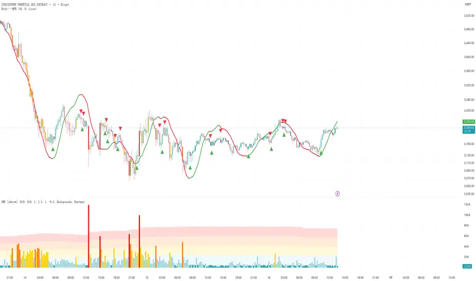
Bcnk——GJBBcnk-GJB Trend Detection Indicator
Basic Introduction
Bcnk-GJB is a technical indicator based on Pine Script 6, displayed as an overlay on the price chart. This indicator analyzes market trend conditions using multiple moving average lines.
Visual Features
· Displayed directly on the candlestick chart
· Uses two colors: green and red
· Includes both upward and downward arrow shapes
· Arrows appear above or below the candlesticks
Technical Components
· Utilizes 10 calculation lines with different periods
· Period parameters increase from 31 to 40
· Each line has independent color status
· Employs linear regression calculation method
Display Elements
Color Status
· Green represents upward movement
· Red represents downward movement
Arrow Signals
· Green upward triangles: displayed below candlesticks
· Red downward triangles: displayed above candlesticks
Parameter Settings
Data Source Selection
· Default calculation uses closing price
Offset Adjustment
· Adjustable display position of the indicator
Feature Characteristics
· Multiple lines displayed simultaneously
· Intuitive and easy-to-understand color changes
· Clear and distinct arrow markers
· Simple and direct status recognition
Interface Description
· Indicator name: Bcnk——GJB
· Short title: Bcnk——GJB
· Display position: Overlay on top of price chart
This is a trend status visualization tool that helps observe market movement changes through colors and arrows.

Bcnk——MFB//@version=6
indicator(title = '', shorttitle = 'Bcnk——MFB', overlay = true)
length = input(title = 'Length', defval = 32)
offset = input(title = 'Offset', defval = 0)
src = input(close, title = 'Source')
// ZLSMA 计算
lsma = ta.linreg(src, length, offset)
lsma2 = ta.linreg(lsma, length, offset)
zlsma = lsma + lsma - lsma2
// 趋势方向(颜色用它控制)
isUp = zlsma >= zlsma
col = isUp ? color.green : color.red
// 主线
plot(zlsma, color = col, linewidth = 3)
// ============================
// 变色(趋势方向变)就画箭头
// ============================
// 红 → 绿
upSignal = isUp and not isUp
// 绿 → 红
downSignal = not isUp and isUp
// 上箭头
plotshape(upSignal, title = 'Up Arrow', style = shape.arrowup, location = location.belowbar, color = color.new(color.green, 0), size = size.small)
// 下箭头
plotshape(downSignal, title = 'Down Arrow', style = shape.arrowdown, location = location.abovebar, color = color.new(color.red, 0), size = size.small)
Lorentzian Length Adaptive Moving Average [LLAMA] Adaptation of "Machine Learning: Lorentzian Classification" by
Gradient color by base on work by
LLAMA: A regime-aware adaptive moving average that bends with the market.
Start with a problem traders know:
Traditional moving averages are either too slow (EMA200) or too fast (EMA9)
Adaptive MAs exist, but they often hug price too tightly or smooth too much, failing to balance bias and tactics
LLAMA uses a Lorentzian distance function to adapt its length dynamically. Instead of a fixed smoothing window, it stretches or contracts depending on market conditions. This distortion reduces lag while still providing a clear bias line.
The indicator looks back at recent bars and measures how similar they are using a Lorentzian distance (a log‑scaled absolute difference). It keeps track of the “nearest neighbors” — bars that most resemble the current regime. Each neighbor carries a label (long, short, neutral) based on simple price comparisons. By averaging these labels, LLAMA predicts whether the market is leaning bullish or bearish. That prediction is then mapped into a dynamic length between and .
Bullish bias -> length stretches toward max (smoother, more stable).
Bearish bias -> length contracts toward min (snappier, more reactive).
During breakouts, LLAMA tightens and comes into contact with bars, giving actionable signals. During chop, it stretches to avoid false triggers. It covers both ends of the spectrum (bias and tactics) in one line, something static MA's can't do.
Think of LLAMA as a lens that bends with the market:
Wide lens (max length) for big picture bias.
Narrow lens (min length) for tactical precision.
The "Lorentzian Loop" is the math that decides when to widen or narrow.

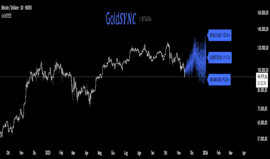
Gold𝑺𝒀𝑵𝑪🟡 Gold𝑺𝒀𝑵𝑪 - BTC follows GOLD
Gold𝑺𝒀𝑵𝑪 is a quantitative projection tool that visualizes how Bitcoin (BTC/USD) would perform if it mirrored the recent price behavior of Gold (XAU/USD).
It extends Gold’s last n days of normalized performance forward on the BTC chart and builds a volatility-adjusted projection corridor.
⚙️ Core Mechanics
Projection Engine:
Calculates Gold’s relative performance over the selected lookback window and applies it to BTC’s last closing price.
Volatility Scaling:
Computes the rolling standard deviation of Gold’s logarithmic returns to estimate the potential deviation range.
Dynamic Gradient Bands:
Three upper and lower standard deviation layers (1σ, 2σ, 3σ) are drawn using fading gradient fills to visualize increasing uncertainty.
Scenario Labels:
Displays key levels for:
𝑩𝑼𝑳𝑳𝑪𝑨𝑺𝑬 — +2σ projection
𝑬𝑿𝑷𝑬𝑪𝑻𝑬𝑫 — mean projection
𝑩𝑬𝑨𝑹𝑪𝑨𝑺𝑬 — −2σ projection
📈 Usage
Designed for 1D charts (daily timeframe).
Provides a comparative “sync” between Gold and Bitcoin to study cross-asset momentum, volatility symmetry, and directional bias.
Useful in macro correlation analysis or when modeling BTC’s potential movement under Gold-like conditions.
🧠 Interpretation
Gold𝑺𝒀𝑵𝑪 doesn’t predict - it synchronizes.
It offers a contextual view of BTC’s potential path if it followed Gold’s rhythm, enhanced by statistically derived volatility zones.
Created by: @SP_Quant
Credits: BitAura
Session H/L + Mid + Quarters — Live EvolvingSession High and Low with quarter lines for stop progressions with lines projected back X days

R Dominante by Mata (CRT Madre + CRT Interior)Dominant Range (Green + Red + Outstanding Lines)
This script automatically identifies the dominant parent candle (CRT – Candle Range Theory) and draws its range with a green box. It also allows you to create independent red parent candles that function autonomously.
Main Features:
Main Green Box: Represents the dominant parent candle, following the actual CRT:
It is activated and remains active while the price reaches the extremes.
It is only invalidated if there is a close outside the range.
It is automatically deactivated when it reaches both extremes (high and low).
Independent Red Box: Detects ranges independent of the green box and is deactivated when both extremes are reached.
Fully Automatic: No manual range adjustments required.
Configuration: Adjust the transparency of the boxes and the maximum number of bars to review.
Recommended Use:
Ideal for traders who apply Candle Range Theory (CRT).
Allows for clear identification of dominant and secondary ranges.
Useful for determining touch points of extremes and planning strategic entries and exits.

CME GapThe win rate is 99%, but the stoploss is uncertain
you will loss all your money in one failure

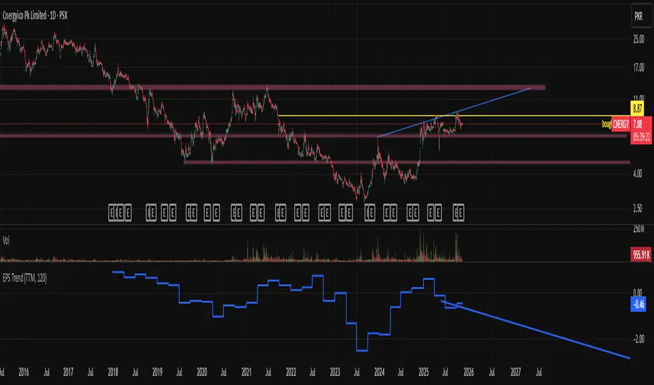
EPS Trendline (Fundamentals Insight by Mazhar Karimi)Overview
This indicator visualizes a company’s Earnings Per Share (EPS) data directly on the chart—pulled from TradingView’s fundamental database—and applies a dynamic linear regression trendline to highlight the long-term direction of earnings growth or decline.
It’s designed to help investors and quantitative traders quickly see how the company’s profitability (EPS) has evolved over time and whether it’s trending upward (growth), flat (stagnant), or downward (decline).
How it Works
Uses request.financial() to fetch EPS data (Diluted or Basic).
You can select whether to use TTM (Trailing Twelve Months), FQ (Fiscal Quarter), or FY (Fiscal Year) data.
The script fits a regression line (using ta.linreg) over a configurable window to visualize the underlying EPS trend.
Updates automatically when new financial data is released.
Inputs
EPS Period: Choose between FQ / FY / TTM
Use Diluted EPS: Toggle to compare Diluted vs. Basic EPS
Regression Window: Adjust how many bars are used to fit the trendline
Interpretation Tips
A rising trendline indicates earnings momentum and potential investor confidence.
A flat or declining trendline may warn of profitability slowdowns.
Combine with price action or valuation ratios (like P/E) for deeper analysis.
Works best on stocks or ETFs with fundamental data (not available for crypto or FX).
Suggestions / Use Cases
Pair with Price/Earnings ratio indicators to evaluate valuation vs. fundamentals.
Use in conjunction with earnings release events for context.
Ideal for long-term investors, swing traders, or fundamental quants tracking financial health trends.
Future Enhancements (Planned Ideas)
🔹 Option to display multiple regression lines (short-term and long-term)
🔹 Support for comparing multiple tickers’ EPS in the same pane
🔹 Integration with Net Income, Revenue, or Free Cash Flow trends
🔹 Add a “Rate of Change” signal for momentum-based EPS analysis
BB SPY Mean Reversion Investment StrategySummary
Mean reversion first, continuation second. This strategy targets equities and ETFs on daily timeframes. It waits for price to revert from a Bollinger location with candle and EMA agreement, then manages risk with ATR based exits. Uniqueness comes from two elements working together. One, an adaptive band multiplier driven by volatility of volatility that expands or contracts the envelope as conditions change. Two, a bias memory that re arms the same direction after any stop, target, or time exit until a true opposite signal appears. Add it to a clean chart, use the markers and levels, and select on bar close for conservative alerts. Shapes can move while the bar is open and settle on close.
Scope and intent
• Markets. Currently adapted for SPY, needs to be optimized for other assets
• Timeframes. Daily primary. Other frames are possible but not the default
• Default demo. SPY on daily
• Purpose. Trade mean reversion entries that can chain into a longer swing by splitting holds into ATR or time segments
Originality and usefulness
• Novelty. Adaptive band width from volatility of volatility plus a persistent bias array that keeps the original direction alive across sequential entries until an opposite setup is confirmed
• Failure modes mitigated. False starts in chop are reduced by candle color and EMA location. Missed continuation after a take profit or stop is addressed by the re arm engine. Oversized envelopes during quiet regimes are avoided by the adaptive multiplier
• Testability. Every module has Inputs and visible levels so users can see why a suggestion appears
• Portable yardstick. All risk and targets are expressed in ATR units
Method overview in plain language
The engine measures where price sits relative to Bollinger bands, confirms with candle color and EMA location, requires ADX for shorts(in our case long close since we use it currently as long only), and optionally requires a trend or mean reversion regime using band width percent rank and basis slope. Risk uses ATR for stop, target, and optional breakeven. A small array stores the last confirmed direction. While flat, the engine keeps a pending order in that direction. The array flips only when a true opposite setup appears.
Base measures
• Range basis. True Range smoothed over a user defined ATR Length
• Return basis. Not required
Components
• Bollinger envelope. SMA length and standard deviation multiplier. Entry is based on cross of close through the band with location bias
• Candle and EMA filter. Close relative to open and close relative to EMA align direction
• ADX gate for shorts. Requires minimum trend strength for short trades
• Adaptive multiplier. Band width scales using volatility of volatility so envelopes breathe with conditions
• Regime gate optional. Band width percent rank and basis slope identify trend or mean reversion regimes
• Risk manager. ATR stop, ATR target, optional breakeven, optional time exit
• Bias memory. Array stores last confirmed direction and re arms entries while flat
Fusion rule
Minimum satisfied gates count style. All required gates must be true. Optional gates are controlled in Inputs. Bias memory never overrides an opposite confirmed setup.
Signal rule
• Long setup when close crosses up through the lower band, the bar closes green, and close is above the long EMA
• Short setup when close crosses down through the upper band, the bar closes red, close is below the short EMA, and ADX is above the minimum
• While flat the model keeps a pending order in the stored direction until a true opposite setup appears
• IN LONG or IN SHORT describes states between entry and exit
What you will see on the chart
• Markers for Long and Short setups
• Exit markers from ATR or time rules
• Reference levels for entry, stop, and target
• Bollinger bands and optional adaptive bands
Inputs with guidance
Setup
• Signal timeframe. Uses the chart timeframe
• Invert direction optional. Flips long and short
Logic
• BB Length. Typical 10 to 50. Higher smooths more
• BB Mult. Typical 1.0 to 2.5. Higher widens entries
• EMA Length long. Typical 10 to 50
• EMA Length short. Typical 5 to 30
• ADX Minimum for short. Typical 15 to 35
Filters
• Regime Type. none or trend or mean reversion
• Rank Lookback. Typical 100 to 300
• Basis Slope Length and Threshold. Larger values reduce false trends
Risk
• ATR Length. Typical 10 to 21
• ATR Stop Mult. Typical 1.0 to 3.0
• ATR Take Profit Mult. Typical 2.0 to 5.0
• Breakeven Trigger R. Move stop to entry after the chosen multiple
• Time Exit. Minimum bars and extension when profit exceeds a fraction of ATR
Bias and rearm
• Bias flips kept. Array depth
• Keep rearm when flat. Maintain a pending order while flat
UI
• Show markers and levels. Clean defaults
Usage recipes
Alerts update in real time and can change while the bar forms. Select on bar close for conservative workflows.
Properties visible in this publication
• Initial capital 25000
• Base currency USD
• If any higher timeframe calls are enabled, request.security uses lookahead off
• Commission 0.03 percent
• Slippage 3 ticks
• Default order size method Percent of equity with value 5
• Pyramiding 0
• Process orders on close On
• Bar magnifier Off
• Recalculate after order is filled Off
• Calc on every tick Off
Realism and responsible publication
No performance claims. Costs and fills vary by venue. Shapes can move intrabar and settle on close. Strategies use standard candles only.
Honest limitations and failure modes
High impact releases and thin liquidity can break assumptions. Gap heavy symbols may require larger ATR. Very quiet regimes can reduce contrast in the mean reversion signal. If stop and target can both be touched inside one bar, outcome follows the TradingView order model for that bar path.
Regimes with extreme one sided trend and very low volatility can reduce mean reversion edges. Results vary by symbol and venue. Past results never guarantee future outcomes.
Open source reuse and credits
None.
Backtest realism
Costs are realistic for liquid equities. Sizing does not exceed five percent per trade by default. Any departure should be justified by the user.
If you got any questions please le me know

Hybrid Linear Regression Channel with Fibonacci LevelsHow to Use the LRC Fib Hybrid Indicator (Detailed Guide)
1. Read the Trend
2.The thick blue line is the linear regression midline.
If it’s sloping upward → uptrend (favor longs).
If sloping downward → downtrend (favor shorts).
The gray channel bounds are ±2 standard deviations (adjustable).
3. Understand Fibonacci Levels
Fib lines are projected parallel to the regression slope using the channel width as 100%:
Red dashed lines (0.0 to 0.786): Support zones in uptrends.
Blue dashed line (0.5): Midline/neutral.
Green dashed lines (1.0 to 2.618): Resistance zones in downtrends.
Strongest levels: 0.618 (support) and 1.618 (resistance).
4. Buy Signal (Long Entry)
Triggered when:
Midline is rising (uptrend confirmed).
Price crosses above a red Fib level (0.0–0.786).
Volume > 20-period average (if confirmation enabled).
Action:
Enter long on the green triangle (▲).
Stop Loss: Below the lower gray channel or recent swing low.
Take Profit: At 1.0, 1.272, or 1.618 green Fibs.
5. Sell Signal (Short Entry)
Triggered when:
Midline is falling (downtrend).
Price crosses below a green Fib level (1.272–2.618).
Volume > average.
Action:
Enter short on the red triangle (▼).
Stop Loss: Above the upper gray channel.
Take Profit: At 1.0, 0.786, or 0.618 red Fibs.
6. Use the Info Table (Bottom-Right)
Shows live prices of all Fib levels, current trend ("Up"/"Down"), and signal status ("BUY"/"SELL"/"None").
7. Customize via Settings (Gear Icon)
Regression Length: 50–200 (shorter = faster response).
Std Dev Multiplier: 1.5–3.0 (tighter/wider channel).
Toggle Fibs: Hide unused levels to declutter.
Volume Confirmation: Turn off for pure price action.
8. Set Alerts
Right-click chart → Add Alert → Select "Buy Signal" or "Sell Signal" → Enable popup/email/webhook.
9. Best Practices
Best in trending markets (avoid chop).
Wait for volume spike on bounce.
Combine with higher timeframe bias.
Use 0.618/1.618 as primary reversal zones.
This indicator gives you adaptive trend, precise entries, volume filter, and dynamic targets — all in one clean overlay.

Henry's MA & RSProviding 10 21 50 200 MA and RS rating based on S&P 500, basically for US stocks. Enjoy!

NSR - Dynamic Linear Regression ChannelOverview
The NSR - Dynamic Linear Regression Channel is a powerful overlay indicator that plots a dynamic regression-based channel around price action. Unlike static channels, this tool continuously recalculates the linear regression trendline from a user-defined starting point and builds upper and lower boundaries using a combination of standard deviation and maximum price deviations (highs/lows).
It visually separates "Premium" (overvalued) and "Discount" (undervalued) zones relative to the regression trend — ideal for mean-reversion, breakout, or trend-following strategies.
Key Features
Dynamic Regression Line Calculates slope, intercept, and average using full lookback from a reset point.
Adaptive Channel Width Combines standard deviation of residuals with max high/low deviations for robust boundaries.
Auto-Reset on Breakout Channel resets when price closes beyond upper/lower band twice in direction of trend .
Visual Zones Blue shaded = Premium (resistance zone)
Red shaded = Discount (support zone)
Real-Time Updates Live channel extends with each bar; historical channels preserved on reset.
How It Works
Regression Calculation
Uses all bars since last reset to compute the best-fit line:
y = intercept + slope × bar_position
Deviation Bands
Statistical : Standard deviation of price from regression line
Structural : Maximum distance from highs to line (upper) and lows to line (lower)
Final band = Regression Line ± (Deviation Input × StdDev)
Channel Reset Logic
Resets when:
Price closes above upper band twice in an uptrend (slope > 0)
OR closes below lower band twice in a downtrend (slope < 0)
Prevents overextension and adapts to new trends.
Visual Output
Active channel updates in real-time
Completed channels saved as historical reference (up to 500 lines/boxes)
Input Parameters
Deviation (2.0) - Multiplier for standard deviation to set channel width
Premium Color - blue color for upper (resistance) zone
Discount Color - red color for lower (support) zone
Best Use Cases
Mean Reversion - Buy near lower band in uptrend, sell near upper band
Breakout Trading - Enter on confirmed close beyond band + volume
Trend Confirmation - Use slope direction + price position in channel
Stop Loss / Take Profit - Place stops beyond opposite band
Pro Tips
Use on higher timeframes (4H, Daily) for cleaner regression fits
Combine with volume or momentum to filter false breakouts
Lower Deviation (e.g., 1.5) for tighter, more responsive channels
Watch channel resets — they often mark significant trend shifts
Why Use DLRC?
"Most channels are static. This one evolves with the market."
The NSR-DLRC gives you a mathematically sound, visually intuitive way to see:
Where price should be (regression)
Where it has been (deviation extremes)
When the trend is breaking structure
Perfect for traders who want regression-based precision without rigid assumptions.
Add to chart → Watch price dance within the evolving trend corridor.

Dual Harmonic-based AHR DCA (Default :BTC-ETH)A panel indicator designed for dual-asset BTC/ETH DCA (Dollar Cost Averaging) decisions.
It is inspired by the Chinese community indicator "AHR999" proposed by “Jiushen”.
How to use:
Lower HM-based AHR → cheaper (potential buy zone).
Higher HM-based AHR → more expensive (potential risk zone).
Higher than Risk Threshold → consider to sell, but not suitable for DCA.
When both AHR lines are below the Risk threshold → buy the cheaper one (or split if similar).
If one AHR is above Risk → buy the other asset.
If both are above Risk → simulation shows “STOP (both risk)”.
Not limited to BTC/ETH — you can freely change symbols in the input panel
to build any dual-asset DCA pair you want (e.g., BTC/BNB, ETH/SOL, etc.).
What you’ll see:
Two lines: AHR BTC (HM) and AHR ETH (HM)
Two dashed lines: OppThreshold (green) and RiskThreshold (red)
Colored fill showing which asset is cheaper (BTC or ETH)
Buy markers:
- B = Buy BTC
- E = Buy ETH
- D = Dual (split budget)
Top-right table: prices, AHRs, thresholds, qOpp/qRisk%, simulation, P&L
Labels showing last-bar AHR values
Core idea:
Use an AHR based on Harmonic Moving Average (HM) — a ratio that measures how “cheap or expensive” price is relative to both its short-term mean and long-term trend.
The original AHR999 used SMA and was designed for BTC only.
This indicator extends it with cross-exchange percentile mapping, allowing the empirical “opportunity/risk” zones of the AHR999 (on Bitstamp) to adapt automatically to the current market pair.
The indicator derives two adaptive thresholds:
OppThreshold – opportunity zone
RiskThreshold – risk zone
These thresholds are compared with the current HM-based AHR of BTC and ETH to decide which asset is cheaper, and whether it is good to DCA or not, or considering to sell(When it in risk area).
This version uses
Display base: Binance (default: perpetual) with HM-based AHR
Percentile base: Bitstamp spot SMA-AHR (complete, stable history)
Rolling window: 2920 daily bars (~8 years) for percentile tracking
Concept summary
AHR measures the ratio of price to its long-term regression and short-term mean.
HM replaces SMA to better reflect equal-fiat-cost DCA behavior.
Cross-exchange percentile mapping (Bitstamp → Binance) keeps thresholds consistent with the original AHR999 interpretation.
Recommended settings (1D):
DCA length (harmonic): 200
Log-regression lookback: 1825 (≈5 years)
Rolling window: 2920 (≈8 years)
Reference thresholds: 0.45 / 1.20 (AHR999 empirical priors)
Tie split tolerance (ΔAHR): 0.05
Daily budget: 15 USDT (simulation)
All display options can be toggled: table, markers, labels, etc.
Notes:
When the rolling window is filled (2920 bars by default), thresholds are first calculated and then visually backfilled as left-extended lines.
The “buy markers” and “decision table” are light simulations without fees or funding costs — for rhythm and relative analysis, not backtesting.

Sector Analysis [SS]Introducing the most powerful sector analysis tool/indicator available, to date, in Pine!
This is a whopper indicator, so be sure to read carefully to ensure you understand its applications and uses!
First of all, because this is a whopper, let's go over the key functional points of the indicator.
The indicator compares the 11 main sector ETFs against whichever ticker you are looking at.
The functions include the following:
Ability to pull technicals from the sectors, such as RSI, Stochastic and Z-Score;
Ability to look at the correlation of the sector ETF to the current ticker you are looking at.
Ability to calculate the R2 value between the ticker you are looking at and each sector.
The ability to run a Two Tailed T-Test against the log returns of the Ticker of interest and the Sector (to analyze statistically significant returns between sectors/tickers).
The ability to analyze the distribution of returns across all sector ETFs.
The ability to pull buying and selling volume across all sector ETFs.
The ability to create an integrated moving average using a sector ETF to predict the expected close range of a ticker of interest.
These are the highlight functions. Below, I will go more into them, what they mean and how to use them.
Pulling Technicals
This is pretty straight forward. You can pull technicals, such as RSI, Stochastic and Z-Score from all the sector ETFs and view them in a table.
See below for the example:
Pulling Correlation
In order to see which sector your ticker of interest follows more closely, we need to look first at correlation and then at R2.
The correlation will look at the immediate relationship over a specified time. A highly positive value, indicates a strong, symbiotic relationship, which the sector and the ticker follow each other. This would be represented by a correlation of 0.8 or higher.
A strong negative correlation, such as -0.8 or lower, indicates that the sector and the ticker are completely opposite. When one goes up, the other goes down and vice versa.
You can adjust your correlation assessment length directly in the settings menu:
If you want to use a sector ETF to find the expected range for a ticker of interest, it is important to locate the highest, POSITIVE, correlation value. Here are the results for MSFT at a correlation lookback of 200:
In this example, we can see the best relationship is with the ETF XLK.
Analysis of R2
R2 is an important metric. It essentially measures how much of the variance between 2 tickers are explained by a simple, linear relationship.
A high R2 means that a huge degree of variance can be explained between the 2 tickers. A low R2 means that it cannot and that the 2 tickers are likely not integrated or closely related.
In general, if you want to use the sector ETF to find the mean and trading range and identify over-valuation/over-extension and under-extension statistically, you need to see both a high correlation and a high R-Squared. These 2 metrics should be analyzed together.
Let's take a look at MSFT:
Here, despite the correlation implying that XLK was the ticker we should use to analyze, when we look at the R Squared, we see actually, we should be using XLI.
XLI has a strong positive relationship with MSFT, albeit a bit less than XLK, but the R2 is solid, > 0.9, indicating the XLI explains much of MSFT's variance.
Two Tailed T-Test
A two tailed T-test analyzes whether there is a statistically significant difference between 2 different groups, or in our case, tickers.
The T-Test is conducted on the log returns of the ticker of interest and the sector. You then can see the P value results, whether it is significant or not. Let's look at MSFT again:
Looking at this, we can see there is no statistically significant difference in returns between MSFT and any of the sectors.
We can also see the SMA of the log returns for more detailed comparison.
If we were to observe a significant finding on the T-Test metrics, this would indicate that one sector either outperforms or underperforms your ticker to a statistically significant degree! If you stumble upon this, you would check the average log returns to compare against the average returns of your ticker of interest, to see whether there is better performance or worse performance from the sector ETF vs. your ticker of interest.
Analyzing the Distribution
The indicator will also analyze the distribution of returns.
This is an interesting option as it can help you ascertain risk. Normally distributed returns imply mean reverting behavviour. Deviations from that imply trending behaviour with higher risk expectancy. If we look at the distribution statistics currently over the last 200 trading days, here are the results:
Here, we can see all show signs of trending, as none of the returns are normally distributed. The highest risk sectors are XLK and XLY.
Why are they the highest risk?
Because the indicator has found a heavy right tailed distribution, indicated sudden and erratic mean reversion/losses are possible.
Creating an MA
Now for the big bonus of the indicator!
The indicator can actually create a regression based range from closely correlated sectors, so you can see, in sectors that are strongly correlated to your ticker, whether your ticker is over-bought, oversold or has mean reverted.
Let's look at MSFT using XLI, our previously identified sector with a high correlation and high R2 value:
The results are pretty impressive.
You can see that MSFT has rode the mean of the sector on the daily timeframe for quite some time. Each time it over extended itself above the sector implied range, it mean reverted.
Currently, if you were to trade based on Pairs or statistics, MSFT is no trade as it is currently trading at its sector mean.
If you are a visual person, you can have the indicator plot the mean reversion points directly:
Green represents a bullish mean reversion and red a bearish mean reversion.
Concluding Remarks
If you like pair trading, following the link between sectors and tickers or want a more objective way to determine whether a ticker is over-bought or oversold, this indicator can help you.
In addition to doing this, the indicator can provide risk insights into different sectors by looking at the distribution, as well as identify under-performing sectors or tickers.
It can also shed light on sectors that may be technically over-bought or oversold by looking at Z-Score, stochastics and RSI.
Its a whopper and I really hope you find it helpful and useful!
Thanks everyone for reading and checking this out!
Safe trades!
Central Limit Theorem Reversion IndicatorDear TV community, let me introduce you to the first-ever Central Limit Theorem indicator on TradingView.
The Central Limit Theorem is used in statistics and it can be quite useful in quant trading and understanding market behaviors.
In short, the CLT states: "When you take repeated samples from any population and calculate their averages, those averages will form a normal (bell curve) distribution—no matter what the original data looks like."
In this CLT indicator, I use statistical theory to identify high-probability mean reversion opportunities in the markets. It calculates statistical confidence bands and z-scores to identify when price movements deviate significantly from their expected distribution, signaling potential reversion opportunities with quantifiable probability levels.
Mathematical Foundation
The Central Limit Theorem (CLT) says that when you average many data points together, those averages will form a predictable bell-curve pattern, even if the original data is completely random and unpredictable (which often is in the markets). This works no matter what you're measuring, and it gets more reliable as you use more data points.
Why using it for trading?
Individual price movements seem random and chaotic, but when we look at the average of many price movements, we can actually predict how they should behave statistically. This lets us spot when prices have moved "too far" from what's normal—and those extreme moves tend to snap back (mean reversion).
Key Formula:
Z = (X̄ - μ) / (σ / √n)
Where:
- X̄ = Sample mean (average return over n periods)
- μ = Population mean (long-term expected return)
- σ = Population standard deviation (volatility)
- n = Sample size
- σ/√n = Standard error of the mean
How I Apply CLT
Step 1: Calculate Returns
Measures how much price changed from one bar to the next (using logarithms for better statistical properties)
Step 2: Average Recent Returns
Takes the average of the last n returns (e.g., last 100 bars). This is your "sample mean."
Step 3: Find What's "Normal"
Looks at historical data to determine: a) What the typical average return should be (the long-term mean) and b) How volatile the market usually is (standard deviation)
Step 4: Calculate Standard Error
Determines how much sample averages naturally vary. Larger samples = smaller expected variation.
Step 5: Calculate Z-Score
Measures how unusual the current situation is.
Step 6: Draw Confidence Bands
Converts these statistical boundaries into actual price levels on your chart, showing where price is statistically expected to stay 95% and 99% of the time.
Interpretation & Usage
The Z-Score:
The z-score tells you how statistically unusual the current price deviation is:
|Z| < 1.0 → Normal behavior, no action
|Z| = 1.0 to 1.96 → Moderate deviation, watch closely
|Z| = 1.96 to 2.58 → Significant deviation (95%+), consider entry
|Z| > 2.58 → Extreme deviation (99%+), high probability setup
The Confidence Bands
- Upper Red Bands: 95% and 99% overbought zones → Expect mean reversion downward as the price is not likely to cross these lines.
- Center Gray Line: Statistical expectation (fair value)
- Lower Blue Bands: 95% and 99% oversold zones → Expect mean reversion upward
Trading Logic:
- When price exceeds the upper 95% band (z-score > +1.96), there's only a 5% probability this is random noise → Strong sell/short signal
- When price falls below the lower 95% band (z-score < -1.96), there's a 95% statistical expectation of upward reversion → Strong buy/long signal
Background Gradient
The background color provides real-time visual feedback:
- Blue shades: Oversold conditions, expect upward reversion
- Red shades: Overbought conditions, expect downward reversion
- Intensity: Darker colors indicate stronger statistical significance
Trading Strategy Examples
Hypothetically, this is how the indicator could be used:
- Long: Z-score < -1.96 (below 95% confidence band)
- Short: Z-score > +1.96 (above 95% confidence band)
- Take profit when price returns to center line (Z ≈ 0)
Input Parameters
Sample Size (n) - Default: 100
Lookback Period (m) - Default: 100
You can also create alerts based on the indicator.
Final notes:
- The indicator uses logarithmic returns for better statistical properties
- Converts statistical bands back to price space for practical use
- Adaptive volatility: Bands automatically widen in high volatility, narrow in low volatility
- No repainting: yay! All calculations use historical data only
Feedback is more than welcome!
Henri
NSR Dynamic Channel - HTF + ReversionNSR Dynamic Channel – HTF Volatility + Reversion
(Beginner-friendly, pro-grade, non-repainting)
The NSR Dynamic Channel builds an adaptive volatility envelope that compares current price action to a statistically-derived “expected” range pulled from a user-selected higher timeframe (HTF).
Is this just another keltner variation?
In short: Keltner reacts. NSR anticipates.
Keltner says “price moved a lot.”
NSR says “this move is abnormal compared to the last 2 days on a higher timeframe — and here’s the probability it snaps back.”
The channel is not a simple multiple of recent ATR or standard deviation; instead it:
Samples HTF volatility over a rolling window (default: last 2 days on the chosen HTF).
Expected Range
HTF Volatility Spread = StDev of 1-bar ATR on the HTF
Scales this HTF range to the current chart’s volatility using a compression ratio :
compRatio = SMA(High-Low over lookback) / Expected Range
This makes the channel tighten in low-vol regimes and widen in high-vol regimes .
Centers the channel on a composite mean ( AVGMEAN ) calculated from:
Smoothed Adaptive Averages of the current timeframe close
SMA of close over the user-defined lookback ( Slow )
The three means are averaged to reduce lag and noise.
Draws two layers :
HTF Expected Channel (gray fill) = PAMEAN ± expectedD
Dynamic Expected Band (inner gray) = HTF Expected Range
Adds a fast 2σ envelope around AVGMEAN using the standard deviation of close over the lookback period.
Core Calculations (Conceptual Overview)
HTF Baseline → ATR on user HTF → SMA & StDev over a defined number of days
Compression Ratio → Normalizes current range to HTF “normal” volatility
Expected Band Width → Expected Range × CompressionRatio
Bias Detection → % change of composite mean over 2 bars → “bullish” / “bearish” filter
Overextension % → Position of price within the expected band (0–100%)
How to Use It (3 Steps)
Apply to any chart – defaults work on futures (NQ/ES), stocks (SPY), crypto (BTC), forex, etc.
Price is outside both the fast 2σ envelope and the HTF-scaled expected band
Expect some sort of reversion
Enable alerts – two built-in conditions:
NSR Exit Long – bullish bias + high crosses upper expected edge
NSR Exit Short – bearish bias + low crosses lower expected edge
Optional toggles :
Show 2σ Price Range → fast overextension lines
Expected Channel → HTF-based gray fill
Mean → MEAN centerline
Why It Works
Context-aware : Uses HTF “normal” volatility as anchor
Adaptive : Shrinks in consolidation, expands in breakouts
Filtered signals : Only triggers when both statistical layers agree
Non-repainting : All calculations use confirmed bars
Happy trading!
nsrgroup
