Swing Highs and Lows between two InstrumentsThis Indicator will show you common Swing Points between two different trading symbols.
You can also use it to display the Swing Points of the current symbol or another symbol only.
When applying the Indicator to your chart it will ask you to put in a symbol. This symbol is used to find common Swing Points against the symbol that you have on your screen. Should you decide not to choose any symbol the indicator will instead mark all Swing Points for the current symbol.
Settings
Symbol: Choose any symbol that you want to compare to the selected symbol on your screen.
Sensitivity: The sensitivity defines how many candles left and right of a Swing Point have to be below (Swing High) or above (Swing Low) in order for the Indicator to mark it. A lower sensitivity will give a lot more Swing points, whereas a higher sensitivity will show less, but more important Swing Points.
Equal Highs Permissible: When calculating where a Swing Point is you can decide how you want equal highs and equal lows to be handled. The default is set to "yes" which means equal highs will be counted as if they were below (Swing High) or above (Swing Low). Choosing "no" will alter the indicators behaviour and only mark a Swing Point if all values within the sensitivity are below (Swing High) or above (Swing Low). As equal highs/lows are not below/above the Swing Point, but at the same level it will not mark the Swing Point.
Options:
You can choose to display Swing Highs and Lows for each symbol individually as well as Common Swing Points, which is the default. If you choose to display different Swing Points at the same time the visual order of importance is the following: common Swing Points > current symbol Swing Points > second symbol Swing Points.
You can also change the symbols and colors that mark the Swing Points or restrict the timeframes that the Indicator works on.
Compare

CAM | Currency Strength PerformanceOverview 📊
The "CAM | Currency Strength Performance" indicator is a powerful forex trading tool that blends traditional composite analysis with dynamic performance tracking! 🚀 It compares the strength of a currency pair’s base and quote currencies against the pair’s price movement, offering traders a clear, colorful view of market dynamics through normalized lines and an upgraded strength-based histogram. 🎨
How It Works 🛠️
🔍 Automatic Currency Detection: Instantly identifies the base (e.g., XAU in XAUUSD) and quote (e.g., USD) currencies—no setup required!
📈 Composite Strength Calculation: Measures each currency’s power by averaging its exchange rate against a basket of 10 major currencies (GBP, EUR, CHF, USD, AUD, CAD, NZD, JPY, NOK, XAU). A classic strength snapshot! 💪
📏 Normalization: Scales composites and pair prices with a smart formula (price minus moving average, divided by standard deviation) for easy comparison. ⚖️
🎨 Dynamic Visualization:
Plots 3 normalized lines with unique colors:
Base Composite
Quote Composite
Actual Pair (⚪ white)
Benefits 🌈
🧠 Simplified Analysis: Normalized composites make static strength clear, while the new histogram reveals dynamic trends.
✅ Enhanced Decisions: Color-coded lines and a performance-driven histogram pinpoint trading opportunities fast—spot when base or quote takes the lead! 🚨
⏱️ Time-Saver: Auto-detection and dual metrics (static + dynamic) streamline your workflow.
🌍 Versatile: Works across all supported pairs, with colors adapting to currencies (e.g., orange AUD, yellow XAU).
👀 Eye-Catching: Vibrant visuals (purple GBP, green USD) and a purple histogram make it engaging and intuitive.
How It Helps Traders 💡
📈 Spot Trends: Normalized lines show steady strength; the histogram tracks recent outperformance—perfect for timing trades.
⚠️ Catch Divergences: See when strength shifts (e.g., base surging, quote lagging) don’t match price—hello, reversal signals! 🔍
🛡️ Manage Risk: Levels (1, -1) and histogram swings help gauge overbought/oversold conditions for smarter stops.
🔮 Big Picture: Combines static strength with dynamic momentum, giving a fuller market view for scalping or long-term strategies.
Conclusion ✨
"CAM | Currency Strength Performance" now fuses classic strength analysis with real-time performance tracking. With its upgraded histogram, traders get a dual lens—static composites plus dynamic strength—turning complex forex data into actionable insights! 📈💰
Mar 11
Release Notes
✨ New Feature: Strength Histogram:
Tracks the performance of base and quote currencies over a customizable lookback period (default: 10 bars). 📅
Calculates strength as the currency’s percentage change minus the basket’s average change, then plots the difference (base - quote) as a purple histogram. 📊
⚙️ Customizable Settings: Adjust Scaling Period (50), Histogram Scale Factor (0.5), Lookback Bars (10), and Levels (1, -1) to fit your trading style! 🎚️
How It Differs from the Previous Version 🔄
Old Histogram:
Showed the static difference between normalized base and quote composites—a snapshot of relative strength at a single point in time. 📷
Focused on current exchange rate levels, scaled by the pair’s normalized price movement.
New Histogram:
Displays the dynamic strength difference (base strength - quote strength) over a user-defined lookback period (e.g., 10 bars). 🌊
Measures past and current performance by calculating percentage changes relative to a basket, highlighting momentum and trends. 📈
Offers a more responsive, time-based view, showing how each currency has performed recently rather than just its absolute strength.

CAM | Comparison and Normalisation Indicator Description: "CAM | Comparison and Normalisation" 🌟
Overview 📊
The "CAM | Comparison and Normalisation" indicator is a must-have tool for forex traders! 🚀 It analyzes the strength of a currency pair’s base and quote currencies against the pair’s price movement, using automatic detection, composite calculations, and normalization—all wrapped in a colorful, easy-to-read package. 🎨
How It Works 🛠️
- 🔍 **Automatic Currency Detection**: Instantly spots the base (e.g., EUR in EURUSD) and quote (e.g., USD) currencies—no manual setup needed!
- 💪 **Composite Strength Calculation**: Measures each currency’s power by averaging its rate against 9 major currencies (GBP, EUR, CHF, USD, AUD, CAD, NZD, JPY, NOK). A true strength test! 🏋️♂️
- 📏 **Normalization**: Scales everything with a smart formula (price minus moving average, divided by standard deviation) so base, quote, and pair prices play on the same field. ⚖️
- 🎨 **Dynamic Visualization**:
- Plots 3 normalized lines with unique colors:
- **Base Composite** (e.g., purple for GBP, blue for EUR)
- **Quote Composite** (e.g., green for USD, yellow for JPY)
- **Actual Pair** (⚪ white)
- Adds labels on the last bar (e.g., "Base: GBP" in purple). 🏷️
- 📊 **Performance Histogram**: Shows the base vs. quote strength gap with a green (👍) or red (👎) area chart—adjusted by the pair’s price.
- ⚙️ **Customizable Settings**: Adjust Scaling Period (50), Histogram Scale (0.5), and Levels (1, -1) to fit your style! 🎚️
Benefits 🌈
- 🧠 **Simplified Analysis**: Normalized data cuts through the noise, making trends crystal clear.
- ✅ **Enhanced Decisions**: Colorful lines and histograms spotlight trading signals fast.
- ⏱️ **Time-Saver**: No setup—just drop it on a chart and go!
- 🌍 **Versatile**: Works on any supported pair, with colors adapting automatically (e.g., orange AUD on AUDCAD).
- 👀 **Eye-Catching**: Currency-specific colors (like purple GBP from pound notes) make it fun and easy to follow.
How It Helps Traders 💡
- 📈 **Spot Trends**: See if the base is flexing 💪 or the quote is fading 📉, and how it ties to the pair’s price.
- ⚠️ **Catch Divergences**: Histogram flags when currency strength and price don’t match—hello, opportunity! 🚨
- 🛡️ **Manage Risk**: Normalized values and levels help gauge overbought/oversold zones for smarter stops.
- **Big Picture**: Compare currency strength to pair price for strategic edge, whether scalping or swinging.
Example in Action 🎬
- **GBPUSD Chart**:
- purple GBP line climbs, greenUSD dips, histogram turns green 👍—GBP’s gaining! If the white pair line rises too, it’s a bullish hint.
Conclusion ✨
"CAM | Comparison and Normalisation" turns forex complexity into clear, actionable insights. With its auto-detection, vibrant visuals, and trader-friendly design, it’s your shortcut to smarter trades! 📈💰

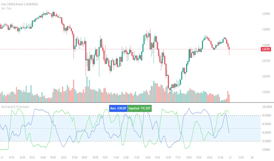
Multi Asset & TF Stochastic
Multi Asset & TF Stochastic
This indicator allows you to compare the stochastic oscillator values of two different assets across multiple timeframes in a single pane. It’s designed for traders who want to analyse the momentum of one asset (by default, the chart’s asset) alongside a second asset of your choice (e.g., comparing EURUSD to the USD Index).
How It Works:
Main Asset:
The indicator automatically uses the chart’s asset for the primary stochastic calculation. You have the option to adjust the timeframe for this asset using a dropdown that includes TradingView’s standard timeframes, a "Chart" option (which automatically uses your chart’s timeframe), or a "Custom" option where you can type in any timeframe.
Second Asset:
You can enable the display of a second asset by toggling the “Display Second Asset” option. Choose the asset symbol (default is “DXY”) and select its timeframe from an identical dropdown. When enabled, the script calculates the stochastic oscillator for the second asset, allowing you to compare its momentum (%K and %D lines) with that of the main asset.
Stochastic Oscillator Settings:
Customize the %K length, the smoothing period for %K, and the smoothing period for %D. Both assets’ stochastic values are calculated using these parameters.
Visual Display:
The indicator plots the %K and %D lines for the main asset in prominent colours. If the second asset is enabled, its %K and %D lines are also plotted in different colours. Additionally, overbought (80) and oversold (20) levels are marked, with a midline at 50, making it easier to gauge market conditions at a glance.
%D line can be toggled off for a cleaner view if required:
Asset Information Table:
A table at the top-centre of the pane displays the active asset symbols—ensuring you always know which assets are being analysed.
How to Use:
Apply the Indicator:
Add the script to your chart. By default, it will use the chart’s current asset and timeframe for the primary stochastic oscillator.
Adjust the Main Asset Settings:
Use the “Main Asset Timeframe” dropdown to select a specific timeframe for the main asset or stick with the “Chart” option for automatic syncing with your current chart.
Enable and Configure the Second Asset (Optional):
Toggle on “Display Second Asset” if you wish to compare another asset. Select the desired symbol and adjust its timeframe using the provided dropdown. Choose “Custom” if you need a timeframe not listed by default.
Review the Plots and Table:
Observe the stochastic %K and %D lines for each asset. The overbought/oversold levels help indicate potential market turning points. Check the table at the top-centre to confirm the asset symbols being displayed.
This versatile tool is ideal for traders who rely on momentum analysis and need to quickly compare the stochastic signals of different markets or instruments. Enjoy seamless multi-asset analysis with complete control over your timeframe settings!
Currency ComparatorIndicator Description
This script helps you compare the price changes of various cryptocurrencies against each other.
While TradingView provides some pairs like ETH/BTC or BNB/BTC, it lacks support for comparing lower-market-cap coins against BTC or other currencies. That’s where this script comes in, allowing you to easily view ratios like DOGS/BTC, LSD/BTC, and more.
You can also analyze the relationship between two high-market-cap assets, such as ETH/SOL, which is often not available directly on TradingView.
Additionally, this indicator enables you to view the changes of two cryptocurrencies alongside a base currency. For example, you can observe how Bitcoin's rise impacts LSD and whether it strengthens or weakens relative to BTC.
Features
Maximized View: You can open the indicator in a maximized chart view and use it like any other chart for your technical analysis.
Customizable Comparisons: Compare any two assets with ease by configuring the indicator inputs.
Important Notes
1.Preserving Drawings:
Drawings and tools applied to the indicator chart are not tied to the indicator’s settings. This means changing the inputs won’t affect them. To avoid losing your work:
Open the chart of the base asset (e.g., LSD/USDT) where you want to analyze a specific pair (e.g., LSD/BTC).
Use the indicator there. This way, whenever you want to revisit your analysis, you only need to open the base chart (e.g., LSD/USDT) and update the indicator inputs to the desired pair (e.g., LSD/BTC).
2.Deleting the Indicator:
Removing the indicator from the chart will also delete all your drawings. If you need to keep them, do not delete the indicator.
3.Precision Settings:
By default, the indicator displays up to 12 decimal places (precision). For pairs where such precision isn’t required, you can adjust it in the settings under the "Style" section to your preferred value. If you need higher precision again, simply reset it to the default value.

[Spinn] ATH ScreenerThe indicator helps visualize the market’s state as a kind of heatmap, showing how far coins are from their all-time highs (ATH).
Since TradingView has a limitation on the number of coins processed simultaneously (no more than 40), all coins are divided into sets of 40 coins per set. If you place multiple copies of the indicator on the chart and assign a different set number in each copy, you can see the full picture for the exchange or the entire market.
The screener displays a table indicating the set number and the base currency (default is USDT).
For each coin, the following data is provided:
its name;
the distance from the current price to the ATH in percentage;
a 🔹 icon marks new coins (with a short price history);
coins that recently reached their ATH or ATL are highlighted in bold;
the background is colored as follows:
green — when less than 40% remains to the ATH;
red — when more than 60% remains;
blue — between 40% and 60%;
gray — when no data is available.
Hovering over a coin displays its name, current price, ATH and ATL values, and how many days ago they were reached.
Settings
Coin set number
Base currency (USDT)
Exchange
List of all coins on the exchange (comma-separated)*
No overlaps — if this option is enabled, tables with different sets will be placed one below the other.
Sorted — if this option is enabled, coins in the set will be sorted by their distance from ATH.
Colorize — whether to color the cell background with the specified colors or leave it light gray.
Bold ATH or ATL, days back — highlight coins in bold that recently reached an extreme (number of days is configurable).
New coins (🔹), days — mark young coins with a short price history using an icon (number of days is configurable).
Table width, % — approximate table width as a percentage of screen width.
Text size — text size in the table, from 1 to 3.
*Note: The default list was up-to-date at the time of the indicator’s publication. If certain coins are no longer traded, they will be marked with a dark gray background (no data).
Recommendation: to prevent the graph from obscuring the data, I recommend hiding it. This is done in the Object Tree, on the right side of the panel.
—
Индикатор помогает увидеть состояние рынка в виде своеобразной тепловой карты — как далеко монеты находятся от своих исторических максимумов (ATH).
Поскольку у TradingView есть ограничение на количество одновременно обрабатываемых монет (не более 40), все монеты разбиты на наборы по 40 монет в каждом. Если разместить на графике несколько копий индикатора и в каждой копии задать свой номер набора монет, можно видеть всю картину по бирже или рынку целиком.
Скринер выводит на экран таблицу с указанием номера набора монет и базовой валюты (по умолчанию — USDT).
Для каждой монеты указаны следующие данные:
её название;
расстояние от текущей цены до ATH в процентах;
значком 🔹 выделены новые монеты (с короткой историей графика);
жирным шрифтом выделены монеты, у которых ATH или ATL был достигнут недавно;
фон окрашен в такие оттенки:
зелёные — когда до ATH осталось менее 40%;
красные — более 60%;
голубые — между 40% и 60%;
серые — когда нет данных.
Если навести курсор на монету, будут показаны её название, текущая цена, значения ATH и ATL, а также сколько дней назад они были достигнуты.
Настройки
Номер набора монет
Базовая монета (USDT)
Биржа
Список всех монет на бирже (через запятую)*
No overlaps — если эта опция выделена, таблицы с разными наборами будут размещены одна под другой.
Sorted — если эта опция отмечена, монеты в наборе будут отсортированы по удалению от ATH.
Colorize — окрашивать ли фон ячеек в указанные выше цвета или оставить его светло-серым.
Bold ATH or ATL, days back — выделять жирным монеты, у которых недавно был достигнут экстремум (задаётся количество дней).
New coins (🔹), days — выделять значком молодые монеты, история графика которых небольшая (задаётся количество дней).
Table width, % — задаётся приблизительная ширина таблицы в процентах от ширины экрана.
Text size — размер текста в таблице, от 1 до 3.
*Примечание: заданный по умолчанию список был актуален на момент публикации индикатора. Если какие-то монеты перестали торговаться, они будут отмечены тёмно-серым фоном (нет данных).
Рекомендация: для того, чтобы график не заслонял данные, рекомендую его скрыть. Делается это в Дереве объектов, справа на панели.

Normalized Price ComparisonNormalized Price Comparison Indicator Description
The "Normalized Price Comparison" indicator is designed to provide traders with a visual tool for comparing the price movements of up to three different financial instruments on a common scale, despite their potentially different price ranges. Here's how it works:
Features:
Normalization: This indicator normalizes the closing prices of each symbol to a scale between 0 and 1 over a user-defined period. This normalization process allows for the comparison of price trends regardless of the absolute price levels, making it easier to spot relative movements and trends.
Crossing Alert: It features an alert functionality that triggers when the normalized price lines of the first two symbols (Symbol 1 and Symbol 2) cross each other. This can be particularly useful for identifying potential trading opportunities when one asset's relative performance changes against another.
Customization: Users can input up to three symbols for analysis. The normalization period can be adjusted, allowing flexibility in how historical data is considered for the scaling process. This period determines how many past bars are used to calculate the minimum and maximum prices for normalization.
Visual Representation: The indicator plots these normalized prices in a separate pane below the main chart. Each symbol's normalized price is represented by a distinct colored line:
Symbol 1: Blue line
Symbol 2: Red line
Symbol 3: Green line
Use Cases:
Relative Performance Analysis: Ideal for investors or traders who want to compare how different assets are performing relative to each other over time, without the distraction of absolute price differences.
Divergence Detection: Useful for spotting divergences where one asset might be outperforming or underperforming compared to others, potentially signaling changes in market trends or investment opportunities.
Crossing Strategy: The alert for when Symbol 1 and Symbol 2's normalized lines cross can be used as a part of a trading strategy, signaling potential entry or exit points based on relative price movements.
Limitations:
Static Alert Messages: Due to Pine Script's constraints, the alert messages cannot dynamically include the names of the symbols being compared. The alert will always mention "Symbol 1" and "Symbol 2" crossing.
Performance: Depending on the timeframe and the number of symbols, performance might be affected, especially on lower timeframes with high data frequency.
This indicator is particularly beneficial for those interested in multi-asset analysis, offering a streamlined way to observe and react to relative price movements in a visually coherent manner. It's a powerful tool for enhancing your trading or investment analysis by focusing on trends and relationships rather than raw price data.

Automatic comparison of symbols depending on custom listIn the indicator settings, specify a list of tickers and the corresponding symbol for comparison (e.g. TVC:DXY). Each new list must be on a separate line. The line must begin with the symbol for comparison, then an equal sign (=), and then a list of tickers separated by commas (e.g. OANDA:XAUUSD, OANDA:XAGUSD). If the ticker selected in the chart window is not found in any of the lists, then the symbol from the first list, which is specified before the equal sign, will be used as the symbol for comparison. For example:
TVC:DXY = OANDA:XAUUSD, OANDA:XAGUSD
OANDA:BCOUSD = OANDA:SPX500USD
OANDA:SPX500USD = BINANCE:BTCUSDT
***
Автоматическое сравнение символов в зависимости от настраиваемого списка
В настройках индикатора укажите список тикеров и соответствующий символ для сравнения. Каждый новый список должен быть на отдельной строке. В начале строки должен быть указан символ для сравнения (например, TVC:DXY), затем знак равенства (=) и после него список тикеров, разделенных запятыми (например, OANDA:XAUUSD, OANDA:XAGUSD). Если выбранный в окне графика тикер не будет найден ни в одном из списков, то в качестве символа для сравнения ему будет соответствовать символ из первого списка, который указан перед знаком равенства. Например:
TVC:DXY = OANDA:XAUUSD, OANDA:XAGUSD
OANDA:BCOUSD = OANDA:SPX500USD
OANDA:SPX500USD = BINANCE:BTCUSDT

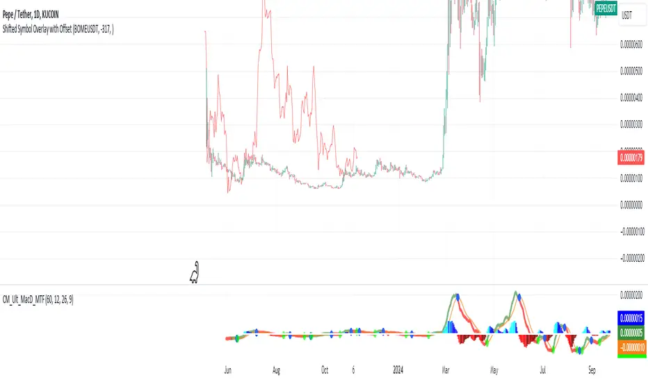
Shifted Symbol Overlay with OffsetThe Shifted Symbol Overlay Indicator is a custom TradingView indicator designed to overlay the price data of one stock or asset over another, allowing for direct visual comparison. This is particularly useful for comparing the performance of two assets over different time periods. The indicator enables you to shift the data from one asset either forward or backward in time, making it easier to compare historical data from one stock with more recent data from another. The indicator supports shifting both to the right (future periods) and to the left (earlier periods), helping traders and analysts explore correlations or divergences between two financial instruments.
The indicator also includes a normalization option that adjusts the scale of the two assets, so you can compare them even if they have vastly different price levels. This is useful when you're interested in relative performance rather than the absolute price values.
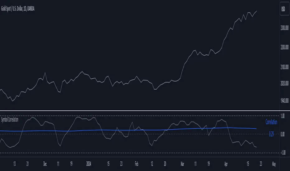
Symbol CorrelationThe "Symbol Correlation" indicator calculates and displays the correlation between the chosen symbol's price and another selected source over a specified period. It also includes a moving average (SMA) of this correlation to provide a smoothed view of the relationship.
Why SMA and Table Display ?
The inclusion of SMA (Simple Moving Average) with adjustable length (SMA Length) enhances the indicator's utility by smoothing out short-term fluctuations in correlation, allowing for clearer trend identification. The SMA helps to visualize the underlying trend in correlation, making it easier to spot changes and patterns over time.
The table display of the correlation SMA value offers a concise summary of this trend. By showcasing the current correlation SMA alongside its historical values, traders can quickly gauge the relationship's strength relative to previous periods.
Interpreting the Indicator:
1. Correlation Values: The primary plot shows the raw correlation values between the symbol's price and the specified source. A value of 1 indicates a perfect positive correlation, -1 signifies a perfect negative correlation, and 0 suggests no linear relationship.
2. Correlation SMA: The SMA line represents the average correlation over a defined period (SMA Length). Rising SMA values indicate strengthening correlation trends, while declining values suggest weakening correlations.
3. Choosing SMA Length: Traders can adjust the SMA Length parameter to tailor the moving average to their specific analysis horizon. Shorter SMA lengths react quickly to price changes but may be more volatile, while longer SMA lengths smooth out noise but respond slower to recent changes.
In summary, the "Symbol Correlation" indicator is a valuable tool for assessing the evolving relationship between a symbol's price and an external source. Its use of SMA and tabular presentation facilitates a nuanced understanding of correlation trends, aiding traders in making informed decisions based on market dynamics.
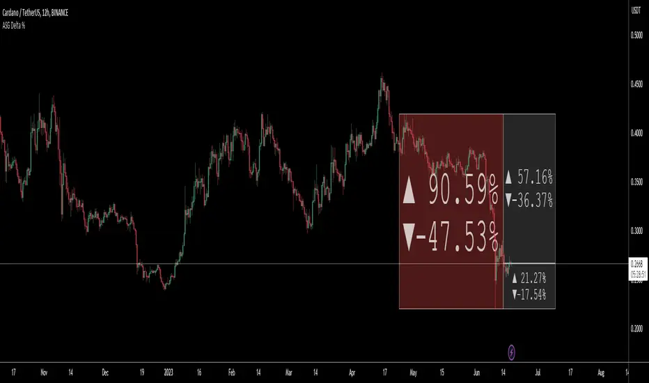
ASG Delta %This utility script provides a convenient way to calculate the percentage gain or drop of a token's price within a user-defined date range. It eliminates the need for manual measurement on individual charts, saving time and effort.
The script is particularly valuable when integrated into a daily token scanning routine for watchlists. By comparing the significant gains or drops among different tokens, traders can identify potential trading opportunities.
Simply select the desired date range, and the script will identify the highest and lowest price points achieved during that period. It then shows a visual representation in the form of a bullish or bearish box, displaying the percentage change (delta %). If the current price falls within the box's upper and lower bounds, additional percentage information can be shown in either the 'normal' or 'reverse' mode.
For instance, if a token experiences a -52.35% drop, enabling the 'Reverse' setting will reveal a potential 109.86% gain (from the low), or a 76.02% gain (from current price) or a potential drop of -16.5% (from current price) etc.. Having these basic statistics available, without having to manually chart them, especially during prolonged bear or bull markets, enables traders to make informed decisions and position themselves for more profitable trades.
I hope you find this script valuable. Your comments and recommendations are welcome as they will help improve the script's functionality further.
Altcoin ComparatorUse this indicator to compare an altcoin's ratio compared to Bitcoin (orange), the general altcoin market (blue), and the entire cryptocurrency market cap (yellow).
Bright colors indicate the altcoin is outperforming the crypto market while dull colors in imply it is under-performing.
Likewise, staying in the green implies sustained outperformance while staying in the red implies sustained under-perfrmance.
Oversold values imply the altcoin is expensive while overbought imply it is cheap.
Be sure to use market caps: ETH, SOL, ADA, etc. not ETHUSD, SOLUSDT, etc.

MarketronShows you how the asset on the chart is trending versus the market. You can customise the market that it uses, and there are some common markets programmed in as options.
Displays moving averages and a simple red/green bias.
You could do this yourself by typing, e.g., ADAUSDT/TOTAL into the asset box in TradingView and adding some EMAs manually and then interpreting them by eye. There's no hidden technology in this indicator. It just makes it a lot easier.
You can choose various bias options.
I'm not sure if it will work at resolutions lower than one day, depending on the level of your TradingView plan.
These are all the user-configurable settings and what they do.
Market (Auto) – Choose from various preselected markets.
Market Ticker Manual Override – You can type in the ticker for your market if it's not in the list. If you do, it overrides the Auto list.
Show Classic EMAs – Show customisable Exponential Moving Averages.
Bias Mode – Derive the red/green bias from whether price is above/below the Classic EMAs, or from a custom EMA function, or both.
Show Bias Background – Colour the background, or not, with the directional bias.
EMA 1 Length (smallest) – The length for the smallest EMA.
EMA 2 Length – Length for the second EMA.
EMA 3 Length – Length for the third EMA.

Multi-Asset Month/Month % change 10yr Averages10 Year Averages of Month-on-Month % change: Shows current asset, and 3x user input assets
-For comparing seasonal tendencies among different assets.
-Choose from a variety of monthly average measures as source: sma(close, length), sma(ohlc4, length); as well as sma's of vwap, vwma, volume, volatility. (sma = simple moving average).
-Averages based on month cf previous month: i.e. Feb % = Feb compared to Jan; Jan % = Jan compared to prev year's Dec. Average of the last 10yrs of these values is the printed value.
-Plot on current year (2023), or previous year (2022). If Plotting on current year, and a month of year has not yet occured, a 9yr average will be printed.
/// notes ///
-daily bars in month is a global setting; so choose assets which have similar trading days per month. i.e. Crypto: length = 30 (days per month); Stocks/FX/Indices: length = 21 (days per month).
-only plots on Daily timeframe.
10yr Avgs; Plotting with Year = 2022; using sma(close, 21) as source for average M/M change

DXY Overlay CompareOverlays the DXY chart over the top of any other chart. When the dollar strength increases, asset prices can drop and vice versa. Was created personally to compare with the price of Bitcoin.

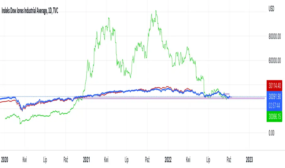
Hussarya compare DJI SPX BTCScript shows relations between DJI downJones SPX and BTC:USD.
DJI chart must be set from candlestick to line
Red line is price (close). x 8
Green line ist te price BTCUSD from Binance price (close) x 1.5
Time OffsetCompare ticker with time offset.
I couldn't find anything like this. I was hoping to use it to find a ticker that might act like a leading indicator for another one! Who knows?
In the settings you can choose any ticker to compare, input the the number of bars you want it to be offset (positive or negative), and select plot source.
Overlay Mini Plot(s) of Correlated Asset(s)Overlay a small plot of a correlated asset of your choosing. Shrink/expand, Set vertical and horizontal position, plot multiple mini-plots via duplicate indicators with varied settings.
Plots the last X bars of any asset; including the live candle currently painting
Useful for low time frame trading when you want to see correlated asset price movement right alongside the price movement you're watching.
Useful for quick and simple comparisons; when you don't want the clutter of split screen or multi-pane view.
Useful for backtesting.
Price scale agnostic; just plots the shape of the recent price action, with several optional labels: Asset+timeframe | Live Price | Highest price over X bars | Lowest price over X bars.
Works fine with all the assets i've tested it on.
~~User inputs~~
-number of bars to paint.
-horizontal offset: plot to right X bars or to left X bars
-vertical offset: shift up or down, shrink or expand; by using 2 'spacer' inputs
-color/transparancy of candles and price labels.
-width (pixels) of candle bodies.
-choose to display price labels or not
-choose to display asset label or not
~~Tips~~
--Add several of these indicators; changing the vertical 'Shift/Shrink' settings on each to visually separate them.
--In the above chart or EurUsd, there are three indicators =>> three mini-plots overlaid: DXY, EurGbp and GbpUsd. Using the following settings for Space Above:Space Below: DXY- 0.1:4.5 | EurGbp- 1.8:1.8 | GbpUsd- 4.5:0.1
--the more you add, the more you'll have to vertically shrink the plots
© twingall

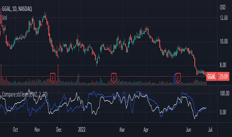
Compare std levelIt is used to compare symbol with different magnitudes and volatilities. It is compared by the level within its range of standard deviations.
Visually, we are comparing where the price is in its Bollinger Band , for each symbol.
100 means that the price is near the upper band. 0 means that the price is near the lower band
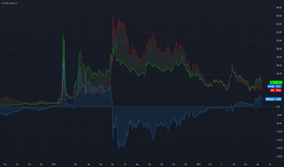
741 GME vs AMCA very simple script to compare 7 shares of $AMC versus 1 share of $GME.
The script uses the closing price of the given securities.
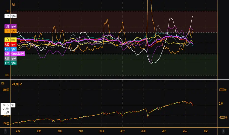
EsIstTurnt's Relative Value Comparison Multi SymbolCompare the relative valuation of up to 8 tickers. By taking a shorter term moving average and dividing by a longer term moving average(optionally with an offset) we get a value that is either above or below 1. Easy to tell what is undervalued and overvalued with this setup. Useful for comparing different asset classes or sector specific securities looking for outperformers/underperformers. Overvalued and Undervalued levels marked by Red and Green background. Recommended in conjunction with other indicators of your choosing for confirmation of trend changes but this is good for getting a broader view of the market you're interested in. Multiple timeframes, sources available however you should tinker with it to find what gives you the best view for your preferred timeframe.
.b pin-up symbolWhen trading cryptocoins, it is necessary to check the price trend of NASDAQ, BTC.D, BTC.OI, BTC spot or other coins of similar groups.
However it is very cumbersome to put a comparison symbol in the Tradingview chart and combine individual indicators one by one.
Moreover even with such a combination, the chart is messy and visibility is not good.
This script was developed as a composite-solution to that situation, and will make you happy.
- NQ1!, USTECH100CFD | symbol fixed
- BTC.Dominance, BTC.OpenInterest, BTC symbol, others pin-up-symbol | selectable
- Pin-up-symbol | selectable
- Pin-up-symbol's candle chart
- Trending
* EMA 9,21,50,200 ribbon classic EMA
* .b price line ; .b price = unique trending price with price-action + relative-volume-action + ATR
* Dynamic S/R Cloud ; BB + donchian band + high/low + atr mixed custom-logic
* VWWMA + .b price Shadow ; Volume-weighted WMA on .b price = unique MA faster than classic VWMA
Trending shadow direction is not bad even on low-timeframe (1, 2, 3, 5m, 15m...)
- Pattern
* Harmonic Pattern ; A simplified version of the harmonic pattern indicator, simply show-up pattern complete position
for reference only - adopted from HeWhoMustNotBeNamed's script.
- Information Panel
* BTC Dominance, BTC Open Interest, Pin-Up-Symbol price
* Trend meter ; 5,15,30,1h,2h,4h Meter Calc with 1 minute-timeframe candles
5 = Green if the current price is higher than the price 5 minutes ago.
1h = Green if the current price is higher than the price 2 hours ago.
4h = Red if the current price is lower than the price 4 hours ago.
* caution ; To use real-time chart of "CME_MINI:NQ1!" you have to additional subscribe CME data,
default setting is 'NQ1!' , you can change to 'USTECH100CFD'
* When you choose symbol which is closed trading hours, the script's update stopped.
Even if the selected pin-up-symbol is on trading hours, the currently selected symbol's chart doesn't update.
* recommended | chart setting > Appearance : Top margin 0%, Bottom margin 0% for optimized screen usage :)
if you have any questions freely contact to me by message on tradingview, or telegram @sr_bt
but please understand that responses may be quite late.
------------------------------------------------------------------------------------------------------------------------------------------------------------
copyright 2022 (sr_b)
Special thanks to all of contributors of community.
The script (originaly .b) may be freely distributed under the MIT license.
The other classic script code also may be freely distributed under the MIT license.
Simplified Harmonic script part | core adopted from 'Multi ZigZag Harmonic Patterns (HeWhoMustNotBeNamed)' MPL2.0 license