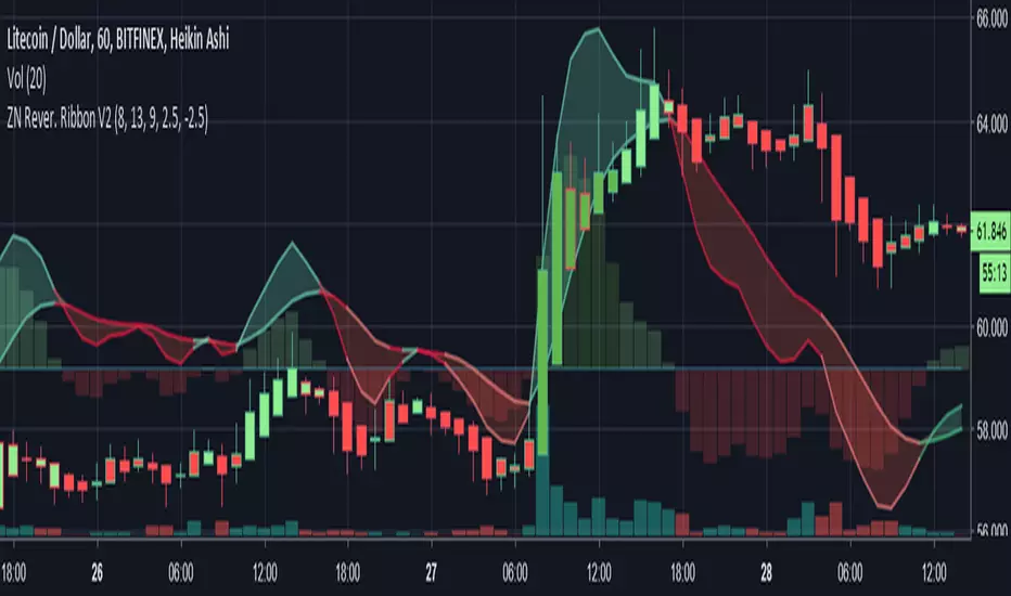
Librehash Reversion Ribbon V2

Known as the ‘ZN Reversion Ribbon V2’, for short, this indicator is designed to:
1. Create multiple buy and sell signals
2. Help users gauge the momentum of the price movement.
3. Re-color candles to give users a better understanding of price direction as well as plotting entries and exits.
4. Serve as an enhanced version of the MACD indicator.
5. Effectively gauge buy and sell pressure at any given point in time by using former price data.
There are a lot of moving parts to this indicator, so this guide will be dedicated to dissecting these moving parts, piece by piece.
#1 — Histogram
Perhaps the simplest part of the indicator to dissect at the start is the Histogram. This is also the part of the indicator that can be the most important complement to any other readings that are being made.
You read the histogram in the same manner that you would read the Histogram for the MACD.
The bars in the background are the histogram. Reading this portion of the indicator is fairly simple though.
1. As the green bars get darker, the buy pressure is increasing.
2. As the red bars get darker, the sell pressure is increasing.
3. If the current bar is larger than the last, the trend is sustained. This is the same principle that you would observe in the MACD. The core difference, however, is that this indicator is plugged in with a specific formula (beyond just the basic moving averages), that make them more responsive to price movement in a way that allows for the anticipation of signals being formed.
#2 — Ribbon
The ribbon on this indicator has about 3 different buy/sell signals embedded within it that will allow traders to anticipate an impending change in trend well before it EVER occurs.
This may be the most valuable part of the indicator itself.
Let’s start with the first facet of the ribbon.
A) — The ‘widening’ of the ribbon
When the ribbon ‘expands’, that means that the trend is ‘strengthening’ or growing. When the ribbon narrows or ‘contracts’, that means that the trend is becoming weaker and that this may serve as a warning of impending trend reversal.
In the picture above, you can see the color change of the ribbon itself as well.
You’ll notice that the ribbon transitions from a darker red to a lighter red. That’s a sign of waning sell pressure. You can apply this concept to the green portion of the ribbon too.
B)— The Line Sometimes Signals Before the Cross
This one is a bit harder to explain, but the way that the indicator is programmed is not to turn ‘green’ or ‘red’ based on the crosses, but rather on a mathematical formula.
Now, because of the way the indicator is programmed, the cross often coincides with the color change — but not always.
Below is an example:
Of course, beyond this, there are the usual buy and sell signals that come with the MACD as well.
For instance, there is —
C) The Change in Direction of the is a ‘Buy’ or ‘Sell’ Signal As Well
--------------
Changes in the Candle Colors
Perhaps the most elaborate part of this indicator is the fact that it changes the colors of the candles on the chart in live time without repainting.
In order to understand the candles, here’s a quick guide:
a) dark green with green outline = extreme buy pressure
b) lighter green with green outline = normal buy pressure
c) dark red = heavy sell pressure
d) light red = light sell pressure
e) dark green with red outline = impending reversal downward
f) purple with any outline = ambiguous / neutral
g) light green with red outline = very, very weak sell pressure
h) dark green with red outline = exhausted buy pressure
f) dark red with green outline = exhausted sell pressure
Effectiveness of Indicator
This indicator has the ability to be a ‘game changer’ in terms of its ability to dissect price action.
This next picture is another awesome example of how this indicator works.
Check it out:
Here are the multiple reasons why we could’ve anticipated the reversal in price direction before red candles started showing up:
1. The actual reversion lines themselves began to converge.
2. The Histogram is declining.
3. The bar colors move from dark green to light green.
Now, you may be looking at the above picture and thinking, ‘Well it seems that it didn’t catch the major upswing in the price later though’.
This is true, however —
The gain from this move was preposterous.
Even still, the indicator ensures that we still garner some pretty significant profits.
Conclusion
What you see here sums up this indicator for the most part. However, there are continued updates that will be put out for the indicator in the near future as well.
As always, these can be pushed directly through TradingView (which will happen soon).
Skrypt tylko na zaproszenie
Dostęp do tego skryptu mają wyłącznie użytkownicy zatwierdzeni przez autora. Aby z niego korzystać, należy poprosić o zgodę i ją uzyskać. Zgoda jest zazwyczaj udzielana po dokonaniu płatności. Więcej informacji można znaleźć w instrukcjach autora poniżej lub kontaktując się bezpośrednio z librehash.
TradingView NIE zaleca płacenia za skrypt ani korzystania z niego, jeśli nie ma pełnego zaufania do jego autora i nie rozumie się zasad jego działania. Można również znaleźć darmowe, otwartoźródłowe alternatywy w skryptach społeczności.
Instrukcje autora
Wyłączenie odpowiedzialności
Skrypt tylko na zaproszenie
Dostęp do tego skryptu mają wyłącznie użytkownicy zatwierdzeni przez autora. Aby z niego korzystać, należy poprosić o zgodę i ją uzyskać. Zgoda jest zazwyczaj udzielana po dokonaniu płatności. Więcej informacji można znaleźć w instrukcjach autora poniżej lub kontaktując się bezpośrednio z librehash.
TradingView NIE zaleca płacenia za skrypt ani korzystania z niego, jeśli nie ma pełnego zaufania do jego autora i nie rozumie się zasad jego działania. Można również znaleźć darmowe, otwartoźródłowe alternatywy w skryptach społeczności.