OPEN-SOURCE SCRIPT
US Yield Curve Comparison
Zaktualizowano
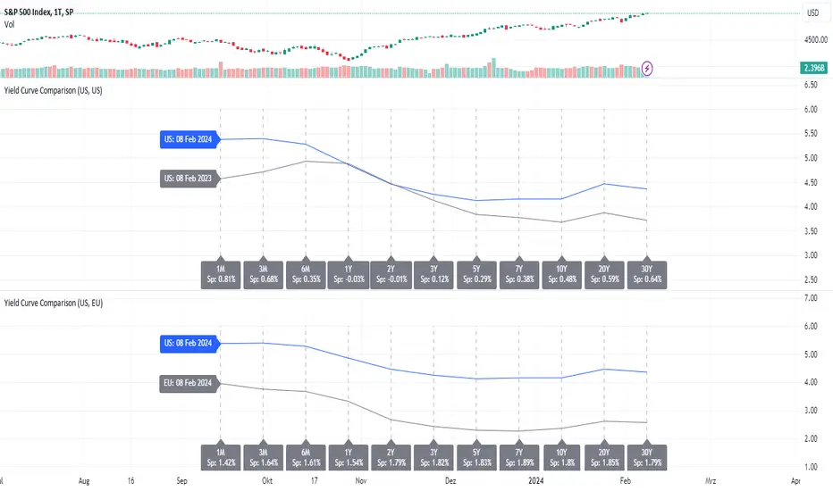
In finance, the yield curve is a graph which depicts how the yields on debt instruments – such as bonds – vary as a function of their years remaining to maturity. The graph's horizontal or x-axis is a time line of months and years remaining to maturity, with the shortest maturity on the left and progressively longer time periods on the right. The vertical or y-axis depicts the annualized yield to maturity.
To see changes of a definded timeframe, use this indicator to compare the current US yield curve with one in the past.
To see changes of a definded timeframe, use this indicator to compare the current US yield curve with one in the past.
Informacje o Wersji
- refactoringInformacje o Wersji
- refactoringInformacje o Wersji
- refactoringInformacje o Wersji
- refactoringInformacje o Wersji
Use this indicator to compare US/US or US/EU yield curve at a specific date.Informacje o Wersji
This indicator is deprecated and no longer supported. Use the following indicator instad:https://de.tradingview.com/script/dKzWtiuY/
Informacje o Wersji
- refactoringSkrypt open-source
W prawdziwym duchu TradingView autor tego skryptu opublikował go jako open source, aby inwestorzy mogli go zrozumieć i zweryfikować. Pozdrowienia dla autora! Możesz go używać bezpłatnie, ale ponowne użycie tego kodu w publikacji podlega Zasadom Regulaminu. Możesz go oznaczyć jako ulubione, aby użyć go na wykresie.
Wyłączenie odpowiedzialności
Informacje i publikacje przygotowane przez TradingView lub jego użytkowników, prezentowane na tej stronie, nie stanowią rekomendacji ani porad handlowych, inwestycyjnych i finansowych i nie powinny być w ten sposób traktowane ani wykorzystywane. Więcej informacji na ten temat znajdziesz w naszym Regulaminie.