ICT Cycle Boxes - MTFICT Cycle Boxes – Pro Strategy (3×MTF)
A multi-timeframe, confluence-driven strategy designed to capture impulsive moves, controlled pullbacks, and regime shifts. It evaluates three timeframes at once:
TF-A (Higher): establishes the broader regime.
TF-B (Mid): confirms trend context and momentum.
TF-C (Trade TF): times the entry.
Two entry tiers are used:
Very-Good Entries: all conditions align in the direction of the higher-timeframe regime, with fresh confirmation on the trade timeframe.
Medium Entries: directionally aligned but with lighter confirmation, for additional opportunities during established trends.
Risk is managed with ATR-based stops/targets on the trade timeframe, an optional trailing stop, position sizing by percent of equity, a cooldown after flat, and optional early exit when the trade timeframe returns to a neutral regime. Session filtering and flip-on-opposite are available for refined execution.
How to use
Set TF-A/TF-B/TF-C to suit your market (e.g., W/D/60, D/240/30).
Adjust risk parameters (stop/target, trailing, position size).
Enable session filtering if desired.
Review results in the Strategy Tester and fine-tune to your market and instrument.
Sentiment

Adaptive Fear & Greed Index with ML-Enhanced SD - HOSSAM Adaptive Fear and Greed Index with ML-Enhanced Standard Deviation
📊 Overview
A sophisticated market sentiment indicator that combines traditional Fear and Greed Index methodology with machine learning-inspired adaptive algorithms. This tool dynamically adjusts to changing market conditions, providing more accurate sentiment readings and early warning signals.
🔥 Key Features
Adaptive Standard Deviation: Automatically adjusts volatility bands based on market conditions
VWAP Integration: Incorporates volume-weighted average price for better price context
Machine Learning Elements: Self-adjusting parameters that learn from recent market behavior
Multi-Regime Detection: Identifies high/low volatility environments
Dynamic Weighting: Automatically adjusts component weights based on market performance
Z-Score Analysis: Statistical significance measurement for deviations
📈 How It Works
The indicator combines four key market components:
Price Momentum with VWAP deviation
Volume-Weighted Volatility
RSI with Volume Confirmation
Market Structure Analysis
🎯 Interpretation
0-30: Extreme Fear (Potential Buying Opportunity)
30-40: Fear
40-60: Neutral
60-70: Greed
70-100: Extreme Greed (Potential Selling Opportunity)
⚡ Unique Advantages
Self-Adjusting Bands: SD bands expand during high volatility, contract during calm periods
Regime Awareness: Different signals for high/low volatility environments
Volume Validation: All components include volume confirmation
Statistical Significance: Z-scores show how extreme current readings are
🚨 Alert Conditions
Extreme greed/fear in high volatility regimes
Statistical outliers (Z-score > 2.5)
Trend acceleration signals
💡 Ideal For
Crypto traders seeking sentiment-based entries/exits
Swing traders looking for mean reversion opportunities
Risk management and position sizing decisions
Market regime identification
⚙️ Customization
Adjustable parameters include lookback period, SD multiplier, smoothing, and ML learning rate to match your trading style.
Category: Strategy & Sentiment Analysis
Tags: #FearAndGreed #MarketSentiment #Volatility #Cryptocurrency #Trading #Indicator #MachineLearning #VWAP

ML+MA+ATRretardretardretardretardretardretardretardretardretardretardretardretardretardretardretardretardretardretardretardretard never believe this
ADX y DI + ATRADR + DI
Every time ADR cross 25, print an ATR value label
Every time ADR +25 and DI+ cross DI-, print an ATR value label
Every time ADR +25 and DI- cross DI+, print an ATR value label
I use ATR for my SL.

ST Market StructureStructure
MTUIP Main Trend Upward Inflection Point
MTDIP Main Trend Downward Inflection Point
KR + KEY Range Inflection for the Main trend (+/-)
KRI - KEY Range Inflection for the Main trend (+/-)
MS Market Sentiment
UT#1 New trend leg up target 1
BOC Breakout Confirmation
IB Intraday Bias
BDC Breakdown Confirmation
DT#1 New trend leg down target 1

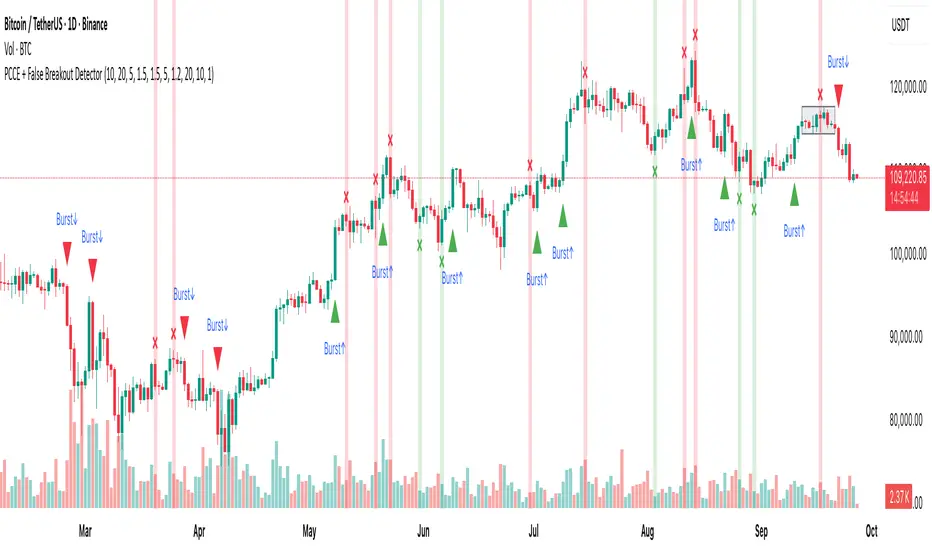
PCCE + False Breakout DetectorPCCE + False Breakout Detector
Type: Invite-Only Indicator (closed source)
Purpose : Detect price compression and the first expansion after it, while flagging failed breakouts (bull/bear traps) for risk control.
1) What’s original here!
This tool integrates three behaviour-driven tests that work in a single decision flow:
A compression score built from:
(a) monotonic body shrink,
(b) wick-dominance, and
(c) relative range contraction versus history.
This is not a bands/oscillator port; it’s a structure-first filter that isolates coils.
A thrusted expansion requirement that combines real-body impulse and relative-volume participation (+ optional EMA alignment) to qualify a breakout beyond the coil envelope.
An immediate post-breakout failure test (trap logic) that checks whether the breakout re-enters the prior swing range within a short window.
Used together, these steps turn raw breaks into contextual, risk-aware events: setup → trigger → validation. That is the value of the combination.
⸻
2) Concepts behind the calculations:
Let body_t = |close_t − open_t|,
uw_t = high_t − max(open_t, close_t) (upper wick),
lw_t = min(open_t, close_t) − low_t (lower wick),
R_t(k) = highest(high, k)_t − lowest(low, k)_t (range over k bars),
MA_body(k) = SMA(body, k), MA_vol(k) = SMA(volume, k).
2.1 Compression (coil) detection
We evaluate within a window k = coilLength:
• Body shrink count: number of consecutive steps where body_(t−i) < body_(t−i−1).
• Wick dominance: AvgWickBody = avg( (uw + lw) / body ) over the window; require AvgWickBody > wickRatioMin.
• Relative range contraction: current R_t(k) must be less than α × avg( R_(t−j)(k) ) computed over a lookback of rangeWindow windows, with α < 1 (tight market).
When all three are true, we mark a coil zone; the coil bounds are High_coil = highest(high, k), Low_coil = lowest(low, k).
2.2 Expansion (“Burst”) confirmation
A breakout is only qualified when all hold on bar close:
• Direction: close > High_coil → up; close < Low_coil → down.
• Body thrust: body_t > MA_body(k) × bodyMult.
• Participation: volume_t > MA_vol(k) × volumeMultiplier.
• Trend alignment (optional): close_t > EMA(emaLen) for up / < EMA for down.
• Cooldown: t − lastSignal > cooldownBars.
If satisfied, print Burst↑ or Burst↓ on that bar.
2.3 Failed breakout (trap) detection
Let H_s and L_s be the prior swing high/low from a lookback rangeLookback (excluding the current bar). Define:
• Bull break attempt: a bar that closed above H_s.
Bull trap: within fakeoutBars bars after that attempt, any close returns below H_s. Mark ❌ red above that bar.
• Bear break attempt: a bar that closed below L_s.
Bear trap: within fakeoutBars bars after that attempt, any close returns above L_s. Mark ❌ green below that bar.
Alerts fire on bar close only.
⸻
3) What you’ll see on the chart
• Coil box: shaded envelope (tight-range bounds).
• Burst labels: Burst↑ / Burst↓ only when thrust + volume (and optional EMA) confirm the break.
• Trap markers: ❌ red (failed bullish breakout) / ❌ green (failed bearish breakout).
• Alerts: “Burst Up” and “Burst Down” (close-based).
⸻
4) How to use it
1. Preparation : When a coil box appears, mark the bounds; expect expansion risk to rise.
2. Trigger : Act only on Burst labels (they already encode body/volume thrust and optional trend).
3. Validation : If a ❌ trap prints shortly after a breakout, treat it as a warning/exit event; breakouts that re-enter the prior swing range are statistically fragile.
4. Context : Works well on 15m–4H where structure is visible. Combine with your own higher-timeframe bias, S/R, liquidity pools, and risk rules.
5. Tuning :
• Tighten/loosen coil sensitivity via coilLength, wickRatioMin, and the range contraction factor.
• Use larger bodyMult / volumeMultiplier to demand stronger breaks.
• cooldownBars controls clustering in fast sessions.
• rangeLookback and fakeoutBars control how strict the trap check is.
⸻
5) Repainting, scope, and limitations
• Burst and trap labels are evaluated on bar close; once printed, they do not repaint. Coil boxes can update while forming; they stabilize once conditions are met.
• Sudden news/illiquid periods can defeat filters; adjust multipliers and cooldown for your instrument.
• This is an indicator, not a strategy; it does not publish PnL, win-rate, or forward promises.
Fetti Fields Header (Presets)This is for individuals that like to customize their charts and add some style and motivation

ORB Storico + Box Multipli + Notifiche (final clean v2)Session ORB Live Pro — Pre-Market Boxes & MA Suite
Description (EN):
Session ORB Live Pro is a Pine v6 indicator built for intraday traders who rely on Opening Range Breakouts. It draws session boxes for London, New York, and Asia—plus configurable Pre-London and Pre-New York windows—live from the very first candle (no waiting for 10 bars). The high/low levels update in real time, and optional breakout alerts fire the moment price closes beyond the range. To keep charts clean and relevant for scalping, the boxes auto-hide on chart timeframes above 20 minutes.
Beyond ranges, the tool adds a compact moving-average suite: SMA-50 and RMA-200 out of the box, plus three fully customizable MAs (SMA/EMA/RMA/WMA/HMA) with selectable color, thickness, and style (line, stepline, circles). Each session and pre-session can be toggled on/off and tinted with its own color, so you can tailor the visual map of liquidity grabs and range breaks to your strategy.
Key features
Live ORB boxes for London, New York, Asia (no 10-bar delay).
Pre-sessions: Pre-London & Pre-New York with independent time windows and colors.
Auto visibility filter: boxes show only on ≤ 20m chart TF; hidden on higher TFs.
Breakout alerts when price closes above/below the session range (ready for alert() rules).
MA toolkit: SMA-50, RMA-200 + 3 user MAs (SMA/EMA/RMA/WMA/HMA) with color, style, and width.
Clean inputs using input.session; robust, low-friction UX.
How to use
Set your ORB calculation timeframe (e.g., 15m) and choose which sessions/pre-sessions to display.
Pick colors for each box and enable alerts if you want instant breakout notifications.
Configure the MA suite for trend bias and dynamic S/R (e.g., SMA-50 for momentum, RMA-200 for bias).
Trade the first clean break or the retest of the ORB extremes—your choice. The visual map updates tick by tick.

X Trend dashboard (Lite)X Trend Dashboard
The X Trend Dashboard provides an instant snapshot of market sentiment by analyzing the aggregate "pressure" from 11 classic technical indicators. This version features a flexible EMA Fan (Fast, Medium, and Slow EMAs) instead of fixed timeframes, allowing for greater adaptability to any chart.
This tool is ideal for quickly assessing current market strength and identifying moments when bulls or bears are in control. The panel also displays the asset's correlation with BTC and ETH for additional market context.
Settings
Dashboard Settings: Change the panel's appearance and position.
Correlation Settings: Configure the BTC and ETH correlation.
Indicator Components: Enable or disable any of the indicators, including the three customizable EMAs, to tailor the pressure calculation to your trading style.

Crypto Market Dominance Stacked with LabelsA professional stacked area chart showing the dominance of major crypto market segments: BTC, ETH, Top 100 Altcoins, and #101+ Altcoins. Each layer is color-coded for clarity and includes dynamic labels with the current dominance percentage. Provides a clear visual representation of market share trends for traders, analysts, and crypto enthusiasts.
Features:
Stacked visualization of BTC, ETH, Top 100, and small-cap altcoins (#101+).
Color-coded areas for easy identification.
Dynamic labels showing each category’s current dominance percentage.
Horizontal reference lines for percentage levels.
Approximates top 100 and #101+ altcoins using TOTAL2 and TOTAL3 market cap tickers.
Use Case:
Track how market share shifts between BTC, ETH, large altcoins, and smaller altcoins over time. Ideal for analyzing trends, spotting dominance changes, and visualizing overall crypto market structure.

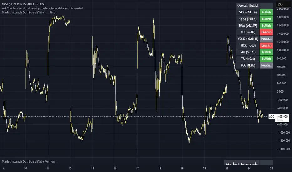
Market Internals Dashboard (Table) v5 - FixedHas a Dashboard for Market Internals and 3 Indices, very helpful
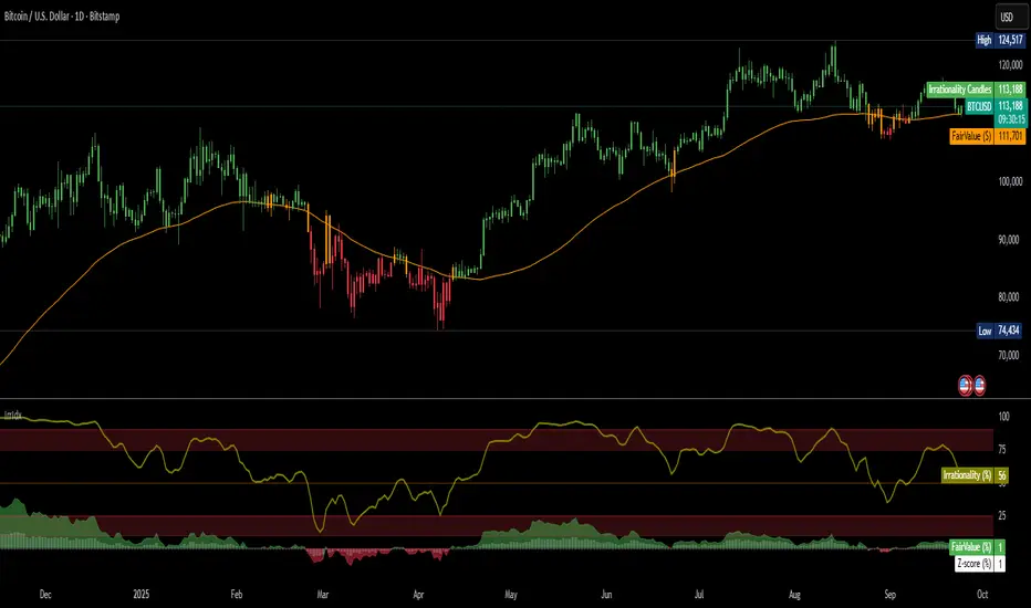
Irrationality Index by CRYPTO_ADA_BTC"The market can be irrational longer than you can stay solvent" ~ John Maynard Keynes
This indicator, the Irrationality Index, measures how far the current market price has deviated from a smoothed estimate of its "fair value," normalized for recent volatility. It provides traders with a visual sense of when the market may be behaving irrationally, without giving direct buy or sell signals.
How it works:
1. Fair Value Calculation
The indicator estimates a "fair value" for the asset using a combination of a long-term EMA (exponential moving average) and a linear regression trend over a configurable period. This fair value serves as a smoothed baseline for price, balancing trend-following and mean-reversion.
2. Volatility-Adjusted Z-Score
The deviation between price and fair value is measured in standard deviations of recent log returns:
Z = (log(price) - log(fairValue)) / volatility
This standardization accounts for different volatility environments, allowing comparison across assets.
3. Irrationality Score (0–100)
The Z-score is transformed using a logistic mapping into a 0–100 scale:
- 50 → price near fair value (rational zone)
- >75 → high irrationality, price stretched above fair value
- >90 → extreme irrationality, unsustainable extremes
- <25 → high irrationality, price stretched below fair value
- <10 → extreme bearish irrationality
4. Price vs Fair Value (% deviation)
The indicator plots the percentage difference between price and fair value:
pctDiff = (price - fairValue) / fairValue * 100
- Positive values → Percentage above fair value (optimistic / overvalued)
- Negative values → Percentage below fair value (pessimistic / undervalued)
Visuals:
- Irrationality (%) Line (0–100) shows irrationality level.
- Background Colors: Yellow= high bullish irrationality, Green= extreme bullish irrationality, Orange= high bearish irrationality, Red= extreme bearish irrationality.
- Price - FairValue (%) plot: price deviation vs fair value (%), Colored green above 0 and red below 0.
- Label: display actual price, estimated fair value, and Z-score for the latest bar.
- Alerts: configurable thresholds for high and extreme irrationality.
How to read it:
- 50 → Market trading near fair value.
- >75 / >90 → Price may be irrationally high; risk of pullback increases.
- <25 / <10 → Price may be irrationally low; potential rebound zones, but trends can continue.
- Price - FairValue (%) plot → visual guide for % price stretch relative to fair value.
Notes / Warnings:
- Measures relative deviation, not fundamental value!
- High irrationality scores do not automatically indicate trades; markets can remain can be irrational longer than you can stay solvent .
- Best used with other tools: momentum, volume, divergence, and multi-timeframe analysis.
Volume ClusteringThis Volume Clustering script is a powerful tool for analyzing intraday trading dynamics by combining two key metrics: volume Z-Score and Cumulative Volume Delta (CVD). By categorizing market activity into distinct clusters, it helps you identify high-conviction trading opportunities and understand underlying market pressure.
How It Works
The script operates on a simple, yet effective, premise: it classifies each trading bar based on its statistical significance (volume Z-Score) and buying/selling pressure (CVD).
Volume Z-Score
The volume Z-Score measures how far the current bar's volume is from its average, helping to identify periods of unusually high or low volume. This metric is a powerful way to spot when institutional or large players might be entering the market. A high Z-Score suggests a significant event is taking place, regardless of direction.
Cumulative Volume Delta (CVD)
CVD tracks the net buying and selling pressure across different timeframes. The script uses a lower timeframe (e.g., 1-minute) and anchors it to a higher timeframe (e.g., 1-day) to capture intraday pressure. A positive CVD indicates more buying pressure, while a negative CVD suggests more selling pressure.
Cluster Categories
The script analyzes the confluence of these two metrics to assign a cluster to each bar, providing actionable insights. The clusters are color-coded and labeled to make them easy to interpret:
🟢 High Conviction Bullish: Unusually high volume (high Z-Score) combined with significant buying pressure (high CVD). This cluster suggests strong bullish momentum.
🔴 High Conviction Bearish: Unusually high volume (high Z-Score) coupled with significant selling pressure (low CVD). This cluster suggests strong bearish momentum.
🟡 Low Conviction/Noise: Low to moderate volume and mixed buying/selling pressure. This represents periods of indecision or consolidation, where market noise is more prevalent.
🟣 Other Clusters: The script also identifies other combinations, such as high volume with moderate CVD, or low volume with high CVD, which can provide additional context for understanding market dynamics.
Key Features & Customization
The script offers several customizable settings to tailor the analysis to your specific trading style:
Z-Score Lookback Length: Adjust the lookback period for calculating the average volume. A shorter period focuses on recent volume trends, while a longer period provides a broader context.
CVD Anchor & Lower Timeframe: Define the timeframes used for CVD calculation. You can anchor the analysis to a daily or weekly timeframe while using a lower timeframe (e.g., 1-minute) to capture granular intraday pressure.
High/Low Volume Mode: Toggle between "High Volume" mode (which uses 90th and 10th percentiles for clustering) and "Low Volume" mode (which uses 75th and 25th percentiles). This allows you to choose whether to focus on extreme events or more subtle shifts in market sentiment.

Relative Sector Index Benchmarking by QuantxQuantX Relative Strength helps traders identify whether a stock is outperforming or underperforming NIFTY. It uses a clean histogram with background highlights and a trend line to spot market leaders, laggards, and strength reversals quickly.

BioSwarm Imprinter™BioSwarm Imprinter™ — Agent-Based Consensus for Traders
What it is
BioSwarm Imprinter™ is a non-repainting, agent-based sentiment oscillator. It fuses many short-to-medium lookback “opinions” into one 0–100 consensus line that is easy to read at a glance (50 = neutral, >55 bullish bias, <45 bearish bias). The engine borrows from swarm intelligence: many simple voters (agents) adapt their influence over time based on how well they’ve been predicting price, so the crowd gets smarter as conditions change.
Use it to:
• Detect emerging trends sooner without overreacting to noise.
• Filter mean-reversion vs continuation opportunities.
• Gate entries with a confidence score that reflects both strength and persistence of the move.
• Combine with your execution tools (VWAP/ORB/levels) as a state filter rather than a trade signal by itself.
⸻
Why it’s different
• Swarm learning: Each agent improves or decays its “fitness” depending on whether its vote matched the next bar’s direction. High-fitness agents matter more; weak agents fade.
• Multi-horizon by design: The crowd is composed of fixed, simple lookbacks spread from lenMin to lenMax. You get a blended, robust view instead of a single fragile parameter.
• Two complementary lenses: Each agent evaluates RSI-style balance (via Wilder’s RMA) and momentum (EMA deviation). You decide the weight of each.
• No repaint, no MTF pitfalls: Everything runs on the chart’s timeframe with bar-close confirmation; no request.security() or forward references.
• Actionable UI: A clean consensus line, optional regime background, confidence heat, and triangle markers when thresholds are crossed.
⸻
What you see on the chart
• Consensus line (0–100): Smoothed to your preference; color/area makes bull/bear zones obvious.
• Regime coloring (optional): Light green in bull zone, light red in bear zone; neutral otherwise.
• Confidence heat: A small gauge/number (0–100) that combines distance from neutral and recent persistence.
• Markers (optional): Triangles when consensus crosses up through your bull threshold (e.g., 55) or down through your bear threshold (e.g., 45).
• Info panel (optional): Consensus value, regime, confidence, number of agents, and basic diagnostics.
⸻
How it works (under the hood)
1. Horizon bins: The range is divided into numBins. Each bin has a fixed, simple integer length (crucial for Pine’s safety rules).
2. Per-bin features (computed every bar):
• RSI-style balance using Wilder’s RMA (not ta.rsi()), then mapped to −1…+1.
• Momentum as (close − EMA(L)) / EMA(L) (dimensionless drift).
3. Agent vote: For its assigned bin, an agent forms a weighted score: score = wRSI*RSI_like + wMOM*Momentum. A small dead-band near zero suppresses chop; votes are +1/−1/0.
4. Fitness update (bar close): If the agent’s previous vote agreed with the next bar’s direction, multiply its fitness by learnGain; otherwise by learnPain. Fitness is clamped so it never explodes or dies.
5. Consensus: Weighted average of all votes using fitness as weights → map to 0–100 and smooth with EMA.
Why it doesn’t repaint:
• No future references, no MTF resampling, fitness updates only on confirmed bars.
• All TA primitives (RMA/EMA/deltas) are computed every bar unconditionally.
⸻
Signals & confidence
• Bullish bias: consensus ≥ bullThr (e.g., 55).
• Bearish bias: consensus ≤ bearThr (e.g., 45).
• Confidence (0–100):
• Distance score: how far consensus is from 50.
• Momentum score: how strong the recent change is versus its recent average.
• Combined into a single gate; start filtering entries at ≥60 for higher quality.
Tip: For range sessions, raise thresholds (60/40) and increase smoothing; for momentum sessions, lower smoothing and keep thresholds at 55/45.
⸻
Inputs you’ll actually tune
• Agents & horizons:
• N_agents (e.g., 64–128)
• lenMin / lenMax (e.g., 6–30 intraday, 10–60 swing)
• numBins (e.g., 12–24)
• Weights & smoothing:
• wRSI vs wMOM (e.g., 0.7/0.3 for FX & indices; 0.6/0.4 for crypto)
• deadBand (0.03–0.08)
• consSmooth (3–8)
• Thresholds & hygiene:
• bullThr/bearThr (55/45 default)
• cooldownBars to avoid signal spam
⸻
Playbooks (ready-to-use)
1) Breakout / Trend continuation
• Timeframe: 15m–1h for day/swing.
• Filter: Take longs only when consensus > 55 and confidence ≥ 60.
• Execution: Use your ORB/VWAP/pullback trigger for entry. Trail with swing lows or 1.5×ATR. Exit on a close back under 50 or when a bearish signal prints.
2) Mean reversion (fade)
• When: Sideways days or low-volatility clusters.
• Setup: Increase deadBand and consSmooth.
• Signal: Bearish fades when consensus rolls over below ≈55 but stays above 50; bullish fades when it rolls up above ≈45 but stays below 50.
• Targets: The neutral zone (~50) as the first take-profit.
3) Multi-TF alignment
• Keep BioSwarm on 1H for bias, execute on 5–15m:
• Only take entries in the direction of the 1H consensus.
• Skip counter-bias scalps unless confidence is very low (explicit mean-reversion plan).
⸻
Integrations that work
• DynamoSent Pro+ (macro bias): Only act when macro bias and swarm consensus agree.
• ORB + Session VWAP Pro: Trade London/NY ORB breakouts that retest while consensus >55 (long) or <45 (short).
• Levels/Orderflow: BioSwarm is your “go / no-go”; execution stays with your usual triggers.
⸻
Quick start
1. Drop the indicator on a 1H chart.
2. Start with: N_agents=64, lenMin=6, lenMax=30, numBins=16, deadBand=0.06, consSmooth=5, thresholds 55/45.
3. Trade only when confidence ≥ 60.
4. Add your favorite execution tool (VWAP/levels/OR) for entries & exits.
⸻
Non-repainting & safety notes
• No request.security(); no hidden lookahead.
• Bar-close confirmation for fitness and signals.
• All TA calls are unconditional (no “sometimes called” warnings).
• No series-length inputs to RSI/EMA — we use RMA/EMA formulas that accept fixed simple ints per bin.
⸻
Known limits & tips
• Too many signals? Raise deadBand, increase consSmooth, widen thresholds to 60/40.
• Too few signals? Lower deadBand, reduce consSmooth, narrow thresholds to 53/47.
• Over-fitting risk: Keep learnGain/learnPain modest (e.g., ×1.04 / ×0.96).
• Compute load: Large N_agents × numBins is heavier; scale to your device.
⸻
Example recipes
EURUSD 1H (swing):
lenMin=8, lenMax=34, numBins=16, wRSI=0.7, wMOM=0.3, deadBand=0.06, consSmooth=6, thr=55/45
Buy breakouts when consensus >55 and confidence ≥60; confirm with 5–15m pullback to VWAP or level.
SPY 15m (US session):
lenMin=6, lenMax=24, numBins=12, consSmooth=4, deadBand=0.05
On trend days, stay with longs as long as consensus >55; add on shallow pullbacks.
BTC 1H (24/7):
Increase momentum weight: wRSI=0.6, wMOM=0.4, extend lenMax to ~50. Use dynamic stops (ATR) and partials on strong verticals.
⸻
Final word
BioSwarm is a state engine: it tells you when the market is primed to continue or mean-revert. Pair it with your entries and risk framework to turn that state into trades. If you’d like, I can supply a companion strategy template that consumes the consensus and back-tests the three playbooks (Breakout/Fade/Flip) with standard risk management.

DynamoSent DynamoSent Pro+ — Professional Listing (Preview)
— Adaptive Macro Sentiment (v6)
— Export, Adaptive Lookback, Confidence, Boxes, Heatmap + Dynamic OB/OS
Preview / Experimental build. I’m actively refining this tool—your feedback is gold.
If you spot edge cases, want new presets, or have market-specific ideas, please comment or DM me on TradingView.
⸻
What it is
DynamoSent Pro+ is an adaptive, non-repainting macro sentiment engine that compresses VIX, DXY and a price-based activity proxy (e.g., SPX/sector ETF/your symbol) into a 0–100 sentiment line. It scales context by volatility (ATR%) and can self-calibrate with rolling quantile OB/OS. On top of that, it adds confidence scoring, a plain-English Context Coach, MTF agreement, exportable sentiment for other indicators, and a clean Light/Dark UI.
Why it’s different
• Adaptive lookback tracks regime changes: when volatility rises, we lengthen context; when it falls, we shorten—less whipsaw, more relevance.
• Dynamic OB/OS (quantiles) self-calibrates to each instrument’s distribution—no arbitrary 30/70 lines.
• MTF agreement + Confidence gate reduce false positives by highlighting alignment across timeframes.
• Exportable output: hidden plot “DynamoSent Export” can be selected as input.source in your other Pine scripts.
• Non-repainting rigor: all request.security() calls use lookahead_off + gaps_on; signals wait for bar close.
Key visuals
• Sentiment line (0–100), OB/OS zones (static or dynamic), optional TF1/TF2 overlays.
• Regime boxes (Overbought / Oversold / Neutral) that update live without repaint.
• Info Panel with confidence heat, regime, trend arrow, MTF readout, and Coach sentence.
• Session heat (Asia/EU/US) to match intraday behavior.
• Light/Dark theme switch in Inputs (auto-contrasted labels & headers).
⸻
How to use (examples & recipes)
1) EURUSD (swing / intraday blend)
• Preset: EURUSD 1H Swing
• Chart: 1H; TF1=1H, TF2=4H (default).
• Proxies: Defaults work (VIX=D, DXY=60, Proxy=D).
• Dynamic OB/OS: ON at 20/80; Confidence ≥ 55–60.
• Playbook:
• When sentiment crosses above 50 + margin with Δ ≥ signalK and MTF agreement ≥ 0.5, treat as trend breakout.
• In Oversold with rising Coach & TF agreement, take fade longs back toward mid-range.
• Alerts: Enable Breakout Long/Short and Fade; keep cooldown 8–12 bars.
2) SPY (daytrading)
• Preset: SPY 15m Daytrade; Chart: 15m.
• VIX (D) matters more; preset weights already favor it.
• Start with static 30/70; later try dynamic 25/75 for adaptive thresholds.
• Use Coach: in US session, when it says “Overbought + MTF agree → sell rallies / chase breakouts”, lean momentum-continuation after pullbacks.
3) BTCUSD (crypto, 24/7)
• Preset: BTCUSD 1H; Chart: 1H.
• DXY and BTC.D inform macro tone; keep Carry-forward ON to bridge sparse ticks.
• Prefer Dynamic OB/OS (15/85) for wider swings.
• Fade signals on weekend chop; Breakout when Confidence > 60 and MTF ≥ 1.0.
4) XAUUSD (gold, macro blend)
• Preset: XAUUSD 4H; Chart: 4H.
• Weights tilt to DXY and US10Y (handled by preset).
• Coach + MTF helps separate trend legs from news pops.
⸻
Best practices
• Theme: Switch Light/Dark in Inputs; the panel adapts contrast automatically.
• Export: In another script → Source → DynamoSent Pro+ → DynamoSent Export. Build your own filters/strategies atop the same sentiment.
• Dynamic vs Static OB/OS:
• Static 30/70: fast, universal baseline.
• Dynamic (quantiles): instrument-aware; use 20/80 (default) or 15/85 for choppy markets.
• Confidence gate: Start at 50–60% to filter noise; raise when you want only A-grade setups.
• Adaptive Lookback: Keep ON. For ultra-liquid indices, you can switch it OFF and set a fixed lookback.
⸻
Non-repainting & safety notes
• All request.security() calls use lookahead=barmerge.lookahead_off and gaps=barmerge.gaps_on.
• No forward references; signals & regime flips are confirmed on bar close.
• History-dependent funcs (ta.change, ta.percentile_linear_interpolation, etc.) are computed each bar (not conditionally).
• Adaptive lookback is clamped ≥ 1 to avoid lowest/highest errors.
• Missing-data warning triggers only when all proxies are NA for a streak; carry-forward can bridge small gaps without repaint.
⸻
Known limits & tips
• If a proxy symbol isn’t available on your plan/exchange, you’ll see the NA warning: choose a different symbol via Symbol Search, or keep Carry-forward ON (it defaults to neutral where needed).
• Intraday VIX is sparse—using Daily is intentional.
• Dynamic OB/OS needs enough history (see dynLenFloor). On short histories it gracefully falls back to static levels.
Thanks for trying the preview. Your comments drive the roadmap—presets, new proxies, extra alerts, and integrations.

Deep in the Tape – VSA Educational (Invite Only)Deep in the Tape – VSA Educational (Invite-Only)
Overview
This invite-only study is built entirely on the Volume Spread Analysis (VSA) methodology developed by Tom Williams. VSA examines the interplay of volume, spread (bar range), and closing position to highlight the footprints of professional activity.
The aim of this tool is educational: to make it easier for traders to study how supply and demand pressures appear on the chart in real time. It does not generate trading advice, but instead plots markers based on classical VSA principles so students of the method can recognize strength, weakness, confirmations, and traps without the cryptic complexity often found in raw VSA study.
What It Displays
Key VSA Events (visual markers on the chart):
Stopping Volume (SV): Wide down bars with climactic volume closing off the lows.
Selling Climax (SC): Exhaustion selling at the end of a decline, often near bottoms.
Shakeout (SO): A sharp push down that springs back to close strong.
No Supply (NS): Narrow down bar on low volume, showing lack of selling pressure.
No Demand (ND): Narrow up bar on low volume, showing lack of buying interest.
Supply Coming In: Volume surge after an up-move, suggesting sellers active.
Buying Climax (BC): Wide up bar with climactic volume and weakness into the close.
Upthrust (UT): False break above prior highs with a weak close.
End of Rising Market (EoRM): Narrow up bar on very high volume, closing weak, often signaling distribution.
Test Bar: Down bar on very low volume in an uptrend, testing for lack of supply.
Contextual Tools:
Trigger Levels: High/low of ultra-high volume bars projected forward, serving as natural support/resistance levels.
Cluster Zones: Optional shading to mark zones of repeated high-volume activity (potential accumulation/distribution).
Background MA: A simple moving average for context only — not a signal generator.
Interpreting the Markers (Tom Williams Style)
Bullish Background (professional strength):
Events such as SV, SC, SO, and NS.
Best studied when price is trading above trigger levels and above the MA, showing demand in control.
Bearish Background (professional weakness):
Events such as BC, UT, Supply Coming In, and EoRM.
Best studied when price is below trigger levels and below the MA, showing supply dominance.
Multi-Timeframe Context & Market Behavior
A key principle to study with this tool is that higher-timeframe context usually outweighs signals on smaller timeframes. For example:
A short marker on a 5-minute chart often fails if the hourly background is bullish.
Likewise, a bullish signal on a small timeframe is less reliable if higher-timeframe background is bearish.
This highlights an important discipline lesson: not every small signal should be acted upon in isolation. Patience and alignment with the broader background improves study of how professional activity develops.
Channeling & Probing Behavior After Climactic Volume:
After a Stopping Volume (SV) bar on ultra-high volume, the market often enters a sideways channel between the blue (support) and red (resistance) trigger lines.
Professionals may probe the market — for example, dropping price through the lower red line on low volume to test for active sellers. If no significant supply is found, price rallies back inside the channel.
This absorption process may repeat until weakness is removed. Only then do No Supply (NS) or Test bars appear, providing stronger bullish confirmation.
The reverse applies in a bearish background, where No Demand (ND) or weakness confirmations appear after probing and absorption.
Studying these patterns helps traders recognize the probing nature of professional activity, why markets often pause after climactic signals, and how strength or weakness is confirmed over time.
Aggressive Trades (Educational Extension)
In addition to classical confirmations, this study also highlights aggressive follow-through conditions — situations where professionals act quickly after a major VSA event, before the “clean” confirmation appears.
Aggressive Longs may include:
Breakouts immediately above a Stopping Volume (SV) or Selling Climax (SC) high with strong volume.
Shakeout confirmations (price closes above the SO high on effort).
Failure of weakness (e.g., BC/UT/Supply signals that get overrun on strength).
Aggressive Shorts may include:
Confirmed follow-through after Supply Coming In.
Breakdowns after a Buying Climax (BC) or Upthrust (UT).
Shakeout failures where the rally attempt collapses.
End of Rising Market (EoRM) breaks on weakness.
These are marked separately for study. They are not “signals” but rather examples of how strength or weakness can assert itself early.
Failures (Educational Study Only)
Not all setups confirm. In VSA, Tests sometimes fail, and NS/ND bars can be absorbed. These are marked as Failure markers.
Their purpose is purely educational:
To show where expectations do not play out.
To help students see how traps or absorptions form.
To illustrate Tom Williams’ lesson that the market is a testing ground — not a perfect pattern machine.
Why It’s Original
Built directly from Tom Williams’ VSA logic — spread, volume relative to average, wick size, close location, and background context.
Adds projected trigger levels, cluster zones, and aggressive trade markers for educational context.
Designed for clarity and study, removing unnecessary complexity while staying faithful to VSA principles.
Not a mash-up of public scripts — a purpose-built framework for studying supply and demand dynamics.
Disclaimer
This script is for educational and analytical purposes only.
It does not generate buy/sell/alert signals, nor does it provide financial advice.
Always perform your own analysis and risk management before making trading decisions.

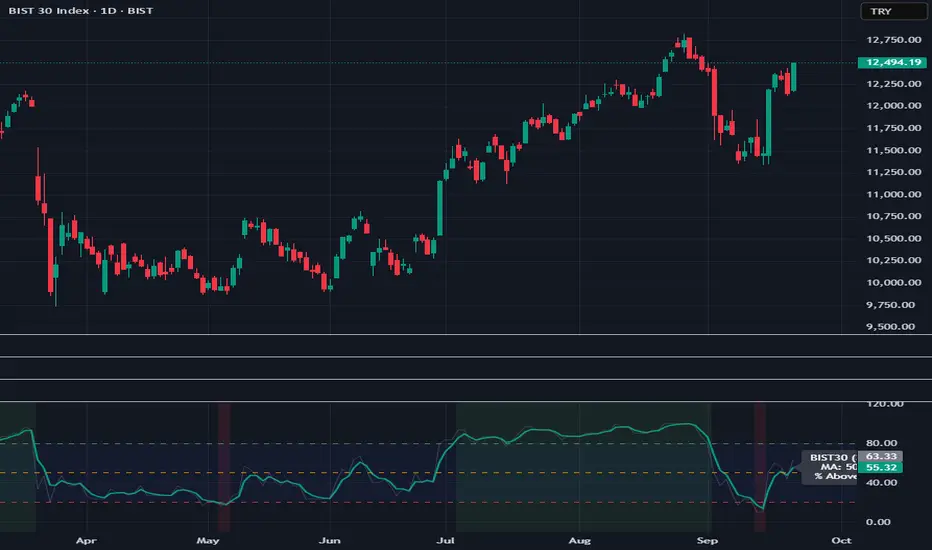
BIST30 % Above Moving Average (Breadth)
BIST30 % Above Moving Average (Breadth)
This indicator shows the percentage of BIST30 stocks trading above a selected moving average.
It is a market breadth tool, designed to measure the overall health and participation of the market.
How it works
By default, it uses the 50-day SMA.
You can switch between SMA/EMA and choose different periods (5 / 20 / 50 / 200).
The script checks each BIST30 stock individually and counts how many are closing above the chosen MA.
Interpretation
Above 80% → Overbought zone (short-term correction likely).
Below 20% → Oversold zone (potential rebound).
Around 50% → Neutral / indecisive market.
If the index (BIST:XU030) rises while this indicator falls → the rally is narrow-based, led by only a few stocks (a warning sign).
Use cases
Short-term traders → Use MA=5 or 20 for momentum signals.
Swing / Medium-term investors → Use MA=50 for market health.
Long-term investors → Use MA=200 to track bull/bear market cycles.
Notes
This script covers only BIST30 stocks by default.
The list can be updated for BIST100 or specific sectors (e.g., banks, industrials).
Breadth indicators should not be used as standalone buy/sell signals — combine them with price action, volume, and other technical tools for confirmation.
Bull/Bear Thermometer - GSK-VIZAG-AP-INDIABull/Bear Thermometer - GSK-VIZAG-AP-INDIA
Overview
The Bull/Bear Thermometer is a visual volume-based indicator designed to gauge the cumulative buying (bullish) and selling (bearish) pressure over customization time intervals on any chart. It uses Cumulative Volume Delta (CVD) to track buying and selling dominance and visually represents this data as vertical bar meters with percentage scales.
Key Features
Multi-Time frame Accumulation: Allows users to select accumulation intervals - Daily, Weekly, or Monthly - adapting to their trading style and time frame.
Cumulative Volume Delta (CVD) Computation: Calculates the net buying and selling volume by comparing volume on bullish and bearish bars to measure market strength.
Visual Thermometer Display: Presents buying (CVD+) and selling (CVD-) dominance in colorful vertical bars on an easy-to-read table overlay on the price chart.
Percentage Scale with Highlights: Includes a percentage scale from 0% to 100%, highlighting the important 50% benchmark with a yellow line for quick reference.
Clear Color Coding: Uses green and red color schemes to represent bullish and bearish pressure, with distinctive numeric labels.
Customization Reset Points: Weekly reset day and Monthly reset date options ensure the accumulation aligns with user preference or trading strategy cycles.
Inputs and Usage
Select Time frame: Choose how the buying/selling volume is accumulated — Daily, Weekly (reset day configurable), or Monthly (reset date configurable).
Volume-Based Signals: Monitor changes in buying and selling pressure levels as the market tides shift.
Table Display: A table positioned at the bottom right corner overlays the price chart showing percentage bars for both buying and selling dominance.
Ideal for: Day traders, swing traders, and volume-focused market analysts who want a quick visual summary of market sentiment.
How It Works
The indicator tracks volume on each bar, assigning positive or negative values depending on whether the bar closes higher or lower than the previous.
It accumulates these values over the selected time frame to calculate the cumulative buying (green) and selling (red) volumes.
The data is then converted to percentages and mapped as vertical colored bars in the table.
The midpoint (50%) is highlighted with a yellow line, helping traders quickly assess bullish/bearish balance.
Why Use This Indicator?
Simplicity: Easy to interpret visual thermometer of market sentiment.
Customization: Flexible period settings align with different trading styles.
Volume Insight: Goes beyond price action, factoring volume momentum for deeper market understanding.
Non-intrusive Overlay: Displayed neatly on chart without clutter or distraction.
Recommended Pairings
Use alongside price action or trend indicators.
Suitable for equities, futures, forex, and crypto instruments where volume data is reliable.
AlphaShell IndicatorAlphaShell integrates key technical elements such as Exponential Moving Averages (EMAs), Relative Strength Index (RSI), Volume analysis, and the Average Directional Index (ADX). The indicator's unique strength lies in its ability to assess the confluence of these diverse factors, dynamically weighing their combined strength to validate potential trend continuations or reversals.
AlphaShell doesn't tell you to buy or sell - it alerts you to high-probability setups that match your analytical framework, allowing you to make informed decisions based on your own strategy.
Core Features:
Combines EMA trend, RSI strength, volume spikes, break of structure, fair value gaps, CVC momentum, and more for comprehensive analysis.
VWAP max distance filter blocks trades too far from VWAP, cooldown system prevents signal spam, EMA velocity detects breakout acceleration.
Prevents same-side signals from repeating until an opposite signal occurs, ensuring clean and reliable trade entries.
Green triangles for high-probability long entries, Red triangles for high-probability short entries with clean visual overlays.

Mag 7 Weighted Performance % (Today Only)shows the cumulative weighted performance of mag 7 stocks as a percentage.

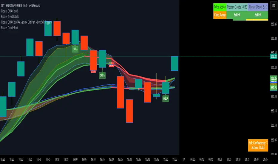
Ripster EMA Cloud A+ Setup + Exit Plan + Buy/Sell TriggersUsing the Ripster Cloud Method, a conditional system that helps with entries and exits
FX % Change TableFX % Change Table
This tool provides currency strength analysis at a glance, allowing traders to instantly identify which currencies are outperforming or underperforming without the need to manually check each pair. It offers decision support for entries and exits by helping traders align their positions with broader strength and weakness trends, such as buying the strongest currency against the weakest. Its versatility makes it suitable for any timeframe, whether used by scalpers or swing traders. Best of all, it delivers these insights in a clean and simple format, presenting complex multi-pair calculations in an easy-to-read visual display.
This tool is especially helpful for traders who incorporate currency strength analysis, correlation checks, or basket trading into their strategy. It reduces time spent flipping through charts and provides a structured overview for smarter trade decisions.
Unlike traditional single-pair indicators, this tool calculates the percentage change between the current and previous higher timeframe closes for a group of forex pairs. You can choose between two curated groups:
• Majors – EURUSD, GBPUSD, USDJPY, USDCHF, AUDUSD, NZDUSD, USDCAD
• Cross Pairs – A wide basket of EUR, GBP, AUD, NZD, CAD, and CHF crosses
For each symbol, the script requests the selected timeframe’s price data, calculates the percentage change from the previous bar’s close, and then displays it in a neatly formatted table. Green highlights strength, red highlights weakness, and gray shows neutrality — making shifts in momentum instantly recognizable.
How to Use
1. Select your timeframe – For example, "60" (1H) to view hourly change, "240" (4H) for broader moves, or "D" for daily strength/weakness.
2. Choose your group – Focus on the Majors for a macro USD view, or switch to Cross Pairs for secondary flows.
3. Position the table – Place it in any corner of your chart (top-left, top-right, bottom-left, bottom-right) to match your workspace.
The table updates dynamically at the close of each bar, ensuring the displayed data always reflects the most recent market movements.
