KP Support ResistneSummary for TradingView Publication: Demand and Supply Indicator
The Demand and Supply Indicator automatically identifies and plots high-probability supply and demand zones on your chart, eliminating the need for manual zone drawing. These zones represent areas where institutional buying or selling previously caused significant price movements, making them critical for predicting future price reactions and reversals.
Key Features
Automated Zone Detection: The indicator uses price action analysis to identify where aggressive buying creates demand zones (support) and aggressive selling creates supply zones (resistance)
Multi-Timeframe Support: Works seamlessly across all timeframes — from 1-minute scalping to daily swing trading — providing consistent zone visibility regardless of chart view
Zone Quality Scoring: Evaluates and scores each zone based on strength, freshness, and institutional activity to highlight the most reliable trading opportunities
Visual Clarity: Supply zones appear above price (typically red), demand zones below price (typically green), with customizable colors and line thickness to match your charting style
Alert System: Set up notifications for when price approaches or interacts with key zones, ensuring you never miss potential trade setups
Trading Applications
This indicator excels in multiple trading strategies:
Identifying reversal points at untested zones
Planning trend continuation entries during pullbacks to demand (uptrends) or rallies to supply (downtrends)
Setting logical stop-loss levels below demand or above supply zones
Combining with other indicators like RSI, MACD, or volume for enhanced confirmation
Why Use This Indicator
Supply and demand zones frequently mark strong turning points due to institutional order flow, often detecting reversals earlier than lagging indicators. The indicator works across all markets including forex, crypto, stocks, and futures, providing clear entry/exit points and natural risk-defined trade structures.
Sentiment

NOVA - SessionsKey Features:
Three Major Sessions:
Asia (Tokyo):** Draws the overnight consolidation range (High/Low/Mid).
London:** Draws the breakout session range.
New York:** Draws the reversal/continuation session range (aligned with the Stock Market Open).
Smart Timezone Logic:
All sessions are calculated using their **local** exchange times (e.g., Tokyo time for Asia, NY time for NYSE) but display correctly on your chart in Amsterdam time. You never have to adjust for Daylight Savings.
Support & Resistance:
The Highs, Lows, and Midpoints extend to the right, allowing you to see how previous sessions act as support or resistance later in the day.
Daily Open:
Marks the exact opening price at Midnight to help you determine if price is "premium" (expensive) or "discount" (cheap) for the day.
Midnight VWAP:
A volume-weighted average price that resets every night, acting as a dynamic "fair value" line for the day.
Clean Visuals:
Completely customizable. You can toggle background boxes, lines, and text labels to keep your chart clean.
In short:
It automates the "boring work" of marking up your chart every morning so you can focus purely on price action.

V-Max: Tactical Clock & Price (Master Fit)Overview
The V-Max Tactical Clock & Price is a high-visibility utility dashboard engineered for precision execution in global financial markets. It serves as a "Physical Timezone Navigator," providing real-time price tracking and synchronized local time display directly on the chart. This ensures traders can align their execution with specific market openings and closing volatility regardless of the exchange's default timezone.
Core Technical Logic & Features
This script focuses on the physics of time-alignment and visual stability:
Physical Time Calibration Engine: Unlike standard UI clocks, this script employs a millisecond-level compensation engine using the formula: $timenow + (tz\_offset \times 60 \times 60 \times 1000)$. This allows for precise synchronization with any global market (e.g., London, New York, or Asia sessions).
Momentum-Driven Price Rendering: The price display utilizes conditional coloring logic ($close \ge open ? up\_col : dn\_col$) to provide immediate visual feedback on the current bar's momentum.
High-Identifiability UI (Master Fit): Leverages the table.new titan rendering engine with size.huge font specifications for the price. This ensures critical data remains readable even on small mobile screens or high-density multi-chart layouts.
Anti-Flicker Monospaced Formatting: Employs font.family_monospace to ensure strict numerical alignment, preventing visual flickering or "jumping" during periods of extreme market volatility.
How to Use
Timezone Setup: Enter your local GMT offset (e.g., +8 for Taiwan/Singapore, -5 for New York) in the settings.
Visual Customization: Adjust the dashboard position (default: Bottom Left) and background aesthetics to fit your professional trading workspace.
產品概述
V-Max 戰術時鐘與價格顯示器是一款為全球市場設計的高辨識度工具。它作為一個實時的「全球時區導航儀」,在圖表上直接提供實時價格追蹤與同步化的本地時間顯示,確保交易者能精確對齊各國市場開盤瞬間的波動。
核心技術邏輯與功能物理時間校準引擎:採用毫秒級時間補償運算,公式為:$timenow + (tz\_offset \times 60 \times 60 \times 1000)$。這讓交易者能精確校準全球任一交易所的本地時間。
動能價格渲染:價格顯示具備即時漲跌變色邏輯,提供直觀的即時盤感反饋。
特大字體 UI (Master Fit):採用 size.huge 字體規格顯示價格,確保在移動端或複雜多圖表布局下依然清晰易讀。
防閃爍等寬格式:使用等寬字體確保數字在劇烈波動時不會產生視覺跳動,維持高度的讀數穩定性。
Access & Support
This script is published as a Free Public Utility in the TradingView Library. Disclaimer: For educational purposes only. Past performance does not guarantee future results.
Disclaimer: This script is for technical analysis and educational purposes only. It does not provide financial advice.


BBands + Overbought/Oversold MarkersAdvanced Bollinger Bands indicator with overbought/oversold signals, automatic squeeze detection, and multi-timeframe (MTF) capabilities.
Retains all functions of the original Bollinger Bands indicator from TradingView with a few added features:
Overbought/Oversold Markers: Visual signals when price opens and closes outside the bands
🔴 Red Highlight & Arrow → Price opens & closes above the upper BB (potential overbought/excess momentum).
🟢 Green Highlight & Arrow → Price opens & closes below the lower BB (potential oversold/reversal).
Squeeze Detection: Automatically highlights when bandwidth reaches its lowest point (narrowest BB width) in the lookback period, signalling potential breakout zones
Multi-Timeframe Bands: Display Bollinger Bands from any timeframe on your current chart (e.g., weekly bands on a daily chart), including markers and squeeze zones
Dual Rendering MTF Modes: Choose between traditional plots (unlimited history) or smooth line drawing (~125-165 MTF bars of history)
Built-in Alerts: Set alerts for overbought conditions, oversold conditions, squeeze detection, or any combination
Fully Customizable: Adjust MA type (SMA/EMA/RMA/WMA/VWMA), standard deviation multiplier, colors, and marker styles
Perfect for: Swing traders, MTF analysis, volatility-based entries, and identifying consolidation/expansion cycles.

Tomorrow Bullish Detector (StephC6)Tomorrow Bullish Detector
This indicator is a specialized technical analysis suite designed to pinpoint high-probability bullish entries using a 6-factor confluence model. It features a dynamic dashboard and visual chart overlays to keep your analysis clean and focused.
### Key Features
- Real-Time Scorecard Monitor: The on-screen dashboard serves as a live monitor for the most current candle only. It provides an immediate snapshot of technical health.
- Fixed Metric Logic: The six core metrics within the scorecard are not changeable, ensuring strategy integrity:
Trend Alignment: Fast and Slow EMA relationship.
Baseline Position: Price relative to the 200 SMA.
Momentum (RSI): Strength relative to the 50 midline.
Breakout Status: Detection of recent high breaches.
Volatility (ATR): Filtering active vs. quiet market states.
Relative Volume (RVOL): Tracking institutional volume presence.
- Simplified 2-Tier Grading:
Grade A (83%): High-conviction signal with fully customizable label, text, and background colors.
Grade B (67%): Secondary setups using subtle, neutral tones to reduce chart clutter.
- Full Customization:
Custom Text Colors: Independently set the text color for both A and B labels for maximum readability on any chart theme.
EMA/SMA Toggles: Toggle Fast EMA, Slow EMA, and 200 SMA visibility.
Moveable Dashboard: Reposition the panel to any corner of the screen and adjust text scaling.
### Integrated Alerts
Grade A Setups: Notifies you only when the most high-conviction criteria are met.
Grade B Setups: Optional alerts for secondary opportunities.
### How to Use
To get the most out of this tool, follow these three steps for analysis:
Monitor the Live Scorecard: Look at the dashboard in your chosen corner. It monitors the most current candle in real-time. A "STRONG" signal status only appears when the 6-factor confluence meets your Grade A or B thresholds. If the metrics show "Wait" or "Weak," the setup is not yet mature.
Identify the Entry Grade:
- Grade A (83%): This is your high-conviction setup. When you see the Lime green label (default) and background highlight, it means 5 out of 6 technical factors are aligned.
- Grade B (67%): This is a secondary trend-continuation setup. Use this to identify potential entries when the primary trend is already established but momentum is still healthy.
Clean Your Workspace: If your chart feels cluttered, use the Trend Settings to toggle off the EMA lines. The scorecard will continue to calculate the trend logic in the background even if the lines are hidden, allowing you to maintain a clean "price-action only" view while still receiving signals.
### Disclaimer
For Educational Purposes Only. This indicator is a technical tool designed to assist in market analysis and does not constitute financial advice. Trading involves significant risk.

ADR Dashboard with Move, Left and AlertsIndicator Name: ADR Dashboard with Move, Left and Alerts
Overview
The ADR Dashboard is a powerful real-time trading tool that tracks how much a stock, crypto, or other asset has moved today relative to its Average Daily Range (ADR). It provides a clear visual representation of:
1. Today’s price movement (Move)
2. Remaining potential movement left to reach ADR (Left)
3. Percentage of ADR covered (% Covered)
4.Additionally, it provides automated alerts for key movement thresholds.
A) What it Does
1.Calculates the Average Daily Range (ADR):
2. Uses True Range over a user-defined lookback period (default 14 days).
3. ADR measures typical daily volatility.
B) Tracks Today’s Move:
1. Move = Current Price – Today’s Open (Realtime)
2. Positive → bullish move, Negative → bearish move
C) Tracks Remaining Potential (Left):
1. Left = ADR – |Move| (Realtime)
2. Shows how much of the ADR is still available for today’s move
3. Percentage Covered:
4. % Covered = |Move| / ADR × 100
D) Color-coded for visual clarity:
1. Green (<50%) → small move, plenty of range left
2. Yellow (50–80%) → moderate move, watch for acceleration
3. Orange (80–100%) → strong move, ADR almost reached
4. Red (>100%) → ADR exceeded, momentum may be exhausted
E) Dashboard Table:
1. Columns: ADR | Move | Left | % Covered
2. Position: middle-right of the chart
F) Left column color-coded:
1. Green → some ADR left
2. Red → ADR fully reached or exceeded
3. Move column: usually yellow for visibility, but could be enhanced for positive/negative moves
G) Alerts
The indicator provides directional alerts:
Bullish Alerts (upward moves):
1. 90% ADR warning: fires when Move ≥ 90% of ADR → early warning of strong bullish momentum
2. 100% ADR breach: fires when Move ≥ ADR → full daily range reached
Bearish Alerts (downward moves):
1. 90% ADR warning: fires when Move ≤ -90% of ADR → early warning of strong bearish momentum
2. 100% ADR breach: fires when Move ≤ -ADR → full daily range reached
All alerts are unique and fire once per session per threshold.
H) How Traders Can Use This Indicator
Momentum Trading:
1. Identify strong intraday moves approaching ADR.
2. Enter positions early at 90% ADR warning or take profits near 100% ADR.
Scalping & Intraday Trading:
1. Gauge how much of today’s range is left for quick entries/exits.
2. Avoid trades when ADR is almost fully consumed → reduces risk of reversals.
Swing Trading:
1. Combine with trend indicators to see if today’s move is significant relative to historical volatility.
I) Risk Management:
1. Set profit targets or stop-loss levels based on Move and Left values.
Visual Efficiency:
At-a-glance view of Move, Left, % Covered, and alert status without manual calculations.
Key Features
1. Real-time Move and Left updates
2. Color-coded % Covered and Left for quick visualization
3. Alerts for 90% and 100% ADR levels, bullish and bearish
4. Clean dashboard table at middle-right of the chart
5. Works across stocks, crypto, forex, and other markets
J) Why This Indicator is Powerful
1. Combines volatility (ADR) with real-time price tracking
2. Provides visual clarity and actionable alerts
3. Helps traders stay ahead of intraday moves, manage risk, and time entries/exits effectively

Algoat_Alpha Composite Fear & GreedMarket sentiment is often noisy. We engineered a way to silence the noise.
The Algoat_Alpha Composite Fear & Greed Index is a structural sentiment engine designed for the modern trader. While standard indicators often lag or react too quickly to volatility, this tool solves the "Single Point of Failure" problem by aggregating four distinct market dimensions into a single, high-fidelity score (0-100).
Whether you are tracking liquidity grabs on CRYPTOCAP:BTC , structural shifts on CRYPTOCAP:SOL , or macro cycles on AMEX:SPY , this tool provides a normalized, algorithmic view of market psychology.
THE COMPOSITE ENGINE (METHODOLOGY)
To generate a reliable "Alpha" score, this script does not rely on a single input. Instead, it filters price action through a logic gate of Momentum, Volume, and Volatility.
RSI (Momentum): Establishes the baseline velocity of the move.
MFI (Volume Integrity): We fuse momentum with volume. If price pushes into "Greed" but volume (MFI) diverges, the Composite Score remains suppressed, filtering out weak structure and "fakeouts."
%B (Bollinger Volatility): Measures statistical extension. This distinguishes between a healthy trend and a statistically anomalous "Blow-off Top" (Extreme Greed).
CCI (Deviation): A custom normalization algorithm clamps the typically unbounded CCI to a 0-100 scale to detect standard deviation extremes.
FRACTAL TIMEFRAME LOGIC
This engine is Timeframe Agnostic, allowing for multi-dimensional analysis:
Intraday (1m - 15m): Identify micro-cycle exhaustion and liquidity sweeps.
Swing (1H - 4H): Gauge trend strength and mid-term sentiment shifts.
Macro (Daily - Weekly): Locate structural tops (Extreme Greed) and capitulation bottoms (Extreme Fear).
KEY FEATURES
1. Pine Screener Integration (Alerts):
This is a "Scanner-First" tool. It broadcasts 5 distinct alert signals, allowing you to filter the entire market for psychological anomalies using the TradingView Screener.
Extreme Fear (<25): Detects statistical oversold conditions often associated with capitulation.
Extreme Greed (>75): Detects statistical overextension often associated with euphoria.
2. The HUD Dashboard A clean, algorithmic overlay designed to keep your chart uncluttered:
Real-Time Score: Instant 0-100 reading.
Trend Context: Displays Previous Bar, 7-Day Average, and 30-Day Average to visualize sentiment momentum.
Smart Tooltips: Hover over any element for a detailed breakdown of the metric.
INTERPRETING THE ZONES
Zone 0-25 (EXTREME FEAR): Market is statistically oversold on high volume. Historically, this aligns with "Value" zones where Smart Money may be accumulating.
Zone 75-100 (EXTREME GREED): Market is overextended relative to volatility bands. Historically, this aligns with "Premium" zones where distribution may occur.
Sentiment is fractal. NASDAQ:TSLA might be showing "Greed" on the Daily while showing "Fear" on the 15m. Check the score for your asset on multiple timeframes—are they aligned or diverging?
Disclaimer: This tool is for educational purposes only and does not constitute financial advice.

Institutional Z-Score Pro
═══════════════════════════════════════════════════════════════════════════════
INSTITUTIONAL Z-SCORE PRO v1.0
Professional Mean Reversion & Momentum Indicator
═══════════════════════════════════════════════════════════════════════════════
SUBTITLE:
Professional Z-Score indicator with 4 calculation methods, regime detection, MTF analysis, quadrant statistics, and win rate tracking. Used by institutional traders.
🎯 OVERVIEW
The Institutional Z-Score Pro transforms traditional Z-Score analysis into a
professional-grade trading system used by quantitative hedge funds and
institutional traders. This indicator identifies statistical extremes, measures
momentum shifts, and provides probability-based edge calculations across
multiple timeframes and market regimes.
Unlike basic Z-Score indicators, this version incorporates robust statistical
methods, adaptive calculations, regime detection, and comprehensive performance
tracking to give you the edge professional traders use.
━━━━━━━━━━━━━━━━━━━━━━━━━━━━━━━━━━━━━━━━━━━━━━━━━━━━━━━━━━━━━━━━━━━━━━━━━━━
✨ KEY FEATURES
📊 FOUR Z-SCORE CALCULATION METHODS:
• Standard (SMA/StdDev) - Traditional approach
• Robust (MAD) - Median Absolute Deviation for outlier resistance
• Exponential (EWMA) - Faster adaptation to trends
• Volume-Weighted - Institutional footprint tracking
🔄 ADAPTIVE TECHNOLOGY:
• Volatility-adjusted lookback periods
• Regime-aware threshold adjustments
• Dynamic smoothing based on market conditions
🎭 REGIME DETECTION SYSTEM:
• ADX-based trend classification (Uptrend/Downtrend/Range)
• Volatility regime identification (High/Normal/Low Vol)
• Adaptive thresholds for different market conditions
📈 MULTI-TIMEFRAME ANALYSIS:
• Higher timeframe Z-Score overlay
• MTF trend alignment indicators
• Cross-timeframe confirmation signals
📊 ADVANCED QUADRANT ANALYSIS:
• Real-time position tracking (4 quadrants)
• Win rate calculation per quadrant
• Average return per quadrant
• Distribution percentage analysis
• Expected value calculations
📉 PERCENTILE RANKING:
• Historical context (252-day rolling)
• Current Z-Score percentile position
• Extreme move identification
🎨 PROFESSIONAL VISUALIZATION:
• Color-coded Z-Score plot by regime
• Momentum histogram (Z-Change)
• Standard deviation bands (±1σ, ±2σ)
• Dynamic extreme zones
• Filled probability zones
• Two comprehensive data tables
🔔 SIX ALERT CONDITIONS:
• Extreme Overbought/Oversold
• Long/Short Reversal Signals
• Bullish/Bearish Momentum Confirmation
━━━━━━━━━━━━━━━━━━━━━━━━━━━━━━━━━━━━━━━━━━━━━━━━━━━━━━━━━━━━━━━━━━━━━━━━━━━
🔬 METHODOLOGY
WHAT IS Z-SCORE?
Z-Score measures how many standard deviations a value is from its mean. In
trading, it identifies statistical extremes:
• Z > +2: Price is 2 standard deviations above average (overbought)
• Z < -2: Price is 2 standard deviations below average (oversold)
• Z near 0: Price is near its average (neutral)
ROBUST Z-SCORE (MAD METHOD):
Instead of simple mean/standard deviation (susceptible to outliers), the MAD
(Median Absolute Deviation) method uses:
• Median instead of mean (more robust)
• MAD instead of standard deviation (outlier resistant)
• Used by quantitative hedge funds for options pricing
VOLUME-WEIGHTED Z-SCORE:
Gives more weight to high-volume bars, revealing institutional activity:
• VWAP-based calculation
• Identifies smart money moves
• Better for options and derivatives trading
ADAPTIVE LOOKBACK:
Automatically adjusts calculation period based on volatility:
• High volatility → Shorter lookback (more responsive)
• Low volatility → Longer lookback (more stable)
• Reduces false signals across market conditions
━━━━━━━━━━━━━━━━━━━━━━━━━━━━━━━━━━━━━━━━━━━━━━━━━━━━━━━━━━━━━━━━━━━━━━━━━━━
📊 QUADRANT ANALYSIS EXPLAINED
The indicator tracks momentum changes through 4 quadrants:
Q1 (Z+, ΔZ+) → Strong Uptrend ⬆⬆
• Both Z-Score and momentum positive
• Trend continuation signal
• Best in trending up markets
Q2 (Z+, ΔZ-) → Potential Top ⬇
• Overbought but momentum fading
• Mean reversion setup
• Best in ranging markets
Q3 (Z-, ΔZ-) → Strong Downtrend ⬇⬇
• Both Z-Score and momentum negative
• Trend continuation signal
• Best in trending down markets
Q4 (Z-, ΔZ+) → Potential Bottom ⬆
• Oversold but momentum improving
• Mean reversion setup
• Best in ranging markets
The table shows COUNT, %, AVERAGE RETURN, and WIN RATE for each quadrant,
allowing you to identify which setups have the best historical edge.
━━━━━━━━━━━━━━━━━━━━━━━━━━━━━━━━━━━━━━━━━━━━━━━━━━━━━━━━━━━━━━━━━━━━━━━━━━━
🎯 HOW TO USE
STEP 1: CHOOSE YOUR Z-SCORE METHOD
• Stocks/Forex: Standard or Exponential
• Crypto/Volatile: Robust (MAD)
• Options/High Volume: Volume-Weighted
STEP 2: CONFIGURE TIMEFRAMES
Current TF → Recommended HTF:
• 5min → 1H
• 15min → 4H
• 1H → 1D
• 4H → 1W
• 1D → 1W
STEP 3: UNDERSTAND THE REGIME
Watch the regime indicator in the table:
• UPTREND: Use Q1 signals (trend continuation)
• DOWNTREND: Use Q3 signals (trend continuation)
• RANGE: Use Q2/Q4 signals (mean reversion)
STEP 4: WAIT FOR ALIGNMENT
Best trades occur when:
✓ Z-Score extreme (>2 or <-2)
✓ Momentum confirming (Z-Change aligned)
✓ Correct regime (trending vs ranging)
✓ MTF alignment (same direction on higher TF)
━━━━━━━━━━━━━━━━━━━━━━━━━━━━━━━━━━━━━━━━━━━━━━━━━━━━━━━━━━━━━━━━━━━━━━━━━━━
💼 TRADING STRATEGIES
🔵 STRATEGY 1: MEAN REVERSION (Ranging Markets)
Entry Conditions:
• Market Regime: Range (ADX < 25)
• Z-Score < -2 (oversold)
• Z-Change > 0 (momentum turning positive)
• Quadrant: Q4
• MTF: Not in strong downtrend
Entry: Long when all conditions met
Stop: Below recent low or -1.5 ATR
Target: Z-Score = 0 (mean)
Expected: 55-60% win rate
🔴 STRATEGY 2: TREND CONTINUATION (Trending Markets)
Entry Conditions:
• Market Regime: Uptrend (ADX > 25)
• Z-Score > 0 (above average)
• Z-Change > 0 (positive momentum)
• Quadrant: Q1
• MTF: Bullish aligned
Entry: Long pullbacks to +1 Z-Score
Stop: Below 0 Z-Score
Target: Trail with +2 Z-Score
Expected: 60-65% win rate
🟡 STRATEGY 3: EXTREME FADE (High Probability)
Entry Conditions:
• Z-Score > 3.0 (extreme overbought)
• Percentile Rank > 95%
• Volume: High
• Z-Change: Negative (momentum fading)
Entry: Short on first Z-Change < 0
Stop: Above recent high
Target: Z-Score = +1
Expected: 65-70% win rate
━━━━━━━━━━━━━━━━━━━━━━━━━━━━━━━━━━━━━━━━━━━━━━━━━━━━━━━━━━━━━━━━━━━━━━━━━━━
⚙️ SETTINGS GUIDE
CORE Z-SCORE SETTINGS:
• Z-Score Length: 40 (default), 20-60 for faster/slower
• Source: 'close' for price, 'Returns' for % changes
• Z-Score Method: Start with 'Standard', try others for your asset
• Adaptive Lookback: Enable for automatic regime adjustment
• Smoothing Factor: 2.0 (higher = more smooth)
MULTI-TIMEFRAME:
• Enable MTF: Toggle on for confirmation
• Higher Timeframe: 3-5x your current timeframe
• Show MTF Alignment: Visual confirmation
REGIME DETECTION:
• Enable: Always recommended
• ADX Length: 14 (standard)
• Trend Threshold: 25 (lower = more trends detected)
• Volatility Length: 20
QUADRANT ANALYSIS:
• Lookback Bars: 100-500 (more = better statistics)
• Show Table: Display quadrant metrics
• Show Probabilities: Display win rates
VISUALIZATION:
• Show Bands: ±1σ, ±2σ reference levels
• Show Extreme Zones: Dynamic overbought/oversold
• Color by Regime: Visual regime identification
• Extreme Threshold: 2.5 (adjust per asset)
ADVANCED METRICS:
• Show Percentile: Historical ranking
• Percentile Length: 252 (trading days in year)
• Show Edge: Win rates and returns
ALERTS:
• Enable Alerts: Toggle on
• Alert Threshold: 2.0 (lower = more alerts)
━━━━━━━━━━━━━━━━━━━━━━━━━━━━━━━━━━━━━━━━━━━━━━━━━━━━━━━━━━━━━━━━━━━━━━━━━━━
🔔 ALERT CONDITIONS
The indicator provides 6 built-in alert conditions:
1. EXTREME OVERBOUGHT: Z-Score > threshold
Use: Fade extremes, prepare for reversal
2. EXTREME OVERSOLD: Z-Score < -threshold
Use: Buy oversold, mean reversion setup
3. REVERSAL LONG SIGNAL: Oversold + momentum turning up
Use: High-probability long entries
4. REVERSAL SHORT SIGNAL: Overbought + momentum turning down
Use: High-probability short entries
5. MOMENTUM LONG: Strong uptrend confirmed
Use: Trend continuation longs
6. MOMENTUM SHORT: Strong downtrend confirmed
Use: Trend continuation shorts
To set alerts: Right-click chart → Add Alert → Select condition → Create
━━━━━━━━━━━━━━━━━━━━━━━━━━━━━━━━━━━━━━━━━━━━━━━━━━━━━━━━━━━━━━━━━━━━━━━━━━━
📊 READING THE TABLES
QUADRANT TABLE (Top Right):
• Q1-Q4: Quadrant identifier
• Type: Z-Score and momentum direction
• Count: Number of occurrences
• %: Distribution percentage
• Avg Return: Mean return per quadrant (YOUR EDGE!)
• Win %: Win rate per quadrant (YOUR PROBABILITY!)
Focus on quadrants with:
✓ High win rate (>55%)
✓ Positive average return
✓ Current regime alignment
METRICS TABLE (Top Left):
• Current Z-Score: Real-time Z value
• Percentile Rank: 0-100% (95%+ = extreme)
• HTF Z-Score: Higher timeframe value
• MTF Alignment: Timeframe agreement
━━━━━━━━━━━━━━━━━━━━━━━━━━━━━━━━━━━━━━━━━━━━━━━━━━━━━━━━━━━━━━━━━━━━━━━━━━━
🎓 BEST PRACTICES
✅ DO:
• Use regime filters (don't fight strong trends)
• Combine with volume analysis
• Respect multi-timeframe alignment
• Track your quadrant edge over time
• Use appropriate Z-Score method for your asset
• Set alerts for extreme moves
• Adjust thresholds per asset volatility
❌ DON'T:
• Trade against strong trends without confirmation
• Ignore regime indicators
• Use same settings for all assets
• Expect 100% win rate (no indicator guarantees this)
• Trade every signal (be selective)
• Ignore risk management
• Trade during major news events
━━━━━━━━━━━━━━━━━━━━━━━━━━━━━━━━━━━━━━━━━━━━━━━━━━━━━━━━━━━━━━━━━━━━━━━━━━━
🎯 IDEAL FOR:
✓ Options traders (identifies statistical extremes)
✓ Mean reversion strategies
✓ Trend continuation confirmation
✓ Swing trading (multi-day holds)
✓ Day trading with proper timeframe selection
✓ Statistical arbitrage
✓ Quantitative trading approaches
✓ Risk-managed trading systems
━━━━━━━━━━━━━━━━━━━━━━━━━━━━━━━━━━━━━━━━━━━━━━━━━━━━━━━━━━━━━━━━━━━━━━━━━━━
📚 ASSET-SPECIFIC RECOMMENDATIONS
STOCKS (S&P 500, Large Cap):
• Method: Standard or Exponential
• Length: 40-60
• Extreme Threshold: 2.5
• HTF: 4H or 1D
CRYPTOCURRENCY (BTC, ETH):
• Method: Robust (MAD)
• Length: 30-40
• Extreme Threshold: 3.0-3.5
• HTF: 4H or 1D
FOREX (EUR/USD, GBP/USD):
• Method: Standard
• Length: 40-50
• Extreme Threshold: 2.0-2.5
• HTF: 4H
COMMODITIES (Gold, Oil):
• Method: Volume-Weighted or Standard
• Length: 40-60
• Extreme Threshold: 2.5-3.0
• HTF: 1D
INDICES (SPX, NDX):
• Method: Volume-Weighted
• Length: 40-50
• Extreme Threshold: 2.5
• HTF: 4H or 1D
━━━━━━━━━━━━━━━━━━━━━━━━━━━━━━━━━━━━━━━━━━━━━━━━━━━━━━━━━━━━━━━━━━━━━━━━━━━
⚠️ IMPORTANT NOTES
WHAT THIS INDICATOR DOES:
✓ Identifies statistical extremes
✓ Quantifies momentum changes
✓ Provides probability-based edge
✓ Adapts to market regimes
✓ Tracks historical performance
WHAT THIS INDICATOR DOESN'T DO:
✗ Guarantee profits (no indicator does)
✗ Replace risk management
✗ Work in all market conditions
✗ Account for fundamental events
✗ Predict black swan events
LIMITATIONS:
• Less effective during breaking news
• Requires sufficient historical data (100+ bars)
• Performance varies by asset and timeframe
• Not suitable for very low liquidity assets
• Should be combined with proper risk management
━━━━━━━━━━━━━━━━━━━━━━━━━━━━━━━━━━━━━━━━━━━━━━━━━━━━━━━━━━━━━━━━━━━━━━━━━━━
🔧 TECHNICAL SPECIFICATIONS
• Pine Script Version: 6
• Overlay: No (separate pane)
• Max Bars Back: 500
• Real-time Calculation: Yes
• Repainting: No (confirmed bars only)
• MTF Security: Lookahead disabled
• Performance: Optimized for speed
━━━━━━━━━━━━━━━━━━━━━━━━━━━━━━━━━━━━━━━━━━━━━━━━━━━━━━━━━━━━━━━━━━━━━━━━━━━
📖 FURTHER READING
To understand the statistical concepts:
• Z-Score and Standard Normal Distribution
• Median Absolute Deviation (MAD)
• Exponentially Weighted Moving Average (EWMA)
• Volume-Weighted Average Price (VWAP)
• Average Directional Index (ADX)
Trading Applications:
• Mean Reversion Strategies
• Statistical Arbitrage
• Quantitative Trading Systems
• Options Volatility Trading
━━━━━━━━━━━━━━━━━━━━━━━━━━━━━━━━━━━━━━━━━━━━━━━━━━━━━━━━━━━━━━━━━━━━━━━━━━━
💡 TIPS & TRICKS
OPTIMAL USAGE:
1. Start with default settings
2. Observe for 50+ bars to build statistics
3. Analyze which quadrants perform best on your asset
4. Adjust extreme threshold based on volatility
5. Enable MTF for higher probability setups
6. Use alerts to catch opportunities
COMBINING WITH OTHER INDICATORS:
• RSI: Confirm overbought/oversold
• Volume: Validate signal strength
• Support/Resistance: Entry/exit levels
• Moving Averages: Trend confirmation
BACKTESTING TIPS:
• Review quadrant statistics after 100+ trades
• Focus on positive expectancy quadrants
• Adjust strategy based on regime performance
• Track win rate and average return separately
━━━━━━━━━━━━━━━━━━━━━━━━━━━━━━━━━━━━━━━━━━━━━━━━━━━━━━━━━━━━━━━━━━━━━━━━━━━
🆘 TROUBLESHOOTING
ISSUE: No signals appearing
SOLUTION: Check if extreme threshold is too high, reduce to 2.0
ISSUE: Too many false signals
SOLUTION: Enable regime detection, increase threshold, enable MTF
ISSUE: Quadrant statistics all zero
SOLUTION: Wait for 100+ bars to accumulate data
ISSUE: HTF Z-Score shows N/A
SOLUTION: Ensure MTF is enabled and timeframe is valid
ISSUE: Win rates seem low
SOLUTION: Different market conditions favor different quadrants, analyze by regime
━━━━━━━━━━━━━━━━━━━━━━━━━━━━━━━━━━━━━━━━━━━━━━━━━━━━━━━━━━━━━━━━━━━━━━━━━━━
📞 SUPPORT & UPDATES
For questions, suggestions, or bug reports:
• Comment below
• Message me directly
• Check for updates regularly
PLANNED ENHANCEMENTS:
• Machine learning integration
• Additional statistical methods
• Backtesting module
• Custom alert messages
• More regime types
━━━━━━━━━━━━━━━━━━━━━━━━━━━━━━━━━━━━━━━━━━━━━━━━━━━━━━━━━━━━━━━━━━━━━━━━━━━
⚖️ DISCLAIMER
This indicator is for educational and informational purposes only. It should
not be considered financial advice. Trading involves substantial risk of loss.
Past performance does not guarantee future results. Always conduct your own
research and consider consulting with a licensed financial advisor before
making investment decisions.
The indicator provides statistical analysis and probability-based signals, but
cannot predict future price movements with certainty. Use proper risk
management, position sizing, and stop losses on all trades.
━━━━━━━━━━━━━━━━━━━━━━━━━━━━━━━━━━━━━━━━━━━━━━━━━━━━━━━━━━━━━━━━━━━━━━━━━━━
🙏 CREDITS & ACKNOWLEDGMENTS
Statistical methods inspired by quantitative finance research and institutional
trading practices. Special thanks to the TradingView community for feedback
and suggestions.
━━━━━━━━━━━━━━━━━━━━━━━━━━━━━━━━━━━━━━━━━━━━━━━━━━━━━━━━━━━━━━━━━━━━━━━━━━━
📊 VERSION HISTORY
v1.0 - Initial Release
• 4 Z-Score calculation methods
• Adaptive lookback periods
• Regime detection system
• Multi-timeframe analysis
• Quadrant analysis with statistics
• Percentile ranking
• 6 alert conditions
• Professional visualization
━━━━━━━━━━━━━━━━━━━━━━━━━━━━━━━━━━━━━━━━━━━━━━━━━━━━━━━━━━━━━━━━━━━━━━━━━━━
🌟 If you find this indicator useful, please:
• Give it a like 👍
• Add to favorites ⭐
• Share with fellow traders 🔄
• Leave a comment with your feedback 💬
Thank you for using Institutional Z-Score Pro!
Happy Trading! 🚀📈
═══════════════════════════════════════════════════════════════════════════════
#zscore, #mean #reversion, #momentum, #statistical analysis, #regime detection, #multi-timeframe, #quantitative, #institutional, #probability, #statistics, #overbought, #oversold,

Intraday Sentiment DynamicsThe purpose of this script is to create a structured model of intraday sentiment by analyzing how price behaves relative to VWAP. Instead of treating VWAP deviation as a simple overbought or oversold measure, the script aims to understand the dynamics behind that deviation — how quickly sentiment is shifting, whether that shift is strengthening or weakening, and when abrupt changes in behaviour occur. Its goal is to provide a standardized, volatility‑adjusted framework that helps traders identify trend continuation, trend exhaustion, mean‑reversion setups, and early regime shifts.
To achieve this, the script begins by calculating the difference between the bar’s midpoint and VWAP. This raw deviation is then standardized using a rolling mean and standard deviation, producing a z‑score that expresses how far price is from VWAP in statistical terms. Standardization removes volatility bias, session drift, and asset‑specific scaling issues, making the signal comparable across different market conditions. A weighted moving average smooths this standardized deviation to reduce noise and prepare it for slope‑based analysis.
The core of the script is a slope‑normalization mechanism that measures how the standardized VWAP deviation changes over time. For each bar, the script computes the slope over a user‑defined length, separates positive and negative slope events, and maintains these in arrays that track their recent behaviour. From these arrays, it calculates average magnitudes and standard deviations, allowing it to normalize the current slope into a consistent, volatility‑adjusted scale. This ensures that both small and extreme slope events are interpreted meaningfully.
This normalization function is applied recursively to generate three higher‑order derivatives. The first derivative, velocity, represents the rate at which sentiment is moving toward or away from VWAP. The second derivative, acceleration, measures whether this movement is strengthening or weakening. The third derivative, jerk, captures sudden changes in acceleration and serves as an early indicator of shifts in market behaviour. Together, these derivatives form a multi‑layered behavioural model that reveals the internal structure of intraday sentiment.
The script visualizes these components using distinct color families and filled regions that highlight positive and negative behaviour. Background shading reinforces the dominant direction of each derivative, making it easy to see when sentiment is building, fading, or reversing. The standardized VWAP deviation is plotted alongside these derivatives, and horizontal lines at ±1, ±2, and ±3 standard deviations provide a statistical frame of reference for identifying extreme conditions.
In practical trading terms, the indicator helps identify strong continuation environments when velocity, acceleration, and jerk align in the same direction. It highlights early signs of trend exhaustion when jerk flips before acceleration, often preceding reversals. It supports mean‑reversion trades when VWAP deviation reaches extreme levels and the derivative chain begins to weaken. It also detects regime shifts when jerk spikes, helping traders avoid traps during sudden liquidity events or fake breakouts. By converting VWAP deviation into a structured, derivative‑based model, the script provides a clear and actionable view of intraday sentiment dynamics.

Ultimate Institutional Signal Detector***
# 📊 Institutional Signal Detector - Multi-Confluence Order Flow System
## 🎯 Overview
The **Ultimate Institutional Signal Detector** is an advanced multi-confluence indicator designed for professional traders who demand institutional-grade order flow analysis. This system combines three independent signal dimensions—**Whale Detection**, **Volume Exhaustion**, and **Volatility Expansion**—to identify high-probability trading opportunities with exceptional precision.
Unlike traditional volume indicators, this tool uses **Lower Timeframe (LTF) delta aggregation** and **RVOL normalization** to detect genuine institutional activity while filtering out retail noise.
***
## 🔥 What Makes This Different?
### 1. **Lower Timeframe Delta Aggregation**
- Analyzes intrabar buy/sell volume distribution from lower timeframes
- Provides superior order flow granularity compared to single-timeframe analysis
- Accurately estimates institutional buying vs. selling pressure
### 2. **RVOL-Normalized Statistical Thresholds**
- Raw volume is normalized by Relative Volume (RVOL) to amplify signals during high institutional participation
- Uses sigma-based statistical thresholds (customizable sensitivity)
- Eliminates false signals during low-liquidity periods
### 3. **Triple-Confluence Grading System**
Signals are classified by confluence strength:
| Grade | Confluence | Win Rate Expectation | Use Case |
|-------|------------|---------------------|----------|
| **A+** | 🐋 + 🚦 + ⚡ (Triple) | 70-80% | Swing positions, Options directional bets |
| **A** | Any 2 of 3 (Double) | 60-70% | Intraday scalps with tight stops |
| **ABS** | Absorption Reversal | 65-75% | Counter-trend reversals at support/resistance |
***
## 📈 Signal Components
### 🐋 **Whale Detection (Order Flow)**
- **Method**: LTF delta aggregation with RVOL normalization
- **Logic**: Normalized buy/sell volume > (Average + Sigma × StdDev)
- **Filters**: Requires bullish/bearish candle + minimum RVOL threshold
- **Detects**: Large institutional orders entering the market
### 🚦 **Volume Exhaustion (Climax)**
- **Method**: Current volume vs. moving average comparison
- **Logic**: Volume > 3.5× Volume MA (default)
- **Identifies**: Exhaustion climaxes and capitulation events
- **Use Case**: Often precedes trend reversals or strong continuation
### ⚡ **Volatility Expansion (Breakout)**
- **Method**: Candle range vs. ATR comparison
- **Logic**: (High - Low) > 2.0× ATR (default)
- **Confirms**: Genuine breakouts vs. low-volatility fakeouts
- **Filter**: Ensures price is actually moving, not just volume spiking
### ⚠️ **Absorption Detection (Special Setup)**
- **Method**: High whale volume + Small candle body (<30% of range)
- **Logic**: Institutional players passively absorbing aggressive retail flow
- **Signal**: Price rejection despite massive volume = trapped traders
- **Trade Direction**: **Counter** to the failed move (reversal setup)
***
## 🎨 Visual Design - Professional Grade
### Clean Label System
- **A+ Signals**: Large labels (normal size) for triple confluence
- **A Signals**: Medium labels (small size) for double confluence
- **ABS Signals**: Tiny labels for absorption zones
- **ATR-Based Positioning**: Labels auto-adjust distance based on volatility (never overlap price)
### Rich Tooltip Information
Hover over any label to see:
- Confluence breakdown (which signals triggered)
- RVOL value
- Current price
- Body ratio (for absorption)
### Real-Time Dashboard
Top-right panel displays:
- Current RVOL (color-coded: green = valid, yellow = marginal, gray = low)
- Buy/Sell volume breakdown
- Active signal status (Long/Short)
- Confluence score (●●● = triple, ●●○ = double)
***
## ⚙️ Settings & Customization
### Whale Detection Settings
- **Lookback Period** (14): Statistical calculation window
- **Sensitivity (Sigma)** (2.5): Lower = more signals, Higher = only extreme whales
- **Lower Timeframe** (1m): Timeframe for delta aggregation
- **Absorption Threshold** (0.3): Body ratio for absorption detection
### Exhaustion & Volatility Settings
- **Exhaustion Threshold** (3.5×): Volume spike multiplier
- **ATR Length** (11): Volatility calculation period
- **Volatility Multiplier** (2.0×): Range expansion threshold
### Confluence Logic
- **A+ Grade** (Triple Confluence): Enable/disable
- **A Grade** (Double Confluence): Enable/disable
- **B Grade** (Single Signal): Enable/disable (off by default)
- **Min RVOL Threshold** (1.3×): Minimum RVOL for valid signals
### Visual Customization
- **Show Labels**: Toggle on/off
- **Label Distance (ATR)** (1.5×): Adjust label spacing from candles
- **Color Schemes**: Fully customizable for A+, A, and Absorption signals
***
## 📊 How to Use
### **Entry Strategy**
#### A+ Signals (Highest Conviction)
1. Wait for triple confluence (🐋 + 🚦 + ⚡)
2. Enter on signal bar close or next bar open
3. Risk: 1.5-2% per trade
4. Stop loss: Below/above signal bar wick + 1 ATR buffer
5. Targets: 2:1 or 3:1 R:R
#### A Signals (Strong Confirmation)
1. Double confluence provides solid confirmation
2. Better for intraday scalps (15m-1H charts)
3. Risk: 0.75-1% per trade
4. Tighter stops recommended
#### Absorption Signals (Reversal Setup)
1. High volume + small body = failed directional attempt
2. Trade **against** the absorbed pressure
3. Excellent at major support/resistance
4. Combine with other reversal indicators (RSI divergence, etc.)
### **Risk Management Rules**
- **RVOL Gate**: Only trade signals with RVOL ≥ 1.3× (default)
- **Trend Alignment**: A+ signals with trend = higher win rate
- **Avoid News**: Disable during major economic releases
- **Volume Confirmation**: Watch for follow-through volume in next 2-3 bars
***
## 🚀 Best Practices
### Timeframe Selection
- **5m-15m**: Scalping (focus on A signals)
- **1H-4H**: Swing trading (focus on A+ signals)
- **Daily**: Position trading (A+ only, ignore A signals)
### Symbol Types
- **Highly Liquid Assets**: Works best (BTC, ETH, ES, NQ, major forex pairs)
- **Stocks**: Use on high-volume stocks (>1M daily volume)
- **Low Liquidity**: Not recommended (RVOL normalization less effective)
### Combining With Other Tools
- **Trend Indicators**: EMA ribbons, Supertrend
- **Support/Resistance**: Key levels enhance signal quality
- **Market Structure**: Break of structure + A+ signal = powerful combo
***
## 📋 Key Features
✅ Lower Timeframe (LTF) delta aggregation for superior order flow insight
✅ RVOL-normalized statistical thresholds eliminate false positives
✅ Triple-confluence grading system (A+, A, ABS)
✅ Absorption detection for high-probability reversal setups
✅ Professional clean design with ATR-adaptive positioning
✅ Real-time dashboard with buy/sell volume breakdown
✅ Rich tooltip information (no chart clutter)
✅ Fully customizable sensitivity and visual settings
✅ Built-in alerts for A+, A, and Absorption signals
✅ No repainting (uses confirmed bar data only)
***
## 🔔 Alert Setup
The indicator includes 6 alert conditions:
1. **A+ BUY** - Triple confluence bullish
2. **A+ SELL** - Triple confluence bearish
3. **A BUY** - Double confluence bullish
4. **A SELL** - Double confluence bearish
5. **ABSORPTION BUY** - Reversal setup (buy)
6. **ABSORPTION SELL** - Reversal setup (sell)
**To set alerts:**
1. Click "Create Alert" on the indicator
2. Select desired alert condition
3. Alerts include {{ticker}}, price, and confluence type
***
## ⚠️ Important Notes
### Not a Holy Grail
- This indicator identifies **high-probability setups**, not guaranteed wins
- Always use proper risk management (1-2% risk per trade)
- Combine with price action, support/resistance, and trend analysis
### Performance Considerations
- LTF data requests may load slower on lower timeframes
- Recommended to use 1m or 5m LTF on charts 15m and above
- Dashboard updates in real-time (may affect performance on slow devices)
### Recommended Settings by Experience
- **Beginners**: A+ signals only, Sensitivity 3.0
- **Intermediate**: A+ and A signals, Sensitivity 2.5
- **Advanced**: All signals, Sensitivity 2.0, custom RVOL thresholds
***
## 📖 Educational Resources
### Understanding the Signals
**Initiative vs. Absorption:**
- **Initiative** = Whale volume + normal/large candle body → trade WITH the direction
- **Absorption** = Whale volume + tiny candle body → trade AGAINST the failed direction
**Why Triple Confluence Works:**
When all three signals align, it indicates:
1. Institutional money entering (whale volume)
2. Market participant exhaustion (climax volume)
3. Price expansion confirming momentum (volatility)
This combination creates optimal entry points with favorable risk/reward.
***
## 💡 Tips for Maximum Profitability
1. **Wait for Confluence**: Don't trade single signals (B grade) unless experienced
2. **RVOL is King**: Higher RVOL = stronger signal reliability
3. **Trend is Friend**: A+ signals aligned with trend = 75%+ win rate
4. **Absorption at Levels**: Absorption signals near support/resistance = highest probability
5. **Volume Follow-Through**: Confirm signal strength with continued volume in next 2-3 bars
6. **Time of Day**: Best signals occur during high-liquidity sessions (avoid pre-market/after-hours)
***
## 🔧 Version History
**v1.0 (Current)**
- Initial release
- LTF delta aggregation
- RVOL normalization
- Triple-confluence system
- Absorption detection
- Professional dashboard
***
## 👨💻 Developer Notes
This indicator is the result of extensive research into institutional order flow patterns and multi-factor confluence systems. The statistical approach ensures signals are mathematically significant, not arbitrary visual patterns.
**Philosophy**: Quality over quantity. This indicator generates fewer signals, but each one represents genuine institutional activity with quantifiable edge.
***
## 📞 Support & Feedback
If you find this indicator valuable, please leave a comment and boost! Your feedback helps improve future versions.
**Feature Requests Welcome:**
- Additional confluence factors
- Custom alert messages
- New visual styles
- Performance optimizations
***
## ⚖️ Risk Disclaimer
**Trading involves substantial risk of loss and is not suitable for all investors.** Past performance is not indicative of future results. This indicator is a tool for analysis and does not constitute financial advice. Always conduct your own research and consult with a licensed financial advisor before making trading decisions.
The developer assumes no responsibility for trading losses incurred through the use of this indicator.
***
## 🏷️ Tags
`orderflow` `institutional` `volume` `confluence` `whaledetection` `rvol` `ltf` `delta` `absorption` `volatility` `exhaustion` `professional` `scalping` `daytrading` `swingtrading`
***
**© 2025 HK - Ultimate Institutional Signal Detector**
*Built for world-class traders who demand institutional-grade analysis.*
***

NQ Pro Dashboard (Master Fix)This indicator is a "Head-Up Display" designed specifically for trading NQ (Nasdaq-100 Futures). It aggregates data from the broader market (volatility) and the specific stocks that drive the Nasdaq index (The "Magnificent 7") to give you a single Trend Power Score.
Here is a breakdown of how the logic works under the hood:
1. The Inputs (Data Feed)
The script watches 9 specific assets in real-time (daily timeframe data):
Fear Gauges:
VIX: The volatility index for the S&P 500.
VXN: The volatility index specifically for the Nasdaq-100.
The Engine (Mag 7):
NVDA, AAPL, MSFT, AMZN, GOOGL, META, TSLA.
2. The Logic: "Weighted" Market Strength
Instead of treating every stock equally, the script applies a Weighting Multiplier to the Mag 7 stocks based on their approximate impact on the Nasdaq-100 index.
Heavyweights (1.5x): NVDA, AAPL, MSFT (These move the market the most).
Middleweights (1.0x): AMZN, GOOGL, META.
Lightweight (0.7x): TSLA (Has the least pull of the group).
It calculates a single percentage number (MAG 7 (W)) representing the combined push or pull of these stocks.
3. The "Trend Power" Score (0-100)
This is the core signal. It starts at a neutral 50 and adds/subtracts points based on market conditions.
Fear Factor:
If VIX or VXN drops > 2% (Fear dying), it adds points (Bullish).
If VIX or VXN spikes > 2% (Fear rising), it subtracts points (Bearish).
Stock Strength:
If the Weighted Mag 7 Average is > 1.0% (Strong Rally), it adds a massive 30 points.
If it's negative (Sell-off), it subtracts points.
The Score Breakdown:
80 - 100 (Green): STRONG BULL. The engines are firing (stocks up) and the brakes are off (VIX down). Do not short.
0 - 20 (Red): STRONG BEAR. Panic selling is occurring. Do not buy.
40 - 60 (Orange): CHOP / RANGE. Conflicting signals (e.g., stocks are up but VIX is also up). Be careful.
4. The "Exhaustion" Meter (ATR)
The RANGE row tells you if the market has "gas left in the tank."
It compares Today's Range (High - Low) to the 14-Day Average Range (ATR).
< 50% (Yellow): Compressed. The market hasn't moved much yet. Expect a breakout soon.
> 120% (Purple): Extended. The market has moved massive amounts today. A reversal or pause is statistically likely (mean reversion).
5. The Visuals (Leaders Row)
The bottom row gives you a quick visual scan of the individual stocks:
N▲ (Green): Nvidia is up.
T▼ (Red): Tesla is down.
This helps you spot "divergences"—for example, if the Trend Score is high but NVDA is Red, the rally might be fragile.

QuantLabs MASM Correlation TableThe Market is a graph. See the flows:
The QuantLabs MASM is not a standard correlation table. It is an Alpha-Grade Scanner architected to reveal the hidden "hydraulic" relationships between global macro assets in real-time.
Rebuilt from the ground up for Version 3, this engine pushes the absolute limits of the Pine Script™ runtime. It utilizes a proprietary Logarithmic Math Engine, Symmetric Compute Optimization, and a futuristic "Ghost Mode" interface to deliver a 15x15 real-time correlation matrix with zero lag.
Under the Hood: The Quant Architecture
We stripped away standard libraries to build a lean, high-performance engine designed for institutional-grade accuracy.
1. Alpha Math Engine (Logarithmic Returns) Most tools calculate correlation based on Price, which generates spurious signals (e.g., "Everything is correlated in a bull run").
The Solution: Our engine computes Logarithmic Returns (log(close/close )) by default. This measures the correlation of change (Velocity & Vector), not price levels.
The Result: A mathematically rigorous view of statistical relationships that filters out the noise of general market drift.
Dual-Core: Toggle seamlessly between "Alpha Mode" (Log Returns) for verified stats and "Visual Mode" (Price) for trend alignment.
Calculation Modes: Pearson (Standard), Euclidean (Distance), Cosine (Vector), Manhattan (Grid).
2. Symmetric Compute Optimization Calculating a 15x15 matrix requires evaluating 225 unique relationships per bar, which often crashes memory limits.
The Fix: The V3 Engine utilizes Symmetric Logic, recognizing that Correlation(A, B) == Correlation(B, A).
The Gain: By computing only the lower triangle of the matrix and mirroring pointers to the upper triangle, we reduced computational load by 50%, ensuring a lightning-fast data feed even on lower timeframes.
3. Context-Aware "Ghost Mode" The UI is designed for professional traders who need focus, not clutter.
Smart Detection: The matrix automatically detects your current chart's Ticker ID. If you are trading QQQ, the matrix will visually highlight the Nas100 row and column, making them opaque and bright while dimming the rest.
Dynamic Transparency: Irrelevant data ("Noise" < 0.3 correlation) fades into the background. Only significant "Alpha Signals" (> 0.7) glow with full Neon Saturation.
Key Features
Dominant Flow Scanner: The matrix scans all 105 unique pairs every tick and prints the #1 Strongest Correlation at the bottom of the pane (e.g., DOMINANT FLOW: Bitcoin ↔ Nas100 ).
Streak Counter: A "Stubbornness" metric that tracks how many consecutive days a strong correlation has persisted. Instantly identify if a move is a "flash event" or a "structural trend."
Neon Palette: Proprietary color mapping using Electric Blue (+1.0) for lockstep correlation and Deep Red (-1.0) for inverse hedging.
Usage Guide
Placement: Best viewed in a bottom pane (Footer).
Assets: Pre-loaded with the Essential 15 Macro Drivers (Indices, BTC, Gold, Oil, Rates, FX, Key Sectors). Fully editable via settings (Ticker|Name).
Reading the Grid:
🔵 Bright Blue: Assets moving in lockstep (Risk-On).
🔴 Bright Red: Assets moving perfectly opposite (Hedge/Risk-Off).
⚫ Faded/Black: No statistical relationship (Decoupled).
Key Improvements Made:
Formatting: Added clear bullet points and bolding to make it scannable.
Clarity: Clarified the "Logarithmic Returns" section to explain why it matters (Velocity vs. Price Levels).
Tone: Maintained the "high-tech/quant" vibe but removed slightly clunky phrases like "spurious signals" (unless you prefer that academic tone, in which case I left it in as it fits the persona).
Structure: Grouped the "Modes" under the Math Engine for better logic.
Created and designed by QuantLabs

Option Price SR (csgnanam)## ⚖️ Disclaimer
This script is provided for **educational and analytical purposes only**.
It does not constitute financial advice.
Use proper risk management and trade responsibly.
---
## 📌 Indicator Concept & Trading Logic
This is a rule-based reference indicator designed to interpret **option price behavior** using **previous-day derived equilibrium levels**.
The indicator helps traders classify the market into **range-bound, breakout, or invalid trade zones** by observing how **ATM Call (CE) and Put (PE)** prices react around these levels.
All levels are **fixed for the trading day** and recalculated only on the next session.
---
## 📊 Core Levels Explained
The indicator plots the following **daily-anchored reference levels**:
* **PDH / PDL** – Previous Day High / Low of the option
* **PDC** – Previous Day Close
* **100% AVG (Breakout Zone)**
Average of previous-day CE and PE prices for the same strike
* **75% AVG (Midzone)**
Balance / decision zone
* **50% AVG (Support Zone)**
Lower acceptance / decay boundary
These levels act as **reaction zones**, not prediction lines.
---
## 🧠 Market Interpretation Logic
### 1️⃣ Range-Bound Market Condition
* When **both ATM CE and ATM PE** are **trading within the 100% AVG (Breakout) level**,
the market has a **high probability of remaining range-bound**.
* Premium expansion is limited on both sides.
* Ideal environment for **non-directional strategies**.
---
### 2️⃣ Breakout Validation
* A **true directional move** requires **asymmetry** between CE and PE.
* If **one side moves into breakout**, the **opposite side must stay suppressed**.
**Example:**
* If **CE breaks down below Midzone**,
then **PE must be above Breakout or at least above Midzone**.
* The same logic applies inversely for PE breakdowns.
This confirms **capital rotation**, not random premium decay.
---
### 3️⃣ Midzone (75%) – Reversal Watch Area
* The **Midzone** is a **high-probability reaction area**.
* Many intraday reversals initiate from this level.
* Price acceptance or rejection here defines:
* Continuation
* Mean reversion
* Failed breakout
This zone should be **closely monitored for structure and volume behavior**.
---
### 4️⃣ Support Zone (50%) – Trade Invalidation
* When an option price trades **below the Support (50%) level**:
* That option side becomes **non-tradable**
* Premium strength is lost
* Risk increases significantly
Trades **below support** are considered **low probability** and should be avoided.
---
## ⚠️ Important Usage Notes
* This indicator is **not a buy/sell signal generator**
* It is a **context and decision-filter tool**
* Best used in combination with:
* Price action
* Structure
* Spot/index behavior
* Time-of-day context
All levels are **session-anchored** and do **not repaint intraday**.
---
## 🎯 Intended Use Case
* Intraday option traders
* ATM / near-ATM focus
* Range vs directional market identification
* Premium behavior analysis
* Trade filtering and risk control
---

Volume + VWAP + Prior Session Levels DashboardVolume Spike + VWAP + Session Levels Dashboard
This indicator is a real-time market context dashboard designed to help traders quickly understand participation, value, and key reference levels without cluttering the chart with multiple indicators.
Instead of plotting lines or signals, the script summarizes critical intraday information into a compact on-chart table, allowing traders to make faster, more informed decisions based on how active the market is, where fair value is, and where important reference levels exist.
Core Concepts Used
This script is built on three widely used market principles:
Relative Volume Participation
Volume-Weighted Average Price (VWAP)
Prior Session Reference Levels
The indicator does not attempt to predict direction. Its purpose is to provide objective context that traders can combine with their own strategies.
How the Indicator Works
1. Volume Spike Analysis (Relative Volume)
Rather than showing raw volume, the script measures how unusual the current bar’s volume is compared to recent activity.
A moving average of volume is calculated using a user-defined lookback period.
Current volume is divided by this average to produce a volume multiple (for example, 2.0× normal volume).
This multiple is translated into a descriptive strength label, ranging from Below Threshold to Legendary.
This approach helps traders immediately recognize when participation is significantly above normal, which often coincides with institutional activity, breakouts, or important reactions near key levels.
2. Daily VWAP (Current and Prior Day)
VWAP (Volume-Weighted Average Price) represents the average price traded, weighted by volume, and is commonly used as a measure of fair value.
This script calculates VWAP internally by:
Accumulating price × volume throughout the day
Dividing by total volume
Automatically resetting at the start of each new trading day
The dashboard displays:
Current day VWAP – real-time session fair value
Prior day VWAP – an important reference from the previous session
Traders often use these levels to evaluate whether price is trading at a premium, discount, or near equilibrium.
3. Previous Day High and Low
The indicator also displays:
Previous day high
Previous day low
These levels frequently act as liquidity targets, support/resistance zones, or reaction points, especially during intraday trading sessions.
Dashboard Design
All information is presented in a two-column dashboard showing:
Metric name
Current value or status
The dashboard can be positioned in any corner of the chart and updates in real time, allowing traders to maintain awareness without constantly switching indicators or timeframes.
How to Use This Indicator
This script is best used as a decision-support tool, not a standalone trading system.
Typical uses include:
Identifying abnormally high volume near important price levels
Evaluating price position relative to VWAP
Monitoring reactions around prior day highs and lows
Staying oriented during fast market conditions without chart clutter
The indicator works on any timeframe and adapts automatically to the instrument’s trading session.
Customization Options
Users can:
Adjust the volume moving average length to define what “normal” volume means
Choose the price source used for VWAP calculation
Change the dashboard’s on-screen position
Summary
The Volume Spike + VWAP + Session Levels Dashboard provides a clear, objective snapshot of market conditions by combining participation, value, and reference levels into a single visual tool. It is designed to help traders answer a simple but critical question:
“Is the market doing something meaningful right now — and where?”
This indicator focuses on context, clarity, and usability for traders who want insight without unnecessary complexity.

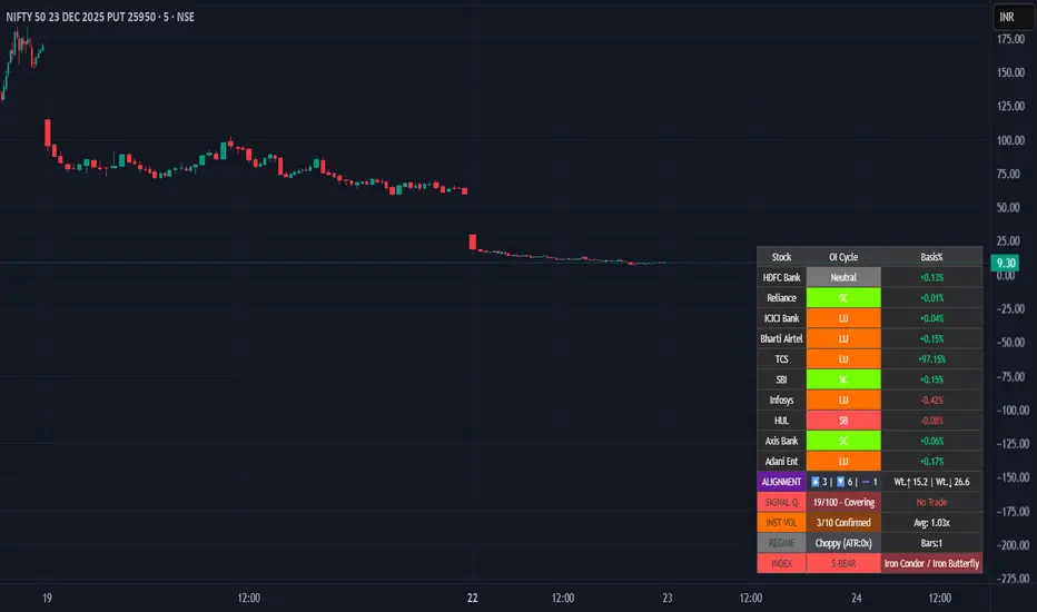
Smart Money Flow - Institutional OI & Volume Analyzer [Pro]# 🎯 Nifty Smart Money Flow - Institutional OI & Volume Analyzer
## What It Does
Professional-grade indicator that tracks **Open Interest (OI) cycles, volume footprints, and basis analysis** across Nifty 50's top 10 heavyweight stocks (representing ~54% of index weight). Identifies institutional accumulation/distribution using **4-quadrant OI analysis** combined with volume surge detection and ATR-based regime filtering.
## 🔥 Key Features
### Institutional-Grade Analytics
- **OI Cycle Detection**: Identifies Long Buildup (LB), Short Covering (SC), Short Buildup (SB), and Long Unwinding (LU) for top 10 Nifty constituents
- **Volume Validation Layer**: Detects institutional footprints via volume spikes >150-200% of 20-period MA
- **Cost of Carry Analysis**: Real-time basis tracking between spot and futures prices
- **Signal Quality Score (0-100)**: 4-component scoring system measuring alignment strength, weighted momentum, trend purity, and basis confirmation
### Advanced Regime Detection
- **Percent-Based ATR Filter**: Normalized volatility comparison prevents false signals across different price levels
- **Consecutive Bar Confirmation**: Requires 3+ bars of sustained signal before regime classification
- **Dynamic Strategy Recommendations**: Suggests optimal option structures (Call/Put Spreads, Iron Condor, Straddle) based on market regime
### Smart Money Divergence Alerts
- **Top Stock Divergence Detection**: Warns when heavyweight stocks (HDFC, Reliance, ICICI) contradict index signal
- **Pareto Principle Application**: Weights top 3 stocks (~30% index weight) for maximum predictive accuracy
## 📊 Visual Dashboard
Clean, dark-theme optimized table displaying:
- Individual stock OI cycles with color coding
- Basis/premium percentages for each heavyweight
- Alignment metrics (Bullish/Bearish/Neutral count)
- Quality score with position sizing guidance (Full Size/Spreads Only/No Trade)
- Institutional volume confirmation count
- Real-time regime status with ATR ratio
## 💡 How To Use
### For Intraday Traders (1m-15m)
1. Enable "Institutional Volume Filter" for noise reduction
2. Wait for Quality Score ≥60 for directional trades
3. Use regime-based structure recommendations (displayed in INDEX row)
### For Swing/Positional Traders (1H-Daily)
1. Focus on consecutive bar count ≥3 for trend confirmation
2. Check for divergence warnings before major positions
3. Use basis analysis to time entries (premium = bullish sentiment)
### For Options Traders
1. **Quality Score 60-100**: Full size directional (Buy Calls/Puts)
2. **Quality Score 30-60**: Spreads only (Call Spread/Put Spread)
3. **Quality Score 0-30**: Avoid directional; use Iron Condor in choppy regime
## ⚙️ Customization Options
- **10 Toggle Switches**: Show/hide individual stocks for cleaner dashboard
- **Volume Threshold**: Adjust institutional detection sensitivity (default 1.5x)
- **Regime ATR Length**: Fine-tune volatility measurement period (default 14)
- **Alignment Thresholds**: Set minimum bullish/bearish stock count for signals (default 5/10)
## 📈 Best For
- Nifty 50 Index traders (Futures & Options)
- Bank Nifty analysis (3 major banks included)
- Institutional flow tracking
- Multi-stock correlation analysis
- Regime-based strategy adaptation
## 🚨 Alerts Included
✅ Strong Bullish Signal (7+ stocks aligned + volume confirmation)
✅ Strong Bearish Signal (7+ stocks aligned + volume confirmation)
✅ Divergence Warning (Top stocks contradict index move)
✅ Institutional Volume Surge (7+ stocks with volume spikes)
## 📚 Technical Foundation
Based on institutional trading principles:
- **Order Flow Analysis**: Price + OI correlation for position identification
- **Smart Money Concepts**: Volume profile + basis analysis for institutional tracking
- **Regime Filtering**: Adaptive strategy selection based on volatility environment
- **Weighted Aggregation**: Pareto principle ensures top stocks drive signal quality
## 🔧 Version History
- v6.0: Initial release with 10-stock coverage
- Optimized request.security() calls: 30 total (3 per stock)
- Dynamic table rendering with barstate.islast efficiency
## 📌 Important Notes
- **Data Source**: NSE India (Spot + Futures + OI)
- **Update Frequency**: Real-time (dependent on chart timeframe)
- **Best Timeframes**: 5m, 15m, 1H, Daily
- **Avoid**: Pre-market hours (OI data may be stale)
---
**Category**: Volume / Order Flow
**Market**: NSE India - Nifty 50
**Timeframe**: Multi-timeframe (1m to Daily)
**Complexity**: Advanced (suitable for intermediate to professional traders)
## Tags (for SEO)
#nifty50 #orderflow #openinterest #institutional #smartmoney #volume #regime #niftyfutures #niftyoptions #oi #banknifty #heavyweights #basis #costofcarry #divergence #qualityscore #nseindia #optionstrading #algorithmic #quantitative
Hurst-Optimized Adaptive Channel [Kodexius]Hurst-Optimized Adaptive Channel (HOAC) is a regime-aware channel indicator that continuously adapts its centerline and volatility bands based on the market’s current behavior. Instead of using a single fixed channel model, HOAC evaluates whether price action is behaving more like a trend-following environment or a mean-reverting environment, then automatically selects the most suitable channel structure.
At the core of the engine is a robust Hurst Exponent estimation using R/S (Rescaled Range) analysis. The Hurst value is smoothed and compared against user-defined thresholds to classify the market regime. In trending regimes, the script emphasizes stability by favoring a slower, smoother channel when it proves more accurate over time. In mean-reversion regimes, it deliberately prioritizes a faster model to react sooner to reversion opportunities, similar in spirit to how traders use Bollinger-style behavior.
The result is a clean, professional adaptive channel with inner and outer bands, dynamic gradient fills, and an optional mean-reversion signal layer. A minimalist dashboard summarizes the detected regime, the current Hurst reading, and which internal model is currently preferred.
🔹 Features
🔸 Robust Regime Detection via Hurst Exponent (R/S Analysis)
HOAC uses a robust Hurst Exponent estimate derived from log returns and Rescaled Range analysis. The Hurst value acts as a behavioral filter:
- H > Trend Start threshold suggests trend persistence and directional continuation.
- H < Mean Reversion threshold suggests anti-persistence and a higher likelihood of reverting toward a central value.
Values between thresholds are treated as Neutral, allowing the channel to remain adaptive without forcing a hard bias.
This regime framework is designed to make the channel selection context-aware rather than purely reactive to recent volatility.
🔸 Dual Channel Engine (Fast vs Slow Models)
Instead of relying on one fixed channel, HOAC computes two independent channel candidates:
Fast model: shorter WMA basis and standard deviation window, intended to respond quickly and fit more reactive environments.
Slow model: longer WMA basis and standard deviation window, intended to reduce noise and better represent sustained directional flow.
Each model produces:
- A midline (basis)
- Outer bands (wider deviation)
- Inner bands (tighter deviation)
This structure gives you a clear core zone and an outer envelope that better represents volatility expansion.
🔸 Rolling Optimization Memory (Model Selection by Error)
HOAC includes an internal optimization layer that continuously measures how well each model fits current price action. On every bar, each model’s absolute deviation from the basis is recorded into a rolling memory window. The script then compares total accumulated error between fast and slow models and prefers the one with lower recent error.
This approach does not attempt curve fitting on multiple parameters. It focuses on a simple, interpretable metric: “Which model has tracked price more accurately over the last X bars?”
Additionally:
If the regime is Mean Reversion, the script explicitly prioritizes the fast model, ensuring responsiveness when reversals matter most.
🔸 Optional Output Smoothing (User-Selectable)
The final selected channel can be smoothed using your choice of:
- SMA
- EMA
- HMA
- RMA
This affects the plotted midline and all band outputs, allowing you to tune visual stability and responsiveness without changing the underlying decision engine.
🔸 Premium Visualization Layer (Inner Core + Outer Fade)
HOAC uses a layered band design:
- Inner bands define the core equilibrium zone around the midline.
- Outer bands define an extended volatility envelope for extremes.
Gradient fills and line styling help separate the core from the extremes while staying visually clean. The midline includes a subtle glow effect for clarity.
🔸 Adaptive Bar Tinting Strength (Regime Intensity)
Bar coloring dynamically adjusts transparency based on how far the Hurst value is from 0.5. When market behavior is more decisively trending or mean-reverting, the tint becomes more pronounced. When behavior is closer to random, the tint becomes more subtle.
🔸 Mean-Reversion Signal Layer
Mean-reversion signals are enabled when the environment is not classified as Trending:
- Buy when price crosses back above the lower outer band
- Sell when price crosses back below the upper outer band
This is intentionally a “return to channel” logic rather than a breakout logic, aligning signals with mean-reversion behavior and avoiding signals in strongly trending regimes by default.
🔸 Minimalist Dashboard (HUD)
A compact table displays:
- Current regime classification
- Smoothed Hurst value
- Which model is currently preferred (Fast or Slow)
- Trend flow direction (based on midline slope)
🔹 Calculations
1) Robust Hurst Exponent (R/S Analysis)
The script estimates Hurst using a Rescaled Range approach on log returns. It builds a returns array, computes mean, cumulative deviation range (R), standard deviation (S), then converts RS into a Hurst exponent.
calc_robust_hurst(int length) =>
float r = math.log(close / close )
float returns = array.new_float(length)
for i = 0 to length - 1
array.set(returns, i, r )
float mean = array.avg(returns)
float cumDev = 0.0
float maxCD = -1.0e10
float minCD = 1.0e10
float sumSqDiff = 0.0
for i = 0 to length - 1
float val = array.get(returns, i)
sumSqDiff += math.pow(val - mean, 2)
cumDev += (val - mean)
if cumDev > maxCD
maxCD := cumDev
if cumDev < minCD
minCD := cumDev
float R = maxCD - minCD
float S = math.sqrt(sumSqDiff / length)
float RS = (S == 0) ? 0.0 : (R / S)
float hurst = (RS > 0) ? (math.log10(RS) / math.log10(length)) : 0.5
hurst
This design avoids simplistic proxies and attempts to reflect persistence (trend tendency) vs anti-persistence (mean reversion tendency) from the underlying return structure.
2) Hurst Smoothing
Raw Hurst values can be noisy, so the script applies EMA smoothing before regime decisions.
float rawHurst = calc_robust_hurst(i_hurstLen)
float hVal = ta.ema(rawHurst, i_smoothHurst)
This stabilized hVal is the value used across regime classification, dynamic visuals, and the HUD display.
3) Regime Classification
The smoothed Hurst reading is compared to user thresholds to label the environment.
string regime = "NEUTRAL"
if hVal > i_trendZone
regime := "TRENDING"
else if hVal < i_chopZone
regime := "MEAN REV"
Higher Hurst implies more persistence, so the indicator treats it as a trend environment.
Lower Hurst implies more mean-reverting behavior, so the indicator enables MR logic and emphasizes faster adaptation.
4) Dual Channel Models (Fast and Slow)
HOAC computes two candidate channel structures in parallel. Each model is a WMA basis with volatility envelopes derived from standard deviation. Inner and outer bands are created using different multipliers.
Fast model (more reactive):
float fastBasis = ta.wma(close, 20)
float fastDev = ta.stdev(close, 20)
ChannelObj fastM = ChannelObj.new(fastBasis, fastBasis + fastDev * 2.0, fastBasis - fastDev * 2.0, fastBasis + fastDev * 1.0, fastBasis - fastDev * 1.0, math.abs(close - fastBasis))
Slow model (more stable):
float slowBasis = ta.wma(close, 50)
float slowDev = ta.stdev(close, 50)
ChannelObj slowM = ChannelObj.new(slowBasis, slowBasis + slowDev * 2.5, slowBasis - slowDev * 2.5, slowBasis + slowDev * 1.25, slowBasis - slowDev * 1.25, math.abs(close - slowBasis))
Both models store their structure in a ChannelObj type, including the instantaneous tracking error (abs(close - basis)).
5) Rolling Error Memory and Model Preference
To decide which model fits current conditions better, the script stores recent errors into rolling arrays and compares cumulative error totals.
var float errFast = array.new_float()
var float errSlow = array.new_float()
update_error(float errArr, float error, int maxLen) =>
errArr.unshift(error)
if errArr.size() > maxLen
errArr.pop()
Each bar updates both error histories and computes which model has lower recent accumulated error.
update_error(errFast, fastM.error, i_optLookback)
update_error(errSlow, slowM.error, i_optLookback)
bool preferFast = errFast.sum() < errSlow.sum()
This is an interpretable optimization approach: it does not attempt to brute-force parameters, it simply prefers the model that has tracked price more closely over the last i_optLookback bars.
6) Winner Selection Logic (Regime-Aware Hybrid)
The final model selection uses both regime and rolling error performance.
ChannelObj winner = regime == "MEAN REV" ? fastM : (preferFast ? fastM : slowM)
rawMid := winner.mid
rawUp := winner.upper
rawDn := winner.lower
rawUpInner := winner.upper_inner
rawDnInner := winner.lower_inner
In Mean Reversion, the script forces the fast model to ensure responsiveness.
Otherwise, it selects the lowest-error model between fast and slow.
7) Optional Output Smoothing
After the winner is selected, the script optionally smooths the final channel outputs using the chosen moving average type.
smooth(float src, string type, int len) =>
switch type
"SMA" => ta.sma(src, len)
"EMA" => ta.ema(src, len)
"HMA" => ta.hma(src, len)
"RMA" => ta.rma(src, len)
=> src
float finalMid = i_enableSmooth ? smooth(rawMid, i_smoothType, i_smoothLen) : rawMid
float finalUp = i_enableSmooth ? smooth(rawUp, i_smoothType, i_smoothLen) : rawUp
float finalDn = i_enableSmooth ? smooth(rawDn, i_smoothType, i_smoothLen) : rawDn
float finalUpInner = i_enableSmooth ? smooth(rawUpInner, i_smoothType, i_smoothLen) : rawUpInner
float finalDnInner = i_enableSmooth ? smooth(rawDnInner, i_smoothType, i_smoothLen) : rawDnInner
This preserves decision integrity since smoothing happens after model selection, not before.
8) Dynamic Visual Intensity From Hurst
Transparency is derived from the distance of hVal to 0.5, so stronger behavioral regimes appear with clearer tints.
int dynTrans = int(math.max(20, math.min(80, 100 - (math.abs(hVal - 0.5) * 200))))

Checklist Fred - Ultimate Pro V6.6
🇬🇧 ENGLISH VERSION (Complete Guide)
Fred’s Checklist - Ultimate Pro V6.2
1. The Philosophy: "Quality at a Fair Price"
This indicator is not a "miracle" signal generator. It is a multi-criteria scoring system that merges the three pillars of investing: Financial Health, Valuation, and Technical Timing.
The goal is simple: To select only exceptional companies that are "taking a breather" (moderate RSI) before a potential trend resumption.
2. How the 10 Criteria Work (The Score)
Each criterion is worth 1 point. A score of 8/10 or higher indicates a favorable statistical alignment.
I. Fundamental Pillar (Quality)
Revenue/EPS Growth: Proof that the company is gaining market share and generating increasing profits.
Net Margin: Filters for profitability. Companies that retain a significant portion of their revenue are more resilient.
ROE (Return on Equity): Measures management's efficiency at generating profits from shareholders’ equity.
Debt/Equity: Ensures the company is not over-leveraged relative to its own capital.
Free Cash Flow (FCF): The company must generate "hard cash" and not just accounting profits.
II. Valuation Pillar (Price)
P/E vs. Index: The script compares the stock's P/E ratio to its market average (S&P 500, NASDAQ, or TSX). This prevents "overpaying" for a stock relative to its peers.
III. Technical Pillar (Timing)
SMA 50 & 200: The price must be above these moving averages to confirm a healthy long-term uptrend.
RSI : This is the "Comfort Zone." We look for stocks that are neither overheating (RSI > 70) nor in a freefall (RSI < 30).
3. Customizable Settings (The Gear Icon)
The tool is fully customizable via the settings panel to suit different investor profiles:
Threshold Adjustments: Modify minimum Margins or ROE targets based on sector requirements.
RSI Zones: Expand or narrow the entry window (e.g., 40-60) depending on your risk tolerance.
Index Updates: Manually enter the current average P/E for the S&P 500, Nasdaq, and TSX. The script automatically detects the stock's origin.
4. Market Context Behavior
Market State Indicator Impact Pro Tip
Bull Market Many stocks will hit 8/10 or 9/10. Be highly selective; aim for 10/10 to avoid "bubble" valuations.
Bear Market Scores drop (often < 5/10). The indicator keeps you safely on the sidelines.
Sideways (Range) RSI becomes the key factor. Look for a return to the 35-55 zone paired with strong FCF.
5. How to Read the Results
10/10 (Green): Rare. Signals a total alignment of all stars.
7/10 to 9/10 (Orange/Green): Interest Zone. Identify the missing point (often a "N/A" data point or an RSI slightly out of range).
Below 7/10: Too many compromises. It is usually better to move on to the next ticker.
Disclaimer: This indicator is for educational and informational purposes only and does not constitute financial advice. Trading involves significant risk of loss. Past performance is not indicative of future results. Always perform your own due diligence before making any investment decision.
____________________________________________________________________________________________________________________________________________________________________

Global Sessions Pro NY/London/Tokyo - O/C/H/LGLOBAL SESSIONS PRO — NY / LONDON / TOKYO
Session Opens, Highs, Lows, Midpoints, Closes, Ranges & Killzones
OVERVIEW
Global Sessions Pro is a comprehensive session-mapping indicator designed for traders who rely on market structure, session context, and time-based behavior.
The indicator automatically plots New York, London, and Tokyo sessions, including:
• Session Open, High, Low, Midpoint, and Close
• Prior session levels projected forward
• Session range boxes
• Right-side labeled price levels (clearly identified)
• Stacked session summary labels (no overlap)
• Optional killzones and overlap windows
• Breakout alerts (prior or current session levels)
The script is fully timezone-aware, DST-safe, and works on any chart timeframe.
KEY FEATURES
SESSION MAPPING
For each session (NY / London / Tokyo), the indicator can display:
• Open
• High
• Low
• Midpoint (High + Low) / 2
• Close
Each level is drawn with its own horizontal line and optional right-side label, so there is never confusion about which line represents which level.
SESSION RANGE BOXES
Optional shaded boxes highlight the true session range as it develops in real time.
These are useful for visualizing:
• Compression vs expansion
• Relative session volatility
• Strength or weakness between sessions
Opacity and visibility are fully configurable.
RIGHT-SIDE LEVEL LABELS
Each session level can be labeled on the right edge of the chart, showing:
• Session name (NY / Lon / Tok)
• Level type (O / H / L / M / C)
• Optional price value
Examples:
NY H: 18234.25
Lon L: 18098.50
Tok M: 18142.75
This eliminates ambiguity when multiple session levels overlap or share similar colors.
SESSION SUMMARY LABELS (AUTO-STACKED)
At the top of each session range, an optional summary label displays:
• Session name
• Open / High / Low / Close
• Total range (points)
• Range in ticks
• ATR multiple
Summary labels are automatically stacked vertically using ATR-based or tick-based spacing, preventing overlap even when multiple sessions occur close together.
PRIOR SESSION LEVELS
The indicator can project prior session levels into the next session, including:
• Prior High and Low
• Optional prior Open, Close, and Midpoint
These levels are commonly used for:
• Support and resistance
• Liquidity sweeps
• Mean reversion
• Failed breakouts
Projection length is configurable and safely capped to comply with TradingView drawing limits.
KILLZONES AND SESSION OVERLAPS
Optional background shading highlights key institutional windows:
• London Open
• New York Open
• London / New York overlap
These zones help identify high-probability volatility windows and time-based trade filters.
All killzones respect the selected session timezone basis.
ALERTS
Built-in alerts are available for:
• Break of prior session high
• Break of prior session low
• Break of current session high
• Break of current session low
Alerts can be configured to trigger on wick or close.
Alert logic is written using precomputed crossover detection to ensure historical consistency and avoid missed or false alerts.
TIMEZONE AND SESSION HANDLING (IMPORTANT)
SESSION TIME BASIS OPTIONS
The indicator supports three session-time modes:
Market Local (DST-aware) – Recommended
• New York uses America/New_York
• London uses Europe/London
• Tokyo uses Asia/Tokyo
• Automatically adjusts for daylight saving time
UTC (Fixed)
• Sessions are interpreted strictly in UTC
• Best for crypto or non-DST workflows
• Requires manual adjustment during DST changes
Custom Timezone
• Define a single custom timezone for all sessions
This ensures sessions display correctly regardless of the chart’s timezone.
DEFAULT SESSION TIMES
(Default values assume Market Local (DST-aware) mode)
Tokyo: 09:00 – 15:00
London: 08:00 – 16:30
New York: 09:30 – 16:00
These defaults are optimized for cash and index trading.
FX traders may adjust session windows as needed.
BEST USE CASES
This indicator is particularly effective for:
• Index futures (ES, NQ, RTY, DAX, FTSE)
• Forex session-based strategies
• Time-based breakout systems
• Liquidity sweep and mean-reversion models
• London Open and New York Open trading
• Multi-session market context analysis
PERFORMANCE AND SAFETY NOTES
• All future-drawn objects are capped to comply with TradingView limits
• Crossover logic is evaluated every bar to prevent calculation drift
• Old session drawings are automatically culled to reduce chart clutter
• Works on all intraday and higher timeframes
RECOMMENDED SETTINGS
For most traders:
• Session Time Basis: Market Local (DST-aware)
• Show Open / High / Low / Midpoint: ON
• Prior Session Levels: ON
• Summary Labels: ON
• Killzones: ON
• Alerts: ON (Close-based)
FINAL NOTES
This indicator is designed to provide objective session structure without opinionated trade signals. It works best as a context layer combined with your own execution rules, confirmations, and risk management.
If you trade time, structure, and liquidity, this script provides the framework.

Falcon HeatWaveIntroducing the MyFXSchool Falcon HeatWave Leading Indicator™, a next-generation market prediction tool designed exclusively for traders who want accuracy, clarity, and early trend identification. Built using advanced price-action logic, institutional order-flow concepts, and dynamic volatility algorithms, this indicator gives you a true leading advantage—not just lagging signals.

Binance futures Funding Rate Sentiment ZonesHello,
This script is pretty much self explanatory.
Instead of having to have Binance open to check the Funding rate for futures USDT coins, it is shown in TradingView.
There are multiple colors that are shown:
-0.05% to 0.05% = neutral funding, no color on background
-+0.05% to -+0.1% = transition zone, long/short population increasing/decreasing
-+0.1% to -+ 2% = extreme positive / negative funding, red color

Binance Perp Basis % (Auto)Hello,
This script is pretty much self explanatory.
It is the real-time basis rate % of Binance futures crypto paired with USDT.
If the indicator shows "NaN" it means that the coin exists in USDT.P but does not have a homologue in spot to run the basis rate & calculation.
To change colors:
for positive & negative basis rate % you simply have to open the script & change the values here shown:
//=== 4. Plot =================================================================
col = basis >= 0 ? color.new(color. white , 0) : color.new(color. black , 0)
To change the 0 line color and opacity:
line(0, "Zero line", color=color.new(color.gray, 60), linestyle=hline.style_dashed)

Daily Candle Bias Backtesting Stats @MaxMaserati This indicator, is a powerful backtesting and probability tool designed to quantify the "follow-through" of specific candle types across different market sessions.
It identifies specific price action setups and tracks whether price hits a "Target" (continuation) or an "Invalidation" (reversal) first, providing real-time win rates for your favorite sessions.
The Candle Bias Stats indicator automatically categorizes every candle based on the MMM candle bias and tracks their historical success rate. It calculates how often a candle's high/low is broken before its opposite end is touched. By breaking this data down into sessions (Asian, London, NY), it identifies high-probability "time-of-day" windows where specific price action setups are most reliable.
MMM CANDLE LOGIC
Bullish Expansion & Breakout Signatures
Bullish Body Close Plus (BuBC Plus): Represents strong bullish momentum where price closes above the previous high and near its own top, signaling that buyers are in complete control.
Bullish Body Close Minus (BuBC Minus): Indicates weak bullish momentum; while the price closes above the previous high, a long top wick shows sellers pushed back, suggesting a potential retest of the previous high.
Bearish Expansion & Breakout Signatures
Bearish Body Close Plus (BeBC Plus): A very strong bearish signal where price closes below the previous low and near its own bottom, indicating sellers are dominant.
Bearish Body Close Minus (BeBC Minus): Signifies weak bearish momentum; the price breaks the previous low but finishes with a long bottom wick as buyers push back, often leading to a retest of the old ceiling.
Bullish Reversal & Trap Signatures (Affinity)
Bullish Affinity Plus (BuAF Plus): A strong bullish reversal where a new low is made, but sellers hit a wall and get trapped, causing price to finish near its top with a long bottom wick.
Bullish Affinity Minus (BuAF Minus): A weak bullish bounce where a new low is made and price finishes back inside the previous range, but buyers lack the energy for a significant move.
Bearish Reversal & Trap Signatures (Affinity)
Bearish Affinity Plus (BeAF Plus): A strong bearish reversal; buyers are trapped after making a new high, and price finishes near its bottom with a long top wick.
Bearish Affinity Minus (BeAF Minus): A weak bearish drop where sellers stop the rise but lack the energy to push price significantly lower.
Neutral & Volatility Signatures
Close Inside Bullish (CI•BuAF): Bullish neutral state where price stays inside the previous candle’s range but finishes in the top half, indicating buyers are slightly more active.
Close Inside Bearish (CI•BeAF): Bearish neutral state where price remains inside the previous box and finishes in the bottom half.
Seek & Destroy Bullish (S&D•BuAF): Bullish volatility characterized by price moving above and below the previous candle before buyers win the battle and close price near the top.
Seek & Destroy Bearish (S&D•BeAF): Bearish volatility where sellers win a high-chaos battle, closing price near the bottom after sweeping both sides of the previous candle.
H4 CANDLE EXAMPLE
Deep Dive: Analysis of the 4H Statistics
The image presents a comprehensive backtest of 4,999 total candles from September 2022 to December 2025. Here is the breakdown of what the interface is telling us:
1. The Strategy: Target vs. Invalidation
The indicator tracks BuBC (Bullish Body Close) and BeBC (Bearish Body Close).
The Target: For a Bullish candle, the target is the High. For a Bearish candle, it is the Low.
The Invalidation: The opposite end of the candle (the Low for Bullish, the High for Bearish).
The Goal: To see which level is touched first in the subsequent bars.
2. Global Performance (The Top Right Table)
Looking at the BuBC (1402 samples) section:
Target First (67.8%): In nearly 7 out of 10 cases, once a 4H candle closes "bullish" (breaking the previous high), the price continues higher to break its own high before it ever returns to take out its own low.
Both Hit (17.7%): This is a critical metric. It represents "Stop Runs" or "Wicks" where price hits the target but also hits the invalidation within the same tracking period.
Efficiency (1.3 Bars): This tells us the "follow-through" is almost immediate. If the trade doesn't work within 1 or 2 candles, the statistical edge drops off significantly.
3. The Session Breakdown (The Bottom Left Table)
This is where the "Edge" is found. Not all hours of the day are created equal.
Asian Late (02:00-06:00) – The "Star" Performer: With a 72.9% Target rate, this is labeled "BEST." It has the lowest "Both%" (6.5%), meaning moves during these hours are incredibly "clean." If a setup forms here, price usually moves directly to the target without looking back.
London Open & Overlap (06:00-14:00): These sessions maintain a high win rate (approx. 70%). This suggests that the European session provides reliable trend continuation for the S&P 500.
NY Session (14:00-18:00) – The "Trap" Zone: This is labeled "WORST" for a reason. While the win rate is basically a coin flip (49.6%), the Both% spikes to 36.7%. This means that even if you are right about the direction, the market is highly likely to "sweep" your stop loss before going to the target. It is the most volatile and "fake-out" prone time for this specific setup.
Summary of the Data
The statistics show that the S&P 500 4H Candle Bias is a highly reliable trend-following indicator, provided you trade it at the right time.
The data suggests a clear three-step logic:
Directional Edge: Both Bullish and Bearish body closes have a natural ~67% probability of continuation.
Timing is Everything: Trading during the Late Asian and London sessions increases your probability of success to over 70% with very low risk of a "fake-out."
Risk Warning: Avoid "Body Close" breakout strategies during the NY Mid-day (14:00-18:00). The statistics prove that this window is dominated by "Seek and Destroy" price action, where price is mathematically likely to hit both your target and your stop, usually hitting the stop first.
