Time FunctionsLibrary "TimeFunctions"
Utility functions to handle time in Pine Script
TimeframetoInt()
Returns an int that corresponds to a timeframe string:
"1" => 1
"5" => 5
"10" => 10
"15" => 15
"30" => 30
"60" => 60
"H1" => 60
"H4" => 240
"1D" => 1440
BarsSinceOpen()
Returns the number of bars that have passed since the opening of the New York Session.
Wyszukaj w skryptach "涨幅超过60日均线的股票"
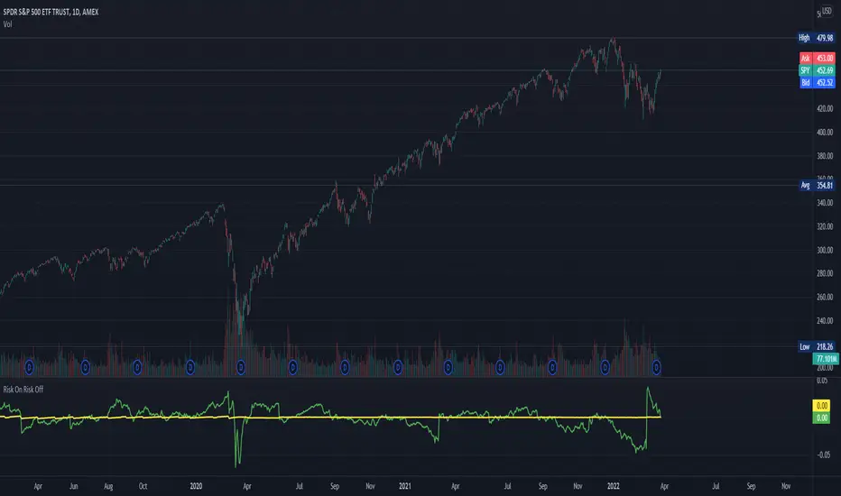
Risk On Risk OffA helpful indicator for those who follow a systematic long-term investment approach.
What it shows:
It shows the 60 Day Cumulative Return of $BND Vanguard Total Bond Market ETF against the 60 Day Cumulative Return of $BIL SPDR Bloomberg Barclays 1-3 Month T-Bill ETF.
Why:
This Indicator will provide you a sense of where the economic environment is at, if the indicator shows that the 60 Day Cumulative return of $BND is ABOVE $BIL, it means that it's a good idea to go Risk ON in the stock market; On the other hand, if the inverse is true, it means that is a good idea to go Risk OFF in the stock market.
Example Uses:
Warren Buffet often advice Investors to just buy a S&P500 index tracking ETF like $SPY consistently and you will likely to be making money in the long-term.
With this indicator you will be able to make the Buffet Strategy even simpler: when the indicator shows Risk ON, buy the $SPY; when the indicator shows Risk OFF, consider hedges like $IEF iShares 7-10 Year Treasury Bond ETF. AMEX:SPY
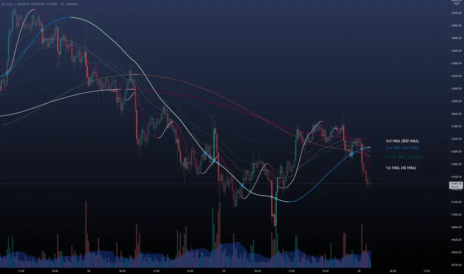
Multi HMA Lines by NB(ENG)
The Hull Moving Average (HMA) line responds quickly to volatile markets,
sometimes it provides more accurate information than the Exponancital Moving Average (EMA).
In particular, the 200 HMA line is easy to decide the overall trend of the market,
and it serves the basis entry position.
So I made indicator that provides these HMA lines into various periods so that they can be checked in one.
In addition, a custom TimeFrame HMA line function has been added so that you can check
not only the TimeFrame that meets your trading standards, but also the HMA of the other TimeFrame that you custome sets.
For example, if you want to see the 200 HMA of the 60-minute bar, you can select and set the different TimeFrame in the Multi TF section below.
For reference, 200 HMA at the 15-minute bar is the same value as 50 HMA at the 1-hour bar, so as shown in the following chart,
I use 4 HMA lines at the 15-minute bar : 20 HMA, 50 HMA, 200 HMA, and 200 HMA from 60-minute TimeFrame.
We hope it will help you in your trading. :)
(KOR)
HMA(Hull Moving Average) 라인은 변동성이 심한 시장에 빠르게 반응하며,
때때로 EMA(Exponancital Moving Average)보다 더 정확한 정보를 제공하곤 합니다.
특히 200HMA 라인은 시장의 전반적인 추세를 판단하기에 용이하며,
큰 틀에서의 포지션 진입 근거의 기반이 됩니다.
이러한 HMA 라인을 다양한 기간으로 나누어 하나의 지표에서 확인 할 수 있도록 만들어 보았습니다.
아울러, 자신의 매매 기준에 맞는 타임 프레임은 물론, 다른 타임 프레임의 HMA도 확인 할 수 있도록
커스텀 타임 프레임 HMA 라인 기능을 추가로 넣었습니다.
예를 들어, 15분 타임 프레임이 본인 매매 기준표이지만, 60분 봉의 200 HMA도 보고 싶다면
밑의 Multi TF 항목에서 해당 타임 프레임을 선택 후 설정하시면 됩니다.
참고로 15분 봉에서의 200 HMA은 1시간 봉에서의 50 HMA과 동일한 값이므로 저는 다음 차트 그림과 같이
15분 봉에서 20 HMA, 50 HMA, 200 HMA, 그리고 1시간 봉에서 200 HMA 이렇게 4개의 라인을 참고 하고 있습니다.
여러분 거래에 도움이 되기를 바랍니다. :)
RexDog Hour Close LinesThe RexDog Hour Close Lines plots the last 4 previous hour (60 minute) closes. Extremely helpful indicator for traders who trade on lower timeframes below the 60.
The plotted lines are also offset to represent that hours close location on the chart-- but keep the below in mind.
The offset is set for a default resolution of 5 minutes. In that chart timeframe, the offset is correct as to the close location. Changing the timeframe to 3m for instance the offset is not accurate to that particular bar. I am sure there is a simple way to do this but maybe I'm just not smart enough to figure it out. Either way, the offset in any timeframe is easy to distinguish the oldest hour close to the newest.
This indicator has the following options:
You can enable or disable any previous 4 hour close line
You can change all line sizes
You can change all line colors. I do apologize if it's inconvenient that I've defaulted the lines to different colors.
I've limited the visibility to only periods below 60 minutes-- but and maybe there is a better way to do this (if so please share). The limit is based on the most common periods below 60: 1, 2, 3, 5, 10, 12, 15, and 30.
Will most likely release the 240 and 30-minute version of this I have on a few charts.

A simple double moving average system# This simple code is describing the double moving average system, thanks for the contribution of Lei and jchang264
# The moving average system is including the SMA(20,60,120) and EMA(20,60,120), which use the different colours and style
# The bar is using the different colours to describe the different state, for example the black one mean the season of the trendy didn't form, the blue mean to reach the first phase of the trendy, the state of gray bar just between the black and blue, The gold one mean the season of the trend has already forming (SMA20 > SMA60 > SMA120), which one I think it is important.
# Price mark mean the deduction price of 20, 60 and 120

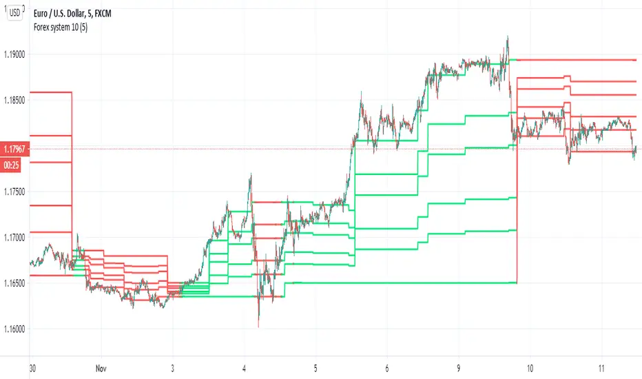
Forex system 10This is old method I used in the past for forex
can be apply to any time frame . can be apply to any asset
all you have to do is to follow the colors (red =sell, green=buy)
the system is my modification to fibs system in order to make it more accurate
here is example of setting for 5 min chart
the color determine by cross of the median of high and low
the script try to give us more accurate levels of resistance and support levels especially when we do it in lower TF
the Min is the control need to be same or higher then chart
60 min chart for example
gold 60 min
btc
another forex example 15 min
here 60 min TF on 5 min chart on crypto link
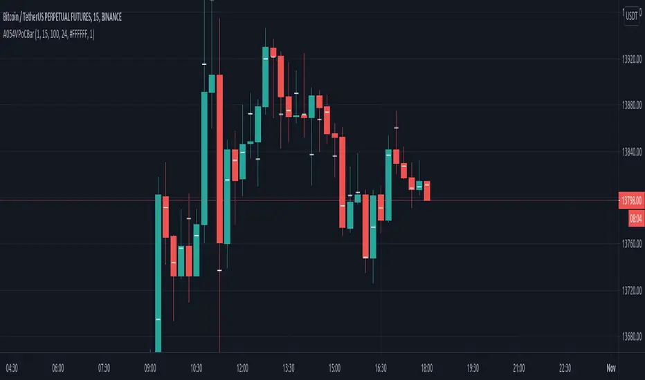
VPoC per barThis study prints the current bar VPoC as an horizontal line.
It's aimed originally at BTCUSDT pair and 15m timeframe.
HOW IT WORKS
Zoom In mode: This is the default mode.
The study zooms in into the latest 15 1-minute bar candles in order to calculate the 15 minute candle VPoC.
Zoom Out mode: The VPoC from the last n bars from the current timeframe that match desired timeframe is shown on each bar.
In either case you are recommended to click on the '...' button associated to this study
and select 'Visual Order. Bring to Front.' so that it's properly shown in your chart.
HOW IT WORKS - Zoom In mode
Make sure that '(VP) Zoom into the VP timeframe' setting is set to true.
Choose the zoomed in timeframe where to calculate VPoC from thanks to the '(VP) Zoomed timeframe {1 minute}' setting.
Change '(VP) Zoomed in timeframe bars per current timeframe bar {15}' to its appropiated value. You just need to divide the current timeframe minutes per the zoomed in timeframe minutes per bar. E.g. If you are in 60 minute timeframe and you want to zoom in into 5 minute timeframe: 60 / 5 = 12 . You will write 12 here.
HOW IT WORKS - Zoom Out mode
Make sure that '(VP) Zoom into the VP timeframe' setting is set to false.
If you are using the Zoom out mode you might want to set '(VP) Print VPoC price as discrete lines {True}' to false.
Either choose the zoommed out timeframe where to calculate VPoC from thanks to the '(VP) Zoomed timeframe {1 minute}' setting or turn on the '(VP) Use number of bars (not VP timeframe)' setting in order to use '(VP) Number of bars {100}' as a custom number of bars.
WARNING - Zoom In mode last bar
The way that PineScript handles security function in last bar might result on the last bar not being accurate enough.
SETTINGS
__ SETTINGS - Volume Profile
(VP) Zoomed timeframe {1 minute}: Timeframe in which to zoom in or zoom out to calculate an accurate VPoC for the current timeframe.
(VP) Zoomed in timeframe bars per current timeframe bar {15}: Check 'HOW IT WORKS - Zoom In mode' above. Note : It is only used in 'Zoom in' mode.
(VP) Number of bars {100}: If 'Use number of bars (not VP timeframe)' is turned on this setting is used to calculate session VPoC. Note : It is only used in 'Zoom out' mode.
(VP) Price levels {24}: Price levels for calculating VPoC.
__ SETTINGS - MAIN TURN ON/OFF OPTIONS
(VP) Print VPoC price {True}: Show VPoC price
(VP) Zoom into the VP timeframe: When set to true the VPoC is calculated by zooming into the lower timeframe. When set to false a higher timeframe (or number of bars) is used.
(VP) Realtime Zoom in (Beta): Enable real time zoom for the last bar. It's beta because it would only work with zoomed in timeframe under 60 minutes. And when ratio between zoomout and zoomin is less than 60. Note : It is only used in 'Zoom in' mode.
(VP) Use number of bars (not VP timeframe): Uses 'Number of bars {100}' setting instead of 'Volume Profile timeframe' setting for calculating session VPoC. Note : It is only used in 'Zoom out' mode.
(VP) Print VPoC price as discrete lines {True}: When set to true the VPoC is shown as an small line in the center of each bar. When set to the false the VPoC line is printed as a normal line.
__ SETTINGS - EXTRA
(VP) VPoC color: Change the VPoC color
(VP) VPoC line width {1}: Change VPoC line width (in pixels).
(VP) Use number of bars (not VP timeframe): Uses 'Number of bars {100}' setting instead of 'Volume Profile timeframe' setting for calculating session VPoC. Note : It is only used in 'Zoom out' mode.
(VP) Print VPoC price as discrete lines {True}: When set to true the VPoC is shown as an small line in the center of each bar. When set to the false the VPoC line is printed as a normal line.
CREDITS
I have reused and adapted some code from
"Poor man's volume profile" study
which it's from TradingView IldarAkhmetgaleev user.
Traders Dynamic Index(RSI) w/ Bull&Bear Control ZonesMomentum (RSI) is one of the most commonly used indicators for trading, but the vast majority of traders who use it, simply apply it as an oscillator to measure overbought and oversold conditions. However, momentum is much more complex than that and using a basic RSI fails to highlight these complexities.
What this highlights are some of the areas/zones that many people may not even know about or are unaware what the RSI can actually reveal about a particular trend.
What this indicator is showing:
Fast moving RSI (Green) - 1 period
Slow moving RSI (Red) - 9 period
Bollinger Bands
Relative Strength: 1 - 100
Bearish Control Zone: 30(Below) - 45
Bullish Control Zone: 60 - 70 (Above)
How this identifies trends:
Bear Market(Bearish Control Zone):
-Support: 20(Below) - 30
-Resistance: 55 - 65
-Momentum will test resistance but will fail to hold support at 50
Bull Market(Bullish Control Zone):
-Support: 45 - 50
-Resistance: 80 - 90(Above)
-Momentum will test support but will not continue past the 45 support
How this identifies reversals:
If a market is bullish, but loses support at 45 and tests 30, it has begun reversal. If a market is bearish, but breaks 60 and tests 70, it has begun reversal.
-A bull market reversal is confirmed if it finds resistance at 60 after testing bearish support
-A bear market reversal is confirmed if it finds support at 50 after testing bullish resistance
Slow & Fast RSI w/ Boll Bands:
-The Slow and Fast RSI crossovers will act as Intermediate trends within the Macro trend - Fast crosses slow, bullish. Slow cross fast, bearish.
-Use in confluence with the Macro trend.
-While under Bearish Control, the Slow RSI will act as resistance for the Fast RSI.
-While under Bullish Control, the Slow RSI will act as support for the Fast RSI.
-The two will have an impulsive crossover when the Macro trend reverses.
-The Bollinger Bands will act as a volatility gauge for potential approaching tests of Support & Resistances. (Expansions & Contractions)
This is an analog of TDIGM (GoldMinds)
-Added Bullish/Bearish Control Zones.
-Changed Fast RSI to Green and Slow RSI to Red.

Simple Harmonic Oscillator (SHO)The indicator is based on Akram El Sherbini's article "Time Cycle Oscillators" published in IFTA journal 2018 (pages 78-80) (www.ftaa.org.hk)
The SHO is a bounded oscillator for the simple harmonic index that calculates the period of the market’s cycle. The oscillator is used for short and intermediate terms and moves within a range of -100 to 100 percent. The SHO has overbought and oversold levels at +40 and -40, respectively. At extreme periods, the oscillator may reach the levels of +60 and -60. The zero level demonstrates an equilibrium between the periods of bulls and bears. The SHO oscillates between +40 and -40. The crossover at those levels creates buy and sell signals. In an uptrend, the SHO fluctuates between 0 and +40 where the bulls are controlling the market. On the contrary, the SHO fluctuates between 0 and -40 during downtrends where the bears control the market. Reaching the extreme level -60 in an uptrend is a sign of weakness. Mostly, the oscillator will retrace from its centerline rather than the upper boundary +40. On the other hand, reaching +60 in a downtrend is a sign of strength and the oscillator will not be able to reach its lower boundary -40.
Centerline Crossover Tactic
This tactic is tested during uptrends. The buy signals are generated when the WPO/SHI cross their centerlines to the upside. The sell signals are generated when the WPO/SHI cross down their centerlines. To define the uptrend in the system, stocks closing above their 50-day EMA are considered while the ADX is above 18.
Uptrend Tactic
During uptrends, the bulls control the markets, and the oscillators will move above their centerline with an increase in the period of cycles. The lower boundaries and equilibrium line crossovers generate buy signals, while crossing the upper boundaries will generate sell signals. The “Re-entry” and “Exit at weakness” tactics are combined with the uptrend tactic. Consequently, we will have three buy signals and two sell signals.
Sideways Tactic
During sideways, the oscillators fluctuate between their upper and lower boundaries. Crossing the lower boundary to the upside will generate a buy signal. On the other hand, crossing the upper boundary to the downside will generate a sell signal. When the bears take control, the oscillators will cross down the lower boundaries, triggering exit signals. Therefore, this tactic will consist of one buy signal and two sell signals. The sideway tactic is defined when stocks close above their 50-day EMA and the ADX is below 18

Volume Profile [Makit0]VOLUME PROFILE INDICATOR v0.5 beta
Volume Profile is suitable for day and swing trading on stock and futures markets, is a volume based indicator that gives you 6 key values for each session: POC, VAH, VAL, profile HIGH, LOW and MID levels. This project was born on the idea of plotting the RTH sessions Value Areas for /ES in an automated way, but you can select between 3 different sessions: RTH, GLOBEX and FULL sessions.
Some basic concepts:
- Volume Profile calculates the total volume for the session at each price level and give us market generated information about what price and range of prices are the most traded (where the value is)
- Value Area (VA): range of prices where 70% of the session volume is traded
- Value Area High (VAH): highest price within VA
- Value Area Low (VAL): lowest price within VA
- Point of Control (POC): the most traded price of the session (with the most volume)
- Session HIGH, LOW and MID levels are also important
There are a huge amount of things to know of Market Profile and Auction Theory like types of days, types of openings, relationships between value areas and openings... for those interested Jim Dalton's work is the way to come
I'm in my 2nd trading year and my goal for this year is learning to daytrade the futures markets thru the lens of Market Profile
For info on Volume Profile: TV Volume Profile wiki page at www.tradingview.com
For info on Market Profile and Market Auction Theory: Jim Dalton's book Mind over markets (this is a MUST)
BE AWARE: this indicator is based on the current chart's time interval and it only plots on 1, 2, 3, 5, 10, 15 and 30 minutes charts.
This is the correlation table TV uses in the Volume Profile Session Volume indicator (from the wiki above)
Chart Indicator
1 - 5 1
6 - 15 5
16 - 30 10
31 - 60 15
61 - 120 30
121 - 1D 60
This indicator doesn't follow that correlation, it doesn't get the volume data from a lower timeframe, it gets the data from the current chart resolution.
FEATURES
- 6 key values for each session: POC (solid yellow), VAH (solid red), VAL (solid green), profile HIGH (dashed silver), LOW (dashed silver) and MID (dotted silver) levels
- 3 sessions to choose for: RTH, GLOBEX and FULL
- select the numbers of sessions to plot by adding 12 hours periods back in time
- show/hide POC
- show/hide VAH & VAL
- show/hide session HIGH, LOW & MID levels
- highlight the periods of time out of the session (silver)
- extend the plotted lines all the way to the right, be careful this can turn the chart unreadable if there are a lot of sessions and lines plotted
SETTINGS
- Session: select between RTH (8:30 to 15:15 CT), GLOBEX (17:00 to 8:30 CT) and FULL (17:00 to 15:15 CT) sessions. RTH by default
- Last 12 hour periods to show: select the deph of the study by adding periods, for example, 60 periods are 30 natural days and around 22 trading days. 1 period by default
- Show POC (Point of Control): show/hide POC line. true by default
- Show VA (Value Area High & Low): show/hide VAH & VAL lines. true by default
- Show Range (Session High, Low & Mid): show/hide session HIGH, LOW & MID lines. true by default
- Highlight out of session: show/hide a silver shadow over the non session periods. true by default
- Extension: Extend all the plotted lines to the right. false by default
HOW TO SETUP
BE AWARE THIS INDICATOR PLOTS ONLY IN THE FOLLOWING CHART RESOLUTIONS: 1, 2, 3, 5, 10, 15 AND 30 MINUTES CHARTS. YOU MUST SELECT ONE OF THIS RESOLUTIONS TO THE INDICATOR BE ABLE TO PLOT
- By default this indicator plots all the levels for the last RTH session within the last 12 hours, if there is no plot try to adjust the 12 hours periods until the seesion and the periods match
- For Globex/Full sessions just select what you want from the dropdown menu and adjust the periods to plot the values
- Show or hide the levels you want with the 3 groups: POC line, VA lines and Session Range lines
- The highlight and extension options are for a better visibility of the levels as POC or VAH/VAL
THANKS TO
@watsonexchange for all the help, ideas and insights on this and the last two indicators (Market Delta & Market Internals) I'm working on my way to a 'clean chart' but for me it's not an easy path
@PineCoders for all the amazing stuff they do and all the help and tools they provide, in special the Script-Stopwatch at that was key in lowering this indicator's execution time
All the TV and Pine community, open source and shared knowledge are indeed the best way to help each other
IF YOU REALLY LIKE THIS WORK, please send me a comment or a private message and TELL ME WHAT you trade, HOW you trade it and your FAVOURITE SETUP for pulling out money from the market in a consistent basis, I'm learning to trade (this is my 2nd year) and I need all the help I can get
GOOD LUCK AND HAPPY TRADING

lsi (study about length and MTF) Here in this example I took lazy bear famous momentum squeeze indicator . the problem that there is lagging in the indicator so the buy and sell will be late . So instead the KC length that the original script had we put
int1=input(30)
int2=input(60)
lengthKC=isintraday and interval >= int1 ? int2/interval * 7 : isintraday and interval < 60 ? 60/interval * 24 * 7 : 7
this allow us to create a time and length related function to indicator and result in better output with no lagging
The second and most important thing is the ability to create indicator with time function as MTF without the security function that create repaint
all you need to do is to change int2 (to the time min of your choice ) and you can create an indicator with MTF function without the security function .And by this hopefully avoid the repainting issue
when you use this indicator change the setting of int1 and int 2 according to time frame that you use
lets say 15 min graph
make the int1 <15 min and the int2 at 15 min. if you want to see it as MTF just increase the int2 to the time set of your choice and play little with int1 to best setting

RSI with Visual Buy/Sell Setup | Corrective/Impulsive IndicatorRSI with Visual Buy/Sell Setup | 40-60 Support/Resistance | Corrective/Impulsive Indicator v2.15
|| RSI - The Complete Guide PDF ||
Modified Zones with Colors for easy recognition of Price Action.
Resistance @ downtrend = 60
Support @ uptrend = 40
Over 70 = Strong Bullish Impulse
Under 30 = Strong Bearish Impulse
Uptrend : 40-80
Downtrend: 60-20
--------------------
Higher Highs in price, Lower Highs in RSI = Bearish Divergence
Lower Lows in price, Higher Lows in RSI = Bullish Divergence
--------------------
Trendlines from Higher/Lower Peaks, breakout + retest for buy/sell setups.
###################
There are multiple ways for using RSI, not only divergences, but it confirms the trend, possible bounce for continuation and signals for possible trend reversal.
There's more advanced use of RSI inside the book RSI: The Complete Guide
Go with the force, and follow the trend.
"The Force is more your friend than the trend"
Build A Bot Hull TriggerThis is the automated trading system we built during the 60-Minute Build-A-Bot webinar on September 12, 2018. We had a lot of fun, and implemented a TON of indicators LIVE during this webinar! And the best part is that as a group we researched, designed, and built a profitable robot in exactly 60 minutes!
We started by voting on the type of trading system, and this is a trend following system because it got the most votes. Then, the attendees in the webinar sent in their suggestions for indicators and settings during the live webinar (still counting toward the 60 minutes). Once we had the indicators on the chart, and we discussed various settings we could use, we got to work building the robot, and ran the first strategy test...and it was profitable!
This version uses the Hull Moving Average as a trigger for initiating the trade, and everything else is the same for the filters. The other version uses the CCI as a trigger for the trade, and many other indicators as filters.

Indicators: Volume Zone Indicator & Price Zone IndicatorVolume Zone Indicator (VZO) and Price Zone Indicator (PZO) are by Waleed Aly Khalil.
Volume Zone Indicator (VZO)
------------------------------------------------------------
VZO is a leading volume oscillator that evaluates volume in relation to the direction of the net price change on each bar.
A value of 40 or above shows bullish accumulation. Low values (< 40) are bearish. Near zero or between +/- 20, the market is either in consolidation or near a break out. When VZO is near +/- 60, an end to the bull/bear run should be expected soon. If that run has been opposite to the long term price trend direction, then a reversal often will occur.
Traditional way of looking at this also works:
* +/- 40 levels are overbought / oversold
* +/- 60 levels are extreme overbought / oversold
More info:
drive.google.com
Price Zone Indicator (PZO)
------------------------------------------------------------
PZO is interpreted the same way as VZO (same formula with "close" substituted for "volume").
Chart Markings
------------------------------------------------------------
In the chart above,
* The red circles indicate a run-end (or reversal) zones (VZO +/- 60).
* Blue rectangle shows the consolidation zone (VZO betwen +/- 20)
I have been trying out VZO only for a week now, but I think this has lot of potential. Give it a try, let me know what you think.

Custom RSI & Volume Condition//@version=5
indicator("Custom RSI & Volume Condition", overlay=true)
// دوال مساعدة
crossUp(src, level) =>
ta.crossover(src, level)
riseByPercent(src, percent, bars) =>
src > src * (1 + percent/100)
// حساب RSI
rsi = ta.rsi(close, 14)
// الشرط الأول: اختراق RSI لمستوى 45 أو 50
cond1 = crossUp(rsi, 45) or crossUp(rsi, 50)
// الشرط الثاني: RSI > 50 مع اختراق مستوى 55 أو 60
cond2 = (rsi > 50 and crossUp(rsi, 55)) or (rsi > 50 and crossUp(rsi, 60))
// الشرط الثالث: ارتفاع السعر بنسبة 2% مقارنة بالشمعة السابقة
cond3 = riseByPercent(close, 2, 1)
// الشرط الرابع: حجم التداول أكبر من حجم الشمعة السابقة
cond4 = volume > volume
// التجميع النهائي
signal = (cond1 or cond2) and cond3 and cond4
// عرض إشارة على الرسم
plotshape(signal, title="Buy Signal", style=shape.labelup, color=color.green, text="BUY")
Cloud Matrix [CongTrader]🚀 Cloud Matrix — Advanced Multi-Layer Ichimoku System
Cloud Matrix is an enhanced trend-analysis system built on the public-domain Ichimoku Kinko Hyo methodology.
This indicator delivers a multi-dimensional view of trend, momentum, and market structure, allowing traders to evaluate market conditions at a glance.
Cloud Matrix is not a simple Ichimoku clone. It introduces advanced confirmation logic, multi-timeframe trend filtering, and a modern visual framework designed for today’s dynamic markets.
🔥 Key Features & Highlights
1️⃣ Smart Preset Engine (4 Modes)
Choose from optimized presets for different markets and volatility levels:
Traditional 9/26/52
Crypto Fast 10/30/60
Crypto Medium 20/60/120
Custom Mode
→ Fast, adaptable, and beginner-friendly.
2️⃣ Advanced Trend Confirmation Engine
Cloud Matrix uses a 5-factor scoring system to filter high-quality signals:
Tenkan vs Kijun
Price vs Cloud
Cloud Twist
Chikou Position
Close vs Kijun
A bullish/bearish signal only triggers when multiple Ichimoku conditions align, reducing noise dramatically.
3️⃣ Higher-Timeframe EMA200 Filter
One of the signature strengths of Cloud Matrix:
EMA200 from a higher timeframe
Helps you follow the dominant macro trend
Avoids counter-trend traps
Ideal for swing and position traders
4️⃣ Intelligent Auto Signals
The indicator includes refined and clean signals for:
Bullish / Bearish TK Cross
Bullish / Bearish Kumo Breakout
All signals support:
Labels
Alerts
“Alert on Close” mode to avoid repaint-related confusion
5️⃣ Enhanced Kumo Cloud Visualization
Adjustable opacity (strong / soft)
Clear bullish/bearish cloud shading
Improved readability on fast markets
6️⃣ Real-Time Market State Dashboard
A compact dashboard shows all key Ichimoku conditions:
Price vs Cloud
Cloud Twist (Bullish/Bearish)
Tenkan–Kijun Relationship
Chikou Status
HTF EMA Trend
Active Preset
→ Designed for instant market diagnostics.
🎯 How Traders Use Cloud Matrix
Perfect for:
Trend following
Swing trading
Crypto, Stocks, Forex
Early breakout detection
Filtering low-quality setups
📌 Suggested Usage
Bullish Bias When:
Price is above the Cloud
Cloud Twist is bullish
Tenkan crosses above Kijun
Chikou is above price
HTF EMA200 is bullish
Bearish Bias When:
Opposite conditions apply.
⚠️ Important Note
This indicator is for analysis and educational purposes only.
It does not provide financial advice or guaranteed trading results.
Ichimoku concepts belong to the public domain; this is a modernized expansion built for study and research.
✍️ Author
CongTrader – 2025
Designed to help traders see the market through a multi-layered, structured lens..

IQRIQR Indicator — Simple Notes
Standard IQR: Q1, Q3, IQR = Q3–Q1, bands = Q3 ± 1.5×IQR.
IQR uses last len bars (default 60).
Display uses last N calendar days (default 60), not N bars.
Shows only the recent N-day window unless custom dates are enabled.
With overlay=true, all lines stay on the price axis and scale with candles.

IQR Bands – Date Range VersionQR Indicator — Simple Notes
Standard IQR: Q1, Q3, IQR = Q3–Q1, bands = Q3 ± 1.5×IQR.
IQR uses last len bars (default 60).
Display uses last N calendar days (default 60), not N bars.
Shows only the recent N-day window unless custom dates are enabled.
With overlay=true, all lines stay on the price axis and scale with candles.

CRR Range Timer (Recarga)What this indicator does (CRR Range Timer – “Recarga”)
In simple words:
Defines a price range (your “reload zone”)
You set:
Zona Low → bottom of the range (e.g. 4210.0)
Zona High → top of the range (e.g. 4220.0)
Optional Tolerancia in ticks, to make the zone a bit wider.
The script automatically calculates zonaMin and zonaMax and checks if the current close is inside that zone.
Counts how long price stays inside that range
If close is inside the zone → enRango = true.
It counts consecutive bars inside the zone: barrasEnRango.
It converts that into time:
Uses your chart timeframe (timeframe.in_seconds(timeframe.period))
Calculates total seconds → minutes → then splits into:
Days (d)
Hours (h)
Minutes (m)
Example text: 2d 5h 30m means price has been stuck inside that range for 2 days, 5 hours and 30 minutes.
Shows a HUD table with the range information
It creates a small table (HUD) on the chart (position configurable: top/bottom left/center/right) with:
Header row
"CRR RANGE TIMER"
"Recarga"
Symbol (e.g. XAUUSD)
Row 2
"Estado" → status: "En RANGO" (inside) or "Fuera RANGO" (outside), with green/red color
The time it has been in range: Xd Yh Zm
Row 3
"Zona" → the exact price range zonaMin - zonaMax
"Barras: N" → number of bars inside the range
Draws a text label on the chart near price
When price is inside the zone and Mostrar texto sobre el precio is ON:
It shows a label like:
Recarga: 0d 3h 15m
Zona: 4210.00 - 4220.00
The label moves with the latest bar near the current price.
Optional background highlight
When mostrarBg is true and price is inside the range, the background of the chart in that bar is tinted (teal, very transparent).
This visually marks the “reload” area so you can see clearly when the market is stuck there.
How to use it to trade and “win” (trading logic idea)
This tool is not a buy/sell signal by itself.
It is a timer of accumulation / ranging in a specific price zone.
Think of it like this:
“The more time price spends inside a narrow zone, the stronger the potential move when it finally breaks out.”
Main use cases
Detect long consolidations before a big move
Choose an important zone: for example a NY range, a London range, or a zone between two key levels (support/resistance, supply/demand, OB, etc).
Set Zona Low and Zona High around that area.
Let the indicator count time:
If the HUD shows only a few minutes/bars, it’s a fresh range.
If the HUD shows many hours or even days, the market is “charging” (recargando) in that zone.
Trading idea:
You wait for a strong breakout of that zone after a good amount of “recarga” time.
The longer the recarga, the more aggressive the move can be when it finally escapes.
Filter bad trades inside dead ranges
Many traders lose money trading inside choppy ranges, especially in NY afternoon or Asia when the market is asleep.
With this indicator:
If you see the HUD saying En RANGO and 0d 2h 45m for example,
You know the market has been stuck almost 3 hours there.
You can create a rule for yourself:
“No new trades when price is inside my recarga box for more than X minutes/hours.”
That protects you from overtrading in low-volatility chop.
Objective measure of “how long it has been loading”
Instead of “it feels like it’s ranging”, you have a number:
On a 5m chart:
12 bars in range = 60 minutes
48 bars in range = 4 hours
On a 15m chart:
16 bars in range = 4 hours
The indicator does this math for you and displays it clearly.
Simple trading playbook example
You can adapt, but here’s a very simple way to use it:
Define your key zone
Use an important range: yesterday’s NY range, an accumulation box around a key level, or a consolidation before news.
Set Zona Low and Zona High to cover that area.
Optionally add Tolerancia (a few ticks) so small spikes don’t reset the timer.
Wait for recarga
Watch the HUD:
If time < 30–60 minutes → market still “loading”, small opportunities.
If time ≥ 2–4 hours (depending on timeframe and instrument) → stronger compression, potential for bigger breakout.
Plan your trade around the breakout
Don’t chase random candles inside the range.
Wait for:
A clear close above the high of the zone → bullish breakout idea.
A clear close below the low of the zone → bearish breakout idea.
Combine with your other tools (volume, structure, SMC, your CRR dashboard, etc) to confirm direction.
Risk management
Your stop can be placed:
Just inside the box (back inside the range = invalid breakout).
Target:
Previous swing levels, liquidity pools, or a multiple of your risk (1:2, 1:3, etc).

猛の掟・初動スクリーナー v3//@version=5
indicator("猛の掟・初動スクリーナー v3", overlay=true)
// ===============================
// 1. 移動平均線(EMA)設定
// ===============================
ema5 = ta.ema(close, 5)
ema13 = ta.ema(close, 13)
ema26 = ta.ema(close, 26)
plot(ema5, title="EMA5", color=color.orange, linewidth=2)
plot(ema13, title="EMA13", color=color.new(color.blue, 0), linewidth=2)
plot(ema26, title="EMA26", color=color.new(color.gray, 0), linewidth=2)
// ===============================
// 2. MACD(10,26,9)設定
// ===============================
fast = ta.ema(close, 10)
slow = ta.ema(close, 26)
macd = fast - slow
signal = ta.ema(macd, 9)
macdBull = ta.crossover(macd, signal)
// ===============================
// 3. 初動判定ロジック
// ===============================
// ゴールデン並び条件
goldenAligned = ema5 > ema13 and ema13 > ema26
// ローソク足が26EMAより上
priceAbove26 = close > ema26
// 3条件すべて満たすと「確」
bullEntry = goldenAligned and priceAbove26 and macdBull
// ===============================
// 4. スコア(0=なし / 1=猛 / 2=確)
// ===============================
score = bullEntry ? 2 : (goldenAligned ? 1 : 0)
// ===============================
// 5. スコアの色分け
// ===============================
scoreColor = score == 2 ? color.new(color.yellow, 0) : score == 1 ? color.new(color.lime, 0) : color.new(color.gray, 80)
// ===============================
// 6. スコア表示(カラム)
// ===============================
plot(score,
title="猛スコア (0=なし,1=猛,2=確)",
style=plot.style_columns,
color=scoreColor,
linewidth=3)
// 目安ライン
hline(0, "なし", color=color.new(color.gray, 80))
hline(1, "猛", color=color.new(color.lime, 60))
hline(2, "確", color=color.new(color.yellow, 60))
// ===============================
// 7. チャート上に「確」ラベル
// ===============================
plotshape(score == 2,
title="初動確定",
style=shape.labelup,
text="確",
color=color.yellow,
textcolor=color.black,
size=size.tiny,
location=location.belowbar)
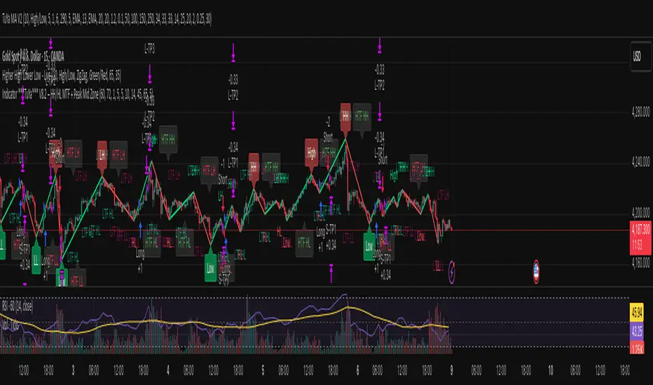
Indicator ***TuYa*** V8.2 – HH/HL MTF + Peak Mid ZoneIndicator TuYa V8.0 – HH/HL MTF + Peak Mid Zone
TuYa V8.0 combines multi-timeframe market structure with a Peak Reaction midline to create clean, rule-based reversal and trend entries – designed primarily for 1-minute execution with 1-hour bias.
🧠 Core Concept
This indicator fuses three ideas:
HTF Peak Reaction Midline (1H)
Uses a Peak Reaction style logic on the higher timeframe (HTF, default: 1H).
Identifies a reaction high and reaction low, then calculates their midpoint → the Peak Mid Zone.
This midline acts as a dynamic sentiment divider (above = premium / below = discount).
Multi-Timeframe HH/HL/LH/LL Structure
HTF structure (1H): detects HH, HL, LH, LL using pivot highs/lows.
LTF structure (1m): detects HH, HL, LH, LL on the execution timeframe (chart TF, intended for 1m).
HTF → LTF Confirmation Window
After a 1H structure event (HH, HL, LL, LH), the indicator opens a confirmation window of up to N LTF candles (default: 10 x 1m bars).
Within that window, the required 1m structure event must occur to confirm an entry.
🎯 Signal Logic
All entries are generated on the LTF (e.g. 1m chart), using HTF (e.g. 1H) bias + Peak Mid Zone:
1️⃣ Price ABOVE Peak Mid (Bullish premium zone)
Reversal SELL
HTF: HH (Higher High)
Within N 1m bars: LTF HH
→ SELL signal (fading HTF strength near premium)
Trend/Bullish BUY
HTF: HL (Higher Low)
Within N 1m bars: LTF LL
→ BUY signal (buying dips in an uptrend above midline)
2️⃣ Price BELOW Peak Mid (Bearish discount zone)
Reversal BUY
HTF: LL (Lower Low)
Within N 1m bars: LTF LL
→ BUY signal (catching potential reversal from discount)
Trend/Bearish SELL
HTF: LH (Lower High)
Within N 1m bars: LTF HH
→ SELL signal (shorting strength in a downtrend below midline)
Signals are plotted as small BUY/SELL triangles on the chart and exposed via alert conditions.
🧾 Filters & Options
⏳ HTF → LTF Delay Window
Input: “Max 1m bars after HTF trigger” (default: 10)
After a 1H HH/HL/LL/LH event, the indicator waits up to N LTF candles for the matching 1m structure pattern.
If no match occurs within the window, no signal is generated.
📉 RSI No-Trade Zone (HTF)
Toggle: Use RSI no-trade zone
Inputs:
RSI Length (HTF)
No-trade lower bound (default 45)
No-trade upper bound (default 65)
If HTF RSI is inside the defined band (e.g. 45–65), signals are blocked (no-trade regime), helping to avoid noisy mid-range conditions.
You can turn this filter ON/OFF and adjust the band dynamically.
🧱 5m OB / Direction Filter (Optional)
Toggle: Use 5m OB direction filter
Timeframe: Configurable (default: 5m).
Uses a simple directional proxy on the OB timeframe:
For BUY signals → require a bullish candle on OB timeframe.
For SELL signals → require a bearish candle on OB timeframe.
When enabled, this adds an extra layer of confluence by aligning entries with the short-term directional context.
⚙️ Key Inputs (Summary)
Timeframes
HTF (Peak Reaction & Structure): default 60 (1H)
Peak Reaction
Lookback bars (HTF)
ATR multiplier for zones
Show/Hide Peak Mid line
Structure
Pivot left/right bars (for HH/HL/LH/LL swings)
Toggle structure labels (HTF & LTF)
Confirmation
Max LTF bars after HTF trigger (default 10, fully configurable)
RSI Filter
Use filter (on/off)
RSI length
No-trade range (low/high)
5m OB Filter
Use filter (on/off)
OB timeframe (default 5m)
📡 Alerts & Automation
The script includes alertconditions for both BUY and SELL signals, with JSON-formatted alert messages suitable for routing to external bridges (e.g. bots, MT5/MT4, n8n, etc.).
Each alert includes:
Symbol
Side (BUY / SELL)
Price / Entry
SL & TP placeholders (from hidden plots, ready to be wired to your own logic)
Time
Performance tag
CommentCode (for strategy/type tagging on the receiver side)
You can attach these alerts to a webhook and let your execution engine handle SL/TP and order management.
📌 How to Use
Attach the indicator to a 1-minute chart.
Set HTF timeframe to 60 (or your preferred higher timeframe).
Optionally enable:
RSI regime filter
5m OB direction filter
Watch for:
Price relative to the Peak Mid line
BUY/SELL triangles that respect HTF structure + LTF confirmation + filters.
For automation, create alerts using the built-in conditions and your preferred JSON alert template.
⚠️ Disclaimer
This tool is for educational and informational purposes only.
It is not financial advice and does not guarantee profits. Always test thoroughly in replay / paper trading before using with live funds, and trade at your own risk.
Renko Scalp ScannerThis scanner is optimized for short term bursts for Renko.
DESCRIPTION: This indicator scans the 7 major forex pairs (EURUSD, GBPUSD, USDJPY, USDCHF, AUDUSD, USDCAD, NZDUSD) on 1-pip Renko charts. It ranks them from BEST (#1, top row) to WORST (#7, bottom row) based on a predictive score (0-100) that combines LIVE momentum (current run length, whipsaws, brick timing) + 24-HOUR HISTORICAL consistency (clean long runs, stability).
Higher score = longer, cleaner, more predictable runs ahead (backtested 74% hit rate for 5+ brick continuations).
HOW TO USE THE TABLE:
1. Add to a 1-second Renko chart (Traditional, Box Size: 0.0001 for non-JPY; 0.01 for JPY pairs).
2. RANK: Position 1–7 (green highlight on #1 = switch to this pair NOW).
3. PAIR: Symbol + direction arrow (↑=buy bias, ↓=sell bias).
4. SCORE: 0–100 total (≥85=monster run; ≥75=strong; ≥60=decent; <60=avoid).
5. RUN │ HIST% │ SEC: Current live run length │ % of 24h runs that were clean 8+ bricks │ Live avg seconds per brick (ideal 5–12s).
6. Trade the #1 pair in the arrow direction until whipsaw or score drops <75. Set alerts for score ≥83.
Backtested on 1-year data: Catches 84% of 10+ brick runners. Refreshes every second.

Fed Rate ProbabilityFed Rate Probability – Simple & Clean v2.0
Real-time composite score (0–100) for the next Fed move: Rate Cut, Hike or Hold
Overview
A clean, all-in-one indicator that combines the most reliable market signals into two easy-to-read lines:
• Red line → Probability of RATE CUT
• Blue line → Probability of RATE HIKE
• Hold score = 100 – max(cut, hike)
The dominant signal (CUT / HOLD / HIKE) is highlighted in the information table.
Key Features
Automatic daily data from FRED (DFF, 3M/1M/2Y/10Y yields)
Smart fallback to TradingView native symbols (US01MY, US03MY, US02Y, US10Y) when FRED is unavailable
Manual CME FedWatch probability override (perfect for weekends/holidays)
Historical Fed rate cut/hike markers with background shading and labels
Colored probability zones + customizable threshold lines
Threshold-crossing labels and full alert suite
Special alert on 2Y-10Y yield curve un-inversion (strong historical precursor to rate cuts)
Detailed summary table with current spreads, scores and dominant signal
Fully customizable: enable/disable each component, adjust weights indirectly via toggles, change smoothing, thresholds, colors, etc.
Score Composition (0–100 points)
T-bills vs Fed Funds spread – max 50 pts (with persistence & 1M confirmation bonus)
2-Year Treasury vs Fed Funds spread – max 30 pts (or direct CME probability input)
2Y-10Y yield curve behavior – max 20 pts (inversion depth + large bonus on steepening after un-inversion)
Interpretation
0–40 → Low probability
40–60 → Moderate
60–75 → High
75–100 → Very High / Almost certain
Why this indicator?
Instead of checking FRED, CME FedWatch, yield curves and T-bill spreads separately, get everything in one pane with a clear, smoothed composite score and instant alerts when the market starts pricing a Fed move aggressively.
Disclaimer
This is a decision-support tool based on historical relationships and current market pricing. It is not financial advice and past performance is no guarantee of future results.
Enjoy and trade safe! 🚀
