MTF POWER OF 3 TNF💻Types of Candlesticks in the Indicator
• Strong/Valid Candles: Identified by small asterisks below and above the candlestick body; Those with a body larger than 55% of the candle's total range.
• Tailed Candles: Are not marked by asterisks.
( onedrive.live.com)]! ( onedrive.live.com)
The General Idea of the Indicator's Signals
The indicator generates signals based on specific candlestick patterns. It identifies valid candlesticks (those with a body larger than 55% of the total candlestick range) and marks them with asterisks above and below the body. Candlesticks with significant tails (long wicks) that do not meet the criteria are not marked.
These signals help traders spot potential trend reversals or continuation patterns, depending on the context and location of the marked candles within the broader price action.
(onedrive.live.com)]! (onedrive.live.com)
Daily time frame conditions
( onedrive.live.com)]! ( onedrive.live.com)
Weekly and monthly time frame conditions
( onedrive.live.com)]! ( onedrive.live.com)
( onedrive.live.com)]! ( onedrive.live.com)
(onedrive.live.com)]! (onedrive.live.com)
(onedrive.live.com)]! (onedrive.live.com)
Best Trading Conditions
- Condition 1: (the best)
• Daily Timeframe: Buy
• Weekly Timeframe: Positive (Bullish)
• Monthly Timeframe: Positive (Bullish)
( onedrive.live.com)]- ! ( onedrive.live.com)
- Condition 2:
• Daily Timeframe: Buy
• Weekly Timeframe: Positive (Bullish)
• Monthly Timeframe: Negative (Bearish) (with the condition that monthly resistance is distant)
(onedrive.live.com)]- ! (onedrive.live.com)
- Confirmatory trend line
( onedrive.live.com)]- ! ( onedrive.live.com)
- Volume detection by candle colors;
- ! (onedrive.live.com)
Wyszukaj w skryptach "weekly"
DTT ⴵDTT ⴵ — Watermarks, Sessions & HTF Countdown
DTT ⴵ is a clean, lightweight utility for adding professional watermarks and time-based reminders to any chart. It displays your brand/title, live market data (ticker/price/timeframe), the current date, configurable trading sessions (with your own reminder header), and an optional higher-timeframe (HTF) bar-close countdown —each with independent positioning, sizing, and auto-contrast.
Designed for focus and discipline: use it to keep risk reminders visible, mark key session windows, and glance the next HTF close without cluttering the chart.
What it shows
Main Watermark (brand/message)
Big title + subtitle, anywhere on the chart, with optional auto color that adapts to light/dark themes.
Market Data Watermark
Per-line display for Ticker, Last Price, and Timeframe (formatted as M5 / H1 / D1 / W1 / MN1, etc.). Each line has its own color, or you can enable a global auto-contrast override.
Date Watermark
Current date in your preferred format (e.g., yyyy-MM-dd, MMM dd, yyyy), with optional auto-contrast.
HTF Countdown (optional)
Minutes (or smart d/h/m) remaining to the next close of selected higher timeframes (5m → Monthly). Can auto-hide lower TFs relative to the current chart timeframe.
Session Watermarks (up to 3)
Three time windows with names, colors, and a timezone selector. Show a prominent header like “Reminder ⚠︎” or “Check Position Size” and only display sessions when they’re currently active.
Quick Start
In Main Watermark, set your Title and optional Subtitle.
In Market Data, choose which lines you want (Ticker/Price/Timeframe) and their position.
In Date Watermark, pick a format and position.
Toggle HTF Countdown on (optional). Choose which TFs to track (e.g., D/W), and whether to Auto-Hide Lower TF.
In Session Watermarks, set your Timezone and edit any of the three sessions (name, time window, color). Only active sessions will render.
Inputs & Controls
Main Watermark
Enable Main Watermark — show/hide.
Position — any of the 9 corners/centers.
Main Title / Subtitle — free text.
Sizes — Tiny / Small / Normal / Large / Huge (independent per line).
Auto-Adjust Colors to Chart — adapts title/subtitle to theme, with extra protection on extremely bright/dark backgrounds.
Manual Colors — choose title/subtitle colors when Auto is off.
Market Data Watermark
Enable Market Data — show/hide.
Position / Text Size — independent of the main watermark.
Show Ticker / Price / Timeframe — toggle each line.
Ticker/Price/Timeframe Colors — per-line colors.
Auto-Adjust All Colors — override individual colors with automatic contrast to chart background.
Timeframe formatting is normalized:
1,3,5,15,30,45 → M1/M3/M5/M15/M30/M45
60,120,180,240 → H1/H2/H3/H4
D or 1D → D1 ; multi-day → D2, D3, …
W or 1W → W1 ; multi-week → W2, …
M or 1M → MN1 ; multi-month → MN2, …
Date Watermark
Enable Date
Position / Text Size
Date Format — yyyy-MM-dd, MM/dd/yyyy, dd/MM/yyyy, MMM dd, yyyy, dd MMM yyyy
Date Color or Auto-Adjust Color
HTF Countdown
Enable HTF Countdown
Position / Text Size
Show Header / Header Text / Header Color
Auto-Hide Lower Timeframes — when ON, only show countdowns above the current chart TF.
Pick TFs — 5m, 15m, 30m, 1h, 4h, D, W, M (toggle any).
Format — Smart (d/h/m) or Minutes Only (m).
Countdown Color or Auto-Adjust Colors (applies to header & lines).
Session Watermarks
Enable Session Watermarks
Position / Text Size
Timezone — select from common regions or Exchange (uses the symbol’s exchange).
Show Header / Header Text / Header Color — e.g., “Reminder ⚠︎”, “Risk Management 🔔”.
Session 1 / 2 / 3
Enable
Name — e.g., “Potential News”, “NY Open”, “Close Positions”
Time — HHMM-HHMM (24-hour) using the selected Timezone
Color
Text Opacity — 0 = fully opaque text, 100 = fully transparent text.
Auto-Adjust Session Colors — auto-contrast against background (applies opacity too).
Sessions only render when the current time is inside their time window.
How it works (under the hood)
Tables on last bar: All watermarks render via table.* only on the last bar for performance (barstate.islast).
Auto-contrast: The script inspects chart.bg_color to detect light/dark and extreme backgrounds, choosing white/black when needed.
Market data: Uses syminfo.ticker, close, and a formatter for timeframe.period.
Date: Formatted with str.format from the current bar’s time.
HTF countdowns:
Pulls time(tf) to anchor the current HTF bar start and computes the minutes until the next close.
Smart mode chooses Xd Yh, Xh Ym, or Xm automatically; Minutes Only shows Xm.
Daily/Weekly/Monthly calculations use current clock values. Weekly assumes the next week starts Monday; monthly uses actual month length for countdown display.
Auto-Hide Lower TFs compares TFs in minutes vs. the current chart TF and hides anything at or below it.
Sessions: input.session windows are evaluated in the selected timezone (or exchange hours if “Exchange” is chosen). A session row appears only while in-session.
Tips & Best Practices
Use Auto-Adjust color options when sharing charts across themes (dark/light).
Keep the Main Watermark subtle (e.g., Normal/Small) and move Market Data to a corner to avoid covering price.
For scalping charts, enable D and W countdowns—great for anticipating session/HTF closes.
Set Session 1 to your news-check window and keep the header on (e.g., “Check Position Size ”).
Limitations / Notes
Countdown logic depends on TradingView’s session/time context; exotic custom sessions may not match exchange close rules.
Weekly countdown assumes week rollover on Monday.
“Monthly” duration comparisons use an approximate 30-day minute value only for thresholding in some helpers; the visible countdown uses the real month length.
No alerts—this is a visual utility.
Performance
Very light; all drawing is table-based and only refreshed on the last bar.
Works on any symbol and timeframe.
Built for the DTT Trading Community ⴵ to promote clarity, patience, and time-based discipline on the chart.

Key levels + Session Range (Sweep-Aware Levels)Overview
This indicator provides a single, clean view of two core intraday contexts that day traders rely on:
Daily Liquidity Levels: prior day high/low (PDH/PDL), prior day open/close, weekly highs/lows, and other commonly referenced reference points.
Session Ranges: clearly plotted high/low for each active session (e.g., Asia, London, New York), tracked live as the session evolves.
By unifying these two information layers, traders can immediately see when price is sweeping a session’s extremes into known daily liquidity—a frequent precursor to reversals or continuation moves. This saves chart space, reduces cognitive overload, and turns two separate checks into one coherent read.
What it does
Plots daily liquidity references: previous day high/low, previous day open/close, and optional higher-timeframe levels (open, high, mid and low 4H ,Day, Week, month, year and quarterly).
Tracks session high/low live: as each session unfolds, the indicator updates that session’s running High and Low, then locks them at session end.
Maps interaction between the two layers: you can instantly spot session sweeps that tag PDH/PDL (or weekly extremes), highlight potential liquidity grabs, and frame risk with objective boundaries.
Keeps the chart clean: just essential lines/zones and concise labels—no extra clutter.
Why it’s useful & original
Single-purpose integration: Rather than a generic mashup, this is a purpose-built fusion where session dynamics are read in the context of daily liquidity. That relationship is the core edge—seeing when a session sweep aligns with known liquidity pools.
Workflow efficiency: One overlay replaces two indicators, simplifying visibility and reducing conflicting visuals.
Decision clarity: The combination highlights setups many intraday traders already watch manually (e.g., NY session high sweep into PDH), but makes them obvious in real time.
How it works (plain-English logic)
Daily Liquidity Engine
At the start of each day, the indicator records PDH, PDL, prior open/close and (optionally) prior week high/low.
These levels are plotted and extended across the session as static references.
Session Range Tracker
For each defined session (e.g., Asia/London/New York), the script initializes session High/Low at session open.
Throughout the session, it updates those extremes in real time and locks them on session close.
Interaction Layer
When price reaches or sweeps a session High/Low near a daily level (e.g., within your chosen tolerance), the confluence becomes visually obvious.
Traders can then decide whether it’s a likely liquidity grab (fade/reversal idea) or a continuation through the pool (breakout idea), per their plan.
How to use it
Identify session context: Start by noting where price is trading relative to the current session’s High/Low.
Locate nearby daily liquidity: Check distance to PDH/PDL, prior open/close, and weekly extremes.
Look for confluence:
Sweep-and-fade idea: Session High swept into PDH (or Session Low into PDL) with failure to hold → potential reversal context.
Break-and-go idea: Strong close through PDH/PDL following a session extreme break → potential continuation context.
Risk framing: Session High/Low and PDH/PDL provide objective anchors for stops and targets. Adapt to your own risk model (e.g., use ATR or structure-based stops).
Keep it clean: Use this as your primary overlay to avoid clutter; add confirmations (volume, structure) only if they genuinely help your process.
Settings (typical options)
Sessions: Choose which sessions to display (e.g., Asia/London/NY) and their time zones/hours.
Daily Levels: Toggle PDH/PDL, prior open/close, prior week High/Low, and other references you rely on.
Visuals: Colors, line styles, label visibility, and optional band shading for quick recognition.
Confluence Tolerance (optional): Define how near a session extreme must be to a daily level to consider it a “liquidity touch/sweep” in your visuals.
Alerts (optional): First touch/sweep of session High/Low, break/close beyond PDH/PDL, or custom distance conditions.
Chart & Publishing Notes (for reviewers and users)
Clean chart by design: Only essential lines/labels for session extremes and daily references.
Plain-English description: Explains what, why, and how so non-coders can use it confidently.
Original integration: The value here is the purposeful interaction—seeing session sweeps in context of daily liquidity in one place—rather than a cosmetic mashup.
Limitations & good practice
This tool is contextual, not predictive. It highlights structure and liquidity landmarks; trade decisions are yours.
Session definitions vary by asset/exchange; ensure your session times match your market.
Past behavior at these levels does not guarantee future outcomes; always use proper risk management.
Disclaimer
This indicator is for educational and informational purposes only and is not financial advice. Trading involves risk; always test and evaluate with your own methods and risk parameters.
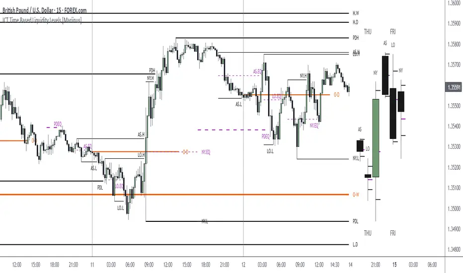
ICT Time Based Liquidity Levels [Mariinus]Indicator Overview – Inspired by ICT Concepts
This indicator helps you spot where liquidity rests and where major price moves are likely to begin or end — giving you clarity for both entries and exits.
Inspired by the teachings of the Inner Circle Trader (ICT), this tool builds on his philosophies and principles that have reshaped how traders view price action. One of the most powerful lessons that stuck with me personally is his quote:
"Time & Price, where it is Time first and then Price”
Another fundamental concept that underpins this tool is the idea that:
"Price is constantly moving in cycles from Premium to Equilibrium, from Equilibrium to Discount from Discount back to Premium."
With these core ideas in mind, this indicator was developed to help traders who are already using an ICT-based framework and focus on Kill Zones and by this on Time Based Liquidity.
In addition to plotting Session Highs and Lows on your chart, the ICT Time Based Liquidity Levels indicator also includes derived levels that provide deeper market insight. These include the Equilibrium of the full Session Range (High to Low) as well as the Equilibrium of the Wicks – offering a more nuanced view of price balance and potential turning points, in line with ICT’s core concepts.
To make sure your chart is not cluttered with lines, you can select which levels to show – and more importantly – you can plot Session Candles next to your Chart. Unlike standard time-based candles (e.g. 4H candles), these are “true” Session Candles that reflect the actual OHLC of trading Sessions, making it easier and clearer to see how Sessions interact with each other.
Next to Intraday Highs and Lows, the indicator will also plot Daily and Weekly Liquidity Pools above and below the Market, giving you insights to where Price is most likely heading towards.
You can set Alerts that trigger whenever one of these key levels is tagged, so you stay focused without staring at the screen all day.
⚠️ Important Disclaimer:
This is not a standalone trading plan.
This is not a buy or sell signal generator.
Instead, this tool is designed to support traders who follow ICT principles by helping them identify higher-probability PD Arrays – the key levels where setups are more likely to occur. If your trading plan includes looking for specific PD Arrays and structural frameworks taught by ICT, then this indicator is a visual aid to refine and focus your attention on the areas where your framework has a higher probability of playing out.
⚙️ Explanation of the Settings
You can combine up to 6 Sessions to monitor their respective levels while operating on a lower timeframe. You can define the timings and a long and short naming of those Sessions.
In the Days Section you can Set a lookback period to control how far back you want to calculate levels. Next to that you can select which Daily and or Weekly Levels you want to have shown on your Charts together with choosing their coloring, style and width.
In the Candles Section you can define how the Session Candles will look like which are plotted next to your Chart. When you have multiple Days of Session Candles it can come in handy to mirror image the Candles which will plot the Candles from right to left instead of the default left to right. In addition you can control how far the distance is between the Candles and your chart, the distance between Candles and Days and the thickness of those Candles. Next you can show or hide the Equilibrium of the total Session Range and the Equilibrium of the Wicks.
In the Lines Section you can specify which Session Levels you want to see on your Chart together with choosing their coloring, style and width.
In the Labels Section you can specify which Labels you want to show and how you want to show them.
In the Openings Section you can specify to show the Midnight Open and or Weekly Open. In addition you can add a divider to be able to distinguish between multiple Days or Weeks.
In the Alert Section you can specify for which Sessions you want to get notified when Key Levels are tagged. After setting this up, you need to set an alert via the Tradingview Alert function to really activate the Alert Function. Be aware that when you change your Alert setup, you need to setup the Tradingview Alert function again.
💡 Example Use Cases
These examples are for educational purposes only. This tool is not financial advice and should always be used in conjunction with your own trading plan—whether it involves Fair Value Gaps, Order Blocks, or a custom combination of ICT-based elements.
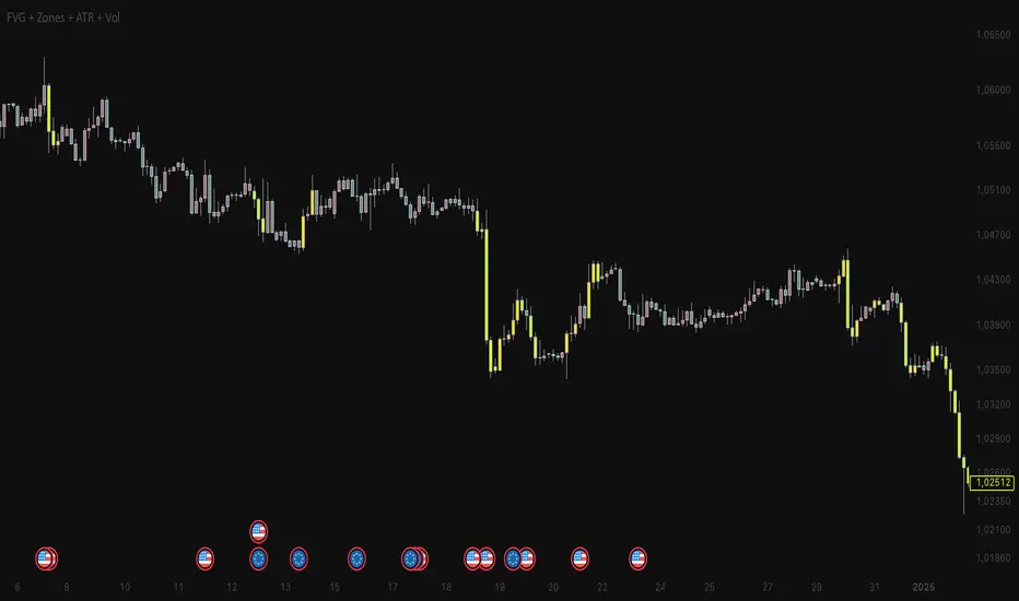
FVG + Zones + ATR + Vol + RangesThis indicator combines Fair Value Gaps (FVGs) with daily, weekly, and monthly ranges, Killzones, ATR & volume filters, and powerful alert conditions.
🔹 Key Features:
• Daily, Weekly & Monthly Ranges
• Automatic plotting of previous highs/lows
• Fully customizable (color, width, line style)
• Optional labels (T-High/T-Low, W-High/W-Low, M-High/M-Low)
• Fair Value Gaps (FVGs)
• Detection of up- and down-FVGs at the start of the 4th candle
• Two modes:
• Raw FVGs → Alerts only (no chart marking)
• Filtered FVGs → Alerts + visual highlights (barcolor)
• Filter conditions: ATR, Volume, and optionally Killzones
• Killzones (active only on < 1H timeframes)
• London (08:00 – 11:00)
• New York AM (14:30 – 17:00)
• New York PM (optional)
• Fully adjustable start/end times + UTC offset (summer/winter time)
• Filters
• ATR filter → qualify FVGs only if volatility is high enough
• Volume filter → qualify FVGs only if volume exceeds SMA
• Alerts
• Filtered FVG alerts (ATR/Vol/Killzones)
• Raw FVG alerts (pure FVG condition, no filtering)
• All alerts trigger exactly at the beginning of the 4th candle
🔹 Use Cases:
• Visualize key market ranges (daily, weekly, monthly)
• Identify and confirm high-probability FVGs within Killzones
• Focus only on quality setups using ATR & Volume filters
• Automate trading workflows with precise FVG alerts
⸻
👉 This tool gives you a complete market overview, combining market structure (ranges) with liquidity concepts (Killzones & FVGs) while enabling efficient trade execution through alerts.
Hodie Smart PD/PW/PM LevelsHodie Smart PD/PW/PM Levels is a professional tool for tracking previous daily, weekly, and monthly highs and lows (PDH/PDL, PWH/PWL, PMH/PML).
It automatically plots levels on the chart and provides unique one-time alerts per period — no more repeated or false signals.
🔧 Features & Settings
1. Levels:
Daily (PDH/PDL)
Weekly (PWH/PWL)
Monthly (PMH/PML)
2. Customization:
Show/hide each level type
Adjustable line thickness and colors
Labels with customizable text and background colors
3. Line Building:
Levels are drawn from the previous period’s high/low and extend until the end of the current period.
🚨 Alert System – Main Advantage
The key strength of this indicator is the smart alert logic:
Each level alert is triggered only once per period (day, week, or month)
No need to recreate alerts every session — the script automatically resets them with each new period
Daily levels use precise "first touch" detection, while weekly/monthly levels fire only once until the next period
✅ This means you can set an alert once and be confident it won’t spam or miss critical touches.
📖 Quick Instruction
1. Add the indicator to your chart
2. In the alerts panel, choose:
Condition: PDH Touch, PDL Touch, PWH Touch, PWL Touch, PMH Touch, or PML Touch
Options: Once per bar (recommended)
Timeframe: any (1-minute interval works best)
3. Alerts will automatically respect the logic:
Daily levels – 1 alert per day
Weekly levels – 1 alert per week
Monthly levels – 1 alert per month
🎯 Why Use This Indicator?
Saves time: set alerts once, no need to update them daily
Eliminates duplicate signals
Clear visualization of key market levels
Works across all markets and timeframes
⚡ Perfect for traders using liquidity concepts, breakout strategies, and Smart Money methods.
NDOG & NWOG - Liquidity + Sunday Box rroielDescription:
This script combines NDOG & NWOG liquidity levels with a Sunday Box framework to provide traders with structured levels for weekly bias, liquidity mapping, and potential entry/exit zones.
Features:
• Automatic plotting of NDOG & NWOG liquidity zones.
• Sunday Box (weekly open range) drawn to define structure and bias.
• Highlights liquidity sweeps and retests for trade confirmation.
• Configurable settings for box time, liquidity range, and display options.
• Built to support ROI/EL strategies by aligning liquidity with weekly key levels.
Use Case:
Helps traders identify where price is likely to react by combining liquidity-based zones with the Sunday box framework. Designed for clarity, confluence, and efficiency in execution.

Futures Key LevelsKey Levels — Sessions, Previous Ranges & Opens (Chicago-aligned sessions)
What it does
This indicator plots commonly used reference levels across multiple timeframes to help you frame the day and find confluence:
Sessions (Chicago TZ): London, New York, and Asia session high/low ranges.
Previous Period Ranges: Previous Day / Week / Month / Quarter / Year High/Low and optional Mid.
Opens: Current Daily / Weekly / Monthly / Quarterly / Yearly opens.
Intraday (4H): Previous 4-Hour High/Low + optional Mid.
Monday Range: Captures Monday’s High/Low (and optional Mid) to use as a weekly reference.
Price-scale markers: Optional markers that track key levels on the price scale without adding extra lines.
How it works (concepts & calculations)
Higher-timeframe values are retrieved using request.security() and update when a new period begins (e.g., previous day’s H/L become fixed at the start of the new day).
Session ranges are built from bar data within session windows using time(session, "America/Chicago"):
London: 02:00–05:00 CT
New York: 08:30–15:00 CT
Asia: 20:00–00:00 CT
“Mid” levels are simple midpoints between each period’s High and Low.
Merge Levels: when different levels land at the same price, their labels are merged to reduce clutter (e.g., “PDH / PWH”).
Why this version is useful / original bits
All-white baseline for clean charts; session colors stand out by design: London = Yellow, New York = Aquatic Blue, Asia = Red.
Right-anchored mode lets you park levels to the right side of the chart with a configurable anchor distance.
Label merging keeps the display minimal when multiple levels coincide.
Price-scale-only markers available when you prefer fewer lines on the chart.
Inputs & customization
Display Style: Standard or Right Anchored (+ distance controls).
Levels toggles: enable/disable each period (Daily/Weekly/Monthly/Quarterly/Yearly), Monday range, 4H range, and session ranges.
Text: optional shorthand labels (e.g., PDH/PDL, PWH/PWL).
Colors: global white theme, with session highlights; you can override in the Inputs.
Price-scale markers: on/off toggle.
How to use it
Use previous High/Low as liquidity pools and areas to watch for sweeps, breaks, or retests.
The Monday range often frames the rest of the week; breaks or rejections around Monday H/L can be informative.
The 4H previous range gives intraday context—great for mean-reversion vs. continuation reads.
Session ranges help you see where the active session expanded price and where liquidity may remain.
Notes & limitations
Sessions are computed in America/Chicago; higher-TF levels use the symbol’s exchange timezone.
This is an indicator, not a strategy; it does not place trades or claim performance.
Always combine levels with your own execution rules (structure, momentum, risk).
Credit: inspired by spacemanBTC; this version adds the all-white styling, Chicago-aligned sessions, right-anchoring, label merging, and price-scale markers.
Also my mentor to tell me about the levels
Disclaimer
This tool is for educational purposes only and is not financial advice. Markets involve risk; do your own research and manage risk appropriately.

Keylevels [KAWS]Overview
The Keylevels Indicator is designed to provide traders with a clear and structured view of important market reference points. It automatically detects and plots session highs and lows, weekly and monthly levels, as well as the previous day’s range. These levels are presented directly on the chart as dynamic lines with optional text labels, offering a consistent framework for understanding price action across multiple time horizons.
Understanding the Concepts
What are Key Levels?
Key levels are significant price points that often serve as reference markers in market activity. They represent areas where the market has previously established boundaries (highs and lows) within sessions, days, weeks, or months. Such levels can highlight where price has repeatedly reacted, providing insight into areas of potential importance.
Why Sessions Matter
Financial markets operate globally, and trading sessions (Asia, London, New York) reflect the activity of different regions. Each session produces distinct highs and lows that can serve as key markers for subsequent price behavior. By capturing these levels automatically, the indicator helps visualize how markets transition from one trading phase to another.
Higher Timeframe Levels
Weekly and monthly highs and lows, as well as the previous day’s range, provide broader structural reference points. These levels are often used to assess whether the market is respecting or breaking significant boundaries over time.
How the Indicator Works
The indicator automatically tracks and plots:
Session Levels: Highs and lows of the Asia, London, and New York sessions.
Session Open Price: A clear reference line marking the opening price of a chosen session.
Daily Levels: Previous day’s high and low, updated at the start of each new day.
Weekly Levels: High and low of the current week, with automatic reset each new week.
Monthly Levels: High and low of the current month, updated dynamically.
Each level is displayed with customizable line styles, colors, and labels. Labels can include text only or also display the exact price, depending on user preference. The indicator further supports the option to extend lines into the future, allowing for ongoing visibility of these reference points.
Customization Options
Display Control: Enable or disable specific sessions, daily, weekly, or monthly levels.
Visual Styling: Adjust line colors, thickness, and style (solid, dashed, dotted).
Labels: Choose whether to display text, include price information, and set text size.
Session Settings: Define your preferred timezone and session open times for accuracy across global markets.
Line Extension: Decide whether levels should extend into the future or stop when broken.
Important Considerations
This indicator is a technical reference tool. It does not generate buy or sell signals but instead provides structural context by highlighting where the market has established significant levels. As with any technical tool, it is most effective when integrated into a broader trading framework that includes market structure, trend analysis, and risk management.

TF ZONES VIPTF Zones is a session and higher-timeframe reference tool for intraday and swing traders (ICT / SMC concepts).
🔹 Features
Killzones (Sessions):
Automatically draws Asia, London, New York AM, New York Lunch, and New York PM ranges.
• Customizable box colors, transparency, and labels
• High/Low pivot lines with optional midpoints
• Alerts when pivots are broken
Day / Week / Month Levels:
• Daily / Weekly / Monthly Opens
• Daily / Weekly / Monthly Highs & Lows
• Alerts on High/Low breaks
Day-of-Week Zones:
Color-coded boxes for each weekday (Mon–Sun) to track daily ranges.
Previous Year High/Low:
Plots prior year’s H/L with labels (PY.H / PY.L).
🔧 Customization
Session drawing limits (max days stored)
Timezone selection (GMT offsets or New York)
Label size, text color, and line style
Box transparency and text display options
Optional alerts on key level breaks
📌 Use Case
Perfect for traders who want to:
Track session ranges (ICT Killzones)
Visualize intraday structure clearly
Use Daily / Weekly / Monthly opens and ranges as confluence
Monitor higher-timeframe and yearly reference levels

TF ZonesTF Zones is a session and higher-timeframe reference tool for intraday and swing traders (ICT / SMC concepts).
🔹 Features
Killzones (Sessions):
Automatically draws Asia, London, New York AM, New York Lunch, and New York PM ranges.
• Customizable box colors, transparency, and labels
• High/Low pivot lines with optional midpoints
• Alerts when pivots are broken
Day / Week / Month Levels:
• Daily / Weekly / Monthly Opens
• Daily / Weekly / Monthly Highs & Lows
• Alerts on High/Low breaks
Day-of-Week Zones:
Color-coded boxes for each weekday (Mon–Sun) to track daily ranges.
Previous Year High/Low:
Plots prior year’s H/L with labels (PY.H / PY.L).
🔧 Customization
Session drawing limits (max days stored)
Timezone selection (GMT offsets or New York)
Label size, text color, and line style
Box transparency and text display options
Optional alerts on key level breaks
📌 Use Case
Perfect for traders who want to:
Track session ranges (ICT Killzones)
Visualize intraday structure clearly
Use Daily / Weekly / Monthly opens and ranges as confluence
Monitor higher-timeframe and yearly reference levels

Pivot ConnectPivot Connect –
a condensed and educational version
Objective
Automatically draws extended horizontal lines at the pivots (relevant highs and lows) of three timeframes:
The current chart (1 min, 5 min, 1 h… whatever you're looking at)
Weekly (W)
4-hour (240 min)
These lines are considered "protected levels": resistances (highs) or supports (lows).
The script also detects when the price breaks only the wick break to change the color/style of the line and warn that the level may have become invalid.
What is a pivot here?
ta.pivothigh / ta.pivotlow calculate a local high/low that has at least n bars on either side.
The pivotStrength parameter (default 12) is that n.
Therefore, a pivot high requires 12 candles to the left and 12 to the right lower than itself.
Lines drawn:
Highs and lows of the current timeframe (red and green)
Weekly highs and lows (blue and orange) if useWeekly = true
4-hour highs and lows (fuchsia and aqua) if use4H = true
Each line extends to the right by "extendLines" bars (default 100).
Wick break
This is reviewed bar by bar:
For a High level: if the high breaks above the line but the close remains below → it is considered a false break (wick break) and the line changes to purple and dashed style.
For a Low level: if the low breaks above the line but the close remains above → same warning.
The wickBreakBars (5) parameter is not used in the current logic; it was probably intended for future validation.
Cleaning Old Lines
Every 100 bars, lines with a right end older than 500 bars are removed to avoid memory overload (max_lines_count = 500).
Quick Customization
Colors and styles for each category.
Show or hide each line group (showHighs, showLows, useWeekly, use4H).
Thickness, solid/dash/dotted style.
Example of on-screen reading
Horizontal red line: resistance of the timeframe itself.
Horizontal blue line: important weekly high.
If a line changes to dashed purple: the price pierced it with the wick but did not close above it (at highs) – possible rejection.
This gives you a visual map of multi-timeframe support and resistance levels with quick alerts for "suspicious" breakouts.
Persistence# Persistence
## What it does
Measures **price change persistence**, defined as the percentage of bars within a lookback window that closed higher than the prior close. A high value means the instrument has been closing up frequently, which can indicate durable momentum. This mirrors Stockbee’s idea: *select stocks with high price change persistence*, and then combine **momentum plus persistence**.
## Can be used for scanning in PineScreener
## Calculation
* `isUp` is true when `close > close `.
* `countUp` counts true instances over the last `len` bars.
* `pctUp = 100 * countUp / len`, bounded between 0 and 100.
* A 50% level is a natural baseline. Above 50% suggests more up closes than down closes in the window.
## Inputs
* **Lookback bars (`len`)**: default 252 for roughly one trading year on a daily chart. On weekly charts use something like 52, on monthly charts use 12.
## How to use
1. **Screen for persistence**
Sort a watchlist by the plotted value, higher is better. Many momentum traders start looking above 58 to 65 percent, then layer a trend filter.
2. **Combine with momentum**
Examples, pick tickers with:
* `pctUp > 60`, and price above a rising EMA50 or EMA100.
* `pctUp rising` and weekly ROC positive.
3. **Switch timeframe to change the horizon**
* Daily chart with `len = 252` approximates one year.
* Weekly chart with `len = 52` approximates one year.
* Monthly chart with `len = 12` approximates one year.
## TC2000 equivalence
Stockbee’s TC2000 expression:
```
CountTrue(c > c1, 252)
```
## Interpretation guide
* **70 to 90**: very strong persistence; often trend leaders, check for extensions and risk controls.
* **60 to 70**: constructive persistence; good hunting ground for swing setups that also pass momentum filters.
* **50**: neutral baseline; around random up vs down frequency.
* **Below 50**: persistent weakness; consider only for mean reversion or short strategies.
## Practical tips
* **Event effects**: ex-dividend gaps can reduce persistence on high yield names. Earnings gaps can swing the value sharply.
* **Survivorship bias**: when backtesting on curated lists, persistence can look cleaner than in live scans.
* **Liquidity**: thin names may show noisy persistence due to erratic prints.
## Reference to Stockbee
* “One way to select stocks for swing trading is to find those with high price change persistence.”
* “Persistence can be calculated on a daily, monthly, or weekly timeframe.”
* TC2000 function: `CountTrue(c > c1, 252)`
* Example noted in the tweet: CVNA had very high one-year price persistence at the time of that post.
* Takeaway: **look for momentum plus persistence**, not persistence alone.

Fibonacci Sequence Circles [BigBeluga]🔵 Overview
The Fibonacci Sequence Circles is a unique and visually intuitive indicator designed for the TradingView platform. It combines the principles of the Fibonacci sequence with geometric circles to help traders identify potential support and resistance levels, as well as price expansion zones. The indicator dynamically anchors to key price points, such as pivot highs, pivot lows, or timeframe changes (daily, weekly, monthly), and generates Fibonacci-based circles around these anchor points.
⚠️For proper indicators visualization use simple not logarithmic chart
🔵 Key Features
Customizable Anchor Points : The indicator can be anchored to Pivot Highs , Pivot Lows , or timeframe changes ( Daily, Weekly, Monthly ), making it adaptable to various trading strategies.
Fibonacci Sequence Logic : The circles are generated using the Fibonacci sequence, where the diameter of each circle is the sum of the diameters of the two preceding circles.
first = start_val
secon = start_val + int(start_val/2)
three = first + secon
four = secon + three
five = three + four
six = four + five
seven = five + six
eight = six + seven
nine = seven + eight
ten = eight + nine
Adjustable Start Value : Traders can modify the starting value of the sequence to scale the circles larger or smaller, ensuring they fit the current price action.
Color Customization : Each circle can be individually enabled or disabled, and its color can be customized for better visual clarity.
Visual Labels : The diameter of each circle (in bars) is displayed next to the circle, providing additional context for analysis.
🔵 Usage
Step 1: Set the Anchor Point - Choose the anchor type ( Pivot High, Pivot Low, Daily, Weekly, Monthly ) to define the center of the Fibonacci circles.
Step 2: Adjust the Start Value - Modify the starting value of the Fibonacci sequence to scale the circles according to the price action.
Step 3: Customize Circle Colors - Enable or disable specific circles and adjust their colors for better visualization.
Step 4: Analyze Price Action - Use the circles to identify potential support/resistance levels, price expansion zones, or trend continuation areas.
Step 5: Combine with Other Tools - Enhance your analysis by combining the indicator with other technical tools like trendlines, moving averages, or volume indicators.
The Fibonacci Sequence Circles is a powerful and flexible tool for traders who rely on Fibonacci principles and geometric patterns. Its ability to anchor to key price points and dynamically scale based on market conditions makes it suitable for various trading styles and timeframes. Whether you're a day trader or a long-term investor, this indicator can help you visualize and anticipate price movements with greater precision.

UniqueHorn - MA Indicator with SMI📊 Overview
The UniqueHorn MA-SMI Indicator is a comprehensive trading tool that combines multiple Moving Averages with the Stochastic Momentum Index (SMI) in a clean, organized display. Designed for traders who need clear visual analysis of trend, momentum, and potential reversal points.
✨ Key Features
Moving Averages (8 Total)
3 EMAs: 5, 10, 20 (for quick trend detection)
5 SMAs: 30, 40, 50, 65, 200 (for medium to long-term trends)
Smart Timeframe Adaptation
Daily & Lower: EMA 5, 10, 20 | SMA 50, 65, 200
Weekly Chart: EMA 10, 20 | SMA 30, 40, 50, 200
Automatic display optimization based on timeframe
SMI Integration (Stochastic Momentum Index)
Visual signals directly on main chart
Overbought/Oversold markers
Bullish/Bearish crossover signals
Optional background coloring for extreme zones
Current SMI value as label
Climax Detection
Buying Climax: New 52-week high with red candle (weakness signal)
Selling Climax: New 52-week low with green candle (strength signal)
Works optimally on weekly charts
📈 Usage & Strategies
Trend Following
Use MAs as dynamic support/resistance
EMA crossovers for entry/exit signals
SMA 200 as primary trend filter
Momentum Trading
SMI < -40: Oversold zone → Potential long opportunity
SMI > 40: Overbought zone → Potential short opportunity
SMI crossovers as early trend reversal signals
Climax Trading
Buying Climax: Warning of potential top formation
Selling Climax: Indication of potential bottom formation
⚙️ Customization Options
Individual color selection for each MA
Separate line widths for EMA 5, 10, and other MAs
Show/Hide individual components
Fully adjustable SMI parameters
Optional info table with status overview
Comprehensive alert system for all signals
🎯 Ideal For
Swing Traders: Use the combination of MAs and SMI for optimal entries/exits
Position Traders: Focus on longer-term MAs and weekly chart signals
Day Traders: Fast EMAs with SMI momentum for short-term setups
📝 Notes
Climax signals work exclusively on weekly charts
SMI signals are available in all timeframes
Timeframe-specific MA display reduces visual clutter
Combine multiple signals for higher probability trades
🔔 Alert Functions
The indicator provides alerts for:
Buying/Selling Climaxes
SMI Overbought/Oversold zones
SMI Bullish/Bearish crossovers
EMA crossovers
Price-SMA200 crossovers
Version: 1.0
Pine Script: v6
Author: UniqueHorn
This indicator is the result of careful development and optimization for professional trading. For questions or suggestions, please use the comments section.
Androlog DailyWeeklyMonthlyAndrologLevel — Daily / Weekly / Monthly Levels
This indicator visualizes the Daily, Weekly, and Monthly key levels introduced by Daniel. It’s intentionally minimal and fast, focused on clean higher‑timeframe references for intraday and daily trading.
What it shows:
Daily open and prior‑day high/low
Weekly and Monthly “open”-based levels
Optional labels for quick price readouts
Controls
Show only new levels or keep/extend old ones
Choose whether levels extend to the right
Alerts
Optional alert conditions for level touches (per your settings)
Uses confirmed higher‑timeframe bars; no historical repaint
Inicio de Semana (línea vertical completa)This indicator plots a vertical line at the start of each new trading week. The line extends across the entire chart window, making it easy to visually identify weekly boundaries.
Key features:
Full-height vertical lines marking the beginning of every week.
Customizable color, width, and style (solid, dotted, or dashed).
Works on any timeframe (daily, intraday, etc.), automatically adjusting to weekly changes.
Purpose:
This tool is designed to help traders quickly spot the start of a new trading week, improving time-based analysis and making it easier to evaluate price action, weekly cycles, and strategy performance.
Multi+Custom VWAPMulti-VWAP (Session, Weekly, Monthly, Custom)
Description:
This script plots multiple VWAP (Volume Weighted Average Price) levels on the chart, giving traders a broader perspective of price action across different time horizons.
Features:
Session VWAP → Resets at the start of each trading session.
Weekly VWAP → Resets every Monday.
Monthly VWAP → Resets at the start of each new month.
Custom VWAP → User can specify a custom start date and time, and the script will calculate VWAP from that moment until the current bar.
Use Cases:
Compare intraday (session) VWAP with higher-timeframe VWAPs (weekly & monthly) to spot confluence levels.
Track how price interacts with institutional benchmarks.
Use custom VWAP to anchor from specific events (earnings, news releases, breakouts, etc.).
Notes:
Works on any timeframe and instrument that has volume data.
Designed to be clean and minimal with adjustable colors and line styles.
Useful for day traders, swing traders, and long-term investors who monitor VWAP across multiple time horizons.
Kio IQ [TradingIQ]Introducing: “Kio IQ ”
Kio IQ is an all-in-one trading indicator that brings momentum, trend strength, multi-timeframe analysis, trend divergences, pullbacks, early trend shift signals, and trend exhaustion signals together in one clear view.
🔶 The Philosophy of Kio IQ
Markets move in trends—and capturing them reliably is the key to consistency in trading. Without a tool to see the bigger picture, it’s easy to mistake a pullback for a breakout, a fakeout for the real deal, or random market noise as a meaningful price move.
Kio IQ cuts through that random market noise—scanning multiple timeframes, analyzing short, medium, and long-term momentum, and telling you on the spot whether a move is strong, weak, a trap, or simply a small move within a larger trend.
With Kio IQ, price action reveals its next move.
You’ll instantly see:
Which way it’s pushing — up, down, or stuck in the middle.
How hard it’s pushing — from fading weakness to full-blown strength.
When the gears are shifting — early warnings, explosive moves, smart pullbacks, or signs it’s running out of steam.
🔶 Why This Matters
Markets move in phases—sometimes they’re powering in one direction, sometimes they’re slowing down, and sometimes they’re reversing.
Knowing which phase you’re in can help you:
Avoid chasing a move that’s about to run out of steam.
Jump on a move when it’s just getting started.
Spot pullbacks inside a bigger trend (good for entries).
See when different timeframes are all pointing the same way.
🔶 What Kio IQ Shows You
Simple color-coded phases: “Strong Up,” “Up,” “Weak Up,” “Weak Down,” “Down,” “Strong Down.”
Clear visual signals
Full Shift: Strong momentum in one direction.
Half Shift: Momentum is building but not full power yet.
Pullback Shift: A small move against the trend that may be ending.
Early Scout / Lookout: First hints of a possible shift.
Exhaustion: Momentum is very stretched and may slow down.
Divergences: When price moves one way but momentum moves the opposite way—often a warning of a change.
Multi-Timeframe Table: See the trend strength for multiple timeframes (5m, current, 30m, 4h, 1D, and optional 1W/1M) all in one place.
Trend Strength %: A single number that tells you how strong the trend is across all timeframes.
Optional meters: A “momentum bar” and “trend strength gauge” for quick checks.
🔶 How It Works Behind the Scenes
Kio IQ measures price movement in different “speeds”:
Slow view: Big picture trend.
Medium view: The main engine for detecting the current phase.
Fast view: Catches recent changes in momentum.
Super-fast view: Finds tiny pullbacks inside the bigger move.
It compares these views to decide whether the market is strong up, weak up, weak down, strong down, or in between. Then it blends data from multiple timeframes so you see the whole picture, not just the current chart.
🔶 What You’ll See on the Chart
🔷 Full Shift Oscillator (FSO)
The image above highlights the Full Shift Oscillator (FSO).
The FSO is the cornerstone of Kio IQ, delivering mid-term momentum analysis. Using a proprietary formula, it captures momentum on a smooth, balanced scale — responsive enough to avoid lag, yet stable enough to prevent excessive noise or false signals.
The Key Upside Level for the FSO is +20, while the Key Downside Level is -20.
The image above shows the FSO above +20 and below -20, and the corresponding price movement.
FSML above +20 confirms sustained upside momentum — the market is being driven by consistent, broad-based buying pressure, not just a price spike.
FSML below -20 confirms sustained downside momentum — sellers are firmly in control across the market.
We do not chase the first sudden price move. Entries are only considered when the market demonstrates persistence, not impulse.
🔷 Half Shift Oscillator (HSO)
The image above highlights the Half Shift Oscillator (HSO).
The HSO is the FSO’s wingman — faster, more reactive, and designed to catch the earliest signs of strength, weakness, or momentum shifts.
While HSO reacts first, it is not a standalone confirmation of a major momentum change or trade-worthy strength.
Using the same proprietary formula as the FSO but scaled down, the HSO delivers smooth, balanced short-term momentum analysis. It is more responsive than the FSO, serving as the scout that spots potential setups before the main signal confirms.
The Key Upside Level for the FSO is +4, while the Key Downside Level is -4.
🔷 PlayBook Strategy: Shift Sync
Shift Sync is a momentum alignment play that triggers when short-term and mid-term momentum lock into the same direction, signaling strong directional control.
🔹 UpShift Sync – Bullish Alignment
HSO > +4 – Short-term momentum is firmly bullish.
FSO > +20 – Mid-term momentum confirms the bullish bias.
When both thresholds are met, buyers are in control and price is primed for continuation higher.
🔹 DownShift Sync – Bearish Alignment
HSO < -4 – Short-term momentum is firmly bearish.
FSO < -20 – Mid-term momentum confirms the bearish bias.
When both thresholds are met, sellers dominate and price is primed for continuation lower.
Execution:
Look for an entry opportunity in the direction of the alignment when conditions are met.
Avoid choppy conditions where alignment is frequently lost.
Why It Works
Think of the market as a tug-of-war between traders on different timeframes. Short-term traders (captured by the HSO) are quick movers — scalpers, intraday players, and algos hunting immediate edge. Mid-term traders (captured by the FSO) are swing traders, funds, and institutions who move slower but carry more weight.
Most of the time, these groups pull in opposite directions, creating chop and fakeouts. But when they suddenly lean the same way, the rope gets yanked hard in one direction. That’s when momentum has the highest chance to drive price further with minimal resistance.
Shift Sync works because it isolates those rare moments when multiple market “tribes” agree on direction — and when they do, price doesn’t just move, it flies.
Best Market Conditions
Shift Sync works best when the higher timeframe trend (daily, weekly, or monthly) is moving in the same direction as the alignment. This higher timeframe confluence increases follow-through potential and reduces the likelihood of false moves.
The image above shows an example of an UpShift Sync signal where the momentum table shows that the 1D momentum is bullish.
The image above shows bonus confluence, where the 1M and 1W momentum are also bullish.
The image above shows an example of a DownShift Sync signal where the momentum table shows that the 1D momentum is bearish. Bonus confluence also exists, where the 1W and 1M chart are also bearish.
Common Mistakes
Chasing late signals – Avoid entering if the Shift Sync trigger has been active for a long time. Instead, wait for a Shift Sync Pullback to look for opportunities to join in the direction of the trend.
Ignoring higher timeframe bias – Taking Shift Sync setups against the daily, weekly, or monthly trend reduces follow-through potential and increases the risk of a failed move.
🔷 Micro Shift Oscillator (MSO)
The image above highlights the Micro Shift Oscillator (MSO)
The MSO is the finishing touch to the FSO and HSO — the fastest and most reactive of the three. It’s built to spot pullback opportunities when the FSO and HSO are aligned, helping traders join strong price moves at the right time.
The MSO may reveal the earliest signs of a momentum shift, but that’s not its primary role. Its purpose is to identify retracement and pullback opportunities within the overarching trend, allowing traders to join the move while momentum remains intact.
🔷 Playbook Strategy: Shift Sync Pullback
Key Levels:
MSO Upside Trigger: +3
MSO Downside Trigger: -3
🔹 UpShift Pullback
Momentum Confirmation:
FSO > +20 – Mid-term momentum is strongly bullish.
HSO > +4 – Short-term momentum confirms alignment with the FSO.
Pullback Trigger:
MSO ≤ -3 – Signals a short-term retracement within the ongoing bullish trend and marks the earliest re-entry opportunity.
Entry Zone:
The blue arrow on the top chart shows where momentum remains intact while price pulls back into a zone primed for a move higher.
Setup Validity: Both FSO and HSO must remain above their bullish thresholds during the pullback.
Invalid Example:
If either the FSO or HSO drop below their bullish thresholds, momentum alignment breaks. No trade is taken.
🔹 DownShift Pullback
Momentum Confirmation:
FSO < -20 – Mid-term momentum is strongly bearish.
HSO < -4 – Short-term momentum aligns with the FSO, confirming seller dominance.
Pullback Trigger:
MSO ≥ +3 – Indicates a short-term retracement against the bearish trend, pointing to possible short-entry opportunities.
Entry Zone:
The purple arrow on the top chart marks valid pullback conditions — all three oscillators meet their bearish thresholds, and price is positioned to continue lower.
Setup Validity: Both FSO and HSO must remain below their bearish thresholds during the pullback.
Invalid Example:
If either oscillator rises above the bearish threshold, momentum alignment is lost and the MSO signal is ignored.
Why It Works
Even in strong trends, price rarely moves in a straight line. Supply and demand dynamics naturally create retracements as traders take profits, bet on reversals, or hedge positions.
While many momentum traders fear these pullbacks, they’re often the fuel for the next leg of the move — offering a “second chance” to join the trend at a more favorable price.
The Shift Sync Pullback pinpoints moments when both short-term (HSO) and mid-term (FSO) momentum remain firmly aligned, even as price moves temporarily against the trend. This alignment suggests the retracement is a pause, not a reversal.
By entering during a controlled pullback, traders often secure better entries, tighter stops, and stronger follow-through potential when the trend resumes.
Best Market Conditions:
Works best when the higher timeframe (daily, weekly, or monthly) is trending in the same direction as the pullback setup.
Consistent momentum is ideal — avoid erratic, news-driven chop.
Following a recent breakout (Gate Breaker setup) when momentum is still fresh.
Common Mistakes
Ignoring threshold breaks – Entering when either HSO or FSO dips through their momentum threshold often leads to taking trades in weakening trends.
Trading against higher timeframe bias – A pullback against the daily or weekly trend is more likely to fail; use higher timeframe confluence as a filter.
🔷 Macro Shift Oscillator (MaSO)
The chart above shows the MaSO in isolation.
While the MaSO is not part of any active Kio IQ playbook strategies, it delivers the clearest view of the prevailing macro trend.
MaSO > 0 – Macro trend is bullish. Readings above +4 signal extreme bullish conditions.
MaSO < 0 – Macro trend is bearish. Readings below -4 signal extreme bearish conditions.
Use the MaSO for context, not entries — it frames the environment in which all other signals occur
🔷 Shift Gates – Kio IQ Momentum Barriers
The image above shows UpShift Gates.
UpShift Gates mark the highest price reached during periods when the FSO is above +20 — moments when mid-term momentum is firmly bullish and buyers are in control.
UpShift Gates are upside breakout levels — key swing highs formed before a pullback during periods of strong bullish momentum. When price reclaims an UpShift Gate with momentum confirmation, it signals a potential continuation of the uptrend.
The image above shows DownShift Gates.
DownShift Gates Mark The Lowest Price Reached During Periods When The FSO Is Below -20 — Moments When Mid-Term Momentum Is Firmly Bearish And Sellers Are In Control.
DownShift Gates are downside breakout levels — key swing lows formed before an upside pullback during periods of strong bearish momentum. When price reclaims a DownShift Gate with momentum confirmation, it signals a potential continuation of the downtrend.
🔷 Playbook Strategy: Gate Breakers
Core Rule:
Long signal when price decisively closes beyond an UpGate (for longs) or DownGate (for shorts). The breakout must show commitment — no wick-only tests.
🔹 UpGate Breaker (UpGate)
Trigger: Price closes above the UpShift Gate level.
Bonus Confluence: MaSO > 0 at the moment of the break — confirms that the macro trend bias is in favor of the breakout.
Invalidation: Avoid taking the signal if the gate level forms part of a DownShift Rift (bearish divergence) — this signals underlying weakness despite the break.
The chart above shows valid UpGate Breakers.
The chart above shows an invalidated UpGate Breaker setup.
🔹 DownGate Breaker (DownGate)
Trigger: Price closes below the DownShift Gate level.
Bonus Confluence: MaSO < 0 at the moment of the break — confirms that the macro trend bias is in favor of the breakdown.
Invalidation: Avoid taking the trade if the gate level forms part of an UpShift Rift (bullish divergence) — this signals underlying strength despite the break.
The chart above shows a valid DownGate Breaker.
Why It Works
Key swing levels like Shift Gates attract a high concentration of resting orders — stop losses from traders caught on the wrong side and breakout orders from momentum traders waiting for confirmation.
When price decisively clears a gate with a strong close, these orders trigger in quick succession, creating a burst of directional momentum.
Adding the MaSO filter ensures you’re breaking gates with the prevailing macro bias, improving the odds that the move will continue rather than stall.
The divergence-based invalidation rule (Rift filter) prevents entries when underlying momentum is moving in the opposite direction, helping avoid “fake breakouts” that trap traders.
Best Market Conditions:
Works best in markets with clear trend structure and visible Shift Gates (not during chop).
Strongest when higher timeframe (1D, 1W, 1M) momentum aligns with the breakout direction.
MaSO > 0 for bullish breakouts, MaSO < 0 for bearish breakouts
Most reliable after a period of consolidation near the gate, where pressure builds before the break.
Common Mistakes
Trading wick-only tests – A breakout without a decisive candle close beyond the gate often fails.
Ignoring MaSO bias – Taking a break in the opposite macro direction greatly reduces follow-through odds.
Skipping the Rift filter – Entering when the gate forms part of a divergence setup exposes you to higher reversal risk.
Chasing extended moves – If price is already far beyond the gate by the time you see it, risk/reward is poor; wait for the next setup or a retest.
🔷 Shift Rifts - Kio IQ Divergences
This chart shows an UpShift Rift — a bullish divergence where price action and momentum part ways, signaling a potential trend reversal or acceleration.
Setup:
Price Action: Price is marking lower lows, indicating short-term weakness.
FSO Reading: The Full Shift Oscillator (FSO) is marking higher lows over the same period, showing underlying momentum strengthening despite falling prices.
The rift between price and the FSO suggests selling pressure is losing force while buyers quietly regain control.
When confirmed by broader trend alignment in Kio IQ’s multi-timeframe momentum table, the UpShift Rift becomes a setup for a bullish move.
This chart shows a DownShift Rift — a bearish divergence where price action and momentum split, signaling a potential downside reversal.
Setup:
Price Action: Price is marking higher highs, suggesting continued strength on the surface.
FSO Reading: The Full Shift Oscillator (FSO) is marking lower highs over the same period, revealing weakening momentum beneath the price advance.
The rift between price and momentum signals that buying pressure is fading, even as price makes new highs. This disconnect often precedes a momentum shift in favor of sellers.
When aligned with multi-timeframe bearish signals in Kio IQ’s momentum table, the DownShift Rift becomes a strong setup for downside continuation or reversal.
🔷 Playbook Strategy: Rift Reversal
The Rift Reversal is a divergence-based reversal play that signals when momentum is fading and an trend reversal is likely. It’s designed to catch early turning points before the broader market catches on.
Trader’s Note:
This strategy is not intended for beginners — it requires confidence in reading divergence and trusting momentum shifts even when price action still appears weak. Best suited for traders experienced in managing reversals, as entries often occur before the broader market confirms the move.
🔹 UpRift Reversal
Core Setup:
Price Action – Forms a lower low.
Momentum Rift – The FSO forms a higher low, signaling bullish divergence and weakening selling pressure.
Trigger:
A confirmed UpRift Reversal signal is printed when:
Bullish Divergence is detected — price makes a new low, but the oscillator fails to confirm.
Momentum begins turning up from the divergence low (marked on chart as ⇝)
The image above shows a valid UpRift Reversal play.
🔹 DownRift Reversal
Core Setup:
Price Action – Forms a higher high.
Momentum Rift – The FSO forms a lower high, signaling bearish divergence and weakening buying pressure.
Trigger
A confirmed DownRift Reversal signal is printed when:
Bearish Divergence is detected — price makes a new high, but the oscillator fails to confirm.
Momentum begins turning down from the divergence high (marked on chart as ⇝).
Why It Works
Shift Rifts work because momentum often fades before a price reverses.
Price is the final scoreboard — it reflects what has already happened. Momentum, on the other hand, is a leading indicator of pressure. When the FSO begins to move in the opposite direction of price, it signals that the dominant side in the market is losing steam, even if the scoreboard hasn’t flipped yet.
In an UpShift Rift, sellers keep pushing price lower, but each push has less force — buyers are quietly building pressure under the surface.
In a DownShift Rift, buyers keep marking new highs, but they’re spending more effort for less result — sellers are starting to take control.
These disconnects happen because large participants often scale into or out of positions gradually, creating momentum shifts before price reflects it. Shift Rifts capture those turning points early.
Best Market Conditions:
Best in markets that have been trending strongly but are starting to show signs of exhaustion.
Works well after a prolonged move into key support/resistance, where large players may take profits or reverse positions.
Higher win potential when the Rift aligns with higher timeframe momentum bias in Kio IQ’s multi-timeframe table.
Common Mistakes
Forcing Rifts in choppy markets – In sideways chop, small oscillations can look like divergences but lack conviction.
Ignoring multi-timeframe bias – Trading an UpShift Rift when higher timeframes are strongly bearish (or vice versa) reduces follow-through odds.
Entering too early – Divergences can extend before reversing; wait for momentum to confirm a turn (⇝) before making a trading decision.
Confusing normal pullbacks with Rifts – Not every dip in momentum is a divergence; the Rift requires a clear and opposing trend between price and FSO.
🔷 Shift Count – Momentum Stage Tracker
Purpose:
Shift Count measures how far a bullish or bearish push has progressed, from its first spark to potential exhaustion.
It tracks momentum in defined steps so traders can instantly gauge whether a move is just starting, picking up steam, fully extended, or at risk of reversing.
How It Works
Bullish Momentum:
Start (1–2) → New momentum emerging, early entry window.
Acceleration (3–4) → Momentum in full swing, best for holding or adding to a position.
Extreme Bullish Momentum / Final Stages (5) → Watch for signs of reversal or take partial profits.
Exhaust – Can only occur after 5 is reached, signaling that the rally may be losing steam.
Bearish Momentum:
Start (-1 to -2) → New selling pressure emerging.
Acceleration (-3 to -4) → Bear trend accelerating.
Extreme Bearish Momentum / Final Stages (-5) → Watch for reversal or scale out.
Exhaust – Can only occur after -5 is reached, signaling that the sell-off may be running out of force.
The chart above shows a full 5-UpShift count.
The chart above shows a full 5-DownShift count.
Why It’s Useful
Markets often move in momentum “steps” before reversing or taking a breather.
Shift Count makes these steps visible, helping traders:
Spot the early stages of a potential move.
Identify when a move is picking up steam.
Identify when a move is mature and vulnerable to reversal.
Combine with other Kio IQ strategies for better-timed entries and exits.
Why This Works
It’s visually obvious where you are in the momentum cycle without overthinking.
You can build rules like:
Only enter in Start phase when higher timeframe agrees.
Manage positions aggressively once in Acceleration phase.
Be ready to exit or fade in Exhaust phase.
Best Market Conditions
Trending markets where pullbacks are shallow.
Works best when combined with Shift Sync Pullback or Gate Breaker triggers to confirm timing.
Higher timeframe direction confluence.
Common Mistakes
Treating Exhaust as always a reversal — sometimes strong markets push past 5/-5 multiple times.
Ignoring higher timeframe bias — a “Start” on a 1-minute chart against a strong daily trend is much riskier.
🔷 Playbook Strategy: Exhaust Flip
Core idea: When Shift Count reaches 5 (or -5) and then prints Exhaust, momentum has likely climaxed, whether temporarily or leading to a full reversal. We take the first qualified signal against the prior move.
Trader’s Note:
This strategy is not intended for beginners — it requires confidence in trusting momentum shifts even when price action still appears strong. Best suited for traders experienced in managing reversals, as entries often occur before the broader market confirms the move.
🔹 UpExhaust Flip (fade a bullish run)
Setup:
Shift Count hits 5, then an Exhaust print occurs.
Invalidation
The local high is broken to the upside.
The chart above explains the UpExhaust Flip strategy in greater detail.
🔹 DownExhaust Flip (fade a bearish run)
Setup:
Shift Count hits -5, then an Exhaust print occurs.
Invalidation
The local low is broken to the downside.
The chart above explains the DownExhaust Flip strategy in greater detail.
Bonus Confluence (optional, not required)
Rift assist: An UpShift Rift (for longs) or DownShift Rift (for shorts) near Exhaust strengthens the flip.
MaSO context: Neutral or opposite-leaning MaSO helps. Avoid flips straight against a strong MaSO bias unless you have a structure break.
Why It Works
Exhaust marks climax behavior: the prior side has pushed hard, then failed to extend after meeting significant pushback. Liquidity gets thin at the edges; aggressive profit-taking meets early contrarians. A small confirmation (micro structure break or HSO turn) is often enough to flip the tape for a snapback.
Best Market Conditions
After extended, one-sided runs (multiple Shift Count steps without meaningful pullbacks).
Near Shift Gates or obvious swing extremes where trapped orders cluster.
When higher-timeframe momentum is neutral or softening (you’re fading the last thrust of a decisive move, not a fresh trend).
Common Mistakes
Fading too early: Taking the trade at 5 without waiting for the Exhaust.
Fading freight trains: Fighting a fresh Shift Sync in the same direction right after Exhaust (often just a pause).
No structure reference: Entering without a clear micro swing to anchor risk.
🔷 MTF Shift Table
The MTF Shift Table table provides a compact, multi-timeframe view of market momentum shifts. Each cell represents the current shift count within a given timeframe, while the classification label indicates whether momentum is strong, weak, or normal.
The chart above further outlines the MTF Shift Table.
Why It Works
Markets rarely move in a perfectly linear fashion — momentum develops, stalls, and transitions at different speeds across different timeframes. This table allows you to:
See momentum alignment at a glance – If multiple higher and lower timeframes show a sustained shift count in the same direction, the move has greater structural support.
Spot divergences early – A shorter timeframe reversing against a longer-term sustained count can warn of potential pullbacks or trend exhaustion before price confirms.
Identify “momentum stacking” opportunities – When shift counts escalate across timeframes in sequence, it often signals a stronger and more durable move.
Avoid false enthusiasm – A single timeframe spike without agreement from other periods may be noise rather than genuine momentum.
The Trend Score provides a concise, at-a-glance evaluation of an asset’s directional strength across multiple timeframes. It distills complex momentum and Shift data into a single, easy-to-read metric, allowing traders to quickly determine whether the prevailing conditions favor bullish or bearish continuation. The Trend Scale scales from -100 to 100.
How to Use It in Practice
Trend Confirmation – Confirm that your intended trade direction is backed by multiple timeframes maintaining consistent momentum.
Risk Timing – Reduce position size or take partial profits when lower timeframes begin shifting against the dominant momentum classification.
Multi-timeframe Confluence – Combine with other system signals (e.g., FSO, HSO) for higher-probability entries.
This table effectively turns a complex multi-timeframe read into a single, glanceable heatmap of momentum structure, enabling quicker and more confident decision-making.
The MTF Shift Table is the confluence backbone of every playbook strategy for Kio IQ.
🔷 Momentum Meter
The Momentum Meter is a composite gauge built from three of Kio IQ’s core momentum engines:
HSO – Short-term momentum scout
FSO – Mid-term momentum backbone
MaSO – Macro trend context
By combining these three readings, the meter provides the most strict and lagging momentum classification in Kio IQ.
It only flips direction when a composite score of all three oscillators reach defined thresholds, filtering out short-lived counter-moves and false starts.
Why It Works
Many momentum tools flip too quickly — reacting to short-lived spikes that don’t represent real directional commitment. The Momentum Meter avoids this by requiring alignment across short, mid, and macro momentum engines before it shifts bias.
This triple-confirmation rule filters out noise, catching only those moments when traders of all speeds — scalpers, swing traders, and long-term participants — are leaning in the same direction. When that happens, price movement tends to be more sustained and less prone to immediate reversal.
In other words, the Momentum Meter doesn’t just tell you “momentum looks good” — it tells you momentum looks good to everyone who matters, across all horizons.
How It Works
Blue = All three engines align bullish.
Pink = All three engines align bearish.
The meter ignores smaller pullbacks or temporary oscillations that might flip the faster indicators — it waits for total alignment before changing state.
Because of this strict confirmation requirement, the Momentum Meter reacts slower but delivers higher-conviction shifts.
How to Interpret Readings
Blue (Bullish Alignment):
Sustained buying pressure across short, mid, and macro views. Often marks the “full confirmation” stage of a move.
Pink (Bearish Alignment):
Sustained selling pressure across all views. Confirms sellers are in control.
Practical Uses
Trend Followers – Use as a “stay-in” confirmation once a position is already open.
Swing Traders – Great for filtering out low-conviction setups; if the Momentum Meter disagrees with your intended direction, conditions aren’t fully aligned.
Confluence and Direction Filter – The Momentum Meter can be used as a form of confluence i.e. blue = longs only, pink = shorts only.
Limitations
Will always turn after the faster oscillators (HSO/MSO). This is intentional.
Works best in trending markets — in choppy conditions it may lag shifts significantly.
Should be used as a bias filter, not a standalone entry signal.
🔷 Trend Strength Meter
The Trend Strength Meter is a compact visual gauge that scores the current trend’s strength on a scale from -5 to +5:
+5 = Extremely strong bullish trend
0 = Neutral, no clear trend
-5 = Extremely strong bearish trend
This is an optional tool in Kio IQ — designed for quick reference rather than as a primary trading trigger.
Why it works
Single-indicator trend reads can be misleading — they might look strong on one metric while quietly weakening on another. The Trend Strength Meter solves this by blending multiple inputs (momentum alignment, structure persistence, and multi-timeframe data) into one composite score.
This matters because trend health isn’t just about direction — it’s about persistence. A +5 or -5 score means the market is not only trending but holding that trend with structural support across multiple timeframes.
By tracking both direction and staying power, the Trend Strength Meter flags when a move is at risk of fading before price action fully confirms it — giving you a head start on adjusting your position or taking profits.
How It Works
The Trend Strength Meter evaluates multiple market inputs — including momentum alignment, price structure, and persistence — to assign a numeric value representing how firmly the current move is holding.
The scoring logic:
Positive values indicate bullish conditions.
Negative values indicate bearish conditions.
Higher magnitude (closer to ±5) = stronger conviction in that direction.
Values near zero suggest the market is in a transition or range.
How to Interpret Readings
+4 to +5 (Strong Up) – Trend is well-established, often with multi-timeframe agreement.
+1 to +3 (Up) – Bullish bias present, but not at maximum conviction.
0 (Neutral) – No dominant trend; could be consolidation or pre-shift phase.
-1 to -3 (Down) – Bearish bias present but moderate.
-4 to -5 (Strong Down) – Trend is firmly bearish, with consistent downside momentum.
Why It Works
A single timeframe or momentum reading can give a false sense of trend health.
The Trend Strength Meter aggregates multiple layers of market data into one simplified score, making it easy to see whether a move has the underlying support to continue — or whether it’s more likely to stall.
Because the score considers both direction and persistence, it can flag when a move is losing strength even before price structure fully shifts.
🔷 Kio IQ – Supplemental Playbook Strategies
These phases are part of the Kio IQ Playbook—situational tools that can help you anticipate potential momentum changes.
While they can be useful for planning and tactical adjustments, they are not primary trade triggers and should be treated as early, lower-conviction cues.
🔹 1. Scouting Phase (Light Early Cue)
Purpose: Provide the earliest possible hint that momentum may be shifting.
Upshift Trigger: FSO crosses above the 0 line.
Downshift Trigger: FSO crosses below the 0 line.
Why It Works
The 0 line in the Full Shift Oscillator (FSO) acts as a neutral momentum boundary.
When the FSO moves above 0, it suggests that medium-term momentum has shifted to bullish territory.
When it moves below 0, it suggests that medium-term momentum has shifted to bearish territory.
This crossover is often the first measurable sign of a momentum reversal or acceleration, well before slower indicators confirm it.
Think of it as "momentum poking its head above water"—you’re spotting the change before it becomes obvious on price alone.
Best Use
Works best when confirmed later by Lookout Phase or other primary Kio IQ signals.
Ideal for scouting in anticipation of potential opportunities.
Helpful when monitoring multiple assets and you want a quick filter for shifts worth watching.
Can act as a trade trigger when the MTF Shift Table shows confluence (i.e., UpShift Scouting Signal + Bullish MTF Table + High Trend Strength Score).
Common Mistakes
Acting on Scouting Phase signals against the MTF Shift Table as a stand-alone trade trigger. Without higher timeframe alignment or additional confirmation, many Scouting Phase crossovers can fade quickly or reverse, leading to premature entries.
Ignoring market context
A bullish Scouting Phase in a strong downtrend can easily fail.
Always check higher timeframe trend alignment.
Overreacting to noise: On lower timeframes, small fluctuations can create false scouting signals.
Best Practices
Filter with trend: Only act on Scouting Phases that align with the dominant higher timeframe trend.
Watch volatility: In low-volatility conditions, false scouting triggers are more likely.
🔹 2. Lookout Phase (Early Momentum Alert)
Purpose:
The Lookout Phase signals an early alert that momentum is potentially strengthening in a given direction. It’s more meaningful than the Scouting Phase, but still considered a preliminary cue.
Triggers:
Upshift: FSO crosses above the HSO.
Downshift: FSO crosses below the HSO.
Why It Works:
The Lookout Phase is designed to identify moments when mid-term momentum (FSO) overtakes short-term momentum (HSO). Since the FSO is smoother and reacts more gradually, its crossover of the faster-reacting HSO can indicate a shift from short-lived fluctuations to a more sustained directional move.
This makes it a valuable early read on momentum transitions—especially when supported by higher-timeframe context.
Best Practices:
Always check the MTF Shift Table for higher-timeframe alignment before acting on a Lookout Phase signal.
Look for confluence with the Momentum Meter
Treat Lookout Phase entries as probing positions—small, exploratory trades that can be scaled into if follow-through develops.
Common Mistakes:
Treating Lookout Phase signals as a definitive trade trigger without context
Entering solely on a Lookout Phase crossover, without considering the MTF Shift Table or broader market structure, can result in chasing short-lived momentum bursts that fail to follow through.
Ignoring prevailing higher-timeframe momentum
Trading a Lookout Phase signal that is counter to the dominant trend or higher-timeframe bias increases the risk of whipsaws and false moves.
🔶 Summary
Kio IQ is an all-in-one trading indicator that combines momentum, trend strength, multi-timeframe analysis, divergences, pullbacks, and exhaustion alerts into a clear, structured view. It helps traders cut through market noise by showing whether a move is strong, weak, a trap, or simply part of a larger trend. With tools like the Full Shift Oscillator, Multi-Timeframe Shift Table, Shift Gates, and Rift Divergences, Kio IQ simplifies complex market behavior into easy-to-read signals. It’s designed to help traders spot early shifts, align with momentum, and recognize when trends are building or losing steam—all in one place.
Paid script
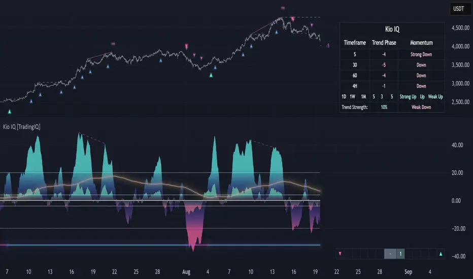
Cheat CodeWhy Monday & Friday
Monday evening (NY): frequently seeds the weekly expansion. Its DR/IDR often acts as a weekly “starter envelope,” useful for breakout continuation or fade back into the box plays as liquidity builds.
Friday evening (NY): often exposes end-of-week traps (run on stops into the close) and sets expectation boundaries into the following week. Carry these levels forward to catch Monday’s reaction to Friday’s closing structure.
Typical use-cases
Breakout & retest:
Price closes outside the Monday DR/IDR → look for retests of the band edge for continuation.
Liquidity sweep (“trap”) recognition:
Friday session wicks briefly beyond Friday DR/IDR then closes back inside → watch for mean reversion early next week.
Bias filter:
Above both Monday DR midline and Friday DR midline → bias long until proven otherwise; the inverse for shorts.
Session open confluence:
Reactions at the open line frequently mark decision points for momentum vs. fade setups.
(This is a levels framework, not a signals engine. Combine with your execution model: orderflow, S/R, session timing, or higher-TF bias.)
Inputs & styling (quick reference)
Display toggles (per day):
Show DR / IDR / Middle DR / Middle IDR
Show Opening Line
Show DR/IDR Box (choose DR or IDR as box source)
Show Price Labels
Style controls (per day):
Line width (1–4), style (Solid/Dashed/Dotted)
Independent colors for DR, IDR, midlines, open line
Box background opacity
Timezone:
Default America/New_York (changeable).
Optional on-chart warning if your chart TZ differs.
Practical notes
Works on intraday charts; levels are anchored using weekly timestamps for accuracy on any symbol.
Live updating: During the Mon/Fri calc windows, DR/IDR highs/lows and midlines keep updating until the session ends.
Clean drawings: Lines, box, and labels are created once per session and then extended/updated—efficient on resources even with long display windows.
Max elements: Script reserves ample line/box/label capacity for stability across weeks.
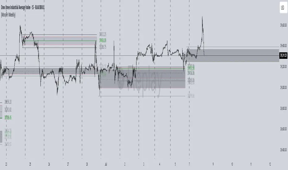
Advanced VWAP CalendarThe Advanced VWAP Calendar is a designed to plot Volume Weighted Average Price (VWAP) lines anchored to user-defined and preset time periods, including weekly, monthly, quarterly, and custom anchors. As of August 15, 2025, this indicator provides traders with a robust tool for analyzing price trends relative to volume-weighted averages, with clear labeling and extensive customization options. Below is a summary of its key features and functionality, with technical details and code references updated to focus on user-facing behavior and presentation, while preserving all other aspects of the original summary.
Key Features
Multiple Time Period VWAPs:
Weekly VWAPs: Supports up to five VWAPs for a user-selected month and year, starting at midnight each Monday (e.g., W1 Aug 2025, W2 Aug 2025). Enabled via a single toggle, with anchors automatically set to the first Monday of the chosen month.
Monthly VWAPs: Plots VWAPs for all 12 months of a selected year (e.g., Jan 2025, Feb 2025) or a single user-specified month/year. Labels use month abbreviations (e.g., "Aug 2025").
Quarterly VWAPs: Covers four quarters of a selected year (e.g., Q1 2025, Q2 2025), with options to enable all quarters or individual ones (Q1–Q4).
Legacy VWAPs: Provides monthly and quarterly VWAPs for a user-selected legacy year (e.g., 2024), labeled with a "Legacy" prefix (e.g., "Legacy Jan 2024," "Legacy Q1 2024"), with similar enablement options.
Custom VWAPs: Includes 10 fully customizable VWAPs, each with user-defined anchor times, labels (e.g., "Q1 2025"), colors, line widths (1–5), text colors, bubble styles, text sizes (8–40), and background options.
Clear and Dynamic Labeling:
Labels appear to the right of the chart, showing the VWAP value (e.g., "Q1 2025 123.45").
Weekly labels follow a "W# Month Year" format (e.g., "W1 Aug 2025").
Monthly labels use abbreviated months (e.g., "Aug 2025"), while quarterly labels use "Q# Year" (e.g., "Q3 2025").
Legacy labels include a "Legacy" prefix (e.g., "Legacy Q1 2024").
Labels support customizable text sizes (tiny to huge) and can be displayed with or without a background, with optional bubble styles.
Flexible Customization:
Each VWAP can be enabled or disabled independently, with user inputs for anchor times, labels, and visual properties.
Colors are predefined for weekly (red, orange, blue, green, purple), monthly (varied), quarterly (red, blue, green, yellow), and legacy VWAPs, but custom VWAPs allow any color selection.
Line widths and text sizes are adjustable, ensuring visual clarity and chart readability.
This indicator was a dual effort, code was heavily contributed in effort by AzDxB, major credit and THANKS goes to him www.tradingview.com
FX4M by fx4_livingFX4M Simplified by fx4_living
1. Previous Period Framework
Selectable Period: Prior Daily, Weekly, or Monthly.
Range Box: Full high-to-low span of the prior period, shaded by up/down close.
Body Box: Open-to-close section within the range box.
High/Low Lines: Horizontal lines at the previous period’s high/low.
Equilibrium Line: Midpoint between the previous high and low.
2. Intraday Opening Lines
Plots reference price lines for:
Daily Open
(00:00 New York) Midnight Open
09:30 AM Open
13:30 PM Open
Current-Hour Open; plus Weekly/Monthly Opens when Weekly/Monthly is selected.
Each line has its own color, style, and time/price label.
3. Intraday High/Low Tracking
Marks the current day’s highest and lowest prices.
“D-H” and “D-L” labels with time in tooltip.
4. Accumulation Range
Definition: First one-third of the selected reference period.
Shows full range (high-to-low) and body (open-to-close), shaded by up/down close.
After it ends, the Accumulation High/Low/EQ are drawn as horizontal lines.
Optional alerts mark the first time the Accumulation High or Low is reached.
5. Accumulation Range Deviation Levels
After the Accumulation period ends, horizontal levels are drawn at ±0.5, ±1.0, ±1.5 … ±3.5 of the Accumulation range size from its High/Low. Optional small labels show the level value.
Optional alerts mark the first time each deviation level is reached.
6. Previous Period Hit Detection
Marks the first time price reaches the prior period’s High, Low, or Equilibrium during the current period.
Optional alerts are possible.
7. Pre-Market Zone
Marks 05:00–06:59 New York time with a shaded box and dotted midline; color reflects up/down close. The midline can extend forward.
Displayed on intraday charts up to 15 minutes.
8. Status Table
Daily High (time & price)
Daily Equilibrium (current deviation % and price)
Daily Low (time & price)
MWD Institutional order flow (optional): shows Daily/Weekly/Monthly closes vs. their respective opens (directional arrows in colored cells).
Customizable Watermark (optional).
Enjoy
fx4_living

FVG + Bank Level Targeting w/ Alert TriggerDescription:
FVG + Bank Level Targeting w/ Alert Trigger is an intraday trading tool that combines Fair Value Gap (FVG) detection with dynamic institutional targeting using prior-day, weekly, and monthly high/low "Bank Levels." When a Fair Value Gap is detected, the script projects a logical target using the closest bank level in price's direction, and visually extends that level on your chart.
This tool is designed to help traders anticipate where price is most likely to move after an FVG appears — and alert them when price breaks through key target zones.
How It Works:
* Bank Level Calculation:
The indicator calculates Daily, Weekly, and Monthly high and low levels from the previous bar of each respective timeframe.
These are optionally plotted on the chart with a slight tick offset to avoid overlap with price.
* FVG Detection:
Bullish FVGs are defined by a gap between the low of the current candle and the high two candles prior, with a confirming middle candle.
Bearish FVGs follow the reverse pattern.
Once detected, the script finds the nearest unbroken institutional level (Bank Level) in the direction of the FVG and anchors a target line at that price level.
* Target Line Projection:
The script draws a persistent horizontal line (not just a plotted value) at the selected bank level.
These lines automatically extend a set number of bars into the future for clarity and trade planning.
* Breakout Detection:
When price crosses above a Bull Target or below a Bear Target, the script triggers a breakout condition.
These breakouts are useful for trade continuation or reversal setups.
* Alerts:
Built-in alert conditions notify you in real time when price crosses above or below a target.
These can be used to set TradingView alerts for your preferred Futures symbols or intraday pairs.
Parameters:
Tick Offset Multiplier: Adds distance between price and plotted levels.
Show Daily/Weekly/Monthly Levels: Toggle for each institutional level group.
FVG Extend Right (bars): Controls how far the target lines extend into the future.
Color Controls: Customize colors for FVG fill and target lines.
Use Case:
This indicator is designed for traders who want to:
Trade continuation or reversal moves around institutional price zones
Integrate Fair Value Gap concepts with more logical, historically anchored price targets
Trigger alerts when market structure evolves around key levels
It is especially useful for intraday Futures traders on the 15-minute chart or lower, but adapts well to any instrument with strong reactionary behavior at prior session highs/lows.