Wyszukaj w skryptach "weekly"
Weekly Futures VWAP (Major Indices) - StableAutomatically puts the VWAP anchor on Sunday opening of futures at 16:00, you are able to toggle on/off VWAP bands and of course enter alerts

Weekly Breakout Screenermencari harga saham yang kuat breakout harga mingguan. potensi swing trading

Weekly Confluence Setup [Final v6]Trend: EMA 21 and SMA 50
Momentum: MACD and RSI in a separate pane
Volume: Anchored VWAP from recent swing low
Confluence Signals: Clear triangle markers with optional alerts to the chart timeframe
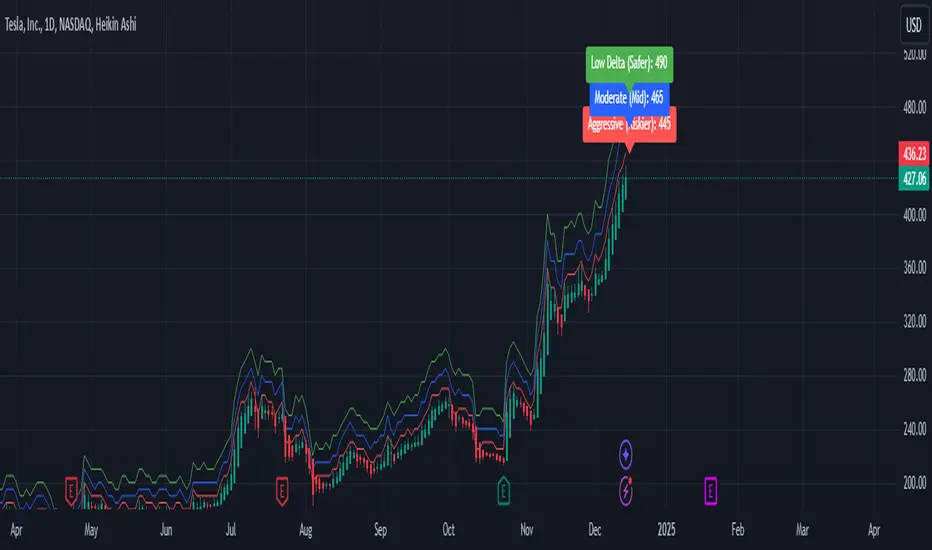
Weekly Covered Calls Strategy with IV & Delta LogicWhat Does the Indicator Do?
this is interactive you must use it with your options chain to input data based on the contract you want to trade.
Visualize three strike price levels for covered calls based on:
Aggressive (closest to price, riskier).
Moderate (mid-range, balanced).
Low Delta (farthest, safer).
Incorporate Implied Volatility (IV) from the options chain to make strike predictions more realistic and aligned with market sentiment. Adjust the risk tolerance by modifying Delta inputs and IV values. Risk is defined for example .30 delta means 30% chance of your shares being assigned. If you want to generate steady income with your shares you might want to lower the risk of them being assigned to .05 or 5% etc.
How to Use the Indicator with the Options Chain
Start with the Options Chain:
Look for the following data points from your options chain:
Implied Volatility (IV Mid): Average IV for a particular strike price.
Delta:
~0.30 Delta: Closest strike (Aggressive).
~0.15–0.20 Delta: Mid-range strike (Moderate).
~0.05–0.10 Delta: Far OTM, safer (Low Delta).
Strike Price: Identify strike prices for the desired Deltas.
Open Interest: Check liquidity; higher OI ensures tighter spreads.
Input IV into the Indicator:
Enter the IV Mid value (e.g., 0.70 for 70%) from the options chain into the Implied Volatility field of the indicator.
Adjust Delta Inputs Based on Risk Tolerance:
Aggressive Delta: Increase if you want strikes closer to the current price (riskier, higher premium).
Default: 0.2 (20% chance of shares being assigned).
Moderate Delta: Balanced risk/reward.
Default: 0.12 (12%)
Low Delta: Decrease for safer, farther OTM strikes.
Default: 0.05 (5%)
Visualize the Chart:
Once inputs are updated:
Red Line: Aggressive Strike (closest, riskiest, higher premium).
Blue Line: Moderate Strike (mid-range).
Green Line: Low Delta Strike (farthest, safer).
Step-by-Step Workflow Example
Open the options chain and note:
Implied Volatility (IV Mid): Example 71.5% → input as 0.715.
Delta for desired strikes:
Aggressive: 0.30 Delta → Closest strike ~ $455.
Moderate: 0.15 Delta → Mid-range strike ~ $470.
Low Delta: 0.05 Delta → Farther strike ~ $505.
Open the indicator and adjust:
IV Mid: Enter 0.715.
Aggressive Delta: Leave at 0.12 (or adjust to bring strikes closer).
Moderate Delta: Leave at 0.18.
Low Delta: Adjust to 0.25 for safer, farther strikes.
View the chart:
Compare the indicator's strikes (red, blue, green) with actual options chain strikes.
Use the visualization to: Validate the risk/reward for each strike.
Align strikes with technical trends, support/resistance.
Adjusting Inputs Based on Risk Tolerance
Higher Risk: Increase Aggressive Delta (e.g., 0.15) for closer strikes.
Use higher IV values for volatile stocks.
Moderate Risk: Use default values (0.12–0.18 Delta).
Balance premiums and probability.
Lower Risk: Increase Low Delta (e.g., 0.30) for farther, safer strikes.
Focus on higher IV stocks with good open interest.
Key Benefits
Simplifies Strike Selection: Visualizes the three risk levels directly on the chart.
Aligns with Market Sentiment: Incorporates IV for realistic forecasts.
Customizable for Risk: Adjust inputs to match personal risk tolerance.
By combining the options chain (IV, Delta, and liquidity) with the technical chart, you get a powerful, visually intuitive tool for covered call strategies.
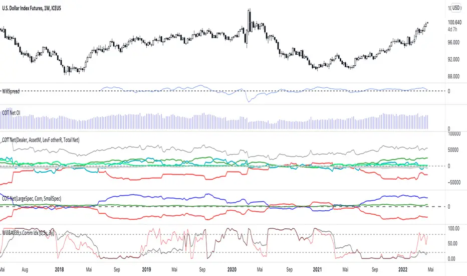
Weekly COTAdjusted COT Index
Improves upon: "COT Index Commercials vs large and small Speculators" by SystematicFutures
How: CoT Indexes are adjusted by Open Interest to normalise data over time, and threshold background colours are in-line with Larry Williams recommendations from his book.
Note: This indicator is **only** accurate on the Daily time-frame due to the mid-week release date for CoT data.
This script calculates and plots the Adjusted Commitment of Traders (COT) Index for Commercial, Large Speculator, and Retail (Small Speculator) categories.
The CoT Index is adjusted by Open Interest to normalise data through time, following the methodology of Larry Williams, providing insights into how these groups are positioned in the market with an arguably more historically accurate context.
COT Categories
-------------------
- Commercials (Producers/Hedgers): Large entities hedging against price changes in the underlying asset.
- Large Speculators (Non-commercials): Professional traders and funds speculating on price movements.
- Retail Traders (Nonreportable/Small Speculators): Small individual traders, typically less informed.
Features
----------
- Open Interest Adjustment
- The net positions for each category are normalized by Open Interest to account
for varying contract sizes.
- Customisable Look-back Period
- You can adjust the number of weeks for the index calculation to control the
historical range used for comparison.
- Thresholds for Extremes
- Upper and lower thresholds (configurable) are provided to mark overbought and
oversold conditions.
- Defaults
- Overbought: <=20
- Oversold: >= 80
- Hide Current Week Option
- Optionally hide the current week's data until market close for more accurate comparison.
- Visual Aids
- Plot the Commercials, Large Speculators, and Retail indexes, and optionally highlight extreme positioning.
Inputs
--------
- weeks
- Number of weeks for historical range comparison.
- upperExtreme and lowerExtreme
- Thresholds to identify overbought/oversold conditions (default 80/20).
- hideCurrentWeek
- Option to hide current week's data until market close.
- markExtremes
- Highlight extremes where any index crosses the upper or lower thresholds.
- Options to display or hide indexes for Commercials, Large Speculators, and Small Speculators.
Outputs
----------
- The script plots the COT Index for each of the three categories and highlights periods of extreme positioning with customisable thresholds.
Usage
-------
- This tool is useful for traders who want to track the positioning of different market participants over time.
- By identifying the extreme positions of Commercials, Large Speculators, and Retail traders, it can give insights into market sentiment and potential reversals.
- Reversals of trend can be confirmed with RSI Divergence (daily), for example
- Continuation can be confirmed with RSI overbought/oversold conditions (daily), and/or hidden RSI Hidden Divergence, for example

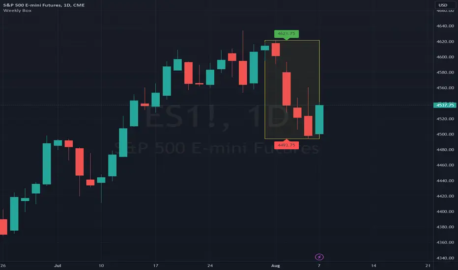
Weekly BoxThe indicator shows a box based on the high and low of the previous week that extends into the current week. The box is used to monitor breakouts or break downs of the price with respect to the previous week levels.
The box is colored:
- green, if there is a breakout above the previous week high; or
- red, if there is a break down below the previous week low; or
- yellow, if the price stays inside of the box.
during the current week.
Labels for the box top and bottom prices can be enabled or disabled in the settings.
Weekly Opening Gap (cryptonnnite)In the context of general equities, opening price that is substantially higher or lower than the previous day's closing price, usually because of some extraordinarily positive or negative news. Opening gap using as a potential target which market usually trades to.

RTI Pivot Points StandardWeekly daily Pivot point for ease.
This is will show support and resistance on 15 minutes and 30 minutes time frame.
COT Net Positions BTC & ETH FO_ALLWeekly Commitment of Traders Report for Futures positions, as well as futures plus options positions.
This is only for Bitcoin and Ether.
OPEN INTEREST
DEALER
ASSET MANAGER
LEVERAGED FUNDS
OTHER REPORTABLE
TOTAL REPORTABLE
NON REPORTABLE
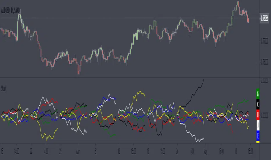
Weekly currency strength indicatorThe indicator uses the SAXO feed for the currencies USD, EUR, GBP, JPY, AUD and CAD. This can easily be changed to your preferred feed and currencies by changing the code.
The overall idea is to get a clear picture of which currencies are strengthening and weakening. This indicator does not predict future price movements.
Weekly & Daily Percantage Price OscillatorMy first script.
By Vitali Apirine. Technical Analysis of Stocks & Commodities ( February 2018, Vol.36 Issue 2). Thank you.

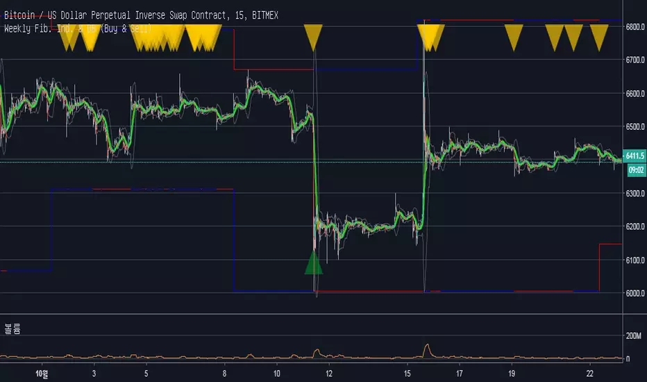
Weekly Fibonacci Ind. & BB (Buy & Sell)Description :
Fibonacci Retracements are used to estimate likely reversal points during an up- or down-trend. Percentage retracement levels, based on significant Fibonacci numbers, are plotted as horizontal lines against the latest trend move.
1. Blue and Red Line : The highest and lowest peak of candles.
Blue line and Red line changes colors according to the position of candles above or below the 0.5 Fibonacci Retracements line.
2. Yellow Line : 0.5 Fibonacci Retracements line.
3. Green Line : BB Basis line.
Reference of Fibonacci Retracements :
www.incrediblecharts.com
Mavilim Multiple Trend By BDweekly mavilim line,daily mavilim line and more,within your current chart. and shows multiple mavilim trend. if u need something like this

Multiple Trend Indicatorweekly 21wma,daily 21wma and more,within your current chart. and shows multiple trend. if u need something like this


Mid-Term Refuges / Refugios de Mediano Plazo (RMP)═════════════════════════════════════════════════════════════
MID-TERM REFUGES (RMP) V1.0 - ENGLISH VERSION
═════════════════════════════════════════════════════════════
The Mid-Term Refuges (RMP) indicator is an essential tool for traders and investors who base their decisions on price action. Based on a proven methodology used by institutional investors since the days of auction floors, RMP plots psychological support and resistance levels that the market has consistently respected over decades.
═══════════════════════════════════════════
SOLID AND PROVEN METHODOLOGY
═══════════════════════════════════════════
RMP automatically calculates 31 key levels (refuges) based on the asset's annual opening price on the daily timeframe:
• RESISTANCES (R1 - R15): Projected by adding 10% intervals to the annual opening price, identifying zones where the price historically encounters selling pressure.
• SUPPORTS (S1 - S15): Calculated by subtracting 10% intervals from the opening price, marking levels where buyer interest traditionally emerges.
• ANNUAL OPENING PRICE (PA): The central level from which the entire refuge framework is constructed.
The simplicity of this technique is precisely its greatest strength: clear, objective levels that update automatically at the beginning of each year or when using the Bar Replay feature.
═══════════════════════════════════════════
WHY DOES THIS METHOD WORK?
═══════════════════════════════════════════
Financial markets are ecosystems where millions of operators participate, from retail traders to institutional funds. When a critical mass of participants uses the same reference levels, these become self-fulfilling prophecies: buy and sell orders concentrate at these levels, generating predictable price reactions.
The 10% refuges are not arbitrary. They represent significant psychological thresholds that capture moments of indecision, consolidation, or reversal in the market. A movement of 20%, 30%, or 50% from the annual opening is not trivial: it captures market attention and triggers risk management decisions.
═══════════════════════════════════════════
PRACTICAL APPLICATIONS
═══════════════════════════════════════════
RMP is particularly valuable for:
SWING TRADERS: Identifies optimal entry and exit points for trades that develop over weeks or months within the current year.
MID-TERM INVESTORS: Provides context to assess whether the current price is overextended or presents relative value opportunities.
RISK MANAGEMENT: Allows placing stops and targets at technically relevant levels, not at arbitrary points.
MULTI-TIMEFRAME ANALYSIS: Works perfectly on 1H, 4H, and Daily timeframes, maintaining constant values as long as historical data reaches the beginning of the year.
═══════════════════════════════════════════
VALIDATION: DO YOUR OWN BACKTESTING
═══════════════════════════════════════════
RMP's effectiveness varies depending on the asset you trade. Not all instruments are equally sensitive to these institutional levels. How can you know if RMP will work with your favorite assets?
Perform this simple exercise:
1. Activate TradingView's Bar Replay feature.
2. Go back to periods where your asset had movements greater than +/- 10%.
3. Observe how many times the price (OHLC) reacts, respects, or approaches the refuges.
4. The higher the frequency of matches, the greater the probability that institutional investors are using these levels with your asset.
This backtesting not only validates the tool but will give you statistical confidence to incorporate RMP into your trading plan.
═══════════════════════════════════════════
INTEGRATION WITH OTHER REFUGE INDICATORS
═══════════════════════════════════════════
RMP is part of a complete refuge-based analysis ecosystem:
• RLP (Long-Term Refuges): For automatic determination of the predominant phase of a Zigzag, which institutional investors choose as the basis for a Fibo whose levels calculate the projection for order placement over the following years.
• RLPS (Simplified Long-Term Refuges): Simplified version of RLP in which the known coordinates of the predominant phase are captured.
• RS (Weekly Refuges): For short-term tactical analysis (4H, 1H) based on chosen phases of a Zigzag that define the Fibo levels effective during the current week and the following 2 weeks.
By combining RMP with RLP/RLPS and RS, you obtain a multi-level framework that allows you to operate with clarity at any time horizon, from intraday positions to investments spanning months and years.
═══════════════════════════════════════════
PHILOSOPHY: PRICE ACTION, NOT DIVINATION
═══════════════════════════════════════════
RMP does not attempt to predict the future. Oscillators and complex algorithms try to anticipate movements based on past patterns, frequently falling into overfitting and false signals.
Our approach is different: we observe what the price does at objective levels and react accordingly. This is technical analysis in its purest and most honest form.
The only additional technique we have found consistently useful to complement refuges is the drawing of trend lines, which captures price direction and momentum in a visual and intuitive manner.
═══════════════════════════════════════════
HIGHLIGHTED TECHNICAL FEATURES
═══════════════════════════════════════════
• 31 CONFIGURABLE LEVELS: Activate or deactivate any refuge according to your needs.
• PROFESSIONAL VISUALIZATION: Labels with formatted price (thousand separators) and percentage.
• COMPLETE CUSTOMIZATION: Adjustable colors, widths, line styles, and opacities.
• FUTURE EXTENSION: Project lines forward to anticipate reaction zones.
• MARGIN LABELS: Native integration with TradingView's price scale.
• AUTOMATIC UPDATE: Levels recalculate at the beginning of each year.
• BAR REPLAY COMPATIBILITY: Works perfectly with the Bar Replay feature.
═══════════════════════════════════════════
IMPORTANT TECHNICAL CONSIDERATIONS
═══════════════════════════════════════════
Refuges remain constant and precise on 1 HOUR, 4 HOUR, and DAILY timeframes. On weekly timeframe, values may vary due to data compression; in that case, you will need to manually copy the levels if you wish to use them.
This limitation is not a defect, but a consequence of how TradingView handles historical data at different temporal resolutions.
═══════════════════════════════════════════
START TODAY
═══════════════════════════════════════════
RMP is the result of years of observation, iterative development, and refinement based on real market experience. It's not magic, it's method. It's not divination, it's preparation.
If you are a trader or investor who values clarity over complexity, objectivity over opinions, and price action over lagging indicators, RMP will transform how you interpret charts.
Download it, test it on your favorite assets, validate it with backtesting, and see for yourself why institutional investors have trusted these levels for decades.
═══════════════════════════════════════════
FINAL NOTE FOR CONSCIOUS INVESTORS
═══════════════════════════════════════════
As developers of RMP, we identify ourselves as "slow investors with average IQ." We are not mathematical geniuses nor do we have access to high-frequency algorithms. We are disciplined traders seeking simple and repeatable advantages in the market.
RMP is that advantage. It is our contribution to the TradingView community: a robust, transparent tool grounded in principles that have withstood the test of time.
Use it with discipline. Combine it with solid risk management. And may your trades always be conscious and planned.
════════════════════════════════════════════════════════════
Developed with Vibe Coding by: aj p'óolom máasewal
Coded by Claude Sonnet 4.5 from Anthropic
════════════════════════════════════════════════════════════

[TA] Sessions OHLC# TA Sessions OHLC
TA Sessions OHLC is a session-based market structure indicator that maps Regular Trading Hours (RTH) and Globex / Extended Hours (ETH) levels directly onto your chart.
It provides a clear, consistent framework for understanding where price is trading relative to session structure , so you can make better decisions around context, bias, and execution.
This indicator does not generate signals. It defines the map.
---
## What TA Sessions OHLC Plots
### 🔹 Regular Trading Hours (RTH)
* Session High
* Session Low
* Session Mid
* RTH Open
* Optional Previous RTH High / Low
### 🔹 Globex / Extended Trading Hours (ETH)
* Session High
* Session Low
* Session Mid
* Globex Open
* Globex Close
* Optional Previous Globex High / Low
### 🔹 Additional References
* Previous Open / Previous Close
* Week Open / Previous Week Open
* Optional RTH range extension levels (projected above and below the session range)
### 🔹 Session Table (Optional)
An on-chart table showing:
* Open, High, Low, Mid, Close, Range
For both RTH and ETH , with configurable layout and styling.
---
## How Traders Use This Indicator
TA Sessions OHLC is designed to answer one core question:
“Where are we trading relative to the session?”
Below are common, practical use cases.
---
## 1️⃣ Session Bias & Context
* Price above RTH Mid → bullish session context
* Price below RTH Mid → bearish session context
* Price rotating around mid → balanced / rotational session
Many traders use the session mid as a bias filter , not an entry signal.
---
## 2️⃣ RTH vs Globex Behavior
Globex often sets the range , and RTH decides acceptance or rejection .
Common observations:
* RTH breaking and holding above Globex High → acceptance
* RTH failing at Globex High/Low → rejection / fade opportunity
* RTH trading back into Globex range → balance / chop risk
TA Sessions OHLC makes these relationships explicit.
---
## 3️⃣ Previous Session Levels as Reaction Zones
Previous RTH and Globex highs/lows frequently act as:
* Support / resistance
* Liquidity targets
* Decision points during trend continuation or reversal
Use them to:
* Define areas to take profits
* Avoid chasing trades into known reference levels
* Frame risk (what happens if this level fails?)
---
## 4️⃣ Opens & Closes as Anchors
* RTH Open often defines early bias
* Globex Close often acts as an overnight reference
* Previous Close is frequently defended or tested early in the session
These levels help identify:
* Early trend days
* Failed opens
* Range-bound sessions
---
## 5️⃣ Range Expansion & Extension Levels
Optional extension levels project potential expansion beyond the RTH range.
Typical use:
* Price breaks RTH High → extension levels become contextual upside zones
* Price breaks RTH Low → downside extensions frame potential continuation
These are reference zones , not targets.
---
## How NOT to Use This Indicator
* Do not treat levels as automatic buy/sell signals
* Do not assume every level must hold
* Do not trade every touch
This tool defines structure , not entries.
---
## Best Practices
* Use on intraday charts (1–30 minute recommended)
* Combine with:
* Order flow
* Price action
* Volume / VWAP
* Your existing execution model
* Disable levels you don’t use to keep charts clean
---
## Supported Sessions
Preconfigured for:
* CME
* NYSE
* London
* Tokyo
Higher-timeframe session modes (weekly/monthly) are not included in this version and may be added later.
---
## Who This Indicator Is For
TA Sessions OHLC is built for traders who:
* Care about session behavior
* Trade futures, indices, or liquid intraday markets
* Want objective structure without signals or bias
* Prefer understanding context before execution
---
🎄 Released free as part of a Christmas giveaway.
Invite-only access.
Merry Christmas 🎅

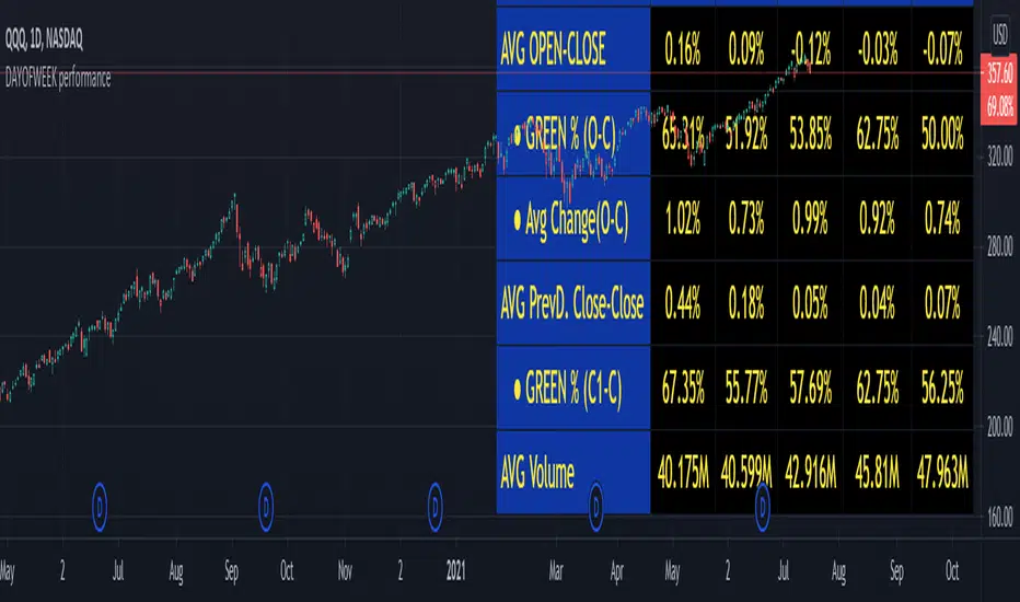
DAYOFWEEK performance1 -Objective
"What is the ''best'' day to trade .. Monday, Tuesday...."
This script aims to determine if there are different results depending on the day of the week.
The way it works is by dividing data by day of the week (Monday, Tuesday, Wednesday ... ) and perform calculations for each day of the week.
1 - Objective
2 - Features
3 - How to use (Examples)
4 - Inputs
5 - Limitations
6 - Notes
7 - Final Tooughs
2 - Features
AVG OPEN-CLOSE
Calculate de Percentage change from day open to close
Green % (O-C)
Percentage of days green (open to close)
Average Change
Absolute day change (O-C)
AVG PrevD. Close-Close
Percentage change from the previous day close to the day of the week close
(Example: Monday (C-C) = Friday Close to Monday close
Tuesday (C-C) = Monday C. to Tuesday C.
Green % (C1-C)
Percentage of days green (open to close)
AVG Volume
Day of the week Average Volume
Notes:
*Mon(Nº) - Nº = Number days is currently calculated
Example: Monday (12) calculation based on the last 12 Mondays. Note: Discrepancies in numbers example Monday (12) - Friday (11) depend on the initial/end date or the market was closed (Holidays).
3 - How to use (Examples)
For the following example, NASDAQ:AAPL from 1 Jan 21 to 1 Jul 21 the results are following.
The highest probability of a Close being higher than the Open is Monday with 52.17 % and the Lowest Tuesday with 38.46 %. Meaning that there's a higher chance (for NASDAQ:AAPL ) of closing at a higher value on Monday while the highest chance of closing is lower is Tuesday. With an average gain on Tuesday of 0.21%
Long - The best day to buy (long) at open (on average) is Monday with a 52.2% probability of closing higher
Short - The best day to sell (short) at open (on average) is Tuesday with a 38.5% probability of closing higher (better chance of closing lower)
Since the values change from ticker to ticker, there is a substantial change in the percentages and days of the week. For example let's compare the previous example ( NASDAQ:AAPL ) to NYSE:GM (same settings)
For the same period, there is a substantial difference where there is a 62.5% probability Friday to close higher than the open, while Tuesday there is only a 28% probability.
With an average gain of 0.59% on Friday and an average loss of -0.34%
Also, the size of the table (number of days ) depends if the ticker is traded or not on that day as an example COINBASE:BTCUSD
4 - Inputs
DATE RANGE
Initial Date - Date from which the script will start the calculation.
End Date - Date to which the script will calculate.
TABLE SETTINGS
Text Color - Color of the displayed text
Cell Color - Background color of table cells
Header Color - Color of the column and row names
Table Location - Change the position where the table is located.
Table Size - Changes text size and by consequence the size of the table
5 - LIMITATIONS
The code determines average values based on the stored data, therefore, the range (Initial data) is limited to the first bar time.
As a consequence the lower the timeframe the shorter the initial date can be and fewer weeks can be calculated. To warn about this limitation there's a warning text that appears in case the initial date exceeds the bar limit.
Example with initial date 1 Jan 2021 and end date 18 Jul 2021 in 5m and 10 m timeframe:
6 - Notes and Disclosers
The script can be moved around to a new pane if need. -> Object Tree > Right Click Script > Move To > New pane
The code has not been tested in higher subscriptions tiers that allow for more bars and as a consequence more data, but as far I can tell, it should work without problems and should be in fact better at lower timeframes since it allows more weeks.
The values displayed represent previous data and at no point is guaranteed future values
7 - Final Tooughs
This script was quite fun to work on since it analysis behavioral patterns (since from an abstract point a Tuesday is no different than a Thursday), but after analyzing multiple tickers there are some days that tend to close higher than the open.
PS: If you find any mistake ex: code/misspelling please comment.