infoThis is a very simple script that i use to add useful info to my trading view charts.
specifically i track following :
1. VIX
2. RSI
3. ticker name and timeframe
Feel free to change, modify as per your requirements
Wyszukaj w skryptach "vix"

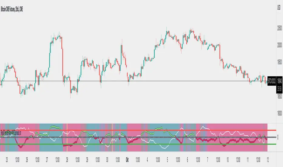
Market Internal TrendMIT - Market Internal Trend
I've developed what I consider to be the best market internals, market breadth indicator on Trading View to date :)
Market internals (sometimes referred to as Market Breadth) are built-in indicators of the market, there are the following main indicators:
TICK - Uptick or downtick transaction of market (NYSE/NASDAQ)
ADD - Advancing or declining issues/stocks of the market
VOLD - Up volume or down volume of the issues/stocks of the market
TRIN - Trend of market based on ADD and VOLD
VIX - Volatility of the market
PCN - Options market puts vs calls
What makes this different?
This single compact indicator delivers an "eyes on glass" style presentation to detail extreme movements of TICK, sentiment analysis of ADD and VOLD as well as their trends and report when the market is most likely balanced or an in imbalance. No need to study multiple clouds and amassing a ton of different charts all with similar indicator setups and candle analysis in the heat of the moment.
Use this to determine the overall initial trend at open, watching for imbalance and extreme movement on TICK as a signal to prepare for potential trades. The metrics table is useful to see where potential rejections/bounces may occur on the volatility index.
Extreme tick closures (see below) can provide excellent trim or exit signals for existing trades depending on the market structure of the day (trending or ranging).
How To Use
The main histogram represents the highs and lows of TICK, anything within the +/- $500 region is most likely normal movement while anything outside of that will brighten in color and indicates potential larger reactions. Extreme highs and lows will be represented by white diamonds by default, closures are indicated by bright colored crosses at $0. Price levels should be noted on the securities being traded during TICK extreme movement, these usually act as dynamic support and resistance from my observations but your results may vary (please share in comments your experiences!).
There is a smoothed trend line over the histogram, by default it's white in color, and this represents simply a trend of TICK closures - when it's trending down the market should be following in kind and vice versa; adjust the smoothing length in settings to suit your trading style.
The center line will have colored dots, by default yellow for balanced markets or white for imbalanced markets. When the market is in an imbalance that's when trending moves have been observed and balanced markets are usually choppy with sideways price action not suitable for quick scalp type trading styles.
The upper colored band represents the market overall advancing or declining issues/stocks within the market, by default green tones are bullish for a advancing market and red tones represent bearish market - the brighter the tone the strong the sentiment. There are triangles at all times above this band and that represents a smoothed trend status as compared to the current amount of stocks in advance or decline, if the smoothed trend is above then it's potentially a signal of reversal (red triangles over green band would be bearish reversal and vice versa).
The lower colored band works the exact same as the upper band but it tracks the up and down volume of the issues/stocks within the market, it utilizes the same color and triangle logics as the upper band.
Markets
Currently this will present internals data for NYSE and NASDAQ, I'm still researching other markets internals and their particulars.
The signals on this indicator will best apply to SPY, QQQ, ES, NQ or highly liquid ETFs largely affected by NYSE or NASDAQ - individual stocks may have mixed results depending on how they're moving with major indexes so keep that in mind when watching for sympathy moves with the indicator.
Usage Conditions
All of the market internals are fantastic indicators when day trading, I've had great success on 1-15 minute and even higher for scalps or intra-day swings. Observing the middle dots will save those of you that struggle in choppy markets from being too aggressive when opportunities don't exist.
Use the triangles, diamonds, dots and crosses to your advantage to manage your scalps and intra-day swings, or gain an edge in preparation for entering trades!
I hope this indicator is a benefit to all for day trading, provide any feedback or feature requests in the comments.

Volatility Spike EstimatorPlots the Average True Range (ATR), its historical mean, the upper threshold for a volatility spike, and uses background color to show the likelihood of a volatility spike based on the current ATR value.
Green background indicates an increased likelihood of a volatility spike, while red background means a spike might have already occurred or be in progress.
Update: In this version, we added a short-term ATR calculation with an adjustable input parameter, shortTermATRLength. The likelihood of a volatility spike is now estimated based on the short-term ATR instead of the original ATR. This change makes the indicator more sensitive to recent market conditions and can help detect potential volatility spikes more quickly.

Negative Correlation SignalsThank you to Hendrik Fuchs who coded this for me - I highly recommend you...
The AUDUSD/EURUSD has a negative correlation with the DXY as does the GBPJPY/USDJPY have with the JPYX. This indicator is very simple and uses opposite candle pinbars (pinbar/doji structure can be set by you) of the two instruments on the chart whilst the stochastic RSI should be above 80 for overbought on the one but below 20 on the other for oversold (or vice versa) to generate a signal.
This indicator works as follow:
1. Choose an instrument that has an opposing negatively correlated instrument (EURUSD & DXY, GBPJPY & JPYX, US100 & VIX, etc.)
2. Add indicator to the chart and open settings.
3. Open the settings and add the correct instruments (default is set to GBPJPY & JPYX).
4. Enter your desired Stochastic RSI & candle formation settings.
You will see buy and sell signals appear on the charts. Alerts are possible (Any alert() function call). Does not repaint after close of candle. Better on higher timeframes but can also be used for scalping. Best used as confluence or as part of a trend trading system.
There are obviously many many variations that I have not even thought off - please let us know in the comment section if you find settings/timeframes/instruments that work particularly well.

VolatilityCone by ImpliedVolatilityThis volatility cone draws the implied volatility as standard deviations from a measurement date.
For best results set measurement date to high volume bars.
How to use:
1) Select VolatilityCone from Indicators
2) Click to the chart to set the measurement date
3) Determine the impliedvolatility for the measurement date of your symbol
e.g.
For S&P500 use VIX value at measurement date for implied volatility

FTFC Watchlist (The Strat)This indicator is a five custom ticker watchlist that shows seven pre-defined higher timeframes using '#TheStrat' technique and can be used on any ticker from common stock, forex and crypto.
Explanation of 'TheStrat' trading technique
‘TheStrat’ technique works off the basis of labelling whether the focus candle did or did not break any of the previous candles high or low values. There are three possible label definitions; either a 1 candle, 2 candle or a 3 candle.
1 bar (inside) - If price movement on the new candle remains within the high and low of previous candle.
3 bar (outside) – If price movement went above both the high and the low of the previous candle.
2 bar (directional) – If price movement only broke with the high (called a 2-up) or if price movement only broke the low of the previous candle (called a 2-down).
Once labelled the technique then looks for certain combination of these labelled candles (called actionable setups) such as: 2-1-2, 1-2-2, 3-1-2.
What is Full Time Frame Continuity (FTFC)
Under 'The Strat' full timeframe continuity is limited to the colour (open vs close) of the candle being either green or red. When higher timeframe align with the 'same colour' is suggest that there is stronger support for that direction of the candle.
How does the indicator work?
The indicator will allow you to daily enter up to 5 watchlist tickers and in as close to real time (slight lag) show the developing FTFC of your watchlist tickers and avoids having to switch chart tickers to see the developing timeframe continuity
Example of how to use the indicator
A simple example will be the relationship between SPY and VIX and by having the higher timeframe overview of these two watchlist tickers while trading will give potential insights to how the market is trading overall.
Some people might also find it useful to see 'consolidation' (1 bar) and 'expansion' (3 bar) highlighted in the timeframe. This feature can be enabled in the settings.
Indicator caveats:
= Must run on 5min (or lower) chart timeframe. If not indicator will produce 'runtime error'.
= Weekly computation is not 100% reliable due to bug in TV when a month end occurs mid week.
= Please change the indicator colour if used on a non-dark theme.
= Please note this information is only presented for educational and learning purposes. It is by no means financial advice or provide any form of trading signals.
TO ENABLE , please follow these steps:
1) Add indicator to your chart and open settings
2) Enter which tickers (max 5) you wish to add to your watchlist by enabling the checkbox
3) Decide on the timeframes you wish to view
4) Configure the colouring of the watchlist.
Hope this indicator provides useful and educational information and helps to improve your overall access to information.

CM_Williams_Vix_Fix - Market Top and Bottom with multi-timeframeThis is a modification of CM_Williams_Vix_Fix indicator to include both market tops and bottoms with multi-timeframe support. The original indicator only finds market bottoms.
All credits go to the original author ChrisMoody.
Original script link
Working:
The histogram above 0 signifies the trend of market going UP and the histogram below 0 signifies the trend of market going DOWN.
The histogram bar is calculated using "LookBack Period Standard Deviation High" number of candles. A threshold is calculated using bollinger bands and based on percentile of "Look Back Period Percentile High" number of candles.
If the histogram bar above 0 crosses the up threshold then we have market top which is signified by histogram bar having the color green. If the histogram bar below 0 crosses the down threshold then we have market bottom which is signified by histogram bar having the color red.
The market tops and bottoms can also be calculated across multiple timeframes.
Sample usage:
Suppose the market is in an uptrend and the indicator displays red market bottom bar, this might be an indication that the market has reached the end of a pullback. We can use additional indicators like stochastic or rsi to get additional confluence.
This indicator does not repaint but you need to wait for the candle to close.

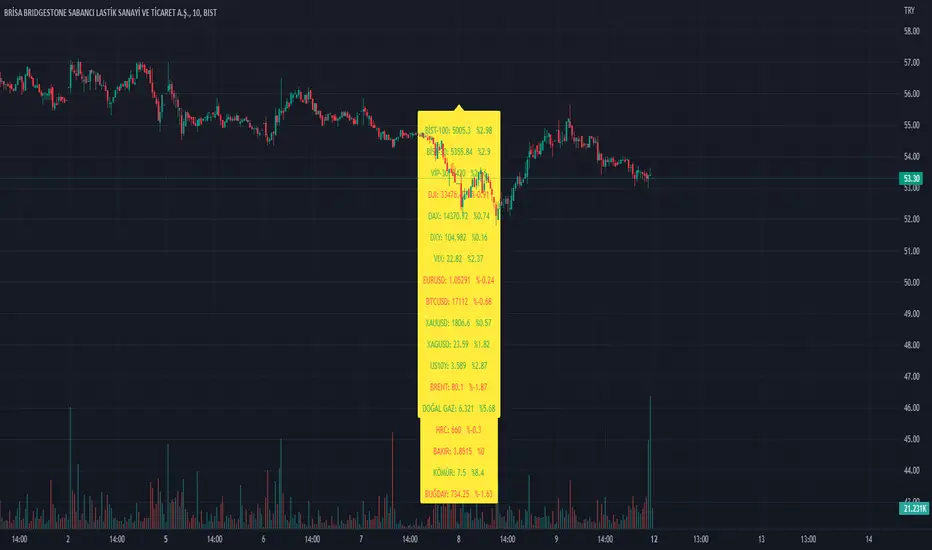
Index_and_Commodity_PricesThis indicator shows real-time current day-to-day performance of 18 different indices and commodities . Here is the list of different sector ETFs that this indicator tracks
/////INDEX//////
1. BİST-100 - XU0100 - TR- Index
2. BİST-30 - XU030 - TR - Index
3. VİOP-30 - XU030D1! - Index
4. DJI - Dow Jones - Index
5. DAX - DAX Index
6. VIX - Volatilite S&P Index
//////FOREX MARKET/////
7. DXY - U.S. Dollar Index
8. EURUSD -
9. BTCUSD -
10. XAUUSD -
11. XAGUSD -
//////COMMODITY///////
12. BR1! - Brent
13. NG1! - Natural Gas
14. HRC1! -
15. ZW1! -
16. HG1! -
17. DJUSCL -
///////OTHER///////
18. US10Y -
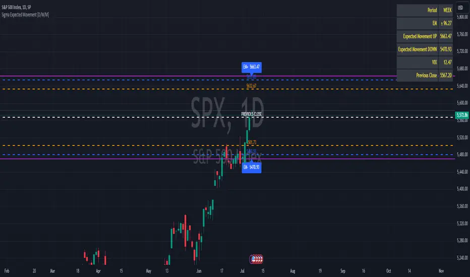
Sigma Expected Movement [D/W/M]Based on the VIX, this indicator shows the expected movement of a stock, ETF or index.
This indicator has two standard deviations that you can set for better guidance.
You can also adjust it for a result in one day, one week or one month.
Settings
* Period
* 1st Deviation: Default 68%
* 2nd Deviation: Default 90%
*Round To Integer: If it checked, it will search for the nearest integer (+/-). Optimal for people who do Options.
*Table Position: refers to which corner you want to put the table with information.
SPX_Strikes_OpcionSigmaThis is a tool to know the strikes to use for Iron Condor.
You can change the colors for the lines.
It uses the VIX to estimate the movement of the SPX index.

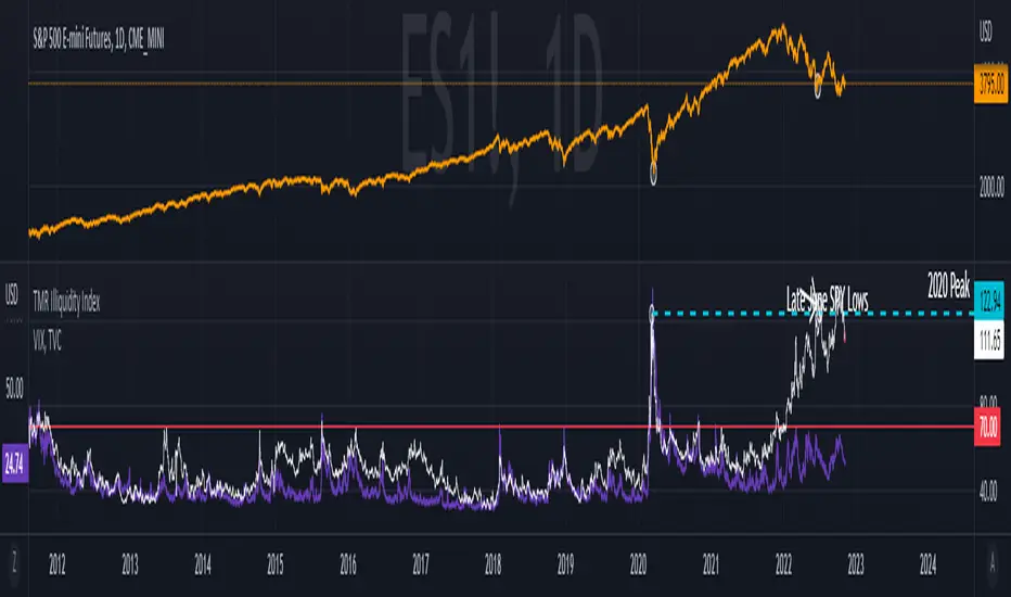
TMR Illiquidity Index
This index is a composition of all major market liquidity factors including:
- Volatility (Interest Rates, Bonds, and Equities)
- Federal Reserve Balance Sheet
- Dollar Demand
This indicator compiles the major concepts of liquidity that Market Radar illustrated over time into one easy-to-understand chart. This index measures how "illiquid" conditions are. The higher the index goes the more illiquid + volatile the market tends to behave, vis vera the lower it goes. This index allows us to evaluate the current health of market conditions and gain a visual on how liquidity is represented in the market.
Historically, we've noticed a very strong correlation between this index and the VIX, so another point to reference is where this index is in relation to the VIX.
Use the link below to obtain access to this indicator. Thank you
*This is not an indicator that claims any realized returns or an emphasis on potential returns. Any returns achieved with this strategy are not guaranteed and should not be indicative of future results. Nor should this be used as the sole decision prior to making an investment or as investment advice*
VOLQ Sigma TableThis indicator replaces the implied volatility of VOLQ with the daily volatility and reflects that value into the price on the NDX chart to create the VOLQ standard deviation table.
It will only be useful for stocks related to the Nasdaq Index.
For example, NDX, QQQ or so.
And we want to predict the range of weekly fluctuations by plotting those values as a line in the future.
It is expressed as High 2σ by adding the standard deviation 2 sigma value of the VOLQ value from last week's closing price.
It is expressed as High 1σ by adding the standard deviation 1 sigma value of the VOLQ value from last week's closing price.
It is expressed as Low 1σ by subtracting the standard deviation 1 sigma value of the VOLQ value from the closing price of the previous week.
It is expressed as Low 2σ by subtracting the standard deviation 2 sigma value of the VOLQ value from last week's closing price.
1day predicts daily fluctuations.
2day predicts 2-day fluctuations.
3day predicts 3-day fluctuations.
4day predicts 4-day fluctuations.
5day predicts 5-day fluctuations.
In the settings you can select the start date to display the VOLQ line via input.
-----------------------------
What motivated me to create this indicator?
From my point of view, the reason for classifying vix volq historical volatility (realized volatility) is that the most important point is that VIXX and VolQ are calculated from implied volatility. It can be standardized as one-month volatility. There are many strike prices, but exchanges use the implied volatility of options traded on their own exchanges.
Because historical volatility depends on how the period is set, to compare with VIXX, we compare it with a month, that is, 20 business days. One-month implied volatility means (actually different depending on the strike price), because option traders expect that the one-month volatility will be this much, and it is the volatility created by volatility trading.
So we see it as the volatility expected by derivatives traders, especially volatility traders.
I'm trying to infer what the market thinks will fluctuate this much from the numbers generated there.

Volatility Cone [Loxx]When it comes to forecasting volatility, it seems that the old axiom about weather is applicable: "Everyone talks about it, but no one can do much about it!" Volatility cones are a tool that may be useful in one’s attempt to do something about predicting the future volatility of an asset.
A "volatility cone" is a plot of the range of volatilities within a fixed probability band around the true parameter, as a function of sample length. Volatility cone is a visualization tool for the display of historical volatility term structure. It was introduced by Burghardt and Lane in early 1990 and is popular in the option trading community. This is mostly a static indicator due to processor load and is restricted to the daily time frame.
Why cones?
When we enter the options arena, in an effort to "trade volatility," we want to be able to compare current levels of implied volatility with recent historical volatility in an effort to assess the relative value of the option(s) under consideration Volatility cones can be an effective tool to help us with this assessment. A volatility cone is an analytical application designed to help determine if the current levels of historical or implied volatilities for a given underlying, its options, or any of the new volatility instruments, such as VolContractTM futures, VIX futures, or VXX and VXZ ETNs, are likely to persist in the future. As such, volatility cones are intended to help the user assess the likely volatility that an underlying will go on to display over a certain period. Those who employ volatility cones as a diagnostic tool are relying upon the principle of "reversion to the mean." This means that unusually high levels of volatility are expected to drift or move lower (revert) to their average (mean) levels, while relatively low volatility readings are expected to rise, eventually, to more "normal" values.
How to use
Suppose you want to analyze an options contract expiring in 3-months and this current option has an current implied volatility 25.5%. Suppose also that realized volatility (y-axis) at the 3-month mark (90 on the x-axis) is 45%, median in 35%, the 25th percentile is 30%, and the low is 25%. Comparing this range to the implied volatility you would maybe conclude that this is a relatively "cheap" option contract. To help you visualize implied volatility on the chart given an expiration date in bars, the indicator includes the ability to enter up to three expirations in bars and each expirations current implied volatility
By ascertaining the various historical levels of volatility corresponding to a given time horizon for the options futures under consideration, we’re better prepared to judge the relative "cheapness" or "expensiveness" of the instrument.
Volatility options
Close-to-Close
Close-to-Close volatility is a classic and most commonly used volatility measure, sometimes referred to as historical volatility .
Volatility is an indicator of the speed of a stock price change. A stock with high volatility is one where the price changes rapidly and with a bigger amplitude. The more volatile a stock is, the riskier it is.
Close-to-close historical volatility calculated using only stock's closing prices. It is the simplest volatility estimator. But in many cases, it is not precise enough. Stock prices could jump considerably during a trading session, and return to the open value at the end. That means that a big amount of price information is not taken into account by close-to-close volatility .
Despite its drawbacks, Close-to-Close volatility is still useful in cases where the instrument doesn't have intraday prices. For example, mutual funds calculate their net asset values daily or weekly, and thus their prices are not suitable for more sophisticated volatility estimators.
Parkinson
Parkinson volatility is a volatility measure that uses the stock’s high and low price of the day.
The main difference between regular volatility and Parkinson volatility is that the latter uses high and low prices for a day, rather than only the closing price. That is useful as close to close prices could show little difference while large price movements could have happened during the day. Thus Parkinson's volatility is considered to be more precise and requires less data for calculation than the close-close volatility. One drawback of this estimator is that it doesn't take into account price movements after market close. Hence it systematically undervalues volatility. That drawback is taken into account in the Garman-Klass's volatility estimator.
Garman-Klass
Garman Klass is a volatility estimator that incorporates open, low, high, and close prices of a security.
Garman-Klass volatility extends Parkinson's volatility by taking into account the opening and closing price. As markets are most active during the opening and closing of a trading session, it makes volatility estimation more accurate.
Garman and Klass also assumed that the process of price change is a process of continuous diffusion (geometric Brownian motion). However, this assumption has several drawbacks. The method is not robust for opening jumps in price and trend movements.
Despite its drawbacks, the Garman-Klass estimator is still more effective than the basic formula since it takes into account not only the price at the beginning and end of the time interval but also intraday price extremums.
Researchers Rogers and Satchel have proposed a more efficient method for assessing historical volatility that takes into account price trends. See Rogers-Satchell Volatility for more detail.
Rogers-Satchell
Rogers-Satchell is an estimator for measuring the volatility of securities with an average return not equal to zero.
Unlike Parkinson and Garman-Klass estimators, Rogers-Satchell incorporates drift term (mean return not equal to zero). As a result, it provides a better volatility estimation when the underlying is trending.
The main disadvantage of this method is that it does not take into account price movements between trading sessions. It means an underestimation of volatility since price jumps periodically occur in the market precisely at the moments between sessions.
A more comprehensive estimator that also considers the gaps between sessions was developed based on the Rogers-Satchel formula in the 2000s by Yang-Zhang. See Yang Zhang Volatility for more detail.
Yang-Zhang
Yang Zhang is a historical volatility estimator that handles both opening jumps and the drift and has a minimum estimation error.
We can think of the Yang-Zhang volatility as the combination of the overnight (close-to-open volatility ) and a weighted average of the Rogers-Satchell volatility and the day’s open-to-close volatility . It considered being 14 times more efficient than the close-to-close estimator.
Garman-Klass-Yang-Zhang
Garman Klass is a volatility estimator that incorporates open, low, high, and close prices of a security.
Garman-Klass volatility extends Parkinson's volatility by taking into account the opening and closing price. As markets are most active during the opening and closing of a trading session, it makes volatility estimation more accurate.
Garman and Klass also assumed that the process of price change is a process of continuous diffusion (geometric Brownian motion). However, this assumption has several drawbacks. The method is not robust for opening jumps in price and trend movements.
Despite its drawbacks, the Garman-Klass estimator is still more effective than the basic formula since it takes into account not only the price at the beginning and end of the time interval but also intraday price extremums.
Researchers Rogers and Satchel have proposed a more efficient method for assessing historical volatility that takes into account price trends. See Rogers-Satchell Volatility for more detail.
Exponential Weighted Moving Average
The Exponentially Weighted Moving Average (EWMA) is a quantitative or statistical measure used to model or describe a time series. The EWMA is widely used in finance, the main applications being technical analysis and volatility modeling.
The moving average is designed as such that older observations are given lower weights. The weights fall exponentially as the data point gets older – hence the name exponentially weighted.
The only decision a user of the EWMA must make is the parameter lambda. The parameter decides how important the current observation is in the calculation of the EWMA. The higher the value of lambda, the more closely the EWMA tracks the original time series.
Standard Deviation of Log Returns
This is the simplest calculation of volatility . It's the standard deviation of ln(close/close(1))
Sampling periods used
5, 10, 20, 30, 60, 90, 120, 150, 180, 210, 240, 270, 300, 330, and 360
Historical Volatility plot
Purple outer lines: High and low volatility values corresponding to x-axis time
Blue inner lines: 25th and 75th percentiles of volatility corresponding to x-axis time
Green line: Median volatility values corresponding to x-axis time
White dashed line: Realized volatility corresponding to x-axis time
Additional things to know
Due to UI constraints on TradingView it will be easier to visualize this indicator by double-clicking the bottom pane where it appears and then expanded the y- and x-axis to view the entire chart.
You can click on each point on the graph to see what the volatility of that point is.
Option expiration dates will show up as large dots on the graph. You can input your own values in the settings.

COT Net Positions Divergence, 5% High and Low of HistoryThis is the COT Netto Indicator with a Line of the Highest and Lowest Points in History and a 5 % Line of the Highest or Lowest Value calculated to the 0-Line.
There are also programmed Divergences to 3 different Calculations.
This only works with Futures .
--Energies, Metals, Bonds, Softs, Currencies, Livestock, live cattle , feeder cattle, lean hogs , index--
Open Interest for:
ZW, ZC , ZS, ZM, ZL, ZO, ZR, CL , RB, HO, NG , GC , SI, HG, PA, PL, ZN, ZB, ZT, ZF, CC , CT , KC, SB , JO, LB , AUDUSD , GBPUSD , USDCAD , EURUSD , USDJPY , USDCHF , USDMXN , NZDUSD , USDRUB , DX , BTC , ETH, LE, GF , HE, NQ, NDX, ES, SPX , RTY, VIX
If you want to know more just give me a message.

WillSpreadIntermarket + Williams Spread + POIV + ADVolumen sπThe Indicator is a combination of different types of measurements to the Price Action.
1.1 RSI Contra Input like Dollar Index (white Line)
1.2 RSI (colored line)
If you switch off 1.1. and 1.2. you can use the Willspread, POIV or AD Volume as a Indicator
2. The WillSpread is set to measure your Symbol to another chosen Market like Dollar as Contra . But you can switch also between different markets.
2. Accumulation/Distribution with True Range of High or Low including OpenInterest. This only works with Futures .
--Energies, Metals, Bonds, Softs, Currencies, Livestock, live cattle , feeder cattle, lean hogs , index--
Open Interest for:
ZW, ZC , ZS, ZM, ZL, ZO, ZR, CL , RB, HO, NG , GC , SI, HG, PA, PL, ZN, ZB, ZT, ZF, CC , CT , KC, SB , JO, LB , AUDUSD , GBPUSD , USDCAD , EURUSD , USDJPY , USDCHF , USDMXN , NZDUSD , USDRUB , DX , BTC , ETH, LE, GF , HE, NQ, NDX, ES, SPX , RTY, VIX ,
3. Accumulation/Distribution with True Range of High or Low including Volume .
4. The color shows if the Market has positive or negative (RSI, Willspread, Volume or Open Interest)
5. The Indicator also shows Divergences to Price and RSI or Willspread Movements.
If you want to have more information just give me a message.
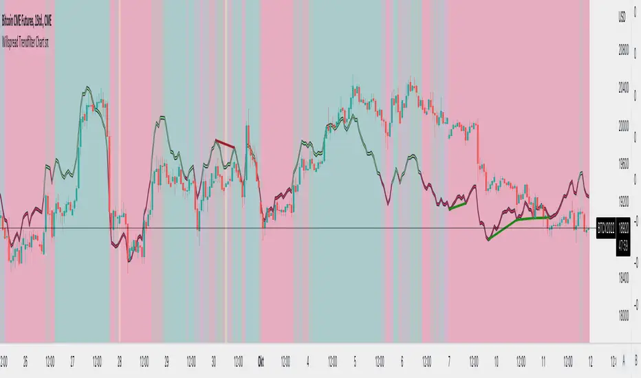
Willspread Chart + POIV & ADVolumen TrendColor sπThe Indicator is a combination of different types of measurements to the Price Action.
1. Spread: The Spread is set to measure your Symbol to another chosen Market like Dollar as Contra . But you can switch also between different markets.
2. Accumulation/Distribution with True Range of High or Low including OpenInterest. This only works with Futures .
--Energies, Metals, Bonds, Softs, Currencies, Livestock, live cattle , feeder cattle, lean hogs , index--
Open Interest for:
ZW, ZC, ZS, ZM, ZL, ZO, ZR, CL, RB, HO, NG, GC, SI, HG, PA, PL, ZN, ZB, ZT, ZF, CC, CT, KC, SB, JO, LB, AUDUSD, GBPUSD, USDCAD, EURUSD, USDJPY, USDCHF, USDMXN, NZDUSD, USDRUB, DX, BTC, ETH, LE, GF, HE, NQ, NDX, ES, SPX, RTY, VIX,
3. Accumulation/Distribution with True Range of High or Low including Volume .
4. The color shows if the Market has positive or negative (Willspread, Volume or Open Interest)
5. The Indicator also shows Divergences to Price and Willspread Movements.
If you want to have more information just give me a message.
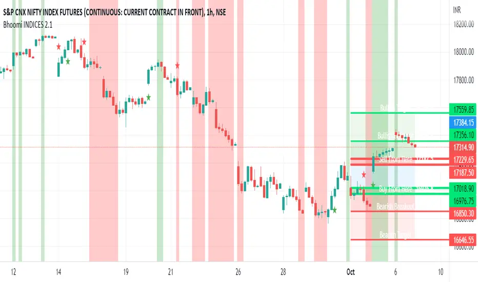
Bhoomi INDICES 2.1Bhoomi 2.0 is a Market Directional Indicator. It predicts the same by plotting respective zones and Labels.
To request access and to know more Information please contact us here.
Bhoomi 2.0 INDICES works on the Major World Indices as listed on tradingview. More to come in future, but please find the current list below. If you do not see the INDEX you trades, please comment below and we will add that for you.
"SPCFD:SPX"
"TVC:IXIC"
"DJCFD:DJI"
"TVC:NI225"
"CBOE:VIX"
"TSX:TSX"
"TVC:UKX"
"XETR:DAX"
"EURONEXT:PX1"
"EURONEXT:PX1GR"
"EURONEXT:PX1NR"
"TVC:FTMIB"
"TVC:NI225"
"TVC:KOSPI"
"TVC:SHCOMP "
"SZSE:399001"
"HSI:HSI"
"TVC:STI"
"ASX:XJO"
"NZX:NZ50G"
"TWSE:TAIEX"
"FTSEMYX:FBMKLCI"
"IDX:COMPOSITE"
"TVC:SX5E"
"BME:IBC"
"SIX:SMI"
"GPW:WIG20"
"EURONEXT:AEX"
"EURONEXT:BEL20"
"INDEX:BEL20"
"MOEX:IMOEX"
"OMXHEX:OMXH25"
"OMXICE:OMXI10"
"OMXSTO:OMXS30"
"OMXCOP:OMXC25"
"BELEX:BELEX15"
"OMXRSE:OMXRGI"
"OMXTSE:OMXTGI"
"OMXVSE:OMXVGI"
"BIST:XU100"
"TASE:TA35"
"TVC:SA40"
"NSE:NIFTY"
"BSE:SENSEX"
"DFM:DFMGI"
"TADAWUL:TASI"
"QSE:GNRI"
"BAHRAIN:BSEX"
"NSENG:NSE30"
"EGX:EGX30"
"BMFBOVESPA:IBOV"
"BMV:ME"
"BYMA:IMV"
"BVC:ICAP"
"BCS:SP_IPSA"
"BVL:SPBLPGPT"
"CURRENCYCOM:US500"
"CURRENCYCOM:US300"
"CURRENCYCOM:US100"
"CURRENCYCOM:US30"
"INDEX:DEU30"
"CBOE:VXD"
INDEX:DE40
Implied Volatility Estimator using Black Scholes [Loxx]Implied Volatility Estimator using Black Scholes derives a estimation of implied volatility using the Black Scholes options pricing model. The Bisection algorithm is used for our purposes here. This includes the ability to adjust for dividends.
Implied Volatility
The implied volatility (IV) of an option contract is that value of the volatility of the underlying instrument which, when input in an option pricing model (such as Black–Scholes), will return a theoretical value equal to the current market price of that option. The VIX , in contrast, is a model-free estimate of Implied Volatility. The latter is viewed as being important because it represents a measure of risk for the underlying asset. Elevated Implied Volatility suggests that risks to underlying are also elevated. Ordinarily, to estimate implied volatility we rely upon Black-Scholes (1973). This implies that we are prepared to accept the assumptions of Black Scholes (1973).
Inputs
Spot price: select from 33 different types of price inputs
Strike Price: the strike price of the option you're wishing to model
Market Price: this is the market price of the option; choose, last, bid, or ask to see different results
Historical Volatility Period: the input period for historical volatility ; historical volatility isn't used in the Bisection algo, this is to serve as a comparison, even though historical volatility is from price movement of the underlying asset where as implied volatility is the volatility of the option
Historical Volatility Type: choose from various types of implied volatility , search my indicators for details on each of these
Option Base Currency: this is to calculate the risk-free rate, this is used if you wish to automatically calculate the risk-free rate instead of using the manual input. this uses the 10 year bold yield of the corresponding country
% Manual Risk-free Rate: here you can manually enter the risk-free rate
Use manual input for Risk-free Rate? : choose manual or automatic for risk-free rate
% Manual Yearly Dividend Yield: here you can manually enter the yearly dividend yield
Adjust for Dividends?: choose if you even want to use use dividends
Automatically Calculate Yearly Dividend Yield? choose if you want to use automatic vs manual dividend yield calculation
Time Now Type: choose how you want to calculate time right now, see the tool tip
Days in Year: choose how many days in the year, 365 for all days, 252 for trading days, etc
Hours Per Day: how many hours per day? 24, 8 working hours, or 6.5 trading hours
Expiry date settings: here you can specify the exact time the option expires
*** the algorithm inputs for low and high aren't to be changed unless you're working through the mathematics of how Bisection works.
Included
Option pricing panel
Loxx's Expanded Source Types
Related Indicators
Cox-Ross-Rubinstein Binomial Tree Options Pricing Model

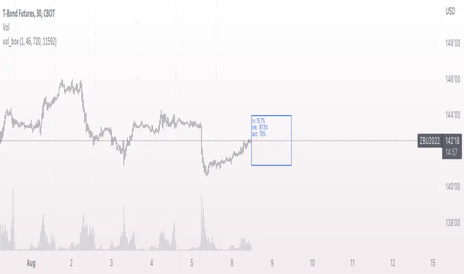
vol_coneDraws a volatility cone on the chart, using the contract's realized volatility (rv). The inputs are:
- window: the number of past periods to use for computing the realized volatility. VIX uses 30 calendar days, which is 21 trading days, so 21 is the default.
- stdevs: the number of standard deviations that the cone will cover.
- periods to project: the length of the volatility cone.
- periods per year: the number of periods in a year. for a daily chart, this is 252. for a thirty minute chart on a contract that trades 23 hours a day, this is 23 * 2 * 252 = 11592. for an accurate cone, this input must be set correctly, according to the chart's time frame.
- history: show the lagged projections. in other words, if the cone is set to project 21 periods in the future, the lines drawn show the top and bottom edges of the cone from 23 periods ago.
- rate: the current interest or discount rate. this is used to compute the forward price of the underlying contract. using an accurate forward price allows you to compare the realized volatility projection to the implied volatility projections derived from options prices.
Example settings for a 30 minute chart of a contract that trades 23 hours per day, with 1 standard deviation, a 21 day rv calculation, and half a day projected:
- stdevs: 1
- periods to project: 23
- window: 23 * 2 * 21 = 966
- periods per year: 23 * 2 * 252 = 11592
Additionally, a table is drawn in the upper right hand corner, with several values:
- rv: the contract's current realized volatility.
- rnk: the rv's percentile rank, compared to the rv values on past bars.
- acc: the proportion of times price settled inside, versus outside, the volatility cone, "periods to project" into the future. this should be around 65-70% for most contracts when the cone is set to 1 standard deviation.
- up: the upper bound of the cone for the projection period.
- dn: the lower bound of the cone for the projection period.
Limitations:
- pinescript only seems to be able to draw a limited distance into the future. If you choose too many "periods to project", the cone will start drawing vertically at some limit.
- the cone is not totally smooth owing to the facts a) it is comprised of a limited number of lines and b) each bar does not represent the same amount of time in pinescript, as some cross weekends, session gaps, etc.

Magic Line 2.0 βWELCOME TO MAGIC LINE 2.0 β
This indicator is intended to show current market sentiment – a reflection of that which market internals (VIX, ADD, TICK, VOLD and TRIN) are doing.
The indicator does not make any reference to, or have any knowledge of, SPX price action.
If Magic Line is green, that suggests that market sentiment is rising. If Magic Line is red, that suggests that market sentiment is falling.
If Magic Line is above zero, that usually suggests an overall positive market sentiment, and if it is only slightly red, then SPX price action could still be bullish. And vice versa.
USERS ARE ENCOURAGED TO:
- Adjust the Main Parameters … find out what works for you!
- Adjust the Flat Zone … if you are using a longer timeframe, a higher value in the Flat Zone might be beneficial
Users are also encouraged to play with the Internals, in particular:
- Turn the individual Internals on / off … experiment; what happens if you turn off everything, other than say ADD?
- Adjust the relative weighting of each Internal
It's not really recommended to play with the EMA weightings (either of the internals, or the fast / slow lines) - but you're welcome to do so, if you wish!
ADDITIONAL NOTES
Market internals are often not very beneficial for trading futures, or long options. If you’re not careful, you can get badly chopped up.
If you set Grind Correction to max. (100) you’ll get a positive trend even on a grind day. The downside is that on a more volatile day, the indicator will be a little slower in responding.
If Magic Line is flat, or just wandering around in the chop zone, SPX price action may well be flat, slowly grinding, or choppy.
This has been back-tested and forward-tested during 2022 (April – August) market conditions (Trading View doesn’t give short-timeframe data further back) . If market conditions change significantly, I may find that I need to adjust / update some of the coding. TBA …
Disclaimer; it is of course recommended to have all market internals open individually, rather than relying on a ‘Market Internals Smoothie’ for making trading decisions! :)

vol_boxA simple script to draw a realized volatility forecast, in the form of a box. The script calculates realized volatility using the EWMA method, using a number of periods of your choosing. Using the "periods per year", you can adjust the script to work on any time frame. For example, if you are using an hourly chart with bitcoin, there are 24 periods * 365 = 8760 periods per year. This setting is essential for the realized volatility figure to be accurate as an annualized figure, like VIX.
By default, the settings are set to mimic CBOE volatility indices. That is, 252 days per year, and 20 period window on the daily timeframe (simulating a 30 trading day period).
Inside the box are three figures:
1. The current realized volatility.
2. The rank. E.g. "10%" means the current realized volatility is less than 90% of realized volatility measures.
3. The "accuracy": how often price has closed within the box, historically.
Inputs:
stdevs: the number of standard deviations for the box
periods to project: the number of periods to forecast
window: the number of periods for calculating realized volatility
periods per year: the number of periods in one year (e.g. 252 for the "D" timeframe)
DCVIXThe DCVIX is a modified version of the Williams Vix Fix indicator.
It is a volatility based indicator based on Bollinger Bands and Standard Deviations. It is designed to assist you in identifying times of high and low volatility.
During times of high volatility (squeeze), price action often finds a local bottom. During times of low volatility, price action often finds a local top.
The DCVIX will print aqua bars on the histogram during times of high volatility (squeeze). This will assist you in identifying potential price action bottom.
The DCVIX also shows the changes in volatility based on the size of the bars. This may also assist you in identifying breakouts and even potential market tops.
This indicator is designed to be used in conjunction with other forms of confluence.
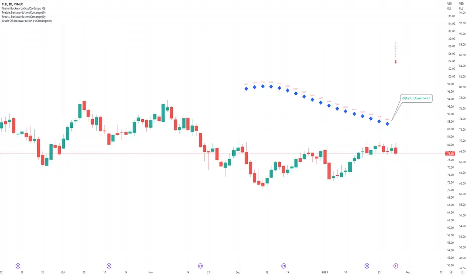
Crude Oil: Backwardation Vs ContangoCrude Oil, CL
Plots Futures Curve: Futures contract prices over the next 3.5 years; to easily visualize Backwardation Vs Contango(carrying charge) markets.
Carrying charge (contract prices increasing into the future) = normal, representing the costs of carrying/storage of a commodity. When this is flipped to Backwardation(As the above; contract prices decreasing into the future): it's a bullish sign: Buyers want this commodity, and they want it NOW.
Note: indicator does not map to time axis in the same way as price; it simply plots the progression of contract months out into the future; left to right; so timeframe DOESN'T MATTER for this plot
TO UPDATE (every year or so): in REQUEST CONTRACTS section, delete old contracts (top) and add new ones (bottom). Then in PLOTTING section, Delete old contract labels (bottom); add new contract labels (top); adjust the X in 'bar_index-(X+_historical)' numbers accordingly
This is one of several similar Futures Curve indicators: Meats | Metals | Grains | VIX | Crude Oil
If you want to build from this; to work on other commodities; be aware that Tradingview limits the number of contract calls to 40 (hence the multiple indicators)
Tips:
-Right click and reset chart if you can't see the plot; or if you have trouble with the scaling.
-Right click and add to new scale if you prefer this not to overlay directly on price. Or move to new pane below.
-If this takes too long to load (due to so many security calls); comment out the more distant future half of the contracts; and their respective labels. Or comment out every other contract and every other label if you prefer.
--Added historical input: input days back in time; to see the historical shape of the Futures curve via selecting 'days back' snapshot
updated 20th June 2022
© twingall