Multi-Indicator Trading DashboardMulti-Indicator Trading Dashboard: Comprehensive Analysis and Actionable Signals
This Pine Script indicator, "Multi-Indicator Trading Dashboard," provides a comprehensive overview of key market indicators and generates actionable trading signals, all presented in a clear, easy-to-read table format on your TradingView chart.
Key Features:
Real-time Indicator Analysis: The dashboard displays real-time values and signals for:
RSI (Relative Strength Index): Tracks overbought and oversold conditions.
MACD (Moving Average Convergence Divergence): Identifies trend changes and momentum.
ADX (Average Directional Index): Measures trend strength.
Volatility (ATR-based): Estimates volatility as a percentage, acting as a VIX proxy for single-symbol charts.
Trend Determination: Analyzes 20, 50, and 200-period EMAs to provide a clear trend assessment (Strong Bullish, Cautious Bullish, Cautious Bearish, Strong Bearish).
Combined Trading Signals: Integrates signals from RSI, MACD, ADX, and trend analysis to generate a combined "Buy," "Sell," or "Neutral" action signal.
User-Friendly Table Display: Presents all information in a neatly organized table, positioned at the top-right of your chart.
Visual Chart Overlays: Plots 20, 50, and 200-period EMAs directly on the chart for visual trend confirmation.
Background Color Alerts: Colors the chart's background based on the "Buy" or "Sell" action signal for quick visual cues.
Customizable Inputs: Allows you to adjust key parameters like RSI lengths, MACD settings, ADX thresholds, and EMA periods.
How It Works:
Indicator Calculations: The script calculates RSI, MACD, ADX, and a volatility proxy (ATR) using standard Pine Script functions.
Trend Analysis: It compares 20, 50, and 200-period EMAs to determine the overall trend direction.
Individual Signal Generation: It generates individual "Buy," "Sell," or "Neutral" signals based on RSI, MACD, and ADX values.
Combined Signal Logic: It combines the individual signals and trend analysis, assigning a "Buy" or "Sell" action only when at least two indicators align.
Table Display: It creates a table and populates it with the calculated values, signals, and trend information.
Chart Overlays: It plots the EMAs on the chart and colors the background based on the combined action signal.
Use Cases:
Quick Market Overview: Get a snapshot of key market indicators and trend direction at a glance.
Confirmation Tool: Use the combined signals to confirm your existing trading strategies.
Educational Purpose: Learn how different indicators interact and influence trading decisions.
Automated Alerting: Set up alerts based on the "Buy" or "Sell" action signals.
Customization:
Adjust the input parameters to fine-tune the indicator's sensitivity to your trading style and the specific market you're analyzing.
Disclaimer:
This indicator is for informational and educational purposes only and should not be considered financial advice. Always conduct thorough research and consult with 1 a qualified professional before making any 2 trading decisions.
Wyszukaj w skryptach "vix"

AlphaSync | QuantEdgeB📢 Introducing AlphaSync by QuantEdgeB
🛠️ Overview
AlphaSync is a comprehensive medium-term market guidance system designed for major assets such as BTC, ETH, and SOL. This system helps traders determine the overall market direction by integrating three universal strategies (EvolveXSync, ApexSync, QBHV Sync) and a Hybrid strategy (HybridSync).
🚀 What Makes AlphaSync Unique?
✅ Multi-Strategy Fusion → A robust blend of technical, economic, on-chain, and volatility-driven insights.
✅ HybridSync Component (90% Non-Price Factors) → Incorporates macro and liquidity signals to balance pure price-based models.
✅ Structured Decision-Making → The Trend Confluence score aggregates all sub-strategies, providing a unified market signal.
__________________________________________________________________________________
✨ Key Features
🔹 HybridSync (Hybrid Model)
Utilizes on-chain, economic, liquidity, and volatility factors to provide a fundamental market risk outlook. Unlike technical models, it derives signals primarily from macroeconomic indicators, risk appetite gauges, and capital flows.
🔹 EvolveXSync, & ApexSync (Technical Strategies)
Both strategies are purely price-based, relying on volatility-adjusted trend models, adaptive moving averages, and statistical deviations to confirm bullish or bearish trends.
🔹 QBHV Sync (Momentum & Deviation-Based System)
A fusion of momentum-deviation and a volatility-driven trend confirmation model, designed to detect shifts in momentum while filtering out market noise.
🔹 Trend Confluence (Final Aggregated Signal)
A weighted combination of all four models, delivering a single, structured signal to eliminate conflicting indicators and refine decision-making.
__________________________________________________________________________________
📊 How It Works
1️⃣ HybridSync – Non-Price Market Structure Analysis
HybridSync is an economic and liquidity-based framework, integrating macro variables, credit spreads, volatility indices, capital flows, and on-chain dynamics to assess risk-on/risk-off conditions.
📌 Key Components:
✔ On-Chain Metrics → Tracks investor behavior, exchange flows, and market cap ratios.
✔ Liquidity Indicators → Monitors global money supply (M2), Federal Reserve balance sheet, credit markets, and capital flows.
✔ Volatility & Risk Metrics → Uses MOVE, VIX, VVIX ratios, and bond market stress indicators to identify risk sentiment shifts.
🔹 Why HybridSync?
• Price alone does not dictate the market; macro liquidity and risk factors are often leading indicators of price movement, especially when it comes to risk assets such as cryptocurrencies.
• Improves decision-making in uncertain market environments, particularly during high-volatility or trendless conditions.
2️⃣ EvolveXSync, & ApexSync – Trend-Following & Volatility Models
Both EvolveXSync, & ApexSync are technical strategies, independently designed to capture trend strength and volatility dynamics.
📌 Core Mechanisms:
✔ VIDYA-Based Trend Detection → Adaptive moving averages adjust dynamically to price swings.
✔ SD-Filtered EMA Models → Uses normalized standard deviation levels to confirm trend validity.
✔ ATR-Adjusted Breakout Filters → Prevents false signals by incorporating dynamic volatility assessments.
🔹 Why Two UniStrategies?
• EvolveXSync, & ApexSync have different calculation methods, providing diverse perspectives on trend confirmation.
• Ensures robustness by mitigating overfitting to a single price-based model.
3️⃣ QBHV Sync – Momentum Deviation & Trend Confirmation
This component blends Bollinger Momentum Deviation (BMD) with a percentile-based trend model to confirm trend shifts.
📌 Core Components:
✔ Bollinger Momentum Deviation → A normalized SMA-SD filter detects overbought/oversold conditions.
✔ Percentile-Based Trend Confirmation → Ensures trends align with long-term volatility structure.
✔ Adaptive Signal Filtering → Prevents unnecessary trade signals by refining thresholds dynamically.
🔹 Why QBHV Sync?
• Adds a statistical layer to trend assessment, preventing whipsaws in volatile conditions.
• Complements HybridSync by ensuring price movements align with broader market forces.
4️⃣ Trend Confluence – The Final Aggregated Signal
AlphaSync blends HybridSync, EvolveXSync, ApexSync, and QBHV Sync into one final output.
📌 How It’s Weighted ? Equal Weight to remove any bias and over-reliance on one input.
✔ HybridSync (Macro & On-Chain Factors) → 25% Weight
✔ UniStrat V1 (Pure Trend) → 25% Weight
✔ UniStrat V2 (Trend + ATR) → 25% Weight
✔ QBHV Sync (Momentum & Deviation) → 25% Weight
🔹 Why Merge These Into One System?
The core philosophy behind AlphaSync is to create a holistic, structured decision-making framework that eliminates the weaknesses of single-method trading approaches. Instead of relying solely on technical indicators, which can lag or fail in macro-driven markets, AlphaSync blends price-based trend signals with macroeconomic, liquidity, and risk-adjusted models.
This multi-layered approach ensures that the system:
✔ Adapts dynamically to different market environments.
✔ Eliminates conflicting signals by creating a structured confluence score.
✔ Prevents over-reliance on a single market model, improving robustness.
📌 Final Signal Interpretation:
✅ Long Signal → AlphaSync Score > Long Threshold
❌ Short Signal → AlphaSync Score < Short Threshold
__________________________________________________________________________________
👥 Who Should Use AlphaSync?
✅ Medium-Term Traders & Portfolio Managers → Ideal for traders who require macro-confirmed trend signals.
✅ Systematic & Quantitative Traders → Designed for algorithmic integration and structured decision-making.
✅ Long-Term Position Traders → Helps identify major trend shifts and capital rotation opportunities.
✅ Risk-Conscious Investors → Incorporates macro volatility assessments to minimize unnecessary risk exposure.
__________________________________________________________________________________
📊 Backtest Mode - Evaluating Historical Performance
AlphaSync includes a fully integrated backtest module, allowing traders to assess its historical performance metrics.
🔹 Backtest Metrics Displayed:
✔ Equity Max Drawdown → Measures historical peak loss.
✔ Profit Factor → Evaluates profitability vs. loss ratio.
✔ Sharpe & Sortino Ratios → Risk-adjusted return metrics.
✔ Total Trades & Win Rate → Performance across different market cycles.
✔ Half Kelly Criterion → Optimal position sizing based on historical returns.
📌 Disclaimer:Backtest results are based on past performance and do not guarantee future success. Always incorporate real-time validation and risk management in live trading.
🚀 Why This Matters?
✅ Strategy Validation → See how AlphaSync performs across various market conditions.
✅ Customizable Analysis → Adjust parameters and observe real-time backtest results.
✅ Risk Awareness → Understand potential drawdowns before deploying capital.
Behavior Across Crypto Majors:
BTC
ETH
SOL
📌 Disclaimer: Backtest results are based on historical data and past market behavior. Performance is not indicative of future results and should not be considered financial advice. Always conduct your own backtests and research before making any investment decisions. 🚀
__________________________________________________________________________________
📌 Customization & Default Settings
📌 AlphaSync Input Parameters & Default Values
🔹 Strategy Configuration
• Color Mode → "Strategy"
• Extra Plots → true
• Long/Cash Signal Label → false
• AlphaSync Dashboard → true
• Enable BackTest Table → false
• Enable Equity Curve → false
• Table Position → "Bottom Left"
• Start Date → '01 Jan 2018 00:00'
• AlphaSync Long Threshold → 0.00
• AlphaSync Short Threshold → 0.00
🔹 QBHV.Sync
• DEMA Source → close
• DEMA Length → 14
• Percentile Length → 35
• ATR Length → 14
• Long Multiplier (ATR Up) → 1.8
• Short Multiplier (ATR Down) → 2.5
• Momentum Length → 8
• Momentum Source → close
• Base Length (SMA Calculation) → 40
• Source for BMD → close
• Standard Deviation Length → 30
• SD Multiplier → 0.7
• Long Threshold → 72
• Short Threshold → 59
🔹 EvolveXSync Configuration
• VIDYA Loop Length → 2
• VIDYA Loop Hist Length → 5
• Vidya Loop Long Threshold → 40
• Vidya Loop Short Threshold → 10
• Dynamic EMA Length → 12
• Dynamic EMA SD Length → 30
• Dynamic EMA Upper SD Weight → 1.032
• Dynamic EMA Lower SD Weight → 1.02
• SD Median Length → 12
• Normalized Median Length → 20
• Median SD Length → 30
• Median Long SD Weight → 0.98
• Median Short SD Weight → 1.04
🔹ApexSync Configuration
• DEMA Length → 30
• DEMA ATR Length → 14
• DEMA ATR Multiplier → 1.0
• G-VIDYA Length → 9
• G-VIDYA Hist Length → 30
• VIDYA ATR Length → 14
• VIDYA ATR Multiplier → 1.7
• SD Kijun Length → 24
• Normalized Kijun Length → 50
• KIJUN SD Length → 32
• KIJUN Long SD Weight → 0.98
• KIJUN Short SD Weight → 1.02
🔹 Risk Mosaic (Macro & Liquidity Component)
• Risk Signal Smoothing Length (EMA) → 8
🚀 AlphaSync is fully customizable to match different market conditions and trading styles
🚀 By default, AlphaSync is optimized for structured, medium-term market guidance.
__________________________________________________________________________________
📌 Conclusion
AlphaSync redefines medium-term trend analysis by merging technical, fundamental, and quantitative models into one unified system. Unlike traditional strategies that rely solely on price action, AlphaSync incorporates macroeconomic and liquidity factors, ensuring a more holistic market view.
🔹 Key Takeaways:
1️⃣ Hybrid + Technical Fusion – Balances macro & price-based strategies for stronger decision-making.
2️⃣ Multi-Factor Trend Aggregation – Reduces false signals by merging independent methodologies.
3️⃣ Structured, Data-Driven Approach – Designed for quantitative trading and risk-aware portfolio allocation.
📌 Master the market with precision and confidence | QuantEdgeB
🔹 Disclaimer: Past performance is not indicative of future results. No trading strategy can guarantee success in financial markets.
🔹 Strategic Advice: Always backtest, optimize, and align parameters with your trading objectives and risk tolerance before live trading.

Capitulation Volume Detector by @RhinoTradezOverview
Hey traders, want to catch the market when it’s totally losing it? The Capitulation Volume Detector is your go-to buddy for spotting those wild moments when panic selling takes over. Picture this: prices plummet, volume explodes, and everyone’s bailing out—that’s capitulation, and it might just signal a turning point. This script throws a bright marker on your chart whenever the chaos hits, so you can decide if it’s time to jump in or sit tight. Built fresh in Pine Script v6, it’s sleek, customizable, and packs an alert to keep you posted—perfect for stocks, indices like SPY, or even crypto chaos.
Inspired by epic sell-offs like March 2020’s COVID crash, this tool’s here to help you navigate the storm with a smile (and maybe a profit).
What It Does
Capitulation volume is that “everyone’s out!” moment: a steep price drop meets a massive volume surge, hinting that sellers are tapped out. It’s not a guaranteed reversal—sometimes the bleeding continues—but it’s a loud clue that fear’s peaked. Here’s the magic:
Volume Check : Measures current volume against a customizable average (default: 20 bars).
Price Plunge : Tracks the percentage drop from the last close.
Capitulation Cal l: When volume rockets past your threshold (e.g., 2x average) and price tanks (e.g., -5%), you get a red triangle above the bar.
Stay Alert : Fires off a detailed message (e.g., “Volume 300M > 200M, Drop -10%”) so you’re never caught off guard.
Think of it as your market meltdown radar—simple, effective, and ready to roll.
Functionality Breakdown
Volume Surge Spotter :
Uses a 20-bar Simple Moving Average (SMA) of volume as your baseline.
Flags any bar where volume exceeds this average by your chosen multiplier (default: 2x).
Price Drop Detector :
Calculates the percentage change from the prior close.
Triggers when the drop’s bigger than your set limit (default: -5%).
Capitulation Marker:
Combines both signals: high volume + sharp drop = capitulation.
Slaps a red triangle above the bar for instant “whoa, there it is!” vibes.
Real-Time Alerts :
Sends a custom alert with volume and drop details, keeping you in the loop without babysitting the chart.
Customization Options
Tune it to your trading style with these easy settings:
Volume Multiplier (x Avg): Starts at 2.0 (2x average volume). Bump it to 3.0 for only the wildest spikes or dial it to 1.5 for more frequent catches. Range: 1.0-10.0, step 0.1.
Price Drop Threshold (%): Default 5.0 (a -5% drop). Go big with 10.0 for crash-level falls or ease to 3.0 for lighter dips. Range: 1.0-20.0, step 0.1.
Average Volume Period: Default 20 bars. Stretch it to 50 for a broader view or shrink to 10 for quick reactions. Range: 1-100.
Capitulation Marker Color: Red by default—because panic’s loud! Switch it to blue, green, or pink to match your chart’s personality.
How to Use It
Drop It On : Add it to any chart with volume data—SPY daily for market moves, /ES 15-minute for intraday action, or your go-to stock.
Play with Settings : Hit the indicator’s config gear and tweak the multiplier, drop threshold, period, or marker color to fit your vibe.
Set an Alert : Right-click the indicator, add an alert with “Any alert() function call,” and get pinged when capitulation strikes.
Watch the Action : Look for those red triangles on big drop days—pair with your favorite reversal signals for extra oomph.
Pro Tips
Daily Charts : Catch market-wide capitulations like March 23, 2020 (SPY: -10%, 3x volume).
Intraday : Spot flash crashes or sector sell-offs on 15-minute or 5-minute bars.
Context Matters : High volume alone isn’t enough—check the VIX or candlestick patterns (e.g., hammers) to confirm a bottom.

Put/Call RatioPut/Call Ratio Indicator
This indicator visualizes the Put/Call Ratio for various market symbols, helping traders assess market sentiment and potential reversals. It offers a dropdown menu to select from a range of Put/Call Ratios, including broad equities (CBOE), major indices (SPX, QQQ, IWM, VIX), and individual stocks (TSLA, GOOG, META, AMZN, MSFT, INTC).
The indicator plots the Put/Call Ratio with adjustable moving averages and standard deviation bands to highlight overbought or oversold conditions. A short-term moving average (default: 10 periods) is displayed with trend-based coloring, while longer-term moving averages (defaults: 30 and 200 periods) are calculated but hidden by default. Bands at 1, 1.5, and 2 standard deviations provide context for extreme readings.
Key Overbought/Oversold Signals:
Short-Term Extremes: The 10-day moving average moves beyond 1 standard deviation from the 200-day moving average, signaling potential overbought (above) or oversold (below) conditions. This will be highlighted by red or green background color.
Ratio Extremes: The Put/Call Ratio line itself crosses outside 2 standard deviations from the 200-day moving average, indicating stronger overbought or oversold zones.
Conditional coloring of the ratio line reflects its position relative to the bands, and background shading highlights when the short-term moving average crosses key levels.
Key Features:
Selectable Put/Call Ratio symbols.
Trend-colored moving averages.
Standard deviation bands for volatility analysis.
Dynamic line and background coloring for quick insights.
Usage:
Use this indicator to gauge market sentiment—high ratios may suggest bearish sentiment or oversold conditions, while low ratios may indicate bullish sentiment or overbought conditions. Combine with price action or other tools for confirmation.

Volatility level'sThis indicator allows you to visualize and analyze critical levels based on the current market volatility. Using advanced measures such as standard deviations and daily variations, it plots dynamic probability levels (SD+1, SD+2, etc.), while adapting to your customized volatility settings.
Key Features:
Customized Volatility Adaptation :
- Adjust the volatility thresholds (Max Asset Volatility (5d) and Min Asset Volatility (5d)) for asset-specific analysis.
Advanced Visualization:
- Display up to 6 daily probability levels (from SD+3 to SD-3) with customizable lines and labels.
Real-Time Statistics :
- Detailed information table on the asset's positive and negative variations, including standard deviations.
Optimized Graphical Management :
- Option to add colored backgrounds to quickly visualize variations, and toggle vertical lines at day changes.
Precise Filters :
- Eliminate noise by filtering variations based on specific VIX (volatility index) conditions.
This tool is perfect for technical traders looking to integrate probabilistic analysis into their strategy. Add it to your charts and discover a new way to anticipate market movements!

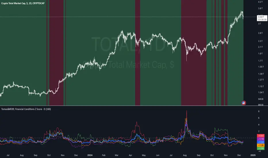
Tomas' Financial Conditions Z Score"The indicator is a composite z-score comprised of the following four components (equally-weighted):
Credit spreads - ICE BofA High Yield Option Adjusted Spread (BAMLH0A0HYM2) and ICE BofA Corporate Index Option Adjusted Spread (BAMLC0A0CM)
Volatility indexes - VIX (S&P 500 implied volatility) and MOVE (US Treasury bond implied volatility)
I've got it set to a 160-day lookback period, which I think is roughly the best setting after some tinkering.
When the z-score is above zero, it throws a red signal - and when the z-score is below zero, it throws a green signal.
This indicator is a follow-on from the "traffic light financial conditions indicator" that I wrote a thread about a couple of months ago.
I moved on from that previous indicator because it is based on the Federal Reserve's NFCI, which is regularly revised, but I didn't take that into account at the time.
So not a great real-time indicator, if the signal can be subsequently revised in the opposite direction weeks later.
This new indicator is based on real-time market data, so there's no revisions, and it also updates daily, as opposed to weekly for the NFCI"
VolbandsThe Volbands indicator dynamically plots upper and lower volatility bands based on implied daily moves derived from volatility indices. This tool provides a visual forecast of the next trading day's price range, helping traders anticipate potential price movement boundaries.
Key Features:
1. Auto-Detect Volatility Index: Volbands automatically detects the appropriate volatility index based on the current symbol. For example, it uses the VIX for S&P 500, VXN for Nasdaq 100, and custom indexes like VXAPL for Apple. Users can also manually select a specific volatility index if preferred.
2. Projected Bands:
- The indicator plots the projected upper and lower bands for the next trading day using the implied move from the volatility index.
- Displays today’s projected bands as a reference and overlays next day’s bands with a slight offset, visually indicating the anticipated range.
3. Dynamic Updates: The indicator updates automatically as new bars are added, ensuring that users have up-to-date projections based on the latest volatility data.
4. Highlighting Extreme Price Action: Candles that close outside of the projected bands are colored in yellow, highlighting moments of higher-than-expected volatility.
5. Informative Table: A customizable table displays relevant information, including:
- The selected or auto-detected volatility index
- Implied daily move percentage
- Projected upper and lower levels
Potential Applications:
- Risk Management: The Volbands indicator can help traders set more informed stop-loss and take-profit levels based on volatility-driven price projections.
- Identifying Overbought/Oversold Conditions: Price movement outside the projected bands may indicate overbought or oversold conditions, potentially signaling trade opportunities.
-Enhancing Entry and Exit Points: The projected bands act as soft support and resistance levels, assisting traders in timing entries and exits in anticipation of volatility-driven price reactions.
Future Enhancements:
Potential improvements to expand functionality could include:
- Additional Volatility Indices: Expanding coverage to include more assets and volatility indices.
- Alerts: Setting alerts for when prices breach the projected bands, enabling traders to react quickly to unexpected price movements.
- Customization of Bands: Adding options for users to adjust the implied move percentage, creating customized bands that reflect individual trading strategies.
This indicator combines implied volatility with price action, offering valuable insights to traders on expected price ranges and volatility.

Market Risk IndicatorIntroducing the easy to use Market Risk Indicator (MRI) which works well on all major Equity Indices and Large-Cap stocks.
It uses a proprietary backtested logic, and a vast improvement over the commonly used VIX indicator which is prone to manipulation via Options at illiquid strikes.
MRI works on all timeframes. My favorite timeframe is Daily.
Usage:
Look for deviation between risk (blue plot) and price action. Expected behavior is they move in opposite direction. If a certain instrument is not following this rule, stop.
If risk increases but price stays rangebound or also spikes; it indicates a fake move. Exit LONG and prepare SHORT once price action confirms the reversal.
If risk decreases but price stays rangebound or dips; it also indicates a fake move. Exit SHORT and prepare LONG once price action confirms the reversal.
If magnitude of risk decrease is larger than magnitude of price move up, then enter LONG once price action confirms the upside breakout.
If magnitude of risk increase is higher than magnitude of price move down, then enter SHORT once price action confirms the downside breakout.
Some further examples published:
NSE:NIFTY :
NSE:BANKNIFTY :
OANDA:SPX500USD :
BLACKBULL:US30 :
OANDA:DE30EUR :
OANDA:JP225USD :
NSE:TATASTEEL :
NYSE:JPM :

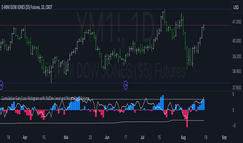
Cumulative Gain/Loss Histogram This TradingView Pine Script indicator combines several analytical tools to assist traders in making informed investment decisions. It calculates and visualizes cumulative gain/loss percentage, standard deviation levels, and normalizes trading volume on a reversed scale.
Components:
Basis for Calculation:
Users can select the basis data for the calculations: Price, VIX (Volatility Index), VVIX (Volatility of Volatility Index), or MOVE (Volatility Index for Treasury Securities).
Cumulative Gain/Loss:
This is computed based on the selected basis. The script tracks the cumulative percentage change in the selected basis data. Positive changes are aggregated to track gains, while negative changes accumulate to track losses.
Standard Deviation Levels:
The script calculates standard deviation (StdDev) for the cumulative gain/loss data over a specified period. Two levels are determined:
Positive StdDev Level: Shows the upper threshold for gains.
Negative StdDev Level: Shows the lower threshold for losses.
These levels are useful for identifying extreme deviations in the data.
Normalized Volume:
The trading volume is normalized to fit within a -5 to 5 scale, but the scale is reversed. Higher trading volumes will be represented by lower values on this scale. This normalized volume is plotted as a gray line on the chart.
How to Use This Indicator:
Identify Trends and Extremes:
Cumulative Gain/Loss: Look for periods where the cumulative gain/loss exceeds the standard deviation levels. This can indicate significant trend changes or potential reversals. Standard Deviation Levels: Use these levels to gauge whether the market is experiencing extreme conditions. For example, if the cumulative gain/loss crosses above the positive StdDev level, it might suggest an overbought condition.
Volume Analysis:
Normalized Volume: Analyze the volume trends with the reversed scale. Higher normalized volume values (which are lower on the -5 to 5 scale) could indicate high trading activity or market interest, potentially signaling a strong move or trend. Conversely, lower normalized volume values (which are higher on the -5 to 5 scale) may suggest lower trading activity or consolidation.
Decision-Making:
Combine the insights from cumulative gain/loss and standard deviation levels with volume analysis to make more informed trading decisions.
Buy Signal: Consider entering a position when the cumulative gain/loss reaches or exceeds the negative StdDev level and volume analysis supports increased market activity.
Sell Signal: Consider exiting a position when the cumulative gain/loss exceeds the positive StdDev level, indicating possible overbought conditions, especially if volume trends also align with the potential reversal.
Summary:
This script is designed to help traders understand market dynamics through cumulative gain/loss trends, standard deviation thresholds, and volume analysis. By interpreting these elements together, traders can identify potential trading opportunities and make more informed decisions based on market conditions and trends.
Macro Risk On/Off SentimentOverview
As an Ichimoku trader, I've always found it crucial to understand the broader market sentiment before entering trades. That's why I developed this Macro Risk On/Off Sentiment Indicator. It's designed to provide a comprehensive view of global market risk sentiment by analysing multiple factors across different asset classes. By combining nine key market indicators, it produces an overall risk sentiment score, giving me a clearer picture of the market's mood before I apply my Ichimoku strategy.
Rationale
While Ichimoku is powerful for identifying trends and potential entry points, I realised it doesn't always capture the broader market context. Markets don't exist in isolation—they're influenced by a myriad of factors including volatility, economic indicators, and cross-asset relationships. By creating this indicator, I aimed to fill that gap, providing myself with a macro view that complements my Ichimoku analysis.
How It Works
The indicator analyses nine different market factors:
VIX (Volatility Index): Measures market expectations of near-term volatility.
S&P 500 Performance: Represents the overall US stock market performance.
US 10-Year Treasury Yield: Indicates bond market sentiment and economic outlook.
Gold Price Movement: Often seen as a safe-haven asset.
US Dollar Index: Measures the strength of the USD against a basket of currencies.
Emerging Markets Performance: Represents risk appetite for higher-risk markets.
High Yield Bond Spreads: Indicates credit market risk sentiment.
Copper/Gold Ratio: An economic growth indicator.
Put/Call Ratio: Measures overall market sentiment based on options trading.
Each factor is assigned a score based on its z-score relative to its recent history, then weighted according to its perceived importance. The overall risk score is a weighted average of these individual scores.
How I Use It
Before applying my Ichimoku strategy, I first check this indicator to gauge the overall market sentiment:
I look at the blue line plotted on the chart, which represents the overall risk score.
I note the background colour: green for risk-on (positive score) and red for risk-off (negative score).
I check the label in the lower-left corner, which provides specific FX pair recommendations and market expectations.
In a risk-on environment (positive score):
I focus on long positions in AUD/JPY, NZD/JPY, EUR/USD, etc.
I look for short opportunities in USD/CAD, USD/NOK, etc.
I expect commodities and yields to rise
In a risk-off environment (negative score):
I focus on long positions in USD/JPY, USD/CHF, USD/CAD
I look for short opportunities in AUD/USD, NZD/USD, EUR/USD
I expect increased volatility and falling yields
The strength of the sentiment is reflected in how close the score is to either 1 (strong risk-on) or -1 (strong risk-off). This helps me gauge how aggressive or conservative I should be with my Ichimoku trades.
Customisation
I've designed this indicator to be flexible. You can modify it to:
Adjust the lookback period and moving average length (both default to 30)
Change the weighting of different factors in the final score calculation
Include or exclude specific factors based on your analysis needs
By combining this Macro Risk On/Off Sentiment Indicator with my Ichimoku analysis, I've found I can make more informed trading decisions, taking into account both the technical setups I see on the chart and the broader market context.

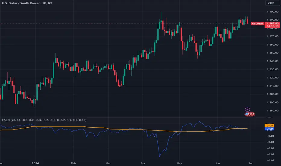
Enhanced Market Influence DashboardDescription
The "Enhanced Market Influence Dashboard" (EMID) is a sophisticated trading indicator developed in Pine Script, designed to provide traders with a comprehensive view of the market's influences by analyzing a diverse set of financial instruments. This script integrates various market data, calculates dynamic weights based on volatility, and combines them into a composite score to help traders identify significant market movements.
Concept and Methodology
The EMID indicator aggregates data from multiple financial instruments, including forex pairs, commodities, indices, and ETFs. By calculating the median and volatility of these instruments over user-defined timelines, it dynamically adjusts their weights to reflect current market conditions. The composite score generated from these weighted values helps traders understand the overall market influence and detect significant movements.
Key Features
Market Data Integration: The script fetches real-time data from various symbols such as USD/JPY, Gold, Dollar Index (DXY), US Treasury Rate, VIX Index, Crude Oil, EUR/USD, Emerging Market Index, QYLD ETF, and Nasdaq 100 Futures.
1. Dynamic Weight Calculation: The script calculates dynamic weights for each instrument based on their volatility relative to their simple moving average. This approach ensures that more volatile instruments have a proportionally higher impact on the composite score.
2. Median and Volatility Analysis: It uses the median value and standard deviation over specified timelines to gauge the central tendency and volatility of each instrument.
3. Composite Score Generation: By normalizing the difference between current prices and their respective medians, and applying dynamic weights, the script generates a composite score that reflects the overall market sentiment.
4. Baseline Calculation: A dynamic baseline is computed as the median of the composite score over the lookback period, providing a reference point for identifying significant deviations.
5. Alerts: The script includes alert conditions to notify traders of significant market movements, either above or below the baseline by a threshold value.
Usage
To use the EMID indicator, follow these steps:
1. Input Configuration: Adjust the input parameters to suit your trading strategy. The key inputs include:
-Median Timeline: The period for calculating the median values.
-Volatility Timeline: The period for calculating volatility.
-Base Weights: Set the base weights for each financial instrument according to their perceived influence on the market.
-Adding the Indicator: Apply the EMID indicator to your chart in TradingView. Ensure that the symbols used in the script are relevant to your trading strategy and available in your TradingView subscription.
2. Interpreting the Composite Score: The composite score plotted on the chart gives an aggregated view of market influences. Compare the composite score with the baseline to identify significant market movements.
-A composite score significantly above the baseline indicates a potential market uptrend.
-A composite score significantly below the baseline indicates a potential market downtrend.
-Setting Alerts: Use the alert conditions to set up notifications for significant market movements. These alerts help you stay informed about critical changes in market sentiment.
Underlying Calculations
1. Median Calculation: The median function is applied to each instrument's price data over the specified timeline.
2. Volatility Calculation: Volatility is calculated as the standard deviation divided by the simple moving average over the volatility timeline.
3. Dynamic Weight Application: Base weights are multiplied by the respective volatility values to get dynamic weights.
4. Normalized Scores: The script normalizes the difference between current prices and their medians, then multiplies by the dynamic weights to get individual scores.
5. Composite Score: Summing all normalized and weighted scores results in the composite score.
6. Baseline: The baseline is the median of the composite score over the median timeline.
By integrating multiple market influences and dynamically adjusting weights based on volatility, the EMID indicator provides a robust tool for traders to analyze market conditions and make informed trading decisions.
Fear & Greed index (advanced)The Fear & Greed index (advanced) is a comprehensive and customizable technical analysis tool designed to gauge market sentiment and identify potential buying or selling opportunities. This advanced version of the Fear & Greed Index incorporates a wide range of market data and technical indicators, providing traders with a more nuanced and sector-specific view of market sentiment.
Key Features:
Sector-specific analysis: The script automatically determines the sector based on the ticker data in TradingView, allowing traders to assess market sentiment for specific sectors. Users can also manually select a different sector to analyze, such as Technology, Healthcare, Energy, or Consumer Discretionary.
Additional components: This advanced Fear & Greed Index includes several new components not found in other versions, such as sector performance, Fast and Slow EMA comparison, VIX/VIX3M ratio, and the number of S&P 500 stocks above their 20-day EMA. These additional data points provide a more comprehensive view of market sentiment.
Sector performance: The script calculates sector performance by determining overbought and oversold areas, helping traders identify potential entry and exit points for sector-specific trades.
Customizable components: Users can enable or disable individual components of the Fear & Greed Index, allowing them to fine-tune the indicator to their specific needs and preferences. Tooltips are provided to explain each component in detail.
Component plotting: Traders can choose to plot particular components of the Fear & Greed Index directly on their charts, providing a visual representation of specific market sentiment factors.
Color-coded chart: The Fear & Greed Index chart is color-coded to clearly show bullish (green) or bearish (red) trends, making it easy for traders to identify potential market shifts at a glance.
Index calculation methods: Users can select between two index calculation methods: Volatility Adjusted Index and Composite Z Score. This flexibility allows traders to choose the method that best suits their trading style and market analysis preferences.
Volatility-weighted components: The script assigns weights to each component based on market volatility, ensuring that the index adapts to changing market conditions and provides a more accurate representation of sentiment.
How it works:
The Fear & Greed index combines data from multiple market indicators and technical analysis tools to create a comprehensive sentiment score. The script fetches data for each component, such as sector performance, market volatility, and put/call ratios, and normalizes the values to ensure a consistent scale.
Users can customize the index by enabling or disabling individual components, allowing them to focus on the factors they consider most relevant to their trading strategy. The script then applies a volatility-weighted formula to the enabled components, giving more weight to components that demonstrate higher volatility, as these tend to have a more significant impact on market sentiment.
The resulting Fear & Greed Index score is plotted on a color-coded chart, with green representing bullish sentiment and red indicating bearish sentiment. The script also detects divergences between the index and price action, alerting traders to potential trend reversals or market shifts.
By providing a comprehensive, sector-specific, and customizable view of market sentiment, the Fear & Greed Index helps traders make informed decisions and identify potential opportunities across various market conditions and timeframes.
We encourage you to provide feedback, ideas, and suggestions for improvements to help us continue refining this indicator and better serve the trading community. Your input is valuable in shaping the future development of the Fear & Greed index.

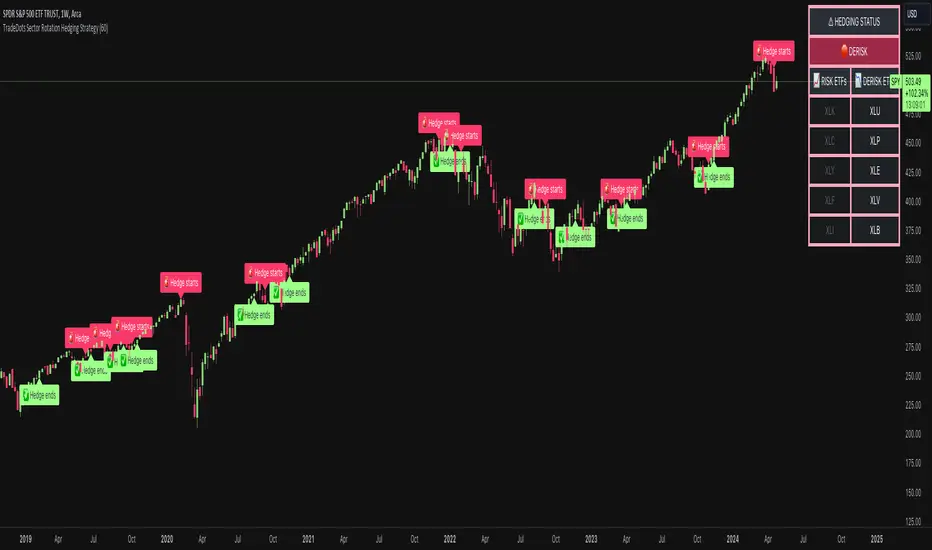
Sector Rotation Hedging With Volatility Index [TradeDots]The "Sector Rotation Hedging Strategy With Volatility Index" is a comprehensive trading indicator developed to optimally leverage the S&P500 volatility index. It is designed to switch between distinct ETF sectors, strategically hedging to moderate risk exposure during harsh market volatility.
HOW DOES IT WORK
The core of this indicator is grounded on the S&P500 volatility index (VIX) close price and its 60-day moving average. This serves to determine whether the prevailing market volatility is above or below the quarterly average.
In periods of elevated market volatility, risk exposure escalates significantly. Traders retaining stocks in sectors with disproportionately high volatility face increased vulnerability to negative returns. To tackle this, our indicator employs a two-pronged approach utilizing two sequential candlestick close prices to confirm if volatility surpasses the average value.
Upon confirming above-average volatility, a hedging table is deployed to spotlight ETFs with low volatility, such as the Utilities Select Sector SPDR Fund (XLU), to derisk the overall portfolio.
Conversely, in low-volatility conditions, sectors yielding higher returns like the Technology Select Sector SPDR Fund (XLK) are preferred. The hedging table is utilized to earmark high-return sector ETFs.
Thus, during highly volatile market periods, the strategy recommends enhancing portfolio allocation to low-volatility ETFs. During low-volatility windows, the portfolio is calibrated towards high-volatility ETFs for heightened returns.
IMPORTANT CONSIDERATION
In real trading, additional considerations encompassing trading commissions, management fees, and ancillary rotation costs should be factored in. False signals may arise, potentially leading to losses from these fees.
RISK DISCLAIMER
Trading entails substantial risk, and most day traders incur losses. All content, tools, scripts, articles, and education provided by TradeDots serve purely informational and educational purposes. Past performances are not definitive predictors of future results.
Red Light, Green Light Red Light, Green Light" is a comprehensive trading indicator designed for traders who need a clear, visual representation of market trends, applicable to any financial instrument and timeframe. It combines the analytical depth of three customizable moving averages with the visual simplicity of traffic lights. Users can adjust the length, MA type (including options like Donchian/Ichimoku baseline), source, and utilize multi-timeframe analysis, all enhanced with an offset feature for precise market alignment.
This indicator is ideal for users of Ichimoku Clouds, Donchian Channels, Price Action Scanners, Bollinger Bands, and moving average strategies, offering a new perspective in technical analysis.
The color system of the indicator simplifies trend identification:
Green indicates a strong bullish trend, suggesting traders consider long positions. This occurs when the short MA is above both the medium and long MAs, and the medium is also above the long MA.
Yellow signals caution in a bullish trend, pointing to potential consolidation or distribution phases. It appears when the short MA crosses below the medium MA while the medium remains above the long MA.
Orange reflects caution in a bearish trend, functioning similarly to yellow but under bearish conditions.
Red signifies a strong bearish trend, recommending short selling opportunities. It manifests when all MAs align in descending order, with the short MA at the lowest.
The 'cloud' feature, between the first two MAs, provides trend context akin to the Ichimoku Cloud but with a unique approach. While the Ichimoku system uses price position relative to the cloud to dictate trade bias, "Red Light, Green Light" relies on the color transitions of the MAs to guide trading decisions, with green and yellow for bullish scenarios and red and orange for bearish conditions.
Optimal use of "Red Light, Green Light" involves setting the moving average to the Donchian Baseline with default lengths of 20, 50, and 200, adjusting line thickness for visibility, and moderating cloud opacity as preferred.
Additionally, I developed this indicator primarily as a price action scanner to aid in identifying the most ideal financial instruments for trading based on their directional trends. It’s particularly useful for scanning through multiple timeframes of top-performing or bottom-performing stocks to discern which ones present the best trading opportunities. For instance, a stock that is consistently green from longer timeframes like 12M to 1D but shows yellow, orange, or red in shorter timeframes like 4H or 1H may be experiencing a minor pullback in an overall strong bullish trend, potentially signaling a buying opportunity. Conversely, in a bear market, consistent red in larger timeframes with green or yellow in shorter timeframes could indicate short-selling opportunities.
I recommend using this tool in conjunction with other indicators like Chris Moody’s Williams Vix Fix to enhance your market analysis and decision-making process.
I'm keen to receive feedback and learn about other tools on TradingView that can augment this price action scanning approach.

Gains CorrelationsScript Description: This script is to tie the major futures indexes together at a macro level with the normal relationships (i.e. 10YR Yield, DXY, VIX inversely related to Equities) and determine how strong the correlation is between them using a 20 period average. For example, a move up in the 10YR yield while having a strong inverse covariance with equities should signal a downward move for equities. In addition, if ES and NQ are going down, and the Dow and RTY have a strong covariance, the probability of them going down as well is strong. Overall, it's a macro indicator on broad market movements.
Originality & Usefulness: The script functions by tying 7 major indexes together using correlation strength relative to the currently selected ticker. The user can change the tickers and also invert if needed. This is different from the single correlation script by adding in several as they track in tandem. The chart used is to illustrate periods where correlations are tight with equities and the lines are clustered towards the top range of strong covariance. It also highlights when Equities are far out of line with others like gold (GC). A loose covariance would mean the relationship is weak and this indicator would show a divergence in price action between them. The overall intent is to show that most indexes rise and fall together but sometimes they move faster together.

VolatilityFlex LevelsThe VolatilityFlex Levels indicator computes the degree of change (or sigma) by leveraging the selected Volatility Index (such as VIX or any user-specified volatility index). It utilizes this information to graphically represent distinct levels for a designated financial instrument. These levels include -sigma, -3/4sigma, -1/2sigma, -1/4sigma, 1/4sigma, 1/2sigma, 3/4sigma, and sigma.

COT MCIThe COT MCI script is a market indicator based on the data from the Commitment of Traders Reports.
Integration of COT Report Data:
The script sources COT data from futures contracts, including:
Treasury Bonds (ZB), Dollar Index (DX), 10-Year Treasury Notes (ZN)
Commodities like Soybeans (ZS), Soy Meal (ZM), Soy Oil (ZL), Corn (ZC), Wheat (ZW), Kansas City Wheat (KE), Pork (HE), Cattle (LE)
Precious Metals such as Gold (GC), Silver (SI), Palladium (PA), Platinum (PL)
Industrial Metals like Copper (HG), Aluminum (AUP), Steel (HRC)
Energy Products like Crude Oil (CL), Heating Oil (HO), Gasoline (RB), Natural Gas (NG), Brent Crude (BB)
Currencies such as AUD (6A), GBP (6B), CAD (6C), EUR (6E), JPY (6J), CHF (6S), NZD (6N), BRL (6L), MXN (6M), RUB (6R), ZAR (6Z)
Others: Sugar (SB), Coffee (KC), Cocoa (CC), Cotton (CT), Ethanol (EH), Rice (ZR), Oats (ZO), Whey (DC), Orange Juice (OJ), Lumber (LBS), Livestock (GF), E-mini S&P 500 (ES), E-mini Russell 2000 (RTY), E-mini Dow Jones (YM), E-mini NASDAQ-100 (NQ), VIX Futures (VX), S&P 500 (SP), DJIA (DJIA)
Cryptocurrencies such as Bitcoin (BTC) and Ethereum (ETH)
Functions and Logic of the Script:
COT Calculation: Determines the net positions for commercial actors and large speculators. Also Available are short and long positions of commercials or large speculators.
Position Change Analysis: Analyzes the percentage changes in net positions and open interest data over a period of 6 weeks (Weekly Chart).
Average Value Calculation: Determines short-term and long-term trend averages.
Trend Analysis: Buy and sell signals (represented in colors) are based on linear regressions and average calculations.
Usage and Application Examples:
Ideal for traders looking for a detailed analysis of market dynamics and position changes in the futures market. Suitable for decision-making in transaction timing and assessing market sentiment.
Usage Notes:
Users should be familiar with the interpretation of COT data and basic concepts of futures trading. Particularly suitable for medium to long-term trading strategies.

Expected Intraday MovementThis indicator pretends to represent the "probable" maximum movement of an asset, for the rest of the day.
This indicator should be used "only" in intraday timeframe. You will not be able to see it if you select a longer timeframe.
To calculate the probable maximum movement, the indicator uses the VIX value for each minute.
On the first candle of the day, it also calculates the probable maximum movement for the whole day, and plots it in horizontal lines.
It also allows adding a couple of extra lines (for visual purposes only).
It also allows the creation of alerts, so that when the value of the asset is close to one of the limits, it can send you an alert using the Tradingview alert system.
Summary of parameters:
Intraday bands: allows you to show/hide the bands for each minute.
Intraday first candle projection: allows to show/hide the estimated projection from the first candle of the day.
Enable alert: allows to enable/disable alerts.
Upper and lower band offset: optional offset where alarms will be triggered (e.g. 10 points before the limit is reached).
Intraday Extra Projection: allows to show/hide extra levels (for visual purposes only)
Upper and lower extra: values for extra levels.
As always, no indicator is meant to provide a single, reliable strategy to your trading regimen and no indicator or group of indicators should be relied on solely. Be sure to do your own analysis and assessments of the stock prior to taking any trades.
Safe trades everyone!

Rug Pull DetectorOverview
Have you ever wondered why tickers have such erratic movements that seemingly come from nowhere? These "rug pull" events happen quite often and can catch even the most seasoned traders off-guard.
Unlike most other indicators which rely on historical data to make inferences about future price movements, the Rug Pull Detector (RPD) enables you to take a glimpse into market makers' delta-neutral hedging in real-time.
Market makers by nature must be delta-neutral which means that they cannot position themselves to profit from providing liquidity (either long or short). Liquidity provided to the short or long side must end up in a stock purchase or sale to neutralize the trade.
Volatile movements in a ticker's price movement most often result directly after a period of extremely low volatility. These volatile movements are very often "rug pulled" which ends up reverting the ticker back to the price at which the event first occurred. RPD shows these events in real-time. This knowledge can be used to help determine the most probable near-future direction a ticker will gravitate towards after a rug pull event occurs.
Usage
RPD works on any ticker and on any timeframe and can be used as a tool in determining an exit price for a trade. Vertical shading on the chart indicates a warning signal that a rug pull event may be about to kick-off. Once a rug pull event has occurred and is confirmed, a blue label will appear on the chart with a price. A line is then drawn from the bar at which the event occurred and is extended to each subsequent bar until the price is reached once more; thus concluding the event. Furthermore, red or green shading will be present to easily visually identify rug pull events on the chart and whether they are risks to the downside (red) or upside (green). RPD is broken down into 2 main types of events:
Active Event - These events are characterized by a red or green shading and a blue price line.
Dormant Event - These events do not have shading but are still identifiable via a blue price line. Active events that are superseded by newer events will become dormant.
Active events tend to have a higher chance to return to the initial price point and tend to arrive there quicker.
Dormant events have a slightly lower chance to return to the initial price point and may take longer to arrive there.
Please note:
This indicator has no way of telling the exact amount of time that will pass before the ticker returns to the identified price; however, in more cases than not - the ticker will return to that price within a reasonable amount of time relative to the timeframe you are viewing.
There is a small chance any single event will never conclude. These are anomalies and do occur on occasion.
Using RPD alongside tools such as the RSI, Anchored VWAP, or other trend-based indicators will help determine when the ticker's price might be about to pivot and head back towards the identified price point.
Seeing is Believing:
SPY 1D downside rug-pull
----------------------------------------------
AAPL 15s downside and upside rug-pulls
----------------------------------------------
AMD 2D downside rug-pull
----------------------------------------------
VIX 1h downside and upside rug-pulls
Want to see more? Check out my recent Ideas for more examples of the Rug Pull Detector in action.
Disclaimer:
Any information in relation to the Rug Pull Detector does not constitute any financial, investment, or trading advice. Trade or invest at your own risk.

Correlational cyclesCorrelation is a statistical measure that expresses the extent to which two variables are linearly related (meaning they change together at a constant rate). It's a common tool for describing simple relationships without making a statement about cause and effect.
This script allows the user to input a multiplier to reverse the symbol input. This enables the user to look at a correlation measure between VIX and QQQ and the same time.. And get a better of understanding of what is not alligning and what is. the peaks in correlations usually signal a coming volatile period.

Apeiron Fair Value Bands ProWHAT IS IT
The Apeiron Fair Value Bands Pro is an indicator that estimates the fair value area of an asset and provides levels of interest and likely reaction. It was created to determine fair value. Knowing fair value allows traders and investors to determine when an asset is at a premium or at a discount, which allows them to make more informed decisions about when to buy or sell. Fair value is constantly changing, and sometimes waiting for it to develop each session or month can lead to missed opportunities. Therefore, it is useful to have an estimate of fair value at all times.
HOW DOES IT WORK?
The simplest way to have a constant estimation of fair value could probably be a Moving Average. By averaging previous prices, we get the average price which ideally reflects where most traders have been interested in participating in the market. This isn’t necessarily the most accurate fair value estimation you can get, however using different types of moving averages and combining them allows for a better estimation of the FV. It is also important to consider that price is always moving away and back into the MA, so in order to determine FV, we must allow an area for price to move within which we can consider the FVA. By taking into account volatility, previous relevant levels and the MA, the Apeiron Bands determine a FVA, where in theory price should stay most of the time.
According to the normal distribution, the price should stay within 1 standard deviation (SD) around 68% of the time and within 2 SD around 95% of the time during range periods (when data is most symmetrical). In the case of the Apeiron Bands, based on backtest data, the price tends to stay within 1 FVA around 75% of the time, within 2 FVA around 90% of the time during strong trends, around 80% and 95% correspondingly during weak trends, and >85% and >95% during ranges.
Additionally, based on backtesting data, pivots occur on average at around 1 FVA ±0.05 (This does not necessarily mean that most pivots occur at 1 FVA, however, the fact the average is 1±0.05 implies there is relevance to this level).
Finally, in order to account for volatility and the slight differences between symbols, a customizable tolerance ribbon is added to the moving average (MA) and each plotted band.
This data remains the same throughout all timeframes and types of market (tested on cryptocurrencies, forex pairs, stocks, indices and futures)
Examples of the time spent within the FVAs:
Examples of average pivot FVA :
HOW TO USE IT?
Identify potential reversal levels at premium and discount prices:
Knowing that price stays within 1 FVA the majority of time and inside 2 FVA most of the time, as well that in average pivots occur around 1 FVA, it can be inferred that both the Bands representing 1 & 2 FVA (B1 & B2) work as potential reversal levels as shown in the examples. This can be very good in confluence with other strategies to spot trade entries. If this is done taking into account if the asset is at a premium or discount allows for a higher probability of being on the right side of the market.
For example, during an uptrend price sometimes goes below it’s MA only to then continue up. In this particular case, the bands would provide an ideal entry at a discount to ride the uptrend.
During ranges, the bands can be used to identify potential pivots for each move up and down, and because of their adaptive nature they can be a great confluence to which horizontal levels are more likely to act as support and resistance.
For intraday traders, the bands can help them identify assets at one of the extremes and potentially even inside one of the bands, indicating that price is likely to reverse from there. Then they can use LTF to find ideal entries or catch the trend with the bands.
For swing traders and investors, using the bands can be a good way to scan different assets to find extended prices to either side and potential entry levels
Identify emerging trends:
Sometimes price will have a minimum reaction to the bands or no reaction at all. Knowing that price spends most of the time inside the bands, the fact that it breaks out of the FVA indicates that a new trend is likely to begin on that particular TF and price will try to establish a new FVA. Once there is a sustained PA outside the bands, a new trend can be assumed (Deviations happen as well, so it is very important to be aware of higher TF as well).
Other times, price will start sliding between B1 and B2, slowly displacing the MA. This can also be an indication for the start of a trend.
Identify exhaustions (potential tops & bottoms):
I call exhaustions to scenarios when price keeps going up/down but it fails to keep pushing the FVA with it. This indicates weakness in the trend and that a new FVA is being established. This often leads to a potential reversal or correction that marks the top or bottom of a move. Not only that, but when the new FVA is established price tends to go and test the other side of the FVA. Identifying exhaustions and being patient for them to form can potentially provide a great entry and RR ratio.
Exhaustions also happen after strong rallies or crashes, and in these cases it is advised to wait for price to re-enter its FVA, providing more clarity and often even better entries.
Exhaustions appear in all timeframes and symbols, however they can take some time to develop and it is important to be patient with them. And as always, it is highly recommended to also check for confluence on different TF.
8H Bands:
4H Bands:
Additional Features:
- Additional Bands:
The Apeiron Fair Value Bands can plot up to 4 Bands. Each fully customizable. The preset and suggested use is to have B1 & B2 and add thinner aid bands B0.5 & B1.5 which represent the middle of 1 & 2 FVA. These are not the main levels of interest but they can prove useful as support and resistance many times. Besides using mid levels, using fib values (0.618 & 1.618) can work even better on some assets and give better reactions.
NATGAS 1H Bands - Fib Mids:
The extra bands can also be used for FVA 3 and FVA 4, which can be useful during extremely volatile periods or on very LTF
- Multi Timeframe & precision:
The bands work on very low TF as well as High TF. Sometimes data can be limited on HTF and the bands will not have enough to be calculated and many LTF are very volatile and don’t work as well. In these scenarios, the bands have a setting called “Precision” under the preferences section that allows the user to decrease or increase the amount of data taken into account. This allows for optimization on any TF and even on any symbol.
GOLD 1min Bands:
EURUSD 5D Bands:
VIX 1H Bands:
- Multi Bands Confluence:
Combining 2 different length FV bands can be very useful to find confluence levels and spot trends and reversals earlier. For example, on the 15 min TF, using a 50 MA with only 1 FVA at the same time as a 200 MA with all Band can be ideal to keep track of short term moves and their micro-trends while always considering the longer trend which might be different that the short term one. As well, having MTF band confluence can indicate that a level is more likely to signal a reversal if reached.
- Multi Timeframe Confluence:
One of the best ways to use the bands is by using it in confluence with itself in other TFs, when price moves sharply into a confluent level given by multiple TFs’ Bands, it is more likely for price to find support and resistance and/or reverse there. Ex. 5 Min B2, 15 Min B1.5 & 30 Min B1, if price reaches this confluent level and shows weakness, this is likely a short term reversal level.
NATGAS MTF Bands:
How to set it up and customize it: (Explain how they are important)
- The MA Lab:
The Apeiron Bands utilizes a MA Lab to generate the most customizable MAs possible. It allows combining up to 3 different MAs, where each MA can be single, double or triple (same process as creating a DEMA or TEMA). As well each MA can be given more or less weight in the calculation of the final MA. Besides it’s features, the MA Lab allows the user to select only one MA and stick to basic settings and MA types if preferred.
When to use the MA Lab:
If you wanted a reactive MA (EMA) which was also volume weighted, you can then combine it with a VWMA and get a VW-EMA.
If you want a more reactive VWMA you can double or triple it. Then in order to make it smoother you combine it with a SMMA. Finally maybe you want to use it to follow trends closely so you also combine it with a HMA to take momentum into consideration.
- Presets:
The multiplier for each band, the width of each tolerance ribbon and the individual colors of each band can all be individually selected. However, to make the user's experience as smooth as possible, FVA multipliers, Ribbon width and colors can be preset and modified all at the same time with the most basic and ideal settings. This allows for quick customization options as well as personalized detailed custom settings.
- Show only Lower or Upper bands:
This setting is meant for scouting for discounts and premiums across the board. By only showing bands on one side it cleans up the chart and makes it easier to spot important levels on only one side of the price. This can be very useful when looking for swing opportunities or when following a particular trend to only focus on potential entries for it.
MATIC 4H Bands showing only bottom bands:
AMZN 1D Bands showing only bottom bands:
Settings used in indicator preview:
- Custom MA: 200 EMA/200 WMA/200 SMMA (200 EWSMMA)
- Band 1: 0.5 - Ribbon Width: 5 - Color: Blue
- Band 2: 1 - Ribbon Width: 10 - Color: Green
- Band 3: 1.5 - Ribbon Width: 5 - Color: Blue
- Band 4: 2 - Ribbon Width: 10 - Color: Red
Disclaimer:
The bands CAN but are NOT meant to be used as a standalone indicator. Previous performance does not guarantee future performance. The bands are an analytical tool, not a signal indicator. While certain scenarios can be interpreted as a signal, never follow them blindly and always use them in confluence with other analysis, systems or indicators.
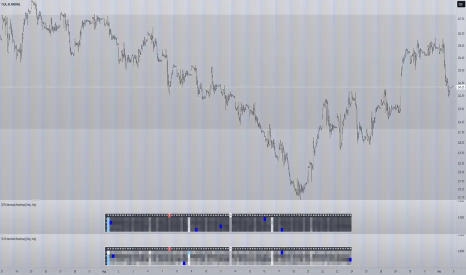
[GTH decimals heatmap] (wide screen advised)Preface
I share my personal general view on indicators below; skip ahead to the Description below if you are not interested.
It is my personal conviction that most - if not all - indicators rely mainly on trader's belief that they work, and in a feedback system like free markets they might become a self-fulfilling prophecy as a result, if (!) a big part of the traders believes in it, because some famous trader releases an indicator, or such person's public statement goes viral.
One of those voodoo indicators is the famous "follow-through day". There is zero statistical evidence for its validity, beyond the validity of a statement like "If it's bright at day it's usually the sun shining". The uselessness was proven exactly on its inventor's YT channel, Investors Business Daily. According to the examiner, its inventor William J. O'Neil himself could not explain the values used for this indicator. It might have been an incidental observation at some point without general validity. A.k.a "curve fitting". Still, it's being used by many today.
Another one of those indicators is the three points reversal on the S&P 500 Volatility Index (VIX) which allegedly might potentially maybe indicate a possible shift in trend. Both indicators share an immediately problematic feature: They use absolute values. Nothing is ever absolute in a highly subjective and emotionally driven game like the markets where a lot of money can be made and lost.
Most indicators can not produce additional information since they can only re-pack price/volume action. Many times an interpretion of the distance between price and a moving average and/or the slope of a moving average deliver very similar - if not better - results than MACD, RSI etc., especially with standard settings, the origin of which are usually unknown (always a warning sign). Very few indicators can deliver information which is otherwise hard to quantify, e. g. market noise (Kaufman's Efficiency Ratio or Price Density) or volatility, standard deviation etc.
It is common knowledge that trading the markets is a game of probability. No indicator works all the time (or at all, see above). In order to make decisions based on any indicator, the probability for its validity and the conditions under which validity seemed to have occurred, must be known. Otherwise it is just coffee grounds reading under the illusion of adding to the edge, when in fact it is only adding to the trees, making it even harder to see the forest.
Description
A common belief is that whole or half-dollar prices tend to be attraction points in price action, so a number of traders include those into decision making. But are they really...?
Spoiler Alert:
Generally, it is safe to say that for the big majority of stocks there is very thin evidence for it. It depends vastly on the asset, the timeframe used and the market period (pre/post/main trading times). If at all, there seems to be an above random but still thin evidence for whole prices being significant attraction points. Interesting/surprising patterns are visible on many stocks/timeframes/session periods, though.
The screenshot shows TSLA, 30m timeframe, two heatmaps added. The top one shows pre/post-market data only, the bottom one main market data only. The cyan fields indicate the strongest occurrence, the dark blue fields indicate the weakest occurrence of open/high/low/close prices at the respective decimal. The red field indicates the current/last price decimal.
Clearly, TSLA displays a strong pre-market attraction for .00, followed by .33 and .67 and .50. This pattern of thirds seems to be a unique feature of TSLA. In the main trading session it is being diluted by a more random distribution.
Other interesting equities to examine:
SPY: No significant pattern on any timeframe!
META: Generally weak patterns on all timeframes, but interestingly on the 1D there is evidence for less randomness on O and H, more on L and most on C.
AAPL: 1D, foggy attraction areas around .35 and .12. Whole price is no attraction area at all! Very weak attraction around .73.
AMD: Strong pattern on D, W, M, attraction areas around 1/16th intervals. No patterns on lower timeframes.
AMZN: Significant differences between pre/post and main session. Strong 1/16th pattern below D in pre/post.
TAOP: Strong 1/5th pattern on all timeframes.
Read the tool tips and go explore!
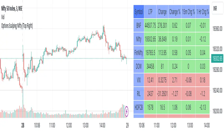
Options Scalping NiftyThis Indicator is Owned by Team Option Scalping.
Top Right Corner TABLE ( 6 , 10 )
When you are trading in Nifty futures , we have to check major Stocks which is contributing to Nifty move. So we have given that in this tab.
This table consist of 5 Major Indices and 5 Stocks :
• BankNifty
• Nifty
•FinNifty
• Dow
• VIX
• RIL
• HDFCBANK
• INFY
• TCS
• ICICBANK
And following data of each stock has been provided:
• LTP
• Daily Change
• Daily Percentage Change
• 15-minute Change Percentage
• 1-Hour Change Percentage
This Table is completely different from Our other publish indicator named "Options Scalping V2". That consist of banking stocks data, and this consist of Nifty Stocks data. Data set are same but constituents are different.