Wosabi 2 Time Cycle Gann and candles v3Important Note: This indicator relies on your expertise in time cycles and does not provide any buy or sell signals. It helps you by automating the drawing of minor and major time cycles and digital gates, relying on your personal expertise. It simply draws a vertical line every 12 candles from your selected starting candle and repeats this until the cycle is complete after 12 minor cycles. Additionally, it calculates digital gates, and you need to configure the settings to choose the type of calculation for the digital gate, whether it's based on the commonly known digital gates (12-15-18) or gate targets, for example (369-693-936-258-582-825-147...), and then multiply them based on the price difference you input to draw horizontal lines for the expected gates. If a gate is broken, the price will continue to the next gate.
This indicator is an auxiliary tool for drawing the five, seven, ten, and even fifty or more cycles that Gann discussed. With its default settings, it draws vertical lines every 12 candles for 12 minor cycles (modifiable), forming a major cycle of 144 candles, which is the ten-cycle. (You should have experience in time cycle patterns as explained by Gann to know if the trend will continue up or down over time). The indicator only draws the columns that define the minor cycles, and their total forms the major cycle.
- The indicator also draws digital gates as horizontal lines, which you need to set manually and adjust the price difference from one currency to another in the settings.
- When adding the indicator for the first time, you must specify the starting candle of the trend, whether at a bottom or a top, and determine the highest or lowest price expected to reach five digital gates. If you expect an upward cycle, set the price at the resistance area where you expect the price to bounce. If you want to draw a downward cycle, set the price at the support area where you expect the bounce. You can later adjust the gates from the settings if you want to calculate them according to the digital gate. For example, if you start drawing the downward cycle for Bitcoin, as in the above picture when the highest price was 73881, we add the first two digits 7+3=10, 1+0=1, and the number 1 corresponds to gate 12, so you select it from the settings and then adjust the price difference to 1000 or its multiples since Bitcoin's price is in thousands. If it is another currency with a price not exceeding $100, adjust the price difference to 10 or its multiples. Thus, adjust the price difference from one currency to another. For currencies with values in fractions, the price difference will be 0.0001 or the closest figure to the currency's price, as an example.
- You can display a horizontal line at the close of each minor cycle, i.e., every 12 candles.
- You can display a strategic line at candle 42 from the start of the cycle. The strategic line is used to guide you; if the trend is up and doesn't close below this line after 7 minor cycles, the trend will likely continue up, or above it if the trend is down. In a downtrend, there are slightly different rules that can't be fully explained here.
- You can also display lines on the vibration candles, which are multiples of the number 3 from the start of the cycle, i.e., 3, 9, 12, 15, etc.
- When the trend is upward, the ending price should be higher than the starting price to draw the trend towards the gates correctly. When the trend is downward, the ending price should be lower than the starting price.
- You can now calculate digital gates in more than one way, and you can adjust the digital gates (if you have a specific method for calculating them), double them, or divide them.
** One of the most important additions is the ability to convert minor time cycles into candles to visualize the upcoming direction of the minor cycle.
ملاحظة هامة : هذا المؤشر يعتمد على خبرتك في الدورات الزمنية ولن يعطيك اي اشارات شراء او بيع فهو مؤشر يوفر عليك الرسم للدورات الزمنية الصغرى والكبرى والبوابات الرقمية ويعتمد على خبرتك الشخصية وعمله ببساطه يقوم برسم خط عمودي كل 12 شمعة من بعد اختيارك لاي شمعة ويكرر رسم الاعمده حتى اكتمال الدورة بعد 12 دورة زمنية صغرى كما انه يقوم بحساب البوابات الرقمية ويجب عليك ضبط الاعدادات من المؤشر باختيار نوع الحساب للبوابة الرقمية هل هو حساب البوابات الرقمية المتعارف عليها ( 12-15-18) او حسب اهداف البوابات كمثال (369-693-936-258-582-825-147.....) ثن يتم مضاعفتها حسب ادخالك لفارق الاسعار ليتم رسم خطوط افقيه للبوابات المتوقع اذا كسرها يستمر السعر بالوصول للبوابة التي تليها .
هذا المؤشر اداة مساعدة لرسم دورة الخمس او السبع اوالعشر وحتى الخمسين واكثر التي تحدث عنها gan ، فهو باعداداته الافتراضية يرسم خطوط اعمده راسية كل 12 شمعة ولعدد 12 دورة صغرى (يمكن تعديلها) لتتكون دورة كبرى من 144 شمعة وهي دورة العشرة ، (يجب ان يكون ليك خبرة في انماط الدورات الزمنية كما شرحها gan لتعرف هل سيستمر الصعود او الهبوط زمنياً ) فالمؤشر فقط يرسم الاعمدة التي تحدد الدورات الصغرى ومجموعها يكون الدورة الكبرى .
- يقوم المؤشر ايضا برسم البوابات الرقمية في خطوط افقية وعليك تحديدها بشكل يدوي وتعديل فارق السعر من عملة لاخرى من الاعدادات .
- عند اضافة المؤشر لاول مرة يجب تحديد شمعة بداية الاتجاه سواء عند قاع او قمة وكذلك تحديد السعر الاعلى او الادنى المتوقع ان تصل له خمس بوابات رقمية فاذا كنت تتوقع ان الدورة صاعدة فحينها تحدد السعر عند منطقة المقاومة التي تتوقع ان يرتد منها السعر وان كنت تريد رسم دورة هابطة فحينها تحدد السعر عند منطقة الدعم المتوقع الارتداد منه ويمكنك تعديل البوابات لاحقا من الاعدادات اذا اردت حسابها حسب البوابة الرقمية على سبيل المثال اذا رسمت بداية الدورة الهابطة للبيتكوين كما في الصورة اعلاه حينما كان سعر اعلى قمة 73881 نقوم بجمع اول رقمين و هم 7+3=10 , 1+0=1 والرقم 1 يتبع البوابه 12 فتقوم باختيارها من الاعدادات ثم تقوم بتعديل فارق السعر الى 1000 او مضاعفاته كون سعر البيتكوين بالالاف وان كانت عمله اخرى نفترض ان سعرها ل يتجاوز 100 دولار نعدل فارق السعر الى 10 او مضاعفاته وهكذا نقوم بتعديل فارق السعر من عملة الى اخرى ففي العملات الصفرية سيكون فارق السعر 0.0001 او حسب الرقم القريب لسعر العملة هذا فقط كمثال .
- يمكنك اظهار خط افقي عند اغلاق كل دورة صغرى اي كل 12 سمعة .
- يمكنك اظهار خط الاستراتيجي عند شمعة 42 من بداية الدورة وخط الاستراتيجي يسترشد من خلاله اذا لم يتم الاغلاق اسفله اذا كان الاتجاه صاعد بعد 7 دورات صغرى ان الاتجاه سيستمر او اعلاه اذا كان الاتجاه هابط وفي الاتجاه الهابط هنالك قواعد مختلفة قليلاً لا يتسع المجال لشرحها.
- يمكنك كذلك اظهار خطوط على شمعات الاهتزاز التي تكون من بداية الدورة مضاعفات الرقم 3 اي 3,9,12,15 وهكذ .
- عندما يكون الاتجاه صاعد يجب ان يكون سعر النهاية اعلى من سعر البداية ليتم رسم الاتتجاه للبوابات بشكل صحيح وعندما يكون الاتجاه هابط يجب ان يكون سعر النهاية ادنى من سعر البداية .
- يمكنك الان حساب البوابات الرقمية باكثر من طريقة ويمكنك تعديل البوابات الرقمية (اذا كان لديك طريقة معينة لحسابها) او مضاعفتها او تقسيمها .
** من اهم الاضافات هو امكانية تحويل الدورات الزمنية الصغرة الى شموع حتى تتخيل الاتجاه القادم لحركة الدورة الصغرى .
Wyszukaj w skryptach "the strat"

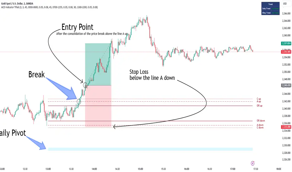
ACD Indicator [TradingFinder] M Fisher Pivots Methodology Signal🔵 Introduction
The book "The Logical Trader" begins with a comprehensive review of the ACD Methodology principles, which include identifying specific price points related to the opening range.
This method allows you to set reference points for trading and use points "A" and "C" for trade entry. You will also learn about the "Pivot Range" and how to combine them with the ACD method to maximize position size and minimize risk.
In this indicator, the strategy is implemented to make it easier to use.
🔵 How to Use
The "ACD" strategy can be applied to various markets such as stocks, commodities, or forex, providing buy and sell signals that allow you to set your price targets and stop losses.
This strategy is based on the assumption that the opening range of trades is statistically significant each day, meaning the initial market fluctuations influence the market until the end of the day.
The ACD trading strategy is known as a breakout strategy and performs best in volatile or strongly trending markets, such as crude oil and stocks.
Some of the rules for using the ACD strategy include the following :
Consider points A and C as reference points and continuously pay attention to these points during trades. These points serve as entry and exit points for trades.
Examine daily and multi-day pivot ranges to analyze market trends. If the price is above the pivots, the trend is upward, and if below the pivots, the trend is downward.
Trading with the ACD strategy in forex is possible using the ACD indicator. This indicator is a technical tool used to measure the balance between supply and demand in the market. By analyzing trading volume and price, this indicator helps traders identify trend strength and suitable entry and exit points.
To use the ACD indicator, consider the following :
Identifying strong trends: The ACD indicator can help you identify strong and stable trends in the market.
Determining entry and exit points: ACD provides buy and sell signals to enter or exit trades at the best possible time.
Bullish Setup :
When the "A up" line is broken, it is advisable to wait for some time to ensure that this is not a "Fake Breakout" and that the price stabilizes above this line.
After entering the trade, the best stop loss you can choose is below the "A down" line. However, it is recommended to test this in backtests to achieve the best results. The suitable reward-to-risk ratio for this strategy is 1, which should also be backtested.
Bearish Setup :
When the "A down" line is broken, it is advisable to wait for some time to ensure that this is not a "Fake Breakout" and that the price stabilizes below this line.
After entering the trade, the best stop loss you can choose is above the "A up" line. However, it is recommended to test this in backtests to achieve the best results. The suitable reward-to-risk ratio for this strategy is 1, which should also be backtested.
🔵 Setting
NDay Pivot Range Period : Using this entry you can specify the number of days to calculate NDay Pivot Range.
Show Daily Pivot Range : Set the Daily Pivot color and displayed or not.
Show NDay Pivot Range : Set the NDay Pivot color and displayed or not.
ATR Period Levels : Determining the period of the ATR indicator, which is used to determine the A and C levels.
Show Tokyo ACD Setup : Set the Tokyo ACD Setup color and displayed or not.
Tokyo Opening Range Time : The amount of time taken to determine the opening range. You can set this number between 5 and 60 minutes.
Tokyo Session : Market start and end time.
A Level Multiplier : The coefficient that is multiplied by ATR to determine the distance of line A up and A down.
C Level Multiplier : The coefficient that is multiplied by ATR to determine the distance of line C up and C down.
The same settings exist for the London and New York sessions.
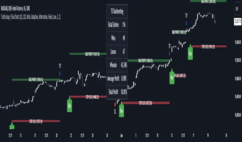
ICT Turtle Soup | Flux Charts💎 GENERAL OVERVIEW
Introducing our new ICT Turtle Soup Indicator! This indicator is built around the ICT "Turtle Soup" model. The strategy has 5 steps for execution which are described in this write-up. For more information about the process, check the "HOW DOES IT WORK" section.
Features of the new ICT Turtle Soup Indicator :
Implementation of ICT's Turtle Soup Strategy
Adaptive Entry Method
Customizable Execution Settings
Customizable Backtesting Dashboard
Alerts for Buy, Sell, TP & SL Signals
📌 HOW DOES IT WORK ?
The ICT Turtle Soup strategy may have different implementations depending on the selected method of the trader. This indicator's implementation is described as :
1. Mark higher timerame liquidity zones.
Liquidity zones are where a lot of market orders sit in the chart. They are usually formed from the long / short position holders' "liquidity" levels. There are various ways to find them, most common one being drawing them on the latest high & low pivot points in the chart, which this indicator does.
2. Mark current timeframe market structure.
The market structure is the current flow of the market. It tells you if the market is trending right now, and the way it's trending towards. It's formed from swing higs, swing lows and support / resistance levels.
3. Wait for market to make a liquidity grab on the higher timeframe liquidity zone.
A liquidity grab is when the marked liquidity zones have a false breakout, which means that it gets broken for a brief amount of time, but then price falls back to it's previous position.
4. Buyside liquidity grabs are "Short" entries and Sellside liquidity grabs are "Long" entries by default.
5. Wait for the market-structure shift in the current timeframe for entry confirmation.
A market-structure shift happens when the current market structure changes, usually when a new swing high / swing low is formed. This indicator uses it as a confirmation for position entry as it gives an insight of the new trend of the market.
6. Place Take-Profit and Stop-Loss levels according to the risk ratio.
This indicator uses "Average True Range" when placing the stop-loss & take-profit levels. Average True Range calculates the average size of a candle and the indicator places the stop-loss level using ATR times the risk setting determined by the user, then places the take-profit level trying to keep a minimum of 1:1 risk-reward ratio.
This indicator follows these steps and inform you step by step by plotting them in your chart.
🚩UNIQUENESS
This indicator is an all-in-one suit for the ICT's Turtle Soup concept. It's capable of plotting the strategy, giving signals, a backtesting dashboard and alerts feature. It's designed for simplyfing a rather complex strategy, helping you to execute it with clean signals. The backtesting dashboard allows you to see how your settings perform in the current ticker. You can also set up alerts to get informed when the strategy is executable for different tickers.
⚙️SETTINGS
1. General Configuration
MSS Swing Length -> The swing length when finding liquidity zones for market structure-shift detection.
Higher Timeframe -> The higher timeframe to look for liquidity grabs. This timeframe setting must be higher than the current chart's timeframe for the indicator to work.
Breakout Method -> If "Wick" is selected, a bar wick will be enough to confirm a market structure-shift. If "Close" is selected, the bar must close above / below the liquidity zone to confirm a market structure-shift.
Entry Method ->
"Classic" : Works as described on the "HOW DOES IT WORK" section.
"Adaptive" : When "Adaptive" is selected, the entry conditions may chance depending on the current performance of the indicator. It saves the entry conditions and the performance of the past entries, then for the new entries it checks if it predicted the liquidity grabs correctly with the current setup, if so, continues with the same logic. If not, it changes behaviour to reverse the entries from long / short to short / long.
2. TP / SL
TP / SL Method -> If "Fixed" is selected, you can adjust the TP / SL ratios from the settings below. If "Dynamic" is selected, the TP / SL zones will be auto-determined by the algorithm.
Risk -> The risk you're willing to take if "Dynamic" TP / SL Method is selected. Higher risk usually means a better winrate at the cost of losing more if the strategy fails. This setting is has a crucial effect on the performance of the indicator, as different tickers may have different volatility so the indicator may have increased performance when this setting is correctly adjusted.
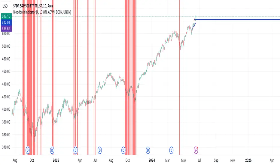
Bloodbath IndicatorThis indicator identifies days where the number of new 52-week lows for all issues exceeds a user-defined threshold (default 4%), potentially signaling a market downturn. The background of the chart turns red on such days, providing a visual alert to traders following the "Bloodbath Sidestepping" strategy.
Based on: "THE RIPPLE EFFECT OF DAILY NEW LOWS," By Ralph Vince and Larry Williams, 2024 Charles H. Dow Award Winner
threshold: Percentage of issues making new 52-week lows to trigger the indicator (default: 4.0).
Usage:
The chart background will turn red on days exceeding the threshold of new 52-week lows.
Limitations:
This indicator relies on historical data and doesn't guarantee future performance.
It focuses solely on new 52-week lows and may miss other market signals.
The strategy may generate false positives and requires further analysis before trading decisions.
Disclaimer:
This script is for informational purposes only and should not be considered financial advice. Always conduct your own research before making any trading decisions.
[GYTS-Pro] Flux Composer🧬 Flux Composer (Professional Edition)
🌸 Confluence indicator in GoemonYae Trading System (GYTS) 🌸
The Flux Composer is a powerful tool in the GYTS suite that is designed to aggregate signals from multiple Signal Providers, apply advanced decaying functions, and offer customisable and advanced confluence mechanisms. This allows making informed decisions by considering the strength and agreement ("when all stars align") of various input signals.
🌸 --------- TABLE OF CONTENTS --------- 🌸
1️⃣ Main Highlights
2️⃣ Flux Composer’s Features
Multi Signal Provider support
Advanced decaying functions
Customisable Flux confluence mechanisms
Actionable trading experience
Filtering options
User-friendly experience
Upgrades compared to Community Edition
3️⃣ User Guide
Selecting Signal Providers
Connecting Signal Providers to the Flux Composer
Understanding the Flux
Tuning the decaying functions
Choosing Flux confluence mechanism
Choosing sensitivity
Utilising the filtering options
Interpreting the Flux for trading signals
4️⃣ Limitations
🌸 ------ 1️⃣ --- MAIN HIGHLIGHTS --- 1️⃣ ------ 🌸
- Signal aggregation : Combines signals from multiple different 📡 Signal Providers, each of which can be tuned and adjusted independently.
- Decaying function : Utilises advanced decaying functions to model the diminishing effect of signals over time, ensuring that recent signals have more weight. In addition to the decaying effect, the "quality" of the original signals (e.g. a "strong" GDM from WaveTrend 4D ) are accounted for as well.
- Flux confluence mechanism : The aggregation of all decaying functions form the "Flux", which is the core signal measurement of the Flux Composer. Multiple mechanisms are available for creating the Flux and effectively using it for actionable trading signals.
- Visualisation : Provides detailed visualisation options to help users understand and tune the contributions of individual Signal Providers and their decaying functions.
- Backtesting : The 🧬 Flux Composer is a core component of the TradingView suite of the 🌸 GoemonYae Trading System (GYTS) 🌸. It connects multiple 📡 Signal Providers, such as the WaveTrend 4D, and processes their signals to produce a unified "Flux". This Flux can then be used by the GYTS "🎼 Order Orchestrator" for backtesting and trade automation.
🌸 ------ 2️⃣ --- FLUX COMPOSER'S FEATURES --- 2️⃣ ------ 🌸
Let's delve into more details...
💮 1. Multi Signal Provider support
Using the name of the GYTS "🎼 Order Orchestrator" as an analogy: Imagine a symphony where each instrument plays its own unique part, contributing to the overall harmony. The Flux Composer operates similarly, integrating multiple Signal Providers to create a comprehensive and robust trading signal -- the "Flux". Currently, it supports up to four streams from the WaveTrend 4D's ’s Gradient Divergence Measure (GDM) and another four streams from the Quantile Median Cross (QMC). These can be either four "Professional Edition" Signal Providers or eight "Community Editions".
Note that the GDM includes 2 different continuous signals and the QMC 3 different continuous signals (from different frequencies). This means that the Community Edition can handle 2*2 + 2*3 = 10 different continuous signals and the Professional Edition as much as 20.
As GYTS evolves, more Signal Providers will be added; at the moment of releasing the Flux Composer, only WaveTrend 4D is publicly available.
💮 2. Advanced decaying functions
A trading signal can be relevant today, less relevant tomorrow, and irrelevant in a week's time. In other words, its relevance diminishes, or decays , over time. The Flux Composer utilises decaying functions that ensure that recent signals carry more weight, while older signals fade away. This is crucial for accurate signal processing. The intensity and decay settings allow for precise control, allowing emphasising certain signals based on their strength and relevance over time. On top of that, unlike binary signals ("buy now"), the Flux Composer utilises the actual values from the Signal Providers, differentiating between the exact quality of signals, and thus offering a detailed representation of the trading landscape. We will illustrate this in a further section.
💮 3. Customisable Flux confluence mechanisms
Another core component of the Flux Composer is the ability of intelligently combining the decaying functions. It offers four sophisticated confluence mechanisms: Amplitude Compression, Accentuated Amplitude Compression, Trigonometric, and GYTSynthesis. Each mechanism has its unique way of processing the Flux, tailored to different trading needs. For instance, the Amplitude Compression method scales the Flux based on recent values, much like the Stochastic Oscillator, while the Trigonometric method uses smooth functions to reduce outliers’ impact. The GYTSynthesis is a proprietary method, striking a balance between signal strength and discriminative power.
We'll discuss this in more detail in the User Guide section.
💮 4. Actionable trading experience
While the mathematical abilities might seem overwhelming, the goal of the Flux Composer is to transform complex signal data into actionable trading signals. When the Flux reaches certain thresholds, it generates clear bullish or bearish signals, making it easy for traders to interpret. The inclusion of upper and lower thresholds (UT and LT) helps in identifying strong signals visually and should be a familiar behaviour similar to how many other indicators operate. Furthermore, the Flux Composer can plot trading signals directly on the oscillator, showing triangle shapes for buy or sell signals. This visual aid is complemented by the possibility to setup TradingView alerts.
💮 5. Filtering options
The Professional Edition also offers filtering options to possibly further improve the quality of Flux signals. Signal streams can be divided into “Signal Flux” and “Filter Flux.” The Filter Flux acts as a gatekeeper, ensuring that only signals meeting the Filter's criteria (which consist of similar UT/LT thresholds) are considered for trading. This dual-layer approach enhances the reliability of trading signals, reducing the chances of false positives.
💮 6. User-friendly experience
GYTS is all about sophisticated, robust methods but also "elegance". One of the interpretations of the latter, is that the users' experience is very important. Despite the Flux Composer's mathematical underpinnings, it offers intuitive settings that with omprehensive tooltips to help with a smooth setup process. For those looking to fine-tune their signals, the Flux Composer allows the visualisation of individual decaying functions. This feature helps users understand the impact of each setting and make informed adjustments. Additionally, the background of the chart can be coloured to indicate the trading direction suggested by the Filter Flux, providing an at-a-glance overview of market conditions.
💮 7. Upgrades compared to Community Edition
Number of signal streams -- At the moment of writing, the Professional Edition works with 4x GDM and 4x QMC signal streams from WaveTrend 4D Signal Provider , while Community Edition (CE) Flux Composer (FC) only works with 2x GDM and 2x QMC signal streams.
Flux confluence mechanism -- CE includes the Amplitude Compression and Trigonometric confluence mechanisms, while the Pro Edition also includes the Accentuated Amplitude Compression and the GYTSynthesis mechanisms.
Signal streams as filters -- The Pro Edition can use Signal Providers as filters.
🌸 ------ 3️⃣ --- USER GUIDE --- 3️⃣ ------ 🌸
💮 1. Selecting Signal Providers
The Flux Composer’s foundation lies in its Signal Providers. When starting with the Flux Composer, using a single Signal Provider can already provide significant value due to the nature of decaying functions. For instance, the WaveTrend 4D signal provider includes up to 5 signal types (GDM and QMC in different frequencies) in a single direction (long/short). Moreover, the various confluence mechanisms that enhance the resulting Flux result in improved discrimination between weak and strong signals. This approach is akin to ensemble learning in machine learning, where multiple models are combined to improve predictive performance.
While using a single Signal Provider is beneficial, the true power of the Flux Composer is realised with multiple Signal Providers. Here are two general approaches to selecting Signal Providers:
Diverse Behaviours
Use Signal Providers with different behaviours, such as WaveTrend 4D on various assets/timeframes or entirely different Signal Providers. This approach leverages diversification to achieve robustness, rooted in the principle that varied sources enhance the overall signal quality. To explain this with an analogy, this strategy aligns with the theory of diversification in portfolio management, where combining uncorrelated assets reduces overall risk. Similarly, combining uncorrelated signals can mitigate the risk of signal failure. A practical example can be integrating a mean-reversion signal with a trend-following signal -- these can balance each other out, providing more stable outputs over different market conditions.
Enhancing a Single Provider
If you consider a particular Signal Provider highly effective, you could improve its robustness by using multiple instances with slight variations. These variations could include different sources (e.g., close, HL2, HLC3), data providers (same asset across different brokers/exchanges), or parameter adjustments. This method mirrors Monte Carlo simulations, often used in risk management and derivative pricing, which involve running many simulations with varied inputs to estimate the probability of different outcomes. By applying similar principles, the strategy becomes less susceptible to overfitting, ensuring the signals are not overly dependent on specific data conditions.
💮 2. Connecting Signal Providers to the Flux Composer
Moving on to practicalities: how do you connect Signal Providers with the Flux Composer? You may have noticed that when you open the drawdown of a data source in a TradingView indicator (with "open", "high", "low", etc.), you also see names from other indicators on your chart. We call these "streams", and the Signal Providers are designed such that they output this stream in a way that the Flux Composer can interpret it. Thus, to connect a Signal Provider with the Flux Composer, you should first have that Signal Provider on your chart. Obviously you should set it up an a way that it seems to provide good signals. After that, in the Data Stream dropdown in the Flux Composer, you can select the stream that is outputted by your Signal Provider. This will always be with a prefix of "🔗 STREAM" (after the Signal Provider's indicator name). See the chart below.
There is one important nuance: when you have multiple (similar) Signal Providers on your chart, it may be hard to select the correct data stream in the Flux Composer as the names of the streams keep repeating when you use identical indicators. So be sure to be attentive as you might end up using the same signals multiple times.
Also, the Signal Providers have an "Indicator name" parameter (and another parameter to repeat this name) that is handy to use when you have multiple Signal Providers on your screen. It is handy to give names that describe the unique settings of that Signal Provider so you can better differentiate what you are looking at on your screen.
💮 3. Understanding the Flux
Let's understand how the Signal Provider's signals are processed. In the chart below, you see we have one Signal Provider (WaveTrend 4D) connected to the Flux Composer and that it gives a bearish QMC signal. The Flux Composer converts this into a decaying function. You can show these functions per Signal Provider when the option "Show decaying function of Signal Provider" is enabled (as it is in the chart).
In our opinion, of crucial importance is the ability to process the quality of signals, rather than just any signal. In mathematical terms, we are interested in continuous signals as these provide a spectrum of values. These signals can reflect varying degrees of market sentiment or trend strength, offering richer information than binary signals, which offer only two states (e.g., buy/sell). Especially in the context of the Flux Composer, where you aggregate multiple signals, it makes a big difference whether you combine 10 weak signals or 10 strong signals. To illustrate this principle, look at the chart below where there are 4 signals of different strengths. As you can see, each of the signals affects the Flux with different intensities.
💮 4. Tuning the decaying functions
As previously mentioned, the decaying functions are a way to give more importance to recent signals while allowing older ones to fade away gradually. This mimics the natural way we assess information, giving more weight to recent events. The decaying functions in the Flux Composer are highly customisable while remaining easy to use. You can adjust the initial intensity , which sets the starting strength of a signal, and the decay rate, which determines how quickly this signal diminishes over time. Let's look at specific examples.
If we add 3 Flux Composers on the chart, connect the same Signal Provider, keep all settings the same with one exception, we get the chart below. Here we have changed the "intensity" parameter of the specific signal. As you can see, the decaying functions are different. The intensity determines the initial strength of the decayed function. Adjusting the intensity allows you to emphasise certain signal types based on their perceived reliability or importance.
Let's now keep the intensity the same ("normal"), but change the "decay" parameter. As you can see in the image below, the decay controls how quickly the signal’s strength diminishes over time. By adjusting the decay, you can model the longevity of the signal’s impact. A faster decay means the signal loses its influence quickly, while a slower decay means it remains relevant for a longer period.
So how do multiple signals interact? You can see this as a simple "stacking of decaying functions" (although there is more to it, see next section). In the chart below we different strenghts of signals and different decay rates to illustrate how the Flux is constructed.
Hopefully this helps with developing some intuition how signals are converted to decaying functions, how you can control them, and how the Flux is constructed. When tuning these parameters, use the visualisation options to see how individual decaying functions contribute to the overall Flux. This helps in understanding and refining the parameters to achieve the desired trading signal behaviour.
💮 5. Choosing Flux confluence mechanism
While we mentioned that the Flux is a "stacking of individual decaying functions", in the back-end, that is not exactly that simple. Like previously mentioned, for GYTS, "elegance" is very important. One of the interpretations is "user friendliness" and the Flux confluence mechanism is one of the essential developments for this characteristic. The Flux confluence mechanism is critical in synthesising the aggregated signals into the Flux. The choice of mechanism affects how the signals are combined and the resulting trading signals. The Professional Edition offers four distinct mechanisms, each with its strengths.
The Amplitude Compression mechanism is intuitive, scaling the Flux based on recent values, intuitively not unlike the method of the well-known Stochastic Oscillator. The Accentuated Amplitude Compression method takes this a step further, giving more weight to strong Flux values. The Trigonometric mechanism smooths the Flux and reduces the impact of outliers, providing a balanced approach. Finally, the GYTSynthesis mechanism, a proprietary approach, balances signal strength and discriminative power, making it easier to tune and generalise.
It's difficult to convey the workings of the Flux confluence mechanism in a chart, but let's take the opportunity to show how the Flux would look like when connecting both one WaveTrend 4D Signal Provider signals to four Flux Composers with default settings, except the Flux confluence mechanism:
You may notice subtle differences between the four methods. They react differently to different values and their overall shape is slightly be different. The Amplitude Compression is more "pointy" and GYTSynthesis doesn't react to low values. There are many nuances, especially in combination with tuning the sensitivity and upper/lower threshold (UT/LT) parameters.
💮 6. Choosing sensitivity
Speaking of the sensitivity , this parameters fine-tunes how responsive the Flux is to the input signals. Higher sensitivity results in more pronounced responses, leading to more frequent trading signals. Lower sensitivity makes the Flux less responsive, resulting in fewer but potentially more reliable signals.
You might think that changing the upper/lower threshold (UT/LT) parameters would be equivalent, but that's not the case. The sensitivity In case of the Amplitude Compression mechanisms, changing the sensitivity would change the relative Flux shape over time, and with the Trigonometric and GYTSynthesis mechanisms, the Flux shape itself (independent of time) would change. In other words, these are all good parameters for tuning.
💮 7. Utilising the filtering options
When choosing the signal stream of a Signal Provider, you can also change the default "Signal" category of that Signal Provider to a "Filter". In the example below, two Signal Providers are connected; the second is set as a filter. You can see that a second row of a Flux is shown in the Flux Composer (this visualisation can be disabled), corresponding with the signals of the second Signal Provider.
Logically, only when the Filter Flux gives a signal in a certain direction, signals from the regular Signal Flux are registered. Generally speaking, for this use case it is handy to set the thresholds for the Filter Flux low and possibly to decrease the decay rate so that the filtering is active for a long enough time.
💮 8. Interpreting the Flux for trading signals
Lastly, the Signal Flux gives buy and sell signals when it crosses the upper/lower thresholds (UT/LT), when the filter allows it (if enabled). This can be visualised with the triangles as you may have seen in the charts in the previous sections. For people using TradingView's alerts -- these would work too out of the box. And finally, for backtesting and possibly trade automation, we will have the GYTS "🎼 Order Orchestrator" that connects with the Flux Composer.
🌸 ------ 4️⃣ --- LIMITATIONS --- 4️⃣ ------ 🌸
Only 🌸 GYTS 📡 Signal Providers are supported, as there is a specific method to pass continuous (non-binary) data in the data stream
At the moment of release, only the WaveTrend 4D Signal Provider is available. Other Signal Providers will be gradually released.

[GYTS-CE] Flux Composer🧬 Flux Composer (Community Edition)
🌸 Confluence indicator in GoemonYae Trading System (GYTS) 🌸
The Flux Composer is a powerful tool in the GYTS suite that is designed to aggregate signals from multiple Signal Providers, apply customisable decaying functions, and offer customisable and advanced confluence mechanisms. This allows making informed decisions by considering the strength and agreement ("when all stars align") of various input signals.
🌸 --------- TABLE OF CONTENTS --------- 🌸
1️⃣ Main Highlights
2️⃣ Flux Composer’s Features
Multi Signal Provider support
Advanced decaying functions
Customisable Flux confluence mechanisms
Actionable trading experience
User-friendly experience
3️⃣ User Guide
Selecting Signal Providers
Connecting Signal Providers to the Flux Composer
Understanding the Flux
Tuning the decaying functions
Choosing Flux confluence mechanism
Choosing sensitivity
Interpreting the Flux for trading signals
4️⃣ Limitations
🌸 ------ 1️⃣ --- MAIN HIGHLIGHTS --- 1️⃣ ------ 🌸
- Signal aggregation : Combines signals from multiple different 📡 Signal Providers, each of which can be tuned and adjusted independently.
- Decaying function : Utilises advanced decaying functions to model the diminishing effect of signals over time, ensuring that recent signals have more weight. In addition to the decaying effect, the "quality" of the original signals (e.g. a "strong" GDM from WaveTrend 4D with GDM ) are accounted for as well.
- Flux confluence mechanism : The aggregation of all decaying functions form the "Flux", which is the core signal measurement of the Flux Composer. Multiple mechanisms are available for creating the Flux and effectively using it for actionable trading signals.
- Visualisation : Provides detailed visualisation options to help users understand and tune the contributions of individual Signal Providers and their decaying functions.
- Backtesting : The 🧬 Flux Composer is a core component of the TradingView suite of the 🌸 GoemonYae Trading System (GYTS) 🌸. It connects multiple 📡 Signal Providers, such as the WaveTrend 4D, and processes their signals to produce a unified "Flux". This Flux can then be used by the GYTS "🎼 Order Orchestrator" for backtesting and trade automation.
🌸 ------ 2️⃣ --- FLUX COMPOSER'S FEATURES --- 2️⃣ ------ 🌸
Let's delve into more details...
💮 1. Multi Signal Provider support
Using the name of the GYTS "🎼 Order Orchestrator" as an analogy: Imagine a symphony where each instrument plays its own unique part, contributing to the overall harmony. The Flux Composer operates similarly, integrating multiple Signal Providers to create a comprehensive and robust trading signal -- the "Flux". Currently, it supports up to two streams from the WaveTrend 4D’s Gradient Divergence Measure (GDM) and another two streams from the WaveTrend 4D's Quantile Median Cross (QMC) .
Note that the GDM includes 2 different continuous signals and the QMC 3 different continuous signals (from different frequencies). This means that the Community Edition can handle 2*2 + 2*3 = 10 different continuous signals.
As GYTS evolves, more Signal Providers will be added; at the moment of releasing the Flux Composer, only WaveTrend 4D with GDM and with QMC are publicly available.
💮 2. Advanced decaying functions
A trading signal can be relevant today, less relevant tomorrow, and irrelevant in a week's time. In other words, its relevance diminishes, or decays , over time. The Flux Composer utilises decaying functions that ensure that recent signals carry more weight, while older signals fade away. This is crucial for accurate signal processing. The intensity and decay settings allow for precise control, allowing emphasising certain signals based on their strength and relevance over time. On top of that, unlike binary signals ("buy now"), the Flux Composer utilises the actual values from the Signal Providers, differentiating between the exact quality of signals, and thus offering a detailed representation of the trading landscape. We will illustrate this in a further section.
💮 3. Customisable Flux confluence mechanisms
Another core component of the Flux Composer is the ability of intelligently combining the decaying functions. It offers two sophisticated confluence mechanisms: Amplitude Compression and Trigonometric. Each mechanism has its unique way of processing the Flux, tailored to different trading needs. The Amplitude Compression method scales the Flux based on recent values, much like the Stochastic Oscillator, while the Trigonometric method uses smooth functions to reduce outliers’ impact We'll discuss this in more detail in the User Guide section.
💮 4. Actionable trading experience
While the mathematical abilities might seem overwhelming, the goal of the Flux Composer is to transform complex signal data into actionable trading signals. When the Flux reaches certain thresholds, it generates clear bullish or bearish signals, making it easy for traders to interpret. The inclusion of upper and lower thresholds (UT and LT) helps in identifying strong signals visually and should be a familiar behaviour similar to how many other indicators operate. Furthermore, the Flux Composer can plot trading signals directly on the oscillator, showing triangle shapes for buy or sell signals. This visual aid is complemented by the possibility to setup TradingView alerts.
💮 5. User-friendly experience
GYTS is all about sophisticated, robust methods but also "elegance". One of the interpretations of the latter, is that the users' experience is very important. Despite the Flux Composer's mathematical underpinnings, it offers intuitive settings that with omprehensive tooltips to help with a smooth setup process. For those looking to fine-tune their signals, the Flux Composer allows the visualisation of individual decaying functions. This feature helps users understand the impact of each setting and make informed adjustments.
🌸 ------ 3️⃣ --- USER GUIDE --- 3️⃣ ------ 🌸
💮 1. Selecting Signal Providers
The Flux Composer’s foundation lies in its Signal Providers. When starting with the Flux Composer, using a single Signal Provider can already provide significant value due to the nature of decaying functions. For instance, the WaveTrend 4D signal provider includes up to two GDM and three QMC signals in a single direction (long/short). Moreover, the various confluence mechanisms that enhance the resulting Flux result in improved discrimination between weak and strong signals. This approach is akin to ensemble learning in machine learning, where multiple models are combined to improve predictive performance.
While using a single Signal Provider is beneficial, the true power of the Flux Composer is realised with multiple Signal Providers. Here are two general approaches to selecting Signal Providers:
Diverse Behaviours
Use Signal Providers with different behaviours, such as WaveTrend 4D on various assets/timeframes or entirely different Signal Providers. This approach leverages diversification to achieve robustness, rooted in the principle that varied sources enhance the overall signal quality. To explain this with an analogy, this strategy aligns with the theory of diversification in portfolio management, where combining uncorrelated assets reduces overall risk. Similarly, combining uncorrelated signals can mitigate the risk of signal failure. A practical example can be integrating a mean-reversion signal with a trend-following signal -- these can balance each other out, providing more stable outputs over different market conditions.
Enhancing a Single Provider
If you consider a particular Signal Provider highly effective, you could improve its robustness by using multiple instances with slight variations. These variations could include different sources (e.g., close, HL2, HLC3), data providers (same asset across different brokers/exchanges), or parameter adjustments. This method mirrors Monte Carlo simulations, often used in risk management and derivative pricing, which involve running many simulations with varied inputs to estimate the probability of different outcomes. By applying similar principles, the strategy becomes less susceptible to overfitting, ensuring the signals are not overly dependent on specific data conditions.
💮 2. Connecting Signal Providers to the Flux Composer
Moving on to practicalities: how do you connect Signal Providers with the Flux Composer? You may have noticed that when you open the drawdown of a data source in a TradingView indicator (with "open", "high", "low", etc.), you also see names from other indicators on your chart. We call these "streams", and the Signal Providers are designed such that they output this stream in a way that the Flux Composer can interpret it. Thus, to connect a Signal Provider with the Flux Composer, you should first have that Signal Provider on your chart. Obviously you should set it up an a way that it seems to provide good signals. After that, in the Data Stream dropdown in the Flux Composer, you can select the stream that is outputted by your Signal Provider. This will always be with a prefix of "🔗 STREAM" (after the Signal Provider's indicator name). See the chart below.
There is one important nuance: when you have multiple (similar) Signal Providers on your chart, it may be hard to select the correct data stream in the Flux Composer as the names of the streams keep repeating when you use identical indicators. So be sure to be attentive as you might end up using the same signals multiple times.
Also, the Signal Providers have an "Indicator name" parameter (and another parameter to repeat this name) that is handy to use when you have multiple Signal Providers on your screen. It is handy to give names that describe the unique settings of that Signal Provider so you can better differentiate what you are looking at on your screen.
💮 3. Understanding the Flux
Let's understand how the Signal Provider's signals are processed. In the chart below, you see we have one Signal Provider (WaveTrend 4D) connected to the Flux Composer and that it gives a bearish QMC signal. The Flux Composer converts this into a decaying function. You can show these functions per Signal Provider when the option "Show decaying function of Signal Provider" is enabled (as it is in the chart).
In our opinion, of crucial importance is the ability to process the quality of signals, rather than just any signal. In mathematical terms, we are interested in continuous signals as these provide a spectrum of values. These signals can reflect varying degrees of market sentiment or trend strength, offering richer information than binary signals, which offer only two states (e.g., buy/sell). Especially in the context of the Flux Composer, where you aggregate multiple signals, it makes a big difference whether you combine 10 weak signals or 10 strong signals. To illustrate this principle, look at the chart below where there are 4 signals of different strengths. As you can see, each of the signals affects the Flux with different intensities.
💮 4. Tuning the decaying functions
As previously mentioned, the decaying functions are a way to give more importance to recent signals while allowing older ones to fade away gradually. This mimics the natural way we assess information, giving more weight to recent events. The decaying functions in the Flux Composer are highly customisable while remaining easy to use. You can adjust the initial intensity , which sets the starting strength of a signal, and the decay rate, which determines how quickly this signal diminishes over time. Let's look at specific examples.
If we add 3 Flux Composers on the chart, connect the same Signal Provider, keep all settings the same with one exception, we get the chart below. Here we have changed the "intensity" parameter of the specific signal. As you can see, the decaying functions are different. The intensity determines the initial strength of the decayed function. Adjusting the intensity allows you to emphasise certain signal types based on their perceived reliability or importance.
Let's now keep the intensity the same ("normal"), but change the "decay" parameter. As you can see in the image below, the decay controls how quickly the signal’s strength diminishes over time. By adjusting the decay, you can model the longevity of the signal’s impact. A faster decay means the signal loses its influence quickly, while a slower decay means it remains relevant for a longer period.
So how do multiple signals interact? You can see this as a simple "stacking of decaying functions" (although there is more to it, see next section). In the chart below we use different "intensity" and "decay" parameters to discuss how the Flux is created.
Hopefully this helps with developing some intuition how signals are converted to decaying functions, how you can control them, and how the Flux is constructed. When tuning these parameters, use the visualisation options to see how individual decaying functions contribute to the overall Flux. This helps in understanding and refining the parameters to achieve the desired trading signal behaviour.
💮 5. Choosing Flux confluence mechanism
While we mentioned that the Flux is a "stacking of individual decaying functions", in the back-end, that is not exactly that simple. Like previously mentioned, for GYTS, "elegance" is very important. One of the interpretations is "user friendliness" and the Flux confluence mechanism is one of the essential developments for this characteristic. The Flux confluence mechanism is critical in synthesising the aggregated signals into the Flux. The choice of mechanism affects how the signals are combined and the resulting trading signals. The Community Edition offers two distinct mechanisms, each with its strengths.
The Amplitude Compression mechanism is intuitive, scaling the Flux based on recent values, intuitively not unlike the method of the well-known Stochastic Oscillator. On the other hand, the Trigonometric mechanism smooths the Flux and reduces the impact of outliers, providing a balanced approach. It's difficult to convey the workings of the Flux confluence mechanism in a chart, but let's take the opportunity to show how the Flux would look like when connecting both GDM and QMC signals to two Flux Composers with default settings, except the Flux confluence mechanism:
You can notice that the upper Flux Converter (FC) triggered two signals while the other FC triggered only one. There are more nuances, especially in combination with tuning the sensitivity and upper/lower threshold (UT/LT) parameters.
💮 6. Choosing sensitivity
Speaking of the sensitivity , this parameters fine-tunes how responsive the Flux is to the input signals. Higher sensitivity results in more pronounced responses, leading to more frequent trading signals. Lower sensitivity makes the Flux less responsive, resulting in fewer but potentially more reliable signals.
You might think that changing the upper/lower threshold (UT/LT) parameters would be equivalent, but that's not the case. The sensitivity In case of the Amplitude Compression mechanism, changing the sensitivity would change the relative Flux shape over time, and with the Trigonometric mechanism, the Flux shape itself (independent of time) would change. In other words, these are all good parameters for tuning.
💮 8. Interpreting the Flux for trading signals
Lastly, the Signal Flux gives buy and sell signals when it crosses the upper/lower thresholds (UT/LT) This can be visualised with the triangles as you may have seen in the charts in the previous sections. For people using TradingView's alerts -- these would work out of the box. And finally, for backtesting and possibly trade automation, we will have the GYTS "🎼 Order Orchestrator" that connects with the Flux Composer.
🌸 ------ 4️⃣ --- LIMITATIONS --- 4️⃣ ------ 🌸
Only 🌸 GYTS 📡 Signal Providers are supported, as there is a specific method to pass continuous (non-binary) data in the data stream
At the moment of release, only WaveTrend 4D with GDM and with QMC are available. Other Signal Providers will be gradually released.

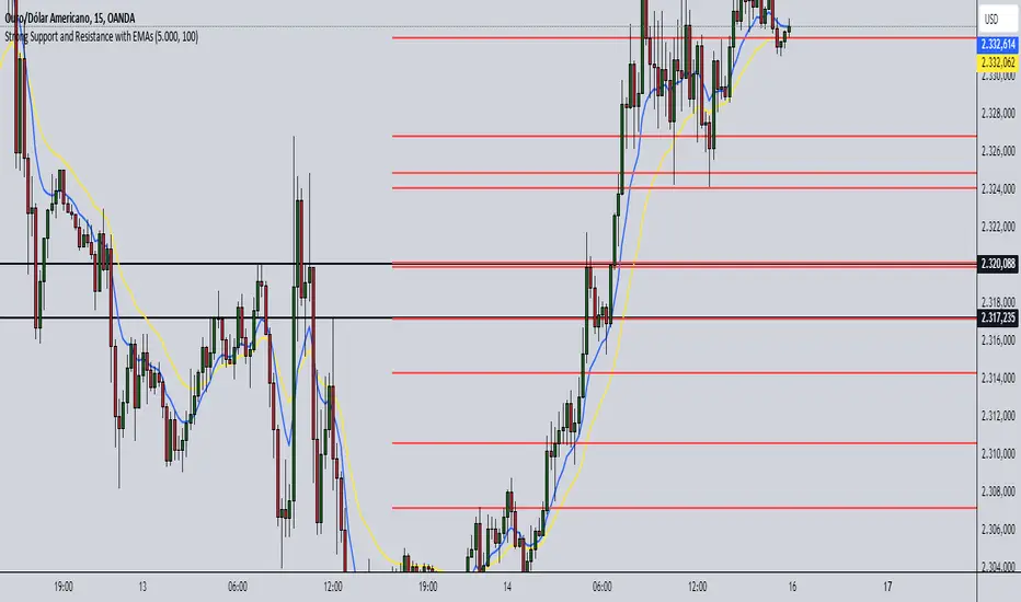
Strong Support and Resistance with EMAs @viniciushadek
### Strategy for Using Continuity Points with 20 and 9 Period Exponential Moving Averages, and Support and Resistance
This strategy involves using two exponential moving averages (EMA) - one with a 20-period and another with a 9-period - along with identifying support and resistance levels on the chart. Combining these tools can help determine trend continuation points and potential entry and exit points in market operations.
### 1. Setting Up the Exponential Moving Averages
- **20-Period EMA**: This moving average provides a medium-term trend view. It helps smooth out price fluctuations and identify the overall market direction.
- **9-Period EMA**: This moving average is more sensitive and reacts more quickly to price changes, providing short-term signals.
### 2. Identifying Support and Resistance
- **Support**: Price levels where demand is strong enough to prevent the price from falling further. These levels are identified based on previous lows.
- **Resistance**: Price levels where supply is strong enough to prevent the price from rising further. These levels are identified based on previous highs.
### 3. Continuity Points
The strategy focuses on identifying trend continuation points using the interaction between the EMAs and the support and resistance levels.
### 4. Buy Signals
- When the 9-period EMA crosses above the 20-period EMA.
- Confirm the entry if the price is near a support level or breaking through a resistance level.
### 5. Sell Signals
- When the 9-period EMA crosses below the 20-period EMA.
- Confirm the exit if the price is near a resistance level or breaking through a support level.
### 6. Risk Management
- Use appropriate stops below identified supports for buy operations.
- Use appropriate stops above identified resistances for sell operations.
### 7. Validating the Trend
- Check if the trend is validated by other technical indicators, such as the Relative Strength Index (RSI) or Volume.
### Conclusion
This strategy uses the combination of exponential moving averages and support and resistance levels to identify continuity points in the market trend. It is crucial to confirm the signals with other technical analysis tools and maintain proper risk management to maximize results and minimize losses.
Implementing this approach can provide a clearer view of market movements and help make more informed trading decisions.
Grid TraderGrid Trader Indicator ( GTx ):
Overview
The Grid Trader Indicator is a tool that helps traders visualize key levels within a specified trading range. The indicator plots accumulation and distribution levels, an entry level, an exit level, and a midpoint. This guide will help you understand how to use the indicator and its features for effective grid trading.
Basics of Trading Range, Grid Buy, and Grid Sell
Trading Range
A trading range is the horizontal price movement between a defined upper ( resistance ) and lower ( support ) level over a period of time. When a security trades within a range, it repeatedly moves between these two levels without trending upwards or downwards significantly. Traders often use the trading range to identify potential buy and sell points:
Upper Level (Resistance): This is the price level at which selling pressure overcomes buying pressure, preventing the price from rising further.
Lower Level (Support): This is the price level at which buying pressure overcomes selling pressure, preventing the price from falling further.
Grid Trading Strategy
Grid trading is a type of trading strategy that involves placing buy and sell orders at predefined intervals around a set price. It aims to profit from the natural market volatility by buying low and selling high in a range-bound market. The strategy divides the trading range into several grid levels where orders are placed.
Grid Buy
Grid buy orders are placed at intervals below the current price . When the price drops to these levels, buy orders are triggered . This strategy ensures that the trader buys more as the price falls, potentially lowering the average purchase price .
Grid Sell
Grid sell orders are placed at intervals above the current price . When the price rises to these levels, sell orders are triggered . This ensures that the trader sells portions of their holdings as the price increases, potentially securing profits at higher levels .
Key Points of Grid Trading
Grid Size : The interval between each buy and sell order. This can be constant (e.g., $2 intervals) or variable based on certain conditions.
Accumulation Range : The lower part of the trading range where buy orders are placed.
Distribution Range : The upper part of the trading range where sell orders are placed.
Midpoint : The average price of the entry and exit levels, often used as a reference point for balance.
As the price moves up and down within this range, your buy orders will be triggered as the price drops and your sell orders will be triggered as the price rises. This allows you to accumulate more of the asset at lower prices and sell portions at higher prices, profiting from the price oscillations within the defined range. Grid trading can be particularly effective in a sideways market where there is no clear long-term trend. However, it requires careful monitoring and adjustment of grid levels based on market conditions to minimize risks and maximize returns .
Configuring the Indicator :
Once the indicator is added, you will see a settings icon next to it. Click on it to open the settings menu.
Adjust the Upper Level , Lower Level , Entry Level , and Exit Level to match your trading strategy and market conditions.
Set the Levels Visibility to control how many bars back the levels will be plotted.
Interpreting the Levels :
Accumulation Levels : These are plotted below the entry level and are potential buy zones. They are labeled as Accumulation Level 1, 2, and 3.
Distribution Levels : These are plotted above the exit level and are potential sell zones. They are labeled as Distribution Level 1, 2, and 3.
Upper Level : Marked in fuchsia, indicating the top boundary of the trading range.
Exit Level : Marked in yellow, indicating the level at which you plan to exit trades.
Midpoint : Marked in white, indicating the average of the entry and exit levels.
Entry Level : Marked in yellow, indicating the level at which you plan to enter trades.
Lower Level : Marked in aqua, indicating the bottom boundary of the trading range.
By visualizing key levels, you can make informed decisions on where to place buy and sell orders, potentially maximizing your trading profits through systematic grid trading.

Moving Average Momentum SignalsBest for trade execution in lower timeframe (1m,5m,15m) with momentum confirmation in higher timeframes (2h,4h,1d)
This indicator relies on three key conditions to determine buy and sell signals: the price's deviation from a short-term moving average, the change in the moving average over time (past 10 candles), and the price's deviation from a historical price (40 candles). The strategy aims to target moments where the asset's price is likely to experience a reversal or momentum shift.
Conditions
Price deviation from short-term Moving Average (MA): Current candle close minus the 10-period MA (price action past 10 candles)
Change in Moving Average over time: Current 10-period MA minus the 10-period MA from 10 candles ago (price action past 20 candles)
Price deviation from historical price: Current close minus the close from 40 candles ago (price action past 40 candles)
Signal Generation Logic
Buy Signal: Triggered when all three conditions are positive. Confirmed if the previous signal was a sell or if there were no previous signals
Sell Signal: Triggered when all three conditions are negative. Confirmed if the previous signal was a buy or if there were no previous signals
Usage and Strategy
After back testing, I observed the higher timeframes were a good indication of momentum/sentiment that you can take note of while trading intraday on the lower time frames (time intervals stated above). Background highlights are also displayed for easier visualization of bullish/bearish skew in terms of the volume of signals generated.

Tetuan SniperThe TEMA and EMA Crossover Alert with SL, TP, and Order Signal strategy combines the power of Triple Exponential Moving Average (TEMA) and Exponential Moving Average (EMA) to generate high-quality trading signals. This strategy is designed to provide clear entry and exit points, manage risk through dynamic Stop Loss (SL) and Take Profit (TP) levels, and optimize trade sizes based on account balance and risk tolerance.
Key Features:
EMA and TEMA Crossover:
The strategy identifies potential buy and sell signals based on the crossover of EMA and TEMA. A buy signal is generated when TEMA crosses above EMA, and a sell signal is generated when TEMA crosses below EMA.
Dynamic Stop Loss (SL) and Take Profit (TP):
Stop Loss levels are dynamically set based on a user-defined number of pips below (for buy orders) or above (for sell orders) the lowest or highest point since the crossover.
Take Profit levels are dynamically adjusted using another TEMA, providing a flexible exit strategy that adapts to market conditions.
Lot Size Calculation:
The strategy calculates the optimal lot size based on the account balance, risk percentage per trade, and the number of maximum open orders. For JPY pairs, the lot size is adjusted by dividing by 100 to account for the different pip value.
The lot size is rounded to two decimal places for better readability and precision.
Visual Alerts and Labels:
Clear visual alerts and labels are provided for each buy and sell signal, including the recommended SL, TP, and lot size. The labels are placed in a way to avoid overlapping important chart elements.
Trend Visualization:
The area between the TEMA and EMA is colored to indicate the trend, with green for bullish trends and red for bearish trends, making it easy to visualize the market direction.
Inputs:
SL Points: Number of pips for the Stop Loss.
EMA Period: Period for the Exponential Moving Average.
TEMA Period: Period for the Triple Exponential Moving Average.
Account Balance: The total account balance for calculating the lot size.
Risk Percentage: The percentage of the account balance to risk per trade.
Take Profit TEMA Period: Period for the TEMA used to set Take Profit levels.
Lot per Pip Value: The value of 1 pip per lot.
Maximum Open Orders: The maximum number of open orders to split the balance among.
Example Usage
This strategy is suitable for traders who want to automate their trading signals and manage risk effectively. By combining TEMA and EMA crossovers with dynamic SL and TP levels and precise lot size calculation, traders can achieve a disciplined and methodical approach to trading.

Noise Area Indicator with Gap AdjustmentsThis version of the Noise Area Pine Script, developed with the assistance of ChatGPT, includes adjustments for opening gaps to better account for overnight price changes that affect the market open. This Pine Script is designed to provide traders with a dynamic visualization of the Noise Area based on the volatility of the last 14 trading days. It calculates the upper and lower boundaries using the daily opening price, representing typical price movements relative to the open. This helps identify significant deviations, potentially indicating the start of a trend.
Features:
Captures and adjusts for gaps between the previous day's close and the current day's open, allowing for more precise trend analysis.
Sets the Noise Area boundaries using both the daily opening price and the previous day's closing price, ensuring that sudden market moves are adequately considered.
Measures deviations in price from the opening, averaged over the last 14 days to calculate absolute movements.
Plots upper and lower boundaries on the chart, providing a visual guide for traders to assess market volatility.
Includes a dynamically plotted daily opening price, serving as a consistent reference point for market open conditions.
Usage:
This indicator is particularly useful for day traders and short-term traders who need to understand intraday volatility and pinpoint potential breakout points, aiding in the strategic planning of entry and exit points based on historical volatility patterns relative to the daily open (with gap adjustments).

Enhanced Forex IndicatorDescription of the "Enhanced Forex Indicator"
The "Enhanced Forex Indicator" is designed for traders who want a comprehensive technical analysis tool on the TradingView platform. This script integrates Exponential Moving Averages (EMAs), support and resistance zones, and candlestick pattern recognition to provide actionable trading signals, particularly useful for Forex and other financial markets. The script is suitable for intraday trading and swing trading.
Components of the Indicator
Exponential Moving Averages (EMAs):
Short EMA (Blue Line): Faster responding average, good for identifying recent trend changes.
Long EMA (Red Line): Slower moving average, helps in confirming longer-term trends.
Support and Resistance Zones:
Resistance Zone (Red): Area where potential selling pressure could overcome buying pressure, halting price increases temporarily or reversing them.
Support Zone (Green): Area where potential buying pressure could overcome selling pressure, supporting prices and preventing them from falling further.
Candlestick Patterns:
Bullish Engulfing Pattern (Green Triangle Up 'BE'): Suggests a potential upward reversal or start of a bullish trend.
Bearish Engulfing Pattern (Red Triangle Down 'BE'): Indicates a potential downward reversal or start of a bearish trend.
Buy/Sell Signals:
Buy Signal (Green Label 'BUY'): Triggered when the price is above both EMAs and a bullish engulfing pattern is detected.
Sell Signal (Red Label 'SELL'): Triggered when the price is below both EMAs and a bearish engulfing pattern is detected.
Trading Setup:
Entry: Consider entering a buy position when the 'BUY' signal appears, indicating bullish conditions. Enter a sell position when the 'SELL' signal appears, indicating bearish conditions.
Exit: Look for closing signals opposite your entry or use predefined take profit and stop loss levels. For instance, exit a buy position on a 'SELL' signal or when the price drops below the support zone.
Risk Management:
Set stop losses just below the support zone for buy orders and above the resistance zone for sell orders to protect against significant losses.
Adjust position sizes according to your risk tolerance and account balance.
Considerations:
Use this indicator in conjunction with other analysis tools and fundamental data to confirm signals and strengthen your trading strategy.
Periodically backtest the strategy based on this indicator to ensure its effectiveness in current market conditions.
Optimization:
Adjust the lengths of the EMAs and the buffer size of the support and resistance zones to better fit the asset's volatility and your trading timeframe.

Holding Zone Input Parameters
The script has three input parameters:
· length: an integer input with a default value of 20, likely used for calculating moving averages or other indicators.
· zoneSize: a decimal input with a default value of 1.5, likely used to define the size of the "holding zone".
· entryZone: an integer input with a default value of 50, likely used to define the entry point for the strategy.
Calculate Holding Zone
The script calculates two values:
· highs: the highest high over the last length bars.
· lows: the lowest low over the last length bars.
Then, it calculates the zoneHigh and zoneLow values by subtracting/adding a fraction of the difference between highs and lows from/to highs and lows, respectively. This creates a "holding zone" between zoneHigh and zoneLow.
Plot Holding Zone
Finally, the script plots two lines:
· zoneHigh with a blue color and a linewidth of 2.
· zoneLow with a blue color and a linewidth of 2.
________________________________________________________________
For the 15 min timeframe I use the parameters 10 for the length, 0.5 for the zone size and 20 for the entry zone. this makes it more sensitive to price

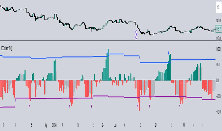
Timeframe Continuity Oscillator [TFO]This indicator is used to visualize timeframe continuity - a core concept of "The Strat" - along with some added logic for potential range limiters.
When discussing timeframe continuity, typically we are evaluating several timeframes to see if price is trading above or below the current open of each respective timeframe. If we are concerned with the 15m, 4h, and 1D for example, and price is trading above the current open of each of those timeframes, we can say that we have full timeframe continuity (FTFC) up. Conversely, if price is trading below the current open of each of those timeframes, we can say that we have FTFC down.
We can visualize this with an oscillator of sorts, where the zero line is anchored to the open price of the highest timeframe that we're concerned with. Using the prior example, this would be the 1D timeframe. As long as price is above the current 1D open, it is impossible to have FTFC down; and as long as price is below the current 1D open, it is impossible to have FTFC up. This is why we base the oscillator's values off of the highest timeframe's open (the values are simply how far price has traded from this open) - any value greater than zero tells us that there is potential to have FTFC up, and any value less than zero tells us that there is potential to have FTFC down.
There are a few ways we chose to visualize this data. First, we can choose the "Binary" option which simply uses one solid bullish color above the zero line, and one solid bearish color below the zero line.
Second, we can choose the "Gradient" option to help describe whether we have FTFC up or down. Values above the zero line will be a mix of the bullish color and mid color, where the mid color indicates no timeframe continuity up and the bullish color indicates FTFC up - sort of like a color spectrum of timeframe continuity to describe how many timeframes are in agreement. Similarly, values below the zero line will be a mix of the bearish color and the mid color, where the mid color again indicates no timeframe continuity down and the bearish color indicates FTFC down.
Lastly, we can choose the "FTFC Only" option which will only color the histogram bars as bullish if there is FTFC up, or bearish if there is FTFC down.
One more feature that we added is these upper and lower bands that aim to help describe the potential upper and lower limits that price may travel, relative to the highest timeframe's open. This is done by taking the standard deviation of some defined lookback period, for example, 2 standard deviations of the previous 10 weeks, assuming 1W is the highest timeframe enabled.
The concept is similar to that of an ADR (average daily range) as it can be used to estimate maximum range extensions for the largest timeframe. The arrows you see are plotted once the value exceeds either band - alerts can be enabled for these events as well through any alert() function call.
Multi-Pairs Stratrgy Backtesting ScreenerThis indicator is for viewing and checking the results of a specific strategy simultaneously on 25 currency pairs. Results such as number of trades, wins, losses, canceled trades and most importantly win rate.
Long condition is as follows:
Short condition is as follows:
An Alert Fibo Level is built in to indicate the buy or sell status.
Reset Deal Calculation Fibo Level , if the price hits it, the indicator resets all calculations and prepares for the next situation.
If Other situation appear after missed situation, indicator consider it:
All statistics collected in Screener Table :
Date Period:
Users can customize the date period during which the strategy is tested, allowing for a more granular analysis of performance over specific timeframes.
Entry:
Entry is based on Fibonacci level between the Lower Low and Higher High pivots for Long deals.
Entry is based on Fibonacci level between the Higher High and Lower Low pivots for Short deals.
Allowing a second entry
There is a feature that If the risk-to-reward ratio is below the specified input (rr), the trading deal wont initiate.
Stop Loss:
Adjustable based on Fibonacci levels , Base Pivot, Percent and ATR.
The Base Pivot is calculate from LL pivot point for Long and HH pivot point for short (not Entry price).
The Percent and ATR is calculate from Entry price.
Targets:
Adjustable based on Source, Fibonacci levels , Percent and ATR.
Source indicates the maximum (minimum) value between the open and close of the candle where the Higher High (Lower Low) pivot point was formed for Long (Short) deals.
Percent and ATR calculates from Entry 1 Price
Exit Methods :
The goal is to offer users a diverse set of exits before the price touches the target or stop loss.
1. Pending Entry Time-out
cancel pending entry based on candle counting since alert fired. (before deal started)
2. Active Deal Reverse
If a deal (long or short position) is currently open, and the reverse signal is emitted, the script will close the existing deal.
3. Reverse Deal Exit
If a deal (long or short position) is currently open, and the reverse signal is emitted, the script will automatically close the existing deal.
4. Move Exit
With this method, if Entry 2 is triggered, the deal will be closed when the price touches the Entry price.
5. Candle Counting Exit
This exit type is based on the number of candles since the deal started.

Smart Money Concept + Strategy Backtesting Toolkit [Shah]This indicator, primarily designed for strategy backtest. It’s important to emphasize that the orders generated by this indicator are in the form of stop-limit orders .
For Long setup , When lower lows and lower highs form, after price moving up from the last higher high, a “change of character” occurs. Entry will takes place in the golden zone.
This the Long setup:
And this is the Long setup Example on chart:
For Short setup , When higher lows and higher highs form after the price moves down from the last higher low, a “change of character” occurs. Entry will take place within the golden zone.
This the Short setup:
And this is the Short setup Example on chart:
Key Features:
Date Period:
Users can customize the date period during which the strategy is tested, allowing for a more granular analysis of performance over specific timeframes.
DCA Entry:
Entry is based on Fibonacci level between the Lower Low and Higher High pivots for Long deals .
Entry is based on Fibonacci level between the Higher High and Lower Low pivots for Short deals .
Allowing a second entry with a specified position size
Entering at a different price based on a Percent or ATR change.
There is a feature that If the risk-to-reward ratio is below the specified input (rr), the trading deal wont initiate, and the signal alert wont be triggered.
Stop Loss:
Adjustable based on Fibonacci levels , Percent and ATR.
The percent and ATR is calculate from LL pivot point for Long and HH pivot point for short (not Entry price)’
Targets:
Adjustable based on Source, Fibonacci levels , Percent and ATR.
Source indicates the maximum (minimum) value between the open and close of the candle where the Higher High (Lower Low) pivot point was formed for Long (Short) deals.
Percent and ATR calculates from Entry 1 Price
There is a feature that closes the part of the position size at Target 1 based on a percentage, leaving the rest to close at Target 2, entry, exit price, or stop loss.
Plots:
The visual representation of the indicator includes the key plots:
Reset Deal Calculation Fibonacci Level
Alert Fire Fibonacci Level
Entry 1
Entry 2
Entry Average
Stop Loss
Target 1
Target 2
Labels:
Displays informative labels upon trade open and close, providing details about each transaction like gain and equity and etc.
Risk Management:
Allows setting initial capital, risk per trade, and commission for each transaction.
Score Table:
Provides statistical information for Regular deals (refers to deals that closed in Target price or Stop loss price) and Exited deals (representing deals that didn’t touch the stop loss or targets.):
Number of trades
Win rate
Profit factor
Average Risk to Reward ratio
Total Profit and Loss (PnL)
Commission paid
Live equity
It should note that Winrate calculated based on closed deals at target or stop loss. (Exited trades doesn’t into account in calculation of Winrate)
Exit Methods :
The goal is to offer users a diverse set of exits before the price touches the target or stop loss.
1. Pending Entry Time-out
cancel pending entry based on candle counting since alert fired. (before deal started)
2. Break Even
If Target 2 is reached, the stop loss automatically adjusts to the entry price.
3. Active Deal Reverse
If a deal (long or short position) is currently open, and the reverse signal is emitted, the script will close the existing deal.
4. Reverse Deal Exit
If a deal (long or short position) is currently open, and the reverse signal is emitted, the script will automatically close the existing deal.
5. Move Exit
With this method, if Entry 2 is triggered, the deal will be closed when the price touches the Entry price.
6. Candle Counting Exit
This exit type is based on the number of candles since the deal started.
7. Profit Zone Shield Exit
Once a deal enters profit, the Exit level moves to the entry level after reaching a Fibonacci level between TP1 and Entry 1.
Deep Backtesting Table:
It includes:
Time period of the backtest
Pair name and timeframe
Count the long and short trades
Win streak and loss streak
Total deal chances and missed chances
Count the deals goes directly from entry 1 to tp1 and entry 2 to tp1
Count the deals that touched entry 2 and entry 2 filled percent
Count the number of each exit type
Other statistics such as CAGR, Sharpe, Kurtosis, Skewness, and Max Drawdown.

Greenblatts Magic Formula - A multiple approachThis indicator is supposed to help find undervalued stocks. Inspired by Joel Greenblatt's strategy where he ranks stocks with the lowest EV/EBIT and the highest ROC. Inspired by the ERP5 strategy I have added Earnings Yield together with ROC.
My approach and how I use the indicator is to see Magic Formula score as a multiple, rather than ranking the numbers between different stocks. Like P/E for comparison. Different kinds of companies trades at different multiples so you have to compare the current MF Score in relation to historical MF Score to get an idea if it truly is undervalued. You also want to see that price actually reacts to a low MF Score.
As i general rule for myself I stay away from companies with EV/EBIT above 13 and generally want to see MF Score below 6-7. A company trading at a negative MF Score indicates that the company may be heavily undervalued.
Red line = EV/EBIT
Green line = ROC + EY / 2
Yellow line = "MF Score" EVEBIT - (ROC+EY/2)
Blue line = The 50 EMA of MF score
The strategy is simple. Look for companies which might be undervalued. Compare the current MF score to it's history. If it's trading near a previous bottom it indicates that the company might be undervalued. You can also use the MF EMA to see a more smooth curve to interpret the multiple.

Sweep institutionalThis indicator focuses on identifying "SWEEPs" based on taking liquidity at highs and lows. The application of the SWEEP strategy is highly determinant in the Swing points, as they serve as the target of our operations.
ALERTS INCLUDED
🔹Example of Strategy Application
1.-Create the BULLISH SWEEP.
2.-You can enter LONG.
3.-If it is a BULLISH SWEEP, take a long with a SWING HIGH target (2-3 pips up).
4.-If it is a BULLISH SWEEP, place your SL behind the SWEEP (2-3 pips).
(This example is bullish, but it would be the same in a bearish setup, applying everything in the opposite way)
t's very crucial for the strategy to reference SWING POINTS, as these points will be our take profit and stop loss points.
The strategy is based on identifying a SWEEP. After this, we can look for trading opportunities with targets on the opposite side of the fractal. Remember, if you decide to enter, the Stop Loss should be placed protected by the Sweep, and the Take Profit should be set at the opposite Swing, as seen in the example.
Use this STRATEGY IN TIMEFRAMES GREATER THAN 30M. If you decide to use it in timeframes <30M, there's a higher probability of encountering false SWEEPs (the most optimal are 1h & 4h)
🔹Use
The Sweep strategy involves identifying potential trades based on the creation of a "SWEEP" (liquidity grab) at the Swing High or Swing Low. Below is an example of a bearish opportunity after taking liquidity from a Swing High with a wick and no candle body closing above it.
🔹Details
As you have seen, it indicates the surpassing of a high without the candle body, this is called a “SWEEP.” Each time this occurs, the price is likely to surpass the opposite SWING High/Low. The following example will show more clearly how it works in both bullish and bearish scenarios.
🔹Configuration
-Cooldown period: is the length of the operating Range line
-Swing detection: determines the points to be used as SL and TP protection
Bullish/Berish Sweep
-Line Width: size of the line
-Line Style: design type
-Color
Opening RangeThe opening range or first 30 minutes of trading during the day sets the tone and becomes an important reference through the rest of the day. Price will react as it reaches the high and low of the opening range.
Backtesting has shown that the strategies based on the opening range have merit and provide an edge in trading. By not being aware of these points of reference you put yourself at risk.
In addition to the opening range, the distance from the high or low of the opening range plus the width of the opening range forms another important reference point.
Opening Range Rules.
Price must break out of the opening range in order to have a trending day. As long as price is inside the opening range, expect the trade to be choppy.
Once price leaves the opening range the market can begin to trend. However, before it trends most times it will retest the boundary of the opening range. This is a critical point, and a better than average entry for a position to join the trend. However, if price closes back inside the opening range watch out. Re-entry to the opening range has a high probability of going to the middle of the opening range, and a better than average probability of crossing the entire opening range.
In the above chart we can see price broke below the opening range then returned to retest the opening range before beginning a downward trend that delivered 175 pts on NQ.
Upon re-entering the opening range price tried to break down again but ultimately traveled up until it hit the 50% mark of the opening range.
Once a trend has begun the first target is the green line which is 1 width of the opening range outside of the opening range.
Once price broke out of the opening range to the upside, it came back to retest the opening range high, before beginning an uptrend that delivered 120 pts on NQ.
RSI and MACD Crossover SignalsBest for Short-Term/Intraday Trading on SPY, TSLA, NVDA
Strategy Concept:
This strategy is designed for short-term trading across various assets and timeframes (Recommend: 1min, 5min, 15min, 1hr, 4hr, 1day). It leverages the Relative Strength Index (RSI) and Moving Average Convergence Divergence (MACD) to identify potential buy and sell signals. The strategy aims to capture moments where the asset's price is likely to experience a reversal or a significant momentum shift.
By combining the RSI and MACD indicators, the strategy seeks to increase the accuracy of identifying potential trend reversals or continuations, taking into account both the momentum and the trend direction of the asset.
RSI (Relative Strength Index) Parameters:
The RSI period is set to 14
Overbought and oversold levels are set at 70 and 30, respectively
The RSI is used to identify potential reversal points when the asset is overbought or oversold
MACD (Moving Average Convergence Divergence) Parameters:
The MACD settings are configured with a fast length of 8, a slow length of 34, and a signal smoothing of 8
The MACD line crossing over or under the signal line is used to confirm the potential buy or sell signals indicated by the RSI
Signal Generation Logic:
Buy Signal:
Triggered when the RSI crosses above the oversold level (30).
Confirmed if the MACD line crosses above the signal line within a delay period of up to 4 candles after the RSI signal.
Sell Signal:
Triggered when the RSI crosses below the overbought level (70).
Confirmed if the MACD line crosses below the signal line within a delay period of up to 4 candles after the RSI signal.
Additional Features:
The script includes a notification system that alerts the trader when either a buy or sell signal is detected. The alert signal is combined with both the buy and sell signal in 1 so people without premium can be alerted when any signal appears.
Buy signals are visually represented on the chart below the price bars with a green "BUY" label.
Sell signals are indicated above the price bars with a red "SELL" label.
Usage and Application:
This strategy is versatile and recommended to be played with scalps and day trades. I prefer SPY 0DTE on the 1 and 5 minute timeframe and looking for bigger trend reversals on the 1hr, 4hr, and 1 day timeframe.
CARNAC Magic DCAThe "CARNAC Magic DCA" indicator is designed for investors looking for the best opportunities for Dollar-Cost Averaging (DCA).
How it works:
The Carnac Dynamic DCA Threshold calculates a dynamic threshold for DCA entries using Exponential Moving Average (EMA), Average True Range (ATR), and the maximum distance from the EMA over a full lookback period, aiding in identifying optimal buy opportunities. It also only signals a DCA buying opportunity after a bearish candle, which helps lower the average DCA price.
Configurable Inputs:
EMA Start Length: Sets the initial length for the series of EMAs, affecting their sensitivity to price changes.
ATR Length: Determines the period for the ATR calculation, influencing the dynamic DCA threshold's responsiveness to market volatility.
ATR Multiplier: Modifies the impact of the ATR on the DCA threshold, allowing for finer control over the threshold's sensitivity to volatility.
Start Calculation From: Enables setting a specific start date for calculations, tailoring the analysis to a particular trading period.
DCA Buy Signal Alert: Generates an alert when the price is below both the dynamic DCA threshold and the opening price, indicating a potential buy signal based on DCA strategy.
Ten EMAs: Carnac Magic DCA includes a ten EMA plot, which decrease in length from the user-defined starting length, offering a multi-layered trend analysis.
EMA Color Coding: The sequential arrangement of EMAs is visually represented through color coding, facilitating quick trend recognition.
Average Buy Price Analysis: Calculates and displays the average buy price and its percentage difference from the average closing price since the user-defined start date, helping assess the strategy’s effectiveness compared to traditional DCA methods (purchasing at the close of every candle).
Visual Indicators and Labels: Includes visual alerts for buy signals and informative labels showing average buy prices and related statistics.

VWAP, MFI, RSI with S/R StrategyBest for 0dte/intraday trading on AMEX:SPY with 1 minute chart
Strategy Concept
This strategy aims to identify potential reversal points in a price trend by combining momentum indicators (RSI and MFI), volume-weighted price (VWAP), and recent price action trends. It looks for conditions where the price is poised to change direction, either bouncing off a support level in a potential uptrend or falling from a resistance level in a potential downtrend.
By incorporating both price level analysis (support/resistance) and momentum indicators, the strategy seeks to increase the likelihood of identifying significant trend reversals, taking into consideration both recent price movements and the current price's position relative to historical highs and lows.
VWAP (Volume-Weighted Average Price)
VWAP acts as a benchmark to determine the general market trend. It's an average price weighted by volume.
A price above VWAP is often considered bullish, and a price below VWAP is seen as bearish.
MFI (Money Flow Index) and RSI (Relative Strength Index) Parameters
MFI is a volume-weighted RSI, used to identify overbought (above 70) or oversold (below 30) conditions.
RSI is a momentum indicator that measures the magnitude of recent price changes to identify overbought or oversold conditions, similar to MFI.
The script uses standard overbought (70) and oversold (30) thresholds for both MFI and RSI.
Trend Check Function
The function trendCheck analyzes the past pastBars candles to count how many were bullish (closing price higher than the opening price) and bearish.
This function is used to assess the recent trend direction.
Support and Resistance Detection
The script calculates the highest high (highestHigh) and lowest low (lowestLow) over the last lookbackSR (50) periods to identify potential support and resistance levels.
isNearSupport and isNearResistance are conditions to check if the current price is within 0.08% of these identified levels, indicating proximity to support or resistance.
Buy and Sell Logic
Buy Signal:
The RSI crosses over the oversold threshold (30).
The MFI is also below its oversold level (30).
The current price is above the VWAP.
The recent trend (past 20 bars) has been predominantly bearish.
The price is near the identified support level.
Sell Signal:
The RSI crosses under the overbought threshold (70).
The MFI is above its overbought level (70).
The current price is below the VWAP.
The recent trend has been predominantly bullish.
The price is near the identified resistance level.
Non-Repainting Awesome Oscillator[TV1ndicator]Non-Repainting Awesome Oscillator (NRAO) is an improved standard Awesome Oscillator
NRAO, unlike the built-in AO , does not repaint the values calculated on real-time bars when using an alternative timeframe .
The modification is based on the current version of the built-in Awesome Oscillator - 27.0
Comparison of AO and NRAO
In the following screenshot AO(gaps on), AO(gaps off), NRAO\ (non-repainting off), NRAO(non-repainting on) , the chart timeframe is 1 minute, and the indicator timeframe is 10 minutes:
Starting from 9:17, the chart worked in real time.
The following screenshot shows the same indicators for the same period, but after refreshing the page at 10:21:
The repainting of the built-in AO's minute-to-minute data when the "Wait for timeframe closes" option is turned off is obvious.
Even turning on the "Wait for timeframe closes" option, which in theory should prevent repainting, does not help. On historical data, the value is calculated at the close of the bar of an alternative timeframe, and is displayed at 9, 19, 29,39,... minutes of the chart.
On real data, the AO value is calculated at the close of the first bar of the chart timeframe, the opening of which coincides with the opening of a bar of an alternative timeframe, and is displayed at 10, 20, 30, 40,... minutes of the chart.
In addition, AO displays a value on the first real-time bar, which will disappear if you refresh the page after some time.
NRAO(non-repainting off) works similarly to AO(gaps off).
NRAO(non-repainting on) calculates and displays values in the same way both in history and in real time.
P.S. I publish this indicator in order to describe the problem using its example. The vast majority of built-in indicators are subject to such repaint. Unfortunately, sometimes repaint can lead to an erroneous trading decision. Not only beginners, but sometimes even experienced traders face this problem. Over many years of practice, I have repeatedly encountered situations where my clients were disappointed in their strategies as soon as they realized that standard indicators on alternative timeframes were repainting, and the strategy I wrote using indicators without repainting did not work quite as they expected.
I hope this example will help in the future to avoid unnecessary mistakes when using built-in indicators on alternative timeframes.
If you find this modification useful for other built-in indicators, write what other indicators without repainting you would like to see.
Non-Repainting Awesome Oscillator (NRAO) - это усовершенствованный стандартный Awesome Oscillator
NRAO в отличии от встроенного AO не перерисовывает значения, рассчитанные на барах реального времени при использовании альтернативного таймфрейма.
За основу модификации взята актуальная версия встроенного Awesome Oscillator - 27.0
Сравнение работы AO и NRAO
На следующем скриншоте отображены AO(gaps on), AO(gaps off), NRAO(non-repainting off), NRAO(non-repainting on) на таймфрейме графика 1 минута, и таймфрейме индикаторов 10 минут:
Начиная с 9:17 график работал в реальном времени.
На следующем скриншоте отображены те же индикаторы за тот же период, только после обновления страницы в 10:21:
Перерисовка ежеминутных данных встроенного AO при выключенной опции "Дождаться закрытия интервала" видна сразу.
Даже включение опции "Дождаться закрытия интервала", которая по идее должна была бы исключить перерисовку, не избавляет встроенный AO от неё. На исторических данных значение рассчитывается на закрытии бара альтернативного таймфрейма, и отображается на 9, 19, 29,39,... минутах графика.
На реальных данных значение AO рассчитывается на закрытии первого бара таймфрейма графика, открытие которого совпадает с открытием бара альтернативного таймфрейма, и отображается на 10, 20, 30, 40,... минутах графика.
Кроме того AO отображает значение на первом баре реального времени, которое не будет отображено, если обновить страницу спустя некоторое время.
NRAO(non-repainting off) работает аналогично AO(gaps off).
NRAO(non-repainting on) рассчитывает и отображает значения одинаково как на истории, так в реальном времени.
P.S. Я публикую этот индикатор для того, чтобы на его примере описать проблему. Подобной перерисовке подвержено абсолютное большинство встроенных индикаторов. К сожалению, иногда подобная перерисовка может привести к ошибочному торговому решению. С этой проблемой сталкиваются не только новички, но иногда и бывалые трейдеры. За многолетнюю практику я не один раз сталкивался с ситуациями, когда мои клиенты были разочарованы в своих стратегиях, как только они понимали, что стандартные индикаторы на альтернативных таймфреймах иногда перерисовываются, и написанная мной стратегия с использованием индикаторов без перерисовки работает не совсем так как они ожидали. Искренне надеюсь, что этот пример поможет вам в будущем избежать лишних ошибок при использовании встроенных индикаторов на альтернативных таймфреймах.
Если вы считаете полезным такую доработку для других встроенных индикаторов, пишите в отзывах какие еще индикаторы без перерисовки вы бы хотели видеть.
