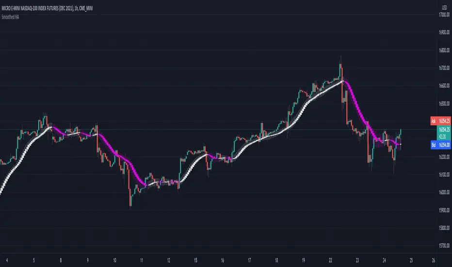
Smoothed Heiken Ashi - SamXThis is my version of the Smoothed Heiken Ashi indicator. While there are a few versions of these out there (most notably "Modified Smoothed Heiken Ashi" by badshah_e_alam and "Smoothed Heiken Ashi Candles v1" by jackvmk), none matched what I was looking for.
1. All had hard-coded the smoothing to use the EMA calculation - in this indicator, these are user-configurable
2. Both applied the double-smoothing principle (Take a moving-average of price, apply the Heiken Ashi conversion, then apply a second moving average to the smoothed Heiken Ashi candles to calculate new candles). While this is the most common approach, I had a few issues with this:
Even if setting both moving average lengths to 1, the indicator did not correctly calculate what should be the actual corresponding Heiken Ashi candle values (as compared to the built-in Heiken Ashi chart on Tradingview)
They were inconsistent in operating on different chart types - indicator values for the same candle can differ between using a base Heiken Ashi or Renko chart vs a standard Candle or Bar chart.
I wanted the ability to easily enable/disable the second smoothing (which is now a configuration option)
I wanted the ability to configure different moving-average calculations for each smoothing iteration (e.g. EMA for the initial smoothing, and Smoothed Moving Average for the second smoothing)
3. Many of the inputs were not clearly or properly defined in the settings window - this script has far more refined user input settings, put in logical groupings, and with relevant help text.
4. Enhanced some visual styling (and added to the Settings) to make it easier for the user to enable/disable printing candle wicks, as well as customizing the bullish / bearish bar colors
5. Added alerts for bar color change to help users catch potential trend reversals
Reference paper on the original Smoothed HA formulas: www.researchgate.net
Reference on the more common implementation formulas (using double-smoothing): www.sierrachart.com
Wyszukaj w skryptach "text"
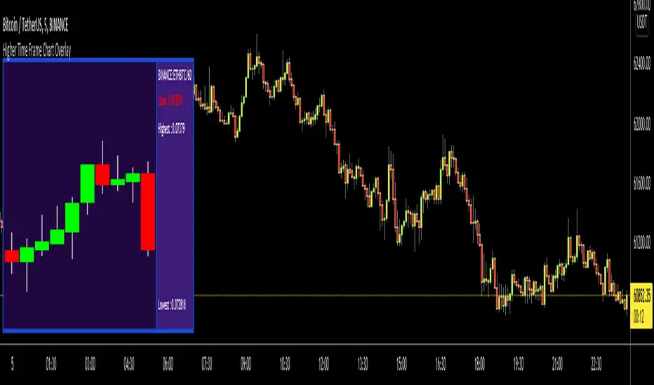
Higher Time Frame Chart OverlayHello All,
This script gets OHLC values from any security and Higher/Same time frame you set, then creates the chart including last 10 candles. it shows Symbol name, Time Frame, Highest/Lowest level of last 10 candles and Close Price at the right side of the chart as well. Closing price text color changes by the real-time candle of the related symbol and time frame. The all this was made using the Tables in Pine and the chart location doesn't change even if you change the size of main chart window.
Almost everything can be change as you want. You can change/set:
- Colors of Body and Top/Bottom Wicks separately
- The Height of each Cell
- The Width of Body and Wicks
- The Background and Frame color
- Enable/disable Status Panel (if you disable Status Panel then only candle chart is shown)
- Location of Status Panel
- Text color and Text size
- The Background color of Status Panel
Some examples:
The info shown in Status Panel:
You can change The Height of each Cell and The Width of Body and Wicks
You can change colors:
You can change location of the chart:
If you add the script more than once then you can see the charts for different symbols and time frames: (This may slow down your chart)
If you right-click on the script and choose "Visual Order" => "Bring to front" then it will be better visually:
P.S. Using this script may slow down your chart, especially if you add it more than once
Enjoy!
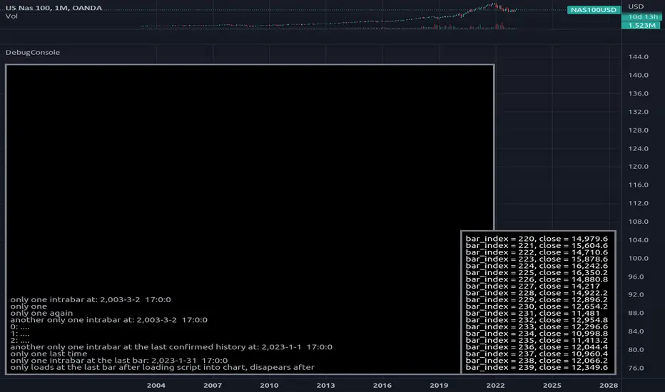
DebugConsoleLibrary "DebugConsole"
Methods for debuging/output into a table, console like style.
init(size) initiate property variables.
Parameters:
size : int, console line size.
Returns: tuple, table and string array.
queue(console_id, new_line) Regular Queue, will be called once every bar its called.
Parameters:
console_id : string array, console configuration array.
new_line : string, with contents for new line.
Returns: void.
queue_one(console_id, new_line) Queue only one time, will not repeat itself.
Parameters:
console_id : string array, console configuration array.
new_line : string, with contents for new line.
Returns: void.
update(table_id, console_id) Update method for the console screen.
Parameters:
table_id : table, table to update console text.
console_id : string array, console configuration array.
Returns: void.
Gain/StopLoss Percentage LinesGain/StopLoss Percentage Lines is a quick way to enter your Entry Price in to a stock and track the percentage of gain or loss at the 5% and 10% markers.
Click on the gear settings icon and type in your entry price. The percentage is defaulted to 5%. You can change this to a different percentage at this screen. Note that whatever number you enter will be doubled for the upper and lower lines. For instance, if you want to set your first red line stop loss and green gain line at 2.5%, your two other upper and lower green and red lines will be at 5%.
However, this will not change the text on the tab marker.
To change the tab text, go in to the Pine Editor and change the green text that says "5% Gain" and "5% Loss" to your new percentages.

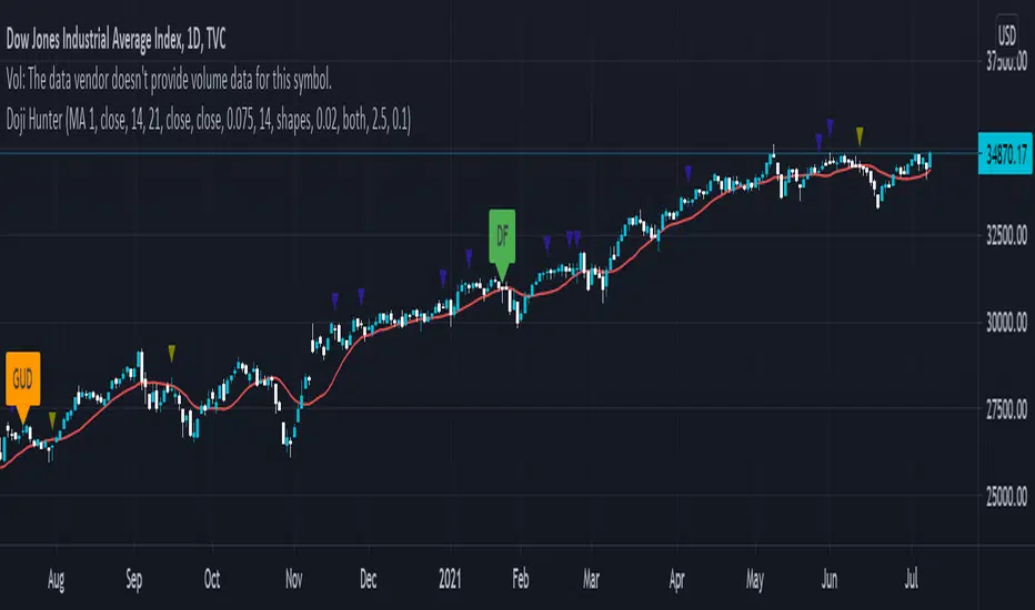
Doji Hunter█ OVERVIEW
This script is built to search for 8 different Doji candlestick patterns in markets and makes them appear on screen with bar coloring and creating color-coded labels/shapes. It will identify the following variants based upon user input for various rules to abide by:
Gapping Up
Gapping Down
Gravestone
Dragonfly
Long-Legged
Rickshaw Man
Northern (Doji in uptrend)
Southern (Doji in downtrend)
Note: for the remainder of this description, the types for inputs will be marked by italic text.
█ OPTIONS
This script features a wide range of options available to the user to modify how it functions. The first set of inputs dictate how the trend analysis is done with moving averages. The second and third sets of inputs dictate specific rules for how Doji candles are analyzed and the colors used for when they appear.
█ INPUTS (short)
1 — Moving Average Rules:
The Northern and Southern Doji variants require some trend analysis which will be done by Moving Averages. The inputs in this section change various things about the moving average(s) to be used. In the second section of inputs, there is one boolean option that will nullify the need for trend detection and consolidates the Northern and Southern Doji variants into one.
2/3 — Doji Rules and Colors:
The next two sections of inputs correspond to the various rules that dictate how various doji variants will be analyzed, as well as the colors that correspond to each variant. The colors will also apply to each of the labels/shapes used.
4 — Diagnostics:
The last boolean will allow the user to see extra detail with regards to how and when dojis are detected. Note: This is not a part of any prior section and is simply included as a last functional item to the list of all inputs.
An example of multiple labels being shown on screen for various types of Dojis (DJI 1D chart):
█ INPUTS (extended)
1 — Moving Average Rules:
This section consists of 10 different inputs specific to the rules on how the moving average functions for trend analysis.
"Trend Rule" ( string list) determines which Moving Average will be used for trend detection. It has 3 options: "MA 1", "MA 2", or "BOTH". The second input "Trend Source" determines which OHLC (or combination) value to use in comparison to either MA 1 or MA 2 (EX: Trend Rule -> "MA 1" and Trend Source -> "close": if close > MA 1 -> uptrend, downtrend otherwise). If "BOTH" is selected then "Trend Source" is ignored and added nuance in the script ensures that the shorter MA being above the longer MA yields an uptrend (downtrend otherwise).
The next 8 inputs focus on 4 different parts of both MA 1 and 2.
Length ( integer(s) )
Color
Switch between SMA/EMA ( boolean(s) )
Source for MA
Note: Additional attention to detail has been made here as trend direction is ignored if "BOTH" is selected for the MA Rules and the lengths of both Moving Averages are set to be the same.
2/3 — Doji Rules and Colors:
The next two sections include 19 inputs that are related to how this script will analyze and identify the different variants of Doji candles.
"Identify Pattern On Close" ( boolean ) modifies which candles are to be used for determining when Doji candles are recognized. This changes an offset used for historical reference on some global variables which will force the script to only identify patterns after the current candle has closed.
"Doji Body Tolerance" ( float ) tells the script the maximum % the candle body may be of the high-low range to be considered a Doji candle.
"Doji Wick Sample" ( integer ) defines how many prior candles to sample from in calculating the current average upper and lower wick sizes.
"Simplify Northern/Southern Dojis" ( boolean ) makes this script ignore trend direction for Doji detection and consolidates Northern and Southern Dojis into being recognized as the same. This has an added effect of removing the plotted moving averages from the screen.
"Northern/Southern Display" ( string list ) that has multiple options for how Northern and Southern Dojis will be displayed on screen. Because of how labels may be extremely taxing on TradingView's servers to display, the default setting is "shapes" where Northern and Southern (N/S) Dojis will be marked with a colored triangle at the top of the candle. If "Simplify Northern/Southern Dojis" is true, all N/S Dojis will be marked with an x-cross instead. Other options include "labels" which enables the use of labels accompanied by their respective tooltip and color, or "none" where N/S Dojis will be only noticeable by their changed barcolor.
"Allow Gravestone/Dragonfly Shadows" ( boolean ) allows a bit of additional nuance to the definition of Gravestone or Dragonfly Dojis with small shadows.
"Gravestone/Dragonfly Shadow Tolerance" ( float ) defines the maximum % that the lower wick/upper wick (respectively) may be relative to the high-low range for Gravestone or Dragonfly Dojis to still be considered valid.
"Doji Long Wick Setting" ( string list) is a list of settings for three different ways of confirming if a Doji is Long-Legged. The settings are "one", "two", and "average". These define how many wick lengths of a candle need to exceed the calculated average wick lengths (EX: "both" -> upper wick length > upper wick average and lower wick length > lower wick average). The "average" setting will combine the lengths of both wicks and both prior wick averages, divide both of these sums by 2 and compare them instead.
"Doji Long Wick Tolerance" ( float ) defines how large compared to the averages that wick lengths need to be in order for them to be considered "Long-Legged" (EX: 1.50 -> upper/lower wick needs to exceed 150% the average of previous upper/lower wicks).
"Rickshaw Man Body Placement Tolerance" ( float ) defines how close to the high-low range's midpoint the candle body's midpoint needs to be in order for it to be considered a Rickshaw Man Doji candle instead.
The remaining 9 inputs define the colors to use for differentiating between all Doji variants this script will recognize.
█ USAGE
My hope for this script is that users find this easy to use/understand and will tinker with the input values to better identify Doji candlesticks across a wide range of markets.
Suggestions for changes in the future are welcome.
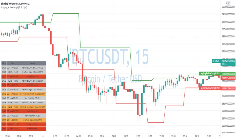
Logging in Pine ScriptI'm building quite a lot of pretty complicated indicators/strategies in Pine Script. Quite often they don't work from the 1 try so I have to debug them heavily.
In Pine Script there are no fancy debuggers so you have to be creative. You can plot values on your screens, check them in the data window, etc.
If you want to display some textual information, you can plot some info as labels on the screen.
It's not the most convenient way, so with the appearance of tables in Pine Script, I decided to implement a custom logger that will allow me to track some useful information about my indicator over time.
Tables work much better for this kind of thing than labels. They're attached to your screen, you can nicely scale them and you can style them much better.
The idea behind it is very simple. I used few arrays to store the message, bar number, timestamp, and type of the message (you can color messages depend on the type for example).
There is a function log_msg that just append new messages to these arrays.
In the end, for the last bar, I create the table and display the last X messages in it.
In parameters, you can show/hide the entire journal, change the number of messages displayed and choose an offset. With offset, you can basically scroll through the history of messages.
Currently, I implemented 3 types of messages, and I color messages according to these types:
Message - gray
Warning - yellow
Error - red
Of course, it's a pretty simple example, you can create a much fancier way of styling your logs.
What do you think about it? Is it useful for you? What do you use to debug code in Pine Script?
Disclaimer
Please remember that past performance may not be indicative of future results.
Due to various factors, including changing market conditions, the strategy may no longer perform as good as in historical backtesting.
This post and the script don’t provide any financial advice.
Hull MA with BB (With Alerts)This is a combination of the standard Bollinger bands with a VWAP(Pink line), and the 'Hull Trend with Kahlman' script by user capissimo, and the NMA (Moving Average 3.0 (3rd Generation)) script by everget.
You can find the original scripts here:
This indicator gives you several confirmations of a good entry and exit positions for Crypto currency like bitcoin and most alt coins. I use this on a 15min, 30min, 1hour, and 4hour chart for best results.
How to use:
Entry Signals:
-A candle closes above the NMA (Yellow Step Line). AND
-You see a Long (text) flag. AND
-The candles are near the bottom of the Bollinger bands and heading upwards.
Exit Signals:
-Candles have passed below and closed below the NMA (Yellow Step Line). AND
-You see a Short (text) flag.
It's important to use these confirmations with other indicators so you have the best entry/exit positions, and make sure you are on normal candles and not HA or any other types.
There are alerts built in that you can setup for the Short and Long text flags that you see. These are generally good alerts to follow. I use the alerts as a reminder to check the charts and see if my other indicators line up for a good trade.

Exploring UnicodeThis script demonstrates how to display Unicode characters and symbols, including emoji, in Pine:
• Part 1 displays multi-line labels on hi/lo pivots.
• Part 2 displays price/volume bumps using small up/down arrows plotted with plotchar() .
• Part 3 detects bounces and uses plotshape() to mark them.
You can use our `f_bounceFrom()` function from this part as confirmation for signals in your strategies.
Note that the labels displayed on pivots with the code in Part 1 are plotted in the past. In realtime, they would only appear where they are after 50 bars have elapsed from that point. The other plots are plotted on the bar where their conditions are detected.
You can display thousands of Unicode characters and symbols using Pine. As you can see with our script, it is very easy to do so. The challenge will often be to find the exact symbols you are looking for. Many websites exist to help you explore Unicode characters or symbols. The PineCoders Resources page contains a section presenting a few of them.
Duyck has a Unicode font function script containing functions to convert strings to monospaced Unicode representations. TradingView uses the Trebuchet font for most of its text, including text displayed with Pine scripts. While its numerals are monospace and will align vertically in labels text, Duyck's functions will be handy when you need to convert characters to a monospaced form, so they also align vertically in multi-line labels.
What is Unicode?
Unicode is to character encoding what Wikipedia is to knowledge; it holds codes to a good proportion of the characters or symbols used by humans, past or present. In the early days of computing, environments from different manufacturers often used different character encoding schemes, making transport between them difficult. Unicode solves that challenge. It is a comprehensive encoding scheme that visionaries from Xerox and Apple came up with in the late 80's. The addition of members from the Research Libraries Group, Sun Microsystems, Microsoft, Next and Metaphor created the "Unicode working group" and later, the Unicode Consortium , which continues to improve and manage the Unicode standard.
Theoretically, Unicode encodes values representing characters or glyphs —not their pictorial representations. The letters "A" or "a", or the blue heart emoji "💙" are each represented by a Unicode value. In practice, however, there are many different versions of the Latin alphabet in Unicode. That is how our low pivot label can display different representations of the letters "ITV". The exact rendition of Unicode symbols on a specific device is left to equipment manufacturers and typeface designers.
The current Unicode space is comprised of 17 planes of 65,536 characters each, which allows for more than one million code points . Planes are further divided into character blocks , which typically hold a character set corresponding to one script—or language. Emoticons are in the character block starting at U+1F600.
Look first. Then leap.

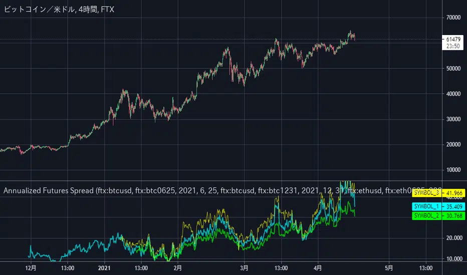
Annualized Futures Spread2つの銘柄間のスプレッドを年率換算してオシレーターの枠に表示するスクリプトです。
(BTCUSD現物とBTC-0625先物契約のような2銘柄間で使用することを想定しています。)
設定で年率換算していない生の乖離率の表示に切り替えることも可能です。
初期設定ではFTXの BTCUSDとBTCUSD-0624、BTCUSDとBTC-1231、ETHUSDとETH-0625 が指定されています。
そのまま使用しても構いませんし、設定やソースコードを編集して活用してくださって構いません。
ーーーーーーーーーーーーー
This custom script can be used to display the annualized spread rate between two specified symbols like BTCUSD and BTC-0625.
It is also possible to display raw spreads that are not annualized. (Just simply clicking the checkbox in setting.)
The default settings are BTC0625 and BTCUSD, BTC1231 and BTCUSD, and ETH0625 and ETHUSD on FTX Exchange.
You may use it as-is, or edit the settings or modify the source code as you like.
(This script was removed due to a violation of the English-Only house rule once, so this is a repost with a revised title and text.)
String Manipulation Framework [PineCoders FAQ]█ OVERVIEW
This script provides string manipulation functions to help Pine coders.
█ FUNCTIONS PROVIDED
f_strLeft(_str, _n)
Function returning the leftmost `_n` characters in `_str`.
f_strRight(_str, _n)
Function returning the rightmost `_n` characters in `_str`.
f_strMid(_str, _from, _to)
Function returning the substring of `_str` from character position `_from` to `_to` inclusively.
f_strLeftOf(_str, _of)
Function returning the sub-string of `_str` to the left of the `_of` separating character.
f_strRightOf(_str, _of)
Function returning the sub-string of `_str` to the right of the `_of` separating character.
f_strCharPos(_str, _chr)
Function returning the position of the first occurrence of `_chr` in `_str`, where the first character position is 0. Returns -1 if the character is not found.
f_strReplace(_src, _pos, _str)
Function that replaces a character at position `_pos` in the `_src` string with the `_str` character or string.
f_tickFormat()
Function returning a format string usable with `tostring()` to round a value to the symbol's tick precision.
f_tostringPad(_val, _fmt)
Function returning a string representation of a numeric `_val` using a special `_fmt` string allowing all strings to be of the same width, to help align columns of values.
`f_tostringPad()`
Using the functions should be straightforward, but `f_tostringPad()` requires more explanations. Its purpose is to help coders produce columns of fixed-width string representations of numbers which can be used to produce columns of numbers that vertically align neatly in labels, something that comes in handy when, for example, you need to center columns, yet still produce numbers of various lengths that nonetheless align.
While the formatting string used with this function resembles the one used in tostring() , it has a few additional characteristics:
• The question mark (" ? ") is used to indicate that padding is needed.
• If negative numbers must be handled by the function, the first character of the formatting string must be a minus sign ("-"),
otherwise the unary minus sign of negative numbers will be stripped out.
• You will produce more predictable results by using "0" rather than "#" in the formatting string.
You can experiment with `f_tostringPad()` formatting strings by changing the one used in the script's inputs and see the results on the chart.
These are some valid examples of formatting strings that can be used with `f_tostringPad()`:
"???0": forces strings to be four units wide, in all-positive "int" format.
"-???0": forces strings to be four units wide, plus room for a unary minus sign in the first position, in "int" format.
"???0.0": forces strings to be four units wide to the left of the point, all-positive, with a decimal point and then a mantissa rounded to a single digit.
"-???0.0?": same as above, but adds a unary minus sign for negative values, and adds a space after the single-digit mantissa.
"?????????0.0": forces the left part of the float to occupy the space of 10 digits, with a decimal point and then a mantissa rounded to a single digit.
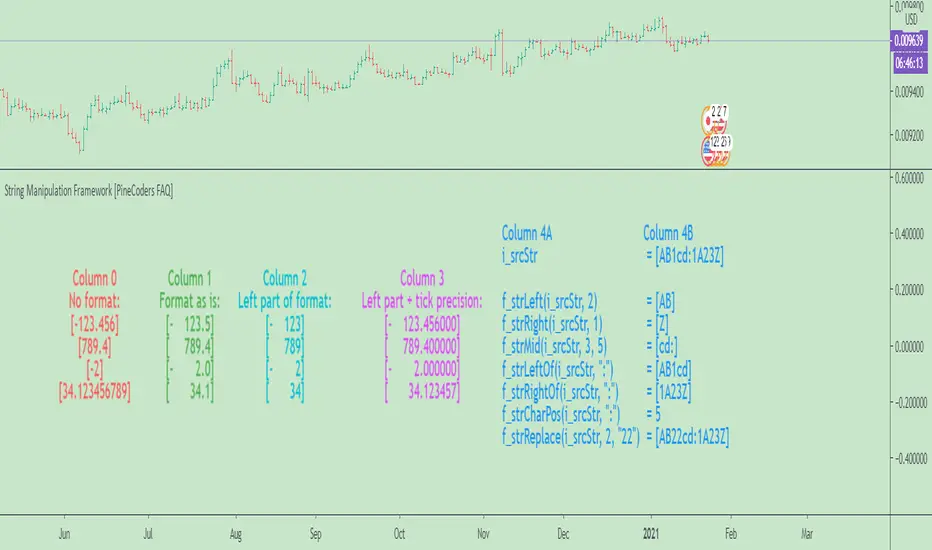
█ CHART
The information displayed by this indicator uses the values in the script's Inputs, so you can use them to play around.
The chart shows the following information:
• Column 0 : The numeric input values in a centered column, converted to strings using tostring() without a formatting argument.
• Column 1 : Shows the values formatted using `f_tostringPad()` with the formatting string from the inputs.
• Column 2 : Shows the values formatted using `f_tostringPad()` but with only the part of the formatting string left of the decimal point, if it contains one.
• Column 3 : Shows the values formatted using `f_tostringPad()` but with the part of the formatting string left of the decimal point,
to which is added the right part of the `f_tostringPad()` formatting string, to obtain the precision in ticks of the symbol the chart is on.
• Column 4 : Shows the result of using the other string manipulation functions in the script on the source string supplied in the inputs.
It also demonstrates how to split up a label in two distinct parts so that you can vertically align columns when the leftmost part contains strings with varying lengths.
You will see in our code how we construct this column in two steps.
█ LIMITATIONS
The Pine runtime is optimized for number crunching. Too many string manipulations will take a toll on the performance of your scripts, as can readily be seen with the running time of this script. To minimize the impact of using string manipulation functions in your scripts, consider limiting their calculation to the first or last bar of the dataset when possible. This can be achieved by using the var keyword when declaring variables containing the result of your string manipulations, or by enclosing blocks of code in if blocks using barstate.isfirst or barstate.islast .
█ NOTES
To understand the challenges we face when trying to align strings vertically, it is useful to know that:
• As is the case in many other places in the TadingView UI and other docs, the Pine runtime uses the MS Trebuchet font to display label text.
• Trebuchet uses proportionally-spaced letters (a "W" takes more horizontal space than an "I"), but fixed-space digits (a "1" takes the same horizontal space as a "3").
Digits all use a figure space width, and it is this property that allows us to align numbers vertically.
The fact that letters are proportionally spaced is the reason why we can't vertically align columns using a "legend" + ":" `+ value structure when the "legend" part varies in width.
• The unary minus sign is the width of a punctuation space . We use this property to pad the beginning of numbers
when you use a "-" as the first character of the `f_tostringPad()` formatting string.
Our script was written using the PineCoders Coding Conventions for Pine .
The description was formatted using the techniques explained in the How We Write and Format Script Descriptions PineCoders publication.
█ THANKS
Thanks to LonesomeTheBlue for the `f_strReplace()` function.
Look first. Then leap.
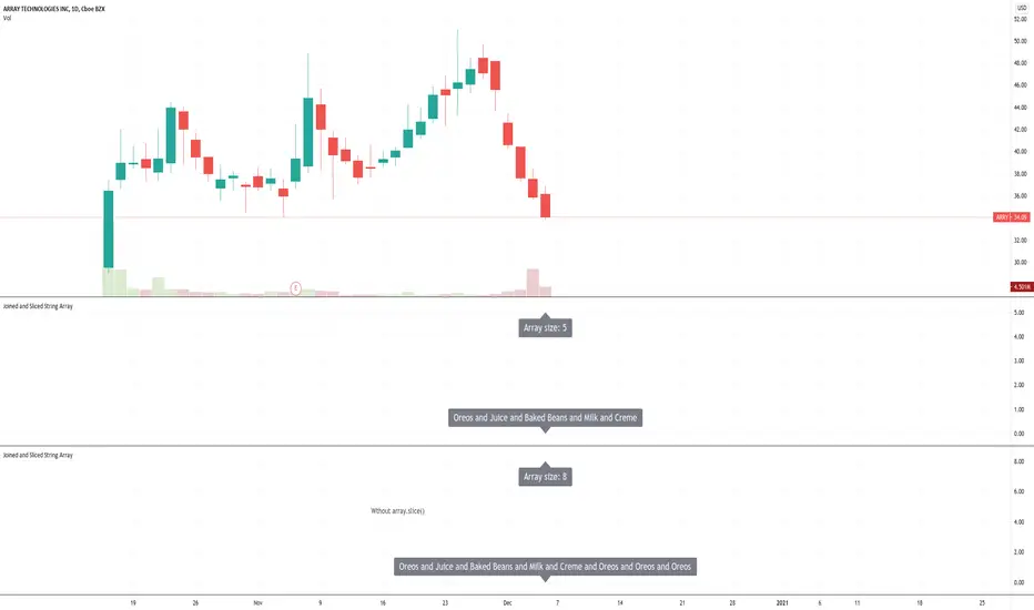
Joined and Sliced String ArrayUsing the new Pine Script array built-ins to join string elements together for label text. The array is sliced to remove extraneous elements.
Buy/Sell IndicatorBased on logic from many top contributors here, the script utilizes LazyBear's WaveTrend Oscillator Indicator along with custom code to plot a few key components for daily trading;
Boundaries for entry and exit points which are based on a 6-day trend in OPEN/HIGH and OPEN/LOW prices.
Daily HIGH and LOW points to establish a good view of stock's movements
Entry and exit points with confidence levels. These can be treated as entry points for short to medium term investments
Entry points come in the colours of White and Lime, where white is slightly confident and lime is extremely confident
Exit points come in the colours of Maroon, and Red, where maroon is slightly confident and red is extremely confident
Each Entry and Exit point also comes without text, or with a M or H above it, where M indicates medium confidence on the point and an O indicates overconfidence.
Use Case:
The best possible use case is to enter a trade on a LIME point with O text, this means that is an overconfident entry point.
The trade should be exited on a RED point with O text, this means that is an overconfident exit point.
But you can do with the indicators as you please.
In addition to LazyBear's code, the following existing models and indicators are taken into account:
RSI of closing price over a period of 25
EMA of RSI

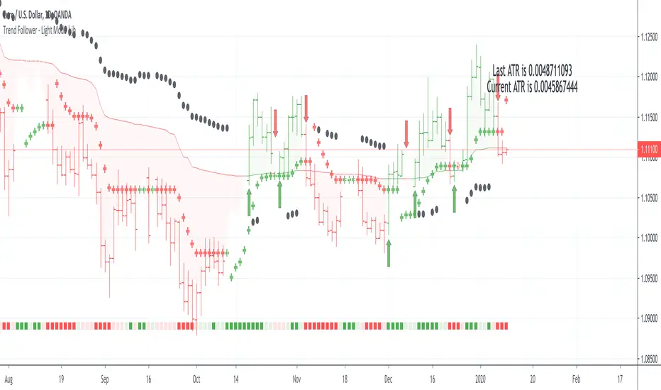
Trend Follower - Light Mode | jhFollow up script for my Trend Follower script.
I'm used to dark mode, so I coded a few key plots in white, so those are changed into black on the script.
Notably:
- > 1 ATR in black dots along the baseline
- Current and previous ATR text labels to the right of the price
- A text label spacing input that allows you to adjust the spacing for text label from price.
This is a trend following system that combines 3 indicators which provide different functionalities, also a concept conceived by VP's No Nonsense FX / NNFX method.
1. Baseline
The main baseline filter is an indicator called Modular Filter created by Alex Grover
- www.tradingview.com
- Alex Grover - Modular Filter
-------
That's the moving average like baseline following price, filtering long and short trends and providing entry signals when the price crosses the baseline.
Entry signal indicated with arrows.
2. Volume/Volatility, I will called it Trend Strength
The next indicator is commonly known as ASH, Absolute Strength Histogram.
This indicator was shared by VP as a two line cross trend confirmation indicator, however I discovered an interesting property when I modified the calculation of the histogram.
- Alex Grover Absolute Strength
-------
My modification and other info here
- Absolute Strength Histogram v2
-------
I simplified the display of the trend strength by plotting squares at the bottom of the chart.
- Lighted Squares shows strength
- Dimmed Squares shows weakness
3. Second Confirmation / Exits / Trailing Stop
Finally the last indicator is my usage of QQE (Qualitative Quantitative Estimation), demonstrated in my QQE Trailing Line Indicator
- QQE Trailing Line for Trailing Stop
-------
Three usages of this amazing indicator, serving as :
- Second trend confirmation
- Exit signal when price crosses the trailing line
- Trailing stop when you scaled out the second trade
This indicator is plotted with crosses.
Additional plots and information
Bar Color
- Green for longs, Red for shorts, White when the baseline direction conflicts with the QQE trailing line direction
- When it's white, it's usually ranging and not trending, ASH will also keep you off ranging periods.
-------
ATR Filter
- White circles along the baseline, they will show up if the price has moved more than one ATR from the baseline
- The default allowance is 1 ATR.
-------
The previous and current ATR value
- Label on the right side of the chart showing the previous and current value of ATR

Strategy Death To The Bear Simple strategy for the indicator "Death To The Bear".
Simple rules:
- Entry according to the selected weapons.
- Take profit 1 (TP1) in% of daily ATR (can be set, default 20%)
- Active Stop in Breakeven when I take profit in TP1.
- Take profit 2 (TP1) in% of daily ATR (can be set, default 30%)
* Pyramidization can be changed from the configuration (maximum number of tickets to average your price)
* Many do not like to pyramid, but I can assure you that with good management, and good choice of the instrument and time frame, you will get good money.
Note: at the request of some people who cannot see the EMOJI in the configuration you can choose TEXT.
Thumbs up

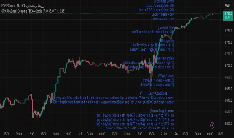
SPX AbuBasel Scalping PRO – Stable//@version=5
indicator("SPX AbuBasel Scalping PRO – Stable", overlay=true, precision=2)
// ==== Inputs ====
lenRSI = input.int(7, "RSI Length")
tp1ATR = input.float(0.35, "TP1 ATR Factor", step=0.05)
tp2ATR = input.float(0.70, "TP2 ATR Factor", step=0.05)
tp3ATR = input.float(1.00, "TP3 ATR Factor", step=0.05)
slATR = input.float(0.45, "SL ATR Factor", step=0.05)
useVol = input.bool(true, "Use Volume Filter")
// ==== Indicators ====
rsi = ta.rsi(close, lenRSI)
vwap = ta.vwap
atr = ta.atr(14)
// Bollinger Bands
basis = ta.sma(close, 20)
dev = 2.0 * ta.stdev(close, 20)
upper = basis + dev
lower = basis - dev
// Volume filter
volOK = volume > ta.sma(volume, 20)
// Divergence
bullDiv = low < low and rsi > rsi
bearDiv = high > high and rsi < rsi
// Reversal candles
bullCandle = close > open and close > high
bearCandle = close < open and close < low
// VWAP slope
trendUp = vwap > vwap
trendDown = vwap < vwap
// ==== Entry Conditions ====
buySig = bullDiv and bullCandle and close > vwap and trendUp and (not useVol or volOK) and close < lower
sellSig = bearDiv and bearCandle and close < vwap and trendDown and (not useVol or volOK) and close > upper
// ==== Targets ====
tp1 = buySig ? close + atr * tp1ATR : sellSig ? close - atr * tp1ATR : na
tp2 = buySig ? close + atr * tp2ATR : sellSig ? close - atr * tp2ATR : na
tp3 = buySig ? close + atr * tp3ATR : sellSig ? close - atr * tp3ATR : na
sl = buySig ? close - atr * slATR : sellSig ? close + atr * slATR : na
// ==== Plot Signals ====
plotshape(buySig, title="BUY", style=shape.labelup, color=color.green, text="BUY", size=size.small)
plotshape(sellSig, title="SELL", style=shape.labeldown, color=color.red, text="SELL", size=size.small)
// ==== Draw Levels ====
if buySig or sellSig
line.new(bar_index, tp1, bar_index + 1, tp1, extend=extend.right, color=color.new(color.green, 0))
line.new(bar_index, tp2, bar_index + 1, tp2, extend=extend.right, color=color.new(color.lime, 0))
line.new(bar_index, tp3, bar_index + 1, tp3, extend=extend.right, color=color.new(color.green, 40))
line.new(bar_index, sl, bar_index + 1, sl, extend=extend.right, color=color.new(color.red, 0))
// ==== Alerts ====
alertcondition(buySig, "SPX BUY", "AbuBasel PRO: BUY Signal")
alertcondition(sellSig, "SPX SELL", "AbuBasel PRO: SELL Signal")
Wyckoff Accumulation/Distribution - Enhanced by ChakraWyckoff Accumulation/Distribution - Enhanced Indicator
Overview
An advanced Pine Script v6 indicator that detects Wyckoff accumulation and distribution patterns using RSI-based trend analysis, pivot detection, and volume confirmation. This enhanced version improves upon traditional Wyckoff indicators with cleaner code, English variable names, and additional market structure signals.
Key Features
Wyckoff Phase Detection
Accumulation Phase:
SC (Selling Climax): Bottom pivot with extreme bearish RSI and high volume
AR (Automatic Rally): First bounce after selling climax
ST (Secondary Test): Retest of lows without extreme RSI
SOS (Sign of Strength): Strong bullish breakout with volume confirmation ⭐ NEW
Distribution Phase:
BC (Buying Climax): Top pivot with extreme bullish RSI and high volume
DAR (Automatic Reaction): First drop after buying climax
DST (Distribution Secondary Test): Retest of highs
SOW (Sign of Weakness): Strong bearish breakdown with volume confirmation ⭐ NEW
Market Structure Events
Spring: False breakdown (RSI crosses above lower band) with background highlight
UTAD (Upthrust After Distribution): False breakout (RSI crosses below upper band) with background highlight
Visual Features
Range Boxes: Automatically draws consolidation ranges (gray) that change color on breakout:
🟢 Green = Accumulation (bullish breakout)
🔴 Red = Distribution (bearish breakout)
Pivot Markers: Orange triangles show regular (non-Wyckoff) pivot points
Bar Coloring: Lime bars for bullish trends, purple bars for bearish trends
Color-Coded Labels: All Wyckoff events clearly marked with descriptive text
Customizable Settings
RSI Settings:
RSI Length (default: 14)
Trend Sensitivity (default: 20) - Higher values = more sideways detection
Pivot Settings:
Pivot Length (default: 5) - Controls pivot point detection sensitivity
Display Options:
Toggle range boxes on/off
Toggle regular pivot markers
Toggle bar coloring by trend
Customize label text color
Advanced Detection:
Volume Confirmation toggle - Require high volume for climax events
Volume Threshold (default: 1.5x) - Adjustable volume multiplier
Alerts
8 comprehensive alert conditions:
Selling Climax (SC)
Buying Climax (BC)
Spring detection
UTAD detection
Sign of Strength (SOS)
Sign of Weakness (SOW)
Range Breakout
Improvements Over Original
✅ Pine Script v6 (latest version)
✅ English variable names (was Turkish)
✅ Fixed DAR label bug (was showing "AR")
✅ Added SOS (Sign of Strength) detection
✅ Added SOW (Sign of Weakness) detection
✅ Optional volume confirmation toggle
✅ Organized input groups for better UX
✅ Enhanced visual options
✅ Comprehensive alert system
✅ Cleaner, more maintainable code structure
Best Use Cases
Timeframes: Works on all timeframes; best on 4H, Daily, or Weekly
Markets: Stocks, Forex, Crypto, Indices
Trading Style: Swing trading, position trading, market structure analysis
Combine With: Support/Resistance, Volume Profile, Order Flow analysis
How It Works
The indicator uses RSI to identify market states (sideways, bullish, bearish) and combines this with pivot point detection and volume analysis to identify key Wyckoff events. When price is ranging (RSI between upper/lower bands), it draws a box. On breakout, the box color changes to indicate accumulation or distribution, helping traders identify smart money positioning.
Tips for Use
Lower Trend Sensitivity (10-15) for more signals in trending markets
Higher Trend Sensitivity (25-30) for clearer signals in choppy markets
Enable Volume Confirmation in high-volume markets (stocks, major crypto)
Disable Volume Confirmation in low-volume or forex markets
Watch for Spring/UTAD events within boxes for potential reversals
Version: 1.0
Pine Script: v6
Author: Chakrapani Chittabathina

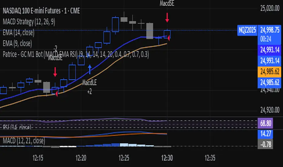
Patrice - GC M1 Bot (MACD EMA RSI)//@version=6
indicator("Patrice - GC M1 Bot (MACD EMA RSI)", overlay = true)
//----------------------
// Inputs (optimisés GC)
//----------------------
emaLenFast = input.int(9, "EMA rapide")
emaLenSlow = input.int(14, "EMA lente")
rsiLen = input.int(14, "RSI length")
atrLen = input.int(14, "ATR length")
volLen = input.int(20, "Volume moyenne")
slMult = input.float(0.4, "SL = ATR x", step = 0.1)
tpMult = input.float(0.7, "TP = ATR x", step = 0.1)
minAtr = input.float(0.7, "ATR minimum pour trader", step = 0.1)
maxDistEmaPct = input.float(0.3, "Distance max EMA9 (%)", step = 0.1)
//----------------------
// Indicateurs
//----------------------
ema9 = ta.ema(close, emaLenFast)
ema14 = ta.ema(close, emaLenSlow)
= ta.macd(close, 12, 26, 9)
hist = macdLine - signalLine
rsi = ta.rsi(close, rsiLen)
atr = ta.atr(atrLen)
volMa = ta.sma(volume, volLen)
//----------------------
// Session 9:30 - 11:00 (NY)
//----------------------
hourSession = hour(time, "America/New_York")
minuteSession = minute(time, "America/New_York")
inSession = (hourSession == 9 and minuteSession >= 30) or
(hourSession > 9 and hourSession < 11) or
(hourSession == 11 and minuteSession == 0)
//----------------------
// Filtres vol / ATR / distance EMA
//----------------------
volFilter = volume > volMa
atrFilter = atr > minAtr
distEmaPct = math.abs(close - ema9) / close * 100.0
distFilter = distEmaPct < maxDistEmaPct
//----------------------
// Tendance
//----------------------
bullTrend = close > ema9 and close > ema14 and ema9 > ema14
bearTrend = close < ema9 and close < ema14 and ema9 < ema14
//----------------------
// MACD : 2e barre
//----------------------
bullSecondBar = hist > 0 and hist > 0 and hist <= 0
bearSecondBar = hist < 0 and hist < 0 and hist >= 0
//----------------------
// Filtres RSI
//----------------------
rsiLongOk = rsi < 70 and rsi >= 45 and rsi <= 65
rsiShortOk = rsi > 30 and rsi >= 35 and rsi <= 55
//----------------------
// Gestion du risque (simple pour l'instant)
//----------------------
canTradeRisk = true
//----------------------
// Conditions d'entrée
//----------------------
longCond = bullTrend and bullSecondBar and rsiLongOk and inSession and volFilter and atrFilter and distFilter and canTradeRisk
shortCond = bearTrend and bearSecondBar and rsiShortOk and inSession and volFilter and atrFilter and distFilter and canTradeRisk
//----------------------
// SL / TP (info seulement, pas d'ordres)
//----------------------
slPoints = atr * slMult
tpPoints = atr * tpMult
longSL = close - slPoints
longTP = close + tpPoints
shortSL = close + slPoints
shortTP = close - tpPoints
//----------------------
// Visuels
//----------------------
plot(ema9, title = "EMA 9")
plot(ema14, title = "EMA 14")
plotshape(longCond, title = "Signal Long", style = shape.triangleup, location = location.belowbar, size = size.tiny, text = "L")
plotshape(shortCond, title = "Signal Short", style = shape.triangledown, location = location.abovebar, size = size.tiny, text = "S")
//----------------------
// Conditions d'ALERTE
//----------------------
alertcondition(longCond, title = "ALERTE LONG", message = "Signal LONG Patrice GC bot")
alertcondition(shortCond, title = "ALERTE SHORT", message = "Signal SHORT Patrice GC bot")
Multi-Timeframe Supertrend + MACD + MTF Dashboard if you like it click source code and save it in notepad for back up .
The Multi-Timeframe Supertrend Dashboard is a powerful tool designed to give traders a clear view of market trends across multiple timeframes, all from a single dashboard. This indicator leverages the Supertrend method to calculate buy and sell signals based on the direction of price relative to dynamically calculated support and resistance lines. The dashboard is optimized for dark mode and provides easy-to-interpret color-coded signals for each timeframe.
How It Works
The Supertrend indicator is a trend-following indicator that uses the Average True Range (ATR) to set upper and lower bands around the price, adapting dynamically as volatility changes. When the price is above the Supertrend line, the market is considered in an uptrend, triggering a "BUY" signal. Conversely, when the price falls below the Supertrend line, the market is in a downtrend, triggering a "SELL" signal.
This Multi-Timeframe Supertrend Dashboard calculates Supertrend signals for the following timeframes:
1 minute
5 minutes
15 minutes
1 hour
Daily
Weekly
Monthly
For each timeframe, the dashboard shows either a "BUY" or "SELL" signal, allowing traders to assess whether trends align across timeframes. A "BUY" signal displays in green, and a "SELL" signal displays in red, giving a quick visual reference of the overall trend direction for each timeframe.
Customization Options
ATR Period: Defines the period for the Average True Range (ATR) calculation, which determines how responsive the Supertrend lines are to changes in market volatility.
Multiplier: Sets the sensitivity of the Supertrend bands to price movements. Higher values make the bands less sensitive, while lower values increase sensitivity, allowing quicker reactions to changes in price.
How to Interpret the Dashboard
The Multi-Timeframe Supertrend Dashboard allows traders to see at a glance if trends across multiple timeframes are aligned. Here’s how to interpret the signals:
BUY (Green): The current timeframe’s price is in an uptrend based on the Supertrend calculation.
SELL (Red): The current timeframe’s price is in a downtrend based on the Supertrend calculation.
For example:
If all timeframes display "BUY," the asset is in a strong uptrend across multiple time horizons, which may indicate a bullish market.
If all timeframes display "SELL," the asset is likely in a strong downtrend, signaling a bearish market.
Mixed signals across timeframes suggest market consolidation or differing trends across short- and long-term periods.
Use Cases
Trend Confirmation: Use the dashboard to confirm trends across multiple timeframes before entering or exiting a position.
Quick Market Analysis: Get a snapshot of market conditions across timeframes without having to change charts.
Multi-Timeframe Alignment: Identify alignment across timeframes, which is often a strong indicator of market momentum in one direction.
Dark Mode Optimization
The dashboard has been optimized for dark mode, with white text and contrasting background colors to ensure easy readability on darker TradingView themes.
Nov 4, 2024
Release Notes
Multi-Timeframe Supertrend Dashboard with Alerts
Overview
The Multi-Timeframe Supertrend Dashboard with Alerts is a powerful indicator designed to give traders a comprehensive view of market trends across multiple timeframes. This dashboard uses the Supertrend method to calculate buy and sell signals based on the direction of price relative to dynamic support and resistance levels. The indicator is optimized for dark mode and provides a color-coded display of buy and sell signals for each timeframe, along with optional alerts for trend alignment.
How It Works
The Supertrend indicator is a trend-following indicator that uses the Average True Range (ATR) to set upper and lower bands around the price, adjusting dynamically with market volatility. When the price is above the Supertrend line, the market is considered in an uptrend, triggering a "BUY" signal. Conversely, when the price falls below the Supertrend line, the market is in a downtrend, triggering a "SELL" signal.
The Multi-Timeframe Supertrend Dashboard displays Supertrend signals for the following timeframes:
1 minute
5 minutes
15 minutes
1 hour
Daily
Weekly
Monthly
For each timeframe, the dashboard shows either a "BUY" or "SELL" signal, allowing traders to assess trend alignment across multiple timeframes with a single glance. A "BUY" signal displays in green, and a "SELL" signal displays in red.
Alerts for Trend Alignment
This indicator includes built-in alert conditions that allow traders to receive notifications when all timeframes simultaneously align in a "BUY" or "SELL" signal. This is particularly useful for identifying moments of strong trend alignment across short-term and long-term timeframes. The alerts can be set to notify the trader when:
All timeframes display a "BUY" signal, indicating a strong bullish alignment across all time horizons.
All timeframes display a "SELL" signal, signaling a strong bearish alignment.
Customization Options
ATR Period: Defines the period for the Average True Range (ATR) calculation, which determines how responsive the Supertrend lines are to changes in market volatility.
Multiplier: Sets the sensitivity of the Supertrend bands to price movements. Higher values make the bands less sensitive, while lower values increase sensitivity, allowing quicker reactions to changes in price.
How to Interpret the Dashboard
BUY (Green): The price is above the Supertrend line, indicating an uptrend for that timeframe.
SELL (Red): The price is below the Supertrend line, indicating a downtrend for that timeframe.
Examples:
If all timeframes display "BUY," the asset is in a strong uptrend across multiple time horizons, signaling potential buying opportunities.
If all timeframes display "SELL," the asset is likely in a strong downtrend, signaling potential selling opportunities.
Mixed signals suggest a consolidation phase or differing trends across short- and long-term periods.
Use Cases
Trend Confirmation: Use the dashboard to confirm trends across multiple timeframes before entering or exiting a position.
Alert Notifications: Set alerts to receive notifications when all timeframes align in a "BUY" or "SELL" signal.
Quick Market Analysis: Get an instant overview of market conditions without switching between charts.
Multi-Timeframe Alignment: Identify alignment across timeframes, often a strong indicator of market momentum in one direction.
Dark Mode Optimization
The dashboard has been optimized for dark mode, with white text and contrasting background colors to ensure easy readability on darker TradingView themes.
Nov 6, 2024
Release Notes
Multi-Timeframe Supertrend Dashboard with Custom Alerts
Description:
This Multi-Timeframe Supertrend Dashboard indicator provides a powerful tool for traders who want to monitor multiple timeframes simultaneously and receive alerts when all timeframes align on a single trend (either BUY or SELL). The indicator uses the popular Supertrend calculation, with customizable ATR (Average True Range) period and multiplier values to tailor sensitivity to your trading style.
Key Features:
Customizable Timeframes:
Track and display up to six timeframes, fully configurable to meet any trading strategy. The default timeframes include 1 Minute, 5 Minutes, 15 Minutes, 1 Hour, 1 Day, and 1 Week but can be changed to any intervals supported by TradingView.
Selective Display Options:
With a user-friendly display selection, you can choose which timeframes to show on the dashboard. For example, you may choose to view only Timeframe 1 through Timeframe 5 or any combination of the six.
Real-Time Alignment Alerts:
Alerts can be set to trigger when all selected timeframes align on a BUY or SELL signal. This feature enables traders to catch strong trends across timeframes without constant monitoring. Alerts are fully configurable, allowing for sound notifications, email alerts, or even webhook notifications to automated trading systems.
Custom Supertrend Settings:
Adjust the ATR Period and Multiplier values to control the Supertrend's sensitivity. Lower values result in more frequent trend changes, while higher values smooth out the trend and focus on larger market moves.
Intuitive Color-Coded Dashboard:
The dashboard is visually optimized for quick insights:
Green cells indicate a BUY trend.
Red cells indicate a SELL trend.
Background color changes when all selected timeframes align, giving an instant visual cue for strong trends.
How to Use:
Select Timeframes:
Go to the input settings to choose the timeframes you want to monitor. Each timeframe is labeled (e.g., Timeframe 1, Timeframe 2) for easy reference.
Configure Display Preferences:
Enable or disable specific timeframes to customize your dashboard view. This is useful for focusing only on timeframes relevant to your strategy.
Set ATR and Multiplier Values:
Adjust these settings to define the Supertrend calculation's responsiveness. This customization allows adaptation to various markets, including stocks, forex, and cryptocurrencies.
Enable Alerts:
Turn on alerts to receive notifications when all active timeframes align. Customize the alert type and delivery (sound, popup, email, etc.) to ensure you’re notified on time.
Ideal For:
Trend Traders who want confirmation of trends across multiple timeframes.
Scalpers and Day Traders looking for quick trend changes with smaller timeframes.
Swing Traders who want a broader overview of market alignment across hourly and daily frames.
Automated System Developers looking for reliable signals across multiple timeframes to integrate with other strategies.

(CRT) MTF Candle Range Theory Model# 🚀 **CASH Pro MTF – Candle Range Theory (CRT) Indicator**
**The Smart Money ICT Setup Detector** 🔥
Hey Traders!
Here is the **ultimate Pine Script indicator** that automatically detects one of the most powerful Smart Money / ICT setups: **Candle Range Theory (CRT)**
---
### What is Candle Range Theory – CRT?
**CRT** is a high-probability price action model based on **liquidity grabs** and **range expansion**.
Price loves to:
1️⃣ Raid the low/high of the previous candle (take stop-losses)
2️⃣ Then reverse and run to the opposite side of the range (or beyond)
When this happens near a **key higher-timeframe level**, magic happens!
### Bullish CRT Model
- Price touches a **strong HTF support**
- Previous candle closes near that support
- Next candle **sweeps the low** (grabs liquidity)
- Current candle **closes above the raided low AND breaks the high** of the sweep candle
**Result → Aggressive bullish move expected!**
**Entry:** On close above the high (or on retest + MSS)
**Stop Loss:** Below the swept low
**Take Profit:** CRT High or next liquidity pool
### Bearish CRT Model
- Price touches a **strong HTF resistance**
- Previous candle closes near resistance
- Next candle **sweeps the high** (grabs buy stops)
- Current candle **closes below the raided high AND breaks the low** of the sweep candle
**Result → Strong bearish expansion!**
**Entry:** On close below the low
**Stop Loss:** Above the swept high
**Take Profit:** CRT Low or next downside liquidity
This whole setup can form in **just 3 candles**… or sometimes more if price consolidates after the sweep.
---
### Why This Indicator is Special
This is **NOT** a simple 3-candle pattern scanner!
This is a **true CRT + MTF confluence beast** with:
- **Multi-Timeframe Confirmation** (default 4H – fully customizable)
- **Built-in RSI Filter** (avoid fake moves in overbought/oversold)
- **Day-2 High/Low Levels** automatically drawn (the exact CRT range!)
- **Clean “LONG” / “SHORT” labels** right on the candle (no ugly arrows or offset)
- **Background highlight** on signal
- **Fully grouped inputs** – super clean settings panel
---
### Features at a Glance
| Feature | Included |
|--------------------------------|----------|
| Higher Timeframe Confirmation | Yes |
| RSI Overbought/Oversold Filter | Yes |
| Day-2 High/Low Lines + Labels | Yes |
| Clean Text Signals (no offset) | Yes |
| Background Highlight | Yes |
| Fully Customizable Colors & Text| Yes |
| Works on All Markets & TFs | Yes |
---
### How to Use
1. Add the indicator to your chart
2. Wait for a **LONG** or **SHORT** label to appear
3. Confirm price is near a **key HTF level** (order block, FVG, etc.)
4. Enter on close or retest (your choice)
5. Manage risk with the drawn Day-2 levels
**Pro Tip:** Combine with ICT Market Structure Shift (MSS) or Fair Value Gaps for even higher accuracy!

BTC Dual Cycle: Stats DashboardOverview
"Price takes the elevator down, but takes the stairs up."
This indicator is a macro-analysis tool designed to visualize the true duration of Bitcoin’s market cycles. Unlike standard oscillators that focus on short-term price action, the Macro Cycle Tracker filters out the noise to answer two fundamental questions:
Are we in a phase of Expansion (Price Discovery)?
Are we in a phase of Recovery (Repairing the damage of a crash)?
It visually separates the market into two distinct regimes based on a configurable drawdown threshold (default: -50%) and provides real-time statistics on how long these phases historically last.
How It Works
The script tracks the All-Time High (ATH) and divides market history into two colored zones:
🟢 The Green Zone (Expansion / Price Discovery)
Trigger: Starts immediately when Bitcoin breaks the previous ATH.
Meaning: The market is healthy, profitable, and exploring new valuation levels.
End: The zone ends when price drops by 50% (configurable) from the cycle top.
🔴 The Red Zone (Recovery / Capitulation)
Trigger: Starts when price drops below the 50% threshold from the peak.
Meaning: The asset is "underwater." This zone remains active persistently—even during relief rallies—until the previous ATH is fully reclaimed.
Philosophy: A cycle is not over until the damage is repaired.
Key Features
Cycle Timer: Displays the exact number of days passed for every historical cycle directly on the chart.
Live Counter: Shows the current duration of the active phase (e.g., "ZONE GREEN: 450 Days...").
Statistical Dashboard: A table in the bottom-right corner automatically calculates the Mean and Median duration (in days) for both Green and Red phases. This allows you to compare the current cycle against historical averages.
How to Use
For Investors (HODLers): Use the Red Zone to understand the "Time Cost" of a bear market. It helps visualize that recovery takes patience and that price action below the old ATH is merely accumulation.
For Analysts: Use the Dashboard statistics to project potential cycle turning points based on historical median durations.
Settings
Drop Percent (%): Default is 50%. This defines the "Crash" threshold. You can adjust this to 20% or 30% for more sensitive cycle detection.
Text Size: Adjust the size of the dashboard text to fit your screen resolution.
Disclaimer: This tool is for educational purposes only and does not constitute financial advice. Past performance is not indicative of future results.

청산맵[by좐주노]//@version=5
indicator("청산맵 "
, overlay = true
, max_lines_count = 500
, max_labels_count = 500
, max_boxes_count = 500)
//------------------------------------------------------------------------------
//Settings
//-----------------------------------------------------------------------------{
length = input(14, '청산기간 기준 ')
area = input.string('꼬리기준', '측정 범위', options = )
intraPrecision = input(false, 'Intrabar Precision', inline = 'intrabar')
intrabarTf = input.timeframe('1', '' , inline = 'intrabar')
filterOptions = input.string('Count', 'Filter Areas By', options = , inline = 'filter')
filterValue = input.float(0, '' , inline = 'filter')
//Style
showTop = input(true, 'Swing High' , inline = 'top', group = 'Style')
topCss = input(color.red, '' , inline = 'top', group = 'Style')
topAreaCss = input(color.new(color.red, 50), 'Area', inline = 'top', group = 'Style')
showBtm = input(true, 'Swing Low' , inline = 'btm', group = 'Style')
btmCss = input(color.teal, '' , inline = 'btm', group = 'Style')
btmAreaCss = input(color.new(color.teal, 50), 'Area', inline = 'btm', group = 'Style')
labelSize = input.string('Tiny', 'Labels Size', options = , group = 'Style')
//-----------------------------------------------------------------------------}
//Functions
//-----------------------------------------------------------------------------{
n = bar_index
get_data()=>
= request.security_lower_tf(syminfo.tickerid, intrabarTf, get_data())
get_counts(condition, top, btm)=>
var count = 0
var vol = 0.
if condition
count := 0
vol := 0.
else
if intraPrecision
if n > length
if array.size(v ) > 0
for in v
vol += array.get(l , index) < top and array.get(h , index) > btm ? element : 0
else
vol += low < top and high > btm ? volume : 0
count += low < top and high > btm ? 1 : 0
set_label(count, vol, x, y, css, lbl_style)=>
var label lbl = na
var label_size = switch labelSize
'Tiny' => size.tiny
'Small' => size.small
'Normal' => size.normal
target = switch filterOptions
'Count' => count
'Volume' => vol
if ta.crossover(target, filterValue)
lbl := label.new(x, y, str.tostring(vol, format.volume)
, style = lbl_style
, size = label_size
, color = #00000000
, textcolor = css)
if target > filterValue
label.set_text(lbl, str.tostring(vol, format.volume))
set_level(condition, crossed, value, count, vol, css)=>
var line lvl = na
target = switch filterOptions
'Count' => count
'Volume' => vol
if condition
if target < filterValue
line.delete(lvl )
else if not crossed
line.set_x2(lvl, n - length)
lvl := line.new(n - length, value, n, value
, color = na)
if not crossed
line.set_x2(lvl, n+3)
if crossed and not crossed
line.set_x2(lvl, n)
line.set_style(lvl, line.style_dashed)
if target > filterValue
line.set_color(lvl, css)
set_zone(condition, x, top, btm, count, vol, css)=>
var box bx = na
target = switch filterOptions
'Count' => count
'Volume' => vol
if ta.crossover(target, filterValue)
bx := box.new(x, top, x + count, btm
, border_color = na
, bgcolor = css)
if target > filterValue
box.set_right(bx, x + count)
//-----------------------------------------------------------------------------}
//Global variables
//-----------------------------------------------------------------------------{
//Pivot high
var float ph_top = na
var float ph_btm = na
var bool ph_crossed = na
var ph_x1 = 0
var box ph_bx = box.new(na,na,na,na
, bgcolor = color.new(topAreaCss, 80)
, border_color = na)
//Pivot low
var float pl_top = na
var float pl_btm = na
var bool pl_crossed = na
var pl_x1 = 0
var box pl_bx = box.new(na,na,na,na
, bgcolor = color.new(btmAreaCss, 80)
, border_color = na)
//-----------------------------------------------------------------------------}
//Display pivot high levels/blocks
//-----------------------------------------------------------------------------{
ph = ta.pivothigh(length, length)
//Get ph counts
= get_counts(ph, ph_top, ph_btm)
//Set ph area and level
if ph and showTop
ph_top := high
ph_btm := switch area
'Wick Extremity' => math.max(close , open )
'Full Range' => low
ph_x1 := n - length
ph_crossed := false
box.set_lefttop(ph_bx, ph_x1, ph_top)
box.set_rightbottom(ph_bx, ph_x1, ph_btm)
else
ph_crossed := close > ph_top ? true : ph_crossed
if ph_crossed
box.set_right(ph_bx, ph_x1)
else
box.set_right(ph_bx, n+3)
if showTop
//Set ph zone
set_zone(ph, ph_x1, ph_top, ph_btm, ph_count, ph_vol, topAreaCss)
//Set ph level
set_level(ph, ph_crossed, ph_top, ph_count, ph_vol, topCss)
//Set ph label
set_label(ph_count, ph_vol, ph_x1, ph_top, topCss, label.style_label_down)
//-----------------------------------------------------------------------------}
//Display pivot low levels/blocks
//-----------------------------------------------------------------------------{
pl = ta.pivotlow(length, length)
//Get pl counts
= get_counts(pl, pl_top, pl_btm)
//Set pl area and level
if pl and showBtm
pl_top := switch area
'Wick Extremity' => math.min(close , open )
'Full Range' => high
pl_btm := low
pl_x1 := n - length
pl_crossed := false
box.set_lefttop(pl_bx, pl_x1, pl_top)
box.set_rightbottom(pl_bx, pl_x1, pl_btm)
else
pl_crossed := close < pl_btm ? true : pl_crossed
if pl_crossed
box.set_right(pl_bx, pl_x1)
else
box.set_right(pl_bx, n+3)
if showBtm
//Set pl zone
set_zone(pl, pl_x1, pl_top, pl_btm, pl_count, pl_vol, btmAreaCss)
//Set pl level
set_level(pl, pl_crossed, pl_btm, pl_count, pl_vol, btmCss)
//Set pl labels
set_label(pl_count, pl_vol, pl_x1, pl_btm, btmCss, label.style_label_up)
//-----------------------------------------------------------------------------}

My script// @version=5 indicator("Custom LuxAlgo-Style Levels", overlay=true, max_lines_count=500)
// --- Trend Detection (EMA Based) fastEMA = ta.ema(close, 9) slowEMA = ta.ema(close, 21) trendUp = fastEMA > slowEMA trendDown = fastEMA < slowEMA
plot(fastEMA, title="Fast EMA", color=color.new(color.blue, 0)) plot(slowEMA, title="Slow EMA", color=color.new(color.orange, 0))
// --- Buy / Sell Signals buySignal = trendUp and ta.crossover(fastEMA, slowEMA) sellSignal = trendDown and ta.crossunder(fastEMA, slowEMA)
plotshape(buySignal, title="Buy", style=shape.labelup, color=color.new(color.green,0), size=size.small, text="BUY") plotshape(sellSignal, title="Sell", style=shape.labeldown, color=color.new(color.red,0), size=size.small, text="SELL")
// --- Auto Support & Resistance length = 20 sup = ta.lowest(length) res = ta.highest(length)
plot(sup, title="Support", color=color.new(color.green,70), linewidth=2) plot(res, title="Resistance", color=color.new(color.red,70), linewidth=2)
// --- Market Structure (Simple Swing High/Low) sh = ta.highest(high, 5) == high sl = ta.lowest(low, 5) == low
plotshape(sh, title="Swing High", style=shape.triangledown, location=location.abovebar, color=color.red, size=size.tiny) plotshape(sl, title="Swing Low", style=shape.triangleup, location=location.belowbar, color=color.green, size=size.tiny)
// --- Alerts alertcondition(buySignal, "Buy Signal", "Trend Buy Signal Detected") alertcondition(sellSignal, "Sell Signal", "Trend Sell Signal Detected")
