Statistical Package for the Trading Sciences [SS]
This is SPTS.
It stands for Statistical Package for the Trading Sciences.
Its a play on SPSS (Statistical Package for the Social Sciences) by IBM (software that, prior to Pinescript, I would use on a daily basis for trading).
Let's preface this indicator first:
This isn't so much an indicator as it is a project. A passion project really.
This has been in the works for months and I still feel like its incomplete. But the plan here is to continue to add functionality to it and actually have the Pinecoding and Tradingview community contribute to it.
As a math based trader, I relied on Excel, SPSS and R constantly to plan my trades. Since learning a functional amount of Pinescript and coding a lot of what I do and what I relied on SPSS, Excel and R for, I use it perhaps maybe a few times a week.
This indicator, or package, has some of the key things I used Excel and SPSS for on a daily and weekly basis. This also adds a lot of, I would say, fairly complex math functionality to Pinescript. Because this is adding functionality not necessarily native to Pinescript, I have placed most, if not all, of the functionality into actual exportable functions. I have also set it up as a kind of library, with explanations and tips on how other coders can take these functions and implement them into other scripts.
The hope here is that other coders will take it, build upon it, improve it and hopefully share additional functionality that can be added into this package. Hence why I call it a project. Okay, let's get into an overview:
Current Functions of SPTS:
SPTS currently has the following functionality (further explanations will be offered below):
Ability to Perform a One-Tailed, Two-Tailed and Paired Sample T-Test, with corresponding P value.
Standard Pearson Correlation (with functionality to be able to calculate the Pearson Correlation between 2 arrays).
Quadratic (or Curvlinear) correlation assessments.
R squared Assessments.
Standard Linear Regression.
Multiple Regression of 2 independent variables.
Tests of Normality (with Kurtosis and Skewness) and recognition of up to 7 Different Distributions.
ARIMA Modeller (Sort of, more details below)
Okay, so let's go over each of them!
T-Tests
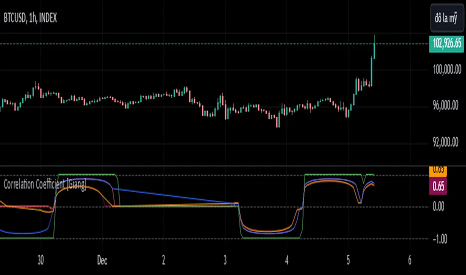
So traditionally, most correlation assessments on Pinescript are done with a generic Pearson Correlation using the "ta.correlation" argument. However, this is not always the best test to be used for correlations and determine effects. One approach to correlation assessments used frequently in economics is the T-Test assessment.
The t-test is a statistical hypothesis test used to determine if there is a significant difference between the means of two groups. It assesses whether the sample means are likely to have come from populations with the same mean. The test produces a t-statistic, which is then compared to a critical value from the t-distribution to determine statistical significance. Lower p-values indicate stronger evidence against the null hypothesis of equal means.
A significant t-test result, indicating the rejection of the null hypothesis, suggests that there is statistical evidence to support that there is a significant difference between the means of the two groups being compared. In practical terms, it means that the observed difference in sample means is unlikely to have occurred by random chance alone. Researchers typically interpret this as evidence that there is a real, meaningful difference between the groups being studied.
Some uses of the T-Test in finance include:
Risk Assessment: The t-test can be used to compare the risk profiles of different financial assets or portfolios. It helps investors assess whether the differences in returns or volatility are statistically significant.
Pairs Trading: Traders often apply the t-test when engaging in pairs trading, a strategy that involves trading two correlated securities. It helps determine when the price spread between the two assets is statistically significant and may revert to the mean.
Volatility Analysis: Traders and risk managers use t-tests to compare the volatility of different assets or portfolios, assessing whether one is significantly more or less volatile than another.
Market Efficiency Tests: Financial researchers use t-tests to test the Efficient Market Hypothesis by assessing whether stock price movements follow a random walk or if there are statistically significant deviations from it.
Value at Risk (VaR) Calculation: Risk managers use t-tests to calculate VaR, a measure of potential losses in a portfolio. It helps assess whether a portfolio's value is likely to fall below a certain threshold.
There are many other applications, but these are a few of the highlights. SPTS permits 3 different types of T-Test analyses, these being the One Tailed T-Test (if you want to test a single direction), two tailed T-Test (if you are unsure of which direction is significant) and a paired sample t-test.
Which T is the Right T?
Generally, a one-tailed t-test is used to determine if a sample mean is significantly greater than or less than a specified population mean, whereas a two-tailed t-test assesses if the sample mean is significantly different (either greater or less) from the population mean. In contrast, a paired sample t-test compares two sets of paired observations (e.g., before and after treatment) to assess if there's a significant difference in their means, typically used when the data points in each pair are related or dependent.
So which do you use? Well, it depends on what you want to know. As a general rule a one tailed t-test is sufficient and will help you pinpoint directionality of the relationship (that one ticker or economic indicator has a significant affect on another in a linear way).
A two tailed is more broad and looks for significance in either direction.
A paired sample t-test usually looks at identical groups to see if one group has a statistically different outcome. This is usually used in clinical trials to compare treatment interventions in identical groups. It's use in finance is somewhat limited, but it is invaluable when you want to compare equities that track the same thing (for example SPX vs SPY vs ES1!) or you want to test a hypothesis about an index and a leveraged share (for example, the relationship between FNGU and, say, MSFT or NVDA).
Statistical Significance
In general, with a t-test you would need to reference a T-Table to determine the statistical significance of the degree of Freedom and the T-Statistic.
However, because I wanted Pinescript to full fledge replace SPSS and Excel, I went ahead and threw the T-Table into an array, so that Pinescript can make the determination itself of the actual P value for a t-test, no cross referencing required :-).
Left tail (Significant):
Both tails (Significant):
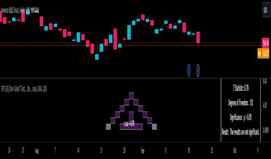
Distributed throughout (insignificant):
As you can see in the images above, the t-test will also display a bell-curve analysis of where the significance falls (left tail, both tails or insignificant, distributed throughout).
That said, I have not included this function for the paired sample t-test because that is a bit more nuanced. But for the one and two tailed assessments, the indicator will provide you the P value.
Pearson Correlation Assessment
I don't think I need to go into too much detail on this one.
I have put in functionality to quickly calculate the Pearson Correlation of two array's, which is not currently possible with the "ta.correlation" function.
Quadratic (Curvlinear) Correlation
Not everything in life is linear, sometimes things are curved!
The Pearson Correlation is great for linear assessments, but tends to under-estimate the degree of the relationship in curved relationships. There currently is no native function to t-test for quadratic/curvlinear relationships, so I went ahead and created one.
You can see an example of how Quadratic and Pearson Correlations vary when you look at CME_MINI:ES1! against AMEX:DIA for the past 10 ish months:
Pearson Correlation:
Quadratic Correlation:
One or the other is not always the best, so it is important to check both!
R-Squared Assessments:
The R-squared value, or the square of the Pearson correlation coefficient (r), is used to measure the proportion of variance in one variable that can be explained by the linear relationship with another variable. It represents the goodness-of-fit of a linear regression model with a single predictor variable.
R-Squared is offered in 3 separate forms within this indicator. First, there is the generic R squared which is taking the square root of a Pearson Correlation assessment to assess the variance.
The next is the R-Squared which is calculated from an actual linear regression model done within the indicator.
The first is the R-Squared which is calculated from a multiple regression model done within the indicator.
Regardless of which R-Squared value you are using, the meaning is the same. R-Square assesses the variance between the variables under assessment and can offer an insight into the goodness of fit and the ability of the model to account for the degree of variance.
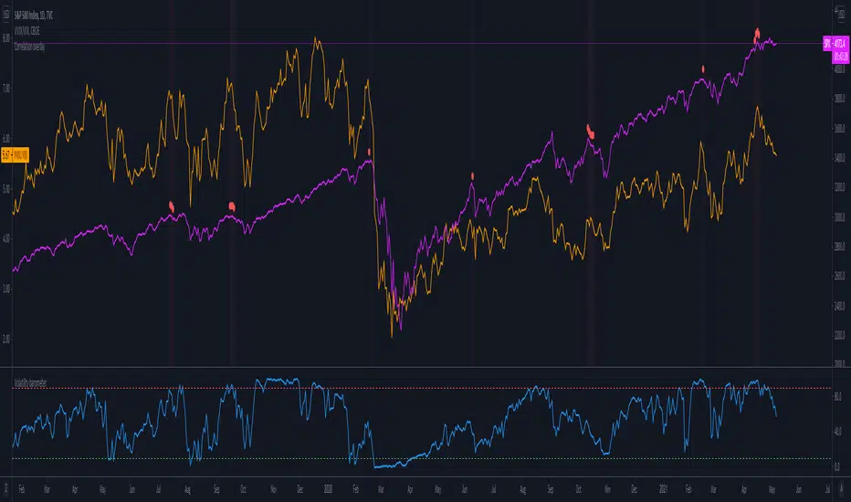
Here is the R Squared assessment of the SPX against the US Money Supply:
Standard Linear Regression
The indicator contains the ability to do a standard linear regression model. You can convert one ticker or economic indicator into a stock, ticker or other economic indicator. The indicator will provide you with all of the expected information from a linear regression model, including the coefficients, intercept, error assessments, correlation and R2 value.
Here is AAPL and MSFT as an example:
Multiple Regression
Oh man, this was something I really wanted in Pinescript, and now we have it!
I have created a function for multiple regression, which, if you export the function, will permit you to perform multiple regression on any variables available in Pinescript!
Using this functionality in the indicator, you will need to select 2, dependent variables and a single independent variable.
Here is an example of multiple regression for NASDAQ:AAPL using NASDAQ:MSFT and NASDAQ:NVDA :
And an example of SPX using the US Money Supply (M2) and AMEX:GLD :
Tests of Normality:
Many indicators perform a lot of functions on the assumption of normality, yet there are no indicators that actually test that assumption!
So, I have inputted a function to assess for normality. It uses the Kurtosis and Skewness to determine up to 7 different distribution types and it will explain the implication of the distribution. Here is an example of SP:SPX on the Monthly Perspective since 2010:
And NYSE:BA since the 60s:
And NVDA since 2015:
ARIMA Modeller
Okay, so let me disclose, this isn't a full fledge ARIMA modeller. I took some shortcuts.
True ARIMA modelling would involve decomposing the seasonality from the trend. I omitted this step for simplicity sake. Instead, you can select between using an EMA or SMA based approach, and it will perform an autogressive type analysis on the EMA or SMA.
I have tested it on lookback with results provided by SPSS and this actually works better than SPSS' ARIMA function. So I am actually kind of impressed.
You will need to input your parameters for the ARIMA model, I usually would do a 14, 21 and 50 day EMA of the close price, and it will forecast out that range over the length of the EMA.
So for example, if you select the EMA 50 on the daily, it will plot out the forecast for the next 50 days based on an autoregressive model created on the EMA 50. Here is how it looks on AMEX:SPY :
You can also elect to plot the upper and lower confidence bands:
Closing Remarks
So that is the indicator/package.
I do hope to continue expanding its functionality, but as of now, it does already have quite a lot of functionality.
I really hope you enjoy it and find it helpful. This. Has. Taken. AGES! No joke. Between referencing my old statistics textbooks, trying to remember how to calculate some of these things, and wanting to throw my computer against the wall because of errors in the code, this was a task, that's for sure. So I really hope you find some usefulness in it all and enjoy the ability to be able to do functions that previously could really only be done in external software.
As always, leave your comments, suggestions and feedback below!
Take care!
Wyszukaj w skryptach "spx"
Market InternalsMarket internals can be a powerful tool for determining future moves, overall trend health and provide a means of directional confidence.
This indicator watches a handful of SPX and US stocks based internals to determine key areas of sentiment changes, the internals monitored are:
US Stocks Ticks
Call and Put SPX Volume
SPX Gamma Dispersion
US Stocks Ask and Big Volume
US Stocks Advancing and Declining Issues
Each time there's a bullish or bearish sentiment change it will be market with green/red flag and a single letter that identifies what market internal has changed.
SPX gamma dispersion events aren't to be considered directional from historical observations made but can be a sign of liquidity adjustments and when paired with any of the other aforementioned internals sentiment changes can be used as a powerful signal.
If it's observed that market internals are changing erratically then it's a clear indication of market chop and best to wait for cleaner trends.
Future updates may include non-SPX based internals analysis, change in display, alerts/alertconditions and more. Feel free to comment with any desired changes and we can discuss!
Wskaźnik Pine Script®
Correlative Move IndicatorEDIT: When loading this indicator it uses a default symbol for comparison of SPX. On Tradingview SPX is a Daily price (unless you buy real time) so you will see "Loading ..." and never see data. Move out to a daily time frame -or- switch the symbol to something available intraday. /EDIT
Correlates the movement of the price you are graphing to the price of someting else that you pick (default is SPX, see EDIT above)
Comments in code explain what I did. If correlations are too tight for CC to show anything but a flat line try this.
Please comment / improve.
=====================
// A simple indicator that looks complex (impress your friends)
// Provides rate of change in the propensity of something
// to move in correlation with whatever you are graphing.
// Inputs are:
// "Compared symbol" - standard Trading View symbol input. You can input ratios & formulas if you like; Defaults to SPX
// "Invert?" - by default the indicator shows the item you have charted as numerator and the "Compared symbol"
// the denominator. So if you graphed "UVXY" and open this indicator with default compared symbol "SPX" then
// the base relationship is UVXY/SPX. Click the box if you want SPX/UVXY (for example) instead.
// "Fast EMA Period" - the period for the fast EMA (white line). default = 7
// "Slow EMA Period" - the period for the slow EMA (black line). default = 27. Important: the bakground color of the indicator
// changes based on this EMA hitting threshold values below.
// "+ threshold" - > threshold for green background. default = 1.0
// "- threshold" - < threshold for red background. default = 0.99
// "BBand Period" - number of periods back for BBand (1 std deviation) calculation. default = 15
// Does not measure correlation per se - it measures change in that correlation.
// If two things do not correlate well in the first place then you will see a lot of noise
// and I wish you much luck in interpreting it.
// However, if two things do correlate well (like VXX and VIX) then this will help you detect
// circumstances where that correlation is unstable. Such instability can signal change in direction.
// I developed it to track real time changes in contango / backwardation in various VIX futures instruments which I trade.
// Tip - always try invert - sometimes the correlation changes become clearer. That can be because the threshold bias
// towards "+" with the defaults here, so think about what the "logical" relationship is and adjust the thresholds, or invert,
// or do both. Just remember - the indicator is below the item you are charting, so the default "source"/"compared"
// relationship is intuitive as you look at the screen. Volatility traders, however, will find "invert" useful with default
// thresholds signalling "green" for contango and "red" for backwardation.
// Short and long ema trends added for smoothing and trend change indications.
// Background color changes to green when correlation changing "positively" and red when "negatively" and white when near 1.
// Think of the value "1" as representing the base "1 to 1" correlation between two things. That doesn't mean same price -
// it means same rate and direction in change in price.
// 1 std deviation is used to build a basic Bollinger Band in blue. The number of periods for calculating that is an input.
// You may find a change in correlation signal outside a Bollinger Band signals a direction change. TV alerts can be
// set for such events.
Wskaźnik Pine Script®
FX Risk Regime (Risk-On - Risk-Off) - CompositeOverview
FX Risk Regime - Composite is a macro-driven regime detection indicator designed to classify market conditions into:
Risk-On
Risk-Off
Neutral / Transitional
The model aggregates cross-asset information from equities, volatility, USD strength, and carry flows to generate a standardised composite risk score. It is particularly useful for FX traders who trade risk-sensitive and defensive currency pairs.
This indicator does not directly predict price direction. Instead, it identifies the prevailing macro regime so traders can align directional bias and risk management accordingly.
Conceptual Framework
Financial markets tend to rotate between two dominant macro states:
Risk-On
Equities rising
Volatility falling
USD softening
Carry trades performing
Capital flows into higher-beta currencies and growth-linked assets.
Risk-Off
Equities declining
Volatility rising
USD strengthening
Carry trades unwinding
Capital rotates into defensive currencies and safe-haven assets.
This indicator quantifies these dynamics and standardises them using Z-scores to create a normalised composite regime signal.
Indicator Architecture
The model is constructed using four cross-asset components:
1. Equity Momentum (SPX)
Symbol: SP:SPX
Measures risk appetite via equity momentum
Positive equity momentum = Risk-On bias
2. Volatility Index (VIX)
Symbol: CBOE:VIX
Standardised and inverted
Rising volatility = Risk-Off
Falling volatility = Risk-On
3. USD Index (DXY)
Symbol: TVC:DXY
USD strength is associated with defensive flows
Rising DXY = Risk-Off
4. Carry Proxy (AUDJPY)
Symbol: OANDA:AUDJPY
High-beta FX pair representing global carry flows
Rising AUDJPY = Risk-On
Mathematical Construction
Each component is transformed using:
Log momentum
Rolling Z-Score normalisation
Optional EMA smoothing
Composite Score:
RawScore = Z(SPX Momentum)
+ Z(−VIX)
+ Z(−DXY Momentum)
+ Z(AUDJPY Momentum)
The result is smoothed and compared to a configurable regime threshold.
R egime Classification
Green Background
Risk-On Regime (score > +threshold)
Red Background
Risk-Off Regime (score < −threshold)
Neutral Zone
Between thresholds — transitional conditions.
What Does the 0.8 Threshold Mean?
The default threshold (0.8) represents approximately:
0.8 standard deviations above or below the composite mean.
It filters out noise and avoids reacting to minor fluctuations.
Lower threshold - more signals, more sensitivity
Higher threshold - fewer signals, stronger conviction
For swing trading, values between 0.8 and 1.2 are typically appropriate.
How to Use This Indicator
1. Regime Filter for FX Trading
Use as a directional bias filter.
In Risk-On:
Favor:
AUDJPY
NZDJPY
CADJPY
EURAUD
GBPJPY
Avoid:
USDJPY shorts
CHF strength trades
In Risk-Off:
Favor:
USDJPY longs
CHFJPY shorts
EURJPY shorts
AUDUSD shorts
Avoid:
Carry longs
2. Position Sizing Tool
Increase size in aligned regime
Reduce exposure during neutral regime
3. Strategy Overlay
Combine with:
Trend systems (EMA / MACD)
Momentum systems
Breakout systems
Carry strategies
This indicator improves expectancy by preventing trades against macro flow.
Best Timeframes
Recommended:
1H
4H
Daily
Lower timeframes may be noisy because macro variables update at slower frequencies.
Asset Classes Where It Works Best
FX Pairs:
- JPY crosses
- Commodity currencies
- High beta crosses
Indices:
- DAX
- Nasdaq
- S&P500
Commodities:
- Oil
- Copper
Crypto:
- BTCUSD (during macro-correlated phases)
Strengths
Cross-asset driven
Macro consistent
Quantitative standardization
Regime persistence model (state memory)
Adaptable threshold
Fully transparent logic
Limitations
Not a predictive model
Reacts with slight lag
May misclassify during structural regime shifts
Dependent on external symbol data availability
Regime changes can be violent. Use risk management.
Suggested Improvements (Advanced Users)
For advanced research:
Weight components by historical Information Ratio
Use dynamic thresholds based on rolling volatility
Add bond yield spreads (US10Y vs JGB)
Add credit spreads (CDX)
Add copper/gold ratio
Customization
All major parameters are configurable:
Z-Score Lookback
Momentum Lookback
Threshold
Smoothing
Symbols
This allows adaptation for:
Short-term trading
Swing trading
Macro overlay models
Wskaźnik Pine Script®
Swing Trading IndicatorThis script is a swing‑trading dashboard designed for BTC, ETH, S&P 500 (for now). It combines weekly RSI, USDT.D, VIX, moving averages and Fisher Transform into a single visual tool, with background highlights, an on‑chart info table and ready‑made alerts to help you time high‑probability swing entries and manage risk.
1. Overview
The indicator is intended to work on daily timeframe.
Signals are context‑aware: BTC and ETH get USDT.D conditions, SPX gets VIX and EMA‑100 logic, and all non‑ETH symbols can also use Fisher Transform as a mean‑reversion filter.
2. Conditions and background highlights
Each component sets a boolean condition and, when active, paints a background layer:
Weekly RSI condition
True when weekly RSI is below its symbol‑specific threshold.
USDT.D conditions
BTC: triggered when USDT.D is above the user threshold and the chart symbol is BTC.
ETH: same logic for ETH, but tracked separately..
VIX condition (SPX only)
True when VIX high is at or above the VIX threshold while the chart is SPX.
EMA condition (BTC & SPX)
BTC: daily close below EMA‑200.
SPX: daily close below EMA‑100.
Fisher Transform condition (non‑ETH)
Fisher Transform on the chart timeframe, using the configured period.
True when Fisher value is below the Fisher threshold.
3. Intended use and notes
This indicator is designed as a confluence tool for swing traders, not a standalone buy/sell system. It works best on assets that are in a clear uptrend, where the main idea is to accumulate during corrections within that broader bullish structure.
During larger market shocks, deep corrections, or black‑swan events, trend‑based and mean‑reversion filters can produce false signals, because volatility and correlations often behave abnormally in those periods. For that reason, this script should always be combined with independent risk management, higher‑timeframe trend analysis, and your own discretion.
Wskaźnik Pine Script®
Z-score RegimeThis indicator compares equity behaviour and credit behaviour by converting both into z-scores. It calculates the z-score of SPX and the z-score of a credit proxy based on the HYG divided by LQD ratio.
SPX z-score shows how far the S&P 500 is from its rolling average.
Credit z-score shows how risk-seeking or risk-averse credit markets are by comparing high-yield bonds to investment-grade bonds.
When both z-scores move together, the market is aligned in either risk-on or risk-off conditions.
When SPX z-score is strong but credit z-score is weak, this may signal equity strength that is not supported by credit markets.
When credit z-score is stronger than SPX z-score, credit markets may be leading risk appetite.
The indicator plots the two z-scores as simple lines for clear regime comparison.
Wskaźnik Pine Script®
Correlation HeatMap [TradingFinder] Sessions Data Science Stats🔵 Introduction
n financial markets, correlation describes the statistical relationship between the price movements of two assets and how they interact over time. It plays a key role in both trading and investing by helping analyze asset behavior, manage portfolio risk, and understand intermarket dynamics. The Correlation Heatmap is a visual tool that shows how the correlation between multiple assets and a central reference asset (the Main Symbol) changes over time.
It supports four market types forex, stocks, crypto, and a custom mode making it adaptable to different trading environments. The heatmap uses a color-coded grid where warmer tones represent stronger negative correlations and cooler tones indicate stronger positive ones. This intuitive color system allows traders to quickly identify when assets move together or diverge, offering real-time insights that go beyond traditional correlation tables.
🟣 How to Interpret the Heatmap Visually ?
Each cell represents the correlation between the main symbol and one compared asset at a specific time.
Warm colors (e.g. red, orange) suggest strong negative correlation as one asset rises, the other tends to fall.
Cool colors (e.g. blue, green) suggest strong positive correlation both assets tend to move in the same direction.
Lighter shades indicate weaker correlations, while darker shades indicate stronger correlations.
The heatmap updates over time, allowing users to detect changes in correlation during market events or trading sessions.
One of the standout features of this indicator is its ability to overlay global market sessions such as Tokyo, London, New York, or major equity opens directly onto the heatmap timeline. This alignment lets traders observe how correlation structures respond to real-world session changes. For example, they can spot when assets shift from being inversely correlated to moving together as a new session opens, potentially signaling new momentum or macro flow. The customizable symbol setup (including up to 20 compared assets) makes it ideal not only for forex and crypto traders but also for multi-asset and sector-based stock analysis.
🟣 Use Cases and Advantages
Analyze sector rotation in equities by tracking correlation to major indices like SPX or DJI.
Monitor altcoin behavior relative to Bitcoin to find early entry opportunities in crypto markets.
Detect changes in currency alignment with DXY across trading sessions in forex.
Identify correlation breakdowns during market volatility, signaling possible new trends.
Use correlation shifts as confirmation for trade setups or to hedge multi-asset exposure
🔵 How to Use
Correlation is one of the core concepts in financial analysis and allows traders to understand how assets behave in relation to one another. The Correlation Heatmap extends this idea by going beyond a simple number or static matrix. Instead, it presents a dynamic visual map of how correlations shift over time.
In this indicator, a Main Symbol is selected as the reference point for analysis. In standard modes such as forex, stocks, or crypto, the symbol currently shown on the main chart is automatically used as the main symbol. This allows users to begin correlation analysis right away without adjusting any settings.
The horizontal axis of the heatmap shows time, while the vertical axis lists the selected assets. Each cell on the heatmap shows the correlation between that asset and the main symbol at a given moment.
This approach is especially useful for intermarket analysis. In forex, for example, tracking how currency pairs like OANDA:EURUSD EURUSD, FX:GBPUSD GBPUSD, and PEPPERSTONE:AUDUSD AUDUSD correlate with TVC:DXY DXY can give insight into broader capital flow.
If these pairs start showing increasing positive correlation with DXY say, shifting from blue to light green it could signal the start of a new phase or reversal. Conversely, if negative correlation fades gradually, it may suggest weakening relationships and more independent or volatile movement.
In the crypto market, watching how altcoins correlate with Bitcoin can help identify ideal entry points in secondary assets. In the stock market, analyzing how companies within the same sector move in relation to a major index like SP:SPX SPX or DJ:DJI DJI is also a highly effective technique for both technical and fundamental analysts.
This indicator not only visualizes correlation but also displays major market sessions. When enabled, this feature helps traders observe how correlation behavior changes at the start of each session, whether it's Tokyo, London, New York, or the opening of stock exchanges. Many key shifts, breakouts, or reversals tend to happen around these times, and the heatmap makes them easy to spot.
Another important feature is the market selection mode. Users can switch between forex, crypto, stocks, or custom markets and see correlation behavior specific to each one. In custom mode, users can manually select any combination of symbols for more advanced or personalized analysis. This makes the heatmap valuable not only for forex traders but also for stock traders, crypto analysts, and multi-asset strategists.
Finally, the heatmap's color-coded design helps users make sense of the data quickly. Warm colors such as red and orange reflect stronger negative correlations, while cool colors like blue and green represent stronger positive relationships. This simplicity and clarity make the tool accessible to both beginners and experienced traders.
🔵 Settings
Correlation Period: Allows you to set how many historical bars are used for calculating correlation. A higher number means a smoother, slower-moving heatmap, while a lower number makes it more responsive to recent changes.
Select Market: Lets you choose between Forex, Stock, Crypto, or Custom. In the first three options, the chart’s active symbol is automatically used as the Main Symbol. In Custom mode, you can manually define the Main Symbol and up to 20 Compared Symbols.
Show Open Session: Enables the display of major trading sessions such as Tokyo, London, New York, or equity market opening hours directly on the timeline. This helps you connect correlation shifts with real-world market activity.
Market Mode: Lets you select whether the displayed sessions relate to the forex or stock market.
🔵 Conclusion
The Correlation Heatmap is a robust and flexible tool for analyzing the relationship between assets across different markets. By tracking how correlations change in real time, traders can better identify alignment or divergence between symbols and gain valuable insights into market structure.
Support for multiple asset classes, session overlays, and intuitive visual cues make this one of the most effective tools for intermarket analysis.
Whether you’re looking to manage portfolio risk, validate entry points, or simply understand capital flow across markets, this heatmap provides a clear and actionable perspective that you can rely on.
BKLevelsThis displays levels from a text input, levels from certain times on the previous day, and high/low/close from previous day. The levels are drawn for the date in the first line of the text input. Newlines are required between each level
Example text input:
2024-12-17
SPY,606,5,1,Lower Hvol Range,FIRM
SPY,611,1,1,Last 20K CBlock,FIRM
SPY,600,2,1,Last 20K PBlock,FIRM
SPX,6085,1,1,HvolC,FIRM
SPX,6080,2,1,HvolP,FIRM
SPX,6095,3,1,Upper PDVR,FIRM
SPX,6060,3,1,Lower PDVR,FIRM
For each line, the format is ,,,,,
For color, there are 9 possible user- configurable colors- so you can input numbers 1 through 9
For line style, the possible inputs are:
"FIRM" -> solid line
"SHORT_DASH" -> dotted line
"MEDIUM_DASH" -> dashed line
"LONG_DASH" -> dashed line
Wskaźnik Pine Script®
Correlation Coefficient [Giang]### **Introduction to the "Correlation Coefficient" Indicator**
#### **Idea behind the Indicator**
The "Correlation Coefficient" indicator was developed to analyze the linear relationship between Bitcoin (**BTCUSD**) and other important economic indices or financial assets, such as:
- **SPX** (S&P 500 Index): Represents the U.S. stock market.
- **DXY** (Dollar Index): Reflects the strength of the USD against major currencies.
- **SPY** (ETF representing the S&P 500): A popular trading instrument.
- **GOLD** (Gold price): A traditional safe-haven asset.
The correlation between these assets can help traders understand how Bitcoin reacts to market movements of traditional financial instruments, providing opportunities for more effective trading decisions.
Additionally, the indicator allows users to **customize asset symbols for comparison**, not limited to the default indices (SPX, DXY, SPY, GOLD). This flexibility enables traders to tailor their analysis to specific goals and portfolios.
---
#### **Significance and Use of Correlation in Trading**
**Correlation** is a measure of the linear relationship between two data series. In the context of this indicator:
- **The correlation coefficient ranges from -1 to 1**:
- **1**: Perfect positive relationship (both increase or decrease together).
- **0**: No linear relationship.
- **-1**: Perfect negative relationship (one increases while the other decreases).
- **Use in trading**:
- Identify **strong relationships or unusual divergences** between Bitcoin and other assets.
- Help determine **market sentiment**: For example, if Bitcoin has a negative correlation with DXY, traders might expect Bitcoin to rise when the USD weakens.
- Provide a foundation for hedging strategies or investments based on inter-asset relationships.
---
#### **Components of the Indicator**
The "Correlation Coefficient" indicator consists of the following key components:
1. **Main Data (BTCUSD)**:
- The closing price of Bitcoin is used as the central asset for calculations.
2. **Comparison Data**:
- Users can select different asset symbols for comparison. By default, the indicator supports:
- **SPX**: Stock market index.
- **DXY**: Dollar Index.
- **SPY**: Popular ETF.
- **GOLD**: Gold price.
3. **Correlation Coefficients**:
- Calculated between BTC and each comparison index, based on a Weighted Moving Average (WMA) over a user-defined period.
4. **Graphical Representation**:
- Displays individual correlation coefficients with each comparison index, making it easier for traders to track and analyze.
---
#### **How to Analyze and Use the Indicator**
**1. Identify Key Correlations:**
- Observe the correlation lines between BTC and the indices to determine positive or negative relationships.
- Example:
- If the **Correlation Coefficient (BTC-DXY)** sharply declines to -1, this indicates that when USD strengthens, Bitcoin tends to weaken.
**2. Analyze the Strength of Correlations:**
- **Strong Correlations**: If the coefficient is close to 1 or -1, the relationship between the two assets is very clear.
- **Weak Correlations**: If the coefficient is near 0, Bitcoin may be influenced by other factors outside the compared index.
**3. Develop Trading Strategies:**
- Use correlations to predict Bitcoin's price movements:
- If BTC has an inverse relationship with **DXY**, traders might consider selling BTC when the USD strengthens.
- If BTC and **SPX** are strongly correlated, traders can monitor the stock market to predict Bitcoin's trend.
**4. Evaluate Changes Over Time:**
- Use different timeframes (daily, weekly) to track the correlation's fluctuations.
- Look for unusual signals, such as a breakdown or shift from positive to negative relationships.
---
#### **Conclusion**
The "Correlation Coefficient" indicator is a powerful tool that helps traders analyze the relationship between Bitcoin and major financial indices. The ability to customize asset symbols for comparison makes the indicator flexible and suitable for various trading strategies. When used correctly, this indicator not only provides insights into market sentiment but also supports the development of intelligent trading strategies and optimized profits.
Wskaźnik Pine Script®
Scaled Historical ATR [SS]Hello again everyone,
This is the Scaled ATR Range indicator. This was done in response to an article/analysis I posted regarding the expected high and range on SPX. I would encourage you to read it here:
Essentially, I took SPX data, scaled it to correct for inflation, then calculated the ATR for Bullish years to get our average range to expect and our close range to expected.
I accomplished this analysis using Excel; however, I figured Pinescript would handle this type of task more elegantly, and I was correct!
This indicator is the result.
What it does:
This indicator permits the analyst to select a historic period in time. The indicator will then scale the period into returns and convert the range to a corrected range based on the current position of the ticker. How it does this is by converting the returns of the historic period selected, then multiplying the returns by the current period open, to ensure that the range amounts are corrected for inflation and natural growth of a ticker.
I say analyst because this indicator is intended to be used by both professional and recreational analysts, to give them an easy way to:
a) Scale historic data and correct it based on the current rate; and
b) Offer insight into a ticker’s ATR and behaviour during bullish and bearish periods.
Prior to this indicator, the only way to do this would be manually or the use of statistical software.
How to use?
The indicator’s use is quite simple. Once launched, the indicator will ask the user to input a timeframe period that the user is interested in assessing. In the main chart above, I chose SPX between 1995 and 2001.
The user can further filter down the data using the settings menu. In the settings menu, there is an option to filter by “All”, “Bullish Periods” or “Bearish Periods”.
Filtering by “All”
Filtering by “All” will include all candles selected within the timeframe. This includes both bearish and bullish candles. It will give you the averaged out range for the entire period of time, including both bearish and bullish instances.
Filtering by “Bullish”
Filtering by “Bullish” will omit any red candles from the analysis. It will only return the ATR ranges for green, bullish candles.
Filtering by “Bearish”
Inverse to filtering by Bullish, if you filter by Bearish, it will only include the red, bearish candles in the analysis.
My suggestion? If you are trying to determine t he likely outcome of a bullish year, filter by Bullish instances. If you want the likely outcome of a bearish year, filter by Bearish.
Other features of the Indicator:
The indicator will display the current period statistics. In the main chart above, you can see that the current ranges for this year are displayed. This allows you to do a side by side comparison of the current period vs. the historic period you are looking at. This can alert you to further upside, further downside and the anticipated close range. It can also alert you to whether or not we are following a similar trajectory as the historical periods you are looking at.
As well, the indicator will list target prices for the current period based on the historical periods you are looking at. This helps to put things into perspective.
Concluding Remarks
And that is the indicator in a nutshell! I encourage you to read the article I linked above to see how you may use it in an analysis. This would be the best example of a real world application of this indicator!
Otherwise, I hope you enjoy and, as always, safe trades!
Wskaźnik Pine Script®
[dharmatech] Area Under Yield Curve : USThis indicator displays the area under the U.S. Treasury Securities yield curve.
If you compare this to SP:SPX , you'll see that there are large periods where they are inversely related. Other times, they track together. When the move together, watch out for the expected and eventual divergence.
By default, this indicator will show up in a separate pane. If you move it to an existing pane (e.g. along side SP:SPX ) you'll need to move it to a different price scale.
The area under the yield curve is a quick way to see if the overall yield curve moved up or down. Generally speaking, increasing yields isn't good for markets, unless there is some other stimulus going on simultaneously.
The following treasury securities are used in this calculation:
FRED:DGS1MO (1 month)
FRED:DGS3MO (3 month)
FRED:DGS6MO (6 month)
FRED:DGS1 (1 year)
FRED:DGS2 (2 year)
FRED:DGS3 (3 year)
FRED:DGS5 (5 year)
FRED:DGS7 (7 year)
FRED:DGS10 (10 year)
FRED:DGS20 (20 year)
FRED:DGS30 (30 year)
Wskaźnik Pine Script®
Ultimate Correlation CoefficientIt contains the Correlations for SP:SPX , TVC:DXY , CURRENCYCOM:GOLD , TVC:US10Y and TVC:VIX and is intended for INDEX:BTCUSD , but works fine for most other charts as well.
Don't worry about the colored mess, what you want is to export your chart ->
TradingView: How can I export chart data?
and then use the last line in the csv file to copy your values into a correlation table.
Order is:
SPX
DXY
GOLD
US10Y
VIX
Your last exported line should look like this:
2023-05-25T02:00:00+02:00 26329.56 26389.12 25873.34 26184.07 0 0.255895534 -0.177543633 0.011944815 0.613678565 0.387705043 0.696003298 0.566425278 0.877838156 0.721872645 0 -0.593674719 -0.839538073 -0.662553817 -0.873684242 -0.695764534 -0.682759656 -0.54393749 -0.858188808 -0.498548691 0 0.416552489 0.424444345 0.387084882 0.887054782 0.869918437 0.88455388 0.694720993 0.192263269 -0.138439783 0 -0.39773255 -0.679121698 -0.429927048 -0.780313396 -0.661460134 -0.346525721 -0.270364046 -0.877208139 -0.367313687 0 -0.615415111 -0.226501775 -0.094827955 -0.475553396 -0.408924242 -0.521943234 -0.426649404 -0.266035908 -0.424316191
The zeros are thought as a demarcation for ease of application :
2023-05-25T02:00:00+02:00 26329.56 26389.12 25873.34 26184.07 0 -> unused
// 15D 30D 60D 90D 120D 180D 360D 600D 1000D
0.255895534 -0.177543633 0.011944815 0.613678565 0.387705043 0.696003298 0.566425278 0.877838156 0.721872645 -> SPX
0
-0.593674719 -0.839538073 -0.662553817 -0.873684242 -0.695764534 -0.682759656 -0.54393749 -0.858188808 -0.498548691 -> DXY
0
0.416552489 0.424444345 0.387084882 0.887054782 0.869918437 0.88455388 0.694720993 0.192263269 -0.138439783 -> GOLD
0
-0.39773255 -0.679121698 -0.429927048 -0.780313396 -0.661460134 -0.346525721 -0.270364046 -0.877208139 -0.367313687 -> US10Y
0
-0.615415111 -0.226501775 -0.094827955 -0.475553396 -0.408924242 -0.521943234 -0.426649404 -0.266035908 -0.424316191 -> VIX
Wskaźnik Pine Script®
VIX Rule of 16There’s an interesting aspect of VIX that has to do with the number 16. (approximately the square root of the number of trading days in a year).
In any statistical model, 68.2% of price movement falls within one standard deviation (1 SD ). The rest falls into the “tails” outside of 1 SD .
When you divide any implied volatility (IV) reading (such as VIX ) by 16, the annualized number becomes a daily number
The essence of the “rule of 16.” Once you get it, you can do all sorts of tricks with it.
If the VIX is trading at 16, then one-third of the time, the market expects the S&P 500 Index (SPX) to trade up or down by more than 1% (because 16/16=1). A VIX at 32 suggests a move up or down of more than 2% a third of the time, and so on.
• VIX of 16 – 1/3 of the time the SPX will have a daily change of at least 1%
• VIX of 32 – 1/3 of the time the SPX will have a daily change of at least 2%
• VIX of 48 – 1/3 of the time the SPX will have a daily change of at least 3%
Wskaźnik Pine Script®
Volatility barometerIt is the indicator that analyzes the behaviour of VIX against CBOE volaility indices (VIX3M, VIX6M and VIX1Y) and VIX futures (next contract to the front one - VX!2). Because VIX is a derivate of SPX, the indicator shall be used on the SPX chart (or equivalent like SPY).
When the readings get above 90 / below 10, it means the market is overbought / oversold in terms of implied volatility. However, it does not mean it will reverse - if the price go higher along with the indicator readings then everything is fine. There is an alarming situation when the SPX is diverging - e.g. the price go higher, the readings lower. It means the SPX does not play in the same team as IVOL anymore and might reverse.
You can use it in conjunction with other implied volatility indicators for stronger signals: the Correlation overlay ( - the indicator that measures the correlation between VVIX and VIX) and VVIX/VIX ratio (it generates a signal the ratio makes 50wk high).
Wskaźnik Pine Script®
VIX-VXV-Ratio-Buschi
English:
This script shows the ratio between the VIX (implied volatility of SPX options over the next month) and the VXV (implied volatility of SPX options over the next three months). Since in normal "Contango" mode, the VXV should be higher than the VIX, the crossing under 1.0 or maybe 0.95 after a volatility spike could be a sign for a calming market or at least a calming volatility.
Deutsch:
Dieses Skript zeigt das Verhältnis zwischen dem VIX (implizite Volatilität der SPX-Optionen über den nächsten Monat) und dem VXV (implizite Volatilität der SPX-Optionen über die nächsten drei Monate). Da im normalen "Contango"-Modus der VXV höher als der VIX liegen sollte, kann das Abfallen unter 1,0 oder 0,95 nach einer Volatilitätsspitze ein Anzeichen für einen ruhiger werdenden Markt oder zumindest eine ruhiger werdende Volatilität sein.
Wskaźnik Pine Script®
Dual Iron Butterfly Analyzer Overview
This indicator backtests and analyzes a 0DTE (zero days to expiration) dual iron butterfly options strategy on SPX. It measures how often price stays within profitable ranges from a fixed daily entry time to settlement, calculating expected P/L based on your butterfly structure.
The strategy enters at 16:00 CET (10:00 ET) and settles at RTH close (22:00 CET / 16:00 ET), giving approximately 6 hours of exposure per trade.
Strategy Structure
The dual iron butterfly consists of two overlapping flies centered around the entry price:
Fly A (Bearish-Biased)
Center strike at Entry Price minus Offset (default: -20 points)
Wings extend ±40 points from center
Fly B (Bullish-Biased)
Center strike at Entry Price plus Offset (default: +20 points)
Wings extend ±40 points from center
This creates three profit zones:
Max Profit Zone: Price settles between the two center strikes (within ±20 points of entry)
Both Win Zone: Price settles where both flies remain profitable (within ±40 points)
Breakeven Zone: Combined structure breaks even at ±60 points from entry
How It Works
The indicator captures the entry price at 16:00 CET each trading day and records the settlement price at the following day's first bar. It then calculates:
Deviation Analysis
Absolute percentage and point deviation from entry to settlement, sorted into customizable buckets to show the probability distribution.
P/L Calculation
For each fly, the P/L formula is: Credit minus the minimum of (deviation from center) or (wing width). The combined P/L sums both flies. With default settings (29 points credit per fly, $100 multiplier), max profit per day is $3,200 and max loss is $2,200.
Drawdown Tracking
The indicator tracks cumulative P/L over the lookback period, calculating peak equity, maximum drawdown, and current drawdown to assess strategy risk.
What Makes This Different
Unlike standard deviation indicators, this tool is purpose-built for options traders analyzing dual iron butterfly viability. It provides:
Options-specific P/L calculations based on actual butterfly payoff structure
Visual probability distribution with key thresholds marked (breakeven, both-win, max-profit zones)
Rolling lookback window that respects your chosen sample size
Drawdown metrics essential for position sizing and risk management
Features
Distribution Table — Shows deviation buckets with cumulative probability
Zone Highlighting — Color-coded rows for max profit, both-win, and breakeven thresholds
P/L Summary — Total P/L, average per session, win rate, best/worst days
Drawdown Section — Max drawdown in dollars and percentage, peak equity, current drawdown
Optional Labels — Entry and settlement markers on the chart
Configurable Structure — Adjust offset, wing width, and credit to match your actual trades
Settings Guide
Iron Butterfly Structure
Center Offset — Distance from entry price to each fly's center strike (default: 20 points). Larger offset = wider max profit zone but lower probability.
Wing Width — Distance from center to outer wings (default: 40 points). Determines max loss per fly and breakeven distance.
Net Credit per Fly — Premium received per iron butterfly in SPX points (default: 29). Adjust based on current market conditions and your actual fills.
Lookback — Rolling window of trading days to analyze (default: 252 = 1 year). Use 504 for 2 years of data.
Distribution Settings
Bucket Size — Percentage increment for distribution buckets (default: 0.10%). Smaller = more granular view.
Number of Buckets — How many rows to display (default: 20).
Display
Table Position — Corner placement for the statistics table.
Show Entry/Settle Labels — Toggle chart labels marking entry and settlement prices.
How to Use
Apply to SPX (SPCFD) on an intraday timeframe (1 hour recommended)
Set the butterfly parameters to match your intended trade structure
Review the Cumul % column to see probability of staying within each deviation level
The highlighted BREAKEVEN row shows your probability of profit
Use the P/L Summary to evaluate expected returns over your lookback period
Monitor the Drawdown section to understand worst-case scenarios for position sizing
Interpreting the Table
Purple row (MAX PROFIT) — Deviation where both flies achieve maximum profit
Green row (BOTH WIN) — Deviation where both flies remain profitable
Yellow row (BREAKEVEN) — Combined structure breakeven point
Green percentages (≥80%) — High probability levels
Orange percentages (60-79%) — Medium probability levels
Red percentages (<60%) — Lower probability levels
Chart Requirements
Symbol: SPX (use SPCFD for extended hours data)
Timeframe: Intraday (1h recommended, 30m or lower also works)
The chart must include 16:00 CET bars for entry detection
Alerts
Deviation Exceeds Breakevens — Triggered when settlement exceeds the combined breakeven range
Max Profit Zone Hit — Triggered when settlement falls within the max profit zone
Limitations
Historical analysis only — Past deviation patterns may not predict future behavior
Fixed entry time — Does not account for intraday entry timing optimization
Credit assumption — Actual premiums vary with VIX, time to expiry, and market conditions
No transaction costs — Does not include commissions, fees, or slippage
Single contract — Assumes 1 contract per trade with no scaling or compounding
Disclaimer
This indicator is for educational and research purposes only. It does not constitute financial advice.
Past performance does not guarantee future results
Options trading involves significant risk of loss
The P/L calculations are theoretical based on your input parameters
Always paper trade and validate with real market data before risking capital
Conduct your own research and consult a financial advisor if needed
Wskaźnik Pine Script®
Swing IA Cockpit [v2]//@version=5
indicator("Swing IA Cockpit ", overlay=true, max_bars_back=500)
// === INPUTS ===
mode = input.string("Pullback", title="Entry Mode", options= )
corrLen = input.int(60, "Correlation Window Length")
scoreWeightBias = input.float(0.6, title="Weight: Bias", minval=0, maxval=1)
scoreWeightTiming = 1.0 - scoreWeightBias
// === INDICATEURS H1 ===
ema200_H1 = ta.ema(close, 200)
ema50_H1 = ta.ema(close, 50)
rsi_H1 = ta.rsi(close, 14)
donchianHigh = ta.highest(high, 20)
donchianLow = ta.lowest(low, 20)
atr_H1 = ta.atr(14)
avgATR_H1 = ta.sma(atr_H1, 50)
body = math.abs(close - open)
avgBody = ta.sma(body, 20)
// === H4 / D1 ===
close_H4 = request.security(syminfo.tickerid, "240", close)
ema200_H4 = request.security(syminfo.tickerid, "240", ta.ema(close, 200))
rsi_H4 = request.security(syminfo.tickerid, "240", ta.rsi(close, 14))
atr_H4 = request.security(syminfo.tickerid, "240", ta.atr(14))
avgATR_H4 = request.security(syminfo.tickerid, "240", ta.sma(ta.atr(14), 50))
close_D1 = request.security(syminfo.tickerid, "D", close)
ema200_D1 = request.security(syminfo.tickerid, "D", ta.ema(close, 200))
// === CORRÉLATIONS ===
dxy = request.security("TVC:DXY", "60", close)
spx = request.security("SP:SPX", "60", close)
gold = request.security("OANDA:XAUUSD", "60", close)
corrDXY = ta.correlation(close, dxy, corrLen)
corrSPX = ta.correlation(close, spx, corrLen)
corrGold = ta.correlation(close, gold, corrLen)
// === LOGIQUE BIAIS ===
biasLong = close_D1 > ema200_D1 and close_H4 > ema200_H4 and rsi_H4 >= 55
biasShort = close_D1 < ema200_D1 and close_H4 < ema200_H4 and rsi_H4 <= 45
bias = biasLong ? "LONG" : biasShort ? "SHORT" : "NEUTRAL"
// === LOGIQUE TIMING ===
isBreakoutLong = mode == "Breakout" and high > donchianHigh and close > ema200_H1 and rsi_H1 > 50
isBreakoutShort = mode == "Breakout" and low < donchianLow and close < ema200_H1 and rsi_H1 < 50
var float breakoutPrice = na
var int breakoutBar = na
if isBreakoutLong or isBreakoutShort
breakoutPrice := close
breakoutBar := bar_index
validPullbackLong = mode == "Pullback" and not na(breakoutBar) and bar_index <= breakoutBar + 3 and close > ema50_H1 and low <= ema50_H1
validPullbackShort = mode == "Pullback" and not na(breakoutBar) and bar_index <= breakoutBar + 3 and close < ema50_H1 and high >= ema50_H1
timingLong = isBreakoutLong or validPullbackLong
timingShort = isBreakoutShort or validPullbackShort
// === SCORES ===
scoreTrend = (close_D1 > ema200_D1 ? 20 : 0) + (close_H4 > ema200_H4 ? 20 : 0)
scoreMomentumBias = (rsi_H4 >= 55 or rsi_H4 <= 45) ? 20 : 10
scoreCorr = 0
scoreCorr += biasLong and corrDXY < 0 ? 10 : 0
scoreCorr += biasLong and corrSPX > 0 ? 10 : 0
scoreCorr += biasLong and corrGold >= 0 ? 10 : 0
scoreCorr += biasShort and corrDXY > 0 ? 10 : 0
scoreCorr += biasShort and corrSPX < 0 ? 10 : 0
scoreCorr += biasShort and corrGold <= 0 ? 10 : 0
scoreCorr := math.min(scoreCorr, 30)
scoreVolBias = atr_H4 > avgATR_H4 ? 10 : 0
scoreBias = scoreTrend + scoreMomentumBias + scoreCorr + scoreVolBias
scoreStruct = (timingLong or timingShort) ? 40 : 0
scoreMomentumTiming = rsi_H1 > 50 or rsi_H1 < 50 ? 25 : 10
scoreTrendH1 = (close > ema50_H1 and ema50_H1 > ema200_H1) or (close < ema50_H1 and ema50_H1 < ema200_H1) ? 20 : 10
scoreVolTiming = atr_H1 > avgATR_H1 ? 15 : 5
scoreTiming = scoreStruct + scoreMomentumTiming + scoreTrendH1 + scoreVolTiming
scoreTotal = scoreBias * scoreWeightBias + scoreTiming * scoreWeightTiming
scoreLong = biasLong ? scoreTotal : 0
scoreShort = biasShort ? scoreTotal : 0
delta = scoreLong - scoreShort
scoreExtMomentum = (rsi_H4 > 55 ? 10 : 0)
scoreExtVol = atr_H4 > avgATR_H4 ? 10 : 0
scoreExtStructure = body > avgBody ? 10 : 5
scoreExtCorr = (scoreCorr > 15 ? 10 : 5)
scoreExtension = scoreExtMomentum + scoreExtVol + scoreExtStructure + scoreExtCorr
// === VERDICT FINAL ===
verdict = "NO TRADE"
verdict := bias == "NEUTRAL" or math.abs(delta) < 10 or scoreTotal < 70 ? "NO TRADE" :
scoreTotal < 80 ? "WAIT" :
scoreTotal >= 85 and math.abs(delta) >= 20 and scoreExtension >= 60 ? "TRADE A+" :
"TRADE"
// === TABLE COCKPIT ===
var table cockpit = table.new(position.top_right, 2, 9, border_width=1)
if bar_index % 5 == 0
table.cell(cockpit, 0, 0, "Bias", bgcolor=color.gray)
table.cell(cockpit, 1, 0, bias)
table.cell(cockpit, 0, 1, "ScoreBias", bgcolor=color.gray)
table.cell(cockpit, 1, 1, str.tostring(scoreBias))
table.cell(cockpit, 0, 2, "ScoreTiming", bgcolor=color.gray)
table.cell(cockpit, 1, 2, str.tostring(scoreTiming))
table.cell(cockpit, 0, 3, "ScoreTotal", bgcolor=color.gray)
table.cell(cockpit, 1, 3, str.tostring(scoreTotal))
table.cell(cockpit, 0, 4, "ScoreLong", bgcolor=color.gray)
table.cell(cockpit, 1, 4, str.tostring(scoreLong))
table.cell(cockpit, 0, 5, "ScoreShort", bgcolor=color.gray)
table.cell(cockpit, 1, 5, str.tostring(scoreShort))
table.cell(cockpit, 0, 6, "Delta", bgcolor=color.gray)
table.cell(cockpit, 1, 6, str.tostring(delta))
table.cell(cockpit, 0, 7, "Extension", bgcolor=color.gray)
table.cell(cockpit, 1, 7, str.tostring(scoreExtension))
table.cell(cockpit, 0, 8, "Verdict", bgcolor=color.gray)
table.cell(cockpit, 1, 8, verdict, bgcolor=verdict == "TRADE A+" ? color.green : verdict == "TRADE" ? color.lime : verdict == "WAIT" ? color.orange : color.red)
// === ALERTS ===
alertcondition(verdict == "TRADE A+" and bias == "LONG", title="TRADE A+ LONG", message="TRADE A+ signal long")
alertcondition(verdict == "TRADE A+" and bias == "SHORT", title="TRADE A+ SHORT", message="TRADE A+ signal short")
alertcondition(verdict == "NO TRADE", title="NO TRADE / RANGE", message="Marché confus ou neutre — pas de trade")
Wskaźnik Pine Script®
Volatility Radar Volatility Radar
A comprehensive VIX-based dashboard for volatility regime analysis and trade bias confirmation. Designed for options traders who use VIX levels to inform directional bias and identify potential traps in market positioning.
Dashboard Columns
1. 10-Min Rule
Displays your current directional bias based on VIX zone positioning with time-based confirmation.
CALLS (Green): VIX is below the Bullish Chop level — conditions favor call buying / bullish stock positioning
PUTS (Red): VIX is above the Bearish Chop level — conditions favor put buying / bearish stock positioning
CHOP (Yellow): VIX is between the two chop levels — no clear directional edge
Confirmation Logic: The bias must hold for a configurable period (default: 10 minutes) before showing "✓ CONFIRMED". A countdown timer shows time remaining until confirmation. High-velocity moves (spikes or crushes) trigger immediate confirmation. If VIX touches a chop boundary, the timer resets.
2. VIX Levels
Displays four user-configurable VIX thresholds that define the volatility regime zones:
Bearish (Red): Extreme fear — VIX at or above this level signals high volatility / bearish stock conditions
Resist (Orange): Upper chop boundary — resistance level for VIX
Support (Yellow): Lower chop boundary — support level for VIX
Bullish (Green): Low fear — VIX at or below this level signals low volatility / bullish stock conditions
The current zone is highlighted based on where VIX is trading relative to these levels.
3. Options Flow
Displays net options flow sentiment to gauge market positioning. Supports both simulated and real-time OPRA data.
Simulated Mode (Default):
Net Val: Shows simulated flow based on candle direction (bullish candle = positive, bearish = negative) multiplied by volume
Sentiment: BULLISH, BEARISH, or NEUTRAL based on flow direction
- Header displays "Options Flow (Sim)"
Real-Time OPRA Mode:
Vol: Shows actual call and put volumes summed across strikes near ATM (e.g., "C:12.5K P:8.2K")
Sentiment: BULLISH if call volume > put volume, BEARISH if puts dominate
- Header displays "Options Flow 📡"
- Net flow calculated as: `Total Call Volume - Total Put Volume`
⚠️ OPRA Data Requirement
Real-time mode requires an active OPRA data subscription in TradingView. Without this subscription, the options volume data will not populate. Enable "Use Real-Time OPRA Data" in settings and configure the required parameters (see Settings section below).
4. Velocity
Monitors the speed of VIX movement to detect rapid regime changes.
STABLE (Gray): Normal VIX movement
⚡ SPIKE (Red): VIX increased by more than the velocity threshold (default: 0.40 points) over the last 5 bars — rapid fear increase
⚡ CRUSH (Green): VIX decreased by more than the velocity threshold over the last 5 bars — rapid fear decrease
Calculation: `VIX - VIX ` (current VIX minus VIX from 5 bars ago)
5. Trap Detect
Identifies potential positioning traps by comparing VIX regime with options flow direction.
CLEAN (Gray): No divergence detected — flow aligns with VIX regime
⚠️ TRAP (Orange): High VIX + Bullish Flow — warns of potential bull trap; smart money may be selling into retail call buying during elevated fear
🛡️ ABSORB (Yellow): Low VIX + Bearish Flow — institutional absorption pattern; put buying during low VIX may indicate smart money hedging or accumulation
Horizontal Level Lines
Four horizontal lines are automatically drawn on the chart at your configured VIX levels:
1. Green line: Bullish level
2. Yellow line: Bullish Chop (Support) level
3. Orange line: Bearish Chop (Resist) level
4. Red line: Bearish level
Settings
Display Settings
Table Position: Choose where the dashboard appears on your chart
Text Size: Tiny, Small, or Normal
Table Background / Transparency: Customize dashboard appearance
10-Minute Rule
Confirmation Minutes: Time required in a zone before bias is confirmed (default: 10)
Velocity Threshold: Points per 5-bar period to trigger spike/crush detection (default: 0.40)
VIX Levels
Bullish (Green): Low volatility threshold (default: 14)
Bullish Chop (Yellow): Lower chop boundary (default: 16)
Bearish Chop (Orange): Upper chop boundary (default: 20)
Bearish (Red): High volatility threshold (default: 25)
Options Flow Data
Use Real-Time OPRA Data: Toggle between simulated and real-time options data (default: off)
Ticker Override: Manual ticker symbol. Leave blank to auto-detect from chart. Examples: SPY, QQQ, SPXW, NDX. Note: SPX auto-converts to SPXW for options symbols.
Center/Anchor Price: Required for OPRA mode. Enter the current underlying price (e.g., 590 for SPY, 5900 for SPX). This determines the ATM strike for data fetching.
Expiry Date (YYMMDD): Options expiration date in YYMMDD format (e.g., 260117 for Jan 17, 2026). Leave blank to use today's date (0DTE).
Strikes Above/Below ATM: Number of strikes to scan on each side of center price (1-10, default: 5). Higher values capture more flow data but use more API calls.
Strike Step Auto-Detection:
- SPX/SPXW, NDX: $5 strikes
- VIX: $0.50 strikes
- SPY, QQQ, and others: $1 strikes
What's New in This Release
1. Real-Time OPRA Options Flow: New toggle to switch between simulated and real-time options data. When enabled with an OPRA subscription, fetches actual call/put volumes across up to 11 strikes around ATM.
2. Configurable Options Parameters: New settings for ticker override, center price, expiry date, and strike range for precise options data targeting.
3. Horizontal Level Lines: VIX threshold levels are now drawn directly on the chart as colored horizontal lines for quick visual reference
4. Reordered Settings: VIX level inputs now flow logically from Bullish to Bearish
Best Practices
1. Use on VIX chart: Apply this indicator directly to a VIX chart (CBOE:VIX) for best results
2. Wait for confirmation: Don't act on bias until the 10-minute rule confirms
3. Respect velocity signals: Spikes and crushes can indicate regime changes before price confirms
4. Watch for traps: Divergence between flow and VIX regime often precedes reversals
5. Customize your levels: Adjust VIX thresholds based on current market conditions and your trading style
6. OPRA Setup: If using real-time options data, ensure you:
- Have an active OPRA subscription in TradingView
- Set the correct Center/Anchor Price for the underlying you're tracking
- Update the expiry date if trading non-0DTE options
- Match the ticker to your target (SPY for SPY options, leave blank on VIX chart for VIX options)
Disclaimer
This indicator is for educational and informational purposes only. It is not financial advice. Options flow data is simulated by default; real-time OPRA data requires a separate TradingView subscription. Always do your own research and manage risk appropriately.
Wskaźnik Pine Script®
RS Proxy Suite (Sector-Weighted) - by kuokkuokIndicator Description
RS Proxy Suite (Sector-Weighted) is a Pine Script indicator for TradingView, designed for stock traders to calculate a stock's Relative Strength (RS) proxy score. This indicator simulates a market proxy universe by weighting multiple sector ETFs, evaluating a stock's strength relative to a benchmark like the SPX. Inspired by the M.E.T.S. (Multiple Edge Trading Strategy) system, it helps users identify market-leading stocks, potential breakout opportunities, and low-risk entry points.
Key Features and Benefits:
RS Proxy Rating (1–99 Score): Computes the stock's RS score (higher is stronger), aiding in screening super-strong stocks. A score above 80 indicates the stock outperforms most peers, making it a prime buy candidate.
RS Line and Blue Dot Divergence: Displays the RS line trend and marks RS-leading new high divergences. This acts like an "early warning light," signaling potential low-risk entries (e.g., when RS hits a new high but price hasn't caught up yet).
Sector-Weighted Design: Integrates Growth, Cyclical, Defensive, and Policy ETFs to simulate a comprehensive market environment. Weights are adjustable for flexibility across market phases.
Dashboard Display: A concise panel shows RS Rating, RS Trend, and Blue Dot status for quick decision-making.
Application Scenarios: Ideal for technical analysts to screen leaders, spot trend reversals, or confirm breakouts with VCP patterns (Volatility Contraction Patterns). Its strength lies in avoiding single-index bias for more stable RS assessments.
This indicator avoids subjective judgments, relying on quantitative momentum calculations to help traders "go with the flow" and reduce false breakout risks. Shared for community use—feedback welcome for improvements.
User Manual -
This manual guides you on installing and using the RS Proxy Suite (Sector-Weighted) indicator on TradingView. It's suited for daily or weekly charts, applicable to US stocks or markets correlated with SPX. Ensure your TradingView account supports Pine Script v6.
1. Installation Steps
Step 1: Log in to TradingView and open the Chart page.
Step 2: Click the "Indicators" button in the top toolbar, search for "RS Proxy Suite (Sector-Weighted)" (or paste the Pine Script code into the Pine Editor and add it).
Step 3: If installing from the Community Scripts library, click "Add to Chart"; for custom code, save and add to the chart.
Step 4: The indicator will appear below the chart (overlay=false). Confirm no error messages.
2. Parameter Adjustment Guide
The indicator offers multiple input parameters in TradingView's "Settings" panel. Defaults are optimized, but adjust based on market conditions. Here's a grouped breakdown:
Data Source:
Market Index SPX: Default "SP:SPX", changeable to other indices (e.g., "TVC:NDX").
Calculation Price: Default close (closing price), switch to high/low/open for sensitivity tweaks.
RS Momentum Periods (Adjustable):
Short Term (Default 63 days): Short-term momentum; larger values smooth it out.
Medium Term (Default 126 days): Mid-term momentum.
Long Term (Default 252 days): Long-term momentum for capturing major trends.
Momentum Weights:
Short Term Weight: Default 0.4, emphasizes recent performance.
Medium Term Weight: Default 0.2.
Long Term Weight: Default 0.4. Sum doesn't need to be 1; system normalizes automatically.
Sector Weights: Each ETF weight is independently adjustable (step 0.1). Defaults reflect sector importance, e.g., higher for growth ETFs.
XLK Weight (Technology): Default 1.5.
SOXX Weight (Semiconductors): Default 1.3.
XLY Weight (Consumer Discretionary): Default 1.2.
XLC Weight (Communication Services): Default 1.1.
XLG Weight (Large Cap Growth): Default 1.3.
XLI Weight (Industrials): Default 1.0.
XLF Weight (Financials): Default 1.0.
XLB Weight (Materials): Default 0.9.
XLE Weight (Energy): Default 0.9.
XLV Weight (Health Care): Default 0.8.
XLP Weight (Consumer Staples): Default 0.8.
XLU Weight (Utilities): Default 0.7.
XLRE Weight (Real Estate): Default 0.7.
PPA Weight (Aerospace & Defense): Default 0.9.
Adjustment Tips: Boost XLK/SOXX for tech-favorable markets; increase XLV/XLP for defensive phases.
Visualization Settings:
Show RS Line: Displays RS line (black) and 50-day MA (gray).
Show Blue Dot Divergence (Blue Dot): Marks divergence signals.
Show Dashboard: Enables the dashboard.
Dashboard Position: Choose locations like "Bottom Right".
3. Output Interpretation
RS Line: Black line shows stock strength vs. SPX; upward trend means outperforming. Gray line is 50-day MA—breaking above signals strength.
Blue Dot: Blue circle appears for RS leading price new highs (like a "coiled spring"), indicating potential low-risk entries. Confirm with: RS > 50-day MA and volume surge.
Dashboard:
RS Rating: Score 1–99; green (>80) for strong, yellow (50–80) neutral, red (<50) weak.
RS Trend: Green "Strong" or red "Weak".
Blue Dot: Blue "Present" or red "None".
Interpretation Analogy: RS Rating is like a stock's "health score"—above 80 is an "athlete" worth tracking for breakouts; Blue Dot is a "green light," but pair with volume to confirm true breakouts (avoid fakes).
4. Usage Examples
Screening Leaders: Add to AAPL chart—if RS Rating > 85 and Blue Dot appears, check if price nears VCP pivot; this is a low-risk buy setup.
Trend Judgment: Rising RS line with M.E.T.S. Stage 2 (uptrend) confirms trend-following trades.
Weight Tweaks: For defensive markets, raise XLV/XLU weights and recalculate RS Proxy.
5. Common Issues and Warnings
Q: Indicator not showing? A: Verify ETF symbols (e.g., AMEX:XLK) or switch timeframes.
Q: Inaccurate scores? A: Adjust periods/weights and backtest on historical data.
Q: Avoiding false breakouts? A: Combine with volume and support/resistance; Blue Dot is a alert, not a buy signal.
Warnings: Based on historical data; markets are volatile—use with other tools. Results are for reference only, not investment advice. Test in a demo account.
Wskaźnik Pine Script®
HSLevelsLibPubLibrary "HSLevelsLibPub"
Centralized levels library for Heatseeker trading system.
Update levels HERE ONCE - all consuming scripts auto-refresh.
getVIXThresholds()
Returns VIX threshold levels for regime determination
Returns: as tuple of floats
getVIXThresholdsCSV()
Returns VIX thresholds as CSV strings
Returns: as tuple of strings
getExpiry()
Returns current options expiry date in YYMMDD format
Returns: string in YYMMDD format (e.g., "260108" for Jan 8, 2026)
getAnchorStrike(symbol)
Returns the anchor strike price for a given symbol
Parameters:
symbol (simple string) : The ticker symbol (SPY, QQQ, SPX, VIX)
Returns: float anchor strike price
getFractalPrices(symbol)
Returns fractal level prices as CSV for a symbol
Parameters:
symbol (simple string) : The ticker symbol (SPY, QQQ, SPX)
Returns: string of comma-separated prices
getFractalLabels(symbol)
Returns fractal level labels as CSV for a symbol
Parameters:
symbol (simple string) : The ticker symbol (SPY, QQQ, SPX)
Returns: string of comma-separated labels
getFractalLevels(symbol)
Returns both fractal prices and labels as CSV tuple
Parameters:
symbol (simple string) : The ticker symbol
Returns: tuple
getAnchorStrikeAuto()
Auto-detect symbol and return appropriate anchor strike
Returns: float anchor strike for current chart symbol
getFractalLevelsAuto()
Auto-detect symbol and return fractal levels
Returns: for current chart symbol
getAllData(symbol)
Get all data for a symbol in one call
Parameters:
symbol (simple string) : The ticker symbol
Returns:
getVersion()
Returns library version and last update timestamp
Returns: string with version info
Biblioteka Pine Script®
MMM Fear & Greed Meter - Multi-Asset @MaxMaseratiMMM Fear & Greed Meter - Multi-Asset Edition
Professional Sentiment Analysis for Futures, Stocks, and Crypto
The MMM Fear & Greed Meter is an advanced market sentiment indicator that transforms CNN's Fear & Greed methodology into an actionable trading tool. Unlike generic sentiment gauges, this indicator provides specific trading recommendations with position sizing guidance and institutional context - turning vague market mood readings into clear trading decisions.
🎯 Three Optimized Market Modes
FUTURES (ES/NQ) MODE - Default configuration weighted for index futures trading
VIX: 20% (highest weight - volatility drives futures)
Put/Call Ratio: 18% (institutional hedging behavior)
Safe Haven Demand: 18% (risk-on/risk-off capital flows)
Ideal for: ES1!, NQ1! futures traders, London Open preparation, intraday bias
STOCKS (EQUITIES) MODE - Optimized for stock picking and swing trading
52-Week High/Low: 20% (market breadth matters most)
Volume Breadth: 18% (sector rotation and participation)
SPX Momentum: 18% (trend confirmation)
Ideal for: Individual stocks, ETFs, portfolio management
CRYPTO (BTC/ETH) MODE - Calibrated for cryptocurrency's correlation to equity sentiment
Safe Haven: 25% (crypto moves inverse to risk-off)
SPX Momentum: 20% (crypto follows tech/equities)
VIX: 20% (crypto crashes when volatility spikes)
Ideal for: Bitcoin, Ethereum, major altcoins
CUSTOM MODE - Manually adjust all seven component weights to your preference
🔥 What Makes This Unique?
1. ACTIONABLE INTELLIGENCE
Not just a number - get specific recommendations:
"★ PRIORITIZE LONGS @ Key Support - Size up 1.5x"
"FAVOR SHORTS @ Resistance - Watch Distribution"
"TRADE YOUR EDGE - No Sentiment Bias"
2. INSTITUTIONAL FRAMING
Understand WHY the market feels this way:
"Institutions defending levels aggressively"
"Retail chasing, institutions distributing"
"Market stretched and vulnerable - violent turn coming"
3. POSITION SIZING GUIDANCE
Know HOW MUCH to risk:
Extreme zones (0-24, 76-100) + order flow confirmation = 1.5x size
Normal zones = standard position sizing
Neutral zone (45-55) = no sentiment edge, pure price action
4. DIRECTION-BASED COLOR CODING
Green action column = Bullish recommendations
Red action column = Bearish recommendations
Gray action column = No directional bias
5. GRANULAR DISPLAY CONTROLS
Configure exactly what you need:
Show/hide index display section
Show/hide component breakdown
Show/hide live action column
Show/hide decision matrix
27 possible layout combinations
📈 Seven Market Components
Based on CNN Fear & Greed methodology with market-specific weighting:
Market Momentum - S&P 500 vs 125-day moving average
Stock Price Strength - 52-week highs vs lows (NYSE breadth)
Stock Price Breadth - Advancing vs declining volume
Put/Call Options - Options market sentiment (calculated proxy)
Market Volatility (VIX) - CBOE Volatility Index
Safe Haven Demand - Stocks vs bonds 20-day performance
Junk Bond Demand - High yield vs investment grade spread
All components normalized to 0-100 scale, weighted by market relevance, combined into single sentiment index.
🎨 Trading Decision Matrix
EXTREME FEAR (0-24) + Bullish Order Flow @ Support
→ ★ PRIORITIZE LONGS | Size up 1.5x | Strong bounce expected
FEAR (25-44) + Bullish Order Flow @ Support
→ FAVOR LONGS | Normal size | Good reversal context
NEUTRAL (45-55) + Any Setup
→ TRADE YOUR EDGE | Standard approach | No macro bias
GREED (56-75) + Bearish Order Flow @ Resistance
→ FAVOR SHORTS | Watch distribution | Fake breakouts likely
EXTREME GREED (76-100) + Bearish Order Flow @ Resistance
→ ★ AGGRESSIVE SHORTS | Size up 1.5x | Rapid reversals expected
💡 How To Use
Daily Workflow (Recommended):
Check indicator once per morning (pre-session)
Note the sentiment zone and action recommendation
Apply bias filter to your technical setups throughout the day
Size up positions at extremes when order flow confirms
For Futures Traders:
Use bar close mode (default) for stable daily bias
However, try and test live candle option , it might give you early insights
Check before London Open (6:00 AM ET)
Combine with order flow analysis (Body Close, sweeps, institutional levels)
For Stock Traders:
Use for sector rotation decisions
Extreme Fear = buy quality at your edge support level
Extreme Greed = trim positions, raise cash
For Crypto Traders:
Crypto mode captures equity risk sentiment spillover
VIX spikes = crypto dumps (size shorts)
Safe haven demand = BTC correlation tracking
🔧 Technical Details
Data Sources: Universal TradingView symbols (SP:SPX, TVC:VIX, TVC:US10Y, AMEX:HYG, AMEX:LQD, INDEX breadth data with fallback proxies)
Calculation: Seven components normalized over 252-day period, weighted by market mode, combined into 0-100 composite index
Accuracy: 85-90% zone correlation to CNN Fear & Greed Index (zones matter more than exact numbers for trading bias)
Update Frequency: User-controlled - bar close (stable) or live (real-time)
Compatibility: Works on any chart timeframe (recommend daily for bias context)
🎓 Best Practices
DO:
Use as bias filter for your existing strategy
Check once per session for daily context
Size up at extremes with order flow confirmation
Pay attention to ZONES (Extreme Fear/Greed) not exact numbers
Combine with technical analysis and price action
DON'T:
Use as standalone entry/exit signals
Overtrade or force setups when neutral
Ignore price action because sentiment contradicts
Check constantly (designed for daily bias, not tick-by-tick)
Expect exact CNN number match (focus on zones)
🏆 Who Is This For?
Futures Traders - ES/NQ intraday traders needing daily bias context
Stock Traders - Equity swing traders and stock pickers
Crypto Traders - BTC/ETH traders following equity risk sentiment
Position Traders - Anyone wanting institutional sentiment context
Systematic Traders - Adding sentiment filter to mechanical systems
📚 Based On CNN Fear & Greed Methodology
This indicator builds upon CNN Business's proven Fear & Greed Index framework, enhancing it with:
Market-specific component weighting (Futures/Stocks/Crypto)
Actionable trading recommendations with position sizing
Institutional market context and framing
Flexible display options for different trading workflows
Universal data compatibility for all TradingView users
Wskaźnik Pine Script®
Macro Return ForecastWhen the macro environment was similar, what annualized return did the market usually deliver next?
Before using the indicator, make sure your chart is set to any US-market symbol (SPX, QQQ, DIA, etc.).
This requirement is simple: the indicator pulls macro series from US data (yields, TIPS, credit spreads, breadth of US indices).
Because these series are independent from the chart’s price series, the chart symbol itself does not affect the internal calculations.
Any US symbol works, and the output of the model will be identical as long as you are on a US asset with daily, weekly or monthly timeframe.
The plotted price does not matter: the macro engine is fully exogenous to the chart symbol.
1. What the indicator does relative to selected assets
In the settings you choose which market you want to analyze:
- S&P500
- Nasdaq or NQ100
- Dow Jones
- Russell 2000
- US-wide (VTI)
- S&P500 sectors (XLF, XLY, XLP, etc.)
For each one, the indicator loads:
- Its internal breadth series (percentage of constituents above MA200)
- Its price history to compute forward log-returns at multiple horizons
- Its regime position relative to its own MA200 (for bull/bear filtering)
This means the tool is not tied to the chart symbol you display.
If your chart is SPX but the indicator setting is “S&P500 Technology”, the expected return projection is computed for the Technology sector using its own data, not the chart’s data.
You can therefore:
- Visualize macro-driven expected returns for any major US index or sector.
- Compare how different parts of the market historically reacted to similar macro states.
- Switch assets instantly to see which segment historically behaved better in comparable macro conditions.
The indicator becomes an analyzer of macro sensitivity, not a chart-dependent indicator.
2. Method overview
The model answers a statistical question:
“When macro conditions looked like they do today, what forward annualized return did this asset usually deliver?”
To do this it combines four macro pillars:
- Market breadth of the selected asset
- Yield curve slope (US 10Y minus 2Y)
- US credit spread (high yield minus gov)
- US real rate (TIPS 10Y)
It normalizes each metric into a 0–100 score, groups similar historical states into bins, and examines what the asset did next across six horizons (from ~9 months to ~5 years).
This produces a historical map connecting macro states to realized forward returns.
It is not a forecast model.
It is a conditional-distribution estimator: it tells you what has historically happened from similar setups.
3. Why this produces useful insights on assets
For any chosen asset (SPX, Nasdaq, sectors…), the indicator computes:
- Its forward return distribution in similar macro states.
- How often these states occurred (n).
- Whether the macro environment that preceded positive returns in the past resembles today’s.
- Whether the asset tends to be more sensitive or more resilient than the broad index under given macro configurations.
- Whether a given sector historically benefited from specific yield-curve, credit or real-rate environments.
This lets you answer questions such as:
- Does this sector usually outperform in an inverted yield curve environment?
- Does the Nasdaq historically recover strongly after breadth collapses?
- How did the S&P500 behave historically when real rates were this high?
- Is today’s credit-spread environment typically associated with positive or negative forward returns for this index?
These insights are not predictions but statistical context backed by past market behavior.
4. Why the technique is robust (and why it matters)
The engine uses strict, non-optimistic data processing:
- Winsorization of returns to neutralize extreme outliers without deleting information.
- Shrinkage estimators to avoid overfitting when bins contain few occurrences.
- Adaptive or static bounds for scaling macro indicators, ensuring comparability across cycles.
- Inverse-variance weighting of horizons with penalties for horizon redundancy.
- HAC-style adjustments to reduce autocorrelation bias in return estimation.
Each method aims to prevent artificial inflation of expected-return values and to keep the estimator stable even in unusual macro states.
This produces a result that is not “optimistic”, not curve-fit, not dependent on chart tricks, and not sensitive to isolated historical anomalies.
5. What you get as a user
A single clean line:
Expected Annual Return (%)
This line reflects how the chosen asset historically performed after macro environments similar to today’s.
The color gradient and confidence indicator (n) show the density of comparable episodes in history.
This makes the output extremely simple to read:
- High, stable expectation: historically supportive macro environment.
- Low or negative expectation: historically weaker environments.
- Low confidence: the macro state is rare and historical comparisons are limited.
The tool therefore adds context, not signals.
It helps you understand the environment the asset is currently in, based on how markets behaved in similar conditions across US market history.
Wskaźnik Pine Script®
QQQ TimingThis is a trend-following position trading strategy designed for the QQQ and the leveraged ETF QLD (ProShares Ultra QQQ). The primary goal is to capture multi-month holds for maximal profit.
Key Instruments & Performance
The strategy performs best with QLD, which yields far superior results compared to QQQ.
TQQQ (triple-leveraged) results in higher drawdowns and is not the optimal choice.
Important: The system is not intended for use with other indexes, individual stocks, or investments (like crypto or gold), as performance can vary widely.
Buy Signals
The strategy's signals are rooted in the S&P 500 Index (SPX), as testing showed it provides more reliable triggers than using QQQ itself.
Primary Buy Signal (Credit to IBD/Mike Webster): The SPX triggers a buy when its low closes above the 21-day Exponential Moving Average (EMA) for three consecutive days.
Refinement with Downtrend Lines: During corrective or bear periods, results and drawdowns can be significantly improved by incorporating downtrend lines. These lines connect lower highs. The strategy waits for the price to close above a drawn downtrend line before executing a buy. This refinement can modify the primary signal, either by allowing for an earlier entry or, in some cases, completely nullifying a false signal until the trend change proves itself.
Risk Management & Exit Strategy
Initial Buy Risk: A 3.7% stop loss is applied immediately upon the initial entry.
Initial Exit Rule: An exit is required if the QQQ's low drops below the 50-day Simple Moving Average (SMA).
Note: The 3.7% stop often provides protection when the initial buy occurs below the 50-day SMA. However, if QQQ is already trading above its 50-day SMA at the time of the SPX signal (indicating relative strength), historically, it has been better to use the 50-day SMA rule to give the position more room to run.
Trend Exit (Profit-Taking): To stay in a strong trend for the optimal amount of time, the long position is exited when a moving average crossover to the downside is triggered, based around the 107-day Simple Moving Average (SMA).
Strategia Pine Script®


