Ichimoku Kinko Hyo and moreI am publishing my updated Ichimoku ++ study with a more suitable title. Future updates will take place with this version.
Description:
The intention of this script is to build/provide a kind of work station / work bench for analysing markets and especially Bitcoin . Another goal is to get maximum market information while maintaining a good chart overview. A chart overloaded with indicators is useless because the structure of the chart is more difficult to see. The chart should be clear and market structure should be easy to see. The script allows you to add indicators and signals in different visualizations to better assess the quality of signals and the sentiment of the market.
A general advise:
Use the included indicators and signals in a confluent way to get stoploss, buy and sell entry points. SR clusters can be identified for use in conjunction with Fractals and other indicators as entry and exit pints. My other scripts can also help. Prefer 4 hours, daily and a longer time frame. There is no "Holy Grail" :).
Wyszukaj w skryptach "market structure"

Ichimoku ++ public v0.9Description:
The intention of this script is to build/provide a kind of work station / work bench for analysing markets and especially Bitcoin . Another goal is to get maximum market information while maintaining a good chart overview. A chart overloaded with indicators is useless because it obscures the view of the chart as the most important indicator. The chart should be clear and market structure should be easy to see. In addition, some indicator signals can be activated to better assess the quality of signals from the past. The chart environment or the chart context is important for the quality of a signal.
The intention of this script is not to teach someone how to trade or how to use these Indicators but to provide a tool to analyse markets better and to help to draw conclusions of market behaviour in a higher quality.
A general advise:
Use the included indicators and signals in a confluent way to get stoploss, buy and sell entry points. SR clusters can be identified for use in conjunction with fractals as entry and exit pints. My other scripts can also help. Prefer 4 hours, daily and a longer time frame. There is no "Holy Grail" :).
If someone is new to trading you should learn about the indicators first. Definitely learn about Ichimoku Cloud Indicator.
Integrated indicators are:
Ichimoku Cloud and signals
Parabolic SAR and signal
ATR stop
Bollinger Bands
EMA / SMA and background color as signal
Williams Fractals and signal
Puell Multiple signal

Orbital Barycenter Matrix @darshaksscThe Orbital Barycenter Matrix is a visual, informational-only tool that models how price behaves around a dynamically calculated barycenter —a type of moving equilibrium derived entirely from historical price data.
Instead of focusing on signals, this indicator focuses on market structure symmetry, distance, compression, expansion, and volatility-adjusted movement.
This script does not predict future price and does not provide buy/sell signals .
All values and visuals come solely from confirmed historical data , in full compliance with TradingView policy.
📘 How the Indicator Works
1. Dynamic Barycenter (Core Mean Line)
The barycenter is calculated from a smoothed blend of historical price components.
It represents the center of mass around which price tends to oscillate.
This is not a forecast line—only a representation of historical average behavior.
2. Orbital Rings (Distance Zones)
Around the barycenter, the indicator draws several “orbital rings.”
Each ring shows a volatility-scaled distance from the barycenter using ATR-based calculations.
These rings help visualize:
How far price has drifted from its historical center
Whether price is moving in an inner, mid, or outer region
How volatility influences the spacing of the rings
Rings do not imply future targets and are informational only.
3. Orbital Extension Range
Beyond the outermost ring, a wider band (extension range) shows a high-volatility reference distance.
It represents extended displacement relative to past price behavior—not a projected target.
4. Orbit Trail (Motion Trace)
The Orbit Trail plots small circles behind price, helping visualize how price has moved through the orbital regions over time.
Colors adjust with “pressure” (distance from center), making compression and expansion easy to observe.
5. Satellite Nodes (Swing Markers)
Confirmed swing highs and lows (using fixed pivots) are marked as small dots.
Their color reflects the orbital zone they formed in, giving context to how significant or extended each pivot was.
These swing markers do not repaint because they use confirmed pivots.
6. Pressure & Distance Calculations
The indicator converts price displacement away from the barycenter into a pressure metric, scaled between 0%–100%.
Higher pressure means price is further from its historical center relative to volatility.
The dashboard displays:
Zone classification
ATR-based distance
Pressure level
A small intensity gauge
All are informational readings—no direction or forecast.
📊 Key Features
✔ Dynamic barycenter core
✔ Up to four orbital rings
✔ Informational orbital extension band
✔ Visual orbit trail showing recent movement
✔ Non-repainting satellite swing nodes
✔ Distance & pressure analytics
✔ Fully adjustable HUD
✔ Always-visible floating dashboard (screen-anchored)
✔ Zero repainting on confirmed elements
✔ 100% sourced from historical data only
✔ Policy-safe: no predictions, no signals, no targets
🎯 What to Look For
1. How close price is to the barycenter
This can reveal whether price is in:
The inner region
The mid zone
The outer region
The extended field
2. Pressure level
Shows how “stretched” price is relative to its past behavior.
3. Satellite nodes
Indicate where confirmed pivots formed and in which orbital band.
4. Ring interactions
Observe how price moves between rings—inside, outside, or oscillating around them.
5. Color changes in the orbit trail
These show changes in market compression/expansion.
🧭 How to Read the Indicator
Inner Orbit
Price close to its historical equilibrium.
Mid Orbit
Moderate displacement from typical range.
Outer Orbit
Historically extended movement.
Beyond Extension Field
Price has moved further than usual relative to historical volatility.
These are descriptive conditions only , not trade recommendations.
🛠 How to Apply It on the Chart
Use the barycenter to understand where price has historically balanced.
Observe how volatility changes the spacing between rings.
Use pressure readings to identify when price is compressed, neutral, or extended.
Use swing nodes to contextualize historical pivot formation.
Watch how price interacts with rings to better understand rhythm, velocity, and structural behavior.
This tool is meant to enhance visual understanding—not to generate trade entries or exits.
⚠️ Important Disclosure
This indicator is strictly informational.
It does not predict or project future price movement.
It does not provide buy/sell/long/short signals.
All lines, zones, and values are derived solely from past market data.
Any interpretation is at the user’s discretion.

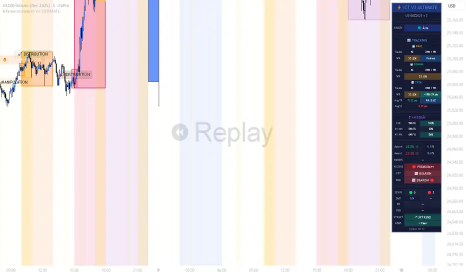
BifaneiroSinaleiro V3 ULTIMATEBifaneiroSinaleiro V3 ULTIMATE - Complete ICT Analysis System & Signal Generator
This isn't just an indicator - it's your 24/7 ICT analyst that does the manual work for you.
━━━━━━━━━━━━━━━━━━━━━━━━━━━━━━━━━━━━━━
🔥 WHAT IT DOES FOR YOU:
━━━━━━━━━━━━━━━━━━━━━━━━━━━━━━━━━━━━━━
✅ Marks ALL ICT Concepts Automatically:
- Fair Value Gaps (LTF + HTF with priority)
- Market Structure (BOS/CHoCH in real-time)
- Breaker Blocks (validated with volume + killzone)
- Liquidity Sweeps (Asian High/Low runs)
- Premium/Discount Arrays + OTE Zones
- Institutional Sessions (London, NY Silver Bullets)
✅ Advanced Pattern Recognition:
- Turtle Soup (sweep + reversal)
- Unicorn Model (sweep → BOS → FVG)
- SMT Divergences (monitors correlated pairs)
- PO3/AMD Phases (Accumulation → Manipulation → Distribution)
✅ Intelligent Scoring System:
- 12+ confluence factors analyzed
- Minimum score 12 for signals (configurable)
- Score 20+ = EXTREME (enables 2nd trade in session)
- Visual score display on every signal
✅ Professional Trade Management:
- 1 trade per session (London, NY AM, NY PM) = max 3/day
- EXTREME mode: 2 trades per session = max 6/day
- Automatic stop loss (session range-based)
- Dynamic take profit (score-adjusted multiplier)
- Auto breakeven after 2.5x move
- EOD close (23:59) with P&L label
- Weekend close (Fri 23:55) with P&L label
✅ 100% ICT Pure Methodology:
- NO EMAs, NO ATR, NO lagging indicators
- Pure price action: High/Low/Range only
- HTF confirmation via Premium/Discount (not EMAs!)
- Stop loss via Asian Range (not ATR!)
━━━━━━━━━━━━━━━━━━━━━━━━━━━━━━━━━━━━━━
⚡ WHY IT'S DIFFERENT:
━━━━━━━━━━━━━━━━━━━━━━━━━━━━━━━━━━━━━━
Traditional indicators show 1-2 concepts. This shows 10+ simultaneously.
Manual ICT takes 2-3 hours per session. This does it in milliseconds.
Other systems guess. This scores with objective confluence.
You save hours daily. You trade better. You profit more consistently.
━━━━━━━━━━━━━━━━━━━━━━━━━━━━━━━━━━━━━━
📊 WHAT YOU GET:
━━━━━━━━━━━━━━━━━━━━━━━━━━━━━━━━━━━━━━
- Real-time dashboard (scores, confluences, structure)
- Precision signals (only in killzones, only with confluences)
- Trade tracking (win rate, RR, P&L by session)
- Multi-timeframe analysis (automatic)
- News block filter (configurable)
- Full customization (colors, thresholds, sessions)
- Comprehensive alerts (8+ types)
Works on: Forex, Indices, Commodities, Crypto
Best on: 1m-5m for execution, 15m+ for swing
Timezone: Configured for CET (UTC+1), easily adjustable
⚠️ This is a professional tool requiring ICT/SMC understanding.
Not magic - it's methodology, automated.
🚀 Stop drawing. Start trading. Add to chart now.
(CRT) MTF Candle Range Theory Model# 🚀 **CASH Pro MTF – Candle Range Theory (CRT) Indicator**
**The Smart Money ICT Setup Detector** 🔥
Hey Traders!
Here is the **ultimate Pine Script indicator** that automatically detects one of the most powerful Smart Money / ICT setups: **Candle Range Theory (CRT)**
---
### What is Candle Range Theory – CRT?
**CRT** is a high-probability price action model based on **liquidity grabs** and **range expansion**.
Price loves to:
1️⃣ Raid the low/high of the previous candle (take stop-losses)
2️⃣ Then reverse and run to the opposite side of the range (or beyond)
When this happens near a **key higher-timeframe level**, magic happens!
### Bullish CRT Model
- Price touches a **strong HTF support**
- Previous candle closes near that support
- Next candle **sweeps the low** (grabs liquidity)
- Current candle **closes above the raided low AND breaks the high** of the sweep candle
**Result → Aggressive bullish move expected!**
**Entry:** On close above the high (or on retest + MSS)
**Stop Loss:** Below the swept low
**Take Profit:** CRT High or next liquidity pool
### Bearish CRT Model
- Price touches a **strong HTF resistance**
- Previous candle closes near resistance
- Next candle **sweeps the high** (grabs buy stops)
- Current candle **closes below the raided high AND breaks the low** of the sweep candle
**Result → Strong bearish expansion!**
**Entry:** On close below the low
**Stop Loss:** Above the swept high
**Take Profit:** CRT Low or next downside liquidity
This whole setup can form in **just 3 candles**… or sometimes more if price consolidates after the sweep.
---
### Why This Indicator is Special
This is **NOT** a simple 3-candle pattern scanner!
This is a **true CRT + MTF confluence beast** with:
- **Multi-Timeframe Confirmation** (default 4H – fully customizable)
- **Built-in RSI Filter** (avoid fake moves in overbought/oversold)
- **Day-2 High/Low Levels** automatically drawn (the exact CRT range!)
- **Clean “LONG” / “SHORT” labels** right on the candle (no ugly arrows or offset)
- **Background highlight** on signal
- **Fully grouped inputs** – super clean settings panel
---
### Features at a Glance
| Feature | Included |
|--------------------------------|----------|
| Higher Timeframe Confirmation | Yes |
| RSI Overbought/Oversold Filter | Yes |
| Day-2 High/Low Lines + Labels | Yes |
| Clean Text Signals (no offset) | Yes |
| Background Highlight | Yes |
| Fully Customizable Colors & Text| Yes |
| Works on All Markets & TFs | Yes |
---
### How to Use
1. Add the indicator to your chart
2. Wait for a **LONG** or **SHORT** label to appear
3. Confirm price is near a **key HTF level** (order block, FVG, etc.)
4. Enter on close or retest (your choice)
5. Manage risk with the drawn Day-2 levels
**Pro Tip:** Combine with ICT Market Structure Shift (MSS) or Fair Value Gaps for even higher accuracy!

jhehli LiquidityWhat are BSL and SSL?
In the context of Smart Money Concepts, liquidity simply refers to pending orders—specifically Stop Losses and Buy/Sell Stop orders—resting above old highs and below old lows.
BSL (Buy-Side Liquidity): This is found above Swing Highs. Retail traders who are short the market will place their "Buy Stop" protective orders here. Additionally, breakout traders place "Buy Limit" orders here. Smart Money views this area as a pool of willing buyers. To fill large sell orders, institutions must drive price up into this liquidity to pair their massive sell interest with these buy stops.
SSL (Sell-Side Liquidity): This is found below Swing Lows. Retail traders who are long the market place their "Sell Stop" protective orders here. Smart Money targets these levels to accumulate long positions. They need the market to sell off into these levels so they can buy from the willing sellers at a discount.
How this Indicator Works
This tool automates the process of market structure analysis by identifying key Swing Highs and Swing Lows.
Detection: It scans price action to find fractal highs and lows (classic swing points) where price has rejected a level.
Visualization: It projects a line from these points, clearly marking where the "stops" are likely residing.
Liquidity Raids: When price pierces these levels, it is considered a "Liquidity Raid" or "Stop Hunt."
How to Use This in Your Trading
Do not treat these lines simply as Support and Resistance. In the ICT methodology, old highs and lows are targets, not barriers.
For Reversals: Wait for a "Turtle Soup" or "Judas Swing." This occurs when price aggressively expands into a BSL or SSL level to trigger stops, only to quickly reverse back into the trading range. This indicates that Smart Money has finished their accumulation or distribution.
For Bias: If the higher timeframe trend is Bullish, expect SSL to be raided to fuel the move, while BSL becomes the target (Draw on Liquidity).
By using this indicator, you remove the guesswork of manually marking every swing point, allowing you to focus on price action and the reaction at these critical liquidity pools.

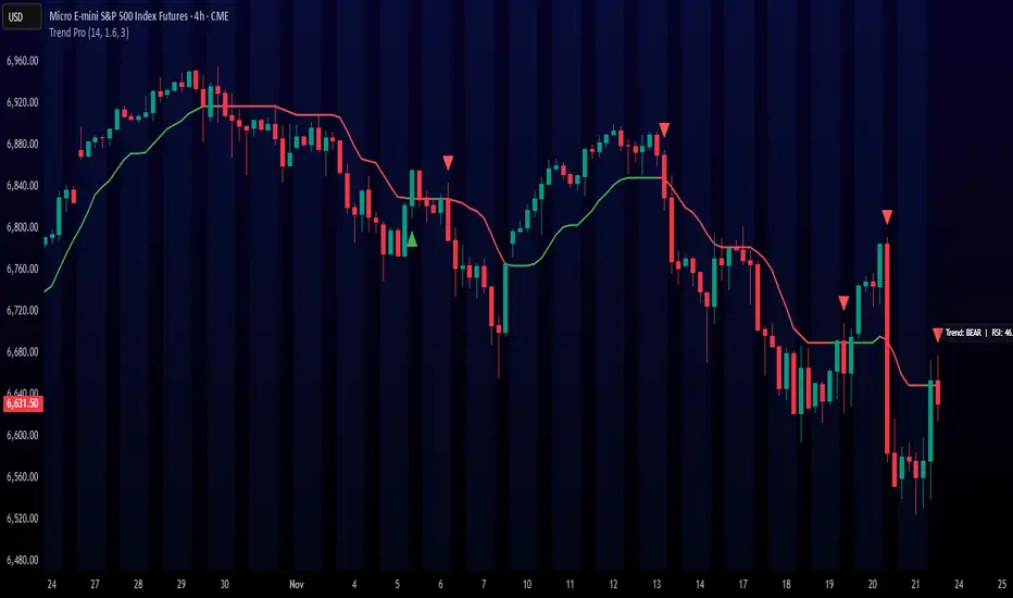
Trend ProTrend Pro is a volatility-adaptive trend and momentum system designed for scalping, day trading, and short-term swing trading.
It uses an ATR-based dynamic trend line (Alpha-Trend style) to identify momentum shifts and confirm directional strength.
Unlike traditional moving averages, Trend Pro adapts to volatility and reacts faster during expansions while filtering noise during chop.
🔍 How Trend Pro Works
Trend Pro builds a dynamic volatility channel using ATR and tracks whether price stays above or below this adaptive line.
When price crosses and closes on the opposite side, it suggests a shift in market control.
When price closes above the line → the trend turns BULLISH (green)
When price closes below the line → the trend turns BEARISH (red)
This gives a clear, visual trend state without repainting.
Tips for Best Performance:
✔ Avoid signals directly inside major ranges or sideways chop
✔ Strongest entries come after small pullbacks into the line
✔ Combine signals with:
Market structure
Key swing highs/lows
Liquidity sweeps
Session timing (NYSE open, power hour)
✔ Trend Pro works best when used with the trend, not counter-trend
Enjoy!
30m Hollow Candle on 5m - SSThis indicator overlays 30-minute candles on a 5-minute chart using clean, hollow-style higher-timeframe (HTF) candles.
The design keeps your chart readable while giving you full insight into the 30m structure that drives intraday price movements.
Each 30-minute candle is drawn as a transparent, hollow outline, so your 5-minute candles remain perfectly visible. The indicator preserves all candle characteristics:
Wicks (high & low)
Open/close levels
Color-coded direction (green = bullish, red = bearish)
Invisible body to avoid overlapping or chart clutter
This tool allows intraday traders to track 30m market structure without constantly switching timeframes.

Simple VP Shape DetectorSimple VP Shape Detector is a lightweight Pine Script tool designed to help traders quickly identify the four major Volume Profile shapes commonly used in orderflow and auction-market theory:
D-Shape (Balanced Profile)
P-Shape (Short-Covering / Buyer-Dominant)
B-Shape (Long-Liquidation / Seller-Dominant)
Thin Profile (Trend Profile)
This indicator uses candle statistics (range, body size, volume distribution approximation, and directional movement) to estimate the underlying shape of the volume profile when the full Volume Profile tool is not available.
✔️ What this indicator does
Analyzes recent bars to estimate volume concentration vs. price movement
Flags possible VP shapes using simple logic
Displays labels above/below candles showing:
“D” → Balanced
“P” → Buyer-heavy
“B” → Seller-heavy
“T” → Trending / Thin profile
Helps traders quickly identify auction conditions
✔️ Why this is useful
Volume Profile tools require premium data or heavy visual processing.
This script provides a simple, fast, CPU-light alternative that still captures the essential behavior of profile shapes.
✔️ How shapes are detected
D-Shape: small directional movement + larger body clustering
P-Shape: strong upward move + volume weighted to upper half
B-Shape: strong downward move + volume weighted to lower half
Thin: long range candles with little internal consolidation
⚠️ Disclaimer
This script is an approximation. It does NOT replace full Volume Profile tools.
It is designed as an educational / supplemental tool for market structure analysis.

Vince/Williams Extreme Volatility VulnerabilityDescription: This indicator implements the "Period of Extreme Vulnerability" concept developed by Ralph Vince and Larry Williams. The theory posits that a healthy market must regularly see the number of New Lows "dry up" (drop to near zero). When the percentage of New Lows fails to drop below a minimal threshold (default 0.15%) for a prolonged period (default 65 days), it indicates that internal market structure is rotting even if prices are rising, leaving the market fragile and prone to sudden volatility shocks.
I have programmed this script to track that exact condition—the extended absence of a "low" New Lows reading. It applies a 50-day Moving Average filter to contextually categorize the signal:
Red Dot (Crash Warning): Triggers when the vulnerability period begins while the price is above the 50 SMA. This is the classic warning signal, indicating that an uptrend is unsupported by market internals and a sharp correction may be imminent.
Green Dot (Contrarian Buy): Triggers when the vulnerability period begins while the price is below the 50 SMA. The script identifies this as a potential capitulation or value point where the persistent internal weakness is likely already priced in.
Note: This indicator requires exchange-wide data (New Lows, Advancers, Decliners) to function. It is best used on daily timeframes.

CRT / ORB Signals [Yosiet]What is the CRT Pattern?
The Counter-Retracement Pattern is a classic three-candle setup that reveals moments of market structure weakness and potential reversal. It occurs when a strong move is temporarily rejected, signaling a possible continuation.
Several names for the same candlestick pattern: CRT, ORB, Morning Star, Evening Star, and others, but I'm not going to talk about it.
Here’s the anatomy of a Bullish CRT:
Candle 1 (C1: The Signal Candle): A significant momentum candle in a downtrend.
Candle 2 (C2: The Retracement/Sweep Candle): This is the critical candle. It must sweep the low of C1 (liquidity grab / sweep) but then close with its body inside the range of C1 .
Candle 3 (C3: The Confirmation/Entry Candle): A bullish candle that closes above C2's close, confirming the pattern.
Here’s the anatomy of a Bearish CRT:
The bearish pattern is the exact inverse, sweeping the high of Candle 1.
Why This Indicator?
Clarity and Precision. This script is built for accuracy and minimalism.
No Repainting: The logic is calculated on the closed historical bars. The signal is only plotted on the entry candle (Candle 3) after it has closed.
Clean Visuals: Instead of cluttering every candle, it shows you only what you need:
Green Up Arrow: Signals a confirmed Bullish CRT, suggesting a Long entry.
Red Down Arrow: Signals a confirmed Bearish CRT, suggesting a Short entry.
Faint Circles: Subtle white circles mark the high/low of Candle 1 and Candle 2, helping you visually trace the pattern structure without obstruction.

BS by bigmmBS by bigmm is a powerful tool designed to track and display cumulative trading volumes for bullish (green) and bearish (red) bars over a user-defined period. This indicator provides valuable insights into market sentiment by quantifying buying and selling pressure through volume analysis.
Adjustable lookback period from 20 to 10,000 bars
Default setting of 500 bars for balanced analysis
Real-time calculation updates on each new bar
BUY Volume: Total volume of green bars (close > open)
SELL Volume: Total volume of red bars (close < open)
Interpretation:
Higher BUY Volume: Indicates stronger buying pressure
Higher SELL Volume: Suggests stronger selling pressure
Balanced Volumes: Shows equilibrium between buyers and sellers
Ideal For:
Swing traders analyzing medium-term trends
Position traders evaluating long-term market sentiment
Volume-based trading strategies
Market structure analysis

Quantum Money Flow PRO [QUANTUM EDITION]Quantum Money Flow PRO is a sophisticated trading indicator that reveals the hidden movements of institutional "smart money" in real-time. Using advanced quantum-inspired algorithms, it analyzes volume, money flow, and market structure to provide professional-grade trading signals with unprecedented accuracy.
⚡ Key Features:
🔍 SMART MONEY DETECTION:
Quantum Delta Analysis: Tracks institutional order flow through volume delta calculations
Money Flow Index (MFI): Identifies overbought/oversold conditions with precision
Power Histogram: Visualizes smart money accumulation/distribution patterns
Open Interest Simulation: Estimates institutional positioning through volume analysis
🎯 TRADING SIGNALS:
QUANTUM STRONG SIGNALS 🌀: High-probability entries with multiple confirmations
QUANTUM WEAK SIGNALS 🟡: Early warnings for potential trend changes
Divergence Detection: Spot hidden reversals before price moves
Convergence Signals: Confirm trend strength with price-indicator alignment
📊 QUANTUM DASHBOARD:
Real-time percentage-based metrics (0-100%)
Color-coded market state identification
Instant signal recognition with emoji indicators
Professional table layout with quantum-themed design
🔄 MULTI-TIMEFRAME ANALYSIS:
Works on all timeframes from 1-minute to monthly
Adaptive calculations for any market condition
Consistent performance across forex, stocks, and crypto
🚨 ALERT SYSTEM:
8 different alert conditions for automated trading
Customizable sound and visual notifications
Mobile push notifications supported
🎨 VISUAL ENHANCEMENTS:
Quantum-themed oscillators with professional styling
Clear overbought/oversold zones with gradient fills
Chart labels for instant signal recognition
Customizable colors to match your trading style
💡 PERFECT FOR:
Day traders seeking institutional edge
Swing traders identifying major turning points
Position traders monitoring smart money flow
Algorithmic traders needing reliable signals
📈 MARKETS:
Forex (All major/minor pairs)
Stocks (NYSE, NASDAQ, etc.)
Cryptocurrencies (BTC, ETH, altcoins)
Indices (SPX, NASDAQ, DOW)
Commodities (Gold, Oil, etc.)
🔧 EASY SETUP:
Apply to any chart
Customize colors and alerts in settings
Watch quantum signals appear in real-time
Trade with institutional-level insight
⚠️ RISK DISCLAIMER:
This indicator is for educational and informational purposes only. Always practice proper risk management and backtest strategies before live trading. Past performance does not guarantee future results.

sima-Prev HTF & Sessions (Tehran)This indicator automatically plots the Opening, Closing, High, and Low levels of the major global trading sessions: London, New York, and Asia. It is designed to help traders visualize intraday liquidity zones, session-based volatility, and potential reaction levels where price commonly expands or reverses.
The script includes fully adjustable session times and highlights each session using clean visual markers so traders can easily identify market structure within different time windows. By displaying the Open, Close, High, and Low of each session, the indicator helps forecast areas of interest such as breakout levels, range boundaries, and session-based support/resistance.
This tool is especially useful for intraday traders, scalpers, and anyone who relies on session dynamics to analyze market behavior. It works on all timeframes and all markets, including Forex, indices, metals, and crypto. No repainting is used; all levels are plotted based on completed session data.

Previous Day OHLC with Fib LevelThe Previous Day OHLC indicator is designed to help traders identify key price levels from the previous trading session. These levels often act as important zones of support, resistance, and market reaction points during the current day’s price action.
This indicator automatically plots the Previous Day’s Open, High, Low, and Close on any intraday timeframe, making it a powerful tool for day traders, scalpers, and swing traders who rely on market structure and session behavior.

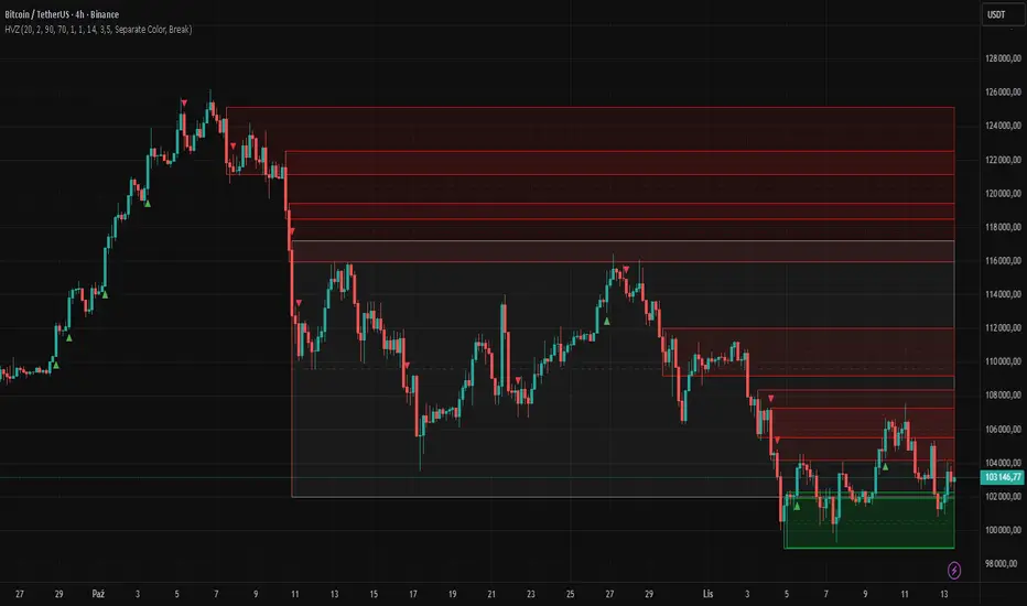
High Volume Zones with Signals – HVZ█ OVERVIEW
"High Volume Zones with Signals – HVZ" is a technical analysis indicator that identifies High Volume Zones (HVZ) on the chart and draws them as fully customizable boxes. Perfect for traders using price action, ICT, and Smart Money Concepts. The indicator highlights key volume-based support/resistance levels, detects potential consolidation zones (very large candles), and generates precise breakout and exit signals. Flexible volume filters, ATR filter, and visual styling options ensure a clean and highly effective chart.
█ CONCEPTS
The indicator detects candles with volume significantly above the average (default ≥ 2× SMA of volume over 20 periods). Such candles often signal institutional activity and create strong supply/demand zones.
The ATR filter additionally identifies very large candles – frequently a sign of market capitulation (panic buying/selling). Within the range of such a candle, prolonged consolidation often occurs, especially on higher timeframes (e.g., 4H and above).
Why are HVZ important? High-volume zones are areas where the market has left a large number of orders – institutions return there to “refresh” liquidity before the next move. A breakout against the zone’s character triggers a Break signal:
- Bullish HVZ broken downward (close below the lower boundary) → Break Down (sell),
- Bearish HVZ broken upward (close above the upper boundary) → Break Up (buy).
Note: The indicator requires real exchange volume – it will not work correctly on instruments without reported volume (e.g., certain CFDs or forex).
█ FEATURES
- HVZ Detection: Automatic identification of high-volume zones with Volume SMA Length and Volume Multiplier filters; historical initialization up to 500 candles back.
- ATR Filter: Optional detection of very large candles (potential consolidation/capitulation) using - ATR Length and ATR Multiplier; three action modes:
Skip Zone – large candle creates no zone,
Separate Color – zone is drawn in a distinct style (gray by default),
Normal Zone – treated like a regular HVZ.
- Gray zones (large candles, Separate Color): generate exactly the same Break signals as regular zones – based solely on the original candle direction (bullish → Break Down on lower break, bearish → Break Up on upper break). Gray color is only a visual marker for potential consolidation/capitulation zones.
- Customizable Boxes: Separate styles for bullish and bearish zones (border color, background gradient, line thickness and style); adjustable background and 50 % midline transparency.
- Break & Exit Signals:
Break Up/Down – green/red triangle after a candle closes outside the zone (zone disappears, triangle remains as a trace).
Exit Up/Down – green/red circle when price leaves the zone without a full breakout.
Signal Type option: Break, Exit, or Both.
- Midline: Automatic dashed line at the 50 % zone level with independent transparency control.
- Chart Cleanup: Automatic removal of inactive zones older than 500 candles (max_boxes_count=500).
- Alerts: Built-in alerts for Break Up and Break Down with clear messages.
█ HOW TO USE
Add to Chart: Paste the script in Pine Editor or find it in TradingView’s indicator library.
Configure Settings:
- Volume Filter: Volume SMA Length (default 20) and Volume Multiplier (default 2.0) – higher multiplier = fewer but stronger zones.
- ATR Filter: Enable/disable, set ATR Length (14) and ATR Multiplier (3.5); choose action for very large candles (Skip Zone / Separate Color / Normal Zone).
- Box Style: Background transparency (90) and midline transparency (70).
- Bull/Bear Box Style: Border and gradient colors, line thickness (1-5).
- ATR Style: Separate colors for large-candle zones (gray by default).
- Signal Settings: Choose Signal Type (Break/Exit/Both) and signal colors.
Signal Interpretation:
- Break Up (green triangle below bar): Bearish HVZ broken upward → buy signal, continuation of uptrend.
- Break Down (red triangle above bar): Bullish HVZ broken downward → sell signal, continuation of downtrend.
- Exit Up/Down (circles): Price leaves zone without breakout – may signal end of correction or reversal setup.
- HVZ Zones: Price often returns to high-volume zones to clear orders. An unfilled zone remains a price magnet.
- 50 % Level (midline): Ideal target for partial take-profit or reaction point inside the zone.
Combine signals with other tools (e.g., RSI, MACD, higher timeframes) for higher confidence.
█ APPLICATIONS
- Price Action & ICT: HVZ act as dynamic S/R; in an uptrend look for buys after breaking a bearish HVZ, in a downtrend look for sells after breaking a bullish HVZ. If you trade retests instead of breakouts, increase Volume Multiplier to 2.5-3.0 – fewer zones but much stronger. Note that after breaking a very strong zone, price often pulls back deeply before continuing.
- Breakout Strategies: For maximum Break signals, lower Volume Multiplier to 1.5-1.8 – gives many high-quality entries in trending markets. Always trade in the direction of the prevailing trend (e.g., only longs in uptrends). Enter after a Break signal with confirmation from volume or momentum (MACD above zero, RSI >50 for longs, <50 for shorts).
█ NOTES
- The indicator requires real exchange volume – it will not function properly on instruments without reported volume (e.g., certain CFDs, forex).
- Always confirm signals with additional context (market structure, higher timeframe).
Trendlines with Breaks Oscillator [LuxAlgo]The Trendlines with Breaks Oscillator is an oscillator based on the Trendlines with Breaks indicator, and tracks the maximum distance on price from bullish and bearish trendline breakouts.
The oscillator features divergences and trendline breakout detection.
🔶 USAGE
This tool is based on our Trendlines with Breaks indicator, which detects bullish and bearish trendlines and highlights the breaks on the chart. Now, we bring you this tool as an oscillator.
The oscillator calculates the maximum distance between the price and the break of each trendline, for both bullish and bearish cases, then calculates the delta between both.
When the oscillator is above 0, the market is in an uptrend; when it is below 0, it is in a downtrend. An ascending slope indicates positive momentum, and a descending slope indicates negative momentum.
Trendline breaks are displayed as green and red dots on the oscillator. A green dot corresponds to a bullish break of a descending trendline, and a red dot corresponds to a bearish break of an ascending trendline.
The oscillator calculation depends on two parameters from the settings panel: short and long alpha length. These parameters are used to calculate a synthetic EMA with a variable alpha for both bullish and bearish breaks. The final result is the difference between the two averages.
As shown in the image, using the same trend detection parameters but different alphas can produce very different results. The larger the alphas, the smoother the oscillator becomes, detecting bigger trends but making it less reactive.
This tool features the same trendline detection system as the Trendlines with Breaks indicator, which is based on three main parameters: swing length, slope, and calculation method.
As we can see in the image above, the data collected for the oscillator calculation will be different when using different parameters. A larger length detects larger trends. A larger slope or a different calculation method also impacts the final result.
🔹 Signal Line
The signal line is a smoothed version of the oscillator; traders can choose the smoothing method and length used from the settings panel.
In the image, the signal line crossings are displayed as vertical lines. As we can see, the market usually corrects downward after a bearish crossing and corrects upward after a bullish crossing.
Traders can choose among 10 different smoothing methods for the signal line. In the image, we can see how different methods and lengths give different outputs.
🔹 Divergences
The tool features a divergence detector that helps traders understand the strength behind price movements. Traders can adjust the detection length from the settings panel.
As shown in the image, a bearish divergence occurs when the price prints higher highs, but the momentum on the histogram prints lower highs. A bullish divergence occurs when the price prints lower lows, but the histogram prints higher lows.
By adjusting the length of the divergence detector, traders can filter out smaller divergences, allowing the tool to only detect more significant ones.
The image above depicts divergences detected with different lengths; the larger the length, the bigger the divergences are detected.
🔶 SETTINGS
🔹 Trendlines
Swing Detection Lookback: The size of the market structure used for trendline detection.
Slope: Slope steepness, a value of 0 gives horizontal levels, values larger than 1 give a steeper slope
Slope Calculation Method: Choose how the slope is calculated
🔹 Oscillator
Short Alpha Length: Synthetic EMA short period
Long Alpha Length: Synthetic EMA long period
Smoothing Signal: Choose the smoothing method and period
Divergences: Enable or disable divergences and select the detection length.
🔹 Style
Bullish: Select bullish color.
Bearish: Select bearish color.

Choch Pattern Levels WITH ALERTS [credit to: @BigBeluga]🔵 OVERVIEW
The Choch Pattern Levels WITH ALERTS indicator automatically detects Change of Character (CHoCH) shifts in market structure — crucial moments that often signal early trend reversals or major directional transitions. It plots the structural break level, visualizes the pattern zone with triangle overlays, and tracks delta volume to help traders assess the strength behind each move. Now, an additional feature of alerts have been included!
🔵 CONCEPTS
CHoCH Pattern: A bullish CHoCH forms when price breaks a previous swing high after a swing low, while a bearish CHoCH appears when price breaks a swing low after a prior swing high.
snapshot
Break Level Mapping: The indicator identifies the highest or lowest point between the pivot and the breakout, marking it with a clean horizontal level where price often reacts.
snapshot
Delta Volume Tracking: Net bullish or bearish volume is accumulated between the pivot and the breakout, revealing the momentum and conviction behind each CHoCH.
snapshot
Chart Clean-Up: If price later closes through the CHoCH level, the zone is automatically removed to maintain clarity and focus on active setups only.
🔵 FEATURES
Automatic CHoCH pattern detection using pivot-based logic.
Triangle shapes show structure break: pivot → breakout → internal high/low.
snapshot
snapshot
Horizontal level marks the structural zone with a ◯ symbol.
snapshot
Optional delta volume label with directional sign (+/−).
Green visuals for bullish CHoCHs, red for bearish.
Fully auto-cleaning invalidated levels to reduce clutter.
Clean organization of all lines, labels, and overlays.
User-defined Length input to adjust pivot sensitivity.
snapshot
NEW! - alert system inserted to Pinescript for either: any triangle forms or whether a bullish "green" triangle or bearish "red" triangle forms - providing real-time alerts for whenever timeframe chart you've selected while creating the alert.
🔵 HOW TO USE
Use CHoCH levels as early trend reversal zones or confirmation signals.
Treat bullish CHoCHs as support zones, bearish CHoCHs as resistance.
Look for high delta volume to validate the strength behind each CHoCH.
Combine with other BigBeluga tools like supply/demand, FVGs, or liquidity maps for confluence.
Adjust pivot Length based on your strategy — shorter for intraday, longer for swing trading.
🔵 CONCLUSION
Choch Pattern Levels WITH ALERTS highlights key structural breaks that can mark the start of new trends. By combining precise break detection with volume analytics and automatic cleanup, it provides actionable insights into the true intent behind price moves — giving traders a clean edge in spotting early reversals and key reaction zones with real-time alerts for precision to evaluate and enter markets.

SD Levels + EMASD Levels + EMA
Overview:
The SD Levels + EMA indicator combines volatility-based standard deviation levels with dual EMA signals to help traders identify potential breakout zones, overextended regions, and trend shifts. It overlays key market structure levels directly on the chart, giving a clear visual roadmap of intraday and daily strength zones.
🧠 Core Features
1. Standard Deviation Levels (SD Module)
Calculates volatility using annualized standard deviation from the selected source (hlc3 by default).
Automatically plots:
Settlement level
±0.33 SD, ±0.66 SD, ±1 SD, ±1.33 SD, ±1.66 SD, ±2 SD bands
Optionally displays:
Previous day’s high/low
Current day’s running high/low
These levels help spot volatility extremes, mean reversion zones, and breakout potential.
2. EMA Module
Plots two customizable EMAs (default = 5 and 10 periods).
Highlights bullish/bearish crossovers with clear up/down triangles.
Generates alerts for crossover events.
Includes an optional $-spaced grid (default $25) with user-defined levels above and below current price.
3. Visual & Utility Options
Optional info table showing:
Current Price
EMA 5
EMA 10
Real-time trend direction (Bullish ↑, Bearish ↓, Neutral)
Lightweight, non-repainting logic optimized for intraday timeframes.
User-friendly inputs to toggle each module independently.
⚙️ Recommended Use
Combine SD zones with EMA crossovers to confirm volatility-based breakouts or fade reversions near extremes.
The extended ±SD ladder helps traders map confluence areas between volatility expansion and EMA momentum.
🛠 Customization
Adjust SD sensitivity via level toggles and settlement source.
Modify grid spacing, number of levels, and EMA periods.
Enable/disable tables, labels, and individual components to match your charting style.
📢 Alerts
🔔 Bullish EMA Cross: EMA 5 crosses above EMA 10
🔔 Bearish EMA Cross: EMA 5 crosses below EMA 10
⚡ Summary
A hybrid indicator that merges volatility-based structure (SD levels) with trend-based momentum (EMA crosses)—ideal for traders who want to visualize both mean-reversion zones and trend continuation opportunities within a single tool.

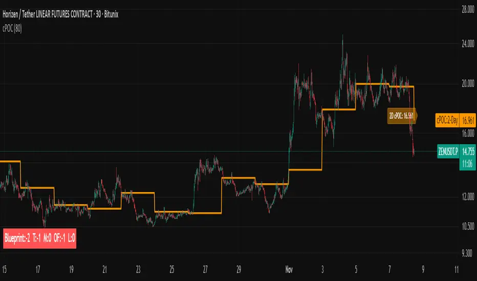
cPOC 2 DayIt’s perfect for your 2-Day cPOC since:
It derives from volume distribution data.
It highlights market structure, value area, and composite volume behavior.
Traders searching for “cPOC,” “volume profile,” or “market profile” will find it here.
Use this if your indicator’s main function is showing POCs, VAH/VAL, or composite volume balance zones.
If your cPOC script is part of a broader system:
Trend Analysis — if it’s used for directional bias and context with VWAP/EMAs.
Support/Resistance — if the tool primarily highlights POC/VAH/VAL as static levels to trade from.
Other — only if your indicator mixes data from multiple frameworks (e.g., combines orderflow, delta, VWAP, and TPO).
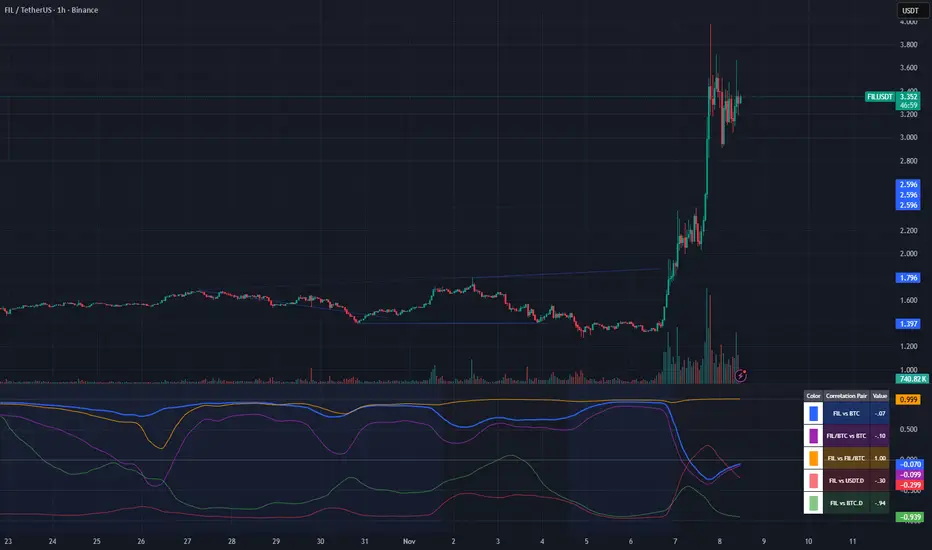
Crypto Correlation Oscillator# Crypto Correlation Oscillator
**Companion indicator for Tri-Align Crypto Trend**
## Overview
The Crypto Correlation Oscillator helps you identify **alpha opportunities** and **market regime changes** by showing how closely your coin follows Bitcoin and other assets over time. It displays rolling correlations as an oscillator in a separate pane below your price chart.
## What It Does
This indicator calculates **Pearson correlations** between different trading pairs on a rolling window (default: 100 bars). Correlations range from **-1.0** (perfect inverse relationship) to **+1.0** (perfect positive relationship), with **0** meaning no correlation.
### The 5 Correlation Lines
1. **Blue (thick line) - Coin vs BTC**: The most important metric
- **High correlation (>0.7)**: Your coin is just following BTC - no independent movement
- **Low correlation (<0.3)**: Your coin has **alpha** - it's moving independently from BTC
- **Negative correlation**: Your coin moves opposite to BTC (rare but powerful)
2. **Purple - Coin/BTC vs BTC**: Inverse relationship check
- **Negative values**: When BTC rises, your coin weakens relative to BTC
- **Positive values**: When BTC rises, your coin strengthens against BTC
3. **Orange - Coin vs Coin/BTC**: Structural consistency check
- Shows how well the Coin/USDT and Coin/BTC pairs maintain their mathematical relationship
- Unusual values can indicate liquidity issues or market inefficiencies
4. **Light Red - Coin vs USDT.D** (optional): Stablecoin dominance correlation
- Shows how your coin correlates with USDT dominance
- Useful for understanding flight-to-safety dynamics
5. **Light Green - Coin vs BTC.D** (optional): Bitcoin dominance correlation
- Shows how your coin correlates with BTC dominance
- Helps identify altcoin season vs BTC dominance cycles
## How to Read It
### Finding Alpha Opportunities
- **Low blue line (<0.3)**: Your coin is decoupled from BTC → potential alpha
- **Blue line dropping**: Coin is gaining independence from BTC
- **Blue line spiking to >0.9**: Coin is a "BTC clone" with no independent movement
### Regime Change Detection
- **Blue line crossing 0.5**: Major shift in correlation behavior
- **Purple line turning negative**: Coin starting to weaken when BTC rises (warning sign)
- **Sharp correlation changes**: Market structure is shifting - adjust strategy
### Visual Zones
- **Blue background**: High correlation zone (>0.7) - coin just following BTC
- **Red background**: Inverse correlation zone (<-0.5) - coin moving opposite to BTC
### Reference Lines
- **+1.0 / -1.0**: Perfect correlation boundaries (dotted gray)
- **+0.5 / -0.5**: Moderate correlation thresholds (dotted gray)
- **0.0**: Zero correlation line (solid gray)
## Dynamic Legend
The legend table (top-right) automatically shows the actual symbol names based on your chart:
- **Example on SOLUSDT**: Shows "SOL vs BTC", "SOL/BTC vs BTC", "SOL vs SOL/BTC", etc.
- **Color boxes**: Match the plot colors for easy identification
- **Live values**: Current correlation numbers update in real-time
- **Tooltips**: Hover over labels for interpretation guidance
## Configuration
### Key Inputs
- **Correlation Lookback** (default: 100): Number of bars for rolling correlation window
- Shorter = more reactive, noisier
- Longer = smoother, slower to detect changes
- **Correlation Smoothing** (default: 5): EMA smoothing period for raw correlations
- Reduces noise while preserving trends
- **Symbol Detection**: Auto-detects symbols from your chart, or use manual overrides
- **Dominance Pairs**: Toggle USDT.D and BTC.D correlations on/off
## Usage Tips
1. **Combine with main Tri-Align indicator**: Use correlation for context, Tri-Align for entry/exit signals
2. **Watch for divergences**: Correlation changing while price moves in sync can signal upcoming shift
3. **Adjust lookback period**: Use shorter (50-70) for day trading, longer (150-200) for position trading
4. **Focus on the blue line**: It's your primary alpha indicator
## Technical Details
- **Calculation**: Pearson correlation coefficient with EMA smoothing
- **Data source**: Close prices from `request.security()` (multi-timeframe capable)
- **Update frequency**: Every bar on your selected timeframe
- **Overlay**: False (displays in separate pane)
## Quick Interpretation Guide
| Blue Line Value | Interpretation | Action |
|----------------|----------------|--------|
| > 0.9 | Coin is a BTC clone | Avoid - no alpha opportunity |
| 0.7 - 0.9 | High correlation | Standard altcoin behavior |
| 0.3 - 0.7 | Moderate correlation | Some independence emerging |
| < 0.3 | Low correlation | **Strong alpha opportunity** |
| < 0 | Inverse correlation | Rare - potential hedge asset |
| Purple Line | Interpretation |
|-------------|----------------|
| Strongly negative | Coin weakens when BTC rises - risky |
| Near zero | Coin/BTC pair moves independently of BTC |
| Positive | Coin strengthens with BTC - ideal |
## Version History
### v1.0 (Initial Release)
- Pearson correlation calculation with configurable lookback
- 5 correlation pairs: Coin vs BTC, Coin/BTC vs BTC, Coin vs Coin/BTC, USDT.D, BTC.D
- EMA smoothing to reduce noise
- Visual zones for high/inverse correlation
- Dynamic legend with symbol name extraction
- Auto-symbol detection matching main Tri-Align indicator
WaleedGhuman SMT/MSS/OF/ModelsAt the core of the WaleedGhuman SMT/MSS/OF/Models indicator lies a sophisticated Smart Money Technique (SMT) Divergence Engine that operates across specific distinct timeframes simultaneously. The result is a comprehensive market analysis tool that bridges the gap between macro market structure and micro price action, delivering institutional-grade divergence analysis in an accessible, visually intuitive format.

KKTT V9Description for Publication
Order Flow + Opening Range Trend Dashboard Combo
This indicator combines Cumulative Volume Delta (CVD) momentum, Opening Range breakout levels, and a Multi-Timeframe Trend Dashboard to provide a complete intraday market view.
Features:
CVD Momentum (Order Flow):
Detects real buying/selling pressure by tracking cumulative delta between bullish and bearish candles.
Buy signal → when CVD crosses above its EMA, price above EMA200, and volume above average.
Sell signal → when CVD crosses below its EMA, price below EMA200, and volume above average.
Opening Range Levels:
Automatically marks the key session opening price, upper breakout (Buy Line), and lower breakout (Sell Line).
Helps identify potential breakout zones for major sessions (e.g., Asia, Europe, US).
Trend Dashboard:
Displays the trend status for multiple timeframes (D1, H4, H1, H15).
Green → Uptrend
Red → Downtrend
Orange → Sideways
Use this dashboard to align intraday signals with higher-timeframe trends.
Usage Tips:
Prioritize buy signals when higher-timeframe trends are bullish.
Prioritize sell signals when higher-timeframe trends are bearish.
Combine with support/resistance zones for better confirmation.
This script provides a clear visualization of order flow strength, market structure, and session volatility — ideal for traders who want to capture directional moves with strong momentum confirmation.
