Bars Since EMA OverlayCounts number of bars since an EMA Touch or an EMA cross with close and shades the area when a threshold is exceeded. Currently supported for 3 thresholds.
Wyszukaj w skryptach "liquidity"

TQ's Support & Resistance(My goal creating this indicator): Provide a way to categorize and label key structures on multiple different levels so I can create a plan based on those observable facts.
The Underlying Concept / What is Momentum?
Momentum indicates transaction pressure. If the algorithm detects price is going up, that would be considered positive momentum. If the algorithm detects price is going down negative momentum would be detected.
The Momentum shown is derived from a price action pattern. Unlike my previous Support & Resistance indicator that used Super Trend, this indicator uses a unique pattern I created. On the first bar bearish momentum is detected a resistance Level is made at the highest point of the previous bullish condition. On the first bar bullish momentum is detected a support Level is made at the lowest point of the previous bearish condition. This happens on 5 different Momentum Levels, (short-term to long-term). I currently use this pattern to trade so the source code is protected.
What is Severity?
Severity is How we differentiate the importance of different Highs and Lows. If Momentum is detected on a higher level the Supply or Demand Level is updated. The Color and Size representing that Level will be shown. Demand and Supply Levels made by higher levels are more SEVERE than a demand level made by a lower level.
Technical Inputs
- to ensure the correct calculation of Support and Resistance levels change BAR_INDEX. BAR_INDEX creates a buffer at the start of the chart. For example: If you set BAR_INDEX to 300. The script will wait for 300 bars to elapse on the current chart before running. This allows the script more time to gather data. Which is needed in order for our dynamic lookback length to never return an error (Dynamic lookback length can't be negative or zero). The lower the timeframe the greater the number of bars need. For Example, if I open up a 1min chart I would enter 5000 as my BAR_INDEX since that will provide enough data to ensure the correct calculation of Support and Resistance levels. If I was on a daily chart, I would enter a lower number such as 800. Don't be afraid to play around with this.
- Toggle options (Close) or (High & Low) creates Support and Resistance Levels using the Lowest close and Highest close or using the Lowest low and Highest high.
Level Inputs
- The indicator has 5 Different Levels indicating SEVEREITY of a Supply and Demand Levels. The higher the Level the more SEVERE the Level.
Display Inputs
- You have the option to customize the Length, Width, Line Style, and Colors of all 5 different
- This indicator includes a Trend Chart. To Easily verify the current trend of any displayed by this indicator toggle on Chart On/Off. You also get the option to change the Chart Position and the size of the Trend Chart
How Trend Is being Determined?
(Close > Current Supply Level) if this statement is true technically price made a HH, so the trend is bullish.
(Close < Current Demand Level) if this statement is true technically price made a LL, so the trend is bearish.
- Fully customize how you display Market Structure on different levels. Line Length, Line Width, Line Style, and Line color can all be customized.
How it can be used?
(Examples of Different ways you can use this indicator): Easily categorize the severity of each and every Supply or Demand Level in the market (The higher Level the stronger the level)
: Quickly Determine the trend of any Level.
: Get a consistent view of a market and how different Levels are behaving but just use one chart.
: Take the discretion from hand drawing support and resistance lines out of your trading.
: Find and categorize strong levels for potential breakouts.
: Trend Analysis, use Levels to create a narrative based on observable facts from these Levels.
: Different Targets to take money off the table.
: Use Severity to differentiate between different trend line setups.
: Find Great places to move your stop loss too.

Visible Range Support and Resistance [AlgoAlpha]🌟 Introducing the Visible Range Support and Resistance 🌟
Discover key support and resistance levels with the innovative "Visible Range Support and Resistance" indicator by AlgoAlpha! 🚀📈 This advanced tool dynamically identifies significant price zones based on the visible range of your chart, providing traders with crucial insights for making informed decisions.
Key Features:
Dynamic support and resistance levels based on visible chart range 📏
User-defined resolution for tailored analysis 🎯
Clear visual representation of significant key zones 🖼️
Easy integration with any trading strategy 💼
How to Use:
🛠 Add the Indicator : Add the indicator to favourites. Adjust settings like resolution and horizontal extension to suit your trading style.
📊 Market Analysis : Identify key support and resistance zones based on the highlighted areas. These zones indicate significant price levels where the market may react.
How it Works:
The indicator segments the price range into user-defined resolutions, analyzing the highest and lowest points to establish boundaries. It calculates the frequency of price action within these segments, highlighting key levels where price movements are least concentrated (areas where price tends to pivot). Customizable settings like resolution and horizontal extension allow for tailored analysis, while the intuitive visual representation makes it easy to spot potential support and resistance zones directly on your chart.
By leveraging this indicator, you can gain deeper insights into market dynamics and improve your trading strategy with data driven support and resistance analysis. Happy trading! 💹✨

Delta Magnet Zone Extended – Selective HideLiquidity Zone Reversal — Description 🔍📊
This indicator automatically identifies liquidity zones where price previously grabbed orders, swept highs/lows, or created strong reaction points. Instead of plotting thin lines, this version converts those levels into zones, giving traders a clearer view of where the market has unfinished business and where future reactions are likely to occur.
These zones act as institutional magnets — areas where liquidity providers, algos, and larger players commonly enter or exit positions.
How It Works ⚙️💡
The script scans recent price action and detects local swing highs and lows. It then builds rectangular liquidity zones around these levels, extending them forward so you can see:
🟥 Bearish liquidity sweep zones
🟩 Bullish liquidity sweep zones
🔁 Areas where price previously failed, rejected, or consolidated
🎯 Potential reversal targets on both sides of the market
These zones update automatically as new structure forms, giving you an always-current map of market memory.
Why the 9-Day Look-Back Is Powerful (My Default) 📅✨
I personally keep the look-back set to 9 days by default because:
✔️ It captures the entire previous trading week
✔️ It maps out where SPY/QQQ/ES has already tapped liquidity
✔️ It shows the true zones institutions defended
✔️ It reveals where price is most likely to react again moving forward
Using a 9-day window gives you a clean, high-signal map of:
Last week’s highs & lows
Prior liquidity sweeps
Rejection zones
Imbalance cleanup levels
This keeps the chart minimal, powerful, and hyper-relevant to current order flow.
How Traders Use These Zones 🎯📈
Here are the most common ways traders use these liquidity zones:
1️⃣ Identify High-Probability Reversal Areas 🔄
Price often reacts strongly when returning to a past liquidity zone — especially if it previously swept stops there.
2️⃣ Confirm Breakouts or Failures 🚪➡️
Break above a bearish zone?
Momentum continuation is likely.
Reject inside a zone?
Reversal or range expansion often follows.
3️⃣ Set Targets & Stop Placement 🎯🛡️
Zones give logical:
Profit targets
Trend exhaustion points
Areas to avoid entering new trades
4️⃣ Time 0DTE Scalps With Precision ⚡
Liquidity zones tighten your expectations for:
Where SPY/QQQ will bounce
Where reversals start
Where liquidity magnets pull price by end of day
Why This Indicator Matters 🧠🔥
Liquidity drives markets.
Not indicators.
Not moving averages.
Not random levels.
This tool shows you where actual orders exist, where they were previously swept, and where institutions are most likely to step in again.
It gives you:
Cleaner charts
Higher confidence
Better strike selection
More precise entries
Stronger exits
All without noise.

Directional Pressure (maybexo)Liquidity Candles, observed in financial markets, display distinctive candlestick patterns that are noteworthy. These candles exhibit intentional price behavior aimed at triggering stop-loss orders and momentarily misleading traders. The pattern typically starts with a price movement against the current trend, activating stop-loss orders and capitalizing on liquidity from traders anticipating the prevailing trend. Subsequently, the price swiftly changes course, breaking and conclusively closing beyond the prior candle's range, often surprising unsuspecting traders.
Characteristics:
1. Liquidity Grab:
- Liquidity Candles initiate with a deliberate move against the existing trend, aimed at triggering stop-loss orders and gathering liquidity from traders who have placed stops in anticipation of the initial trend.
- Notably, the size of the wick in this liquidity grab is significant; a larger wick indicates a more substantial liquidity grab and can strengthen the indication of a potential market reversal.
2. Swift Reversal and Breakout:
- Following the liquidity grab, the price swiftly changes direction, breaking and conclusively closing above or below the previous candle's range.
3. Institutional Behavior:
- These candles are often linked to institutional trading behavior, suggesting potential involvement by significant market participants due to their distinct and deliberate price action.
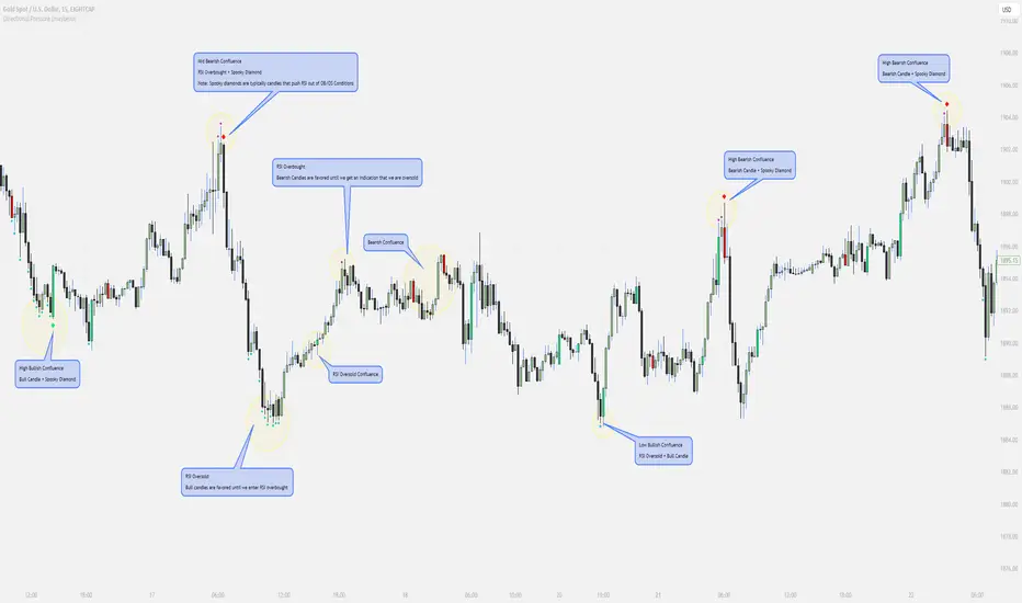
// Diamonds
1. RSI Diamonds:
The RSI Diamonds represent RSI entering either overbought or oversold levels.
These Diamonds serve as an early indication for "Spooky Diamonds" as Spooky Diamonds can only form in these conditions
2. Spooky Diamonds:
The Spooky Diamonds highlight specific candle conditions, aiding in the identification of bullish or bearish momentum in the market while considering the RSI status.
Bullish Candle Momentum: The candle size is greater than the previous candle multiplied by a user-defined factor (filterMultiplier) and the closing price is higher than the opening price. This can suggest bullish momentum.
Bearish Candle Momentum: The candle size is greater than the previous candle multiplied by the filterMultiplier, and the closing price is lower than the opening price. This can suggest bearish momentum.
Important Notes:
The Candles + Diamonds should not be used in isolation as buy or sell signals but rather as additional information for your trading strategy.
The goal of this indicator is to provide a visual representation of RSI data and potential momentum during overbought or oversold conditions.
By utilizing the diamonds and candles, you can easily identify RSI levels and their interaction with candles, aiding in decision-making within your trading strategy.
Disclaimer: Always consider your risk tolerance and conduct thorough analysis before making any trading decisions.
Inspiration Credits:
Vanitati
Mr. Casino
🧠 Rogue BTC Dominance + BTC Price MonitorLiquidity never lies.
When whales are done pumping, they exit before price tanks, often during sideways chop or fake strength.
So we build a tracker that detects:
Volume drop during uptrend (distribution phase)
Exchange inflows of coins
Rising USDT.D while price holds → stealth exit
Divergence between price & on-chain flows
👁️ Quick Use Case: BTC/USDT with USDT.D Overlay
If you see this pattern:
BTC sideways or slow uptrend
Volume declining
USDT.D rising
BTC.D holding flat
→ Liquidity Exit Detected.
Smart money is exiting quietly, waiting for retail to hold the bag.
Liquidity Stress Index (SOFR - IORB)How to use:
> +10 bps — TIGHT
−5 +10 bps — NEUTRAL
< −5 bps — LOOSE

Liquidity Sweeps (Improved)this is improved version of liqudity sweep and alert thois is my third attempt

Multi-Timeframe Sweep IndicatorsLiquidity Sweeps: Identify when price sweeps stops above/below key levels
Breakout Confirmation: Confirm breakouts across multiple timeframes
Entry Timing: Use lower timeframe sweeps for precise entries
Risk Management: Higher timeframe sweeps may indicate stronger moves
The indicator works best when combined with other analysis techniques like support/resistance levels, volume analysis, and market structure.
Liquidity Fvg IdentifierDear Traders,
This indicator is very effective and supports Price action Traders.
Swing Identification
This automatically Detect swings level and mark as per the chart Time frame. these lines can be used for support and resistance.This is represented by Yellow and Blue lines
There is an option to put Higher time frame swing levels and these are represented by Green and Red Lines. Eg: if you are trading in 5 mins and you also want 1 hour swing levels , then you can get this by selecting higher time frame 1 hour and select both Chart and Htf in the option provided.
Trade: If price is approaching where both Times frames swing lines are coinciding these levels act as strong Support and Resistance . You need to wait for proper price action to form and take Trades.
FVG
This also automatically detect Fare Value Gaps and mark as per the chart Time Frame. These can be used for reversal trades . This is represented buy purple blocks
There is an option to put higher time frame FVG and these are represented by Red Blocks. Eg : if you are trading in 15 mins and you also want 4 hours FVG, then you can get this by selecting Higher time frame 4 hours and select both chart and HTF in the option provided.
Trade: If price is approaching where both time frames FVG are coinciding , these box will act as strong support and reversal. wait for proper price action and trade can be taken.
Volume Breakout.
This will automatically detect and volume breakout of last 60 candles and plots below the candle. These can be adjusted in setting as per requirement. suppose you want for last 30 candles , you can select 30 and it will plot below candle when ever there is breakout.
Trade: When ever volume breakout is coming near swing or fvg support or resistance , this can be considered to support reversal.
Pls take your financial advisor suggesting before using taking trades .
any suggestion reach to us thru message
Thanks

Volume-Weighted Price MovementThe Volume-Weighted Price Movement (VWPM) indicator is an easy to read technical analysis tool that analyses how volume and price movement work together to drive market momentum.
How It Works
The VWPM indicator tracks two primary components:
Bullish Movement (green line): Measures the upward price movement weighted by volume. When price closes above the open, this component calculates how much buying pressure exists by multiplying the price change (close - open) by the volume of that period.
Bearish Movement (red line): Measures the downward price movement weighted by volume. When price closes below the open, this component calculates how much selling pressure exists by multiplying the price change (open - close) by the volume of that period.
Bull-Bear Difference (lime/orange line): Shows the net momentum by subtracting bearish movement from bullish movement, providing an at-a-glance view of which force is dominant.
The VWPM integrates volume data to identify whether price movements are backed by significant participation. A large price move with low volume carries less weight than the same move with high volume, providing a more accurate reflection of market strength.
A shorter lookback period makes the indicator more responsive to recent price action, while a longer period smooths out market noise for trend identification.
Interpretation
Bullish Signals
When the green line (bull movement) rises and stays above the red line
When the Bull-Bear Difference line crosses above zero and maintains positive momentum
Divergence between price making lower lows but the bull line making higher lows (hidden strength)
Bearish Signals
When the red line (bear movement) rises and stays above the green line
When the Bull-Bear Difference line crosses below zero and maintains negative momentum
Divergence between price making higher highs but the bull line making lower highs (hidden weakness)
open source, if anyone makes the script better please let me know :)

Liquidity Levels [LuxAlgo]The Peak Activity Levels indicator displays support and resistance levels from prices accompanied by significant volume. The indicator includes a histogram returning the frequency of closing prices falling between two parallel levels, each bin shows the number of bullish candles within the levels.
1. Settings
Length: Lookback for the detection of volume peaks.
Number Of Levels: Determines the number of levels to display.
Levels Color Mode: Determines how the levels should be colored. "Relative" will color the levels based on their location relative to the current price. "Random" will apply a random color to each level. "Fixed" will use a single color for each level.
Levels Style: Style of the displayed levels. Styles include solid, dashed, and dotted.
1.1 Histogram
Show Histogram: Determines whether to display the histogram or not.
Histogram Window: Lookback period of the histogram calculation.
Bins Colors: Control the color of the histogram bins.
2. Usage
The indicator can be used to display ready-to-use support and resistance. These are constructed from peaks in volume. When a peak occurs, we take the price where this peak occurred and use it as the value for our level.
If one of the levels was previously tested, we can hypothesize that the level might be used as support/resistance in the future. Additional analysis using volume can be done in order to confirm a potential bounce.
The histogram can return various information to the user. It can show if the price stayed within two levels for a long time and if the price within two levels was mostly made of bullish or bearish candles.
In the chart above, we can see that over the most recent 200 bars (determined by Histogram Window) 68 closing prices fall between levels A and B, with 27 bars being bullish.
Additionally, the width of a bin and its length can sometimes give information about the volatility of a specific price variation. If a bin is very wide but short (a low number of closing prices fallen within the levels) then we can conclude a most of the movement was done on a short amount of time.

BIGG CHIEFF RWB MASTER v2.0 (Indicator) [v1.0]Here is a **clean, professional TradingView indicator description** you can paste directly into the script description. It explains the *logic and philosophy* without exposing proprietary specifics, while still sounding robust and credible.
---
## 📊 Indicator Overview
This indicator is a **rule-based EMA crossover strategy built on price action, opening range structure, directional bias, and momentum confirmation**.
It is designed for intraday trading during the New York session and adapts to both time-based and tick-based charts.
The system focuses on **clarity, patience, and consistency**, filtering out low-quality conditions while aligning trades with higher-probability market structure.
---
## 🧭 Core Concepts
### Opening Range Structure
* The strategy uses the **first 15 minutes of the New York session** to define an Opening Range.
* This range establishes **key intraday structure**, including:
* High
* Low
* Midpoint
* The Opening Range remains visible for the entire session and resets each day.
* Trades are framed around **breaks, retests, and rejections** of this structure.
---
## 📈 Trend, Bias & Momentum
### Directional Bias
Bias is determined by:
* **EMA stacking order**
* **Price location relative to the Opening Range**
* Optional **higher-timeframe trend alignment**
Once bias is confirmed:
* Trades are only taken **in the direction of that bias**
* Opposing trades are locked out until structure meaningfully changes
This prevents overtrading and reduces whipsaws in choppy conditions.
---
### Higher-Timeframe Alignment (Optional)
A higher-timeframe trend filter can be enabled to:
* Keep trades aligned with the broader market direction
* Improve win rate during trending sessions
* Reduce countertrend entries
---
## ⚡ Volatility & Time Filters
To avoid low-quality trades, the system includes:
* **Volatility filtering** to prevent entries during compressed or dead markets
* **Session time windows** to focus on the most liquid trading hours
* Optional **no-trade time blocks** for news or known high-risk periods
---
## 💧 Liquidity Awareness
The indicator accounts for **key liquidity zones**, such as:
* Prior session highs and lows
* Overnight and premarket extremes
Trades are filtered to ensure there is **sufficient room for reward** before running into nearby liquidity, helping avoid premature exits.
---
## ✅ Entry Logic (Primary Mode)
Trades are based on **structure first, confirmation second**:
* Breakouts must be confirmed by **candle closes**, not wicks
* Entries occur on **retracements and rejection candles**, not chase candles
* Priority is given to cleaner retests closer to structure
* Optional controls allow limiting trades to **first-touch setups only**
This encourages patience and avoids emotional entries.
---
## 🛑 Risk Management & Trade Management
The system is built around **R-multiple consistency**, not fixed targets.
* Stops are volatility-based
* Multiple profit targets can be enabled
* Optional partial profits and trailing stop logic are included
* Trailing behavior can follow momentum or structure once price moves favorably
Everything is designed to **protect capital first and scale winners second**.
---
## 🧠 Philosophy
This indicator is not designed to predict the market.
It is designed to **react intelligently** to what price is already confirming.
It prioritizes:
* Structure over indicators
* Bias over impulse
* Confirmation over hope
* Risk management over win rate
Best results come from disciplined execution, patience, and respecting the filters.

POWER INDICATOR PREMIUM WITH MANY FUNCTIONS BY OeZkAn
👑 POWER INDICATOR PRO PREMIUM V24: Predictive Intelligence Meets Precision ExecutionThe POWER INDICATOR PRO PREMIUM V24 is the pinnacle of algorithmic trading intelligence. This system transcends traditional indicators by utilizing a sophisticated framework of advanced mathematical equations to predict the impending trend direction before the market moves. It combines Smart Money Concepts (SMC), Multi-Timeframe (MTF) convergence, and Dynamic Risk Management to deliver unparalleled clarity and execution confidence.If you seek a trading partner that provides leading, predictive signals and high-probability entries, this system is your definitive solution.
🧠 The Core Element: Predictive Market Context & Directional ForecastThe foundational strength of the POWER INDICATOR is its ability to forecast the market's bias through advanced quantification:
🚀 Directional Pre-Cognition (LRC & Mathematical Models):The system utilizes the Linear Regression Curve (LRC) and proprietary statistical models as its core mathematical engine. This process extrapolates the probable trend path and generates a Directional Forecast for the coming bars, enabling you to anticipate moves rather than react to them. This forecast serves as the ultimate bias filter.
🧠 The Convictional Filter: Quantifying Probability ($60\%$ Confidence):This filter is our proprietary Probability Brain. It eliminates market noise by forcing convergence across multiple high-level factors (MTF agreement, Momentum, SMC levels).High-Conviction Threshold: Independent analysis confirms that the Conviction Filter provides an exceptionally high win rate and signal quality starting at just $60\%$. Setting your threshold at this level ensures you only consider trades where the predictive mathematical components are in strong alignment.
🌊 FVG & GP Predictive Zones:The system automatically identifies and projects critical Fair Value Gaps (FVG/LSOB) and the Golden Pocket (GP) Re-Test Zone. These zones are algorithmically identified as high-probability targets for pullbacks and reversals, providing a clear map of where liquidity will be sought.
💡 The Convictional Trading Workflow: A 3-Step Guide to ExecutionContext Check: Confirm the LRC Directional Forecast aligns with your trade and the Conviction Score Meter is above your desired threshold (minimum $60\%$).Optimal Entry: Wait for the signal to trigger at a high-R:R entry point (GP, FVG, or Aggressive Impulse), guided by your chosen trading mode.Dynamic Management: Let the system handle risk, utilizing Structural SL and automatic Multi-Method Trailing Stops post-TP1.
🎯 Mode Selection: Matching Strategy to MarketThe indicator's power lies in its Modularity. Selecting the correct mode is crucial for optimizing your results.Trading StyleRecommended ModesPrimary Rationale & Entry LogicHigh-Frequency ScalpingCT Scalp-OnlyDesigned for counter-trend entries in a pullback towards the Golden Pocket (GP). Uses tighter SL/TP multipliers for quick profit-taking. (Fast, high-R:R)ATR Channel Scalp (ACS)Utilizes volatility channels (ATR bands) for quick mean-reversion trades when price overextends.Strategic Day Trading / Swing TradingUltimate Fusion Mode (UFM)The highest probability mode. Best for catching major shifts confirmed by SMC (LRC, GP, FVG, MSS). Waits for a deep, high-R:R Re-Test Entry.Haupttrend & Scalp (Kombi)Excellent general-purpose mode. Focuses on trend continuation but allows for high-R:R pullback entries at key levels (GP/FVG). (Balanced)FVG Mitigation Entry (FME)Ideal for SMC traders. Waits for the price to precisely re-test and mitigate an unmitigated Fair Value Gap (FVG) or Liquidity Sweep (LSOB) zone before entry.Breakout & Momentum TradingBand Breakout-OnlyTriggers an entry only when price decisively breaks outside the SMA Volatility Bands (configurable). Filtered by momentum requirements.Dynamic Range Expansion (DRE)Specifically detects low-volatility consolidation before an anticipated high-momentum expansion phase.
🔔 The Master Alert System: Your Execution EdgeThe powerful Alert functionality ensures you can monitor multiple assets and timeframes without being glued to the screen.1.
✅ Dynamic MASTER ALARM (Compact Text)The core alert uses a compact, dynamic JSON/text message that contains all necessary information for quick execution:Action: BUY / SELLMode Used: Conviction Score: Key Level: 2. LRC/GP Combo-Alert (High-R:R)This is the most valuable alert for strategic traders. It triggers only when the LRC direction is confirmed and the price enters the Golden Pocket (GP) Re-Test Zone, indicating an optimal high-R:R pullback opportunity.Final Note: To maximize the predictive power, ensure the useConvictionFilter is set to a minimum of $60\%$ and the useStructureSL is activated to protect your capital with intelligent stop placement.Stop reacting. Start predicting. Activate the POWER INDICATOR PRO PREMIUM V24 and lead the market today!
⚠️ IMPORTANT NOTICE: Full Version vs. Public Release
This current version, the POWER INDICATOR PRO PREMIUM V24 (Full Feature Test Release), is publicly available only for demonstration and testing purposes to showcase the system's full potential (including all 12 Dynamic Modes and the advanced Convictional Filter).
A slightly streamlined Public Version will remain permanently free and accessible to the community. However, the Full Premium Version—featuring the complete 12-Mode selection, all predictive functionalities, and crucial additions such as enhanced, precise Entry/Exit Labels and Dynamic Stop Loss/Take Profit Labels directly calculated by the algorithm—will soon be available exclusively for subscribers.
Test the power now and be ready for the subscription launch!

Buy Sell Strategy By Sultan Of Multan (Breakout/Retest)This is a comprehensive, all-in-one trading system designed for Forex, Crypto, and Stocks. It combines Smart Money Concepts (SMC), Trend Following, and Volatility Analysis into a single, easy-to-use toolkit.
Whether you are a scalper or a day trader, this indicator adapts to your style by allowing you to switch between Aggressive Breakouts and Conservative Retests.
🔥 Key Features:
1. Dual Entry Modes (New Update)
Breakout Mode: Get instant signals when price breaks market structure with momentum (BOS/CHoCH).
Retest Mode: The script waits for price to break and then pull back to the broken level before signaling. This reduces fake-outs and improves entry precision.
2. Smart Money Concepts (SMC)
Auto Fractals & Structure: Automatically detects BOS (Break of Structure) and CHoCH (Change of Character).
Fair Value Gaps (FVG): Detects 3-bar imbalances and alerts on midline taps.
Order Blocks (OB): Highlights valid bullish and bearish order blocks with trend alignment.
3. Trend & Bias Filters
EMA Stack & VWAP: Signals are only generated when the trend is aligned (Price > EMA200 & VWAP).
Multi-Timeframe Analysis: Optional HTF filter to ensure you are trading with the higher trend.
4. Advanced Confidence System
Score HUD: A smart panel that rates every signal (0-100) based on Volume (OBV), RSI, Liquidity, and Trend strength.
Volume Analysis: Integrated OBV slope and RVOL (Relative Volume) filters to confirm valid moves.
5. Complete Trade Management
ATR-Based TP/SL: Automatically calculates Stop Loss and Take Profit levels based on market volatility.
Unified Alerts: Get a single alert that includes Entry, SL, TP1, TP2, and Trade Analysis (Risk/Reward, Context) for easy automation.
Safe/Risky Panel: A dashboard that tells you if the last signal was "Safe" (high confidence) or "Risky".
🛠 How to Use:
Select Entry Method: Go to settings and choose "Breakout" for fast entries or "Retest" for safer entries.
Check the HUD: Look at the bottom center/right panels. Only take trades when the Score is Green/High and Volume is supportive.
Follow the Trend: The background color and VWAP line indicate the current market bias. Trade in the direction of the trend.
Disclaimer:
This tool is designed to assist your analysis, not to replace it. Always manage your risk and test on a demo account first.

Single Prints and Poor Highs/Lows [Real-Time]This indicator is designed for traders utilizing Auction Market Theory (AMT) who need real-time visibility into market structure inefficiencies. Unlike standard TPO tools that often wait for closed bars or finished sessions, this script builds a developing TPO profile tick-by-tick to identify Single Prints and Poor Highs/Lows the moment they form.
Key Features:
Real-Time Single Prints: Automatically detects and highlights areas of single-print inefficiencies (buying/selling tails) as they happen. These "ghost" boxes persist on the chart until price repairs (fills) them, acting as immediate targets or support/resistance zones.
Poor High/Low Detection: Strictly implements AMT logic to identify "unfinished" auctions. If a session extreme is formed by two or more TPO blocks (indicating a flat top/bottom rather than a rejection tail), it marks the level with a dotted line.
Repair Logic: Both Single Prints and Poor High/Low lines are dynamic. If price revisits and repairs the structure, the markers automatically vanish to keep your chart clean.
Session Control: Fully customizable RTH (Regular Trading Hours) session input (default 08:30–15:15) to ensure profiles are built on relevant liquidity.
Quantization: Adjustable "Ticks per Block" allowing you to tune the sensitivity of the TPO profile to different assets (ES, NQ, CL, etc.).
How It Works:
TPO Construction: The script breaks the session into 30-minute periods (configurable) and tracks price overlap.
Single Prints: When the market expands rapidly, leaving gaps in the profile (single TPO blocks), a box is drawn. If price trades back through this box, it deletes itself.
Poor Extremes: It monitors the current session High and Low. If the extreme price level has a TPO count of ≥ 2, it is flagged as "Poor." If the extreme is a single print (count = 1), it is considered a valid tail and left unmarked.
Settings:
RTH Session: Define your specific trading session time.
TPO Period: Default is 30 minutes (standard AMT).
Ticks per Block: Controls the vertical resolution of the TPO. (Higher values = coarser profile, Lower values = more precision).
Colors: Fully customizable colors for Live Prints, Historical Prints, and Poor High/Low lines.
Usage:
Use this tool to spot immediate structural targets. A Poor High often acts as a magnet for price to revisit and "repair," while Single Prints often defend as support/resistance on the first retest.
SLO Pro-J-Algo # Smart Liquidity & OTE Analysis Tool
## OVERVIEW
This indicator is designed for traders who utilize institutional trading concepts, specifically liquidity sweeps and optimal trade entry (OTE) zones, combined with session-based market structure analysis. It identifies potential market manipulation points where stop losses are likely clustered, and highlights high-probability entry zones based on Fibonacci retracements.
The tool combines four main analytical components that work synergistically to identify trading opportunities aligned with smart money behavior.
---
## CORE CONCEPTS & METHODOLOGY
### 1. TRADING SESSIONS ANALYSIS
**What it does:**
The indicator tracks three major forex trading sessions with customizable time zones:
- **Asian Session** (Default: 01:00-13:00 UTC+4) - Typically characterized by range-bound price action
- **London Session** (Default: 11:00-20:00 UTC+4) - High volatility period with increased institutional activity
- **New York Session** (Default: 17:00-00:00 UTC+4) - Overlaps with London creating peak liquidity
**How it works:**
- Automatically highlights active sessions with colored background boxes
- Draws session high/low lines which often act as intraday support/resistance
- Identifies session overlaps (e.g., London-NY overlap) where volatility and liquidity are highest
- Color-codes the price bars during overlaps to alert traders to increased opportunity periods
- Displays real-time session status (🟢 Open / 🔴 Closed) for quick reference
**Trading Application:**
Session highs and lows frequently become liquidity targets. The indicator helps traders anticipate when price might sweep these levels before continuing in the original direction. Session overlaps are prime times for major moves as multiple institutional players are active simultaneously.
---
### 2. EXTERNAL LIQUIDITY SWEEPS
**What it does:**
Identifies when price "sweeps" or breaks beyond significant swing highs and lows where stop losses are typically clustered. These sweeps often precede reversals or continuations after liquidity is collected.
**How it works:**
- Scans the previous 20 bars (configurable) to identify swing high and low points
- Marks these levels as "buyside liquidity" (above highs) or "sellside liquidity" (below lows)
- Monitors price action using three detection methods:
* **Wick Break:** Any candle wick extending beyond the liquidity level
* **Close Break:** Candle body closing beyond the level (stronger confirmation)
* **Full Retrace:** Price breaks the level then closes back inside the range (classic liquidity grab)
- Uses an ATR-based buffer to avoid false signals from minor price spikes
- Confirms sweeps only after a configurable number of confirmation bars to reduce repainting
**The Logic Behind It:**
Institutional traders need liquidity to fill large orders. Stop losses clustered above swing highs and below swing lows provide this liquidity. When these levels are swept, it often indicates smart money is entering positions in the opposite direction, causing reversals.
**Visual Representation:**
- Blue horizontal lines mark buyside liquidity zones (above price)
- Gray horizontal lines mark sellside liquidity zones (below price)
- Labels indicate when liquidity has been swept (✓) or remains active
- Historical zones are maintained for context (configurable display limit)
---
### 3. INTERNAL LIQUIDITY DETECTION
**What it does:**
Identifies equal highs (EQH) and equal lows (EQL) within recent price action - levels that have been tested multiple times without breaking. These represent internal liquidity pools that price often revisits before making larger moves.
**How it works:**
- Examines the most recent 8 bars (configurable) for price levels that occur multiple times
- Uses an ATR-based threshold (default 0.1% of ATR) to determine if highs or lows are "equal"
- Requires minimum 3 occurrences (configurable) of the same level to qualify as internal liquidity
- Tracks both the creation and sweeping of these internal levels
- Differentiates between wick breaks and close breaks for sweep confirmation
**The Concept:**
Unlike external liquidity at swing points, internal liquidity represents recent stop clusters and pending orders within the current price structure. Identifying these levels helps traders anticipate short-term price targets and potential reversal points before larger directional moves.
**Why This Matters:**
Price often needs to clear internal liquidity before making sustained moves to external liquidity levels. This creates a "roadmap" of where price is likely to go in sequence, improving trade timing.
**Visual Representation:**
- Cyan lines mark internal buyside liquidity (equal highs)
- Orange lines mark internal sellside liquidity (equal lows)
- Dashed or solid lines based on user preference
- Labels show when internal levels are swept
---
### 4. OPTIMAL TRADE ENTRY (OTE) ZONES
**What it does:**
Calculates and displays Fibonacci retracement zones (0.618-0.786) from recent swing points, representing "discount" or "premium" areas where institutional traders often enter positions after a liquidity sweep or structure break.
**How it works:**
- Identifies swing highs and lows using a 10-bar lookback period (configurable)
- Calculates three key Fibonacci levels:
* **0.618** - The "golden ratio" retracement (most significant)
* **0.705** - Mid-point between 0.618 and 0.786
* **0.786** - Deep retracement level (square root of 0.618)
- Optionally requires a structure break before displaying OTE zones
- Dynamically extends zones as new price action develops
- Tracks whether price has entered the zone (✅) or exited without filling (❌)
- Displays up to 2 most recent zones (configurable) to avoid chart clutter
**The Methodology:**
OTE zones represent areas where price is at a "discount" (for longs) or "premium" (for shorts) relative to the recent swing. After a liquidity sweep or structure break, institutional traders often wait for retracements into these zones before entering, as it offers better risk-to-reward ratios.
**Combining with Liquidity:**
The most powerful setups occur when:
1. External liquidity is swept
2. Price retraces into an OTE zone
3. Internal liquidity is present as a target
This confluence suggests smart money activity and high-probability trade opportunities.
**Visual Representation:**
- Shaded blue zone between 0.618 and 0.786 levels
- Three horizontal lines showing key Fibonacci levels with different colors/styles
- Labels (🎯) indicate bullish or bearish OTE zones
- Entry (✅) and exit (❌) status for each zone
---
## WHY THESE FEATURES WORK TOGETHER
This indicator combines these four components because they represent different stages of institutional trading behavior:
1. **Session Timing** - Identifies WHEN institutional activity is highest
2. **Liquidity Sweeps** - Shows WHERE smart money is collecting liquidity
3. **OTE Zones** - Highlights WHERE institutional entries likely occur after sweeps
4. **Internal Liquidity** - Provides SHORT-TERM targets for profit-taking or add-ons
Rather than using each concept in isolation, this integration creates a complete market structure framework. For example:
- A buyside liquidity sweep during London open →
- Followed by a retrace into a bullish OTE zone →
- With internal sellside liquidity as the initial target
This sequence represents a complete high-probability trade setup aligned with smart money principles.
---
## ANTI-REPAINTING FEATURES
**The Repainting Problem:**
Many indicators that identify patterns on historical data repaint their signals when live trading, showing signals that weren't actually there in real-time. This creates a false sense of accuracy.
**Our Solution:**
- **Confirmation Bars Setting:** Signals only appear after X bars have confirmed the pattern (default: 2 bars)
- **Marked Confirmation:** Labels show "C" when using confirmed signals
- **Trade-off:** More confirmation = less repainting but slightly delayed signals
- **User Control:** Traders can toggle between real-time signals (faster but may repaint) and confirmed signals (delayed but reliable)
---
## KEY CUSTOMIZATION OPTIONS
### Master Controls
- Toggle each major feature on/off independently
- Combine only the features relevant to your trading style
### Display Settings
- Adjust lookback periods for each component
- Control number of historical zones displayed
- Customize colors, line styles, and transparency
- Show/hide labels and session names
- Configure text sizes for different screen setups
### Detection Sensitivity
- **Sweep Detection:** Choose between wick breaks, close breaks, or full retraces
- **ATR Buffer:** Add distance requirements to confirm sweeps (reduces false signals)
- **Equal Level Threshold:** Adjust how close levels must be to qualify as "equal"
- **Confirmation Bars:** Balance between signal speed and reliability
### Alert System
- Session open/close notifications
- Liquidity sweep alerts
- OTE zone entry alerts
- Configurable alert frequency and types
---
## HOW TO USE THIS INDICATOR
### Basic Setup
1. Add the indicator to your chart (works on all timeframes, though 5M-1H recommended for intraday)
2. Enable the features you want to use via Master Controls
3. Adjust colors and transparency to match your chart preferences
4. Configure alert preferences if using notifications
### Trading Workflow
**Step 1: Identify the Session**
- Determine which trading session is active or approaching
- Note session highs/lows as potential liquidity targets
- Be especially alert during session overlaps
**Step 2: Watch for Liquidity Sweeps**
- Monitor external liquidity lines (swing highs/lows)
- When price sweeps liquidity, anticipate a potential reversal
- Stronger sweeps (close breaks + full retraces) are more significant
**Step 3: Wait for OTE Retracement**
- After a sweep, wait for price to retrace into the OTE zone (0.618-0.786)
- Bullish OTE after sellside sweep = potential long
- Bearish OTE after buyside sweep = potential short
**Step 4: Use Internal Liquidity as Targets**
- Look for internal liquidity in the direction of your trade
- These serve as initial profit targets
- External liquidity serves as extended targets
**Step 5: Manage Confirmation Settings**
- For live trading, use confirmed signals (2+ confirmation bars)
- For backtesting or analysis, you may use real-time signals
- Note that confirmed signals appear with "C" marking
### Example Trade Scenarios
**Bullish Setup:**
1. London session opens (increased volume)
2. Price sweeps sellside liquidity below Asian low
3. Price retraces into bullish OTE zone (0.618-0.786 of the sweep move)
4. Target internal buyside liquidity, then external buyside liquidity
**Bearish Setup:**
1. NY session overlap with London (peak liquidity)
2. Price sweeps buyside liquidity above recent high
3. Price retraces into bearish OTE zone
4. Target internal sellside liquidity, then session lows
---
## BEST PRACTICES
### What This Indicator Does Well
✓ Identifies high-probability institutional trading zones
✓ Provides clear visual roadmap of likely price targets
✓ Reduces chart clutter with configurable history limits
✓ Works across multiple timeframes and instruments
✓ Minimizes repainting with confirmation settings
### What This Indicator Doesn't Do
✗ Does not provide entry/exit arrows (intentional - requires trader discretion)
✗ Does not guarantee winning trades (no indicator does)
✗ Does not work in isolation (combine with price action/market context)
✗ Does not replace risk management (always use stop losses)
### Recommended Complementary Analysis
- Price action patterns (engulfing candles, pinbars at OTE zones)
- Volume profile or footprint charts for order flow confirmation
- Higher timeframe trend context (don't fade strong trends)
- Economic calendar awareness (avoid major news events)
---
## TECHNICAL NOTES
### Performance Optimization
- Uses max_bars_back limitation to reduce memory usage
- Automatic cleanup of old zones to prevent slowdown
- Efficient array management with configurable display limits
- Suitable for both intraday and swing trading timeframes
### Timeframe Recommendations
- **1-5 Minute:** Scalping with tight internal liquidity targets
- **15-30 Minute:** Intraday trading with session-based setups
- **1-4 Hour:** Swing trading with multi-session analysis
- **Daily:** Position trading using weekly liquidity levels
### Instrument Compatibility
Works on all liquid instruments:
- Forex pairs (optimal due to clear sessions)
- Stock index futures (ES, NQ, etc.)
- Cryptocurrency (24/7 markets - use custom session times)
- Individual stocks (less pronounced session effects)
---
## EDUCATIONAL RESOURCES
To better understand the concepts used in this indicator:
**Liquidity Concepts:**
- Study institutional order flow and stop loss hunting
- Learn about market microstructure and liquidity provision
- Understand the difference between retail and institutional trading
**Fibonacci/OTE:**
- Research Fibonacci retracements in trending markets
- Study the mathematical significance of the golden ratio (0.618)
- Practice identifying retracement entries on historical charts
**Session Trading:**
- Analyze volume profiles during different forex sessions
- Study typical price behavior during session overlaps
- Understand timezone conversions for your local trading hours
---
## VERSION HISTORY & UPDATES
This script represents a complete integration of multiple smart money concepts into a single, cohesive tool. Future updates will be published using the Update feature rather than creating separate scripts for minor variations.
---
## DISCLAIMER
This indicator is for educational and informational purposes only. It does not constitute financial advice or trading recommendations. All trading involves risk, and past performance does not guarantee future results. Always practice proper risk management and never risk more than you can afford to lose.
The concepts presented here (liquidity sweeps, OTE zones, session analysis) are widely discussed trading theories. This indicator is an interpretation and visualization of these concepts, not a guarantee of their effectiveness.
---
## SETTINGS SUMMARY
**Master Controls:** Enable/disable each major feature independently
**Repainting Controls:** Adjust confirmation requirements for signals
**Trading Sessions:** Customize session times, colors, and display options
**External Liquidity:** Configure detection sensitivity and visual styling
**Internal Liquidity:** Adjust lookback periods and threshold sensitivity
**OTE Zones:** Select which Fibonacci levels to display and entry requirements
**Alerts:** Configure notifications for sessions, sweeps, and entries
---
## SUPPORT & FEEDBACK
If you find this indicator helpful, please leave a like and comment with your feedback. For questions about specific settings or concepts, refer to the tooltips in the indicator settings panel - each parameter includes a detailed explanation.
Remember: The best indicator is the one you understand and can apply consistently within your trading plan. Take time to practice with this tool on demo accounts before risking real capital.

Liquidity_Detection_Fx_Shepherd [ALLDYN]### Breakdown of the Basic "Fx_Shepherd_Liquidity" Script
#### 1. **Purpose of the Script:**
This basic version of the "Fx_Shepherd_Liquidity" script is designed to help traders detect potential liquidity grabs by analyzing price movements and candle patterns in the market. It works by identifying large price deviations and compares multiple candles to detect liquidity sweeps either to the upside or downside.
#### 2. **How it Works:**
- **User Inputs:**
- `Maru_rate`: This is a user-defined percentage that helps determine how much the price movement of a candle needs to deviate from the candle's range (high - low) to be considered a liquidity grab.
- `Compare`: Another percentage input used to compare the relative size of three candles versus one candle.
- `MA`: This represents the "Big candle period," or the moving average period for big candles.
- `urgent_rate`: This is used to determine urgency by comparing the current candle's range to an SMA of previous candles.
- **Key Calculation Steps:**
- **Candle Deviation (Up and Down):**
- `Up` measures how much the current candle closes above its open (bullish deviation).
- `Down` measures how much the current candle closes below its open (bearish deviation).
- **Average Deviations:**
- `UP_Sum` and `Do_Sum` calculate the SMA of Up and Down deviations, respectively, over the defined period (MA). These averages help detect when a candle deviates significantly from the norm.
- **Urgency Detection:**
- `Check_Up_Urgent` and `Check_Dow_Urgent` are conditions that check if the current candle’s high-low range exceeds the defined urgent rate. This signals whether the price movement is "urgent" or significant.
- **Liquidity Detection:**
- **For Upward Liquidity:**
- The script checks if the candle is bullish (`close > open`) and whether the price deviation (`close - open`) meets or exceeds the user-defined `Maru_rate`.
- The script then compares the size of the previous three candles (`high - low`) with a single candle (`Compare`) to confirm a liquidity grab.
- Finally, it looks for continuous upward candle patterns to confirm the strength of the move.
- **For Downward Liquidity:**
- Similar logic applies, but for bearish candles. It checks whether the candle is bearish (`close < open`) and applies the same size comparisons to detect downward liquidity grabs.
- **Candle Highlighting:**
- If the conditions for a liquidity grab are met (both urgency and size), the script changes the bar color to green for upward liquidity and yellow for downward liquidity. These colored bars visually highlight the candles that meet the liquidity grab conditions.
- The script also colors up to three consecutive candles if they meet the liquidity grab conditions (offset = -1, -2).
#### 3. **Benefits of Using This Script:**
- **Liquidity Grab Detection:**
This script helps detect potential liquidity grabs, which occur when large players in the market push the price in a direction to trigger stop-losses or lure retail traders into a position before reversing the price direction. By detecting these movements, traders can avoid being trapped and potentially take advantage of the upcoming reversal.
- **Simple & Lightweight:**
The script uses basic inputs and calculations to detect liquidity grabs, making it easy to use and understand. It's less complex than the advanced version, which makes it suitable for traders who prefer simplicity or are new to liquidity grab detection.
- **Visual Clarity:**
The script uses color changes (green for upward grabs and yellow for downward grabs) to help traders easily spot potential liquidity grab areas on the chart. These visual cues make it more straightforward to interpret.
#### 4. **When to Use This Basic Version:**
- **Quick Liquidity Detection:** This script is ideal for traders who need a quick way to detect potential liquidity grabs without the complexity of managing dynamic parameters or volume confirmation.
- **Simplified Trading Strategies:** If your trading strategy doesn’t rely heavily on volume or multi-timeframe liquidity grab adjustments, this script can work well for basic setups where price action is the primary indicator.
- **Faster Execution:** Since this version doesn’t require dynamic adjustments or volume confirmation, it executes faster, making it suitable for traders who need lightweight tools to stay on top of fast-moving markets.
### Conclusion:
The basic version of the **Fx_Shepherd_Liquidity** script offers a simplified tool for detecting potential liquidity grabs. Its straightforward design, adjustable Maru rate, and visual bar color changes make it easy to integrate into any trading strategy focused on price action. While it lacks the advanced features of the premium version, it serves as a solid, lightweight solution for traders who prefer simplicity over complexity.

Bitcoin Power Law Global Liqudity Model by G. SantostasiIn recent studies, we've observed a notable correlation between Bitcoin's price and global liquidity metrics. This relationship reveals significant insights into Bitcoin's price movements and offers a new perspective on using macroeconomic indicators to understand and predict Bitcoin's market trends.
Our analysis shows that Bitcoin's price exhibits periodic bubbles, which seem closely associated with oscillations in global liquidity. Notably, the overall price path of Bitcoin appears to be a complex function of global liquidity. This relationship is not as simple as the Bitcoin Power Law in time that can be described with a simple equation, Price ∼ time⁶.
Instead, we have developed a polynomial model to describe this complex relationship between liquidity and Bitcoin price. With a 4-degree polynomial (with 5 different parameters needed to fit the data), we can get a decent fit to the data.
The fit is obtained using 500 data points by polynomial regression. The vector coefficients of the polynomial are obtained such that the sum of squared error between the observations and theoretical polynomial model is minimized.
This model needs to be taken with a grain of salt given the warning by famous mathematician Von Neumann: "With four parameters I can fit an elephant, and with five I can make him wiggle his trunk." discussing a model created by Italian Physicist Fermi. By this he meant that the Fermi simulations relied on too many input parameters, presupposing an overfitting phenomenon.
We can still gain some insights into the relationship between Global Liquidity and the price evolution of Bitcoin using this complex model.
When the price of Bitcoin is plotted against our global liquidity index, we observe a polynomial relationship. This model allows us to see when Bitcoin's price deviates significantly from the predicted value based on global liquidity:
Above the Model: When Bitcoin's price is above the polynomial fit, it indicates a potential lack of sufficient liquidity to support the current price level, suggesting a likely correction.
Below the Model: Conversely, when the price is below the fit, it implies that liquidity might be higher than what is reflected in the price, indicating potential upward movement.
Our global liquidity index comprises several key macroeconomic metrics from major financial institutions worldwide. Here are some of the major components:
RRP (Reverse Repurchase Agreements): This metric indicates the level of liquidity in the financial system through temporary sales of securities with an agreement to repurchase them.
FED (Federal Reserve System): Represents the balance sheet of the US central bank, reflecting its monetary policy actions.
TGA (Treasury General Account): Reflects the US Treasury’s cash balance, impacting the liquidity in the banking system.
PBC (People's Bank of China): Shows the monetary policy actions and liquidity management by China’s central bank.
ECB (European Central Bank): Represents the balance sheet and liquidity management actions of the Eurozone's central bank.
BOJ (Bank of Japan): Reflects Japan's central bank's monetary policy and liquidity measures.
Other Central Banks: Includes metrics from various other central banks like the Bank of England, Bank of Canada, Reserve Bank of Australia, etc.
M2 Money Supply: This includes money supply metrics from various countries like the USA, Europe, China, Japan, and other significant economies.
These components collectively provide a comprehensive view of global liquidity, which is crucial for understanding its impact on Bitcoin's price.
Using the polynomial model and the author's Bitcoin power law model we can create 2 oscillators, one that shows deviations from the trend (normalized to the price to make the peaks more uniform) and the other showing deviations of the polynomial liquidity model from the power law trend.
The oscillators show the difference between the price and the power law model relative to the price, Orange Line. The Blue Line is instead the difference between the Global Liquidity Model of the price and the power law model relative to the model itself. The two oscillators can be overlayed to show their differences and similarities.
Analysis: In addition to similar observations from the discussion above we can see that most Bitcoin bottoms are not directly associated with bottoms in the liquidity model indicating a different mechanism at play that determines Bitcoin bottoms (probably due to miners' capitulation).
Using the new force_overlay function we plot the polynomial liquidity model directly over the Bitcoin price chart while we display the 2 oscillators in a separate panel.

Advanced Smart Trading Suite with OTE═══════════════════════════════════════
ADVANCED SMART TRADING SUITE WITH OPTIMAL TRADE ENTRY
═══════════════════════════════════════
A comprehensive institutional trading system combining multiple advanced concepts including multi-timeframe liquidity analysis, order blocks, fair value gaps, and optimal trade entry zones. Features optional anti-repainting controls for confirmed signal generation.
───────────────────────────────────────
WHAT THIS INDICATOR DOES
───────────────────────────────────────
This all-in-one trading suite provides:
- Multi-Timeframe Liquidity Detection - HTF (Higher Timeframe), LTF (Lower Timeframe), and current timeframe liquidity sweep identification
- Order Blocks - Institutional accumulation/distribution zones with enhanced detection
- Fair Value Gaps (FVG) - Price imbalance detection
- Inverse Fair Value Gaps (iFVG) - Counter-trend imbalance zones
- Optimal Trade Entry (OTE) Zones - Fibonacci retracement-based entry zones (0.618-0.786)
- Trading Sessions - Asian, London, and New York session visualization
- Anti-Repainting Controls - Optional confirmed signals with adjustable confirmation bars
- Comprehensive Alert System - Notifications for all major events
───────────────────────────────────────
HOW IT WORKS
───────────────────────────────────────
ANTI-REPAINTING SYSTEM:
This indicator includes optional anti-repainting controls that fundamentally change how signals are generated:
Confirmed Mode (Recommended):
- Signals wait for confirmation bars before appearing
- No repainting - what you see is final
- Adjustable confirmation period (1-5 bars)
- Slight lag in signal generation
- Better for backtesting and systematic trading
Live Mode:
- Signals appear immediately as patterns develop
- May repaint as new bars form
- Faster signal generation
- Better for discretionary real-time trading
The confirmation system affects all features: liquidity sweeps, order blocks, FVGs, and OTE zones.
LIQUIDITY SWEEP DETECTION:
Three-Tier System:
1. Current Timeframe Liquidity:
- Detects swing highs/lows on chart timeframe
- Configurable lookback and confirmation periods
- Session-tagged for context (Asian/London/NY)
2. HTF (Higher Timeframe) Key Liquidity:
- Default: 4H timeframe (configurable to Daily/Weekly)
- Strength-based filtering using ATR multipliers
- Distance-based clustering prevention
- Only strongest levels displayed (top 1-10)
- Labels show timeframe and strength rating
3. LTF (Lower Timeframe) Key Liquidity:
- Default: 1H timeframe (configurable)
- Precision entry/exit levels
- Strength-based ranking
- Distance filtering to avoid clutter
Sweep Detection Methods:
- Wick Break: Any wick beyond the level
- Close Break: Close price beyond the level
- Full Retrace: Break and close back inside (stop hunt detection)
Buffer System:
- Configurable ATR-based buffer for sweep confirmation
- Prevents false positives from minor price fluctuations
ORDER BLOCKS (Enhanced):
Detection Methodology:
- Identifies the last opposing candle before significant structure break
- Bullish OB: Last red candle before bullish break
- Bearish OB: Last green candle before bearish break
Enhanced Filters:
1. Size Filter:
- Minimum order block size (ATR-based)
- Ensures significant zones only
2. Volume Filter:
- Requires above-average volume (configurable multiplier)
- Confirms institutional participation
3. Imbalance Filter:
- Requires strong directional move after OB formation
- Validates true institutional activity
Violation Detection:
- Wick-based: Any wick through the zone
- Close-based: Close price through the zone
- Automatic removal of broken order blocks
FAIR VALUE GAPS (FVG):
Bullish FVG: Gap between candle 3 low and candle 1 high (three-bar pattern)
Bearish FVG: Gap between candle 3 high and candle 1 low
Requirements:
- Minimum gap size (ATR-based)
- Clear price imbalance
- No overlap between the three candles
Fill Detection:
- Configurable fill threshold (default 50%)
- Tracks partial and complete fills
- Removes filled gaps to keep chart clean
INVERSE FAIR VALUE GAPS (iFVG):
What are iFVGs:
- Counter-trend FVGs that form after original FVG is filled
- Indicate potential reversal or continuation failure
- Form within specific timeframe after original FVG
Detection Rules:
- Must occur after a FVG is filled
- Must form within 20 bars of original FVG
- Minimum size requirement (ATR-based)
- Opposite direction to original FVG
Visual Distinction:
- Dashed border boxes
- Different color scheme from regular FVGs
- Combined labels when FVG and iFVG overlap
OPTIMAL TRADE ENTRY (OTE) ZONES:
Based on Fibonacci retracement principles used by institutional traders:
Concept:
After a structure break (swing high/low violation), price often retraces to specific Fibonacci levels before continuing. The OTE zone (0.618 to 0.786) represents the optimal entry area.
Bullish OTE Formation:
1. Swing low is formed
2. Structure breaks above previous swing high (bullish structure break)
3. Price retraces into 0.618-0.786 Fibonacci zone
4. Entry signal when price enters and holds in OTE zone
Bearish OTE Formation:
1. Swing high is formed
2. Structure breaks below previous swing low (bearish structure break)
3. Price retraces into 0.618-0.786 Fibonacci zone
4. Entry signal when price enters and holds in OTE zone
Key Fibonacci Levels:
- 0.618 (Golden ratio - primary target)
- 0.705 (Square root of 0.5 - institutional level)
- 0.786 (Square root of 0.618 - deep retracement)
Structure Break Requirement:
- Optional setting to require confirmed structure break
- Prevents premature OTE zone identification
- Ensures proper swing structure is established
Entry/Exit Tracking:
- Green checkmark: Price entered OTE zone validly
- Red X: Price exited OTE zone (stop or target)
- Real-time status monitoring
TRADING SESSIONS:
Displays three major trading sessions with full customization:
Asian Session (Tokyo + Sydney):
- Default: 01:00-13:00 UTC+4
- Typically lower volatility
- Sets up key levels for London open
London Session:
- Default: 11:00-20:00 UTC+4
- Highest liquidity period
- Major institutional moves
New York Session:
- Default: 16:00-01:00 UTC+4
- US market hours
- High impact news events
Features:
- Real-time status indicators (🟢 Open / 🔴 Closed)
- Session high/low tracking
- Overlap detection and highlighting
- Historical session display (0-30 days)
- Customizable colors and borders
───────────────────────────────────────
HOW TO USE
───────────────────────────────────────
MASTER CONTROLS:
Enable/disable major features independently:
- Trading Sessions
- Liquidity Sweeps (Current TF)
- HTF Liquidity Sweeps
- LTF Liquidity Sweeps
- Order Blocks
- Fair Value Gaps
- Inverse Fair Value Gaps
- Optimal Trade Entry Zones
ANTI-REPAINTING SETUP:
For Backtesting/Systematic Trading:
1. Enable "Use Confirmed Signals"
2. Set Confirmation Bars to 2-3
3. All signals will wait for confirmation
4. No repainting will occur
For Real-Time Discretionary Trading:
1. Disable "Use Confirmed Signals"
2. Signals appear immediately
3. Be aware signals may adjust with new bars
MULTI-TIMEFRAME LIQUIDITY STRATEGY:
Top-Down Analysis:
1. Identify HTF liquidity levels (4H/Daily) for major targets
2. Find LTF liquidity levels (1H) for entry refinement
3. Wait for HTF liquidity sweep (liquidity grab)
4. Enter on LTF order block in direction of HTF sweep
5. Target next HTF or LTF liquidity level
Liquidity Sweep Trading:
1. HTF liquidity sweep = major institutional move
2. Look for immediate reversal or continuation
3. Use order blocks for entry timing
4. Place stops beyond the swept liquidity
SESSION-BASED TRADING:
Asian Session Strategy:
1. Identify Asian session high/low
2. Wait for London or NY session to open
3. Trade breakouts of Asian range
4. Target previous day's highs/lows
London/NY Session Strategy:
1. Watch for liquidity sweeps at session open
2. Enter on order block confirmation
3. Use OTE zones for retracement entries
4. Target session high/low or HTF liquidity
OTE ZONE TRADING:
Setup Identification:
1. Wait for clear swing high/low formation
2. Confirm structure break in intended direction
3. Monitor for price retracement to 0.618-0.786 zone
4. Enter when price enters OTE zone with confirmation
Entry Rules:
- Bullish: Long when price enters OTE zone from above
- Bearish: Short when price enters OTE zone from below
- Stop loss: Beyond 0.786 level or swing extreme
- Target: Previous swing high/low or HTF liquidity
Exit Management:
- Indicator tracks when price exits OTE zone
- Red X indicates position should be managed/closed
- Use order blocks or FVGs for partial profit targets
FAIR VALUE GAP STRATEGY:
FVG Entry Method:
1. Wait for FVG formation
2. Monitor for price return to FVG
3. Enter on first touch of FVG zone
4. Stop beyond FVG boundary
5. Target: Fill of FVG or next liquidity level
iFVG Reversal Strategy:
1. Original FVG is filled
2. iFVG forms in opposite direction
3. Indicates failed move or reversal
4. Enter on iFVG confirmation
5. Target: Opposite end of range or next structure
Combined FVG + iFVG:
- When both overlap, indicator combines labels
- Represents high-probability reversal zone
- Use with order blocks for confirmation
ORDER BLOCK STRATEGY:
Entry Approach:
1. Wait for order block formation after structure break
2. Enter on first return to order block
3. Place stop beyond order block boundary
4. Target: Next order block or liquidity level
Confirmation Layers:
- Order block + FVG = strong confluence
- Order block + Liquidity sweep = institutional setup
- Order block + OTE zone = optimal entry
- Order block + Session open = high probability
Volume Analysis:
- Wider colored section = stronger institutional interest
- Use volume bars to confirm order block strength
- Higher volume order blocks = more reliable
───────────────────────────────────────
CONFIGURATION GUIDE
───────────────────────────────────────
LIQUIDITY SETTINGS:
Lookback: 5-30 bars
- Lower = more frequent, sensitive levels
- Higher = fewer, more significant levels
- Recommended: 15 for intraday, 20-25 for swing
Sweep Detection Type:
- Wick Break: Most sensitive
- Close Break: More conservative
- Full Retrace: Stop hunt detection
Sweep Buffer: 0-1.0 ATR
- Adds distance requirement for sweep confirmation
- Prevents false positives
- Recommended: 0.1 for most markets
HTF/LTF LIQUIDITY:
HTF Timeframe Selection:
- Swing trading: 1D or 1W
- Day trading: 4H or 1D
- Scalping: 1H or 4H
LTF Timeframe Selection:
- Swing trading: 4H or 1D
- Day trading: 1H or 4H
- Scalping: 15m or 1H
Strength Filters:
- Min Pivot Strength: Higher = fewer, stronger levels
- Min Distance: Higher = less clustering
- Recommended: 2.0 ATR for HTF, 1.5 ATR for LTF
ORDER BLOCK SETTINGS:
Swing Length: 5-20
- Controls sensitivity of structure break detection
- Lower = more order blocks, faster signals
- Higher = fewer order blocks, stronger signals
- Recommended: 8-10 for most timeframes
Enhancement Filters:
- Min Size: 0.5-1.5 ATR typical
- Volume Multiplier: 1.2-2.0 typical
- Imbalance: Enable for strongest signals only
OTE SETTINGS:
Swing Length: 5-50
- Controls OTE zone formation sensitivity
- Lower = more frequent, smaller moves
- Higher = fewer, larger trend moves
- Recommended: 10-15 for intraday
Require Structure Break:
- Enabled: Only shows OTE after confirmed break
- Disabled: Shows potential OTE zones earlier
- Recommended: Enable for higher probability setups
FVG SETTINGS:
Min FVG Size: 0.1-2.0 ATR
- Lower = more gaps detected
- Higher = only significant gaps
- Recommended: 0.5 ATR for most markets
Fill Threshold: 0.1-1.0
- Determines when gap is considered "filled"
- 0.5 = 50% fill required
- Higher = more conservative
iFVG Min Size: 0.1-2.0 ATR
- Typically smaller than regular FVG
- Recommended: 0.3 ATR
ALERT SYSTEM:
Available Alerts:
- Liquidity Sweeps (Current TF)
- HTF Liquidity Sweeps
- LTF Liquidity Sweeps
- Session Changes (Open/Close)
- OTE Entry Signals
Alert Setup:
1. Enable alerts in settings
2. Select specific alert types
3. Create TradingView alert using "Any alert() function call"
4. Configure delivery method (mobile, email, webhook)
Alert Messages Include:
- Event type and direction
- Confirmation status (if using confirmed mode)
- Price level
- Timeframe (for liquidity sweeps)
───────────────────────────────────────
RECOMMENDED CONFIGURATIONS
───────────────────────────────────────
For Day Trading (15m-1H charts):
- HTF Liquidity: 4H
- LTF Liquidity: 1H
- Liquidity Lookback: 15
- Order Block Swing Length: 8
- OTE Swing Length: 10
- Confirmed Signals: Enabled, 2 bars
For Swing Trading (4H-1D charts):
- HTF Liquidity: 1D or 1W
- LTF Liquidity: 4H
- Liquidity Lookback: 20
- Order Block Swing Length: 10
- OTE Swing Length: 15
- Confirmed Signals: Enabled, 2-3 bars
For Scalping (5m-15m charts):
- HTF Liquidity: 1H or 4H
- LTF Liquidity: 15m or 1H
- Liquidity Lookback: 10-12
- Order Block Swing Length: 6-8
- OTE Swing Length: 8
- Confirmed Signals: Optional
───────────────────────────────────────
PERFORMANCE OPTIMIZATION
───────────────────────────────────────
This indicator is optimized with:
- max_bars_back declarations for efficient lookback
- Automatic memory cleanup every 10 bars
- Conditional execution based on enabled features
- Drawing object limits to prevent performance degradation
Memory Management:
- Old liquidity zones automatically removed
- Filled FVGs/iFVGs cleaned up
- Exited OTE zones removed
- Mitigated order blocks deleted
Best Practices:
- Enable only needed features
- Use appropriate timeframe combinations
- Don't display excessive historical sessions
- Monitor drawing object counts on lower timeframes
───────────────────────────────────────
EDUCATIONAL DISCLAIMER
───────────────────────────────────────
This indicator combines multiple institutional trading concepts:
- Liquidity theory (where orders accumulate)
- Order flow analysis (institutional footprints)
- Price imbalance detection (FVGs)
- Fibonacci retracement theory (OTE zones)
- Session-based trading (time-of-day patterns)
All calculations use standard technical analysis methods:
- Pivot high/low detection
- ATR-based normalization
- Volume analysis
- Fibonacci ratios
- Time-based filtering
The indicator identifies potential setups but does not predict future price movements. Success depends on proper application within a complete trading plan including risk management, position sizing, and market context analysis.
───────────────────────────────────────
USAGE DISCLAIMER
───────────────────────────────────────
This tool is for educational and analytical purposes. Trading involves substantial risk of loss. The anti-repainting features provide confirmed signals but do not guarantee profitability. Always conduct independent analysis, use proper risk management, and never risk capital you cannot afford to lose. Past performance does not indicate future results.

EGX30 Advance/Decline Line🇪🇬 EGX30 Advance/Decline & Market Breadth Suite
This comprehensive indicator provides a deep dive into the market breadth of the EGX30 index, allowing traders and analysts to monitor underlying buying and selling pressure across its constituents. It offers five distinct metrics for a holistic view of market health, ranging from traditional Advance/Decline analysis to advanced McClellan Oscillators and TRIN (Arms Index) readings.
Key Features and Metrics
The indicator is selectable via the 'Select Metric' input and can display the following on your chart:
1. Advance/Decline Line: A cumulative measure of the difference between the number of advancing stocks and declining stocks (Advancing Stocks−Declining Stocks). It helps confirm the market's trend strength.
2. McClellan Oscillator: Calculated using the Advance/Decline Ratio (AD Ratio) smoothed by two Exponential Moving Averages (EMAs). It acts as a momentum measure of the A/D Line, highlighting potential overbought/oversold conditions and trend turns.
Climax Levels: Horizontal lines are plotted at +0.1 (Buy Climax) and −0.1 (Sell Climax).
3. Arms Index (TRIN): A volume-based indicator that measures the ratio of the Advance/Decline Ratio to the Advancing Volume/Declining Volume Ratio. A value above 1.0 is generally bearish (more volume in declining stocks), while a value below 1.0 is bullish.
Bands: Upper and Lower deviation bands are calculated and plotted for advanced analysis of extremes.
4. Total Volume: The raw, aggregated volume of all EGX30 constituent stocks.
5. Total Liquidity (Total Traded Value): The sum of (Price × Volume) for all EGX30 constituent stocks, giving a more accurate representation of capital flow.
⚙️ Customizable & Smart Configuration
The indicator is designed for maximum flexibility and accuracy across different chart timeframes:
Automatic Timeframe Configuration: When enabled (default), the script automatically selects optimized lookback periods for the Moving Average (MA), McClellan EMAs, and TRIN Lookback based on whether the chart is Intraday, Daily, Weekly, or other.
Manual Overrides: Disable the auto-configuration to manually set the MA Length, McClellan Fast/Slow EMAs, and TRIN Lookback/StdDev Multiplier for custom analysis.
📊 Advanced Data Table (Market Breakdown)
When the 'Show Table' input is toggled ON, a detailed statistics table appears on the chart's top-right corner, providing real-time market insights.
Top Performance (Contributors): Ranks and displays the Top N (customizable) stocks that are contributing the most to the index's movement, calculated as Weight × Percentage Change.
Top Liquidity: Ranks and displays the Top N stocks by their current-bar traded value (Price×Volume), expressed as a percentage of the Total Traded Value.
Horizontal Stats (Row 3): Provides a comprehensive summary of the current market state:
Adv, Decl, Unch: Count of advancing, declining, and unchanged stocks.
Net Adv: The difference between advancing and declining stocks.
Net Vol / Net Liq: Net Volume/Liquidity as a percentage of Total Volume/Liquidity.
Primary Metric/Volume Stats: Depending on the selected metric, it displays the current value of TRIN or the raw Total Volume and Total Liquidity.
This tool is indispensable for traders needing a clear, quantified understanding of the EGX30's underlying market dynamics.
EGX30 Advance/Decline v1.1
In this improved version, the relative weights of the index components have been adjusted, some stocks have been removed from the index, and new stocks have been added based on the latest update of the Egyptian Exchange's EGX30 index. Some visual improvements have also been made.

CandelaCharts - Unicorn Model📝 Overview
The Unicorn Model is an advanced indicator that pinpoints high-probability reversal setups based on the ICT Unicorn formation. It uses a zigzag-based structure to detect engineered liquidity grabs followed by sharp displacements in the opposite direction—ideal for fade entries or the start of new trends.
The indicator is enhanced with macro time filters, allowing it to align model detections with key trading sessions and institutional flow windows.
The ICT Unicorn Model is a precision-driven intraday strategy rooted in smart money concepts. It combines time-of-day sensitivity, engineered liquidity runs, and institutional order flow to uncover high-quality trading opportunities.
📦 Features
Liquidity Levels: Projects forward-looking liquidity zones after a Unicorn model is confirmed, highlighting potential price targets. These zones act as magnet areas where price is likely to be drawn, helping traders manage exits, partials, and re-entries with greater precision.
Unicorn: The Unicorn formation utilizes a smart money framework and a dynamic zigzag detection method to identify engineered liquidity grabs—sharp sweeps of previous highs or lows—followed by impulsive reversals.
Macros: These time-based intervals represent key moments when institutional algorithms are most active, seeking liquidity, rebalancing, or delivering price to key levels like fair value gaps and liquidity pools.
Custom TF Pairing: Choose your preferred combination of entry timeframe and context timeframe. For example, trade 5m setups within a 1h HTF bias, allowing precise alignment of microstructure with broader directional intent.
HTF & LTF PD Arrays: Displays high- and low-timeframe PD Arrays (e.g., Fair Value Gaps, Inversion Fair Value Gaps) that act as zones of interest or rejection, enhancing confluence and risk control.
History: Backtest previous Unicorn setups directly on the chart. Toggle historical models to analyze past behavior, improve your confidence, and fine-tune your trade execution across varying market regimes.
Killzone Filter: Restrict signal generation to specific trading sessions or killzones (e.g., London Open, New York AM). This minimizes false positives in low-volume or overlapping ranges.
Standard Deviation: Dynamically calculates and plots four deviation bands from the model confirmation point. These levels offer insight into stretch targets, volatility bands, and potential mean-reversion zones.
Dashboard: A real-time control panel showing the active model, HTF candle timer, current directional bias, asset name, and session date—offering clarity and fast decision-making at a glance.
⚙️ Settings
Core
Status: Filter models based on status
Bias: Controls what model type will be displayed, bullish or bearish
Fractal: Controls the timeframe pairing that will be used
Length: Sets the maximum number of candles allowed for a model to develop
Labels: Display the model label (e.g., C1, C2, Cn)
Unicorn
Zigzag: Adjusts the length of the Zigzag formation
Breaker: Defines the style of Breaker Blocks
Sweeps
Sweep: Shows the sweep that forms a model
I-sweep: Controls the visibility of invalidated sweeps
D-purge: Plots the double purge sweeps
S-area: Highlights the sweep area
Liquidity
Liquidity: Displays the liquidity levels that belong to the model
History
History: Controls the number of past models displayed on the chart
Filters
Asia: Filter models based on Asia Killzone hours
London: Filter models based on London Killzone hours
NY AM: Filter models based on NY AM Killzone hours
NY Launch: Filter models based on NY Launch Killzone hours
NY PM: Filter models based on NY PM Killzone hours
Custom: Filter models based on user Custom hours
HTF
Candles: Controls the number of HTF candles that will be visible on the chart
NY Open: Display True Day Open line
Offset: Controls the distance of HTF from the current chart
Space: Controls the space between HTF candles
Size: Controls the size of HTF candles
PD Array: Displays ICT PD Arrays
CE Line: Style the equilibrium line of PD Array
Border: Style the border of the PD Array
LTF
H/L Line: Displays on the LTF chart the High and Low of each HTF candle
O/C Line: Displays on the LTF chart the Open and Close of each HTF candle
PD Array: Displays ICT PD Arrays
CE Line: Style the equilibrium line of PD Array
Border: Style the border of the PD Array
Standard Deviation
StDev: Controls standard deviation of available levels
Labels: Controls the size of standard deviation levels
Anchor: Controls the anchor point of standard deviation levels (wick, body)
Lines: Controls the line widths and color of standard deviation levels
Dashboard
Panel: Display information about the current model
💡 Framework
The Unicorn Model analyzes price action by combining key elements to identify high-probability trade setups. It detects liquidity sweeps and uses a zigzag method to spot Breaker Blocks. The model maps PD Arrays like Fair Value Gaps and Inversion FVGs for precision zones, integrates macro time filters for context, and projects forward price targets based on liquidity clusters. Together, these components provide a clear framework to anticipate market trends and optimize entries and exits.
The model incorporates the following timeframe pairing:
15s - 5m
1m - 15m
1m - 30m
2m - 20m
3m - 30m
3m - 60m
5m - 1H
15m - 4H
15m - 8H
30m - 9H
30m - 12H
1H - 1D
2H - 2D
3H - 3D
4H - 1W
8H - 2W
12H - 3W
1D - 1M
2D - 2M
1W - 3M
2W - 6M
3W - 9M
1M - 12M
Below are the key components that make up the model:
Sweep
D-purge
Zigzag (Breaker)
PD Arrays (FVG, IFVG)
Macros
Standard Deviation
Liquidity
The Unicorn Model operates through a defined lifecycle that tracks its current stage, helping to assess the validity of potential trade opportunities.
The model's lifecycle includes the following statuses:
Formation (grey)
Invalidation (red)
Success (green)
Through the phases of Formation, Invalidation, and Success, traders can effectively manage positions, minimize risk, and capitalize on the high-probability setups presented by the Unicorn Model.
⚡️ Showcase
The Unicorn Model is an advanced trading framework designed to elevate your market analysis and increase your trading edge. By leveraging smart money concepts and sophisticated pattern detection, it helps you spot key liquidity sweeps, reversal zones, and high-probability setups, enabling more precise entries, exits, and risk management tailored to market structure.
LTF PD Array
LTF PD Arrays are crucial to the Unicorn Model and must align with the Zigzag Breaker for the setup to be considered valid.
HTF PD Array
Higher-Timeframe PD Arrays deliver essential macro context, serving to validate both the direction and momentum of potential reversals.
Timeframe Alignment
Timeframe alignment is a fundamental element of the Unicorn trading model. By integrating multi-timeframe context, the model effectively identifies high-probability models.
Killzone Filters
Filter Unicorn Models according to key market sessions—Asia, London, New York AM, New York Launch, and New York PM—to target periods of high liquidity. This approach improves the accuracy and timing of trade setups by capturing moments when smart money is most active.
Macros
The Unicorn Model uses ICT Macro Times to identify key trading periods when institutional activity is most intense. By syncing setups with these critical windows, the model improves accuracy and provides better context for entries, risk management, and potential reversals.
Gain a trading advantage with the Unicorn Model — your essential tool for clearer insights, smarter decision-making, and more confident trade execution.
🚨 Alerts
This script provides alert options for all model types, which must be configured within TradingView.
Bearish Model
A bearish model alert is triggered when a model forms, signaling a 4 Zigzag points formation and a bearish Breaker.
Bullish Model
A bullish model alert is triggered when a model forms, signaling a 4 Zigzag points formation and a bullish Breaker.
⚠️ Disclaimer
These tools are exclusively available on the TradingView platform.
Our charting tools are intended solely for informational and educational purposes and should not be regarded as financial, investment, or trading advice. They are not designed to predict market movements or offer specific recommendations. Users should be aware that past performance is not indicative of future results and should not rely on these tools for financial decisions. By using these charting tools, the purchaser agrees that the seller and creator hold no responsibility for any decisions made based on information provided by the tools. The purchaser assumes full responsibility and liability for any actions taken and their consequences, including potential financial losses or investment outcomes that may result from the use of these products.
By purchasing, the customer acknowledges and accepts that neither the seller nor the creator is liable for any undesired outcomes stemming from the development, sale, or use of these products. Additionally, the purchaser agrees to indemnify the seller from any liability. If invited through the Friends and Family Program, the purchaser understands that any provided discount code applies only to the initial purchase of Candela's subscription. The purchaser is responsible for canceling or requesting cancellation of their subscription if they choose not to continue at the full retail price. In the event the purchaser no longer wishes to use the products, they must unsubscribe from the membership service, if applicable.
We do not offer reimbursements, refunds, or chargebacks. Once these Terms are accepted at the time of purchase, no reimbursements, refunds, or chargebacks will be issued under any circumstances.
By continuing to use these charting tools, the user confirms their understanding and acceptance of these Terms as outlined in this disclaimer.
