Prev Day High EMA Crossover with 7-Day SMA Trailing StopPrev Day High EMA Crossover with 7-Day SMA Trailing Stop
Overview
This indicator is designed for traders who seek high-probability breakout trades using a combination of Exponential Moving Averages (EMAs), the previous day's high, and a 7-day Simple Moving Average (SMA) trailing stop. It helps identify bullish and bearish crossover signals while ensuring confirmation with price action above or below key levels.
How It Works
1. Entry Signals:
✅ Bullish Entry:
The 9 EMA crosses above the 15 EMA (bullish momentum).
The price is above the previous day’s high (confirming a breakout).
The candle closes above the open (bullish confirmation).
✅ Bearish Entry:
The 9 EMA crosses below the 15 EMA (bearish momentum).
The price is below the previous day’s high (confirming a failure to break higher).
The candle closes below the open (bearish confirmation).
2. Exit Strategy (Trailing Stop):
📌 Long Exit: If in a long trade, exit when the price closes below the 7-day SMA.
📌 Short Exit: If in a short trade, exit when the price closes above the 7-day SMA.
Wyszukaj w skryptach "key levels"

E9 MM Nuke signalScript identifies wickless candles on a specified higher timeframe and plots them on a lower timeframe (If desired), such as 15 minutes. It includes options to adjust the margin for error (e.g. 5 tick wick), higher timeframe, and toggle the volume filter with period adjustment.
Wickless candles signal strong market sentiment shifts, indicating areas of significant buying or selling pressure. These areas can become key levels of support or resistance, making them crucial to monitor for potential price revisits.
Why Price Revisits Wickless Areas
Manipulators often create artificial wickless candles to deceive traders. However, genuine market movements can also produce wickless candles, indicating a strong consensus among market participants. In either case, the price is likely to revisit these areas as traders and investors react to the perceived market sentiment shift.
Key Features:
Margin Input:
Description: Allows users to specify the margin in 0.01 tick increments to account for small wicks due to spread issues.
Example: A margin of 0.05 ticks means the script will consider candles wickless if the high is within 0.05 ticks of the open and the low is within 0.05 ticks of the open.
Volume Filter:
Description: Users can enable or disable a volume filter to consider only candles with a volume greater than the average volume over a specified period.
Default: Enabled by default.
Volume Period Input: Users can specify the period for calculating the average volume (e.g., 9 periods).
Higher Timeframe Input:
Description: Allows users to select the higher timeframe on which to identify wickless candles.
Options: H4 ("240"), Daily ("D"), Weekly ("W"), Monthly ("M").
Plotting:
Bearish Wickless Candles: Plotted with a red circle and a "🐻" emoji above the bar.
Bullish Wickless Candles: Plotted with a green circle and a "🐂" emoji below the bar.

Prior Day High and Low RaysPrior Day High and Low Rays
This custom TradingView indicator projects rays from the prior day's high and low prices, helping you visualize key levels of support and resistance from the previous trading day. The rays extend to the right, continuing from the prior day's high and low throughout the current trading day.
Features:
Displays a ray starting at the prior day's high price.
Displays a ray starting at the prior day's low price.
Rays extend to the right and are only plotted for the immediate prior day.
Customizable ray color and width through the indicator settings.
Use Case:
Track important price levels from the previous day that can act as support or resistance.
Customize the appearance of the rays to match your chart's style and preferences.
This tool is designed for traders who want to incorporate prior day price action into their analysis and maintain a clean, customized chart display.

PGO For Loop | mad_tiger_slayerPGO For Loop Indicator
The PGO For Loop indicator, inspired by Alex Orekhov's "Pretty Good Oscillator," and indicator originally made by Mark Johnson, the PGO designed as a fast and responsive tool to capture quick price movements in financial markets. This oscillator leverages a combination of moving averages and Average True Range (ATR) to measure price deviations, providing a concise yet powerful framework for identifying potential trade entry and exit points. What makes this
"enhanced" PGO indicator special is its ability to identify trending periods more accurately. By using thresholds, this allows the script to enter accurate long and short conditions extremely quickly.
Intended Uses:
Used to capture long-term trends:
Used to identify quick reversals:
Used on higher timeframes above 8hrs for more accurate signals
Used in strategies to enter and exit trades quickly
Can be used for Scalping
NOT Intended Uses:
Not to be used as Mean Reversion
Not to be used as valuation (Overbought or Oversold)
Key Features:
Quick Detection of Market Movements:
The indicator's primary focus is on speed, making it suitable for medium-term traders looking to capitalize on rapid price changes. It is particularly effective in trending or volatile markets.
Customizable Thresholds:
Users can set upper and lower thresholds to define long and short conditions, offering flexibility to adapt the indicator to different trading styles and asset classes.
Noisy but Purposeful:
While the PGO For Loop may generate frequent signals, it is specifically tuned for traders aiming to enter and exit trades quickly, embracing the noise as part of its effectiveness in capturing rapid market dynamics.
Integrated Visuals:
The script plots key levels and provides dynamic visual feedback through colored candles and shapes, enabling intuitive and quick decision-making.
How It Works:
Oscillator Calculation:
The PGO value is derived by comparing the source price's deviation from its moving average to the ATR. This highlights price movements relative to recent volatility.
Signal Identification:
When the oscillator exceeds the upper threshold, it signals potential long opportunities UNTIL the PGO reaches the lower threshold.
When the oscillator drops below the lower threshold, it signals potential short opportunities UNTIL the oscillator reaches above the upper threshold.
No signals occur when the oscillator lies between these thresholds.
Visual Cues:
Color-coded candles indicate market bias (green for long, red for short, gray for neutral).
Upward and downward triangles highlight changes in signal direction.
Note:
This indicator is intentionally "noisy," as it prioritizes capturing fast movements over filtering out minor fluctuations. Users should pair it with other tools or techniques to confirm signals and manage risk effectively.
Volume Spike IndicatorThe Volume Spike Indicator is designed to identify significant volume spikes in the market. This tool helps traders recognize unusual trading activity, which may indicate potential reversals, breakouts, or increased volatility. The indicator uses a simple moving average (SMA) of volume over a specified period and highlights bars where the current volume exceeds a multiple of this average.
Features:
Volume SMA Calculation:
The indicator calculates the SMA of volume over a customizable period (default: 20 bars).
Spike Multiplier:
A threshold multiplier (default: 4) determines what qualifies as a "spike."
Spikes occur when the current volume is greater than the SMA multiplied by this threshold.
Visual Alerts:
If a spike is detected, a red cross ( Cross ) and X-shape ( X-Cross ) are plotted above the corresponding bar for easy identification.
How to Use:
Spot High-Activity Areas:
Use this indicator to find points of unusually high trading activity, which can signify key levels or moments of interest in the market.
Adjust Settings for Sensitivity:
Length : Change the SMA period to match your trading timeframe.
Spike Multiplier : Lower values detect smaller spikes; higher values focus on extreme events.
Combine with Other Indicators:
This tool works best when combined with price action analysis, support/resistance levels, or trend indicators to confirm trading signals.
Customization Options:
Length: Number of bars for SMA calculation (default: 20).
Spike Multiplier: Threshold for defining volume spikes (default: 4).
This indicator is suitable for traders looking to enhance their analysis by identifying abnormal market activity.

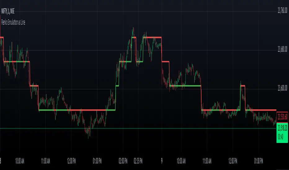
Renko Chart EmulationRenko charts are a popular tool in technical analysis, known for their ability to filter out market noise and focus purely on price movements. Unlike traditional candlestick or bar charts, Renko charts are not time-based but are constructed using bricks that represent a fixed price movement. This makes them particularly useful for identifying trends and key levels of support and resistance. While Renko charts are commonly found on platforms with specialized charting capabilities, they can also be emulated in Pine Script as a line indicator.
The Renko emulation indicator in Pine Script calculates the movement of price based on a user-defined brick size. Whenever the price moves up or down by an amount equal to or greater than the brick size, a new level is plotted, indicating a shift in price direction. This approach helps traders visualize significant price moves without the distractions of smaller fluctuations. By plotting the Renko levels as a continuous line and coloring it based on direction, this indicator provides a clean and straightforward representation of market trends.
Traders can use this Renko emulation line to identify potential entry and exit points, as well as to confirm ongoing trends. The simplicity of Renko charts makes them a favorite among those who prefer a minimalist approach to technical analysis. However, it is essential to choose an appropriate brick size that aligns with the volatility of the trading instrument. A smaller brick size may result in frequent signals, while a larger one can smooth out the chart, focusing only on the most substantial price movements. This script offers a flexible solution for incorporating Renko-style analysis into any trading strategy.
Inside/Outside Bar Direction Highlighter
Here’s a trading indicator in Pine Script (v6) that combines the essence of the Inside Bar, Outside Bar, and directional patterns inspired by TT3 Theory. This indicator highlights bars based on their classification as inside, outside, or directional and provides potential trade signals.
Inside Outside Indicator
Explanation:
Bar Classification:
Inside Bar: Current high is less than the previous high, and the low is greater than the previous low.
Outside Bar: Current high exceeds the previous high, and the low breaks below the previous low.
Up/Down Bars: Closing prices relative to the previous high/low.
Visual Highlights:
Bars are visually highlighted with colors for easy identification.
Trade Signals:
Long Signal: When the close crosses above the previous high and it's a directional up bar.
Short Signal: When the close crosses below the previous low and it's a directional down bar.
Customizable Inputs:
Colors for inside, outside, up, and down bars can be modified.
You can copy and paste this script into the Pine Editor on TradingView to see it in action. Adjust the logic to fit your trading strategy as needed.
You said:
summary of how to use this indicator without buy/sell signal
ChatGPT said:
ChatGPT
How to Use the Inside/Outside Bar Direction Highlighter Indicator (Without Buy/Sell Signals)
Understand the Bar Classifications:
Inside Bars: Highlighted in blue (default). These indicate periods of market consolidation. Look for potential breakouts in either direction.
Outside Bars: Highlighted in orange (default). These represent increased volatility, where both higher highs and lower lows are made. Watch for reversals or continuations based on broader trends.
Directional Up Bars: Highlighted in green (default). These occur when the current close is above the previous high, signaling bullish momentum.
Directional Down Bars: Highlighted in red (default). These occur when the current close is below the previous low, indicating bearish momentum.
Identify Key Patterns:
Use the highlighted bars to spot price action setups, such as:
Breakouts from inside bars.
Reversal signals following outside bars.
Continuation patterns when directional bars align with the trend.
Combine with Your Analysis:
Trend Analysis: Match bar classifications with trend direction on larger timeframes (e.g., daily, 4-hour).
Support/Resistance: Use inside and outside bars near key levels for confirmation or reversal signals.
Volume: Higher volume on directional bars strengthens the momentum signal.
Customize the Colors:
Adjust the bar highlight colors to fit your chart theme for better visibility.
No Automatic Signals:
This indicator doesn’t provide explicit buy/sell recommendations. Instead, use the visual highlights to make informed decisions based on your trading strategy.
By interpreting these bar patterns, you can better gauge market behavior and make more confident decisions without relying on preset signals.
Drummond Geometry - Pldot and EnvelopeThis Pine Script will:
1.Calculate and display the PL Dot (Price Level Dot), a moving average that reflects short-term market trends.
2.Plot the Envelope Top and Bottom lines based on averages of previous highs and lows, which represent key areas of resistance and support.
Drummond Geometry Overview
Drummond Geometry is a method of market analysis focused on:
PL Dot : Captures market energy and trend direction. It reacts to price deviations and serves as a magnet for price returns, often referred to as a "PL Dot Refresh."
Envelope Theory : Considers price movements as cycles oscillating between the Envelope Top and Bottom. Prices breaking these boundaries often indicate trends, retracements, or exhaustion.
The geometry helps traders visualize energy flows in the market and anticipate directional changes using established support and resistance zones.
Understanding PL Dot and Envelope Top/Bottom
PL Dot:
Formula: Average(Average(H, L, C) of last three bars)
Usage: Indicates short-term trends:
Trend: PL Dot slopes upward or downward.
Congestion: PL Dot moves horizontally.
Envelope Top and Bottom:
Formula:
Top: (11 H1 + 11 H2 + 11 H3) / 3
Bottom: (11 L1 + 11 L2 + 11 L3) / 3
Usage: Acts as dynamic resistance and support:
Price above the top: Indicates strong bullish momentum.
Price below the bottom: Indicates strong bearish momentum.
Advantages of Drummond Geometry
Clarity of Market Flow: Highlights the relationship between price and key levels (PL Dot, Envelope Top/Bottom).
Predictive Power: Suggests possible reversals or continuation based on energy distribution.
Adaptability: Works across multiple time frames and market types (trending, congestion).
Trading Strategy
PL Dot Trades:
Buy: When price returns to the PL Dot in an uptrend.
Sell: When price returns to the PL Dot in a downtrend.
Envelope Trades:
Reversal: Trade counter to price if it breaks and retreats from the Envelope Top/Bottom.
Continuation: Trade in the direction of price if it sustains movement beyond the Envelope Top/Bottom.

Wick Highlight IndicatorDescription:
This script is designed to help traders quickly spot significant wicks, which indicate areas of strong market rejection. By focusing on longer wicks, it identifies potential turning points where there was a strong buying or selling reaction.
Features:
Adjustable Minimum Wick Length: Users can set the minimum length of wicks to be highlighted, helping filter out less significant wicks. Default is set at 50 points.
Seller and Buyer Wick Analysis: Highlights both the top (seller pressure) and bottom (buyer pressure) wicks separately, giving a clearer view of market strength and rejection.
Non-Intrusive Display: Wicks are highlighted in black at 10% opacity, providing clear visual markers while keeping the chart clean and readable.
How to Use It: This indicator is open-source and free for all users. It aims to identify wicks that are larger than the average noise, which often indicates strong price rejections or future targets. You can adjust the minimum length to tailor the indicator to different market conditions and trading styles.
Why It Matters: Wicks often signify moments when price levels were rejected strongly, pointing to areas of potential support or resistance. By focusing only on significant wicks, this indicator helps you hone in on potential key levels of interest without overwhelming the chart with less important data. This can be particularly useful in spotting reversals or market exhaustion.
No other indicators are required, and the chart is kept clean for clarity and ease of understanding.
Notes:
This is an open-source script, and no solicitations or ads are included.
The indicator is intended to highlight significant wicks only and does not issue any buy/sell signals.
It is compliant with TradingView's publishing rules, focusing on transparency, clarity, and adding value to the community.

Scalp System# Scalp System
A premium scalping system designed specifically for 2-minute charts, combining multiple timeframe analysis with trend-based trading decisions. This indicator helps identify high-probability scalping opportunities through color-coded moving averages and their crossovers.
## Strategy Overview
### Entry Signals
- ONLY trade LONG when price is above RED line
- ONLY trade SHORT when price is below RED line
- Primary entry: BLUE/GREEN crosses
- Strong trend confirmation: YELLOW/PURPLE crosses
### Best Practices
1. Trade with the trend (follow RED line direction)
2. Wait for price pullbacks of faster lines
3. Combine crosses with support/resistance levels
4. Use smaller targets
5. Quick exits on failed breakouts
6. Monitor volume for confirmation
### Color Guide
- YELLOW: Fast trend identifier
- BLUE: Very short-term momentum (1min)
- GREEN: Short-term momentum (3min)
- RED: Trend filter
- PURPLE: Strong trend baseline
### Risk Management
- Place stops beyond the RED line
- Scale out at key levels
- Use 1:1.5 minimum risk/reward
- Avoid trading during major news
- Reduce position size in choppy markets
### Best Trading Hours
- Most effective during first 2 hours after market open
- Good opportunities during power hour (last hour)
- Avoid lunch hour chop (11:30-1:30 EST)
## Tips
- Less is more - wait for clean setups
- Respect the RED line as your trend filter
- Multiple timeframe confirmation increases success rate
- Use crosses as triggers, not absolute signals
- Practice in simulator before live trading

Previous Daily Candle The Previous Daily Candle indicator is a powerful tool designed to enhance your intraday trading by providing clear visual cues of the previous day's price action. By outlining the high, low, open, and close of the previous daily candle and adding a middle dividing line, this indicator offers valuable context to inform your trading decisions.
🎯 Purpose
Visual Clarity: Highlight the key levels from the previous day's price movement directly on your intraday charts.
Trend Confirmation: Quickly identify bullish or bearish sentiment based on the previous day's candle structure.
Support and Resistance: Use the outlined high and low as potential support and resistance levels for your trading strategies.
Customizable Visualization: Tailor the appearance of the outlines and middle line to fit your trading style and chart aesthetics.
🛠️ Features
Outlined Candle Structure:
High and Low Lines: Clearly mark the previous day's high and low with customizable colors and line widths.
Open and Close Representation: Visualize the previous day's open and close through the outlined structure.
Middle Dividing Line:
Average Price Level: A horizontal line divides the candle in half, representing the average of the open and close prices.
Customizable Appearance: Adjust the color and thickness to distinguish it from the high and low outlines.
Bullish and Bearish Differentiation:
Color-Coded Outlines: Automatically change the outline color based on whether the previous day's candle was bullish (green by default) or bearish (red by default).
Enhanced Visual Feedback: Quickly assess market sentiment with intuitive color cues.
Customization Options:
Outline Colors: Choose distinct colors for bullish and bearish candle outlines to match your chart's color scheme.
Middle Line Color: Select a color that stands out or blends seamlessly with your existing chart elements.
Line Width Adjustment: Modify the thickness of all lines to ensure visibility without cluttering the chart.
Transparent Candle Body:
Non-Intrusive Display: The indicator only draws the outlines and middle line, keeping the candle body transparent to maintain the visibility of your primary chart data.
⚙️ How It Works
Data Retrieval: The indicator fetches the previous day's open, high, low, and close prices using TradingView's request.security function.
Candle Analysis: Determines whether the previous day's candle was bullish or bearish by comparing the close and open prices.
Dynamic Drawing: Upon the start of a new day, the indicator deletes the previous outlines and redraws them based on the latest data.
Time Synchronization: Accurately aligns the outlines with the corresponding time periods on your intraday chart.
📈 How to Use
Add to Chart:
Open TradingView and navigate to the Pine Editor.
Paste the provided Pine Script code into the editor.
Click on Add to Chart to apply the indicator.
Customize Settings:
Access the indicator's settings by clicking the gear icon next to its name on the chart.
Adjust the Bullish Outline Color, Bearish Outline Color, Middle Line Color, and Outline Width to your preference.
Interpret the Lines:
Bullish Candle: If the previous day's close is higher than its open, the outlines will display in the bullish color (default green).
Bearish Candle: If the previous day's close is lower than its open, the outlines will display in the bearish color (default red).
Middle Line: Represents the midpoint between the open and close, providing a quick reference for potential support or resistance.
Integrate with Your Strategy:
Use the high and low outlines as potential entry or exit points.
Combine with other indicators for confirmation to strengthen your trading signals.
SMA- Ashish SinghSMA
This script implements a Simple Moving Average (SMA) crossover strategy using three SMAs: 200-day, 50-day, and 20-day, with buy and sell signals triggered based on specific conditions involving these moving averages. The indicator is overlaid on the price chart, providing visual cues for potential buy and sell opportunities based on moving average crossovers.
Key Features:
Moving Averages:
The 200-day, 50-day, and 20-day SMAs are calculated and plotted on the price chart. These are key levels that traders use to assess trends.
The 200-day SMA represents the long-term trend, the 50-day SMA is used for medium-term trends, and the 20-day SMA is for short-term analysis.
Buy Signal:
A buy signal is triggered when the price is below all three moving averages (200 SMA, 50 SMA, 20 SMA) and the SMAs are in a specific downward trend (200 SMA > 50 SMA > 20 SMA). This is an indication of a potential upward reversal.
The buy signal is marked with a green triangle below the price bar.
Sell Signal:
A sell signal is triggered when the price is above all three moving averages and the SMAs are in a specific upward trend (200 SMA < 50 SMA < 20 SMA). This signals a potential downward reversal.
The sell signal is marked with a red triangle above the price bar.
Trade Information:
After a buy signal, the buy price, bar index, and timestamp are recorded. When a sell signal occurs, the percentage gain or loss is calculated along with the number of days between the buy and sell signals.
The script automatically displays a label on the chart showing the gain or loss percentage along with the number of days the trade lasted. Green labels represent gains, and red labels represent losses.
User-friendly Visuals:
The buy and sell signals are plotted as small triangles directly on the chart for easy identification.
Detailed trade information is provided with well-formatted labels to highlight the profit or loss after each trade.
How It Works:
This strategy helps traders to identify trend reversals by leveraging long-term and short-term moving averages.
A single buy or sell signal is triggered based on price movement relative to the SMAs and their order.
The tool is designed to help traders quickly spot buying and selling opportunities with clear visual indicators and gain/loss metrics.
This indicator is ideal for traders looking to implement a systematic SMA-based strategy with well-defined buy/sell points and automatic performance tracking for each trade.
Disclaimer: The information provided here is for educational and informational purposes only. It is not intended as financial advice or as a recommendation to buy or sell any stocks. Please conduct your own research or consult a financial advisor before making any investment decisions. ProfitLens does not guarantee the accuracy, completeness, or reliability of any information presented.

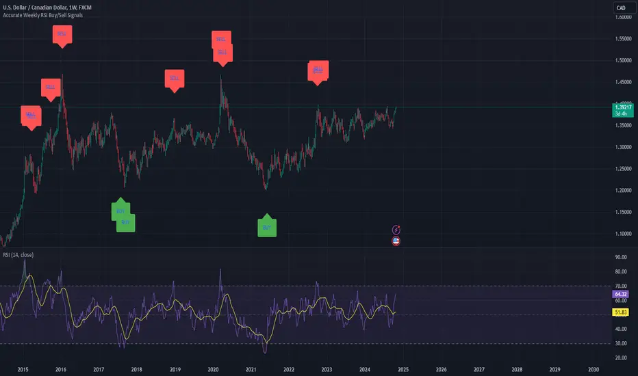
Weekly RSI Buy/Sell SignalsWeekly RSI Buy/Sell Signal Indicator
This indicator is designed to help traders identify high-probability buy and sell opportunities on the weekly chart by using the Relative Strength Index (RSI). By utilizing weekly RSI values, this indicator ensures signals align with broader market trends, providing a clearer view of potential price reversals and continuation.
How It Works:
Weekly RSI Calculation: This script calculates the RSI using a 14-period setting, focusing on the weekly timeframe regardless of the user’s current chart view. The weekly RSI is derived using request.security, allowing for consistent signals even on intraday charts.
Signal Conditions:
Buy Signal: A buy signal appears when the RSI crosses above the oversold threshold of 30, suggesting that price may be gaining momentum after a potential bottom.
Sell Signal: A sell signal triggers when the RSI crosses below the overbought threshold of 70, indicating a possible momentum shift downwards.
Visual Cues:
Buy/Sell Markers: Clear green "BUY" and red "SELL" markers are displayed on the chart when buy or sell conditions are met, making it easy to identify entry and exit points.
RSI Line and Thresholds: The weekly RSI value is plotted in real time with color-coded horizontal lines at 30 (oversold) and 70 (overbought), providing a visual reference for key levels.
This indicator is ideal for traders looking for reliable, trend-based signals on higher timeframes and can be a helpful tool for filtering out shorter-term market noise.
Judas Swing ICT 01 [TradingFinder] New York Midnight Opening M15🔵 Introduction
The Judas Swing (ICT Judas Swing) is a trading strategy developed by Michael Huddleston, also known as Inner Circle Trader (ICT). This strategy allows traders to identify fake market moves designed by smart money to deceive retail traders.
By concentrating on market structure, price action patterns, and liquidity flows, traders can align their trades with institutional movements and avoid common pitfalls. It is particularly useful in FOREX and stock markets, helping traders identify optimal entry and exit points while minimizing risks from false breakouts.
In today's volatile markets, understanding how smart money manipulates price action across sessions such as Asia, London, and New York is essential for success. The ICT Judas Swing strategy helps traders avoid common pitfalls by focusing on key movements during the opening time and range of each session, identifying breakouts and false breakouts.
By utilizing various time frames and improving risk management, this strategy enables traders to make more informed decisions and take advantage of significant market movements.
In the Judas Swing strategy, for a bullish setup, the price first touches the high of the 15-minute range of New York midnight and then the low. After that, the price returns upward, breaks the high, and if there’s a candlestick confirmation during the pullback, a buy signal is generated.
bearish setup, the price first touches the low of the range, then the high. With the price returning downward and breaking the low, if there’s a candlestick confirmation during the pullback to the low, a sell signal is generated.
🔵 How to Use
To effectively implement the Judas Swing strategy (ICT Judas Swing) in trading, traders must first identify the price range of the 15-minute window following New York midnight. This range, consisting of highs and lows, sets the stage for the upcoming movements in the London and New York sessions.
🟣 Bullish Setup
For a bullish setup, the price first moves to touch the high of the range, then the low, before returning upward to break the high. Following this, a pullback occurs, and if a valid candlestick confirmation (such as a reversal pattern) is observed, a buy signal is generated. This confirmation could indicate the presence of smart money supporting the bullish movement.
🟣 Bearish Setup
For a bearish setup, the process is the reverse. The price first touches the low of the range, then the high. Afterward, the price moves downward again and breaks the low. A pullback follows to the broken low, and if a bearish candlestick confirmation is seen, a sell signal is generated. This confirmation signals the continuation of the downward price movement.
Using the Judas Swing strategy enables traders to avoid fake breakouts and focus on strong market confirmations. The strategy is versatile, applying to FOREX, stocks, and other financial instruments, offering optimal trading opportunities through market structure analysis and time frame synchronization.
To execute this strategy successfully, traders must combine it with effective risk management techniques such as setting appropriate stop losses and employing optimal risk-to-reward ratios. While the Judas Swing is a powerful tool for predicting price movements, traders should remember that no strategy is entirely risk-free. Proper capital management remains a critical element of long-term success.
By mastering the ICT Judas Swing strategy, traders can better identify entry and exit points and avoid common traps from fake market movements, ultimately improving their trading performance.
🔵 Setting
Opening Range : High and Low identification time range.
Extend : The time span of the dashed line.
Permit : Signal emission time range.
🔵 Conclusion
The Judas Swing strategy (ICT Judas Swing) is a powerful tool in technical analysis that helps traders identify fake moves and align their trades with institutional actions, reducing risk and enhancing their ability to capitalize on market opportunities.
By leveraging key levels such as range highs and lows, fake breakouts, and candlestick confirmations, traders can enter trades with more precision. This strategy is applicable in forex, stocks, and other financial markets and, with proper risk management, can lead to consistent trading success.

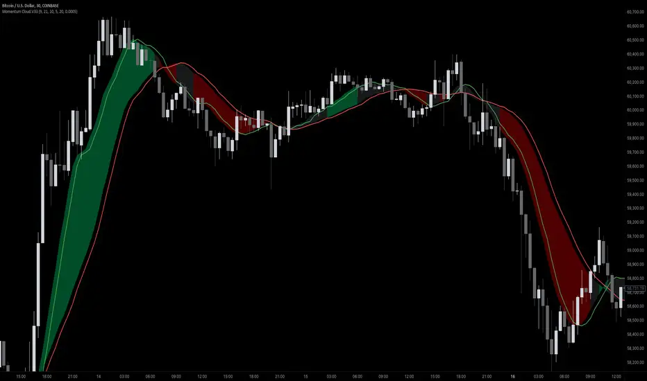
Momentum Cloud.V33🌟 Introducing MomentumCloud.V33 🌟
MomentumCloud.V33 is a cutting-edge indicator designed to help traders capture market momentum with clarity and precision. This versatile tool combines moving averages, directional movement indexes (DMI), and volume analysis to provide real-time insights into trend direction and strength. Whether you’re a scalper, day trader, or swing trader, MomentumCloud.V33 adapts to your trading style and timeframe, making it an essential addition to your trading toolkit. 📈💡
🔧 Customizable Parameters:
• Moving Averages: Adjust the periods of the fast (MA1) and slow (MA2) moving averages to fine-tune your trend analysis.
• DMI & ADX: Customize the DMI length and ADX smoothing to focus on strong, actionable trends.
• Volume Multiplier: Modify the cloud thickness based on trading volume, emphasizing trends with significant market participation.
📊 Trend Detection:
• Color-Coded Clouds:
• Green Cloud: Indicates a strong uptrend, suggesting buying opportunities.
• Red Cloud: Indicates a strong downtrend, signaling potential short trades.
• Gray Cloud: Reflects a range-bound market, helping you avoid low-momentum periods.
• Dynamic Volume Integration: The cloud thickness adjusts dynamically with trading volume, highlighting strong trends supported by high market activity.
📈 Strength & Momentum Analysis:
• Strength Filtering: The ADX component ensures that only strong trends are highlighted, filtering out market noise and reducing false signals.
• Visual Momentum Gauge: The cloud color and thickness provide a quick visual representation of market momentum, enabling faster decision-making.
🔔 Alerts:
• Custom Alerts: Set up alerts for when the trend shifts or reaches critical levels, keeping you informed without needing to constantly monitor the chart.
🎨 Visual Enhancements:
• Gradient Cloud & Shadows: The indicator features a gradient-filled cloud with shadowed moving averages, enhancing both aesthetics and clarity on your charts.
• Adaptive Visual Cues: MomentumCloud.V33’s color transitions and dynamic thickness provide an intuitive feel for the market’s rhythm.
🚀 Quick Guide to Using MomentumCloud.V33
1. Add the Indicator: Start by adding MomentumCloud.V33 to your chart. Customize the settings such as MA periods, DMI length, and volume multiplier to match your trading style.
2. Analyze the Market: Observe the color-coded cloud and its thickness to gauge market momentum and trend direction. The thicker the cloud, the stronger the trend.
3. Set Alerts: Activate alerts for trend changes or key levels to capture trading opportunities without needing to watch the screen continuously.
⚙️ How It Works:
MomentumCloud.V33 calculates market momentum by combining moving averages, DMI, and volume. The cloud color changes based on the trend direction, while its thickness reflects the strength of the trend as influenced by trading volume. This integrated approach ensures you can quickly identify robust market movements, making it easier to enter and exit trades at optimal points.
Settings Overview:
• Moving Averages: Define the lengths for the fast and slow moving averages.
• DMI & ADX: Adjust the DMI length and ADX smoothing to focus on significant trends.
• Volume Multiplier: Customize the multiplier to control cloud thickness, highlighting volume-driven trends.
📚 How to Use MomentumCloud.V33:
• Trend Identification: The direction and color of the cloud indicate the prevailing trend, while the cloud’s thickness suggests the trend’s strength.
• Trade Execution: Use the green cloud to look for long entries and the red cloud for short positions. The gray cloud advises caution, as it represents a range-bound market.
• Alerts: Leverage the custom alerts to stay on top of market movements and avoid missing critical trading opportunities.
Unleash the power of trend and momentum analysis with MomentumCloud.V33! Happy trading! 📈🚀✨
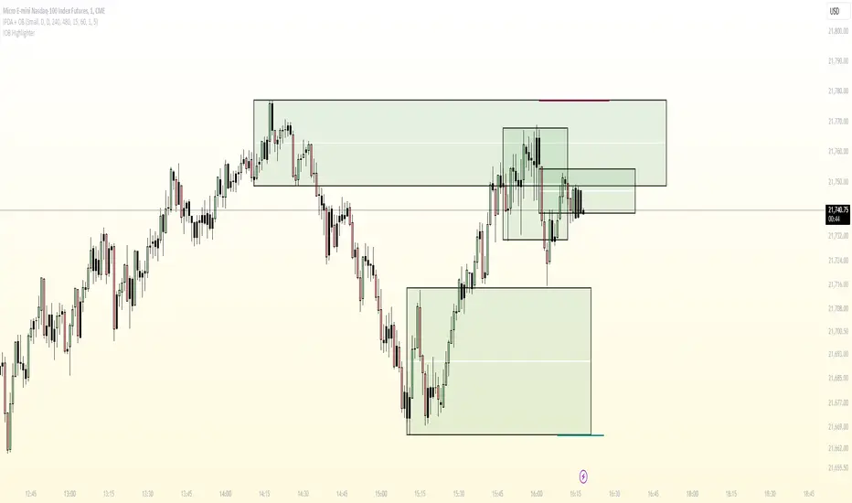
Candle Wick Shadows [UkutaLabs]█ OVERVIEW
The Candle Wick Shadows Indicator identifies untested wicks in real time that occur when there is an imbalance in the number of buyers and sellers at a price-level. This imbalance occurs when a market exchange receives too many of one kind of order, and not enough of its counterpoint.
Candle Wick Shadows is a powerful trading indicator that will automatically identify and label strong ranges on traders’ charts that can be incorporated into a wide variety of different trading strategies.
█ USAGE
The script automatically identifies and measures real-time ranges of imbalance between buying and selling pressure in the market using real-time price-action information. These levels indicate potential Supply and Demand zones which serve to help the trader identify areas where price has changed direction in the past due to an imbalance of buyers and sellers.
The script also allows users to mirror higher time frame Candle Wick Shadows onto lower time frame charts to gain a stronger understanding of key levels on another scale.
█ SETTINGS
Configuration
- Show Labels: Determines whether or not identification labels are drawn on the chart.
- Max CWS Display: Determines the number of Candle Wick Shadows that will be drawn on the chart. This is for each higher timeframe option that is toggled, not the total.
Current Time Frame
-Wick Shadow (On/Off): Determines whether or not wick shadows are drawn from the current time frame chart.
- Bullish Color: Determines the color of bullish wick shadows from the current time frame.
- Bearish Color: Determines the color of bearish wick shadows from the current time frame.
5 Minute (Higher Timeframe)
-Wick Shadow (On/Off): Determines whether or not wick shadows are drawn from the 5 minute time frame chart.
- Bullish Color: Determines the color of bullish wick shadows from the 5 minute time frame.
- Bearish Color: Determines the color of bearish wick shadows from the 5 minute time frame.
15 Minute (Higher Timeframe)
-Wick Shadow (On/Off): Determines whether or not wick shadows are drawn from the 15 minute time frame chart.
- Bullish Color: Determines the color of bullish wick shadows from the 15 minute time frame.
- Bearish Color: Determines the color of bearish wick shadows from the 15 minute time frame.
30 Minute (Higher Timeframe)
-Wick Shadow (On/Off): Determines whether or not wick shadows are drawn from the 30 minute time frame chart.
- Bullish Color: Determines the color of bullish wick shadows from the 30 minute time frame.
- Bearish Color: Determines the color of bearish wick shadows from the 30 minute time frame.
60 Minute (Higher Timeframe)
-Wick Shadow (On/Off): Determines whether or not wick shadows are drawn from the 60 minute time frame chart.
- Bullish Color: Determines the color of bullish wick shadows from the 60 minute time frame.
- Bearish Color: Determines the color of bearish wick shadows from the 60 minute time frame.
240 Minute (Higher Timeframe)
-Wick Shadow (On/Off): Determines whether or not wick shadows are drawn from the 240 minute time frame chart.
- Bullish Color: Determines the color of bullish wick shadows from the 240 minute time frame.
- Bearish Color: Determines the color of bearish wick shadows from the 240 minute time frame.
Daily (Higher Timeframe)
-Wick Shadow (On/Off): Determines whether or not wick shadows are drawn from the daily time frame chart.
- Bullish Color: Determines the color of bullish wick shadows from the daily time frame.
- Bearish Color: Determines the color of bearish wick shadows from the daily time frame.

Candle Wick Retest [UkutaLabs]█ OVERVIEW
The Candle Wick Retest Indicator identifies untested wicks in real time that occur when there is an imbalance in the number of buyers and sellers at a price-level. This imbalance occurs when a market exchange receives too many of one kind of order, and not enough of its counterpoint.
Candle Wick Retest is a powerful trading indicator that will automatically identify and label strong ranges on traders’ charts that can be incorporated into a wide variety of different trading strategies.
█ USAGE
The script automatically identifies and measures real-time ranges of imbalance between buying and selling pressure in the market using real-time price-action information. These levels indicate potential Supply and Demand zones which serve to help the trader identify areas where price has changed direction in the past due to an imbalance of buyers and sellers.
The script also allows users to mirror higher time frame Candle Wick Retests onto lower time frame charts to gain a stronger understanding of key levels on another scale.
█ SETTINGS
Configuration
- Show Labels: Determines whether or not identification labels are drawn on the chart.
- Max CW Display: Determines the number of Candle Wick Retests that will be drawn on the chart. This is for each higher timeframe option that is toggled, not the total.
Current Time Frame
- Wick Retest (On/Off): Determines whether wick retests will be drawn from the current time frame chart.
- Wick Retest Bullish Color: Determines the color of bullish wick retests from the current time frame.
- Wick Retest Bearish Color: Determines the color of bearish wick retests from the current time frame.
5 Minute (Higher Timeframe)
- Wick Retest (On/Off): Determines whether wick retests will be drawn from the 5 minute chart.
- Wick Retest Bullish Color: Determines the color of bullish wick retests from the 5 minute time frame.
- Wick Retest Bearish Color: Determines the color of bearish wick retests from the 5 minute time frame.
15 Minute (Higher Timeframe)
- Wick Retest (On/Off): Determines whether wick retests will be drawn from the 15 minute time frame chart.
- Wick Retest Bullish Color: Determines the color of bullish wick retests from the 15 minute time frame.
- Wick Retest Bearish Color: Determines the color of bearish wick retests from the 15 minute time frame.
30 Minute (Higher Timeframe)
- Wick Retest (On/Off): Determines whether wick retests will be drawn from the 30 minute time frame chart.
- Wick Retest Bullish Color: Determines the color of bullish wick retests from the 30 minute time frame.
- Wick Retest Bearish Color: Determines the color of bearish wick retests from the 30 minute time frame.
60 Minute (Higher Timeframe)
- Wick Retest (On/Off): Determines whether wick retests will be drawn from the 60 minute time frame chart.
- Wick Retest Bullish Color: Determines the color of bullish wick retests from the 60 minute time frame.
- Wick Retest Bearish Color: Determines the color of bearish wick retests from the 60 minute time frame.
240 Minute (Higher Timeframe)
- Wick Retest (On/Off): Determines whether wick retests will be drawn from the 240 minute time frame chart.
- Wick Retest Bullish Color: Determines the color of bullish wick retests from the 240 minute time frame.
- Wick Retest Bearish Color: Determines the color of bearish wick retests from the 240 minute time frame.
Daily (Higher Timeframe)
- Wick Retest (On/Off): Determines whether wick retests will be drawn from the daily time frame chart.
- Wick Retest Bullish Color: Determines the color of bullish wick retests from the daily time frame.
- Wick Retest Bearish Color: Determines the color of bearish wick retests from the daily time frame.

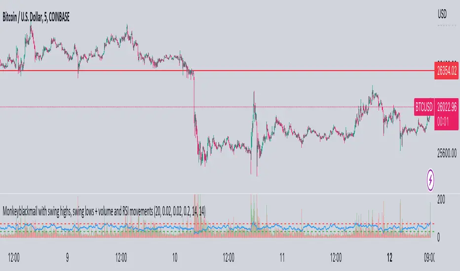
MonkeyblackmailThis script consists of several sections. test it and tell me your concerns. a lot of more works will be done
Volume Accumulation : The first part of the script checks for a new 5-minute interval and accumulates the volume of the current interval. It separates the volume into buying volume and selling volume based on whether the closing price is closer to the high or low of the bar.
Volume Normalization and Pressure Calculation : The script then normalizes the volume with a 20-period EMA, and calculates buying pressure, selling pressure, and total pressure. These calculations provide insight into the underlying demand (buying pressure) and supply (selling pressure) conditions in the market.
RSI Calculation and Overbought/Oversold Conditions : The script calculates the RSI (Relative Strength Index) and checks whether it is in an overbought (RSI > 70) or oversold (RSI < 30) state. The RSI is a momentum indicator, providing insights into the speed and change of price movements.
Volume Condition Check and Wondertrend Indicator : The script checks if the volume is high for the past five bars. If it is, it applies the Wondertrend Indicator, which uses a combination of the Parabolic SAR (Stop and Reverse) and Keltner Channel to identify potential trends in the market.
Swing High/Low and Fibonacci Retracement : The script identifies swing high and swing low points using a specified pivot length. Then, it draws Fibonacci retracement levels between these swing high and swing low points.
he monkeyblackmail script works well in the 5 minutes chart and combines several elements of technical analysis, including volume analysis, momentum indicators, trend-following indicators, volatility channels, and Fibonacci retracements. It aims to provide a comprehensive view of the market condition, highlighting key levels and potential trends in an easily understandable format. Don’t be too quick to start trading with it, first study how it work and you will blackmail the market.
28 Levels V0.1V 0.1
Daily, weekly and monthly important key levels for trading options.
FYI: Not fully functional. It will take ongoing effort to complete the algo.
[Pt] Periodic Volume ProfileThis script is an attempt to recreate the Periodic Volume Profile that is built-in by TradingView, with slightly different features. Related blog: www.tradingview.com
This script is based on another script "Volume Profile, Pivot Anchored" by @dgtrd
*Note that only limited number Volume Profile can be displayed on the chart due to limitations on displaying boxes and lines.
Description
This Periodic Volume Profile (PVP) indicator allows trades to view volume profiles for periods longer than the current timeframe. The indicator builds one general volume profile for each new period, set by the user through the “Periodic Timeframe” input parameter.
This script also has the option to extend Point of Control (POC) lines with optional end conditions: Until Bar Touch, Until Last Bar, Until Bar Cross, or None, which extends to the right.
Signals are generated for Naked POC touches and crosses by a triangle symbol and a cross symbol, by default.
Alerts are available for POC touches and crosses.
What is Volume Profile?
Volume profile is a technical analysis tool that shows the volume of trades at different prices for a given security or market over a specific period of time.
Volume profile can be used to identify key levels of support and resistance, as well as to assess the overall supply and demand for a security. For example, if there is a high volume of trades at a particular price level, this may indicate that there is a significant level of support or resistance at that price. On the other hand, if there is relatively low volume at a particular price, this may indicate that there is not much interest in trading at that level.
Traders can use volume profile to identify trends, make trading decisions, and set stop-loss and take-profit orders. It can also be useful for identifying patterns such as "pockets of liquidity," which are areas where there is a high volume of trades but relatively little price movement.
It is important to note that volume profile should be used in conjunction with other technical analysis tools and should not be relied upon in isolation. It is also important to consider the overall context and market conditions when interpreting volume profile data.
Key Difference with TradingView's PVP indicator - TradingView's PVP intraday period does not align with standard intraday timeframes as it is determined by # of bars. This script provides volume profiles that aligns with higher timeframe periods.
Enjoy~!
Directional Movement RibbonWhat makes this different from directional movement index?
The aim is to reduce the amount of data analysis necessary before taking action; currently using DMI requires reviewing the DM+ and DM- plots, and ADX as well as review the overall trend of each one. Also there is the final analysis to determine whether a strong trend hasn’t been established at all.
This indicator condenses the information found from the standard DMI into an intuitive colored ribbon that reveals direction and strength at a glance.
How to use it?
Review the ribbon for sentiment based on color, green being bullish and red being bearish, (if using default color scheme). The brightness of the color determines the strength of the sentiment, brightest being strongest. If no color is represented at all then it is due to weakness and/or lack of direction.
Features
All colors customizable
Toggle display of indecision areas
Adjust levels considered strong, weak trends
Which markets is this meant for?
This can be used in any market, though it’s recommended to use with liquid markets where direction and strength can be found often.
What conditions?
Recommend to utilize with key levels and most commonly utilized moving average periods such as 20, 50, 100 or 200.

Ichimoku Buy/Sell Signals of manual MTF Tenkan crossing KijunIchimoku Buy/Sell Signals based on fast, small time frame Tenkans crossing longer timeframes Kijuns - Manual MTF Analysis
This code marks the potential change of direction based on the input of one timeframe's Ichimoku Tenkan (conversion) line crossing over a higher, longer timeframe's Ichimoku Kijun (base) line.
Feel free to change the inputs if need be and to hide the yellow box. Use Ichimoku rules of Tenkan, Kijun, Lagging Span, and Cloud for Take profit/Stop Losses. It is best to wait 3-5 minutes after the signal to enter to confirm the trend and to confirm if the Lagging Span has broken key levels. I refer to the book Trading with Ichimoku - A Practical Guide to Low-Risk Ichimoku Strategies by Karen Peloille as the Ichimoku rulebook. Good luck.
For day trading/scalping/intraday - 1min/3min/5min
Tenkan Line Timeframe = 1min
Kijun Line Timeframe = 5min
For swing trading - multiple days/weeks - 4HR/Daily/Weekly Charts
Tenkan Line Timeframe = day
Kijun Line Timeframe = week
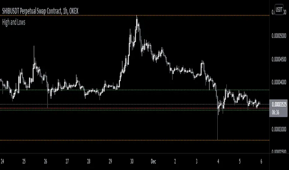
Monthly/Weekly/Daily/High and LowsSimple script that marks the prior month/week/day highs and lows for finding key levels.