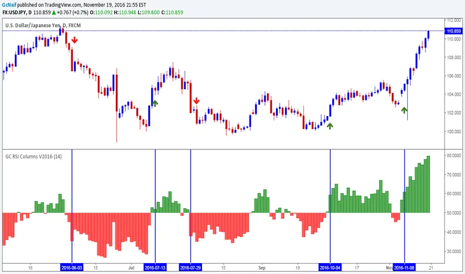
GC RSI Columns V2016This is a basic RSI indicator but in column format.I had been using this for a while and it gives a nice visual representation of trend change by changing color of the column.
Base line is 50 level. Anything above 50 is buy opportunity and below 50 is sell opportunity . Try it on higher time frames and see the results.
Example on chart above.
Note: i published it on demand. many folks were asking me for this ,since it(column rsi) was not available in public indicators
Wyszukaj w skryptach "demand"
Dynamic SUPRES Multi Timeframe UpdateDynamic SUPRES can be interpreted in different ways. Each square marks an area of congestion that could serve as support and resistance.
FLASH UPDATE: Now is possible to choose the timeframe and the bars color on/off.
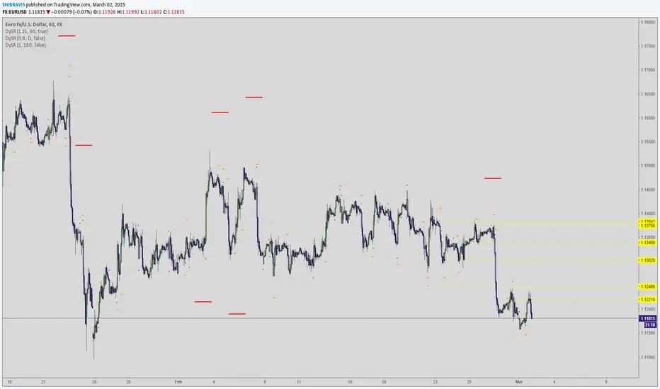
Dynamic SUPRESDynamic SUPRES can be interpreted in different ways. Each square marks an area of congestion that could serve as support and resistance.

VPT_OBVThis is a derivation of the On Balance Volume Indicator.
The idea behind it is that volume consists of two parts. The driving theory is the basic law of supply and demand.
Part 1: Volume consists of shares traded at an equilibrium price. An equal number of buyers and sellers are present during this volume. This area is displayed as the upper and lower shadows on a single candlestick. For this indicator, volume traded in equilibrium is not included in the display.
Part 2: Volume consists of shares that are not traded at an equilibrium price, driving price up or down for the time period. In this volume, buyers or sellers are not present in equal numbers. This area is displayed as the body of the candlestick. This indicator focuses on this part of volume.
VPT_OBV plots only the volume that occurs at the difference in price between the open and the close. To achieve this, volume is divided by the difference between the high and the low (in pennies). Next, the difference between the open and close is calculated (in pennies). Volume is then divided by the difference in the high and low, to get the amount of volume needed to move the asset up or down by $0.01 during the time period. This number is then multiplied by the difference between the open and close.
VPT_OBV plots the outcome as a cumulative total. A simple moving average of the VPT_OBV is thrown in to provide smoothing.

Yacine EMA Bands V2Version 2, because of popular demand.
Default values are weekly.
Feel free to try other configurations.

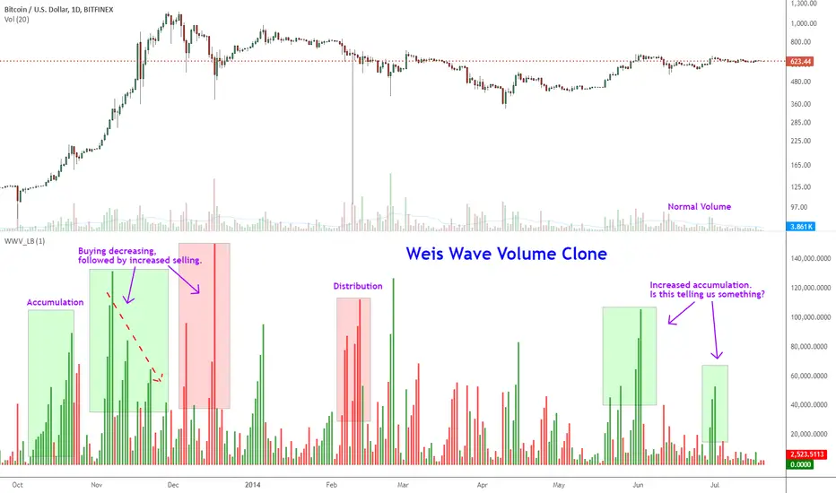
Indicator: Weis Wave Volume [LazyBear]This indicator takes market volume and organizes it into wave charts, clearly highlighting inflection points and regions of supply/demand.
Try tuning this for your instrument (Forex not supported) by adjusting the "Trend Detection Length". This "clubs together" minor waves. If you like an oscillator-kind-of display, enable "ShowDistributionBelowZero" option.
Note: This indicator is a port of a clone of WeisVolumePlugin available for another platform. I don't know how close this is to the original Weis, if any has access to it, do let me know how this compares. Thanks.
More info:
weisonwyckoff.com
Complete list of my indicators:
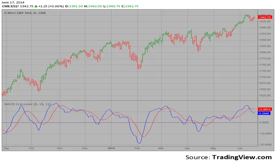
MACD Crossover MACD – Moving Average Convergence Divergence. The MACD is calculated
by subtracting a 26-day moving average of a security's price from a
12-day moving average of its price. The result is an indicator that
oscillates above and below zero. When the MACD is above zero, it means
the 12-day moving average is higher than the 26-day moving average.
This is bullish as it shows that current expectations (i.e., the 12-day
moving average) are more bullish than previous expectations (i.e., the
26-day average). This implies a bullish, or upward, shift in the supply/demand
lines. When the MACD falls below zero, it means that the 12-day moving average
is less than the 26-day moving average, implying a bearish shift in the
supply/demand lines.
A 9-day moving average of the MACD (not of the security's price) is usually
plotted on top of the MACD indicator. This line is referred to as the "signal"
line. The signal line anticipates the convergence of the two moving averages
(i.e., the movement of the MACD toward the zero line).
Let's consider the rational behind this technique. The MACD is the difference
between two moving averages of price. When the shorter-term moving average rises
above the longer-term moving average (i.e., the MACD rises above zero), it means
that investor expectations are becoming more bullish (i.e., there has been an
upward shift in the supply/demand lines). By plotting a 9-day moving average of
the MACD, we can see the changing of expectations (i.e., the shifting of the
supply/demand lines) as they occur.
HTR Reclaim Hunter
🏹 HTR Reclaim Hunter
(1H Execution + Zones + 4H Bias)
HTR Reclaim Hunter is a trend-continuation indicator designed to identify high-probability pullback & reclaim entries using multi-timeframe bias, EMA structure, and dynamic reclaim zones.
This indicator is best suited for swing trading and intraday continuation setups, especially in trending markets.
🔑 CORE CONCEPT
Trade WITH the higher-timeframe trend.
Enter on pullbacks.
Confirm strength on reclaim.
HTR Reclaim Hunter combines:
4H trend bias
1H execution logic
EMA reclaim structure
Supply & demand reclaim zones
Built-in SL / TP visualization
🧭 RECOMMENDED SETTINGS
Best timeframe: 1H (designed for this)
Markets: Stocks, Crypto, Futures, Forex
Works best in: Trending markets (not chop)
📊 WHAT YOU SEE ON THE CHART
🔹 EMA Structure
EMA 50 (green): Trend filter
EMA 9 (colored): Momentum & pullback guide
🔹 Reclaim Zones
Green boxes: Support / demand zones
Red boxes: Resistance / supply zones
These zones highlight areas where price previously reacted and may reclaim.
🔹 Trade Signals
LONG label: Bullish reclaim setup
SHORT label: Bearish reclaim setup
🔹 Risk Levels (Optional)
Stop Loss (Red)
TP1 (Orange)
TP2 (Green)
🟢 LONG TRADE RULES
A LONG signal appears when ALL of the following are true:
4H trend is bullish
Price above 4H EMA 50
EMA 50 is rising
1H trend is bullish
Price above EMA 50
EMA 9 above EMA 50
Pullback occurs
Price pulls back below EMA 9
Reaches or taps EMA 50
Reclaim confirmation
Strong bullish candle closes back above EMA 9
Candle is not a doji
Signal prints
A green LONG label appears
👉 This indicates a trend continuation entry, not a reversal.
🔴 SHORT TRADE RULES
A SHORT signal appears when ALL of the following are true:
4H trend is bearish
Price below 4H EMA 50
EMA 50 is falling
1H trend is bearish
Price below EMA 50
EMA 9 below EMA 50
Pullback occurs
Price pulls back above EMA 9
Reaches or taps EMA 50
Reclaim confirmation
Strong bearish candle closes back below EMA 9
Candle is not a doji
Signal prints
A red SHORT label appears
🛑 STOP LOSS & TAKE PROFIT
When enabled, the indicator automatically plots:
Stop Loss
Based on recent swing high / low
TP1
1R (1× risk)
TP2
Configurable runner target (default 2R)
These are visual guides only — always manage risk according to your plan.
⚠️ IMPORTANT NOTES
This indicator is not meant for ranging or choppy markets
Best results occur when:
EMA 50 is clearly sloped
Price respects reclaim zones
Always confirm with:
Market structure
Volume
Higher-timeframe context
🔔 ALERTS
Alerts are available for:
HRH LONG
HRH SHORT
Alerts trigger on confirmed reclaim signals, not on every pullback.
❗ DISCLAIMER
This indicator is for educational purposes only.
It does not provide financial advice.
Always test and manage risk appropriately.
🏹 FINAL TIP
HTR Reclaim Hunter works best when you are patient.
Skip chop.
Wait for clean trends.
Hunt only high-quality reclaims.
If you want, I can also:
Write a short description version
Create a “Quick Start” section
Add example captions for screenshots
Help you choose TradingView tags & category
trend-following
ema reclaim
pullback strategy
multi-timeframe
price action

Order Blocks+swl - Dual MTF Fixed ExtendedOrder Blocks+SWL - Dual MTF with Swing Validation
Overview
This advanced TradingView indicator combines Multi-Timeframe Order Block detection with Swing High/Low validation to identify high-probability supply and demand zones. The tool displays order blocks from higher timeframes and current timeframe, then highlights those that align with swing points for enhanced reliability.
🔧 Key Features
Multi-Timeframe Order Block Detection
- Current Timeframe: Detects order blocks on the chart's native timeframe
- HTF1 & HTF2: Two customizable higher timeframes (default: 60m, 240m)
- Independent Toggles: Enable/disable each timeframe's OBs separately
Smart Order Block Logic
- Long Order Blocks: Formed when current candle's LOW > middle candle's HIGH
- Short Order Blocks: Formed when current candle's HIGH < middle candle's LOW
- Persistent Display: Boxes extend until price fills the zone
- Color Coding:
- Current TF: Green (long) / Red (short)
- HTF1: Orange (long) / Maroon (short)
- HTF2: Blue (long) / Purple (short)
Swing Point Integration
-Swing Lows (SWL) & Swing Highs (SWH): Automatically detected using pivots
-Validation Overlay: Highlights order blocks that coincide with swing points
- Lime boxes: Long OBs with SWL confirmation
- Fuchsia boxes: Short OBs with SWH confirmation
Visual Elements
- Order Block Boxes: Semi-transparent zones with bold borders
- Entry Markers: Triangle shapes below/above bars for visual confirmation
- Swing Labels: SWL/SWH labels at pivot points
- Valid OB Overlay: Distinctive colored boxes for validated zones
⚙️ Input Parameters
Display Controls
- `Show Long OBs`: Toggle long order block display
- `Show Short OBs`: Toggle short order block display
- `Show Current TF OBs`: Display order blocks from current timeframe
- `Use HTF1/HTF2 OBs`: Enable higher timeframe order blocks
- `HTF1/HTF2`: Customizable timeframe strings
Technical Settings
- `My Input`: Maximum unfilled boxes to display (50-50000, default: 1000)
- `Swing Lookback / Forward Length`: Pivot detection sensitivity (default: 10)
📊 How It Works
1. Order Block Detection: The indicator scans three timeframes for specific candlestick patterns that indicate potential supply/demand zones.
2. Swing Point Detection: Simultaneously identifies swing highs and lows using pivot logic.
3. Validation Overlay: When an order block forms on the same candle as a swing point, it creates a special highlighted zone indicating higher probability.
4. Memory Management: Automatically manages box count to prevent performance issues while maintaining historical context.
🎯 Trading Applications
- Trend Continuation: Validated order blocks in trend direction offer high-probability entries
- Reversal Zones: Swing-aligned order blocks at key levels suggest potential reversals
- Multi-Timeframe Analysis: Higher timeframe OBs provide stronger support/resistance
- Zone Trading: Trade bounces from or breaks through validated zones
💡 Usage Tips
1. Prioritize Validated Zones: Focus on lime/fuchsia boxes as they have swing confirmation
2. Timeframe Hierarchy: HTF2 (240m) > HTF1 (60m) > Current TF for zone strength
3. Combine with Price Action: Use zones alongside candlestick patterns and volume
4. Risk Management: Place stops beyond opposite side of order block
⚠️ Limitations
- Not a standalone trading system - combine with other analysis
- May repaint on current bar until close
- Higher timeframes require sufficient historical data
- Swing detection sensitivity depends on length parameter
---
Note: This tool is for educational purposes. Always practice proper risk management and backtest strategies before live trading.

Smart Money Concept, Modern ViewSmart Money Concept, Modern View (SMCMV)
Institutional Volume Flow Analysis with VWMA Matrix
━━━━━━━━━━━━━━━━━━━━━━━━━━━━━━━━━━━━━━━━━━━━━━━━━━
📌 OVERVIEW
SMCMV is an advanced institutional-grade indicator that combines Volume-Weighted Moving Average (VWMA) matrix analysis with sophisticated volume decomposition to detect buyer and seller entry points. The indicator provides a comprehensive real-time dashboard displaying market structure, volume dynamics, and validated trading signals.
Key Features:
• Dual Volume Model: Geometry-based (candle range split) and Intrabar (precise LTF data)
• 10-Period VWMA Spectrum: Multi-timeframe support/resistance matrix (7, 13, 19, 23, 31, 41, 47, 67, 83, 97)
• 5-Layer Scoring System: 100-point institutional-grade signal quality assessment
• State Machine Signal Engine: Validated entry/exit signals with timer and range confirmation
• Real-time Prediction Engine: Candle-by-candle buyer/seller probability estimation
• High Volume Node Detection: Automatic identification of significant volume zones
━━━━━━━━━━━━━━━━━━━━━━━━━━━━━━━━━━━━━━━━━━━━━━━━━━
📊 DASHBOARD REFERENCE
1) NOW VECTOR (Current Market State)
This section captures the immediate market conditions:
• FLOW ANGLE: Directional angle of price movement in degrees (from VWMA-5). Positive = bullish, Negative = bearish.
• LTP: Last Traded Price - current close price.
• NET FLOW (Δ): Volume Delta - net difference between buying and selling volume. Shows ⚡+ or ⚡-.
• LIQUIDITY: Total volume on the current bar (K/M format).
• BUY VOL: Estimated buying volume based on selected model.
• SELL VOL: Estimated selling volume.
• BID PRES.: Buying volume as percentage of total volume.
• ASK PRES.: Selling volume as percentage of total volume.
• DIRECTION: Current state with hysteresis: BULL (🐂), BEAR (🐻), or NEUT (⚪).
2) DATA QUALITY / CONFIG
Configuration status and data integrity monitoring:
• VOL MODEL: INTRABAR (uses LTF data) or GEOMETRY (estimates from candle structure).
• IB LTF: Intrabar Lower Timeframe for precise volume decomposition.
• MODE: Micro (7 periods: 7-47) or Macro (10 periods: 7-97).
• IB OK: Intrabar data validity - OK or NO.
• IB STREAK: Consecutive bars with valid intrabar data.
• LATENCY: Data freshness indicator. ✓ = current, ↺ = using historical reference.
3) STRUCTURE RADAR
Market structure analysis showing price position relative to VWMA matrix:
• WIRES ▲/▼: Count of VWMAs above (resistance) and below (support).
• RES: Nearest Resistance - shows MA period, "ZN RES", or "BLUE SKY".
• SUPP: Nearest Support - shows MA period, "ZN SUPP", or "FREE FALL".
4) ACTIVE INTERACTION
Real-time analysis of price interaction with key levels:
• Header Status: "⚠ TESTING SUPPLY (ASK SIDE)" / "⚠ TESTING DEMAND (BID SIDE)" / "--- NO KEY INTERACTION ---"
• TARGET: Active level being tested (MA period or zone type).
• TEST LEVEL: Exact price level being tested.
• SCORE: Total score (0-100%) with letter grade .
• VOLUME POWER: Volume ratio vs historical average (e.g., "2.5x").
• BREAKOUT: "CONFIRMED" if attacking volume exceeds defending, "REJECTED" otherwise.
• DELTA DIR: "ALIGNED" if delta matches accumulation trend, "CONFLICT" if opposing.
━━━━━━━━━━━━━━━━━━━━━━━━━━━━━━━━━━━━━━━━━━━━━━━━━━
🎯 5-LAYER SCORING SYSTEM (100 Points Total)
Layer 1: Volume Quality (Max 25 pts)
• Mass (0-10): Volume ratio vs average. 0.5x=0, 1.0x=5, 2.0x=8, 3.0x+=10
• Spike (0-8): Volume Z-Score intensity
• Trend (0-7): Volume trend alignment with price direction
Layer 2: Battle Structure (Max 25 pts)
• Break (0-10): Breakout intensity ratio (attacker vs defender)
• Dom (0-8): Internal dominance ratio
• Pres (0-7): Pressure imbalance percentage
Layer 3: Flow & Energy (Max 20 pts)
• Delta (0-8): Delta alignment with accumulation trend
• Accel (0-6): Delta acceleration
• Mom (0-6): Flow momentum
Layer 4: Geometry (Max 15 pts)
• Impact (0-7): Impact angle directness
• Vec (0-5): Vector alignment
• PriceZ (0-3): Price Z-Score position
Layer 5: Army Structure (Max 15 pts)
• Stack (0-5): MA stack depth
• Conf (0-5): Confluence percentage
• Trend (0-5): Trend alignment count (7>13, 13>23, 23>97)
Grade Scale:
• A+ = 90-100 pts (Exceptional)
• A = 80-89 pts (Strong)
• B+ = 70-79 pts (Good)
• B = 60-69 pts (Moderate)
• C+ = 50-59 pts (Below average)
• C/D/F = Below 50 pts (Weak)
━━━━━━━━━━━━━━━━━━━━━━━━━━━━━━━━━━━━━━━━━━━━━━━━━━
5) SIGNAL STATUS PANEL
Real-time signal state machine status:
• Header: "🐂 BUYERS ACTIVE" / "🐻 SELLERS ACTIVE" / "⏳ VALIDATING..." / "⏸ RANGE / FLAT"
• LOCK PRICE: Price at which signal was locked/confirmed.
• RANGE ±: Validation range percentage.
• POSITION: Price vs lock: "▲ ABOVE" / "▼ BELOW" / "● AT LOCK"
• DISTANCE: Percentage distance from lock price.
• vs RANGE: Position vs validation range: "IN_RANGE" / "ABOVE" / "BELOW"
• VAL TICKS: Validation progress (current/required ticks).
6) REALTIME PREDICTION PANEL
Candle prediction engine:
• WINNER: Predicted dominant side: "BUYERS" / "SELLERS" / "NEUTRAL"
• CONFIDENCE: Prediction confidence percentage.
• ACCURACY: Historical prediction accuracy (session-specific).
• BUY/SELL PROB: Individual probabilities for each side.
━━━━━━━━━━━━━━━━━━━━━━━━━━━━━━━━━━━━━━━━━━━━━━━━━━
🏷️ SIGNAL LABELS REFERENCE
• 🐂 BUYER ENTRY (Green): Confirmed buyer entry signal. Validation complete.
• 🐻 SELLER ENTRY (Red): Confirmed seller entry signal. Validation complete.
• 🔻 REVERSAL BUY→SELL (Magenta): Reversal from buyer to seller position.
• 🔺 REVERSAL SELL→BUY (Cyan): Reversal from seller to buyer position.
• ⏹ EXIT → FLAT (Gray): Position exit to flat/neutral state.
• ⬆ BUYER STRONGER (Small Green): Lock price updated higher during buyer state.
• ⬇ SELLER STRONGER (Small Red): Lock price updated lower during seller state.
Display Modes:
• Minimal: Icon only (hover for tooltip details)
• Normal: Icon + Price level
• Detailed: Full information (price, score, grade)
━━━━━━━━━━━━━━━━━━━━━━━━━━━━━━━━━━━━━━━━━━━━━━━━━━
📈 CHART ELEMENTS
VWMA Spectrum Lines
Colored gradient lines representing the 10-period VWMA matrix. Color progresses from light blue (fast: 7-period) through purple to orange (slow: 97-period). These act as dynamic support/resistance levels weighted by volume.
High Volume Node Lines
• Blue Lines: High Buy Volume zones - potential demand areas
• Red Lines: High Sell Volume zones - potential supply areas
• Yellow Lines: Overlapping zones (buy + sell extremes) - high conflict areas
Lock Price Line & Range Band
• Dashed Line: Locked price level (green for buyers, red for sellers)
• Dotted Lines: Upper/lower bounds of validation range
━━━━━━━━━━━━━━━━━━━━━━━━━━━━━━━━━━━━━━━━━━━━━━━━━━
⚙️ INPUT SETTINGS GUIDE
Volume Model
• Calculation Method: "Geometry (Candle-Range Split)" for universal compatibility or "Intrabar (Precise)" for accurate buy/sell separation.
• Intrabar LTF: Lower timeframe for Intrabar mode (e.g., "1" for 1-minute).
Direction Filter
• Direction Trigger Angle: Threshold for directional state change (default: 1.5°)
• Neutral Reset Angle: Threshold for returning to neutral (default: 0.7°)
Testing Filter
• Level Proximity (%): How close price must be to "test" a level (default: 0.25%)
• Require Wick Touch: If enabled, requires high/low to touch proximity band.
Signal Validation
• Lock Range (%): Price range for validation (default: 0.5%)
• Validation Ticks: Consecutive bars required (default: 3)
• Validation Time: Minimum seconds for real-time confirmation (default: 5)
• Minimum Hold Bars: Stay in position for at least this many bars (default: 5)
• Exit Mode: "Reversal Only" / "Signal Loss" / "Price Stop"
• Stop Loss (%): Exit threshold (default: 1.0%)
Signal Score Filter
• Score Range Minimum: Minimum score for signal generation (default: 10%)
• Score Range Maximum: Maximum score threshold (default: 100%)
━━━━━━━━━━━━━━━━━━━━━━━━━━━━━━━━━━━━━━━━━━━━━━━━━━
💡 USAGE RECOMMENDATIONS
1. Start with Macro mode to see the complete VWMA spectrum, then switch to Micro for cleaner charts.
2. Use Intrabar mode when your broker provides lower timeframe data.
3. Focus on high-grade signals (B+ or better) for higher probability setups.
4. Wait for validation to complete before acting on signals.
5. Use the Lock Price line as your reference for position management.
━━━━━━━━━━━━━━━━━━━━━━━━━━━━━━━━━━━━━━━━━━━━━━━━━━
⚠️ IMPORTANT NOTES
• This indicator is designed for educational and analytical purposes.
• Always combine with proper risk management and additional confirmation.
• Past performance and signal quality do not guarantee future results.
• The prediction accuracy is session-specific and resets on chart reload.
━━━━━━━━━━━━━━━━━━━━━━━━━━━━━━━━━━━━━━━━━━━━━━━━━━
Volume-Based Indicator — Data Granularity & Table Guide
1) Critical warning about data granularity (read first)
Important: This indicator is built entirely on volume-derived calculations (volume, volume delta, and related flow metrics). Because of that, its precision is only as good as the granularity and history of the data you feed it.
The most granular view is a tick-based interval (e.g., 1T = one trade/tick). If tick-based intervals are not available for your symbol or your plan, the closest time-based approximation is a 1-second chart (1S).
If you enable any "high-precision / intrabar" options (anything that relies on the smallest updates), make sure you understand which TradingView plan you are using, because intrabar historical depth (how many bars you can load) varies by plan. More history generally means more stable baselines for volume statistics, regime detection, and long lookback features.
Plan-related notes (TradingView)
TradingView limits how many intrabar historical bars can be loaded, depending on your plan. The exact limits are defined by TradingView and can change over time, but as of the current documentation, the intrabar limits are:
• Basic: 5,000 bars
• Essential: 10,000 bars
• Plus: 10,000 bars
• Premium: 20,000 bars
• Expert: 25,000 bars
• Ultimate: 40,000 bars
Tick charts / tick-based intervals are currently positioned as a feature of professional-tier plans (e.g., Expert/Elite/Ultimate). Availability may also vary by symbol and data feed.

KTBB Intel: Multi-Timeframe ContextKabroda Intel
This is the official structural companion tool for the Kabroda System. While the "BattleBox Command" script handles specific intraday execution levels, this Kabroda Intel utility visualizes Multi-Timeframe Market Structure to provide broader context.
How It Works (Technical Logic): This script automates the analysis of higher-timeframe structure using standard Pivot High/Low logic, preventing the need for traders to manually switch timeframes.
Scanning: It utilizes request.security() to scan the user-defined Primary (default: 4H) and Secondary (default: 1H) timeframes.
Calculation: It identifies significant structural pivots using ta.pivothigh and ta.pivotlow functions with a customizable lookback period.
Data Integrity: It uses barmerge.lookahead_on with specific index offsets to ensure the data is non-repainting and represents confirmed closed-candle structure only.
Key Features:
Macro Context: Projects 4-Hour Supply & Demand zones directly onto your 5m or 15m execution chart.
Intraday Structure: Highlights 1-Hour breakdown/breakout levels that often act as "speed bumps" for intraday trends.
Zone Visualization:
Red Zones: 4H Supply / Major Resistance.
Green Zones: 4H Demand / Major Support.
Orange/Blue Zones: 1H Intraday Pivots.
Usage Guide:
Step 1: Add this indicator to your chart.
Step 2: Ensure it is running alongside the Kabroda BattleBox Command script.
Step 3: Use these zones as "Caution Areas." Do not execute trades directly into a Red 4H Zone, even if your lower timeframe triggers suggest a breakout. Context overrides execution.
Disclaimer: This tool is for structural analysis only. It identifies historical pivot points and projects them forward as potential areas of interest.

NW Curved Interest ZonesThis indicator automatically scans and plots curved (non-linear) interest zones using Nadaraya-Watson kernel regression smoothing to create a dynamic, adaptive "mean" curve. It then identifies and draws the strongest parallel curved zones where price has repeatedly bounced with statistical validation – perfect for non-linear, organic trending or ranging markets.
How It Works (Technical Methodology)
Curved Mean Calculation
The core curve is generated via Nadaraya-Watson kernel regression (Gaussian weighting):
Smooths closing prices over the lookback period with user-adjustable bandwidth (default 30.0) – higher = smoother/less reactive, lower = tighter fit.
Range methods: "Lookback Bars" (default 400), "Fixed Start Date", or "Entire History".
Channel Envelope Detection
Measures maximum deviations above/below the smoothed curve across the period.
Defines full channel height and base offset for percentage-based zoning.
Stable Update & Anti-Repaint Logic
Full recalculation only after user-defined closed bars (default 50) OR on forced break (if price escapes visible zone envelope).
All data (curve points, slope for projection, levels, scores) snapshotted and frozen until next confirmed update.
Prevents flickering/live-bar repainting while allowing adaptive refresh.
Auto Mode Scanning
When enabled:
Scans channel height in % steps (default 1.0%).
Each candidate creates a thin curved zone parallel to the NW curve (thickness % of price, default 0.01%).
Counts valid "hits": Price touches zone and holds without break for user-defined bars (default 20).
Break source: "Close" (conservative) or "Wick" (sensitive).
Direction inferred from close relative to zone center.
Level Selection
Ranks by hit count, filters close clusters (min distance %), limits to max zones (default 8).
Manual mode: Directly applies user percentages (e.g., 0/50/100 for bottom/median/top).
Curved Zone Construction
Zones drawn as smooth, filled polylines (curved=true) following the kernel regression shape.
Historical section uses exact smoothed points; future projection uses last slope for realistic extension.
Optional long future extension or limited projection.
Dynamic coloring: Supply (above price), Demand (below price).
Dashboard
Table displays current price at each zone (stable during bar), % level, hit count (green when strong).
Update status with countdown or "TRIGGERED!" on force break.
How to Use
Ideal for markets with natural curvature (parabolic moves, rounded bottoms/tops, organic trends).
High hit counts: Proven curved support/resistance – expect strong reactions.
Bandwidth: Higher (50+) for major structural curves; lower (10–20) for shorter-term adaptive zones.
Hold Bars: Increase for stricter validation in noisy assets.
Force Break Update: Keeps zones relevant during strong trends/breakouts.
Supply Zones (Curved above price): Dynamic overhead resistance.
Demand Zones (Curved below price): Dynamic underlying support.
Confluence: Excellent with volume, order blocks, or divergence for entries/exits.
Manual Mode: Quickly overlay classic % (e.g., channel parallels).
Smooth, non-repainting curved zones provide superior visual alignment to real price action compared to linear channels.
Disclaimer
This indicator is a technical analysis tool and should be used in conjunction with other forms of analysis. Past performance does not guarantee future results. Always use proper risk management.

Diagonal Interest Zones ScannerThis indicator automatically scans and plots diagonal (slanted) interest zones – dynamic trend-parallel channels that identify statistically validated support/resistance levels within a trending price structure. It detects the strongest "bounce" zones where price has repeatedly respected slanted lines without breaking for a specified hold period, ideal for trending markets.
How It Works (Technical Methodology)
Trend Channel Detection
The script calculates a linear trend slope from a user-defined anchor point (start of lookback or fixed date) to the current close.
Range is determined by finding the maximum deviation above/below this trend line over the lookback period.
This creates a "channel envelope" capturing the full price oscillation around the trend.
Data can be sourced from current or higher timeframe for structural alignment.
Stable Update Mechanism
To prevent flickering on live bars:
Full recalculation (scanning + slope) occurs only after user-defined "Update Frequency" bars close (default 50).
All calculated values (slope, channel bottom, levels, scores) are "snapshotted" and frozen until next confirmed update.
Drawing uses these stable snapshots, ensuring zones remain fixed during real-time price movement.
Auto Mode Scanning
When enabled:
Scans the channel height in percentage steps (default 1.0%).
Each candidate creates a thin diagonal zone (thickness % of price, default 0.04%) parallel to the trend.
Counts valid "hits": Price touches zone and holds (no break) for user-defined bars (default 10).
Break source: "Close" (strict) or "Wick" (sensitive).
Direction assumed by close relative to zone center (support/resistance).
Level Selection and Filtering
Ranks by hit count, applies minimum distance (% of channel height) to avoid overlap.
Limits to max zones (default 9), sorted low to high.
Manual mode alternative: Directly uses input percentages (e.g., 0, 50, 100 for channel bottom/mid/top).
Diagonal Zone Construction
Zones are drawn as filled diagonal bands using two parallel lines (top/bottom) with linefill.
Thickness is volatility-adjusted (% of current price).
Optional extension far into future or limited projection.
Colors: Supply (above price, default light gray), Demand (below price, default cyan) – updates live but positions stay stable.
Dashboard and Visuals
Table shows current price at each zone (stable during bar), % level, hit count (green if high).
Update countdown displayed for transparency.
How to Use
Perfect for trending markets – identifies dynamic, parallel support/resistance zones that move with price structure.
High hit counts: Strong diagonal zones – expect bounces or acceleration on retest.
Update Frequency: Higher values (100+) for very stable long-term channels; lower for adaptive intraday.
Validation Bars: Increase for stricter zones (fewer false positives).
Multi-Timeframe: Use higher TF input for major trend channels on lower charts.
Supply Zones (Diagonal above price): Dynamic resistance – potential shorts or profit targets.
Demand Zones (Diagonal below price): Dynamic support – potential longs or trailing stops.
Manual Mode: Quick plotting of fixed % (e.g., channel median, quartiles).
Confluence: Combine with horizontal levels, volume, or order flow for entries.
Zones remain visually stable (no repainting during bar) thanks to snapshot logic – reliable for live trading decisions.
Disclaimer
This indicator is a technical analysis tool and should be used in conjunction with other forms of analysis. Past performance does not guarantee future results. Always use proper risk management.

Interest Zones ScannerThis indicator automatically scans a user-defined price range (on current or higher timeframe) to detect and plot the strongest horizontal support/resistance zones based on validated price reactions. It intelligently identifies levels where price has repeatedly bounced without breaking for a specified number of bars, prioritizing high-probability reaction areas.
How It Works (Technical Methodology)
Range Calculation
The script determines the high/low range using a configurable method:
"Lookback Bars": User-defined number of bars (default 400) on the target timeframe.
"Fixed Start Date": Bars since a specified date (default dynamic).
Data is fetched via request.security() from a selectable timeframe (default current chart TF) for multi-timeframe alignment.
Auto Mode Scanning
When enabled:
Scans the entire range in small percentage steps (default 1.0%, adjustable down to 0.5%).
For each potential level, creates a thin volatility-adjusted zone (height % of price, default 0.07%).
Counts "valid hits": Instances where price touches the zone and holds (no break) for user-defined bars (default 10).
Break detection: Configurable "Close" (strict) or "Wick" (sensitive).
Assumes support/resistance direction based on close relative to zone center.
Level Selection and Filtering
Ranks candidates by hit count (highest first).
Applies minimum distance filter (% apart, default 8%) to avoid clustering.
Limits to user-defined max zones (default 9) for clean display.
Sorts final zones from low to high price.
Manual Mode Alternative
When auto disabled: Directly uses user-input percentages (e.g., classic Fibo levels like 23.6, 50, 61.8) applied to the range – no validation/scoring.
Zone Construction
Horizontal boxes centered on validated levels, with dynamic height (% of price).
Colored by position: Supply (above close, default light gray), Demand (below close, default cyan).
Optional full extension (both sides) or right-only.
Labeled with percentage from range low.
Dashboard and Visuals
Table (positionable) shows:
% Level, Exact Price, Hit Count (green if >3).
Header with validation details and lookback info.
Vertical line marks range start for reference.
How to Use
This scanner excels at finding statistically validated horizontal zones where price has shown respect – ideal for support/resistance, mean reversion, or breakout setups.
Auto Mode: Best for discovering hidden/non-obvious levels. Higher hit counts = stronger zones (expect reactions/retests).
Validation Bars: Increase (e.g., 20+) for stricter, higher-quality zones in trending markets; lower for more sensitive detection.
Min Distance: Higher % for fewer, separated zones; lower for denser grids.
Multi-Timeframe: Set target TF higher (e.g., Daily) for major structural levels on lower charts.
Supply Zones (Above Price): Potential resistance – shorts or take-profits.
Demand Zones (Below Price): Potential support – longs or stops below.
Confluence: Combine with volume, order blocks, or fibo for entries. Watch for multiple hits + confluence.
Manual Mode: Quick plotting of custom % (e.g., fibo retracements/extensions).
Fine-tune scan step smaller for precision (slower on large lookbacks) or larger for speed.
Disclaimer
This indicator is a technical analysis tool and should be used in conjunction with other forms of analysis. Past performance does not guarantee future results. Always use proper risk management.

Box Theory [Interactive Zones] PyraTimeThis script combines Nicholas Darvas’s "Box Theory" with modern Supply and Demand (Premium/Discount) concepts. It automatically identifies the most recent Swing High and Swing Low to delineate the current trading range.
The purpose of this tool is to visualize market structure and help traders identify when price is relatively expensive (Premium) or cheap (Discount) within a defined range.
Visual Guide: What You Are Seeing
The Box: Represents the active trading range defined by the most recent significant Swing High and Swing Low.
Red Zone (Premium): The top 25% of the range. Mathematically, prices here are considered "expensive" relative to the current structure.
Green Zone (Discount): The bottom 25% of the range. Prices here are considered "cheap" relative to the current structure.
Grey Zone (Equilibrium): The middle 50% of the range. This is the area of fair value where price often consolidates.
Dashed Line (EQ): The exact 50% midpoint of the range.
Tutorial: How to Trade Using This Indicator
Method 1: Mean Reversion (Range Trading) This method applies when the market is moving sideways.
Identify Structure: Wait for a box to form.
Wait for Extremes: Do not trade when price is in the middle (Grey/White area). Wait for price to enter the Red or Green zones.
Entry Trigger:
Shorts: When price enters the Red Zone, look for a rejection (wicks leaving the zone) or a lower timeframe breakdown. Target the EQ (Midline) as your first take profit.
Longs: When price enters the Green Zone, look for support formation. Target the EQ (Midline) as your first take profit.
Method 2: Trend Continuation (Breakouts) This method applies when the market is trending strongly.
Breakout: Monitor the alerts. A close outside the box indicates a potential shift in market structure.
Retest: After a breakout up, the old "Red Zone" (Resistance) often flips to become new Support. Wait for price to pull back to the top of the old box before entering.
Configuration Guide (Settings)
Pivot Left/Right Bars (Sensitivity):
Default (20/20): Best for Swing Trading. It filters out market noise and only draws boxes based on major structural points.
Lower (5/5): Best for Scalping. It will create smaller, more frequent boxes but increases the risk of false signals.
Zone Percentage:
Default (25%): Standard deviation for Supply/Demand zones.
Alternative (15%): Use this for "sniping" entries at the absolute extremes of the range.
Multi-Timeframe (MTF):
Enable "Use Higher Timeframe" to see Daily or Weekly ranges while trading on lower timeframes (like the 15m or 1H). This helps keep your intraday trades aligned with the major trend.
Technical Note on "Lag" This indicator uses Pivots to draw the box. A pivot is only confirmed after a certain number of bars have passed (the "Pivot Right Bars" setting).
Example: If "Pivot Right Bars" is set to 20, the box will update 20 bars after the actual high or low occurred. This is necessary to confirm that the point was indeed a Swing High/Low. Do not treat the box lines as predictive; they are reactive to confirmed structure.

XAU Seasonality + Setup Quality + Month Strength | WarRoomXYZXAU Seasonality Engine is a technical analysis indicator developed for the study of recurring, calendar-based behavior on XAUUSD (Gold).
The tool blends month-of-year seasonality statistics with higher-timeframe context and a setup-quality gate to help users observe when market conditions historically lean strong, weak, or neutral — and how strict trade selection should be during each regime.
Indicator Concept
An indicator for XAUUSD that combines:
1. Seasonality Regime (Month-of-Year Bias)
► Classifies the current month as Strong / Weak / Neutral based on either:
• Preset months (user-defined)
or
• Auto mode (computed from historical monthly performance)
► Strong months suggest a bullish tailwind (not a signal).
► Weak months suggest headwind / caution and require stricter setup quality.
2. Monthly Performance Engine (Under the Hood)
► Uses the symbol’s monthly timeframe data to compute, per calendar month:
• Average monthly return (%)
• Win rate (%) — how often that month closes positive
• Month Strength Score (0–100) — a blended score derived from performance data
► The score is designed to provide a relative strength snapshot of seasonality by month.
3. Month Strength Histogram
► Plots a histogram (0–100) of the current month’s strength score.
• Higher bars = historically stronger month tendency
• Lower bars = historically weaker month tendency
► Optional horizontal reference lines mark “strong” and “weak” zones to make regimes obvious at a glance.
4. Setup Quality Meter (Confluence Filter)
► The indicator calculates a Setup Quality Score (0–100) using market structure and momentum components, such as:
• EMA trend alignment
• Momentum confirmation (EMA fast vs slow)
• Structure break confirmation (BOS)
• Liquidity sweep behavior
• Candle confirmation logic
► This score is intended as a trade-selectivity filter , not a trade executor.
5. Adaptive Rules for Weak Months (Strict Mode)
► When the indicator detects a weak seasonal regime, conditions automatically tighten:
• The A+ threshold increases (adaptive thresholding)
• Optional rule: Weak months require BOS + Sweep + FVG simultaneously before any A+ condition is considered valid
This forces the user into “higher-quality-only” behavior during historically weaker seasonal periods.
🔹1 Visual Components Included
• Seasonality regime label (Strong / Weak / Neutral)
• Optional background shading based on regime
• Month Strength Score histogram (0–100)
• Current month stats: Avg return + win rate
• Setup Quality Meter value (0–100)
• Adaptive A+ threshold display
• Weak-month confluence gate status (BOS / Sweep / FVG pass/fail)
• Optional alerts when strict criteria are met
➣What Means in the XAU Indicator
🔹 Definition (in THIS indicator)
Win Rate = the percentage of historical months that closed positive for the same calendar month.
It is NOT:
trade win rate ❌
signal accuracy ❌
It is a s tatistical seasonality metric .
How It’s Calculated
For each calendar month (January, February, etc.), the indicator:
1.Looks at historical monthly candles (Monthly timeframe).
2. Counts how many times that month:
•Closed higher than it opened (or higher than previous month close).
3. Divides:
Number of positive months
÷
Total number of observed months
× 100
Example: September
If over the last 20 years:
September closed green 14 times
September closed red 6 times
Then:
Win Rate = (14 / 20) × 100 = 70%
That’s what you see as in the dashboard.
What the Win Rate Is Used For
1️⃣ Part of the Month Strength Score
The indicator blends:
•Average Monthly Return (%) → measures magnitude
•Win Rate (%) → measures consistency
Combined into:
Month Strength Score (0–100)
This avoids a common trap:
•A month with 1 huge rally but many losses ≠ reliable
•A month with steady positive closes = higher quality environment
What Win Rate Tells You
High Win Rate (e.g. 65–75%)
•Gold more often closes higher in this month
•Continuation is statistically more likely
•Pullbacks are more likely to resolve in trend direction
Low Win Rate (e.g. 35–45%)
•Gold more often fails to close higher
•More chop, deeper retracements, false breakouts
•Continuation trades statistically struggle
What It Does NOT Tell You
🚫 It does NOT mean:
•“You will win 70% of your trades”
•“Every setup in this month works”
•“Direction is guaranteed”
Seasonality is context, not prediction.
Why This Is Powerful When Combined With Your System
On its own, win rate is just data.
But in your indicator, it’s used to:
•🔒 Raise the A+ threshold in weak months
•🧠 Force BOS + Sweep + FVG confluence
•❌ Block marginal setups automatically
So instead of guessing:
-“Why is gold so choppy this month?”
You know:
-“This month historically underperforms SO I must be stricter.”
➣What Means in the XAU Seasonality Indicator
🔹 Definition (in THIS indicator)
Avg Monthly Return = the average percentage gain or loss of XAUUSD for a specific calendar month, calculated across many years.
It measures magnitude , not frequency.
It is NOT:
•trade profit ❌
•expected return for the next month ❌
•guaranteed performance ❌
It is a historical seasonality tendency.
How It’s Calculated
For each calendar month (January, February, etc.), the indicator:
1.Takes every historical occurrence of that month.
2.Calculates the percentage change of the monthly candle:
(Monthly Close − Previous Monthly Close)
÷ Previous Monthly Close × 100
3. Adds all those percentage changes together.
4. Divides by the total number of observations.
Example: September
Assume over 20 years:
+2.4%, +1.1%, −0.6%, +3.0%, +1.8%, ...
If the sum of all September returns = +28% across 20 years:
Avg Monthly Return = +1.40%
That’s the number displayed in the indicator.
What Avg Monthly Return Is Used For
1️⃣ Measuring Strength of Movement
•Win Rate → “How often does it close green?”
•Avg Monthly Return → “How big are the moves when it works?”
Both are needed.
A month can:
•Win often but move very little
•Move a lot but only occasionally
The indicator combines both to avoid misleading conclusions.
How to Interpret Avg Monthly Return
Positive Avg Return (e.g. +0.8% to +2.0%)
•Gold tends to expand during this month
•Continuation phases are more likely
•Pullbacks are often absorbed
Near-Zero Avg Return (e.g. −0.2% to +0.2%)
•Market is statistically balanced
•Expect chop, rotations, false breaks
•Continuation is less reliable
Negative Avg Return (e.g. −0.5% or worse)
•Downward pressure or heavy mean reversion
•Rallies often fade
•Risk of aggressive stop hunts
What Avg Monthly Return Does NOT Mean
🚫 It does NOT mean:
•“Price will move +1.4% this month”
•“You should buy because the number is positive”
•“This is a guaranteed edge”
It describes historical behavior, not future certainty.
Why Avg Monthly Return Matters More Than People Think
Two months can have the same win rate but behave very differently:
Example:
Month Win Rate Avg Return Reality
Month A 65% +0.2% Small, choppy wins
Month B 55% +1.6% Fewer wins, but strong expansions
Your indicator would rank Month B as stronger, which is correct for continuation-based strategies.
How It Feeds the Month Strength Score
The indicator blends:
•60% Avg Monthly Return (normalized)
•40% Win Rate
This means:
•Big moves matter more than small consistency
•But consistency still matters enough to prevent distortion
Result:
Month Strength Score (0–100)
Which is then used to:
•tighten or relax A+ thresholds
•activate weak-month strict rules
•control trade frequency
🔹2. Intended Use
The indicator is designed as a discretionary analysis tool to support study of:
• seasonal bias and calendar tendencies
• relative strength/weakness across months
• how strict trade selection should be across different regimes
• confluence behavior when seasonal conditions are unfavorable
The tool does not generate forecasts, does not guarantee outcomes, and should not be relied upon as a stand-alone decision mechanism.
🔹3.How to Use XAU Seasonality Engine
Recommended charts: XAUUSD, intraday (5m–15m) with a HTF context (1H–4H).
1. Identify the Seasonal Regime
• Strong month → you can allow more continuation bias (still require structure).
• Neutral month → trade normally, standard criteria.
• Weak month → tighten selection, demand clean A+ conditions only.
2. Read the Month Strength Histogram
• If the score is high (e.g., 70+), the month has historically shown stronger tendency.
• If the score is low (e.g., 40 and below), expect slower conditions, deeper pullbacks, or more chop — and reduce marginal trades.
3. Use the Setup Quality Meter as the Gate
► In normal/strong months:
• A+ threshold is moderate (e.g., 70)
► In weak months:
• A+ threshold is higher (e.g., 80+)
• Optional strict mode: must also pass BOS + Sweep + FVG alignment
4. Example Trade Logic (Framework, Not Signals)
► Bullish framework in a Strong Month:
• Seasonal regime = Strong (tailwind)
• Structure supports bullish continuation (trend alignment)
• Sweep occurs into demand / liquidity grab
• Setup Quality reaches A+ threshold
• Entry: confirmation candle or retrace to key level
• SL: beyond sweep low / invalidation
• TP: nearest liquidity / prior highs / HTF level
► Weak Month rule-set (Strict Mode):
• Seasonal regime = Weak (headwind)
• Only consider trades if:
✅ BOS confirms direction
✅ Sweep occurs and rejects cleanly
✅ FVG exists recently (or is mitigated if you choose that model)
✅ Setup Quality exceeds the elevated adaptive threshold
If any one is missing → no trade
This is not meant to “predict” gold — it’s meant to enforce discipline when seasonality historically underperforms.
🔹4.Limitations and User Responsibility
► The indicator does not represent financial advice or imply performance expectations.
► Seasonality is statistical tendency, not certainty — macro conditions can override it.
► Results vary by broker feed, timeframe, and settings.
► Users should test thoroughly in simulation before applying to live markets.
► All trading decisions, risk management, and execution remain solely the responsibility of the user.
🔹5. Alerts
Optional alerts can notify when:
• a new month begins and the seasonal regime changes
• A+ criteria are met
• weak-month strict conditions pass (BOS + Sweep + FVG)
Alerts are informational only and do not constitute actionable recommendations.
Disclaimer
This script is provided for informational and educational purposes only . It does not provide financial, investment, or trading advice, and it does not guarantee profits or future performance. All decisions made based on this script are solely the responsibility of the user.
This script does not execute trades, manage risk, or replace the need for trader discretion. Market behavior can change quickly, and past behavior detected by the script does not ensure similar future outcomes.
Users should test the script on demo or simulation environments before applying it to live markets and must maintain full responsibility for their own risk management, position sizing, and trade execution.
Trading involves risk, and losses can exceed deposits. By using this script, you acknowledge that you understand and accept all associated risks.

ICT Liquidity Sweep/Swing Fail Pattern V.1# ICT Liquidity Sweep/Swing Fail Pattern V.1
## Indicator Description & User Guide
---
## 📊 Indicator Overview
**Name:** ICT Liquidity Sweep/Swing Fail Pattern V.1
**Type:** Support/Resistance & Liquidity Detection
**Trading Style:** ICT Concepts (Inner Circle Trader)
**Best Timeframes:** 1M, 5M, 15M, 1H
---
## 🎯 Core Features
### 1. **Support & Resistance Lines**
- Automatically draws key swing high and swing low levels
- Based on significant pivot points in price structure
- Updates dynamically as new swings form
### 2. **"X" Mark - Liquidity Sweep**
- **Symbol:** X marker on chart
- **Meaning:** Indicates a liquidity sweep (stop hunt)
- **What it shows:** Price briefly moved beyond a key level to trigger stops, then reversed
- **Trading significance:** High-probability reversal zones after liquidity is taken
### 3. **"SFP" Label - Swing Failure Pattern**
- **Symbol:** SFP text label
- **Meaning:** Swing Failure Pattern detected
- **What it shows:** Price attempted to make a new high/low but failed and reversed sharply
- **Trading significance:** Strong reversal signal - smart money rejecting the level
---
## 📈 How to Use This Indicator
### Entry Setup Strategy:
#### **For SHORT Trades (Sell):**
1. Wait for **SFP** to appear at a swing high
2. Look for **X marker** confirming liquidity sweep above the high
3. **Entry Zone (Red Box):** Enter SHORT positions when price returns to this zone
4. **Stop Loss:** Place above the red zone (above the swept high)
5. **Take Profit (Green Box):** Target the green zone below
#### **For LONG Trades (Buy):**
1. Wait for **SFP** to appear at a swing low
2. Look for **X marker** confirming liquidity sweep below the low
3. **Entry Zone (Green Box):** Enter LONG positions when price returns to this zone
4. **Stop Loss:** Place below the green zone (below the swept low)
5. **Take Profit (Red Box):** Target the red zone above
---
## 🎨 Color Coding System
| Color | Zone Type | Usage |
|-------|-----------|-------|
| 🔴 **Red Box** | Stop Loss / Supply Zone | Place SL here for LONG trades / Entry zone for SHORT trades |
| 🟢 **Green Box** | Take Profit / Demand Zone | Target zone for LONG trades / Place SL here for SHORT trades |
| ❌ **X Mark** | Liquidity Sweep Point | Stop hunt occurred - reversal likely |
| 📝 **SFP Label** | Swing Failure Pattern | Failed breakout - strong reversal signal |
---
## 💡 Trading Examples
### Example 1: SHORT Trade (As shown in your chart)
```
1. SFP appears at swing high (Red zone around 4,000)
2. X marker confirms liquidity sweep above the high
3. Entry: SHORT when price re-enters red zone
4. Stop Loss: Above red zone (e.g., 4,002)
5. Take Profit: Green zone below (3,964-3,972)
6. Risk:Reward = 1:3+
```
### Example 2: LONG Trade
```
1. SFP appears at swing low (Green zone)
2. X marker confirms liquidity sweep below the low
3. Entry: LONG when price re-enters green zone
4. Stop Loss: Below green zone
5. Take Profit: Previous red zone above
6. Risk:Reward = 1:2 minimum
```
---
## ⚠️ Important Trading Rules
### ✅ DO:
- Wait for BOTH SFP and X marker confirmation
- Enter on price returning to the zone (not on first touch)
- Use proper position sizing (1-2% risk per trade)
- Combine with market structure analysis
- Look for confluences (orderblocks, fair value gaps)
### ❌ DON'T:
- Trade against the higher timeframe trend
- Enter without confirmation signals
- Ignore the colored zones for SL/TP placement
- Overtrade - wait for quality setups
- Move stop loss to breakeven too early
---
## 🔧 Indicator Settings (Typical)
**Adjustable Parameters:**
- Swing Length: Number of bars to identify swing points
- Show/Hide X markers
- Show/Hide SFP labels
- Zone opacity and colors
- Line thickness
---
## 📚 ICT Concepts Explained
### **Liquidity Sweep:**
Smart money intentionally pushes price beyond key levels to trigger retail stop losses, then reverses to their intended direction. The X marker identifies these moments.
### **Swing Failure Pattern (SFP):**
Price attempts to make a new high/low but lacks follow-through, indicating weak momentum and likely reversal. Similar to a "false breakout" but more specific to swing structures.
### **Supply & Demand Zones:**
- **Red zones** = Areas where selling pressure overwhelmed buyers
- **Green zones** = Areas where buying pressure overwhelmed sellers
- These zones act as magnets for price to return and react
---
## 🎓 Best Practices
1. **Confluence is Key:**
- Combine with daily/weekly bias
- Check for orderblocks nearby
- Look for imbalances (FVG)
2. **Session Timing:**
- Best during London/New York sessions
- Avoid low liquidity periods
3. **Risk Management:**
- Never risk more than 1-2% per trade
- Use proper lot sizing
- Take partial profits at key levels
4. **Timeframe Correlation:**
- Check higher timeframe for bias
- Enter on lower timeframe for precision
- Exit based on higher timeframe targets
---
## 📞 Support & Updates
**Version:** 1.0
**Compatibility:** TradingView Pine Script v5
**Updates:** Regular improvements based on ICT methodology
---
## ⚡ Quick Reference Card
| Signal | Action | SL Placement | TP Target |
|--------|--------|--------------|-----------|
| SFP + X at High | SHORT at Red Zone | Above Red | Green Zone |
| SFP + X at Low | LONG at Green Zone | Below Green | Red Zone |
**Remember:** The indicator shows you WHERE to trade, but YOU decide WHEN based on confirmation and market context.
---
*Disclaimer: This indicator is a tool for technical analysis. Always use proper risk management and never trade with money you cannot afford to lose.*

Buy / Sell Volume + % (Classic + Pressure)Buy / Sell Volume % (Classic + Pressure)
Overview
Buy / Sell Volume (Classic + Pressure) is a volume decomposition and dominance indicator designed to help traders understand how trading volume is distributed between buying and selling pressure on each candle.
Instead of treating volume as a single number, this indicator splits total volume into estimated Buy Volume and Sell Volume, visualizes them symmetrically, and summarizes dominance using a compact on-chart dashboard.
The indicator is intended as a context and confirmation tool, not a trade signal generator.
Core Concepts
1. Buy / Sell Volume Decomposition
The indicator estimates buying and selling activity based on the position of the close within the candle’s high–low range:
Closes near the high → more buying pressure
Closes near the low → more selling pressure
Middle closes → balanced activity
This provides a clear visual view of demand vs supply on every bar.
2. Dual Calculation Modes
🔹 Classic Mode (Default)
Uses pure candle-range logic
Buy Volume + Sell Volume = Total Volume (exact conservation)
No smoothing or directional bias
Values closely match traditional volume behavior
Best for:
Structural analysis
Accumulation / distribution studies
Comparing against raw volume
🔹 Pressure Mode
Introduces a directional bias:
Bullish candles slightly favor buy volume
Bearish candles slightly favor sell volume
Optional EMA smoothing reduces noise
Still volume-conserving (Buy + Sell = Total Volume)
Best for:
Identifying dominance
Trend continuation confirmation
Absorption vs initiative activity
Visual Elements
Volume Bars
Buy Volume plotted above zero
Sell Volume plotted below zero
Optional Total Volume Envelope for context
Color by Dominance
Bright colors when one side dominates
Faded colors when dominance is weak
Helps instantly identify:
Accumulation
Distribution
Absorption
Dashboard (Optional)
A compact dashboard displays:
Buy %
Sell %
Dominance State
BUY DOM
SELL DOM
BALANCED
The dashboard can be toggled ON/OFF and switched between Normal and Compact size to suit multi-pane layouts.
How to Use This Indicator
This indicator works best as a confirmation layer, not a standalone system.
Common Use Cases
Confirming breakouts or breakdowns
Spotting accumulation or distribution near key levels
Identifying absorption during consolidations
Filtering false price moves
Examples
Price rising + strong Buy % → constructive demand
Price rising + strong Sell % → possible distribution
Flat price + balanced volume → absorption / compression
What This Indicator Is NOT
❌ Not true order-flow or bid/ask data
❌ Not a buy/sell signal generator
❌ Not predictive on its own
All calculations are candle-based estimations, designed for context and insight, not execution timing.
Best Use
Works on all timeframes
Most reliable on liquid instruments
Especially useful when combined with:
Support / resistance
Trend structure
Market regime or breadth indicators
Summary
Buy / Sell Volume (Classic + Pressure) helps traders go beyond raw volume by visualizing who is in control of each candle, how strong that control is, and whether volume behavior supports price action.
Used correctly, it can significantly improve trade selectivity, confidence, and risk awareness.

Momentum Candle by DNDFXMomentum Candle v2 is a simple yet powerful indicator designed to detect strong momentum candles based on candle body size and the ratio between the body and total wick.
This indicator is ideal for traders who focus on:
Momentum trading
Breakout strategies
XAUUSD (Gold) scalping
Supply & Demand / Smart Money Concepts (SMC) confirmation
🔧 How the Indicator Works
The indicator analyzes each candle and classifies it as a Bullish Momentum or Bearish Momentum candle when these conditions are met:
✅ The candle body exceeds the minimum size
✅ The total wick is smaller compared to the body
✅ The Body-to-Wick ratio meets the strength filter
Visual signals include:
Green background for bullish momentum
Red background for bearish momentum
Up/Down triangle markers as entry guidance
⚙️ Customizable Parameters
Min Body Size (Points) – Sets the minimum candle body size
Min Body : Wick Ratio – Controls how dominant the body is compared to the wicks
All parameters can be optimized according to your trading style and timeframe.
✅ Best Use Cases
This indicator is useful for:
Breakout confirmation
Momentum validation
Filtering false breakouts
Scalping and intraday trading on XAUUSD
🧠 Trading Tips
For better accuracy, combine this indicator with:
Support & Resistance
Supply & Demand zones
Break of Structure (BOS) / CHoCH
Best performance on M5 – H1 timeframes.
⚠️ DISCLAIMER
This indicator is a supporting tool, not a guaranteed profit system. Always apply proper risk management. You are fully responsible for your trading decisions.

T-DOW-FLOW: Final Edition
T-DOW-FLOW: Market Structure & Smart Pivot Zones
This indicator is a comprehensive technical analysis tool designed to visualize "Market Structure" based on Dow Theory and precise Supply/Demand Zones. It helps traders identify the true market trend and high-probability reaction levels by analyzing raw price action (ZigZag Pivots) rather than lagging indicators.
The script integrates three core systems:
ZigZag Trend Cloud: Visualizes the market bias (Uptrend/Downtrend).
Smart Pivot Zones (Type 1): Highlights the specific "Wick-to-Body" area of recent pivots.
Auto Density Channels (Type 2): Detects historical support/resistance clusters.
1. ZigZag Trend Identification
Logic: The script utilizes ta.highestbars and ta.lowestbars to detect Swing Highs and Swing Lows.
Trend Cloud:
If the structure creates a Higher High, the background cloud turns Green (Uptrend).
If the structure creates a Lower Low, the background cloud turns Red (Downtrend).
This provides an instant visual filter for "Trend Flow," encouraging traders to trade only in the direction of the dominant market structure.
2. SR Type 1: Smart Pivot Zones (Wick-to-Body)
Unlike standard indicators that draw thin lines at the absolute High/Low, this script focuses on the "Imbalance Zone".
It calculates the price range between the Pivot's Wick and the Pivot's Body (Open/Close) and fills this area with a colored zone.
Why? The area between the wick and body often represents the precise zone where institutional orders were filled, acting as a more reliable support/resistance level than a single price point.
3. SR Type 2: Auto Density Channels
This module scans a significant amount of historical data (default: 300 bars) to find clusters of pivot points.
Areas where multiple pivots align within a specific width are drawn as Channels. These represent strong, long-term psychological levels.
Trend Filter: Check the Trend Cloud color.
Green: Look for Long opportunities.
Red: Look for Short opportunities.
Entry Trigger: Wait for the price to retrace into a Smart Pivot Zone (Type 1) or an Auto Channel (Type 2).
Look for price rejection (wicks) at these zones in the direction of the Trend Cloud.
Structure Confirmation: Use the ZigZag lines and labels (HH, HL, etc.) to confirm that the market structure is still intact before entering.
ZigZag Settings: Adjust the sensitivity of the trend detection.
SR Type 1: Toggle the "Wick-to-Body" fill and choose between Wicks or Bodies as the primary source.
SR Type 2: Adjust the historical loopback period and channel width sensitivity.
This script is for educational and technical analysis purposes only. Past performance does not guarantee future results.
(以下、日本語説明 / Japanese Description)
このインジケーターは、「ダウ理論」に基づくトレンド判定と、精密な「需給ゾーン(Supply/Demand)」を可視化するための市場構造分析ツールです。 遅行指標を使わず、純粋なプライスアクション(ZigZagピボット)に基づいて、機関投資家の意識する価格帯を特定します。
1. ZigZagトレンドクラウド
ロジック: 一定期間の高値・安値を検出し、ダウ理論に基づいてトレンドを判定します。
視覚化: 高値切り上げ(上昇トレンド)なら「緑」、安値切り下げ(下落トレンド)なら「赤」の背景色を表示します。これにより、トレードすべき方向(順張り)を一目で判断できます。
2. SR Type 1: スマートピボットゾーン (Wick-to-Body)
単なる水平線ではなく、ローソク足の**「ヒゲ先」から「実体」までの価格差**をゾーンとして塗りつぶして表示します。
理由: ヒゲと実体の間の領域は、大口の注文が執行された(需給の不均衡が発生した)重要なエリアであることが多く、ピンポイントのラインよりも信頼性の高い反発ゾーンとして機能します。
3. SR Type 2: オート・デンシティ・チャネル
過去の長期間(デフォルト300本)のデータをスキャンし、ピボットが密集している価格帯を自動で「チャネル」として描画します。長期的に意識される強力なレジサポ帯です。
環境認識: 背景のトレンドクラウドの色に従い、目線を固定します。
エントリー: 価格がSRゾーン(Type 1)やチャネル(Type 2)に引きつけて、反発する動きを確認してエントリーします。
構造確認: ZigZagラインとラベル(HH/HLなど)を見て、トレンドが崩れていないことを確認します。

White Crow**White Crow — cluster reversal signals + market structure**
> Indicator that helps you read market structure (pivots, trend, last extremes) and spot potential reversals through CCI/RSI signal clusters. This is *not* a standalone trading system and does not guarantee any result — it is a tool for filtering and confirming your own market ideas.
---
## 1. Concept
White Crow combines three core blocks:
1. **Pivots & market structure**
Automatically detects **local tops/bottoms** and derives a *Bullish / Bearish / Sideways* bias from them.
In the top-right corner you see a compact panel with current trend and **Last Bottom / Last Top** prices.
2. **Momentum & overbought/oversold zones**
Inside, the indicator uses:
* **CCI** with fixed levels `+100 / -100`;
* an optional **RSI filter** with overbought/oversold levels (`80 / 20`).
These generate basic *Buy / Close* signals.
3. **Cluster signals Buy X / CloseV**
The script tracks **clusters of signals inside a 4-bar window** and highlights rarer, “amplified” events:
* **Buy X** — cluster buy signal (multiple buy conditions in a row);
* **CloseV** — cluster signal for exit/reversal.
**Buy X and CloseV are the strongest and most reliable signals in this indicator** because they are based on repeated conditions rather than a single bar. They work **best on higher timeframes (1H–4H)**, where they reflect meaningful shifts in order flow instead of noise.
> ⚠️ Important: Buy X and CloseV are *only signals*. They must be used as **one of several confirmation factors** for your own view of market structure (support/resistance, trend, price action, volume, etc.), not as standalone reasons to enter or exit trades.
---
## 2. How it works
### 2.1. Pivots and trend detection
* The indicator builds a **zigzag-like structure**:
after a local high, once price retraces down by a given percentage (`pivotSigma`), a **Top** is marked;
after a local low, once price retraces up by the same percentage, a **Bottom** is marked.
* Using the sequence of recent tops and bottoms, the script determines the trend:
* *Bullish* — the last low is higher than the previous one (HL);
* *Bearish* — the last high is lower than the previous one (LH);
* otherwise — *Sideways*.
* The info table shows:
* **Market Trend** — Bullish / Bearish / Sideways;
* **Last Bottom / Last Top** with adaptive decimal precision (works for crypto, FX, stocks, etc.).
### 2.2. Base Buy / Close signals
* **Long condition (Buy):**
* `CCI < -100` (oversold),
* if RSI filter is enabled — `RSI < 20`.
* **Short/Exit condition (Close):**
* `CCI > +100` (overbought),
* if RSI filter is enabled — `RSI > 80`.
These conditions generate the regular **Buy** and **Close** labels on the chart.
### 2.3. Clusters: Buy X and CloseV
To reduce noise, the indicator evaluates not only the current bar, but also the **last 4 bars**:
* `buy_count` — how many times the long condition was true within the last 4 bars;
* `sell_count` — how many times the short condition was true within the last 4 bars.
Then:
* **Buy X** appears when:
* `buy_count ≥ 2` (conditions for Buy were met on at least 2 of the last 4 bars),
* the time filter between two Buy X signals is satisfied (`Min Bars Between Signals`).
* **CloseV** appears when:
* `sell_count ≥ 2`,
* the required number of bars has passed since the previous CloseV.
> ✅ This is why **Buy X / CloseV are stronger and more trustworthy than single Buy/Close signals**, especially on **1H–4H** timeframes: the market confirms the same overbought/oversold condition several times in a row.
### 2.4. Order Blocks
* When `Show Order Blocks` is enabled, the indicator highlights **impulsive candles** whose body exceeds a threshold based on ATR.
* Colored rectangles mark **potential order blocks** (areas where strong buying or selling previously occurred).
## 3. Inputs and customization
Inputs are grouped in TradingView-friendly categories.
### 3.1. Pivot Settings
* `Show Pivots` — enable/disable **Top / Bottom** markers.
* `Sigma (% retracement)` — pivot sensitivity (minimum retracement in % required to confirm a pivot).
* Colors for Top/Bottom — for visual tuning.
**Tip:**
On H1–H4 you can keep near-default values.
On lower timeframes, reduce `Sigma` if you want more detailed local structure.
### 3.2. CCI / RSI Settings
* `CCI Period` — CCI length (short by default for faster reaction).
* `Enable RSI Filter` / `RSI Period` — toggle and length for RSI filter.
* RSI levels are fixed at **20 / 80** to mark strong oversold/overbought zones.
**Usage:**
* For more conservative entries — keep the RSI filter enabled.
* For more frequent signals (e.g. scalping) — you can disable the RSI filter.
### 3.3. Order Blocks
* `Show Order Blocks` — display order block zones.
* `Block Threshold (ATR multiplier)` — how large a candle must be (vs ATR) to be considered significant.
### 3.4. Signals & Filters
* `Show Buy / Show Buy X / Show Close / Show CloseV` — choose which labels you want to see.
* `Enable Time Filter` — enable minimum spacing between amplified signals.
* `Min Bars Between Signals` — how many bars must pass between two Buy X or two CloseV signals.
**Tip:**
If you see too many amplified signals, increase `Min Bars Between Signals`.
If you want more activity, decrease it.
### 3.5. Alerts
* `Buy Alerts / Buy X Alerts / Close Alerts / CloseV Alerts` — choose which signal types should trigger alerts.
* `One Alert Per Bar` — when enabled, alerts are triggered only once per bar (recommended for H1–H4).
Alerts are generated via `alert()`, with messages that include signal type, ticker, timeframe and current price.
---
## 4. How to trade with White Crow
### 4.1. Recommended timeframes
* 📌 **Main focus: 1H–4H.**
On these timeframes:
* pivots and trend are more stable;
* CCI/RSI reflect meaningful swings;
* **Buy X / CloseV clusters** filter out a lot of intrabar noise.
You can still experiment on M1–M15, but expect more signals and more sensitivity to noise.
### 4.2. Reading the signals step by step
1. **Start with context**
* Look at **Market Trend / Last Bottom / Last Top** in the info panel.
* See where price is relative to these points: near resistance, near support, inside a range, etc.
2. **Identify zones of interest**
* Use pivots and order blocks as potential support/resistance areas.
* Wait for price to approach these zones.
3. **Watch the signals**
* **Buy** — early sign of local oversold conditions.
* **Buy X** — amplified cluster signal; more weight than a single Buy.
* **Close** — early warning of potential exhaustion in the current move.
* **CloseV** — amplified cluster exit/reversal signal.
4. **Practical approach**
* In a *Bullish* trend:
* focus on **Buy / Buy X** near bottoms and demand blocks;
* use **Close / CloseV** for partial profit-taking or tightening stops.
* In a *Bearish* trend:
* focus on **Close / CloseV** near tops and supply blocks;
* use **Buy / Buy X** mainly for countertrend scalps with strict risk control.
---
## 5. Important notes and disclaimer
1. **Buy X / CloseV are stronger — but not “magic” signals.**
They are statistically more meaningful than single Buy/Close signals because:
* they require multiple confirmations within a cluster;
* they are time-filtered.
However, **false signals are still possible**, especially in news spikes and low-liquidity conditions.
2. **Best performance on higher timeframes (1H–4H).**
Here, Buy X and CloseV usually reflect genuine shifts in supply/demand rather than micro noise.
3. **This is a confirmation tool, not a complete system.**
Pro Trading White Crow:
* does not manage risk;
* does not define position size or stop-loss;
* does not replace your own analysis.
Always use its signals as **one of several confluence factors** together with structure, trend, price action, volume, and your trading plan.
4. **Educational purpose only.**
This script and description are for educational and analytical purposes only.
They **do not constitute investment advice or a guarantee of profit**.
You are fully responsible for all trading decisions and risk management.
---
---
## White Crow — кластерные сигналы разворота + структура рынка
> Индикатор помогает читать рыночную структуру (пивоты, тренд, последние экстремумы) и находить потенциальные развороты через кластеры сигналов CCI/RSI. Это *не* готовая торговая система и *не* гарантия результата — а инструмент для фильтрации и подтверждения ваших собственных идей по рынку.
---
## 1. Концепция
White Crow объединяет три ключевых блока:
1. **Пивоты и структура рынка**
Автоматически находит **локальные вершины и впадины** и на их основе формирует трендовое смещение: *Bullish / Bearish / Sideways*.
В правом верхнем углу — компактная панель с текущим трендом и ценами **Last Bottom / Last Top**.
2. **Моментум и зоны перегрева**
Внутри используются:
* **CCI** с фиксированными уровнями `+100 / -100`;
* опциональный **фильтр RSI** с уровнями перепроданности/перекупленности (`20 / 80`).
По ним строятся базовые сигналы *Buy / Close*.
3. **Кластерные сигналы Buy X / CloseV**
Скрипт отслеживает **кластеры сигналов внутри окна в 4 бара** и выделяет более редкие, «усиленные» события:
* **Buy X** — кластерный сигнал покупки (несколько buy-условий подряд);
* **CloseV** — кластерный сигнал выхода/разворота.
Именно **Buy X и CloseV являются наиболее сильными и достоверными сигналами индикатора**, так как возникают при повторяющемся выполнении условий, а не на одном баре. Лучше всего они работают **на старших таймфреймах (1–4 часа)**, где отражают реальное смещение баланса спроса/предложения, а не рыночный шум.
> ⚠️ Важно: Buy X и CloseV — *это всего лишь сигналы*. Они должны использоваться **как один из факторов подтверждения** вашего видения структуры рынка (уровни, тренд, price action, объём и т.д.), а не как единственная причина для входа или выхода.
---
## 2. Как это работает
### 2.1. Пивоты и определение тренда
* Индикатор строит **структуру в стиле зигзага**:
после локального максимума, когда цена откатывает вниз на заданный процент (`pivotSigma`), отмечается **Top**;
после локального минимума, когда цена откатывает вверх на тот же процент, отмечается **Bottom**.
* По последовательности последних вершин и впадин определяется тренд:
* *Bullish* — последний минимум выше предыдущего (HL);
* *Bearish* — последний максимум ниже предыдущего (LH);
* иначе — *Sideways*.
* В информационной таблице отображаются:
* **Market Trend** — Bullish / Bearish / Sideways;
* **Last Bottom / Last Top** с адаптивным количеством знаков (подходит под крипту, форекс, акции и т.д.).
### 2.2. Базовые сигналы Buy / Close
* **Условие для Buy (лонг):**
* `CCI < -100` (зона перепроданности),
* при включённом фильтре — `RSI < 20`.
* **Условие для Close (шорт/выход):**
* `CCI > +100` (зона перекупленности),
* при включённом фильтре — `RSI > 80`.
По этим условиям индикатор рисует обычные метки **Buy** и **Close**.
### 2.3. Кластеры: Buy X и CloseV
Чтобы отсеять лишний шум, индикатор оценивает не только текущий бар, но и **4 последних бара**:
* `buy_count` — сколько раз условие на покупку выполнялось за последние 4 бара;
* `sell_count` — сколько раз условие на продажу/выход выполнялось за последние 4 бара.
Далее:
* **Buy X** появляется, когда:
* `buy_count ≥ 2` (минимум на 2 из 4 баров были условия для покупки),
* соблюдён фильтр по времени между усиленными сигналами (`Min Bars Between Signals`).
* **CloseV** появляется, когда:
* `sell_count ≥ 2`,
* прошло достаточно баров с момента предыдущего CloseV.
> ✅ Поэтому **Buy X и CloseV заметно сильнее и надёжнее одиночных Buy/Close**, особенно на **таймфреймах 1–4 часа**: рынок несколько раз подряд подтверждает один и тот же перегрев/разрядку момента.
### 2.4. Order Blocks
* При включённом `Show Order Blocks` индикатор выделяет **импульсные свечи**, чьё тело больше заданного множителя ATR.
* По таким свечам строятся цветные прямоугольники — **потенциальные блоки ордеров** (области поддержек/сопротивлений, где ранее проходил крупный объём).
---
## 3. Настройки и кастомизация
Настройки сгруппированы в привычные разделы TradingView.
### 3.1. Pivot Settings
* `Show Pivots` — включить/выключить метки **Top / Bottom**.
* `Sigma (% retracement)` — чувствительность к пивотам (минимальная глубина отката в процентах).
* Цвета Top/Bottom — визуальная настройка.
**Совет:**
На H1–H4 можно оставить значения близкие к стандартным.
На младших ТФ уменьшайте `Sigma`, если нужна более детальная структура.
### 3.2. CCI / RSI Settings
* `CCI Period` — период CCI (по умолчанию короткий, для более быстрой реакции).
* `Enable RSI Filter` / `RSI Period` — включение и длина RSI-фильтра.
* Уровни RSI фиксированы: **20 / 80**, выделяя сильную перепроданность/перекупленность.
**Использование:**
* Для более консервативной торговли — держите фильтр RSI включённым.
* Для более частых сигналов (скальпинг и т.п.) — можно фильтр отключить.
### 3.3. Order Blocks
* `Show Order Blocks` — отображение блоков ордеров.
* `Block Threshold (ATR multiplier)` — насколько большой должна быть свеча относительно ATR, чтобы считаться значимой.
### 3.4. Signals & Filters
* `Show Buy / Show Buy X / Show Close / Show CloseV` — выбор типов отображаемых меток.
* `Enable Time Filter` — включение минимального интервала между усиленными сигналами.
* `Min Bars Between Signals` — сколько баров должно пройти между двумя Buy X или двумя CloseV.
**Совет:**
Если усиленных сигналов слишком много — увеличьте `Min Bars Between Signals`.
Если хотите больше активности — уменьшите это значение.
### 3.5. Alerts
* `Buy Alerts / Buy X Alerts / Close Alerts / CloseV Alerts` — выбор типов сигналов для алертов.
* `One Alert Per Bar` — при включении алерты отправляются один раз на бар (рекомендуется для H1–H4).
Алерты формируются через `alert()` с сообщением, включающим тип сигнала, тикер, таймфрейм и текущую цену.
---
## 4. Как использовать White Crow в торговле
### 4.1. Рекомендуемые таймфреймы
* 📌 **Основной фокус: 1–4 часа.**
На этих ТФ:
* структура по пивотам и тренд более стабильны;
* CCI/RSI отражают существенные ценовые колебания;
* кластеры **Buy X / CloseV** лучше отсеивают шум.
На M1–M15 индикатор тоже можно применять, но нужно быть готовым к большему количеству сигналов и чувствительности к микродвижениям.
### 4.2. Пошаговое чтение сигналов
1. **Начните с контекста**
* Посмотрите на **Market Trend / Last Bottom / Last Top** в панели.
* Определите, где находитесь относительно этих уровней: у сопротивления, у поддержки, внутри диапазона и т.п.
2. **Найдите зоны интереса**
* Используйте пивоты и order blocks как потенциальные области спроса/предложения.
* Ждите подхода цены к этим зонам.
3. **Отслеживайте сигналы**
* **Buy** — ранний признак локальной перепроданности.
* **Buy X** — усиленный кластерный сигнал, более значимый, чем одиночный Buy.
* **Close** — ранний сигнал возможного ослабления текущего движения.
* **CloseV** — усиленный кластерный сигнал выхода/разворота.
4. **Практическое применение**
* В *бычьем* тренде:
* фокус на **Buy / Buy X** возле впадин и зон спроса;
* **Close / CloseV** использовать для частичной фиксации и подтягивания стопа.
* В *медвежьем* тренде:
* фокус на **Close / CloseV** возле вершин и зон предложения;
* **Buy / Buy X** — для аккуратных контртрендовых входов с жестким риском.
---
## 5. Важные замечания и дисклеймер
1. **Buy X / CloseV сильнее, но не «волшебные» сигналы.**
Они статистически более значимы, чем одиночные Buy/Close, потому что:
* требуют нескольких подтверждений в кластере;
* фильтруются по времени.
Однако **ложные срабатывания всё равно возможны**, особенно на новостях и в условиях низкой ликвидности.
2. **Оптимальная область применения — старшие ТФ (1–4 часа).**
Здесь Buy X и CloseV обычно отражают реальное изменение баланса спроса/предложения, а не шум.
3. **Это инструмент подтверждения, а не полноценная система.**
Pro Trading White Crow:
* не управляет рисками;
* не считает размер позиции и уровень стоп-лосса;
* не заменяет ваше собственное видение рынка.
Всегда используйте его сигналы **как один из факторов согласованности** вместе со структурой, трендом, price action, объёмом и персональным торговым планом.
4. **Образовательный характер.**
Скрипт и описание предназначены для обучения и анализа графиков.
Они **не являются инвестиционной рекомендацией и не гарантируют прибыль**.
Вы самостоятельно принимаете все торговые решения и несёте полную ответственность за риск.
---

Apex Trend & Liquidity Master with TP/SLThe Apex Trend & Liquidity Master is a systematic trading framework that identifies trend direction and key structural price levels for entry and exit decisions. The system uses a volatility-adaptive trend detection mechanism built on Hull Moving Averages with ATR-based bands to filter consolidation periods and isolate directional moves.
The liquidity detection engine identifies potential reversal zones by marking swing highs and lows that meet statistical significance thresholds. These zones represent areas where institutional order flow previously caused price rejection. Zones remain active until price closes through them, indicating mitigation of the level.
This implementation is an enhanced derivative of the original system with fully automated risk management. Stop losses are calculated using ATR multiples with entry candle wick protection as a minimum threshold, while take profits maintain a fixed 3:1 risk-reward ratio. An additional exit mechanism closes profitable positions when price reaches opposing supply or demand zones, providing early profit-taking at probable reversal points before full target completion.
Entry signals generate only on trend changes when volume exceeds average levels, reducing false breakouts in ranging conditions. The system includes complete position tracking with three distinct exit types: take profit hits, stop loss hits, and profitable zone contact exits. All calculations use confirmed historical data with no forward-looking bias, though supply/demand zone identification operates with a confirmation lag inherent to pivot point detection.

Linear Trajectory & Volume StructureThe Linear Trajectory & Volume Structure indicator is a comprehensive trend-following system designed to identify market direction, volatility-adjusted channels, and high-probability entry points. Unlike standard Moving Averages, this tool utilizes Linear Regression logic to calculate the "best fit" trajectory of price, encased within volatility bands (ATR) to filter out market noise.
It integrates three core analytical components into a single interface:
Trend Engine: A Linear Regression Curve to determine the mean trajectory.
Volume Verification: Filters signals to ensure price movement is backed by market participation.
Market Structure: Identifies previous high-volume supply and demand zones for support and resistance analysis.
2. Core Components and Logic
The Trajectory Engine
The backbone of the system is a Linear Regression calculation. This statistical method fits a straight line through recent price data points to determine the current slope and direction.
The Baseline: Represents the "fair value" or mean trajectory of the asset.
The Cloud: Calculated using Average True Range (ATR). It expands during high volatility and contracts during consolidation.
Trend Definition:
Bullish: Price breaks above the Upper Deviation Band.
Bearish: Price breaks below the Lower Deviation Band.
Neutral/Chop: Price remains inside the cloud.
Smart Volume Filter
The indicator includes a toggleable volume filter. When enabled, the script calculates a Simple Moving Average (SMA) of the volume.
High Volume: Current volume is greater than the Volume SMA.
Signal Validation: Reversal signals and structure zones are only generated if High Volume is present, reducing the likelihood of trading false breakouts on low liquidity.
Volume Structure (Smart Liquidity)
The script automatically plots Support (Demand) and Resistance (Supply) boxes based on pivot points.
Creation: A box is drawn only if a pivot high or low is formed with High Volume (if the volume filter is active).
Mitigation: The boxes extend to the right. If price breaks through a zone, the box turns gray to indicate the level has been breached.
3. Signal Guide
Trend Reversals (Buy/Sell Labels)
These are the primary signals indicating a potential change in the macro trend.
BUY Signal: Appears when price closes above the upper volatility band after previously being in a downtrend.
SELL Signal: Appears when price closes below the lower volatility band after previously being in an uptrend.
Pullbacks (Small Circles)
These are continuation signals, useful for adding to positions or entering an existing trend.
Long Pullback: The trend is Bullish, but price dips momentarily below the baseline (into the "discount" area) and closes back above it.
Short Pullback: The trend is Bearish, but price rallies momentarily above the baseline (into the "premium" area) and closes back below it.
4. Configuration and Settings
Trend Engine Settings
Trajectory Length: The lookback period for the Linear Regression. This is the most critical setting for tuning sensitivity.
Channel Multiplier: Controls the width of the cloud.
1.0: Aggressive. Results in narrower bands and earlier signals, but more false positives.
1.5: Balanced (Default).
2.0+: Conservative. Creates a wide channel, filtering out significant noise but delaying entry signals.
Signal Logic
Show Trend Reversals: Toggles the main Buy/Sell labels.
Show Pullbacks: Toggles the re-entry circle signals.
Smart Volume Filter: If checked, signals require above-average volume. Unchecking this yields more signals but removes the volume confirmation requirement.
Volume Structure
Show Smart Liquidity: Toggles the Support/Resistance boxes.
Structure Lookback: Defines how many bars constitute a pivot. Higher numbers identify only major market structures.
Max Active Zones: Limits the number of boxes on the chart to prevent clutter.
5. Timeframe Optimization Guide
To maximize the effectiveness of the Linear Trajectory, you must adjust the Trajectory Length input based on your trading style and timeframe.
Scalping (1-Minute to 5-Minute Charts)
Recommended Length: 20 to 30
Multiplier: 1.2 to 1.5
Logic: Fast-moving markets require a shorter lookback to react quickly to micro-trend changes.
Day Trading (15-Minute to 1-Hour Charts)
Recommended Length: 55 (Default)
Multiplier: 1.5
Logic: A balance between responsiveness and noise filtering. The default setting of 55 is standard for identifying intraday sessions.
Swing Trading (4-Hour to Daily Charts)
Recommended Length: 89 to 100
Multiplier: 1.8 to 2.0
Logic: Swing trading requires filtering out intraday noise. A longer length ensures you stay in the trade during minor retracements.
6. Dashboard (HUD) Interpretation
The Head-Up Display (HUD) provides a summary of the current market state without needing to analyze the chart visually.
Bias: Displays the current trend direction (BULLISH or BEARISH).
Momentum:
ACCELERATING: Price is moving away from the baseline (strong trend).
WEAKENING: Price is compressing toward the baseline (potential consolidation or reversal).
Volume: Indicates if the current candle's volume is HIGH or LOW relative to the average.
Disclaimer
*Trading cryptocurrencies, stocks, forex, and other financial instruments involves a high level of risk and may not be suitable for all investors. This indicator is a technical analysis tool provided for educational and informational purposes only. It does not constitute financial advice, investment recommendations, or a guarantee of profit. Past performance of any trading system or methodology is not necessarily indicative of future results.
