Spiral Levels [ChartPrime]SPIRAL LEVELS
⯁ OVERVIEW
The Spiral Levels [ ChartPrime ] indicator, designed for use on TradingView and developed with Pine Script™ , leveraging a combination of traditional pivot points and spiral geometry to visualize support and resistance levels on the chart. By plotting spirals from pivot points, the indicator provides a distinctive perspective on potential price movements.
It's an experiment inspired from spirals in the Pine documentation and the concept of using spirals to add padding/offsets to SR zones in a market (an idea we plan to expand on in the future).
◆ USAGE
● Identifying Pivot Points: The indicator identifies significant pivot highs and lows based on user-defined criteria.
● Filtered Pivot Points: Pivot points for spirals are filtered using volume and high/low thresholds to ensure they are significant.
● Spiral Visualization: Spirals are plotted from these pivots, indicating potential future support and resistance levels or as liquidity zones.
Additionally, the plotted levels can serve as liquidity zones where the price might attempt to grab liquidity, providing a deeper understanding of market behavior at significant volume levels.
● Volume-Based Coloring: Spirals are colored based on volume data, providing additional context about the strength of the price movement.
● Labeling and Line Extensions: Labels display volume information, and lines extend from the end of the spirals to the current bar for clarity.
● Spiral Rotation: By adjusting the "Number of spiral rotations" input, you can control the number of rotations each spiral makes around a pivot point, offering more detailed insights. This also allows you to control the distance of levels from a pivot. More rotations will extend the spiral further from the pivot point, potentially identifying support and resistance levels or liquidity zones at greater distances.
This modification emphasizes that the number of rotations not only provides more detailed insights but also affects the spatial distribution of the identified levels relative to the pivot point.
⯁ USER INPUTS
● Pivots
Left Bars: Determines the number of bars to the left of the pivot.
Right Bars: Determines the number of bars to the right of the pivot.
● Filter
Volume Filter: Sets the threshold for volume filtering.
High & Low Filter: Sets the threshold for filtering pivot highs and lows.
● Spiral
Spirals Shown: Specifies the number of spirals to be displayed on the chart.
Number of spiral rotations: Sets the number of rotations for each spiral.
X Scale: Adjusts the horizontal scale of the spirals.
Y Scale: Adjusts the vertical scale of the spirals, relative to the ATR(200).
Reverse Spirals: Option to reverse the direction of the spirals.
⯁ TECHNICAL NOTES
The indicator uses Pine Script's polyline feature for smooth spiral rendering.
It implements a custom cross detection function to manage line and label visibility.
The script is optimized to limit calculations to the last 1000 bars for performance.
It automatically manages the number of displayed elements to prevent clutter and ensure smooth performance.
The Spiral Levels ChartPrime indicator offers a unique and visually engaging method to identify potential support and resistance levels. By integrating volume data and pivot points with spiral geometry, traders can gain valuable insights into market dynamics and make more informed trading decisions.
Wyszukaj w skryptach "deep股票代码"

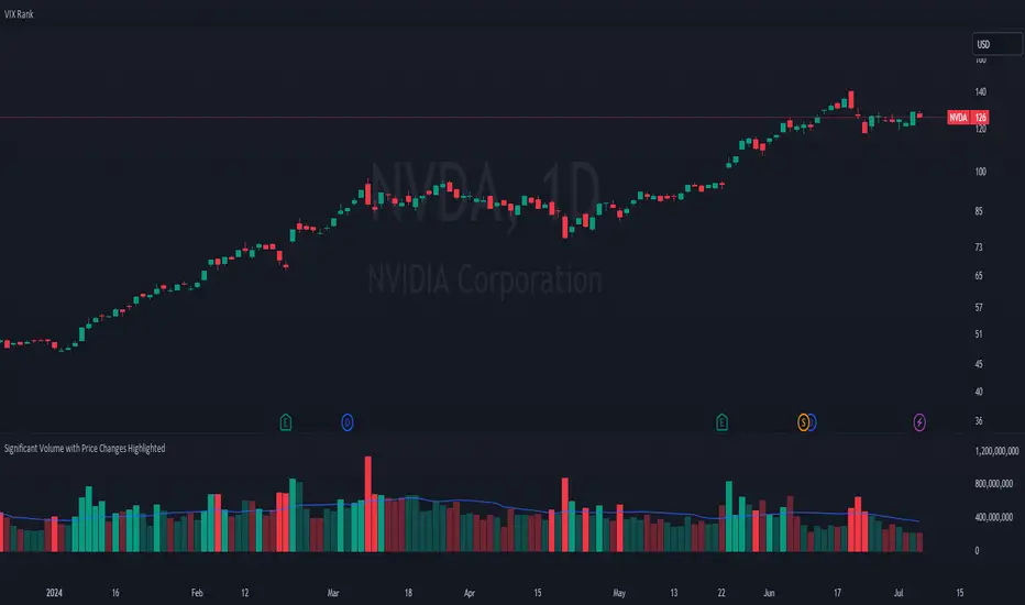
Significant Volume with Price Changes HighlightedSignificant Volume with Price Changes Highlighted
The "Significant Volume with Price Changes Highlighted" indicator by PappyTrading is a powerful tool designed to help traders identify significant volume spikes and price changes in the market. This indicator overlays the volume bars on the price chart and highlights them based on specific volume and price change conditions, providing a clear visual representation of market activity.
What It Does
This indicator calculates the moving average of the volume over a specified period and compares the current volume to this average. It also calculates the daily percentage change relative to the previous day's close and compares this to its moving average. The volume bars are then color-coded based on the following conditions:
Bright Green (#089981): Indicates a significant volume spike with an above-average price increase.
Bright Red (#f23645): Indicates a significant volume spike with an above-average price decrease.
Green with 60% transparency: Indicates a normal up day with a price increase but not a significant volume spike.
Red with 60% transparency: Indicates a normal down day with a price decrease but not a significant volume spike.
Additionally, the indicator plots a 20-period simple moving average (SMA) of the volume, providing a reference point to understand the general volume trend.
How It Works
Volume Calculation:
The indicator calculates the 20-period SMA of the volume and compares the current volume to this average to determine if there is a significant volume spike.
Price Change Calculation:
The indicator calculates the daily percentage change in price relative to the previous day's close and compares this to the 20-period SMA of the percentage change to identify significant price movements.
Color Coding:
The volume bars are color-coded based on the combination of the volume and price change conditions. This visual representation allows traders to quickly identify significant market activities.
How to Use It
Overlay on Chart:
Add the "Significant Volume with Price Changes Highlighted" indicator to your chart. The volume bars will be displayed at the bottom of the chart, color-coded based on the conditions described above.
Identify Market Activity:
Use the color-coded volume bars to identify significant market activities. Bright green bars indicate strong buying pressure, while bright red bars indicate strong selling pressure. Transparent green and red bars indicate normal market activity without significant volume spikes.
Volume Moving Average:
The blue line represents the 20-period SMA of the volume. Use this as a reference to understand the general volume trend and identify deviations from the average.
Concepts Underlying the Calculations
Volume Spikes: Significant volume spikes often precede or accompany major market moves. By highlighting these spikes, traders can gain insights into potential market turning points or continuation patterns.
Price Changes: Large price changes relative to the previous day's close indicate strong market momentum. By comparing these changes to their moving average, the indicator helps traders identify unusually strong buying or selling pressure.
This indicator is ideal for traders who want to gain a deeper understanding of market dynamics by analyzing volume and price changes together. It is suitable for various trading styles, including trend following, swing trading, and scalping.
Visible Range Support and Resistance [AlgoAlpha]🌟 Introducing the Visible Range Support and Resistance 🌟
Discover key support and resistance levels with the innovative "Visible Range Support and Resistance" indicator by AlgoAlpha! 🚀📈 This advanced tool dynamically identifies significant price zones based on the visible range of your chart, providing traders with crucial insights for making informed decisions.
Key Features:
Dynamic support and resistance levels based on visible chart range 📏
User-defined resolution for tailored analysis 🎯
Clear visual representation of significant key zones 🖼️
Easy integration with any trading strategy 💼
How to Use:
🛠 Add the Indicator : Add the indicator to favourites. Adjust settings like resolution and horizontal extension to suit your trading style.
📊 Market Analysis : Identify key support and resistance zones based on the highlighted areas. These zones indicate significant price levels where the market may react.
How it Works:
The indicator segments the price range into user-defined resolutions, analyzing the highest and lowest points to establish boundaries. It calculates the frequency of price action within these segments, highlighting key levels where price movements are least concentrated (areas where price tends to pivot). Customizable settings like resolution and horizontal extension allow for tailored analysis, while the intuitive visual representation makes it easy to spot potential support and resistance zones directly on your chart.
By leveraging this indicator, you can gain deeper insights into market dynamics and improve your trading strategy with data driven support and resistance analysis. Happy trading! 💹✨

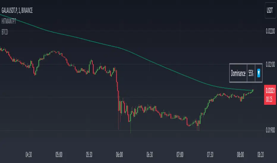
Dominance DashboardThe "Dominance Dashboard" is a TradingView indicator designed to provide traders with a clear and concise visual representation of Bitcoin Dominance (BTC.D). This script helps traders monitor BTC.D in real-time, offering insights into market dynamics and potential trading signals based on the changes in Bitcoin's market dominance.
Key Features
Real-Time BTC Dominance: Displays the current Bitcoin Dominance percentage.
Historical Comparison: Shows the previous day's Bitcoin Dominance for comparison.
Visual Indicators: Utilizes color-coded arrows to indicate changes in Bitcoin Dominance (increase or decrease).
Customizable Table Settings: Users can customize the position, size, and colors of the displayed table to suit their preferences.
How It Works
Data Retrieval: The script uses request.security to fetch the latest and previous day's BTC.D data.
Comparison Mechanism: It compares the current BTC Dominance with the previous day's value to determine whether BTC.D has increased, decreased, or remained unchanged.
Dynamic Table Display: Based on user preferences, the script dynamically adjusts the table's position, text size, and colors.
Using the Indicator
Table Settings:
Show Header: Toggle the visibility of the table header.
Position: Choose from various predefined positions (e.g., Top Right, Bottom Right) to place the dashboard on your chart.
Text Size: Select the text size (Tiny, Small, Normal, Large) for better readability.
Text and Border Colors: Customize the text and border colors to match your chart's theme.
Timeframe Settings:
Show Current BTC Dominance: Enable or disable the display of the current BTC Dominance percentage.
Underlying Concepts
BTC Dominance: Bitcoin Dominance (BTC.D) measures Bitcoin's market capitalization relative to the total market capitalization of all cryptocurrencies. Monitoring BTC.D helps traders understand the flow of capital in and out of Bitcoin compared to other cryptocurrencies.
Visual Change Indicators: The script uses simple arrow symbols (🔼 for an increase and 🔽 for a decrease) to provide quick visual cues about the direction of change in BTC Dominance. This feature helps traders quickly assess market conditions without deep analysis.
Practical Use Cases
Market Sentiment Analysis: A rising BTC Dominance could indicate a market shift towards Bitcoin, potentially signaling a bearish sentiment for altcoins. Conversely, a falling BTC Dominance might suggest increased interest in altcoins.
Trend Confirmation: Traders can use BTC Dominance trends to confirm their trading strategies. For example, if a trader is bullish on Bitcoin, an increasing BTC Dominance might reinforce their position.
Portfolio Management: By monitoring BTC Dominance, traders can make informed decisions about portfolio rebalancing between Bitcoin and other cryptocurrencies.
BTC x M2 Divergence (Weekly)### Why the "M2 Money Supply vs BTC Divergence with Normalized RSI" Indicator Should Work
IMPORTANT
- Weekly only indicator
- Combine it with BTC Halving Cycle Profit for better results
The "M2 Money Supply vs BTC Divergence with Normalized RSI" indicator leverages the relationship between macroeconomic factors (M2 money supply) and Bitcoin price movements, combined with technical analysis tools like RSI, to provide actionable trading signals. Here's a detailed rationale on why this indicator should be effective:
1. **Macroeconomic Influence**:
- **M2 Money Supply**: Represents the total money supply, including cash, checking deposits, and easily convertible near money. Changes in M2 reflect liquidity in the economy, which can influence asset prices, including Bitcoin.
- **Bitcoin Sensitivity to Liquidity**: Bitcoin, being a digital asset, often reacts to changes in liquidity conditions. An increase in money supply can lead to higher asset prices as more money chases fewer assets, while a decrease can signal tightening conditions and lower prices.
2. **Divergence Analysis**:
- **Economic Divergence**: The indicator calculates the divergence between the percentage changes in M2 and Bitcoin prices. This divergence can highlight discrepancies between Bitcoin's price movements and broader economic conditions.
- **Market Inefficiencies**: Large divergences may indicate inefficiencies or imbalances that could lead to price corrections or trends. For example, if M2 is increasing (indicating more liquidity) but Bitcoin is not rising proportionately, it might suggest a potential upward correction in Bitcoin's price.
3. **Normalization and Smoothing**:
- **Normalized Divergence**: Normalizing the divergence to a consistent scale (-100 to 100) allows for easier comparison and interpretation over time, making the signals more robust.
- **Smoothing with EMA**: Applying Exponential Moving Averages (EMAs) to the normalized divergence helps to reduce noise and identify the underlying trend more clearly. This double-smoothed divergence provides a clearer signal by filtering out short-term volatility.
4. **RSI Integration**:
- **RSI as a Momentum Indicator**: RSI measures the speed and change of price movements, indicating overbought or oversold conditions. Normalizing the RSI and incorporating it into the divergence analysis helps to confirm the strength of the signals.
- **Combining Divergence with RSI**: By using RSI in conjunction with divergence, the indicator gains an additional layer of confirmation. For instance, a bullish divergence combined with an oversold RSI can be a strong buy signal.
5. **Dynamic Zones and Sensitivity**:
- **Good DCA Zones**: Highlighting zones where the divergence is significantly positive (good DCA zones) indicates periods where Bitcoin might be undervalued relative to economic conditions, suggesting good buying opportunities.
- **Red Zones**: Marking zones with extremely negative divergence, combined with RSI confirmation, identifies potential market tops or bearish conditions. This helps traders avoid buying into overbought markets or consider selling.
- **Peak Detection**: The sensitivity setting for detecting upside down peaks allows for early identification of potential market bottoms, providing timely entry points for traders.
6. **Visual Cues and Alerts**:
- **Clear Visualization**: The plots and background colors provide immediate visual feedback, making it easier for traders to spot significant conditions without deep analysis.
- **Alerts**: Built-in alerts for key conditions (good DCA zones, red zones, sell signals) ensure traders can act promptly based on the indicator's signals, enhancing the practicality of the tool.
### Conclusion
The "M2 Money Supply vs BTC Divergence with Normalized RSI" indicator integrates macroeconomic data with technical analysis to offer a comprehensive view of Bitcoin's market conditions. By analyzing the divergence between M2 money supply and Bitcoin prices, normalizing and smoothing the data, and incorporating RSI for momentum confirmation, the indicator provides robust signals for identifying potential buying and selling opportunities. This holistic approach increases the likelihood of capturing significant market movements and making informed trading decisions.

Multi Exchange Relative Volume IndicatorThe Multi Exchange Relative Volume indicator is a powerful tool designed to visualize the relative volume across different exchanges. This is particularly useful for decentralized securities like forex and crypto, where volume data is spread across multiple markets. By aggregating volume data from various exchanges, this indicator helps traders identify trends, spot unusual volume spikes, and make informed trading decisions.
Key Features:
Multi-Exchange Volume Aggregation: Collects and sums the volume data from up to five different exchanges, offering a holistic view of the market activity.
Customizable Inputs: Easily select and configure up to five different exchanges of your choice to monitor their volume activity.
Relative Volume Visualization: Compares the aggregated volume against historical averages to highlight periods of high or low volume.
Color-Coded Volume Bars: Volume bars are color-coded based on the relative volume percentage, providing quick visual cues:
- Red for volume 1.0-1.5 times the average
- Orange for volume 1.5-2.0 times the average
- Green for volume 2.0-3.0 times the average
- Yellow for volume greater than 3.0 times the average
- Grey for below average volume
Dynamic Lookback Period: Adjust the lookback period to suit your trading style and timeframe, allowing for flexible analysis.
Exponential Moving Average (EMA): Includes an EMA of volume to smooth out short-term fluctuations and highlight longer-term trends.
Scalable Layout: The scaling factor allows you to zoom in or out, adjusting the visual representation of volume data to better fit your chart.
Usage:
Configure Exchanges: Select up to five exchanges you want to monitor from the input settings.
Set Lookback Period and Bars: Customize the lookback period and the number of bars to consider for calculating average volume.
Adjust Scaling: Use the scaling factor to zoom in or out on the volume data for better visualization.
Interpret Volume Bars: Analyze the color-coded volume bars to identify significant changes in volume and potential trading opportunities.
Monitor EMA: Use the EMA line to understand the trend and smooth out noise from the volume data.
The Multi Exchange Relative Volume indicator is an essential tool for traders who want to gain deeper insights into market activity across multiple exchanges. By visualizing relative volume, it helps in identifying potential breakout or breakdown points, enhancing your trading strategy.

Volume Positive & Negative Levels [ChartPrime]Volume Positive & Negative Levels
Overview:
The Volume Positive & Negative Levels indicator by ChartPrime is designed to provide traders with a clear visualization of volume activity across different price levels. By plotting volume levels as histograms, this tool helps identify significant areas of buying (positive volume) and selling (negative volume) pressure, enhancing the ability to spot potential support and resistance zones.
Key Features:
⯁ Lookback Period:
- The `lookbackPeriod` parameter, set to 500 bars, determines the range over which the volume analysis is conducted, ensuring a comprehensive view of the market’s volume activity. The maximum lookback period is 500 bars or the bars currently visible on the chart, whichever is smaller.
⯁ Dynamic Volume Calculation:
- Volume is calculated dynamically based on the price action, with positive volume indicating buying pressure (close > open) and negative volume indicating selling pressure (close < open).
⯁ Color Coding for Clarity:
- Positive Volume: Represented with a distinct color (`#ad9a2c`), making it easy to identify areas of buying interest.
- Negative Volume: Highlighted with another color (`#ad2cad`), simplifying the detection of selling pressure.
Volume Threshold and Bins:
- The indicator allows users to set a volume threshold (`volume_level`) to highlight significant volume levels, with the default set at 70.
- The number of bins (`numBins`) defines the granularity of the volume profile, with a higher number providing more detail.
⯁ Volume Profile Visualization:
- The volume profile is plotted as a histogram, with the height of each bar proportional to the volume at that price level. This visualization helps in quickly assessing the strength of volume at various price points.
⯁ Interactive Labels and Threshold Indicators:
- Labels: The indicator uses labels to mark significant volume levels, providing quick reference points for traders.
- Threshold Lines: Lines are drawn at specified volume thresholds, with colors and widths dynamically adjusted based on the volume levels.
⯁ User Inputs:
- Volume Threshold (`volume_level`): Sets the minimum volume required to highlight significant levels.
- Number of Bins (`numBins`): Determines the resolution of the volume profile.
- Line Width (`line_withd`): Specifies the width of the lines used in the visualization.
The Volume Positive & Negative Levels indicator is a powerful tool for traders looking to gain deeper insights into market dynamics. By providing a clear visual representation of volume activity across different price levels, it helps traders identify key support and resistance zones, spot trends, and make more informed trading decisions. Whether you are a day trader or a swing trader, this indicator enhances your ability to analyze volume data effectively, improving your overall trading strategy.

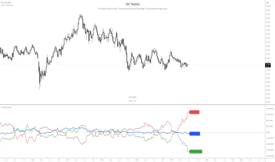
COT-NocTradingIndicator Description:
Commitments of Traders (COT) Data Indicator
The Commitments of Traders (COT) Data Indicator on TradingView provides insights into market sentiment based on the weekly CFTC (Commodity Futures Trading Commission) reports. It plots three key lines derived from this data, offering valuable information for traders seeking to understand positioning trends among large speculators, commercial hedgers, and small traders.
Lines Plotted:
Commercials: Reflects positions held by commercial entities engaged in the production or sale of the underlying commodity. Their positions often act as a hedge against physical market exposure.
Non Commercials: Represents positions held by large speculators, typically hedge funds and large financial institutions, who often take more significant positions based on their market outlook.
Retail Traders: Shows positions held by small traders, including individual retail traders and smaller institutional players, providing insights into the broader retail sentiment.
Labeling:
Each line is accompanied by a label to clearly identify its corresponding group, enhancing clarity and ease of interpretation for traders analyzing the indicator.
Usage:
Trend Confirmation: Monitor the positioning of commercial and non commercial relative to retail traders to confirm trends and potential reversals.
Sentiment Analysis: Assess shifts in market sentiment based on changes in positioning across different trader categories.
Trading Signals: Use crossovers, divergences, and extreme positioning relative to historical data to generate potential trading signals.
This indicator is valuable for traders looking to incorporate institutional positioning data into their trading strategies, offering a deeper understanding of market dynamics beyond price action alone.
Energy ScriptEnergy Script Indicator
Description of Indicator
The Energy Script Indicator calculates the market's energy using the formula `Energy = Price * sqrt(Volume)`; providing insight into market activity by combining price movement and volume. This indicator is designed to help traders identify potential reversals and continuation points based on energy levels.
Features
Energy Calculation: Utilizes price and volume to compute market energy, highlighting significant activity changes.
Smoothing Options: Two customizable smoothing periods to filter out noise and highlight trends.
Threshold Alert: Set a threshold value to receive alerts when energy exceeds predefined levels, aiding in quick decision-making.
Customizable Colors: Choose colors for different plot lines to suit your charting preferences.
How to Use:
1. Smoothing Periods: Adjust `Smoothing 1` and `Smoothing 2` to control the sensitivity of the energy plots.
2. Threshold: Set the `Threshold` value to identify significant energy levels. Enable or disable threshold plotting as needed.
3. Volume Integration: Toggle `Use Volume` to include or exclude volume in energy calculations.
4. Alerts: Receive alerts when energy levels cross the defined threshold, signaling potential market movements.
This indicator is a powerful tool for analyzing market dynamics by combining price action with volume, providing a deeper understanding of market energy and potential trading opportunities.

Weekday Signal [QuantAlchemy]### Weekday Signal Indicator
#### Overview
The "Weekday Signal " indicator offers a method for triggering entry and exit signals based on specific weekdays and defined trading sessions. This allows traders to tailor their strategies to time slots and days, ensuring strategic execution and optimal trading periods.
Additionally, this indicator exposes signals for external use in other scripts, enabling integration with additional trading strategies or indicators, thereby enhancing its utility and flexibility for trading systems.
#### Definitions
- **Weekday Signal**: An indicator designed to trigger entry and exit signals based on specific weekdays within defined trading sessions.
- **Time Zone**: The local or preferred time zone setting to match market hours across global exchanges.
- **Trading Session**: The specific hours within a day when the trading signals are active.
#### Plots
- **Enter Signal**: Plots a signal when the conditions for entering a trade are met.
- **Exit Signal**: Plots a signal when the conditions for exiting a trade are met.
#### Properties
- **Flexible Time Zones**: Allows users to set their preferred time zone to align with global market hours.
- **Customizable Entry and Exit Days**: Users can select specific weekdays for entry and exit signals.
- **Defined Trading Sessions**: Users can define trading session hours to restrict signals to optimal market times.
- **Visual Indicators**: Provides clear visual plots and background colors on the chart to indicate when entry and exit criteria are met.
- **Dual Group Configuration**: Separate controls for entry and exit setups, offering flexibility in managing trading signals.
#### How to Read
1. **Green Background**: Indicates a potential entry signal.
2. **Red Background**: Indicates a potential exit signal.
3. **Status Line and Data Window**: Shows a value of 1 when an entry or exit condition is met and 0 otherwise.
#### Proposed Interpretations
- **Entry Signals**: When the background turns green and the status line/data window shows a value of 1, it indicates a potential time to enter a trade based on the selected weekday and session.
- **Exit Signals**: When the background turns red and the status line/data window shows a value of 1, it indicates a potential time to exit a trade based on the selected weekday and session.
#### Essential Knowledge
- **Weekdays and Trading Sessions**: Understanding the significance of specific trading days and sessions can help in optimizing trade timings.
- **Time Zones**: Correctly setting the time zone ensures alignment with market hours and accurate signal generation.
#### Deeper Concepts
- **Signal Filtering**: The script uses the `time_filter` library to determine if the current time falls within the defined entry or exit periods.
#### Typical Use Cases
- **Intraday Trading**: Traders who want to restrict their trades to specific weekdays and trading sessions.
- **Strategy Integration**: Users can integrate the signals from this indicator into broader trading strategies or other Pine Scripts using the signals as an external reference to an input.
#### Limitations
- **Time Zone Settings**: Incorrect time zone settings can lead to misaligned signals.
- **Trading Sessions**: Signals are limited to the defined trading session hours, which may not cover all market conditions.
#### Final Thoughts
The "Weekday Signal " indicator is a tool for traders looking to refine their entry and exit points based on specific days and sessions. By leveraging customizable time zones and trading sessions, traders can refine their strategic execution.
#### Disclaimer
This indicator is for educational purposes only and should not be construed as financial advice. Trading involves risk, and you should consult with a qualified financial advisor before making any trading decisions.

Activity and Volume Orderflow Profile [AlgoAlpha]🔍 Activity and Volume Orderflow Profile 📊
🚀 Unlock the power of market order flow analysis with the Activity and Volume Orderflow Profile indicator by AlgoAlpha . This versatile tool helps you visualize and understand the dynamics of buying and selling pressure within a specified lookback period. Perfect for traders who want to dig deeper into volume-based market insights!
Key Features:
📊 Profile Type Options : Choose between "Comparison" and "Net Order Flow" to analyze market activity based on your preferred method.
🔎 Adjustable Lookback Period : Customize the lookback period to fit your trading strategy.
🎨 Flexible Appearance Settings : Toggle the display of the profile, lookback period visualization, and heatmap to suit your preferences.
🖍 Color Customization : Set your preferred colors for up and down volumes.
🕹 High Activity Highlight : Use the minimum transparency setting to highlight areas of significant activity.
Quick Guide to Using the Activity and Volume Orderflow Profile
🛠 Add the Indicator: Add the indicator to your favorites. Customize settings like profile type, lookback period, and resolution to fit your trading style.
📊 Market Analysis: Use the profile to identify areas of high buying or selling pressure. In "Comparison" mode, look for significant volume differences; in "Net Order Flow" mode, focus on net volume changes. Additionally, you can use the activity heatmap to find key levels that can act as support and resistance as price is likely to react to the zones as indicated by the heatmap.
How it Works:
The indicator operates by first gathering data on high and low prices, as well as buy and sell volumes, over a user-defined lookback period. It then calculates the maximum and minimum prices during this period and divides this range into bins based on the chosen resolution. For each bin, it computes the total volume of buy and sell orders. In "Comparison" mode, it displays side-by-side boxes representing buy and sell volumes, while in "Net Order Flow" mode, it shows the net volume difference. The indicator visually presents these profiles on the chart with customizable colors, transparency levels, and the option to display a heatmap for enhanced volume activity insights.
Maximize your trading with the Activity and Volume Orderflow Profile from AlgoAlpha! 🚀✨

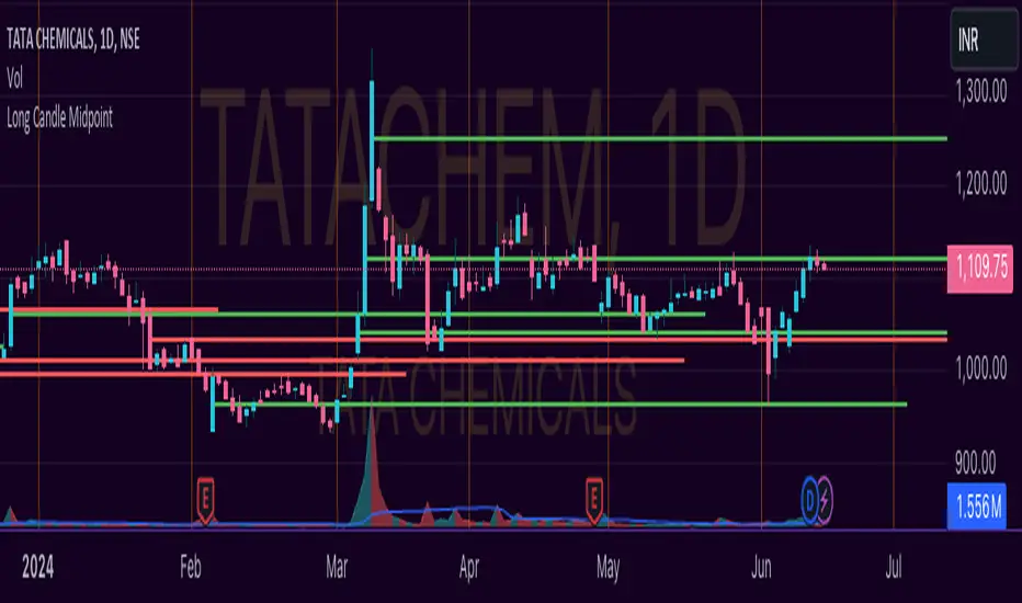
Unlocking the Power of Long Candle MidpointI'm excited to share with you a fascinating concept that can help you identify potential breakout points in the market.
The Pine Script code provided below is designed to identify the midpoint of a long candle, which can be a crucial level for traders to watch.
In this blog post, we'll dive deeper into the concept, explore its applications, and analyze a real-life example of TATACHEM listed on NSE, which is currently trading around a potential psychology line.
What is the Long Candle Midpoint?
The long candle midpoint is a technical indicator that calculates the midpoint of a candlestick that has a significant price movement. This midpoint is then used to draw a horizontal line, which can serve as a potential support or resistance level. The idea is that if a candlestick has a large price movement, it's likely that the market will react to this movement by testing the midpoint of the candle.
How Does the Long Candle Midpoint Indicator Work?
The Pine Script code provided above is designed to calculate the midpoint of a long candle based on the following parameters:
Length: The length of the candlestick is calculated using the len input parameter.
Line Length: The length of the line is calculated using the linExt input parameter.
Calculation Method: The calculation method can be set to either "Highest True Range", "Average True Range", or "Both".
Multiplier: The multiplier is used to adjust the midpoint calculation based on the average range of the candlestick.
The script then plots a horizontal line at the midpoint of the long candle, which can be used as a potential support or resistance level.
Real-Life Example:
Let's take a look at TATACHEM, a stock listed on the National Stock Exchange of India (NSE). As you can see in the chart below,
TATACHEM has been trading around a potential psychology line drawn from the midpoint of a large candle.
As you can see, the stock has previously failed to break above this line, but it's currently trading around it. This could be a sign that the market is preparing for a potential breakout. If the stock can break above this line, it could lead to a bullish rally.
Conclusion
The long candle midpoint indicator is a powerful tool that can help traders identify potential breakout points in the market. By analyzing the midpoint of a long candle, traders can gain insights into the market's sentiment and potential areas of support or resistance.
In the case of TATACHEM, the stock is currently trading around a potential psychology line, which could be a sign of a potential breakout. Traders can consider this point in their watch list for a potential entry. Tips for Traders
Use the long candle midpoint indicator in conjunction with other technical indicators to gain a more comprehensive understanding of the market.
Look for confirmation from other indicators before entering a trade.
Set stop-loss and take-profit levels based on the potential breakout point.
Monitor the market closely and be prepared to adjust your strategy if the market doesn't behave as expected.
By incorporating the long candle midpoint indicator into your trading strategy, you can gain an edge in the market and make more informed trading decisions.
High Probability OS/OB {DCAquant}DCAquant - High Probability OS/OB
The DCAquant - High Probability OS/OB Pine Script is a sophisticated indicator that provides insights into overbought (OB) and oversold (OS) conditions based on Hull Moving Averages (HMA) and Volume Weighted Moving Averages (VWMA). Here's a detailed breakdown of its functionality:
-------------------------------------------------------------------------------------
THIS INDICATOR IS ONLY WRITTEN FOR BTC, ETH and TOTAL!!!!!!!!!!!!!
-------------------------------------------------------------------------------------
Functionality
The script identifies high-probability OB and OS zones by combining multiple moving averages (MAs).
1. Volume Weighted Moving Average (VWMA)
The VWMA function computes the VWMA over a specified length, incorporating both the price and volume.
2. Hull Moving Average with Volume Weight (HMA-VW)
The hullma_vw function calculates the HMA using the VWMA. This involves:
Computing VWMAs over the full length and half-length.
Using these VWMAs to derive the HMA-VW through a weighted approach.
5. Standard Hull Moving Average (HMA)
The hull function computes the HMA using the standard weighted moving average (WMA).
4. Smoothed HMA-VW
This is an Exponential Moving Average (EMA) of the HMA-VW to smooth out short-term fluctuations.
How this works
First, the distance between the 2 MA's is calculated.
The distance is scored against the average price of the last 100 days.
By getting this score we can calculate extremes
The Extremes are categorized into 4 levels. The transparency of the background color distinguishes these 4 levels.
Only the MOST extremes are plotted ON THE CHART. Within the indicator, all 4 levels are plotted.
Usage
Extreme Buy zone: Consider entering the market when the indicator shows deep negative values (oversold). These are highlighted with a cyan background, with increasing opacity indicating stronger buy signals (Level 4 Zones).
Extreme Sell Zone: Consider exiting the market when the indicator shows high positive values (overbought). These are highlighted with a magenta background, with increasing opacity indicating stronger sell signals (Level 4 Zones).
Disclaimer
This indicator should not be used in isolation. It is recommended to use this as part of a systematic approach, incorporating other tools and analysis methods to confirm signals and make well-informed trading decisions.

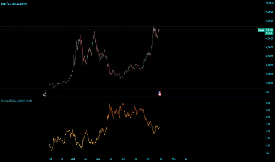
MC vs Total MCMC vs Total MC
this is an edit of StableCoin MC vs Total MC by Crypto5Max supporting muti timeframes and addition dominances
is a powerful and versatile TradingView indicator designed to help traders and analysts visualize the dominance of different types of cryptocurrencies (StableCoin, AltCoin, BTC, ETH) relative to the total market capitalization. This indicator provides a clear and concise way to monitor market trends and make informed decisions based on the dominance of specific cryptocurrency segments.
Key Features:
Customizable Time Frames: Select from a variety of time frames including 5 Min, 15 Min, 30 Min, 1HR, 2HR, 4HR, 8HR, and Daily to tailor the analysis to your needs.
Dominance Type Selection: Choose the type of market capitalization dominance you want to track - StableCoins, AltCoins, Bitcoin, or Ethereum.
Total Market Capitalization Options: Analyze the market with different total market capitalization metrics - total crypto market cap, total market cap excluding BTC, or total market cap excluding BTC and ETH.
Dynamic Label Display: A label that follows the plotted dominance line and dynamically displays the dominance percentage, providing a clear visual representation.
Invisible Background Option: Choose to have an invisible background for a cleaner chart presentation.
How It Works:
Time Frame Selection: Use the time_frame input to choose the desired time frame for your analysis.
Dominance Type Selection: Select the type of dominance to display using the mcap_type input.
Total Market Capitalization Selection: Choose the total market capitalization metric with the total_sym input.
Dominance Calculation: The indicator calculates the dominance of the selected cryptocurrency type as a percentage of the total market capitalization.
Visual Display: The chosen dominance is plotted on the chart, and a label displaying the dominance percentage is dynamically updated to follow the plotted line.
Use Cases:
Market Trend Analysis: Identify trends in the dominance of StableCoins, AltCoins, BTC, or ETH to gauge market sentiment.
Portfolio Allocation: Make informed decisions about portfolio allocation by understanding the market share of different cryptocurrency types.
Technical Analysis: Combine with other technical indicators to enhance your trading strategy and gain deeper market insights.
This indicator is essential for traders, analysts, and investors who want to stay ahead of market movements and make data-driven decisions based on the dominance of various cryptocurrency segments.
Example:
If you select "AltCoin" as the dominance type and "Total 3" as the total market capitalization, the indicator will plot the dominance of AltCoins (excluding BTC and ETH) as a percentage of the total crypto market capitalization (excluding BTC and ETH) on the selected time frame. The dynamic label will display this percentage, updating as the market evolves.
Elevate your market analysis with the MC vs Total MC indicator and gain a comprehensive view of cryptocurrency dominance trends.
Standard Error Bands**Standard Error Bands Indicator: A Statistically Robust Tool for Trend Analysis**
The Standard Error Bands (SEB) indicator is a powerful technical analysis tool designed to help traders identify and assess trends with greater accuracy. Unlike traditional band indicators (e.g., Bollinger Bands) that rely on price averages, SEB leverages linear regression and statistical measures of volatility to offer deeper insights into market dynamics.
**How It Works**
1. **Linear Regression:** The indicator first calculates a linear regression line to model the underlying price trend. This line represents the "best fit" of price data over the specified lookback period.
2. **Standard Error:** Next, it calculates the standard error of the regression. This statistical measure quantifies the average distance between actual prices and the regression line, effectively acting as a volatility gauge.
3. **Smoothing:** Both the linear regression line and the standard error values are smoothed using a Simple Moving Average (SMA) to reduce noise and enhance the visual clarity of the bands.
4. **Band Construction:** The upper and lower bands are formed by adding/subtracting a multiple of the smoothed standard error from the smoothed linear regression line. The default multiplier is 2, representing approximately 95% of price action expected within the bands under normal market conditions.
**Key Insights**
* **Trend Strength:** Tight bands suggest a strong, well-defined trend with low volatility. Prices tend to adhere closely to the regression line, indicating a high probability of trend continuation.
* **Trend Weakness/Change:** Widening or expanding bands signal increased volatility and potential trend weakness. Prices deviating from the regression line may suggest an impending trend reversal or a shift into a sideways consolidation phase.
* **Entry/Exit Signals:**
* Consider entering a trade when prices break out of the bands in the direction of the trend, especially if the bands were previously tight.
* Conversely, consider exiting a trade when prices pierce the bands against the trend or when the bands start to widen significantly.
**Use Cases**
* **Trend Identification:** SEB can help traders identify trends earlier and more accurately than moving average-based indicators.
* **Trend Confirmation:** The bands can be used to confirm the validity and strength of an existing trend.
* **Volatility Assessment:** Changes in band width provide valuable insights into market volatility, aiding risk management decisions.
* **Entry/Exit Timing:** SEB can be incorporated into trading strategies to generate timely entry and exit signals.
**Important Considerations**
* **Parameter Optimization:** Experiment with different lookback periods, smoothing values, and standard error multipliers to find the optimal settings for your preferred trading style and market conditions.
* **Supplementary Indicators:** Combine SEB with other technical indicators (e.g., momentum oscillators, volume analysis) for a more comprehensive market assessment.
* **Backtesting:** Thoroughly backtest any SEB-based trading strategy to ensure its effectiveness before deploying it in live markets.
**Disclaimer:** Technical indicators like SEB are valuable tools but should not be used in isolation. Always consider price action or fundamental factors and risk management principles when making trading decisions.

[Pandora] Error Function Treasure Trove - ERF/ERFI/Sigmoids+PRAISE:
At this time, I have to graciously thank the wonderful minds behind the new "Pine Profiler Mode" (PPM). Directly prior to this release, it allowed me to ascertain script performance even more. While I usually write mostly in highly optimized Pine code, PPM visually identified a few bottlenecks that would otherwise be hard to identify. Anyone who contributed to PPMs creation and testing before release... BRAVO!!! I commend all of those who assisted in it's state-of-the-art engineering and inception, well done!
BACKSTORY:
This script is specifically being released in defense of another member, an exceptionally unique PhD. It was brought to my attention that a script-mod-event occurred, regarding the publishing of a measly antiquated error function (ERF) calculation within his script. This sadly resulted in the now former member jumping ship after receiving unmannerly responses amidst his curious inquiries as to why his erf() was modded. To forbid rusty and rudimentary formulations because a mod-on-duty is temporally offended by a non-nefarious release of code, is in MY opinion an injustice to principles of perpetuating open-source code intended to benefit thousands to millions of community members. While Pine is the heart and soul of TV, the mathematical concepts contributed from the minds of members is the inspirational fuel of curiosity that powers it's pertinent reason to exist and evolve.
It is an indisputable fact that most members are not greatly skilled Pine Poets. Many members may be incapable of innovating robust function code in Pine, even if they have one or more PhDs. We ALL come from various disciplines of mathematical comprehension and education. Some mathematicians are not greatly skilled at coding, while some coders are not exceptional at math. So... what am I to do to attempt to resolve this circumstantial challenge??? Those who know me best are aware that I will always side with "the right side of history" in order to accomplish my primary self-defined missions I choose to accept. Serving as an algorithmic advocate, I felt compelled to intercede by compiling numerous error functions into elegant code of very high caliber that any and every TV member may choose to employ, so this ERROR never happens again.
After weeks of contemplation into algorithms I knew little about, I prioritized myself to resolve an unanticipated matter by creating advanced formulas of exquisitely crafted error functions refined to the best of my current abilities. My aversion for unresolved problems motivated me to eviscerate error function insufficiencies with many more rigid formulations beyond what is thought to exist. ERF needed a proper algorithmic exorcism anyways. In my furiosity, I contemplated an array of madMAXimum diplomatic demolition methods, choosing the chain saw massacre technique to slaughter dysfunctionalities I encountered on a battered ERF roadway. This resulted in prolific solutions that should assuredly endure the test of time. Poetically, as you will come to see, I am ripping the lid off of Pandora's box of error functions in this case to correct wrongs into a splendid bundle of rights for members.
INTENTION:
Error function (ERF) enthusiasts... PREPARE FOR GLORY!! The specific purpose of this script is to deprecate classic error functions with the creation of a fierce and formidable army of superior formulations, each having varying attributes of computational complexity with differing absolute error ranges in their results for multiple compute scenarios. This is NOT an indicator... It is intended to allow members to embark on endeavors to advance the profound knowledge base of this growing worldwide community of 60+ million inquisitive minds. For those of you who believe computational mathematics and statistics is near completion at its finest; I am here to inform you, this is ridiculous to ponder. We are no where near statistical excellence that can and will exist eventually. At this time, metaphorically speaking, we are merely scratching microns off of the surface of the skin of a statistical apple Isaac Newton once pondered.
THIS RELEASE:
Following weeks of pondering methodical experiments beyond the ordinary, I am liberating these wild notions of my error function explorations to the entire globe as copyleft code, not just Pine. This Pandora's basket of ERFs is being openly disclosed for the sake of the sanctity of mathematics, empirical science (not the garbage we are told by CONTROLocrats to blindly trust), revolutionary cutting edge engineering, cosmology, physics, information technology, artificial intelligence, and EVERY other mathematical branch of human knowledge being discovered over centuries. I do believe James Glaisher would favor my aims concerning ERF aspirations embracing the "Power of Pine".
The included functions are intended for TV members to use in any way they see fit. This is a gift to ALL members to foster future innovative excellence on this platform. Any attempt to moderate this code without notification of "self-evident clear and just cause" will be considered an irrevocable egregious action. The original foundational PURPOSE of establishing script moderation (I clearly remember) was primarily to maintain active vigilance over a growing community against intentional nefarious actions and/or behaviors in blatant disrespect to other author's works AND also thwart rampant copypasting bandit operations, all while accommodating balanced principles of fairness for an educational community cause via open source publishing that should support future algorithmic inventions well beyond my lifespan.
APPLICATIONS:
The related error functions are used in probability theory, statistics, and numerous and engineering scientific disciplines. Its key characteristics and applications are innumerable in computational realms. Its versatility and significance make it a fundamental tool in arenas of quantitative analysis and scientific research...
Probability Theory - Is widely used in probability theory to calculate probabilities and quantiles of the normal distribution.
Statistics - It's related to the Gaussian integral and plays a crucial role in statistics, especially in hypothesis testing and confidence interval calculations.
Physics - In physics, it arises in the study of diffusion equations, quantum mechanics, and heat conduction problems.
Engineering - Applications exist in engineering disciplines such as signal processing, control theory, and telecommunications.
Error Analysis - It's employed in error analysis and uncertainty quantification.
Numeric Approximations - Due to its lack of a closed-form expression, numerical methods are often employed to approximate erf/erfi().
AI, LLMs, & MACHINE LEARNING:
The error function (ERF) is indispensable to various AI applications, particularly due to its relation to Gaussian distributions and error analysis. It is used in Gaussian processes for regression and classification, probabilistic inference for Bayesian networks, soft margin computation in SVMs, neural networks involving Gaussian activation functions or noise, and clustering algorithms like Gaussian Mixture Models. Improved ERF approximations can enhance precision in these applications, reduce computational complexity, handle outliers and noise better, and improve optimization and convergence, possibly leading to more accurate, efficient, and robust AI systems.
BONUS ALGORITHMS:
While ERFs are versatile, its opposite also exists in the form of inverse error functions (ERFIs). I have also included a modified form of the inverse fisher transform along side MY sigmoid (sigmyod). I am uncertain what sigmyod() may be used for, but it's a culmination of my examinations deep into "sigmoid domains", something I am fascinated by. Whatever implications it may possess, I am unveiling it along with it's cousin functions. For curious minds, this quality of composition seen here is ideally what underlies what I would term "Pandora functionality" that empowers my Pandora indication. I go through hordes of formulations, testing, and inspection to find what appears to be the most beneficial logical/mathematical equation to apply...
SCRIPT OPERATION:
To showcase the characteristics and performance of my ERF/ERFI formulations, I devised a multi-modal script. By using bar_index , I generated a broad sequence of numeric values to input into the first ERF/ERFI parameter. These sequences allow you to inspect the contours of the error function's outputs for both ERF and ERFI. When combined with compute-intensive precision functions (CIPFs), the polynomial function output values can be subtracted from my CIPFs to obtain results of absolute error, displaying the accuracy of the many polynomial estimation functions I tuned in testing for Pine's float environment.
A host of numeric input settings are wildly adjustable to inspect values/curvatures across the range of numeric input sequences. Very large numbers, such as Divisor:100,000,100/Offset:200,000,000 for ERF modes or... Divisor:100,000,100/Offset:100,000,000 for ERFI modes, will display miniscule output values calculated from input values in close proximity to 0.0 for the various estimates, similar to a microscope. ERFI approximations very near in proximity to +/-1.0 will always yield large deviations of absolute error. Dragging/zooming your chart or using the Offset input will aid with visually clipping off those ERFI extremes where float precision functions cannot suffice.
NOTICE:
perf() and perfi() are intended for precision computation (as good as it basically gets) in a float environment. However, they are CPU intensive (especially perfi). I wouldn't recommend these being used in ANY Pine script unless it's an "absolute necessity" to do so to accomplish your goal. I only built them to obtain "absolute error curvatures" of the error functions for the polynomial approximations. These are visible in the accuracy modes in the indicator Settings.
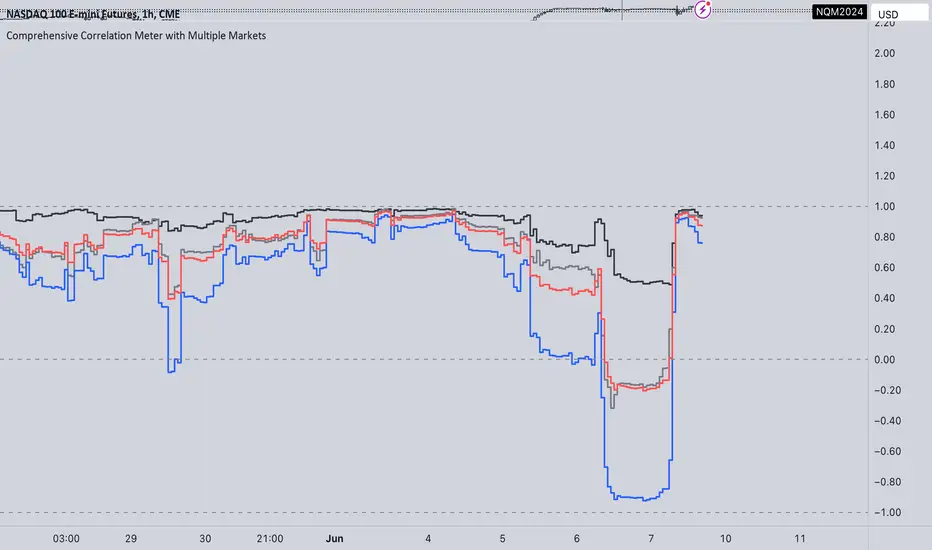
Comprehensive Correlation Meter with Multiple MarketsThe Comprehensive Correlation Meter is designed to provide traders and investors with insights into the relationships between multiple financial instruments. This script expands upon an existing idea on TradingView about correlation by introducing the ability to analyze the correlation between three markets, offering deeper insights into market relationships. It helps users understand how these markets move in relation to each other, aiding in risk management and portfolio diversification.
Key Features:
Multiple Market Analysis: This script allows you to analyze the correlation between your primary market and two other selected markets.
Customizable Inputs: Users can select any symbols for the reference and third markets, and these selections must be confirmed before use.
Correlation Coefficients: Calculates and plots the correlation coefficients for:
Current Market vs. Reference Market
Third Market vs. Reference Market
Current Market vs. Third Market
An average correlation of all three markets combined.
Visual Aids: Plots reference lines at +1, 0, and -1 to indicate maximum positive correlation, no correlation, and maximum negative correlation.
How It Works:
Input Symbols: Select the symbols for the reference and third markets. The current market is based on the chart you are viewing.
Data Collection: The script collects the closing prices of the selected markets and calculates the percentage changes.
Correlation Calculation: Using the collected data, the script computes the covariance and standard deviations to determine the correlation coefficients.
Visualization: The correlation coefficients and covariances are plotted for visual analysis.
How to Use:
Select Symbols:
Use the input fields to specify the reference and third market symbols. Confirm your selections to proceed.
Customize Display:
Choose whether to display the covariance, reference market, current market, and third market.
Select which correlation coefficients to display.
Interpret Results:
A correlation coefficient close to +1 indicates a strong positive correlation.
A coefficient close to -1 indicates a strong negative correlation.
A coefficient around 0 indicates little to no correlation.
Use these insights to manage risk and diversify your portfolio effectively.
Example Use Case:
Suppose you are trading the S&P 500 and want to understand its correlation with the NASDAQ 100 and a particular stock, such as Apple. By setting the S&P 500 as the reference market, the NASDAQ 100 as the third market, and observing the current market (Apple), you can see how these instruments move in relation to each other. This can help you decide on hedging strategies or identify opportunities for diversification. However this is Not a Financial advise
ICT KillZones Hunt [TradingFinder] 4 Sessions + OB + FVG + Alert🔵 Introduction
🟣 ICT
The "ICT" style is a subset of "Price Action" technical analysis. The primary goal of the ICT trading strategy is to merge "Price Action" with the "Smart Money" concept to pinpoint optimal trade entry points.
However, this approach's strength extends beyond merely finding entry points. It also helps traders gain a deeper understanding of price behavior and adapt their trading strategies to the market structure.
The most important concepts of "ICT" :
Order Block
Fair Value Gap(FVG)
Liquidity
🟣 Session
Financial markets are divided into several time periods, each featuring distinct characteristics and levels of activity. These periods, known as sessions, are active at different times during the day.
The primary active sessions in financial markets include :
Asian Session
European Session
New York Session
Based on the UTC time zone, the schedule for these key sessions is :
Asian Session: 23:00 to 06:00
European Session: 07:00 to 16:30
New York Session: 13:00 to 22:00
Note
To avoid session overlap and minimize interference during kill zones, the session times have been modified as follows :
Asian Session: 23:00 to 06:00
European Session: 07:00 to 14:25
New York Session: 14:30 to 22:55
🟣 KillZone
Kill zones are periods within a session where trader activity spikes. During these times, trading volume surges, and price movements become more pronounced.
The major kill zones, according to the UTC time zone, are as follows :
Asian Kill Zone: 23:00 to 03:55
European Kill Zone: 07:00 to 09:55
New York Morning Kill Zone: 14:30 to 16:55
New York Evening Kill Zone: 19:30 to 20:55
🔵 How to Use
🟣 Order Block
Order blocks are a distinct category of "Supply and Demand" zones, formed when a series of orders are grouped together. These blocks are often created by banks or other significant market participants.
Banks typically execute large orders in blocks during their trading sessions. If they were to enter the market with small quantities, substantial price movements would occur before the orders were fully executed, reducing potential profit.
To mitigate this, they divide their orders into smaller, more manageable positions. Traders should seek "buy" opportunities in "demand order blocks" and "sell" opportunities in "supply order blocks."
🟣 Fair Value Gap (FVG)
To pinpoint the "Fair Value Gap" on the chart, meticulous candle-by-candle analysis is essential. Pay close attention to candles with significant bodies, examining each candle alongside the one preceding it.
The candles flanking this central candle should exhibit elongated shadows, with bodies that do not intersect the body of the central candle. The span between the shadows of the first and third candles is referred to as the FVG range.
Note :
The origin of all Order Blocks and FVGs starts from inside a kill zone and extends up to the end of the same session.
🟣 Kill Zone Hunt
Following this strategy, after the conclusion of the kill zone and the stabilization of its high and low lines, if the price touches either of these lines within the same session and encounters a robust rejection, it presents an opportunity to enter a trade.
🔵 Setting
🟣 Global Setting
Show All Order Block :
If it is turned off, only the last Order Block will be displayed.
Show All FVG :
If it is turned off, only the last FVG will be displayed.
Show More Info Session :
If it is turned on, more information about kill zones (Trade Volume, Time, Number of Candles) will be displayed.
🟣 Logic Parameter
Pivot Period of Order Blocks Detector :
Enter the desired pivot period to identify the Order Block.
Order Block Validity Period (Bar) :
You can specify the maximum time the Order Block remains valid based on the number of candles from the origin.
Mitigation Level Order Block :
Determining the basic level of a block order. When the price hits the basic level, the order block due to mitigation.
🟣 Order Blocks Display
Demand Order Block :
Show or not show and specify color.
Supply order Block :
Show or not show and specify color.
🟣 Order Block Refinement
Refine Demand OB :
Enable or disable the refinement feature. Mode selection.
Refine Supply OB :
Enable or disable the refinement feature. Mode selection.
🟣 FVG
FVG Validity Period (Bar) :
You can specify the maximum time the FVG remains valid based on the number of candles from the origin.
Mitigation Level FVG :
Determining the basic level of a FVG. When the price hits the basic level, the FVG due to mitigation.
Show Demand FVG :
Show or not show and specify color.
Show Supply FVG :
Show or not show and specify color.
FVG Filter :
Enable or disable filtering of FVGs. Select filter mode.
🟣 Session
Show More Info Session Color
Asia Session, London Sesseion, New York am Session & New York pm Session :
Show or not show session and kill zones. Change the display color.
🟣 Alert
Send Alert When Touched Session high & Low :
On / Off
Alert Demand OB Mitigation :
On / Off
Alert Supply OB Mitigation :
On / Off
Alert Demand FVG Mitigation :
On / Off
Alert Supply FVG Mitigation :
On / Off
Message Frequency :
This string parameter defines the announcement frequency. Choices include: "All" (activates the alert every time the function is called), "Once Per Bar" (activates the alert only on the first call within the bar), and "Once Per Bar Close" (the alert is activated only by a call at the last script execution of the real-time bar upon closing). The default setting is "Once per Bar".
Show Alert Time by Time Zone :
The date, hour, and minute you receive in alert messages can be based on any time zone you choose. For example, if you want New York time, you should enter "UTC-4". This input is set to the time zone "UTC" by default.
Display More Info :
Displays information about the price range of the order blocks (Zone Price) and the date, hour, and minute under "Display More Info". If you do not want this information to appear in the received message along with the alert, you should set it to "Off".

Leading MACDThe Moving Average Convergence Divergence (MACD) indicator is one of the most popular and versatile tools used by traders to identify potential buy and sell signals. It helps traders determine the strength and direction of a trend by comparing different moving averages of a security's price. The traditional MACD uses two exponential moving averages (EMAs), a fast EMA (typically 12 periods) and a slow EMA (typically 26 periods), along with a signal line (typically a 9-period EMA of the MACD line) to generate trading signals.
Our "Custom MACD with Leading Length" script for TradingView enhances the traditional MACD by introducing an additional smoothing factor called the "leading length." This customization aims to reduce noise and provide a potentially earlier indication of trend changes, making it a valuable tool for traders seeking to optimize their trading strategies.
- **Purpose:** This additional smoothing factor is designed to reduce noise and provide a potentially leading signal, enhancing the accuracy of trend identification.
## How It Works
1. **Calculate the MACD Line:**
The MACD line is calculated by subtracting the slow EMA from the fast EMA. This difference represents the convergence or divergence between the two EMAs.
2. **Calculate the Signal Line:**
The signal line is an EMA of the MACD line. This additional smoothing helps to generate clearer buy and sell signals based on crossovers with the MACD line.
3. **Calculate the Histogram:**
The histogram represents the difference between the MACD line and the signal line. It visually indicates the strength and direction of the trend. A positive histogram suggests a bullish trend, while a negative histogram indicates a bearish trend.
4. **Apply Leading Length Smoothing:**
To incorporate the leading length, the script applies a simple moving average (SMA) to both the MACD and signal lines using the leading length parameter. This additional smoothing helps to further reduce noise and potentially provides earlier signals of trend changes.
## Benefits of the Leading MACD
### Reduced Noise
The leading length parameter adds an extra layer of smoothing to the MACD and signal lines, helping to filter out market noise. This can be particularly beneficial in volatile markets, where frequent price fluctuations can generate false signals.
### Potential Early Signals
By smoothing the MACD and signal lines, the leading length can help to provide earlier indications of trend changes. This can give traders a potential edge in entering or exiting trades before the broader market reacts.
### Enhanced Trend Identification
The combination of the traditional MACD with the leading length smoothing can enhance the accuracy of trend identification. Traders can use this tool to confirm the strength and direction of trends, making it easier to make informed trading decisions.
### Versatility
The Custom MACD with Leading Length can be applied to various timeframes and asset classes, including stocks, forex, commodities, and cryptocurrencies. Its adaptability makes it a valuable tool for traders with different strategies and preferences.
## Practical Applications
### Buy Signal
A typical buy signal occurs when the MACD line crosses above the signal line. With the additional smoothing provided by the leading length, traders might receive this signal slightly earlier, allowing them to enter a long position sooner. This can be particularly advantageous in capturing the beginning of a bullish trend.
### Sell Signal
Conversely, a sell signal is generated when the MACD line crosses below the signal line. The leading length smoothing can help to provide this signal earlier, enabling traders to exit a long position or enter a short position before the trend reversal is fully recognized by the market.
### Divergence Analysis
Traders can also use the Custom MACD with Leading Length for divergence analysis. Bullish divergence occurs when the price makes a new low, but the MACD line forms a higher low. This suggests that the downward momentum is weakening, potentially leading to a bullish reversal. Bearish divergence is the opposite, where the price makes a new high, but the MACD line forms a lower high, indicating a potential bearish reversal.
### Confirmation Tool
The Custom MACD with Leading Length can be used in conjunction with other technical indicators to confirm trading signals. For example, traders might use it alongside support and resistance levels, trendlines, or other momentum indicators to validate their trade entries and exits.
## Conclusion
The Custom MACD with Leading Length is a powerful enhancement of the traditional MACD indicator. By introducing an additional smoothing factor, it aims to reduce noise and provide earlier signals of trend changes. This makes it a valuable tool for traders seeking to improve their market analysis and trading strategies.
Whether you are a day trader, swing trader, or long-term investor, the Custom MACD with Leading Length can help you make more informed decisions by offering clearer insights into market trends. Its adaptability to different timeframes and asset classes further enhances its utility, making it a versatile addition to any trader's toolkit.
Experiment with the parameters to find the optimal settings that suit your trading style and preferences. Use the Custom MACD with Leading Length to gain a deeper understanding of market dynamics and enhance your trading performance.
Harmonic Rolling VWAP (Zeiierman)█ Overview
The Harmonic Rolling VWAP (Zeiierman) indicator combines the concept of the Rolling Volume Weighted Average Price (VWAP) with advanced harmonic analysis using Discrete Fourier Transform (DFT). This innovative indicator aims to provide traders with a dynamic view of price action, capturing both the volume-weighted price and underlying harmonic patterns. By leveraging this combination, traders can gain deeper insights into market trends and potential reversal points.
█ How It Works
The Harmonic Rolling VWAP calculates the rolling VWAP over a specified window of bars, giving more weight to periods with higher trading volume. This VWAP is then subjected to harmonic analysis using the Discrete Fourier Transform (DFT), which decomposes the VWAP into its frequency components.
Key Components:
Rolling VWAP (RVWAP): A moving average that gives more weight to higher volume periods, calculated over a user-defined window.
True Range (TR): Measures volatility by comparing the current high and low prices, considering the previous close price.
Discrete Fourier Transform (DFT): Analyzes the harmonic patterns within the RVWAP by decomposing it into its frequency components.
Standard Deviation Bands: These bands provide a visual representation of price volatility around the RVWAP, helping traders identify potential overbought or oversold conditions.
█ How to Use
Identify Trends: The RVWAP line helps in identifying the underlying trend by smoothing out short-term price fluctuations and focusing on volume-weighted prices.
Assess Volatility: The standard deviation bands around the RVWAP give a clear view of price volatility, helping traders identify potential breakout or breakdown points.
Find Entry and Exit Points: Traders can look for entries when the price is near the lower bands in an uptrend or near the upper bands in a downtrend. Exits can be considered when the price approaches the opposite bands or shows harmonic divergence.
█ Settings
VWAP Source: Defines the price data used for VWAP calculations. The source input defines the price data used for calculations. This setting affects the VWAP calculations and the resulting bands.
Window: Sets the number of bars used for the rolling calculations. The window input sets the number of bars used for the rolling calculations. A larger window smooths the VWAP and standard deviation bands, making the indicator less sensitive to short-term price fluctuations. A smaller window makes the indicator more responsive to recent price changes.
-----------------
Disclaimer
The information contained in my Scripts/Indicators/Ideas/Algos/Systems does not constitute financial advice or a solicitation to buy or sell any securities of any type. I will not accept liability for any loss or damage, including without limitation any loss of profit, which may arise directly or indirectly from the use of or reliance on such information.
All investments involve risk, and the past performance of a security, industry, sector, market, financial product, trading strategy, backtest, or individual's trading does not guarantee future results or returns. Investors are fully responsible for any investment decisions they make. Such decisions should be based solely on an evaluation of their financial circumstances, investment objectives, risk tolerance, and liquidity needs.
My Scripts/Indicators/Ideas/Algos/Systems are only for educational purposes!

Bitcoin Wave RainbowThis Bitcoin Wave Rainbow model is a powerful tool designed to help traders of all levels understand and navigate the Bitcoin market. It works only with BTC in any timeframe, but better looks in dayly or weekly timeframes. It provides valuable insights into historical price behavior and offers forecasts for the next decade, making it an essential asset for both short-term and long-term strategies.
How the Model Works
The model is built on a logarithmic trend, also known as a power law, represented by the green line on the chart. This line illustrates the expected price trajectory of Bitcoin over time. The model also incorporates a range of price fluctuations around this trend, represented by colored bands.
The width of these bands narrows over time, indicating that the model becomes increasingly accurate as it progresses. This is due to the exponential decrease in the range of price fluctuations, making the model a reliable tool for predicting future price movements.
Understanding the Zones
Blue Zone: This zone signifies that the price is below its trend, making it a recommended area for buying Bitcoin. It represents a level where the price is unlikely to fall further, providing a potential opportunity for accumulation.
Green Zone: This zone represents a fair price range, where the price is relatively close to its trend. In this zone, the price may continue to go up or down, depending on the halving season. ransiting up around any halving and transiting down around 2 years after each halving.
Yellow Zone: This zone indicates that the price is somewhat overheated, often due to the hype following a halving event. While there may still be room for the price to rise, traders should exercise caution in this zone, as a price correction could occur.
Red Zone: This zone represents a strong overbought condition, where the price is significantly above its trend. Traders should be extremely cautious in this zone and consider reducing their positions, as the price is likely to revert back towards the trend or even lower.
Using the Model in Your Trading Strategy
This indicator can be used in conjunction with the Bitcoin Wave Model, which complements it by showing harmonic price fluctuations associated with halving events. Together, these indicators provide a comprehensive view of the Bitcoin market, allowing traders to make informed decisions based on both historical data and future projections.
Benefits for Traders
This Bitcoin price model offers numerous benefits for traders, including:
Clear Visualization: The model provides a clear and concise visual representation of Bitcoin's price behavior, making it easy to understand and interpret.
Accurate Forecasting: The model's accuracy increases over time, providing reliable forecasts for future price movements.
Risk Management: The model helps traders identify overbought and oversold conditions, allowing them to manage their risk more effectively.
Strategic Decision-Making: By understanding the different zones and their implications, traders can make more informed decisions about when to buy, sell, or hold Bitcoin.
By incorporating this Bitcoin price model into your trading strategy, you can gain a deeper understanding of the market dynamics and improve your chances of success.

PROWIN STUDY BASIC CURRENT CANDLE TABLE**PROWIN STUDY BASIC CURRENT CANDLE TABLE**
**Description:**
The PROWIN STUDY BASIC CURRENT CANDLE TABLE indicator provides an insightful analysis of the current candle's volume and its comparative performance against the last 50 candles. This script includes several features designed to help traders understand volume trends and potential market direction.
**Key Features:**
1. **Volume Analysis**:
- Accesses the current candle's volume and compares it with the highest and lowest volumes over the past 50 candles.
- Calculates the average volume between the highest and lowest values for a better perspective.
2. **Candle Trend Identification**:
- Identifies whether the current candle is bullish or bearish by comparing the current close price with the previous close price.
3. **Average Volume Calculation**:
- Computes the average volume of bullish (green) and bearish (red) candles over the last 50 periods.
- Derives an average value between the green and red volume averages.
4. **Volume Slope Calculation**:
- Calculates the difference in volume averages (EMAs) between successive periods to determine the slope.
- Computes the angle of inclination for green, red, and average volume lines in degrees.
5. **Plotting**:
- Plots the average volumes of green and red candles as well as the combined average on the chart.
- Visualizes these metrics with color-coded lines for quick interpretation.
6. **Dynamic Table**:
- Displays a dynamic table on the chart that updates in real-time.
- Shows the angles of inclination for buy (green), sell (red), and average volume (blue) with corresponding background colors.
7. **Customizable Background**:
- Includes an option to set a semi-transparent background color for the chart, enhancing visual clarity.
This indicator is designed to help traders gain deeper insights into market volume dynamics and make more informed trading decisions. Whether you're analyzing short-term movements or long-term trends, the PROWIN STUDY BASIC CURRENT CANDLE TABLE offers valuable data at a glance.

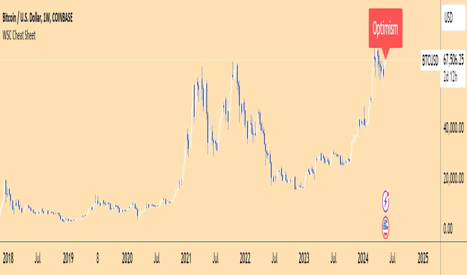
Wall Street Cheat Sheet IndicatorThe Wall Street Cheat Sheet Indicator is a unique tool designed to help traders identify the psychological stages of the market cycle based on the well-known Wall Street Cheat Sheet. This indicator integrates moving averages and RSI to dynamically label market stages, providing clear visual cues on the chart.
Key Features:
Dynamic Stage Identification: The indicator automatically detects and labels market stages such as Disbelief, Hope, Optimism, Belief, Thrill, Euphoria, Complacency, Anxiety, Denial, Panic, Capitulation, Anger, and Depression. These stages are derived from the emotional phases of market participants, helping traders anticipate market movements.
Technical Indicators: The script uses two key technical indicators:
200-day Simple Moving Average (SMA): Helps identify long-term market trends.
50-day Simple Moving Average (SMA): Aids in recognizing medium-term trends.
Relative Strength Index (RSI): Assesses the momentum and potential reversal points based on overbought and oversold conditions.
Clear Visual Labels: The current market stage is displayed directly on the chart, making it easy to spot trends and potential turning points.
Usefulness:
This indicator is not just a simple mashup of existing tools. It uniquely combines the concept of market psychology with practical technical analysis tools (moving averages and RSI). By labeling the psychological stages of the market cycle, it provides traders with a deeper understanding of market sentiment and potential future movements.
How It Works:
Disbelief: Detected when the price is below the 200-day SMA and RSI is in the oversold territory, indicating a potential bottom.
Hope: Triggered when the price crosses above the 50-day SMA, with RSI starting to rise but still below 50, suggesting an early uptrend.
Optimism: Occurs when the price is above the 50-day SMA and RSI is between 50 and 70, indicating a strengthening trend.
Belief: When the price is well above the 50-day SMA and RSI is between 70 and 80, showing strong bullish momentum.
Thrill and Euphoria: Identified when RSI exceeds 80, indicating overbought conditions and potential for a peak.
Complacency to Depression: These stages are identified based on price corrections and drops relative to moving averages and declining RSI values.
Best Practices:
High-Time Frame Focus: This indicator works best on high-time frame charts, specifically the 1-week Bitcoin (BTCUSDT) chart. The longer time frame provides a clearer picture of the overall market cycle and reduces noise.
Trend Confirmation: Use in conjunction with other technical analysis tools such as trendlines, Fibonacci retracement levels, and support/resistance zones for more robust trading strategies.
How to Use:
Add the Indicator: Apply the Wall Street Cheat Sheet Indicator to your TradingView chart.
Analyze Market Stages: Observe the dynamic labels indicating the current stage of the market cycle.
Make Informed Decisions: Use the insights from the indicator to time your entries and exits, aligning your trades with the market sentiment.
This indicator is a valuable tool for traders looking to understand market psychology and make informed trading decisions based on the stages of the market cycle.