REAL STRATEGY : Dow_Factor_MFI/RSI_DVOG_StrategyI'm actually one of those who think it's more important to extract clues from indicators than strategy, but I wanted to test the data about the probability and dow factor I've shared for a long time.
Usually, Bitcoin is used as an eye stain for strategy success, since the graph has increased significantly from the beginning.
To prevent this, I used a commission and in the last lines of document I shared Bitmex's Bitcoin and Ethereum 1W test results.
I don't think there's a factor to repaint. ( Warn me if u see or observe )
I considered Bitcoin because I found working with liquid parities much more realistic.
Ethereum and Bitmex have been featured as a spot and may soon find a place at the CME , so I've evaluated the Ethereum .
But since the Ethereum Bitmex was also spot new, I deleted results that were less than 10 closed trades.
Since the Dow Theory also looks at the harmony in the indices, just try it in the Cryptocurrency market.
Use as indicator in other markets. Support with channels, trend lines with big periods and other supportive indicators.
And my personal suggestion : Use this script and indicator TF : 4H and above.
Specifications :
Commission. ( % 0.125 )
Switchable Methods ( Relative Strength Index / Money Flow Index )
Alarms. (Buy / Sell )
Position closure when horizontal market rates weighs.
Progressive gradual buy/sell alarms.
Clean code layout that will not cause repaint. (Caution : source = close )
Switchable barcolor option (I / 0 )
*****Test results :*****
drive.google.com
Summary:
It was a realistic test.
It has achieved great success in some markets, but as I mentioned earlier, use it only to gain insight into the price movements of cryptos.
Use as indicator in other markets.
This code is open source under the MIT license. If you have any improvements or corrections to suggest, please send me a pull request via the github repository : github.com
Stay tuned ! Noldo.
Wyszukaj w skryptach "crypto"
SHIT35 Alt Index (ROC or Volume) [LucF]SHIT35 is an index of 35 Binance alt/BTC pairs. It provides traders with a more reliable read of BTC pairs price movement than the often uncorrelated USD market cap standard.
Because it must read data coming from 35 markets, SHIT35 is painfully slow and should be kept hidden most of the time. Its features will hopefully seduce traders in using it nonetheless for market analysis.
Features
The Index can be calculated using 4 different modes:
1. Total of instant rate of change for all 35 markets ,
2. Cumulative total of ROCs,
3. Average of ROCs,
4. Plus/Minus volume (an aggregate OBV, if you will).
Select only one of the methods at a time to prevent confusion between modes.
An option allows showing the correlation between the Index as it is configured, and another instrument (CRYPTOCAP:TOTAL2 by default).
Markers can be used to identify abnormal movements in the Index. They are generated using Index exits from Bollinger bands.
The chart shows the Index with, from top to bottom, the default mode with BTC pairs, with USDT pairs, then mode 2 and 4 for BTC pairs.
Index Components
The Index is not weighed. The 35 instruments composing the index all have equivalents in the USDT quote currency on Binance, so you can easily change to those pairs using the Settings. Choosing another exchange or quote currency will require modifications to the list of instruments in the indicator’s code, since if one of the markets cannot be found, the indicator will not work. If the instrument exists but has no history for some bars, zero values will be used for them.
Watchlists
I have created a watchlist for the 35 markets in each of the BTC and USDT quote currencies. To import the watchlists, save the text you’ll find at these links in a file named the way you want your watchlist to be named and import them using the “Import Watchlist…” function.
BTC Watchlist: pastebin.com
USDT Watchlist: pastebin.com
Alerts
You can define alerts on any combination of markers you configure. After defining the markers you want the alert to trigger on, make sure you are on the interval you want the alert to be monitoring at, then create the alert, select the indicator, use the default alert condition and choose your triggering window (usually “Once Per Bar Close”). Once the alert is created, you can change the indicator's inputs with no effect on the alert.
MACD + Stochastic + RSI StrategyMy strategy uses a combination of three indicators MACD Stochastic RSI.
The Idea is to buy when (MACD > Signal and RSI > 50 and Stochastic > 50) occures at the same time
This strategy works well on stocks and cryptos especially during market breaking up after consolidation
The best results are on Daily charts, so its NOT a scalping strategy. But it can work also on 1H charts.
The strategy does not have any stops and profit targets, so we can take all the market can give us at the moment.
The exit point only when MACD goes under Signal
Its Preformance is quite stable.
So, use it, trade it.
If it will help you to imprive your trading results, please donate me
BTC: 12kd1F8buWisUBdq27BBwRkUvzW7Ey3og5

Bitfinex Margin VolumesQuick view on longs/short margin positions on Bitfinex for current Crypto Symbol.

Arbitrage Matrix [LuxAlgo]The Arbitrage Matrix is a follow-up to our Arbitrage Detector that compares the spreads in price and volume between all the major crypto exchanges and forex brokers for any given asset.
It provides traders with a comprehensive view of the entire marketplace, revealing hidden relationships among different exchanges for the same asset and offering easy, visual comparisons.
🔶 USAGE
Arbitrage is the practice of taking advantage of price differences for the same asset across different markets. Arbitrage traders look for these discrepancies to profit from buying where it’s cheaper and selling where it’s more expensive to capture the spread.
For begginers this tool is a clear snapshot of how different markets value the same asset, making global price dynamics easy to grasp.
For advanced traders it is a powerful scanner for arbitrage setups, helping you identify where the biggest opportunities lie in real time.
Arbitrage opportunities are often short‑lived, but they can be highly profitable. By showing you where spreads exist, this tool helps traders:
Understand market inefficiencies
Avoid trading at unfavorable prices
Identify potential profit opportunities across exchanges
By default, the tool searches all the enabled sources for the asset in the chart. It uses crypto exchanges as sources for crypto assets and forex brokers for all other assets.
The data is displayed on a dashboard, which is the tool's only visual element.
Traders can enable or disable any exchange or broker from the settings panel. All are enabled by default.
🔹 Displayable Data
Traders can choose from four types of data to display: last price, last volume, average price, and average volume.
Note that price and volume data may not be available for all assets at all sources, and sources without data will not be displayed.
As the image shows, each chart displays a different type of data for the same asset. In this case, the asset is ETHUSDT.
🔹 Reading the Matrix
Traders must read the data in a row-by-column format, as shown in the following example.
Assume that we are charting BTCUSDT Daily. In the row, we have Exchange A; in the column, we have Exchange B. The data is the average price, and the value is 100. The default length for the average is 20.
It reads like this: The average BTCUSDT price over the last 20 days is $100 higher on Exchange A than on Exchange B.
If the value were -100, it would mean that the average price is $100 lower in Exchange A than in Exchange B.
🔹 Matrix Style
Traders can change the colors and disable the background gradient, which is enabled by default.
They can also fine-tune the location and dashboard size from the settings panel.
🔶 SETTINGS
Sources: Choose between crypto exchanges, forex brokers, or automatic selection based on the asset in the chart.
Average Length: Select the length for the price and volume averages.
Crypto Exchanges: Enable or disable any available exchange.
Forex Brokers: Enable or disable any available broker.
🔹 Dashboard
Data: Select the data to display.
Position: Select the dashboard location.
Size: Select the dashboard size.
🔹 Style
Bullish: Select bullish color.
Bearish: Select bearish color.
Background Gradient: Enable background gradient color.

Filtered Percentile OscillatorThe Filtered Percentile Oscillator is a new trend following tool that uses trend strength for filtering. Noisy at times - but do not underrate it, this tool has great potential. :)
Benefits:
- Very high speed
- Adaptive behaviour filtering excess noise
- High performance on CRYPTO:SUIUSD
- Plotting for better visualization
The Idea
Get a simple indicator that is combined with trend strength for filtering. The best for this was the Percentile. I used it on the classic source to keep it simple, but if anybody wants feel free to change it with/without ChatGPT.
How it works:
Calculate the Percentile of the source.
Calculate the ADX & the Percentile of ADX.
Then we have two filter conditions:
If ADX Percentile+ Absolute Percentile of source > Sum Filter Treshhold is not true, both the Long & Short conditions are automaticly false.
If ADX Percentile > Filter Treshhold it will make the treshholds for the Percentile lower, while if it is below the filter treshhold, it will put the treshholds higher to filter excess noise further.
Enjoy Gs!

Extreme HMA ATR BandsThe Extreme HMA ATR Bands are an advanced trend following tool focused on high speed & high smoothness over multiple assets.
Benefits:
- High Speed
- Smooth trend catching with low amount of false signals
- Great performance on CRYPTO:SOLUSD , BINANCE:SUIUSD , CRYPTO:CROUSD
- Plotting allowing easier visualization of the performance
The Idea
The idea is to create bands that "weight" data into the extreme points. These extreme points are to be taken from HMA to provide a smoother result. Averaging the extreme points we get the "middle" to which we can simply apply the ATR to get high accuracy signals.
How it works:
It calculates HMA over a short period to get a smooth source.
Then calculates the Highest & Lowest point of the HMA and their Lowest & Highest points.
By finding the Lowest Lowest Highest HMA and Highest Highest Lowest HMA and averaging them, you get a middle ground between high responsivness & smoothness.
Enjoy Gs!

MEGA Sector Rotation CRYPTOCAP - 7 Narrativas 1 H### MEGA Sector Rotation CRYPTOCAP - 7 Narratives
**Description for publishing on TradingView:**
This advanced indicator lets you visualize in real time the **rotation of narratives** within the crypto market through 7 key sectors, normalized for perfect side-by-side comparison.
Each line represents the **historical relative strength** (min-max normalization over 5000 bars) of a specific narrative, based on TradingView's official aggregated market caps (CRYPTOCAP) and custom sums. The lines oscillate between 0 and 100, with clear crossovers signaling when a sector is gaining or losing momentum relative to the others.
**The 7 narratives included:**
1. **Layer1** (pink) – Aggregated market cap of major Layer 1 blockchains.
2. **Memecoins** (bright green) – Official MEME.C sector (PEPE, SHIB, WIF, BONK, etc.).
3. **AI** (orange) – Artificial Intelligence and Big Data narrative.
4. **Exchanges** (purple) – Exchange tokens (centralized and decentralized).
5. **DeFi Total** (cyan) – Full aggregated market cap of the DeFi ecosystem.
6. **RWA Custom** (brown) – Custom sum of Real World Assets: ONDO + LINK + CFG + SYRUP.
7. **Privacy** (dark orange) – Custom sum of privacy coins: XMR + ZEC + DASH.
**Quick interpretation:**
- Line >80 and rising → Narrative is **HOT** (strong bullish rotation).
- Line <20 → Narrative is **COLD** (losing strength).
- Bullish crossovers → Money rotating into that sector.
- Transparent fills between lines to highlight leadership zones.
**Features:**
- Optimized for **lower timeframes** (5m, 15m, 1H, 4H) → ideal for day trading and scalping narratives.
- Works on any TF thanks to 5-minute resolution data.
- Thick lines, vibrant colors, and horizontal references (20/50/80) for instant reading.
Perfect for spotting early which narrative is attracting capital flows and anticipating sector moves in the crypto market.
Add this indicator and trade rotations like a pro!
#crypto #sectorrotation #narratives #altcoins #tradingview

MEGA Sector Rotation CRYPTOCAP - 7 Narrativas 5m### MEGA Sector Rotation CRYPTOCAP - 7 Narratives
**Description for publishing on TradingView:**
This advanced indicator lets you visualize in real time the **rotation of narratives** within the crypto market through 7 key sectors, normalized for perfect side-by-side comparison.
Each line represents the **historical relative strength** (min-max normalization over 5000 bars) of a specific narrative, based on TradingView's official aggregated market caps (CRYPTOCAP) and custom sums. The lines oscillate between 0 and 100, with clear crossovers signaling when a sector is gaining or losing momentum relative to the others.
**The 7 narratives included:**
1. **Layer1** (pink) – Aggregated market cap of major Layer 1 blockchains.
2. **Memecoins** (bright green) – Official MEME.C sector (PEPE, SHIB, WIF, BONK, etc.).
3. **AI** (orange) – Artificial Intelligence and Big Data narrative.
4. **Exchanges** (purple) – Exchange tokens (centralized and decentralized).
5. **DeFi Total** (cyan) – Full aggregated market cap of the DeFi ecosystem.
6. **RWA Custom** (brown) – Custom sum of Real World Assets: ONDO + LINK + CFG + SYRUP.
7. **Privacy** (dark orange) – Custom sum of privacy coins: XMR + ZEC + DASH.
**Quick interpretation:**
- Line >80 and rising → Narrative is **HOT** (strong bullish rotation).
- Line <20 → Narrative is **COLD** (losing strength).
- Bullish crossovers → Money rotating into that sector.
- Transparent fills between lines to highlight leadership zones.
**Features:**
- Optimized for **lower timeframes** (5m, 15m, 1H, 4H) → ideal for day trading and scalping narratives.
- Works on any TF thanks to 5-minute resolution data.
- Thick lines, vibrant colors, and horizontal references (20/50/80) for instant reading.
Perfect for spotting early which narrative is attracting capital flows and anticipating sector moves in the crypto market.
Add this indicator and trade rotations like a pro!
#crypto #sectorrotation #narratives #altcoins #tradingview

Stock School IRL & ERLThis indicator is designed to help traders clearly identify liquidity levels on the chart using IRL (Internal Range Liquidity) and ERL (External Range Liquidity).
Liquidity is where the market is attracted.
Price does not move randomly — it moves from one liquidity pool to another.
With this indicator, you can:
• Visually mark IRL (internal liquidity resting inside the range)
• Identify ERL (external liquidity above highs & below lows)
• Understand where Smart Money targets stops
• Anticipate liquidity sweeps, fake breakouts, and reversals
• Improve entries, exits, and trade patience
This tool helps you stop guessing and start reading market intent.
Best used with:
Price Action
Market Structure
Smart Money Concepts (SMC)
Works across:
Stocks • Indices • Forex • Crypto
⚠️ This indicator does not give buy/sell signals.
It provides context, so you trade with logic, not emotions.
If you understand liquidity,
you understand where the market is going next.

Rachev Regime AnalyzerRachev Regime Analyzer ~ GForge
What It Does
Measures the ratio of extreme gains to extreme losses to identify whether markets favor bulls or bears. When your best moves are bigger than your worst moves, conditions are bullish. When the opposite is true, conditions are bearish.
Simple Interpretation:
Ratio > 1.2 → Bullish regime (tail gains exceed tail losses)
Ratio < 0.8 → Bearish regime (tail losses exceed tail gains)
Between → Neutral/transitional
Key Features
Two Modes:
Single Asset: Analyze current chart
Multi-Asset: Aggregate regime across 5 assets with custom weights (great for gauging overall crypto/market conditions)
Customizable:
Lookback period (20-200 bars)
Tail percentile (what counts as "extreme")
Bullish/bearish thresholds
6 color schemes
Optional MA smoothing
Visual Signals:
Buy/sell markers at threshold crosses
Background regime coloring
Info table with current values and confidence score
Configurable alerts
How to Use
Choose lookback period based on your timeframe (40-60 bars is a good start)
Watch for threshold crosses - these mark regime changes
Check confidence score - higher = more reliable
Use multi-asset mode to see if entire market is shifting (not just one coin)
Best combined with: Trend indicators, support/resistance, volume analysis
Parameters
Lookback: More bars = smoother, less responsive
Alpha (0.10): Defines extreme events - lower = more extreme
Thresholds: Adjust based on asset volatility
Return Type: Log returns recommended for most assets
What Makes It Useful
Unlike simple volatility measures, this shows asymmetry - whether extreme moves favor upside or downside. A ratio of 1.5 means your extreme gains are 50% larger than extreme losses - that's actionable information about risk-reward dynamics.
Multi-asset aggregation is particularly powerful for crypto traders wanting to gauge if BTC, ETH, SOL, etc. are all showing similar regime characteristics.
Disclaimer
Educational tool only. Not financial advice. Use proper risk management. No indicator works in isolation - always consider broader market context.
Developed by GForge
Comments and feedback welcome! 👍

ETH Dynamic Risk Strategy# ETH Dynamic Risk Strategy - Publication Description
## Overview
The ETH Dynamic Risk Strategy is a systematic approach to accumulating Ethereum during bear markets and distributing during bull markets. It combines multiple risk indicators into a single composite metric (0-1 scale) that identifies optimal buying and selling zones based on market conditions.
## Key Features
• **Multi-Component Risk Metric**: Combines 4 weighted indicators to assess market conditions
• **Tiered Buy/Sell System**: 3 levels of buy signals (L1, L2, L3) and 3 levels of sell signals based on risk thresholds
• **Configurable Filters**: Optional buy filters to reduce signal frequency by 30-50%
• **Visual Risk Zones**: Color-coded risk metric plot with clear threshold lines
• **Comprehensive Dashboard**: Real-time statistics including position size, P/L, and component scores
## How It Works
### Risk Components (Configurable Weights)
1. **Log Return from ATH** (Default: 35%)
- Tracks drawdown from all-time high over lookback period
- Deep drawdowns (-70% to -90%) = low risk / buying opportunity
- Near ATH (0% to -20%) = high risk / selling opportunity
2. **ETH/BTC Ratio** (Default: 25%)
- Measures ETH strength relative to Bitcoin
- Below historical average = ETH undervalued = low risk
- Above historical average = ETH overvalued = high risk
3. **Volatility Regime** (Default: 20%)
- Compares current volatility to long-term average
- Compressed volatility at lows = opportunity
- Expanded volatility at highs = danger
4. **Trend Strength** (Default: 20%)
- Uses multiple EMA alignment and slope analysis
- Strong downtrends = low risk scores
- Strong uptrends = high risk scores
### Trading Logic
**Buy Signals:**
- L1: Risk ≤ 0.30 → Buy $100 (default)
- L2: Risk ≤ 0.20 → Buy $250 total
- L3: Risk ≤ 0.10 → Buy $450 total
**Sell Signals (Sequential):**
- L1: Risk ≥ 0.75 → Sell 25% of position
- L2: Risk ≥ 0.85 → Sell 35% of remaining
- L3: Risk ≥ 0.95 → Sell 40% of remaining
**Buy Filters (Optional):**
- Minimum days between buys (prevents clustering)
- Minimum risk drop required (ensures falling risk)
- Toggle on/off to compare performance
## Settings Guide
### Risk Components
Toggle individual components on/off and adjust their weights. Total weight is automatically normalized. Experiment with different combinations to match your market view.
### Advanced Settings
- ATH Lookback: How far back to look for all-time highs (500-2000 recommended)
- Volatility Period: Window for volatility calculations (40-100 recommended)
- ETH/BTC MA Period: Moving average for ratio comparison (100-300 recommended)
- Trend Period: Base period for trend calculations (50-150 recommended)
### Trading Thresholds
Customize buy/sell trigger points and position sizes. Lower buy thresholds = more aggressive accumulation. Higher sell thresholds = holding longer into bull markets.
### Buy Filters
- Enable/disable filtering system
- Min Days Between Buys: Spacing between purchases (1-3 recommended)
- Min Risk Drop: How much risk must fall (-0.001 to -0.01 range)
## Best Practices
• **Timeframe**: Works best on daily (1D) and 3-day (3D) charts
• **Initial Capital**: Set based on your DCA budget (default $10,000)
• **Backtest First**: Test different parameter combinations on historical data
• **Position Sizing**: Adjust buy amounts to match your risk tolerance
• **Monitor Filters**: Check "Filtered Buys" stat to ensure filter isn't too strict
## Use Cases
- Long-term ETH accumulation strategy
- Systematic DCA with market-adaptive buying
- Risk-based portfolio rebalancing
- Educational tool for understanding crypto market cycles
## Disclaimer
This strategy is for educational purposes only. Past performance does not guarantee future results. Cryptocurrency trading involves substantial risk. The strategy uses historical price action and technical indicators which may not predict future movements. Always do your own research and never invest more than you can afford to lose.
## Credits
Strategy concept and development by nakphanan with assistance from Claude AI (Anthropic). Built using Pine Script v5....Mostly from Claude AI!!!
## Version History
v7.0 - Initial release with 4-component risk metric, tiered trading system, and optional buy filters

Multiple Time Frame Stoch-RSIThis indicator is designed to show users the values for default stochastic RSI and default RSI settings across multiple time frames.
I have made many bad trades focusing too closely on one particular time frame and indicators that suggest the price will move one way, to be superseded by a higher timeframe pushing price in another direction.
The timeframes are customisable so you can select your own timeframes, but the default timeframes chosen here are part of the BareNaked Crypto or Naked Nation strategy, looking at timeframes in multiples of 3 for lower timeframes.
The idea in its simplest form is that when timeframes like the 3/6/9m are all over sold or over bought (coloured red or green) then it could be a suitable time to place an order. Or at least be more favourable for your trade.
This indicator as with all indicators is designed as a tool to add to whatever arsenal of strategy or tools you are already using and does not constitute financial advice, just be cause 3/6/9m is in red or green does not guarantee that the trade will go your way.
The orange on the timeframes are generally designed to show users where price can reverse so for example if the stochastic 3m is at 10 and in green, but the 9m is at 65 in orange, it could be that a push up is not finished and the 9m drop from oversold to 65 could be reversed due to a low 3m stochastic number and then 9m goes from 65 back up to 100, and vice versa.
The arrows for direction also allow you to quickly deduce the direction of the stochastic RSI, ^ up, V down, and stable -. this should allow you to see if the stochastic has been rising and is beginning to turn around or not.

Arbitrage Detector [LuxAlgo]The Arbitrage Detector unveils hidden spreads in the crypto and forex markets. It compares the same asset on the main crypto exchanges and forex brokers and displays both prices and volumes on a dashboard, as well as the maximum spread detected on a histogram divided by four user-selected percentiles. This allows traders to detect unusual, high, typical, or low spreads.
This highly customizable tool features automatic source selection (crypto or forex) based on the asset in the chart, as well as current and historical spread detection. It also features a dashboard with sortable columns and a historical histogram with percentiles and different smoothing options.
🔶 USAGE
Arbitrage is the practice of taking advantage of price differences for the same asset across different markets. Arbitrage traders look for these discrepancies to profit from buying where it’s cheaper and selling where it’s more expensive to capture the spread.
For begginers this tool is an easy way to understand how prices can vary between markets, helping you avoid trading at a disadvantage.
For advanced traders it is a fast tool to spot arbitrage opportunities or inefficiencies that can be exploited for profit.
Arbitrage opportunities are often short‑lived, but they can be highly profitable. By showing you where spreads exist, this tool helps traders:
Understand market inefficiencies
Avoid trading at unfavorable prices
Identify potential profit opportunities across exchanges
As we can see in the image, the tool consists of two main graphics: a dashboard on the main chart and a histogram in the pane below.
Both are useful for understanding the behavior of the same asset on different crypto exchanges or forex brokers.
The tool's main goal is to detect and categorize spread activity across the major crypto and forex sources. The comparison uses data from up to 19 crypto exchanges and 13 forex brokers.
🔹 Forex or Crypto
The tool selects the appropriate sources (crypto exchanges or forex brokers) based on the asset in the chart. Traders can choose which one to use.
The image shows the prices and volumes for Bitcoin and the euro across the main sources, sorted by descending average price over the last 20 days.
🔹 Dashboard
The dashboard displays a list of all sources with four main columns: last price, average price, volume, and total volume.
All four columns can be sorted in ascending or descending order, or left unsorted. A background gradient color is displayed for the sorted column.
Price and volume delta information between the chart asset and each exchange can be enabled or disabled from the settings panel.
🔹 Histogram
The histogram is excellent for visualizing historical values and comparing them with the asset price.
In this case, we have the Euro/U.S. Dollar daily chart. As we can see, the unusual spread activity detected since 2016, with values at or above 98%, is usually a good indication of increased trader activity, which may result in a key price area where the market could turn around.
By default, the histogram has the gradient and smoothing auto features enabled.
The differences are visible in the chart above. On top is an adaptive moving average with higher values for unusual activity. At the bottom is an exponential moving average with a length of 9.
The differences between the gradient and solid colors are evident. In the first case, the colors are in sync with the data values, becoming more yellow with higher values and more green with lower values. In the second case, the colors are solid and only distinguish data above or below the defined percentiles.
🔶 SETTINGS
Sources: Choose between crypto exchanges, forex brokers, or automatic selection based on the asset in the chart.
Average Length: Select the length for the price and volume averages.
🔹 Percentiles
Percentile Length: Select the length for the percentile calculation, or enable the use of the full dataset. Enabling this option may result in runtime errors due to exceeding the allotted resources.
Unusual % >: Select the unusual percentile.
High % >: Select the high percentile.
Typical % >: Select the typical percentile.
🔹 Dashboard
Dashboard: Enable or disable the dashboard.
Sorting: Select the sorting column and direction.
Position: Select the dashboard location.
Size: Select the dashboard size.
Price Delta: Show the price difference between each exchange and the asset on the chart.
Volume Delta: Show the volume difference between each exchange and the asset on the chart.
🔹 Style
Unusual: Enable the plot of the unusual percentile and select its color.
High: Enable the plot of the high percentile and select its color.
Typical: Enable the plot of the typical percentile and select its color.
Low: Select the color for the low percentile.
Percentiles Auto Color: Enable auto color for all plotted percentiles.
Histogram Gradient: Enable the gradient color for the histogram.
Histogram Smoothing: Select the length of the EMA smoothing for the histogram or enable the Auto feature. The Auto feature uses an adaptive moving average with the data percent rank as the efficiency ratio.

Mutanabby_AI | ONEUSDT_MR1
ONEUSDT Mean-Reversion Strategy | 74.68% Win Rate | 417% Net Profit
This is a long-only mean-reversion strategy designed specifically for ONEUSDT on the 1-hour timeframe. The core logic identifies oversold conditions following sharp declines and enters positions when selling pressure exhausts, capturing the subsequent recovery bounce.
Backtested Period: June 2019 – December 2025 (~6 years)
Performance Summary
| Metric | Value |
|--------|-------|
| Net Profit | +417.68% |
| Win Rate | 74.68% |
| Profit Factor | 4.019 |
| Total Trades | 237 |
| Sharpe Ratio | 0.364 |
| Sortino Ratio | 1.917 |
| Max Drawdown | 51.08% |
| Avg Win | +3.14% |
| Avg Loss | -2.30% |
| Buy & Hold Return | -80.44% |
Strategy Logic :
Entry Conditions (Long Only):
The strategy seeks confluence of three conditions that identify exhausted selling:
1. Prior Move Filter:*The price change from 5 bars ago to 3 bars ago must be ≥ -7% (ensures we're not entering during freefall)
2. Current Move Filter: The price change over the last 2 bars must be ≤ 0% (confirms momentum is stalling or reversing)
3. Three-Bar Decline: The price change from 5 bars ago to 3 bars ago must be ≤ -5% (confirms a significant recent drop occurred)
When all three conditions align, the strategy identifies a potential reversal point where sellers are exhausted.
Exit Conditions:
- Primary Exit: Close above the previous bar's high while the open of the previous bar is at or below the close from 9 bars ago (profit-taking on strength)
- Trailing Stop: 11x ATR trailing stop that locks in profits as price rises
Risk Management
- Position Sizing:Fixed position based on account equity divided by entry price
- Trailing Stop:11× ATR (14-period) provides wide enough room for crypto volatility while protecting gains
- Pyramiding:Up to 4 orders allowed (can scale into winning positions)
- **Commission:** 0.1% per trade (realistic exchange fees included)
Important Disclaimers
⚠️ This is NOT financial advice.
- Past performance does not guarantee future results
- Backtest results may contain look-ahead bias or curve-fitting
- Real trading involves slippage, liquidity issues, and execution delays
- This strategy is optimized for ONEUSDT specifically — results may differ on other pairs
- Always test before risking real capital
Recommended Usage
- Timeframe:*1H (as designed)
- Pair: ONEUSDT (Binance)
- Account Size: Ensure sufficient capital to survive max drawdown
Source Code
Feedback Welcome
I'm sharing this strategy freely for educational purposes. Please:
- Drop a comment with your backtesting results any you analysis
- Share any modifications that improve performance
- Let me know if you spot any issues in the logic
Happy trading
As a quant trader, do you think this strategy will survive in live trading?
Yes or No? And why?
I want to hear from you guys

Volume Threshold Levels - Crypto LidyaVolume Threshold Levels – Crypto Lidya
Understanding volume behavior is one of the most effective ways to detect trend changes, manipulation candles, aggressive entries, and institutional activity.
Volume Threshold Levels (VTL) not only displays raw volume but also calculates dynamic volume thresholds (2x – 3x – 4x) based on the moving average, allowing you to identify statistically meaningful volume anomalies with precision.
📌 1. Volume Columns
The indicator plots each bar’s volume using traditional column-style visualization.
Green: Bullish candle
Red: Bearish candle
Gray: Neutral candle
This helps traders clearly understand the relationship between price and volume.
📌 2. Average Volume Area
VTL offers two types of moving averages for volume:
SMA (Simple Moving Average)
EMA (Exponential Moving Average)
The average volume is drawn as a soft yellow area across the chart.
This area acts as the baseline for normal volume levels.
📌 3. Dynamic Threshold Lines (2x / 3x / 4x)
The script calculates and displays multipliers of the average volume:
2x Average
3x Average
4x Average
These levels appear as bright yellow lines.
They are extremely useful for identifying breakouts, traps, and aggressive institutional entries.
📌 4. Volume Spike Detection (Alerts)
VTL identifies upward crossovers where volume breaks above key levels:
1x Volume Signal
2x Volume Signal
3x Volume Signal
4x Volume Signal
These can be used directly as TradingView alerts.
This allows you to automate detection of high-impact volume spikes.
📌 5. Use Cases
The indicator performs exceptionally well in:
Breakout confirmation
Liquidity sweep analysis
Detecting manipulation candles
Combining with OB, FVG, or other SMC structures
Scalping and low-timeframe aggressive volume interpretation
Algorithmic filters for volume-based strategies
📌 6. Summary
VTL delivers:
✔ Dynamic average volume baseline
✔ Clear 2x–3x–4x volume thresholds
✔ Accurate detection of upside volume explosions
✔ A strong tool for traders who rely on volume confirmation
Completely open-source and ready to be extended.

Dumb Money Flow - Retail Panic & FOMO# Dumb Money Flow (DMF) - Retail Panic & FOMO
## 🌊 Overview
**Dumb Money Flow (DMF)** is a powerful **contrarian indicator** designed to track the emotional state of the retail "herd." It identifies moments of extreme **Panic** (irrational selling) and **FOMO** (irrational buying) by analyzing on-chain data, volume anomalies, and price velocity.
In crypto markets, retail traders often buy the top (FOMO) and sell the bottom (Panic). This indicator helps you do the opposite: **Buy when the herd is fearful, and Sell when the herd is greedy.**
---
## 🧠 How It Works
The indicator combines multiple data points into a single **Sentiment Index** (0-100), normalized over a 90-day period to ensure it always uses the full range of the chart.
### 1. Panic Index (Bearish Sentiment)
Tracks signs of capitulation and fear. High values contribute to the **Panic Zone**.
* **Exchange Inflows:** Spikes in funds moving to exchanges (preparing to sell).
* **Volume Spikes:** High volume during price drops (panic selling).
* **Price Crash (ROC):** Rapid, emotional price drops over 3 days.
* **Volatility (ATR):** High market nervousness and instability.
### 2. FOMO Index (Bullish Sentiment)
Tracks signs of euphoria and greed. High values contribute to the **FOMO Zone**.
* **Exchange Outflows:** Funds moving to cold storage (HODLing/Greed).
* **Profitable Addresses:** When >90% of holders are in profit, tops often form.
* **Parabolic Rise:** Rapid, unsustainable price increases.
---
## 🎨 Visual Guide
The indicator uses a distinct color scheme to highlight extremes:
* **🟢 Dark Green Zone (> 80): Extreme FOMO**
* **Meaning:** The crowd is euphoric. Risk of a correction is high.
* **Action:** Consider taking profits or looking for short entries.
* **🔴 Dark Burgundy Zone (< 20): Extreme Panic**
* **Meaning:** The crowd is capitulating. Prices may be oversold.
* **Action:** Look for buying opportunities (catching the knife with confirmation).
* **🔵 Light Blue Line:**
* The smoothed moving average of the sentiment, helpful for seeing the trend direction.
---
## 🛠️ How to Use (Trading Strategies)
### 1. Contrarian Reversals (The Primary Strategy)
* **Buy Signal:** Wait for the line to drop deep into the **Burgundy Panic Zone (< 20)** and then start curling up. This indicates that the worst of the selling pressure is over.
* **Sell Signal:** Wait for the line to spike into the **Green FOMO Zone (> 80)** and then start curling down. This suggests buying exhaustion.
### 2. Divergences
* **Bullish Divergence:** Price makes a **Lower Low**, but the DMF Indicator makes a **Higher Low** (less panic on the second drop). This is a strong reversal signal.
* **Bearish Divergence:** Price makes a **Higher High**, but the DMF Indicator makes a **Lower High** (less FOMO/buying power on the second peak).
### 3. Trend Confirmation (Midline Cross)
* **Crossing 50 Up:** Sentiment is shifting from Fear to Greed (Bullish).
* **Crossing 50 Down:** Sentiment is shifting from Greed to Fear (Bearish).
---
## ⚙️ Settings
* **Data Source:** Defaults to `INTOTHEBLOCK` for on-chain data.
* **Crypto Asset:** Auto-detects BTC/ETH, but can be forced.
* **Normalization Period:** Default 90 days. Determines the "window" for defining what is considered "Extreme" relative to recent history.
* **Weights:** You can customize how much each factor (Volume, Inflows, Price) contributes to the index.
---
**Disclaimer:** This indicator is for educational purposes only. "Dumb Money" analysis is a probability tool, not a crystal ball. Always manage your risk.
**Indicator by:** @iCD_creator
**Version:** 1.0
**Pine Script™ Version:** 6
---
## Updates & Support
For questions, suggestions, or bug reports, please comment below or message the author.
**Like this indicator? Leave a 👍 and share your feedback!**

Smart Money Flow - Exchange & TVL Composite# Smart Money Flow - Exchange & TVL Composite Indicator
## Overview
The **Smart Money Flow (SMF)** indicator combines two powerful on-chain metrics - **Exchange Flows** and **Total Value Locked (TVL)** - to create a composite index that tracks institutional and "smart money" movement in the cryptocurrency market. This indicator helps traders identify accumulation and distribution phases by analyzing where capital is flowing.
## What It Does
This indicator normalizes and combines:
- **Exchange Net Flow** (from IntoTheBlock): Tracks Bitcoin/Ethereum movement to and from exchanges
- **Total Value Locked** (from DefiLlama): Measures capital locked in DeFi protocols
The composite index is displayed on a 0-100 scale with clear zones for overbought/oversold conditions.
## Core Concept
### Exchange Flows
- **Negative Flow (Outflows)** = Bullish Signal
- Coins moving OFF exchanges → Long-term holding/accumulation
- Indicates reduced selling pressure
- **Positive Flow (Inflows)** = Bearish Signal
- Coins moving TO exchanges → Preparation for selling
- Indicates potential distribution phase
### Total Value Locked (TVL)
- **Rising TVL** = Bullish Signal
- Capital flowing into DeFi protocols
- Increased ecosystem confidence
- **Falling TVL** = Bearish Signal
- Capital exiting DeFi protocols
- Decreased ecosystem confidence
### Combined Signals
**🟢 Strong Bullish (70-100):**
- Exchange outflows + Rising TVL
- Smart money accumulating and deploying capital
**🔴 Strong Bearish (0-30):**
- Exchange inflows + Falling TVL
- Smart money preparing to sell and exiting positions
**⚪ Neutral (40-60):**
- Mixed or balanced flows
## Key Features
### ✅ Auto-Detection
- Automatically detects chart symbol (BTC/ETH)
- Uses appropriate exchange flow data for each asset
### ✅ Weighted Composite
- Customizable weights for Exchange Flow and TVL components
- Default: 50/50 balance
### ✅ Normalized Scale
- 0-100 index scale
- Configurable lookback period for normalization (default: 90 days)
### ✅ Signal Zones
- **Overbought**: 70+ (Strong bullish pressure)
- **Oversold**: 30- (Strong bearish pressure)
- **Extreme**: 85+ / 15- (Very strong signals)
### ✅ Clean Interface
- Minimal visual clutter by default
- Only main index line and MA visible
- Optional elements can be enabled:
- Background color zones
- Divergence signals
- Trend change markers
- Info table with detailed metrics
### ✅ Divergence Detection
- Identifies when price diverges from smart money flows
- Potential reversal warning signals
### ✅ Alerts
- Extreme overbought/oversold conditions
- Trend changes (crossing 50 line)
- Bullish/bearish divergences
## How to Use
### 1. Trend Confirmation
- Index above 50 = Bullish trend
- Index below 50 = Bearish trend
- Use with price action for confirmation
### 2. Reversal Signals
- **Extreme readings** (>85 or <15) suggest potential reversal
- Look for divergences between price and indicator
### 3. Accumulation/Distribution
- **70+**: Accumulation phase - smart money buying/holding
- **30-**: Distribution phase - smart money selling
### 4. DeFi Health
- Monitor TVL component for DeFi ecosystem strength
- Combine with exchange flows for complete picture
## Settings
### Data Sources
- **Exchange Flow**: IntoTheBlock real-time data
- **TVL**: DefiLlama aggregated DeFi TVL
- **Manual Mode**: For testing or custom data
### Indicator Settings
- **Smoothing Period (MA)**: Default 14 periods
- **Normalization Lookback**: Default 90 days
- **Exchange Flow Weight**: Adjustable 0-100%
- **Overbought/Oversold Levels**: Customizable thresholds
### Visual Options
- Show/Hide Moving Average
- Show/Hide Zone Lines
- Show/Hide Background Colors
- Show/Hide Divergence Signals
- Show/Hide Trend Markers
- Show/Hide Info Table
## Data Requirements
⚠️ **Important Notes:**
- Uses **daily data** from IntoTheBlock and DefiLlama
- Works on any chart timeframe (data updates daily)
- Auto-switches between BTC and ETH based on chart
- All other crypto charts default to BTC exchange flow data
## Best Practices
1. **Use on Daily+ Timeframes**
- On-chain data is daily, most effective on D/W/M charts
2. **Combine with Price Action**
- Use as confirmation, not standalone signals
3. **Watch for Divergences**
- Price making new highs while indicator falling = warning
4. **Monitor Extreme Zones**
- Sustained readings >85 or <15 indicate strong conviction
5. **Context Matters**
- Consider broader market conditions and fundamentals
## Calculation
1. **Exchange Net Flow** = Inflows - Outflows (inverted for index)
2. **TVL Rate of Change** = % change over smoothing period
3. **Normalize** both metrics to 0-100 scale
4. **Composite Index** = (ExchangeFlow × Weight) + (TVL × Weight)
5. **Smooth** with moving average
## Disclaimer
This indicator uses on-chain data for analysis. While valuable, it should not be used as the sole basis for trading decisions. Always combine with other technical analysis tools, fundamental analysis, and proper risk management.
On-chain data reflects blockchain activity but may lag price action. Use this indicator as part of a comprehensive trading strategy.
---
## Credits
**Data Sources:**
- IntoTheBlock: Exchange flow metrics
- DefiLlama: Total Value Locked data
**Indicator by:** @iCD_creator
**Version:** 1.0
**Pine Script™ Version:** 6
---
## Updates & Support
For questions, suggestions, or bug reports, please comment below or message the author.
**Like this indicator? Leave a 👍 and share your feedback!**

Ichimoku Cloud (Auto Crypto/Non-Crypto settings)Save the hassle of switching back and forth between crypto and non-crypto settings by using the `syminfo.type` value under the hood.
If it's crypto it uses the 20, 60, 120, 30 settings, otherwise it uses 18, 52, 104, 26 defaults.
You can always override it using the Market Mode input in the settings.
The settings type is displayed in the top right of the chart as either "Crypto Cloud" or "Legacy Cloud" so you know which settings are being applied.

[CASH] Crypto And Stocks Helper (MultiPack w. Alerts)ATTENTION! I'm not a good scripter. I have just learned a little basics for this project, stolen code from other public scripts and modified it, and gotten help from AI LLM's.
If you want recognition from stolen code please tell me to give you the credit you deserve.
The script is not completely finished yet and contains alot of errors but my friends and family wants access so I made it public.
_________________________________________________________________________________
CASH has multiple indicators (a true all-in-one multipack), guides and alerts to help you make better trades/investments. It has:
- Bitcoin Bull Market Support Band
- Dollar Volume
- 5 SMA and 5 EMA
- HODL Trend (a.k.a SuperTrend) indicator
- RSI, Volume and Divergence indicators w. alerts
More to come as well, like Backburner and a POC line from Volume Profile.
Everything is fully customizable, appearance and off/on etc.
More information and explainations along with my guides you can find in settings under "Input" and "Style".

Hidden Zone Detector AI - Crypto/Forex/StockHidden Zone Detector AI - Crypto Forex Stock
Hidden Zone Detector AI is a professional TradingView indicator designed to find hidden supply and demand zones across markets — crypto, forex and stocks — and surface high-probability areas earlier than classical pivot-only methods. It combines price structure analysis, volatility/ATR sizing, volume profiling and multi-mode AI heuristics (Fast / Balanced / Accurate) to generate prediction zones, highlight tested areas, and visually mark zone breakouts. Built with practical trader workflow in mind: configurable anti-repaint options, adaptable Light/Dark UI, clear labels, and candle-coloring for immediate visual context.
How it works
• Detects hidden zones by scanning pivot formations and finding internal “hidden” bars that represent real institutional activity (not just visible swing points).
• Scores zones by size (ATR-relative), volume, and touch characteristics to produce a strength percentage (Weak/Medium/Strong).
• AI heuristics aggregate price, momentum, moving averages, RSI/MACD signals and volume patterns to propose prediction zones — adjustable for speed vs. accuracy.
• Zones are drawn as persistent boxes with optional midlines, labels, and tailored styling when broken or tested.
Main advantages
• Early edge: finds hidden zones that often act before obvious pivots.
• Actionable visuals: labeled zones, color-coded candles, and breakout styling speed decision-making.
• Flexible AI modes: choose Fast for responsiveness, Balanced for day-to-day use, or Accurate for stricter signals.
• Anti-repaint controls: require confirmed bars for predictions to improve signal reliability.
• Multi-market ready: tuned for crypto, forex and stock chart behavior.
• Light/Dark friendly: UI color handling ensures labels remain readable on any chart background.
• Open & reusable: released under Mozilla Public License 2.0 (MPL-2.0) — use and adapt freely with attribution.
Best practices & tips
• Start with Balanced mode and sensitivity ~5; increase sensitivity for earlier but noisier predictions.
• Use prediction confirmation (Require AI Prediction Confirmation) for lower repaint risk.
• Combine zone reads with higher-timeframe context and orderflow/volume tools for stronger entries.
• Adjust max active zones and opacity to keep charts clean on lower timeframes.
License & author
Mozilla Public License 2.0 (MPL-2.0).
Author: a_jabbaroff — created with care for the TradingView community and fellow traders.

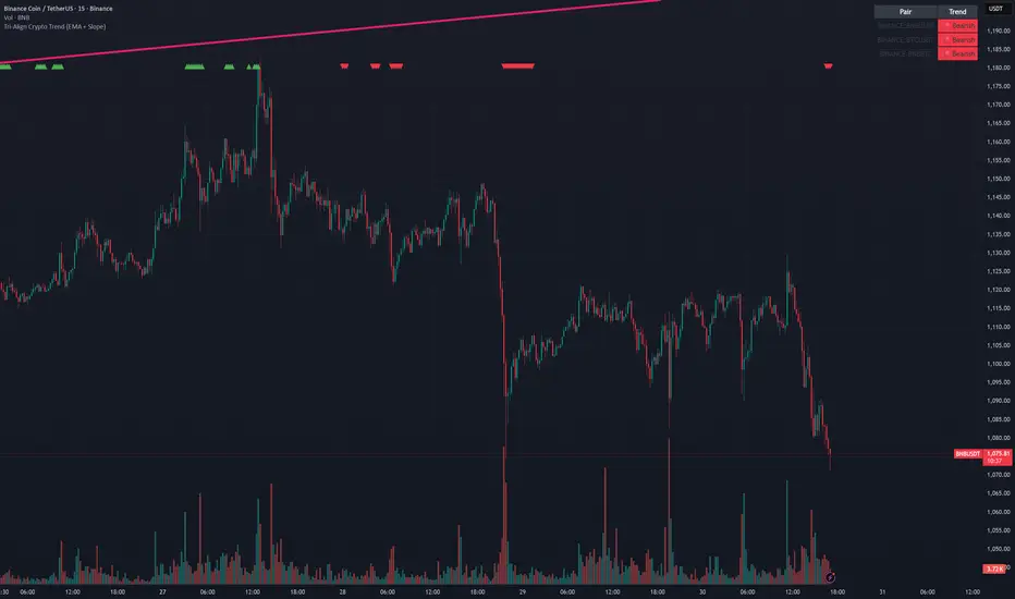
Tri-Align Crypto Trend (EMA + Slope)**Tri-Align Crypto Trend (EMA + Slope)**
Quickly see whether your coin is trending *with* Bitcoin. The indicator evaluates three pairs—**COIN/USDT**, **BTC/USDT**, and **COIN/BTC**—using a fast/slow EMA crossover plus the fast EMA’s slope. Each pair is tagged **Bullish / Bearish / Neutral** in a compact, color-coded table. Alerts fire when **all three** trends align (all bullish or all bearish).
**How to use**
1. Add the indicator to any crypto chart.
2. Set the three symbols (defaults: BNB/USDT, BTC/USDT, BNB/BTC) and optionally choose a signal timeframe.
3. Tune **Fast EMA**, **Slow EMA**, **Slope Lookback**, and **Min |Slope| %** to filter noise and require stronger momentum.
4. Create alerts: *Add alert →* choose the indicator and select **All Three Bullish**, **All Three Bearish**, or **All Three Aligned**.
**Logic**
* Bullish: `EMA_fast > EMA_slow` **and** fast EMA slope ≥ threshold
* Bearish: `EMA_fast < EMA_slow` **and** fast EMA slope ≤ −threshold
* Otherwise: Neutral
Tip: The **COIN/BTC** row reflects relative strength vs BTC—use it to avoid chasing coins that lag the benchmark. (For educational purposes; not financial advice.)