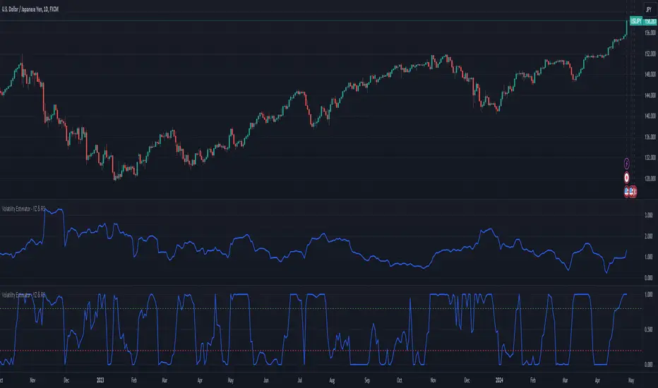
Historical Volatility MOEXIndicator of historical volatility.
The indicator is optimized for hourly bars (1h) and displays - red line - 1 day, yellow line - 3 day, green line - 5 day historical volatility .
The indicator is intended for use on futures of the Moscow Exchange MOEX
White lines - confidence interval HV (normal distribution) for a given sigma and days
Parameters
WindowInput - the number of bars calculating the HV red line
WindowInput2 - number of bars calculating the HV yellow line
WindowInput3 - the number of bars calculating the HV green line
SigmaMultiplicatorInput - set the sigma value for calculating the HV confidence interval
Exp_Day - set the number of days to calculate the confidence interval HV
Индикатор исторической волатильности.
Индикатор оптимизирован под часовые бары и отображает - красная линия - 1 дневная, желтая линия - 3 дневная, зеленая линия - 5 дневная историческая волатильность.
The indicator is intended for use on futures of the Moscow Exchange MOEX
Белые линии - доверительный интервал HV (нормальное распределение) при заданной сигма и дней
Параметры
WindowInput - количество баров расчета HV красная линия
WindowInput2 - количество баров расчета HV желтая линия
WindowInput3 - количество баров расчета HV зеленая линия
SigmaMultiplicatorInput - задаем значение сигма для расчета доверительного интервала HV
Exp_Day - задаем количестве дней для расчета доверительного интервала HV
Use the link below to obtain access to this indicator
Wyszukaj w skryptach "Volatility"

Historical Volatility CMEIndicator of historical volatility.
The indicator is optimized for hourly bars (1h) and displays - red line - 1 day, yellow line - 3 day, green line - 5 day historical volatility .
The indicator is intended for use on futures of the CME NYMEX
White lines - confidence interval HV (normal distribution) for a given sigma and days
Parameters
WindowInput - the number of bars calculating the HV red line
WindowInput2 - number of bars calculating the HV yellow line
WindowInput3 - the number of bars calculating the HV green line
SigmaMultiplicatorInput - set the sigma value for calculating the HV confidence interval
Exp_Day - set the number of days to calculate the confidence interval HV
Индикатор исторической волатильности.
Индикатор оптимизирован под часовые бары и отображает - красная линия - 1 дневная, желтая линия - 3 дневная, зеленая линия - 5 дневная историческая волатильность.
Индикатор предназначен для использования на фьючерсах бирж CME NYMEX
Белые линии - доверительный интервал HV (нормальное распределение) при заданной сигма и дней
Параметры
WindowInput - количество баров расчета HV красная линия
WindowInput2 - количество баров расчета HV желтая линия
WindowInput3 - количество баров расчета HV зеленая линия
SigmaMultiplicatorInput - задаем значение сигма для расчета доверительного интервала HV
Exp_Day - задаем количестве дней для расчета доверительного интервала HV
Use the link below to obtain access to this indicator

Historical Volatility US StoksIndicator of historical volatility.
The indicator is optimized for hourly bars (1h) and displays - red line - 1 day, yellow line - 3 day, green line - 5 day historical volatility .
The indicator is intended for use on U.S. Stocks
White lines - confidence interval HV (normal distribution) for a given sigma and days
Parameters
WindowInput - the number of bars calculating the HV red line
WindowInput2 - number of bars calculating the HV yellow line
WindowInput3 - the number of bars calculating the HV green line
SigmaMultiplicatorInput - set the sigma value for calculating the HV confidence interval
Exp_Day - set the number of days to calculate the confidence interval HV
Индикатор исторической волатильности.
Индикатор оптимизирован под часовые бары и отображает - красная линия - 1 дневная, желтая линия - 3 дневная, зеленая линия - 5 дневная историческая волатильность.
Индикатор предназначен для использования на акциях, ETF , ETN и индексах американских бирж NYSE NASDAQ и др.
Белые линии - доверительный интервал HV (нормальное распределение) при заданной сигма и дней
Параметры
WindowInput - количество баров расчета HV красная линия
WindowInput2 - количество баров расчета HV желтая линия
WindowInput3 - количество баров расчета HV зеленая линия
SigmaMultiplicatorInput - задаем значение сигма для расчета доверительного интервала HV
Exp_Day - задаем количестве дней для расчета доверительного интервала HV
Use the link below to obtain access to this indicator


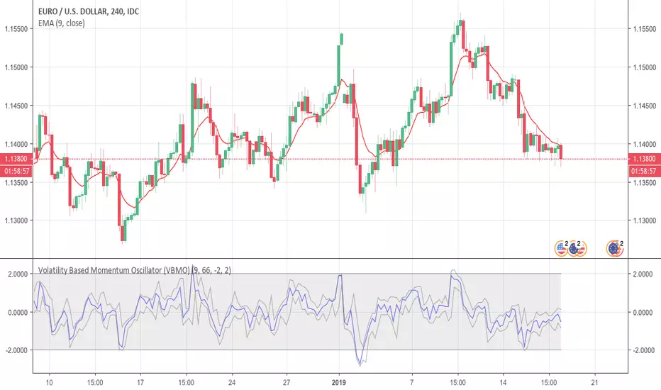
Volatility Based Momentum Oscillator (VBMO)There is a frequent and definitive pattern in price movement, whereby price will steadily drift lower, then accelerate before bottoming out. Similarly, price will often steadily rise, then accelerate into a climax top.
The Volatility Based Momentum Oscillator (VBMO) is designed to delineate between steady versus more accelerated and climactic price movements.
VBMO is calculated using a short-term moving average, the distance of price from this moving average, and the trading instrument’s historical volatility. Even though VBMO’s calculation is relatively simple, the resulting values can help traders identify, analyze and act upon many scenarios, such as climax tops, reversals, and capitulation. Moreover, since the units and scale for VBMO are always the same, the indicator can be used in a consistent manner across multiple timeframes and instruments.
For more details, there is an article further describing VBMO and its applicability.
Volatility ChannelThis script is based on an idea I have had for bands that react better to crypto volatility. It calculates a Donchian Channel, SMMA-Smoothed True Range, Bollinger Bands (standard deviation), and a Keltner Channel (average true range) and averages the components to construct its bands/envelopes. This way, hopefully band touches are a more reliable indicator of a temporary bottom, and so on. Secondary coloring for strength of trend is given as a gradient based on RSI.

Parabolic SAR with Volatility Filter: Buy Alerts for 3commasHey folks and fellow 3commas users !
Here is a new signal generator for your DCA bot on 3commas.
This is a classic Parabolic SAR indicator with a filter for volatility.
NOTE: This is a repainting strategy by design. Recommended to use with "Once per bar" alert style for PSAR

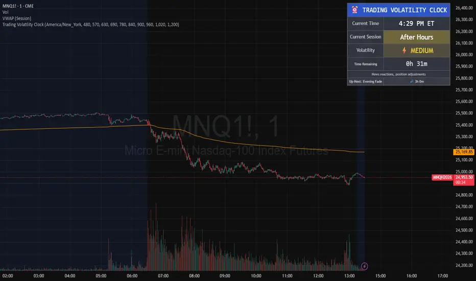
Trading Volatility Clock⏰ TRADING VOLATILITY CLOCK - Know When the Action Happens (Anywhere in the World)
A real-time session tracker with multi-timezone support for active traders who need to know when US market volatility strikes - no matter where they are in the world. Perfect for day traders, scalpers, and anyone trading liquid US markets.
══════════════════════════════════════════════════════
📊 WHAT IT DOES
This indicator displays a live clock showing:
- Current time in YOUR selected timezone (10 major timezones supported)
- Active US market session with color-coded volatility levels
- Countdown timer showing time remaining in current session
- Preview of the next upcoming session
- Optional alerts when entering high-volatility periods
══════════════════════════════════════════════════════
🌍 MULTI-TIMEZONE SUPPORT
SESSIONS ALWAYS TRACK US MARKET HOURS (Eastern Time):
No matter which timezone you select, the sessions always trigger at the correct US market times. Perfect for international traders who want to:
• See their local time while tracking US market sessions
• Know exactly when US volatility hits in their timezone
• Plan their trading day around US market hours
SUPPORTED TIMEZONES:
• America/New_York (ET) - Eastern Time
• America/Chicago (CT) - Central Time
• America/Los_Angeles (PT) - Pacific Time
• Europe/London (GMT) - Greenwich Mean Time
• Europe/Berlin (CET) - Central European Time
• Asia/Tokyo (JST) - Japan Standard Time
• Asia/Shanghai (CST) - China Standard Time
• Asia/Hong_Kong (HKT) - Hong Kong Time
• Australia/Sydney (AEDT) - Australian Eastern Time
• UTC - Coordinated Universal Time
EXAMPLE: A trader in Tokyo selects "Asia/Tokyo"
• Clock shows: 11:30 PM JST
• Session shows: "Opening Drive" 🔥 HIGH
• They know: US market just opened (9:30 AM ET in New York)
══════════════════════════════════════════════════════
🎯 WHY IT'S USEFUL
Whether you trade futures, high-volume stocks, or ETFs, volatility isn't constant throughout the day. Knowing WHEN to expect movement is critical:
🔥 HIGH VOLATILITY (Red):
• Opening Drive (9:30-10:30 AM ET) - Highest volume of the day
• Power Hour (3:00-4:00 PM ET) - Second-highest volume, final push
⚡ MEDIUM VOLATILITY (Yellow):
• Pre-Market (8:00-9:30 AM ET) - Building momentum
• Lunch Return (1:00-2:00 PM ET) - Traders returning
• Afternoon Session (2:00-3:00 PM ET) - Trend continuation
• After Hours (4:00-5:00 PM ET) - News reactions
💤 LOW VOLATILITY (Gray):
• Overnight Grind (12:00-8:00 AM ET) - Thin volume
• Mid-Morning Chop (10:30-11:30 AM ET) - Ranges form
• Lunch Hour (11:30 AM-1:00 PM ET) - Dead zone
• Evening Fade (5:00-8:00 PM ET) - Volume dropping
══════════════════════════════════════════════════════
⚙️ CUSTOMIZATION OPTIONS
TIMEZONE SETTINGS:
• Select from 10 major timezones worldwide
• Clock automatically displays in your local time
• Sessions remain locked to US market hours
SESSION TIME CUSTOMIZATION:
• Every session boundary is adjustable (in minutes from midnight ET)
• Perfect for traders who define sessions differently
• Advanced users can create custom volatility schedules
DISPLAY OPTIONS:
• Toggle next session preview on/off
• Enable/disable high volatility alerts
• Clean, unobtrusive table display in top-right corner
══════════════════════════════════════════════════════
💡 HOW TO USE
1. Add indicator to any chart (works on all timeframes)
2. Select your timezone in Settings → Timezone Settings
3. Set your chart to 1-minute timeframe for real-time updates
4. Customize session times if needed (Settings → Session Time Customization)
5. Watch the top-right corner for live session tracking
TRADING APPLICATIONS:
• Avoid trading during dead zones (lunch hour, mid-morning chop)
• Increase position size during high volatility windows
• Set alerts for Opening Drive and Power Hour
• Plan your trading day around US market volatility schedule
• International traders can track US sessions in their local time
══════════════════════════════════════════════════════
🎓 EDUCATIONAL VALUE
This indicator teaches traders:
• Market microstructure and volume patterns
• Why certain times produce better opportunities
• How institutional flows create intraday patterns
• The importance of timing in active trading
• How to adapt US market trading to any timezone
══════════════════════════════════════════════════════
⚠️ IMPORTANT NOTES
- Works best on 1-minute charts for frequent updates
- Sessions are ALWAYS based on US Eastern Time (ET)
- Timezone selection only changes the clock display
- Clock updates when new bar closes (not tick-by-tick)
- Alerts trigger once per bar when enabled
- Perfect for international traders tracking US markets
══════════════════════════════════════════════════════
📈 BEST USED WITH
- High-volume US stocks: TSLA, NVDA, AAPL, AMD, META
- Major US ETFs: SPY, QQQ, IWM, DIA
- US Futures: ES, NQ, RTY, YM, MES, MNQ
- Any liquid US instrument with clear intraday volume patterns
══════════════════════════════════════════════════════
🌏 FOR INTERNATIONAL TRADERS
This tool is specifically designed for traders outside the US who need to:
• Track US market sessions in their local timezone
• Know when to be at their desk for US volatility
• Avoid waking up for low-volatility periods
• Maximize trading efficiency around US market hours
No more timezone confusion. No more missing the opening bell. Just set your timezone and trade with confidence.
══════════════════════════════════════════════════════
This is an open-source educational tool. Feel free to modify and adapt to your trading style!
Happy Trading! 🚀
Volatility Radar [upslidedown]💎 Overview
Volatility Radar visualizes extreme volatility conditions in a clean, intuitive oscillator format.
Unlike traditional momentum oscillators, it transforms average true range (ATR) behavior into a directional volatility structure, making it easier to spot moments when markets may be shifting into expansion, compression, or potential pivot zones.
💎 How to Use
The oscillator highlights moments when the internal volatility condition becomes active as well as when that condition breaks. These events may coincide with structural turning points, breakout conditions, or volatility expansions. While not a prediction tool, Volatility Radar helps traders identify moments worth paying closer attention to.
💎 Signal Markers
■ Square icons on top/bottom identify when the Volatility Radar condition is ACTIVE
▲▼ Triangle icons on top/bottom identify when the Volatility Radar condition BREAKS
📌 Chart Example:
💎 Oscillator Trends
One of the core features of Volatility Radar is its ability to highlight positive or negative volatility trends. The oscillator automatically colors its components to reflect uptrending vs. downtrending volatility structure, making trend context easier to interpret at a glance.
📌 Chart Example:
💎 Histogram Trends
For users who prefer a more compact or traditional visual style, Volatility Radar includes an optional histogram display mode. This mode provides a clean representation of the detected trend and can be helpful for validating price-action concepts within the broader volatility context.
📌 Chart Example:
💎 Volatility Moving Average
The yellow moving average line offers a volatility moving average that can aid in determining longer term trend strength.
Interpret the trend direction by observing whether the average is increasing/decreasing or above/below the zero line.
Reversals may be observed when values move into oversold territories.
Trend continuation may occur during periods when the average is near the zero line.
Evaluate opportunities when the moving average is "touched" or "pinged" by the radar line (setting available to highlight these crosses).
📌 Chart Example:
💎 Backtesting Support
Volatility Radar outputs external signals designed for use with automated backtesting on TradingView. It integrates with @jason5480’s open-source Template Trailing Strategy and its supporting signal libraries.

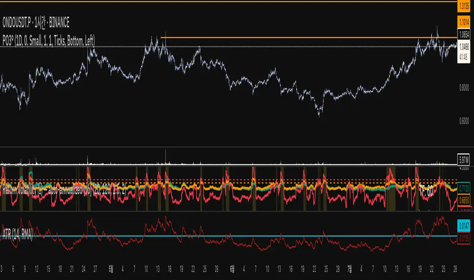
Return Volatility (σ) — auto-annualized [v6]Overview
This indicator calculates and visualizes the return-based volatility (standard deviation) of any asset, automatically adjusting for your chart's timeframe to provide both absolute and annualized volatility values.
It’s designed for traders who want to filter trades, adjust position sizing, and detect volatility events based on statistically significant changes in market activity.
Key Features
Absolute Volatility (abs σ%) – Standard deviation of returns for the current timeframe (e.g., 1H, 4H, 1D).
Annualized Volatility (ann σ%) – Converts abs σ% into an annualized figure for easier cross-timeframe and cross-asset comparison.
Relative Volatility (rel σ) – Ratio of current volatility to the long-term average (default: 120 periods).
Z-Score – Number of standard deviations the current volatility is above or below its historical average.
Auto-Timeframe Adjustment – Detects your chart’s bar size (seconds per bar) and calculates bars/year automatically for crypto’s 24/7 market.
Highlight Mode – Optional yellow background when volatility exceeds set thresholds (rel σ ≥ threshold OR z-score ≥ threshold).
Alert Conditions – Alerts trigger when relative volatility or z-score exceed defined limits.
How It Works
Return Calculation
Log returns: ln(Pt / Pt-1) (default)
or Simple returns: (Pt / Pt-1) – 1
Volatility Measurement
Standard deviation of returns over the lookback period N (default: 20 bars).
Absolute volatility = σ × 100 (% per bar).
Annualization
Uses: σₐₙₙ = σ × √(bars/year) × 100 (%)
Bars/year auto-calculated based on timeframe:
1H = 8,760 bars/year
4H ≈ 2,190 bars/year
1D = 365 bars/year
Relative and Statistical Context
Relative σ = Current σ / Historical average σ (baseLen, default: 120)
Z-score = (Current σ – Historical average σ) / Std. dev. of σ over baseLen
Trading Applications
Volatility Filter – Only allow trade entries when volatility exceeds historical norms (trend traders often benefit from this).
Risk Management – Reduce position size during high volatility spikes to manage risk; increase size in low-volatility trending environments.
Market Scanning – Identify assets with the highest relative volatility for momentum or breakout strategies.
Event Detection – Highlight significant volatility surges that may precede large moves.
Suggested Settings
Lookback (N): 20 bars for short/medium-term trading.
Base Length (M): 120 bars to establish long-term volatility baseline.
Relative Threshold: 1.5× baseline σ.
Z-score Threshold: ≥ 2.0 for statistically significant volatility shifts.
Use Log Returns: Recommended for more consistent scaling across prices.
Notes & Limitations
Volatility measures movement magnitude, not direction. Combine with trend or momentum filters for directional bias.
Very low volatility may still produce false breakouts; combine with volume and market structure analysis.
Crypto markets trade 24/7 — annualization assumes no market closures; adjust for other asset classes if needed.
💡 Best Practice: Use this indicator as a pre-trade filter for breakout or trend-following strategies, or as a risk control overlay in mean-reversion systems.
[LeonidasCrypto]EMA with Volatility GlowEMA Volatility Glow - Advanced Moving Average with Dynamic Volatility Visualization
Overview
The EMA Volatility Glow indicator combines dual exponential moving averages with a sophisticated volatility measurement system, enhanced by dynamic visual effects that respond to real-time market conditions.
Technical Components
Volatility Calculation Engine
BB Volatility Curve: Utilizes Bollinger Band width normalized through RSI smoothing
Multi-stage Noise Filtering: 3-layer exponential smoothing algorithm reduces market noise
Rate of Change Analysis: Dual-timeframe RoC calculation (14/11 periods) processed through weighted moving average
Dynamic Normalization: 100-period lookback for relative volatility assessment
Moving Average System
Primary EMA: Default 55-period exponential moving average with volatility-responsive coloring
Secondary EMA: Default 100-period exponential moving average for trend confirmation
Trend Analysis: Real-time bullish/bearish determination based on EMA crossover dynamics
Visual Enhancement Framework
Gradient Band System: Multi-layer volatility bands using Fibonacci ratios (0.236, 0.382, 0.618)
Dynamic Color Mapping: Five-tier color system reflecting volatility intensity levels
Configurable Glow Effects: Customizable transparency and intensity settings
Trend Fill Visualization: Directional bias indication between moving averages
Key Features
Volatility States:
Ultra-Low: Minimal market movement periods
Low: Reduced volatility environments
Medium: Normal market conditions
High: Increased volatility phases
Extreme: Exceptional market stress periods
Customization Options:
Adjustable EMA periods
Configurable glow intensity (1-10 levels)
Variable transparency controls
Toggleable visual components
Customizable gradient band width
Technical Calculations:
ATR-based gradient bands with noise filtering
ChartPrime-inspired multi-layer fill system
Real-time volatility curve computation
Smooth color gradient transitions
Applications
Trend Identification: Dual EMA system for directional bias assessment
Volatility Analysis: Real-time market stress evaluation
Risk Management: Visual volatility cues for position sizing decisions
Market Timing: Enhanced visual feedback for entry/exit consideration
Angular Volatility📘 Angular Volatility – Technical Indicator for Trend Intensity Analysis
Angular Volatility is an advanced technical analysis tool developed specifically for cryptocurrency markets on the Binance platform. Its primary objective is to detect structural shifts in price dynamics with greater precision by analyzing the combined behavior of market volume and the angular slope of a customizable moving average.
Unlike conventional indicators that operate directly over the price chart, this script displays all of its metrics within a dedicated secondary window, allowing a cleaner and more isolated view of critical movements such as acceleration, pause, or potential reversals. In addition, it includes a robust system for volatility intensity classification, automated alerts, and a live technical info table that summarizes key real-time values.
🎯 What does Angular Volatility analyze?
Angular Volatility measures the interaction between traded volume and the angle of a moving average selected by the user from six types (SMA, EMA, WMA, HMA, ALMA, and SWMA). From these variables, the system generates:
- Angular Volatility Index: A composite value representing the product of volume and angular slope, reflecting the true strength behind a move.
- Angular Oscillator: A standalone line that displays the directional angle (in degrees) of the selected moving average, limited between ±90°.
- Volatility Intensity Levels: Automatic classification of peaks into four levels—moderate, elevated, high, and extreme—displayed with distinct colors and geometric shapes.
- Technical Data Table: A real-time panel showing both the current angle of the moving average and the current value of the Angular Volatility Index in a compact, user-friendly format.
- Custom Alerts System: Five built-in alert conditions allow users to monitor key volatility events without needing to watch the chart constantly.
⚙️ Configuration Parameters
The script includes multiple configuration sections that allow users to fine-tune both its analytical precision and visual appearance:
- High Volume Detection: Adjustable historical depth and sensitivity to identify significant volume spikes.
- Initial Moving Average Settings: Selection of MA type, length, offset, and dynamic coloring based on slope angle.
- Volatility Index Options: Fully customizable visuals, synced with the angle values set in the moving average section.
- Volatile Intensity Styling: Choose which levels to display, customize their colors and icons, and optionally color the main chart candles for quick interpretation.
- Information Table: Options to show/hide the table, adjust size and position, and customize background/text colors.
🧠 Compatibility and Technical Recommendations
This indicator was developed to operate exclusively on Binance using the following timeframes only: 1m – 5m – 15m – 30m – 1h – 4h – 1D.
This restriction is deliberate, ensuring consistency in the mathematical model used to calculate angular data. Using this script on other platforms or timeframes may result in inaccurate readings or logic errors, as asset types like stocks, forex, or indices behave differently in terms of volume structure and slope normalization.
If applied to unsupported markets or timeframes, the script will automatically display a warning message without calculating or drawing technical values.
🔬 Practical Example
The following case study—applied to the BTC chart on a 1-hour timeframe—demonstrates how volatility intensity levels behave in structured scenarios such as channel breakdowns, rebound phases, false breakouts, and high-energy consolidation zones:
🔻 Letter A: Downward breakout and full intensity sequence
- The price was moving within a fairly uniform descending channel, which ends with a false breakout to the upside—quickly invalidated as a market trap.
- The true breakout occurs to the downside through a strong red candle, categorized by the system as moderate intensity (gray).
- This candle is followed by a Doji, then a smaller red candle also marked as moderate intensity, followed by a larger red candle showing high intensity (white), and finally a stronger red candle painted yellow, indicating extreme intensity.
- This full sequence (moderate → moderate → high → extreme) marks a technical climax, after which the price begins a progressive reversal.
- Although the drop unfolds over five red candles, the subsequent recovery takes place over 18 candles, mostly green and smaller in size, forming a “V” shape: sharp decline followed by a steady upward climb.
- This entire section is enclosed within an oval labeled A, with the four intensity levels clearly reflected on both the main chart and the Angular Volatility panel.
🔼 Letter B: Ascending channel and breakout with increasing bullish pressure
- After the rebound described in section A, the price begins forming a new ascending channel, marked with the letter B. This channel starts right where the previous range ends, with a very slight upward offset—nearly indistinguishable.
- In the final stage of this channel, a green candle classified as moderate intensity (gray) attempts a breakout. It is followed by a stronger green candle, painted brown, indicating elevated intensity and confirming bullish acceleration.
- Both candles and the corresponding peak on the Angular Volatility indicator are enclosed in an oval labeled B, representing a second wave of directional energy.
⛓️ Letter C: Resistance zone and consolidation following extreme volatility
- The upward movement continues until it reaches a resistance level, where a large green candle emerges, painted yellow to denote extreme intensity.
- Unlike the previous case in section A, this movement does not trigger a sharp reversal, but rather a technical pause followed by sideways consolidation, forming a horizontal range.
- This zone is marked on the chart with an oval labeled C, representing a classic case of stopping volume and range formation.
Volatility-Adjusted Momentum Score (VAMS) [QuantAlgo]🟢 Overview
The Volatility-Adjusted Momentum Score (VAMS) measures price momentum relative to current volatility conditions, creating a normalized indicator that identifies significant directional moves while filtering out market noise. It divides annualized momentum by annualized volatility to produce scores that remain comparable across different market environments and asset classes.
The indicator displays a smoothed VAMS Z-Score line with adaptive standard deviation bands and an information table showing real-time metrics. This dual-purpose design enables traders and investors to identify strong trend continuation signals when momentum persistently exceeds normal levels, while also spotting potential mean reversion opportunities when readings reach statistical extremes.
🟢 How It Works
The indicator calculates annualized momentum using a simple moving average of logarithmic returns over a specified period, then measures annualized volatility through the standard deviation of those same returns over a longer timeframe. The raw VAMS score divides momentum by volatility, creating a risk-adjusted measure where high volatility reduces scores and low volatility amplifies them.
This raw VAMS value undergoes Z-Score normalization using rolling statistical parameters, converting absolute readings into standardized deviations that show how current conditions compare to recent history. The normalized Z-Score receives exponential moving average smoothing to create the final VAMS line, reducing false signals while preserving sensitivity to meaningful momentum changes.
The visualization includes dynamically calculated standard deviation bands that adjust to recent VAMS behavior, creating statistical reference zones. The information table provides real-time numerical values for VAMS Z-Score, underlying momentum percentages, and current volatility readings with trend indicators.
🟢 How to Use
1. VAMS Z-Score Bands and Signal Interpretation
Above Mean Line: Momentum exceeds historical averages adjusted for volatility, indicating bullish conditions suitable for trend following
Below Mean Line: Momentum falls below statistical norms, suggesting bearish conditions or downward pressure
Mean Line Crossovers: Primary transition signals between bullish and bearish momentum regimes
1 Standard Deviation Breaks: Strong momentum conditions indicating statistically significant directional moves worth following
2 Standard Deviation Extremes: Rare momentum readings that often signal either powerful breakouts or exhaustion points
2. Information Table and Market Context
Z-Score Values: Current VAMS reading displayed in standard deviations (σ), showing how far momentum deviates from its statistical norm
Momentum Percentage: Underlying annualized momentum displayed as percentage return, quantifying the directional strength
Volatility Context: Current annualized volatility levels help interpret whether VAMS readings occur in high or low volatility environments
Trend Indicators: Directional arrows and change values provide immediate feedback on momentum shifts and market transitions
3. Strategy Applications and Alert System
Trend Following: Use sustained readings beyond the mean line and 1σ band penetrations for directional trades, especially when VAMS maintains position in upper or lower statistical zones
Mean Reversion: Focus on 2σ extreme readings for contrarian opportunities, particularly effective in sideways markets where momentum tends to revert to statistical norms
Alert Notifications: Built-in alerts for mean crossovers (regime changes), 1σ breaks (strong signals), and 2σ touches (extreme conditions) help monitor multiple instruments for both continuation and reversal setups

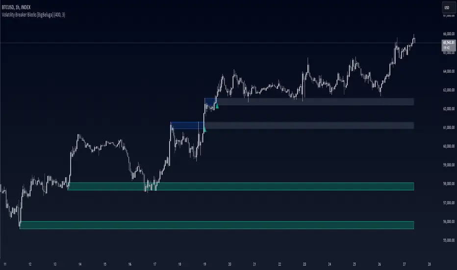
Volatility Breaker Blocks [BigBeluga]The Volatility Breaker Blocks indicator identifies key market levels based on significant volatility at pivot highs and lows. It plots blocks that act as potential support and resistance zones, marked in green (support) and blue (resistance). Even after a breakout, these blocks leave behind shadow boxes that continue to impact price action. The sensitivity of block detection can be adjusted in the settings, allowing traders to customize the identification of volatility breakouts. The blocks print triangle labels (up or down) after breakouts, indicating potential areas of interest.
🔵 IDEA
The Volatility Breaker Blocks indicator is designed to highlight key areas in the market where volatility has created significant price action. These blocks, created at pivot highs and lows with increased volatility, act as potential support and resistance levels.
The idea is that even after price breaks through these blocks, the remaining shadow boxes continue to influence price movements. By focusing on volatility-driven pivot points, traders can better anticipate how price may react when it revisits these areas. The indicator also captures the natural tendency for price to retest broken resistance or support levels.
🔵 KEY FEATURES & USAGE
◉ High Volatility Breaker Blocks:
The indicator identifies areas of high volatility at pivot highs and lows, plotting blocks that represent these zones. Green blocks represent support zones (identified at pivot lows), while blue blocks represent resistance zones (identified at pivot highs).
Support:
Resistance:
◉ Shadow Blocks after Breakouts:
When price breaks through a block, the block doesn't disappear. Instead, it leaves behind a shadow box, which can still influence future price action. These shadow blocks act as secondary support or resistance levels.
If the price crosses these shadow blocks, the block stops extending, and the right edge of the box is fixed at the point where the price crosses it. This feature helps traders monitor important price levels even after the initial breakout has occurred.
◉ Triangle Labels for Breakouts:
After the price breaks through a volatility block, the indicator prints triangle labels (up or down) at the breakout points.
◉ Support and Resistance Retests:
One of the key concepts in this indicator is the retesting of broken blocks. After breaking a resistance block, price often returns to the shadow box, which then acts as support. Similarly, after breaking a support block, price tends to return to the shadow box, which becomes a resistance level. This concept of price retesting and bouncing off these levels is essential for understanding how the indicator can be used to identify potential entries and exits.
The natural tendency of price to retest broken resistance or support levels.
Additionaly indicator can display retest signals of broken support or resistance
◉ Customizable Sensitivity:
The sensitivity of volatility detection can be adjusted in the settings. A higher sensitivity captures fewer but more significant breakouts, while a lower sensitivity captures more frequent volatility breakouts. This flexibility allows traders to adapt the indicator to different trading styles and market conditions.
🔵 CUSTOMIZATION
Calculation Window: Defines the window of bars over which the breaker blocks are calculated. A larger window will capture longer-term levels, while a smaller window focuses on more recent volatility areas.
Volatility Sensitivity: Adjusts the threshold for volatility detection. Lower sensitivity captures smaller breakouts, while higher sensitivity focuses on larger, more significant moves.
Retest Signals: Display or hide retest signals of shadow boxes
Volatility Estimator - YZ & RSThe Yang-Zheng Volatility Estimator (YZVE) integrates both intra-candle and inter-candle dynamics, such as overnight and weekend price changes, offering a more detailed analysis compared to traditional methods. The YZVE is proposed to improve over the standard deviation by accounting for the open, high, low, and close prices of trading periods, instead of only the close prices, and attempts to supplant the Parkinson's Volatility Estimator (PVE) by a also capturing inter-candle dynamics. The YZVE is calculated by this formula:
YZ Volatility Squared σ_YZ² = k * σ_o² + σ_rs² + (1 - k) * σ_c²
where k is a weighting factor that adjusts the emphasis between the overnight and close-to-close components, popularly estimated as:
k = 0.34 / (1.34 + (N+1) / (N-1))
where N is the lookback period. Optionally, users may opt to override this calculation with a specified constant (off by default). Next, the
Overnight Volatility Squared σ_o² = (log(O_t / C_(t-1)))²
measures the volatility associated with overnight price changes, from the previous candle's closing price C_(t-1) to the current candle's opening price O_t. It captures the market's reaction to news and events that occur outside of regular trading hours to reflect risk associated with holding positions over non-trading hours and gaps.
Next, the The Rogers-Satchell Volatility Estimator (RSVE) serves as an intermediary step in the computation of YZVE. It aggregates the logarithmic ratios between high, low, open, and close prices within each trading period, focusing on intra-candle volatility without assuming zero inter-candle drift as commonly implicitly assumed in other volatility models:
Rogers-Satchell Volatility Squared σ_rs² = (log(H_t / C_t) * log(H_t / O_t)) + (log(L_t / C_t) * log(L_t / O_t))
Finally,
Close-to-Close Volatility Squared σ_c² = (log(C_t / C_(t-1)))²
measures the volatility from the close of one candle to the close of the next. It reflects the typical candle volatility, similar to naive standard deviation.
This script also includes an option for users to apply the simpler RS Volatility exclusively, focusing on intraday price movements. Additionally, it offers a choice for normalization between 0 and 1, turning the estimator into an oscillator for comparing current volatility to recent levels. Horizontal lines at user-defined levels are also available for clearer visualization. Both are off by default.
References:
Yang, D., & Zhang, Q. (2000). Drift-independent volatility estimation based on high, low, open, and close prices. The Journal of Business, 73(3), 477-491.
Rogers, L.C.G., & Satchell, S.E. (1991). Estimating variance from high, low and closing prices. Annals of Applied Probability, 1(4), 504-512.
SFC Smart Money - VolatilityIn statistics, a normal distribution is a type of continuous probability distribution for a real-valued random variable. Normal distributions are important in statistics and are often used in the natural and social sciences to represent real-valued random variables whose distributions are not known.
The indicator provide a deep statistic for the specified period. It calculate the normal distribution of all candles in the particular period, in order to measure the volatility and the probabilities. Also it separate bull from bear candles and calculate the normal distribution of each group. The calculations are mode based on open-open data and high-low data.
Volatility
Volatility is a statistical measure of the dispersion of returns for a given security or market index. In most cases, the higher the volatility , the riskier the security. Volatility is often measured from either the standard deviation or variance between returns from that same security or market index.
Volatility often refers to the amount of uncertainty or risk related to the size of changes in a security's value. A higher volatility means that a security's value can potentially be spread out over a larger range of values. This means that the price of the security can change dramatically over a short time period in either direction. A lower volatility means that a security's value does not fluctuate dramatically, and tends to be more steady.
While variance captures the dispersion of returns around the mean of an asset in general, volatility is a measure of that variance bounded by a specific period of time. Thus, we can report daily volatility , weekly, monthly, or annualized volatility .
This statistic gives very accurate information how the price moved in the past and what are normal movements and spikes. From this information, a future actions can be taken.
For better understanding, all data is calculated in pips.
Features:
- Mean - Mean is the one we are most used to, i.e. the average.
- Median -Sometimes, the data set values can have a few values which are at the extreme ends, and this might cause the mean of the data set to portray an incorrect picture.
Thus, we use the median, which gives the middle value of the sorted data set.
- Mode - In a given dataset, the mode will be the number which is occurring the most.
- Max - Maximum volatility for a given range.
- Min - Minimum volatility for a given range.
- Standard Deviation - The standard deviation tells us how far the value deviates from the mean.
- Range - Range simply gives the difference between the min and max values of the data set.
- ATR - Average True Range measures volatility, taking into account any gaps in the price movement.
- Normal Distribution - The basic premise is that given a range of observations, it is found that most of the values center around the mean and within one standard deviation
away from the mean.
- Probability - probability of outcomes.
We all know that the banks and professional traders do not trade with charts, but with different statistical methods, math. models and macroeconomics. This statistical indicator shows one of these methods.
It is recommended to use the indicator on daily timeframe . It also works on other timeframes, for example 1H for intraday analysis.
For more information how the normal distribution works, please search in internet.

Volatility DMBefore anything, take notes of the script limitations :
1) The script has the setting : "Max_bars_back" set to 390. This is required to use dynamic length and an "internal clock"
*390 is the normal number of bars in a typical stock trading day.
2) The script requires volume data to work correctly
* I use a way to represent volatility that requires ( volume + price movement + time, no sma , no stdev)
Why ? Because:
HIGH-LOW = Fail to get gap information, fail to get volume information
TR/ATR = Fail to get volume information
STDEV = Not very good with dynamic length as it use SMA and fails when length <2
Conclusion: this script is basically limited to stock trading.
If I could set Max_bars_back to 23 400 this would even work better with a 1 second time frame as more data would be entered in the system.
The idea behind the script is that volatility exists in two different formats depending on how you observe the situation.
Remember your physics class? Light can be a wave or a particle depending of the situation.
Volatility seems to share a strange similar property.
Format 1) Instant volatility . (Ex. High - Low, TR )
Format 2) Systemic volatility (Ex. Dynamic ATR with variable length)
I then speculate 3 lines. (on both directions, + or -)
What if all transaction were 50% directional according to the instant volatility
What if all transaction were 100% directional according to the instant volatility
What if all transaction were 200% directional according to the instant volatility
sum(0,5*instant volatility , dynamic time)
sum(instant volatility , dynamic time)
sum(2*instant volatility , dynamic time)
This give you potential signals lines and support/resistance .
I then calculate the real price movement
sum(price movement, dynamic time)
Then you need to compare the real price movement VS if all transaction were 100% directional following the system volatility
dif=(sum price movement/sum volatility )*dynamic time
Voila.
If the movement is directional then it follows the system volatility .
If the movement is not directional then it goes back toward the Zero.
Inspirational image :
en.wikipedia.org
Gamma & Volatility Levels [Pro]General Purpose
This indicator analyzes volatility levels and expected price movements, combining gamma concepts (financial options) with volatility analysis to identify support and resistance zones.
Main Components
High Volatility Level (HVL): Calculates a volatility level based on the simple moving average (SMA) of the price plus one standard deviation. This level is represented by an orange line showing where volatility is concentrated.
Expected Movement (Movimiento Esperante): Uses the Average True Range (ATR) multiplied by an adjustable factor to project potential upward and downward movement ranges from the current price. It is drawn in green (upward) and red (downward).
Gamma Levels (Nivelas Gamma): Identifies two key levels: the call resistance (highest high of the last 50 periods) in blue, and the put support (lowest low) in purple. These are based on recent extreme prices.
Additional Information: The indicator calculates the percentage distance between the current price and the HVL, displaying it in a label.
Visual Elements
Colored lines on the chart for each level.
Labels with exact values next to each line.
A table in the upper right corner summarizing all calculated values.
Options to show or hide each element according to preference.
This is a useful tool for traders who work with options or seek to identify levels of extreme volatility and dynamic support/resistance zones.

ZynIQ Volatility Master Pro v2 - (Pro Plus Pack)Overview
ZynIQ Volatility Master Pro v2 analyses expansion and contraction in price behaviour using adaptive volatility logic. It highlights periods of compression, breakout potential and increased directional movement, helping traders understand when the market is shifting between quiet and active phases.
Key Features
• Multi-layer volatility modelling
• Adaptive compression and expansion detection
• Optional trend-aware volatility colouring
• Configurable sensitivity for different assets and timeframes
• Clean visual presentation designed for intraday and swing analysis
• Complements breakout, trend, structure and volume indicators
Use Cases
• Identifying contraction phases before expansion
• Filtering trades during low-volatility conditions
• Spotting volatility increases that accompany breakouts
• Combining volatility context with your other tools for confluence
Notes
This tool provides volatility context and regime awareness. It is not a trading system on its own. Use it with your preferred confirmation and risk management.

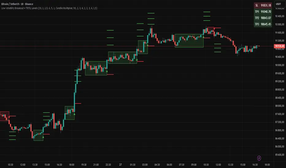
Low Volatility Breakout + TP/SL Levels█ OVERVIEW
"Low Volatility Breakout + TP/SL Levels" is a breakout indicator designed to detect and trade breakouts from periods of low volatility (consolidation). Unlike classic strategies based on fixed support/resistance levels, this indicator dynamically identifies consolidations characterized by small candle bodies and only generates a signal when the breakout occurs with a large, decisive candle. It also automatically plots 3 Take Profit levels and a Stop Loss (with two calculation modes), making it a complete breakout trading tool.
█ CONCEPTS
The strongest market moves most often start after a prolonged period of very low volatility — when candles become small and the market "falls asleep". The indicator first detects such consolidations (small bodies for at least X bars), draws a box around them, and then waits for a breakout with a candle significantly larger than the average. Additional filters (e.g., the box height cannot exceed the average candle body by too much) eliminate false consolidations and volatility traps. Immediately after the breakout, TP1, TP2, TP3, and SL levels are plotted.
█ FEATURES
Dynamic detection of low-volatility consolidations
- candles with small bodies (< average body × consolidationMultiplier)
- minimum number of bars in consolidation: confirmBars (default 5)
Automatic drawing of consolidation boxes
- green (bullish) or red (bearish) with transparent background (85)
- adjustable border thickness (border_width 1–5)
- box height filter (boxHeightMultiplier, default 6.0 × average body) – removes overly stretched/false consolidations
Breakout conditions
- current candle must be larger than average body × threshold (default 1.5)
- must be the largest candle in the entire consolidation
- must close above the highest high (long) or below the lowest low (short)
Breakout signals
- small green triangles below the bar (long)
- small red triangles above the bar (short)
Automatic Take Profit and Stop Loss levels (drawn 5 bars forward)
- two calculation modes:
• Candle Multiplier – based on average true range (high-low) over tp_sl_length period
• Percentage – fixed percentage from breakout close price (percentages must be manually adjusted to the asset and timeframe)
- 3 TP levels (default 2×, 3×, 4× or 2%, 3%, 4%)
- 1 SL level (default 2× or 1.5%)
Live TP/SL price table (top-right corner)
- displays exact current values of SL, TP1, TP2, TP3 immediately after each new signal
- colors identical to drawn lines (red background for SL, green for TP levels)
- updates automatically with every new breakout
Built-in alerts
- “Bullish Breakout Alert” and “Bearish Breakout Alert”
█ HOW TO USE
Add the indicator to your TradingView chart → Indicators → search “Low Volatility Breakout + TP/SL Levels”.
After each valid breakout you will immediately see:
- the colored box
- signal triangle
- horizontal TP/SL lines
- updated table in the top-right corner showing precise price levels for the current trade
Key settings to adjust:
Consolidation Settings
- Volatility Window (length) – period for average body calculation (default 20)
- Consolidation Multiplier – how small bodies must be to count as consolidation (default 2.0)
- Breakout Multiplier – minimum size of breakout candle (default 1.5)
- Box Height Multiplier – maximum allowed box height (default 6.0)
- Min Consolidation Bars – minimum bars required (default 5)
Risk Management Settings
- Choose TP/SL mode: Candle Multiplier or Percentage
- Adjust TP1–3 and SL multipliers/percentages to match your risk management style
Signal interpretation:
- Green triangle below bar + green box + green TP levels in table = long signal
- Red triangle above bar + red box + red SL level in table = short signal
- Boxes remain on chart until broken — they highlight accumulation/distribution zones
█ APPLICATIONS
- Trading breakouts from consolidation on all markets and timeframes
- Recommended to trade in the direction of the higher-timeframe trend or with additional confirmations (e.g., key level breaks). Aggressive mode (trading both directions) is also possible — provided box and TP/SL settings are properly optimized
- Experiment with different TP/SL ratios — higher reward-to-risk setups (e.g., SL 1×, TP3 6–8×) with lower win rate are often more profitable in the long run
- Strongly encourage testing various box parameters (consolidationMultiplier, boxHeightMultiplier, confirmBars) — small changes can dramatically affect signal frequency and quality
█ NOTES
Always test and optimize parameters for the specific instrument and timeframe.
Volatility Signal-to-Noise Ratio🙏🏻 this is VSNR: the most effective and simple volatility regime detector & automatic volatility threshold scaler that somehow no1 ever talks about.
This is simply an inverse of the coefficient of variation of absolute returns, but properly constructed taking into account temporal information, and made online via recursive math with algocomplexity O(1) both in expanding and moving windows modes.
How do the available alternatives differ (while some’re just worse)?
Mainstream quant stat tests like Durbin-Watson, Dickey-Fuller etc: default implementations are ALL not time aware. They measure different kinds of regime, which is less (if at all) relevant for actual trading context. Mix of different math, high algocomplexity.
The closest one is MMI by financialhacker, but his approach is also not time aware, and has a higher algocomplexity anyways. Best alternative to mine, but pls modify it to use a time-weighted median.
Fractal dimension & its derivatives by John Ehlers: again not time aware, very low info gain, relies on bar sizes (high and lows), which don’t always exist unlike changes between datapoints. But it’s a geometric tool in essence, so this is fundamental. Let it watch your back if you already use it.
Hurst exponent: much higher algocomplexity, mix of parametric and non-parametric math inside. An invention, not a math entity. Again, not time aware. Also measures different kinds of regime.
How to set it up:
Given my other tools, I choose length so that it will match the amount of data that your trading method or study uses multiplied by ~ 4-5. E.g if you use some kind of bands to trade volatility and you calculate them over moving window 64, put VSNR on 256.
However it depends mathematically on many things, so for your methods you may instead need multipliers of 1 or ~ 16.
Additionally if you wanna use all data to estimate SNR, put 0 into length input.
How to use for regime detection:
First we define:
MR bias: mean reversion bias meaning volatility shorts would work better, fading levels would work better
Momo bias: momentum bias meaning volatility longs would work better, trading breakouts of levels would work better.
The study plots 3 horizontal thresholds for VSNR, just check its location:
Above upper level: significant Momo bias
Above 1 : Momo bias
Below 1 : MR bias
Below lower level: significant MR bias
Take a look at the screenshots, 2 completely different volatility regimes are spotted by VSNR, while an ADF does not show different regime:
^^ CBOT:ZN1!
^^ INDEX:BTCUSD
How to use as automatic volatility threshold scaler
Copy the code from the script, and use VSNR as a multiplier for your volatility threshold.
E.g you use a regression channel and fade/push upper and lower thresholds which are RMSEs multiples. Inside the code, multiply RMSE by VSNR, now you’re adaptive.
^^ The same logic as when MM bots widen spreads with vola goes wild.
How it works:
Returns follow Laplace distro -> logically abs returns follow exponential distro , cuz laplace = double exponential.
Exponential distro has a natural coefficient of variation = 1 -> signal to noise ratio defined as mean/stdev = 1 as well. The same can be said for Student t distro with parameter v = 4. So 1 is our main threshold.
We can add additional thresholds by discovering SNRs of Student t with v = 3 and v = 5 (+- 1 from baseline v = 4). These have lighter & heavier tails each favoring mean reversion or momentum more. I computed the SNR values you see in the code with mpmath python module, with precision 256 decimals, so you can trust it I put it on my momma.
Then I use exponential smoothing with properly defined alphas (one matches cumulative WMA and another minimizes error with WMA in moving window mode) to estimate SNR of abs returns.
…
Lightweight huh?
∞
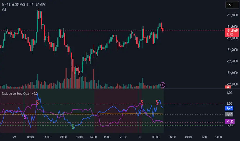
Zscore COrrelation volatility OberlinThis is a complete multi-strategy dashboard for statistical arbitrage (pairs trading). It is designed to solve the biggest challenge in pairs trading: knowing when to trade mean-reversion and when to trade a regime break.
This indicator automatically analyzes the stability of the pair's relationship using two critical filters (a Volatility Ratio filter and a Correlation Z-Score filter). It then provides clear, actionable signals for two opposite strategies based on the current market "regime."
The Regime "Traffic Light" System
The indicator's background color tells you which strategy is currently active.
• 🟢 GREEN Background (Stable Regime): This is the "Mean Reversion" regime. It means both the volatility and correlation filters are stable. The pair is behaving predictably, and you can trust the Z-Score to revert to its mean.
• 🔴 RED Background (Unstable Regime): This is the "Divergence" or "Breakout" regime. It means the pair's relationship has failed (correlation has broken down OR volatility has exploded). In this regime, the Z-Score is not expected to revert and may continue to diverge.
How to Use: The Two Strategies
The indicator will plot text labels on your chart for four specific signals.
📈 Strategy 1: Mean Reversion (Green Regime 🟢)
This is the classic pairs trading strategy. You only take these signals when the background is GREEN.
• LONG Signal: "ACHAT MOYENNE" (Buy Mean)
• What it means: The Z-Score (blue line) has crossed below the lower band (e.g., -2.0) while the regime is stable.
• Your Bet: The spread is statistically "too cheap" and will rise back to the 0-line.
• Action: Buy the Spread (e.g., Buy MES, Sell MNQ).
• SHORT Signal: "VENTE MOYENNE" (Sell Mean)
• What it means: The Z-Score (blue line) has crossed above the upper band (e.g., +2.0) while the regime is stable.
• Your Bet: The spread is statistically "too expensive" and will fall back to the 0-line.
• Action: Sell the Spread (e.g., Sell MES, Buy MNQ).
• Exit Target: Close your position when the Z-Score (blue line) returns to 0.
🚀 Strategy 2: Divergence / Momentum (Red Regime 🔴)
This is a momentum strategy that bets on the continuation of a regime break. These signals appear on the exact bar the background turns RED.
• LONG Signal: "ACHAT ÉCART" (Buy Divergence)
• What it means: The regime just broke (turned RED) at the same time the Z-Score was already rising.
• Your Bet: The pair's relationship is broken, and the spread will continue to "rip" higher, diverging further from the mean.
• Action: Buy the Spread (e.g., Buy MES, Sell MNQ) and hold for momentum.
• SHORT Signal: "VENTE ÉCART" (Sell Divergence)
• What it means: The regime just broke (turned RED) at the same time the Z-Score was already falling.
• Your Bet: The pair's relationship is broken, and the spread will continue to "crash" lower, diverging further from the mean.
• Action: Sell the Spread (e.g., Sell MES, Buy MNQ) and hold for momentum.
• Exit Target: This is a momentum trade, so the exit is not the 0-line. Use a trailing stop or exit when the regime becomes stable again (turns GREEN).
The 3 Indicator Panes
1. Pane 1: Main Dashboard (Signal Pane)
• Z-Score PRIX (Blue Line): Your main signal. Shows the spread's deviation.
• Regime (Background Color): Your "traffic light" (Green for Mean Reversion, Red for Divergence).
• Trade Labels: The explicit entry signals.
2. Pane 2: Volatility Ratio (Diagnostic Pane)
• This pane shows the ratio of the two assets' volatility (Orange Line) vs. its long-term average (Gray Line).
• It is one of the two filters used to decide if the regime is "stable." If the orange line moves too far from the gray line, the regime turns RED.
3. Pane 3: Correlation Z-Score (Diagnostic Pane)
• This is the most critical filter. It measures the Z-Score of the rolling correlation itself.
• If this Purple Line drops below the Red Dashed Line (the "Danger Threshold"), it means the pair's correlation has statistically broken. This is the primary trigger for the RED "Divergence" regime.
Settings
• Symbol 1 & 2 Tickers: Set the two assets for the filters (e.g., "MES1!" and "MNQ1!"). Note: You must still load the spread chart itself (e.g., MES1!-MNQ1!) for the Price Z-Score to work.
• Z-Score Settings: Adjust the lookback period and bands for the Price Z-Score.
• Volatility Filter Settings: Adjust the ATR period, the MA period, and the deviation threshold.
• Correlation Filter Settings: Adjust the lookback periods and the "danger threshold" for the Correlation Z-Score.
Disclaimer: This indicator is for educational and informational purposes only. It does not constitute financial advice. All trading involves significant risk. Past performance is not indicative of future results.