ADX and DI LevelsADX:
ADX is used to quantify trend strength. ADX calculations are based on a moving average of price range expansion over a given period of time. The default setting is 14 bars, although other time periods can be used.1
ADX can be used on any trading vehicle such as stocks, mutual funds, exchange-traded funds and futures.
DI (+/-):
The directional movement index (DMI) is an indicator developed by J. Welles Wilder in 1978 that identifies in which direction the price of an asset is moving. The indicator does this by comparing prior highs and lows and drawing two lines: a positive directional movement line (+DI) and a negative directional movement line (-DI). An optional third line, called the average directional index (ADX), can also be used to gauge the strength of the uptrend or downtrend.
This indicator has the length changed from 14 to 9 so you can have more updated price calculation
I also add the 4 levels I use for day trading; the 10, 20, 30, 40-50 are the levels I like to see the Di to break over.
A lot of traders use different levels, but these I have and found most useful. You can set alerts when any Di crosses over the 40 for true trend breakout!
Wyszukaj w skryptach "Futures"

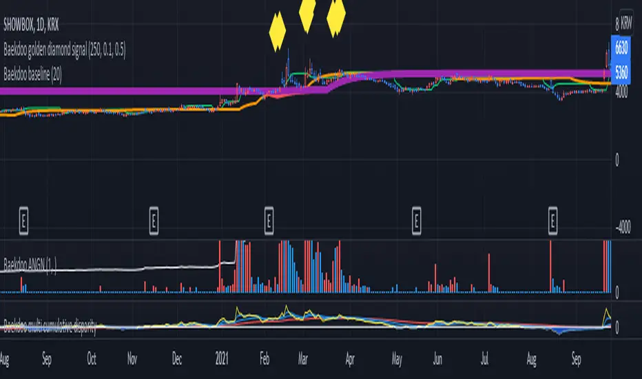
Baekdoo multi OverSold OverBuy colored CandleHi forks,
I'm trader Baekdoosan who trading Equity from South Korea. This Baekdoo multi OverSold OverBuy colored candle will give you the idea of
multiple indicators in one shot with colored candle. Those indicators tell us that oversold or overbuy statistically. For the color, you can freely change
based on your comfort. For me, in Korea white candle has red color and black candle has blue color. So somewhat confusing for you. Anyway you can
easily modify color in the script. Please refer this line.
barcolor(open<close and result_pos == 4 ? color.new(color.red, 0) : open<close and result_pos == 3 ? color.new(color.red, 25) : open<close and result_pos == 2 ? color.new(color.red, 50) : open<close and result_pos == 1? color.new(color.red, 75) : na)
you can see I put different transparency at color.new() function with color code. Let me divide and conquer to explain for up candle
white candle and black candle.
1. White candle
with 4 oversold signal case with white candle tells us it is almost reached real bottom and try to rebound. In this case, I put vivid color (no transparency) on the candle. And all 4 signal case, I put text on "OverSold". It will not happen frequently. Then 2 approaches can be made.
(a) short term approach
You can buy on this time. and you set stop loss with open price. This is mainly aimed for technical rebound.
(b) long term approach
You can accumulate based on your budget with 5 times dividing. At that day might not be the very bottom but those period will most probably real bottom. You can put more weight on latter buy. Let say, 1 : 1.25 : 1.5 : 1.75 : 2.5. So for example, if you have $8,000 to investigate then, buy $1,000 and then $1,250, $1,500, accordingly. If price rebound then don't adding weight on accumulation but with the first amount that you buy(i.e., $1,000 with above example). With this approach, you will not have much stress and you will get profit well. If this is grand bottom case, then you can HODL this long term. What you needs is stick to the plan. :)
with 3 signals the color is less vivid, 2 signals is much less vivid, accordingly.
2. Black candle
The approaches are opposite to above. The signal will tells us for 4 overBuy signals, then vivid blue candle will be shown. Our strategy is distribute to sell. Please do not sell in one shot. As Newton said, "I can calculate the motions of the heavenly bodies, but not the madness of the people". Strong buy phase, we don't know how far will it go. But indicators will tell us it is quite overSold situation. So what I can suggest you is sell it 10% to 20% on resistance price, and put 50% of lower than certain support price. Remember, accumulation and distribution will always better than one shot trading if you want to survive long time on this war field.
Hope this will help your trading on equity as well as crypto. I didn't try it on futures. Best of luck all of you. Gazua~!

Baekdoo ANGNHi forks,
I'm trader Baekdoosan who trading Equity from South Korea. This Baekdoo ANGN indicator plot volume when large volume trading happened.
Assume that the large volume means higher than 1% of its marketcap amount. And adding ANGN (An-Na-Gan-Ni?, means "are you still there? in Korean")
line for upgrade version of On Balance Volume (OBV).
OBV is very good indicator but when it has long tail and short body, it can have wrong indication of buying or selling from big whales. So ANGN with large volume indicator combination would gives you better idea for the big brothers buying or selling tracker.
hope this will help your trading on equity as well as crypto. I didn't try it on futures. Best of luck all of you. Gazua~!

Baekdoo baselineHi forks,
I'm trader Baekdoosan who trading Equity from South Korea. This Baekdoo baseline will give you the idea of big whale's approximate average price. The idea behind this indicator is to combine volume and price. Here's one of the equation.
...
HT4=highest(volume, 250)
NewH4=valuewhen(volume>HT4 , (open+close+low+high+close)/5, 1)
result4=ema(NewH4, 20)
...
As you can see it will update when highest volume is updated by certain period of time. At that update will be the price of the close weighted price. and I put shift value of 20 (offset of input value) due to putting time theorem of Ichimoku Balance Table. 20 days means for 1 month of market day.
Why this idea work? It is mainly for the support / resistance. Resistance is made for lots of individual's buy. When the price goes down, they are tend to hold. As time goes by price getting high to their average price, then they are selling it with small profit or the same price or with small loss. So resistance is made by lots of individuals. And supports are made by small number of big whales. If we see the volume only, then we cannot differentiate easily for lots of individuals and small number of big whales. But lower price's large volume will most probably be the whale where higher price's large volume will most probably tons of individuals.
hope this will help your trading on equity as well as crypto. I didn't try it on futures. Best of luck all of you. Gazua~!
Customizable Gap FinderThis is a fully customizable gap finder. You can change the color of just about anything, on top of hiding filled/old gaps. This is so you can spot those tiny gaps on something such as futures. Be sure to play around with the settings.

RSI Classic Strategy (by Coinrule)One of the questions hobbyist traders more often ask is: what is the perfect trading indicator?
Every indicator is just a tool, so its efficiency is proportional to your ability to read its signals and translate them into an actionable trading strategy. The RSI is likely the most flexible and easy to use among the technical indicators.
This trading strategy tries to catch short-term swings on the coins of your choice with a simple yet profitable setup.
Buy when the RSI is lower than 30 (you can adjust it to 35 in times of steep uptrend).
Sell when the RSI is greater than 65 (the target may range between 60 and 75 depending on the volatility of the coin).
Note that the buy signal comes when the indicator crosses below 30 and not when it crosses above 30 as it happens on the built-in RSI strategy on Tradingview.
The present script overperforms the built-in strategy, even adding trading fees and using a lower amount of capital for each trade (30%). That means that the system can deliver higher net-profits with lower risk levels.
A typical example of market conditions where this strategy works perfectly is as follows.
The first initial breakout indicates that a new leg up in the trend may start. Bitcoin starts to trade within a range which you can identify when it reaches the point 3. That is the perfect time to start the rule because
- trading within a channel anticipates possible swings up and down
- the trend is on the upside, providing low downside risk in buying the dips.
This strategy works well with selected coins of your choice, and it's a great fit on leverage exchanges like Binance Futures.
If you prefer to run it across all available coins on the market, instead, you may choose an optimized version.

Normalized Volatility IndicatorFrom an article by Rajesh Kayakkal:
"Early bear phase signals can help you get out of the market before it turns down. This indicator tells you how.
There are many ways to identify the trend of a financial market, the most common being the 200-day exponential moving average (Ema). When price is trending down below the 200-day Ema, the market is believed to be in a bear phase. If the market is trending up above the 200-day Ema, it is considered to be in a bull phase.
Since every indicator fails at times, I wanted to find other indicators to confirm a trend. In my quest for another indicator to determine the trend for the financial markets, I found the Cboe Volatility Index (Vix) to be a good indicator of the market direction. The Vix is calculated from the weighted average of the implied volatilities of various options on the Standard & Poor’s 500 index futures.
J. Welles Wilder’s average true range can also give an indication of the financial market trends; that is, when the market is in a bull phase, the average true range narrows, and when it is in a bear phase, the average true range expands. The normalized volatility indicator (Nvi) is based on this behavior.
Normalized volatility indicator (Nvi)
Average true range (Atr) varies depending on time. But how do we determine the phase of the financial market with Atr? Perhaps some type of ratio could give us a clue. A ratio presents a relationship of a quantity with respect to another. I did some research based on a ratio of the 64-day average true range and the end-of-day value of equity indexes such as the Standard & Poor’s 500 (Spx). I selected the 64-day period since it is close to the average number of trading days in a quarter. The ratio of the 64-day average true range and closing price does discount seasonal variations in the average true range and gives a single number that can be used to compare volatility of an instrument across many decades. I call this ratio the normalized volatility indicator.
I found an interesting correlation between Nvi and cycles of major equity market indexes. The formula for the Nvi is:
Nvi = 64 - Day average true range/End-of-day price * 100
The NVI gave advanced signals before the cyclical bear phase of SPX commenced in October 2000 and was almost on the spot with the bull phase that began in 2003 and the current secular bear market cycle, which started in November 2007."
Includes options to show inverse NVI and change the ATR length and smoothing.

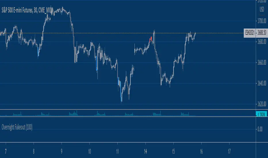
Equity Index Overnight FakeoutThis script highlights when price violates the highest high or lowest low within the user's selected lookback period, with the caveat that it occurs during the GLOBEX session. The script is designed to work exclusively with the trading hours for CME and CBOT Equity Index futures. I'm planning to make a more customizable version down the line.
My reasoning behind this very simple script is that the low liquidity and participation of the overnight session creates a tendency for moves at extremes to mean revert. Let me know what you think.
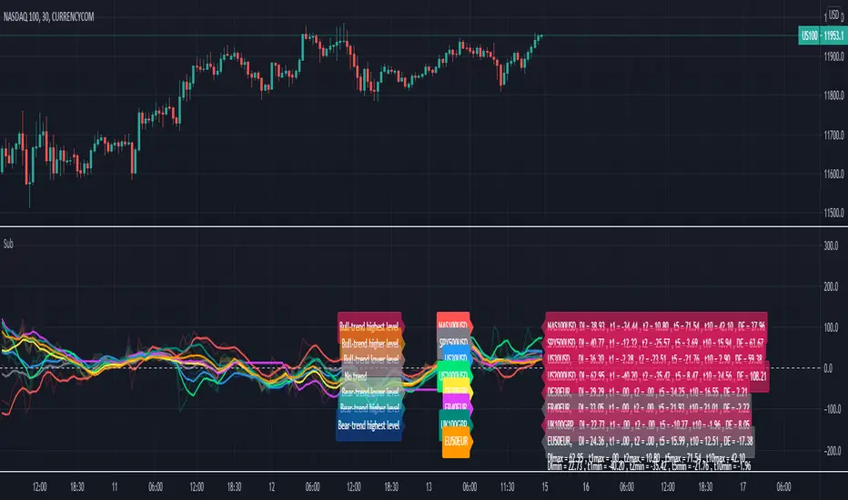
Relative Strength Index of EU and US Stock Index Trends quality//Relative Strength Index of European and US Stock Index Trends quality
//This indicator reveals the relative strength of European and US stock index futures.
//take Bull trend as an example , the current closed price>EMA20 value and the current closed price >20th previous bar closed price( deduction price),
//it's defined as a lower level bull trend .If the current price EMA20>EMA60, it's defined as a higher level bull trend .If the EMA20>EMA60>EMA120,it's defined as the highest level bull trend.
//You can choose to draw the curve with the deviation rate of the original major indexes to 20EMA, or draw the deviation rate with the average value (default value is 5 bars).
//In addition, a more technical method is added to analyze the deviation changes of the major indexes.The deviation rate changing velocity value, parameter tan (abbreviated by t) of 1, 2, 5, 10 is introduced.
//You can have the option of calculate the tan using average value of 5 candlesticks or original value.
//Taking tan1 as an example, it indicates how much the deviation rate between the current price and the previous candlestick has changed.
//The indicator of the index color and the description of the trend quality color can be switched off in option.
//In addition, this code color scheme is only suitable for black background (the code color needs to be changed by yourself if you use white background).
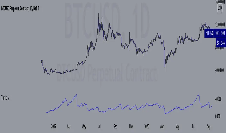
Turtle N NormalizedSimple script that calculates the normalized value of N. Rules taken from an online PDF containing the original Turtle system:
"The Turtles used a volatility-based constant percentage risk position sizing algorithm. The Turtles used a concept that Richard Dennis and Bill Eckhardt called N to represent the underlying volatility of a particular market.
N is simply the 20-day exponential moving average of the True Range, which is now more commonly known as the ATR. Conceptually, N represents the average range in price movement that a particular market makes in a single day, accounting for opening gaps. N was measured in the same points as the underlying contract.
The Turtles built positions in pieces which we called Units. Units were sized so that 1 N represented 1% of the account equity. Thus, a unit for a given market or commodity can be calculated using the following formula:
Unit = 1% of Account/(N x Dollars per Point)"
To normalize the Unit formula, this script instead takes the value of (close/N). Dollars per point = 1 for stocks and crypto, but will change depending on the contract specifications for individual futures.
"Since the Turtles used the Unit as the base measure for position size, and since those units were volatility risk adjusted, the Unit was a measure of both the risk of a position, and of the entire portfolio of positions."
When the value of N is high, volatility is low and you should be more risk-on.
When the value of N is low, volatility is high and you should be more risk-off.
Donchian Channel Strategy [for free bot]
I present to you a script for testing the Donchian channel breakout strategy for the Binance_exchange.
This strategy is trending, and is especially effective for trading cryptocurrency futures.
This strategy is very flexible, and you can configure virtually all possible parameters, moreover, separately for longs and separately for shorts.
In the script, you can configure the parameters of the channel for entry and exit, the exit method, enable or disable purchases / sales, specify take profit and stop loss, and more.
On the example of optimization, only 20% of the deposit is used. This is done for diversification, since there are 37 contracts on binance_futures (at the time of writing the script description). That is, by optimizing the parameters for different currencies, you can very well reduce risks.
Представляю Вам скрипт для тестирования стратегии пробоя канала Дончиана для биржи Бинанс.
Данная стратегия относится к трендовым, и особенно эффективная на торговли криптовалютных фьючерсов.
Данная стратегия очень гибкая, и можно настроить фактически все возможные параметры, при чем, отдельно для покупок и отдельно для продаж.
В скрипте можно настроить параметры канала на вход и на выход, метод выхода, разрешить или запретить покупки/проаджи, указать тейк-профит и стоп-лосс и другое.
На примере оптимизации используется всего 20% от депозита. Это сделано для диверсификации, так как на фьючерсах бинансе присутсвует 37 контрактов (на момент написания описания скрипта). Т.е., оптимизировав параметры под разные валюты, можно очень хорошо снизить риски.

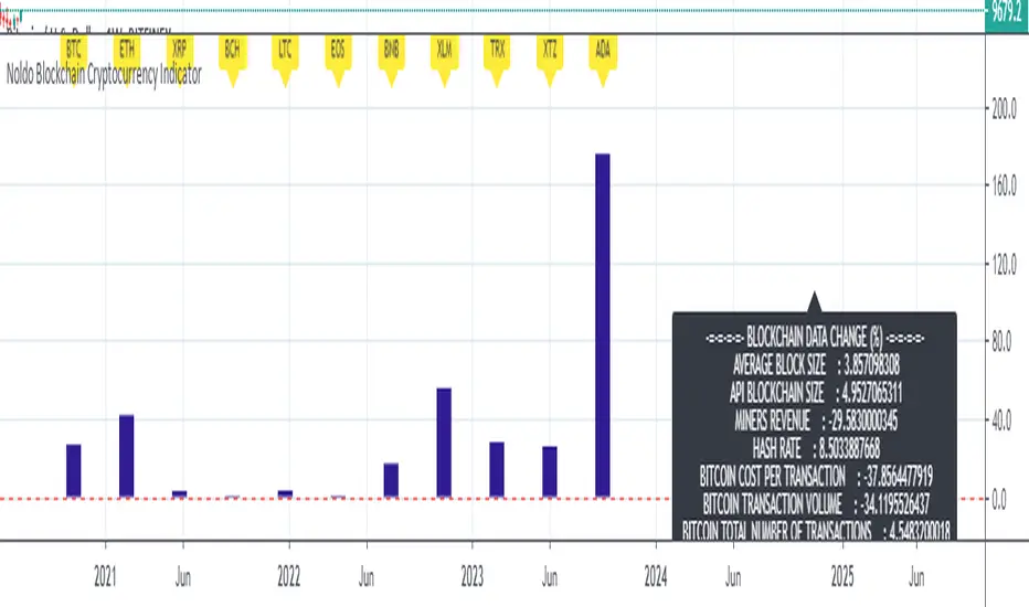
Noldo Blockchain Cryptocurrency Indicator
Hello, this script has the same logic as Noldo CFTC COT Forex Indicator :
And Noldo CFTC COT Commodities Indicator :
*
Script briefly calculates the period length between two signals of Pivot Reversal Strategy when new signal arrives and allows us to see relative Blockchain data and price changes of Major Cryptocurrencies over that automatic length.
This saves us from the hassle and time wasting of searching for a reference point.
Usage
This script works only on all Bitcoin / U.S Dollar pairs and futures.
It only works on 1W graphics.
ICOT data are pulled via Quandl
NOTE :
Since blockchain data is very votalile, 7-day ema values are adjusted to take into account.
Regards.

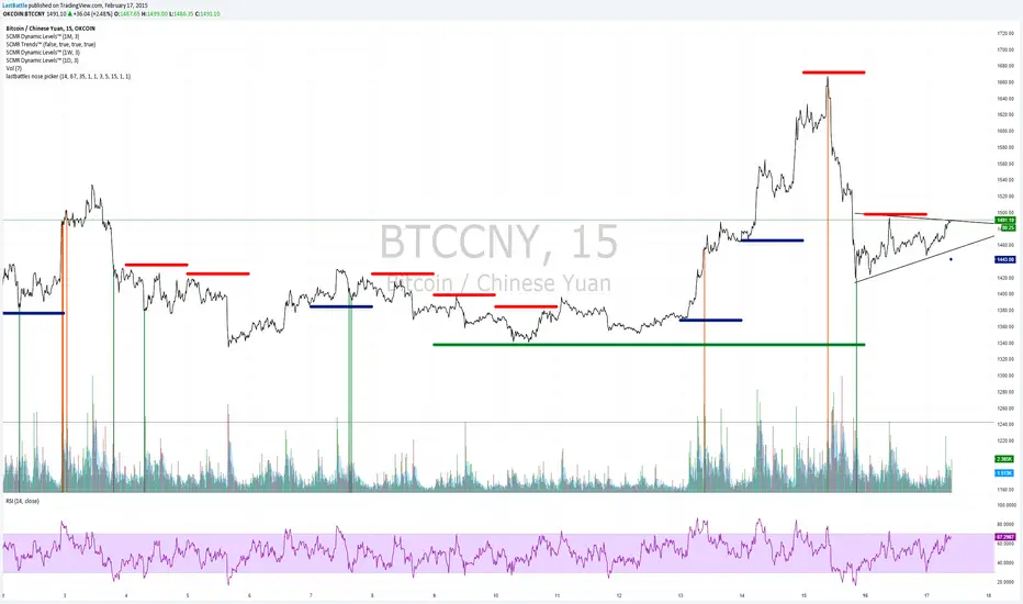
[Bitcoin] Lastbattle's nose pickerI've been working on a top and bottom picker script over the past couple of weeks, based on RSI of multiple timeframe closing price. It've been a pretty good trading system that's tested over the last meteoric rise from 220~270 and back down to 230 right now, and I think it should be released to the community.
Sure, I'm not worried about this strategy not working anymore after it is being used by the majority. Everyone have a different view of the market, and this is more towards psychology. It'll likely to hold for as long as there are still humans trading Bitcoins. Bitcoin market is full of emotions, you'll never run out of it.
So why does it work?
If you take a look at the live charts offered by Bitcoinwisdom and Cryptowatch, they only offer 1, 3, 5, and 15 minute timeframe by default with no other option to switch.
Naturally more traders will look at these levels for oversold and overbought condition.
The same indicator does not work for the broader commodities market such as Gold and Silver.
How does it work?
As long as the RSI levels of 1, 3, 5, and 15 minute fulfills the oversold/overbought level, a signal will be given.
The overbought/oversold level gets compensated the higher volatility the market is in.
Note: **
-This is only for exit strategy. If you're on long, consider reducing or exiting your position when it displays a red. On the other hand if you're short, consider reducing or covering your shorts if it shows a green.
-It may give false signal in a trending market, use your trading experience and judgement to filter them out. (eg: uptrend usually have more than 1 legs AND after a long consolidation, RSI gets to oversold/overbought easily... the market will tend to test the support/resistance again.)
-This is tuned for the 15m interval, the script won't work beyond this. I use it for scalping futures. Feel free to change or remove this line 'plot(interval == 15 and '
-Even if it shows a signal, it may not be the true top/bottom. Sometimes there may be a weak diverged leg aka 'last fart', so that's one reason I dont use this for entry until more confirmation is given via other indicators.
** If your chart is zooming all the way down to 0, right click on the price at the right and select 'Scale price only'
Go ahead and try this out with willy, etc and see what works better :D
Credits:
-LazyBear for the volatility switcher script
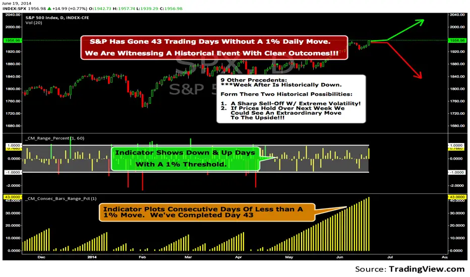
We Are Witnessing A Historical Event With A Clear Outcome!!!"Full Disclosure: I came across this information from www.SentimenTrader.com
I have no financial affiliation…They provide incredible statistical facts on
The General Market, Currencies, and Futures. They offer a two week free trial.
I Highly Recommend.
The S&P 500 has gone 43 trading days without a 1% daily move, up or down.
which is the equivalent of two months and one day in trading days.
During this stretch, the S&P has gained more than 4%,
and it has notched a 52-week high recently as well.
Since 1952, there were nine other precedents. All of
these went 42 trading days without a 1% move, all of
them saw the S&P gain at least 4% during their streaks,
and all of them saw the S&P close at a 52-week highs.
***There was consistent weakness a week later, with only three
gainers, and all below +0.5%.
***After that, stocks did better, often continuing an Extraordinary move higher.
Charts can sometimes give us a better nuance than
numbers from a table, and from the charts we can see a
general pattern -
***if stocks held up well in the following
weeks, then they tended to do extremely well in the
months ahead.
***If stocks started to stumble after this two-
month period of calm, however, then the following months
tended to show a lot more volatility.
We already know we're seeing an exceptional market
environment at the moment, going against a large number
of precedents that argued for weakness here, instead of
the rally we've seen. If we continue to head higher in
spite of everything, these precedents would suggest that
we're in the midst of something that could be TRULY EXTRAORDINARY.
Gold Timing Composite (EURUSD + DXY + US02Y)Here's the publication-ready description for TradingView:
Gold Timing Composite Indicator - 3-Component Model
Overview
A precision-engineered multi-component oscillator designed specifically for intraday gold trading. This indicator synthesizes three critical market drivers—EUR/USD dynamics, broad US Dollar strength, and Treasury yield movements—to isolate genuine gold price catalysts from market noise, delivering high-probability timing signals through triple-layer confirmation.
Components & Methodology
The indicator employs z-score normalization (default 20-period lookback) to harmonize three distinct but correlated market signals into a unified composite reading:
Fast Price Discovery Signal (40%):
EURUSD (40%) - EUR/USD captures rapid USD repricing with the deepest FX liquidity globally
Broad USD Strength Confirmation (35%):
-DXY (35%) - Inverted US Dollar Index measures comprehensive USD strength across six major currencies (EUR 57%, JPY 14%, GBP 12%, CAD 9%, SEK 4%, CHF 4%)
Real Yield Proxy (25%):
-US02Y (25%) - Inverted 2-Year Treasury yield captures Fed policy expectations and real rate dynamics
Key Features
✅ Dual USD Validation - EURUSD (speed) + DXY (breadth) filter EUR-specific moves from true USD weakness
✅ Real Yield Sensitivity - US02Y isolates rate-driven gold moves from pure currency effects
✅ Triple Confirmation System - Visual alignment dots when all three components agree simultaneously
✅ Mean-Reversion Zones - Overbought/oversold thresholds at ±1.5 standard deviations
✅ Clean Visualization - Candle-based display (no wicks) for rapid pattern recognition
✅ EUR/USD Divergence Detection - Identifies when EURUSD moves are EUR-specific vs broad USD moves
How to Use
Basic Signals:
Green candles = Bullish gold pressure (USD weakening / yields falling)
Red candles = Bearish gold pressure (USD strengthening / yields rising)
Above +1.5 = Overbought zone → look for mean-reversion shorts
Below -1.5 = Oversold zone → look for mean-reversion longs
High-Confidence Setups (Alignment Dots):
Lime dot at top = All 3 components bullish → maximum gold long confidence
Magenta dot at bottom = All 3 components bearish → maximum gold short confidence
No dots = Components diverging → reduce position size or wait for clarity
Divergence Trading:
Gold makes new high but composite doesn't confirm → potential reversal down
Gold makes new low but composite doesn't confirm → potential reversal up
Understanding Component Interactions
Normal Correlation (High Confidence):
EURUSD ↑ + DXY ↓ + US02Y ↓ → Broad USD weakness + falling yields → Strong gold bull signal
EURUSD ↓ + DXY ↑ + US02Y ↑ → Broad USD strength + rising yields → Strong gold bear signal
EURUSD/DXY Divergence (Critical Filter):
EURUSD ↑ but DXY flat/up → EUR-specific strength (ECB, Eurozone news) → Weak gold signal
DXY flat = USD not actually weak, just EUR strong → Gold may not follow EURUSD
EURUSD flat but DXY ↓ → Broad USD weakness (JPY, GBP, CAD all strong) → Strong gold signal
True USD weakness beyond just EUR → High-probability gold long
FX vs Yields Divergence:
EURUSD ↑ + DXY ↓ but US02Y ↑ → USD weak in FX but yields rising → Mixed signal
Hawkish Fed repricing vs currency weakness → Medium confidence, smaller size
EURUSD ↓ + DXY ↑ but US02Y ↓ → USD strong but yields falling → Conflicting drivers
Could be risk-off (safe haven bid to Treasuries) → Analyze broader market context
Best Practices
Timeframes: 5-minute to 15-minute charts for intraday trading
Session Focus: London fix (10:30 AM GMT) and New York open (8:20 AM EST) for peak gold liquidity
Pair With:
Key gold technical levels (round numbers, previous highs/lows)
COMEX gold futures volume profile
Real yield charts (when available)
VIX for risk sentiment context
Risk Management:
Full position: When alignment dots appear (all 3 components agree)
Half position: When 2 of 3 components align
Wait/reduce: When all three components diverge
Weight Adjustments:
Fed announcement days (FOMC, CPI, NFP): Increase US02Y to 35%, reduce EURUSD to 35%
ECB policy days: Monitor EURUSD/DXY divergence closely (EUR-specific moves may not affect gold)
Geopolitical events: DXY and yields may diverge (safe-haven flows) → Focus on DXY + yields, reduce EURUSD weight
Asian session: EURUSD less reliable (lower liquidity), consider increasing DXY weight to 45%
Technical Details
Calculation Method: Z-score normalization with configurable lookback period
Default Weights: EURUSD 40% | -DXY 35% | -US02Y 25%
Extreme Threshold: ±1.5 standard deviations (adjustable)
Alignment Trigger: All 3 components in unanimous agreement
Customizable Parameters:
Z-score lookback period (default: 20)
15-20: Faster, more sensitive (intraday focus)
30-50: Slower, smoother (swing trade context)
Individual component weights
Extreme threshold levels (1.3 for more signals, 1.8 for extremes only)
Alignment indicator toggle
Advantages Over Simple Indicators
Unlike single-instrument or DXY-only indicators, this composite:
Filters EUR-specific noise - When EURUSD moves but DXY doesn't confirm, gold often doesn't follow
Combines speed + breadth - EURUSD for fast entries, DXY for broad confirmation
Isolates real yield drivers - US02Y separates rate-driven moves from pure FX effects
Identifies regime shifts - When FX and yields diverge, signals changing market dynamics
Adaptable weighting - Adjust for different sessions, events, or market regimes
Real-World Signal Examples
Example 1: High-Confidence Long (All Aligned)
Fed dovish surprise → US02Y falls sharply
USD sells off → EURUSD rises + DXY falls
Composite surges, lime dot appears
Action: Full position gold long
Example 2: False Signal (EUR-Specific)
ECB hawkish statement → EURUSD rallies
But DXY unchanged (JPY, GBP, CAD not moving)
US02Y also unchanged
Composite rises but no alignment dot
Action: Small/no gold position (move is EUR-specific, not USD weakness)
Example 3: Mixed Signal (FX vs Yields)
Strong US jobs data → US02Y spikes (bearish gold)
But USD sells off in FX → EURUSD up + DXY down (bullish gold)
Composite shows divergence, no dots
Action: Wait for clarity or trade with tight stops
Example 4: Divergence Entry
Gold makes new intraday high
But composite fails to confirm (makes lower high)
Bearish divergence forms
Action: Short gold on next pullback
Suggested Complementary Analysis
Fundamental:
Fed vs ECB policy divergence and forward guidance
Real yield trends (10Y TIPS when available)
Inflation expectations (breakevens)
Central bank balance sheet changes
Geopolitical risk premium
Technical:
Gold futures COT (Commitment of Traders) positioning
COMEX gold open interest
Gold/Silver ratio
Mining stock performance (GDX, GDXJ)
Intermarket:
US equity market performance (risk-on/risk-off context)
Crude oil (inflation proxy)
Copper (growth expectations)
Bitcoin correlation (alternative store of value narrative)
Limitations & Considerations
When the Indicator Struggles:
Flash crashes or circuit breakers - Extreme events can break normal correlations temporarily
Asian session gaps - Lower EURUSD liquidity can cause false signals
Central bank interventions - SNB or BOJ FX intervention distorts DXY temporarily
Geopolitical shocks - Gold can decouple from USD/yields during wars, crises (safe-haven bid)
Quarter-end flows - Rebalancing can create temporary USD moves unrelated to fundamentals
Best Used When:
Normal market conditions (liquid sessions, no major shocks)
Clear trending or mean-reverting environment
Components showing consistent correlations
Combined with price action and volume confirmation
Performance Optimization Tips
Backtest your timeframe - Test 15-25 lookback periods to find optimal sensitivity
Session-specific weights - Use different weight profiles for London vs New York vs Asia
Combine with price action - Don't trade composites alone; wait for gold to confirm with candle patterns
Monitor component correlations - If EURUSD/DXY correlation breaks down, reduce both weights temporarily
Use with stop-loss discipline - Composite extremes suggest mean-reversion, but trends can extend
Disclaimer
This indicator is a technical analysis tool and does not guarantee profitable trades. Gold markets are influenced by numerous factors including geopolitics, central bank policy, inflation, and market sentiment that cannot be fully captured by any indicator. Always employ proper risk management, position sizing, and stop-losses. Backtest thoroughly before live implementation. Past performance is not indicative of future results.
Credits
Developed for intraday precious metals traders seeking multi-factor confirmation for gold timing decisions. Built on intermarket analysis principles combining currency dynamics, interest rate differentials, and statistical normalization for robust signal generation. Designed to filter EUR-specific noise and isolate true USD weakness—the primary driver of gold price movements.
Version: 1.0
Pine Script Version: 6
Asset Class: Precious Metals (Gold, Silver)
Category: Oscillators, Multi-Timeframe Analysis, Intermarket Analysis
Use Case: Intraday mean-reversion and momentum timing for gold (XAUUSD, GC futures)
Trading gold with this indicator? Share your results, questions, or improvement suggestions in the comments!

BTC Fundamental Value Hypothesis [OmegaTools]BTC Fundamental Value Hypothesis is a macro-valuation and regime-detection model designed to contextualize Bitcoin’s price through relative market-cap comparisons against major capital reservoirs: Gold, Silver, the Altcoin market, and large-cap equities. Instead of relying on traditional on-chain metrics or purely technical signals, this tool frames BTC as an asset competing for global liquidity and “store-of-value mindshare”, then estimates an implied fair value based on how BTC historically coexists (or diverges) from these benchmark universes.
Core concept: relative market-cap anchoring
The indicator builds a reference-based fair price by translating external market capitalizations into implied BTC valuation using a dominance framework. In practice, you choose one or more reference universes (Gold, Silver, Altcoins, Stocks). For each selected universe, the script computes how large BTC “should be” relative to that universe (dominance ratio), and converts that into an implied BTC price. The final fair price is the average of the implied prices from the enabled universes.
Two dominance modes: automatic vs manual
1. Automatic Dominance % (default)
When enabled, the model estimates dominance ratios dynamically using a 252-period simple moving average of BTC market cap divided by each reference market cap. This produces an adaptive baseline that follows structural changes over time and reduces sensitivity to short-term spikes.
2. Manual Dominance %
If you prefer a discretionary macro thesis, you can directly input dominance parameters for each reference universe. This is useful when you want to stress-test scenarios (e.g., “BTC should converge toward X% of Gold’s market cap”) or align the model with a specific long-term adoption narrative.
Reference universes and data construction
- BTC market cap: pulled from CRYPTOCAP:BTC.
- Gold and Silver market caps: derived from the corresponding futures symbols (GC1!, SI1!) multiplied by an assumed total above-ground quantity (constant tonnage converted to troy ounces). This provides a practical and tradable proxy for spot valuation context.
- Altcoin market cap: pulled from CRYPTOCAP:TOTAL2 (total crypto market excluding BTC).
- Stocks market cap proxy (Σ3): a deliberately conservative equity benchmark built from three mega-cap stocks (AAPL, MSFT, AMZN) using total shares outstanding (request.financial) multiplied by price. This avoids index licensing complexity while still tracking a meaningful slice of global equity beta/liquidity.
Valuation output: overvalued vs undervalued (log-based)
The valuation readout is expressed as a percentage derived from the logarithmic distance between BTC price and the model’s fair price. This choice makes valuation comparable across long time horizons and reduces distortion during exponential growth phases. A positive valuation indicates BTC trading below the model’s implied value (undervalued), while a negative valuation indicates trading above it (overvalued).
Oscillator: relative momentum and regime confirmation
In addition to fair value, the indicator includes a momentum differential oscillator built from RSI(50):
- BTC RSI is compared to the average RSI of the selected reference universes.
- The oscillator highlights when BTC strength is leading or lagging the broader macro benchmarks.
- Color is rendered through a gradient to provide immediate regime readability (risk-on vs risk-off behavior, expansion vs contraction phases).
Visualization and UI components
- Fair Price overlay: the computed fair price is plotted directly on the BTC chart for immediate comparison with spot price action.
- Valuation shading: the area between price and fair price is filled to visually emphasize dislocation and potential mean-reversion zones.
- Oscillator panel: a zero-centered oscillator with filled bands helps you identify persistent trend regimes versus transitional conditions.
- Summary table: a right-side table displays the current valuation (over/under) and, when Automatic mode is enabled, the live dominance ratios used in the model (BTC/GOLD, BTC/SILVER, BTC/ALTC, BTC/STOCKS).
How to use it (practical workflows)
- Macro valuation context: use fair price as a structural anchor to assess whether BTC is trading at a premium or discount relative to external liquidity baselines.
- Regime filtering: combine valuation with the oscillator to distinguish “cheap but weak” from “cheap and strengthening” (and the inverse for tops).
- Mean-reversion mapping: large, persistent deviations from fair value often highlight speculative extremes or capitulation zones; this can support systematic entries/exits, position sizing, or hedging decisions.
- Scenario analysis: switch to Manual Dominance % to model adoption outcomes, policy-driven shifts, or multi-year re-rating assumptions.
Important notes and limitations (read before use)
- This is a hypothesis-driven macro model, not a literal intrinsic value calculation. Results depend on dominance assumptions, proxies, and data availability.
- Gold/Silver market caps are approximations based on futures pricing and fixed supply constants; real-world supply dynamics, above-ground estimates, and spot/futures basis can differ.
- The Stocks (Σ3) benchmark is a proxy and intentionally not “the whole market”. It is designed to represent a large-cap liquidity reference, not total equity capitalization.
- Always validate signals with additional context (market structure, volatility regime, risk management rules). This indicator is best used as a macro layer in a broader decision framework.
Designed for clarity, macro discipline, and repeatability
BTC Fundamental Value Hypothesis by OmegaTools is built for traders and investors who want a clean, data-driven way to interpret BTC through the lens of competing asset classes and capital flows. It is particularly effective on higher timeframes (Daily/Weekly) where macro relationships are more stable and valuation signals are less noisy.
© OmegaTools, Eros

Weekly High/Low Day StatisticsThis indicator analyzes historical price data to determine which day of the week (Monday through Friday) most frequently hosts the weekly high and low prices. It provides overall counts, percentages, and the total number of weeks analyzed. Ideal for traders studying seasonal or day-of-week patterns in markets like futures (e.g., ES1!, NQ1!) or stocks (e.g., SPY).
Key Features:
Overall Statistics: Aggregates data across all available history, including the current partial week if applicable.
High/Low Tracking: Counts how many times each day was the weekly high or low, with percentages calculated over the total weeks.
Tie Handling: Uses the first occurrence in case of price ties (e.g., if multiple days hit the same high, the earliest day is credited).
Futures-Friendly: Utilizes time_tradingday for accurate day-of-week detection on continuous contracts like ES1!, accounting for session timings in UTC.
Table Display: Results are presented in a clean, semi-transparent table in the top-right corner, with columns for counts, percentages, and a total weeks summary.
Dynamic Updates: Processes all available historical bars on daily (1D) charts, supporting deep history (e.g., back to 2001 for ES1!). Note: On intraday timeframes, historical depth may be limited by TradingView's bar constraints.
How It Works:
The script iterates through daily bars, identifying the start of each new week via ta.change(time("W")). It tracks the highest and lowest prices within each week and assigns them to the corresponding trading day. At the end of each complete week, it tallies the results. The current incomplete week is included for real-time relevance.
Percentages are calculated as: (Count / Total Weeks) * 100, rounded to one decimal place.
Usage Tips:
Recommended Timeframe: Daily (1D) for maximum historical analysis. Works on intraday charts but with shallower data.
Symbols: Best for markets trading Monday-Friday, like indices, futures, or equities. Sunday/Saturday data is ignored as it's typically non-trading.
Customization: If ties should favor the last day instead, modify the comparison operators from >/< to >=/<= in the update logic.
Performance: Efficient for large datasets; no max_bars_back needed as it avoids deep historical references.
This tool can help uncover patterns, such as whether Fridays tend to be highs in bullish markets or Mondays lows during volatility. Use it alongside other indicators for comprehensive strategy building. Feedback welcome—feel free to suggest improvements!

Daily Inputs - The Prometheus InitiativeDaily ES inputs from the Prometheus Initiative is a clean, customizable overlay indicator designed specifically for ES (S&P 500 E-mini futures) day traders who rely on manually selected key price levels each session.
Instead of spending time manually drawing horizontal lines every day, this tool lets you quickly input the daily price levels directly in the settings and instantly see them plotted as horizontal lines across your chart.
Key Features:
• 15 fully editable price inputs with customizable settings.
Why this indicator was created:
Manually drawing 10–15 lines each morning is time-consuming. This indicator was developed to eliminate that friction — allowing fast, accurate plotting of levels so you can focus on execution rather than drawing tools. The largest benefit is that you can toggle the indicator on/off to keep a clean chart as to not interfere with your existing visual levels.
Perfect for:
- ES / NQ futures traders
- Anyone who wants a clean, no-nonsense way to visualize custom horizontal levels
How to use:
1. Add to your chart
2. Open Settings → Enter the daily levels provided
3. Watch price interact with the levels!
Note: This is a manual input tool. Levels do NOT auto-calculate. It's meant to reflect the exact levels posted each day.
Happy trading! 📈
Feel free to leave feedback or suggestions in the comments.
Disclaimer: This indicator is for educational/visual purposes only. Trading futures involves substantial risk of loss and is not suitable for all investors.

RS Score (1-100) vs NQ/ES/YM - TP# RS Score (1–100) vs NQ/ES/YM — How to Use & Interpret
## What this indicator is doing
It gives you a **single score from 1 to 100** that tells you whether a stock is acting like a **leader** or a **laggard** compared to the **overall U.S. market** (Nasdaq + S&P + Dow), using about **1 year of data**.
---
## The core idea: “Is this stock beating the market?”
This script compares your stock to a blended benchmark of:
* **Nasdaq futures (NQ)**
* **S&P futures (ES)**
* **Dow futures (YM)**
### Why that matters
A stock can be going up, but if the market is going up faster, the stock is **not a leader**.
This tool answers:
* “Is this stock outperforming the big market?”
* “Is it doing it consistently, or is it just wild and noisy?”
---
## What the 1–100 score means
Think of **50** as the “middle line.”
### The most important rule
* **Above 50 = outperforming the market blend**
* **Below 50 = underperforming**
* **Around 50 = roughly market-like**
### Easy interpretation bands
* **80–100 (Strong Leader):** stock is outperforming the market clearly and consistently
* **60–80 (Healthy):** generally outperforming, decent leadership
* **45–60 (Neutral-ish):** not special, close to market performance
* **30–45 (Weak):** lagging the market
* **1–30 (Very Weak):** strong underperformance
**Think “leaders live above 50,” and “real leaders tend to stay 70+.”**
---
## Why this score is “smarter” than just comparing returns
This script doesn’t just ask *“did it outperform?”*
It also asks *“did it outperform in a clean, steady way?”*
So it penalizes:
* choppy, unstable performance
* “one lucky spike” moves
That’s why it’s great for finding **higher-quality leadership**.
---
## Timeframe consistency: why it works on Daily, Weekly, Monthly
You added **Lock to last completed Daily bar**.
That means:
* it uses the **same daily reference point** no matter what chart timeframe you switch to
* your RS score won’t “walk around” just because the current day/week/month is still forming
**Practical meaning:**
If your score says 72, it should be 72 whether you’re looking at Daily, Weekly, or Monthly (as of the last completed day).
---
## The “RS New High” marker (NH) — what it’s telling you
The marker shows when your RS score hits a **new high** over your chosen lookback period (default ~252 trading days).
### In plain terms:
> “This stock is now showing its strongest relative performance vs the market (in about a year).”
### Why it’s powerful
A lot of the best leaders:
* show RS new highs **before** price breaks out
* or show RS new highs **during** breakouts
**So NH is a “leadership confirmation” signal.**
### How to use NH in real life
* **Best case:** RS hits a new high **while price is near breakout levels**
→ this often means institutions are accumulating and the stock is acting like a leader
* **Okay case:** price makes new highs but RS does not
→ stock is rising, but it’s not leading (could still work, but less attractive)
---
## Divergences: when RS and price disagree
This is one of the most useful ways to use RS.
### Bearish divergence (warning)
**Price makes a higher high, but RS makes a lower high.**
In simple terms:
> “The stock is still going up, but it’s losing leadership versus the market.”
This often shows up before:
* pullbacks
* breakout failures
* trend weakening
* rotation into stronger names
**It’s a caution sign, not an automatic sell.**
### Bullish divergence (early strength)
**Price makes a lower low, but RS makes a higher low.**
In simple terms:
> “The stock is holding up better than the market — strength is building underneath.”
This can happen before:
* reversals
* strong bounce setups
* early leadership emergence
---
## How to use this indicator in a simple trading workflow
### 1) Screening (finding leaders)
When scanning charts:
* Prefer stocks **above 50**
* Strong candidates are typically **70+**
* Bonus points if you see **NH markers** recently
**Quick rule:**
If RS < 50, it’s usually not worth your time unless you’re hunting deep value turnarounds.
---
### 2) Breakouts (confirming quality)
When a stock is near a breakout point:
* You want RS to be **rising**
* Ideally RS is near highs or prints **NH**
If price breaks out but RS is weak:
* it’s more likely to be a “meh breakout”
* sometimes it works, but it’s less “leader-like”
---
### 3) Managing positions (leadership health check)
If you’re already holding:
* RS staying high and rising = healthy leadership
* RS rolling over while price still rises = **possible early warning**
* RS plunging under 50 = the stock is now **lagging the market** (big red flag)
---
## Common “mistakes” and how to avoid them
### Mistake 1: Thinking RS > 50 means “guaranteed winner”
No — it means it’s acting **stronger than the market**, but price action still matters.
Use it with:
* trend structure
* volume/accumulation
* breakout levels
### Mistake 2: Overreacting to one divergence
One divergence is a warning.
You want confirmation like:
* failed breakout
* heavy sell volume
* loss of key moving averages
* repeated RS lower highs
### Mistake 3: Comparing RS values across totally different markets without context
RS works best when:
* comparing stocks within the same broad market environment
* keeping the same benchmark blend and same lookback
---
## Simple cheat sheet
* **RS > 50:** outperforming market (good)
* **RS 70–100:** leader zone
* **NH marker:** strongest relative strength in lookback window (leadership confirmation)
* **Price HH + RS LH:** bearish divergence (leadership weakening)
* **Price LL + RS HL:** bullish divergence (strength building)
Thank you!

STAX# STAX - MapleStax Candle by Candle Automation
## Overview
STAX is a trend-following indicator that automates the "MapleStax Candle by Candle (CBC)" methodology for futures and equity trading. This system uses a higher timeframe anchor trend combined with lower timeframe execution filters to identify high-probability pullback entries in the direction of the prevailing trend.
## How It Works
### 1. Anchor Trend Detection (10-Minute CBC Flip)
The core of this system is the CBC (Candle by Candle) flip logic on the anchor timeframe (default: 10 minutes):
- **Bullish Flip**: Occurs when a 10m candle closes ABOVE the high of the previous 10m candle
- **Bearish Flip**: Occurs when a 10m candle closes BELOW the low of the previous 10m candle
- Once a flip occurs, the trend remains in that direction until an opposite flip happens
The anchor trend is calculated using `request.security()` with `lookahead=barmerge.lookahead_off` and indexed historical data ` ` to ensure non-repainting behavior. This means signals will not change or disappear after they appear.
### 2. Execution Filters (Current Timeframe)
On your current chart timeframe (recommended: 3 minutes), the indicator applies two key filters:
**EMA Confirmation**:
- For LONG signals: 9-period EMA must be greater than 20-period EMA
- For SHORT signals: 9-period EMA must be less than 20-period EMA
**VWAP Filter** (Strict or Target mode):
- **Strict Mode** (default): Only shows signals when price is on the correct side of VWAP
- LONG signals only above VWAP
- SHORT signals only below VWAP
- **Target Mode**: Shows all valid signals but uses VWAP as the take profit target when price is on the "wrong" side
### 3. Entry Signal Logic
The indicator looks for pullback entries:
- **BUY Signal**: 10m trend is Bullish + EMA 9 > 20 + Current 3m candle is RED (close < open)
- Logic: Wait for a red pullback candle in a bullish trend with bullish EMA alignment
- **SELL Signal**: 10m trend is Bearish + EMA 9 < 20 + Current 3m candle is GREEN (close > open)
- Logic: Wait for a green retracement candle in a bearish trend with bearish EMA alignment
This pullback logic helps you enter after a brief counter-trend move, improving risk/reward compared to chasing breakouts.
### 4. Risk Management
**Stop Loss**: Automatically set at the previous 10-minute candle's low (for longs) or high (for shorts). This represents the last swing point that would invalidate the trend structure.
**Take Profit**:
- When aligned with VWAP: Fixed tick-based target (default: 20 ticks, adjustable)
- When counter to VWAP: Target is VWAP itself, providing a logical profit target
The indicator displays TP and SL levels visually and alerts when they are hit.
### 5. Signal Management
To prevent over-trading, the indicator includes a **cooldown period** (default: 10 bars minimum between signals). This stops signal spam in choppy conditions and forces you to wait for the market to develop before taking another trade.
### 6. Time Session Filters
Two separate trading sessions can be configured with 12-hour clock inputs:
- **Session 1**: Default 9:30 AM - 4:00 PM (New York regular hours)
- **Session 2**: Optional second session for extended hours or different time zones
Signals only appear during enabled sessions, helping you trade during liquid market hours.
## What Makes This Original
This indicator automates a specific methodology (MapleStax CBC) that combines multiple proven concepts:
1. Higher timeframe trend structure (CBC flip logic)
2. Lower timeframe execution timing (EMA filters)
3. Pullback entry strategy (counter-colored candles)
4. Volume-based target selection (VWAP integration)
5. Swing-based stop placement (previous anchor swing points)
The combination of these elements into an automated system with visual feedback and alert functionality is what provides value beyond using these indicators separately.
## How to Use
1. **Choose Your Timeframes**:
- Anchor timeframe: 10 minutes (adjustable) for trend direction
- Execution timeframe: 3-5 minutes recommended for entries
2. **Select VWAP Mode**:
- **Strict Mode**: More conservative, only trades with VWAP bias
- **Target Mode**: More aggressive, uses VWAP as profit target
3. **Configure Sessions**: Enable Session 1 and optionally Session 2 to match your trading hours
4. **Set Risk Parameters**: Adjust take profit ticks based on your instrument and risk tolerance
5. **Watch for Signals**:
- Green "BUY" label below bars = Long entry
- Red "SELL" label above bars = Short entry
- Dashed red line = Stop loss level
- Green "TP ✓" or Red "SL ✗" labels show exit points
6. **Monitor the Status Table**: The table in the top-right shows:
- Current 10m trend direction
- EMA alignment status
- VWAP position
- Active session status
- Current signal state
- Active trade information
7. **Set Alerts**: Use TradingView's alert system with the built-in alert conditions:
- BUY Signal
- SELL Signal
- Take Profit Hit
- Stop Loss Hit
## Best Practices
- **Recommended Timeframes**: 3m execution chart with 10m anchor works well for active trading
- **Instrument Selection**: Works best on liquid futures contracts (ES, NQ, CL, etc.) and major forex pairs
- **Session Trading**: Enable Session 1 for New York hours; avoid low-volume periods
- **Backtest First**: Always backtest the settings on your specific instrument before live trading
- **Use Realistic Parameters**: Default 20-tick TP is conservative; adjust based on instrument volatility
## Limitations and Warnings
**This indicator does NOT**:
- Guarantee profitable trades (past performance does not indicate future results)
- Account for slippage, commissions, or real-world execution challenges
- Work equally well in all market conditions (performs poorly in low-volume, range-bound markets)
- Replace proper risk management and position sizing
- Provide financial advice
**Repainting**: This indicator is designed to be non-repainting. Signals use indexed historical data from the anchor timeframe, meaning they will not change or disappear after they appear. However, the current bar's status will update in real-time until it closes.
**Market Conditions**: This trend-following pullback system performs best in trending markets with clear directional bias. In choppy, range-bound conditions, expect more false signals despite the cooldown filter.
**Stop Loss Execution**: The stop loss levels shown are theoretical. In fast-moving markets, actual fills may occur at worse prices due to slippage.
## Input Parameters
**Anchor Settings**:
- Anchor Timeframe: Higher timeframe for trend detection (default: 10 minutes)
**EMA Settings**:
- Fast EMA: Short-period EMA for execution bias (default: 9)
- Slow EMA: Long-period EMA for execution bias (default: 20)
**VWAP Settings**:
- Strict VWAP Filter: Toggle between strict filtering and target mode
**Signal Management**:
- Min Bars Between Signals: Cooldown period to prevent spam (default: 10 bars)
**Time Filters**:
- Session 1 & 2: Configure up to two trading sessions with start/end times in 12-hour format
**Risk Management**:
- Take Profit (Ticks): Fixed tick target when aligned with VWAP (default: 20)
**Visual Settings**:
- Show Trend Background: Background color based on 10m trend
- Show Stop Loss Lines: Display SL levels on chart
- Show EMAs: Display 9/20 EMAs on chart
- Show VWAP: Display daily VWAP on chart
## Technical Notes
- Uses Pine Script v5
- Non-repainting implementation via `request.security()` with `lookahead_off` and indexed data
- Suitable for alerts and automated trading integration
- Maximum 50 labels and 50 lines to maintain performance
- Status table updates on each bar close
## Credits
This indicator automates the MapleStax Candle by Candle methodology. The CBC flip logic and pullback entry concept are part of the MapleStax trading education system.
---
**Disclaimer**: This indicator is for educational and informational purposes only. It is not financial advice. Trading futures, forex, and equities carries substantial risk of loss. Past performance is not indicative of future results. Always trade with risk capital you can afford to lose and use proper position sizing.

Ranked Exchange Volume (REV)📊 Ranked Exchange Volume (REV) - Multi-Venue Volume Distribution Visualizer
## Stop Guessing Where the Real Volume Is. See It.
Most traders look at aggregate volume and miss the critical story: **where** that volume actually traded. Ranked Exchange Volume (REV) solves this by revealing the complete liquidity landscape across multiple trading venues in a single, elegant visualization.
This isn't just another volume indicator—it's a **dynamic stratified histogram** that automatically reorganizes exchange layers by magnitude on every bar, showing you **instant market dominance** at a glance.
---
## 🎯 The Core Innovation: Self-Organizing Volume Layers
REV displays volume from up to 10 different exchanges as **stacked, color-coded bars** where the largest volume source literally rises to the top. Watch as exchanges compete for dominance in real-time:
- **Largest volume = Top of the bar** (most visible position)
- **Smallest volume = Bottom of the bar** (foundation layer)
- **Everything in between = Automatically sorted on every candle**
This visual hierarchy makes it instantly obvious which venues are leading the market—no mental math required.
---
## ✨ Key Features
### 🔄 **Dynamic Layer Sorting**
Unlike static stacked charts, REV uses real-time stratification. If Binance had 60% of volume last bar but Coinbase takes 70% this bar, you'll see Coinbase jump to the top. The hierarchy reflects current reality, not a fixed order.
### 🎨 **10 Fully Customizable Exchange Slots**
Each exchange slot offers complete control:
- **Enable/Disable toggle** - Turn exchanges on/off without losing your configuration
- **Custom prefix** - Track ANY exchange on TradingView (BINANCE, KRAKEN, OANDA, FXCM, etc.)
- **Custom suffix** - Specify quote currency (USDT, USD, EUR, or leave blank for stocks/forex)
- **Display name** - Control how exchanges appear in the rankings table
- **Color selection** - Match your chart theme or use brand colors for instant recognition
### 📊 **Live Rankings Table**
A real-time leaderboard shows:
- **Rank** - Current position (1 = highest volume)
- **Exchange name** - With color-coded background
- **Volume** - Intelligently formatted with K/M/B units
- **Percentage** - Exact market share
**Table positioning:** Choose from 9 screen positions (top/middle/bottom × left/center/right) to keep your chart clean.
### 🧮 **Intelligent Volume Formatting**
REV automatically detects volume magnitude and applies the appropriate scale:
- **Billions** - Displays as "1.5B" for readability
- **Millions** - Displays as "342.8M"
- **Thousands** - Displays as "45.2K"
- **Full numbers option** - Toggle to see complete values (23,456,789)
The scale adjusts per-bar, so you always see the clearest representation.
### 🚨 **Three Built-In Alert Conditions**
1. **Exchange Dominance Alert (>50%)**
- Triggers when a single venue controls majority of volume
- Signals potential liquidity concentration risk or exchange-specific events
2. **Volume Spike Alert (>2x average)**
- Detects unusual aggregate activity across all venues
- Catches breakouts, news events, or institutional flow
3. **Liquidity Migration Alert**
- Fires when market leadership shifts between exchanges
- Reveals arbitrage opportunities or changing market structure
### 📈 **Optional Total Volume Line**
Display aggregate volume from all exchanges as a reference overlay with customizable color.
---
## 🌍 Market Compatibility: Beyond Crypto
While optimized for cryptocurrency (its primary design), REV works across multiple asset classes:
### ✅ **Cryptocurrency (Perfect Fit)**
**Why it excels:** Crypto trades 24/7 across dozens of global exchanges simultaneously. REV reveals true price discovery.
**Example configurations:**
- **BTC/USDT:** Compare Binance, Coinbase, OKX, Bybit, Kraken, Bitget
- **ETH/USD:** Track institutional venues (Coinbase, Kraken, Gemini) vs retail (Binance, Gate.io)
- **Altcoins:** Identify which exchanges have the deepest liquidity before placing large orders
**Trading applications:**
- **Arbitrage detection** - Spot when volume migrates between venues (price differential opportunities)
- **Exchange risk** - Don't trade on exchanges with suspiciously low volume
- **Whale tracking** - Sudden Coinbase dominance often signals institutional activity
- **Market maker identification** - Consistent Binance leadership suggests MM concentration
### ✅ **Forex (Excellent Fit)**
**Why it works:** Forex doesn't have centralized exchanges—it trades OTC across multiple broker feeds. REV shows which data providers are seeing the action.
**Example configurations:**
- **EUR/USD:** Compare OANDA, FXCM, FOREX.COM, FX_IDC, CAPITALCOM
- **GBP/JPY:** Track volatility across broker feeds
- **Exotics:** Verify liquidity before trading thin pairs
**Setup notes:**
- Leave **suffix field blank** for forex
- Use broker prefixes: OANDA, FXCM, FOREXCOM, FX_IDC, SAXO
- Symbol constructs as "OANDA:EURUSD"
**Trading applications:**
- **Spread verification** - Higher volume feeds typically offer tighter spreads
- **News event tracking** - See which brokers capture the most flow during announcements
- **Session analysis** - Watch London/NY volume shifts across different providers
### ⚠️ **Stocks (Limited But Useful)**
**Where it works:**
- **Dual-listed stocks** - Canadian companies on TSX and NYSE
- **International ADRs** - Same company, different exchanges
- **ETF arbitrage** - Compare volume across regional listings
**Example configurations:**
- **Shopify (SHOP):** Compare TSX vs NYSE volume
- **Alibaba (BABA):** NYSE vs HKEX volume
- **European stocks:** Compare primary exchange vs secondary listings
**Setup notes:**
- Leave **suffix field blank**
- Use exchange prefixes: NYSE, NASDAQ, TSX, LSE, XETRA
- Note: TradingView doesn't show per-venue volume for U.S. equities (NYSE vs BATS vs ARCA all aggregate)
**Limitations:** Most stocks trade primarily on one exchange, so REV is less valuable than in crypto/forex.
### ❌ **Futures (Not Recommended)**
Futures contracts differ by exchange (CME's ES ≠ EUREX's FESX), so volume isn't comparable.
---
## 📚 Practical Use Cases
### 1. **Pre-Trade Liquidity Analysis**
Before entering a large position, check which exchanges have sufficient volume to fill your order without slippage.
**Example:** You want to sell 50 BTC. REV shows Binance has 2,340 BTC volume this hour while a smaller exchange has only 87 BTC. Route your order to Binance for better execution.
### 2. **Exchange Risk Management**
Identify "fake volume" or wash trading by comparing venues.
**Red flag pattern:** An exchange consistently shows 10x the volume of competitors but with minimal price impact—likely artificial.
### 3. **Arbitrage Opportunity Detection**
When volume suddenly concentrates on one exchange, price premiums/discounts often appear.
**Alert pattern:** Liquidity Migration alert fires → Check price differences → Execute arb if spread exceeds fees.
### 4. **Institutional Flow Tracking**
In crypto, institutions typically use regulated exchanges (Coinbase, Kraken, Gemini).
**Pattern to watch:** Coinbase volume spikes to 60%+ dominance → Often precedes directional moves as institutions position.
### 5. **Market Structure Analysis**
Watch long-term trends in exchange dominance to understand market evolution.
**Example insight:** "Binance's market share has dropped from 70% to 45% over 6 months as traders diversify to OKX and Bybit."
### 6. **Event Response Comparison**
During major news events, see which exchanges react first.
**Analysis:** If one exchange shows volume spike 5 minutes before others, that feed may have faster news incorporation.
---
## ⚙️ Technical Specifications
- **Maximum exchanges:** 10 simultaneous venues
- **Sorting algorithm:** Bubble sort (O(n²) but optimal for n=10, prioritizes stability)
- **Update frequency:** Real-time, every bar
- **Data handling:** Gracefully ignores invalid symbols, treats NA as zero
- **Chart type:** Non-overlay (separate pane below price)
- **Performance:** Lightweight, no lag on any timeframe
---
## 🚀 Getting Started
### Quick Setup (5 Minutes)
**For Crypto Traders (Default Configuration):**
1. Add indicator to any crypto chart (BTC, ETH, SOL, etc.)
2. Works immediately—top 10 exchanges pre-configured
3. Customize colors if desired
4. Position table to your preference
**For Forex Traders:**
1. Open any forex pair (EUR/USD, GBP/JPY, etc.)
2. Go to Exchange 1 settings
3. Change prefix to "OANDA" (or your preferred broker)
4. **Clear the suffix field** (leave it blank)
5. Repeat for other exchanges (FXCM, FOREXCOM, FX_IDC, etc.)
6. Disable any unused exchange slots
**For Stock Traders (Dual-Listed):**
1. Open a dual-listed stock (e.g., SHOP on TSX)
2. Exchange 1: Prefix = "TSX", Suffix = blank, Name = "Toronto"
3. Exchange 2: Prefix = "NYSE", Suffix = blank, Name = "New York"
4. Disable exchanges 3-10
5. Compare volume distribution
### Advanced Customization
**Tracking Regional Markets:**
Want to compare Korean vs Japanese crypto exchanges?
- Exchange 1: UPBIT (Korean)
- Exchange 2: BITHUMB (Korean)
- Exchange 3: BITFLYER (Japanese)
- Exchange 4: COINCHECK (Japanese)
**Isolating Institutional Volume:**
Focus only on regulated U.S. exchanges:
- Enable: Coinbase, Kraken, Gemini
- Disable: All others
- Watch for >50% dominance alerts
---
## 👥 Who Is This For?
### ✅ **Perfect for:**
- **Crypto day traders** - Need to know where liquidity actually is
- **Arbitrage traders** - Spot cross-exchange inefficiencies
- **Institutional traders** - Validate execution venues before large orders
- **Forex scalpers** - Compare broker feeds for best execution
- **Market structure analysts** - Track long-term exchange dominance trends
### ❌ **Less useful for:**
- **Long-term investors** who don't care about short-term liquidity
- **Single-exchange traders** who never compare venues
- **Futures traders** (contracts differ by exchange)
---
## 🎓 Understanding the Visualization
**What each colored segment means:**
Each horizontal stripe represents one exchange's volume contribution. The **height** of each stripe shows that exchange's volume relative to others.
**Reading the pattern:**
- **Dominant top layer** (50%+ of bar) = Clear market leader
- **Evenly distributed layers** (10-15% each) = Fragmented liquidity
- **Sudden layer reorganization** = Liquidity migration event
- **Shrinking bottom layers** = Exchanges losing market share
**Color coding strategy:**
The indicator defaults to exchange brand colors for instant recognition:
- Yellow = Binance (their signature gold)
- Blue = Coinbase (their brand blue)
- Purple = Kraken (their brand purple)
- etc.
You can customize all colors to match your chart theme.
---
## 🔧 Configuration Tips
### **Best Practices:**
1. **Start with defaults** - Test on BTC/USDT to understand behavior
2. **Disable unused exchanges** - Cleaner visualization, faster computation
3. **Match your trading venues** - Only track exchanges you actually use
4. **Use brand colors initially** - Helps build visual pattern recognition
5. **Enable alerts strategically** - Don't spam yourself; focus on actionable signals
### **Common Mistakes to Avoid:**
❌ Tracking too many irrelevant exchanges (creates visual noise)
❌ Forgetting to clear suffix for forex/stocks (symbol won't construct properly)
❌ Using the same color for multiple exchanges (defeats instant recognition)
❌ Hiding the table permanently (you lose the percentage data)
---
## 📊 Performance Notes
- **Lightweight computation** - No impact on chart performance
- **Works on all timeframes** - 1-minute to monthly
- **Historical analysis** - Full bar history available (max_bars_back=5000)
- **Multi-monitor friendly** - Table positioning adapts to any screen layout
---
## 🆕 Future Enhancements (Planned)
While the current version is feature-complete, potential additions include:
- Volume-weighted average price (VWAP) overlay per exchange
- Historical dominance charts (which exchange led most this week/month)
- Correlation matrix (do exchanges move together or independently?)
**User feedback shapes development** - Comment with your requests!
---
## 💡 Pro Tips
### **Tip 1: The "Whale Exchange" Filter**
In crypto, institutions use Coinbase/Kraken. Enable ONLY these two exchanges to isolate professional flow and ignore retail noise.
### **Tip 2: The "Arbitrage Scanner"**
Set Liquidity Migration alert on 1-minute timeframe. When it fires, check price across exchanges—often there's a temporary premium/discount.
### **Tip 3: The "Liquidity Gauge"**
Before placing a large market order, switch to 5-minute timeframe and check last 10 bars. If your target exchange consistently has <20% of volume, you'll face slippage.
### **Tip 4: The "Market Structure Tracker"**
Take screenshots of the table weekly. Over time, you'll see exchange market share trends that reveal fundamental shifts in trader preferences.
### **Tip 5: The "News Event Validator"**
During major announcements (Fed decisions, earnings, etc.), watch which exchange shows volume first. That's where informed traders are positioned.
---
## 🎯 Summary
**Ranked Exchange Volume (REV) transforms volume analysis from a single number into a complete market microstructure view.**
Instead of seeing "1.2M volume," you see:
- Binance: 640K (53%)
- Coinbase: 280K (23%)
- OKX: 180K (15%)
- Bybit: 100K (9%)
**That's actionable intelligence.**
Whether you're executing a large crypto trade, arbitraging forex across brokers, or validating liquidity before buying a dual-listed stock, REV shows you **where the market actually is**—not where you assume it is.
---
## 📖 Quick Reference Card
| Feature | What It Does | Why It Matters |
|---------|-------------|----------------|
| **Dynamic Sorting** | Largest volume rises to top | Instant dominance identification |
| **10 Custom Slots** | Track any exchanges | Works for YOUR trading venues |
| **Live Rankings** | Real-time leaderboard | Precise market share data |
| **Smart Formatting** | Auto K/M/B scaling | Always readable, never cluttered |
| **Dominance Alert** | Warns at >50% concentration | Risk management for large orders |
| **Migration Alert** | Fires on leadership change | Arbitrage opportunity signal |
| **Spike Alert** | Detects 2x volume surges | Breakout/news confirmation |
| **Total Line** | Shows aggregate volume | Reference for overall activity |
| **Table Positioning** | 9 screen locations | Adapts to your layout |
| **Full/Short Toggle** | Complete vs abbreviated numbers | Flexibility for different assets |
---
## ✅ Installation & Support
**Install:** Add to your TradingView favorites, apply to any chart
**Updates:** Automatic through TradingView
**Support:** Comment with questions—active developer community
**Like this indicator?** Leave a ⭐ rating and share with fellow traders who need better volume intelligence.
---
**🚀 Start seeing the complete volume picture. Add Ranked Exchange Volume to your charts today.**

SHFE Silver Price Discovery (USD/oz)This indicator converts Shanghai Futures Exchange (SHFE) silver futures into USD per troy ounce and optionally overlays COMEX silver futures for direct, same-unit comparison.
SHFE silver is quoted in CNY per kilogram, while COMEX is quoted in USD per troy ounce. To make SHFE prices comparable on the same chart, the script:
pulls SHFE:AG1! close (CNY/kg)
pulls USD/CNY FX rate
converts to USD/oz using the exact kg → troy oz factor (32.1507466)
Why this is useful:
SHFE pricing often reflects different drivers than Western paper markets (currency effects, local liquidity, industrial demand, and regional availability). Normalizing SHFE into USD/oz lets traders and investors monitor inter-market alignment and spot periods where Eastern pricing diverges from COMEX.
How to use:
Use the SHFE USD/oz line as a “physical-demand-sensitive” reference.
Overlay COMEX to compare regional pricing and identify multi-week divergence regimes.
For the premium/discount histogram, use the companion indicator: “SHFE Silver Premium vs COMEX (USD/oz)”.
This indicator is designed for macro and inter-market analysis rather than short-term scalping.
