Wick SweepThe Wick Sweep indicator identifies potential trend reversal zones based on price action patterns and swing points. Specifically, it looks for "Wick Sweeps," a concept where the market temporarily breaks a swing low or high (creating a "wick"), only to reverse in the opposite direction. This pattern is often indicative of a market attempting to trap traders before making a larger move. The indicator marks these zones using dashed lines, helping traders spot key areas of potential price action.
Key Features:
* Swing Low and High Detection: The indicator identifies significant swing lows and highs within a user-defined period by employing Williams fractals.
* Wick Sweep Detection: Once a swing low or high is identified, the indicator looks for price movements that break through the low or high (creating a wick) and then reverses direction.
* Fractal Plotting: Optionally, the indicator plots fractal points (triangle shapes) on the chart when a swing low or high is detected. This can assist in visually identifying the potential wick sweep areas.
* Line Plotting: When a wick sweep is detected, a dashed line is drawn at the price level of the failed low or high, visually marking the potential reversal zone.
Inputs:
* Periods: The number of bars used to identify swing highs and lows. A higher value results in fewer, more significant swing points.
* Line Color: The color of the dashed lines drawn when a wick sweep is detected. Customize this to match your chart's theme or preferences.
* Show Fractals: A toggle that, when enabled, plots triangle shapes above and below bars indicating swing highs (up triangles) and swing lows (down triangles).
Functionality:
* Swing High and Low Calculation:
- The indicator calculates the swing low and swing high based on the periods input. A swing low is identified when the current low is the lowest within a range of (2 * periods + 1), with the lowest point being at the center of the period.
- Similarly, a swing high is identified when the current high is the highest within the same range.
* Wick Sweep Detection:
- Once a swing low or high is detected, the script looks for a potential wick. This happens when the price breaks the swing low or high and then reverses in the opposite direction.
- For a valid wick sweep, the price should briefly move beyond the identified swing point but then close in the opposite direction (i.e., a bullish reversal for a swing low and a bearish reversal for a swing high).
- A line is drawn at the price level of the failed low or high when a wick sweep is confirmed.
Confirmations for Reversal:
* The confirmation for a wick sweep requires that the price not only break the swing low/high but also close in the opposite direction (i.e., close above the low for a bullish reversal or close below the high for a bearish reversal).
* The confirmation is further refined by checking that the price movement is within a reasonable distance from the original swing point, which prevents the indicator from marking distant, unimportant price levels.
Additional Notes:
* The Wick Sweep indicator does not provide standalone trading signals; it is best used in conjunction with other technical analysis tools, such as trend analysis, oscillators, or volume indicators.
* The periods input can be adjusted based on the trader’s preferred level of sensitivity. A lower period value will result in more frequent swing points and potentially more signals, while a higher value will focus on more significant market swings.
* The indicator may work well in ranging markets where price tends to oscillate between key support and resistance levels.
Wyszukaj w skryptach "Fractal"

Trend Trader-RemasteredThe script was originally coded in 2018 with Pine Script version 3, and it was in invite only status. It has been updated and optimised for Pine Script v5 and made completely open source.
Overview
The Trend Trader-Remastered is a refined and highly sophisticated implementation of the Parabolic SAR designed to create strategic buy and sell entry signals, alongside precision take profit and re-entry signals based on marked Bill Williams (BW) fractals. Built with a deep emphasis on clarity and accuracy, this indicator ensures that only relevant and meaningful signals are generated, eliminating any unnecessary entries or exits.
Key Features
1) Parabolic SAR-Based Entry Signals:
This indicator leverages an advanced implementation of the Parabolic SAR to create clear buy and sell position entry signals.
The Parabolic SAR detects potential trend shifts, helping traders make timely entries in trending markets.
These entries are strategically aligned to maximise trend-following opportunities and minimise whipsaw trades, providing an effective approach for trend traders.
2) Take Profit and Re-Entry Signals with BW Fractals:
The indicator goes beyond simple entry and exit signals by integrating BW Fractal-based take profit and re-entry signals.
Relevant Signal Generation: The indicator maintains strict criteria for signal relevance, ensuring that a re-entry signal is only generated if there has been a preceding take profit signal in the respective position. This prevents any misleading or premature re-entry signals.
Progressive Take Profit Signals: The script generates multiple take profit signals sequentially in alignment with prior take profit levels. For instance, in a buy position initiated at a price of 100, the first take profit might occur at 110. Any subsequent take profit signals will then occur at prices greater than 110, ensuring they are "in favour" of the original position's trajectory and previous take profits.
3) Consistent Trend-Following Structure:
This design allows the Trend Trader-Remastered to continue signaling take profit opportunities as the trend advances. The indicator only generates take profit signals in alignment with previous ones, supporting a systematic and profit-maximising strategy.
This structure helps traders maintain positions effectively, securing incremental profits as the trend progresses.
4) Customisability and Usability:
Adjustable Parameters: Users can configure key settings, including sensitivity to the Parabolic SAR and fractal identification. This allows flexibility to fine-tune the indicator according to different market conditions or trading styles.
User-Friendly Alerts: The indicator provides clear visual signals on the chart, along with optional alerts to notify traders of new buy, sell, take profit, or re-entry opportunities in real-time.
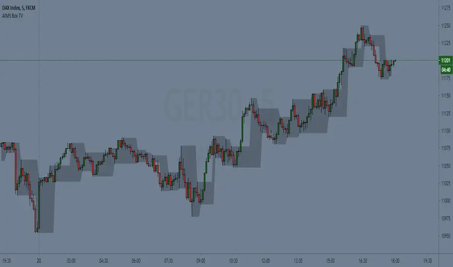
AIMS Box TV [ Trade in line with the Structure of the Market] Introduction to AIMS Box
The Market has an underlying Unseen Structure that can be revealed by using this indicator.
The underlying structure of the Market is Elliott Wave. And the Underlying Structure of Elliott Wave is the Fractals. This BOX is based on the Fractals.
The AIMS Box is created using the fractals. The Upper and Lower Levels require a minimum of five bars with the top of the box being the upper Fractal; the bottom of the box, the lower Fractal
The AIMS Levels are the high and low of the AIMS Box – the upper and lower Fractals.
This indicator, by itself, provided the concept that revolutionised my trading.
AIMS Box can be used for
1. Calculating Risk Per Trade
2. To Find the Trend of the Market i.e. Stepping Up is Uptrend and Stepping Down is Down Trend.
3. The box lower levels are used for Trailing Stops for Buy Orders and Box High levels are used for Trailing Stop for Sell Trades.
Anatomy of the AIMS Box and the AIMS Levels
As mentioned earlier, the AIMS Boxes are formed using high and low Fractals. A new AIMS Box will be created whenever price makes a new high or low Fractal.
The bottom of the AIMS Box – the Lower AIMS Level - is created when a low Fractal is formed i.e. the low of a candle is lower than two candles to the left and two candles to the right.
The AIMS Level clearly shows support and resistance – where price approached a level and could not go further, forcing it to retrace on itself.
Pending Sell Order is set 1 pip below the lower AIMS Level (provided it’s a correct Setup).
The top of the AIMS Box – the Upper AIMS Level - is created when a high Fractal is formed i.e. the high of a candle is higher than two candles to the left and two candles to the right.
Pending Buy Order is set 1 pip + spread above the AIMS Box (provided it’s a correct Setup).
Benefits of this Indicator:
Objective information generated by the AIMS Box and its Levels
Crystal clear entry levels.
Stop-loss levels – clear support and resistance levels.
Money management information.
Position/lot size information.
Trailing stop-loss mechanism.
AIMS Box also generates the following additional information about the market:
The market always creates an AIMS Box before it turns around.
Every trend starts and ends with an AIMS Level.
Entries are always taken on the breakout of the AIMS Box.
We don’t take entries inside the AIMS Box on the timeframe that produced the Setup.
When price is inside the grey shaded zone, it is inside the AIMS Box; it is within the AIMS
How to Get Access to This Script?
Contact me using the link below to gain access.
Structure Pilot Vision [Wang Indicators]Built and refined with Dave Teaches, the HTF Vision Pro supercharges the trader, providing them with the tools to approach price with a layered analysis.
Providing the trader the instruments to put on the spotlight significant zones to anticipate price deliveries
HTF CANDLE VISION
Displays up to 3 series of HTF Candles
Shows candlesticks from a higher time frame (e.g., daily, 4-hour, weekly) on a lower time frame chart (e.g., 1-hour, 15-minute). This allows traders to simultaneously observe both short-term and long-term market dynamics.
Customizable Time Frames: Users can select any higher time frame to overlay on the current chart. Common time frames include daily, weekly, and monthly candles, but other custom time frames can also be used.
Color Coding: The HTF candles are color-coded for easy differentiation from the lower time frame candles. Users can customize colors to suit their preferences.
Open, High, Low, Close (OHLC) Representation: The indicator displays the full candlestick pattern for the chosen HTF, including the open, high, low, and close values. This helps traders easily identify key price levels and trends.
Settings :
Number of candles
Space between the chart and the HTF candles
Space between candles sets
Size : from Tiny (2x regular candle size) to Large (x8 regular candle size)
Space between candles
Colors of candles, borders and wicks
Incorporating a Higher Time Frame (HTF) candle into your Lower Time Frame (LTF) chart can be immensely beneficial for traders looking to enhance their analysis and decision-making process.
Use Cases for HTF Candles on LTF Charts:
Trend Confirmation:
Use Case: A trader might be looking at a 15-minute chart (LTF) but wants to confirm if the short-term trends align with the daily trend (HTF). Plotting a daily candle on the 15-minute chart helps visualize whether the short-term movements are part of a broader, longer-term trend.
Support and Resistance Identification:
Use Case: By plotting a weekly candle on a daily chart, traders can quickly identify levels that have acted as significant support or resistance in the past on the higher time frame, which might not be as visible or influential on the daily chart alone.
Entry and Exit Points Enhancement:
Use Case: When preparing to enter a trade based on a 1-hour chart, overlaying a 4-hour candle can provide insights into potential reversal points or continuation patterns that are more significant on the higher time frame, thus refining entry and exit strategies.
Volatility and Breakout Analysis:
Use Case: Seeing how a single HTF candle (like a monthly candle on a weekly chart) closes can give traders an idea of the market's volatility or the strength behind breakouts. A long wick on the HTF candle might suggest a rejected breakout or a potential reversal.
Risk Management:
Use Case: Using an HTF candle can help set more informed stop-loss levels. For instance, if a trader uses a 4-hour candle on a 1-hour chart, they might place their stop-loss just beyond the low of the HTF candle, assuming this represents a significant level of support or resistance.
Contextual Trading Decisions:
Use Case: For scalpers or day traders, understanding where the current price action sits within the context of a higher timeframe can lead to better decision-making. For instance, trading within an HTF consolidation range might suggest less aggressive moves, while being near the top or bottom of such a range might indicate potential for larger movements.
Market Sentiment Analysis:
Use Case: The color (red for bearish, green for bullish) and size of the HTF candle can give a quick visual cue of the market sentiment over that period, helping traders assess whether they are going with or against the broader market flow.
Swing Trading:
Use Case: Swing traders might plot a weekly candle on a daily chart to align their trades with the direction of the weekly trend, ensuring they're not fighting the broader market momentum.
Educational and Visual Reference:
Use Case: For educational purposes, having an HTF candle overlay can serve as a visual reminder for students or new traders about how price movements on different time frames can influence each other, aiding in teaching concepts like "the trend is your friend."
Wang use cases :
The way it is intended to be used is as follow
If you trade the 1 min chart and have a set of 5 min HTF candles plotted on your charts it could be used as follow :
As long as the 5 min keep providing close below the last 5 min candle if you're short you're safe ... if the 5 min candle stop closing below the last ones and start giving up-close you should consider closing your trade
Another use of HTF Candle is to find fractals responsible (up or down internal mouv before the breakout that creates a new zone). This fractal acts as supply and demand zone responsible for maintening the trend or for a reversal.
See examples below :
These fractals are interesting zones because they often cause the price to react, so following a flip in the fractal, you can take a short in bearish zones and a long in bullish zones. Fractals are easier to detect thanks to the HTF candles function, and allow you to enter positions with greater confidence. They can be used in the same way as the 70%, 50% and 30% interest zones, or they can be used simultaneously.
Use with zones :
▫️ VERTICAL BARS VISION ▫️
The vertical bars provide a view of market fractality: on a low time frame chart, they show the size of a candle in a higher time frame, and thus give a better understanding of the price fractality essential to the strategy we use.
Example :
For your information, when you modify data in the vertical bars or HTF candles parameters, the two are synchronized automatically.
The Vertical HTF Candle Closures Indicator is a simple yet effective tool that helps traders visually track the closing times of higher time frame (HTF) candles (such as 4H, 1H, 15M) on a lower time frame chart (e.g., 1-minute).
This feature plots vertical lines on the chart at the exact closure time of each selected HTF, allowing traders to quickly recognize key moments when the HTF candles close, or better yet when we trade above / below the last one and reverse ''sweepy sweepy'' .
Its more like a vertical and more micro visualisation than the HTF Candles.
Wang usage :
its a great tool to be able to reverse engineer what's in a HTFcandle precisely its a good combination with HTF candle projections to train the eyes of the traders about Whats is inside a candle that formed on the higher time frame
Limitation & know issues :
The chart may become cluttered with too many lines if multiple time frames are selected. Adjusting the line style or disabling certain time frames can help reduce visual noise.
On low time frame (<30s), some bar may notshow exactly on time (e.g : in 10sec timeframe, the 15min bar can be displayed at 01:15:10 instead of 01:15:00).
Because of the data provider and the interpreter of Trading View, if there is not data for a candle, Trading view just "skip" the candle. Sometime, those skip are on the candle that goes to 15min, 1 hour or 4 hour. As this is a Trading View issue. There is pretty much nothing we can do.
Some users may experience vertical bars at 1am, 5am, 9am ... instead of 0am, 4am, 8am ... That is because of the difference between the Timezone set on the chart and the timezone of the market they trade. Vertical bar will always refer to the symbol displayed
Quantum Breakout System**Quantum Breakout System (QBS) by @profitgang**
**Description:**
The Quantum Breakout System combines multi-dimensional fractal analysis with a novel “quantum energy” momentum indicator to identify high-probability support and resistance breakout zones. It plots colored boxes around the latest primary fractals—red/orange/yellow for resistance and lime/green/blue for support—each labeled “Strong”, “Medium” or “Weak” to convey relative breakout strength. Optional background fills highlight pre-breakout staging areas.
**Key Features:**
* **Multi-Timeframe Fractals:** Detects primary fractals on the current chart, with adjustable lookback lengths.
* **Quantum Energy Momentum:** Computes an energy score by blending short, medium, and long RSI-based momentum; scaled by ATR-normalized volatility.
* **Dynamic Breakout Zones:** Plots color-coded boxes around fractals, with embedded labels indicating “Resistance — Strong/Medium/Weak” and “Support — Strong/Medium/Weak.”
* **Pre-Breakout Staging:** Semi-transparent background fills show upcoming breakout windows to help you prepare.
* **Fully Customizable:** User inputs for fractal lengths, energy smoothing, prediction bars, confidence thresholds, and label sizing.
* **Non-Repainting Logic:** All signals are evaluated on bar close to ensure historical consistency.
**Inputs & Controls:**
• Primary/secondary/tertiary fractal lengths
• Quantum energy smoothing and time-weight ratios
• Prediction bars ahead & confidence threshold
• Toggle fractal boxes, staging zones, and labels
• Label text size and color transparency
Resistance boxes (res_col):
Red = Strong breakdown potential (quantum_energy > 0.7)
Orange = Medium potential (0.5 < quantum_energy ≤ 0.7)
Yellow = Weak potential (quantum_energy ≤ 0.5)
Support boxes (sup_col):
Lime = Strong breakout potential (quantum_energy > 0.7)
Green = Medium potential (0.5 < quantum_energy ≤ 0.7)
Blue = Weak potential (quantum_energy ≤ 0.5)
**Usage & Disclaimer:**
This indicator is designed to help spot potential breakout areas—it does **not** guarantee future performance. Always backtest and use proper risk management. By using QBS, you acknowledge that @profitgang and TradingView are not responsible for any trading outcomes.
Happy trading!

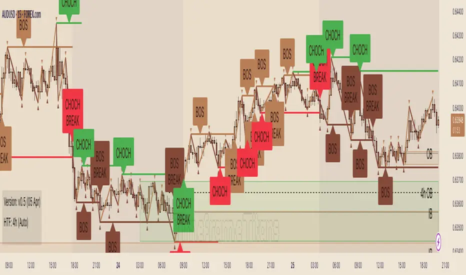
Timeframe Titans: Market Structure & MTF Order Blocks🟩 OVERVIEW
A combined market structure and order block indicator. Displays fractals, zigzags, Break Of Structure and Change Of Character lines. Shows order blocks on the chart and a higher timeframe.
Unique features include:
• The structure rules require counter fractals for BOS. This enables us to use more responsive fractal settings without creating excessive noise.
• Structure is strict. After the initial CHoCH there is always one and only one active CHoCH line.
• Order blocks can be filtered by market structure.
• Order blocks are based entirely on candle patterns (which appear to be unique among all the indicators we tested) instead of using pivots or other configurable calculations.
• Order blocks have separate mitigation levels, not merely the edge of the block, and being partially mitigated is a separate logical state.
🟩 WHAT IS MARKET STRUCTURE?
There are many ways to conceptualise and code market structure — the prevailing trend derived from important price levels. All of them start with identifying highs and lows in price, then use breaks of those levels to assign a trend.
This indicator displays the following market structure features:
• Williams Fractals to derive high and low pivots.
• Zigzag lines, which connect highs and lows.
• Break of Structure (BOS) lines, which are formed from the highest high in an *uptrend* or the lowest low in a *downtrend*. A break of a BOS line signals trend continuation.
• Change of Character (CHoCH) lines, which are formed from the highest high in a *downtrend* or the lowest low in an *uptrend*. A break of a CHoCH line signals trend reversal.
• Market structure bias, which is derived from the break of a CHoCH line. If a CHoCH line is broken to the upside, the trend is bullish, and if to the downside, bearish.
(For more details of the market structure features of this indicator, see the FEATURES OF THIS INDICATOR section.)
This definition of market structure implies that:
• There can only ever be one single active BOS line.
• There can only ever be one single active CHoCH line.
• A break of a BOS line creates a new CHoCH line.
• A break of a CHoCH line creates a new bias, a new BOS line, and a new CHoCH line.
• Before we can create a BOS, we need to know the bias, for which we need the CHoCH, for which we need BOS... just one of the chicken-vs-egg difficulties of coding market structure.
To understand how this indicator differs from other market structure indicators, see the COMPARISON WITH OTHER INDICATORS section.
🟩 WHAT ARE ORDER BLOCKS?
Order blocks are candle patterns that appear at highs and lows. The theory is that these areas are where many orders were filled — too many for the order book, causing an imbalance in buyers and sellers. As such, these areas can form support or resistance levels when price returns to them.
This indicator displays the following features related to order blocks:
• Imbalances, also called Fair Value Gaps.
• Order blocks of two different types (Imbalance Block and Standard Order Blocks)
(For more details of the order block features of this indicator, see the FEATURES OF THIS INDICATOR section.)
There are different patterns that can define order blocks, but the common element is that price should move vigorously away from the area after the pattern forms.
To understand how this indicator differs from other order block indicators, see the COMPARISON WITH OTHER INDICATORS section.
🟩 FEATURES OF THIS INDICATOR
Pivots
Shows Williams high and low fractals, with a configurable lookback. The pivots are always calculated, since they are the building block of all other market structure features. The pivot shape display can be turned on or off, and the display customised.
Zigzag
Draws lines between the highs and lows. The lines can be shown or hidden, and the colour and thickness configured.
Break of Structure
BOS lines are always calculated, but can be shown or hidden. The appearance can be customised. BOS lines are drawn from the candle that has the high or low that defines their level. They always extend until they are broken or the bias changes. The BOS lines have an optional, configurable label. When a BOS line is broken, an optional, configurable label is drawn on that bar.
Change of Character
CHoCH lines can be shown, hidden, and customised. CHoCH lines always extend until they are broken or a new CHoCH line is formed. CHoCH lines have optional labels. A different, customisable label is drawn when a CHoCH line is broken.
Market structure bias
Market structure bias is derived from the break of a CHoCH line. If a CHoCH line is broken to the upside, the trend is bullish, and if to the downside, bearish. The background is shaded a configurable colour based on the trend.
Imbalances
Imbalances are drawn in configurable colours. When they are mitigated, you can choose to change the colour, delete them, or leave them.
Order blocks
Two types of imbalance order blocks are displayed: Standard Order Blocks and Imbalance Blocks. They can be shown or hidden, and customised, independently.
Each order block has a mitigation line with configurable colours and style. If price exceeds the mitigation line, the order block is mitigated and is considered inactive.
The order blocks, or their labels, can be deleted when the order block is mitigated. If not deleted, their colour is changed and they no longer extend with each new bar.
Order blocks on the chart timeframe can be shown conditionally within the context of the market structure: you can choose to show:
• Pro-trend order blocks (bearish order blocks that were created in bearish market structure and vice-versa).
• Counter-trend order blocks (bearish order blocks that were created in bullish market structure and vice-versa).
• All order blocks.
Higher timeframe
Imbalances and order blocks can be independently shown and customised on a single higher timeframe. The HTF functions of this indicator do not repaint because they use confirmed data.
You can choose a custom, fixed higher timeframe, or an "Auto" mode where the script automatically chooses the higher timeframe based on the chart timeframe.
Script information messages
An optional table shows information about the script, including configuration problems, such as if a custom HTF is not actually higher than the chart timeframe.
🟩 HOW TO USE
There are very many ways to use market structure and order blocks in trading and we recommend you study extensively, and if possible get a trusted mentor.
Here is a random example we found on the recent GBPUSD chart. In the screenshot below, the left chart is at 30m and the right is at 5m. We've toggled various settings to make the chart clearer for demonstration purposes.
1 — We get a CHoCH break on the higher timeframe. So our bias (if we are trying to trade with the trend) is bearish. Now we look for some other confluence.
2 — Price revisits the top of the range and mitigates an imbalance block. It wicks the CHoCH (resetting it) but does not break it on close. The bearish market structure is thus preserved. For these reasons, we're thinking about a short, and we switch to the 5m chart on the right to find an entry. We've chosen a Custom HTF of 30m to match the left chart and we can see the mitigated HTF order block, marked "30m IB". We can see when price moves definitively out of the order block area to the downside.
3 — A bearish order block is formed and very quickly price comes back into it. We could enter a short here with a stop above the closest relevant fractal.
4 — Another bearish order block forms and price retests it. Another entry. Two previous 5m bullish order blocks at the bottom of the chart act as support. We could potentially close our short here.
5 — Another test of the same block, which was not mitigated the first time. Another potential short entry. As it happens, price makes a massive run lower here, such that we could trail our stop down one ATR above every single high fractal (marked out using manual rays and a public ATR indicator) for a good R:R, but that's not the point.
This is a made-up, retrofitted example with a fairly generic methodology. It's just to show how some of the features of this indicator could be used in trading:
• Market structure can give a bias. It can also mark interesting levels.
• Using multiple timeframes, while more complex, can level up your trading experience.
• Price trading back into order blocks can be a good R:R entry.
Your actual way of trading, your playbook of setups, your knowledge of your strengths and weakness as a trader, is your own.
🟩 LIMITATIONS
This indicator is intended for use on Forex markets, although order blocks and market structure do form on any reasonably liquid asset.
The HTF uses confirmed data, so you need to wait until the HTF bar is closed before the order block can form. Therefore it does not repaint, in the sense that people worry about repainting, of changing data in the past. We use the latest recommended method of fetching HTF data .
The market structure uses live chart data, so structure and order blocks that are created by conditions on an open realtime bar can appear and disappear as the current bar close changes. This is quite normal .
The Williams pivots are by definition only confirmed after a defined number of bars, and like everyone else we plot them offset into the past.
Similarly, we offset order blocks into the past so that they start on the candle that has the high or low that defines the order block, not the candle that created them. For HTF order blocks, we calculate the number of chart bars back assuming a 24-hour market, which gives accurate offsets only on Forex and other symbols that trade close to 24 hours each day.
🟩 COMPARISON WITH OTHER INDICATORS
There are a great number of market structure and order block indicators already published on TradingView. Since there are only a certain number of highs and lows on the chart from which to produce structure and order blocks, they all look somewhat similar. However, this indicator, written entirely from scratch without reference to the code of any other indicators, is unique and original in two kinds of ways: in patterns and in features.
PRECISE PATTERNS
We believe that edge in trading can be found in, amongst other things, precision in analysis. You can't truly trust your backtests if your system is not repeatable, and your system is repeatable only if its definitions are precise.
We trade with this indicator, and our students trade with it as well. Why did we spend months creating a new indicator instead of using one of the many existing ones, most of which are free and open source?
Because they are not quite how we wanted.
The indicator was created from our proprietary structure rules, which are based on the generally accepted understanding of market structure, with some specific tweaks.
To prepare this description (after the indicator is finished), we searched for "Market Structure", "CHoCH", and "SMC" and list below all popular (with over 3K boosts; excluding invite-only) indicators that show market structure with CHoCH (sometimes called MSS). We configured the settings to most closely match how our indicator works, added both indicators to the same chart, and looked for relevant differences.
The purpose of this section is not to try to say that this indicator is better than any other, but just that it is different. This difference is important for us and our students.
Indicator #1
As you can see, the indicator interpreted the first part of the chart as a downtrend, whereas ours interpreted it as an uptrend. The structure is completely different, because our Williams Fractal lookback is 2, and the minimum "Swing Points" value for Indicator #1 is 10. Although this indicator is deservedly popular, it isn't what we can use for the way we trade.
Indicator #2
Setting the "Zigzag Length" to 2 results in wildly different market structure, as shown below. For many fractals, this indicator does not place the zigzag at the highest high or lowest low, as ours does consistently. It does not highlight the trend in any way. It gives many Market Structure Breaks in a short period. Although it's again wildly popular, it doesn't match our way of encoding market structure.
Indicator #3
Again, setting the "Pivot lb" and "Pivot rb" inputs to 2 gives much too sensitive market structure. This is because this indicator does not require, as we do, a counter-fractal to form after a fractal in order to confirm a BOS. We believe that this rule gives less noisy structure while also being responsive. Most indicators attempt to compensate for this by having a much larger lookback period. While this does of course give fewer pivots and less noise, this is simply a different logic and gives different results. Note also that although this indicator correctly defines the first section of the chart as an uptrend, it does not draw a CHoCH line. As discussed above, our definition of market structure means that there should always be one and only one active CHoCH line, and we draw this at the earliest sensible opportunity.
Indicator #4
Again, the lack of any extra pivot confirmation logic means that this indicator creates different structure with the same lookback period. Also note the lack of initial CHoCH.
Indicator #5
The lowest lookback is 3, and so this indicator too gives very different structure.
Indicator #6
Of course, using a lookback of 2 gives different structure with this indicator too. For variety, here we show a lookback of 5, which is the lowest setting that returns significantly less noisy structure. You can see that the main CHoCH at the top of the chart is similar but not at the same place. Increasing the lookback does not ever result in a CHoCH at the same place, because the logic is simply different. When the lookback increases above 10, no CHoCH lines are drawn at the top at all.
Indicator #7
This indicator uses the highest/lowest price for the last 10 bars (fixed), along with some other bar conditions. You can see the resulting structure is quite different. Among other differences, it does not create a BOS at the top of the chart, even in an uptrend, and it does not create an opposing CHoCH when the existing CHoCH is broken.
Indicator #8
With "Custom" market structure and a length of 2, BOS and CHoCH lines are drawn by this indicator but in incongruous places.
Conclusion
Although we only illustrate the top few alternatives, we did check many, many others.
These market structure indicators may produce useful output, but their structure differs significantly from ours. We didn't even need to get into specific examples because the general approaches are so different. It is up to the user to decide which indicator, and which interpretation of market structure, best suits their needs.
ORDER BLOCKS
Continuing, we illustrate differences with the most popular order block indicators, trying to get them to match our order blocks. Note that some of these are also in the previous list as market structure indicators.
Order blocks are always formed at swings when price moves away with force, so they will be sort of the same across all the very many existing order block indicators. We are looking for precision and differentiation, as we did with market structure.
Indicator #1
This indicator does not have ability to display mitigated order blocks, only active ones. The order blocks do not match at all.
Indicator #2
With a period of 2, this indicator marks many of the same order blocks as ours. It doesn't extend the blocks, and doesn't mark them when mitigated. The logic for choosing the order block candle is also clearly different.
Indicator #3
Even with very sensitive settings, this indicator did not create as many order blocks as ours and they are quite different.
Indicator #4
Again you can see the logic for choosing candles and creating blocks is simply different. This indicator has inadequate protection against empty arrays, which causes runtime errors on charts with not much history (not a problem for Forex charts in general, but noticeable on the testing chart).
Indicator #5
We were unable to get the order blocks to extend with this indicator, although it should be possible. Anyway the blocks are wildly different.
Indicator #6
Even with the most sensitive settings, this indicator showed only one order block on our test chart.
Indicator #7
This indicator incorporates complex price action concepts. Nevertheless, the order blocks are very different indeed.
Indicator #8
This indicator forms quite different blocks to ours. It has several interesting settings including a choice of using the candle body or wick.
Indicator #9
We were not able to configure this indicator to produce the same order blocks as ours.
Indicator #10
On very sensitive settings, this indicator matches many of our order blocks, but at the same time many are different.
Conclusion
None of the indicators tested here (nor the many others we looked at previously) use the same logic as ours. The differences are so obvious that we don't have to call out individual blocks and analyse how they differ.
Fundamentally, other indicators seem to use variable precision for pivots in their order block detection calculations. Our order blocks are pure candle patterns with two different rulesets for Standard Order Blocks and Imbalance Order Blocks, and this logic does not change.
Note that our order blocks do not always automatically extend to the swing high or low, nor allow the user to choose the limit of the block, but use unique rules.
In summary, our indicator differs from other order block indicators in terms of fundamental detection logic, candle placement, boundary definition, mitigation levels, and logical states (see below).
UNIQUE COMBINATION OF FEATURES
In comparison to all other indicators we looked at, our indicator:
• Uses order blocks with three states: active, mitigated, and partially mitigated. Our mitigation lines for order blocks are rules-based. If price touches the mitigation line, the order block is considered fully mitigated. If price goes inside the order block but does not hit the mitigation line, it is only partially mitigated. These three states are visually distinguished.
• Has the most extensive visual customisation options of all those we looked at. We believe that being able to customise how you see indicator outputs is very important for reducing mental load while analysing and trading.
• Has a unique feature that combines market structure and order blocks, where the user can choose to show pro-trend order blocks (bullish blocks that are formed in bullish structure and vice-versa) or counter-trend blocks (bullish blocks that are formed in bearish structure and vice-versa).
• Approximates an initial trend bias very quickly, so we can start creatng BOS, CHoCH, etc.
• Requires a counter pivot to confirm a BOS line. This seemingly small logical step actually creates very different structure, as we saw in the comparison section.
• Uses a sophisticated array-based sorting mechanism to preserve the selected number of imbalances, use the rest of the TradingView box allowance for order blocks, and delete excess order block objects (not just drawings) in reverse historical order.
• Hides order block drawings if they are a configurable distance away from price. Magically redraws them if price moves closer.
• Includes an equivalent to the system "Calculated bars" setting for the high timeframe, to avoid unnecessary processing and improve performance.
🟩 CODING CONSIDERATIONS
This indicator consists of all original code written by @SimpleCryptoLife for Timeframe_Titans.
AI was used for the following purposes:
• Autocomplete
• Checking that bullish and bearish logic is parallel in a given function
• Querying the names and locations of variables hundreds of lines away when we forgot what they're called, like an expensive search-and-replace
• Help with debugging (it usually makes up elaborate and wrong ideas though)
It was not used to replace the coder's expertise and creativity, or to "vibe-code" some black-box functionality we didn't understand. We can recommend that you use AI the same way.
═════════════════════════════════════════════════════════════
缠中禅V6Pro"ChanLun" is a highly regarded technical analysis method originating in China. Since its introduction in 2006, ChanLun has quickly gained significant attention and a strong following in the Chinese trading community due to its remarkable ability to navigate complex market dynamics.
ChanLun places great emphasis on market structure, price action, momentum, and the intricate interactions between market forces. It recognizes that the market operates in cyclical patterns and aims to capture the underlying structure and rhythm of price movements. Through detailed analysis of the intricate relationship between price and time, it provides traders with a unique perspective on market trends, potential reversals, and key turning points.
🟠 Algorithm
🔵 Step 1: Candlestick Conversion
In ChanLun, candlestick analysis pays less attention to the opening/closing prices and wicks, focusing instead on the range that the stock price reaches. Therefore, the first step in ChanLun involves converting each candlestick to include only the high and low prices, ignoring other elements.
🔵 Step 2: Candlestick Standardization
In the second step, the converted candlesticks are standardized to ensure strict directional consistency and to eliminate the presence of inner or outer bars. For any two adjacent candlesticks A and B, if one price range completely contains the other, A and B are merged into a new candlestick C. If A is in an uptrend from the previous candlestick, C is defined as High(C) = max(High(A), High(B)) and Low(C) = max(Low(A), Low(B)). If A is in a downtrend from the previous candlestick, C is defined as High(C) = min(High(A), High(B)) and Low(C) = min(Low(A), Low(B)).
After completing these steps, when considering any adjacent candlesticks A and B, we can always observe one of the following conditions:
1. High(A) > High(B) and Low(A) > Low(B)
2. High(A) < High(B) and Low(A) < Low(B)
The diagram below illustrates how the candlesticks are displayed after this step.
🔵 Step 3: Fractals
A "fractal" refers to a pattern formed by three consecutive "normalized" candlesticks, where the middle candlestick shows significantly higher or lower values compared to the surrounding candlesticks. When considering three adjacent candlesticks A, B, and C, we have one of two conditions:
1. High (B) > High (A) and High (B) > High (C) and Low (B) > Low (A) and Low (B) > Low (C)
2。 High (B) < Low (A) and High (B) < Low (C) and Low (B) < Low (A) and Low (B) < Low (C) For
In #1 above, we refer to the combination of A, B, and C as the "top fractal", while for #2 we specify it as the "bottom fractal".
The image below illustrates all fractals, with the red triangle indicating the top fractal and the green triangle indicating the bottom splitting.
🔵 Step 4: Strokes
A "stroke" is a line that connects the top fractal and the bottom fractal, following these rules:
1. There must be at least one "free" candlestick between these fractals, which means it is not part of the top or bottom split. This guarantees that the stroke contains at least five candlesticks from start to finish.
2. The top fractal must have a higher price compared to the bottom fractal.
3. The end fractal should represent the highest or lowest point within the entire stroke range. (There is an option in this indicator to enable or disable this rule.)
Brushstrokes enable traders to identify and visualize significant price movements or trends while effectively filtering out minor fluctuations.
🔵 Step 5: Segmentation
A "subdivision" is a higher-level line that connects the start and end points of at least three consecutive strokes, reflecting the trend of the current market structure. As new strokes emerge, it continues to extend until there is a break in the market structure. A breakout occurs when an uptrend forms lower highs and lower lows, or when a downtrend forms higher highs and higher lows. It is important to note that within the trading range, the brushstrokes typically exhibit higher highs and lower lows or higher lows and lower highs patterns (similar to the inner and outer bars). In this case, the brushstrokes will merge in a similar manner to the candlesticks described earlier until there is a clear breakout in the market structure. Contrary to brushstrokes, segments provide a relatively stable depiction of market trends on higher time frames.
It is important to note that the algorithm used to calculate line segments from strokes can again be applied recursively to the generated line segments, forming higher-level line segments that represent market trends over a larger time frame.
🔵 Step 6: Pivot
In ChanLun, the term "pivot" does not represent a price reversal point. Instead, it refers to a trading range where the security's price tends to fluctuate. Within a given "Segment," a pivot is determined by the overlap of two consecutive strokes moving in opposite directions along the segment. When two downward trend strokes, A and B, form a pivot P within an upward trend segment S, the upper and lower boundaries of the pivot are defined as follows:
1. Upper limit (P) = min(high(A), high(B))
2. Lower limit (P) = max(low(A), low(B))
The pivot range is usually where consolidation and high trading volume occur.
If future strokes moving in the opposite direction along the current segment overlap with the upper and lower boundaries of the pivot, those strokes will merge into the existing pivot, extending it along the x-axis. A new pivot is formed when two consecutive strokes moving in the opposite direction along the current segment intersect each other without overlapping the previous pivot.
Similarly, pivots can be recursively identified in higher-level segments. The blue boxes below indicate "Segment Pivots" identified in the context of higher-level segments.
🔵 Step 7: Buy/Sell Points
ChanLun defines three types of buy/sell points.
1. Type 1 Buy and Sell Points: Also called trend reversal points. These points mark where an old segment ends and a new segment begins.
2. Type 2 Buy and Sell Points: Also called trend continuation points. These points occur when the price is in a trend, indicating trend continuation. In an uptrend, Type 2 buy points are rebound points after the price retraces to previous lows or support levels, signaling a likely continuation of the upward movement. In a downtrend, Type 2 sell points are pullback points after the price bounces to previous highs or resistance levels, signaling a likely continuation of the downward movement.
3. Type 3 Buy and Sell Points: These points represent retests of a pivot range breakout. The presence of these retest points indicates that the price may continue to move up/down above/below the pivot level.
Astute readers may notice that these buy/sell points are lagging indicators. For example, multiple candlesticks will have occurred by the time a new segment is confirmed at a Type 1 buy/sell point in that segment. In fact, buy/sell points do lag behind actual market movements. However, ChanLun addresses this issue through multi-timeframe analysis. By examining buy/sell points confirmed in lower timeframes, additional confidence can be gained in determining the overall trend of higher timeframes.
🔵 Step 8: Divergence
Another core technique in ChanLun is using divergence to predict the occurrence of Type 1 buy/sell points. While MACD is the most commonly used indicator for detecting divergence, other indicators like RSI can also serve this purpose.
🟠 Summary
Essentially, ChanLun is a powerful technical analysis method that combines careful examination and interpretation of price charts, the application of technical indicators and quantitative tools, and keen attention to multiple timeframes. Its goal is to identify current market trends and uncover potential trading opportunities. What sets ChanLun apart is its holistic approach, which integrates both qualitative and quantitative analysis to facilitate informed and successful trading decisions.
“缠论”是一种起源于中国的备受推崇的技术分析方法。自 2006 年推出以来,ChanLun 凭借其驾驭复杂市场动态的非凡能力,迅速在中国交易社区中获得了极大的关注和强大的追随者。
ChanLun 非常重视市场结构、价格行为、动量以及市场力量之间错综复杂的相互作用。它认识到市场以周期性模式运作,旨在捕捉价格变动的底层结构和节奏。通过对价格和时间之间错综复杂的关系的细致分析,它为交易者提供了关于市场趋势、潜在逆转和关键转折点的独特视角。
该指标提供了 ChanLun 理论的细致而全面的实施。它有助于对所有基本组成部分进行深入分析和可视化表示,包括 “Candlestick Conversion”, “Candlestick Standardization”, “Fractal”, “Stroke”, “Segment”, “Pivot” 和 “Buying/Selling Point”。
🟠 算法
🔵 1 步:烛台转换
在 ChanLun 中,烛台分析较少关注开盘价/收盘价和灯芯,而是强调股价达到的价格范围。因此,ChanLun 的第一步涉及将每根烛条转换为仅包含最高价和最低价,而忽略其他元素。
🔵 第 2 步:烛台标准化
在第二步中,对转换后的烛台进行标准化,以确保严格的方向一致性,并消除内柱线或外柱线的存在。对于任何相邻的两根烛条 A 和 B,其中一根的价格范围完全包含另一根,A 和 B 被合并为新的烛条 C。如果 A 从前一根蜡烛开始呈上升趋势,则 C 将被定义为最高价 (C) = 最大值(最高价 (A), 最高价 (B)) 和最低价 (C) = 最大值(最低价 (A), 最低价 (B))。如果 A 从前一根蜡烛开始呈下降趋势,则 C 将被定义为最高价 (C) = min(最高价 (A), 最高价 (B)) 和最低价 (C) = min(最低价 (A), 最低价 (B))。
完成这些步骤后,在考虑任何相邻的烛条 A 和 B 时,我们始终可以观察到以下任一条件:
1. 最高价 (A) > 最高价 (B) 和最低价 (A) >最低价 (B)
2。最高价 (A) <最高价 (B) 和最低价 (A) <最低价 (B)
下图说明了此步骤后烛台的显示方式。
🔵 第 3 步:分形
“分形”是指由三个连续的“标准化”烛台形成的形态,其中中间的烛台与周围的烛台相比显示出明显的更高或更低的值。当考虑三个相邻的烛台 A、B 和 C 时,我们有以下两个条件之一:
1. 最高价 (B) > 最高价 (A) 和高点 (B) >最高价 (C) 和最低价 (B) >最低价 (A) 和最低价 (B) >最低价 (C)
2。高 (B) < 低 (A) 和高 (B) < 低 (C) 和低 (B) < 低 (A) 和低 (B) < 低 (C)对于
上面的 #1,我们将 A、B 和 C 的组合称为“顶部分形”,而对于 #2,我们将其指定为“底部分形”。
下图说明了所有分形,其中红色三角形表示顶部分形,绿色三角形表示底部分形。
🔵 第 4 步:笔画
“笔画” 是连接顶部分形和底部分形的一条线,遵循以下规则:
1. 在这些分形之间必须至少有一个 “自由” 烛台,这意味着它不是顶部或底部分形的一部分。这保证了笔画从头到尾至少包含五根烛条。
2. 与底部分形相比,顶部分形必须具有更高的价格。
3. 端点分形应表示整个笔画范围内的最高点或最低点。(此指示器中有一个选项用于启用或禁用此规则。
笔触使交易者能够识别和可视化重大的价格波动或趋势,同时有效地过滤掉微小的波动。
🔵 第 5 步:细分
“细分”是一条更高级别的线,连接至少连续三个笔画的起点和终点,反映了当前市场结构的趋势。随着新笔触的出现,它继续延伸,直到市场结构出现中断。当上升趋势形成较低的高点和较低的低点,或者当下降趋势形成更高的高点和更高的低点时,就会发生突破。值得注意的是,在交易区间内,笔触通常表现出更高的高点和更低的低点或更高的低点和更低的高点形态(类似于内柱和外柱)。在这种情况下,笔触将以与前面描述的烛台类似的方式合并,直到市场结构出现明显的突破。与笔触相反,分段在更高的时间范围内提供了对市场趋势的相对稳定的描述。
需要注意的是,用于从笔画计算线段的算法可以再次递归地应用于生成的线段,形成更高级别的线段,代表更大时间范围内的市场趋势。
🔵 第 6 步:枢轴
在 ChanLun 中,“枢轴”一词并不表示价格反转点。相反,它代表证券价格趋于波动的交易区间。在给定的 “Segment” 中,枢轴由沿线段相反方向移动的两个连续笔画的重叠决定。当两个下降趋势笔触 A 和 B 在上升趋势段 S 内形成枢轴 P 时,枢轴的上限和下限定义如下:
1. 上限 (P) = min(最高 (A), 最高 (
pein:
B)
2. 下限 (P) = 最大值(最低 (A), 最低 (B))
枢轴范围通常是发生盘整和交易量高的地方。
如果沿当前线段的相反方向移动的未来笔触与枢轴的上限和下限重叠,则该笔划将合并到现有枢轴中,并沿 x 轴延伸枢轴。当沿当前线段的相反方向移动的两个连续笔触彼此相交而不与前一个轴重叠时,将形成新的枢轴。
同样,也可以在更高级别的 segment 中递归识别 pivots。下面的蓝色框表示在更高级别区段的上下文中标识的“Segment Pivots”。
🔵 第 7 步:购买/出售积分
ChanLun 中定义了三种类型的购买/出售积分。
1. 类型 1 买入和卖出点:也称为趋势反转点。这些点是旧路段终止和生成新路段的位置。
2. 类型 2 买入和卖出点:也称为趋势延续点。这些点发生在价格处于趋势中时,标志着趋势的延续。在上升趋势中,类型 2 买点是价格回撤至先前低点或支撑位后的反弹点,表明价格可能会继续上涨。在下跌趋势中,类型 2 卖点是价格反弹至前高点或阻力位后的回调点,表明价格可能会继续下跌。
3. 类型 3 买入和卖出点:这些点表示对枢轴范围突破的重新测试。这些重新测试点的存在表明,价格有可能在枢轴水平上方/下方继续向上/向下移动。
挑剔的读者可能会注意到这些买入/卖出点是滞后指标。例如,当确认新区段时,自该区段的类型 1 买入/卖出点以来已经发生了多根烛台。
事实上,买入/卖出点确实落后于实际市场走势。然而,ChanLun 通过使用多时间框架分析解决了这个问题。通过检查较低时间框架中确认的买入/卖出点,可以在确定较高时间框架的整体趋势方面获得额外的信心。
🔵 第 8 步:背离
ChanLun 的另一个核心技术是应用背离来预测 1 型买入/卖出点的出现。虽然 MACD 是检测背离最常用的指标,但 RSI 等其他指标也可用于此目的。
🟠 总结
从本质上讲,ChanLun 是一种强大的技术分析方法,它结合了对价格图表的仔细检查和解释、技术指标和定量工具的应用以及对多个时间框架的敏锐关注。其目标是确定当前的市场趋势并发现潜在的交易前景。ChanLun 的与众不同之处在于其整体方法,该方法融合了定性和定量分析,以促进明智和成功的交易决策。

Project Pegasus RevenantDescription
Project Pegasus Revenant is a reversal and liquidity-trap detection system combining a configurable fractal reversal engine with the SweepTrigger liquidity finder. It highlights potential structural turning points and stop-hunt scenarios directly on the chart.
What’s unique
Fractal Reversal Engine: Adjustable strictness (1 = loose, 5 = strict) to fit different market conditions.
Signal Filtering: Minimum bar spacing to avoid clustering of false or repeated signals.
SweepTrigger Add-on: Detects liquidity sweeps with wick-based rejection logic, auto-doji detection, and range-strength confirmation.
Dual Signal Output: Circle markers for pure fractal reversals, triangles for sweep-based liquidity traps.
Adaptive Filters: Customizable thresholds for body size, candle range, and sweep strength.
How it works (technical)
Fractals: A reversal fractal is confirmed when the high/low at position n is surrounded by lower/higher highs/lows across a configurable frontier.
Signal confirmation: Once price trades back through the fractal level within a limited number of bars, a potential reversal is triggered.
Bar filter: Signals require a minimum distance in bars to prevent noise.
SweepTrigger logic:
Wick comparison (upper vs lower) determines rejection direction.
Doji and low-body candles are auto-filtered.
Range check ensures the current candle exceeds a configurable multiple of the average range.
Visuals:
Green/Red circles = fractal reversals.
Cyan/Purple triangles = liquidity sweep triggers.
How to use
Watch fractal signals to anticipate structural reversal points.
Combine SweepTrigger signals with liquidity highs/lows for identifying stop hunts and fakeouts.
Use as standalone reversal tool or as confirmation within a broader system (e.g., order blocks, volume profile, or market structure).
Key settings
Reversal Mode: 1–5 (controls strictness of fractals).
SweepTrigger: On/off toggle, lookback window, body-size filter, range strength multiplier.
Visuals: Shapes, sizes, and color-coded signals for clear separation between fractal and sweep triggers.
Notes & limitations
Works on all timeframes.
Signals are reactive (based on confirmed bars), not predictive — no lookahead logic.
Too strict settings may reduce signal frequency; too loose may increase noise.
Disclaimer
For educational and informational purposes only. Not financial advice.

Hybrid Adaptive Double Exponential Smoothing🙏🏻 This is HADES (Hybrid Adaptive Double Exponential Smoothing) : fully data-driven & adaptive exponential smoothing method, that gains all the necessary info directly from data in the most natural way and needs no subjective parameters & no optimizations. It gets applied to data itself -> to fit residuals & one-point forecast errors, all at O(1) algo complexity. I designed it for streaming high-frequency univariate time series data, such as medical sensor readings, orderbook data, tick charts, requests generated by a backend, etc.
The HADES method is:
fit & forecast = a + b * (1 / alpha + T - 1)
T = 0 provides in-sample fit for the current datum, and T + n provides forecast for n datapoints.
y = input time series
a = y, if no previous data exists
b = 0, if no previous data exists
otherwise:
a = alpha * y + (1 - alpha) * a
b = alpha * (a - a ) + (1 - alpha) * b
alpha = 1 / sqrt(len * 4)
len = min(ceil(exp(1 / sig)), available data)
sig = sqrt(Absolute net change in y / Sum of absolute changes in y)
For the start datapoint when both numerator and denominator are zeros, we define 0 / 0 = 1
...
The same set of operations gets applied to the data first, then to resulting fit absolute residuals to build prediction interval, and finally to absolute forecasting errors (from one-point ahead forecast) to build forecasting interval:
prediction interval = data fit +- resoduals fit * k
forecasting interval = data opf +- errors fit * k
where k = multiplier regulating intervals width, and opf = one-point forecasts calculated at each time t
...
How-to:
0) Apply to your data where it makes sense, eg. tick data;
1) Use power transform to compensate for multiplicative behavior in case it's there;
2) If you have complete data or only the data you need, like the full history of adjusted close prices: go to the next step; otherwise, guided by your goal & analysis, adjust the 'start index' setting so the calculations will start from this point;
3) Use prediction interval to detect significant deviations from the process core & make decisions according to your strategy;
4) Use one-point forecast for nowcasting;
5) Use forecasting intervals to ~ understand where the next datapoints will emerge, given the data-generating process will stay the same & lack structural breaks.
I advise k = 1 or 1.5 or 4 depending on your goal, but 1 is the most natural one.
...
Why exponential smoothing at all? Why the double one? Why adaptive? Why not Holt's method?
1) It's O(1) algo complexity & recursive nature allows it to be applied in an online fashion to high-frequency streaming data; otherwise, it makes more sense to use other methods;
2) Double exponential smoothing ensures we are taking trends into account; also, in order to model more complex time series patterns such as seasonality, we need detrended data, and this method can be used to do it;
3) The goal of adaptivity is to eliminate the window size question, in cases where it doesn't make sense to use cumulative moving typical value;
4) Holt's method creates a certain interaction between level and trend components, so its results lack symmetry and similarity with other non-recursive methods such as quantile regression or linear regression. Instead, I decided to base my work on the original double exponential smoothing method published by Rob Brown in 1956, here's the original source , it's really hard to find it online. This cool dude is considered the one who've dropped exponential smoothing to open access for the first time🤘🏻
R&D; log & explanations
If you wanna read this, you gotta know, you're taking a great responsability for this long journey, and it gonna be one hell of a trip hehe
Machine learning, apprentissage automatique, машинное обучение, digital signal processing, statistical learning, data mining, deep learning, etc., etc., etc.: all these are just artificial categories created by the local population of this wonderful world, but what really separates entities globally in the Universe is solution complexity / algorithmic complexity.
In order to get the game a lil better, it's gonna be useful to read the HTES script description first. Secondly, let me guide you through the whole R&D; process.
To discover (not to invent) the fundamental universal principle of what exponential smoothing really IS, it required the review of the whole concept, understanding that many things don't add up and don't make much sense in currently available mainstream info, and building it all from the beginning while avoiding these very basic logical & implementation flaws.
Given a complete time t, and yet, always growing time series population that can't be logically separated into subpopulations, the very first question is, 'What amount of data do we need to utilize at time t?'. Two answers: 1 and all. You can't really gain much info from 1 datum, so go for the second answer: we need the whole dataset.
So, given the sequential & incremental nature of time series, the very first and basic thing we can do on the whole dataset is to calculate a cumulative , such as cumulative moving mean or cumulative moving median.
Now we need to extend this logic to exponential smoothing, which doesn't use dataset length info directly, but all cool it can be done via a formula that quantifies the relationship between alpha (smoothing parameter) and length. The popular formulas used in mainstream are:
alpha = 1 / length
alpha = 2 / (length + 1)
The funny part starts when you realize that Cumulative Exponential Moving Averages with these 2 alpha formulas Exactly match Cumulative Moving Average and Cumulative (Linearly) Weighted Moving Average, and the same logic goes on:
alpha = 3 / (length + 1.5) , matches Cumulative Weighted Moving Average with quadratic weights, and
alpha = 4 / (length + 2) , matches Cumulative Weighted Moving Average with cubic weghts, and so on...
It all just cries in your shoulder that we need to discover another, native length->alpha formula that leverages the recursive nature of exponential smoothing, because otherwise, it doesn't make sense to use it at all, since the usual CMA and CMWA can be computed incrementally at O(1) algo complexity just as exponential smoothing.
From now on I will not mention 'cumulative' or 'linearly weighted / weighted' anymore, it's gonna be implied all the time unless stated otherwise.
What we can do is to approach the thing logically and model the response with a little help from synthetic data, a sine wave would suffice. Then we can think of relationships: Based on algo complexity from lower to higher, we have this sequence: exponential smoothing @ O(1) -> parametric statistics (mean) @ O(n) -> non-parametric statistics (50th percentile / median) @ O(n log n). Based on Initial response from slow to fast: mean -> median Based on convergence with the real expected value from slow to fast: mean (infinitely approaches it) -> median (gets it quite fast).
Based on these inputs, we need to discover such a length->alpha formula so the resulting fit will have the slowest initial response out of all 3, and have the slowest convergence with expected value out of all 3. In order to do it, we need to have some non-linear transformer in our formula (like a square root) and a couple of factors to modify the response the way we need. I ended up with this formula to meet all our requirements:
alpha = sqrt(1 / length * 2) / 2
which simplifies to:
alpha = 1 / sqrt(len * 8)
^^ as you can see on the screenshot; where the red line is median, the blue line is the mean, and the purple line is exponential smoothing with the formulas you've just seen, we've met all the requirements.
Now we just have to do the same procedure to discover the length->alpha formula but for double exponential smoothing, which models trends as well, not just level as in single exponential smoothing. For this comparison, we need to use linear regression and quantile regression instead of the mean and median.
Quantile regression requires a non-closed form solution to be solved that you can't really implement in Pine Script, but that's ok, so I made the tests using Python & sklearn:
paste.pics
^^ on this screenshot, you can see the same relationship as on the previous screenshot, but now between the responses of quantile regression & linear regression.
I followed the same logic as before for designing alpha for double exponential smoothing (also considered the initial overshoots, but that's a little detail), and ended up with this formula:
alpha = sqrt(1 / length) / 2
which simplifies to:
alpha = 1 / sqrt(len * 4)
Btw, given the pattern you see in the resulting formulas for single and double exponential smoothing, if you ever want to do triple (not Holt & Winters) exponential smoothing, you'll need len * 2 , and just len * 1 for quadruple exponential smoothing. I hope that based on this sequence, you see the hint that Maybe 4 rounds is enough.
Now since we've dealt with the length->alpha formula, we can deal with the adaptivity part.
Logically, it doesn't make sense to use a slower-than-O(1) method to generate input for an O(1) method, so it must be something universal and minimalistic: something that will help us measure consistency in our data, yet something far away from statistics and close enough to topology.
There's one perfect entity that can help us, this is fractal efficiency. The way I define fractal efficiency can be checked at the very beginning of the post, what matters is that I add a square root to the formula that is not typically added.
As explained in the description of my metric QSFS , one of the reasons for SQRT-transformed values of fractal efficiency applied in moving window mode is because they start to closely resemble normal distribution, yet with support of (0, 1). Data with this interesting property (normally distributed yet with finite support) can be modeled with the beta distribution.
Another reason is, in infinitely expanding window mode, fractal efficiency of every time series that exhibits randomness tends to infinitely approach zero, sqrt-transform kind of partially neutralizes this effect.
Yet another reason is, the square root might better reflect the dimensional inefficiency or degree of fractal complexity, since it could balance the influence of extreme deviations from the net paths.
And finally, fractals exhibit power-law scaling -> measures like length, area, or volume scale in a non-linear way. Adding a square root acknowledges this intrinsic property, while connecting our metric with the nature of fractals.
---
I suspect that, given analogies and connections with other topics in geometry, topology, fractals and most importantly positive test results of the metric, it might be that the sqrt transform is the fundamental part of fractal efficiency that should be applied by default.
Now the last part of the ballet is to convert our fractal efficiency to length value. The part about inverse proportionality is obvious: high fractal efficiency aka high consistency -> lower window size, to utilize only the last data that contain brand new information that seems to be highly reliable since we have consistency in the first place.
The non-obvious part is now we need to neutralize the side effect created by previous sqrt transform: our length values are too low, and exponentiation is the perfect candidate to fix it since translating fractal efficiency into window sizes requires something non-linear to reflect the fractal dynamics. More importantly, using exp() was the last piece that let the metric shine, any other transformations & formulas alike I've tried always had some weird results on certain data.
That exp() in the len formula was the last piece that made it all work both on synthetic and on real data.
^^ a standalone script calculating optimal dynamic window size
Omg, THAT took time to write. Comment and/or text me if you need
...
"Versace Pip-Boy, I'm a young gun coming up with no bankroll" 👻
∞
Support Resistance ImportanceThe Support Resistance Importance indicator is designed to highlight key price levels based on the relationship between fractal occurrences and volume distribution within a given price range. By dividing the range into bins, the indicator calculates the total volume traded at each fractal level and normalizes the values for easy visualization. The normalized values represent an "importance score" for each price range, helping traders identify critical support and resistance levels where price action might react.
Key Features:
Fractal Detection:
The indicator detects Williams Fractals, which are specific price patterns representing potential market reversals. It identifies both upward fractals (potential resistance) and downward fractals (potential support).
Price Range Binning:
The price range is divided into a user-defined number of bins (default is 20). Each bin represents a segment of the total price range, allowing the indicator to bucket price action and track fractal volumes in each bin.
Volume-Based Importance Calculation:
For each bin, the indicator sums up the volume traded at the time a fractal occurred. The volumes are then normalized to reflect their relative importance.
The importance score is calculated as the relative volume in each bin, representing the potential influence of that price range. Higher scores indicate stronger support or resistance levels.
Normalization:
The volume data is normalized to allow for better comparison across bins. This normalization ensures that the highest and lowest volumes are scaled between 0 and 1 for visualization purposes. The smallest volume value is used to scale the rest, ensuring meaningful comparisons.
Visualization:
The indicator provides a table-based visualization showing the price range and the corresponding importance score for each bin.
Each bin is color-coded based on the normalized importance score, with blue or greenish shades indicating higher importance levels. The current price range is highlighted to help traders quickly identify relevant areas of interest.
Trading Utility:
Traders can use the importance scores to identify price levels where significant volume has accumulated at fractals. A higher importance score suggests a stronger likelihood of the price reacting to that level.
If a price moves towards a bin with a high score and the bins above it have much smaller values, it suggests that the price may "pump" up to the next high-scored range, similar to how price drops can occur.
Example Use Case:
Suppose the price approaches a bin with an importance score of 25, and the bins above have much smaller values. This suggests that price may break higher towards the next significant level of resistance, offering traders an opportunity to capitalize on the move by entering long positions or adjusting their stop losses.
This indicator is particularly useful for support and resistance trading, where understanding key levels of price action and volume can improve decision-making in anticipating market reactions.

Mandelbrot-Fibonacci Cascade Vortex (MFCV)Mandelbrot-Fibonacci Cascade Vortex (MFCV) - Where Chaos Theory Meets Sacred Geometry
A Revolutionary Synthesis of Fractal Mathematics and Golden Ratio Dynamics
What began as an exploration into Benoit Mandelbrot's fractal market hypothesis and the mysterious appearance of Fibonacci sequences in nature has culminated in a groundbreaking indicator that reveals the hidden mathematical structure underlying market movements. This indicator represents months of research into chaos theory, fractal geometry, and the golden ratio's manifestation in financial markets.
The Theoretical Foundation
Mandelbrot's Fractal Market Hypothesis Traditional efficient market theory assumes normal distributions and random walks. Mandelbrot proved markets are fractal - self-similar patterns repeating across all timeframes with power-law distributions. The MFCV implements this through:
Hurst Exponent Calculation: H = log(R/S) / log(n/2)
Where:
R = Range of cumulative deviations
S = Standard deviation
n = Period length
This measures market memory:
H > 0.5: Trending (persistent) behavior
H = 0.5: Random walk
H < 0.5: Mean-reverting (anti-persistent) behavior
Fractal Dimension: D = 2 - H
This quantifies market complexity, where higher dimensions indicate more chaotic behavior.
Fibonacci Vortex Theory Markets don't move linearly - they spiral. The MFCV reveals these spirals using Fibonacci sequences:
Vortex Calculation: Vortex(n) = Price + sin(bar_index × φ / Fn) × ATR(Fn) × Volume_Factor
Where:
φ = 0.618 (golden ratio)
Fn = Fibonacci number (8, 13, 21, 34, 55)
Volume_Factor = 1 + (Volume/SMA(Volume,50) - 1) × 0.5
This creates oscillating spirals that contract and expand with market energy.
The Volatility Cascade System
Markets exhibit volatility clustering - Mandelbrot's "Noah Effect." The MFCV captures this through cascading volatility bands:
Cascade Level Calculation: Level(i) = ATR(20) × φ^i
Each level represents a different fractal scale, creating a multi-dimensional view of market structure. The golden ratio spacing ensures harmonic resonance between levels.
Implementation Architecture
Core Components:
Fractal Analysis Engine
Calculates Hurst exponent over user-defined periods
Derives fractal dimension for complexity measurement
Identifies market regime (trending/ranging/chaotic)
Fibonacci Vortex Generator
Creates 5 independent spiral oscillators
Each spiral follows a Fibonacci period
Volume amplification creates dynamic response
Cascade Band System
Up to 8 volatility levels
Golden ratio expansion between levels
Dynamic coloring based on fractal state
Confluence Detection
Identifies convergence of vortex and cascade levels
Highlights high-probability reversal zones
Real-time confluence strength calculation
Signal Generation Logic
The MFCV generates two primary signal types:
Fractal Signals: Generated when:
Hurst > 0.65 (strong trend) AND volatility expanding
Hurst < 0.35 (mean reversion) AND RSI < 35
Trend strength > 0.4 AND vortex alignment
Cascade Signals: Triggered by:
RSI > 60 AND price > SMA(50) AND bearish vortex
RSI < 40 AND price < SMA(50) AND bullish vortex
Volatility expansion AND trend strength > 0.3
Both signals implement a 15-bar cooldown to prevent overtrading.
Advanced Input System
Mandelbrot Parameters:
Cascade Levels (3-8):
Controls number of volatility bands
Crypto: 5-7 (high volatility)
Indices: 4-5 (moderate volatility)
Forex: 3-4 (low volatility)
Hurst Period (20-200):
Lookback for fractal calculation
Scalping: 20-50
Day Trading: 50-100
Swing Trading: 100-150
Position Trading: 150-200
Cascade Ratio (1.0-3.0):
Band width multiplier
1.618: Golden ratio (default)
Higher values for trending markets
Lower values for ranging markets
Fractal Memory (21-233):
Fibonacci retracement lookback
Uses Fibonacci numbers for harmonic alignment
Fibonacci Vortex Settings:
Spiral Periods:
Comma-separated Fibonacci sequence
Fast: "5,8,13,21,34" (scalping)
Standard: "8,13,21,34,55" (balanced)
Extended: "13,21,34,55,89" (swing)
Rotation Speed (0.1-2.0):
Controls spiral oscillation frequency
0.618: Golden ratio (balanced)
Higher = more signals, more noise
Lower = smoother, fewer signals
Volume Amplification:
Enables dynamic spiral expansion
Essential for stocks and crypto
Disable for forex (no central volume)
Visual System Architecture
Cascade Bands:
Multi-level volatility envelopes
Gradient coloring from primary to secondary theme
Transparency increases with distance from price
Fill between bands shows fractal structure
Vortex Spirals:
5 Fibonacci-period oscillators
Blue above price (bullish pressure)
Red below price (bearish pressure)
Multiple display styles: Lines, Circles, Dots, Cross
Dynamic Fibonacci Levels:
Auto-updating retracement levels
Smart update logic prevents disruption near levels
Distance-based transparency (closer = more visible)
Updates every 50 bars or on volatility spikes
Confluence Zones:
Highlighted boxes where indicators converge
Stronger confluence = stronger support/resistance
Key areas for reversal trades
Professional Dashboard System
Main Fractal Dashboard: Displays real-time:
Hurst Exponent with market state
Fractal Dimension with complexity level
Volatility Cascade status
Vortex rotation impact
Market regime classification
Signal strength percentage
Active indicator levels
Vortex Metrics Panel: Shows:
Individual spiral deviations
Convergence/divergence metrics
Real-time vortex positioning
Fibonacci period performance
Fractal Metrics Display: Tracks:
Dimension D value
Market complexity rating
Self-similarity strength
Trend quality assessment
Theory Guide Panel: Educational reference showing:
Mandelbrot principles
Fibonacci vortex concepts
Dynamic trading suggestions
Trading Applications
Trend Following:
High Hurst (>0.65) indicates strong trends
Follow cascade band direction
Use vortex spirals for entry timing
Exit when Hurst drops below 0.5
Mean Reversion:
Low Hurst (<0.35) signals reversal potential
Trade toward vortex spiral convergence
Use Fibonacci levels as targets
Tighten stops in chaotic regimes
Breakout Trading:
Monitor cascade band compression
Watch for vortex spiral alignment
Volatility expansion confirms breakouts
Use confluence zones for targets
Risk Management:
Position size based on fractal dimension
Wider stops in high complexity markets
Tighter stops when Hurst is extreme
Scale out at Fibonacci levels
Market-Specific Optimization
Cryptocurrency:
Cascade Levels: 5-7
Hurst Period: 50-100
Rotation Speed: 0.786-1.2
Enable volume amplification
Stock Indices:
Cascade Levels: 4-5
Hurst Period: 80-120
Rotation Speed: 0.5-0.786
Moderate cascade ratio
Forex:
Cascade Levels: 3-4
Hurst Period: 100-150
Rotation Speed: 0.382-0.618
Disable volume amplification
Commodities:
Cascade Levels: 4-6
Hurst Period: 60-100
Rotation Speed: 0.5-1.0
Seasonal adjustment consideration
Innovation and Originality
The MFCV represents several breakthrough innovations:
First Integration of Mandelbrot Fractals with Fibonacci Vortex Theory
Unique synthesis of chaos theory and sacred geometry
Novel application of Hurst exponent to spiral dynamics
Dynamic Volatility Cascade System
Golden ratio-based band expansion
Multi-timeframe fractal analysis
Self-adjusting to market conditions
Volume-Amplified Vortex Spirals
Revolutionary spiral calculation method
Dynamic response to market participation
Multiple Fibonacci period integration
Intelligent Signal Generation
Cooldown system prevents overtrading
Multi-factor confirmation required
Regime-aware signal filtering
Professional Analytics Dashboard
Institutional-grade metrics display
Real-time fractal analysis
Educational integration
Development Journey
Creating the MFCV involved overcoming numerous challenges:
Mathematical Complexity: Implementing Hurst exponent calculations efficiently
Visual Clarity: Displaying multiple indicators without cluttering
Performance Optimization: Managing array operations and calculations
Signal Quality: Balancing sensitivity with reliability
User Experience: Making complex theory accessible
The result is an indicator that brings PhD-level mathematics to practical trading while maintaining visual elegance and usability.
Best Practices and Guidelines
Start Simple: Use default settings initially
Match Timeframe: Adjust parameters to your trading style
Confirm Signals: Never trade MFCV signals in isolation
Respect Regimes: Adapt strategy to market state
Manage Risk: Use fractal dimension for position sizing
Color Themes
Six professional themes included:
Fractal: Balanced blue/purple palette
Golden: Warm Fibonacci-inspired colors
Plasma: Vibrant modern aesthetics
Cosmic: Dark mode optimized
Matrix: Classic green terminal
Fire: Heat map visualization
Disclaimer
This indicator is for educational and research purposes only. It does not constitute financial advice. While the MFCV reveals deep market structure through advanced mathematics, markets remain inherently unpredictable. Past performance does not guarantee future results.
The integration of Mandelbrot's fractal theory with Fibonacci vortex dynamics provides unique market insights, but should be used as part of a comprehensive trading strategy. Always use proper risk management and never risk more than you can afford to lose.
Acknowledgments
Special thanks to Benoit Mandelbrot for revolutionizing our understanding of markets through fractal geometry, and to the ancient mathematicians who discovered the golden ratio's universal significance.
"The geometry of nature is fractal... Markets are fractal too." - Benoit Mandelbrot
Revealing the Hidden Order in Market Chaos Trade with Mathematical Precision. Trade with MFCV.
— Created with passion for the TradingView community
Trade with insight. Trade with anticipation.
— Dskyz , for DAFE Trading Systems

MTFX Daily RangeThe MTFX Daily Range plots the Previous Day’s High, Low, Close, and Midpoint directly onto your intraday chart, along with a full suite of fractal extensions above and below the range. All levels print live with price, giving you a real-time road map without lag or repainting.
🔹 Key Features
Core levels: PDH, PDL, PDC, Midpoint, Current Open.
Fractal extensions: ±0.25, ±0.75, ±1.00, ±1.25, ±1.50, ±2.00 — capturing sweeps, expansions, and exhaustion zones.
Customisable styles: Colours, line widths, and visibility can be adjusted.
Toggle control: Levels can be switched on/off to keep charts clean.
Alerts: Wick breaks and candle closes at PD levels for instant structural awareness.
🔹 Why Fractals Matter
Most PD scripts stop at the high and low. This one goes further:
Why Most Traders Struggle With Previous Day Levels
You've seen it happen: price approaches yesterday's high, you take a breakout trade, and it immediately reverses. Or you set support at previous day's low, only to watch price slice through it like butter.
The problem? Most traders only look at PDH and PDL. They're missing the fractal structure that reveals where price actually respects levels.
The Fractal Advantage:
Markets aren't random - they're fractal. The same patterns repeat across different scales. The MTFX Daily Range indicator maps these fractal relationships using the previous day's range as the base measurement.
Contextual precision: Know instantly if price is contained, probing liquidity, or breaking out.
Exit planning: Fractals act as natural TP zones.
🔹 Benefits of Combining Daily Range with MTFX Asia Session Indicator:
Layered conviction: Asia defines the session narrative, PD Range anchors the higher‑timeframe structure.
Sweep logic: Asia sweeps at PDH/PDL are far more meaningful.
Complete narrative: Asia gives timing, PD gives structure — together they keep you out of noise.
Like this indicator? Boost it and follow for updates! 🚀
Published by Mummytrades_FX.

DAMMU Swing Trading PRODammu Scalping Pro – Short Notes
1️⃣ Purpose:
Scalping and swing trading tool for 15-min and 1-min charts.
Designed for trend continuation, pullbacks, and reversals.
Works well with Heikin Ashi candles (optional).
2️⃣ Core Components:
EMAs:
Fast: EMA5-12
Medium: EMA12-36 Ribbon
Long: EMA75/89 (1-min), EMA180/200 (15-min), EMA540/633
Price Action Channel (PAC): EMA-based High, Low, Close channel.
Fractals: Regular & filtered (BW) fractals for swing recognition.
Higher Highs / Lower Highs / Higher Lows / Lower Lows (HH, LH, HL, LL).
Pivot Points: Optional display with labels.
3️⃣ Bar Coloring:
Blue: Close above PAC
Red: Close below PAC
Gray: Close inside PAC
4️⃣ Alerts:
Swing Buy/Sell arrows based on PAC breakout and EMA200 filter.
Optional “Big Arrows” mode for visibility.
Alert messages: "SWING_UP" and "SWING_DN"
5️⃣ Workflow / Usage Tips:
Set chart to 15-min (for trend) + 1-min (for entry).
Optionally enable Heikin Ashi candles.
Trade long only above EMA200, short only below EMA200.
Watch for pullbacks into EMA channels or ribbons.
Confirm trend resumption via PAC breakout & bar color change.
Use fractals and pivot points to draw trendlines and locate support/resistance.
6️⃣ Optional Filters:
Filter PAC signals with 200 EMA.
Filter fractals for “Pristine/Ideal” patterns (BW filter).
7️⃣ Visuals:
EMA ribbons, PAC fill, HH/LL squares, fractal triangles.
Pivot labels & candle numbering for patterns.
8️⃣ Notes:
No extra indicators needed except optionally SweetSpot Gold2 for major S/R levels.
Suitable for scalping pullbacks with trend confirmation.
If you want, I can make an even shorter “one-screen cheat sheet” with colors, alerts, and EMAs, perfect for real-time chart reference.
Do you want me to do that?

DAMMU Swing Trading PRODammu Scalping Pro – Short Notes
1️⃣ Purpose:
Scalping and swing trading tool for 15-min and 1-min charts.
Designed for trend continuation, pullbacks, and reversals.
Works well with Heikin Ashi candles (optional).
2️⃣ Core Components:
EMAs:
Fast: EMA5-12
Medium: EMA12-36 Ribbon
Long: EMA75/89 (1-min), EMA180/200 (15-min), EMA540/633
Price Action Channel (PAC): EMA-based High, Low, Close channel.
Fractals: Regular & filtered (BW) fractals for swing recognition.
Higher Highs / Lower Highs / Higher Lows / Lower Lows (HH, LH, HL, LL).
Pivot Points: Optional display with labels.
3️⃣ Bar Coloring:
Blue: Close above PAC
Red: Close below PAC
Gray: Close inside PAC
4️⃣ Alerts:
Swing Buy/Sell arrows based on PAC breakout and EMA200 filter.
Optional “Big Arrows” mode for visibility.
Alert messages: "SWING_UP" and "SWING_DN"
5️⃣ Workflow / Usage Tips:
Set chart to 15-min (for trend) + 1-min (for entry).
Optionally enable Heikin Ashi candles.
Trade long only above EMA200, short only below EMA200.
Watch for pullbacks into EMA channels or ribbons.
Confirm trend resumption via PAC breakout & bar color change.
Use fractals and pivot points to draw trendlines and locate support/resistance.
6️⃣ Optional Filters:
Filter PAC signals with 200 EMA.
Filter fractals for “Pristine/Ideal” patterns (BW filter).
7️⃣ Visuals:
EMA ribbons, PAC fill, HH/LL squares, fractal triangles.
Pivot labels & candle numbering for patterns.
8️⃣ Notes:
No extra indicators needed except optionally SweetSpot Gold2 for major S/R levels.
Suitable for scalping pullbacks with trend confirmation.
If you want, I can make an even shorter “one-screen cheat sheet” with colors, alerts, and EMAs, perfect for real-time charT
OrderBlocks by exp3rts (Non-Repainting)The OrderBlocks by exp3rts indicator automatically identifies and visualizes bullish and bearish order blocks using confirmed, non-repainting fractals combined with Fair Value Gap (FVG) validation for enhanced accuracy.
This tool is designed to help traders spot high-probability institutional price zones — areas where large buy or sell orders previously caused significant moves — allowing you to anticipate potential reversal, continuation, or mitigation levels with precision.
Core Features
✅ Non-Repainting Logic: Uses confirmed 3- or 5-bar fractals only after full pattern completion.
📈 Dynamic Order Block Detection: Marks both bullish and bearish OBs automatically.
⚖️ FVG Filter (Optional): Optionally require a Fair Value Gap within a user-defined distance to confirm valid OBs.
🎯 Customizable OB Lines: Adjust color, style (solid, dashed, dotted), width, and body/wick placement.
🧹 Auto-Cleanup: Option to remove order block lines once price has been mitigated (touched/filled).
🔺🔻 Fractal Display: Toggle fractal highs/lows on or off for extra structure clarity.
⚡ Optimized for Performance: Uses efficient array management to run smoothly within TradingView’s bar processing limits.
How to Use
Add the indicator to your chart.
Adjust settings such as Fractal Filter (3/5), FVG distance, and Line Style to match your trading preference.
Watch for bullish OBs (green lines) near potential demand zones and bearish OBs (red lines) near supply zones.
Use in confluence with market structure and liquidity concepts for best results.
Settings Overview
Fractal Filter: Choose between 3-bar or 5-bar swing fractals.
Order Block Type: Detect OBs based on Close or High/Low break structure.
FVG Filter: Optionally require nearby Fair Value Gaps.
Delete After Fill: Automatically remove mitigated OBs.
Visuals: Customize line color, thickness, and style for clear chart integration.
Made for any timeframe & any market.
Grothendieck-Teichmüller Geometric SynthesisDskyz's Grothendieck-Teichmüller Geometric Synthesis (GTGS)
THEORETICAL FOUNDATION: A SYMPHONY OF GEOMETRIES
The 🎓 GTGS is built upon a revolutionary premise: that market dynamics can be modeled as geometric and topological structures. While not a literal academic implementation—such a task would demand computational power far beyond current trading platforms—it leverages core ideas from advanced mathematical theories as powerful analogies and frameworks for its algorithms. Each component translates an abstract concept into a practical market calculation, distinguishing GTGS by identifying deeper structural patterns rather than relying on standard statistical measures.
1. Grothendieck-Teichmüller Theory: Deforming Market Structure
The Theory : Studies symmetries and deformations of geometric objects, focusing on the "absolute" structure of mathematical spaces.
Indicator Analogy : The calculate_grothendieck_field function models price action as a "deformation" from its immediate state. Using the nth root of price ratios (math.pow(price_ratio, 1.0/prime)), it measures market "shape" stretching or compression, revealing underlying tensions and potential shifts.
2. Topos Theory & Sheaf Cohomology: From Local to Global Patterns
The Theory : A framework for assembling local properties into a global picture, with cohomology measuring "obstructions" to consistency.
Indicator Analogy : The calculate_topos_coherence function uses sine waves (math.sin) to represent local price "sections." Summing these yields a "cohomology" value, quantifying price action consistency. High values indicate coherent trends; low values signal conflict and uncertainty.
3. Tropical Geometry: Simplifying Complexity
The Theory : Transforms complex multiplicative problems into simpler, additive, piecewise-linear ones using min(a, b) for addition and a + b for multiplication.
Indicator Analogy : The calculate_tropical_metric function applies tropical_add(a, b) => math.min(a, b) to identify the "lowest energy" state among recent price points, pinpointing critical support levels non-linearly.
4. Motivic Cohomology & Non-Commutative Geometry
The Theory : Studies deep arithmetic and quantum-like properties of geometric spaces.
Indicator Analogy : The motivic_rank and spectral_triple functions compute weighted sums of historical prices to capture market "arithmetic complexity" and "spectral signature." Higher values reflect structured, harmonic price movements.
5. Perfectoid Spaces & Homotopy Type Theory
The Theory : Abstract fields dealing with p-adic numbers and logical foundations of mathematics.
Indicator Analogy : The perfectoid_conv and type_coherence functions analyze price convergence and path identity, assessing the "fractal dust" of price differences and price path cohesion, adding fractal and logical analysis.
The Combination is Key : No single theory dominates. GTGS ’s Unified Field synthesizes all seven perspectives into a comprehensive score, ensuring signals reflect deep structural alignment across mathematical domains.
🎛️ INPUTS: CONFIGURING THE GEOMETRIC ENGINE
The GTGS offers a suite of customizable inputs, allowing traders to tailor its behavior to specific timeframes, market sectors, and trading styles. Below is a detailed breakdown of key input groups, their functionality, and optimization strategies, leveraging provided tooltips for precision.
Grothendieck-Teichmüller Theory Inputs
🧬 Deformation Depth (Absolute Galois) :
What It Is : Controls the depth of Galois group deformations analyzed in market structure.
How It Works : Measures price action deformations under automorphisms of the absolute Galois group, capturing market symmetries.
Optimization :
Higher Values (15-20) : Captures deeper symmetries, ideal for major trends in swing trading (4H-1D).
Lower Values (3-8) : Responsive to local deformations, suited for scalping (1-5min).
Timeframes :
Scalping (1-5min) : 3-6 for quick local shifts.
Day Trading (15min-1H) : 8-12 for balanced analysis.
Swing Trading (4H-1D) : 12-20 for deep structural trends.
Sectors :
Stocks : Use 8-12 for stable trends.
Crypto : 3-8 for volatile, short-term moves.
Forex : 12-15 for smooth, cyclical patterns.
Pro Tip : Increase in trending markets to filter noise; decrease in choppy markets for sensitivity.
🗼 Teichmüller Tower Height :
What It Is : Determines the height of the Teichmüller modular tower for hierarchical pattern detection.
How It Works : Builds modular levels to identify nested market patterns.
Optimization :
Higher Values (6-8) : Detects complex fractals, ideal for swing trading.
Lower Values (2-4) : Focuses on primary patterns, faster for scalping.
Timeframes :
Scalping : 2-3 for speed.
Day Trading : 4-5 for balanced patterns.
Swing Trading : 5-8 for deep fractals.
Sectors :
Indices : 5-8 for robust, long-term patterns.
Crypto : 2-4 for rapid shifts.
Commodities : 4-6 for cyclical trends.
Pro Tip : Higher towers reveal hidden fractals but may slow computation; adjust based on hardware.
🔢 Galois Prime Base :
What It Is : Sets the prime base for Galois field computations.
How It Works : Defines the field extension characteristic for market analysis.
Optimization :
Prime Characteristics :
2 : Binary markets (up/down).
3 : Ternary states (bull/bear/neutral).
5 : Pentagonal symmetry (Elliott waves).
7 : Heptagonal cycles (weekly patterns).
11,13,17,19 : Higher-order patterns.
Timeframes :
Scalping/Day Trading : 2 or 3 for simplicity.
Swing Trading : 5 or 7 for wave or cycle detection.
Sectors :
Forex : 5 for Elliott wave alignment.
Stocks : 7 for weekly cycle consistency.
Crypto : 3 for volatile state shifts.
Pro Tip : Use 7 for most markets; 5 for Elliott wave traders.
Topos Theory & Sheaf Cohomology Inputs
🏛️ Temporal Site Size :
What It Is : Defines the number of time points in the topological site.
How It Works : Sets the local neighborhood for sheaf computations, affecting cohomology smoothness.
Optimization :
Higher Values (30-50) : Smoother cohomology, better for trends in swing trading.
Lower Values (5-15) : Responsive, ideal for reversals in scalping.
Timeframes :
Scalping : 5-10 for quick responses.
Day Trading : 15-25 for balanced analysis.
Swing Trading : 25-50 for smooth trends.
Sectors :
Stocks : 25-35 for stable trends.
Crypto : 5-15 for volatility.
Forex : 20-30 for smooth cycles.
Pro Tip : Match site size to your average holding period in bars for optimal coherence.
📐 Sheaf Cohomology Degree :
What It Is : Sets the maximum degree of cohomology groups computed.
How It Works : Higher degrees capture complex topological obstructions.
Optimization :
Degree Meanings :
1 : Simple obstructions (basic support/resistance).
2 : Cohomological pairs (double tops/bottoms).
3 : Triple intersections (complex patterns).
4-5 : Higher-order structures (rare events).
Timeframes :
Scalping/Day Trading : 1-2 for simplicity.
Swing Trading : 3 for complex patterns.
Sectors :
Indices : 2-3 for robust patterns.
Crypto : 1-2 for rapid shifts.
Commodities : 3-4 for cyclical events.
Pro Tip : Degree 3 is optimal for most trading; higher degrees for research or rare event detection.
🌐 Grothendieck Topology :
What It Is : Chooses the Grothendieck topology for the site.
How It Works : Affects how local data integrates into global patterns.
Optimization :
Topology Characteristics :
Étale : Finest topology, captures local-global principles.
Nisnevich : A1-invariant, good for trends.
Zariski : Coarse but robust, filters noise.
Fpqc : Faithfully flat, highly sensitive.
Sectors :
Stocks : Zariski for stability.
Crypto : Étale for sensitivity.
Forex : Nisnevich for smooth trends.
Indices : Zariski for robustness.
Timeframes :
Scalping : Étale for precision.
Swing Trading : Nisnevich or Zariski for reliability.
Pro Tip : Start with Étale for precision; switch to Zariski in noisy markets.
Unified Field Configuration Inputs
⚛️ Field Coupling Constant :
What It Is : Sets the interaction strength between geometric components.
How It Works : Controls signal amplification in the unified field equation.
Optimization :
Higher Values (0.5-1.0) : Strong coupling, amplified signals for ranging markets.
Lower Values (0.001-0.1) : Subtle signals for trending markets.
Timeframes :
Scalping : 0.5-0.8 for quick, strong signals.
Swing Trading : 0.1-0.3 for trend confirmation.
Sectors :
Crypto : 0.5-1.0 for volatility.
Stocks : 0.1-0.3 for stability.
Forex : 0.3-0.5 for balance.
Pro Tip : Default 0.137 (fine structure constant) is a balanced starting point; adjust up in choppy markets.
📐 Geometric Weighting Scheme :
What It Is : Determines the framework for combining geometric components.
How It Works : Adjusts emphasis on different mathematical structures.
Optimization :
Scheme Characteristics :
Canonical : Equal weighting, balanced.
Derived : Emphasizes higher-order structures.
Motivic : Prioritizes arithmetic properties.
Spectral : Focuses on frequency domain.
Sectors :
Stocks : Canonical for balance.
Crypto : Spectral for volatility.
Forex : Derived for structured moves.
Indices : Motivic for arithmetic cycles.
Timeframes :
Day Trading : Canonical or Derived for flexibility.
Swing Trading : Motivic for long-term cycles.
Pro Tip : Start with Canonical; experiment with Spectral in volatile markets.
Dashboard and Visual Configuration Inputs
📋 Show Enhanced Dashboard, 📏 Size, 📍 Position :
What They Are : Control dashboard visibility, size, and placement.
How They Work : Display key metrics like Unified Field , Resonance , and Signal Quality .
Optimization :
Scalping : Small size, Bottom Right for minimal chart obstruction.
Swing Trading : Large size, Top Right for detailed analysis.
Sectors : Universal across markets; adjust size based on screen setup.
Pro Tip : Use Large for analysis, Small for live trading.
📐 Show Motivic Cohomology Bands, 🌊 Morphism Flow, 🔮 Future Projection, 🔷 Holographic Mesh, ⚛️ Spectral Flow :
What They Are : Toggle visual elements representing mathematical calculations.
How They Work : Provide intuitive representations of market dynamics.
Optimization :
Timeframes :
Scalping : Enable Morphism Flow and Spectral Flow for momentum.
Swing Trading : Enable all for comprehensive analysis.
Sectors :
Crypto : Emphasize Morphism Flow and Future Projection for volatility.
Stocks : Focus on Cohomology Bands for stable trends.
Pro Tip : Disable non-essential visuals in fast markets to reduce clutter.
🌫️ Field Transparency, 🔄 Web Recursion Depth, 🎨 Mesh Color Scheme :
What They Are : Adjust visual clarity, complexity, and color.
How They Work : Enhance interpretability of visual elements.
Optimization :
Transparency : 30-50 for balanced visibility; lower for analysis.
Recursion Depth : 6-8 for balanced detail; lower for older hardware.
Color Scheme :
Purple/Blue : Analytical focus.
Green/Orange : Trading momentum.
Pro Tip : Use Neon Purple for deep analysis; Neon Green for active trading.
⏱️ Minimum Bars Between Signals :
What It Is : Minimum number of bars required between consecutive signals.
How It Works : Prevents signal clustering by enforcing a cooldown period.
Optimization :
Higher Values (10-20) : Fewer signals, avoids whipsaws, suited for swing trading.
Lower Values (0-5) : More responsive, allows quick reversals, ideal for scalping.
Timeframes :
Scalping : 0-2 bars for rapid signals.
Day Trading : 3-5 bars for balance.
Swing Trading : 5-10 bars for stability.
Sectors :
Crypto : 0-3 for volatility.
Stocks : 5-10 for trend clarity.
Forex : 3-7 for cyclical moves.
Pro Tip : Increase in choppy markets to filter noise.
Hardcoded Parameters
Tropical, Motivic, Spectral, Perfectoid, Homotopy Inputs : Fixed to optimize performance but influence calculations (e.g., tropical_degree=4 for support levels, perfectoid_prime=5 for convergence).
Optimization : Experiment with codebase modifications if advanced customization is needed, but defaults are robust across markets.
🎨 ADVANCED VISUAL SYSTEM: TRADING IN A GEOMETRIC UNIVERSE
The GTTMTSF ’s visuals are direct representations of its mathematics, designed for intuitive and precise trading decisions.
Motivic Cohomology Bands :
What They Are : Dynamic bands ( H⁰ , H¹ , H² ) representing cohomological support/resistance.
Color & Meaning : Colors reflect energy levels ( H⁰ tightest, H² widest). Breaks into H¹ signal momentum; H² touches suggest reversals.
How to Trade : Use for stop-loss/profit-taking. Band bounces with Dashboard confirmation are high-probability setups.
Morphism Flow (Webbing) :
What It Is : White particle streams visualizing market momentum.
Interpretation : Dense flows indicate strong trends; sparse flows signal consolidation.
How to Trade : Follow dominant flow direction; new flows post-consolidation signal trend starts.
Future Projection Web (Fractal Grid) :
What It Is : Fibonacci-period fractal projections of support/resistance.
Color & Meaning : Three-layer lines (white shadow, glow, colored quantum) with labels showing price, topological class, anomaly strength (φ), resonance (ρ), and obstruction ( H¹ ). ⚡ marks extreme anomalies.
How to Trade : Target ⚡/● levels for entries/exits. High-anomaly levels with weakening Unified Field are reversal setups.
Holographic Mesh & Spectral Flow :
What They Are : Visuals of harmonic interference and spectral energy.
How to Trade : Bright mesh nodes or strong Spectral Flow warn of building pressure before price movement.
📊 THE GEOMETRIC DASHBOARD: YOUR MISSION CONTROL
The Dashboard translates complex mathematics into actionable intelligence.
Unified Field & Signals :
FIELD : Master value (-10 to +10), synthesizing all geometric components. Extreme readings (>5 or <-5) signal structural limits, often preceding reversals or continuations.
RESONANCE : Measures harmony between geometric field and price-volume momentum. Positive amplifies bullish moves; negative amplifies bearish moves.
SIGNAL QUALITY : Confidence meter rating alignment. Trade only STRONG or EXCEPTIONAL signals for high-probability setups.
Geometric Components :
What They Are : Breakdown of seven mathematical engines.
How to Use : Watch for convergence. A strong Unified Field is reliable when components (e.g., Grothendieck , Topos , Motivic ) align. Divergence warns of trend weakening.
Signal Performance :
What It Is : Tracks indicator signal performance.
How to Use : Assesses real-time performance to build confidence and understand system behavior.
🚀 DEVELOPMENT & UNIQUENESS: BEYOND CONVENTIONAL ANALYSIS
The GTTMTSF was developed to analyze markets as evolving geometric objects, not statistical time-series.
Why This Is Unlike Anything Else :
Theoretical Depth : Uses geometry and topology, identifying patterns invisible to statistical tools.
Holistic Synthesis : Integrates seven deep mathematical frameworks into a cohesive Unified Field .
Creative Implementation : Translates PhD-level mathematics into functional Pine Script , blending theory and practice.
Immersive Visualization : Transforms charts into dynamic geometric landscapes for intuitive market understanding.
The GTTMTSF is more than an indicator; it’s a new lens for viewing markets, for traders seeking deeper insight into hidden order within chaos.
" Where there is matter, there is geometry. " - Johannes Kepler
— Dskyz , Trade with insight. Trade with anticipation.

ChanLun [AlgoTrader]ChanLun, also known as Entanglement Theory or "缠论," is a highly regarded technical analysis methodology that originated in China. Since its introduction in 2006, ChanLun has rapidly gained significant attention and a strong following within the Chinese trader community due to its exceptional ability to navigate complex market dynamics.
ChanLun places great emphasis on market structure, price action, momentum, and the intricate interplay between market forces. It recognizes that the market operates in cyclical patterns and aims to capture the underlying structure and rhythm of price movements. Through meticulous analysis of the intricate relationships between price and time, it provides traders with a unique perspective on market trends, potential reversals, and critical turning points.
This indicator incorporates three fundamental components of the ChanLun methodology, namely "Candle Standardization," "Fractal," and "Stroke."
- "Candle Standardization" is a process in which the candles are standardized to ensure strict directional consistency and eliminate the presence of inner bars or outer bars.
- "Fractal" refers to the formation of three consecutive "standardized" bars, with the middle bar demonstrating a definitive higher or lower value compared to the bars surrounding it.
- "Stroke" is a line connecting a top fractal and a bottom fractal, subject to the strict condition that there is a minimum of one free bar positioned between them. This requirement ensures that a stroke encompasses a minimum span of five bars from end to end. It is crucial to emphasize that the top fractal consistently maintains a higher value than the bottom fractal.
Within the ChanLun algorithm, these components are processed meticulously and sequentially. The initial step involves candle standardization, where the candles are harmonized to adhere to strict criteria. Subsequently, the identification of fractals takes place by examining the standardized candles. Finally, the stroke component is applied, establishing connections between top and bottom fractals while ensuring the defined conditions are met.
The final component, stroke, enables traders to identify and visualize significant price swings or trends while effectively filtering out minor fluctuations. This functionality proves particularly valuable in recognizing major support and resistance levels, trend reversals, and chart patterns, enhancing the overall analysis process.
__________________________________________________________________________________________________________
本指标严格按照缠论原理实现了三个核心要素,分别为“K线标准化”、“分型”和“笔”。它旨在为缠友们提供准确而可靠的市场分析工具,以在交易中获得更好的表现。
该指标的特色如下:
1. 实时标记分型和笔:本指标具备实时识别和标记分型和笔的功能,以提供清晰的信号和准确的趋势判断。
2. 多种笔算法选择:本指标提供三种不同的笔算法,包括“老笔”、“新笔”和“4K”。这样的设计能够满足不同缠友的个性化需求,让大家根据自己的偏好和策略选择最适合的算法。
3. 自定义颜色:缠友们可以根据自己的喜好和需求,自定义指标的颜色方案。这样的灵活性使得指标能够与图表风格和视觉需求完美匹配。
4. 完美实现K线回放功能:本指标充分利用了K线回放功能,使缠友们能够回顾和分析历史市场数据,从而可以更好地研究和理解市场趋势,提高对市场的洞察力和决策能力。

AnimalsI am a price action trader. I do not like lagging indicators but I love Fibonacci, Weekend, Bounce, Harmonics, Compression Patterns.
This indicator solves it all. It is free and exclusive for the members of the Unofficed Community.
Send me a private message here to get access.
Here is what is coded here -
Fractals:
Bill William's Fractals
Timed Top Fractals
Timed Bottom Fractals
Fractal Based Pivot Line
Bounce Strategy Indicators:
Higher High, Higher Low
Lower High, Lower Low
Inside Bar, Outside Bar
Up Bar, Down Bar
Bounce Chart
All Harmonic Patterns:
Bat, Alternate Bat
ABCD
Butterfly, Gartley, Crab, Shark
5-0 Patterns
Wolf
Price Action Patterns:
Head and Shoulders
Compression Triangle
Decompression Triangle

Chroma Structure [Orderflowing]Chroma Structure | Trend Identification | Pivot Analysis | Market Structure
Built using Pine Script V5.
Introduction
The Chroma Structure Indicator is an analytical tool designed for traders looking for a single script to help in analyzing the market using trend, pivots & structure.
Explainer:
This system integrates Trend Identification, Pivot Analysis, and Market Structure, offering a unique (but not perfect) framework for analysis.
Innovation and Inspiration
Drawing inspiration from a mix of market psychology, chaos theory, technical analysis, and established technical analysis concepts and proprietary code.
The Chroma Structure Indicator stands out for its innovative and colorful approach.
Price Fractals and Price-Fatigue Concepts
The pivot analysis and market structure components of the Chroma Structure Indicator are inspired from the study of price fractals and price-fatigue concepts.
Code for Trend Identification
The trend identification functionality within the Chroma Structure Indicator incorporates elements from our Ribbon Trend Code.
Originality and Usefulness
The originality of the Chroma Structure Indicator is in its 'full frame' approach to market analysis, combining technical analysis elements to offer a view of the markets behavior.
Core Features
Trend Identification: Uses a selection of the chosen moving average, allowing for customized trend analysis sensitive to market volatility. (EMA, SMA, WMA, HMA, Laguerre, LINREG & DEMA)
Pivot Analysis: Features price-fatigue concepts to identify pivotal market turning points, customizable to match individual trading strategies.
Market Structure: Offers a view of market levels and patterns, with the option to include key Fibonacci retracement levels.
Core Settings
1. Trend Identification
Foundation
At its core, the Trend Identification component can use a mix of moving averages, each selected for its properties with market momentum and smoothing of price data.
This blend allows for adaptation to volatility.
Customization
Traders have the ability to choose Trend Threshold, Signal/Filter & MA Types. (EMA, SMA, WMA, HMA, Laguerre, LINREG & DEMA)
Traders can also choose to view signals displayed on the chart with the 'Show Signals & Text' option.
(This can also be done without the Chroma Candles):
Application
Traders can customize the parameters, including type and length, to match their trading style.
This flexibility ensures that the trend signals remain relevant, whether in fast-moving Crypto or more stable Equity/FX markets.
2. Pivot Analysis
Foundation
Pivot Analysis in the concept of market/price exhaustion, where pivotal turning points are identified through a reading of price action and volume.
This analysis is tuned to detect potential shifts, offering early warnings of potential reversals.
Application
By adjusting the sensitivity settings, traders can tailor the Pivot Analysis to their risk tolerance and trading time-horizon.
Whether looking for short-term scalping moves or longer-term swing trades, this component provides help with potential entry and exit points.
3. Market Structure
Foundation
The Market Structure component is a fractal-based approach to give market levels and patterns.
This method has traditional fractal analysis to identify the structure that show areas of potential support, resistance, and changes in structure with breaks.
Customization
Traders can set the length threshold for market structure fractals.
Traders can set the configuration type, either using the candle body data or include wicks price data.
Traders have the flexibility to select key retracement levels (0.5, 0.618) and optionally include the 1.618 level for deeper market structure analysis.
The inclusion of Points of Interest (POI) lines further adds to the structural levels provided by the indicator.
Application
Traders can use the Market Structure to potentially plan their trades around structural levels, gives a potential way to exercise risk management and profit-taking.
The visual representation of these structures can help with the identification of breakout zones, consolidation areas, and potential reversal points.
Functionality
The Chroma Structure Indicator has been further fitted with functionalities like Points of Interest (POI) and pivot alerts.
These additions provide traders with signal alerts, enabling for faster reaction to signals from the indicator.
Detailed Functionality
The indicator's trend component adjusts in real-time (with no repainting) to market changes based on the signal configuration.
Pivot analysis is tuned to detect shifts in market momentum, offering traders early warnings of potential reversals.
The market structure analysis delves into the fractal nature of markets, identifying potentially significant levels.
Analysis and Interpretation
The Chroma Structure Indicator offers a layered analysis, with each component building upon the others to provide a potentially "full frame" view of the asset.
The synergy between Trend Identification, Pivot Analysis, and Market Structure enables traders to see the asset based on a confluence of factors, leading to a more uniform analysis approach.
Structure and Chroma Candle Coloring
Structure: The indicator shows the market structure; H/H (Higher High), L/H (Lower High), L/L (Lower Low), and H/L (Higher Low), providing visual cues for potential trend directions.
Structure Context / Break: Indicate structural contexts or potential breakout points.
Chroma Candles:
Green Candles show a bullish trend or an uptrend.
Red Candles represent a bearish trend or a downtrend.
Grey Candles shows a lack of a clear trend or a potential trend shift, signaling caution or a time of consolidation.
Blue Candles suggest a bullish bias or a potential uptrend, often appearing at the beginning of upward momentum.
Cyan/Light Green/Light Blue Candles are indicative of a bullish reversal or potential early signs of an uptrend reversal.
Yellow/Orange/Purple Candles signal a bearish reversal or potential early signs of a downtrend reversal, urging traders to prepare for possible changes in market direction.
Usage and Applications
This indicator works for various instruments.
It can help traders with:
Combining trend, pivot, and structure to plan potential trade entries and exits.
Offering visual help of the mechanics driving price movements.
Identifying key levels for setting potential stop losses and take profits, based on structure and pivot points through the colored candles.
Example of POI (Point of Interest):
Example of All Fibonacci Levels ON:
Example of Chroma Signals & Text ON:
Example of All Optional Settings ON:
The Value
By integrating these analysis concepts into a single tool, the Chroma Structure Indicator offers value to traders.
Its approach provides visuals of the potential underlying market structure, trend & potential pivots.
Conclusion
The Chroma Structure Indicator is a tool that stands out from the crowd.
It's a good addition for your trading system and can potentially give a full frame view of change in the market and its structure.
Its development is the result of extensive testing and countless revisions, designed to save time on your analysis.
Disclaimer
While the Chroma Structure Indicator is a unique tool for analysis, it is important for traders to remember that no tool can guarantee success.
Past performance is not indicative of future results.
Do not solely rely on the signals from the Chroma Structure indicator.
The indicator is meant to be used as confluence to an existing strategy.

FibADX MTF Dashboard — DMI/ADX with Fibonacci DominanceFibADX MTF Dashboard — DMI/ADX with Fibonacci Dominance (φ)
This indicator fuses classic DMI/ADX with the Fibonacci Golden Ratio to score directional dominance and trend tradability across multiple timeframes in one clean panel.
What’s unique
• Fibonacci dominance tiers:
• BULL / BEAR → one side slightly stronger
• STRONG when one DI ≥ 1.618× the other (φ)
• EXTREME when one DI ≥ 2.618× (φ²)
• Rounded dominance % in the +DI/−DI columns (e.g., STRONG BULL 72%).
• ADX column modes: show the value (with strength bar ▂▃▅… and slope ↗/↘) or a tier (Weak / Tradable / Strong / Extreme).
• Configurable intraday row (30m/1H/2H/4H) + D/W/M toggles.
• Threshold line: color & width; Extended (infinite both ways) or Not extended (historical plot).
• Theme presets (Dark / Light / High Contrast) or full custom colors.
• Optional panel shading when all selected TFs are strong (and optionally directionally aligned).
How to use
1. Choose an intraday TF (30/60/120/240). Enable D/W/M as needed.
2. Use ADX ≥ threshold (e.g., 21 / 34 / 55) to find tradable trends.
3. Read the +DI/−DI labels to confirm bias (BULL/BEAR) and conviction (STRONG/EXTREME).
4. Prefer multi-TF alignment (e.g., 4H & D & W all strong bull).
5. Treat EXTREME as a momentum regime—trail tighter and scale out into spikes.
Alerts
• All selected TFs: Strong BULL alignment
• All selected TFs: Strong BEAR alignment
Notes
• Smoothing selectable: RMA (Wilder) / EMA / SMA.
• Percentages are whole numbers (72%, not 72.18%).
• Shorttitle is FibADX to comply with TV’s 10-char limit.
Why We Use Fibonacci in FibADX
Traditional DMI/ADX indicators rely on fixed numeric thresholds (e.g., ADX > 20 = “tradable”), but they ignore the relationship between +DI and −DI, which is what really determines trend conviction.
FibADX improves on this by introducing the Fibonacci Golden Ratio (φ ≈ 1.618) to measure directional dominance and classify trend strength more intelligently.
⸻
1. Fibonacci as a Natural Strength Threshold
The golden ratio φ appears everywhere in nature, growth cycles, and fractals.
Since financial markets also behave fractally, Fibonacci levels reflect natural crowd behavior and trend acceleration points.
In FibADX:
• When one DI is slightly larger than the other → BULL or BEAR (mild advantage).
• When one DI is at least 1.618× the other → STRONG BULL or STRONG BEAR (trend conviction).
• When one DI is 2.618× or more → EXTREME BULL or EXTREME BEAR (high momentum regime).
This approach adds structure and consistency to trend classification.
⸻
2. Why 1.618 and 2.618 Instead of Random Numbers
Other traders might pick thresholds like 1.5 or 2.0, but φ has special mathematical properties:
• φ is the most irrational ratio, meaning proportions based on φ retain structure even when scaled.
• Using φ makes FibADX naturally adaptive to all timeframes and asset classes — stocks, crypto, forex, commodities.
⸻
3 . Trading Advantages
Using the Fibonacci Golden Ratio inside DMI/ADX has several benefits:
• Better trend filtering → Avoid false DI crossovers without conviction.
• Catch early momentum shifts → Spot when dominance ratios approach φ before ADX reacts.
• Consistency across markets → Because φ is scalable and fractal, it works everywhere.
⸻
4. How FibADX Uses This
FibADX combines:
• +DI vs −DI ratio → Measures directional dominance.
• φ thresholds (1.618, 2.618) → Classifies strength into BULL, STRONG, EXTREME.
• ADX threshold → Confirms whether the move is tradable or just noise.
• Multi-timeframe dashboard → Aligns bias across 4H, D, W, M.
⸻
Quick Blurb for TradingView
FibADX uses the Fibonacci Golden Ratio (φ ≈ 1.618) to classify trend strength.
Unlike classic DMI/ADX, FibADX measures how much one side dominates:
• φ (1.618) = STRONG trend conviction
• φ² (2.618) = EXTREME momentum regime
This creates an adaptive, fractal-aware framework that works across stocks, crypto, forex, and commodities.
⚠️ Disclaimer : This script is provided for educational purposes only.
It does not constitute financial advice.
Use at your own risk. Always do your own research before making trading decisions.
Created by @nomadhedge
rsi wf breakoutRSI Breakout Asif
RSI Breakout Asif Indicator
Overview:
The RSI Breakout Asif indicator is a custom script designed to analyze and highlight potential
breakout points using the Relative Strength Index (RSI) combined with Williams Fractals. This
indicator is specifically developed for traders who want to identify key momentum shifts in the
market.
Features:
1. RSI Analysis:
- The RSI is calculated using a user-defined length and price source.
- Horizontal lines are plotted at levels 70 (overbought), 50 (neutral), and 30 (oversold) to visually
aid decision-making.
2. Williams Fractals on RSI:
- Detects fractal highs and lows based on RSI values.
- Highlights these fractal points with dynamic, symmetrical lines for better visibility.
3. Customization:
- Users can adjust the RSI length and price source for personalized analysis.
- Fractal settings (left and right bar length) are also adjustable, making the indicator versatile for
different trading styles.
4. Visual Enhancements:
- Fractal highs are marked in red, while fractal lows are marked in green.
Asif - Page 1
RSI Breakout Asif
- Precise line placement ensures clarity and reduces chart clutter.
5. Practical Utility:
- Use the fractal breakout signals in conjunction with other technical indicators for enhanced
decision-making.
Usage:
- Add the RSI Breakout Asif indicator to your TradingView chart.
- Adjust the settings according to your trading strategy.
- Observe the RSI values and fractal points to identify potential breakout zones.
Disclaimer:
This indicator is a technical analysis tool and should be used in combination with other analysis
methods. It does not guarantee profitable trades.
Watermarked by Asif.
Asif - Page 2

1H/3m Concept [RunRox]🕘 1H/3m Concept is a versatile trading methodology based on liquidity sweeps from fractal points identified on higher timeframes, followed by price reversals at these key moments.
Below, I will explain this concept in detail and provide clear examples demonstrating its practical application.
⁉️ WHAT IS A FRACTALS?
In trading, a fractal is a technical analysis pattern composed of five consecutive candles, typically highlighting local market turning points. Specifically, a fractal high is formed when a candle’s high is higher than the highs of the two candles on either side, whereas a fractal low occurs when a candle’s low is lower than the lows of the two adjacent candles on both sides.
Traders use fractals as reference points for identifying significant support and resistance levels, potential reversal areas, and liquidity zones within price action analysis. Below is a screenshot illustrating clearly formed fractals on the chart.
📌 ABOUT THE CONCEPT
The 1H/3m Concept involves marking Higher Timeframe (HTF) fractals directly onto a Lower Timeframe (LTF) chart. When a liquidity sweep occurs at an HTF fractal level, we remain on the same LTF chart (since all HTF fractals are already plotted on this lower timeframe) and wait for a clear Market Structure Shift (MSS) to identify our potential entry point.
Below is a schematic illustration clearly demonstrating how this concept works in practice.
Below is another 💡 real-chart example , showing liquidity in the form of a 1H fractal, swept by a rapid impulse move. Immediately afterward, a clear Market Structure Shift (MSS) occurs, signaling a potential entry point into the trade.
Another example is shown below, where we see our hourly fractal, from which price clearly reacts, providing an opportunity to search for an entry point.
As illustrated on the chart, the fractal levels from the higher timeframe are clearly displayed, but we’re working directly on the 5-minute chart. This allows us to remain on one timeframe without needing to switch back and forth between charts to spot such trading setups.
🔍 MTF FRACTALS
This concept can be applied across various HTF-LTF timeframe combinations. Although our examples illustrate 1H fractals used on a 5-minute chart, you can effectively utilize many other timeframe combinations, such as:
30m HTF fractals on 1m chart
1H HTF fractals on 3m chart
4H HTF fractals on 15m chart
1D HTF fractals on 1H chart
The key idea behind this concept is always the same: identify liquidity at fractal levels on the higher timeframe (HTF), then wait for a clear Market Structure Shift (MSS) on the lower timeframe (LTF) to enter trades.
⚙️ SETTINGS
🔷 Trade Direction – Select the preferred trading direction (Long, Short, or Both).
🔷 HTF – Choose the higher timeframe from which fractals will be displayed on the current chart.
🔷 HTF Period – Number of candles required on both sides of a fractal candle (before and after) to confirm fractal formation on the HTF.
🔷 Current TF Period – Sensitivity to the impulse that sweeps liquidity, used for identifying and forming the MSS line.
🔷 Show HTF – Enable or disable displaying HTF fractal lines on your chart. You can also customize line style and color.
🔷 Max Age (Bars) – Number of recent bars within which fractals from the selected HTF will be displayed.
🔷 Show Entry – Enable or disable displaying the MSS line on the chart.
🔷 Enable Alert – Activates TradingView alerts whenever the MSS line is crossed.
You can also enable 🔔 alerts, which notify you whenever price crosses the MSS line. This significantly simplifies the process of identifying these setups on your charts. Simply configure your preferred timeframes and wait for notifications when the MSS line is crossed.
🔶 We greatly appreciate your feedback and suggestions for improving the indicator!

Advanced Physics Financial Indicator Each component represents a scientific theory and is applied to the price data in a way that reflects key principles from that theory.
Detailed Explanation
1. Fractal Geometry - High/Low Signal
Concept: Fractal geometry studies self-similar patterns that repeat at different scales. In markets, fractals can be used to detect recurring patterns or turning points.
Implementation: The script detects pivot highs and lows using ta.pivothigh and ta.pivotlow, representing local turning points in price. The fractalSignal is set to 1 for a pivot high, -1 for a pivot low, and 0 if there is no signal. This logic reflects the cyclical, self-similar nature of price movements.
Practical Use: This signal is useful for identifying local tops and bottoms, allowing traders to spot potential reversals or consolidation points where fractal patterns emerge.
2. Quantum Mechanics - Probabilistic Monte Carlo Simulation
Concept: Quantum mechanics introduces uncertainty and probability into systems, much like how future price movements are inherently uncertain. Monte Carlo simulations are used to model a range of possible outcomes based on random inputs.
Implementation: In this script, we simulate 100 random outcomes by generating a random number between -1 and 1 for each iteration. These random values are stored in an array, and the average of these values is calculated to represent the Quantum Signal.
Practical Use: This probabilistic signal provides a sense of randomness and uncertainty in the market, reflecting the possibility of price movement in either direction. It simulates the market’s chaotic nature by considering multiple possible outcomes and their average.
3. Thermodynamics - Efficiency Ratio Signal
Concept: Thermodynamics deals with energy efficiency and entropy in systems. The efficiency ratio in financial terms can be used to measure how efficiently the price is moving relative to volatility.
Implementation: The Efficiency Ratio is calculated as the absolute price change over n periods divided by the sum of absolute changes for each period within n. This ratio shows how much of the price movement is directional versus random, mimicking the concept of efficiency in thermodynamic systems.
Practical Use: A high efficiency ratio suggests that the market is trending smoothly (high efficiency), while a low ratio indicates choppy, non-directional movement (low efficiency, or high entropy).
4. Chaos Theory - ATR Signal
Concept: Chaos theory studies how complex systems are highly sensitive to initial conditions, leading to unpredictable behavior. In markets, chaotic price movements can often be captured through volatility indicators.
Implementation: The script uses a very long ATR period (1000) to reflect slow-moving chaos over time. The Chaos Signal is computed by measuring the deviation of the current price from its long-term average (SMA), normalized by ATR. This captures price deviations over time, hinting at chaotic market behavior.
Practical Use: The signal measures how far the price deviates from its long-term average, which can signal the degree of chaos or extreme behavior in the market. High deviations indicate chaotic or volatile conditions, while low deviations suggest stability.
5. Network Theory - Correlation with BTC
Concept: Network theory studies how different components within a system are interconnected. In markets, assets are often correlated, meaning that price movements in one asset can influence or be influenced by another.
Implementation: This indicator calculates the correlation between the asset’s price and the price of Bitcoin (BTC) over 30 periods. The Network Signal shows how connected the asset is to BTC, reflecting broader market dynamics.
Practical Use: In a highly correlated market, BTC can act as a leading indicator for other assets. A strong correlation with BTC might suggest that the asset is likely to move in line with Bitcoin, while a weak or negative correlation might indicate that the asset is moving independently.
6. String Theory - RSI & MACD Interaction
Concept: String theory attempts to unify the fundamental forces of nature into a single framework. In trading, we can view the RSI and MACD as interacting forces that provide insights into momentum and trend.
Implementation: The script calculates the RSI and MACD and combines them into a single signal. The formula for String Signal is (RSI - 50) / 100 + (MACD Line - Signal Line) / 100, normalizing both indicators to a scale where their contributions are additive. The RSI represents momentum, and MACD shows trend direction and strength.
Practical Use: This signal helps in detecting moments where momentum (RSI) and trend strength (MACD) align, giving a clearer picture of the asset's direction and overbought/oversold conditions. It unifies these two indicators to create a more holistic view of market behavior.
7. Fluid Dynamics - On-Balance Volume (OBV) Signal
Concept: Fluid dynamics studies how fluids move and flow. In markets, volume can be seen as a "flow" that drives price movement, much like how fluid dynamics describe the flow of liquids.
Implementation: The script uses the OBV (On-Balance Volume) indicator to track the cumulative flow of volume based on price changes. The signal is further normalized by its moving average to smooth out fluctuations and make it more reflective of price pressure over time.
Practical Use: The Fluid Signal shows how the flow of volume is driving price action. If the OBV rises significantly, it suggests that there is strong buying pressure, while a falling OBV indicates selling pressure. It’s analogous to how pressure builds in a fluid system.
8. Final Signal - Combining All Physics-Based Indicators
Implementation: Each of the seven physics-inspired signals is combined into a single Final Signal by averaging their values. This approach blends different market insights from various scientific domains, creating a comprehensive view of the market’s condition.
Practical Use: The final signal gives you a holistic, multi-dimensional view of the market by merging different perspectives (fractal behavior, quantum probability, efficiency, chaos, correlation, momentum/trend, and volume flow). This approach helps traders understand the market's dynamics from multiple angles, offering deeper insights than any single indicator.
9. Color Coding Based on Signal Extremes
Concept: The color of the final signal plot dynamically reflects whether the market is in an extreme state.
Implementation: The signal color is determined using percentiles. If the Final Signal is in the top 55th percentile of its range, the signal is green (bullish). If it is between the 45th and 55th percentiles, it is orange (neutral). If it falls below the 45th percentile, it is red (bearish).
Practical Use: This visual representation helps traders quickly identify the strength of the signal. Bullish conditions (green), neutral conditions (orange), and bearish conditions (red) are clearly distinguished, simplifying decision-making.
