Daily AVWAPsDaily AVWAPs is designed for intraday and swing traders who track institutional volume benchmarks. Instead of a single "rolling" line that resets continuously, this indicator identifies the starting timestamp of the last 5 trading sessions and draws five distinct Anchored VWAPs from those exact moments.
This allows traders to see exactly where the average volume-weighted price stands for the current day (1D), yesterday (2D), and the three days prior (3D, 4D, 5D) simultaneously.
Key Features
Polyline Visualization: Unlike standard indicators that plot historical values for every bar (creating a messy "sawtooth" effect), this script uses Pine Script Polylines. It draws clean, static lines starting from the specific anchor point to the present price, mimicking the manual "Anchored VWAP" drawing tool.
Dynamic Session Detection: The script contains zero hardcoded dates. It automatically detects when a new trading day begins based on the chart data. It works seamlessly across all asset classes (Stocks, Crypto, Futures) and automatically adjusts for weekends, holidays, and irregular trading weeks without manual updates.
Unified Color Control: Input colors are synchronized. Changing a color in the settings menu updates both the chart line and the price scale label instantly.
Toggle Controls: Individual checkboxes allow you to toggle any specific VWAP (1D through 5D) on or off to keep your chart clean.
How to Use
Trend Strength: When the 1D, 2D, and 3D VWAPs are "fanning out" in alignment, the trend is strong.
Mean Reversion: In a sideways market, price often gravitates back to the 5-Day VWAP as a "value area."
Support & Resistance: Watch for price to respect the VWAP of a previous high-volume day (e.g., bouncing off the 3D VWAP during a pullback).
Settings
Source: Select the price data source (default is OHLC4) .
Colors & Toggles: Use the checkboxes to enable/disable specific lines. Customize the color for each specific day's AVWAP directly in the Inputs tab.
This indicator was adapted and repurposed from the original work by The_Last_Gentleman .
Technical Note: This indicator is optimized for intraday timeframes (1m, 5m, 15m, 1H). Because it uses polyline and array logic to scan specific session timestamps, it calculates exclusively on the most recent bar to maintain high performance.
Wyszukaj w skryptach "ETF+加杠杆+操作"
Index Trend Bars – SPY / QQQ / IWMFollows SPY, QQQ, and IWM utilizing the 10 and 20 MA's. This is a simple trend filter
Green = bullish conditions
Orange = Chop
Red = Bearish

Macro Return ForecastWhen the macro environment was similar, what annualized return did the market usually deliver next?
Before using the indicator, make sure your chart is set to any US-market symbol (SPX, QQQ, DIA, etc.).
This requirement is simple: the indicator pulls macro series from US data (yields, TIPS, credit spreads, breadth of US indices).
Because these series are independent from the chart’s price series, the chart symbol itself does not affect the internal calculations.
Any US symbol works, and the output of the model will be identical as long as you are on a US asset with daily, weekly or monthly timeframe.
The plotted price does not matter: the macro engine is fully exogenous to the chart symbol.
1. What the indicator does relative to selected assets
In the settings you choose which market you want to analyze:
- S&P500
- Nasdaq or NQ100
- Dow Jones
- Russell 2000
- US-wide (VTI)
- S&P500 sectors (XLF, XLY, XLP, etc.)
For each one, the indicator loads:
- Its internal breadth series (percentage of constituents above MA200)
- Its price history to compute forward log-returns at multiple horizons
- Its regime position relative to its own MA200 (for bull/bear filtering)
This means the tool is not tied to the chart symbol you display.
If your chart is SPX but the indicator setting is “S&P500 Technology”, the expected return projection is computed for the Technology sector using its own data, not the chart’s data.
You can therefore:
- Visualize macro-driven expected returns for any major US index or sector.
- Compare how different parts of the market historically reacted to similar macro states.
- Switch assets instantly to see which segment historically behaved better in comparable macro conditions.
The indicator becomes an analyzer of macro sensitivity, not a chart-dependent indicator.
2. Method overview
The model answers a statistical question:
“When macro conditions looked like they do today, what forward annualized return did this asset usually deliver?”
To do this it combines four macro pillars:
- Market breadth of the selected asset
- Yield curve slope (US 10Y minus 2Y)
- US credit spread (high yield minus gov)
- US real rate (TIPS 10Y)
It normalizes each metric into a 0–100 score, groups similar historical states into bins, and examines what the asset did next across six horizons (from ~9 months to ~5 years).
This produces a historical map connecting macro states to realized forward returns.
It is not a forecast model.
It is a conditional-distribution estimator: it tells you what has historically happened from similar setups.
3. Why this produces useful insights on assets
For any chosen asset (SPX, Nasdaq, sectors…), the indicator computes:
- Its forward return distribution in similar macro states.
- How often these states occurred (n).
- Whether the macro environment that preceded positive returns in the past resembles today’s.
- Whether the asset tends to be more sensitive or more resilient than the broad index under given macro configurations.
- Whether a given sector historically benefited from specific yield-curve, credit or real-rate environments.
This lets you answer questions such as:
- Does this sector usually outperform in an inverted yield curve environment?
- Does the Nasdaq historically recover strongly after breadth collapses?
- How did the S&P500 behave historically when real rates were this high?
- Is today’s credit-spread environment typically associated with positive or negative forward returns for this index?
These insights are not predictions but statistical context backed by past market behavior.
4. Why the technique is robust (and why it matters)
The engine uses strict, non-optimistic data processing:
- Winsorization of returns to neutralize extreme outliers without deleting information.
- Shrinkage estimators to avoid overfitting when bins contain few occurrences.
- Adaptive or static bounds for scaling macro indicators, ensuring comparability across cycles.
- Inverse-variance weighting of horizons with penalties for horizon redundancy.
- HAC-style adjustments to reduce autocorrelation bias in return estimation.
Each method aims to prevent artificial inflation of expected-return values and to keep the estimator stable even in unusual macro states.
This produces a result that is not “optimistic”, not curve-fit, not dependent on chart tricks, and not sensitive to isolated historical anomalies.
5. What you get as a user
A single clean line:
Expected Annual Return (%)
This line reflects how the chosen asset historically performed after macro environments similar to today’s.
The color gradient and confidence indicator (n) show the density of comparable episodes in history.
This makes the output extremely simple to read:
- High, stable expectation: historically supportive macro environment.
- Low or negative expectation: historically weaker environments.
- Low confidence: the macro state is rare and historical comparisons are limited.
The tool therefore adds context, not signals.
It helps you understand the environment the asset is currently in, based on how markets behaved in similar conditions across US market history.

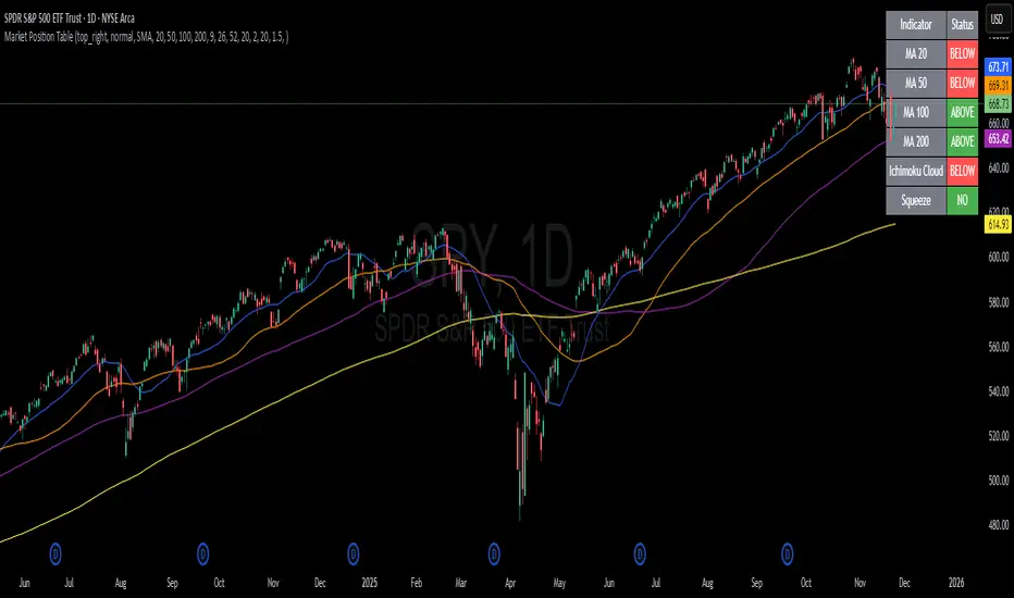
Market Position TableMarket Position Table Indicator
Overview
The Market Position Table is a comprehensive multi-timeframe indicator that provides traders with an instant visual snapshot of market position relative to key technical indicators. This tool displays a clean, color-coded table directly on your chart, showing whether price is above or below critical moving averages, the Ichimoku Cloud, and whether the market is in a TTM Squeeze compression.
Key Features
Visual Status Dashboard
Real-time color coding: Green for bullish positioning (above), Red for bearish positioning (below/compressed)
Clean table display: Organized, easy-to-read format that doesn't clutter your chart
Customizable positioning: Place the table anywhere on your chart for optimal viewing
Technical Indicators Monitored
Four Moving Averages (20, 50, 100, 200 period)
Shows whether price is above or below each MA
Helps identify trend direction and strength
Ichimoku Cloud
Displays whether price is above, below, or inside the cloud
Gray color indicates price is within the cloud (neutral zone)
TTM Squeeze Indicator
Shows when the market is in compression (Squeeze ON = Red)
Alerts when the market is expanding (Squeeze OFF = Green)
Helps identify potential breakout opportunities
Flexible Customization
Moving Average Options:
Choose from 5 MA types: SMA, EMA, WMA, VWMA, HMA
Adjust all four MA periods to your preference
Default settings: 20, 50, 100, 200 periods
Timeframe Control:
Lock to Daily: View daily timeframe signals on any chart timeframe
Custom Timeframe: Select any specific timeframe for calculations
Chart Timeframe: Default behavior matches your current chart
Ichimoku Settings:
Customize Tenkan, Kijun, and Senkou B periods
Default: 9, 26, 52 (traditional settings)
Squeeze Settings:
Adjust Bollinger Band length and multiplier
Customize Keltner Channel length and multiplier
Fine-tune sensitivity to match your trading style
Visual Customization:
Table position: 9 placement options on your chart
Table size: Tiny, Small, Normal, or Large
Optional: Toggle MA plot lines on/off
Table Settings: Position and size
Moving Average Settings: Type and periods
Ichimoku Settings: Period adjustments
Squeeze Settings: BB and KC parameters
Timeframe Settings: Lock to daily or use custom timeframe
Interpretation
Moving Averages:
Green (ABOVE): Price is above the MA - bullish signal
Red (BELOW): Price is below the MA - bearish signal
Multiple green MAs indicate strong uptrend
Multiple red MAs indicate strong downtrend
Ichimoku Cloud:
Green (ABOVE): Price above cloud - bullish trend
Red (BELOW): Price below cloud - bearish trend
Gray (INSIDE): Price in cloud - consolidation/neutral
Squeeze Indicator:
Red (ON): Market is in compression - potential breakout setup
Green (OFF): Market is expanding - trend continuation or reversal in progress
Trading Applications
Trend Confirmation:
Use multiple green MAs + price above Ichimoku cloud to confirm strong uptrends
Use multiple red MAs + price below Ichimoku cloud to confirm strong downtrends
Breakout Trading:
Watch for Squeeze ON (red) as compression builds
When Squeeze turns OFF (green), look for directional breakout
Confirm direction with MA alignment
Multi-Timeframe Analysis:
Lock to daily timeframe while trading intraday charts
Ensure intraday trades align with daily trend direction
Example: Only take long setups on 15-min chart when daily shows green MAs
Support/Resistance:
Major MAs (50, 100, 200) often act as dynamic support/resistance
Watch for price reactions when testing these levels
Best Practices
Combine with Price Action: Use the table as confirmation alongside your chart analysis
Multi-Timeframe Confluence: Check that multiple timeframes align for higher probability setups
Don't Trade on Table Alone: Use this as one tool in your complete trading system
Customize to Your Strategy: Adjust MA types and periods to match your trading style
Monitor All Indicators: Look for alignment across all indicators for strongest signals
Tips for Optimal Use
Day Traders: Enable "Lock to Daily" to stay aligned with the daily trend while trading shorter timeframes
Swing Traders: Use default chart timeframe on daily or weekly charts
Trend Followers: Focus on MA alignment - all green or all red indicates strong trends
Breakout Traders: Watch the Squeeze indicator closely for compression/expansion cycles
Position Traders: Use longer MA periods (e.g., 50, 100, 150, 200) for smoother signals
Alertas QQQ Pre-MarketEste indicador tienen solo las dos medias móviles simples la de 20 y la de 200

ATR STRUCTURESTATIC LINES SET BY ATR VALUES AND MULTIPLED OBSE$RVED EPERCENTAGES more of a tool I use for me then it is for anyone else.
Strat Reversal MTF TableStrat Reversal MTF Table — Your Complete Multi-Timeframe Strat Command Center
Take your Strat trading to the next level with an indicator that shows every reversal, on every timeframe, in one powerful visual dashboard.
Designed for traders who demand speed, clarity, and full Strat alignment, the Strat Reversal MTF Table instantly identifies all major bullish and bearish reversal patterns:
Bullish Patterns
2-1-2
3-1-2
1-3-2
3-2-2
Bearish Patterns
2-1-2
3-1-2
1-3-2
3-2-2
Each signal is displayed with:
Clear pattern name (e.g., “2-1-2 Bull”)
Automatic trigger price
Timeframe label
Color-coded background (Bullish / Bearish / Neutral)
Whether you trade options, equities, futures, or crypto, this indicator makes it effortless to see what’s flipping — and where the strongest setups are emerging.
🔥 Key Features
📊 Multi-Timeframe Scanning (1 min → Daily)
Monitor 7 customizable timeframes at once.
From scalping to swing trading, you always know which timeframe is turning.
⚡ Real-Time OR Close-Confirmed Logic
Choose your style:
Realtime (Wick Mode) → Fast entries
Close-Confirmed → Stronger validation
Ideal for traders who want precision on any timeframe.
🎨 Clean & Customizable Dashboard
Move the table anywhere on the chart
Adjust text size
Choose your own colors
Lightweight and non-intrusive
A perfect blend of simplicity and power.
📩 Instant Alerts, Built In
Get notified instantly when:
Any timeframe reverses
A specific timeframe flips
Multiple reversals fire across the stack
The indicator works great with TradingView’s push notifications, email, and webhooks.
🎯 What This Helps You Do
✔ Catch Strat reversals as they happen
✔ Quickly spot full-timeframe alignment
✔ Improve your entries for options plays
✔ Avoid chop by reading higher-timeframe intent
✔ Trade more confidently with automated trigger levels
This indicator is built for Strat traders who want to trade smarter, faster, and cleaner.
✨ Perfect For
Strat Traders
Options Traders
Futures Scalpers
Intraday & Swing Traders
Quant/Algo-inspired traders
Anyone following Rob Smith’s methodology
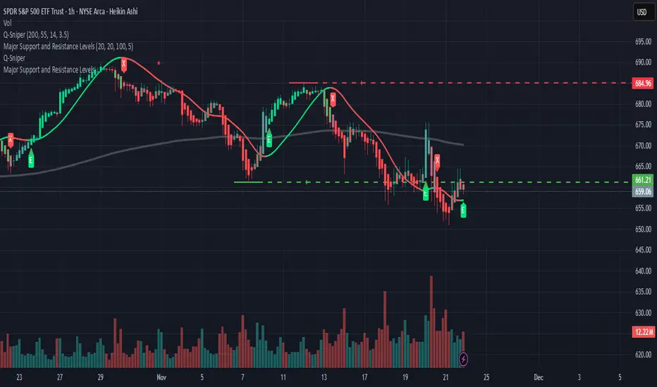
SPY Sniper Levels [Day Trader]Here is a professional, concise description you can copy and paste directly into the TradingView publication description box. I’ve written it to appeal to other serious price action traders.
***
**Title:** SPY Sniper Levels
**Description:**
Designed for high-speed day trading on **SPY** and major indices. This lightweight script eliminates the need for manual morning prep by automatically plotting the four critical liquidity zones that institutional algorithms target every session.
**Features:**
* **PDH / PDL (Solid Lines):** Previous Day High & Low. These are the major "walls" for the session.
* **PMH / PML (Dotted Circles):** Pre-Market High & Low. These levels automatically track during the pre-market session (04:00–09:30 EST) and **lock** the moment the market opens. This creates a static reference for Opening Range Breakouts (ORB).
**How to Trade This Setup:**
1. **The Breakout:** Look for high-volume candles closing outside the PMH/PML in the first 30 minutes.
2. **The Fade:** Watch for "traps" (long wicks) at the PDH/PDL to fade the price back toward VWAP.
3. **The Trend:** If price holds above the PDH, look for a trend day. If it fails to break the PML, look for a chop day.
**Best Settings:**
* Optimized for **1m, 2m, and 5m** timeframes.
* Works best on Dark Mode charts.
***
googleusercontent.com

Gaussian ChannelGaussian channel indicator that gets increasingly opaque depending how many sigma price is from its mean

MA200 Parallel ChannelDynamic MA100 Parallel Bands – Precision S/R Levels
This indicator builds a clean, parallel channel around the 100-period moving average using a fixed ±4 offset.
Because the offset mirrors the short-term MA1 fluctuations, the channel reveals highly accurate support and resistance zones that react instantly to market micro-structure.
Unlike Bollinger Bands—which expand with volatility—this tool stays perfectly parallel and trend-aligned, making breakouts and pullbacks incredibly easy to spot.
How it works:
Centerline: 100-period moving average (MA100)
Upper Band: MA100 + 4
Lower Band: MA100 – 4
MA1 used as a sensitivity reference for micro-trend behavior
Parallel structure ensures stable, predictable levels
Why it’s powerful:
The ±4 channel creates extremely precise S/R zones
Price respecting the lower band = dynamic support
Price rejecting the upper band = dynamic resistance
A clean break above or below the bands highlights strong momentum shifts
Perfect for intraday traders needing structure without noise
Perfect for:
Identifying high-probability bounce levels
Spotting early trend continuation
Confirming MA100 breakouts
Filtering weak signals and fake volatility spikes
If you want razor-sharp support & resistance levels that stay consistent across all timeframes, these MA100 parallel bands deliver exceptional clarity.
Supply and Demand Zones [Clean v6]Supply and Demand Zones
Overview
The Supply and Demand Zones indicator is an automated market structure tool designed to identify high-probability Points of Interest (POI) on any asset or timeframe. Built using Pine Script v6, this script focuses on clarity and performance, providing traders with a clutter-free view of where institutional buying and selling pressure has previously occurred.
Unlike crowded indicators that overwhelm the chart, this script dynamically manages zones—drawing new ones as structure forms and automatically removing invalid zones as price breaks through them.
Key Features
Automated Zone Detection: Automatically identifies Supply (Resistance) and Demand (Support) zones based on Swing Highs and Swing Lows.
Dynamic Zone Management: Active zones extend to the right until price interacts with them.
Break of Structure (BOS) Logic: When price violates a zone (closes beyond the invalidation level), the zone is automatically removed and marked as "Broken" to keep the chart clean.
Zig Zag Structure: Includes an optional Zig Zag overlay to visualize market flow, Higher Highs, and Lower Lows.
ATR-Based Sizing: Zone width is calculated using the Average True Range (ATR), ensuring zones adapt to the asset's current volatility.
Pine Script v6: Optimized using the latest array and method functions for speed and stability.
How It Works
Zone Creation: The script looks for Pivot Highs and Lows based on your defined Swing Length.
Supply Zones (Red): Created at Swing Highs.
Demand Zones (Blue): Created at Swing Lows.
Zone Width: The height of the box is determined by the ATR multiplied by your Zone Width setting. This ensures the zone covers the "wick" area or the volatility range of the pivot.
Invalidation: If the price closes past the outer edge of a zone (the top of a Supply zone or bottom of a Demand zone), the script detects a break, removes the filled box, and leaves a subtle trace of the broken structure.
How to Use
Trend Following: Use the Zig Zag lines to identify the trend direction. Look for Long entries in Demand zones during an uptrend, and Short entries in Supply zones during a downtrend.
Reversals: Watch for price to react at older, unfilled zones (POIs) that align with major support/resistance levels.
Stop Loss Placement: The outer edge of the zone acts as a natural invalidation point. If price closes beyond it, the setup is typically invalidated.
Settings Guide
Swing Length: Determines the sensitivity of the pivot detection. Lower numbers find more local zones (scalping); higher numbers find major structural zones (swing trading).
Max Zones to Keep: Limits the number of historic zones displayed to prevent chart clutter.
Zone Width (ATR): Adjusts how thick the zones are. Increase this value if you want to capture wider wicks.
Visual Settings: Fully customizable colors for Supply, Demand, Borders, and Zig Zag lines.
Disclaimer
This tool is for informational and educational purposes only. It visualizes past price action and does not guarantee future performance. Always manage your risk appropriately.

Dynamic S&R Projector [Polarity Flip]Support and Resistance should not be static. It should tell a story.
Most traders clutter their charts with manually drawn lines, often forgetting which ones were important or which timeframe they came from. This indicator automates the entire process of identifying market structure, adapting dynamically to your trading style while using Volume Price Analysis (VPA) to separate "Smart Money" levels from random noise.
It combines three professional concepts into one tool: Multi-Timeframe Projection, Volume Strength Filtering, and Live Polarity Flipping.
Who is this for?
Day Traders: Project Daily levels onto your 1-minute or 5-minute charts. Stop trading in a vacuum; see the walls before you hit them.
Swing Traders: Project Weekly levels onto your Daily chart to find major trend reversals.
Investors: Project Monthly levels to identify multi-year accumulation zones.
Core Features
1. Smart Timeframe (Auto-Detection) No more toggling settings. The indicator detects what chart you are viewing and automatically projects the next significant Higher Timeframe (HTF) structure:
Viewing Intraday (< Daily)? → Projects Daily Pivots.
Viewing Daily? → Projects Weekly Pivots.
Viewing Weekly? → Projects Monthly Pivots.
2. VPA Strength Filtering (The "Truth" Serum) Not all levels are equal. This script grades every pivot based on the volume activity at the moment it was formed:
Thick Solid Line: Formed on High Volume (>1.5x Average). This is an "Institutional Level." Expect hard bounces.
Thin Dashed Line: Formed on Low Volume. This is a weak structure.
3. Live Polarity Flip (Support ↔ Resistance) The script monitors price action in real-time to respect the "Principle of Polarity."
Wick Protection: The color change is based strictly on the Candle Close. If price wicks through a level but closes back inside, the line retains its original color (rejecting the fakeout).
The Flip: Once price successfully closes past a level, the color instantly flips (Red becomes Green, or Green becomes Red) to indicate the new market state.
How to Trade This Indicator (Example Strategies)
Strategy A: The "Concrete Wall" Bounce (Day & Swing) Identify a Thick Green Line below the current price. This represents a Strong HTF Support defended by institutional volume.
Action: Set Limit Buy orders at the line or wait for a bullish reversal candle (Hammer) to form at the touch.
Strategy B: The "Paper Wall" Breakout (Momentum) Identify price approaching a Thin Dashed Red Line (Weak Resistance).
Action: Since this level lacks volume backing, do not fade it. Look for a breakout setup as price is likely to slice through easily.
Strategy C: The "Flip & Retest" (Trend Following) Watch for a Thick Red Line to turn Green. This means resistance has been conquered.
Action: Wait for price to pull back to this new Green line. If it holds (the line stays Green), enter long. You are now using the "roof" as a "floor."
Settings Guide
Calculation Mode:
Auto (Higher TF): The recommended "Smart" mode described above.
Use Current Chart: Finds pivots on the exact timeframe you are viewing (good for scalping structure).
Fixed Manual: Locks the projection to a specific timeframe (e.g., always show Daily).
Pivot Lookback (Sensitivity):
Default (10/10): Balances major and minor structure.
Higher (20/20): Shows only the most critical major market turns.
Max Number of Lines: Limits how many historical levels are shown to keep your chart clean.
***********************************************************************************************
Disclaimer: This tool is for educational purposes and decision support. Past volume and price action do not guarantee future results. Always manage your risk.

3-DMA Panic Reversal [Diodato/SMI]This indicator is a market breadth tool designed to identify panic selling climaxes and potential bullish reversals. It combines Diodato's 3-DMA % Decliners with the Stochastic Momentum Index (SMI) to filter for high-probability setups.
How It Works The indicator tracks the 3-Day Moving Average of Declining Issues. When this metric spikes above 65%, it signals extreme market panic.
Signals
🟢 Green Dot (Bullish Reversal): Appears when a panic phase ends. It triggers when the 3-DMA Decliners crosses back under the 65% panic threshold, but only if the market was Oversold (SMI < 0) at some point during the panic. This "latch" logic ensures you catch the reversal even if momentum shifts slightly before the panic fully subsides.
🔴 Red Dot (Bearish/Overbought): Appears if the 3-DMA Decliners is high (> 65%) while the market is simultaneously Overbought (SMI > 40). This is a rare but powerful signal of extreme volatility or a "crash up" exhaustion.
Settings
Panic Threshold: Default 65% (Adjustable).
SMI Settings: 10, 3, 3 (Fast/Standard).
Credits Original concept by Diodato. Enhanced with SMI context for precision.

Swing Trading Quantum Trend SniperChange Hull - 55 for 1H or 1D time frame
Change Hull - 24 for 1 M or 5M time frame
High-Probability Swing & Day Trade Setup - ChannelChannel indicator that I use for Day and Swing Trading

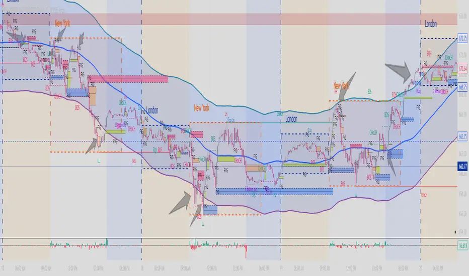
Automated Intraday Key LevelsThis indicator is designed for day traders who focus on price action and key support/resistance levels. It automates the morning routine of marking up charts by instantly plotting critical levels from the Previous Day, the Premarket Session, and the Current Live Session.
Instead of manually drawing lines every morning, this script dynamically calculates and anchors these levels to the market open, extending them across the trading day for a clean, professional workspace.
Key Features
1. Previous Day Context (Static - White Lines) Before the market opens, it is crucial to know where price closed and traded yesterday.
Prev High & Low: Major support/resistance boundaries.
Prev Close: A magnetic level often used for "Gap Fill" strategies.
Prev Open: Provides context on yesterday's directional sentiment.
2. Premarket Session (Static - Orange Lines) The script fetches data from the Extended Trading Hours session (04:00 – 09:30 EST) to identify the overnight range.
PM High & Low: A breakout above the PM High or breakdown below the PM Low often signals the start of a trend day.
PM Midpoint (Dashed): Represents the overnight equilibrium. Staying above this level indicates early bullish strength.
3. Current Day Stats (Dynamic - Blue Lines) Once the Regular Trading Hours (RTH) begin, the script tracks live price action.
Day High (HOD) & Low (LOD): These lines update in real-time as price pushes new extremes. They are thicker to denote their importance as immediate liquidity zones.
Day Midpoint (Dashed): Calculated as (High + Low) / 2. This is a dynamic trend filter; price holding above the daily midpoint suggests buyers are in control, while trading below suggests seller dominance.
Visual Guide
To keep the chart clean and readable, the levels are color-coded:
🟦 Solid Blue (Width 2): Current Day High / Low (The most active levels).
🟦 Dashed Blue: Current Day Midpoint (50% Retracement level).
🟧 Solid Orange: Premarket High / Low.
🟧 Dashed Orange: Premarket Midpoint.
⬜ Solid White: Previous Day Open, High, Low, Close.
All lines are anchored to the 09:30 EST start time to keep the pre-market area of your chart uncluttered.

Labden Predictive Kernel SFPPredictive kernel sfp indicator that uses a fuckton of math instead of typical signals to print buy and sell patterns.

9/21 EMA Trend TOP rIGHT CORNER INDICATORCrossover indicator for the 9 & 21 EMA. Buy Sell for cross up or down respectively. Daily, weekly and Monthly trend.

Labden Swing 1.0Labden Swing Indicator, non real-time. good with semafor, ema 12 & 26 stochastic rsi and macd

Labden Buy/Sell V1.0Based on the semafor dot indicator, emas, hull moving average RSI, and more. best for trend following / momentum trading and reversals

Basic Support and Resistance LinesAs the title says. These are some extremely basic support and resistance lines.

Pair Cointegration & Static Beta Analyzer (v6)Pair Cointegration & Static Beta Analyzer (v6)
This indicator evaluates whether two instruments exhibit statistical properties consistent with cointegration and tradable mean reversion.
It uses long-term beta estimation, spread standardization, AR(1) dynamics, drift stability, tail distribution analysis, and a multi-factor scoring model.
1. Static Beta and Spread Construction
A long-horizon static beta is estimated using covariance and variance of log-returns.
This beta does not update on every bar and is used throughout the entire model.
Beta = Cov(r1, r2) / Var(r2)
Spread = PriceA - Beta * PriceB
This “frozen” beta provides structural stability and avoids rolling noise in spread construction.
2. Correlation Check
Log-price correlation ensures the instruments move together over time.
Correlation ≥ 0.85 is required before deeper cointegration diagnostics are considered meaningful.
3. Z-Score Normalization and Distribution Behavior
The spread is standardized:
Z = (Spread - MA(Spread)) / Std(Spread)
The following statistical properties are examined:
Z-Mean: Should be close to zero in a stationary process
Z-Variance: Measures amplitude of deviations
Tail Probability: Frequency of |Z| being larger than a threshold (e.g. 2)
These metrics reveal whether the spread behaves like a mean-reverting equilibrium.
4. Mean Drift Stability
A rolling mean of the spread is examined.
If the rolling mean drifts excessively, the spread may not represent a stable long-term equilibrium.
A normalized drift ratio is used:
Mean Drift Ratio = Range( RollingMean(Spread) ) / Std(Spread)
Low drift indicates stable long-run equilibrium behavior.
5. AR(1) Dynamics and Half-Life
An AR(1) model approximates mean reversion:
Spread(t) = Phi * Spread(t-1) + error
Mean reversion requires:
0 < Phi < 1
Half-life of reversion:
Half-life = -ln(2) / ln(Phi)
Valid half-life for 10-minute bars typically falls between 3 and 80 bars.
6. Composite Scoring Model (0–100)
A multi-factor weighted scoring system is applied:
Component Score
Correlation 0–20
Z-Mean 0–15
Z-Variance 0–10
Tail Probability 0–10
Mean Drift 0–15
AR(1) Phi 0–15
Half-Life 0–15
Score interpretation:
70–100: Strong Cointegration Quality
40–70: Moderate
0–40: Weak
A pair is classified as cointegrated when:
Total Score ≥ Threshold (default = 70)
7. Main Cointegration Panel
Displays:
Static beta
Log-price correlation
Z-Mean, Z-Variance, Tail Probability
Drift Ratio
AR(1) Phi and Half-life
Composite score
Overall cointegration assessment
8. Beta Hedge Position Sizing (Average-Price Based)
To provide a more stable hedge ratio, hedge sizing is computed using average prices, not instantaneous prices:
AvgPriceA = SMA(PriceA, N)
AvgPriceB = SMA(PriceB, N)
Required B per 1 A = Beta * (AvgPriceA / AvgPriceB)
Using averaged prices results in a smoother, more reliable hedge ratio, reducing noise from bar-to-bar volatility.
The panel displays:
Required B security for 1 A security (average)
This represents the beta-neutral quantity of B required to hedge one unit of A.
Overview of Classical Stationarity & Cointegration Methods
The principal econometric tools commonly used in assessing stationarity and cointegration include:
Augmented Dickey–Fuller (ADF) Test
Phillips–Perron (PP) Test
KPSS Test
Engle–Granger Cointegration Test
Phillips–Ouliaris Cointegration Test
Johansen Cointegration Test
Since these procedures rely on regression residuals, matrix operations, and distribution-based critical values that are not supported in TradingView Pine Script, a practical multi-criteria scoring approach is employed instead. This framework leverages metrics that are fully computable in Pine and offers an operational proxy for evaluating cointegration-like behavior under platform constraints.
References
Engle & Granger (1987), Co-integration and Error Correction
Poterba & Summers (1988), Mean Reversion in Stock Prices
Vidyamurthy (2004), Pairs Trading
Explanation structured with assistance from OpenAI’s ChatGPT
Regards.

