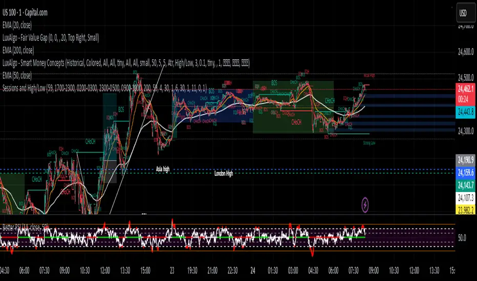
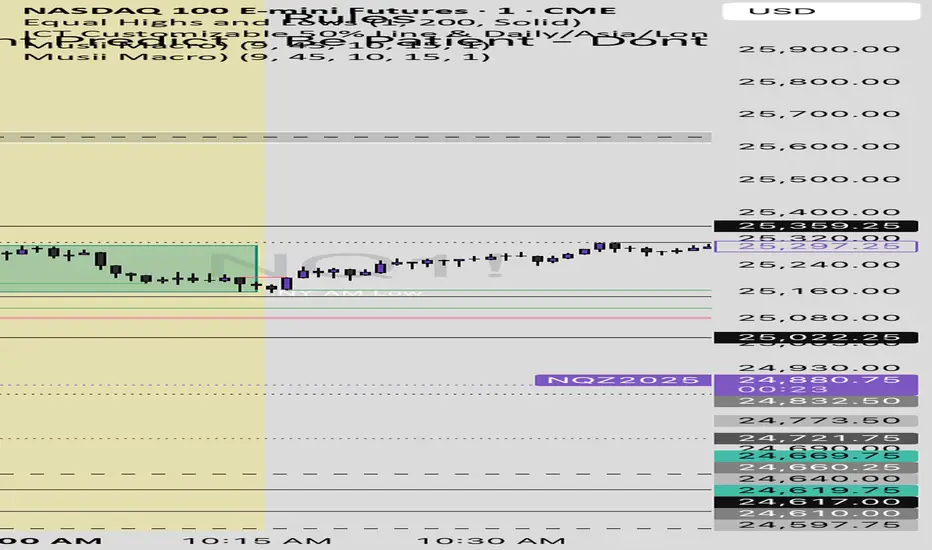
Bollinger Breakout Candle ShadingSubtle shading behind the bars when the price trades outside of the Bollinger bands.
Wyszukaj w skryptach "Cycle"
Manipolazione Luca C H1Osservando le candele h1 neglio orari ( di apertura sessione london e ny) possiamo cogliere molto piu' facilmente le manipolazioni per poter aprire le operazioni o scendere di time frame aspettando un altri trigger di entrata.
By observing the h1 candles during the opening hours (London and New York session) we can much more easily detect manipulations in order to open trades or move down the time frame waiting for other entry triggers.
Manipolazione Luca C.(H1)Osservando le candele su H1 se notiamo una manipolazione evidente entriamo a mercato.
BFM Yen Carry to Risk Ratio (Dynamic Rates)Shows risk of yen carry trade unwinding. Based on cost to borrow from Japan to buy us stocks compared to interest rate in USA.
Bollinger Breakout MarkersSubtle triangle markers that indicate when price extends out of the Bollinger bands to indicate overbought and oversold conditions
Hour/Day/Month Optimizer [CHE] Hour/Day/Month Optimizer — Bucketed seasonality ranking for hours, weekdays, and months with additive or compounded returns, win rate, simple Sharpe proxy, and trade counts
Summary
This indicator profiles time-of-day, day-of-week, and month-of-year behavior by assigning every bar to a bucket and accumulating its return into that bucket. It reports per-bucket score (additive or compounded), win rate, a dispersion-aware return proxy, and trade counts, then ranks buckets and highlights the current one if it is best or worst. A compact on-chart table shows the top buckets or the full ranking; a last-bar label summarizes best and worst. Optional hour filtering and UTC shifting let you align buckets with your trading session rather than exchange time.
Motivation: Why this design?
Traders often see repetitive timing effects but struggle to separate genuine seasonality from noise. Static averages are easily distorted by sample size, compounding, or volatility spikes. The core idea here is simple, explicit bucket aggregation with user-controlled accumulation (sum or compound) and transparent quality metrics (win rate, a dispersion-aware proxy, and counts). The result is a practical, legible seasonality surface that can be used for scheduling and filtering rather than prediction.
What’s different vs. standard approaches?
Reference baseline: Simple heatmaps or average-return tables that ignore compounding, dispersion, or sample size.
Architecture differences:
Dual aggregation modes: additive sum of bar returns or compounded factor.
Per-bucket win rate and trade count to expose sample support.
A simple dispersion-aware return proxy to penalize unstable averages.
UTC offset and optional custom hour window.
Deterministic, closed-bar rendering via a lightweight on-chart table.
Practical effect: You see not only which buckets look strong but also whether the observation is supported by enough bars and whether stability is acceptable. The background tint and last-bar label give immediate context for the current bucket.
How it works (technical)
Each bar is assigned to a bucket based on the selected dimension (hour one to twenty-four, weekday one to seven, or month one to twelve) after applying the UTC shift. An optional hour filter can exclude bars outside a chosen window. For each bucket the script accumulates either the sum of simple returns or the compounded product of bar factors. It also counts bars and wins, where a win is any bar with a non-negative return. From these, it derives:
Score: additive total or compounded total minus the neutral baseline.
Win rate: wins as a percentage of bars in the bucket.
Dispersion-aware proxy (“Sharpe” column): a crude ratio that rises when average return improves and falls when variability increases.
Buckets are sorted by a user-selected key (score, win rate, dispersion proxy, or trade count). The current bar’s bucket is tinted if it matches the global best or worst. At the last bar, a table is drawn with headers, an optional info row, and either the top three or all rows, using zebra backgrounds and color-coding (lime for best, red for worst). Rendering is last-bar only; no higher-timeframe data is requested, and no future data is referenced.
Parameter Guide
UTC Offset (hours) — Shifts bucket assignment relative to exchange time. Default: zero. Tip: Align to your local or desk session.
Use Custom Hours — Enables a local session window. Default: off. Trade-off: Reduces noise outside your active hours but lowers sample size.
Start / End — Inclusive hour window one to twenty-four. Defaults: eight to seventeen. Tip: Widen if rankings look unstable.
Aggregation — “Additive” sums bar returns; “Multiplicative” compounds them. Default: Additive. Tip: Use compounded for long-horizon bias checks.
Dimension — Bucket by Hour, Day, or Month. Default: Hour. Tip: Start Hour for intraday planning; switch to Day or Month for scheduling.
Show — “Top Three” or “All”. Default: Top Three. Trade-off: Clarity vs. completeness.
Sort By — Score, Win Rate, Sharpe, or Trades. Default: Score. Tip: Use Trades to surface stable buckets; use Win Rate for skew awareness.
X / Y — Table anchor. Defaults: right / top. Tip: Move away from price clusters.
Text — Table text size. Default: normal.
Light Mode — Light palette for bright charts. Default: off.
Show Parameters Row — Info header with dimension and span. Default: on.
Highlight Current Bucket if Best/Worst — Background tint when current bucket matches extremes. Default: on.
Best/Worst Barcolor — Tint colors. Defaults: lime / red.
Mark Best/Worst on Last Bar — Summary label on the last bar. Default: on.
Reading & Interpretation
Score column: Higher suggests stronger cumulative behavior for the chosen aggregation. Compounded mode emphasizes persistence; additive mode treats all bars equally.
Win Rate: Stability signal; very high with very low trades is unreliable.
“Sharpe” column: A quick stability proxy; use it to down-rank buckets that look good on score but fluctuate heavily.
Trades: Sample size. Prefer buckets with adequate counts for your timeframe and asset.
Tinting: If the current bucket is globally best, expect a lime background; if worst, red. This is context, not a trade signal.
Practical Workflows & Combinations
Trend following: Use Hour or Day to avoid initiating trades during historically weak buckets; require structure confirmation such as higher highs and higher lows, plus a momentum or volatility filter.
Mean reversion: Prefer buckets with moderate scores but acceptable win rate and dispersion proxy; combine with deviation bands or volume normalization.
Exits/Stops: Tighten exits during historically weak buckets; relax slightly during strong ones, but keep absolute risk controls independent of the table.
Multi-asset/Multi-TF: Start with Hour on liquid intraday assets; for swing, use Day. On monthly seasonality, require larger lookbacks to avoid overfitting.
Behavior, Constraints & Performance
Repaint/confirmation: Calculations use completed bars only; table and label are drawn on the last bar and can update intrabar until close.
security()/HTF: None used; repaint risk limited to normal live-bar updates.
Resources: Arrays per dimension, light loops for metric building and sorting, `max_bars_back` two thousand, and capped label/table counts.
Known limits: Sensitive to sample size and regime shifts; ignores costs and slippage; bar-based wins can mislead on assets with frequent gaps; compounded mode can over-weight streaks.
Sensible Defaults & Quick Tuning
Start: Hour dimension, Additive, Top Three, Sort by Score, default session window off.
Too many flips: Switch to Sort by Trades or raise sample by widening hours or timeframe.
Too sluggish/over-smoothed: Switch to Additive (if on compounded) or shorten your chart timeframe while keeping the same dimension.
Overfit risk: Prefer “All” view to verify that top buckets are not isolated with tiny counts; use Day or Month only with long histories.
What this indicator is—and isn’t
This is a seasonality and scheduling layer that ranks time buckets using transparent arithmetic and simple stability checks. It is not a predictive model, not a complete trading system, and it does not manage risk. Use it to plan when to engage, then rely on structure, confirmation, and independent risk management for entries and exits.
Disclaimer
The content provided, including all code and materials, is strictly for educational and informational purposes only. It is not intended as, and should not be interpreted as, financial advice, a recommendation to buy or sell any financial instrument, or an offer of any financial product or service. All strategies, tools, and examples discussed are provided for illustrative purposes to demonstrate coding techniques and the functionality of Pine Script within a trading context.
Any results from strategies or tools provided are hypothetical, and past performance is not indicative of future results. Trading and investing involve high risk, including the potential loss of principal, and may not be suitable for all individuals. Before making any trading decisions, please consult with a qualified financial professional to understand the risks involved.
By using this script, you acknowledge and agree that any trading decisions are made solely at your discretion and risk.
Do not use this indicator on Heikin-Ashi, Renko, Kagi, Point-and-Figure, or Range charts, as these chart types can produce unrealistic results for signal markers and alerts.
Best regards and happy trading
Chervolino
Total Points Moved by exp3rtsThis lightweight utility tracks the total intraday range of price movement, giving you real-time insight into market activity.
It calculates:
🟩 Bullish Points – Total range from bullish candles (close > open)
🟥 Bearish Points – Total range from bearish candles (close < open)
🔁 Total Points Moved (TPM) – Sum of all high–low ranges for the day
Values are pulled from the 1-second chart for high precision and displayed in a compact tag in the top-right corner.
Enhanced Std Dev Oscillator (Z-Score)Enhanced Std Dev Oscillator (Z-Score)
Overview
The Enhanced Std Dev Oscillator (ESDO) is a refined Z-Score indicator that normalizes price deviations from a moving mean using standard deviation, smoothed for clarity and equipped with divergence detection. This oscillator shines in identifying extreme overbought/oversold conditions and potential reversals, making it ideal for mean-reversion strategies in stocks, forex, or crypto. By highlighting when prices stray too far from the norm, it helps traders avoid chasing trends and focus on high-probability pullbacks.
Key Features
Customisable Mean & Deviation: Choose SMA or EMA for the mean (default: SMA, length 14); opt for Population or Sample standard deviation for precise statistical accuracy.
Smoothing for Clarity: Apply a simple moving average (default: 3) to the raw Z-Score, reducing noise without lagging signals excessively.
Zone Highlighting: Background colours flag extreme zones—red tint above +2 (overbought), green below -2 (oversold)—for quick visual scans.
Divergence Alerts: Automatically detects bullish (price lows lower, Z-Score higher) and bearish (price highs higher, Z-Score lower) divergences using pivot points (default length: 5), with labeled shapes for easy spotting.
Built-in Alerts: Notifications for Z-Score crossovers into OB/OS zones and divergence events to keep you informed without constant monitoring.
How It Works
Core Calculation: Computes the mean (SMA/EMA) over the specified length, then standard deviation (Population or adjusted Sample formula for N>1). Z-Score = (Source - Mean) / Std Dev, handling edge cases like zero deviation.
Smoothing: Averages the Z-Score with an SMA to create a cleaner plot oscillating around zero.
Levels & Zones: Plots horizontal lines at ±1 (orange dotted) and ±2 (red dashed) for reference; backgrounds activate in extreme zones.
Divergence Logic: Scans for pivot highs/lows in price and Z-Score; flags divergences when price extremes diverge from oscillator extremes (looking back 2 pivots for confirmation).
Visualisation: Blue line for the smoothed Z-Score; green/red labels for bull/bear divergences.
Usage Tips
Buy Signal: Z-Score crosses below -2 (oversold) or bullish divergence forms—pair with volume spike for confirmation.
Sell Signal: Z-Score crosses above +2 (overbought) or bearish divergence—watch for resistance alignment.
Customisation: Use EMA mean for trendier assets; enable Sample std dev for smaller datasets. Increase pivot length (7-10) in volatile markets to filter false signals.
Timeframes: Excels on daily/4H for swing trades; test smoothing on lower frames to avoid over-smoothing. Always combine with trend filters like a 200-period MA.
This open-source script is licensed under Mozilla Public License 2.0. Backtest thoroughly—past performance isn't indicative of future results. Trade with discipline! 📈
© HighlanderOne
Advanced Directional Stoch RSIAdvanced Directional Stochastic RSI
Overview
The Advanced Directional Stochastic RSI (Adv Stoch RSI Dir) is a powerful oscillator that combines the classic Stochastic RSI with John Ehlers' SuperSmoother filter for ultra-smooth signals and reduced noise. Unlike traditional Stoch RSI, this indicator incorporates directional coloring based on price action relative to a smoothed trend line, helping traders quickly spot bullish or bearish momentum. It's designed for swing traders and scalpers looking for clearer overbought/oversold conditions in volatile markets.
Key Features
Directional Coloring: %K line turns green when price is above the trend MA (bullish) and red when below (bearish), providing instant visual bias.
Multi-Pass SuperSmoothing: Apply Ehlers' SuperSmoother filter up to 5 times for customizable noise reduction—dial in passes (default: 2) to balance responsiveness and smoothness.
Trend-Aware Baseline: Uses a cascaded smoothed moving average (default length: 20) to gauge overall direction, making the oscillator more context-aware.
Classic Stoch RSI Core: Built on RSI (default: 14) and Stochastic (default: 14), with SMA smoothing for %K (3) and %D (3).
Visual Aids: Includes overbought (80), oversold (20), and midline (50) levels, plus a subtle blue fill between OB/OS zones for easy reference.
How It Works
Source Smoothing: The input source (default: close) is passed through the SuperSmoother filter multiple times to create a trend MA.
Stoch RSI Calculation: Computes RSI on the source, then applies Stochastic to the RSI values, followed by SMA smoothing for base %K and %D.
Advanced Smoothing: Extra SuperSmoother layers are applied to %K and %D based on your chosen passes, minimizing whipsaws.
Directional Logic: Compares current close to the trend MA to color %K dynamically.
Plotting: %K (thick line, colored) and %D (thin orange) oscillate between 0-100, highlighting crossovers and divergences.
Usage Tips
Buy Signal: Green %K crosses above %D below 50, or bounces off oversold (20) in uptrends.
Sell Signal: Red %K crosses below %D above 50, or rejects overbought (80) in downtrends.
Customization: Increase smoothing passes (3-5) for choppy markets; reduce for faster signals. Pair with volume or support/resistance for confirmation.
Timeframes: Best on 1H-4H charts for stocks/crypto; adjust lengths for forex.
This open-source script is licensed under Mozilla Public License 2.0. Backtest thoroughly—past performance isn't indicative of future results. Enjoy trading smarter with less noise! 🚀
© HighlanderOne
Quarter Strength Table (3M) [CHE] Quarter Strength Table (3M) — quarterly seasonality overview for the current symbol
Is there seasonality in certain assets? Some YouTubers claim there is—can you test it yourself?
Summary
This indicator builds a compact table that summarizes quarterly seasonality from three-month bars. It aggregates the simple return of each historical quarter, counts observations, computes the average return and the win rate for each quarter, and flags the historically strongest quarter. The output is a five-column table rendered on the chart, designed for quick comparison rather than signal generation. Because it processes only confirmed higher-timeframe bars, results are stable once a quarter has closed.
Motivation: Why this design?
Seasonality tools often mix intraperiod estimates with live bars, which can lead to misleading flips and inconsistent statistics. The core idea here is to restrict aggregation to completed three-month bars only and to deduplicate events by timestamp. This avoids partial information and double counting, so the table reflects a consistent, closed-bar history.
What’s different vs. standard approaches?
Baseline: Typical seasonality studies that compute monthly or quarterly stats directly on the chart timeframe or update on live higher-timeframe bars.
Architecture differences:
Uses explicit higher-timeframe requests for open, close, time, and calendar month from three-month bars.
Confirms the higher-timeframe bar before recording a sample; deduplicates by the higher-timeframe timestamp.
Keeps fixed arrays of length four for the four quarters; renders a fixed five-by-five table with zebra rows.
Practical effect: Once a quarter closes, counts and averages are stable. The “Best” column marks the highest average quarter so you can quickly identify the historically strongest period.
How it works (technical)
On every chart bar, the script requests three-month open, close, time, and the calendar month derived from that bar’s time. When the three-month bar is confirmed, it computes the simple return for that bar and maps the month to a quarter index between zero and three. A guard stores the last seen three-month timestamp to avoid duplicate writes. Per quarter, it accumulates the sum of returns, the number of samples, and the number of positive samples. From these, it derives average return and win rate. The table header is created once on the first bar; content updates only on the last visible chart bar for efficiency. No forward references are used, and lookahead is disabled in all higher-timeframe requests to avoid peeking.
Parameter Guide
Percent — Formats values as percentages. Default: true. Trade-off: Easier visual comparison; disable if you prefer raw unit returns.
Decimals — Number of digits shown. Default: two. Bounds: zero to six. Trade-off: More digits improve precision but reduce readability.
Show table — Toggles table rendering. Default: true. Trade-off: Disable when space is limited or for batch testing.
Reading & Interpretation
The table shows rows for Q1 through Q4 and columns for Count, Avg Ret, P(win), and Best.
Count: Number of completed three-month bars observed for that quarter.
Avg Ret: Average simple return across all samples in that quarter.
P(win): Share of samples with a positive return.
Best: An asterisk marks the quarter with the highest average return among those with at least one sample.
Use the combination of average and win rate to judge both magnitude and consistency. Low counts signal limited evidence.
Practical Workflows & Combinations
Trend following filter: Favor setups when the upcoming or active quarter historically shows a positive average and a stable win rate. Combine with structure analysis such as higher highs and higher lows to avoid fighting dominant trends.
Exits and risk: When entering during a historically weak quarter, consider tighter risk controls and quicker profit taking.
Multi-asset and multi-timeframe: The default settings work across most liquid symbols. For assets with sparse history, treat results as low confidence due to small sample sizes.
Behavior, Constraints & Performance
Repaint and confirmation: Aggregation occurs only when the three-month bar is confirmed; values do not change afterward for that bar. During an open quarter, no new sample is added.
Higher-timeframe usage: All higher-timeframe requests disable lookahead and rely on confirmation to mitigate repaint.
Resources: Declared `max_bars_back` is two thousand. Arrays are fixed at length four. The script updates the table only on the last visible bar to reduce work.
Known limits: Averages can be affected by outliers and structural market changes. Limited history reduces reliability. Corporate actions and contract rolls may influence returns depending on the symbol’s data source. This is a visualization and not a trading system.
Sensible Defaults & Quick Tuning
Starting values: Percent true; Decimals two; Show table true.
If numbers feel noisy: Decrease decimals to one to reduce visual clutter.
If you need raw values: Turn off Percent to display unit returns.
If the table overlaps price: Toggle Show table off when annotating, or reposition via your chart’s table controls.
What this indicator is—and isn’t
This is a historical summary of quarterly behavior. It visualizes evidence and helps frame expectations. It is not predictive, does not generate trade signals, and does not manage positions or risk. Always combine with market structure, liquidity considerations, and independent risk controls.
Inputs with defaults
Percent: true, boolean.
Decimals: two, integer between zero and six.
Show table: true, boolean.
Pine version: v6
Overlay: true
Primary outputs: Table with five columns and five rows.
Metrics/functions used: Higher-timeframe data requests, table rendering, arrays, bar state checks, month mapping.
Special techniques: Closed-bar aggregation, deduplication by higher-timeframe timestamp, zebra row styling.
Performance/constraints: Two thousand bars back, small fixed loops, higher-timeframe requests without lookahead.
Compatibility/assets/timeframes: Works on time-based charts across most assets with sufficient history.
Limitations/risks: Sample size sensitivity, regime shifts, data differences across venues.
Debug/diagnostics: (Unknown/Optional)
Disclaimer
The content provided, including all code and materials, is strictly for educational and informational purposes only. It is not intended as, and should not be interpreted as, financial advice, a recommendation to buy or sell any financial instrument, or an offer of any financial product or service. All strategies, tools, and examples discussed are provided for illustrative purposes to demonstrate coding techniques and the functionality of Pine Script within a trading context.
Any results from strategies or tools provided are hypothetical, and past performance is not indicative of future results. Trading and investing involve high risk, including the potential loss of principal, and may not be suitable for all individuals. Before making any trading decisions, please consult with a qualified financial professional to understand the risks involved.
By using this script, you acknowledge and agree that any trading decisions are made solely at your discretion and risk.
Do not use this indicator on Heikin-Ashi, Renko, Kagi, Point-and-Figure, or Range charts, as these chart types can produce unrealistic results for signal markers and alerts.
Best regards and happy trading
Chervolino
Seasonal Pattern DecoderSeasonal Pattern Decoder
The Seasonal Pattern Decoder is a powerful tool designed for traders and analysts who want to uncover and leverage seasonal tendencies in financial markets. Instead of cluttering your chart with complex visuals, this indicator presents a clean, intuitive table that summarizes historical monthly performance, allowing you to spot recurring patterns at a glance.
How It Works
The indicator fetches historical monthly data for any symbol and calculates the percentage return for each month over a specified number of years. It then organizes this data into a comprehensive table, providing a clear, year-by-year and month-by-month breakdown of performance.
Key Features
Historical Performance Table: Displays monthly returns for up to a user-defined number of years, making it easy to compare performance across different periods.
Color-Coded Heatmap: Each cell is colored based on the performance of the month. Strong positive returns are shaded in green, while strong negative returns are shaded in red, allowing for immediate visual analysis of monthly strength or weakness.
Annual Summary: A "Σ" column shows the total percentage return for each full calendar year.
AVG Row: Calculates and displays the average return for each month across all the years shown in the table.
WR Row: Shows the "Win Rate" for each month, which is the percentage of time that month had a positive return. This is crucial for identifying high-probability seasonal trends.
How to Use
Add the "Seasonal Pattern Decoder" indicator to your chart. Note that it works best on Daily, Weekly, or Monthly timeframes. A warning message will be displayed on intraday charts.
In the indicator settings, adjust the "Lookback Period" to control how many years of historical data you want to analyze.
Use the "Show Years Descending" option to sort the table from the most recent year to the oldest.
The "Heat Range" setting allows you to adjust the sensitivity of the color-coding to fit the volatility of the asset you are analyzing.
This tool is ideal for confirming trading biases, developing seasonal strategies, or simply gaining a deeper understanding of an asset's typical behavior throughout the year.
## Disclaimer
This indicator is designed as a technical analysis tool and should be used in conjunction with other forms of analysis and proper risk management.
Past performance does not guarantee future results, and traders should thoroughly test any strategy before implementing it with real capital.
Combined SMA with Murrey Math and Fixed Fractal Bands "Combined SMA with Murrey Math and Fixed Fractal Bands" , overlaying a Simple Moving Average (SMA), Murrey Math (MM) bands, and fixed fractal bands on a price chart. Here's a brief description of its functionality:Inputs:SMA Length: Configurable period for the SMA (default: 180 bars).
Resolution: Optional custom timeframe for data.
Frame Size for MM: Lookback period for Murrey Math calculations (default: 180 bars, adjustable via multiplier).
Ignore Wicks: Option to use open/close prices instead of high/low for MM calculations.
Fixed Fractal Size: Fixed distance in points for fractal bands (default: 1.22).
Shade 3/8-5/8 Overlap: Option to highlight overlapping regions between SMA-centered and absolute MM bands.
Data Source:Uses open, close, high, and low prices from the specified ticker and timeframe.
Optionally ignores wicks (high/low) for MM calculations, using max/min of open/close instead.
SMA Calculation:Computes a Simple Moving Average (SMA) based on the closing price and user-defined length.
Murrey Math Bands:Absolute MM Bands: Calculated using a dynamic range based on the highest/lowest prices over a lookback period, scaled logarithmically to create 13 levels (from -3/8 to +3/8, with 8/8 as the midpoint). These adapt to price action.
SMA-Centered MM Bands: Constructs MM bands relative to the SMA, with levels (0/8 to 8/8) spaced by a calculated increment derived from the absolute MM range.
Colors bands dynamically (green for bullish, red for bearish, gray for neutral) based on changes in the 4/8 level or increment, with labels indicating "Higher," "Lower," or "Same" states.
Fixed Fractal Bands:Plots six fixed-distance bands (±1, ±2, ±3) around the SMA, using a user-defined point value (default: 1.22).
Overlaps and Shading:Detects overlaps between SMA-centered and absolute MM bands at key levels (7/8-8/8, 0/8-1/8, and optionally 3/8-5/8).
Shades overlapping regions with distinct colors (red for 7/8-8/8, green for 0/8-1/8, blue for 3/8-5/8).
Fills specific SMA-centered MM regions (3/8-5/8, 0/8-1/8, 7/8-8/8) for visual emphasis.
Visualization:Plots SMA-centered MM bands, absolute MM bands, and fixed fractal bands as stepped lines with varying colors and transparency.
Displays a table at the bottom-right showing the current MM increment value.
Adds labels when the 4/8 level or increment changes, indicating trend direction.
In summary, this indicator combines a user-defined SMA with Murrey Math bands (both absolute and SMA-centered) and fixed fractal bands to provide a multi-level support/resistance framework. It highlights dynamic price levels, trend direction, and key overlaps, aiding traders in identifying potential reversal or consolidation zones.
Midpoints Table:by AGRThis is midpoint indicator for 5m, 15m, 30m, 60m, Day and Week.
This is simple indicator for intraday use 5, 15 and 30m. unless 30m cross any side dont take trade on that side. Also read along with day and week midpoints
EMA Crossover Strategy (15m)50 and 200 ema crossing when leaving anchor. when 50 and 200 crosses will give you direction of where market is going. wait for a pull back and take trade. sl on highest or lowest point of apex tp open . when you see multiple equal ( low or High) get put of trade.
Dominance Signal Apex [CHE]]Dominance Signal Apex — Triple-confirmed entry markers with stateful guardrails
Summary
This indicator focuses on entry timing by plotting markers only when three conditions align: a closed-bar Heikin-Ashi bias, a monotonic stack of super-smoother filters, and the current HMA slope. A compact state machine provides guardrails: it starts a directional state on closed-bar Heikin-Ashi bias, maintains it only while the smoother stack remains ordered, and renders a marker only if HMA slope agrees. This design aims for selective signals and reduces isolated prints during mixed conditions. Markers fade over time to visualize the age and persistence of the current state.
Motivation: Why this design?
Common triggers flip frequently in noise or react late when regimes shift. The core idea is to gate entry markers through a closed-bar state plus independent filter alignment. The state machine limits premature prints, removes markers when alignment breaks, and uses the HMA as a final directional gate. The result is fewer mixed-context entries and clearer clusters during sustained trends.
What’s different vs. standard approaches?
Reference baseline: Single moving-average slope or classic MA cross signals.
Architecture differences:
Multi-length two-pole super-smoother stack with strict ordering checks.
Closed-bar Heikin-Ashi bias to start a directional state.
HMA slope as a final gate for rendering markers.
Time-based alpha fade to surface state age.
Practical effect: Entry markers appear in clusters during aligned regimes and are suppressed when conditions diverge, improving selectivity.
How it works (technical)
Measurements: Four recursive super-smoother series on price at short to medium horizons. Up regime means each shorter smoother sits below the next longer one; down regime is the inverse.
State machine: On bar close, positive Heikin-Ashi bias starts a bull state and negative bias starts a bear state. The state terminates the moment the smoother ordering breaks relative to the prior bar.
Rendering gate: A marker prints only if the active state agrees with the current HMA slope. The HMA is plotted and colored by slope for context.
Normalization and clamping: Marker transparency transitions from a starting to an ending alpha across a fixed number of bars, clamped within the allowed range.
Initialization: Persistent variables track state and bar-count since state start; Heikin-Ashi open is seeded on the first valid bar.
HTF/security: None used. State updates are closed-bar, which reduces repaint paths.
Bands: Smoothed high, low, centerline, and offset bands are computed but not rendered.
Parameter Guide
Show Markers — Toggle rendering — Default: true — Hides markers without changing logic.
Bull Color / Bear Color — Visual colors — Defaults: bright green / red — Aesthetic only.
Start Alpha / End Alpha — Transparency range — Defaults: one hundred / fifty, within zero to one hundred — Controls initial visibility and fade endpoint.
Steps — Fade length in bars — Default: eight, minimum one — Longer values extend the visual memory of a state.
Smoother Length — Internal band smoothing — Default: twenty-one, minimum two — Affects computed bands only; not drawn.
Band Multiplier — Internal band offset — Default: one point zero — No impact on markers.
Source — Input for HMA — Default: close — Align with your workflow.
Length — HMA length — Default: fifty, minimum one — Larger values reduce flips; smaller values react faster.
Reading & Interpretation
Entry markers:
Bull marker (below bar): Closed-bar Heikin-Ashi bias is positive, smoother stack remains aligned for up regime, and HMA slope is rising.
Bear marker (above bar): Closed-bar Heikin-Ashi bias is negative, smoother stack remains aligned for down regime, and HMA slope is falling.
Fade: Transparency progresses over the configured steps, indicating how long the current state has persisted.
Practical Workflows & Combinations
Trend following: Focus on marker clusters aligned with HMA color. Add structure filters such as higher highs and higher lows or lower highs and lower lows to avoid counter-trend entries.
Exits/Stops: Consider exiting or reducing risk when smoother ordering breaks, when HMA color flips, or when marker cadence thins out.
Multi-asset/Multi-TF: Suitable for liquid crypto, FX, indices, and equities. On lower timeframes, shorten HMA length and fade steps for faster response.
Behavior, Constraints & Performance
Repaint/confirmation: State transitions and marker eligibility are decided on closed bars; live bars do not commit state changes until close.
security()/HTF: Not used.
Resources: Declared max bars back of one thousand five hundred; recursive filters and persistent states; no explicit loops.
Known limits: Some delay around sharp turns; brief states may start in noisy phases but are quickly revoked when alignment fails; HMA gating can miss very early reversals.
Sensible Defaults & Quick Tuning
Start here: Keep defaults.
Too many flips: Increase HMA length and raise fade steps.
Too sluggish: Decrease HMA length and reduce fade steps.
Markers too faint/bold: Adjust start and end alpha toward lower or higher opacity.
What this indicator is—and isn’t
A selective entry-marker layer that prints only under triple confirmation with stateful guardrails. It is not a full system, not predictive, and does not handle risk. Combine with market structure, risk controls, and position management.
Disclaimer
The content provided, including all code and materials, is strictly for educational and informational purposes only. It is not intended as, and should not be interpreted as, financial advice, a recommendation to buy or sell any financial instrument, or an offer of any financial product or service. All strategies, tools, and examples discussed are provided for illustrative purposes to demonstrate coding techniques and the functionality of Pine Script within a trading context.
Any results from strategies or tools provided are hypothetical, and past performance is not indicative of future results. Trading and investing involve high risk, including the potential loss of principal, and may not be suitable for all individuals. Before making any trading decisions, please consult with a qualified financial professional to understand the risks involved.
By using this script, you acknowledge and agree that any trading decisions are made solely at your discretion and risk.
Best regards and happy trading
Chervolino
SuperScript Filtered (Stable)🔎 What This Indicator Does
The indicator is a trend and momentum filter.
It looks at multiple well-known technical tools (T3 moving averages, RSI, TSI, and EMA trend) and assigns a score to the current market condition.
• If most tools are bullish → score goes up.
• If most tools are bearish → score goes down.
• Only when the score is very strong (above +75 or below -75), it prints a Buy or Sell signal.
This helps traders focus only on high-probability setups instead of reacting to every small wiggle in price.
________________________________________
⚙️ How It Works
1. T3 Trend Check
o Compares a fast and slow T3 moving average.
o If the fast T3 is above the slow T3 → bullish signal.
o If it’s below → bearish signal.
2. RSI Check
o Uses the Relative Strength Index.
o If RSI is above 50 → bullish momentum.
o If RSI is below 50 → bearish momentum.
3. TSI Check
o Uses the True Strength Index.
o If TSI is above its signal line → bullish momentum.
o If TSI is below → bearish momentum.
4. EMA Trend Check
o Looks at two exponential moving averages (fast and slow).
o If price is above both → bullish.
o If price is below both → bearish.
5. Score System
o Each condition contributes +25 (bullish) or -25 (bearish).
o The total score can range from -100 to +100.
o Score ≥ +75 → Strong Buy
o Score ≤ -75 → Strong Sell
6. Signal Filtering
o Only one buy is allowed until a sell appears (and vice versa).
o A minimum bar gap is enforced between signals to avoid clutter.
________________________________________
📊 How It Appears on the Chart
• Green “BUY” label below candles → when multiple signals agree and the market is strongly bullish.
• Red “SELL” label above candles → when multiple signals agree and the market is strongly bearish.
• Background softly shaded green or red → highlights bullish or bearish conditions.
No messy tables, no clutter — just clear trend-based entries.
________________________________________
🎯 How Traders Can Use It
This indicator is designed to help traders by:
1. Filtering Noise
o Instead of reacting to every small crossover or RSI blip, it waits until at least 3–4 conditions agree.
o This avoids entering weak trades.
2. Identifying Strong Trend Shifts
o When a Buy or Sell arrow appears, it usually signals a shift in momentum that can lead to a larger move.
3. Reducing Overtrading
o By limiting signals, traders won’t be tempted to jump in and out unnecessarily.
4. Trade Confirmation
o Traders can use the signals as confirmation for their own setups.
o Example: If your strategy says “go long” and the indicator also shows a strong Buy, that trade has more conviction.
5. Alert Automation
o Built-in alerts mean you don’t have to watch the chart all day.
o You’ll be notified only when a strong signal appears.
________________________________________
⚡ When It Helps the Most
• Works best in trending markets (bullish or bearish).
• Very useful on higher timeframes (1h, 4h, daily) for swing trading.
• Can also work on lower timeframes (5m, 15m) if combined with higher timeframe trend filtering.
________________________________________
👉 In short
This indicator is a signal filter + trend detector. It combines four powerful tools into one scoring system, and only tells you to act when the odds are stacked in your favor.
________________________________________
MACD-V MomentumThe MACD-V (Moving Average Convergence Divergence – Volatility Normalized) is an award-winning momentum indicator created by Alex Spiroglou, CFTe, DipTA (ATAA). It improves on the traditional MACD by normalizing momentum with volatility, solving several well-known limitations of classic indicators:
✅ Time stability – readings are consistent across history
✅ Cross-market comparability – works equally on stocks, crypto, forex, and commodities
✅ Objective momentum framework – universal thresholds at +150 / -150, +50 / -50
✅ Cleaner signals – reduces false signals in ranges and lag in high momentum
By dividing the MACD spread by ATR, the indicator expresses momentum in volatility units, allowing meaningful comparison across timeframes and markets.
MACD-V defines seven objective momentum states:
Risk (Oversold): below -150
Rebounding: -150 to +50 and above signal
Rallying: +50 to +150 and above signal
Risk (Overbought): above +150
Retracing: above -50 and below signal
Reversing: -150 to -50 and below signal
Ranging: between -50 and +50 for N bars
Optional background tints highlight the active regime (Bull above 200-MA, Bear below 200-MA).
Rare extremes (e.g., MACD-V < -100 in a bull regime) are tagged for additional context.
Use Cases
Identify and track momentum lifecycles across any market
Spot rare extremes for potential reversal opportunities
Filter out low-momentum whipsaws in ranging conditions
Compare momentum strength across multiple symbols
Support systematic and rule-based strategy development
Jasons Bullish Reversal DetectorThis bullish reversal detector is designed to spot higher-quality turning points instead of shallow bounces. At its core, it looks for candles closing above the 20-period SMA, a MACD bullish crossover, and RSI strength above 50. On top of that, it layers in “depth” filters: price must reclaim and retest a long-term baseline (like the 200-period VWMA), momentum should confirm with RSI and +DI leading, short-term EMAs need to slope upward, and conditions like overheated ATR or strong downside ADX will block false signals. When all of these align, the script flags a depth-confirmed bullish reversal, aiming to highlight spots where structure, momentum, and volatility all support a sustainable shift upward.
Best MA Finder: Sharpe/Sortino ScannerThis script, Best MA Finder: Sharpe/Sortino Scanner, is a tool designed to identify the moving average (SMA or EMA) that best acts as a dynamic trend threshold on a chart, based on risk-adjusted historical performance. It scans a wide range of MA lengths (SMA or EMA) and selects the one whose simple price vs MA crossover delivered the strongest results using either the Sharpe ratio or the Sortino ratio. Reading it is intuitive: when price spent time above the selected MA, conditions were on average more favorable in the backtest; below, less favorable. It is a trend and risk gauge, not an overbought or oversold signal.
What it does:
- Runs individual long-only crossover backtests for many MA lengths across short to very long horizons.
- For each length, measures the total number of trades, the annualized Sharpe ratio, and the annualized Sortino ratio.
- Uses the chosen metric value (Sharpe or Sortino) as the score to rank candidates.
- Applies a minimum trade filter to discard statistically weak results.
- Optionally applies a local stability filter to prefer a length that also outperforms its close neighbors by at least a small margin.
- Selects the optimal MA and displays it on the chart with a concise summary table.
How to use it:
- Choose MA type: SMA or EMA.
- Choose the metric: Sharpe or Sortino.
- Set the minimum trade count to filter out weak samples.
- Select the risk-free mode:
Auto: uses a short-term risk-free rate for USD-priced symbols when available.
Manual: you provide a risk-free ticker.
None: no risk-free rate.
- Optionally enable stability controls: neighbor radius and epsilon.
- Toggle the on-chart summary table as needed.
On-chart output:
- The selected optimal MA is plotted.
- The optional table shows MA length, number of trades, chosen metric value annualized, and the annual risk-free rate used.
Key features:
- Risk-adjusted optimization via Sharpe or Sortino for fair, comparable assessment.
- Broad MA scan with SMA and EMA support.
- Optional stability filter to avoid one-off spikes.
- Clear and auditable presentation directly on the chart.
Use cases:
- Traders who want a defensible, data-driven trend threshold without manual trial and error.
- Swing and trend-following workflows across timeframes and asset classes.
- Quick SMA vs EMA comparisons using risk-adjusted results.
Limitations:
- Not a full trading strategy with position sizing, costs, funding, slippage, or stops.
- Long-only, one position at a time.
- Discrete set of MA lengths, not a continuous optimizer.
- Requires sufficient price history and, if used, a reliable risk-free series.
This script is open-source and built from original logic. It does not replicate closed-source scripts or reuse significant external components.
30-10-3 MAX,min dynamicsSupported timeframes: The script works only on timeframes of 1 minute or lower (including second-based timeframes).
Displayed levels: The highs and lows of the last closed candle are plotted for the 30-minute, 10-minute, and 3-minute timeframes.
Updates: The levels update only when a candle closes in the respective timeframe (e.g., every 30 minutes for the 30m levels).
Visualization: Dashed lines for highs and lows (blue for 30m, green for 10m, red for 3m).
Labels indicating "Max 30m", "Min 30m", etc., positioned above the highs and below the lows.
Bitcoin Lagging (N Days)This indicator overlays Bitcoin’s price on any chart with a user-defined N-day lag. You can select the BTC symbol and timeframe (daily recommended), choose which price source to use (open, high, low, close, hlc3, ohlc4), and shift the series by a chosen number of days. An option to normalize the series to 100 at the first visible value is also available, along with the ability to display the original BTC line for comparison.
It is designed for traders and researchers who want to test lagging relationships between Bitcoin and other assets, observe correlation changes, or visualize how BTC’s past prices might align with current market movements. The lagging is calculated based on daily candles, so even if applied on intraday charts, the shift remains in daily units.
이 지표는 비트코인 가격을 원하는 차트 위에 N일 지연된 상태로 표시해 줍니다. 심볼과 타임프레임(일봉 권장)을 선택할 수 있으며, 가격 소스(시가, 고가, 저가, 종가, hlc3, ohlc4)도 설정 가능합니다. 또한 시리즈를 첫 값 기준으로 100에 맞춰 정규화하거나, 원래의 비트코인 가격선을 함께 표시할 수도 있습니다.
비트코인과 다른 자산 간의 시차 효과를 분석하거나 상관관계 변화를 관찰할 때 유용하게 활용할 수 있습니다. 지연은 일봉 기준으로 계산되므로, 분·시간 차트에 적용해도 항상 일 단위로 반영됩니다.