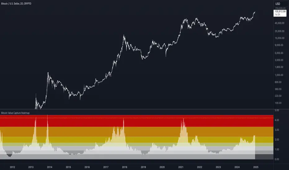
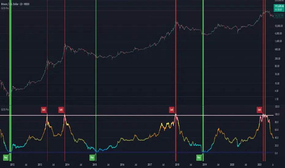
Shift 3M - 30Y Yield Spread🟧 Shift 3M - 30Y Yield Spread
- This indicator visually displays the **inverse of the US Treasury short-long yield spread** (3-month minus 30-year spread reversal signal) in a "price chart-like" form.
- By default, the spread line is shifted by 1 year to help anticipate forward market moves (you can adjust this offset freely).
- Especially customized to be analyzed together with the movements of US indices like the S&P 500, and to help understand broader market cycles.
✅ Description
- Normalizes the spread based on a rolling window length you set (default: 500 bars).
- Both the normalization window and offset (shift) are fully customizable.
- Then, it scales the spread to match your chart’s price range, allowing you to intuitively compare spread movements alongside price action.
- Instantly see the **inverse (reversal) signals of the short-long yield spread**, curve steepening, and how they align with actual price trends.
⚡ By reading macro yield signals, you can **anticipate exactly when a market crash might come or when an explosive rally is about to start**.
⚡ A perfect tool for macro traders and yield curve analysts who want to quickly catch major market turning points!
copyright @invest_hedgeway
============================================================
🟧3개월 - 30년 물 장단기 금리차 역수
- 이 인디케이터는 미국 국채 **장단기 금리차 역수**(3개월물 - 30년물 스프레드의 반전 시그널)를 시각적으로 "가격 차트"처럼 표시해 줍니다.
- 기본적으로 스프레드 선은 **1년(365봉) 시프트**되어 있어, 시장을 선행적으로 파악할 수 있도록 설계되었습니다 (값은 자유롭게 조정 가능).
- 특히 S&P500 등 미국 지수 흐름과 함께 분석할 수 있도록 맞춤화되었으며, 시장 사이클을 이해하는 데에도 큰 도움이 됩니다.
✅ 설명
- 지정한 롤링 윈도우 길이(기본: 500봉)를 기준으로 스프레드를 정규화합니다.
- 정규화 길이와 오프셋(시프트) 모두 자유롭게 설정 가능
- 이후 현재 차트의 가격 레인지에 맞게 스케일링해, 가격과 함께 흐름을 직관적으로 비교할 수 있습니다.
- **장단기 금리차의 역전(역수) 시그널**, 커브 스티프닝 등과 실제 가격 움직임의 관계를 한눈에 확인
⚡ 거시 금리 신호를 통해 **언제 폭락이 올지, 언제 폭등이 터질지** 미리 감지할 수 있습니다.
⚡ 시장의 전환점을 빠르게 캐치하고 싶은 매크로 트레이더와 금리 분석가에게 완벽한 도구!
copyright @invest_hedgeway
Wyszukaj w skryptach "Cycle"
DECODE Global Liquidity IndexDECODE Global Liquidity Index 🌊
The DECODE Global Liquidity Index is a powerful tool designed to track and aggregate global liquidity by combining data from the world's 13 largest economies. It offers a comprehensive view of financial liquidity, providing crucial insights into the underlying currents that can influence asset prices and market trends.
The economies covered are: United States, China, European Union, Japan, India, United Kingdom, Brazil, Canada, Russia, South Korea, Australia, Mexico, and Indonesia. The European Union accounts for major individual economies within the EU like Germany, France, Italy, Spain, Netherlands, Poland, etc.
Key Features:
1. Customizable Liquidity Sources
Include Global M2: You can opt to include the M2 money supply from the 13 listed economies. M2 is a broad measure of money supply that includes cash, checking deposits, savings deposits, money market securities, mutual funds, and other time deposits. (Note: Australia uses M3 as its primary measure, which is included when M2 is selected for Australia).
Include Central Bank Balance Sheets (CBBS): Alternatively, or in addition, you can include the total assets held by the central banks of these economies. Central bank balance sheets expand or contract based on monetary policy operations like quantitative easing (QE) or tightening (QT).
Combined View: If you select both M2 and CBBS, and data is available for both, the indicator will display an average of the two aggregated values. If only one source type is selected, or if data for one type is unavailable despite both being selected, the indicator will display the single available and selected component. This provides flexibility in how you define and analyze global liquidity.
2. Lead/Lag Analysis (Forward Projection):
Lead Offset (Days): This feature allows you to project the liquidity index forward by a specified number of days.
Why it's useful: Global liquidity changes can often be a leading indicator for various asset classes, particularly those sensitive to risk appetite, like Bitcoin or growth stocks. These assets might lag shifts in liquidity. By applying a lead (e.g., 90 days), you can shift the liquidity data forward on your chart to more easily visualize potential correlations and identify if current asset price movements might be responding to past changes in liquidity.
3. Rate of Change (RoC) Oscillator:
Year-over-Year % View: Instead of viewing aggregate liquidity, you can switch to a Year-over-Year (YoY%) Rate of Change (ROC) oscillator.
Why it's useful:
Momentum Identification: The ROC highlights the speed and direction of liquidity changes. Positive values indicate liquidity is increasing compared to a year ago, while negative values show it's decreasing.
Turning Points: Oscillators make it easier to spot potential accelerations, decelerations, or reversals in liquidity trends. A cross above the zero line can signal strengthening liquidity momentum, while a cross below can signal weakening momentum.
Cycle Analysis: It helps in assessing the cyclical nature of liquidity provision and its potential impact on market cycles.
This indicator aims to provide a clear, customizable, and insightful measure of global liquidity to aid traders and investors in their market analysis.
ETH Growth | AlchimistOfCrypto⚠️ DISCLAIMER: This indicator's source code is kept private as it represents a first-of-its-kind innovation in algorithmic cycle detection and visualization for Ethereum. The mathematical models and proprietary algorithms powering this indicator are the result of extensive research and development.
🌈 ETH Growth Rainbow – Unveiling Ethereum's Logarithmic Growth Fields 🌈
"The ETH Growth Rainbow, engineered through advanced logarithmic mathematics, visualizes the probabilistic distribution of Ethereum's price evolution within a multi-cycle growth paradigm. This indicator employs principles from logarithmic regression where coefficients p001, p002, and p003 create mathematical boundaries that define Ethereum's long-term value progression. Our implementation features algorithmically enhanced rainbow visualization derived from Fast Fourier Transform (FFT) spectral analysis, creating a dynamic representation of Ethereum's logarithmic growth with adaptive color gradients that highlight critical cycle-based phase transitions in the asset's monetary evolution."
📊 Professional Trading Application
The ETH Growth Rainbow transcends traditional price prediction models with a sophisticated multi-band illumination system that reveals the underlying structure of Ethereum's monetary evolution. Scientifically calibrated across multiple 85-week cycles (detected through spectral analysis) and featuring seamless rainbow visualization, it enables investors to perceive Ethereum's position within its macro growth trajectory with unprecedented clarity.
- Cycle Detection Methodology 🔬
The 85-week Ethereum cycle was discovered through sophisticated Fast Fourier Transform (FFT) analysis:
- Logarithmic price returns extracted from historical Ethereum data
- FFT decomposition identifies dominant frequency components in price movements
- Signal amplitude analysis reveals the 85-week cycle as the most statistically significant periodicity
- Adaptive frequency filtering validates cycle consistency across multiple market phases
- Cycle duration rounded to nearest week for practical application
- Visual Theming 🎨
Scientifically designed rainbow gradient optimized for cycle pattern recognition:
- Violet-Blue: Lower value accumulation zones with highest mathematical growth potential
- Green: Fair value equilibrium zone representing the regression mean
- Yellow-Orange: Moderate overvaluation regions indicating potential resistance
- Red: Statistical extreme zones indicating mathematical cycle peaks
- Deep Red: New euphoria band (+6) capturing exceptional market extremes
- Cycle Visualization 🔍
- Precise cycle boundaries demarcating Ethereum's fundamental cycle events
- Adaptive band spacing based on mathematical cycle progression (p003 = 0.858)
- Multiple sub-cycle markers revealing the probabilistic nature of Ethereum's trajectory
- Initial cycle starting from 0.1639 (August 3, 2015) to preserve historical accuracy
🚀 How to Use
1. Identify Macro Position ⏰: Locate Ethereum's current price relative to regression bands
2. Understand Cycle Context 🎚️: Note position within the current 85-week cycle for time-based analysis
3. Assess Mathematical Value 🌈: Determine potential over/undervaluation based on band location
4. Adjust Investment Strategy 🔎: Modulate position sizing based on mathematical value assessment
5. Identify Cycle Phases ✅: Monitor band transitions to detect accumulation and distribution zones
6. Invest with Precision 🛡️: Utilize lower bands for strategic accumulation, upper bands for strategic reduction
7. Manage Risk Dynamically 🔐: Scale investment allocations based on mathematical cycle positioning
#ethereum #ETH #cryptocurrency #tradingview #technicalanalysis #logarithmicregression #rainbowchart #cryptotrading #tradingstrategy #priceaction #cryptoinvesting #ethanalysis #tradingbands #cryptoresearch #FFTanalysis #cyclicalanalysis #ethinvestment #ethusd #buyandsell #accumulation #macroindicator #valueanalysis #priceprediction #ethgrowth #cryptosignals #cyclicpatterns #mathematicaltrading #AI #smartmoney #cryptowhales
Neural Network Synthesis: Trend and Valuation [QuantraSystems]Neural Network Synthesis - Trend and Valuation
Introduction
The Neural Network Synthesis (𝓝𝓝𝒮𝔂𝓷𝓽𝓱) indicator is an innovative technical analysis tool which leverages neural network concepts to synthesize market trend and valuation insights.
This indicator uses a bespoke neural network model to process various technical indicator inputs, providing an improved view of market momentum and perceived value.
Legend
The main visual component of the 𝓝𝓝𝒮𝔂𝓷𝓽𝓱 indicator is the Neural Synthesis Line , which dynamically oscillates within the valuation chart, categorizing market conditions as both under or overvalued and trending up or down.
The synthesis line coloring can be set to trend analysis or valuation modes , which can be reflected in the bar coloring.
The sine wave valuation chart oscillates around a central, volatility normalized ‘fair value’ line, visually conveying the natural rhythm and cyclical nature of asset markets.
The positioning of the sine wave in relation to the central line can help traders to visualize transitions from one market phase to another - such as from an undervalued phase to fair value or an overvalued phase.
Case Study 1
The asset in question experiences a sharp, inefficient move upwards. Such movements suggest an overextension of price, and mean reversion is typically expected.
Here, a short position was initiated, but only after the Neural Synthesis line confirmed a negative trend - to mitigate the risk of shorting into a continuing uptrend.
Two take-profit levels were set:
The midline or ‘fair value’ line.
The lower boundary of the 𝓝𝓝𝒮𝔂𝓷𝓽𝓱 indicators valuation chart.
Although mean-reversion trades are typically closed when price returns to the mean, under circumstances of extreme overextension price often overcorrects from an overbought condition to an oversold condition.
Case Study 2
In the above study, the 𝓝𝓝𝒮𝔂𝓷𝓽𝓱 indicator is applied to the 1 Week Bitcoin chart in order to inform long term investment decisions.
Accumulation Zones - Investors can choose to dollar cost average (DCA) into long term positions when the 𝓝𝓝𝒮𝔂𝓷𝓽𝓱 indicates undervaluation
Distribution Zones - Conversely, when overvalued conditions are indicated, investors are able to incrementally sell holdings expecting the market peak to form around the distribution phase.
Note - It is prudent to pay close attention to any change in trend conditions when the market is in an accumulation/distribution phase, as this can increase the likelihood of a full-cycle market peak forming.
In summary, the 𝓝𝓝𝒮𝔂𝓷𝓽𝓱 indicator is also an effective tool for long term investing, especially for assets like Bitcoin which exhibit prolonged bull and bear cycles.
Special Note
It is prudent to note that because markets often undergo phases of extreme speculation, an asset's price can remain over or undervalued for long periods of time, defying mean-reversion expectations. In these scenarios it is important to use other forms of analysis in confluence, such as the trending component of the 𝓝𝓝𝒮𝔂𝓷𝓽𝓱 indicator to help inform trading decisions.
A special feature of Quantra’s indicators is that they are probabilistically built - therefore they work well as confluence and can easily be stacked to increase signal accuracy.
Example Settings
As used above.
Swing Trading
Smooth Length = 150
Timeframe = 12h
Long Term Investing
Smooth Length = 30
Timeframe = 1W
Methodology
The 𝓝𝓝𝒮𝔂𝓷𝓽𝓱 indicator draws upon the foundational principles of Neural Networks, particularly the concept of using a network of ‘neurons’ (in this case, various technical indicators). It uses their outputs as features, preprocesses this input data, runs an activation function and in the following creates a dynamic output.
The following features/inputs are used as ‘neurons’:
Relative Strength Index (RSI)
Moving Average Convergence-Divergence (MACD)
Bollinger Bands
Stochastic Momentum
Average True Range (ATR)
These base indicators were chosen for their diverse methodologies for capturing market momentum, volatility and trend strength - mirroring how neurons in a Neural Network capture and process varied aspects of the input data.
Preprocessing:
Each technical indicator’s output is normalized to remove bias. Normalization is a standard practice to preprocess data for Neural Networks, to scale input data and allow the model to train more effectively.
Activation Function:
The hyperbolic tangent function serves as the activation function for the neurons. In general, for complete neural networks, activation functions introduce non-linear properties to the models and enable them to learn complex patterns. The tanh() function specifically maps the inputs to a range between -1 and 1.
Dynamic Smoothing:
The composite signal is dynamically smoothed using the Arnaud Legoux Moving Average, which adjusts faster to recent price changes - enhancing the indicator's responsiveness. It mimics the learning rate in neural networks - in this case for the output in a single layer approach - which controls how much new information influences the model, or in this case, our output.
Signal Processing:
The signal line also undergoes processing to adapt to the selected assets volatility. This step ensures the indicator’s flexibility across assets which exhibit different behaviors - similar to how a Neural Network adjusts to various data distributions.
Notes:
While the indicator synthesizes complex market information using methods inspired by neural networks, it is important to note that it does not engage in predictive modeling through the use of backpropagation. Instead, it applies methodologies of neural networks for real-time market analysis that is both dynamic and adaptable to changing market conditions.
Moon Phases + Daily, Weekly, Monthly, Quarterly & Yearly Breaks█ Moon Phases
From LuxAlgo description.
Trading moon phases has become quite popular among traders, believing that there exists a relationship between moon phases and market movements.
This strategy is based on an estimate of moon phases with the possibility to use different methods to determine long/short positions based on moon phases.
Note that we assume moon phases are perfectly periodic with a cycle of 29.530588853 days (which is not realistically the case), as such there exists a difference between the detected moon phases by the strategy and the ones you would see. This difference becomes less important when using higher timeframes.
█ Daily, Weekly, Monthly, Quarterly & Yearly Breaks
This indicator marks the start of the selected periods with a vertical line that help with identifying cycles.
It allows to enable or disable independently the daily, weekly, monthly, quarterly and yearly session breaks.
This script is based on LuxAlgo and kaushi / icostan scripts.
Moon Phases Strategy
Year/Quarter/Month/Week/Day breaks
Month/week breaks
UCS_CycleThis indicator was designed to remove trend from price and make it easier to identify cycles.
Although this indicator has similarities to MACD. It is better used to identify the cycle of High and Lows based on the Statistical Data (Default is set to 25).
**** DO NOT USE THIS AS A MOMENTUM INDICATOR ****
TFPV — FULL Radial Kernel MA (Short/Long, Time Folding, Colored)TFPV is a pair of adaptive moving averages built with a radial kernel (Gaussian/Laplacian/Cauchy) on a joint metric of time, price, and volume. It can “fold” time along the market’s dominant cycle so that bars separated by entire cycles still contribute as if they were near each other—helpful for cyclical or range-bound markets. The short/long lines auto-color by regime and include cross alerts.
What it does
Radial-kernel averaging: Weights past bars by their distance from the current bar in a 3-axis space:
Time (αₜ): linear distance or cycle-aware phase distance
Price (αₚ): normalized by robust price scale
Volume (αᵥ): normalized by (log) volume scale
Time folding: Choose Linear (standard) or Circular using:
Homodyne (Hilbert) dominant period, or
ACF (autocorrelation) dominant period
This compresses distances for bars that are one or more full cycles apart, improving smoothing without lagging trends.
Adaptive scales: Price/volume bandwidths use Robust MAD, Stdev, or ATR. Optional Super Smoother center reduces noise before measuring distances.
Visual regime coloring: Short above Long → teal (bullish). Short below Long → orange (bearish). Optional fill highlights the spread.
How to read it
Trend filter: Trade in the direction of the color (teal bullish, orange bearish).
Crossovers: Short crossing above Long often marks early trend continuation after pullbacks; crossing below can warn of weakening momentum.
Spread width: A widening gap suggests strengthening trend; a shrinking gap hints at consolidation or a possible regime change.
Key settings
Lengths
Short/Long window: Lookback for each radial MA. Short reacts faster; Long stabilizes the regime.
Kernel & Metric
Kernel: Gaussian, Laplacian, or Cauchy (default). Cauchy is heavier-tailed (keeps more outliers), Gaussian is tighter.
Axis weights (αₜ, αₚ, αᵥ): Importance of time/price/volume distances. Increase a weight to make that axis matter more.
Ignore weights below: Hard cutoff for tiny kernel weights to speed up/clean contributions.
Time Folding
Topology: Linear (standard MA behavior) or Circular (Homodyne/ACF) (cycle-aware).
Cycle floor/ceil: Bounds for the dominant period search.
σₜ mode: Auto sets time bandwidth from the detected period (or length in Linear mode) × multiplier; Manual fixes σₜ in bars.
Price/Volume Scaling
Price scale: Robust MAD (outlier-resistant), Stdev, or ATR (trend-aware).
σₚ/σᵥ multipliers: Bandwidths for price/volume axes. Larger values = looser matching (smoother, more lag).
Use log(volume): Stabilizes volume’s scale across regimes; recommended.
Kernel Center
Price center: Raw (close) or Super Smoother to reduce noise before measuring price distance.
Plotting
Plot source: Show/hide the input source.
Fill between lines: Visual emphasis of the short/long spread.
Tips
Start with defaults: Cauchy, Circular (Homodyne), Robust MAD, log-volume on.
For choppy/cyclical symbols, Circular time folding often reduces false flips.
If signals feel too twitchy, either increase Short/Long lengths or raise σₚ/σᵥ multipliers (looser kernel).
For strong trends with regime shifts, try ATR price scaling.
Fib Swing Counter [A@J]Fib Swing Counter — Trade the Rhythm of the Market
This indicator automatically marks swing highs and lows with Fibonacci numbers (1, 1, 2, 3, 5, 8, 13, …), helping you track market structure, count price legs, and identify hidden order behind price movement.
Core Features:
Auto-detects pivots and labels them with the Fibonacci sequence.
Alternates between highs and lows — no repeats, no noise.
Custom reset time — start your count at the New York session open, a major news event, or your own strategic point.
Clean and simple visual display, adaptable to your chart style.
How Traders Use It:
Liquidity cycles: Spot when price is expanding or contracting in Fibonacci-driven waves.
Entry timing: Wait for setups to align with a key Fib count.
Confluence with other tools: Combine with ICT concepts, SMT divergence, supply/demand blocks, or Fibonacci retracements.
Session-based analysis: Restart the sequence everyMarket Open, Midnight, New York or London open to study price behavior from a fresh anchor point.
Whether you're into smart money concepts, price action, or algorithmic patterns, this tool adds a rhythmic layer to your analysis — because markets move with sequence, not randomness.
Bitcoin Logarithmic Regression BandsOverview
This indicator displays logarithmic regression bands for Bitcoin. Logarithmic regression is a statistical method used to model data where growth slows down over time. I initially created these bands in 2019 using a spreadsheet, and later coded them in TradingView in 2021. Over time, the bands proved effective at capturing Bitcoin's bull market peaks and bear market lows. In 2024, I decided to share this indicator because I believe these logarithmic regression bands offer the best fit for the Bitcoin chart.
How It Works
The logarithmic regression lines are fitted to the Bitcoin (BTCUSD) chart using two key factors: the 'a' factor (slope) and the 'b' factor (intercept). The two lines in the upper and lower bands share the same 'a' factor, but I adjust the 'b' factor by 0.2 to more accurately capture the bull market peaks and bear market lows. The formula for logaritmic regression is 10^((a * ln) - b).
How to Use the Logarithmic Regression Bands
1. Lower Band (Support Band):
The two lines in the lower band create a potential support area for Bitcoin’s price. Historically, Bitcoin’s price has always found its lows within this band during past market cycles. When the price is within the lower band, it suggests that Bitcoin is undervalued and could be set for a rebound.
2. Upper Band (Resistance Band):
The two lines in the upper band create a potential resistance area for Bitcoin’s price. Bitcoin has consistently reached its highs in this band during previous market cycles. If the price is within the upper band, it indicates that Bitcoin is overvalued, and a potential price correction may be imminent.
Use Cases
- Price Bottoming:
Bitcoin tends to bottom out at the lower band before entering a prolonged bull market or a period of sideways movement.
- Price Topping:
In reverse, Bitcoin tends to top out at the upper band before entering a bear market phase.
- Profitable Strategy:
Buying at the lower band and selling at the upper band can be a profitable trading strategy, as these bands often indicate key price levels for Bitcoin’s market cycles.
Altcoin Season Index - AdamThe "Altcoin Season Index" is a powerful tool for understanding market dynamics between Bitcoin and altcoins. This indicator helps traders identify whether the market is favoring Bitcoin or if it has shifted to favor altcoins. Understanding this can be crucial for making informed decisions about allocating your investments within the crypto market.
Overview of the Altcoin Season Index
The Altcoin Season Index calculates how well the top 10 altcoins are performing compared to Bitcoin over a given period. It helps traders determine if they are currently in an "Altcoin Season" or a "Bitcoin Season." The indicator gives a score from 0 to 100, representing the percentage of altcoins outperforming Bitcoin over a specific time window. When many altcoins are performing better than Bitcoin, it suggests a possible "Altcoin Season," whereas the opposite may indicate a period of Bitcoin dominance.
Key Features:
1. Top 10 Altcoin Performance Comparison: The indicator evaluates the performance of the top 10 altcoins compared to Bitcoin. It provides a clear view of how well altcoins are doing relative to the market leader, Bitcoin.
2. Customizable Performance Period: The period of analysis is adjustable, allowing users to set a specific timeframe, typically in days, to evaluate the relative performance of altcoins versus Bitcoin.
3. Dynamic Replacement of Altcoins: The indicator includes a feature to replace the last coin in the list, ensuring that the data stays relevant as market conditions change. For example, when a new altcoin enters the top 10 in terms of market cap, the indicator can replace an older coin that is falling out of the top ranks.
4. Threshold Indicators: The indicator uses predefined thresholds to determine and visualize whether it is an "Altcoin Season" or a "Bitcoin Season":
- A value above 75 indicates an Altcoin Season, suggesting that altcoins are outperforming Bitcoin.
- A value below 25 suggests Bitcoin dominance, where Bitcoin is outperforming the majority of altcoins.
How the Indicator Works:
1. Performance Calculation: The indicator calculates the percentage change in price for each of the top 10 altcoins and Bitcoin over a given number of days. The comparison is made by looking at how much each asset's price has changed over the specified period.
2. Altcoin Season Calculation: The indicator counts the number of altcoins that have outperformed Bitcoin during the given period. The result is then expressed as a percentage, known as the Altcoin Season Index. If 8 out of 10 altcoins are outperforming Bitcoin, the index will be 80%, signaling a strong altcoin season.
3. Visual Representation: The indicator is visualized on a separate panel within TradingView, showing the Altcoin Season Index over time. Additionally, thresholds are marked on the chart, and background colors are applied to provide visual cues:
- Red Background: When the Altcoin Season Index is above 75, indicating a strong altcoin season.
- Blue Background: When the Altcoin Season Index is below 25, indicating Bitcoin dominance.
Practical Use:
- Identify Market Cycles: Traders can use this indicator to identify when the market is moving into or out of an altcoin season. This can help traders decide whether to rotate capital into altcoins or Bitcoin.
- Investment Strategy Adjustment: During altcoin seasons, altcoins tend to outperform Bitcoin. Traders might allocate more of their portfolio to promising altcoins. Conversely, during Bitcoin-dominant periods, shifting investments towards Bitcoin could provide more stability.
- Support Technical Analysis: This indicator complements other forms of technical analysis by providing macro-level insights about market direction and which asset classes might be favored.
Example Usage:
Imagine that the Altcoin Season Index is currently at 80%. This means that 8 of the top 10 altcoins have performed better than Bitcoin over the selected period. This strong altcoin performance suggests that the market has entered an "Altcoin Season." A trader observing this might consider reallocating funds towards altcoins to capitalize on the positive momentum.
Alternatively, if the index is at 20%, only 2 out of the top 10 altcoins are outperforming Bitcoin, indicating that Bitcoin is currently the stronger player. In this scenario, traders may choose to prioritize Bitcoin or maintain a more conservative portfolio allocation.
Note:
This indicator includes a feature to replace the bottom-ranked altcoin (typically a coin that falls out of the top 10) with a new altcoin when market conditions change. This ensures that the analysis remains relevant by focusing on the top-performing assets by market capitalization.
Conclusion:
The Altcoin Season Index is a helpful tool for understanding broader trends in the cryptocurrency market and making strategic investment decisions. By monitoring which assets are performing better, traders can adapt their strategies and make more informed choices, particularly during shifts in market sentiment.
Please leave your feedback or contributions if there are any inaccuracies in my indicator. Thank you!
GKD-C PA Adaptive Fisher Transform [Loxx]The Giga Kaleidoscope GKD-C PA Adaptive Fisher Transform is a confirmation module included in Loxx's "Giga Kaleidoscope Modularized Trading System."
█ GKD-C PA Adaptive Fisher Transform
Phase Accumulation Adaptive Fisher Transform is an adaptive Fisher Transform using a modified version of Ehlers Phase Accumulation Cycle Period. This version of Phase Accumulation Cylce Period accepts as inputs: 1) total number of cycles you wish to inject into the calculation, this works as a multiplier so the higher this number, the longer the period output; 2) filter is to change the alpha value of the final smother before returning the period output.
What is the Phase Accumulation Cycle?
The phase accumulation method of computing the dominant cycle is perhaps the easiest to comprehend. In this technique, we measure the phase at each sample by taking the arctangent of the ratio of the quadrature component to the in-phase component. A delta phase is generated by taking the difference of the phase between successive samples. At each sample we can then look backwards, adding up the delta phases.When the sum of the delta phases reaches 360 degrees, we must have passed through one full cycle, on average.The process is repeated for each new sample.
The phase accumulation method of cycle measurement always uses one full cycle’s worth of historical data.This is both an advantage and a disadvantage.The advantage is the lag in obtaining the answer scales directly with the cycle period.That is, the measurement of a short cycle period has less lag than the measurement of a longer cycle period. However, the number of samples used in making the measurement means the averaging period is variable with cycle period. longer averaging reduces the noise level compared to the signal.Therefore, shorter cycle periods necessarily have a higher out- put signal-to-noise ratio.
What is Fisher Transform?
The Fisher Transform is a technical indicator created by John F. Ehlers that converts prices into a Gaussian normal distribution.
The indicator highlights when prices have moved to an extreme, based on recent prices. This may help in spotting turning points in the price of an asset. It also helps show the trend and isolate the price waves within a trend.
█ Giga Kaleidoscope Modularized Trading System
Core components of an NNFX algorithmic trading strategy
The NNFX algorithm is built on the principles of trend, momentum, and volatility. There are six core components in the NNFX trading algorithm:
1. Volatility - price volatility; e.g., Average True Range, True Range Double, Close-to-Close, etc.
2. Baseline - a moving average to identify price trend
3. Confirmation 1 - a technical indicator used to identify trends
4. Confirmation 2 - a technical indicator used to identify trends
5. Continuation - a technical indicator used to identify trends
6. Volatility/Volume - a technical indicator used to identify volatility/volume breakouts/breakdown
7. Exit - a technical indicator used to determine when a trend is exhausted
8. Metamorphosis - a technical indicator that produces a compound signal from the combination of other GKD indicators*
*(not part of the NNFX algorithm)
What is Volatility in the NNFX trading system?
In the NNFX (No Nonsense Forex) trading system, ATR (Average True Range) is typically used to measure the volatility of an asset. It is used as a part of the system to help determine the appropriate stop loss and take profit levels for a trade. ATR is calculated by taking the average of the true range values over a specified period.
True range is calculated as the maximum of the following values:
-Current high minus the current low
-Absolute value of the current high minus the previous close
-Absolute value of the current low minus the previous close
ATR is a dynamic indicator that changes with changes in volatility. As volatility increases, the value of ATR increases, and as volatility decreases, the value of ATR decreases. By using ATR in NNFX system, traders can adjust their stop loss and take profit levels according to the volatility of the asset being traded. This helps to ensure that the trade is given enough room to move, while also minimizing potential losses.
Other types of volatility include True Range Double (TRD), Close-to-Close, and Garman-Klass
What is a Baseline indicator?
The baseline is essentially a moving average, and is used to determine the overall direction of the market.
The baseline in the NNFX system is used to filter out trades that are not in line with the long-term trend of the market. The baseline is plotted on the chart along with other indicators, such as the Moving Average (MA), the Relative Strength Index (RSI), and the Average True Range (ATR).
Trades are only taken when the price is in the same direction as the baseline. For example, if the baseline is sloping upwards, only long trades are taken, and if the baseline is sloping downwards, only short trades are taken. This approach helps to ensure that trades are in line with the overall trend of the market, and reduces the risk of entering trades that are likely to fail.
By using a baseline in the NNFX system, traders can have a clear reference point for determining the overall trend of the market, and can make more informed trading decisions. The baseline helps to filter out noise and false signals, and ensures that trades are taken in the direction of the long-term trend.
What is a Confirmation indicator?
Confirmation indicators are technical indicators that are used to confirm the signals generated by primary indicators. Primary indicators are the core indicators used in the NNFX system, such as the Average True Range (ATR), the Moving Average (MA), and the Relative Strength Index (RSI).
The purpose of the confirmation indicators is to reduce false signals and improve the accuracy of the trading system. They are designed to confirm the signals generated by the primary indicators by providing additional information about the strength and direction of the trend.
Some examples of confirmation indicators that may be used in the NNFX system include the Bollinger Bands, the MACD (Moving Average Convergence Divergence), and the MACD Oscillator. These indicators can provide information about the volatility, momentum, and trend strength of the market, and can be used to confirm the signals generated by the primary indicators.
In the NNFX system, confirmation indicators are used in combination with primary indicators and other filters to create a trading system that is robust and reliable. By using multiple indicators to confirm trading signals, the system aims to reduce the risk of false signals and improve the overall profitability of the trades.
What is a Continuation indicator?
In the NNFX (No Nonsense Forex) trading system, a continuation indicator is a technical indicator that is used to confirm a current trend and predict that the trend is likely to continue in the same direction. A continuation indicator is typically used in conjunction with other indicators in the system, such as a baseline indicator, to provide a comprehensive trading strategy.
What is a Volatility/Volume indicator?
Volume indicators, such as the On Balance Volume (OBV), the Chaikin Money Flow (CMF), or the Volume Price Trend (VPT), are used to measure the amount of buying and selling activity in a market. They are based on the trading volume of the market, and can provide information about the strength of the trend. In the NNFX system, volume indicators are used to confirm trading signals generated by the Moving Average and the Relative Strength Index. Volatility indicators include Average Direction Index, Waddah Attar, and Volatility Ratio. In the NNFX trading system, volatility is a proxy for volume and vice versa.
By using volume indicators as confirmation tools, the NNFX trading system aims to reduce the risk of false signals and improve the overall profitability of trades. These indicators can provide additional information about the market that is not captured by the primary indicators, and can help traders to make more informed trading decisions. In addition, volume indicators can be used to identify potential changes in market trends and to confirm the strength of price movements.
What is an Exit indicator?
The exit indicator is used in conjunction with other indicators in the system, such as the Moving Average (MA), the Relative Strength Index (RSI), and the Average True Range (ATR), to provide a comprehensive trading strategy.
The exit indicator in the NNFX system can be any technical indicator that is deemed effective at identifying optimal exit points. Examples of exit indicators that are commonly used include the Parabolic SAR, and the Average Directional Index (ADX).
The purpose of the exit indicator is to identify when a trend is likely to reverse or when the market conditions have changed, signaling the need to exit a trade. By using an exit indicator, traders can manage their risk and prevent significant losses.
In the NNFX system, the exit indicator is used in conjunction with a stop loss and a take profit order to maximize profits and minimize losses. The stop loss order is used to limit the amount of loss that can be incurred if the trade goes against the trader, while the take profit order is used to lock in profits when the trade is moving in the trader's favor.
Overall, the use of an exit indicator in the NNFX trading system is an important component of a comprehensive trading strategy. It allows traders to manage their risk effectively and improve the profitability of their trades by exiting at the right time.
What is an Metamorphosis indicator?
The concept of a metamorphosis indicator involves the integration of two or more GKD indicators to generate a compound signal. This is achieved by evaluating the accuracy of each indicator and selecting the signal from the indicator with the highest accuracy. As an illustration, let's consider a scenario where we calculate the accuracy of 10 indicators and choose the signal from the indicator that demonstrates the highest accuracy.
The resulting output from the metamorphosis indicator can then be utilized in a GKD-BT backtest by occupying a slot that aligns with the purpose of the metamorphosis indicator. The slot can be a GKD-B, GKD-C, or GKD-E slot, depending on the specific requirements and objectives of the indicator. This allows for seamless integration and utilization of the compound signal within the GKD-BT framework.
How does Loxx's GKD (Giga Kaleidoscope Modularized Trading System) implement the NNFX algorithm outlined above?
Loxx's GKD v2.0 system has five types of modules (indicators/strategies). These modules are:
1. GKD-BT - Backtesting module (Volatility, Number 1 in the NNFX algorithm)
2. GKD-B - Baseline module (Baseline and Volatility/Volume, Numbers 1 and 2 in the NNFX algorithm)
3. GKD-C - Confirmation 1/2 and Continuation module (Confirmation 1/2 and Continuation, Numbers 3, 4, and 5 in the NNFX algorithm)
4. GKD-V - Volatility/Volume module (Confirmation 1/2, Number 6 in the NNFX algorithm)
5. GKD-E - Exit module (Exit, Number 7 in the NNFX algorithm)
6. GKD-M - Metamorphosis module (Metamorphosis, Number 8 in the NNFX algorithm, but not part of the NNFX algorithm)
(additional module types will added in future releases)
Each module interacts with every module by passing data to A backtest module wherein the various components of the GKD system are combined to create a trading signal.
That is, the Baseline indicator passes its data to Volatility/Volume. The Volatility/Volume indicator passes its values to the Confirmation 1 indicator. The Confirmation 1 indicator passes its values to the Confirmation 2 indicator. The Confirmation 2 indicator passes its values to the Continuation indicator. The Continuation indicator passes its values to the Exit indicator, and finally, the Exit indicator passes its values to the Backtest strategy.
This chaining of indicators requires that each module conform to Loxx's GKD protocol, therefore allowing for the testing of every possible combination of technical indicators that make up the six components of the NNFX algorithm.
What does the application of the GKD trading system look like?
Example trading system:
Backtest: Multi-Ticker CC Backtest
Baseline: Hull Moving Average
Volatility/Volume: Hurst Exponent
Confirmation 1: Advance Trend Pressure as shown on the chart above
Confirmation 2: uf2018
Continuation: Coppock Curve
Exit: Rex Oscillator
Metamorphosis: Baseline Optimizer
Each GKD indicator is denoted with a module identifier of either: GKD-BT, GKD-B, GKD-C, GKD-V, GKD-M, or GKD-E. This allows traders to understand to which module each indicator belongs and where each indicator fits into the GKD system.
? Giga Kaleidoscope Modularized Trading System Signals
Standard Entry
1. GKD-C Confirmation gives signal
2. Baseline agrees
3. Price inside Goldie Locks Zone Minimum
4. Price inside Goldie Locks Zone Maximum
5. Confirmation 2 agrees
6. Volatility/Volume agrees
1-Candle Standard Entry
1a. GKD-C Confirmation gives signal
2a. Baseline agrees
3a. Price inside Goldie Locks Zone Minimum
4a. Price inside Goldie Locks Zone Maximum
Next Candle
1b. Price retraced
2b. Baseline agrees
3b. Confirmation 1 agrees
4b. Confirmation 2 agrees
5b. Volatility/Volume agrees
Baseline Entry
1. GKD-B Baseline gives signal
2. Confirmation 1 agrees
3. Price inside Goldie Locks Zone Minimum
4. Price inside Goldie Locks Zone Maximum
5. Confirmation 2 agrees
6. Volatility/Volume agrees
7. Confirmation 1 signal was less than 'Maximum Allowable PSBC Bars Back' prior
1-Candle Baseline Entry
1a. GKD-B Baseline gives signal
2a. Confirmation 1 agrees
3a. Price inside Goldie Locks Zone Minimum
4a. Price inside Goldie Locks Zone Maximum
5a. Confirmation 1 signal was less than 'Maximum Allowable PSBC Bars Back' prior
Next Candle
1b. Price retraced
2b. Baseline agrees
3b. Confirmation 1 agrees
4b. Confirmation 2 agrees
5b. Volatility/Volume agrees
Volatility/Volume Entry
1. GKD-V Volatility/Volume gives signal
2. Confirmation 1 agrees
3. Price inside Goldie Locks Zone Minimum
4. Price inside Goldie Locks Zone Maximum
5. Confirmation 2 agrees
6. Baseline agrees
7. Confirmation 1 signal was less than 7 candles prior
1-Candle Volatility/Volume Entry
1a. GKD-V Volatility/Volume gives signal
2a. Confirmation 1 agrees
3a. Price inside Goldie Locks Zone Minimum
4a. Price inside Goldie Locks Zone Maximum
5a. Confirmation 1 signal was less than 'Maximum Allowable PSVVC Bars Back' prior
Next Candle
1b. Price retraced
2b. Volatility/Volume agrees
3b. Confirmation 1 agrees
4b. Confirmation 2 agrees
5b. Baseline agrees
Confirmation 2 Entry
1. GKD-C Confirmation 2 gives signal
2. Confirmation 1 agrees
3. Price inside Goldie Locks Zone Minimum
4. Price inside Goldie Locks Zone Maximum
5. Volatility/Volume agrees
6. Baseline agrees
7. Confirmation 1 signal was less than 7 candles prior
1-Candle Confirmation 2 Entry
1a. GKD-C Confirmation 2 gives signal
2a. Confirmation 1 agrees
3a. Price inside Goldie Locks Zone Minimum
4a. Price inside Goldie Locks Zone Maximum
5a. Confirmation 1 signal was less than 'Maximum Allowable PSC2C Bars Back' prior
Next Candle
1b. Price retraced
2b. Confirmation 2 agrees
3b. Confirmation 1 agrees
4b. Volatility/Volume agrees
5b. Baseline agrees
PullBack Entry
1a. GKD-B Baseline gives signal
2a. Confirmation 1 agrees
3a. Price is beyond 1.0x Volatility of Baseline
Next Candle
1b. Price inside Goldie Locks Zone Minimum
2b. Price inside Goldie Locks Zone Maximum
3b. Confirmation 1 agrees
4b. Confirmation 2 agrees
5b. Volatility/Volume agrees
Continuation Entry
1. Standard Entry, 1-Candle Standard Entry, Baseline Entry, 1-Candle Baseline Entry, Volatility/Volume Entry, 1-Candle Volatility/Volume Entry, Confirmation 2 Entry, 1-Candle Confirmation 2 Entry, or Pullback entry triggered previously
2. Baseline hasn't crossed since entry signal trigger
4. Confirmation 1 agrees
5. Baseline agrees
6. Confirmation 2 agrees
APA-Adaptive, Ehlers Early Onset Trend [Loxx]APA-Adaptive, Ehlers Early Onset Trend is Ehlers Early Onset Trend but with Autocorrelation Periodogram Algorithm dominant cycle period input.
What is Ehlers Early Onset Trend?
The Onset Trend Detector study is a trend analyzing technical indicator developed by John F. Ehlers , based on a non-linear quotient transform. Two of Mr. Ehlers' previous studies, the Super Smoother Filter and the Roofing Filter, were used and expanded to create this new complex technical indicator. Being a trend-following analysis technique, its main purpose is to address the problem of lag that is common among moving average type indicators.
The Onset Trend Detector first applies the EhlersRoofingFilter to the input data in order to eliminate cyclic components with periods longer than, for example, 100 bars (default value, customizable via input parameters) as those are considered spectral dilation. Filtered data is then subjected to re-filtering by the Super Smoother Filter so that the noise (cyclic components with low length) is reduced to minimum. The period of 10 bars is a default maximum value for a wave cycle to be considered noise; it can be customized via input parameters as well. Once the data is cleared of both noise and spectral dilation, the filter processes it with the automatic gain control algorithm which is widely used in digital signal processing. This algorithm registers the most recent peak value and normalizes it; the normalized value slowly decays until the next peak swing. The ratio of previously filtered value to the corresponding peak value is then quotiently transformed to provide the resulting oscillator. The quotient transform is controlled by the K coefficient: its allowed values are in the range from -1 to +1. K values close to 1 leave the ratio almost untouched, those close to -1 will translate it to around the additive inverse, and those close to zero will collapse small values of the ratio while keeping the higher values high.
Indicator values around 1 signify uptrend and those around -1, downtrend.
What is an adaptive cycle, and what is Ehlers Autocorrelation Periodogram Algorithm?
From his Ehlers' book Cycle Analytics for Traders Advanced Technical Trading Concepts by John F. Ehlers , 2013, page 135:
"Adaptive filters can have several different meanings. For example, Perry Kaufman’s adaptive moving average ( KAMA ) and Tushar Chande’s variable index dynamic average ( VIDYA ) adapt to changes in volatility . By definition, these filters are reactive to price changes, and therefore they close the barn door after the horse is gone.The adaptive filters discussed in this chapter are the familiar Stochastic , relative strength index ( RSI ), commodity channel index ( CCI ), and band-pass filter.The key parameter in each case is the look-back period used to calculate the indicator. This look-back period is commonly a fixed value. However, since the measured cycle period is changing, it makes sense to adapt these indicators to the measured cycle period. When tradable market cycles are observed, they tend to persist for a short while.Therefore, by tuning the indicators to the measure cycle period they are optimized for current conditions and can even have predictive characteristics.
The dominant cycle period is measured using the Autocorrelation Periodogram Algorithm. That dominant cycle dynamically sets the look-back period for the indicators. I employ my own streamlined computation for the indicators that provide smoother and easier to interpret outputs than traditional methods. Further, the indicator codes have been modified to remove the effects of spectral dilation.This basically creates a whole new set of indicators for your trading arsenal."
Adaptive Look-back/Volatility Phase Change Index on Jurik [Loxx]Adaptive Look-back, Adaptive Volatility Phase Change Index on Jurik is a Phase Change Index but with adaptive length and volatility inputs to reduce phase change noise and better identify trends. This is an invese indicator which means that small values on the oscillator indicate bullish sentiment and higher values on the oscillator indicate bearish sentiment
What is the Phase Change Index?
Based on the M.H. Pee's TASC article "Phase Change Index".
Prices at any time can be up, down, or unchanged. A period where market prices remain relatively unchanged is referred to as a consolidation. A period that witnesses relatively higher prices is referred to as an uptrend, while a period of relatively lower prices is called a downtrend.
The Phase Change Index (PCI) is an indicator designed specifically to detect changes in market phases.
This indicator is made as he describes it with one deviation: if we follow his formula to the letter then the "trend" is inverted to the actual market trend. Because of that an option to display inverted (and more logical) values is added.
What is the Jurik Moving Average?
Have you noticed how moving averages add some lag (delay) to your signals? ... especially when price gaps up or down in a big move, and you are waiting for your moving average to catch up? Wait no more! JMA eliminates this problem forever and gives you the best of both worlds: low lag and smooth lines.
Ideally, you would like a filtered signal to be both smooth and lag-free. Lag causes delays in your trades, and increasing lag in your indicators typically result in lower profits. In other words, late comers get what's left on the table after the feast has already begun.
That's why investors, banks and institutions worldwide ask for the Jurik Research Moving Average ( JMA ). You may apply it just as you would any other popular moving average. However, JMA's improved timing and smoothness will astound you.
What is adaptive Jurik volatility
One of the lesser known qualities of Juirk smoothing is that the Jurik smoothing process is adaptive. "Jurik Volty" (a sort of market volatility ) is what makes Jurik smoothing adaptive. The Jurik Volty calculation can be used as both a standalone indicator and to smooth other indicators that you wish to make adaptive.
What is an adaptive cycle, and what is Ehlers Autocorrelation Periodogram Algorithm?
From his Ehlers' book Cycle Analytics for Traders Advanced Technical Trading Concepts by John F. Ehlers, 2013, page 135:
"Adaptive filters can have several different meanings. For example, Perry Kaufman’s adaptive moving average (KAMA) and Tushar Chande’s variable index dynamic average (VIDYA) adapt to changes in volatility. By definition, these filters are reactive to price changes, and therefore they close the barn door after the horse is gone.The adaptive filters discussed in this chapter are the familiar Stochastic, relative strength index (RSI), commodity channel index (CCI), and band-pass filter.The key parameter in each case is the look-back period used to calculate the indicator. This look-back period is commonly a fixed value. However, since the measured cycle period is changing, it makes sense to adapt these indicators to the measured cycle period. When tradable market cycles are observed, they tend to persist for a short while.Therefore, by tuning the indicators to the measure cycle period they are optimized for current conditions and can even have predictive characteristics.
The dominant cycle period is measured using the Autocorrelation Periodogram Algorithm. That dominant cycle dynamically sets the look-back period for the indicators. I employ my own streamlined computation for the indicators that provide smoother and easier to interpret outputs than traditional methods. Further, the indicator codes have been modified to remove the effects of spectral dilation.This basically creates a whole new set of indicators for your trading arsenal."
Included
-Your choice of length input calculation, either fixed or adaptive cycle
-Invert the signal to match the trend
-Bar coloring to paint the trend
Happy trading!
Square of Nine Levels [RC] Basic📐 Square of Nine Levels Basic— Precision Market Geometry for Dynamic Price Targets
The Square of Nine Levels Basic indicator is a powerful price-projection and level-mapping tool based on W.D. Gann’s legendary Square of Nine mathematical system. This indicator transforms market prices into geometric rotations and harmonic levels—revealing price zones where markets historically accelerate, pause, or reverse with uncanny accuracy.
Unlike static Fibonacci tools, Square of Nine levels expand radially around a chosen base price, creating concentric price cycles that align with vibrational mathematics and cyclical market resonance. When price interacts with these rotational degrees, traders often witness structural reactions that are invisible to standard indicators.
🧭 What This Indicator Does
Once a trader inputs (or clicks) a Base Price, the indicator automatically:
✔️ Computes Square of Nine projections in upward and downward directions
✔️ Plots concentric price circles (levels of expansion) (Basic Version 1 Level Only)
✔️ Highlights rotational harmonics and midpoint attractors
✔️ Shows Golden Ratio (0.786 / 0.618 / 0.382 / 0.236) cyclic divisions
✔️ Provides clear visual level markers & labels for analysis
✔️ Adjusts dynamically as price trends evolve
These levels act as mathematical magnets, where price frequently:
Finds hidden support or resistance
Creates fair value rejection zones
Forms breakout thresholds
Completes wave and time cycles
Resonates with prior swing pivots
🔍 Key Features
Feature Benefit
_________________________________________________________________________
Auto Square-of-Nine Level Calculation Zero manual computation—instant geometry
Adjustable Circles & Points Model Gann expansions as per your theory
Golden Ratio & Midpoint Zones Adds confluence for precision entries
Multi-color Cycle Layers Instantly differentiate price cycles
Minimal UI Designed for professional clean charts
🧠 Why the Square of Nine Matters
Gann believed that price does not move randomly—it rotates through degrees, harmonics, and vibrational frequencies. The Square of Nine captures this rotation mathematically:
Price in time equals price in space.
This tool reveals those rotational levels, allowing traders to anticipate when price is likely to pivot or continue—with mathematically predictable targets.
🎯 Best Use-Cases
Identifying major support/resistance levels
Timing cycle inflection points
Swing, positional, and index-level forecasting
If you trade using Gann methods, cycles, harmonics, Square of 9, or astro-geometry, this indicator becomes a foundational levels and projection engine.
🚀 Take Your Charting to the Next Dimension
The Square of Nine Levels Basic is not just a level plotter—it is a market resonance system. Once you understand how price vibrates around these circles, you gain a structural edge that most traders never discover.
Square of Nine Levels [RC] Advance📐 Square of Nine Levels — Precision Market Geometry for Dynamic Price Targets
The Square of Nine Levels indicator is a powerful price-projection and level-mapping tool based on W.D. Gann’s legendary Square of Nine mathematical system. This indicator transforms market prices into geometric rotations and harmonic levels—revealing price zones where markets historically accelerate, pause, or reverse with uncanny accuracy.
Unlike static Fibonacci tools, Square of Nine levels expand radially around a chosen base price, creating concentric price cycles that align with vibrational mathematics, planetary motion analogies, and cyclical market resonance. When price interacts with these rotational degrees, traders often witness structural reactions that are invisible to standard indicators.
🧭 What This Indicator Does
Once a trader inputs (or clicks) a Base Price, the indicator automatically:
✔️ Computes Square of Nine projections in upward and downward directions
✔️ Plots concentric price circles (levels of expansion)
✔️ Highlights rotational harmonics and midpoint attractors
✔️ Shows Golden Ratio (0.618 / 0.382) cyclic divisions
✔️ Provides clear visual level markers & labels for analysis
✔️ Adjusts dynamically as price trends evolve
These levels act as mathematical magnets, where price frequently:
Finds hidden support or resistance
Creates fair value rejection zones
Forms breakout thresholds
Completes wave and time cycles
Resonates with prior swing pivots
🔍 Key Features
Feature Benefit
_________________________________________________________________________
Auto Square-of-Nine Level Calculation Zero manual computation—instant geometry
Adjustable Circles & Points Model Gann expansions as per your theory
Golden Ratio & Midpoint Zones Adds confluence for precision entries
Multi-color Cycle Layers Instantly differentiate price cycles
Minimal UI Designed for professional clean charts
🧠 Why the Square of Nine Matters
Gann believed that price does not move randomly—it rotates through degrees, harmonics, and vibrational frequencies. The Square of Nine captures this rotation mathematically:
Price in time equals price in space.
This tool reveals those rotational levels, allowing traders to anticipate when price is likely to pivot or continue—with mathematically predictable targets.
🎯 Best Use-Cases
Identifying major support/resistance levels
Timing cycle inflection points
Confluence with Wave Theory, SMC, FVGs, and geometry
Swing, positional, and index-level forecasting
If you trade using Gann methods, cycles, harmonics, Square of 9, or astro-geometry, this indicator becomes a foundational timing and projection engine.
🚀 Take Your Charting to the Next Dimension
The Square of Nine Levels is not just a level plotter—it is a market resonance system. Once you understand how price vibrates around these circles, you gain a structural edge that most traders never discover.
Bitcoin Power Law [LuxAlgo]The Bitcoin Power Law tool is a representation of Bitcoin prices first proposed by Giovanni Santostasi, Ph.D. It plots BTCUSD daily closes on a log10-log10 scale, and fits a linear regression channel to the data.
This channel helps traders visualise when the price is historically in a zone prone to tops or located within a discounted zone subject to future growth.
🔶 USAGE
Giovanni Santostasi, Ph.D. originated the Bitcoin Power-Law Theory; this implementation places it directly on a TradingView chart. The white line shows the daily closing price, while the cyan line is the best-fit regression.
A channel is constructed from the linear fit root mean squared error (RMSE), we can observe how price has repeatedly oscillated between each channel areas through every bull-bear cycle.
Excursions into the upper channel area can be followed by price surges and finishing on a top, whereas price touching the lower channel area coincides with a cycle low.
Users can change the channel areas multipliers, helping capture moves more precisely depending on the intended usage.
This tool only works on the daily BTCUSD chart. Ticker and timeframe must match exactly for the calculations to remain valid.
🔹 Linear Scale
Users can toggle on a linear scale for the time axis, in order to obtain a higher resolution of the price, (this will affect the linear regression channel fit, making it look poorer).
🔶 DETAILS
One of the advantages of the Power Law Theory proposed by Giovanni Santostasi is its ability to explain multiple behaviors of Bitcoin. We describe some key points below.
🔹 Power-Law Overview
A power law has the form y = A·xⁿ , and Bitcoin’s key variables follow this pattern across many orders of magnitude. Empirically, price rises roughly with t⁶, hash-rate with t¹² and the number of active addresses with t³.
When we plot these on log-log axes they appear as straight lines, revealing a scale-invariant system whose behaviour repeats proportionally as it grows.
🔹 Feedback-Loop Dynamics
Growth begins with new users, whose presence pushes the price higher via a Metcalfe-style square-law. A richer price pool funds more mining hardware; the Difficulty Adjustment immediately raises the hash-rate requirement, keeping profit margins razor-thin.
A higher hash rate secures the network, which in turn attracts the next wave of users. Because risk and Difficulty act as braking forces, user adoption advances as a power of three in time rather than an unchecked S-curve. This circular causality repeats without end, producing the familiar boom-and-bust cadence around the long-term power-law channel.
🔹 Scale Invariance & Predictions
Scale invariance means that enlarging the timeline in log-log space leaves the trajectory unchanged.
The same geometric proportions that described the first dollar of value can therefore extend to a projected million-dollar bitcoin, provided no catastrophic break occurs. Institutional ETF inflows supply fresh capital but do not bend the underlying slope; only a persistent deviation from the line would falsify the current model.
🔹 Implications
The theory assigns scarcity no direct role; iterative feedback and the Difficulty Adjustment are sufficient to govern Bitcoin’s expansion. Long-term valuation should focus on position within the power-law channel, while bubbles—sharp departures above trend that later revert—are expected punctuations of an otherwise steady climb.
Beyond about 2040, disruptive technological shifts could alter the parameters, but for the next order of magnitude the present slope remains the simplest, most robust guide.
Bitcoin behaves less like a traditional asset and more like a self-organising digital organism whose value, security, and adoption co-evolve according to immutable power-law rules.
🔶 SETTINGS
🔹 General
Start Calculation: Determine the start date used by the calculation, with any prior prices being ignored. (default - 15 Jul 2010)
Use Linear Scale for X-Axis: Convert the horizontal axis from log(time) to linear calendar time
🔹 Linear Regression
Show Regression Line: Enable/disable the central power-law trend line
Regression Line Color: Choose the colour of the regression line
Mult 1: Toggle line & fill, set multiplier (default +1), pick line colour and area fill colour
Mult 2: Toggle line & fill, set multiplier (default +0.5), pick line colour and area fill colour
Mult 3: Toggle line & fill, set multiplier (default -0.5), pick line colour and area fill colour
Mult 4: Toggle line & fill, set multiplier (default -1), pick line colour and area fill colour
🔹 Style
Price Line Color: Select the colour of the BTC price plot
Auto Color: Automatically choose the best contrast colour for the price line
Price Line Width: Set the thickness of the price line (1 – 5 px)
Show Halvings: Enable/disable dotted vertical lines at each Bitcoin halving
Halvings Color: Choose the colour of the halving lines
Global M2 YoY % Increase signalThe script produces a signal each time the global M2 increases more than 2.5%. This usually coincides with bitcoin prices pumps, except when it is late in the business cycle or the bitcoin price / halving cycle.
It leverages dylanleclair Global M2 YoY % change, with several modifications:
adding a 10 week lead at the YoY Change plot for better visibility, so that the bitcoin pump moreless coincides with the YoY change.
signal increases > 2.5 in Global M2 at the point at which they occur with a green triangle up.
Moon+Lunar Cycle Vertical Delineation & Projection
Automatically highlights the exact candle in which Moonphase shifts occur.
Optionally including shifts within the Microphases of the total Lunar Cycle.
This allow traders to pre-emptively identify time-based points of volatility,
focusing on mean-reversion; further simplified via the use of projections.
Projections are calculated via candle count, values displayed in "Debug";
these are useful in understanding the function & underlying mechanics.
CCI with Signals & Divergence [AIBitcoinTrend]👽 CCI with Signals & Divergence (AIBitcoinTrend)
The Hilbert Adaptive CCI with Signals & Divergence takes the traditional Commodity Channel Index (CCI) to the next level by dynamically adjusting its calculation period based on real-time market cycles using Hilbert Transform Cycle Detection. This makes it far superior to standard CCI, as it adapts to fast-moving trends and slow consolidations, filtering noise and improving signal accuracy.
Additionally, the indicator includes real-time divergence detection and an ATR-based trailing stop system, helping traders identify potential reversals and manage risk effectively.
👽 What Makes the Hilbert Adaptive CCI Unique?
Unlike the traditional CCI, which uses a fixed-length lookback period, this version automatically adjusts its lookback period using Hilbert Transform to detect the dominant cycle in the market.
✅ Hilbert Transform Adaptive Lookback – Dynamically detects cycle length to adjust CCI sensitivity.
✅ Real-Time Divergence Detection – Instantly identifies bullish and bearish divergences for early reversal signals.
✅ Implement Crossover/Crossunder signals tied to ATR-based trailing stops for risk management
👽 The Math Behind the Indicator
👾 Hilbert Transform Cycle Detection
The Hilbert Transform estimates the dominant market cycle length based on the frequency of price oscillations. It is computed using the in-phase and quadrature components of the price series:
tp = (high + low + close) / 3
smooth = (tp + 2 * tp + 2 * tp + tp ) / 6
detrender = smooth - smooth
quadrature = detrender - detrender
inPhase = detrender + quadrature
outPhase = quadrature - inPhase
instPeriod = 0.0
deltaPhase = math.abs(inPhase - inPhase ) + math.abs(outPhase - outPhase )
instPeriod := nz(3.25 / deltaPhase, instPeriod )
dominantCycle = int(math.min(math.max(instPeriod, cciMinPeriod), 500))
Where:
In-Phase & Out-Phase Components are derived from a detrended version of the price series.
Instantaneous Frequency measures the rate of cycle change, allowing the CCI period to adjust dynamically.
The result is bounded within a user-defined min/max range, ensuring stability.
👽 How Traders Can Use This Indicator
👾 Divergence Trading Strategy
Bullish Divergence Setup:
Price makes a lower low, while CCI forms a higher low.
Buy signal is confirmed when CCI shows upward momentum.
Bearish Divergence Setup:
Price makes a higher high, while CCI forms a lower high.
Sell signal is confirmed when CCI shows downward momentum.
👾 Trailing Stop & Signal-Based Trading
Bullish Setup:
✅ CCI crosses above -100 → Buy signal.
✅ A bullish trailing stop is placed at Low - (ATR × Multiplier).
✅ Exit if the price crosses below the stop.
Bearish Setup:
✅ CCI crosses below 100 → Sell signal.
✅ A bearish trailing stop is placed at High + (ATR × Multiplier).
✅ Exit if the price crosses above the stop.
👽 Why It’s Useful for Traders
Hilbert Adaptive Period Calculation – No more fixed-length periods; the indicator dynamically adapts to market conditions.
Real-Time Divergence Alerts – Helps traders anticipate market reversals before they occur.
ATR-Based Risk Management – Stops automatically adjust based on volatility.
Works Across Multiple Markets & Timeframes – Ideal for stocks, forex, crypto, and futures.
👽 Indicator Settings
Min & Max CCI Period – Defines the adaptive range for Hilbert-based lookback.
Smoothing Factor – Controls the degree of smoothing applied to CCI.
Enable Divergence Analysis – Toggles real-time divergence detection.
Lookback Period – Defines the number of bars for detecting pivot points.
Enable Crosses Signals – Turns on CCI crossover-based trade signals.
ATR Multiplier – Adjusts trailing stop sensitivity.
Disclaimer: This indicator is designed for educational purposes and does not constitute financial advice. Please consult a qualified financial advisor before making investment decisions.
AHR999X IndexAHR999X Index - A Tool to Watch BITSTAMP:BTCUSD Bitcoin Tops
The AHR999X Index is designed as an extension of the well-known AHR999 Index, specifically to help identify Bitcoin's market tops. This index combines two critical components:
200-Day Fixed Investment Cost:
The average cost if you invested a fixed amount into Bitcoin every day over the last 200 days (using a geometric mean).
Growth Estimate:
A price estimate derived from a logarithmic regression model based on Bitcoin's age.
The formula for AHR999X is:
AHR999X = (Bitcoin Price ÷ 200-Day Fixed Investment Cost) × (Bitcoin Price ÷ Growth Estimate) × 3
How to Interpret AHR999X
Above 8: Accumulation Zone – Bitcoin is historically undervalued.
Between 0.45 and 8: Neutral Zone – Bitcoin is within a reasonable price range.
Below 0.45: Exit Zone – Historically signals market tops and high-risk areas.
A Cycle Observation
One important point to note:
The bottom value of AHR999X increases with every Bitcoin market cycle.
This reflects Bitcoin's long-term price appreciation and diminishing volatility over time.
Altcoins vs BTC Market Cap HeatmapAltcoins vs BTC Market Cap Heatmap
"Ground control to major Tom" 🌙 👨🚀 🚀
This indicator provides a visual heatmap for tracking the relationship between the market cap of altcoins (TOTAL3) and Bitcoin (BTC). The primary goal is to identify potential market cycle tops and bottoms by analyzing how the TOTAL3 market cap (all cryptocurrencies excluding Bitcoin and Ethereum) compares to Bitcoin’s market cap.
Key Features:
• Market Cap Ratio: Plots the ratio of TOTAL3 to BTC market caps to give a clear visual representation of altcoin strength versus Bitcoin.
• Heatmap: Colors the background red when altcoins are overheating (TOTAL3 market cap equals or exceeds BTC) and blue when altcoins are cooling (TOTAL3 market cap is half or less than BTC).
• Threshold Levels: Includes horizontal lines at 1 (Overheated), 0.75 (Median), and 0.5 (Cooling) for easy reference.
• Alerts: Set alert conditions for when the ratio crosses key levels (1.0, 0.75, and 0.5), enabling timely notifications for potential market shifts.
How It Works:
• Overheated (Ratio ≥ 1): Indicates that the altcoin market cap is on par or larger than Bitcoin's, which could signal a top in the cycle.
• Cooling (Ratio < 0.5): Suggests that the altcoin market cap is half or less than Bitcoin's, potentially signaling a market bottom or cooling phase.
• Median (Ratio ≈ 0.75): A midpoint that provides insight into the market's neutral zone.
Use this tool to monitor market extremes and adjust your strategy accordingly when the altcoin market enters overheated or cooling phases.
SeasonsThis code represents a seasonal indicator that has a number of unique functions to help traders better understand the market and make informed decisions. Let's take a closer look at each of them:
1. **Chart background shading for each season:** This function allows you to visually see seasonal changes in the market. You'll be able to easily track how the market changes in different seasons, thanks to the color labeling: blue for winter, green for summer, orange for autumn, and yellow for spring.
2. **Vertical markings for each month:** Additional markers on the chart help you orient yourself in time and better understand price dynamics throughout the year. This is especially useful when analyzing seasonal changes and identifying market cyclicality.
3. **Halving timers:** Connecting halving timers on the chart allows you to track important events, such as the reduction of bitcoin mining rewards. Knowing the timing of halving can be a key moment for decision-making and can affect asset prices.
These functions help traders better analyze the market, identify trends and cyclicality, and optimize their trading strategy. Use this indicator in your trading practice to unleash its full potential and reach new heights in your trading career. Don't miss the opportunity to improve your results - apply the seasonal indicator today!
The seasonal indicator is a powerful tool for traders, helping them analyze the market and make informed decisions based on seasonal and cyclical changes. Here are a few reasons why using this indicator can be advantageous:
1. **Identifying seasonal trends:** The seasonal indicator helps identify seasonal trends in the market, such as changes in activity during different seasons or months. For example, some markets may be more volatile or predictable at certain times of the year, and knowing these trends can help in making decisions about entering or exiting positions.
2. **Optimizing trading strategy:** Understanding seasonal changes in the market allows traders to optimize their trading strategy based on the time of year. For example, they may adjust their risk management approaches or choose specific types of trades according to the current season.
3. **Predicting market cyclicality:** The seasonal indicator can also help in predicting market cyclicality and identifying recurring price movement patterns. This enables traders to build their strategies based on past market behavior within specific time intervals.
How to use the seasonal indicator:
1. **Study seasonal changes:** Use the indicator to analyze how the market changes throughout the year. Pay attention to changes in volatility, trading volumes, and price directions depending on the season.
2. **Optimize trading strategy:** Use the data obtained to optimize your trading strategy. Consider entering or exiting positions within specific time intervals to account for seasonal factors.
3. **Predict cyclicality:** Analyze past market behavior using the seasonal indicator to identify cyclicality and recurring patterns. This will help you make more informed decisions based on expected price movements in the future.
Ultimately, using the seasonal indicator allows traders to better understand the market, adapt their strategies, and make more informed decisions based on seasonal and cyclical changes.
All elements on the chart of a particular color will be attributed to the corresponding season. For example, trend lines or levels marked in blue will be associated with winter.
______________________________________________________
Winter
Explanation of price movement during the winter season:
1. Number 1 and the blue line denote the maximum price of Bitcoin. Note that they always form at the peaks, which is consistent.
2. Number 2 and the blue line represent the minimum price specifically during the winter period. This is indeed the minimum price and the bottom point in the cycle.
3. Number 3 and the blue line indicate a local maximum after the breakthrough, after which the price starts to rise towards line number 1, which acts as global resistance.
4. Number 4 denotes the last winter cycle before the breakthrough of the global maximum. It should be noted that in 2017, the resistance was not broken immediately - first in spring, and then at the beginning of 2018, the maximum was set, and the asset growth occurred in winter.
Additionally, it's worth noting that numbers 1 form the maximum, numbers 2 form the minimum, and since the trend is descending, I have marked its line in blue.
______________________________________________________
Summer
Now let's consider the price behavior chart for the summer. To make the situation clearer, I've left a descending trend in blue on the graph. I reiterate that the elements shown in green on the graph pertain specifically to the summer period.
1. Number 1 on the graph denotes the first summer period! The price during this period remains within a narrow range 90% of the time; however, it's worth noting that impulsive movements can occur at the beginning, middle, or end. Thus, 90% of the time the price is in a low volatility zone, while the remaining percentage is in a high volatility zone.
2. Number 2 on the graph represents the second summer period, where a pattern is observed: the price tends to rise at the beginning of the summer period and fall towards the end. Therefore, I've marked this time with an arc, and there's a pattern to it. It's worth noting that during the period of the descending trend from 2014 to 2016, the situation after the downward trend differs from the situation in 2018 and 2023, when changes in the arrangement of this situation occur after the breakout of the descending trend based on wave analysis and the price of the asset itself.
3. Number 3 represents the third summer period! During this period, the price movement direction is upward and then downward, forming a correction in the upward trend. It should be noted that in this movement, all lows gradually rise, while highs renew all previous local highs of the asset price. This period exhibits increased volatility and impulsive movements, with the asset price mostly staying within a range of minimal volatility, with volatility not exceeding 1-2% on some stretches.
4. Under number 4, the fourth summer period is indicated, which has an overall upward direction. In this period, the movement is aggressively upward. Starting from the first month until the middle of summer, the price moves downward, forming a correction in the upward trend. Then, during the next month, the price moves aggressively upward, renewing price highs. Volatility in this period is anomalously high, resembling a hot July summer.
Additionally, based on the price movement in the summer period, we can assume that fractals are evident here, which we can use to our advantage for profit.
______________________________________________________
Shark Trading - We urge all traders to delve deeper into this indicator and incorporate it into their trading practices. It can become an invaluable aid in market analysis and help traders reach new heights in their trading endeavors.
Adaptive, Double Jurik Filter Moving Average (AJFMA) [Loxx]Adaptive, Double Jurik Filter Moving Average (AJFMA) is moving average like Jurik Moving Average but with the addition of double smoothing and adaptive length (Autocorrelation Periodogram Algorithm) and power/volatility {Juirk Volty) inputs to further reduce noise and identify trends.
What is Jurik Volty?
One of the lesser known qualities of Juirk smoothing is that the Jurik smoothing process is adaptive. "Jurik Volty" (a sort of market volatility ) is what makes Jurik smoothing adaptive. The Jurik Volty calculation can be used as both a standalone indicator and to smooth other indicators that you wish to make adaptive.
What is the Jurik Moving Average?
Have you noticed how moving averages add some lag (delay) to your signals? ... especially when price gaps up or down in a big move, and you are waiting for your moving average to catch up? Wait no more! JMA eliminates this problem forever and gives you the best of both worlds: low lag and smooth lines.
Ideally, you would like a filtered signal to be both smooth and lag-free. Lag causes delays in your trades, and increasing lag in your indicators typically result in lower profits. In other words, late comers get what's left on the table after the feast has already begun.
That's why investors, banks and institutions worldwide ask for the Jurik Research Moving Average ( JMA ). You may apply it just as you would any other popular moving average. However, JMA's improved timing and smoothness will astound you.
What is adaptive Jurik volatility?
One of the lesser known qualities of Juirk smoothing is that the Jurik smoothing process is adaptive. "Jurik Volty" (a sort of market volatility ) is what makes Jurik smoothing adaptive. The Jurik Volty calculation can be used as both a standalone indicator and to smooth other indicators that you wish to make adaptive.
What is an adaptive cycle, and what is Ehlers Autocorrelation Periodogram Algorithm?
From his Ehlers' book Cycle Analytics for Traders Advanced Technical Trading Concepts by John F. Ehlers , 2013, page 135:
"Adaptive filters can have several different meanings. For example, Perry Kaufman’s adaptive moving average ( KAMA ) and Tushar Chande’s variable index dynamic average ( VIDYA ) adapt to changes in volatility . By definition, these filters are reactive to price changes, and therefore they close the barn door after the horse is gone.The adaptive filters discussed in this chapter are the familiar Stochastic , relative strength index ( RSI ), commodity channel index ( CCI ), and band-pass filter.The key parameter in each case is the look-back period used to calculate the indicator. This look-back period is commonly a fixed value. However, since the measured cycle period is changing, it makes sense to adapt these indicators to the measured cycle period. When tradable market cycles are observed, they tend to persist for a short while.Therefore, by tuning the indicators to the measure cycle period they are optimized for current conditions and can even have predictive characteristics.
The dominant cycle period is measured using the Autocorrelation Periodogram Algorithm. That dominant cycle dynamically sets the look-back period for the indicators. I employ my own streamlined computation for the indicators that provide smoother and easier to interpret outputs than traditional methods. Further, the indicator codes have been modified to remove the effects of spectral dilation.This basically creates a whole new set of indicators for your trading arsenal."
Included
- Double calculation of AJFMA for even smoother results


