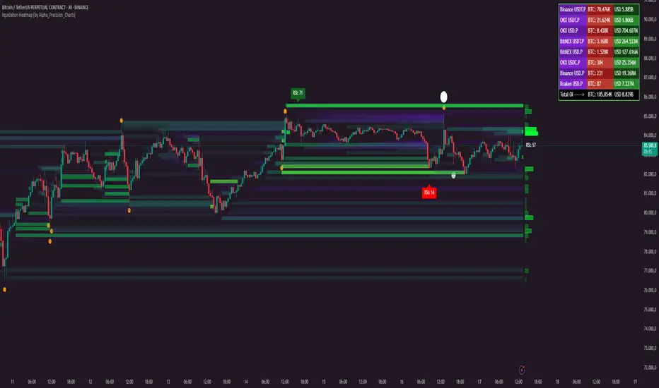
liquidation Heatmap [by Alpha_Precision_Charts]Indicator Description: Heatmap Longs/Shorts with OI Sensitivity & Aggregated Tools
Overview
The "Heatmap Longs/Shorts with OI Sensitivity & Aggregated Tools" is an advanced, multi-functional indicator crafted for futures traders seeking a deeper understanding of market dynamics. This tool integrates several key features—Heatmap of Longs and Shorts with Open Interest (OI) sensitivity, Histograms, Liquidity Exit Bubbles, Volume Bubbles, RSI Labels, Moving Averages, and an OI Table—into a single, cohesive package. By pulling real-time OI data from major exchanges (Binance, BitMEX, OKX, Kraken), it offers a robust framework for analyzing liquidity, order flow, momentum, and trends across various timeframes.
Why Aggregation Matters
Market analysis thrives on combining diverse insights, as relying on a single tool often leaves gaps in understanding. Each component of this indicator addresses a distinct aspect of market behavior:
Heatmap Longs/Shorts with OI Sensitivity: Maps potential liquidation zones based on OI, pinpointing where leveraged positions might cluster.
Histograms: Visualize the density of potential liquidity across price levels, enhancing OI-based analysis.
OI Table: Provides a breakdown of OI across all supported exchanges, offering transparency into total market exposure.
Liquidity Exit Bubbles: Highlight significant position exits (negative OI delta), signaling potential reversals or liquidations.
Volume Bubbles: Detect high-volume events from perpetual futures, revealing aggressive market participation.
RSI Labels: Track momentum with overbought and oversold conditions, refining entry and exit timing.
Moving Averages: Establish trend direction and dynamic support/resistance levels.
The power of aggregation lies in its ability to connect these dots. For instance, the Heatmap identifies potential liquidation zones, Volume Bubbles confirm aggressive moves, and RSI Labels add momentum context. Histograms and the OI Table further enrich this by detailing liquidity density and market exposure, creating a comprehensive view critical for navigating volatile markets.
Key Features
Heatmap Longs/Shorts with OI Sensitivity
Displays potential liquidation levels above (Shorts) and below (Longs) the price, with leverage settings from 5x to 125x.
Includes a Minimum Liquidity Sensitivity filter (0.1-1.0) to exclude small-order noise.
Features a dynamic gradient (purple to yellow) with adjustable intensity based on OI.
Note: Exact trader leverage isn’t known; liquidation zones are inferred from market psychology, as traders often favor specific leverage levels (e.g., 25x, 50x, 125x).
Histograms
Display the density of potential liquidity across price levels, complementing the Heatmap. Note that the largest histogram bars may appear in different locations compared to the most intense (yellow) areas of the Heatmap, as histograms primarily focus on the accumulation of smaller orders.
OI Table
Aggregates OI data from all supported exchanges (Binance, BitMEX, OKX, Kraken) in base currency and USD, sortable by volume.
Displays total OI and individual exchange contributions automatically.
Liquidity Exit Bubbles
Plots bubbles for significant negative OI changes, sized as small, medium, or large based on magnitude.
Positioned above or below candles depending on volatility direction, with customizable colors.
Volume Bubbles
Marks high-volume activity from perpetual futures, with sizes (normal, high, ultra-high) tied to intensity.
Offers adjustable sensitivity and offset for precise placement.
RSI Labels
Provides real-time RSI readings, highlighting overbought (≥70) and oversold (≤30) levels.
Configurable by price source (e.g., High/Low, Close) and timeframe, with customizable appearance.
Moving Averages
Supports SMA, EMA, WMA, and VWMA with three user-defined periods (default: 21, 50, 100).
Toggleable visibility and colors for trend analysis.
How to Use
Scalping/Day Trading (1m-15m):
Load the indicator three times: one at 125x leverage (visible), one at 50x (hidden), and one at 25x (hidden). Use the 125x Heatmap to identify immediate liquidation zones. When price breaks through the 125x liquidity pool, enable the 50x instance, then 25x as needed, to track cascading liquidations.
Pair with Histograms to monitor potential liquidity density, Volume Bubbles for breakout signals, and Liquidity Exit Bubbles for reversals.
Check RSI Labels on short timeframes (e.g., 15m) for overextended moves.
Swing Trading (1H-4H):
Set the Heatmap to lower leverage (e.g., 25x, 10x) and combine with Moving Averages to confirm trends.
Use RSI Labels on matching timeframes to time entries/exits based on momentum.
Reference the OI Table to assess overall market exposure.
Liquidity Analysis:
Adjust the Minimum Liquidity Sensitivity to focus on significant OI clusters. Higher filtering removes small orders, so use Volume Bubbles and the OI Table for broader context in sideways markets.
Use the OI Table to see total OI across all exchanges.
General Tips:
Toggle features (e.g., Bubbles, MAs) to focus on relevant data.
Test settings on your asset—optimized for Bitcoin, adjustable for altcoins.
Settings
Exchanges: Data from Binance, BitMEX, OKX, and Kraken is automatically included.
Heatmap: Enable Longs/Shorts, set start date, adjust leverage and color intensity.
Liquidity Filtering: Tune Minimum Liquidity Sensitivity (0.1-1.0) to balance detail and noise.
Histograms: Automatically active, showing potential liquidity density; no direct settings.
OI Table: Toggle visibility and choose position (e.g., Top Right).
Bubbles: Enable/disable Liquidity Exit and Volume Bubbles, set sensitivities and colors.
RSI: Pick price source, timeframe, and label style (size, color, offset).
Moving Averages: Select type, periods, and visibility.
Why It’s Unique
This indicator blends liquidity tools (Heatmap, Histograms, OI Table, Bubbles) with momentum and trend analysis (RSI, MAs). The adjustable Heatmap intensity enhances visibility of significant OI levels, while the multi-tool approach provides a fuller market perspective.
Notes
Best suited for perpetual futures; test on spot or other instruments for compatibility.
High leverage (e.g., 125x) excels on short timeframes; use 5x-25x for daily/weekly views.
Experiment with settings to optimize for your asset and timeframe.
This indicator relies on the availability of Open Interest (OI) data from TradingView. Functionality may vary depending on data access for your chosen asset and exchange.
Feedback
Your input is valued to enhance this tool. Enjoy trading with a fuller market perspective!
Wyszukaj w skryptach " TABLE "
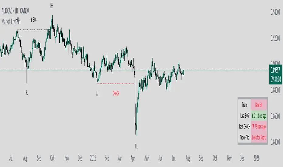
Market RhythmMarket Rhythm
Overview
If you’re a price-action enthusiast who loves to stay on top of structural shifts in the market, Market Rhythm is here to supercharge your charting experience! This script automatically identifies swing points (HH, LH, HL, LL), detects breaks of structure (BOS), flags changes of character (CHoCH), and offers an optional Trade Tip to guide your next move. It also provides a sleek table summarizing the latest signals so you can confirm momentum or pivot-based ideas at a glance.
What It Does
Swing Detection
Spots the last few pivot highs and lows on your chart.
Labels them as HH (Higher High), LH (Lower High), HL (Higher Low), or LL (Lower Low).
You can display all identified swings or only the most recent ones.
Adaptive Swing Logic
Optionally invert your swing lengths when the script detects a bearish trend, allowing it to adapt pivot detection automatically.
This means if the market flips to a downtrend, pivot detection reconfigures itself in real time.
Break of Structure (BOS)
If price breaks above the previous swing high or below the previous swing low, the script prints a BOS line on the chart.
You can choose whether to confirm breakouts via candle closes or wicks.
CHoCH (Change of Character)
When a BOS flips from bullish to bearish (or vice versa) against the prior direction, it’s renamed CHoCH for added clarity.
Color-coded lines and labels let you instantly see if the market’s “character” is reversing.
Optional Trade Tip
The script can suggest “Look for Long” or “Look for Short” based on your last pivot type and overall trend direction.
This “Trade Tip” is completely optional: enable or disable it in the settings, and the table reconfigures itself automatically.
Information Table
A compact on-chart table gives you an at-a-glance summary of:
Trend – Are we bullish, bearish, or uncertain?
Last BOS – If there’s a recent break of structure, how many bars ago did it happen?
Last CHoCH – If the market made a sudden reversal, how many bars back?
Trade Tip (Optional) – Summarizes whether conditions favor a long or short setup, or if it’s best to wait.
Alerts
Built-in alert conditions let you know when a BOS or CHoCH happens (bullish or bearish).
Turn them on to receive notifications without staring at the screen all day.
Chart Elements
Swing Labels: “HH,” “LH,” “HL,” “LL” near the pivot bars.
BOS & CHoCH Lines: Solid/dashed/dotted lines drawn across your chart, marking the level of structure that got broken.
Color Codes: Bullish signals are tinted in blue-ish tones, bearish signals in pink/purple-ish tones, making it easy to parse your chart visually.
Trade Tip Row: If enabled, instantly highlights “Look for Long” or “Look for Short” in a color-coded cell (blue for long, purple for short, gray if none).
Key Settings
Swing Points
Swing Points Display: Show all pivots, only the last set, or no pivots at all.
Invert Right Swing in Bearish Trend: Automatically swap your “Right Swing Length (High)” and “Right Swing Length (Low)” once the script detects a bearish trend (signaled by the most recent CHoCH).
Left Swing Length / Right Swing Length High/Low: Control how sensitive pivot detection is for highs vs. lows.
Pivot Source: Decide if your pivots are based on candle closes or wicks.
BOS Settings
Show BOS: Hide or reveal the Break of Structure lines entirely.
BOS Confirmation: Candle closes or wicks needed for a “true” breakout.
Line Style / Width / Color: Customize the BOS lines to your liking.
Show Only Last BOS: Show only the freshest BOS or keep historical ones on the chart.
CHoCH Settings
Show CHoCH: Rename the first opposite BOS to CHoCH if desired.
Bullish/Bearish Colors: Pick your favorite color theme for CHoCH lines.
Line Style / Width / Show Only Last CHoCH: Similar customizing options as BOS lines.
Table Settings
Show Table: Toggle the entire summary table on/off.
Position & Text Size: Choose table location (top-left, bottom-right, etc.) and text size (small to huge).
Show 'Trade Tip' row: Decide whether to add a fourth row that suggests potential trade direction. If disabled, the table has only three rows (Trend, Last BOS, and Last CHoCH).
Alerts
Several alert conditions are built in (e.g., “Bullish BOS Alert,” “Bearish BOS Alert,” “CHoCH Alert,” etc.), so you can set notifications for real-time structural shifts.
Why You’ll Love It
Visual Clarity: No more guesswork on which pivot was broken or whether a CHoCH just took place—color-coded lines and labels handle it.
Flexible Pivot Logic: Candle closes vs. wicks, separate right swing lengths for highs and lows, and an adaptive approach if the market goes bearish.
Quick Glance Table: Summaries of the latest signals keep you in the loop without cluttering your chart.
Trade Tip Option: Let the script gently nudge you toward potential bullish or bearish setups—only if you want it to!
Alerts for Everything: BOS and CHoCH can trigger alerts so you never miss a key structural change.
Give Market Rhythm a go, and watch your chart transform into a dynamic story of structure breaks, pivot swings, and potential trade cues. Whether you’re a short-term scalper or a higher-timeframe swing trader, this tool aims to simplify your analysis and keep you laser-focused on what matters.
Category SpaghettiThis indicator aims to analyze the strength and weakness between categories by grouping multiple symbols into a single category, calculating the geometric or weighted average rate of change over a specified period, and displaying it as a Spaghetti Chart.
On the left side of the screen, it displays the rate of change for each category, while on the right side, it shows the rate of change for symbols belonging to the selected category.
The indicator is computationally heavy as it can draw up to 10 symbols per category and up to 20 categories. You can slightly improve performance by reducing the number of bars loaded in the Performance Settings.
#################### Settings Description ####################
Calculation Method
You can select either the geometric average or the weighted average.
When the Weighting option is checked, the calculation uses "symbol*weight," enabling weighting for the symbols.
ROC Period
Select the calculation period for the rate of change.
If a symbol included in the calculation period is newly listed or delisted, the result will be NaN.
Date and Time
When checked, the rate of change is calculated from the specified date and time.
Base Symbol Basis Chart
When checked, the rate of change is displayed based on the base symbol specified in Base Symbol.
Highlight
When checked, only the categories specified by numbers in the text box are highlighted.
Separate the numbers with commas.
==================== Symbols Table Settings ====================
Symbols Table
When checked, the Symbols Table is displayed on the right side of the screen.
Select Category
Displays the rate of change for the symbols belonging to the selected category.
Display Limit
When checked, switches the display of the rate of change from all entries to only the top or bottom symbols based on the selected count.
Text Size
Adjusts the text size in the table.
==================== Category Table Settings ====================
Category Table
When checked, the Category Table is displayed on the left side of the screen.
Other settings are similar to the Symbols Table Settings.
==================== Category Settings ====================
Base Symbol
Sets the symbol used for comparison in each category.
The settings include an ON/OFF checkbox, symbol name, color, and line thickness.
Category setting field
The settings include an ON/OFF checkbox, category name, color, line thickness, and a text area below.
In the text area, enter the symbols that make up the category, one per line, in the format "symbol" or "symbol*weight", ensuring each entry is on a new line.
You can register up to 10 symbols per category; registering more than 11 symbols will result in an error.
==================== Color Settings ====================
Table Text
Sets the text color in the table.
Table Background
Sets the table background color.
Positive
Sets the display color when the rate of change is positive.
Negative
Sets the display color when the rate of change is negative.
Reset Line
When checked, a vertical line is drawn at points where the calculation period changes.
Label Shift
Specifies the position of the category name labels displayed on the right side of the Spaghetti Chart.
==================== Performance Settings ====================
Request Bars Count
Sets the number of candlesticks to be called for rate of change calculations.
The smaller the number, the lighter the processing load is expected to be.
----------------------------------------------------------------------------------------------
このインジケーターは、複数のシンボルを一つのカテゴリーにまとめて指定した期間の幾何平均または加重平均騰落率を計算し、Spaghetti Chartとして描画することで、カテゴリー間の強弱の分析を目的としています。
画面左側に各カテゴリーの騰落率、右側に指定したカテゴリーに属するシンボルの騰落率を表示しています。
カテゴリーあたり最大10シンボル、最大20カテゴリーを描画するため、インジケーターの動作が非常に重くなります。
設定のPerformance Settingsから読み込むBarsの数を減らすことで動作が少しだけ軽量になります。
#################### 設定の説明 ####################
Calculation Method
幾何平均と加重平均を選択できます。
Weightingにチェックを入れると「symbol*weight」となり、計算時にシンボルの重み付けが有効になります。
ROC Period
騰落率の計算期間を選択します。
計算期間中に新規上場または上場廃止したシンボルが含まれる場合、計算結果はNaNとなります。
Date and Time
チェックを入れると指定した日時からの騰落率を計算します。
Base Symbol Basis Chart
チェックを入れるとBase Symbolで設定したシンボル基準での騰落率を表示します。
Highlight
チェックを入れるとテキストボックスで指定した番号のカテゴリーのみがハイライトされます。
番号はカンマで区切ってください。
==================== Symbols Table Settings ====================
Symbols Table
チェックを入れると画面右側のSymbols Tableを表示します。
Select Category
選択した番号のカテゴリーに属するシンボルの騰落率を表示します。
Display Limit
チェックを入れると騰落率を全件表示から選択した件数の上位下位のみ表示に切り替えます。
Text Size
テーブルのテキストサイズを変更します。
==================== Category Table Settings ====================
Category Table
チェックを入れると画面左側のCategory Tableを表示します。
他の設定はSymbols Table Settingsと同様です。
==================== Category Settings ====================
Base Symbol
各カテゴリーの比較対象となるシンボルを設定します。
設定は左からON/OFFチェックボックス、シンボル名、色、ラインの太さです。
Category setting field
設定は左からON/OFFチェックボックス、カテゴリー名、色、ラインの太さ、下の段のテキストエリアはカテゴリーを構成するシンボルを入力します。
テキストエリアは、一行ごとに「symbol」または「symbol*weight」のように記述し、必ず改行を行ってください。
最大10シンボルまで登録可能で、11シンボル以上登録するとエラーになります。
==================== Color Settings ====================
Table Text
テーブルのテキストカラーです。
Table Background
テーブルの背景色です。
Positive
騰落率がプラスの時の表示色です。
Negative
騰落率がマイナスの時の表示色です。
Reset Line
チェックを入れると計算期間が切り替えるポイントに縦線を描画します。
Label Shift
Spaghetti Chartの右側に表示するカテゴリー名のラベル位置を指定します。
==================== Performance Settings ====================
Request Bars Count
騰落率計算時に呼び出すローソク足の本数です。
数値が小さいほど動作が軽量になるはずです。

Open-Close Absolute Difference with Threshold CountsThe Open-Close Absolute Difference with Threshold Counts indicator is a versatile tool designed to help traders analyze the volatility and price movements within any given timeframe on their charts. This indicator calculates the absolute difference between the open and close prices for each bar, providing a clear visualization through a color-coded histogram.
Key features include:
• Timeframe Flexibility: Utilizes the current chart’s timeframe, whether it’s a 5-minute, hourly, or daily chart.
• Custom Thresholds: Allows you to set up to four custom threshold levels (Thresholds A, B, C, and D) with default values of 10, 15, 25, and 35, respectively.
• Period Customization: Enables you to define the number of bars (N) over which the indicator calculates the counts, with a default of 100 bars.
• Visual Threshold Lines: Plots horizontal dashed lines on the histogram representing each threshold for easy visual reference.
• Dynamic Counting: Counts and displays the number of times the absolute difference is less than or greater than each threshold within the specified period.
• Customizable Table Position: Offers the flexibility to position the results table anywhere on the chart (e.g., Top Right, Bottom Left).
How It Works:
1. Absolute Difference Calculation:
• For each bar on the chart, the indicator calculates the absolute difference between the open and close prices.
• This difference is plotted as a histogram:
• Green Bars: Close price is higher than the open price.
• Red Bars: Close price is lower than the open price.
2. Threshold Comparison and Counting:
• Compares the absolute difference to each of the four thresholds.
• Determines whether the difference is less than or greater than each threshold.
• Utilizes the ta.sum() function to count occurrences over the specified number of bars (N).
3. Results Table:
• Displays a table with three columns:
• Left Column: Counts where the absolute difference is less than the threshold.
• Middle Column: The threshold value.
• Right Column: Counts where the absolute difference is greater than the threshold.
• The table updates dynamically and can be positioned anywhere on the chart according to your preference.
4. Threshold Lines on Histogram:
• Plots horizontal dashed lines at each threshold level.
• Each line is color-coded for distinction:
• Threshold A: Yellow
• Threshold B: Orange
• Threshold C: Purple
• Threshold D: Blue
How to Use:
1. Add the Indicator to Your Chart:
• Open the Pine Editor on TradingView.
• Copy and paste the provided code into the editor.
• Click “Add to Chart.”
2. Configure Settings:
• Number of Bars (N):
• Set the period over which you want to calculate the counts (default is 100).
• Thresholds A, B, C, D:
• Input your desired threshold values (defaults are 10, 15, 25, 35).
• Table Position:
• Choose where you want the results table to appear on the chart:
• Options include “Top Left,” “Top Center,” “Top Right,” “Bottom Left,” “Bottom Center,” “Bottom Right.”
3. Interpret the Histogram:
• Observe the absolute differences plotted as a histogram.
• Use the color-coded bars to quickly assess whether the close price was higher or lower than the open price.
4. Analyze the Counts Table:
• Review the counts of occurrences where the absolute difference was less than or greater than each threshold.
• Use this data to gauge volatility and price movement intensity over the specified period.
5. Visual Reference with Threshold Lines:
• Refer to the horizontal dashed lines on the histogram to see how the absolute differences align with your thresholds.
Example Use Case:
Suppose you’re analyzing a 5-minute chart for a particular stock and want to understand its short-term volatility:
• Set the Number of Bars (N) to 50 to analyze the recent 50 bars.
• Adjust Thresholds based on the typical price movements of the stock, e.g., Threshold A: 0.5, Threshold B: 1.0, Threshold C: 1.5, Threshold D: 2.0.
• Position the Table at the “Top Right” for easy viewing.
By doing so, you can:
• Quickly see how often the stock experiences significant price movements within 5-minute intervals.
• Make informed decisions about entry and exit points based on the volatility patterns.
• Customize the thresholds and periods as market conditions change.
Benefits:
• Customizable Analysis: Tailor the indicator to fit various trading styles and timeframes.
• Quick Visualization: Instantly assess market volatility and price movement direction.
• Enhanced Decision-Making: Use the counts and visual cues to make more informed trading decisions.
• User-Friendly Interface: Simple configuration and clear display of information.
Note: Always test the indicator with different settings to find the configuration that best suits your trading strategy. This indicator should be used as part of a comprehensive analysis and not as the sole basis for trading decisions.
RSI - ARIEIVhe RSI MAPPING - ARIEIV is a powerful technical indicator based on the Relative Strength Index (RSI) combined with moving averages and divergence detection. This indicator is designed to provide a clear view of overbought and oversold conditions, as well as identifying potential reversals and signals for market entries and exits.
Key Features:
Customizable RSI:
The indicator offers flexibility in adjusting the RSI length and data source (closing price, open price, etc.).
The overbought and oversold lines can be customized, allowing the RSI to signal critical market zones according to the trader’s strategy.
RSI-Based Moving Averages (MA):
Users can enable a moving average based on the RSI with support for multiple types such as SMA, EMA, WMA, VWMA, and SMMA (RMA).
For those who prefer Bollinger Bands, there’s an option to use the moving average with standard deviation to detect market volatility.
Divergence Detection:
Detects both regular and hidden divergences (bullish and bearish) between price and RSI, which can indicate potential market reversals.
These divergences can be customized with specific colors for easy identification on the chart, allowing traders to quickly spot significant market shifts.
Zone Mapping:
The script maps zones of buying and selling strength, filling the areas between the overbought and oversold levels with specific colors, highlighting when the market is in extreme conditions.
Strength Tables:
At the end of each session, a table appears on the right side of the chart, displaying the "Buying Strength" and "Selling Strength" based on calculated RSI levels. This allows for quick analysis of the dominant pressure in the market.
Flexible Settings:
Many customization options are available, from adjusting the number of decimal places to the choice of colors and the ability to toggle elements on or off within the chart.
3 Day Lookback [TFO]This 3 Day Lookback indicator aims to display key information about price with respect to its previous 3 day highs and lows. It was built with the intention of being compact in order to not take up a lot of chart space.
The core component of this indicator is the table. From this table, we look at price with respect to the ranges from 1, 2, and 3 days ago, and assign it a color code. By default, we use 🟢, 🟡, and 🔴 to indicate that price is above, stuck inside, or below these ranges, respectively.
Take the following chart as an example. We manually drew these boxes to encompass the range of each day, from high to low. The leftmost box from 3 days ago is colored red to reflect the fact that price is below that day's low. This is why the table indicates a state of 🔴 for the range from 3 days ago. Then, the following two days are colored yellow to indicate that price is currently trading inside their ranges, which is why the state for both of those days is indicated as 🟡 in the table.
In a similar example below, we can see that price is clearly above the high from 3 days ago and the high from 2 days ago, which is reflected in the table with a state of 🟢 for both. However, since price is currently trading within the range from 1 day ago, it is assigned a state of 🟡 in the table.
As you may have noticed in the above examples, each day's high and low is indicated with labels (ex. "2H" and "2L" for the high and low from 2 days ago). These are optional and can be turned off in the indicator's settings. The lines tracking the previous 3 day highs and lows may also be turned off so that you're just left with the table, as is shown in the below example.
With this minimalistic table, users can get a quick glance at how price is trading with respect to the last few days of price action. Hopefully this proves useful for mobile users as well, since the indicator can be reduced to a simple table that doesn't take up much chart space.

Volume, Volatility, and Momentum Metrics IndicatorVolume, Volatility, and Momentum Metrics Indicator
Welcome to our comprehensive TradingView indicator designed to provide traders with essential volume, volatility, and momentum metrics. This powerful tool is ideal for traders looking to enhance their market analysis by visualizing key indicators in a concise and easy-to-read format.
Key Features
1. Volume Metrics:
• Daily Dollar Volume: Understand the monetary value of the traded volume each day.
• Relative Volume (RVOL) Day: Compare the current volume to the previous day’s volume to gauge trading activity.
• Relative Volume (RVOL) 30D: Assess the average trading volume over the past 30 days.
• Relative Volume (RVOL) 90D: Evaluate the average trading volume over the past 90 days.
2. Volatility and Momentum Metrics:
• Average Daily Range (ADR) %: Measure the average daily price range as a percentage of the current price.
• Average True Range (ATR): Track the volatility by calculating the average true range over a specified period.
• Relative Strength Index (RSI): Determine the momentum by analyzing the speed and change of price movements.
3. Customizable Table Positions:
• Place the volume metrics table and the volatility/momentum metrics table in the bottom-left or bottom-right corners of your chart for optimal visibility and convenience.
Why Use This Indicator?
• Enhanced Market Analysis: Quickly assess volume trends, volatility, and momentum to make informed trading decisions.
• User-Friendly Interface: The clear and concise tables provide at-a-glance information without cluttering your chart.
• Customization Options: Choose where to display the tables to suit your trading style and preferences.
How It Works
This indicator uses advanced calculations to provide real-time data on trading volume, price range, and momentum. By displaying this information in separate, neatly organized tables, traders can easily monitor these critical metrics without diverting their focus from the main chart.
Who Can Benefit?
• Day Traders: Quickly gauge intraday trading activity and volatility.
• Swing Traders: Analyze longer-term volume trends and momentum to identify potential trade setups.
• Technical Analysts: Utilize comprehensive metrics to enhance technical analysis and trading strategies.
Get Started
To add this powerful indicator to your TradingView chart, simply search for “Volume, Volatility, and Momentum Metrics” in the TradingView public library, or use the provided link to add it directly to your chart. Enhance your trading analysis and make more informed decisions with our comprehensive TradingView indicator.

BTC Halving [YinYangAlgorithms]This Indicator not only estimates what it thinks may be the PRICE for the Start, High and Low of the Halving, but likewise estimates WHEN the Start, High and Low of Halving may be. It then creates Trend Lines based on these predictions so that you may get an evaluation towards if the Price is currently Overbought or Oversold. These Trend Lines may be very useful for seeing the Slope in which the Price may move if it is to reach the estimated Price by the estimated Date. By evaluating the Prices location based on these Trend Lines we may determine if the Price is currently Overbought or Oversold.
These Trend Lines likewise may help identify locations of Support and Resistance. If the Price is much higher than its current Trend Line it is Overbought. There is a chance it will Consolidate back to the Trend Line or it may even correct with a dump all the way back to it; the opposite is true if it is much lower than its current Trend Line.
Trend Lines and Estimates are not all that is featured within this Indicator however. There are also Price Zones which may help identify if the price is currently:
Very Overbought (Red)
Slightly Overbought (Orange)
Neutral (Yellow)
Slightly Oversold (Teal)
Very Oversold (Green)
These zones may help give you an idea of how the price is currently fairing and its potential for movement. Likewise, it may help define where Support and Resistance may be found.
The trend line estimates are done with an algorithm created to evaluate the difference between price and % change that has occurred between the Start, High and Low of all the halvings over how many days between each data type. This may allow us to make an educated estimate towards what Price and Date the Start, High and Low will occur at.
Our Zones are created by evaluating the current Market Cap and circulating supply vs Max Supply of BTC. This may help give us an evaluation of what Price may be considered to be Overbought and Oversold; and likewise may help with estimations of where there may be Support and Resistance based on these Zones.
Tutorial:
In the example above we’re displaying the Halving Start Trend Line, our Information Tables and our Estimated Halving Vertical Marker. This Trend Line may help to display not only the trajectory and slope the Price needs to take to reach the Estimated Halving Price by the Estimated Halving Date; but it may also help to show if the price is Overvalued or Undervalued based on its position above or below this Trend Line.
Based on the Trajectory of the Estimated High Upward Trend Line (Green Line) in the photo above and from the ‘High Date’ estimated in the Information tables; we may attempt to estimate the location the ATH of this Bull Market will create and the price slope it may follow in doing so. This Trajectory may be very useful for understanding the price action that may occur for it to reach the High estimated Price by the High estimated Date.
We currently allow for two different types of zones within our Settings, one called ‘Fast’ displayed in the example above; and the other called ‘Slow’ displayed in the example below.
Our Fast Zone aims to move the Zone Levels Faster in an attempt to move with volatility and parabolic movement. This may help to keep the Very Overbought (Red) and Very OverSold (Green) Levels more accurate by attempting to keep the price within them. By doing so, we may aim to keep all of the Slightly Overbought, Slightly Oversold and Neutral Levels more accurate as well.
The Levels within these zones are defined by the Bright (less transparent) Lines. Whereas the Darker (more transparent) lines represent the Basis Lines between two different levels. These Basis lines may likewise act as a Support and Resistance Location too, but generally hold less weight than the actual Levels themselves.
What you may see is that during the Bull Market, the price is within the very Overbought Zones and even touches again the Very Overbought Level a few times. Likewise, during the Bear Market, the price is within the very Oversold Zones and even slightly drops below the Very Oversold Level. This may be expected and likewise may help to give estimates at potential for growth and decay within the Price based on which condition the Market is within.
Slow Zones move a little slower than Fast Zones, however they may still be accurate. Likewise, it is up to you to decide which Zone works better for your specific Trading Style; however, by default, the Zone type is set to Fast.
If you refer to both the Fast and Slow examples above, you may notice in the Fast the Price is only slightly above the ‘Slightly Oversold’ (Teal) line. Also, In the Fast, the Price where the ‘Very Overbought’ Level is 100k. This is one of the many reasons we’ve opted for ‘Fast’ as the default, and it is because it allows more room for movement; and in our opinion, potentially accuracy as well.
If you refer to the Slow example, you’ll see that the price is currently facing the Neutral Level as a Resistance location. However, if you refer to the price residing at the Slows ‘Very Overbought’ Level, it is only 81.5k, compared to the 100k of Fast.
The BTC Halving is a major event that takes place roughly every 4 years. It historically has a major impact on the market, and some may even say it signifies the Start, or close to start of the Bull Market. Therefore, since historically there may be cycles that BTC and potentially crypto itself follows, we’ve developed this Indicator in hopes that it may solve one of the biggest questions traders face. What Date will the Start, High and Low of the Halving occur and also at what Price.
Hopefully this Tutorial has given you some guidance as to how this Indicator may be used to help identify some of these key levels; including the slope at which the price may have to move if it is to reach its projection Price by its projected Date.
Settings:
1. Show Prediction Trend Lines:
- Options:
All
Start + High
Start + Low
High + Low
Start
High
Low
None
- Description:
Prediction Trend Lines may be an important way to see the Slope the Price needs to take to reach the Predicted Price by the Predicted Date. This may be useful for identifying if the Price is currently Overbought or Oversold.
2. Zone Type:
- Options:
Fast
Slow
- Description:
Zone types change the way the Zones expand.
3. Show Zones:
- Options:
All
Zones
Basis
None
- Description:
Zones are a way of seeing Overbought and Oversold Price locations based on Market Cap and Circulating Supply vs Max Supply.
4. Vertical Markers:
- Options:
All
Line
Label
None
- Description:
Vertical Markers display where the Halving has occurred with a Vertical Line and Label.
5. Show Tables:
Tables may be useful for seeing the Price and Date for when the Start, High and Low of the Halving may occur.
6. Fill Zones:
Filling in Zones may help to identify which Zone the Price is currently in.
If you have any questions, comments, ideas or concerns please don't hesitate to contact us.
HAPPY TRADING!

Fib RSI++ by [JohnnySnow]Fib RSI++ by is an RSI Inspired by my absolutely favorite RSI on tradingview: RSI & EMA with Reverse Calculator Panel by balipour.
Built for quicker and easily identify prices at current RSI /possibly reversals/ RSI direction and RSI landings.
From balipour, I reuse /adapt to pinescriptV5 3 lines of code ( ) - the balipour implementation for reversing RSI formula in order to calculate price estimation based on the Given RSI level. Credits to the author.
Inspired by it, I also combine RSI with a MA but tuned to reads better the support/resistance levels (my humble opinion).
For quicker price target identification 2 features were added:
- Gridlines based on Fib levels, standard overbought/oversold levels and other levels I personally use. All of the grid lines can be configured according to user preferences.
- 2 information tables:
--First with a collection of 'close' numbers and Fib RSI levels price estimations at given RSI
--The second table allows the user to add up to 3 custom RSI levels to further target the price estimation.
Author UI Preferences to be used with this indicator: dark theme, hidden vertical and horizontal chart gridlines.

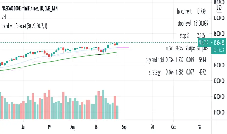
trend_vol_forecastNote: The following description is copied from the script's comments. Since TradingView does not allow me to edit this description, please refer to the comments and release notes for the most up-to-date information.
-----------
USAGE
This script compares trend trading with a volatility stop to "buy and hold".
Trades are taken with the trend, except when price exceeds a volatility
forecast. The trend is defined by a moving average crossover. The forecast
is based on projecting future volatility from historical volatility.
The trend is defined by two parameters:
- long: the length of a long ("slow") moving average.
- short: the length of a short ("fast") moving average.
The trend is up when the short moving average is above the long. Otherwise
it is down.
The volatility stop is defined by three parameters:
- volatility window: determines the number of periods in the historical
volatility calculation. More periods means a slower (smoother)
estimate of historical volatility.
- stop forecast periods: the number of periods in the volatility
forecast. For example, "7" on a daily chart means that the volatility
will be forecasted with a one week lag.
- stop forecast stdev: the number of standard deviations in the stop
forecast. For example, "2" means two standard deviations.
EXAMPLE
The default parameters are:
- long: 50
- short: 20
- volatility window: 30
- stop forecast periods: 7
- stop forecast standard deviations: 1
The trend will be up when the 20 period moving average is above the 50
period moving average. On each bar, the historical volatility will be
calculated from the previous 30 bars. If the historical volatility is 0.65
(65%), then a forecast will be drawn as a fuchsia line, subtracting
0.65 * sqrt(7 / 365) from the closing price. If price at any point falls
below the forecast, the volatility stop is in place, and the trend is
negated.
OUTPUTS
Plots:
- The trend is shown by painting the slow moving average green (up), red
(down), or black (none; volatility stop).
- The fast moving average is shown in faint blue
- The previous volatility forecasts are shown in faint fuchsia
- The current volatility forecast is shown as a fuchsia line, projecting
into the future as far as it is valid.
Tables:
- The current historical volatility is given in the top right corner, as a
whole number percentage.
- The performance table shows the mean, standard deviation, and sharpe
ratio of the volatility stop trend strategy, as well as buy and hold.
If the trend is up, each period's return is added to the sample (the
strategy is long). If the trend is down, the inverse of each period's
return is added to the sample (the strategy is short). If there is no
trend (the volatility stop is active), the period's return is excluded
from the sample. Every period is added to the buy-and-hold strategy's
sample. The total number of periods in each sample is also shown.
Crypto Perp Calc v1Advanced Perpetual Position Calculator for TradingView
Description
A comprehensive position sizing and risk management tool designed specifically for perpetual futures trading. This indicator eliminates the confusion of calculating leveraged positions by providing real-time position metrics directly on your chart.
Key Features:
Interactive Price Selection: Click directly on chart to set entry, stop loss, and take profit levels
Accurate Lot Size Calculation: Instantly calculates the exact position size needed for your margin and leverage
Multiple Entry Support: DCA into positions with up to 3 entry points with customizable allocation
Multiple Take Profit Levels: Scale out of positions with up to 3 TP targets
Comprehensive Risk Metrics: Shows dollar P&L, account risk percentage, and liquidation price
Visual Risk/Reward: Color-coded boxes and lines display your trade setup clearly
Real-time Info Table: All critical position data in one organized panel
Perfect for traders using perpetual futures who need precise position sizing with leverage.
---------
How to Use
Quick Start (3 Clicks)
1. Add the indicator to your chart
2. Click three times when prompted:
First click: Set your entry price
Second click: Set your stop loss
Third click: Set your take profit
3. Read the TOTAL LOTS value from the info table (highlighted in yellow)
4. Use this lot size in your exchange when placing the trade
Detailed Setup
Step 1: Configure Your Account
Enter your account balance (total USDT in account)
Set your margin amount (how much USDT to risk on this trade)
Choose your leverage (1x to 125x)
Select Long or Short position
Step 2: Set Price Levels
Main levels use interactive clicking (Entry, SL, TP)
For multiple entries or TPs, use the settings panel to manually input prices and percentages
Step 3: Read the Results
The info table shows:
TOTAL LOTS - The position size to enter on your exchange
Margin Used - Your actual capital at risk
Notional - Total position value (margin × leverage)
Max Risk - Dollar amount you'll lose at stop loss
Total Profit - Dollar amount you'll gain at take profit
R:R Ratio - Risk to reward ratio
Account Risk - Percentage of account at risk
Liquidation - Price where position gets liquidated
Step 4: Advanced Features (Optional)
Multiple Entries (DCA):
Enable "Use Multiple Entries"
Set up to 3 entry prices
Allocate percentage for each (must total 100%)
See individual lot sizes for each entry
Multiple Take Profits:
Enable "Use Multiple TPs"
Set up to 3 TP levels
Allocate percentage to close at each level (must total 100%)
View profit at each target
Visual Elements
Blue lines/labels: Entry points
Red lines/labels: Stop loss
Green lines/labels: Take profit targets
Colored boxes: Visual risk (red) and reward (green) zones
Info table: Can be positioned anywhere on screen
Alerts
Set price alerts for:
Entry zones reached
Stop loss approached
Take profit levels hit
Works with TradingView's alert system
Tips for Best Results
Always verify the lot size matches your intended risk
Check the liquidation price stays far from your stop loss
Monitor the account risk percentage (recommended: keep under 2-3%)
Use the warning indicators if risk exceeds margin
For quick trades, use single entry/TP; for complex strategies, use multiple levels
Example Workflow
Find your trade setup using your analysis
Add this indicator and click to set levels
Check risk metrics in the table
Copy the TOTAL LOTS value
Enter this exact position size on your exchange
Set alerts for key levels if desired
This tool bridges the gap between TradingView charting and exchange execution, ensuring your position sizing is always accurate when trading with leverage.
Disclaimer, this was coded with help of AI, double check calculations if they are off.

cd_SMT_Sweep_CISD_CxGeneral
This indicator is designed to show trading opportunities after sweeps of higher timeframe (HTF) highs/lows and, if available, Smart Money Technique (SMT) divergence with a correlated asset, followed by confirmation from a lower timeframe change in state delivery (CISD).
Users can track SMT, Sweep, and CISD levels across nine different timeframes.
________________________________________
Usage and Details
Commonly correlated timeframes are available in the menu by default. Users can also enter other compatible timeframes manually if necessary.
The indicator output is presented as:
• A summary table
• Display on HTF candles
• CISD levels shown as lines
Users can disable any of these from the menu.
Presentations of selected timeframes are displayed only if they are greater than or equal to the active chart timeframe.
From the Show/Hide section, you can control the display of:
• SMT table
• Sweep table
• HTF candles
• CISD levels
• HTF boxes aligned with the active timeframe
________________________________________
SMT Analysis
To receive analysis, users must enter correlated assets in the menu (or adjust them as needed).
If asset X is paired with correlated asset Y, then a separate entry for Y correlated with X is not required.
Four correlation pairs are included by default. Users should check them according to their broker/exchange or define new ones.
Checkboxes at the beginning of each row allow activation/deactivation of pairs.
SMT analysis is performed on the last three candles of each selected HTF.
If one asset makes a new high while the correlated one does not (or one makes a new low while the other does not), this is considered SMT and will be displayed both in the table and on the chart.
Charts without defined correlated assets will not display an SMT table.
________________________________________
Sweep Analysis
For the selected timeframes, the current candle is compared with the previous one.
If price violates the previous level and then pulls back behind it, this is considered a sweep. It is displayed in both the table and on the chart.
Within correlated pairs, the analysis is done separately and shown only in the table.
Example with correlated and non-correlated pairs:
• In the table, X = false, ✓ = true.
• The Sweep Table has two columns for Bullish and Bearish results.
• For correlated pairs, both values appear side by side.
• For undefined pairs, only the active asset is shown.
Example 1: EURUSD and GBPUSD pair
• If both sweep → ✓ ✓
• If one sweeps, the other does not → ✓ X
• If neither sweeps → X X
Example 2: AUDUSD with no correlated pair defined
• If sweep → ✓
• If no sweep → X
________________________________________
HTF Candles
For every HTF enabled by the user, the last three candles (including the current one) are shown on the chart.
SMT and sweep signals are marked where applicable.
________________________________________
CISD Levels
For the selected timeframes, bullish and bearish CISD levels are plotted on the chart.
________________________________________
HTF Boxes
HTF boxes aligned with the active timeframe are displayed on the chart.
Box border colors change according to whether the active HTF candle is bullish or bearish.
________________________________________
How to Read the Chart?
Let’s break down the example below:
• Active asset: Nasdaq
• Correlated asset: US500 (defined in the menu, confirmed in the table bottom row)
• Active timeframe: H1 → therefore, the HTF box is shown for Daily
• Since a correlated pair is defined, the indicator runs both SMT and Sweep analysis for the selected timeframes. Without correlation, only Sweep analysis would be shown.
Table is prepared for H1 and higher timeframes (as per user selection and active TF).
Observations:
• SMT side → H1 timeframe shows a bearish warning
• Sweep side → Bearish column shows X and ✓
o X → no sweep on Nasdaq
o ✓ → sweep on US500
Meaning: US500 made a new high (+ sweep) while Nasdaq did not → SMT formed.
The last column of the table shows the compatible LTF for confirmation.
For H1, it suggests checking the 5m timeframe.
On the chart:
• CISD levels for selected timeframes are drawn
• SMT line is marked on H1 candles
• Next step: move to 5m chart for CISD confirmation before trading (with other confluences).
Similarly, the Daily row in the table shows a Bullish Sweep on US500.
________________________________________
Alerts
Two alert options are available:
1. Activate Alert (SMT + Sweep):
Triggers if both SMT and Sweep occur in the selected timeframes. (Classic option)
2. Activate Alert (Sweep + Sweep):
Triggers if sweeps occur in both assets of a correlated pair at the same timeframe.
Interpretation:
If SMT + Sweep are already present on higher timeframes, and simultaneous sweeps appear on lower timeframes, this may indicate a strong directional move.
Of course, this must be validated with CISD and other confluences.
________________________________________
HTF CISD Levels
Although CISD levels act as confirmation levels in their own timeframe, observing how price reacts to HTF CISD levels can provide valuable insights for intraday analysis.
POIs overlapping with these levels may be higher priority.
________________________________________
What’s Next in Future Versions?
• Completed CISD confirmations
• Additional alert options
• Plus your feedback and suggestions
________________________________________
Final Note
I’ll be happy to hear your opinions and feedback.
Happy trading!

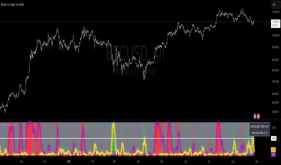
Relative Strength Heat [InvestorUnknown]The Relative Strength Heat (RSH) indicator is a relative strength of an asset across multiple RSI periods through a dynamic heatmap and provides smoothed signals for overbought and oversold conditions. The indicator is highly customizable, allowing traders to adjust RSI periods, smoothing methods, and visual settings to suit their trading strategies.
The RSH indicator is particularly useful for identifying momentum shifts and potential reversal points by aggregating RSI data across a range of periods. It presents this data in a visually intuitive heatmap, with color-coded bands indicating overbought (red), oversold (green), or neutral (gray) conditions. Additionally, it includes signal lines for overbought and oversold indices, which can be smoothed using RAW, SMA, or EMA methods, and a table displaying the current index values.
Features
Dynamic RSI Periods: Calculates RSI across 31 periods, starting from a user-defined base period and incrementing by a specified step.
Heatmap Visualization: Displays RSI strength as a color-coded heatmap, with red for overbought, green for oversold, and gray for neutral zones.
Customizable Smoothing: Offers RAW, SMA, or EMA smoothing for overbought and oversold signals.
Signal Lines: Plots scaled overbought (purple) and oversold (yellow) signal lines with a midline for reference.
Information Table: Displays real-time overbought and oversold index values in a table at the top-right of the chart.
User-Friendly Inputs: Allows customization of RSI source, period ranges, smoothing length, and colors.
How It Works
The RSH indicator aggregates RSI calculations across 31 periods, starting from the user-defined Starting Period and incrementing by the Period Increment. For each period, it computes the RSI and determines whether the asset is overbought (RSI > threshold_ob) or oversold (RSI < threshold_os). These states are stored in arrays (ob_array for overbought, os_array for oversold) and used to generate the following outputs:
Heatmap: The indicator plots 31 horizontal bands, each representing an RSI period. The color of each band is determined by the f_col function:
Red if the RSI for that period is overbought (>threshold_ob).
Green if the RSI is oversold (
SPX Daily Key Levels# Day Trading GPS S&P500 SPX Index Daily Key Levels Indicator
## Description
The Day Trading GPS S&P500 SPX Index Daily Key Levels Indicator (DT-GPS SPX) is a specialized technical tool designed for day traders focusing on trading index options on the CBOE S&P500 SPX index. This indicator provides daily key levels for both the CBOE SPX Index and EIGHTCAP SPX500 CFD, offering traders comprehensive price level analysis and actionable insights.
## Key Features
1. **Dual Market Coverage**:
- CBOE SPX Index levels generation on CBOE SPX chart at 9:30 AM EST
- EIGHTCAP SPX500 CFD levels generation on EIGHTCAP SPX500 CFD at 9:00 AM EST as well as
early display of CBOE SPX Index levels while on EIGHTCAP SPX500 chart at 9:00 AM EST (30 minutes before CBOE SPX 9:30 AM EST market open via separate Table Display for CBOE SPX levels
2. **Comprehensive Level Generation**:
- CBOE SPX index Daily Bull/Bear Key Price Level (BB-KPL) - this is the indicator's daily key Bull/Bear Pivot level for the current day's CBOE SPX trading session
- Multiple Support and Resistance Levels (R1-R6, S1-S6) to accommodate low, moderate and high volatility market environments
- Option for user to also display midpoint levels between any or all main levels if desired
- Fully customizable display options for each main level as well as midpoint levels
3. **Advanced Visualization**:
- Customizable line colors, styles, and widths
- Zone shading between levels
- Midpoint line calculations and display
4. **Dynamic Reference Tables**:
- Separate tables for CBOE SPX Index and EIGHTCAP SPX500 CFD levels
- Customizable table positioning and appearance
- Real-time level updates
5. **Pre-Market Analysis**:
- Early level generation for the EIGHTCAP SPX500 CFD at 9:00AM EST
- Preview of CBOE SPX index levels at 9:00 AM EST - 30 minutes before CBOE SPX index market open at 9:30 AM EST via separate table display at 9:00 AM EST for CBOE SPX index on EIGHTCAP SPX500 CFD chart
## Unique Aspects
1. **Market-Specific Timing**:
- Early access to CBOE SPX levels at 9:00 AM EST (30 minutes before 9:30 AM EST CBOE SPX index market open) via additional CBOE SPX levels table display on EIGHTCAP SPX500 CFD chart displayed at 9:00 AM EST
- CBOE SPX levels on CBOE SPX chart at CBOE SPX index market open (9:30 AM EST)
2. **Dual Display System**:
- Simultaneous viewing of both EIGHTCAP and CBOE levels
- Comparative analysis capabilities
3. **Precision Adjustment**:
- Automatic level adjustments between CFD and Index values
- Market-specific volatility calculations
## How It Enhances Your Trading
- Access key levels before market open through CFD analysis
- Compare and validate levels across both instruments
- Identify potential support and resistance zones with precision
- Implement sophisticated level-to-level trading strategies
- Manage risk with clearly defined price levels
- Track market structure through multiple timeframes
- Make informed decisions for SPX Index Options Trading with comprehensive level information
## Recommended Setup
For optimal use, it's recommended to run the indicator on two charts simultaneously:
1. EIGHTCAP SPX500 CFD chart for early level generation at 9:00 AM EST - 30 minutes before CBOE SPX index market open at 9:30 AM EST
2. CBOE SPX Index chart for official market levels
## Historical Level Analysis Features
**Historical Bull/Bear Key Price Level (BB-KPL)**
The Historical BB-KPL serves as a critical reference point for measuring value and potential price extensions in the market. By analyzing past BB-KPL interactions, traders can better anticipate future price behavior and make more informed decisions about entries and exits.
**Historical Support and Resistance Levels**
These dynamic levels provide crucial insights into market extension and momentum conditions, with levels further from the BB-KPL indicating potential reversal zones while also signaling strong trend conditions. Historical analysis of these levels helps traders identify high-probability trading opportunities by understanding how price has previously reacted at similar extensions from value.
**Video On Indicator Set-Up And Features**
www.youtube.com
**Videos On How To Trade Using This Indicator**
www.youtube.com
www.youtube.com
www.youtube.com
www.youtube.com
## Note
This indicator is specifically designed for day trading index options on the CBOE S&P500 SPX index. It requires appropriate data subscriptions for both CBOE indices and CFDs on TradingView. The indicator works best on timeframes of 30 minutes or less and should be used in conjunction with proper risk management practices. Past performance does not guarantee future results.

Crypto Narratives Performance [SwissAlgo]Crypto Narratives Performance Index
--------------------------------------------------------
What this indicator is
This script displays a relative performance index that compares the market capitalization trends of various crypto categories (narratives) against a selected 'Base asset' (BTC, ETH, or SOL) over a configurable rolling time window (default: 14-day).
It’s designed to help users observe sector rotation dynamics across the crypto ecosystem — such as whether DeFi is outperforming ETH, or if AI coins are underperforming relative to BTC.
--------------------------------------------------------
What it does
This indicator measures the percentage change in total market cap of a selected crypto sector over a user-defined lookback period, and compares it to the percentage change in market cap of a chosen base asset over the same period. The result is expressed as a ratio and transformed into a z-score, normalized over the last 180 bars. This allows the user to easily identify whether the sector is outperforming or underperforming the base asset in relative terms.
It also includes a smoothed signal line, a performance table, and marked background zones (levels of standard deviations) to help interpret potential extremes in sector outperformance or underperformance.
--------------------------------------------------------
How it works
It retrieves daily market capitalization data for both the selected base asset and sector from TradingView's CRYPTOCAP: data feed.
It computes the percent change in $ market cap over one of the following selectable periods: 1, 3, 7, 14, 30, or 60 days (14-day is the default).
The percentage change of the base is subtracted from the percentage change of the sector, producing a raw relative performance differential.
This differential is then normalized into a Z-Score, using a 180-day rolling mean and standard deviation.
The Z-Score is smoothed using an exponential moving average (EMA), and plotted against a secondary EMA signal line (to track potential performance trend changes).
A visual table compares the performance of all listed sectors against the selected base, ranked and annotated with basic symbols (stars for performance, alerts for underperformance vs. the selected 'Base Asset', i.e. BTC or ETH or SOL).
--------------------------------------------------------
Visual Features
* Color-coded plot line: Turns green, yellow, orange, or red based on zone and momentum.
* Signal line: Gray EMA of the z-score for trend comparison.
* Background fill zones:
±3 = "Extreme" outperform/underperform
±2 to ±3 = "Strong" zone
±1 to ±2 = Mild over/underperformance
±1 to -1 = Neutral performance range
* Dynamic Table:
Displays all sector vs. base performance differences.
Highlights the selected comparison sector.
Uses emojis (⭐/⚠️) for relative status at a glance.
--------------------------------------------------------
Who may benefit
This script may assist:
Crypto analysts tracking capital rotation across narratives.
Swing traders looking to spot momentum trends in crypto sectors.
Portfolio allocators observing which groups are leading or lagging relative to majors (BTC, ETH, SOL).
Developers or researchers evaluating sentiment shifts across categories (e.g., AI tokens rising vs. DeFi).
It is not a buy/sell signal tool — it's a sector/crypto narratives -relative monitor.
--------------------------------------------------------
Key Applications
Detect sector rotation (e.g., when Layer 1s start to outperform ETH, or BTC/SOL).
Monitor if certain categories are experiencing sustained interest or fading momentum.
Compare the strength of emerging narratives like DePIN, RWA, or World Liberty vs. majors.
Identify possible "mean-reversion" setups when a sector is excessively stretched relative to its historical norm.
--------------------------------------------------------
Limitations
Data dependency: All calculations rely on TradingView’s CRYPTOCAP: market cap feeds.
Normalization window: The z-score normalization is static at 180 bars; in choppy markets this may over-smooth or underreact.
Asset inclusion: The sectors reflect predefined index aggregates. Not all coins in a category may be equally weighted or relevant.
Lag: EMA smoothing introduces delay in reactive plotting.
No intra-day support: Works best on daily timeframes, as CRYPTOCAP: feeds are daily-only.
Not predictive: This script reflects past capital flows. It does not forecast future price moves.
--------------------------------------------------------
Customization
Users can adjust the following:
Base asset: BTC, ETH, SOL
Crypto sector (comparison): Choose from 11+ sectors, including DeFi, AI, Memes, Layer 1, etc.
Rolling performance period: Choose between 1–60 days.
Smoothing settings: Length of the EMA for the ratio and signal line.
Show/hide info table: Useful for screen space management.
Special Notes:
Please set the chart timeframe at 1-day in line with CRYPTOCAP data availability.
Please select the dark color scheme to view table and colors properly.
--------------------------------------------------------
Risk Disclaimer
This indicator is for informational and educational purposes only. It does not constitute financial advice, trading advice, or an invitation to engage in any financial strategy. Always conduct your own due diligence before making investment decisions. Use at your own risk.
Market conditions may shift rapidly, and past sector performance is not necessarily indicative of future outcomes. This tool is best used as part of a broader analytical framework, not in isolation.
Protected script: source code is hidden to preserve logic integrity and prevent tampering.
If you need clarification or encounter unexpected behavior with data feeds, please check the TradingView Help Center or post in the "Indicators and Strategies" section of the TradingView community.

Rpaid Killzone Breakout v3.6Final Indicator Title: Rapid Killzone Break & HTF Levels
Overview
Welcome to the Rapid Killzone Break & HTF Levels, an all-in-one trading toolkit designed for precision and context. This indicator was built to solve a common problem for day traders: how to combine a precise, lower-timeframe (LTF) entry model with the essential context of higher-timeframe (HTF) levels.
This tool is founded on a session-based breakout strategy, leveraging the volatility and liquidity generated during specific market hours (the "Killzones"). It then layers critical HTF support and resistance levels onto your chart, allowing you to make more informed trading decisions without ever needing to switch timeframes.
Whether you trade Forex, Gold, or major Indices, this indicator provides a comprehensive framework for identifying high-probability breakout opportunities.
The Core Strategy
The methodology is a powerful three-step process based on session liquidity and qualified breakouts:
The Killzone Range: The indicator first identifies the high and low established during a specific, high-volatility trading session (e.g., the first hour of London or New York). This range acts as a pool of liquidity. The core idea is that the market will often seek to "sweep" or run the liquidity resting above the session high or below the session low.
The Qualified Breakout: This is not just any breakout strategy. A valid entry signal only appears when price closes decisively outside the Killzone range with significant momentum. To ensure the quality of the signal, the breakout must meet several user-defined criteria:
The Killzone must have a minimum pip range.
The breakout candle must have a strong body-to-wick ratio.
The breakout must be accompanied by a spike in volume.
Higher Timeframe Confluence: A breakout is more likely to succeed if it aligns with the HTF narrative. This indicator plots the previous higher-timeframe candle's high and low directly onto your chart. These levels act as powerful magnets for price or as formidable support/resistance zones. A breakout on the LTF that targets the HTF previous high is a much higher-probability setup than one trading directly into it.
Key Features
📊 DST-Aware Killzones: Automatically adjusting session boxes for London and New York. The timezones are fully configurable (e.g., Europe/London, America/New_York) and automatically handle Daylight Saving Time changes so you never have to manually adjust them.
📈 Killzone Pivots: Automatically draws the High, Low, and a dotted Midpoint from each Killzone session, acting as key intraday levels.
🏛️ Higher Timeframe (HTF) Levels: Plots the previous HTF candle's High and Low as dashed lines on your chart, providing critical context for support, resistance, and targets.
🕯️ HTF Mini-Candles: Displays a visual summary of the last three HTF candles on the right side of your chart, so you can see the HTF trend at a glance.
⏰ Custom Vertical Timestamps: Up to three configurable vertical lines with labels to mark key events like other session opens (e.g., "Sydney Open").
🎛️ Advanced Breakout Filters: Fine-tune your signals with filters for minimum Killzone range, minimum candle body percentage, and volume spikes. (Important: The volume filter requires a data feed that provides real volume, such as OANDA, FXCM, or futures/stock data).
✅ Dynamic Entry Advice Table: After a signal, a table provides a suggested entry technique (e.g., "50% retrace to signal candle") based on how far price has moved from the breakout level.
📋 Killzone Range Stats Table: A clean table shows the current and average pip range for both the London and New York sessions, helping you gauge current volatility.
🛠️ Fully Customizable: Nearly every visual element can be toggled on/off or have its color and style changed to suit your personal chart theme.
How to Use This Indicator
This tool is designed to provide a clear, step-by-step workflow for your trading sessions.
Setup: In the settings, choose your desired Reference Timeframe (e.g., 240 for 4-Hour). Configure your Killzone session times and colors.
Context is King: Before the session begins, take note of where price is in relation to the dashed HTF High/Low lines. Is price consolidating below the previous HTF low? A breakout might target it. Is price approaching the HTF high? This could be a take-profit area or a point of resistance.
Wait for the Range: Allow the London or New York Killzone (the colored box) to form completely.
Anticipate the Breakout: Once the session box is closed, the indicator is now hunting for a valid breakout.
Validate the Signal: When a "Long" or "Short" label appears, this is your entry signal. Check the Info-Box data (RSI, volume, candle body %) to confirm the strength of the move.
Manage the Trade: Use the Killzone pivots and the HTF High/Low lines as potential areas to manage your trade, take partial profits, or identify a final target. Check the Entry Advice table for ideas on refined entries if you miss the initial move.
Applicable Markets
This strategy is most effective on instruments known for their session-based volatility. It has been tested and works exceptionally well on:
Forex Majors: EUR/USD, GBP/USD, etc.
Gold: XAU/USD
Indices: NASDAQ 100 (NQ100), S&P 500 (SPX500)
It is best used on lower timeframes (such as the 5-minute or 15-minute chart) for trade execution.

Money Risk Management with Trade Tracking
Overview
The Money Risk Management with Trade Tracking indicator is a powerful tool designed for traders on TradingView to simplify trade simulation and risk management. Unlike the TradingView Strategy Tester, which can be complex for beginners, this indicator provides an intuitive, beginner-friendly interface to evaluate trading strategies in a realistic manner, mirroring real-world trading conditions.
Built on the foundation of open-source contributions from LuxAlgo and TCP, this indicator integrates external indicator signals, overlays take-profit (TP) and stop-loss (SL) levels, and provides detailed money management analytics. It empowers traders to visualize potential profits, losses, and risk-reward ratios, making it easier to understand the financial outcomes of their strategies.
Key Features
Signal Integration: Seamlessly integrates with external long and short signals from other indicators, allowing traders to overlay TP/SL levels based on their preferred strategies.
Realistic Trade Simulation: Simulates trades as they would occur in real-world scenarios, accounting for initial capital, risk percentage, leverage, and compounding effects.
Money Management Dashboard: Displays critical metrics such as current capital, unrealized P&L, risk amount, potential profit, risk-reward ratio, and trade status in a customizable, beginner-friendly table.
TP/SL Visualization: Plots TP and SL levels on the chart with customizable styles (solid, dashed, dotted) and colors, along with optional labels for clarity.
Performance Tracking: Tracks total trades, win/loss counts, win rate, and profit factor, providing a clear overview of strategy performance.
Liquidation Risk Alerts: Warns traders if stop-loss levels risk liquidation based on leverage settings, enhancing risk awareness.
Benefits for Traders
Beginner-Friendly: Simplifies the complexities of the TradingView Strategy Tester, offering an intuitive interface for new traders to simulate and evaluate trades without confusion.
Real-World Insights: Helps traders understand the actual profit or loss potential of their strategies by factoring in capital, risk, and leverage, bridging the gap between theoretical backtesting and real-world execution.
Enhanced Decision-Making: Provides clear, real-time analytics on risk-reward ratios, unrealized P&L, and trade performance, enabling informed trading decisions.
Customizable and Flexible: Allows customization of TP/SL settings, table positions, colors, and sizes, catering to individual trader preferences.
Risk Management Focus: Encourages disciplined trading by highlighting risk amounts, potential profits, and liquidation risks, fostering better financial planning.
Why This Indicator Stands Out
Many traders struggle to translate backtested strategy results into real-world outcomes due to the abstract nature of percentage-based profitability metrics. This indicator addresses that challenge by providing a practical, user-friendly tool that simulates trades with real-world parameters like capital, leverage, and compounding. Its open-source nature ensures accessibility, while its integration with other indicators makes it versatile for various trading styles.
How to Use
Add to TradingView: Copy the Pine Script code into TradingView’s Pine Editor and add it to your chart.
Configure Inputs: Set your initial capital, risk percentage, leverage, and TP/SL values in the indicator settings. Select external long/short signal sources if integrating with other indicators.
Monitor Dashboards: Use the Money Management and Target Dashboard tables to track trade performance and risk metrics in real time.
Analyze Results: Review win rates, profit factors, and P&L to refine your trading strategy.
Credits
This indicator builds upon the open-source contributions of LuxAlgo and TCP , whose efforts in sharing their code have made this tool possible. Their dedication to the trading community is deeply appreciated.
FNO Straddle/Strangle Premium TrackerThe FNO Straddle/Strangle Premium Tracker is a powerful Pine Script indicator designed for options traders to monitor the combined premium of a straddle or strangle strategy for Indian F&O instruments. It tracks the sum of call and put option prices, visualizes the premium as a candlestick or line chart, and includes technical indicators like EMAs and premium percentage change. The indicator also provides a real-time data table, alerts for key events, and exportable data for analysis, making it ideal for tracking premium movements and identifying trading opportunities.
Key Features
Customizable Inputs: Select from a wide range of underlying symbols (e.g., NIFTY, BANKNIFTY, stocks like RELIANCE, TCS), expiry date, call/put strike prices, chart type (Candlestick or Line), and timeframe (1-min to Daily).
Premium Visualization: Plots the combined premium (Call + Put) as a candlestick or line chart, with customizable colors for easy trend identification.
Exponential Moving Averages (EMAs): Displays 21, 100, and 200-period EMAs to track premium trends, with alerts for premium crossing above/below the 21-period EMA.
Premium % Change: Shows the percentage change in the combined premium as a histogram for quick momentum analysis.
Real-Time Data Table: A table in the top-right corner displays the latest premium, call/put Last Traded Prices (LTP), and EMA values (21, 100, 200).
Error Handling: Alerts users with a warning label if the selected symbol, expiry, or strike is invalid or data is unavailable.
Data Export: Outputs the latest premium, call LTP, and put LTP as a text string for easy copying or analysis.
LTP Label: Displays the current premium value every 5 bars for quick reference.
How It Works
Input Selection: Choose the underlying symbol, expiry date (YYMMDD format, e.g., 250626 for June 26, 2025), call and put strike prices, chart type, and timeframe.
Data Fetching: The script fetches real-time OHLC (Open, High, Low, Close) data for the selected call and put options using the specified symbol and expiry.
Premium Calculation: Combines the call and put option prices to calculate the straddle/strangle premium (Open, High, Low, Close).
Visualization: Plots the premium as a candlestick (green for bullish, red for bearish) or a blue line chart, along with EMAs, call/put LTP lines, and a premium % change histogram.
Alerts & Notifications: Triggers alerts when the premium crosses the 21-period EMA and displays a warning if data is invalid.
Data Display: Shows key metrics in a table and provides exportable data for further analysis.
Inputs
Select Symbol: Choose the underlying instrument (e.g., NIFTY, BANKNIFTY, RELIANCE, etc.).
Expiry Date: Enter the option expiry in YYMMDD format (e.g., 250626).
Call/Put Strike: Specify the strike prices for the call and put options.
Chart Type: Select "Candlestick" or "Line" to visualize the premium.
Timeframe: Choose the data aggregation period (e.g., 1-min, 5-min, Daily).
Outputs
Chart: Candlestick or line plot of the combined premium, with EMAs (21, 100, 200), call/put LTP, and premium % change histogram.
Table: Real-time display of premium, call/put LTP, and EMA values.
Alerts: Notifications for premium crossing EMA21 or invalid data.
Export Data: A text string with the latest premium, call LTP, and put LTP for external use.
Use Cases
Straddle/Strangle Trading: Monitor premium movements for at-the-money (ATM) straddles or out-of-the-money (OTM) strangles to time entries/exits.
Trend Analysis: Use EMAs to identify bullish or bearish trends in the premium.
Momentum Trading: Leverage the premium % change histogram to spot rapid price movements.
Risk Management: Track call and put LTP individually to assess option price behavior.
Data Analysis: Export premium data for backtesting or strategy development.
How to Use
Add the indicator to your TradingView chart.
Configure the inputs (symbol, expiry, strikes, chart type, timeframe) based on your trading setup.
Monitor the chart for premium trends, EMA crossovers, and % change signals.
Use the table and export data for real-time insights or external analysis.
Set up alerts to get notified when the premium crosses the 21-period EMA.
Notes
Ensure the symbol, expiry, and strike prices are valid for your data provider to avoid "Invalid Symbol" errors.
The indicator works best on Indian F&O instruments (NSE/BSE) with active options chains.
For optimal performance, use shorter timeframes (e.g., 1-min, 5-min) for intraday trading or Daily for positional analysis.
The premium % change histogram helps identify volatility spikes, useful for breakout strategies.
Limitations
Requires valid option chain data from TradingView’s data provider.
Performance may vary on low-liquidity instruments or illiquid strike prices.
Alerts are limited to EMA21 crossovers; additional custom alerts can be added as needed.
Feedback
If you have suggestions or need additional features (e.g., Bollinger Bands, RSI, or volatility metrics), feel free to comment! Happy trading!
Canuck Trading IndicatorOverview
The Canuck Trading Indicator is a versatile, overlay-based technical analysis tool designed to assist traders in identifying potential trading opportunities across various timeframes and market conditions. By combining multiple technical indicators—such as RSI, Bollinger Bands, EMAs, VWAP, MACD, Stochastic RSI, ADX, HMA, and candlestick patterns—the indicator provides clear visual signals for bullish and bearish entries, breakouts, long-term trends, and options strategies like cash-secured puts, straddles/strangles, iron condors, and short squeezes. It also incorporates 20-day and 200-day SMAs to detect Golden/Death Crosses and price positioning relative to these moving averages. A dynamic table displays key metrics, and customizable alerts help traders stay informed of market conditions.
Key Features
Multi-Timeframe Adaptability: Automatically adjusts parameters (e.g., ATR multiplier, ADX period, HMA length) based on the chart's timeframe (minute, hourly, daily, weekly, monthly) for optimal performance.
Comprehensive Signal Generation: Identifies short-term entries, breakouts, long-term bullish trends, and options strategies using a combination of momentum, trend, volatility, and candlestick patterns.
Candlestick Pattern Detection: Recognizes bullish/bearish engulfing, hammer, shooting star, doji, and strong candles for precise entry/exit signals.
Moving Average Analysis: Plots 20-day and 200-day SMAs, detects Golden/Death Crosses, and evaluates price position relative to these averages.
Dynamic Table: Displays real-time metrics, including zone status (bullish, bearish, neutral), RSI, MACD, Stochastic RSI, short/long-term trends, candlestick patterns, ADX, ROC, VWAP slope, and MA positioning.
Customizable Alerts: Over 20 alert conditions for entries, exits, overbought/oversold warnings, and MA crosses, with actionable messages including ticker, price, and suggested strategies.
Visual Clarity: Uses distinct shapes, colors, and sizes to plot signals (e.g., green triangles for bullish entries, red triangles for bearish entries) and overlays key levels like EMA, VWAP, Bollinger Bands, support/resistance, and HMA.
Options Strategy Signals: Suggests opportunities for selling cash-secured puts, straddles/strangles, iron condors, and capitalizing on short squeezes.
How to Use
Add to Chart: Apply the indicator to any TradingView chart by selecting "Canuck Trading Indicator" from the Pine Script library.
Interpret Signals:
Bullish Signals: Green triangles (short-term entry), lime diamonds (breakout), blue circles (long-term entry).
Bearish Signals: Red triangles (short-term entry), maroon diamonds (breakout).
Options Strategies: Purple squares (cash-secured puts), yellow circles (straddles/strangles), orange crosses (iron condors), white arrows (short squeezes).
Exits: X-cross shapes in corresponding colors indicate exit signals.
Monitor: Gray circles suggest holding cash or monitoring for setups.
Review Table: Check the top-right table for real-time metrics, including zone status, RSI, MACD, trends, and MA positioning.
Set Alerts: Configure alerts for specific signals (e.g., "Short-Term Bullish Entry" or "Golden Cross") to receive notifications via TradingView.
Adjust Inputs: Customize input parameters (e.g., RSI period, EMA length, ATR period) to suit your trading style or market conditions.
Input Parameters
The indicator offers a wide range of customizable inputs to fine-tune its behavior:
RSI Period (default: 14): Length for RSI calculation.
RSI Bullish Low/High (default: 35/70): RSI thresholds for bullish signals.
RSI Bearish High (default: 65): RSI threshold for bearish signals.
EMA Period (default: 15): Main EMA length (15 for day trading, 50 for swing).
Short/Long EMA Length (default: 3/20): For momentum oscillator.
T3 Smoothing Length (default: 5): Smooths momentum signals.
Long-Term EMA/RSI Length (default: 20/15): For long-term trend analysis.
Support/Resistance Lookback (default: 5): Periods for support/resistance levels.
MACD Fast/Slow/Signal (default: 12/26/9): MACD parameters.
Bollinger Bands Period/StdDev (default: 15/2): BB settings.
Stochastic RSI Period/Smoothing (default: 14/3/3): Stochastic RSI settings.
Uptrend/Short-Term/Long-Term Lookback (default: 2/2/5): Candles for trend detection.
ATR Period (default: 14): For volatility and price targets.
VWAP Sensitivity (default: 0.1%): Threshold for VWAP-based signals.
Volume Oscillator Period (default: 14): For volume surge detection.
Pattern Detection Threshold (default: 0.3%): Sensitivity for candlestick patterns.
ROC Period (default: 3): Rate of change for momentum.
VWAP Slope Period (default: 5): For VWAP trend analysis.
TradingView Publishing Compliance
Originality: The Canuck Trading Indicator is an original script, combining multiple technical indicators and custom logic to provide unique trading signals. It does not replicate existing public scripts.
No Guaranteed Profits: This indicator is a tool for technical analysis and does not guarantee profits. Trading involves risks, and users should conduct their own research and risk management.
Clear Instructions: The description and usage guide are detailed and accessible, ensuring users understand how to apply the indicator effectively.
No External Dependencies: The script uses only built-in Pine Script functions (e.g., ta.rsi, ta.ema, ta.vwap) and requires no external libraries or data sources.
Performance: The script is optimized for performance, using efficient calculations and adaptive parameters to minimize lag on various timeframes.
Visual Clarity: Signals are plotted with distinct shapes and colors, and the table provides a concise summary of market conditions, enhancing usability.
Limitations and Risks
Market Conditions: The indicator may generate false signals in choppy or low-liquidity markets. Always confirm signals with additional analysis.
Timeframe Sensitivity: Performance varies by timeframe; test settings on your preferred chart (e.g., 5-minute for day trading, daily for swing trading).
Risk Management: Use stop-losses and position sizing to manage risk, as suggested in alert messages (e.g., "Stop -20%").
Options Trading: Options strategies (e.g., straddles, iron condors) carry unique risks; consult a financial advisor before trading.
Feedback and Support
For questions, suggestions, or bug reports, please leave a comment on the TradingView script page or contact the author via TradingView. Your feedback helps improve the indicator for the community.
Disclaimer
The Canuck Trading Indicator is provided for educational and informational purposes only. It is not financial advice. Trading involves significant risks, and past performance is not indicative of future results. Always perform your own due diligence and consult a qualified financial advisor before making trading decisions.

MMPD @MaxMaserati 2.0The MMPD @MaxMaserati 2.0 is a powerful TradingView indicator (Pine Script v6) designed to reveal institutional price action when paired with MMM 2.0 and MMPB 2.0 as part of the Max Maserati Method (MMM) System. It analyzes momentum across multiple timeframes, helping you understand whether the market is overbought (premium) or oversold (discount). With vibrant candle colors, a consistency table, momentum dots, and renamed lines for clarity, it provides an intuitive way to read market dynamics.
Key Features
Multi-Timeframe Analysis: Evaluates six user-defined timeframes to ensure signal consistency.
Candle Classifications: Colors candles to reflect momentum and institutional activity (e.g., Strong Bullish, Bearish Reversal).
Consistency Table: Displays candle types and market conditions across timeframes with a summary bias.
Momentum Dots: Visual dots indicate alignment strength across momentum, balance, and trend direction.
Premium/Discount Zones: Highlights overbought (red fill) and oversold (green fill) areas.
Renamed Lines: Clear labels like "Momentum Line," "Balance Line," and "Trend Direction Line" for better usability.
Input Parameters
Timeframe Settings: Six timeframes (htf1 to htf6, default: 45s, 1m, 5m, 15m, 60m, daily) for multi-timeframe analysis.
Display Settings:
Use Closed Candle Data: Default true, ensures reliability by using closed candles.
Show Momentum Line: Default true, displays the momentum indicator.
Show Balance Line: Default true, shows the market’s directional balance.
Show Trend Direction Line: Default false, optional trend slope.
Trend Direction Length: Default 10, range 3-50, adjusts trend slope sensitivity.
Show Premium/Discount Fill: Default true, highlights overbought/oversold zones.
Visual Settings: Customize colors (e.g., Bullish Color, Bearish Color) and candle opacity (default 20, range 0-100).
Threshold Settings:
Percentage Threshold: Default 60%, sets minimum strength for bullish/bearish classifications.
Premium Threshold: Default 65, defines overbought zone.
Discount Threshold: Default 35, defines oversold zone.
Core Components
1. Candle Types
MMPD classifies candles based on price action, syncing with MMM 2.0’s structure and MMPB 2.0’s blocks:
Strong Bullish: Institutional buying, often at MMPB eBreaks.
Bullish Resumption: Buyers continuing after a pause, tied to MMM’s C3/C4.
Bullish Reversal: Buyers flipping bearish moves, great at MMPB discount zones.
Weak Bullish: Mild bullishness, confirm with MMM’s PO4.
Bullish Pullback: Buyers resting, a setup for MMM’s resumption.
Strong Bearish: Heavy selling, often at MMPB premium eBlocks.
Bearish Resumption: Sellers pushing on, aligned with MMM’s bearish PO4.
Bearish Reversal: Sellers dominating, great at MMPB premium zones.
Weak Bearish: Soft selling, check MMM’s MC2.
Bearish Pullback: Sellers pausing, potential MMPB short entries.
Neutral: No clear direction, use MMM’s structure.
Trap: Warning of a fake-out, cross-check with MMM.
HVC Bullish: Explosive up-move, align with MMM’s C4.
HVC Bearish: Sharp drop, confirm with MMPB’s bearish blocks.
2. Candle Colors
Colors enhance readability, tying to MMM and MMPB:
Bright Green: Strong Bullish/Resumption—big buying.
Cyan: Bullish Reversal—buyers flipping bearish moves.
Green: Weak Bullish/standard bullish close.
Light Green: Bullish Pullback—buyers pausing.
Magenta: Strong Bearish/Resumption—big selling.
Bright Red: Bearish Reversal—sellers taking over.
Red: Weak Bearish/standard bearish close.
Light Red: Bearish Pullback—sellers resting.
Teal: HVC Bullish—high-energy surge.
Dark Red: HVC Bearish—sharp drop.
Orange: Trap—potential fake-out.
Gray: Neutral—no clear bias.
3. Market Conditions
MMPD flags pricing levels:
Extreme Premium (>90): Overbought, likely reversal.
Premium (65-90): Pricey, cautious longs.
Neutral (35-65): Balanced market.
Discount (10-35): Bargain, buying opportunity.
Extreme Discount (<10): Deeply undervalued.
4. Consistency Table
A top-right table summarizes:
Timeframes: Your six chosen timeframes.
MMPD Type: Candle type, colored to match.
MMPD Level: Premium/discount/neutral, with red/green backgrounds.
Summary: Bias (Bullish, Bearish, Premium, Discount) and action (Cheap, Expensive, Neutral).
5. Visual Elements
Momentum Line: Tracks momentum, colored per candle type
Balance Line: Green (bullish) or magenta (bearish), shows market direction.
Trend Direction Line: Optional, green up, magenta down.
Momentum Dots: Green (bullish) or magenta (bearish) circles:
3 dots (Normal, at 0/100): Strong alignment of momentum, balance, and trend.
2 dots (Small, at 1/99): Moderate alignment.
1 dot (Tiny, at 2/98): Weak alignment.
Premium/Discount Fills: Red (>65), green (<35).
Candles: Custom candles, colored to reflect momentum.
How to Use It
Setup: Add to TradingView with MMM 2.0 and MMPB 2.0. Set timeframes (e.g., 45s to daily), tweak thresholds, and enable visuals.
Read the Table: Look for alignment (5+ timeframes Bullish/Discount or Bearish/Premium).
Summary guides bias and action
Interpret Candles: Bright Green/Cyan for bullish setups, Magenta/Bright Red for bearish, Orange for traps.
Use Dots: Three green dots signal strong bullish alignment; three magenta dots signal bearish alignment.
Combine with MMM/MMPB: MMM for structure, MMPB for entries—MMPD confirms momentum and pricing.
Why It’s Special
Institutional Insight: Spots big-player moves with MMM and MMPB.
Clear Visuals: Dots and renamed lines make momentum easy to read.
Versatile: Works for scalping or swings, across markets.
Protective: Trap signals and premium/discount zones keep you sharp.
Notes
Lag: Uses closed candles by default—pair with MMM for real-time.
Best in Trends: Shines in moving markets, less clear in chop.
Learning Curve: Takes time to sync with MMM and MMPB.
Customize: Adjust inputs for your market.
Final Thought
“Analyze, wait, repeat.” MMPD @MaxMaserati 2.0, with MMM 2.0 and MMPB 2.0, helps you master price action. It’s your guide to seeing the market like the pros.
Built on the Max Maserati Method for educational and trading purposes.

NFP High/Low Levels PlusNFP High/Low Levels Plus
Description:
This indicator stores the 12 most recent NFP (Non-Farm-Payroll) days and their values.
Values are captured from 0830 (NFP Release) until close of market
The High and Low values for each NFP month are drawn on the chart with horizontal lines.
- Labels indicating the month's high or low line are placed after the line
- Optionally the high/low price can be displayed additionally
Support and Resistance boxes can be drawn at the closest NFP level above and below the
current price.
- Boxes will automatically update as prices cross the NFP value
Macro Indicator
- This option displays a small table in the top right corner that says "Up" or " Down"
- The Macro Indicator can be used to judge the potential direction for the current month
- Macro direction is calculated by the following:
- UP: If two consecutive days both open and close above the most recent NFP High level
- DOWN: If two consecutive days both open and close below the most recent NFP Low level
Micro Indicator
- This option displays a small table in the top right corner that says "Up" or " Down"
- The Micro Indicator can be used to judge the potential direction for low timeframes 1H or
lower
- Micro direction is calculated by the following:
- UP: If two consecutive 10m candles close above the 20EMA
- DOWN: If two consecutive 10m candles close below the 20EMA
NFP Session Bars
- This feature draws an arrow at the bottom of the chart for each candle that falls within the
NFP session day
- This is useful for identifying NFP Days
Support / Resistance Table
- This displays a table bottom center showing the nearest high and low NFP line level
What is an NFP Day and why is it useful to add to my chart?
- NFP Days are one of the most important data releases monthly
- NFP (Non-Farm-Payroll) is the official release of 80% of the US workforce employed in
manufacturing, construction, and goods
- It does not include those who work on farms, private households, non-profit and
government workers
- Historically these high/low levels for the day create strong support and resistance levels
- Having them displayed on the chart can help identify potential strong levels and pivot points
Full Indicator with all options enabled and identified
Easily update NFP Release Days in the indicator settings
Modify various options: Show/Hide lines, labels, directional indicator tables, values tables
Adjust line width, offsets, colors, font sizes, box widths
Enable individual Directional Indicators and modify colors
Example of full indicator enabled
You can find a list of the NFP Release Schedule on the official US Bureau of Labor Statistics website. This is useful for updating the indicator settings with the correct dates

TMS By TradeINskiTMS (Trade Management System) By TradeINski
First Things First
- Disclaimer: This indicator will not give any buy or sell signal this is just a supporting tool to improve efficiency in my trading.
- Apply Indicators and then open indicator settings and read the following simultaneously to understand better.
- Default color settings are best suited for light themes. Which is also my personal preference.
Users can change most of the default options in settings according to their personal preference in settings.
- When we open settings we can see 3 tabs that are {Inputs tab} {Style tab} {Visibility tab} each tab have its own options, Understand and use it accordingly.
- Background Color grading that is “Green” background means parameter favorable, “Red” not favorable for my trading, “Nah” and black means no sufficient data for calculation especially IPO stocks and other colors are not just for color grading but also have some significance.
Indicator will be only visible in the intraday time frame as its primary TF is lower time frame.
Contents
Table - Trade Management System
Capital
Risk (%)
Stop Loss (%)
RQBC - Real Time Quantity Based On PDC
%DC - Distance From PDC
RQBL - Real Time Quantity Based On LOD
%DL / %DH - Distance From LOD/ HOD
R_VOL
Markers - Intraday levels
Q - Quantity Based on SL
QL - Quantity Based On LOD
E @ - Entry % Distance From PDC
L1 - Line 1 % Distance From PDC
L2 - Line 2 % Distance From PDC
Low of the Day
Table - Trade Management System
Capital
- Capital is nothing but your account size in number. Default value is 1000000.
- Eg. Capital is 10L then enter 1000000.
{Input Tab}
- “Check Mark” Users can show or hide from the table.
- “Capital” Default “1000000”.
- Color Code of the cell is the default Blue color.
- Note - If Currency is INR then output is in Cr’s and other currency is in thousands K & M for millions.
Risk (%)
- Risk in percentage is the percentage of risk per trade you're willing to take from the deployed capital. Default 0.50%.
- Eg. 10L capital 0.5% Risk (%) ie. 5000 is the risk per trade.
{Input Tab}
- “Check Mark” Users can show or hide from the table.
- “Risk (%)” Default “0.50”.
- Color Code of the cell is the default Blue color.
Stop Loss (%)
- Percentage stop loss willing to take or decided for each specific trade from enter level. Default value is 2%
- Eg. Planned SL for specific trade is 2%.
{Input Tab}
- “Check Mark” Users can show or hide intraday markers.
- “Stop Loss (%)” Default “2%”.
- “Color” Users can change as per their preference. Default color is Red.
RQBC - Real Time Quantity Based On PDC (Previous Day Close)
- Here quantity is calculated real time based on four factors i.e account size, risk (%) and current close and with respect to previous day close. This helps in deciding ideal position size quickly.
- Eg. RQBC is 10 as per Account size, Risk (%), Current close and with respect to Previous day close.
{Input Tab}
- “Check Mark” Users can show or hide from the table.
- “RQBC - Real Time Quantity Based On PDC”. Color code of the cell changes as per % change of the stock i.e Green & Red accordingly.
%DC - Distance From PDC (Previous Day Close)
- This is exact same logic as % change ie. based on two factors which are the previous day close and current close and then % change or move is calculated.
- Eg. Stock has moved 3.5% ie. % change is 3.5%
{Input Tab}
- “Check Mark” Users can show or hide from the table.
- “%DC - Distance from PDC”. Color code of the cell changes as per % change of the stock i.e Green & Red accordingly.
RQBL - Real Time Quantity Based On LOD (Low of the Day)
- Here quantity is calculated realtime based on four factors i.e account size, risk (%) and current close with respect to the low of the day that is today's low. This helps in deciding ideal position size based on the current low of the day quickly.
- Eg. Stock has moved 2.7% from the low of the day which most of the time differs from %DC that is % change.
{Input Tab}
- “Check Mark” Users can show or hide from the table.
- “RQBL - Real Time Quantity Based On LOD”. Color code of the cell changes as per %Change of the stock i.e Green & Red accordingly.
%DL / %DH - Distance From LOD (Low Of The Day) / HOD (High Of The Day)
- This is similar to % change but based on two factors which are the low of the day and current close for %DL that is when %change is positive and when % change is negative %DH is calculated based on current close and high of the day. In both cases, % move is calculated.
- Eg. Stock has moved 3.5% from low of the day then its %DL and for %DH vice versa considering high of the day.
{Input Tab}
- “Check Mark” Users can show or hide from the table.
- “%DL / %DH - Distance from LOD / HOD”. Color code of the cell changes as per % change of the stock i.e Green & Red accordingly.
R_VOL - Relative Volume
- Value shown in terms of percentage, Is how much volume is present today with respect to average volume and average volume period is 50.
- Eg. If R_VOL is less than 100% that means specific day volume is less than average volume and if RVOL is more than average volume then specific day volume is more than average volume.
{Inputs Tab}
- “Check Mark” Users can show or hide from the table.
- “R_VOL” Period “50” - Users have the option to choose accordingly.
- “Op” Means output “Drop down” User can choose between complete & Percentage only Play around to notice the difference.
{Note}
- The Following settings for the complete table.
- Position “Drop Down”. Users can choose accordingly.
- Size “Drop Down”. Users can choose accordingly.
MARKER - INTRADAY LEVELS
{Note}
- The Following settings are for all the intraday markers .
- “Line Type” “Drop Down”. Users can choose accordingly.
- Width ”↕” “1”. Mini = 1 & Max = 4. Users can choose accordingly.
- Label Size “Drop Down”. Users can choose accordingly.
Q - Quantity Based On SL (Stop Loss)
- Here Quantity is calculated based on four factors and marked on an intraday time frame and those factors are capital, Risk (%), Stop loss (%) and E @ ie. Entry level. Objective is based on different factors determining ideal position size quickly.
- Eg. Q is 25 based on capital, Risk(%), Stop loss (%) & Entry (%) Ie E @.
{Inputs Tab}
“Check Mark” Users can show or hide intraday markers.
“Q - Quantity Based On SL”. Color of the marker can be changed from the color settings of E @.
{Output}
- “Q - 25” is marked on E @ - Entry % Distance From PDC.
- Marker is colored green by default.
QL - Quantity Based On LOD (Low Of The Day)
- Here Quantity is calculated based on four factors and marked on an intraday time frame and those factors are capital, Risk (%), LOD ie. low of the day and E @ ie. Entry level. Objective is based on different factors determining ideal position size.
- Eg. Q is 25 based on capital, Risk(%), LOD & Entry (%) Ie E @.
{Inputs Tab}
- “Check Mark” Users can show or hide intraday markers.
- “Q - Quantity Based On LOD”. Color of the marker can be changed from the color settings of E @.
{Output}
- “QL - 25” is marked on E @ - Entry %Distance From PDC.
- Marker is colored green by default.
E @ - Entry % Distance From PDC (Previous Day Close)
- Here Entry Price Level is determined and marked, that is how far from previous day close in percentage that is nothing but saying after how much % change you're willing to enter.
- Eg. Enter after 2% Move then the marker shows its price along with “Q” & “QL”.
{Inputs Tab}
- “Check Mark” Users can show or hide intraday markers.
- E - Entry % Distance From PDC.
- “E @ - Entry (%)” Default “2”. Users have the option to change accordingly.
- “Green Color”. Users can choose as per their preference.
{Output}
- “E @ ” “Default 2%” : “Price” / “Q - ” Calculated Quantity based on SL / “QL - “ Calculated quantity based on LOD. Green Color Label.
L1 - Line 1 % DIstance from PDC (Previous Day Close)
- Here Line 1 is the level which is determined by how far from previous day close in percentage that is nothing but saying at what % change the marker should be shown. This acts as a visual support level. Logic is in the live market the price is nearing the entry level and be vigilant to take action.
- Eg. Support level is 1.5% that is 1.5% away from PDC.
{Inputs Tab}
- “Check Mark” Users can show or hide intraday markers.
- L1 - Line 1 % Distance From PDC.
- “L1 - Line 1 (%)” Default “1.5”. Users have the option to change accordingly.
- “Gray Color”. Users can choose as per their preference.
{Output}
- “L1” “Default 1.5%” : “Price”. Gray Color label.
L2 - Line 2 % Distance from PDC (Previous Day Close)
- Here Line 2 is the level which is determined by how far from previous day close in percentage that is nothing but saying at what % change the marker should be shown. This acts as a visual support level. Logic is in the live market the price is nearing the entry level and be vigilant to take action.
- Eg. Support level is 1% that is 1% away from PDC.
{Inputs Tab}
- “Check Mark” Users can show or hide intraday markers.
- L2 - Line 2 % Distance From PDC.
- “L2 - Line 2 (%)” Default “1.5”. Users have the option to change accordingly.
- “Gray Color”. Users can choose as per their preference.
{Output}
- “L2” “Default 1%” : “Price”. Gray Color label.
Low Of The Day
- Here the current low of the day is marked and its price is shown in the intraday label.
Eg. Stock low of the day is 100 then it marks 100.
{Inputs Tab}
- “Check Mark” Users can show or hide intraday markers.
- Low Of the Day
- “Fuchsia Color”. Users can choose as per their preference.
{Output}
- “LOD” : “Price”. Fuchsia Color label.

Overbought / Oversold Screener## Introduction
**The Versatile RSI and Stochastic Multi-Symbol Screener**
**Unlock a wealth of trading opportunities with this customizable screener, designed to pinpoint potential overbought and oversold conditions across 17 symbols, with alert support!**
## Description
This screener is suitable for tracking multiple instruments continuously.
With the screener, you can see the instant RSI or Stochastic values of the instruments you are tracking, and easily catch the moments when they are overbought / oversold according to your settings.
The purpose of the screener is to facilitate the continuous tracking of multiple instruments. The user can track up to 17 different instruments in different time intervals. If they wish, they can set an alarm and learn overbought oversold according to the values they set for the time interval of the instruments they are tracking.**
Key Features:
Comprehensive Analysis:
Monitors RSI and Stochastic values for 17 symbols simultaneously.
Automatically includes the current chart's symbol for seamless integration.
Supports multiple timeframes to uncover trends across different time horizons.
Personalized Insights:
Adjust overbought and oversold thresholds to align with your trading strategy.
Sort results by symbol, RSI, or Stochastic values to prioritize your analysis.
Choose between Automatic, Dark, or Light mode for optimal viewing comfort.
Dynamic Visual Cues:
Instantly highlights oversold and overbought symbols based on threshold levels.
Timely Alerts:
Stay informed of potential trading opportunities with alerts for multiple oversold or overbought symbols.
## Settings
### Display
**Timeframe**
The screener displays the values according to the selected timeframe. The default timeframe is "Chart". For example, if the timeframe is set to "15m" here, the screener will show the RSI and stochastic values for the 15-minute chart.
** Theme **
This setting is for changing the theme of the screener. You can set the theme to "Automatic", "Dark", or "Light", with "Automatic" being the default value. When the "Automatic" theme is selected, the screener appearance will also be automatically updated when you enable or disable dark mode from the TradingView settings.
** Position **
This option is for setting the position of the table on the chart. The default setting is "middle right". The available options are (top, middle, bottom)-(left, center, right).
** Sort By **
This option is for changing the sorting order of the table. The default setting is "RSI Descending". The available options are (Symbol, RSI, Stoch)-(Ascending, Descending).
It is important to note that the overbought and oversold coloring of the symbols may also change when the sorting order is changed. If RSI is selected as the sorting order, the symbols will be colored according to the overbought and oversold threshold values specified for RSI. Similarly, if Stoch is selected as the sorting order, the symbols will be colored according to the overbought and oversold threshold values specified for Stoch.
From this perspective, you can also think of the sorting order as a change in the main indicator.
### RSI / Stochastic
This area is for selecting the parameters of the RSI and stochastic indicators. You can adjust the values for "length", "overbought", and "oversold" for both indicators according to your needs. The screener will perform all RSI and stochastic calculations according to these settings. All coloring in the table will also be according to the overbought and oversold values in these settings.
### Symbols
The symbols to be tracked in the table are selected from here. Up to 16 symbols can be selected from here. Since the symbol in the chart is automatically added to the table, there will always be at least 1 symbol in the table. Note that the symbol in the chart is shown in the table with "(C)". For example, if SPX is open in the chart, it is shown as SPX(C) in the table.
## Alerts
The screener is capable of notifying you with an alarm if multiple symbols are overbought or oversold according to the values you specify along with the desired timeframe. This way, you can instantly learn if multiple symbols are overbought or oversold with one alarm, saving you time.
