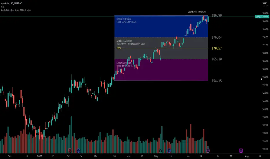
Probability Box Rule of Thirds [PPI]█ Probability Box Rule of Thirds
The Probability Box Rule of Thirds , is a visual indicator that helps traders identify possible overbought and oversold conditions. It does this by dividing the price range – highest high minus the lowest low of a given lookback period or date range – into thirds. Each third has distinct probability characteristics and when combined represent a probability box.
We have spent years refining the probability box concept, and have previously published a How To on Trading View – "How to Trade Probability Ranges – The Critical Rule of 1/3" which can be found here:
To quickly summarize the How To – when using the Rule of Thirds , you are using a combination of statistics, probabilities of success, and prior price action to determine when to enter a trade. The visual range division helps remove subjectivity and clearly shows when the trading odds are stacked in your favor. By identifying and taking higher probability trades, you have a higher chance of success as trading is all about probability and risk management.
Implementing the Rule of Thirds starts with finding an instrument that is consolidating and identifying the nearest important support and resistance levels based on your targeted trading timeframe or lookback period.
The range between the support and resistance levels is divided into thirds to form three zones within the consolidation range.
When going LONG , you want to BUY in the bottom third of the range. Once you buy, your objective is to hold during the middle third and sell when the price enters the top third.
When you buy in the lower third, there's a 66.6% probability of success. If you buy in the middle third, you only have a 50% / 50% chance of success. Going long in the top third of the range gives you a 33.3% chance of success as you are already close to the identified resistance level.
When going SHORT , the sequence and odds are reversed. You want to SELL in the top third of the range, hold the middle third and exit in the bottom third of the range. This gives you a 66.6% chance of success when entering in the top third, a 50% / 50% chance when entering in the middle third, and a 33.3% chance in the bottom third given you are already close to the identified support level.
When the price lies in the middle third, the even 50% / 50% odds provide no probability edge and a trader is better off waiting until the price reaches the upper or lower thirds of the price range.
The Rule of Thirds allows us to quickly visually evaluate trades based on probabilities, selectively enter trades that have the highest odds of success, and avoid likely losing trades. The Rule of Thirds gives you confidence to hold trades based on prior trading ranges and provides clear levels where the prices are likely to either reverse or start trending.
The Probability Box Rule of Thirds automatically implements the first two steps of the Rule of Thirds by using the highest high and lowest low of a given lookback period to identify the support and resistance levels, and automatically divides the range into thirds. The rest of the Rule of Thirds rules remain the same.
Just having the price within the bottom thirds or top thirds, however, does not mean the price will immediately reverse. The GE chart below is an example of a stock that remained 'stuck' in the upper thirds of the price range for an extended amount of time:
And the CVS chart below is an example where the price is 'stuck' in the lower thirds of the price range:
While the price is in the upper or lower thirds, it is very important that the trader should use other indicators to identify when a significant trend reversal occurs. Once a trend reversal event happens, the trader either enters a trade AND/OR exits a trade if already in one.
When the price exceeds the bounds of the probability box, there are three possible outcomes – a strong continuation trend, the price consolidates around the probability box edge, or a trend reversal. Your favorite indicators will help determine which event is happening.
The CVS chart above is a good example of the probability box being exceeded with the last bar. The price exceeding the price range is temporary event as the price range will expand to encompass the revised price range on the next trading day.
█ Indicator Features
Each supported timeframe – Monthly, Weekly, and Daily – allows the selection of an appropriate lookback period for your trading style. The defaults are a good starting point for swing trading and long-term investing. You many need to experiment to find the optimal lookback period for your trading style.
Even if you only day trade, the Probability Box Rule of Thirds with the appropriate lookback periods can help you visualize the bigger picture of where the instrument is heading.
When viewing the charts, you can find the currently selected lookback period above the upper edge of the price range.
The indicator will display a dotted yellow line at 50% of the price range and show the line's value when requested.
The visibility of the actual thirds and border price values are controlled by the " Show Probability Box Values " checkbox. You may need to expand the chart's right margin to see the values.
The " Show Internal Labels " checkbox controls the display of the internal ⅓ Division labels and the percentage odds, along with the 50% label. This option by default is set to off.
The " Show Error Messages " checkbox controls the display of error messages and by default is turned on. Turn off to prevent error messages from being shown on intraday timeframes. Save as indicator default to prevent having to turn off this setting each time added to chart.
The color and transparency controls allow the user to modify the colors used for each third. The default settings are optimized for use with a DARK background.
█ Implementation Notes
IMPORTANT - the Probability Box Rule of Thirds is set up to only handle Monthly, Weekly and Daily charts. This is intentional as the indicator is designed to be used for safer multiple day and longer swing trades. When viewed on intraday charts, the indicator will be hidden.
The Probability Box Rule of Thirds uses a rolling window of the equivalent number of bars for the lookback period rather than relying on the bar starting and ending dates. This allows the use of a standard number of days in the selected lookback window across various instruments and ensures fast, efficient calculations.
The lookback periods are adjusted when non-standard timeframe multipliers are used – e.g., a 12M chart timeframe and a 3-year lookback period will result in a 3 bar lookback. Fractional bars in this calculation are rounded up and any incompatible lookback period and chart timeframe combination will generate a runtime error.
In summary, the Probability Box Rule of Thirds automates and visually identifies overbought and oversold areas, which combined with the Rule of Thirds probability risk profiles, increases your odds of success through better trade selections and higher confidence in your trades.
█ Disclaimer
There is substantial risk in trading. Losses incurred in trading can be significant. Only trade with money you can afford to lose. We make no claims whatsoever regarding the impact of past or future performance on your trading results.
Probability
Probability Trend IndicatorUnderstanding the Indicator:
The indicator calculates the probabilities of upward and downward trends based on the percentage change in price over a specified lookback period.
It displays these probabilities in a table and plots a histogram to represent the difference between the probabilities.
The colors of the histogram bars indicate the trend direction and whether the trend is increasing or decreasing.
Setting the Lookback Period:
The indicator allows you to specify the lookback period, which determines the number of bars to consider for calculating the probabilities.
By default, the lookback period is set to 50 bars. However, you can adjust it based on your trading preferences and the timeframe you're analyzing.
Analyzing the Probabilities:
The indicator calculates the probabilities of upward and downward trends and displays them in a table on the chart.
The probabilities are presented as percentages, representing the likelihood of each type of trend occurring.
You can use these probabilities to gain insights into the potential market direction and assess the strength of the prevailing trend.
Interpreting the Histogram:
The histogram is plotted based on the difference between the probabilities of upward and downward trends, known as the oscillator value.
The histogram bars are colored to provide visual cues about the trend direction and whether the trend is gaining or losing strength.
Green bars indicate upward trends, and red bars indicate downward trends.
Lighter shades of green or red suggest increasing trends, while darker shades suggest decreasing trends.
Making Trading Decisions:
The indicator serves as a tool for assessing the probabilities of trends and can be used alongside other technical analysis methods.
You can consider the probabilities, the histogram pattern, and the overall market context to make informed trading decisions.
It's important to remember that no indicator or tool can guarantee future market movements, so prudent risk management and additional analysis are essential.

Trend Reversal Probability CalculatorThe "Trend Reversal Probability Calculator" is a TradingView indicator that calculates the probability of a trend reversal based on the crossover of multiple moving averages and the rate of change (ROC) of their slopes. This indicator is designed to help traders identify potential trend reversals by providing signals when the short-term moving averages start to slope in the opposite direction of the long-term moving average.
To use the indicator, simply add it to your TradingView chart and adjust the input parameters according to your preferences. The input parameters include the length of the moving averages, the ROC length (trend sensitivity), and the reversal sensitivity (signal percentage).
The indicator calculates the ROC of the moving averages and determines if the short-term moving averages are sloping in the opposite direction of the long-term moving average. The number of short-term moving averages that meet this condition is then counted, and the probability of a trend reversal is calculated based on the percentage of short-term moving averages that meet this condition.
When the probability of a trend reversal is high, a bullish or bearish signal is generated, depending on the direction of the reversal. The bullish signal is generated when the short-term moving averages start to slope upward, and the bearish signal is generated when the short-term moving averages start to slope downward.
Traders can use the "Trend Reversal Probability Calculator" to identify potential trend reversals and adjust their trading strategies accordingly. It is important to note that this indicator is not a guarantee of a trend reversal and should be used in conjunction with other technical analysis tools to make informed trading decisions.

Bayesian predictive leading indicator--------- ENGLISH ---------
This is a predictive indicator ( leading indicator ) that uses Bayes' formula to calculate the conditional probability of price increases given the angular coefficient. The indicator calculates the angular coefficient and its regression and uses it to predict prices.
Bayes' theorem is a fundamental result of probability theory and is used to calculate the probability of a cause causing the verified event. In other words, for our indicator, Bayes' theorem is used to calculate the conditional probability of one event (price event in this case) with respect to another event by calculating the probabilities of the two events (past price) and the conditional probability of the second event (future price) with respect to the first event.
The red line represents the angular coefficient. The blue line represents the normalized expected price. Finally, the yellow line represents the conditional probability that the price will increase or decrease.
How to use it. In addition to the convenient histogram, which follows the angular coefficient, another practical operational application might be to go long when the blue line is above the red and yellow lines. Conversely short when the blue is below the red and yellow.
When the yellow line passes above all others, a reversal in the long direction is imminent and vice versa.
The extent of the reversal depends on how far the yellow line will be away in price from the other 2 lines.
This indicator is in its embryonic state and updates will follow to make it more graphically readable, add alerts, etc.
Stay tuned! Leave a boost and comment or write to me if you wish.
--------- ITALIANO ---------
Questo è un indicatore predittivo ( leading indicator ) che utilizza la formula di Bayes per calcolare la probabilità condizionata che il prezzo aumenti dato il coefficiente angolare. L’indicatore calcola il coefficiente angolare e la sua regressione e lo utilizza per prevedere i prezzi.
Il teorema di Bayes è un risultato fondamentale della teoria della probabilità e viene impiegato per calcolare la probabilità di una causa che ha provocato l’evento verificato. In altre parole, per il nostro indicatore, il teorema di Bayes serve per calcolare la probabilità condizionata di un evento (di prezzo in questo caso) rispetto a un altro evento, calcolando le probabilità dei due eventi (prezzo passato) e la probabilità condizionata del secondo evento (prezzo futuro) rispetto al primo.
La linea rossa rappresenta il coefficiente angolare. La linea blu rappresenta il prezzo previsto normalizzato. Infine la linea gialla rappresenta la probabilità condizionata che il prezzo aumenti o diminuisca.
Come si usa? Oltre al comodo istogramma, che segue il coefficiente angolare, un'altra applicazione operativa pratica potrebbe essere di andare long quando la linea blu è sopra la linea rossa e gialla. Viceversa short quando la blu è sotto la rossa e la gialla.
Quando la linea gialla passa sopra tutte le altre è imminente un'inversione in direzione long e viceversa.
L'entità dell'inversione dipende da quanto la linea gialla sarà distante di prezzo dalle altre 2 linee.
Questo indicatore è al suo stato embrionale e seguiranno aggiornamenti per renderlo graficamente più leggibile, aggiungere alert, ecc.
Stay tuned! Lascia un boost e commenta o scrivimi se desideri.
VS Score [SpiritualHealer117]An experimental indicator that uses historical prices and readings of technical indicators to give the probability that stock and crypto prices will be in a certain range on the next close. This indicator may be helpful for options traders or for traders who want to see the probability of a move.
It classifies returns into five categories:
Extreme Rise - Over 2 standard deviations above normal returns
Rise - Between 0.5 standard deviations and 2 standard deviations above normal returns
Flat - Falling in the range of +/- 0.5 standard deviations of normal returns
Fall - Between 0.5 standard deviations and 2 standard deviations below normal returns
Extreme Fall - Over 2 standard deviations below normal returns
It is an adaptive probability model, which trains on the previous 1000 data points, and is calculated by creating probability vectors for the current reading of the PPO, MA, volume histogram, and previous return, and combining them into one probability vector.

Quantitative Price Forecasting - The Quant ScienceThis script is a quantitative price forecasting indicator that forecasts price changes for a given asset.
The model aims to forecast future prices by analyzing past data within a selected time period. Mathematical probability is used to calculate whether starting from time X can lead to reaching prices Y1 and Y2. In this context, X represents the current selected time period, Y1 represents the selected percentage decrease, and Y2 represents the selected percentage increase. The probabilities are estimated using the simple average.
The simple average is displayed on the chart, showing in red the periods where the price is below the average and in green the periods where the price is above the average.
This powerful tool not only provides forecasts of future prices but also calculates the distribution of variations around the average. It then takes this information and creates an estimate of the average price variation around the simple average.
Using a mean-reverting logic, buying and selling opportunities are highlighted.
We recommend turning off the display of bars on your chart for a better experience when using this indicator.
Unlock the full potential of your trading strategy with our powerful indicator. By analyzing past price data, it provides accurate forecasts and calculates the probability of reaching specific price targets. Its mean-reverting logic highlights buying and selling opportunities, while the simple moving average displayed on the chart shows periods where the price is above or below the average. Additionally, it estimates the average variation of price around the simple average, giving you valuable insights into price movements. Don't miss out on this valuable tool that can take your trading to the next level
Triangulation : Statistically Approved ReversalsA lot of calculation, but a simple and effective result displayed on the chart.
It automatically identifies a very favorable period for a price reversal, by analyzing the daily and intraday price action statistics from the maximum of the most recent bars from the historical data. No repainting. Alerts can be set.
The statistical study is done in real time for each instrument. The probabilities therefore vary over time and adapt to the latest information collected by the indicator.
The time range of the data study can be changed by simply changing the UT :
- 30m = 3.5 last months feed statistics
- 15m = 52 last days feed statistics
- 5m = 17 last days feed statistics (recommanded)
HOW TO USE
This indicator informs when we are in a time period strongly favorable to reversal.
==> Crossing probabilities of different kinds, in price and in time => Triangulation of top and bottom !
HOW It WORK :
fractal statistics on high and low formation.
hour's probabilities of making the high/low of the day are crossed with day's probabilities of making the high/low of the week.
First for the day, we study:
- value of the probability compared to the average probabilities
- value of the coefficient between the high probability and the low probability
which we then refine for the hour, with the same calculation.
Result: bright color for a day + hour with high probability, weak color if the probability is low but remains the only possible bias. Between these two possibilities, intermediate colors are possible - just like looking for shorts if the day is bullish, if it is a high probability hour!
This color is displayed in the background, only if we are forming the high of the day for tops, and the low of the day for bottoms - detected with a stochastic.
All probabilities are studied in real time for the current asset.
We will call this signal "killstats", for "killzones statistics"
fractal statistics on the probability of closure under specific predefined levels according to 36 cycles.
the probabilities of several cycles are studied, for example:
NY session versus London and Asian sessions, London session compared to its opening, NY session compared to its opening, "algorithmic cycles" ( 1h30), Opening of NY compared to its intersection with London..
Each cycle producing a probability of closing with respect to the opening price of each period. The periods are : (Etc/UTC)
15-18h / 15-16h / 9-13h / 14-17h / 18-22h / 10-12h / 9-10h30 / 10h30-12h / 12-13h30 / 13h30-15h / 15h-16h30 / 16h30-18h
The cycles can be superimposed, which allows to support or attenuate a signal for the key periods of the day: 9am-12pm, and 3pm-6pm. The period of the day covered by the study of cycles is 9h-22h.
Result : ==> a straight line with a half bell. Colors = almost transparent for 53% probability (low), and very intense for a high probability (75%). The line displayed corresponds to the opening price, which we are supposed to close within the time limit - before the end of the period, where the line stops.
If the price goes in the opposite direction to the one predicted by the statistics, then a background connects the price to the close level to be respected.
if direction and close is respected, nothing is displayed : there is no opportunity, no divergence between statistics and actual price moves.
By unchecking the "light mode", you can see each close level displayed on the chart, with the corresponding probability and the number of times the cycle was detected. The color varies from intense for a high probability (75%), to light for a low probability (53%)
We will call this signal "cyclic anomalies"
By default, as shown in the indicator presentation image, the "intersection only" option is checked: only the intersection between 1) killstats and 2) cyclic anomalies is displayed. (filter +-30% of killstats signals)
MORE INFORMATIONS
/!\ : during a backtest, it is necessary to refresh the studied data to benefit from the real time signals, and for that you have to use the replay mode. if "Backtesting informations?"is checked, labels are displayed on the graph to warn of the % distortion of the signals. I recommend using the replay mode every 250 candles, and every 1000 candles for premium accounts, to have real signals.
- Alerts can be set for killzone, or intersections ( As in presentation picture)
- The ideal use is in m5. It can trigger several times a day, sometimes in opposite directions, and sometimes not trigger for several days.
- Premium account have 20k candles data, and not 5k => signals may vary depending on your tradingview subscription.

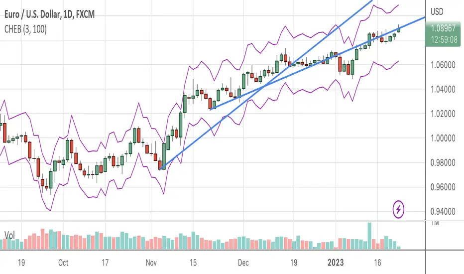
Chebyshevs BandsThis script calculates upper and lower bands using Chebyshev's inequality formula.
The main pros.: the band doesn't depend on particular distribution. It fits to any type of random variables. Also it allows to calculate bands for instruments with extremely high volatility.
Cons.: formula provides a rough estimation in some special cases like lognormal distribution.
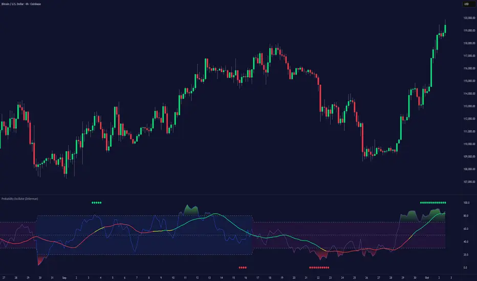
Probability Oscillator (Zeiierman)█ Overview
The Probability Oscillator (Zeiierman) turns price dynamics into a regime-aware probability map of continuation vs. reversal. Rather than treating momentum as a single, fixed signal, it adapts its core estimator to current market conditions—favoring trend persistence in calm regimes and oscillation/reversion in volatile regimes.
You get a fast Probability line, a slower Signal line, dynamic OB/OS bounds, midline bias, color-coded trend probability, background regime cues, and Momentum Impulse dots that reveal concentrated bursts of directional intent. Beneath the surface, the Probability line functions as a sequential Bayesian filter — continuously updating a regime-conditioned prior (trend or volatility) with new market evidence. The resulting posterior odds are then expressed as a bounded oscillator for intuitive interpretation. In stable markets, the prior favors continuity; in volatile markets, it reweights toward mean reversion.
⚪ Why This One Is Unique
The Probability Oscillator operates within a self-adaptive probabilistic framework that continuously reshapes itself in response to the market’s evolving structure. Rather than relying on fixed formulas or static thresholds, it employs a context-aware Bayesian core that interprets flow dynamics through an adaptive regime model.
Its internal architecture blends state recognition, probability normalization, and dynamic envelope mapping, allowing it to adjust between conditions of directional stability and volatility-driven reversion fluidly. The result is an intelligent, self-adjusting probability field that remains stable in trends, reactive in consolidations, and contextually aware across all market states—delivering a refined sense of probabilistic direction without exposing raw computational structure.
█ Main Features
⚪ Probability Oscillator
At the core lies a probability-driven oscillator that continuously adapts its internal weighting to evolving market behavior. It translates incoming price evidence into a smooth probability curve that distinguishes between continuation and reversion phases, providing a refined view of conviction beneath price action.
The Probability Oscillator estimates the likelihood of trend continuation while dynamically adjusting to the surrounding volatility regime:
Probability Line (fast) – Captures short-term probability shifts, weighted by current market conditions — calm or volatile.
Signal Line (slow) – A smoothed probability filter that defines the prevailing bias and confirms directional persistence.
Momentum Impulse Dots – Small markers highlighting bursts of positive (green) or negative (red) momentum, indicating transitions in conviction strength.
The oscillator’s probabilistic framework automatically transitions between two self-adaptive modes:
Low-Volatility Mode – Prioritizes directional momentum and smooth trend continuity, ideal for trending markets.
High-Volatility Mode – Emphasizes oscillatory probability swings and reversals, optimized for range-bound or transitional conditions.
This dual-regime behavior allows the Probability Oscillator to remain stable in directional trends yet responsive in volatile ranges, producing a coherent probabilistic signal across any timeframe.
⚪ Trend Probability Coloring
The Trend Probability Coloring system transforms the Signal Line into a live confidence gauge. Its adaptive hue reflects the underlying probabilistic bias — green for sustained bullish pressure, red for bearish control, and yellow during transitional uncertainty. Behind the scenes, it applies curvature-sensitive weighting and probabilistic smoothing to display a visually coherent measure of directional conviction.
⚪ Impulse Dots
Impulse Dots identify moments of concentrated momentum expansion — short bursts of probabilistic acceleration that often precede shifts in structure. Each impulse represents a localized jump in directional confidence, isolating meaningful change-points from background noise. The result is a precise visualization of where probability and price begin to align, revealing early cues of strength, exhaustion, or imminent rotation.
█ How to Use
⚪ Trend Following
The Signal Line acts as the long-term probabilistic trend gauge, revealing when the market is building or losing directional conviction. Its slope and color communicate both bias and transition strength:
Green → bullish probability bias (trend continuation likely).
Red → bearish probability bias (downside continuation likely).
Yellow → transitional or indecisive phase (potential regime shift).
Use the Signal Line to confirm directional alignment:
A transition from red → yellow → green signals that the market is turning bullish and probability is shifting toward continuation on the upside.
A transition from green → yellow → red signals that bullish conviction is fading and bearish control is emerging.
⚪ Overbought & Oversold
The Probability Oscillator can also be used to identify overbought and oversold conditions by observing when the Probability Line moves above its upper bound or below its lower bound. These events often signal potential market slowdowns, pullbacks, or even broader reversals depending on context and regime.
The OB/OS levels automatically adapt to the prevailing market mode:
Trend Mode (~70/30) – Optimized for riding trends and timing pullbacks within directional continuations.
Volatility Mode (~80/20) – Tailored for fading extremes and capturing fast mean-reversion moves during consolidation phases.
Signals: Reclaims from oversold zones within a bullish bias, or rejections from overbought zones in a bearish bias, represent high-probability inflection points — especially when confirmed by Impulse Dots or regime-aligned Signal Line color transitions.
⚪ Using Volatility Modes to Choose Strategy
The Probability Oscillator automatically adapts its behavior to the active volatility regime, enabling traders to align their approach with the current market state. One of the most effective ways to use the tool is to select a trading strategy that aligns with the prevailing market mode.
Trend Mode (purple fill) – Represents low-volatility, directional environments where markets move smoothly and sustain momentum over time. In these conditions, a trend-following approach is most effective. Focus on the broader direction, participate on Probability-over-Signal crossups above 50, and trail positions as long as the Signal Line remains green. These calm phases often persist before volatility expansion, making them ideal for riding steady continuation waves rather than reacting to short-term fluctuations.
Volatility Mode (blue switch bar) – Activates in high-volatility conditions, signaling increased market agitation and sharper price swings. In this regime, trading becomes more tactical. Mean-reversion and scalping strategies perform best—fade OB/OS extremes, use midline reclaims for timing, or trade Impulse confirmations to capture breakout accelerations and short-term momentum surges.
⚪ Impulse
The Momentum Impulses highlight periods when the market experiences sharp bursts of directional momentum, marking transitions in conviction strength and energy expansion.
Green top dots → Indicate strong bullish impulses, often signaling the onset or acceleration of upward momentum.
Red bottom dots → Indicate strong bearish impulses, highlighting pressure buildup or downside continuation.
These impulses are particularly useful in two contexts:
During ranging markets , they help confirm overbought and oversold conditions, signaling when reversals or exhaustion points are highly probable.
During regime transitions , they validate breakout strength, confirming that new directional phases are supported by genuine momentum rather than noise.
In essence, Impulse Dots visualize the heartbeat of market conviction—pinpointing where momentum surges align with probabilistic bias, whether to confirm a breakout or warn of exhaustion in choppy conditions.
█ How It Works
⚪ Regime Switch Engine
At the foundation lies a Bayesian regime adaptation process that treats volatility as evolving market evidence. The system continuously updates a prior belief about whether the market favors directional persistence or oscillatory reversion. In calm states, it maintains a continuity-biased belief structure that favors smoother probability propagation.
Calculation: Employs a volatility-normalized Bayesian comparator, generating a posterior distribution over regime likelihoods. This ensures the oscillator remains statistically invariant to scale and consistent across instruments and timeframes.
⚪ Trend Probability Coloring (Conviction Layer)
The Trend Probability Coloring system visualizes Bayesian posterior confidence in real time. It continuously updates the Signal Line’s color as new evidence shifts the model’s belief between bullish, neutral, and bearish states.
When the posterior probability leans strongly upward, the line turns green; as uncertainty grows, it fades to yellow; and when conviction turns negative, it transitions to red. Each color change represents a probabilistic reweighting — the model’s evolving assessment of directional dominance.
Calculation: Applies posterior-weighted smoothing and curvature-based confidence mapping to translate Bayesian belief strength into a fluid visual gradient.
⚪ Momentum Impulse Engine
The Momentum Impulse Engine detects sudden bursts in probabilistic conviction — moments when the Bayesian posterior sharply reweights toward one directional outcome. These impulses represent statistically significant shifts in belief, where new evidence rapidly alters the model’s assessment of market direction.
Green impulses highlight surges in bullish probability; red impulses mark spikes in bearish conviction. Each impulse reflects a brief phase of directional dominance, revealing where probability momentum begins to accelerate or exhaust.
Calculation: Employs nonlinear Bayesian change detection and extreme-value gating to isolate abrupt posterior inflections.
-----------------
Disclaimer
The content provided in my scripts, indicators, ideas, algorithms, and systems is for educational and informational purposes only. It does not constitute financial advice, investment recommendations, or a solicitation to buy or sell any financial instruments. I will not accept liability for any loss or damage, including without limitation any loss of profit, which may arise directly or indirectly from the use of or reliance on such information.
All investments involve risk, and the past performance of a security, industry, sector, market, financial product, trading strategy, backtest, or individual's trading does not guarantee future results or returns. Investors are fully responsible for any investment decisions they make. Such decisions should be based solely on an evaluation of their financial circumstances, investment objectives, risk tolerance, and liquidity needs.
Płatny skrypt
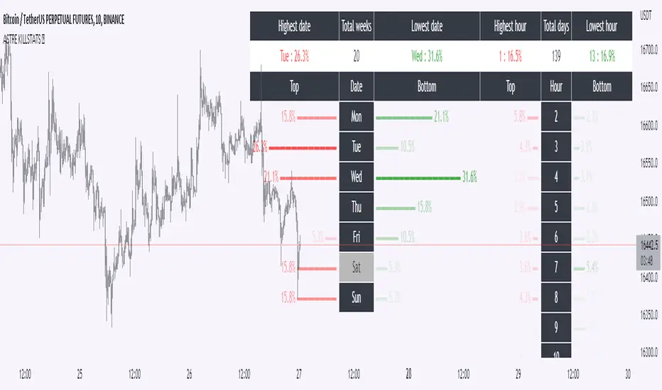
Daily Manual KILLZONESThis indicator is to be used with "KILLSTATS", our indicator allowing to backtest on hundreds of days at which time, and which day the top/low of the day and week is formed.
"Manual Killzone" allows to define our statistical killzones by day of the week manually: you define your own rules according to your interpretation of our Killstats indicator.
It integrates a daily price action filter according to the ICT concept:
It will only display bullish probabilities (green) defined if and only if we are in discount and out of the daily range 25/75%.
Same for bearish probabilities (red)
The blue color is to be applied in case of reversal with high contradictory probability (Example: to be used for Tuesday from 2pm to 3pm, if Tuesday is a day with high probability to form a top, but 2pm/15pm is the time with high probability to form a bottom AND a top. Indecision => blue)
WARNING : Calculated according to Etc/UTC time : put "0" in the Timezone parameter of killstats.
It is necessary to use the replay mode regularly during the backtesting to update the data!
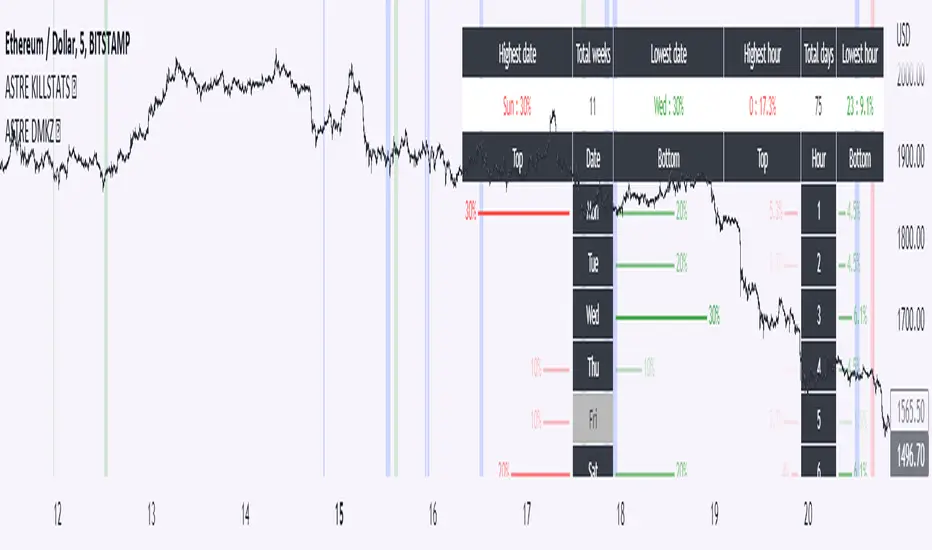
KillstatsBacktest and identify at what times/days the high/low were formed. The periods are shown on the graph along with detailed statistics.
Exemple with "days : 600" and "13h : top 12%" : we understand that over 600 days, in 12% of the cases we have formed the top of the day at 13h.
up to 1000+ days studied to find favorable reversal time slots: killstats! The data presented can sometimes be... surprising.
Increasing/decreasing the timeframe on chart = increase/decrease the studied period.
A period of 1000 days ( UT : h1) allows to have solid but not exact statistics.
A period of 30 days allows to have current statistics but too little sample to know if the data is relevant.
I recommend looking for intersections of killstats over several periods: If over 1000 days AND 30 days, 3pm was a time with a high probability of forming a top, it is interesting to look for short positions between 3pm and 4pm.
The data is displayed in the form of a diagram whose visual allows to identify effective time slots.
Caution. Timeframe: h1 maximum for the study of the day's high/low to be correct - and daily maximum for the study of the week's high/low.
Caution2. Match the timezone with the input (by default set to GMT+1). So if you are at GMT+2, you must put "2" in timezone.
I recommend using this as part of an aggressive high frequency scalping strategy to make the most of your trading session - with the aim of quickly moving to TP1/BE and leaving your winning position open.
Pair Prowler [CR]█ OVERVIEW
Pair Prowler v6 Enhanced is a sophisticated oscillator-based trading system designed for traders seeking high-probability setups with multiple confirmation layers. The indicator combines proprietary signal generation with institutional-grade filters to identify optimal entry and exit points while minimizing false signals.
The system features adaptive zones that dynamically adjust to market conditions, multi-timeframe support/resistance analysis, volume-weighted mean reversion filters, and real-time performance tracking. A comprehensive confluence scoring system evaluates each potential trade across eight technical dimensions, allowing traders to filter for only the highest-quality opportunities.
█ KEY FEATURES
Adaptive Dynamic Zones
Rather than using fixed overbought/oversold levels, the indicator employs statistical methods to calculate adaptive zones that adjust to recent price behavior. These zones automatically widen during high volatility and tighten during consolidation, ensuring signals remain relevant across all market conditions.
VWAP Mean Reversion Filter
This filter uses volume-weighted price analysis to identify when price has moved significantly away from fair value. The system calculates statistical deviation from VWAP and only permits:
- Long entries when price is substantially below VWAP (oversold relative)
- Short entries when price is substantially above VWAP (overbought relative)
Higher Timeframe Support/Resistance Filter
To avoid entries near major reversal zones, the indicator analyzes pivot highs and lows from a user-selected higher timeframe. The system maintains a database of recent support and resistance levels and blocks trades that would occur too close to these critical price levels. This prevents getting stopped out by predictable institutional activity at key levels.
Divergence Detection
The indicator automatically identifies four types of divergences between price and the oscillator.
Risk Entry Signals
For aggressive traders, the indicator provides early warning signals that fire before the main entry triggers. These risk entries offer better entry prices but come with lower probability. They are visually distinct from standard entries and can be toggled on or off.
Safe Exit Zones
In addition to standard exit signals, the system identifies optimal profit-taking zones using statistical analysis and adaptive thresholds. These safe exit zones are highlighted with background coloring to alert traders when positions have reached favorable risk-reward levels.
Performance Statistics Panel
A comprehensive real-time statistics dashboard tracks:
- Total trades executed (long and short separately)
- Win rate percentages (overall, long-only, short-only)
- Profit factor calculation
- Total and average profit/loss per trade
- Largest winning and losing trades
- Maximum consecutive wins and losses
The panel can be positioned in any corner of the chart and updates automatically as trades close. Note that statistics represent theoretical performance based on signal timing and do not account for slippage, commissions, or execution delays.
Comprehensive Alert System
The indicator includes over 20 pre-configured alert types
█ HOW TO USE
Initial Setup
1 — Select your preferred base strategy from the Signal Settings group. Strategy 1 is recommended for most traders as it provides a balanced approach suitable for various market conditions.
2 — Configure the VWAP filter threshold based on your trading style:
Lower thresholds (1.0–1.5) for more frequent entries
Higher thresholds (2.0+) for fewer but more extreme reversals
3 — Set the HTF S/R filter timeframe to approximately 4–6 times your chart timeframe. For example, use 4H pivots when trading on 1H charts.
Reading Signals
Entry signals appear as triangles at the oscillator level:
- Green upward triangles indicate long entries
- Red downward triangles indicate short entries
- Small circles mark early risk entries
Exit signals appear as opposite-colored triangles. Background shading indicates special conditions like safe exit zones or averaging opportunities.
Interpreting Statistics
Use the performance panel to gauge strategy effectiveness:
- Win rates above 50% indicate positive edge
- Profit factor above 1.5 suggests robust performance
- Review max consecutive losses for position sizing guidance
Remember that past theoretical performance does not guarantee future results.
█ NOTES
Timeframe Considerations
This indicator works on all timeframes but performs optimally on 15-minute to 4-hour charts. Very low timeframes (1m–5m) may produce excessive signals, while daily and weekly charts may produce insufficient signals for active trading.
Market Conditions
The adaptive nature of the indicator allows it to function in both trending and ranging markets. However, extremely choppy or low-liquidity conditions may reduce signal quality. The confluence scoring system helps filter these periods automatically.
VWAP Behavior
VWAP resets at session boundaries for traditional markets (stocks) but runs continuously for 24-hour markets (crypto, forex). The z-score filter accounts for this difference automatically.
HTF Pivot Lag
Higher timeframe pivots require confirmation bars before being identified, introducing slight lag. Pivots are detected retrospectively once the full pattern completes on the selected timeframe.
Performance Tracking Limitations
The statistics panel tracks theoretical entry at close of signal bar and exit at close of exit bar. Actual trading results will differ due to:
- Slippage and spread costs
- Commission and fees
- Execution timing and delays
- Partial fills or rejections
- Overnight holding costs
Use the statistics as a comparative tool for optimization rather than a profit predictor.
Filter Interactions
All filters work sequentially. A signal must pass the VWAP filter, then the S/R filter. If any filter rejects the signal, it will not appear on the chart. This hierarchical approach ensures only fully validated setups generate alerts.
Optimization Guidelines
If receiving too many signals, tighten filter thresholds. If receiving too few signals, relax filters. Monitor the statistics panel over at least 50 trades before making significant parameter adjustments.

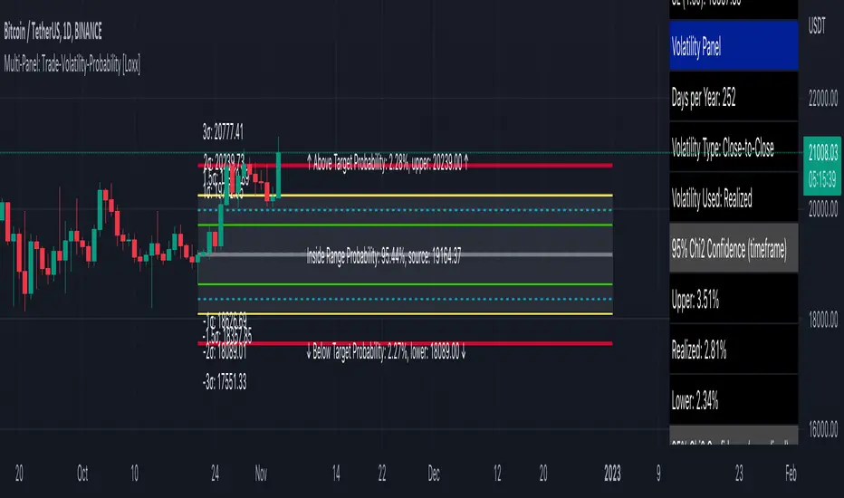
Multi-Panel: Trade-Volatility-Probability [Loxx]Multi-Panel: Trade-Volatility-Probability shows user selected and volatility-based price levels and probabilities on the chart. This is useful for both options and all styles of up/down trading methods that rely on volatility.
Trading Panel: Shows trading information to take profits and stop-loss based on multiples of volatility. Also shows equity inputs by the user to calculate optimal position size
Key things to note about the Trading Panel
-Trade side: Long or short. you change this this to change the take profit and SL levels in displayed on the table to be used w/ up/down trading styles that rely on volatility stops
-Account size: User enters total balance available for trade
-Risk: Total % of account size you're willing to lose should the SL be hit
-Position size: Size of the position given the SL and your preferred Risk
-Take profit/Stop loss levels: Based on multipliers selected by the user in settings. These shouldn't be changed unless you really know what you're doing with volatility stops
-Entry: Source price. can be 1 of 37 different prices. See Loxx's Expanded Source Types:
Volatility Panel: Shows information about the volatility the user selected to be used to take profit/stop-loss/range calculations. Volatility types included are:
Close-to-Close
Close-to-Close volatility is a classic and most commonly used volatility measure, sometimes referred to as historical volatility .
Volatility is an indicator of the speed of a stock price change. A stock with high volatility is one where the price changes rapidly and with a bigger amplitude. The more volatile a stock is, the riskier it is.
Close-to-close historical volatility calculated using only stock's closing prices. It is the simplest volatility estimator. But in many cases, it is not precise enough. Stock prices could jump considerably during a trading session, and return to the open value at the end. That means that a big amount of price information is not taken into account by close-to-close volatility .
Despite its drawbacks, Close-to-Close volatility is still useful in cases where the instrument doesn't have intraday prices. For example, mutual funds calculate their net asset values daily or weekly, and thus their prices are not suitable for more sophisticated volatility estimators.
Parkinson
Parkinson volatility is a volatility measure that uses the stock’s high and low price of the day.
The main difference between regular volatility and Parkinson volatility is that the latter uses high and low prices for a day, rather than only the closing price. That is useful as close to close prices could show little difference while large price movements could have happened during the day. Thus Parkinson's volatility is considered to be more precise and requires less data for calculation than the close-close volatility.
One drawback of this estimator is that it doesn't take into account price movements after market close. Hence it systematically undervalues volatility. That drawback is taken into account in the Garman-Klass's volatility estimator.
Garman-Klass
Garman Klass is a volatility estimator that incorporates open, low, high, and close prices of a security.
Garman-Klass volatility extends Parkinson's volatility by taking into account the opening and closing price. As markets are most active during the opening and closing of a trading session, it makes volatility estimation more accurate.
Garman and Klass also assumed that the process of price change is a process of continuous diffusion (geometric Brownian motion). However, this assumption has several drawbacks. The method is not robust for opening jumps in price and trend movements.
Despite its drawbacks, the Garman-Klass estimator is still more effective than the basic formula since it takes into account not only the price at the beginning and end of the time interval but also intraday price extremums.
Researchers Rogers and Satchel have proposed a more efficient method for assessing historical volatility that takes into account price trends. See Rogers-Satchell Volatility for more detail.
Rogers-Satchell
Rogers-Satchell is an estimator for measuring the volatility of securities with an average return not equal to zero.
Unlike Parkinson and Garman-Klass estimators, Rogers-Satchell incorporates drift term (mean return not equal to zero). As a result, it provides a better volatility estimation when the underlying is trending.
The main disadvantage of this method is that it does not take into account price movements between trading sessions. It means an underestimation of volatility since price jumps periodically occur in the market precisely at the moments between sessions.
A more comprehensive estimator that also considers the gaps between sessions was developed based on the Rogers-Satchel formula in the 2000s by Yang-Zhang. See Yang Zhang Volatility for more detail.
Yang-Zhang
Yang Zhang is a historical volatility estimator that handles both opening jumps and the drift and has a minimum estimation error.
We can think of the Yang-Zhang volatility as the combination of the overnight (close-to-open volatility ) and a weighted average of the Rogers-Satchell volatility and the day’s open-to-close volatility . It considered being 14 times more efficient than the close-to-close estimator.
Garman-Klass-Yang-Zhang
Garman Klass is a volatility estimator that incorporates open, low, high, and close prices of a security.
Garman-Klass volatility extends Parkinson's volatility by taking into account the opening and closing price. As markets are most active during the opening and closing of a trading session, it makes volatility estimation more accurate.
Garman and Klass also assumed that the process of price change is a process of continuous diffusion (geometric Brownian motion). However, this assumption has several drawbacks. The method is not robust for opening jumps in price and trend movements.
Despite its drawbacks, the Garman-Klass estimator is still more effective than the basic formula since it takes into account not only the price at the beginning and end of the time interval but also intraday price extremums.
Researchers Rogers and Satchel have proposed a more efficient method for assessing historical volatility that takes into account price trends. See Rogers-Satchell Volatility for more detail.
Exponential Weighted Moving Average
The Exponentially Weighted Moving Average (EWMA) is a quantitative or statistical measure used to model or describe a time series. The EWMA is widely used in finance, the main applications being technical analysis and volatility modeling.
The moving average is designed as such that older observations are given lower weights. The weights fall exponentially as the data point gets older – hence the name exponentially weighted.
The only decision a user of the EWMA must make is the parameter lambda. The parameter decides how important the current observation is in the calculation of the EWMA. The higher the value of lambda, the more closely the EWMA tracks the original time series.
Standard Deviation of Log Returns
This is the simplest calculation of volatility . It's the standard deviation of ln(close/close(1))
Pseudo GARCH(2,2)
This is calculated using a short- and long-run mean of variance multiplied by θ.
θavg(var ;M) + (1 − θ) avg (var ;N) = 2θvar/(M+1-(M-1)L) + 2(1-θ)var/(M+1-(M-1)L)
Solving for θ can be done by minimizing the mean squared error of estimation; that is, regressing L^-1var - avg (var; N) against avg (var; M) - avg (var; N) and using the resulting beta estimate as θ.
Average True Range
The average true range (ATR) is a technical analysis indicator, introduced by market technician J. Welles Wilder Jr. in his book New Concepts in Technical Trading Systems, that measures market volatility by decomposing the entire range of an asset price for that period.
The true range indicator is taken as the greatest of the following: current high less the current low; the absolute value of the current high less the previous close; and the absolute value of the current low less the previous close. The ATR is then a moving average, generally using 14 days, of the true ranges.
True Range Double
A special case of ATR that attempts to correct for volatility skew.
Chi-squared Confidence Interval:
Confidence interval of volatility is calculated using an inverse CDF of a Chi-Squared Distribution. You can change the volatility input used to either realized, upper confidence interval, or lower confidence interval. This is included in case you'd like to see how far price can extend if volatility hits it's upper or lower confidence levels. Generally, you'd just used realized volatility, so I wouldn't change this setting.
Inverse CDF of a Chi-Squared Distribution
The chi-square distribution is a one-parameter family of curves. The parameter ν is the degrees of freedom.
The icdf of the chi-square distribution is
x=F^−1(p∣ν) = {x:F(x∣ν) = p}
where
p=F(x∣ν)= ∫ (t^(v-2)/2 * e^t/2) / (2^(v/2) / Γ(v/2))
ν is the degrees of freedom, and Γ( · ) is the Gamma function. The result p is the probability that a single observation from the chi-square distribution with ν degrees of freedom falls in the interval .
Additional notes on Volatility Panel
-Shows both current timeframe volatility per candle at whatever date backward you select
-Shows annualized volatility basaed on selected days per year and per bar volatility; this is automaitcally caulculated no matter the timeframe used. This means that it'll calculate annualized volatility for the current candle even on the 1 second timeframe. Days per year should be 252 for everything but cryptocurrency; however, for all types of tradable assets, anything over the 3 day timeframe will calculate on 365 days.
Probability Panel
This panel shows the probability levels of a user selected upper and lower price boundary. This includes the inside range of volatility between the lower and upper price levels and the outside probability below the lower price level and above the upper price level. These values are calculated using the CDF (cumulative density function) of a normal distribution. In simpler terms, CDF returns area under a bell curve between two points left and right, or for our purposes, high and low. This yeilds the probabilities you see in the Probability Panel. See the following graphic to visualize how this works:
The red line is the entry bar; the yellow line is the "mean" but in this case just the chosen source price.
Other things to know
You can turn on/off all labels and levels and fills
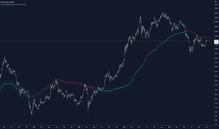
Probability Weighted Moving AverageThe Probability Weighted Moving Average uses a log-normal (continuous) distribution to calculate the probabilities of a range of lengths MAs to assess their performances, and respectively assign weights to a mean of this range. This assumes that the values of the MAs (call it A) aren't normally distributed, but instead log(A) is normally distributed, which can be a fair assumption. In P(t, t+X) where X is the number of trades assessed, it assumes the probability is not dependent on t and independent of previous price.
For P(t, t+X), the higher the value of X, the more trades are assessed.
Range of lengths comes in slow (default) or fast. Faster MAs are not preferable and should be limited to HTFs.
The color code can be either weighted (where lighter shades of blue suggests faster values have more weight, and darker shades suggest slower values have more weight) or coded for bull/bear: green when bullish, red when bearish.
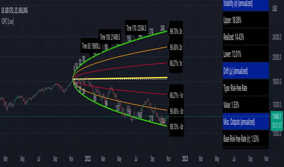
Variety Distribution Probability Cone [Loxx]Variety Distribution Probability Cone forecasts price within a range of confidence using Geometric Brownian Motion (GBM) calculated using selected probability distribution, volatility, and drift. Below is detailed explanation of the inner workings of the indicator and the math involved. While normally this indicator would be used by options traders, this can also be used by regular directional traders who wish to observe a forecast of the confidence interval of possible prices over time.
What is a Random Walk
A random walk is a path which consists of a set of random steps. The starting point is zero and following movement may be one step to the left or to the right with equal probability. In the random walk process, there is no observable trend or pattern which are followed by the objects that is the movements are completely random. That is why the prices of a stock as it moves up and down can be modeled by random a walk process.
Stock Prices and Geometric Brownian Motion
Brownian motion, as first conceived by the botanist Robert Brown (1827), is a mathematical model used to describe random movements of small particles in a fluid or gas. These random movements are observed in the stock markets where the prices move up and down, randomly; hence, Brownian motion is considered as a mathematical model for stock prices.
P(exp(lnS0 + (mu + 1/2*sigma^2)t - z(0.05)*sigma*t^0.5) <= St <= exp(lnS0 + (mu + 1/2*sigma^2)t + z(0.05)*sigma*t^0.5)) = 0.95
Probability Distributions
Typically the normal distribution is used, but for our purposes here we extend this to Student t-distribution, Cauchy, Gaussian KDE, and Laplace
Student's t-Distribution
The probability density function of the Student’s t distribution is given by
g(x) = (L(v+1)/2) / L(v/2) * 1 / L(sqrt(v)) * (1 + x^2/v) ^ (-(v+1)/2)
with v degrees of freedom and v >= 0, denoted by X ~ t(v). The mean is 0 and the variance is v/(v-2). It is known that as v tends to infinity, the Student’s t-distribution tends to a standard normal probability density function, which has a variance of one. Blattberg and Gonedes were the first to propose that stock returns could be modeled by this distribution. (Blattberg and Gonedes, 1974) Platen and Sidorowicz later reaffirmed these findings.(Platen and Rendek, 2007) Finally, Cassidy, Hamp, and Ouyed used these findings to derive the Gosset formula, which is the Student t version of the Black-Scholes model.(Cassidy et al., 2010) They found that v = 2.65 provides the best fit when looking at the past 100 years of returns. They realized that as markets become more turbulent, the degrees of freedom should be adjusted to a smaller value.(Cassidy et al., 2010)
Cauchy Distribution
The probability density function of the Cauchy distribution is given by
f(x) = 1 / (theta*pi*(1 + ((x-n)/v)))
where n is the location parameter and theta is the scale parameter, for -infinity < x < infinity and is denoted by X ~ CAU(L,v). This model is similar to the normal distribution in that it is symmetric about zero, but the tails are fatter. This would mean that the probability of an extreme event occurring lies far out in the distributions tail. Using a crude example, if the normal distribution gave a probability of an extreme event occurring of 0.05% and the “best case” scenario of this event occurring 300 years, then using the Cauchy distribution one would find that the probability of occurring would be around 5% and now the “best case” scenario might have been reduced to only 63 years. Thus giving extreme events more of a likelihood of occurring. The mean, variance, and higher order moments are not defined (they are infinite); this implies that n and theta cannot be related to a mean and standard deviation. The Cauchy distribution is related to the Student’s t distribution T ~ CAU(1,0) when v = 1. In 1963, Benoit Mandelbrot was the first to suggest that stock returns follow a stable distribution, in particular, the Cauchy distribution.(Mandelbrot, 1963) His work was validated by Eugene Fama in 1965.(Fama, 1965) Recent research by Nassim Taleb came to the same conclusion as Mandelbrot, saying that stock returns follow a Cauchy distribution, as reported in his New York Times best-seller book “The Black Swan”.(Taleb, 2010)
Laplace Distribution
In probability theory and statistics, the Laplace distribution is a continuous probability distribution named after Pierre-Simon Laplace. It is also sometimes called the double exponential distribution, because it can be thought of as two exponential distributions (with an additional location parameter) spliced together along the abscissa, although the term is also sometimes used to refer to the Gumbel distribution. The difference between two independent identically distributed exponential random variables is governed by a Laplace distribution, as is a Brownian motion evaluated at an exponentially distributed random time. Increments of Laplace motion or a variance gamma process evaluated over the time scale also have a Laplace distribution.
The probability density function of the Cauchy distribution is given by
f(x) = 1/2b * exp(-|x-µ|/b)
Here, µ is a location parameter and b > 0, which is sometimes referred to as the "diversity", is a scale parameter. If µ = 0 and b=1, the positive half-line is exactly an exponential distribution scaled by 1/2.
The probability density function of the Laplace distribution is also reminiscent of the normal distribution; however, whereas the normal distribution is expressed in terms of the squared difference from the mean µ, the Laplace density is expressed in terms of the absolute difference from the mean. Consequently, the Laplace distribution has fatter tails than the normal distribution.
Gaussian Kernel Density Estimation
In statistics, kernel density estimation (KDE) is the application of kernel smoothing for probability density estimation, i.e., a non-parametric method to estimate the probability density function of a random variable based on kernels as weights. KDE is a fundamental data smoothing problem where inferences about the population are made, based on a finite data sample. In some fields such as signal processing and econometrics it is also termed the Parzen–Rosenblatt window method, after Emanuel Parzen and Murray Rosenblatt, who are usually credited with independently creating it in its current form. One of the famous applications of kernel density estimation is in estimating the class-conditional marginal densities of data when using a naive Bayes classifier, which can improve its prediction accuracy.
Let (x1, x2, ..., xn) be independent and identically distributed samples drawn from some univariate distribution with an unknown density f at any given point x. We are interested in estimating the shape of this function f. Its kernel density estimator is:
f(x) = 1/nh * sum(k(x-xi)/h, n)
where K is the kernel—a non-negative function—and h > 0 is a smoothing parameter called the bandwidth. A kernel with subscript h is called the scaled kernel and defined as Kh(x) = 1/h K(x/h). Intuitively one wants to choose h as small as the data will allow; however, there is always a trade-off between the bias of the estimator and its variance.
The probability density function of Gaussian Kernel Density Estimation is given by
f(x) = 1 / (v * 2*pi)^0.5 * exp(-(x - m)^2 / (2 * v))
where v is the bandwidth component h squared
KDE Bandwidth Estimation
Bandwidth selection strongly influences the estimate obtained from the KDE (much more so than the actual shape of the kernel). Bandwidth selection can be done by a "rule of thumb", by cross-validation, by "plug-in methods" or by other means. The default is Scott's Rule.
Scott's Rule
n ^ (-1/(d+4))
with n the number of data points and d the number of dimensions.
In the case of unequally weighted points, this becomes
neff^(-1/(d+4))
with neff the effective number of datapoints.
Silverman's Rule
(n * (d + 2) / 4)^(-1 / (d + 4))
or in the case of unequally weighted points:
(neff * (d + 2) / 4)^(-1 / (d + 4))
With a set of weighted samples, the effective number of datapoints neff
is defined by:
neff = sum(weights)^2 / sum(weights^2)
Manual input
You can provide your own bandwidth input. This is useful for those who wish to run external to TradingView Grid Search Machine Learning algorithms to solve for the bandwidth per ticker.
Inverse CDF of KDE Calculation
1. Create an array of random normalized numbers, using an inverse CDF of a normal distribution of mean of zero
and standard deviation one
2. Create a line space range of values -3 to 3
3. Create a Gaussian Kernel Density Estimate CDF by iterating over the line space array created in step 2. For each line space item, find the mean difference between the line space and the random variable divided by the bandwidth.
4. Derive test statistics from the resulting KDE inverse CDF, we use cubic spline interpolation to solve for line space value for a given alpha computed using the user selected probability percent value in the settings.
Volatility
Close-to-Close
Close-to-Close volatility is a classic and most commonly used volatility measure, sometimes referred to as historical volatility.
Volatility is an indicator of the speed of a stock price change. A stock with high volatility is one where the price changes rapidly and with a bigger amplitude. The more volatile a stock is, the riskier it is.
Close-to-close historical volatility calculated using only stock's closing prices. It is the simplest volatility estimator. But in many cases, it is not precise enough. Stock prices could jump considerably during a trading session, and return to the open value at the end. That means that a big amount of price information is not taken into account by close-to-close volatility.
Despite its drawbacks, Close-to-Close volatility is still useful in cases where the instrument doesn't have intraday prices. For example, mutual funds calculate their net asset values daily or weekly, and thus their prices are not suitable for more sophisticated volatility estimators.
Parkinson
Parkinson volatility is a volatility measure that uses the stock’s high and low price of the day.
The main difference between regular volatility and Parkinson volatility is that the latter uses high and low prices for a day, rather than only the closing price. That is useful as close to close prices could show little difference while large price movements could have happened during the day. Thus Parkinson's volatility is considered to be more precise and requires less data for calculation than the close-close volatility.
One drawback of this estimator is that it doesn't take into account price movements after market close. Hence it systematically undervalues volatility. That drawback is taken into account in the Garman-Klass's volatility estimator.
Garman-Klass
Garman Klass is a volatility estimator that incorporates open, low, high, and close prices of a security.
Garman-Klass volatility extends Parkinson's volatility by taking into account the opening and closing price. As markets are most active during the opening and closing of a trading session, it makes volatility estimation more accurate.
Garman and Klass also assumed that the process of price change is a process of continuous diffusion (geometric Brownian motion). However, this assumption has several drawbacks. The method is not robust for opening jumps in price and trend movements.
Despite its drawbacks, the Garman-Klass estimator is still more effective than the basic formula since it takes into account not only the price at the beginning and end of the time interval but also intraday price extremums.
Researchers Rogers and Satchel have proposed a more efficient method for assessing historical volatility that takes into account price trends. See Rogers-Satchell Volatility for more detail.
Rogers-Satchell
Rogers-Satchell is an estimator for measuring the volatility of securities with an average return not equal to zero.
Unlike Parkinson and Garman-Klass estimators, Rogers-Satchell incorporates drift term (mean return not equal to zero). As a result, it provides a better volatility estimation when the underlying is trending.
The main disadvantage of this method is that it does not take into account price movements between trading sessions. It means an underestimation of volatility since price jumps periodically occur in the market precisely at the moments between sessions.
A more comprehensive estimator that also considers the gaps between sessions was developed based on the Rogers-Satchel formula in the 2000s by Yang-Zhang. See Yang Zhang Volatility for more detail.
Yang-Zhang
Yang Zhang is a historical volatility estimator that handles both opening jumps and the drift and has a minimum estimation error.
We can think of the Yang-Zhang volatility as the combination of the overnight (close-to-open volatility) and a weighted average of the Rogers-Satchell volatility and the day’s open-to-close volatility. It considered being 14 times more efficient than the close-to-close estimator.
Garman-Klass-Yang-Zhang
Garman Klass is a volatility estimator that incorporates open, low, high, and close prices of a security.
Garman-Klass volatility extends Parkinson's volatility by taking into account the opening and closing price. As markets are most active during the opening and closing of a trading session, it makes volatility estimation more accurate.
Garman and Klass also assumed that the process of price change is a process of continuous diffusion (geometric Brownian motion). However, this assumption has several drawbacks. The method is not robust for opening jumps in price and trend movements.
Despite its drawbacks, the Garman-Klass estimator is still more effective than the basic formula since it takes into account not only the price at the beginning and end of the time interval but also intraday price extremums.
Researchers Rogers and Satchel have proposed a more efficient method for assessing historical volatility that takes into account price trends. See Rogers-Satchell Volatility for more detail.
Exponential Weighted Moving Average
The Exponentially Weighted Moving Average (EWMA) is a quantitative or statistical measure used to model or describe a time series. The EWMA is widely used in finance, the main applications being technical analysis and volatility modeling.
The moving average is designed as such that older observations are given lower weights. The weights fall exponentially as the data point gets older – hence the name exponentially weighted.
The only decision a user of the EWMA must make is the parameter lambda. The parameter decides how important the current observation is in the calculation of the EWMA. The higher the value of lambda, the more closely the EWMA tracks the original time series.
Standard Deviation of Log Returns
This is the simplest calculation of volatility. It's the standard deviation of ln(close/close(1))
Pseudo GARCH(2,2)
This is calculated using a short- and long-run mean of variance multiplied by θ.
θavg(var ;M) + (1 − θ)avg(var ;N) = 2θvar/(M+1-(M-1)L) + 2(1-θ)var/(M+1-(M-1)L)
Solving for θ can be done by minimizing the mean squared error of estimation; that is, regressing L^-1var - avg(var; N) against avg(var; M) - avg(var; N) and using the resulting beta estimate as θ.
Manual
User input % value
Drift
Cost of Equity / Required Rate of Return (CAPM)
Standard Capital Asset Pricing Model used to solve for Cost of Equity of Required Rate of Return. Due to the processor overhead required to compute CAPM, the user must plug in values for beta, alpha, and expected market return using Loxx's CAPM indicator series. Used for stocks.
Mean of Log Returns
Average of the log returns for the underlying ticker over the user selected period of evaluation. General purpose use.
Risk-free Rate (r)
10, 20, or 30 year bond yields for the user selected currency. Under equilibrium the drift of the empirical GBM must be the risk-free rate. If the price process is a GBM under the empirical measure, then a consequence of viability is that it is also a GBM under an equivalent (risk-neutral) measure.
Risk-free Rate adjusted for Dividends (r-q)
This is the Risk-free Rate minus the Dividend Yield.
Forex (r-rf)
This is derived from the Garman and Kohlhagen (1983) modified Black-Scholes model can be used to price European currency options. This is simply the diffeence between Risk-free Rate of the Forex currency in question. This is used for Forex pricing.
Martingale (0)
When the drift parameter is 0, geometric Brownian motion is a martingale. In probability theory, a martingale is a sequence of random variables (i.e., a stochastic process) for which, at a particular time, the conditional expectation of the next value in the sequence is equal to the present value, regardless of all prior values. Typically used for futures or margined futures.
Manual
User input % value
Additional notes
Indicator can be used on any timeframe. The T (time) variable used to annualize volatility and inside the GBM formula is automatically calculated based on the timeframe of the chart.
Confidence interval of volatility is calculated using an inverse CDF of a Chi-Squared Distribution. You change the volatility input used to create the probability cones from from realized volatility to upper or lower confidence levels of volatility to better visualize extremes of range. Generally, you'd stick with realized volatility.
Days per year should be 252 for everything but Cryptocurrency. These are days trader per year. Maximum future forecast bars is 365. Forecast bars are limited to the maximum of selected days per year.
Includes the ability to overlay option expiration dates by bars to see the range of prices for that date at that bar
You can select confidence % you wish for both the cone in general and the volatility. There are three levels for the cones, this will show on the three different levels up and down on the chart.
The table on the right displays important calculated values so you don't have to remember what they are or what settings you selected
All values are annualized no matter the timeframe.
Additional distributions and measures of volatility and drift will be added in future releases.
Bayesian BBSMA + nQQE Oscillator + Bank funds (whales detector)Three trend indicators in one. Fork of Gunslinger2005 indicator, with a fix to display the nQQE oscillator correctly and clearly, and converted to pinescript v5 (allowing to set a different timeframe and gaps).
How to use: Essentially, nQQE is a long term trend indicator which is more adequate in daily or weekly timeframe to indicate the current market cycle. Banker Fund seems better suited to indicate current local trend, although it is sensitive to relief rallies. Bayesian BBSMA is an awesome tool to visualize the buildup in bullish/bearish sentiment, and when it is more likely to get released, however it is unreliable, so it needs to be combined with other indicators.
Please show the original indicators some love:
Bayesian BBSMA:
nQQE:
L3 Banker Fund Flow Trend:
Originally mixed together by Gunslinger2005:

Probability Cloud BASIC [@AndorraInvestor]🔮☁️
This is the BASIC version of the PROBABILITY CLOUD indicator.
It is an evolution beyond traditional standard deviation probabilistic indicators only using bands or channels.
The new PROBABILITY CLOUD graphic representation with customizable transparent layers is based on -2 / +2 standard deviation calculated using 20 fixed predetermined time periods, and is available in several calculation MODES:
SMA , EMA , WMA , VWMA , VWMA & VAWMA
The indicator is designed to let the trader visually understand the probabilistic depth of past, present and future price action, and its evolution over time.
Looking forward to your comments and feedback to guide me on future updates!
🙏 Big THANKS @Electrified for letting me use his work on Deviation Bands/ as a starting point for my first script.

Breakout Probability (Expo)█ Overview
Breakout Probability is a valuable indicator that calculates the probability of a new high or low and displays it as a level with its percentage. The probability of a new high and low is backtested, and the results are shown in a table— a simple way to understand the next candle's likelihood of a new high or low. In addition, the indicator displays an additional four levels above and under the candle with the probability of hitting these levels.
The indicator helps traders to understand the likelihood of the next candle's direction, which can be used to set your trading bias.
█ Calculations
The algorithm calculates all the green and red candles separately depending on whether the previous candle was red or green and assigns scores if one or more lines were reached. The algorithm then calculates how many candles reached those levels in history and displays it as a percentage value on each line.
█ Example
In this example, the previous candlestick was green; we can see that a new high has been hit 72.82% of the time and the low only 28.29%. In this case, a new high was made.
█ Settings
Percentage Step
The space between the levels can be adjusted with a percentage step. 1% means that each level is located 1% above/under the previous one.
Disable 0.00% values
If a level got a 0% likelihood of being hit, the level is not displayed as default. Enable the option if you want to see all levels regardless of their values.
Number of Lines
Set the number of levels you want to display.
Show Statistic Panel
Enable this option if you want to display the backtest statistics for that a new high or low is made. (Only if the first levels have been reached or not)
█ Any Alert function call
An alert is sent on candle open, and you can select what should be included in the alert. You can enable the following options:
Ticker ID
Bias
Probability percentage
The first level high and low price
█ How to use
This indicator is a perfect tool for anyone that wants to understand the probability of a breakout and the likelihood that set levels are hit.
The indicator can be used for setting a stop loss based on where the price is most likely not to reach.
The indicator can help traders to set their bias based on probability. For example, look at the daily or a higher timeframe to get your trading bias, then go to a lower timeframe and look for setups in that direction.
-----------------
Disclaimer
The information contained in my Scripts/Indicators/Ideas/Algos/Systems does not constitute financial advice or a solicitation to buy or sell any securities of any type. I will not accept liability for any loss or damage, including without limitation any loss of profit, which may arise directly or indirectly from the use of or reliance on such information.
All investments involve risk, and the past performance of a security, industry, sector, market, financial product, trading strategy, backtest, or individual's trading does not guarantee future results or returns. Investors are fully responsible for any investment decisions they make. Such decisions should be based solely on an evaluation of their financial circumstances, investment objectives, risk tolerance, and liquidity needs.
My Scripts/Indicators/Ideas/Algos/Systems are only for educational purposes!
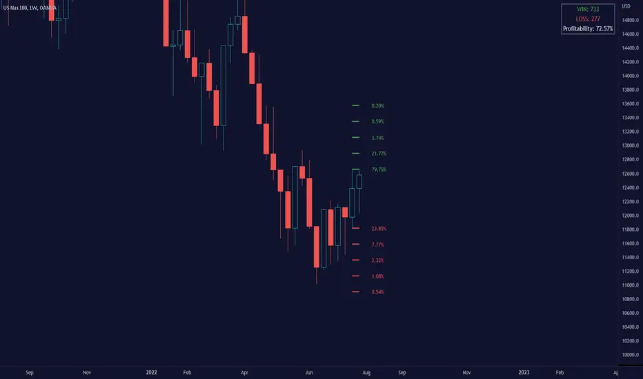
Lune Market Analysis Premium- Version 0.9 -
Lune Algo was developed and built by Lune Trading, utilizing years of their trading expertise. This indicator works on all stocks, cryptos, indices, forex, futures , currencies, ETF's, energy and commodities. All the tools and features you need to assist you on your trading journey. Best of all, Lune Algo is easy to use and many of our tools and strategies have been thoroughly backtested thousands of times to ensure that users have the best experience possible.
Overview
Trade Dashboard—Provides information about the current market conditions, Such as if the market is trending up or down, how much volatility is in the market and even displays information about the current signal.
Trade Statistics—This tool gives you a breakdown of the Statistics of the current selected strategy based on backtests. It tells you the percentage of how often a Take Profit or Stop Loss was hit within a specific time period. Risk and Trade management is very important in trading, and can be the difference between a winning and losing strategy. So we believe that this was mandatory.
Current Features:
Advanced Buy and Sell Signals
Exclusive built-in Strategies
Lune Confidence AI
EK Clouds
Reversal Bands
Vray (Volume Ray)
Divergence Signals
Reversal Signals
Support/Resistance Zones
Built-in Themes
Built-in Risk Management system (take profit/stop loss)
Trade Statistics
Trade Assistance
Trade Dashboard
Advanced Settings
+ More coming soon, Big plans!
Features Breakdown:
Lune Confirmation—Used to help you confirm your trades and trend direction. It uses unique calculations, and its settings can be adjusted to allow traders to adapt the settings to fit their trading style.
Lune Confidence AI—All strategies are equipped with our exclusive built-in Confidence AI. This feature tells you how much confluence there is in a trade. It uses a rating system where signals are given a number from 0 to 5. A rating of 0 indicates that there is not a lot of confluence or confidence in the signal, while a rating of 5 indicates that there is a lot of confidence in the trade. This feature is not perfect and will be improved overtime.
Support/Resistance Zones—Calculates the most important support/resistance levels based on how many times a level has been used as support or resistance. Traders also refer to these as supply and demand zones and key levels.
EK Clouds—Used to further help you confirm trend and was optimized to also be used as support and resistance. This feature is powered by custom moving averages.
Reversal Bands—An optimized and improved version of the infamous Bollinger Bands. When price action takes place within the Reversal Bands it usually indicates that the current symbol is overextended and a reversal is possible.
Vray—Also Known as "Volume Ray", Assists you in better visualizing volume. This helps you find key levels and areas of support that you wouldn't be able to see otherwise. It helps you trade like the institutions.
This indicator's signals DO NOT REPAINT.
If you are using this script you acknowledge past performance is not necessarily indicative of future results and there are many more factors that go into being a profitable trader.
seasonThis script is meant to help verify the existence of a seasonal effect in asset returns, using a Z-test. There are three steps:
1. Think of a way to identify a season. The available methods are: by month, by week of the year, by day of the month, by day of the week, by hour of the day, and by minute of the hour.
2. Set the chart to the unit of your season. For example, if you want to check whether a crop commodity's harvest season has a seasonal implication, select "month". If you want to investigate the exchange's opening or close, select "hour".
3. Using the inputs, select the unit (e.g. "month", "dayofweek", "hour", etc.) and the range that identifies the season. The example natural gas chart has set "start" to 8 and "end" to 12 for September through December.
The test logic is as follows:
The "season" you select has a fixed length; for example, months eight through twelve has a length of four. This length is used to compute a sample mean, which is the mean return of all September-December periods in the chart. It is also used to calculate the mean/stdev of every other four-month period in the chart history. The latter is considered the "population." Using a Z-test, the script scores the difference between the sample returns and the population returns, and displays the results at two levels of significance (P = 0.05 and P = 0.01). The null hypothesis is "there is no difference between the seasonal periods and the population of ordinary periods". If the Z-score is sufficiently large or small, we can reject the null hypothesis and say that there is a seasonal effect at the given level of confidence. The output table will show green for a rejection of the null hypothesis (meaning there is a seasonal effect) or red of acceptance (there is no seasonal effect).
The seasonal periods that you have defined will be highlighted on the chart, so you can make sure they are correct. Additionally, the output table shows the mean, median, standard deviation, and top and bottom percentiles for both the seasonal and population samples.
Many news sites, twitter feeds, influences, etc. enjoy posting statistics about past returns, like "the stock market has gone up on this day 85 out of the past 100 years" and so on. Unfortunately, these posts don't tell you that many of these statistics are meaningless, as even totally random price fluctuations will cause many such interesting figures to occur. This script provides a limited means of testing some such seasonal effects so you can see if they are probably just random, or if they may have some meaning.
Note that Tradingview seems to use 1-based indexing for daily or higher timeframes, and 0-based indexing for intraday timeframes:
Months: 1-12
Weeks: 1-52
Days (of month): 1-31
Days (of week): 1-7
Hours (of day): 0-23
Minutes (of hour): 0-59
Probability ConesA probability cone is an indicator that forecasts a statistical distribution from a set point in time into the future.
Features
Forecast a Standard or Laplace distribution.
Change the how many bars the cones will lookback and sample in their calculations.
Set how many bars to forecast the cones.
Let the cones follow price from a set number of bars back.
Anchor the cones and they will not update from their last location.
Show or hide any set of cones.
Change the deviation used of any cone's upper or lower line.
Change any line's color, style, or width.
Change or toggle the fill colors between any two cone lines.
Basic Interpretations
First, there is an assumption that the distribution starting from the cone's origin, based on the number of historical bars sampled, is likely to represent the distribution of future price.
Price typically hangs around the mean.
About 68% of price stays within the first deviation cones.
About 95% of price stays within the second deviation cones.
About 99.7% of price stays within the third deviation cones.
When price is between the first and second deviation cones, there is a higher probability for a reversal.
However, strong momentum while above or below the first deviation can indicate a trend where price maintains itself past the first deviation. For this reason it's recommended to use a momentum indicator alongside the cones.
There is no mean reversion assumption when price deviates. Price can continue to stay deviated.
It's recommended that the cones are placed at the beginning of calendar periods. Like the month, week, or day.
Be mindful when using the cones on various timeframes. As the lookback setting, which selects the number of bars back to load from the cone's origin, will load the number of bars back based on the current timeframe.
Second Deviation Strategy
How to react when price goes beyond the second deviation is contingent on your trading position.
If you are holding a losing trade and price has moved past the second deviation, it could be time to stop trading and exit.
If you are holding a winning trade and price has moved past the second deviation, it would be best to look at exit strategies to capitalize on the outperformance.
If price has moved beyond the second deviation and you hold no position, then do not open any new trades.

probability_of_touchBased on historical data (rather than theory), calculates the probability of a price level being "touched" within a given time frame. A "touch" means that price exceeded that level at some point. The parameters are:
- level: the "level" to be touched. it can be a number of points, percentage points, or standard deviations away from the mark price. a positive level is above the mark price, and a negative level is below the mark price.
- type: determines the meaning of the "level" parameter. "price" means price points (i.e. the numbers you see on the chart). "percentage" is expressed as a whole number, not a fraction. "stdev" means number of standard deviations, which is computed from recent realized volatlity.
- mark: the point from which the "level" is measured.
- length: the number of days within which the level must be touched.
- window: the number of days used to compute realized volatility. this parameter is only used when "type" is "stdev".
- debug: displays a fuchsia "X" over periods that touched the level. note that only a limited number of labels can be drawn.
- start: only include data after this time in the calculation.
- end: only include data before this time in the calculation.
Example: You want to know how many times Apple stock fell $1 from its closing price the next day, between 2020-02-26 and today. Use the following parameters:
level: -1
type: price
mark: close
length: 1
window:
debug:
start: 2020-02-26
end:
How does the script work? On every bar, the script looks back "length" days and sees if any day exceeded the "mark" price from "length" days ago, plus the limit. The probability is the ratio of such periods wherein price exceeded the limit to the total number of periods.
NEXT Regressive VWAPOverview:
This version of the Volume-Weighted Average Price (VWAP) indicator features an extended algorithm, which, in addition to volume and price, also incorporates regression analysis. The result is a more responsive, often leading VWAP slope with a degree of statistical predictability built in. Just like with the original VWAP, NEXT Regressive VWAP offers two optional Standard Deviation bands that parallel it. These can be set to any deviation level, with the default being 1 and -1, indicating one standard deviation above and one below Regressive VWAP, respectively.
Below is a screenshot comparing NEXT Regressive VWAP (green) to the original VWAP (blue) on CME_MINI:ES1! M3 chart.
Application and Strategy Ideas:
Price above NEXT Regressive VWAP is interpreted to have a bullish bias, and below, bearish. You can use TradingView's native Set Alert functionality to be notified, in real-time, when price crosses Regressive VWAP, and/or any of its standard deviation bands. Another popular "probability play" strategy is to scalp price when it crosses under the upper band (short) and crosses over the lower band (long). The screenshot below visualizes such a strategy on NASDAQ:QQQ M1 chart:
Input Parameters:
There are 3 groups of input.
Regression Settings
Length - controls the length of time (in bars) for regression analysis with higher values yielding smoother, more responsive values.
Regression Weighting - controls the degree of regression analysis incorporated into VWAP, with 5 being average, 0-4 less, 6-10 more. The higher the value, the more responsive the Regressive VWAP curve.
VWAP Settings
Anchor Period - controls the origin of VWAP calculations, start of session being the default.
Source - data used for calculating the VWAP, typically HLC/3, but can be used with other price formats and data sources as well.
Offset - shifting of the VWAP line forward (+) or backward (-).
Standard Deviation Bands Settings
Calculate Bands - checking this will add 2 bands, each equidistant (by the amount of Multiplier) from the NEXT Regressive VWAP line.
Bands Multiplier - standard deviation multiplier, with 1 being the default
Signals and Alerts:
Here is how to set price (close) crossing NEXT Regressive VWAP alerts: open a chart, attach NEXT Regressive VWAP, and right-click on chart -> Add Alert. Condition: Symbol e.g. ES (close) >> Crossing >> Regressive VWAP >> VWAP >> Once Per Bar Close.