NCAT Supply & Demand Zones (BoS + Retest Fade)NCAT for TradingView draws Supply and Demand zones based on a simple Break of Structure (BoS) approach using pivot highs/lows.
When a bullish BoS occurs, it searches back for the most recent qualifying bearish “base candle” and creates a Demand zone.
When a bearish BoS occurs, it searches back for the most recent qualifying bullish “base candle” and creates a Supply zone.
Core logic
Structure (BoS): detected when price closes beyond the last pivot high/low.
Base candle selection: searches back a configurable number of bars and requires a minimum candle body size.
Zone source: draw zone from Wick (high/low) or Open (open + wick boundary depending on zone type).
Zone behavior: zones extend to the right, can fade on retests, and optionally delete when broken by a close beyond the distal line.
Inputs
Session filter (optional): only create new zones during a user-defined session/timezone.
Pivot length: controls pivot detection sensitivity.
Search back / Min body points: controls base candle qualification.
Extend / Max zones / Fade controls: manage performance and chart clutter.
Midline: optional 50% level visualization.
Notes
This is an educational tool and does not predict market direction.
Different symbols have different “point” conventions; adjust “Min body size (points)” accordingly.
Created by: Fernando Fortini
Wskaźniki i strategie

Squeeze Momentum + MACD Balancedcombines Squeeze Momentum and MACD, scaling the MACD to visually match the Squeeze Momentum histogram. I went through your code and it looks mostly correct, but I can give you a few notes and potential improvements to make it cleaner and more robust:

RSI Swing + VWAP + EMA + Camarilla + PDH/PDL+CPRThis script provide the follwing -
1. Daily CPR level
2. Camarilla S3/R3
3. Previous Day High/Low (PDH/PDL)
4. Dynamic VWAP
5. Dynamic EMA 20/200
6. Dynamic RSi Swing
Dec 10
Release Notes
This script provide the follwing -
1. Daily CPR level
2. Camarilla S3/R3
3. Previous Day High/Low (PDH/PDL)
4. Dynamic VWAP
5. Dynamic EMA 20/200/36
6. Dynamic RSi Swing
Which is better: 36 EMA or 36 SMA for Support/Resistance?
✔ 36 EMA (Exponential Moving Average)
Better for intraday, short-term trading, scalping, and momentum trading.
Why?
Reacts faster to price.
Captures trend shifts early.
Works great when market is trending or volatile.
Most traders use EMA for dynamic support/resistance → works better because of crowd behavior.
Ideal for:
NIFTY, BANKNIFTY, FINNIFTY intraday | Options entries | Trend continuation trades.
Why 20 EMA is Important
The 20 EMA is one of the most widely used moving averages for intraday, swing, and positional trading because it captures short-term trend strength and momentum.
📌 20 EMA Works Best For
✔ Intraday trend identification
✔ Momentum continuation entries
✔ Dynamic support/resistance
✔ Quick reversal detection
✔ Options trading (NIFTY/BNF)
✔ Breakout & pullback trades
EMA 200 – Why It’s Extremely Important
The 200 EMA represents the long-term trend and is respected by:
Institutions
Algo systems
Big traders
Swing traders
Index traders
It acts like a major wall of support or resistance.
💡 What EMA 200 Tells You
✔ Long-term trend direction
Price above 200 EMA → Long-term uptrend
Price below 200 EMA → Long-term downtrend
✔ Strong trend reversal signals
When price crosses the 200 EMA on 15m/1h/1D charts → a deeper trend change is possible.
✔ Institutional support/resistance
Very powerful bounce/rejection zones
Many markets reverse exactly at 200 EMA
What is Previous Day High (PDH)?
The highest price the market reached in the previous trading session.
Why PDH is Important?
Acts as strong resistance
Breakout level for uptrend
Sellers often defend this zone
If broken with volume → strong bullish momentum
🔴 What is Previous Day Low (PDL)?
The lowest price the market reached in the previous trading session.
Why PDL is Important?
Acts as strong support
Breakdown level for downtrend
Buyers defend this level
If broken with volume → strong bearish trend
📌 How PDH/PDL Help in Intraday Trading
1️⃣ Range Breakout Trades
If price breaks PDH → bullish breakout (Buy CE)
If price breaks PDL → bearish breakdown (Buy PE)
What is Camarilla R3?
R3 = Resistance Level 3 in the Camarilla Pivot system.
Why R3 is important?
Acts as a major intraday resistance
Price often reverses from R3
If broken with force → strong uptrend starts
Many traders use R3 as a decision zone
Typical Market Behavior at R3
Rejection from R3 → Sell/PE opportunity
Break + Retest above R3 → CE opportunity
🔴 What is Camarilla S3?
S3 = Support Level 3 in the Camarilla Pivot system.
Why S3 is important?
Acts as a major intraday support
Buyers defend this zone
Breakdown of S3 → strong fall
S3 is often a bounce zone in the morning
Typical Market Behavior at S3
Bounce from S3 → Buy/CE opportunity
Break + Retest below S3 → PE opportunity
📌 Trader Logic: R3 & S3 Zones
⭐ 1. Range Reversal Strategy (Most Popular)
At R3 → Sell/PE
At S3 → Buy/CE
What is VWAP?
VWAP = Volume Weighted Average Price
It shows the average price at which most trading has happened during the day, based on both price and volume.
It resets every day at market open.
🔥 Why VWAP Is So Powerful?
VWAP is used by:
Institutions
Algo traders
Scalpers
Intraday traders
Dec 10
Release Notes
This script provide the follwing -
1. Daily CPR level
2. Camarilla S3/R3
3. Previous Day High/Low (PDH/PDL)
4. Dynamic VWAP
5. Dynamic EMA 20/200
6. Dynamic RSi Swing
3 hours ago
Release Notes
This script provide the follwing -
1. Daily CPR level
2. Camarilla S3/R3
3. Previous Day High/Low (PDH/PDL)
4. Dynamic VWAP
5. Dynamic EMA 20/200/36
6. Dynamic RSi Swing
Which is better: 36 EMA or 36 SMA for Support/Resistance?
✔ 36 EMA (Exponential Moving Average)
Better for intraday, short-term trading, scalping, and momentum trading.
Why?
Reacts faster to price.
Captures trend shifts early.
Works great when market is trending or volatile.
Most traders use EMA for dynamic support/resistance → works better because of crowd behavior.
Ideal for:
NIFTY, BANKNIFTY, FINNIFTY intraday | Options entries | Trend continuation trades.
Why 20 EMA is Important
The 20 EMA is one of the most widely used moving averages for intraday, swing, and positional trading because it captures short-term trend strength and momentum.
📌 20 EMA Works Best For
✔ Intraday trend identification
✔ Momentum continuation entries
✔ Dynamic support/resistance
✔ Quick reversal detection
✔ Options trading (NIFTY/BNF)
✔ Breakout & pullback trades
EMA 200 – Why It’s Extremely Important
The 200 EMA represents the long-term trend and is respected by:
Institutions
Algo systems
Big traders
Swing traders
Index traders
It acts like a major wall of support or resistance.
💡 What EMA 200 Tells You
✔ Long-term trend direction
Price above 200 EMA → Long-term uptrend
Price below 200 EMA → Long-term downtrend
✔ Strong trend reversal signals
When price crosses the 200 EMA on 15m/1h/1D charts → a deeper trend change is possible.
✔ Institutional support/resistance
Very powerful bounce/rejection zones
Many markets reverse exactly at 200 EMA
What is Previous Day High (PDH)?
The highest price the market reached in the previous trading session.
Why PDH is Important?
Acts as strong resistance
Breakout level for uptrend
Sellers often defend this zone
If broken with volume → strong bullish momentum
🔴 What is Previous Day Low (PDL)?
The lowest price the market reached in the previous trading session.
Why PDL is Important?
Acts as strong support
Breakdown level for downtrend
Buyers defend this level
If broken with volume → strong bearish trend
📌 How PDH/PDL Help in Intraday Trading
1️⃣ Range Breakout Trades
If price breaks PDH → bullish breakout (Buy CE)
If price breaks PDL → bearish breakdown (Buy PE)
What is Camarilla R3?
R3 = Resistance Level 3 in the Camarilla Pivot system.
Why R3 is important?
Acts as a major intraday resistance
Price often reverses from R3
If broken with force → strong uptrend starts
Many traders use R3 as a decision zone
Typical Market Behavior at R3
Rejection from R3 → Sell/PE opportunity
Break + Retest above R3 → CE opportunity
🔴 What is Camarilla S3?
S3 = Support Level 3 in the Camarilla Pivot system.
Why S3 is important?
Acts as a major intraday support
Buyers defend this zone
Breakdown of S3 → strong fall
S3 is often a bounce zone in the morning
Typical Market Behavior at S3
Bounce from S3 → Buy/CE opportunity
Break + Retest below S3 → PE opportunity
📌 Trader Logic: R3 & S3 Zones
⭐ 1. Range Reversal Strategy (Most Popular)
At R3 → Sell/PE
At S3 → Buy/CE
What is VWAP?
VWAP = Volume Weighted Average Price
It shows the average price at which most trading has happened during the day, based on both price and volume.
It resets every day at market open.
🔥 Why VWAP Is So Powerful?
VWAP is used by:
Institutions
Algo traders
Scalpers
Intraday traders

Market Internals Dashboard (Time-Based Adaptive)Market Internals Dashboard (Time-Based Adaptive)
⚠️ IMPORTANT DISCLAIMER
This indicator is for CONFIRMATION purposes only and should NEVER be used as a standalone trading signal.
✅ Always test thoroughly in paper trading first
✅ Use as ONE confluence factor within your complete trading model
✅ Combine with price action, support/resistance, and your strategy rules
✅ Never enter trades based solely on this indicator
❌ Past performance does not guarantee future results
You are responsible for your own trading decisions and risk management.
📊 WHAT THIS INDICATOR DOES
This comprehensive Market Internals Dashboard monitors real-time NYSE and NASDAQ market breadth indicators to help traders identify:
Market Bias - Is the overall market bullish, bearish, or neutral?
Market Strength - How strong is the current move?
Divergences - Are internals confirming price action or warning of reversal?
Chop Zones - When to avoid trading due to choppy conditions
Extreme Levels - Overbought/oversold conditions for potential fades
Sector Rotation - Is money flowing to Value (NYSE) or Tech (NASDAQ)?
Key Market Internals Tracked:
NYSE Internals:
USI:TICK - Net advancing vs declining stocks
USI:ADD - Advance/Decline Line
USI:VOLD - Volume difference (up vol - down vol)
Volume Ratio - Up volume / Down volume
Cumulative TICK - Session momentum
NASDAQ Internals:
USI:TICKQ - NASDAQ tick indicator
USI:ADDQ - NASDAQ Advance/Decline
USI:VOLDQ - NASDAQ volume difference
NASDAQ Volume Ratio
Cumulative TICKQ
Additional Features:
TVC:VIX - Volatility index for risk sentiment
Volume Pulse - Institutional volume detection
TICK Delta - Momentum acceleration/deceleration
Adaptive Extreme Levels - Dynamic overbought/oversold zones
Fade Detection - Mean reversion opportunities
🎯 HOW THIS HELPS YOUR TRADING
1. Confirmation of Bias
If you're looking for longs, check if NYSE/NASDAQ show bullish alignment
Strong confluence when both markets agree with your directional bias
Avoid counter-trend trades when internals strongly oppose your setup
2. Timing Entries
Wait for internals alignment before entering
Use extreme levels for fade opportunities (mean reversion)
TICK Delta shows acceleration - enter on momentum confirmation
3. Risk Management
CHOP DETECTION warns when conditions are unfavorable
Reduce position size or stay flat during "DANGER ZONE" readings
Exit trades early if internals flip against your position
4. Divergence Alerts
When VOLD rises but price falls = potential bullish reversal
When VOLD falls but price rises = potential bearish reversal
Early warning system before price confirms the reversal
5. Session Context
Cumulative TICK shows session-wide bias
"Strong Bull Session" = favor longs, be selective with shorts
"Strong Bear Session" = favor shorts, be selective with longs
⚙️ SETTINGS GUIDE
📊 Dashboard Display
Dashboard Position - Choose where the dashboard appears (Top Right recommended)
Text Size - Adjust for screen resolution (Normal recommended)
Compact Mode - Shows only Overall Status + Scores (useful for small screens)
Color Settings - Customize background colors for different states:
Bullish/Bearish - Clear directional signals
Neutral - No clear bias
Chop/Warning - Avoid trading
No Data - Outside trading hours
💎 Signal Label
Show Signal Label - Diamond marker on chart when important signals trigger
The label's tooltip shows:
Aligned Bullish/Bearish
Strong market moves
Divergences
Extreme levels
Fade opportunities
📈 Market Internals Sources
Data Timeframe - ⚠️ CRITICAL SETTING
'1' minute = MAXIMUM ACCURACY (recommended for live trading)
'5' minute = Lower accuracy, saves memory
'15' minute = Lowest accuracy
💡 For real-time trading, ALWAYS use '1' minute!
RTH Only (9:30-16:00 EST) - Filters data to Regular Trading Hours only
Recommended: ON (internals are only meaningful during RTH)
Show NYSE/NASDAQ Groups - Enable/disable entire sections
Individual Indicators - Toggle specific internals on/off:
USI:TICK - Most reactive, shows immediate sentiment
USI:ADD - Confirms breadth, slower than TICK
USI:VOLD - Shows institutional money flow
Vol Ratio - Relative volume strength
VOLD Trend - Compares VOLD direction vs price direction
Vol Ratio Trend - Compares Vol Ratio vs price
⚙️ Thresholds
TICK/ADD Thresholds - Standard levels for bullish/bearish signals
NYSE TICK: 500 (conservative), 300 (aggressive)
NYSE ADD: 500 (conservative), 300 (aggressive)
NASDAQ TICK: 400 (conservative), 250 (aggressive)
NASDAQ ADD: 400 (conservative), 250 (aggressive)
VOLD Thresholds - Only for display color coding, not scoring
⚙️ Adaptive Extreme Levels
Use Adaptive Extreme Levels - 🔥 KEY FEATURE
ON = Dynamic thresholds based on recent volatility (RECOMMENDED)
OFF = Fixed extreme levels
Range Lookback (minutes) - Time window for calculating extremes
⚠️ IMPORTANT: Effective lookback depends on chart timeframe!
1min chart: max ~40min effective
5min chart: max ~200min effective
15min+ chart: full range available ✅
Recommended:
60min = Quick adaptation to changing volatility
120min = Balanced
180min = Stable (requires 5min+ chart)
Early Session Period - First X minutes after open use reduced lookback
30min = recommended (first half hour)
Prevents false extremes when range is still building
Early Session Multiplier - Reduces lookback during early session
0.50 = 50% of normal lookback (recommended)
0.25 = Very conservative
Extreme % from High/Low - How far from range extremes to trigger
0.90 = 90% of range (conservative)
0.80 = 80% of range (aggressive)
⚙️ Volume Ratio
Vol Ratio Bullish Threshold - e.g., 1.5 = up volume is 1.5× down volume
1.5 = balanced (recommended)
2.0 = more selective
Vol Ratio Extreme Threshold - For extreme signals
2.5 = very strong imbalance (recommended)
⚙️ VOLD Trend
VOLD Trend Period - Bars back for trend comparison
3 = recent trend (recommended for scalping)
5 = broader trend (swing trading)
VOLD Trend Weight - Importance in scoring
1.0 = equal to other indicators (recommended)
⚙️ Vol Ratio Trend
Same as VOLD Trend but for Volume Ratio
📊 Volume Pulse
Volume Pulse Lookback - Rolling average window
30min = balanced (recommended)
15min = sensitive to volume spikes
60min = stable, longer-term context
Shows when volume is:
🔵 Institutional (2.0×+ average)
High Volume (1.3×+ average)
Normal (0.7-1.3× average)
⚠️ Low Volume (<0.7× average)
📊 Cumulative TICK
Tracks session-wide momentum by summing all TICK readings.
Strong Bullish/Bearish - Thresholds for session bias
+3000 / -3000 = strong session bias (recommended)
Cumulative TICK Trend - Lookback - Bars on YOUR chart timeframe
On 15min chart: 3 bars = 45min trend
On 5min chart: 3 bars = 15min trend
Threshold - Minimum change for trend detection
200 = balanced (recommended)
500 = only strong trends
🔄 Fade Logic
Enable Fade Detection - Mean reversion after extremes
When TICK hits extreme (e.g., +1200) then reverses by X points, signals potential fade.
Fade Reversal Amount - How much TICK must reverse
200 = moderate fade (recommended)
300 = stronger confirmation needed
Require ADD Confluence - Fade signal needs ADD confirmation
ON = safer (recommended)
OFF = more signals, less reliable
⚙️ Hysteresis
Use Hysteresis - Prevents signal flickering
ON = recommended (smoother signals)
Hysteresis % - How much value must change to flip state
10% = balanced (recommended)
⚠️ Chop Detection
Warns when market conditions are unfavorable for trading.
TICK Range for Chop - If TICK stays within ±X for lookback period
400 = identifies tight consolidation (recommended)
ADD Threshold for Chop - If ADD is weak
300 = balanced (recommended)
Lookback Period - Bars to analyze
30 = recent conditions (recommended)
Max Score Difference for Chop - If bull/bear scores are similar
40% = identifies indecision (recommended)
Lunch Time Warning - 11:00-13:30 EST
ON = recommended (lunch chop is real!)
Chop Score Interpretation:
0-40% = 🟢 Tradeable
40-70% = 🟡 Choppy (be careful)
70-100% = 🔴 DANGER (avoid trading)
🎯 Scoring
Weights - Importance of each indicator in final score:
TICK Weight: 1.5 (most reactive)
ADD Weight: 1.5 (breadth confirmation)
Vol Ratio Weight: 1.0 (volume strength)
VOLD Trend Weight: 1.0 (trend confirmation)
Vol Ratio Trend Weight: 1.0 (trend confirmation)
Cumulative TICK Trend Weight: 1.5 (session momentum - very important!)
Strong Signal Threshold - Minimum % for "strong" signal
70% = recommended
80% = more selective
🔄 Alignment & Divergence
Min Score Difference for BIAS - How clear the bias must be
30% = recommended
50% = very clear bias required
Threshold for ROTATION Warning - When one market opposes the other
40% = balanced (recommended)
Rotation Types:
ROTATION TO VALUE = NYSE↑ NASDAQ↓ (buy financials/industrials)
ROTATION TO TECH = NASDAQ↑ NYSE↓ (buy tech stocks)
🔔 Alerts
Configure alerts for various conditions:
Aligned Bullish/Bearish (both markets agree)
Rotation Detected (sector rotation)
Strong Signals (70%+ score)
Chop/Danger (avoid trading)
Extreme Levels (overbought/oversold)
Divergences (early reversal warnings)
Fade Signals (mean reversion)
🎓 USAGE EXAMPLES
Example 1: Scalping ES during RTH
Setup:
Data Timeframe: 1 minute (max accuracy)
Chart: 5-minute ES
Looking for long scalp
Check Dashboard:
✅ Overall Status = "ALIGNED BULL"
✅ NYSE Score = 🟢 75%
✅ NASDAQ Score = 🟢 72%
✅ Market Quality = 🟢 OK (chop score <40%)
✅ Volume Pulse = High Volume or Institutional
Action: Enter long on your strategy signal with high confidence
Example 2: Avoiding Bad Trades
Setup:
Your strategy gives long signal
Price looks good
Check Dashboard:
❌ Overall Status = "🔴 AVOID - Both Choppy"
❌ NYSE Chop = 🔴 DANGER (75%)
❌ NASDAQ Chop = 🔴 DANGER (72%)
❌ TICK Range = narrow consolidation
Action: SKIP THE TRADE - Internals warn conditions are unfavorable
Example 3: Fade Opportunity
Setup:
Market pushed to extreme
Looking for reversal
Check Dashboard:
🔻 NYSE FADE SHORT signal appears
⚡ TICK was +1200 (extreme)
📉 Now reversed to +950
✅ ADD confirmed (turning negative)
Action: Consider short entry (with your reversal setup)
Example 4: Divergence Warning
Setup:
ES making new highs
You're in a long position
Check Dashboard:
⚠️ NYSE BEAR DIVERGENCE
📊 VOLD falling while price rising
🟡 Overall Status changing to "MIXED"
Action: Tighten stops or take profits - internals warn momentum fading
💡 BEST PRACTICES
DO:
✅ Test extensively before live trading
✅ Use on 5min or 15min charts for swing trades
✅ Use on 1min or 3min charts for scalping
✅ Combine with your proven strategy
✅ Respect CHOP DETECTION warnings
✅ Use Data Timeframe = 1 for accuracy
✅ Monitor Volume Pulse for institutional activity
✅ Watch for divergences as early warnings
DON'T:
❌ Trade based on internals alone
❌ Ignore chop warnings ("I'll be careful")
❌ Use Data Timeframe >5 for live trading
❌ Trade against aligned strong signals
❌ Overtrade - wait for quality setups
❌ Ignore session context (Cumulative TICK)
🔧 RECOMMENDED SETTINGS
For Day Trading (Scalping):
Data Timeframe: 1
Adaptive Extremes: ON
Range Lookback: 60 minutes
VOLD Trend Period: 3
Cumulative TICK Weight: 1.5 (important!)
Chop Detection: ON
For Swing Trading:
Data Timeframe: 5
Range Lookback: 120 minutes
VOLD Trend Period: 5
Strong Threshold: 75%
📝 NOTES
Market internals are most reliable during regular trading hours (9:30-16:00 EST)
Lunch period (11:00-13:30 EST) often shows choppy behavior
First 30 minutes after open can be erratic - use early session adjustments
Power hours (9:30-10:30 and 15:00-16:00) tend to have cleaner trends
Volume Pulse helps identify when "smart money" is active
🤝 SUPPORT
If you find this indicator helpful, please consider:
⭐ Leaving a positive review
💬 Sharing your trading experience
📈 Supporting my work with a TradingView subscription (any tier helps!)
Creating and maintaining free, high-quality indicators takes significant time and effort. Your support enables me to continue developing tools for the trading community and keep them updated. Thank you! 🙏
Remember: This is a tool, not a system. Your trading success depends on YOUR complete strategy, risk management, and discipline.
Good luck and trade safe! 🚀

MARAL Execution WorkflowOverview
MARAL Execution Workflow is a discretionary execution decision-support indicator designed to organize market context into a consistent workflow. It is not an automated trading system, does not place orders, and does not predict outcomes.
Meaning of MARAL: Market Alignment + Risk Awareness + Logic-based execution gating — a structured workflow framework designed to improve clarity and consistency in discretionary execution.
This tool supports discretionary decision-making across three stages: Context → Qualification → Management.
It extends analysis beyond entry by supporting post-entry decisions such as: Should I stay? Should I reduce risk? Should I exit? Or should I wait? These are decision-support questions, not predictions.
Key Features
9-Layer Framework + 3 Boards + EDC
The script uses a 9-layer framework coordinated by a centralized decision-state layer (EDC). Each layer has a defined role:
1. Directional Context (Trend/Bias Layer) — establishes a directional preference using configurable bias filters.
2. Higher-Timeframe Context (HTF Layer) — anchors execution to broader context when enabled.
3. Structure Mapping (Swing/Structure Layer) — identifies structural behavior (highs/lows) to frame decision areas.
4. Location / Proximity Awareness (Obstacle Layer) — evaluates proximity to likely reaction areas for risk awareness.
5. Momentum Quality (Momentum Layer) — distinguishes healthier follow-through vs weakening/choppy conditions.
6. Volatility / Stability Regime (VOL/REGIMI) evaluates volatility using ATR% thresholds and regime support using ADX.
7. Pre-Entry Qualification (Checklist Layer) — confirms whether minimum execution conditions are satisfied before entry.
8. Post-Entry Management Context (Management Layer) — monitors changing conditions after a setup for discretionary management.
9. Liquidity Context (Liquidity Layer) — integrates liquidity-based location context using PDH/PDL proximity, sweep/reclaim behavior, and lookback extreme breaks. When enabled, the script may also plot liquidity reference points for visual mapping.
Liquidity Regime States (Panel Output)
The Liquidity Layer displays a 3-state liquidity regime used for execution risk awareness:
• HIGH — a liquidity event is detected (e.g., sweep/reclaim or lookback extreme break).
• NEUTRAL — no event, but liquidity is nearby (proximity to PDH/PDL within a defined threshold).
• LOW — no event and no nearby liquidity pressure detected.
These are context/risk states used for discretionary gating — not buy/sell signals and not outcome predictions.
Boards
• Context Board — summarizes direction, HTF context, structure, momentum, volatility (ATR%), trend regime (ADX), scores, and liquidity context.
• Qualification Gate — rule-based checklist view to confirm minimum execution conditions before entry.
• Management Desk — post-setup view to monitor risk changes, obstacle proximity, deterioration cues, and management states.
EDC — Execution Decision Core
EDC consolidates outputs from the framework into unified workflow states. It applies rule-based gating to reduce conflict when conditions are mixed.
EDC Unified Output States (Decision-Support Only):
• SETUP: WAIT / LONG / SHORT
• ENTRY PERMISSION: ENTER / WAIT / SKIP
• LIQUIDITY: HIGH / NEUTRAL / LOW
• TRADE STATUS: VALID / RISKY / WEAK / —
• ACTION STATE: HOLD / TIGHT SL / SCALE OUT / EXIT / —
— may appear when a state is not applicable (e.g., no active management window is being tracked).
Panels & Labels (Exact On-Chart Meanings)
1) Context Board (Market Environment Snapshot)
• DIRECTION → Bullish / Bearish / Neutral
• H1 CONTEXT / H4 CONTEXT / DAILY CONTEXT → HTF bias states (when enabled). If HTF is disabled, shows OFF.
• STRUCTURE → Bull Struct / Bear Struct / Neutral Struct
• MOMENTUM → BULL / BEAR / NEUTRAL
• VOLATILITY (ATR%) → ATR as a percentage of price (volatility context)
• TREND STRENGTH → ADX context value
• LONG SCORE / SHORT SCORE → internal workflow alignment scores (0–100) with grade: A++ / A+ / A / B / No-Trade
• ALIGNMENT SCORE → combined alignment score used for gating
• LIQUIDITY CONTEXT → HIGH / NEUTRAL / LOW
Important: Scores are internal workflow scoring for filtering/alignment. They are not performance statistics and do not imply guaranteed probability or outcomes.
2) Qualification Gate (Pre-Entry Checklist)
Gate Legend: OK = passes filter, WARN = mixed/caution, BAD = fails filter (execution gated).
• SETUP → WAIT / LONG / SHORT
• HTF CONTEXT → OK / WARN / BAD / —
• STRUCTURE → OK / WARN / BAD / —
• MOMENTUM → OK / WARN / BAD / —
• VOL/REGIME → OK / WARN / BAD / — (Volatility + regime filter; not volume)
o OK = ATR% within thresholds AND ADX meets regime requirement
o WARN = ATR% within thresholds but regime is mixed (ADX below threshold)
o BAD = ATR% outside thresholds
• LIQUIDITY → HIGH / NEUTRAL / LOW
• ALIGNMENT → shows score vs required minimum threshold
• ENTRY PERMISSION → ENTER / WAIT / SKIP
Purpose: reduce forced entries by requiring minimum execution quality.
3) Management Desk (Post-Setup Decision Support)
The Management Desk operates inside an Active Window measured in bars after the last setup (configurable by input). When the management window is not active, some fields may show —.
• TRADE STATUS → VALID / RISKY / WEAK / —
— appears when no active trade state is being tracked (not applicable).
• MARKET PHASE → RANGE / IMPULSE / PULLBACK / CONTINUATION
Environment classification used for management context (not prediction).
• OBSTACLE AHEAD → YES / NO
Proximity risk context (e.g., near PDH/PDL or near swing levels under the script’s logic).
• EXIT PRESSURE → LOW / RISING / HIGH
Management pressure context based on deterioration cues (not a signal).
• MOMENTUM HEALTH → STRONG / WEAKENING / WEAK / NEUTRAL
Follow-through quality context used for management.
• SCORE TREND → IMPROVING / DETERIORATING / STABLE
Direction of the internal workflow score trend (not P&L, not performance).
• RISK STATE → OVEREXTENDED / NORMAL
Overextension context based on distance from EMA vs ATR.
• TRADE AGE → FRESH / MID / LATE / —
Workflow age based on bars since last setup. — when not applicable.
• SL MODE → BE OK / TIGHT / NORMAL / —
Stop-management context used for discretionary risk control. — when not applicable.
• ACTION STATE → HOLD / TIGHT SL / SCALE OUT / EXIT / —
o HOLD = maintain the current plan under present conditions
o TIGHT SL = discretionary prompt to reduce risk by tightening protection
o SCALE OUT = discretionary prompt to partially reduce exposure (partial exit / trim size), typically when obstacle proximity risk is detected
o EXIT = discretionary prompt that conditions deteriorated and exit may be considered
o — = not applicable
• ACTIVE WINDOW → ON / OFF
Shows whether the post-setup management window is active (bars after the last setup, per the “Active Window” input). When OFF, management/trade states may show —.
Optional Modules (Toggleable)
To keep the chart clean and workflow-focused, optional modules can be enabled/disabled:
A) PDH/PDL Reference (Optional)
• Plots Previous Day High / Previous Day Low as structured reference points (risk awareness only).
B) ATR-Based Planning Guides (Optional)
• Optional visual guides for SL / TP1 / TP2 / TP3 based on ATR.
• Visual planning references only. Does not place orders and does not guarantee outcomes.
C) Visual Color Layer (Optional)
• Optional state-based candle coloring for readability only.
D) State Markers (Optional)
• Optional state markers (e.g., LONG/SHORT confirmations). These are state confirmations only, not trade recommendations.
Display & Layout Options
• Display Mode: Mobile / Medium / Desktop
• Mobile Minimal View: optional minimal mode (EDC-only)
• Panel Positioning: 9 anchor positions
(Top Left / Top Center / Top Right / Middle Left / Middle Center / Middle Right / Bottom Left / Bottom Center / Bottom Right)
Why This Is Not a “Mashup”
This publication is not intended to bundle multiple classic indicators as independent buy/sell tools. While it uses familiar building blocks (trend/bias filtering, volatility/regime context, structure references, liquidity context), each component has a defined role inside a single execution workflow:
• Context Board → Qualification Gate → Management Desk organizes information into a consistent discretionary process.
• EDC consolidates multi-layer conditions into unified states using rule-based gating to reduce conflict and prioritize risk awareness.
This is a decision-support framework designed to improve clarity and consistency in discretionary execution. It does not place orders and does not provide guaranteed outcomes.
How to Use (Recommended Workflow)
1. Set context: Use the Context Board to determine directional preference, volatility/regime stability, and location context.
2. Qualify execution: Use the Qualification Gate as the filter. If alignment is not sufficient, avoid forcing entries.
3. Execute with location awareness: Avoid late entries into nearby obstacles. Treat proximity as increased risk.
4. Manage post-setup: Use the Management Desk to monitor risk changes. If states deteriorate, follow your plan (reduce risk, protect, or exit).
5. Stay consistent: Works best with position sizing rules and disciplined confirmation.
Screenshots / Visual Reference (What each panel shows)
Screenshot 1 — Full Workflow View (Desktop)
Shows the complete workflow layout on one chart: Context Board, Qualification Gate, Management Desk, and the EDC (Execution Decision Core) summary together.
Screenshot 2 — Context Board
Shows directional context, HTF context (if enabled), structure mapping, momentum quality, volatility/stability regime (ATR + ADX), and liquidity context (HIGH/NEUTRAL/LOW). This board is used to understand “market alignment” before considering execution.
Screenshot 3 — Qualification Gate (Pre-Entry)
Shows the rule-based checklist view used for discretionary pre-entry qualification. It summarizes SETUP (WAIT/LONG/SHORT), key confluence checks, liquidity context, and ENTRY PERMISSION (ENTER/WAIT/SKIP). This is a gating view—meant to prevent forced entries when alignment is insufficient.
Screenshot 4 — Management Desk (Post-Entry)
Shows post-entry condition monitoring within the active window after the last setup. It highlights trade status shifts (VALID/RISKY/WEAK), obstacle proximity, exit pressure, momentum health, score trend, risk state, SL mode, and action guidance context.
Screenshot 5 — EDC Panel (Execution Decision Core) — Centralized State
Shows the unified decision-support outputs consolidated from the workflow layers and boards into one compact view:
• SETUP: WAIT / LONG / SHORT
• ENTRY PERMISSION: ENTER / WAIT / SKIP
• LIQUIDITY: HIGH / NEUTRAL / LOW
• TRADE STATUS: VALID / RISKY / WEAK
• ACTION STATE: HOLD / TIGHT SL / SCALE OUT / EXIT
These are rule-based guidance states for discretionary execution and risk awareness — not automated actions.
Screenshot 6 — Example –Execution context
The screenshot shows MARAL Execution Workflow applied to XAUUSD on the 1-hour timeframe. All three boards and the EDC panel are visible:
• Context Board (top-right) – Confirms a fully aligned bullish environment: direction and all HTF contexts are Bullish, structure is “Bull Struct”, momentum is “BULL”, volatility (ATR%) is within normal bounds, and the long-side alignment score is high while the short-side score is in “No-Trade” territory. Liquidity Context is “LOW”, indicating limited immediate liquidity pressure.
• Qualification Gate (top-center) – For the same bar, the checklist produces a LONG setup with HTF CONTEXT, STRUCTURE, MOMENTUM and VOL/REGIME all marked OK. Liquidity is LOW, and ALIGNMENT shows “93 / 65”, meaning the current long-side score (93) is above the user-defined minimum threshold (65). ENTRY PERMISSION = ENTER, signaling that, within this framework, execution conditions are sufficiently aligned to allow a discretionary long entry according to the trader’s own plan.
• Management Desk (left) – Once a trade is active, the post-entry view monitors evolving risk. In this example the trade status is VALID and MARKET PHASE is CONTINUATION, while RISK STATE highlights OVEREXTENDED and TRADE AGE is FRESH. MOMENTUM HEALTH = STRONG, SCORE TREND = STABLE, and ACTION STATE = HOLD. This illustrates how the panel can flag extension or emerging pressure without forcing a decision.
• EDC | Execution Decision Core (bottom-right) – The EDC panel consolidates the key states into one unified view: SETUP = LONG, ENTRY PERMISSION = ENTER, LIQUIDITY = LOW, TRADE STATUS = VALID, ACTION STATE = HOLD. These are rule-based guidelines summarizing the interaction between Context, Qualification, Management and liquidity conditions. They are decision-support outputs only; they do not place orders and do not imply any guaranteed outcome.
Inputs & Customization
Inputs are provided to adapt the workflow to different instruments and timeframes, including:
• bias/trend parameters and smoothing, optional HTF context,
• structure sensitivity and lookback,
• momentum thresholds,
• volatility thresholds (ATR% limits) and regime filter (ADX),
• liquidity sensitivity (lookback / proximity thresholds),
• visuals (show/hide boards, display mode, mobile minimal view, text size, positioning).
Markets & Timeframes
Designed for multiple markets and instruments available on Trading View, including:
• Indices (index charts / index futures where available — not an options-chain or options-pricing tool)
• Crypto
• Forex
• Stocks / ETFs
• Commodities
Timeframe-agnostic: can be applied from lower to higher timeframes based on your trading style. Results vary by instrument, timeframe, and volatility/regime.
Limitations (Important)
• Discretionary analysis tool only; does not place trades.
• Optional markers/labels (if enabled) are state confirmations only, not recommendations.
• HTF values can update as HTF candles develop.
• Structure/obstacle references are informational decision areas and may be exceeded.
• No indicator removes risk; risk management remains essential.
• Provided “as-is.” Outputs may differ across symbols, sessions, spreads, or data feeds.
Risk & Disclaimer
Trading involves risk. Past behavior does not indicate future performance. This script is provided for educational and analytical purposes only. You are responsible for all trading decisions, including entries, exits, position sizing, and risk management. The script does not place trades and does not provide investment advice.

PyraTime FVG [Pro] | Smart Anchored Price ActionPyraTime FVG is a professional-grade institutional trading suite designed to declutter price action analysis. Unlike standard indicators that flood the chart with infinite zones, this tool uses a proprietary "Velcro" Anchoring Engine that physically snaps Fair Value Gaps (FVGs) and Order Blocks to the exact candle geometry.
This tool replaces 4 separate indicators (FVG, Market Structure, Order Blocks, and Trend Dashboard) with a single, performance-optimized Pine Script v6 script.
🎯 Key Features
1. The "Velcro" FVG Engine Most FVG indicators draw boxes that extend infinitely, making charts messy.
Smart Extension: Zones extend to the right but automatically "snap" and cut off the moment price mitigates (fills) them.
Precision Anchoring: Boxes are drawn from the exact wick/body limits of the originating candles—no floating pixels.
Mitigation Tracking: Mitigated zones are instantly dimmed and archived, keeping your chart clean for current price action.
2. Intelligent Structure Mapping (BOS & CHoCH) The script distinguishes between trend continuation and trend reversals:
BOS (Break of Structure): Marked with Dotted Lines. Signals that the current trend is healthy and continuing.
CHoCH (Change of Character): Marked with Solid Lines. Signals a potential major trend reversal (e.g., the first Lower Low after an uptrend).
3. Multi-Timeframe (MTF) Scanner A non-intrusive dashboard in the bottom-right corner scans the 1H, 4H, and Daily timeframes in real-time.
IN BULL GAP: Price is currently inside a Higher Timeframe Buying Zone.
IN BEAR GAP: Price is currently inside a Higher Timeframe Selling Zone.
CLEAR: No major HTF obstacles nearby.
📚 How to Trade With This Tool (Tutorial)
Step 1: Check the "Big Picture" Look at the MTF Scanner (Bottom Right).
If the 1H and 4H say "IN BEAR GAP" (Gold), you know the higher timeframe bias is Down. You should prioritize selling opportunities.
Step 2: Wait for Price to Visit a Zone On your current chart (e.g., 5m or 15m), wait for price to enter a Gold FVG (Resistance).
Note: The box will be bright gold. Once price touches it, the script will snap the box to that candle, confirming the test.
Step 3: Confirm with Structure Don't sell blindly. Wait for a CHoCH Label (Change of Character) to appear. This confirms that the short-term uptrend has broken and sellers are stepping in.
Step 4: Target the Opposing Zone Aim for the next unmitigated Teal FVG (Bullish Support) or Order Block below.
⚙️ Settings & Customization
Filter Small Gaps: Uses an ATR filter (default 0.5) to ignore insignificant noise. Increase to 1.0 for a cleaner "Swings Only" view.
Show Midpoint: Toggles a dotted 50% equilibrium line inside every active gap.
Visual Style: Fully customizable colors. Default scheme is PyraTime Desert Gold & Oasis Teal.

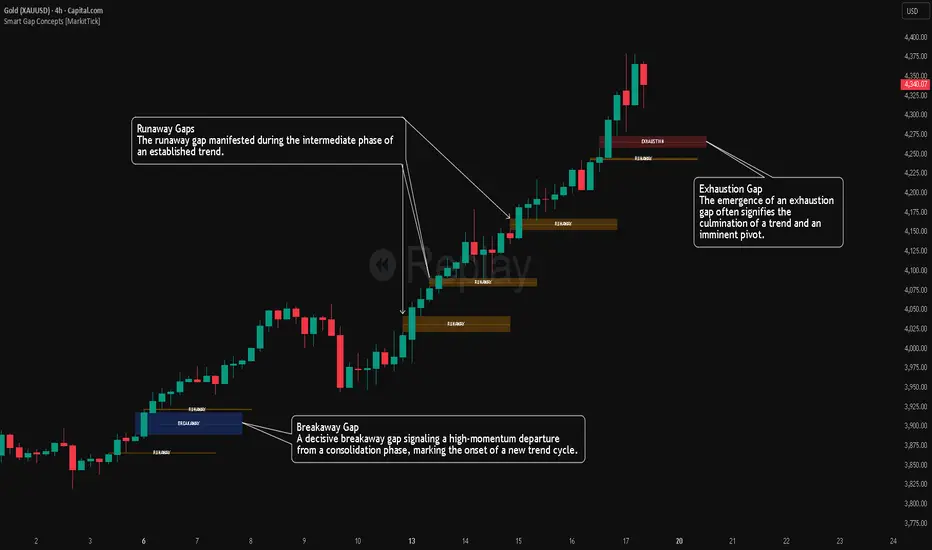
Smart Gap Concepts [MarkitTick]💡 This indicator automates the identification and classification of price gaps, commonly known as Fair Value Gaps (FVG) or Imbalances, by integrating market structure and volume analysis. Unlike standard gap detectors that simply highlight empty space on a chart, this script applies algorithmic filters to categorize gaps into three distinct phases of market movement: Breakaway, Runaway, and Exhaustion. This helps traders understand the potential context of a move rather than just seeing a support or resistance zone.
● Originality and Utility
The primary innovation of this tool is its dynamic classification system. It moves beyond visual detection by checking the "why" behind the gap. By referencing Swing Highs and Swing Lows (Market Structure) alongside Volume efficiency, it determines if a gap represents a breakout, a trend continuation, or a climatic end to a move. Additionally, the script features an automated mitigation tracking system that removes gaps from the chart once price has re-tested the midpoint, ensuring the visual workspace remains clean and relevant to current price action.
● Methodology
The script operates on a multi-stage logic engine:
• Gap Detection
It first identifies the core imbalance where the Low of the current bar does not overlap with the High of the bar two periods prior (for bullish gaps), ensuring the intervening candle represents a strong displacement.
• Structural Analysis (Breakaway Gaps)
The script monitors Pivot Highs and Lows. If a gap occurs simultaneously with a close beyond a key structural Pivot, it is classified as a "Breakaway Gap." This signals the potential start of a new trend.
• Volume and Time Analysis (Exhaustion Gaps)
To identify potential reversals, the script looks for "Trend Maturity." If a gap forms after a long duration since the last pivot and is accompanied by a volume spike (defined by the Volume Spike Multiplier), it is labeled as an "Exhaustion Gap."
• Continuation (Runaway Gaps)
If a gap is valid but meets neither the Breakaway nor Exhaustion criteria, it is considered a "Runaway Gap," typically found in the middle of an established trend.
• Dynamic Cleanup
The script tracks the midpoint of every active gap. If price creates a lower low (for bullish gaps) or higher high (for bearish gaps) beyond this midpoint, the gap is considered mitigated and is removed from the screen.
📖 How to Use
Traders can utilize the color-coded classifications to gauge market intent:
Breakaway (Default Blue): Watch these zones for potential trend initiations. These are often high-probability areas for a retest entry after a structure break.
Runaway (Default Orange): These indicate strong momentum. They can be used to trail stop-losses or add to winning positions, as price should ideally not close below these gaps in a healthy trend.
Exhaustion (Default Red): Be cautious when these appear. They suggest the current move is overextended and a reversal or complex pullback may be imminent.
• Exhaustion Gap : A Practical Case Study
• Breakaway Gap: A Practical Case Study
• Runaway Gap : A Practical Case Study
⚙️ Inputs and Settings
Min Gap Size (Points): Filters out insignificant gaps smaller than this threshold.
Structure Lookback: Defines the sensitivity of the Pivot detection (Swing High/Low).
Volume Avg Length & Multiplier: Determines what qualifies as a "Volume Spike" for exhaustion logic.
Trend Maturity: The minimum number of bars required to consider a trend "old" enough for an exhaustion signal.
Visual Settings: Custom colors for each gap type and box extension length.
● Disclaimer
All provided scripts and indicators are strictly for educational exploration and must not be interpreted as financial advice or a recommendation to execute trades. I expressly disclaim all liability for any financial losses or damages that may result, directly or indirectly, from the reliance on or application of these tools. Market participation carries inherent risk where past performance never guarantees future returns, leaving all investment decisions and due diligence solely at your own discretion.
Market Participation Gradient [Interakktive]Market Participation Gradient (MPG) is a diagnostic oscillator that measures the quality and intensity of market participation by combining price efficiency with activity (volume or a FX-safe proxy) into a single 0–100 score.
Most tools tell you "how much activity exists." MPG focuses on "how effective that activity is," helping you differentiate clean directional participation from absorbed / inefficient participation where effort produces limited directional progress.
█ WHAT IT DOES
- Produces a 0–100 participation score (higher = stronger participation environment)
- Uses color as state context (not buy/sell)
- Classifies participation into four tiers for quick readability
- Includes an optional status-line HUD for at-a-glance context without chart clutter
█ WHAT IT DOES NOT DO
- NO buy/sell signals
- NO entries/exits
- NO alerts by default
- NO repainting / no lookahead (diagnostic context only)
█ HOW TO READ MPG
Level (0–100)
- Higher values = stronger participation environment
- Lower values = thin, drifting participation environment
Color (state language, not direction)
- Teal = Clean participation (efficient movement)
- Magenta = Absorbed participation (high activity, low efficiency)
- Amber = Building / transition state
- Grey = Thin / neutral state
█ TIER SYSTEM
MPG uses four tiers:
- THIN (0–20): low participation environment
- BUILDING (20–40): participation emerging / transitional
- STRONG (40–65): solid participation environment (quality becomes more meaningful)
- EXTREME (65+): very high participation environment (contextually important during events or late-cycle pushes)
█ QUALITY ASSESSMENT (STRONG / EXTREME)
Within STRONG and EXTREME tiers, MPG evaluates participation quality:
- Clean (Teal): Efficiency > 55%
- Absorbed (Magenta): Efficiency < 30% AND Activity > 1.5×
- Neutral (Grey): otherwise (mixed quality)
█ STATUS LINE HUD
MPG can display key values in TradingView's status line:
- Minimal: MPG (0–100) + Tier (0–3)
- Full: adds Direction (-1/0/1) and Quality (-1/0/1)
This provides quick context without tables or on-chart panels.
█ HOW IT WORKS (METHODOLOGY)
MPG combines two independent measurements:
1. Efficiency (0–1)
Efficiency = |Net Displacement| / Total Path Length
- High efficiency = price moved more directly
- Low efficiency = price moved less directly (more back-and-forth)
2. Activity (centered at 1.0)
Activity = Current Volume / Average Volume
- Activity > 1 = above-average activity
- Activity < 1 = below-average activity
FX / indices fallback: If volume is unreliable/unavailable, MPG uses a range-based proxy: (High–Low) / ATR (capped) to prevent distortion.
3. Participation Score (0–100)
Participation = Efficiency × √Activity × 100
The square root applies diminishing returns so activity alone cannot dominate without efficiency support.
█ SETTINGS
Core
- ATR Length — normalization baseline
- Efficiency Lookback — bars used for efficiency
- Volume Average Length — baseline for activity
- Smoothing Length — EMA smoothing (1 = minimal smoothing)
Visuals
- Histogram / Line / Tier Bands toggles
- Optional pane background tint (default OFF)
- Theme: Cinematic (subtle) or Vivid (brighter)
HUD
- Status Line HUD toggle
- HUD Detail: Minimal or Full
█ SUITABLE MARKETS
Works on any market with price data. For symbols with unreliable volume (common in FX), MPG automatically uses the range/ATR activity proxy.
█ RELATED (INTERAKKTIVE)
- MER — Market Efficiency Ratio (pure efficiency)
- ERD — Effort–Result Divergence (effort vs outcome)
- VSI — Volatility State Index (expansion/contraction context)
█ DISCLAIMER
This indicator is for educational and informational purposes only and does not constitute financial advice. Always do your own research and use appropriate risk management.

Su Shen Comprehensive Trading System V2.0Su Shen Comprehensive Trading System V2.0
Su Shen Comprehensive Trading System is an intelligent trading assistant indicator that integrates multiple technical analysis tools. This system provides a comprehensive market perspective by combining multi-timeframe trend analysis, key level identification, and intelligent trading signals.
Core Features
Multi-dimensional Trend Analysis: Analyzes market trends across multiple timeframes simultaneously
Intelligent Trading Signals: Automatically identifies potential entry, take-profit, and exit opportunities
Key Level Identification: Marks important support and resistance zones
Risk Alerts: Indicates current risk level based on market conditions
Applicable Scenarios
Day trading
Swing trading
Trend following
How to Use
After adding the indicator to your chart, the system will automatically display analysis results and trading signals. Users can refer to these signals in conjunction with their own trading strategies.

GEMINI Advanced SMA with Trend & AlertsDescription:
This indicator is a professional Trend & Signal analysis tool designed to help traders identify market direction, entries, and momentum strength at a glance. It combines a customizable dual Moving Average system with an advanced real-time Information Dashboard.
The script is built to keep charts clean while providing maximum data through the on-screen panel.
📈 Key Features
1. Dual Moving Average System
Fast MA (Signal Line): Acts as the primary trigger for entries.
Slow MA (Trend Baseline): Filters the overall market direction.
Visual Cloud: The area between the two MAs is filled with color (Green/Red) to visualize the trend strength and potential support/resistance zones.
Flexibility: You can choose between SMA, EMA, HMA, WMA, or RMA for both lines independently.
2. Professional Data Dashboard A customizable table positioned on your chart provides real-time analytics:
Price Action: Immediate Bullish/Bearish status.
MA Status: Shows if the Fast and Slow MAs are currently Rising or Falling.
Exact Levels: Displays the precise price values of the MAs.
Spread Analysis: Monitors the gap between the Fast and Slow MA ("Expanding" vs "Squeezing") to help identify momentum acceleration or exhaustion.
3. Signals & Alerts
BUY Signal: Generated when the Price crosses OVER the Fast MA.
SELL Signal: Generated when the Price crosses UNDER the Fast MA.
Alerts: Fully compatible with TradingView alerts for automation.
4. Multi-Timeframe (MTF) Support You can calculate the Moving Averages based on a higher timeframe (e.g., viewing 4-hour MAs while trading on a 15-minute chart) to stay aligned with the macro trend.
🛠 How to Use
Trend Identification: Look at the "Cloud" color. Green indicates an uptrend context; Red indicates a downtrend context.
Entry Points: Use the "BUY" and "SELL" labels.
Pro Tip: Take BUY signals only when the Cloud is Green (trading with the trend).
Pro Tip: Take SELL signals only when the Cloud is Red.
Momentum Check: Use the Dashboard to see if the Spread is "EXPANDING" (strong momentum) or "SQUEEZING" (potential consolidation or reversal).
⚙️ Settings
Fast/Slow Length & Type: Fully customizable periods and MA types.
MTF: Enable/Disable higher timeframe calculations.
Dashboard: You can toggle the table visibility, change its size (Tiny, Small, Normal, Large), and move it to any corner of the screen.
Disclaimer: This tool is for informational purposes only and does not constitute financial advice.

VSA Persistent Zones with Arrows Purpose
This indicator is designed to analyze trading volume relative to price movement using the VSA (Volume Spread Analysis) methodology. It aims to:
Identify key price zones where there is strong price movement with high trading volume.
Plot arrows on high-volume candles for quick visual identification.
Keep these zones persistent until broken by price, helping traders make decisions based on real support and resistance levels.

Portfolio P&L Table 10 SlotsOverview
This indicator displays a compact, Excel-style position P&L table directly on your TradingView chart. It is designed to help traders track unrealized profit/loss for a manually-entered position and ensure the calculations only apply to the symbols you actually trade, preventing confusion when switching between tickers.
The script is symbol-aware: it checks the current chart symbol against up to 10 user-defined position slots and shows P&L only when a match is found.
Core Concept
Most P&L scripts on TradingView rely on a single set of inputs (average price, quantity), which remains active even when the user changes chart symbols. That can lead to incorrect P&L displays on instruments where no position exists.
This indicator solves that by combining:
Symbol matching logic (ticker / exchange:ticker / base ticker normalization)
Slot-based position storage (up to 10 positions)
Dynamic real-time P&L calculations driven by the chart’s live price
As a result, the table behaves like a “position panel” that follows the chart, while respecting your actual holdings list.
Matching & Display Logic
Symbol Detection
The indicator compares the current chart symbol to each slot’s symbol using multiple matching methods to reduce false mismatches:
Full symbol (EXCHANGE:TICKER)
Ticker only (TICKER)
Normalized “base ticker” extraction (useful when your chart format differs from inputs)
Position Selection
The first matching slot is selected and displayed.
If no slot matches, the table shows “No position for this symbol” and does not output P&L values.
P&L Calculation Logic
When a valid slot is matched and its values are valid:
Unrealized Gross P&L
Long: (Last Price − Avg Price) × Quantity
Short: (Avg Price − Last Price) × Quantity (handled via direction multiplier)
Unrealized Net P&L (optional)
If fees are enabled, the script subtracts the slot’s total fees from gross P&L.
P&L %
Calculated relative to average price, direction-adjusted for long/short positions.
Breakeven Price
Without fees: breakeven = average price
With fees: breakeven is adjusted using fees / quantity and direction.
The table updates automatically with market movement because all values are recalculated from the chart’s current price.
Inputs and Defaults
General
Include Fees? (default: Off)
Text Size
Table Position (Top/Bottom, Left/Right)
Slots (1 → 10)
Each slot contains:
Symbol (example formats: NVTS, NASDAQ:NVTS, NYSE:PATH)
Side (Long / Short)
Average Price
Quantity
Total Fees (optional; applied only when “Include Fees” is enabled)
Colors (Fully Customizable)
The table supports user-defined colors for:
Header text/background
Body text/background
Positive P&L color
Negative P&L color
Neutral/no-position color
This allows you to match the table visually to any chart theme.
The indicator is intended for :
Quick P&L visibility while charting
Avoiding accidental P&L “carry over” when switching symbols
Tracking a shortlist of positions without external spreadsheets
If you trade more than 10 tickers regularly, the script can be extended further using the same slot architecture.
Limitations
Values are unrealized and based on the chart’s price (close/last available feed).
The script does not track multiple lots per symbol automatically; each slot represents a single consolidated position (avg + total qty).
Disclaimer
This script is provided for educational and analytical purposes only. It does not constitute financial advice, investment recommendations, or an invitation to trade. Trading involves risk, and past performance does not guarantee future results. Always verify your position data and calculations independently before making trading decisions.

Val FXIndicator combining 3 moving averages (SMA/EMA selectable) and Bollinger Bands. Default lengths: 20, 50, 200. All parameters are customizable.

NY Open First Candle (9:30 AM EST) - 15m/1H/4H + FibNY Open First Candle (9:30 AM EST) - 15m/1H/4H + Fib

Falcon HeatWaveIntroducing the MyFXSchool Falcon HeatWave Leading Indicator™, a next-generation market prediction tool designed exclusively for traders who want accuracy, clarity, and early trend identification. Built using advanced price-action logic, institutional order-flow concepts, and dynamic volatility algorithms, this indicator gives you a true leading advantage—not just lagging signals.

Electricity Futures x DAM Window TrackingWhat this one script does
Tracks the OHLC during 11:30–12:00 window per day
Colors bars
11:30–11:45 → Green
11:45–12:00 → Blue
Draws
A horizontal dash at the High and at the Low along with price labels.
Displays a table
Up days - count of days when prices went up post event
Down days - count of days when prices went down post event
Flat days
Avg net change (points) on up days - average of net change on up days
Avg net change (points) on down days - average of net change on down days
Works on 1m / 5m / 15m charts only.
Flux Momentum Oscillator[BullByte]Flux Momentum Oscillator is a professional-grade momentum analysis system built on an original methodology called Momentum Flux Bars (MFB). Unlike conventional oscillators that measure momentum over fixed time periods, this indicator constructs synthetic momentum bars based on actual price movement, creating a pure representation of directional pressure independent of time-based noise.
This is NOT a mashup or combination of existing indicators. The entire system is built from the ground up around a single cohesive concept: measuring momentum through price-triggered synthetic bars rather than time-triggered calculations.
CORE INNOVATION: MOMENTUM FLUX BARS (MFB)
Traditional momentum indicators calculate values at fixed time intervals, which means a slow, grinding move receives the same measurement weight as a fast, explosive move occurring over the same number of bars. This creates distortion in momentum readings.
Momentum Flux Bars solve this problem by forming only when price travels a volatility-adjusted distance. Each MFB represents genuine directional commitment from market participants.
Key Properties of Momentum Flux Bars:
- Form based on price movement, not time passage
- Automatically adjust their formation threshold based on current volatility
- Capture the velocity of price movement (how quickly each bar forms)
- Record volume participation during formation
- Create a noise-filtered view of true market momentum
The oscillator then analyzes the pattern, velocity, and characteristics of recent MFB formations to produce its readings.
WHY THIS APPROACH MATTERS FOR TRADERS
Time-Based Problem: A 14-period RSI on a choppy day produces the same calculation structure as on a trending day, even though market behavior differs completely. The indicator cannot distinguish between meaningful moves and noise.
Flux-Based Solution: When price chops sideways, fewer MFBs form because price fails to travel the required distance. When price trends strongly, MFBs form rapidly in sequence. The oscillator inherently adapts to actual market behavior.
Practical Benefits:
- Cleaner signals during trending conditions
- Automatic noise reduction during consolidation
- Earlier detection of momentum shifts through velocity analysis
- Reduced false signals in choppy markets
- No manual adjustment needed across different market conditions
COMPLETE FEATURE BREAKDOWN
FEATURE 1: AUTO-OPTIMIZATION ENGINE
The indicator includes an optional auto-optimization system that continuously evaluates different sensitivity parameters and selects the configuration producing the cleanest momentum measurement for current conditions.
How It Works:
- Tests multiple ATR multiplier values against recent price history
- Scores each configuration based on trend capture efficiency
- Automatically applies the optimal setting
- Re-evaluates periodically to adapt to changing conditions
Trader Benefit: Eliminates the guesswork of parameter tuning. The indicator finds its own optimal settings.
FEATURE 2: MARKET REGIME CLASSIFICATION
The system classifies current market conditions into four distinct regimes based on MFB formation patterns:
EXPLOSIVE: Rapid MFB formation with strong directional bias and high volume participation. Indicates powerful trending conditions with high momentum.
STEADY: Consistent MFB formation in a primary direction with normal velocity. Represents healthy, sustainable trends suitable for trend-following approaches.
CONSOLIDATING: Mixed direction MFB formation with decreasing velocity. Suggests range-bound conditions where breakout strategies may be appropriate.
DEAD: Minimal MFB formation activity. Indicates extremely low volatility or market indecision. Often precedes significant moves.
Trader Benefit: Instantly understand current market character and adjust strategy accordingly.
FEATURE 3: VELOCITY DIVERGENCE DETECTION
This advanced feature monitors the formation speed of Momentum Flux Bars and compares it against price direction.
Velocity Divergence Bearish: Price making higher highs but MFBs forming progressively slower. Suggests buying pressure is weakening despite higher prices.
Velocity Divergence Bullish: Price making lower lows but MFBs forming progressively slower. Suggests selling pressure is weakening despite lower prices.
Trader Benefit: Early warning system for potential reversals before they appear on price charts.
FEATURE 4: MOMENTUM EXHAUSTION DETECTION
The system identifies when a trending move may be running out of energy by analyzing the duration pattern of consecutive same-direction MFBs.
Exhaustion Pattern: When each successive MFB in a trend takes progressively longer to form, it indicates diminishing momentum even though direction remains unchanged.
States Displayed:
- BUILDING: Momentum is increasing or stable
- PEAK: Maximum momentum velocity reached
- EXHAUSTING: Progressive slowdown detected
Trader Benefit: Know when a trend is losing steam before price reverses.
FEATURE 5: HIGHER TIMEFRAME ALIGNMENT
The indicator checks whether higher timeframe MFB direction supports or conflicts with current timeframe momentum.
ALIGNED BULL: Both timeframes showing bullish MFB direction
ALIGNED BEAR: Both timeframes showing bearish MFB direction
DIVERGENT: Timeframes showing opposing directions
NEUTRAL: Higher timeframe direction unclear
Trader Benefit: Trade with higher timeframe support for higher probability setups.
FEATURE 6: CHOPPY MARKET DETECTION
A dedicated algorithm analyzes recent MFB patterns to determine if the market is in a choppy, directionless state.
Detection Factors:
- Frequency of direction changes in recent MFBs
- Lack of consecutive same-direction formations
- Weak directional bias in the MFB sequence
Trader Benefit: Avoid trend-following strategies when market conditions do not support them.
FEATURE 7: TREND STRENGTH MEASUREMENT
A percentage-based strength reading derived from MFB pattern analysis.
Flux Momentum Oscillator Chart Example
Chart Overview: Bitcoin 15-Minute Chart (Dec 21, 2025)
BTCUSD Market Snapshot
Price: $88,854.53 | Oscillator: 77.38 | Direction: BULLISH | Regime: EXPLOSIVE
1. EXPLOSIVE REGIME DETECTION (Current State - Right Side)
2. MOMENTUM EXHAUSTION ZONE (Mid-Chart)
3. CHOP/CONSOLIDATION PERIOD (Before Breakout)
4. VELOCITY DIVERGENCE (Around 21:00 the previous day)
5. BULLISH MOMENTUM SHIFT (Around 09:00)
6. FORMATION PROGRESS BAR (Bottom of Oscillator)
7. TREND STRENGTH INDICATOR (Bottom Bar)
8. EXTREME ZONES (Top and Bottom Boundaries)
Reading Interpretation:
- Above 70%: Strong trending conditions
- 40% to 70%: Moderate trend or developing move
- Below 40%: Weak trend or choppy conditions
Visual representation provided via the strength bar at the bottom of the indicator panel.
HOW TO READ THE OSCILLATOR PLOT
OSCILLATOR LINE (Main Line):
- Ranges from -100 to +100
- Above zero indicates bullish momentum
- Below zero indicates bearish momentum
- Color intensity reflects momentum direction and strength
- Glow effect (optional) enhances visibility of the main reading
SIGNAL LINE (Secondary Line):
- Smoothed version of the oscillator
- Crossovers indicate momentum shifts
- Purple/accent colored for visual distinction
HISTOGRAM BARS:
- Represent the difference between oscillator and signal line
- Increasing histogram in direction of oscillator confirms momentum
- Decreasing histogram warns of potential momentum shift
- Bright colors indicate increasing momentum
- Faded colors indicate decreasing momentum
ZONE INTERPRETATION:
+75 to +100 (Extreme Bullish Zone):
Very strong bullish momentum. Price has moved significantly and rapidly. Watch for exhaustion patterns. Not ideal for new long entries. Consider profit-taking on existing longs.
+50 to +75 (Strong Bullish Zone):
Healthy bullish momentum. Good conditions for trend-following long strategies. Pullbacks to signal line often provide continuation opportunities.
0 to +50 (Mild Bullish Zone):
Positive but moderate momentum. Trend may be developing or maturing. Watch for strength building or fading.
0 to -50 (Mild Bearish Zone):
Negative but moderate momentum. Downtrend may be developing or maturing. Watch for weakness building or recovering.
-50 to -75 (Strong Bearish Zone):
Healthy bearish momentum. Good conditions for trend-following short strategies. Rallies to signal line often provide continuation opportunities.
-75 to -100 (Extreme Bearish Zone):
Very strong bearish momentum. Price has moved significantly and rapidly to downside. Watch for exhaustion patterns. Not ideal for new short entries. Consider profit-taking on existing shorts.
HOW TO READ THE DASHBOARD
The dashboard provides comprehensive market analysis at a glance. Each row displays specific information:
OSCILLATOR ROW:
Shows current oscillator value with directional icon.
indicates reading above +50 (High)
indicates reading below -50 (Low)
DIRECTION ROW:
Current MFB direction.
BULLISH: Recent MFB formed upward
BEARISH: Recent MFB formed downward
NEUTRAL: No recent MFB or unclear
REGIME ROW:
Current market regime classification.
EXPLOSIVE / STEADY / CONSOLIDATING / DEAD
Color coded for quick recognition.
MARKET ROW:
Trend state assessment.
TRENDING UP: Confirmed uptrend in progress
TRENDING DN: Confirmed downtrend in progress
CHOPPY: No clear trend, high direction changes
MIXED: Partial trend characteristics
STRENGTH ROW:
Visual bar showing trend strength percentage.
More filled bars indicate stronger trend.
Color shifts from red (weak) to yellow (moderate) to green (strong).
VELOCITY ROW:
MFB formation speed status.
ACCELERATING: MFBs forming faster over time
STEADY: Consistent formation speed
DECELERATING: MFBs forming slower over time
MOMENTUM ROW:
Momentum development status.
BUILDING: Momentum increasing
PEAK: Maximum momentum reached
EXHAUSTING: Momentum declining despite same direction
HTF ALIGN ROW:
Higher timeframe alignment status.
BULL: HTF supports bullish bias
BEAR: HTF supports bearish bias
DIVERGENT: HTF opposes current direction
NEUTRAL: HTF unclear
FORMING ROW:
Progress toward next MFB formation.
Visual bar fills as price approaches formation threshold.
Helps anticipate when next MFB will complete.
Additional rows (when not in Compact Mode):
- Flux Size: Current MFB formation threshold value
- ATR Mult: Current optimized ATR multiplier (when auto-optimization enabled)
- Regime %: Numerical regime score
FORMATION PROGRESS INDICATOR
The horizontal line near the bottom of the indicator panel shows progress toward the next MFB formation.
Reading the Progress Line:
- Starts at baseline after each MFB completion
- Rises as price moves toward formation threshold
- Higher position indicates imminent MFB formation
- Color changes from neutral to accent to warning as formation approaches
Practical Use:
- Anticipate when new momentum data will become available
- Gauge intra-bar momentum development
- Understand why signals occur when they do
TREND STRENGTH BAR
The horizontal bar at the very bottom of the indicator displays trend strength visually.
Components:
- Gray background bar represents full scale (0-100%)
- Colored fill represents current strength reading
- Label displays exact percentage value
Color Interpretation:
- Green fill: Strong trend (above 70%)
- Yellow fill: Moderate trend (40-70%)
- Red fill: Weak trend (below 40%)
RECOMMENDED USAGE GUIDELINES
TIMEFRAME RECOMMENDATIONS:
Scalping (1m to 5m):
- Use lower Flux Period (8-10) for faster response
- Focus on oscillator crossovers and histogram momentum
- Regime should be STEADY or EXPLOSIVE for best results
Day Trading (5m to 30m):
- Default settings work well
- Use HTF alignment with 1H or 4H for confirmation
- Avoid trading when regime shows DEAD
Swing Trading (1H to 4H):
- Consider higher Flux Period (18-21) for smoother signals
- Regime classification becomes very valuable
- Velocity divergence provides excellent early warnings
Position Trading (Daily and above):
- Higher Flux Period (21-30) recommended
- Focus on regime changes and exhaustion patterns
- HTF alignment less relevant, oscillator zones more important
ASSET CLASS NOTES:
Forex: Works well on major pairs. Consider slightly higher sensitivity on less volatile pairs.
Crypto: Higher volatility may require lower sensitivity multiplier. Regime detection particularly useful.
Stocks: Excellent for liquid stocks. Less effective on illiquid names due to gappy price action.
Indices: Very effective. Clean price action produces clean MFB patterns.
Commodities: Works well, especially on gold and oil. Adjust sensitivity for different volatility profiles.
SETTINGS OVERVIEW
MODE AND THEME:
- Trading Mode: Simple (clean), Pro (full data), Hybrid (balanced)
- Visual Theme: Dark, Light, Neon, Stealth
- Compact Dashboard: Reduces dashboard rows
FLUX ENGINE:
- Flux Calculation Method: Choose optimization approach
- Enable Auto-Optimization: Let indicator find optimal parameters
- Flux Period: Base volatility calculation period
- Sensitivity Multiplier: Adjust MFB formation threshold
- Optimization Lookback: Bars analyzed for optimization
- Optimization Frequency: How often to re-optimize
OSCILLATOR:
- Oscillator Smoothing: Main line smoothness
- Signal Line Length: Signal line responsiveness
- Momentum Depth: MFBs analyzed for oscillator
- Histogram Scale: Visual scaling of histogram
MARKET STATE:
- Chop Detection Window: MFBs analyzed for chop detection
- Chop Threshold: Sensitivity of chop classification
- Min Trend Confirmation: Consecutive bars for trend confirmation
ADVANCED ANALYSIS:
- Enable Regime Classification: Market regime detection
- Enable Velocity Divergence: Formation speed analysis
- Enable Exhaustion Detection: Trend exhaustion warnings
- Enable HTF Alignment: Higher timeframe checking
- Higher Timeframe: Which timeframe to check
VISUALS:
- Glow Effect: Visual enhancement on oscillator
- Show Zone Fills: Background zone coloring
- Show Formation Progress: Progress indicator display
- Show Trend Strength Bar: Bottom strength bar
- Show Dashboard: Information panel display
- Dashboard Position: Corner placement
SIGNAL INTERPRETATION GUIDELINES
BULLISH MOMENTUM SHIFT:
Oscillator crosses above signal line while not in extreme bearish territory.
Suggests emerging bullish momentum.
Stronger when occurring near zero line or in mild bearish zone.
BEARISH MOMENTUM SHIFT:
Oscillator crosses below signal line while not in extreme bullish territory.
Suggests emerging bearish momentum.
Stronger when occurring near zero line or in mild bullish zone.
STRONG TREND CONDITIONS:
Oscillator beyond +/-55, in direction of signal line, trend strength above 55%, not choppy.
Indicates conditions favorable for trend-following approaches.
EXTREME ZONES:
Oscillator beyond +/-75.
Diamond markers appear.
Exercise caution with new positions in trend direction.
Watch for exhaustion and divergence signals.
ALERT SYSTEM
The indicator includes comprehensive alerts for automated monitoring:
Momentum Alerts:
- Bullish Momentum Shift
- Bearish Momentum Shift
- Strong Uptrend Initiated
- Strong Downtrend Initiated
Zone Alerts:
- Extreme Bullish Zone Reached
- Extreme Bearish Zone Reached
Market State Alerts:
- Choppy Conditions Detected
- Choppy Conditions Cleared
- Explosive Regime Entered
- Dead Regime Entered
Advanced Alerts:
- Velocity Divergence Detected
- Exhaustion Warning Triggered
- HTF Aligned Bullish
- HTF Aligned Bearish
- HTF Divergence Detected
MFB Alerts:
- Bullish MFB Formed
- Bearish MFB Formed
WHAT THIS INDICATOR IS NOT
This indicator is NOT:
- A buy/sell signal generator (it provides momentum context, not trade signals)
- A standalone trading system (combine with price action and other analysis)
- A guarantee of profitability (no indicator can guarantee results)
- A replacement for risk management (always use proper position sizing and stops)
- A mashup of existing indicators (this is original methodology)
ORIGINALITY STATEMENT
The Momentum Flux Bars concept was designed specifically to address limitations of time-based momentum calculations.
Every component of this system serves the central MFB methodology:
- The oscillator measures MFB directional weight
- The regime classifier interprets MFB patterns
- The velocity analysis tracks MFB formation speed
- The exhaustion detector monitors MFB duration progression
- The HTF alignment checks MFB direction across timeframes
This is a unified analytical framework, not a collection of separate indicators.
TECHNICAL NOTES
Non-Repainting Confirmation:
All signal generation uses confirmed bar data only. MFB formations occur on bar close. Historical signals will not change after they appear.
Performance Considerations:
Auto-optimization runs periodically, not every bar, to maintain performance.
MFB history is trimmed to prevent memory issues on extended sessions.
Reduce Max MFB History if experiencing performance issues.
Symbol and Timeframe Handling:
The indicator resets its MFB history when symbol or timeframe changes.
This ensures clean analysis without carryover from previous contexts.
DISCLAIMER
This indicator is provided for educational and informational purposes only. It is not financial advice and should not be considered as such.
Trading involves substantial risk of loss. Past performance of any trading methodology or indicator does not guarantee future results. The author makes no representations regarding the profitability or suitability of this indicator for any particular purpose.
Users are solely responsible for their own trading decisions. Always use proper risk management, including appropriate position sizing and stop-loss orders. Never risk more than you can afford to lose.
Before using this or any indicator in live trading, thoroughly test it on historical data and in a demo environment. Understand its behavior across different market conditions.
The author is not liable for any losses incurred through the use of this indicator.
Developed by BullByte
Version 1.0.0

EMA 8/21 & SMA 50/200 - NDAThese are a useful combination of Moving Averages.
I use these on the Daily chart.
There;s not much to add here - happy charting!

Bens Platypus Dual VWAP_Rolling 7D vs Weekly AnchoredBen’s Platypus Dual VWAP: Rolling 7D vs Weekly Anchored (optional σ bands)
Weekly-anchored VWAP resets on Monday (exchange time). That makes sense for assets tied to a traditional weekly “market open,” but BTC trades 24/7 and often doesn’t respect Monday as a real regime boundary—so the Monday reset can create a mechanical jump that looks like signal but is just arithmetic. If you drive entries/exits off that reset, some algos will get spooked into early entries, fake “stretch” readings, or sudden mean shifts that aren’t actually market behaviour.
This indicator fixes that by plotting:
• Rolling 7D VWAP (thick aqua): a continuous trailing VWAP that does not reset on Mondays, giving you a stable mean for reversion logic.
• Weekly Anchored VWAP (thin purple): kept for context, so you can see the reset effect rather than accidentally trade it.
Result: you can visually compare the two means and quantify when “weekly structure” is useful versus when it’s just a calendar artifact on a 24/7 market.

VN Stock Risk + RS CombinedDescription
This script is a cycle-based risk and relative strength indicator designed for the Vietnam stock market.
It combines:
Market Risk (long-term cycle & trend extension)
Relative Strength (RS) versus VN-Index
The goal is to identify stocks that are not overheated and are outperforming the broader market.
How it works
The indicator calculates:
Risk score (0–1) using:
Deviation from long-term cycle SMA
Price distance from 40-week MA
Medium-term flow (20W / 40W MA)
Relative Strength (RS):
Stock price divided by VN-Index price
Compared to RS 40-week MA
How to use
Timeframe: Weekly only
Green zone: Low risk + RS above MA → accumulate / hold
Yellow zone: Mixed signals → wait
Red zone: High risk or weak RS → avoid / reduce exposure
Rule of thumb:
Buy stocks with lower risk than VN-Index and RS above its 40-week MA.
Intended use
Mid-to-long-term investing
Portfolio allocation
Avoiding market tops
❌ Not for day trading or scalping

Altcoin Risk + RS vs BTC1. What is this indicator?
The Altcoin Risk + RS vs BTC indicator is a cycle-based investment tool, designed to answer one key question:
“Is this altcoin both relatively strong and not overheated?”
It combines two essential dimensions of decision-making:
Risk (cycle & valuation) – Is the price too extended?
Relative Strength (RS) – Is capital flowing into this altcoin instead of Bitcoin?
This indicator is not for short-term trading.
It is optimized for mid-to-long-term positioning, portfolio allocation, and avoiding cycle tops.
2. Core concepts
2.1 Risk Component – “Is the altcoin overheated?”
The Risk score (0 → 1) measures how far the altcoin has moved relative to its own historical growth path.
It combines three elements:
Deviation from long-term cycle SMA (2–3 years)
→ Measures long-term valuation vs cycle trend
Log distance from 20-week moving average
→ Identifies bull vs bear regime
Trend momentum (50-day / 50-week MA)
→ Captures acceleration or exhaustion
Interpretation:
Risk Level Meaning
Low (≤ 0.3) Undervalued / accumulation
Medium (0.3–0.6) Healthy trend
High (≥ 0.8) Overheated / distribution
2.2 Relative Strength (RS) vs Bitcoin – “Is it beating BTC?”
Relative Strength is calculated as:
RS = Altcoin Price / Bitcoin Price
Then compared to its 40-week moving average.
Interpretation:
RS Condition Meaning
RS > MA40 Altcoin outperforming BTC
RS < MA40 BTC stronger (alt underperforming)
This ensures you only buy altcoins that are actually attracting capital, not just rising because BTC is rising.
3. Combined logic (the key idea)
An altcoin is attractive only when BOTH conditions are true:
✅ Condition 1 – Risk filter
Altcoin Risk < Bitcoin Risk
→ The altcoin is not more overheated than BTC
✅ Condition 2 – Relative Strength filter
RS > RS 40W MA
→ The altcoin is outperforming BTC
4. Indicator signals (visual meaning)
Background Color Meaning Action
🟢 Green Low risk + strong RS Accumulate / DCA
🟡 Yellow Mixed conditions Wait / monitor
🔴 Red High risk or weak RS Avoid / reduce
5. How to use it correctly (step-by-step)
Step 1 – Timeframe
Weekly chart only
Daily or lower timeframes will generate noise
Step 2 – Asset selection
Best suited for:
ETH
SOL
BNB
KAS
AVAX
❌ Not recommended for meme coins or illiquid assets
Step 3 – Capital allocation
Focus only on green-zone altcoins
Ignore “interesting narratives” if the indicator is red
Step 4 – Portfolio discipline
Increase exposure when green appears after a long red/yellow period
Reduce exposure when risk turns red, even if price is still rising
6. What this indicator is NOT
❌ Not a scalping tool
❌ Not a top/bottom picker
❌ Not predictive of short-term price movements
It is a risk management and capital allocation framework.
7. Typical mistakes to avoid
Using it on daily charts
Buying altcoins with high RS but very high risk
Ignoring Bitcoin risk context
Applying it to hype-driven meme coins

SuperRSI: Enhanced MomentumSuperRSI is a next-generation momentum indicator designed to overcome the lag and noise found in the traditional Relative Strength Index (RSI). Unlike standard RSI which only looks at close prices, SuperRSI utilizes a unique "Titan Engine" logic that incorporates the full Price Range (Highs and Lows) to calculate momentum. This results in a smoother, more responsive oscillator that detects trend shifts earlier.
Key Features:
🚀 Range-Based Calculation: Factors in the expansion and contraction of price ranges, not just closing prices.
🎨 Dynamic Visuals: Beautiful gradient coloring that adapts to the trend (Bullish/Bearish) and visualizes Overbought/Oversold zones clearly.
⚡ Dual Signal System:
Slow Signal (Default): For reliable trend following.
Fast Signal (Optional): Can be enabled in settings for aggressive entries and scalping.
🔔 Comprehensive Alerts: Built-in alerts for RSI crossovers with Fast/Slow lines and Signal crossovers (Golden/Death Cross).
🛡️ Pine Script v6: Built on the latest version for maximum performance and stability.
How to Use:
Trend Confirmation: When the line is green and above 50, the trend is bullish. When red and below 50, the trend is bearish.
Overbought/Oversold: Look for reversals when the indicator exits the dotted zones (>80 or <20).
Signal Crossovers: Enable the "Fast Signal" in settings to trade the crossovers between the Fast and Slow signal lines (similar to MACD mechanics).
Settings:
Fully customizable colors and lengths.
Option to toggle the "Fast Signal" on or off (Hidden by default to keep the chart clean).

STRIKEZONE INDICATORSTRIKEZONE INDICATOR is an all-in-one trading tool designed for scalping, day trading, and swing trading.
It combines an adaptive EMA based on trading mode, multi-timeframe SuperTrend, dynamic support and resistance levels, RSI, and a multi-TF dashboard for instant market clarity.
The indicator provides:
Main trend identification using EMA and SuperTrend
Key support and resistance zones with breakout detection
Filtered Buy and Sell signals aligned with the trend
A multi-timeframe board showing SuperTrend and EMA alignment
A Mega Signal when all timeframe conditions align and RSI remains neutral
Perfect for spotting high-probability strike zones, improving entry timing, and trading confidently in the direction of the dominant trend.
