Market Sell-Off GaugeOVERVIEW
The Market Sell‑Off Gauge identifies high‑conviction, risk‑off entry opportunities by detecting broad market sell‑off behavior and rising stablecoin dominance, then confirming risk‑off sentiment via NDX weakness, VIX spikes, and elevated volume. It uses fuzzy logic and sigmoid scaling to convert raw signals into a smooth, bounded metric.
FEATURES
Sell‑Off Detection - calculates percentage drops in the primary asset over a user‑defined lookback.
Stablecoin Dominance Surge - tracks combined USDT/USDC dominance rises as a proxy for on‑chain “flight to safety.”
Macro Confirmation
NDX Weakness (NASDAQ‑100)
VIX Spikes (CBOE Volatility Index)
Elevated Volume on declining bars
Fuzzy Logic & Scaling - component values feed into a fuzzy‑logic membership scor and are passed through a sigmoid compressor (–1 to +1). Weighted aggregation derives the final result of the gauge (or metric).
VISUALISATION
Continuous line plot - Smoothed metric (–1 to +1), colored cold‑to‑warm.
Entry circles - Highlighted when all conditions (fuzzy or crisp) are met after the time offset.
Time‑Offset marker - Vertical line/label showing the user‑specified “start” bar.
Component table - Displays real‑time % changes & volume multiples in the lower right of the indicator.
USAGE
Asset drop % - The threshold percent decline to register a sell‑off.
Stables rise % - The threshold percent increase in stablecoin dominance to qualify as a “flight to safety.”
NDX drop % - The threshold percent decline in the NASDAQ‑100 for macro confirmation.
VIX rise % - The threshold percent increase in VIX. Contributes to risk‑off validation.
Volume Multiplier - Defines how many times above SMA volume must rise to confirm conviction.
Lookback Period - Controls the number of bars over which % changes are measured.
Time Offset - Point in time beyond which bars to “fade” historical signals, enables focus on recent data only.
Fuzzy Logic Settings - Enables fuzzy scoring and set membership threshold & sensitivity.
Weights - allows for adjusting the relative importance of each component (Asset, Stables, NDX, VIX, Volume).
Sigmoid Steepness (k) - Controls curve steepness for compression (0.1 = very flat → 5.0 = very sharp S‑curve).
Chart & settings
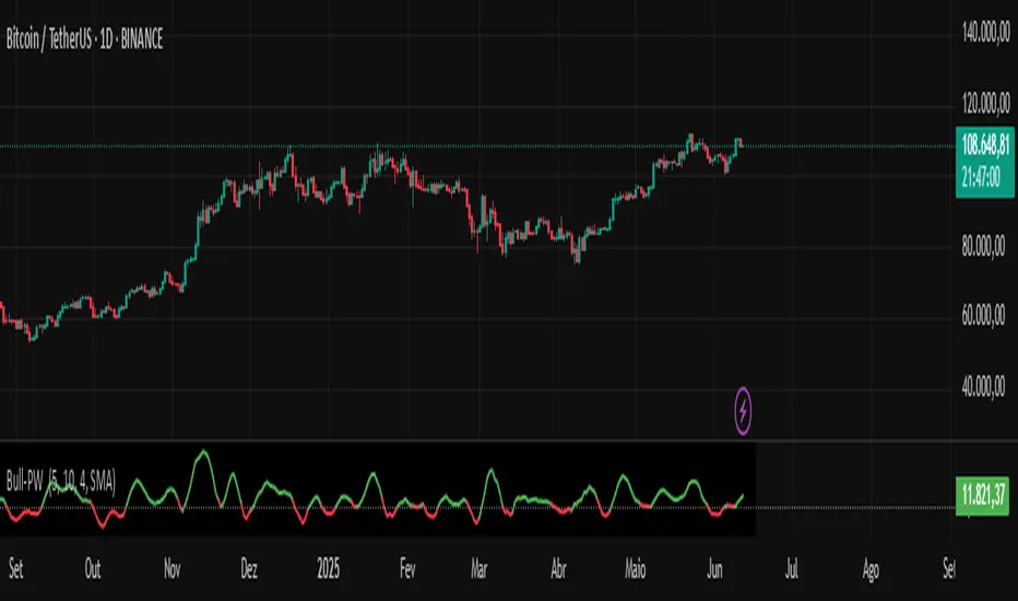
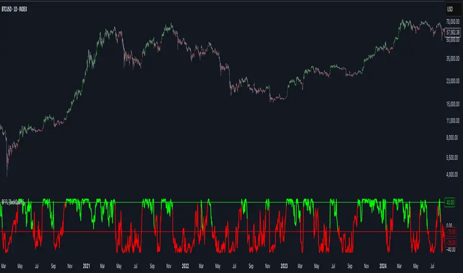
Best applied on 4H or Daily BTCUSD (or similar) charts to capture meaningful sell‑off events.
Combine with broader trend filters (e.g., moving averages) for trend‑aligned entries.
Adjust Sigmoid Steepness and Membership Sensitivity to fine‑tune signal crispness vs. smoothness. Refer to tooltips.
Disclaimer
This indicator is intended for educational purposes only. Always perform your own due diligence before making financial decisions.
Wskaźnik Pine Script®