Price % Change from Time HighDisplays the following.
Highest in Last (interval)
Current Price:
% From High:
% To High:
% From (internal) Chart High:
Wzrost

FCF Yield - cristianhkrThis indicator is a fundamental valuation tool that calculates Free Cash Flow Yield in real-time. Unlike standard indicators, this script solves the data gap for European companies reporting semi-annually and allows for short-term projections.
What is FCF Yield?
It is the real "interest rate" a company generates relative to its current market price.
Formula: FCF Yield = (Free Cash Flow / Market Cap) * 100
Key Features:
Timeframe Flexibility: Switch between TTM (Trailing Twelve Months), FY (Fiscal Year), and FQ (Fiscal Quarter).
Smart Fallback System: Essential for European stocks. If you select "Quarter" for a company that only reports semi-annually (like many European ones: Adidas, LVMH, Pluxee), the script automatically detects and uses the Semi-Annual (FH) data instead of showing an error.
Projection/Annualization: Option to annualize short-term data (multiplies Quarters x4 or Semi-Annuals x2) to estimate annual yield based on the last report.
Intuitive Visualization: Green area for positive cash generation and red for cash burn.
Interpretation Guide (Fundamental):
5%: Generally indicates an attractive valuation (the company generates significant cash relative to its price).
< 2%: The company might be overvalued or is a high-growth company reinvesting everything. Negative: The company is burning cash (liquidity risk or early expansion phase).

Performance Table: Standard DCA | Last 6-12-24-48MThis indicator visualizes Standard Dollar-Cost Averaging (DCA) performance across multiple time horizons (6M, 12M, 24M, 48M).
It summarizes invested capital, current portfolio value, net profit, and return percentage in a compact table, allowing quick comparison of short- and long-term DCA outcomes.
Designed for long-term investors, it helps evaluate how consistent periodic investments perform over time without relying on market timing.
The indicator is asset-agnostic and works on any symbol supported by TradingView.
Key use cases:
Long-term portfolio tracking
DCA strategy validation
Performance comparison across periods
Educational and analytical purposes
This tool focuses on clarity and realism, avoiding over-optimization and short-term noise.
--
I hope this table helps investors better understand long-term DCA performance.
Feedback and suggestions for improvement are always welcome.

Tradix COR Report Index📊 Tradix COT Report Index
The Tradix COT Report Index is an advanced market sentiment and positioning tool built on official Commitment of Traders (COT) Report data, designed to reveal how major market participants are truly positioned, beyond what price alone can show.
Instead of focusing on short-term price movements, the COT Report Index analyzes real futures positioning reported to the CFTC and categorizes it into three key groups:
Commercials – hedgers and so-called smart money
Non-Commercials – institutions, funds, and large speculators
Retail / Non-Reportables – small traders and crowd positioning
Raw positioning data (Long − Short) is transformed into a normalized 0–100 index, allowing traders to instantly identify extreme market sentiment, structural imbalances, and potential turning points — without manually interpreting complex COT tables.
🧠 How the Tradix COT Index Works
The index evaluates current net positions within a historical range (typically the last 52 weeks). This contextual approach makes it easy to see:
when Commercials are at extreme long or short levels
when speculative positioning becomes overcrowded
when the market reaches structural imbalance, increasing the probability of a mean-reversion or trend shift
By standardizing positioning data, the Tradix COT Index allows cross-market comparison, making it equally useful for indices, commodities, currencies, and futures-based CFDs.
🎯 How Traders Use It
The Tradix COT Report Index is not an entry signal tool.
Instead, it acts as a high-timeframe confirmation and market context indicator, commonly used for:
identifying long-term market bias
spotting divergences between price and positioning
confirming trend exhaustion or accumulation phases
filtering trades to align with institutional positioning
When combined with technical analysis, seasonality, and risk management, the COT Index provides a statistical edge rooted in real positioning data, not opinions or lagging indicators.
⚠️ Important Notes
COT data is updated weekly, not in real time
Best used on higher timeframes (Daily, Weekly)
Designed to enhance decision-making, not to replace trading systems

GOLD Dashboard: Realzins + DXY Filter (US10Y/T10YIE)The dashboard isn't a "signal generator," but a macro regime filter. It answers a single, core question:
Which direction do I currently have a structural advantage in gold—long, short, or neither?
I'll explain it to you clearly, practically, and without any theoretical baggage.

SHFE vs COMEX Silver Spread (USD/ozt)the script shows the gap between shanghai and comex silver prices. they need me to say more words in the description for this in order for me to in order to publish with words. more words.

Risk Adjusted Geometric Exponent [VynthraQuant]RAGE Index (Risk-Adjusted Geometric Exponent)
Overview
The RAGE Index is a quantitative momentum oscillator that measures the efficiency and quality of an asset's price trend. Standing for Risk-Adjusted Geometric Exponent , this indicator goes beyond simple price action by evaluating the average logarithmic growth rate relative to the asset's volatility.
In institutional finance, it is not just about how much an asset moves, but how it moves. RAGE identifies trends that exhibit high compounding growth with minimal "noise" or volatility.
The Logic Behind RAGE
The indicator is built on two core quantitative pillars:
1. Geometric Exponent (GE): Instead of simple percentage changes, we calculate the geometric mean of log-returns. This represents the true compounding "velocity" of the price.
2. Volatility Normalization: We divide the GE by the standard deviation of returns (Volatility) over a specific lookback period.
How to Interpret the RAGE Index
* The Zero Line: The most critical level. When RAGE crosses above 0, the asset has entered a state of positive geometric growth. Below 0, the asset is in a state of efficient decay.
* Trend Quality: A rising RAGE value indicates that the trend is becoming more "efficient", growth is increasing while volatility is staying low or decreasing.
* Color-Coded Candles: The script features a `force_overlay` function that colors the candles on your main chart.
* Bullish Color: Efficient growth detected (Long bias).
* Bearish Color: Efficient decay detected (Short bias).
Key Features
* Logarithmic Accuracy: Uses log-returns to ensure time-additivity and eliminate the bias found in standard percentage calculations.
* Adaptive to Volatility: Unlike a standard RSI or MACD, RAGE penalizes "choppy" price action, helping you stay out of sideways markets.
* Optimized Performance: Written in Pine Script v6 with high-efficiency math to ensure fast loading even on lower timeframes.
Settings
* GE Lookback: The window used to calculate the average growth rate.
* Volatility Lookback: The window used to measure the "risk" or noise of the price action.
General Disclaimer
This indicator is for informational and educational purposes only. It does not constitute financial advice. The creator bears no responsibility for any financial decisions or losses resulting from its use. Past performance is not indicative of future results.
Islamic Disclaimer
All trading activity should be approached with awareness of halal and haram principles. Ensure your investments, instruments, and methods align with Islamic ethical standards. This tool does not promote speculative or impermissible practices.

Geometric Exponent [VynthraQuant]Overview
The Geometric Exponent is a specialized momentum and trend-strength indicator designed to quantify the average logarithmic growth rate of an asset over a specific lookback period. Unlike standard moving averages, this indicator focuses on the geometric mean of returns, providing a more accurate representation of compounded growth or decay.
By smoothing out the noise of daily price fluctuations through log-returns, the Geometric Exponent helps traders identify the underlying "velocity" of a trend.
How it Works
The indicator calculates the log-return for each bar within the user-defined GE Lookback period. It then computes the arithmetic mean of these log-returns, which mathematically represents the exponent of the geometric growth over that window.
Positive Values: Indicate a period of geometric growth (upward trend).
Negative Values: Indicate a period of geometric decay (downward trend).
Zero Line: Acts as the equilibrium point where there is no net growth.
Key Features
Log-Return Basis: Better suited for financial time series analysis than simple percentage changes, as log-returns are time-additive.
Customizable Lookback: Adjust the GE Lookback to fit your trading style, from fast-reacting scalping to long-term trend following.
Clean Visuals: An oscillator-style plot that makes it easy to spot momentum shifts and divergences.
How to Use
Trend Confirmation: Look for the Geometric Exponent to stay consistently above zero for long-term bullish trends and below zero for bearish trends.
Mean Reversion: Extreme peaks or valleys in the exponent may suggest that the current growth rate is unsustainable, potentially signaling an upcoming retracement.
Divergence: If price makes a new high but the Geometric Exponent makes a lower high, it suggests the "compounding power" of the trend is weakening.
General Disclaimer
This indicator is for informational and educational purposes only. It does not constitute financial advice. The creator bears no responsibility for any financial decisions or losses resulting from its use. Past performance is not indicative of future results.
Islamic Disclaimer
All trading activity should be approached with awareness of halal and haram principles. Ensure your investments, instruments, and methods align with Islamic ethical standards. This tool does not promote speculative or impermissible practices.

Peter Lynch Value (Dynamic Growth)This indicator implements Peter Lynch's core valuation principle: Fair Price = Earnings Per Share (EPS) * Growth Rate.
It provides a dynamic "fair value" line overlaid on the price chart, allowing traders and investors to quickly assess whether a stock's current price is trading above or below its intrinsic value according to the Lynch method.
Key Features
1. Dynamic Growth Rate Calculation
The indicator uses a custom algorithm to calculate the critical EPS Growth Rate, making it robust against missing data from standard financial fields.
Methodology: It fetches historical TTM Diluted EPS reports (EARNINGS_PER_SHARE_DILUTED, TTM) and calculates the Year-over-Year (YoY) Growth Percentage from the current TTM value versus the TTM value 4 periods prior.
Reliability: This custom calculation ensures the value line appears even when TradingView's pre-calculated growth metrics are unavailable (na).
2. Multiplier Control
P/E Cap: You can enforce a maximum P/E multiplier (maxPE, default 25), preventing the fair value from becoming unrealistically high for extremely fast-growing companies (as Lynch suggested).
Fallback P/E: If insufficient financial history is available to calculate the growth rate, the indicator automatically switches to a user-defined fallbackPE (default 15) and highlights the line in orange as a warning.
3. Smoothing (Optional)
To reduce the volatility often seen in valuation metrics, you can apply an optional Simple Moving Average (SMA) to the Fair Value line. This helps visualize the underlying trend of intrinsic value.
4. Forward Estimate (Optional)
Display an optional projection (circles) based on the analysts' next Fiscal Year EPS Estimate (EARNINGS_ESTIMATE, FY). This shows the potential fair value if the company meets future expectations.
5. Diagnostic Table
A table in the corner provides transparency on the calculation:
Green/Red: Confirms if TTM EPS and Calculated Growth are found.
Final P/E Used: Shows the exact multiplier used (calculated growth or the manual fallback).
Disclaimer: This tool is for informational and educational purposes only and should not be considered financial advice.

PEAD ScreenerPEAD Screener - Post-Earnings Announcement Drift Scanner
═══════════════════════════════════════════════════════════════
WHY EARNINGS ANNOUNCEMENTS CREATE OPPORTUNITY
═══════════════════════════════════════════════════════════════
The days immediately following an earnings announcement are among the noisiest periods for any stock. Within hours, the market must digest new information about a company's profits, revenue, and future outlook. Analysts scramble to update their models. Institutions rebalance positions. Retail traders react to headlines.
This chaos creates a well-documented phenomenon called Post-Earnings Announcement Drift (PEAD): stocks that beat expectations tend to keep rising, while those that miss tend to keep falling - often for weeks after the initial announcement. Academic research has confirmed this pattern persists across decades and markets.
But not every earnings surprise is equal. A company that beats estimates by 5 cents might move very differently than one that beats by 5 cents with unusually high volume, or one where both earnings AND revenue exceeded expectations. Raw numbers alone don't tell the full story.
═══════════════════════════════════════════════════════════════
HOW "STANDARDIZED UNEXPECTED" METRICS CUT THROUGH THE NOISE
═══════════════════════════════════════════════════════════════
This screener uses a statistical technique to measure how "surprising" a result truly is - not just whether it beat or missed, but how unusual that beat or miss was compared to the company's own history.
The core idea: convert raw surprises into Z-scores.
A Z-score answers the question: "How many standard deviations away from normal is this result?"
- A Z-score of 0 means the result was exactly average
- A Z-score of +2 means the result was unusually high (better than ~95% of historical results)
- A Z-score of -2 means the result was unusually low
By standardizing surprises this way, we can compare apples to apples. A small-cap biotech's $0.02 beat might actually be more significant than a mega-cap's $0.50 beat, once we account for each company's typical variability.
This screener applies this standardization to three dimensions: earnings (SUE), revenue (SURGE), and volume (SUV).
═══════════════════════════════════════════════════════════════
THE 9 SCREENING CRITERIA
═══════════════════════════════════════════════════════════════
─────────────────────────────────────────
1. SUE (Standardized Unexpected Earnings)
─────────────────────────────────────────
WHAT IT IS:
SUE measures how surprising an earnings result was, adjusted for the company's historical forecast accuracy.
Calculation: Take the earnings surprise (actual EPS minus analyst estimate), then divide by the standard deviation of past forecast errors. This uses a rolling window of the last 8 quarters by default.
Formula: SUE = (Actual EPS - Estimated EPS) / Standard Deviation of Past Errors
HOW TO INTERPRET:
- SUE > +2.0: Strongly positive surprise - earnings beat expectations by an unusually large margin. These stocks often continue drifting higher.
- SUE between 0 and +2.0: Modest positive surprise - beat expectations, but within normal range.
- SUE between -2.0 and 0: Modest negative surprise - missed expectations, but within normal range.
- SUE < -2.0: Strongly negative surprise - significant miss. These stocks often continue drifting lower.
For long positions, look for SUE values above +2.0, ideally combined with positive SURGE.
─────────────────────────────────────────
2. SURGE (Standardized Unexpected Revenue)
─────────────────────────────────────────
WHAT IT IS:
SURGE applies the same standardization technique to revenue surprises. While earnings can be manipulated through accounting choices, revenue is harder to fake - it represents actual sales.
Calculation: Take the revenue surprise (actual revenue minus analyst estimate), then divide by the standard deviation of past revenue forecast errors.
Formula: SURGE = (Actual Revenue - Estimated Revenue) / Standard Deviation of Past Errors
HOW TO INTERPRET:
- SURGE > +1.5: Strongly positive revenue surprise - the company sold significantly more than expected.
- SURGE between 0 and +1.5: Modest positive surprise.
- SURGE < 0: Revenue missed expectations.
The most powerful signals occur when BOTH SUE and SURGE are positive and elevated (ideally SUE > 2.0 AND SURGE > 1.5). This indicates the company beat on both profitability AND top-line growth - a much stronger signal than either alone.
When SUE and SURGE diverge significantly (e.g., high SUE but negative SURGE), treat with caution - the earnings beat may have come from cost-cutting rather than genuine growth.
─────────────────────────────────────────
3. SUV (Standardized Unexpected Volume)
─────────────────────────────────────────
WHAT IT IS:
SUV detects unusual trading volume after accounting for how volatile the stock is. More volatile stocks naturally have higher volume, so raw volume comparisons can be misleading.
Calculation: This uses regression analysis to model the expected relationship between price volatility and volume. The "unexpected" volume is the residual - how much actual volume deviated from what the model predicted. This residual is then standardized into a Z-score.
In plain terms: SUV asks "Given how much this stock typically moves, is today's volume unusually high or low?"
HOW TO INTERPRET:
- SUV > +2.0: Exceptionally high volume relative to the stock's volatility. This often signals institutional activity - big players moving in or out.
- SUV between +1.0 and +2.0: Elevated volume - above normal interest.
- SUV between -1.0 and +1.0: Normal volume range.
- SUV < -1.0: Unusually quiet - less activity than expected.
High SUV combined with positive price movement suggests accumulation (buying). High SUV combined with negative price movement suggests distribution (selling).
─────────────────────────────────────────
4. % From D0 Close
─────────────────────────────────────────
WHAT IT IS:
This measures how far the current price has moved from the closing price on its initial earnings reaction day (D0). The "reaction day" is the first trading day that fully reflects the earnings news - typically the day after an after-hours announcement, or the announcement day itself for pre-market releases.
Calculation: ((Current Price - D0 Close) / D0 Close) × 100
HOW TO INTERPRET:
- Positive values: Stock has gained ground since earnings. The higher the percentage, the stronger the post-earnings drift.
- 0% to +5%: Modest positive drift - earnings were received well but momentum is limited.
- +5% to +15%: Strong drift - buyers continue accumulating.
- > +15%: Exceptional drift - significant institutional interest likely.
- Negative values: Stock has given back gains or extended losses since earnings. May indicate the initial reaction was overdone, or that sentiment is deteriorating.
This metric is most meaningful within the first 5-20 trading days after earnings. Extended drift (maintaining gains over 2+ weeks) is a stronger signal than a quick spike that fades.
─────────────────────────────────────────
5. # Pocket Pivots
─────────────────────────────────────────
WHAT IT IS:
Pocket Pivots are a volume-based pattern developed by Chris Kacher and Gil Morales. They identify days where institutional buyers are likely accumulating shares without causing obvious breakouts.
Calculation: A Pocket Pivot occurs when:
- The stock closes higher than it opened (up day)
- The stock closes higher than the previous day's close
- Today's volume exceeds the highest down-day volume of the prior 10 trading sessions
The screener counts how many Pocket Pivots have occurred since the earnings announcement.
HOW TO INTERPRET:
- 0 Pocket Pivots: No detected institutional accumulation patterns since earnings.
- 1-2 Pocket Pivots: Some institutional buying interest - worth monitoring.
- 3+ Pocket Pivots: Strong accumulation signal - institutions appear to be building positions.
Pocket Pivots are most significant when they occur:
- Immediately following earnings announcements
- Near moving average support (10-day, 21-day, or 50-day)
- On above-average volume
- After a period of price consolidation
Multiple Pocket Pivots in a short period suggest sustained institutional demand, not just a one-day event.
─────────────────────────────────────────
6. ADX/DI (Trend Strength and Direction)
─────────────────────────────────────────
WHAT IT IS:
ADX (Average Directional Index) measures trend strength regardless of direction. DI (Directional Indicator) shows whether the trend is bullish or bearish.
Calculation: ADX uses a 14-period lookback to measure how directional (trending) price movement is. Values range from 0 to 100. The +DI and -DI components compare upward and downward movement.
The screener shows:
- ADX value (trend strength)
- Direction indicator: "+" for bullish (price trending up), "-" for bearish (price trending down)
HOW TO INTERPRET:
- ADX < 20: Weak trend - the stock is moving sideways, choppy. Not ideal for momentum trading.
- ADX 20-25: Trend is emerging - potentially starting a directional move.
- ADX 25-40: Strong trend - clear directional movement. Good for momentum plays.
- ADX > 40: Very strong trend - powerful move in progress, but may be extended.
The direction indicator (+/-) tells you which way:
- "25+" means ADX of 25 with bullish direction (uptrend)
- "25-" means ADX of 25 with bearish direction (downtrend)
For post-earnings plays, ideal setups show ADX rising above 25 with positive direction, confirming the earnings reaction is developing into a sustained trend rather than a one-day spike.
─────────────────────────────────────────
7. Institutional Buying PASS
─────────────────────────────────────────
WHAT IT IS:
This proprietary composite indicator detects patterns consistent with institutional accumulation at three stages after earnings:
EARLY (Days 0-4): Looks for "large block" buying on the earnings reaction day (exceptionally high volume with a close in the upper half of the day's range) combined with follow-through buying on the next day.
MID (Days 5-9): Checks for sustained elevated volume (averaging 1.5x the 20-day average) combined with positive drift and consistent upward price movement (more up days than down days).
LATE (Days 10+): Detects either visible accumulation (positive drift with high volume) OR stealth accumulation (positive drift with unusually LOW volume - suggesting smart money is quietly building positions without attracting attention).
HOW TO INTERPRET:
- Check mark/value of '1': Institutional buying pattern detected. The stock shows characteristics consistent with large players accumulating shares.
- X mark/value of '0': No institutional buying pattern detected. This doesn't mean institutions aren't buying - just that the typical footprints aren't visible.
A passing grade here adds conviction to other bullish signals. Institutions have research teams, information advantages, and long time horizons. When their footprints appear in the data, it often precedes sustained moves.
Important: This is a pattern detection tool, not a guarantee. Always combine with other analysis.
─────────────────────────────────────────
8. Strong ATR Drift PASS
─────────────────────────────────────────
WHAT IT IS:
This measures whether the stock has drifted significantly relative to its own volatility. Instead of asking "did it move 10%?", it asks "did it move more than 1.5 ATRs?"
ATR (Average True Range) measures a stock's typical daily movement. A volatile stock might move 5% daily, while a stable stock might move 0.5%. Using ATR normalizes for this difference.
Calculation:
ATR Drift = (Current Close - D0 Close) / D0 ATR in dollars
The indicator passes when ATR Drift exceeds 1.5 AND at least 5 days have passed since earnings.
HOW TO INTERPRET:
- Check mark/value of '1': The stock has drifted more than 1.5 times its average daily range since earnings - a statistically significant move that suggests genuine momentum, not just noise.
- X mark/value of '0': The drift (if any) is within normal volatility bounds - could just be random fluctuation.
Why wait 5 days? The immediate post-earnings reaction (days 0-2) often includes gap fills and noise. By day 5, if the stock is still extended beyond 1.5 ATRs from the earnings close, it suggests real buying pressure, not just a reflexive gap.
A passing grade here helps filter out stocks that "beat earnings" but haven't actually moved meaningfully. It focuses attention on stocks where the market is voting with real capital.
─────────────────────────────────────────
9. Days Since D0
─────────────────────────────────────────
WHAT IT IS:
Simply counts the number of trading days since the earnings reaction day (D0).
HOW TO INTERPRET:
- Days 0-5 (Green): Fresh earnings - the information is new, institutional repositioning is active, and momentum trades are most potent. This is the "sweet spot" for PEAD strategies.
- Days 6-10 (Neutral): Mid-period - some edge remains but diminishing. Good for adding to winning positions, less ideal for new entries.
- Days 11+ (Red): Extended period - most of the post-earnings drift has typically played out. Higher risk that momentum fades or reverses.
Research shows PEAD effects are strongest in the first 5-10 days after earnings, then decay. Beyond 20-30 days, the informational advantage of the earnings surprise is largely priced in.
Use this to prioritize: focus on stocks with strong signals that are still in the early window, and be more selective about entries as days accumulate.
═══════════════════════════════════════════════════════════════
PUTTING IT ALL TOGETHER
═══════════════════════════════════════════════════════════════
You can use this screener in the chart view or in the Screener.
One combination of the above filters to develop a shortlist of positive drift candidates may be:
- SUE > 2.0 (significant earnings beat)
- SURGE > 1.5 (significant revenue beat)
- Positive % From D0 Close (price confirming the good news)
- Institutional Buying PASS (big players accumulating)
- Strong ATR Drift PASS (statistically significant movement)
- Days Since D0 < 10 (still in the active drift window)
No single indicator is sufficient. The power comes from convergence - when multiple independent measures all point the same direction.
═══════════════════════════════════════════════════════════════
SETTINGS
═══════════════════════════════════════════════════════════════
Key adjustable parameters:
- SUE Method: "Analyst-based" uses consensus estimates; "Time-series" uses year-over-year comparison
- Window Size: Number of quarters used for standardization (default: 8)
- ATR Drift Threshold: Minimum ATR multiple for "strong" classification (default: 1.5)
- Institutional Buying thresholds: Adjustable volume and CLV parameters
═══════════════════════════════════════════════════════════════
DISCLAIMER
═══════════════════════════════════════════════════════════════
This screener is a research tool, not financial advice. Past patterns do not guarantee future results. Always conduct your own due diligence and manage risk appropriately. Post-earnings trading involves significant uncertainty and volatility. The 'SUE' in this indicator does not represent a real person; any similarity to actual Sue's (or Susans for that matter) living or dead is quite frankly ridiculous, not to mention coincidental.

Scalp Boost LONG✦ Overview
Scalp Boost LONG is a visual tool designed to highlight potential short-term upward impulses.
A signal is generated only when multiple market conditions align at the candle close, combining momentum dynamics, local probability shifts, and abnormal volume behavior.
The indicator does not repaint.
✦ Concept
The tool focuses on selective situations where the market shows signs of micro-breakout potential.
If all internal conditions are confirmed — a LONG event is displayed.
If not — the chart remains clean.
This builds a low-noise signal model, prioritizing quality over frequency.
✦ Signal Logic
The LONG signal requires confirmation of all core conditions:
• Local impulse dynamics
Identifies short-term acceleration suggesting a breakout from a compressed price structure.
• Probability beyond a statistical zone
Uses relative breakout probability instead of fixed levels, checking whether price exceeds expected local ranges.
• Abnormal volume activity
Highlights candles with monetary flow above a custom threshold, signaling increased market interest.
• Anti-overheat filter
Conditions avoiding exhausted or low-momentum phases where continuation is less likely.
Only when all filters are aligned a LONG marker appears.
✦ Visual Structure
The chart display is intentionally minimal:
• ROC Curve
Subdued line, showing short-term momentum without distraction.
• LONG Marker
Green triangle below the candle on confirmed events.
• Candle Highlight
Soft background highlight on the signal bar.
• Volume Marker
Small red dot at the bottom of candles with abnormal monetary flow.
All visual elements appear only on candle close.
✦ Alerts
A clean event structure is available for notifications:
LONG Signal
This allows receiving alerts during chart analysis or in automated workflows while keeping full control over decision-making.
✦ Notes & Guidelines
This tool:
is not a trading system,
does not provide targets or stops,
may trigger against the dominant trend,
should be combined with the user’s own methodology.
Signals are rare by design.
Do not interpret each event as a trend continuation — it highlights conditions, not outcomes.
✦ Suggested Use
-(Non-mandatory ideas for advanced users)
-identifying potential micro-breakouts,
-timing entries around volume spikes,
-adding context to scalping models,
-filtering impulsive moves from noise.
-suitable for a 5-minute timeframe
The indicator can be helpful as a confirmation layer, not a standalone decision tool.

MarketSurge EPS Line [tradeviZion]MarketSurge EPS Line
EPS trend line overlay for TradingView charts, inspired by the IBD MarketSurge (formerly MarketSmith) EPS line style.
Comparison: Left side shows IBD MarketSurge EPS line as reference. Right side shows this TradingView script producing similar output with interactive tooltips. The left side image is for reference only to demonstrate similarity - it is not part of the TradingView script.
Features:
Displays EPS trend line on price charts
Uses 4-quarter earnings moving average
Shows earnings momentum over time
Works with actual, estimated, or standardized earnings data
Customizable line color and width
Interactive tooltips with detailed earnings information
Custom symbol analysis support
How to Use:
Add script to chart
EPS line appears automatically
Adjust color and width in settings if needed
Hover over line for earnings details
Settings Explained:
Display Settings:
Show EPS Line: Toggle to show or hide the EPS trend line
EPS Line Color: Choose the color for the EPS trend line and labels
EPS Line Width: Adjust the thickness of the EPS trend line (1-5 pixels)
Symbol Settings:
By default, the indicator analyzes the EPS data for the symbol currently displayed on your chart. The Custom Symbol feature allows you to:
Analyze EPS data for a different symbol without changing your chart
Compare earnings trends of related stocks or competitors
View EPS data for one symbol while analyzing price action of another
To use Custom Symbol:
Enable "Use Custom Symbol" checkbox
Click on "Custom Symbol" field to open TradingView's symbol picker
Search and select the symbol you want to analyze
The indicator will fetch and display EPS data for the selected symbol
Note: The chart will still show price action for your current symbol, but the EPS line will reflect the custom symbol's earnings data.
Data Settings:
EPS Field: Choose which earnings data source to use:
Actual Earnings: Reported earnings from company financial statements (default). Use this to analyze historical performance based on what companies actually reported.
Estimated Earnings: Analyst consensus forecasts for future quarters. Use this to see what analysts expect and compare expectations with actual results.
Standardized Earnings: Earnings adjusted for comparability across companies. Use this when comparing multiple stocks as it normalizes accounting differences.
Display Scale:
For the indicator to display correctly on the existing chart, it uses its own axis (right scale) by default. However, you can change this, but the view will not look the same. The right scale is recommended for optimal visibility as it allows the EPS line to be clearly visible alongside price action without compression.
Example: EPS line on separate right scale (recommended) - hover over labels to view detailed earnings tooltips
Example: EPS line pinned to Scale A (not recommended - appears as straight line due to small EPS range compared to price)
Example: EPS line displayed in separate pane below price chart
Methodology Credits:
This indicator implements the EPS line visualization methodology developed by Investor's Business Daily (IBD) for their MarketSurge platform (formerly known as MarketSmith). The EPS line concept helps visualize earnings momentum alongside price action, providing a fundamental overlay for technical analysis.
Technical Details:
Designed for daily, weekly, and monthly timeframes
Minimum 4 quarters of earnings data required
Uses TradingView's built-in earnings data
Automatically handles missing or invalid data
This indicator helps you visualize earnings trends alongside price action, providing a fundamental overlay for your technical analysis.

Quantum Portfolio vs S&P 500 (Base: May 2, 2021)This script compares the performance of a custom Quantum Portfolio — a weighted basket of quantum computing, semiconductor, and cybersecurity stocks — against the S&P 500 Index, with both series rebased to 100 on May 2 2021.
It provides a clear, normalized view of cumulative returns, allowing you to visualize portfolio outperformance or underperformance relative to the broader market benchmark.

Quantum Portfolio vs NASDAQ (Base: May 2, 2021)This custom Pine Script indicator tracks and compares the cumulative performance of a multi-asset “Quantum Portfolio” against the NASDAQ 100 benchmark, rebased to a common starting point on May 2, 2021.
Both series are normalized to a base value of 100 on that date, allowing direct visual comparison of percentage growth or decline over time.

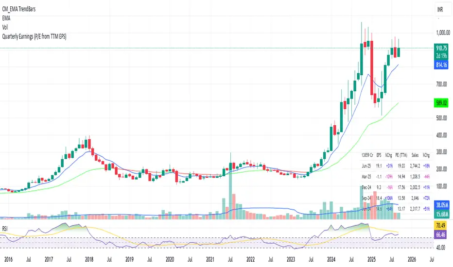
Quarterly Earnings - v1This script shows company fundamentals in a TradingView table: Earnings Per Share (EPS), Price-to-Earnings Ratio (P/E, TTM), Sales (in Crores), Operating Margin (OPM %), Return on Assets (ROA %), and Return on Equity (ROE %).
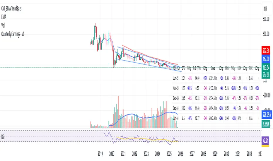
Quarterly Earnings - v1This script shows company fundamentals in a TradingView table: Earnings Per Share (EPS), Price-to-Earnings Ratio (P/E, TTM), Sales (in Crores), Operating Margin (OPM %), Return on Assets (ROA %), and Return on Equity (ROE %).
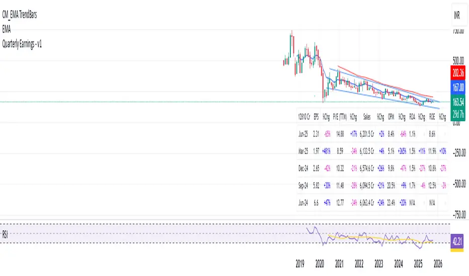
Quarterly EarningsEarnings Per Share (EPS), Price-to-Earnings Ratio (P/E, TTM), Sales (in Crores), Operating Margin (OPM %), Return on Assets (ROA %), and Return on Equity (ROE %). Each metric includes its absolute value and quarter-over-quarter or year-over-year percentage change.

Quarterly EarningsThis Pine script shows quarterly EPS, Sales, and P/E (TTM-based) in a styled table.
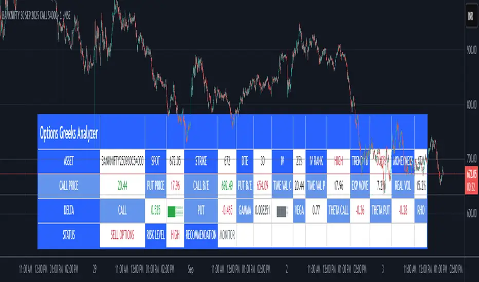
Options Greeks AnalyzerOptions Greeks Analyzer (Training & Learning Guide)
________________________________________
1. Introduction
Options trading is advanced compared to regular stock trading, and one of the most important aspects is Options Greeks. Greeks are mathematical values that measure how the price of an option will react to changes in various factors such as the underlying asset’s price, volatility, interest rates, and time to expiry.
This Options Greeks Analyzer tool is built using TradingView Pine Script v5. It serves as a real time training and analysis dashboard that helps learners visualize how options greeks behave, how option prices change, and how traders can make informed decisions.
📌 Educational Disclaimer:
This tool is only for training and learning purposes. It is not a financial advice tool nor to be used for live trading decisions. The data shown is theoretical Black Scholes model calculations, which may differ from actual option market prices.
________________________________________
2. How the Tool Works
The Options Greeks Analyzer is divided into different modules. Below is a step by step walkthrough:
________________________________________
Step 1: User Inputs
• Implied Volatility (IV%) — You can manually enter volatility, which is the most important factor in option pricing. Higher IV = higher option premium.
• Expiry Selection — Choose from preset durations like 7D, 14D, 30D etc. Days to expiry directly affect time decay (Theta).
• Strike Price Mode — You can select either:
o ATM (At-the-Money = Current price of stock/index)
o Custom strike (Enter your own strike price)
• Risk-Free Rate (%) — A small interest rate factor (like government bond yield) used for theoretical valuation.
• Table Customization — Choose table size, position, and whether to show price lines for easy visibility.
________________________________________
Step 2: Market Data & Volatility
• The tool takes the current market price (Spot Price) as input.
• It calculates realized volatility from historical price fluctuations (using past 30 bars/log returns).
• Implied Volatility (manual input) is then compared to realized vol:
o If IV > Historical Volatility → Market pricing is “expensive” (HIGH IV RANK).
o If IV < Historical Volatility → Market is “cheap” (LOW IV RANK).
o Otherwise, it’s MEDIUM.
📌 Why it matters?
Traders can decide whether buying or selling options is favorable. Beginners learn that timing entry with volatility is more critical than just looking at market direction.
________________________________________
Step 3: Black-Scholes Formula
The core engine uses the Black-Scholes model, a mathematical formula widely used to compute option fair prices.
It uses the following inputs:
• Current price (Spot)
• Strike Price
• Time to Expiry (T)
• Risk Free Rate (r)
• Implied Volatility (σ)
This produces:
• Call Option Price
• Put Option Price
📌 This teaches learners how premiums are derived theoretically and why the same strike can have different values depending on IV and time.
________________________________________
Step 4: Option Greeks Calculation
The tool computes the first order Greeks:
• Delta → Measures how much the option price changes when the underlying stock moves by 1 point.
(Call Delta ranges 0–1, Put Delta ranges -1 to 0).
• Gamma → Sensitivity of Delta to price change. A measure of volatility risk.
• Theta → Time decay. Shows how much value option loses as each day passes. Calls and Puts have negative Theta (decay).
• Vega → Measures how sensitive option price is to volatility changes.
• Rho → Interest rate sensitivity. Mostly minor in equity options but important for training.
📌 New traders learn how each factor impacts profits/losses. Instead of random guessing, they see mathematical impact in numbers.
________________________________________
Step 5: Dashboard & Visualization
The tool builds a professional dashboard table on the chart.
It shows categories such as:
1. Asset Info — Spot, Strike, DTE (days to expiry), IV%, IV Rank, 1-Day Trend, Moneyness (ATM/OTM/ITM).
2. Option Prices — Call, Put, Break-even levels, Time Value, Expected Move (%), Realized vs Implied Vol.
3. Greeks with Visual Progress Bars — Easily shows Delta, Gamma, Vega, Theta, Rho in intuitive graphical representations.
4. Status Bar — Suggests theoretical bias like:
o HIGH IV → Favor Option Selling
o LOW IV → Favor Option Buying
o MEDIUM → Neutral observation
5. Recommendation Line — Offers training-based suggestions like “Buy Straddles”, “Sell Call Spreads”, etc. These are not signals, but scenarios to learn strategies.
________________________________________
3. How It Helps Beginners
1. Learn Greeks in Action:
Beginners often memorize formulas but never see real-time changes. This dashboard updates every bar to show how Greeks change dynamically.
2. Compare Volatilities:
Traders understand difference between historical vs implied volatility and why option premiums behave differently.
3. Understand Risk Levels:
The tool highlights when Gamma risk is high (danger for sellers) or when Theta is most favorable.
4. Training Mode for Strategies:
Helps beginners experiment by changing IV, strike, expiry and seeing how straddles, spreads, naked options would behave theoretically.
5. Prepares Before Live Trading:
Safe environment to practice option analysis without risking capital.
________________________________________
4. Educational Use Cases
• Scenario 1: Change expiry from 7D to 30D — see how Theta becomes slower for longer expiries.
• Scenario 2: Increase IV from 25% to 80% — watch how option premiums inflate, and recommendation changes from “Buy” to “Sell”.
• Scenario 3: Select OTM vs ITM strikes — check how delta moves from near 0 to near 1.
By running these scenarios, learners understand why professional traders hedge Greeks instead of directional gambling.
________________________________________
5. Disclaimer
This Options Greeks Analyzer is built strictly for educational and training purposes.
• It uses theoretical formulas (Black-Scholes) that may not match actual option market prices.
• The recommendations are for learning strategy logic only, not real-world execution signals.
• Trading in options carries significant risks and may result in capital loss.
📌 Always consult with a financial advisor before applying real strategies.
________________________________________
✅ Summary
This Options Greeks Analyzer:
• Teaches how Greeks, IV, and premiums work.
• Provides a real-time interactive dashboard for training.
• Helps beginners practice option scenarios safely.
• Is meant strictly for learning and not live trading execution.
________________________________________
________________________________________
Disclaimer from aiTrendview
This script and its trading signals are provided for training and educational purposes only. They do not constitute financial advice or a guaranteed trading system. Trading involves substantial risk, and there is the potential to lose all invested capital. Users should perform their own analysis and consult with qualified financial professionals before making any trading decisions. aiTrendview disclaims any liability for losses incurred from using this code or trading based on its signals. Use this tool responsibly, and trade only with risk capital.
Trading bot gridsGuide: Price Lines – Arithmetic vs. Geometric
This script draws horizontal price lines (grids) between a start price and an end price.
You can choose whether the lines are distributed evenly (arithmetic) or by percentage (geometric).
🔧 Inputs
Start Price → Lower or upper boundary of the price range.
End Price → Opposite boundary of the price range.
Number of Lines → Total number of lines to be drawn between the start and end prices.
Distribution →
Arithmetic: Fixed USDT distance between each line.
Geometric: Fixed percentage distance between each line.
Grid Color → Color of the drawn lines.
📈 How it Works
The script calculates the lower (lo) and upper (hi) boundaries, regardless of which is entered first.
Arithmetic distribution: Each line is spaced by a fixed amount in USDT.
Geometric distribution: Each line is spaced by the same percentage difference from the previous one.
Lines are created only once at the first bar and remain on the chart.
All lines are extended across the entire visible chart.
💡 Tips
Useful for Grid Bot backtesting or visualizing price zones.
Works for both long and short price ranges.
In geometric mode, lines appear closer together near the lower price range and farther apart toward the upper range.

Bitcoin Logarithmic Growth Curve 2025 Z-Score"The Bitcoin logarithmic growth curve is a concept used to analyze Bitcoin's price movements over time. The idea is based on the observation that Bitcoin's price tends to grow exponentially, particularly during bull markets. It attempts to give a long-term perspective on the Bitcoin price movements.
The curve includes an upper and lower band. These bands often represent zones where Bitcoin's price is overextended (upper band) or undervalued (lower band) relative to its historical growth trajectory. When the price touches or exceeds the upper band, it may indicate a speculative bubble, while prices near the lower band may suggest a buying opportunity.
Unlike most Bitcoin growth curve indicators, this one includes a logarithmic growth curve optimized using the latest 2024 price data, making it, in our view, superior to previous models. Additionally, it features statistical confidence intervals derived from linear regression, compatible across all timeframes, and extrapolates the data far into the future. Finally, this model allows users the flexibility to manually adjust the function parameters to suit their preferences.
The Bitcoin logarithmic growth curve has the following function:
y = 10^(a * log10(x) - b)
In the context of this formula, the y value represents the Bitcoin price, while the x value corresponds to the time, specifically indicated by the weekly bar number on the chart.
How is it made (You can skip this section if you’re not a fan of math):
To optimize the fit of this function and determine the optimal values of a and b, the previous weekly cycle peak values were analyzed. The corresponding x and y values were recorded as follows:
113, 18.55
240, 1004.42
451, 19128.27
655, 65502.47
The same process was applied to the bear market low values:
103, 2.48
267, 211.03
471, 3192.87
676, 16255.15
Next, these values were converted to their linear form by applying the base-10 logarithm. This transformation allows the function to be expressed in a linear state: y = a * x − b. This step is essential for enabling linear regression on these values.
For the cycle peak (x,y) values:
2.053, 1.268
2.380, 3.002
2.654, 4.282
2.816, 4.816
And for the bear market low (x,y) values:
2.013, 0.394
2.427, 2.324
2.673, 3.504
2.830, 4.211
Next, linear regression was performed on both these datasets. (Numerous tools are available online for linear regression calculations, making manual computations unnecessary).
Linear regression is a method used to find a straight line that best represents the relationship between two variables. It looks at how changes in one variable affect another and tries to predict values based on that relationship.
The goal is to minimize the differences between the actual data points and the points predicted by the line. Essentially, it aims to optimize for the highest R-Square value.
Below are the results:
snapshot
snapshot
It is important to note that both the slope (a-value) and the y-intercept (b-value) have associated standard errors. These standard errors can be used to calculate confidence intervals by multiplying them by the t-values (two degrees of freedom) from the linear regression.
These t-values can be found in a t-distribution table. For the top cycle confidence intervals, we used t10% (0.133), t25% (0.323), and t33% (0.414). For the bottom cycle confidence intervals, the t-values used were t10% (0.133), t25% (0.323), t33% (0.414), t50% (0.765), and t67% (1.063).
The final bull cycle function is:
y = 10^(4.058 ± 0.133 * log10(x) – 6.44 ± 0.324)
The final bear cycle function is:
y = 10^(4.684 ± 0.025 * log10(x) – -9.034 ± 0.063)
The main Criticisms of growth curve models:
The Bitcoin logarithmic growth curve model faces several general criticisms that we’d like to highlight briefly. The most significant, in our view, is its heavy reliance on past price data, which may not accurately forecast future trends. For instance, previous growth curve models from 2020 on TradingView were overly optimistic in predicting the last cycle’s peak.
This is why we aimed to present our process for deriving the final functions in a transparent, step-by-step scientific manner, including statistical confidence intervals. It's important to note that the bull cycle function is less reliable than the bear cycle function, as the top band is significantly wider than the bottom band.
Even so, we still believe that the Bitcoin logarithmic growth curve presented in this script is overly optimistic since it goes parly against the concept of diminishing returns which we discussed in this post:
This is why we also propose alternative parameter settings that align more closely with the theory of diminishing returns."
Now with Z-Score calculation for easy and constant valuation classification of Bitcoin according to this metric.
Created for TRW

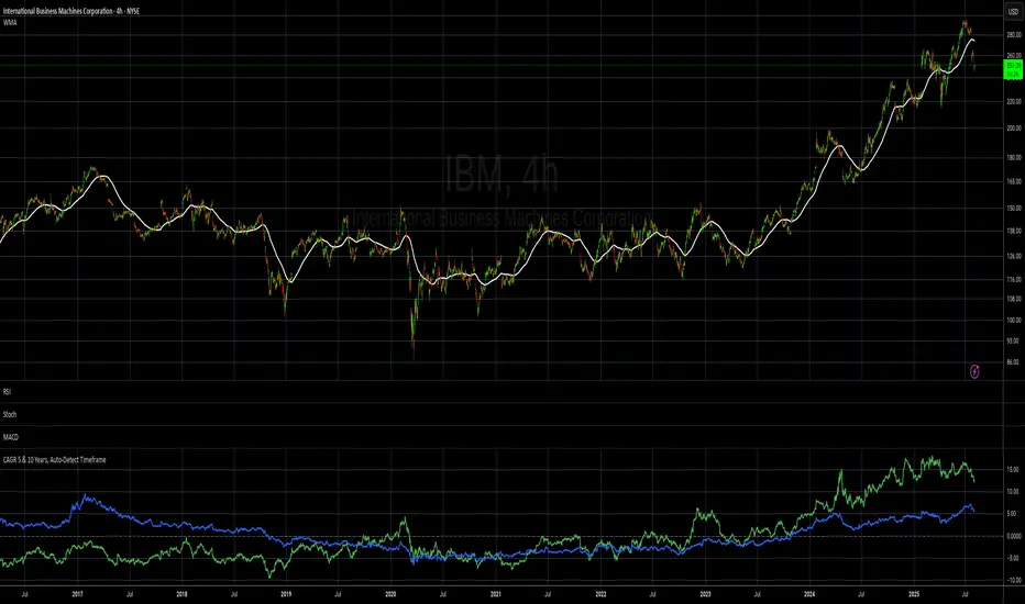
CAGR 5 & 10 Years, Auto-Detect Timeframe# CAGR 5 & 10 Years, Auto-Detect Timeframe
## Overview
This indicator automatically calculates the **Compound Annual Growth Rate (CAGR)** for 5-year and 10-year periods, adapting intelligently to different asset types and timeframes.
## Key Features
### 🤖 **Smart Market Detection**
- **Automatically detects** if the asset operates 24/7 (crypto, crypto futures) or traditional hours (stocks, forex)
### ⏰ **Multi-Timeframe Support**
**Compatible timeframes**: 1H, 2H, 3H, 4H, 6H, 8H, 12H, 1D, 3D, 1W, 1M, 3M, 6M, 12M
### 📊 **Visual Display**
- **Green line**: 5-year CAGR percentage
- **Blue line**: 10-year CAGR percentage
- **Zero reference line** for easy interpretation
## Use Cases
- **Long-term performance analysis** across different timeframes
- **Cross-asset comparison** with automatic market type adjustment
- **Investment planning** with standardized annual growth rates
- **Historical perspective** on asset performance
Perfect for investors and analysts who need consistent, comparable growth metrics across different assets and market types.
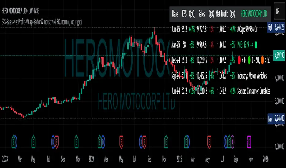
EPS+Sales+Net Profit+MCap+Sector & Industry📄 Full Description
This script displays a comprehensive financial data panel directly on your TradingView chart, helping long-term investors and swing traders make informed decisions based on fundamental trends. It consolidates key financial metrics and business classification data into a single, visually clear table.
🔍 Key Features:
🧾 Financial Metrics (Auto-Fetched via request.financial):
EPS (Earnings Per Share) – Displayed with trend direction (QoQ or YoY).
Sales / Revenue – In ₹ Crores (for Indian stocks), trend change also included.
Net Profit – Also in ₹ Crores, along with percentage change.
Market Cap – Automatically calculated using outstanding shares × price, shown in ₹ Cr.
Free Float Market Cap – Based on float shares × price, also in ₹ Cr.
🏷️ Sector & Industry Info:
Automatically identifies and displays the Sector and Industry of the stock using syminfo.sector and syminfo.industry.
Displayed inline with metrics, making it easy to know what business the stock belongs to.
📊 Table View:
Compact and responsive table shown on your chart.
Columns: Date | EPS | QoQ | Sales | QoQ | Net Profit | QoQ | Metrics
Metrics column dynamically shows:
Market Cap
Free Float
Sector (Row 4)
Industry (Row 5)
🌗 Appearance:
Supports Dark Mode and Mini Mode toggle.
You can also customize:
Number of data points (last 4+ quarters or years)
Table position and size
🎯 Use Case:
This script is ideal for:
Fundamental-focused traders who use EPS/Sales trends to identify momentum.
Swing traders who combine price action with fundamental tailwinds.
Portfolio builders who want to see sector/industry alignment quickly.
It works best with fundamentally sound stocks where earnings and profitability are a major factor in price movements.
✅ Important Notes:
Script uses request.financial which only works with supported symbols (mostly stocks).
Market Cap and Free Float are calculated in ₹ Crores.
All financial values are rounded and formatted for readability (e.g., 1,234 Cr).
🙏 Credits:
Developed and published by Sameer Thorappa
Built with a clean, minimalist approach for high readability and functionality.