Non-standard chart types data
There are additional functions that you may apply to tickerid
function return value. They are heikinashi, renko,
linebreak, kagi and pointfigure. All of them work in the
same manner, they just create a special ticker identifier that could be
passed later as security function first argument.
Note that the “source” argument of the renko, kagi, and linebreak functions is deprecated and is used up to the third (inclusive) version of Pine.
heikinashi function
Heikin-Ashi means ‘average bar’ in Japanese. Open, high, low and close prices of HA candlesticks are not actual prices, they are results from avergaing values of the previous bar, which helps eliminate random volatility.
Pine function heikinashi
creates a special ticker identifier for
requesting Heikin-Ashi data with security function.
This script requests low prices of Heikin-Ashi bars and plots them on top of usual OHLC bars:
study("Example 5", overlay=true)
ha_t = heikinashi(tickerid)
ha_low = security(ha_t, period, low)
plot(ha_low)
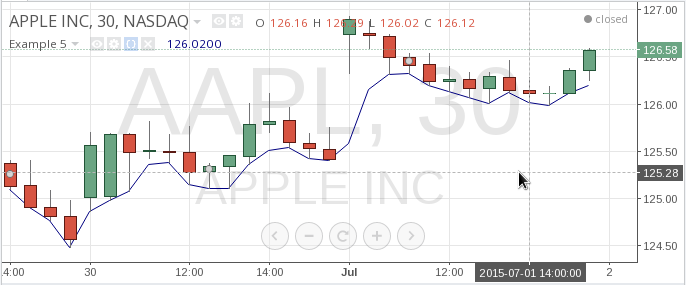
Note that low prices of Heikin-Ashi bars are different from usual bars low prices.
You may want to switch off extended hours data in Example 5. In this
case we should use tickerid function instead of tickerid
variable:
study("Example 6", overlay=true)
t = tickerid(syminfo.prefix, ticker, session.regular)
ha_t = heikinashi(t)
ha_low = security(ha_t, period, low, true)
plot(ha_low, style=linebr)
Note that we pass additional fourth parameter to security (gaps which is set to true),
and it means that points where data is absent, will not be filled up
with previous values. So we’d get empty areas during the extended hours.
To be able to see this on chart we also had to specify special plot
style (style=linebr — Line With Breaks style).
You may plot Heikin-Ashi bars exactly as they look from Pine script. Here is the source code:
study("Example 6.1")
ha_t = heikinashi(tickerid)
ha_open = security(ha_t, period, open)
ha_high = security(ha_t, period, high)
ha_low = security(ha_t, period, low)
ha_close = security(ha_t, period, close)
palette = ha_close >= ha_open ? lime : red
plotcandle(ha_open, ha_high, ha_low, ha_close, color=palette)
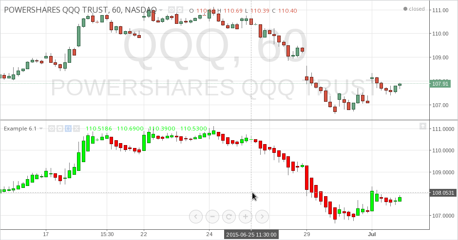
Read more about plotcandle (and plotbar) functions in section Custom OHLC bars and candles.
renko function
Renko chart type only plots price movements, without taking time or volume into consideration. It is constructed from ticks and looks like bricks stacked in adjacent columns [1]. A new brick is drawn after the price passes the top or bottom of previously predefined amount.
study("Example 7", overlay=true)
renko_t = renko(tickerid, "close", "ATR", 10)
renko_low = security(renko_t, period, low)
plot(renko_low)
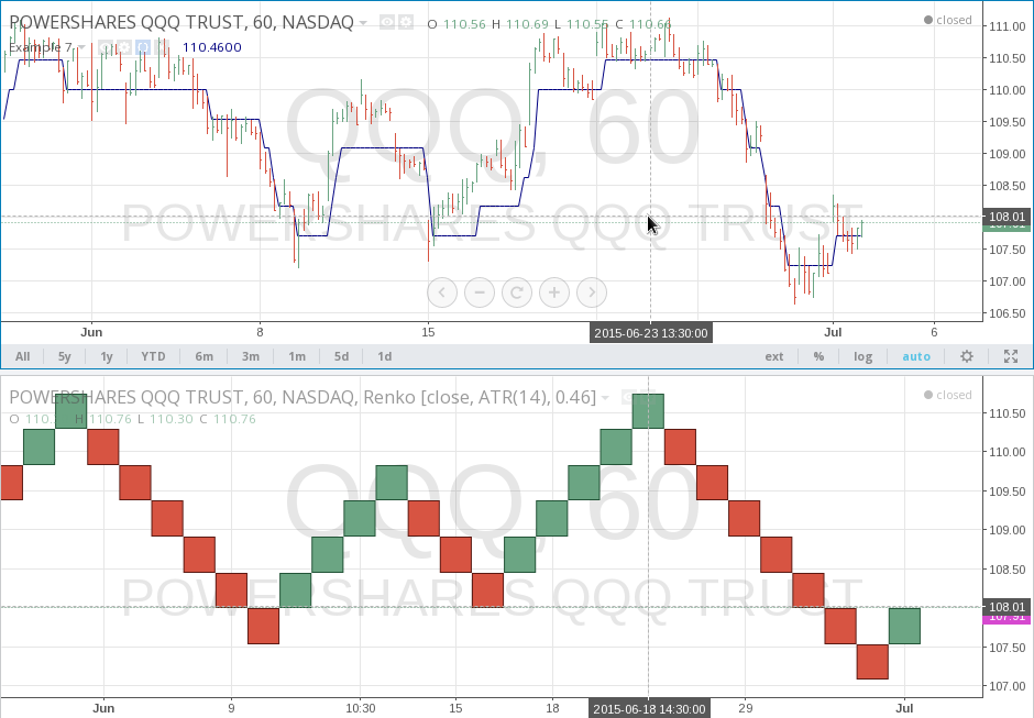
Please note that you cannot plot Renko bricks from Pine script exactly as they look. You can just get a series of numbers that are somewhat OHLC values for Renko chart and use them in your algorithms.
For detailed reference see renko.
linebreak function
Line Break chart type displays a series of vertical boxes that are based on price changes [1].
study("Example 8", overlay=true)
lb_t = linebreak(tickerid, "close", 3)
lb_close = security(lb_t, period, close)
plot(lb_close)
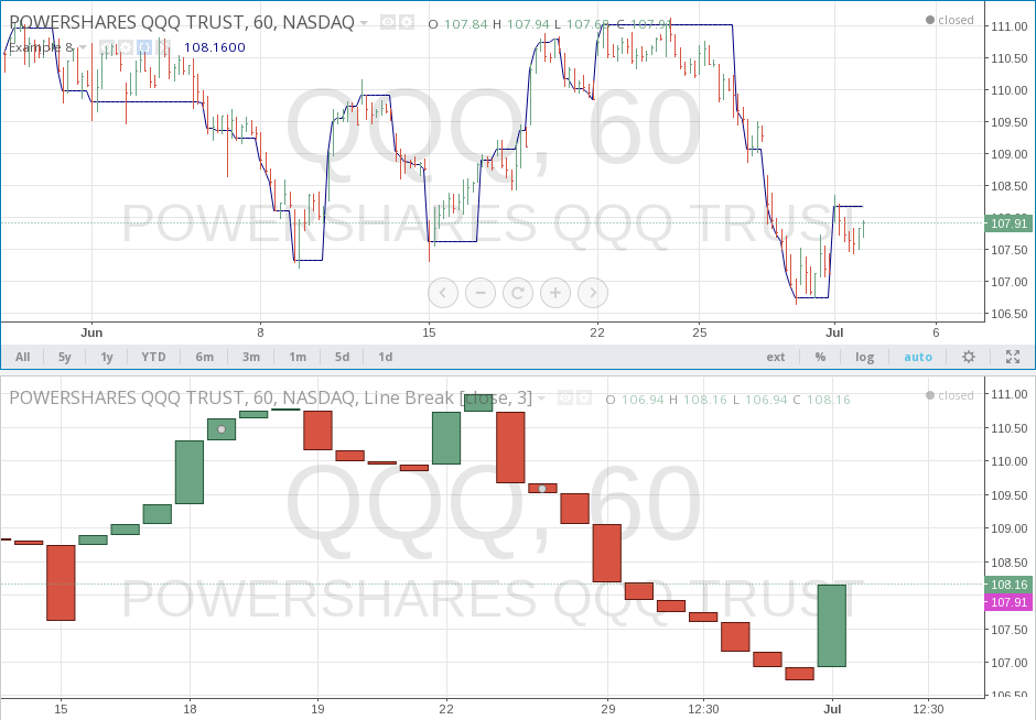
Please note that you cannot plot Line Break boxes from Pine script exactly as they look. You can just get a series of numbers that are somewhat OHLC values for Line Break chart and use them in your algorithms.
For detailed reference see linebreak.
kagi function
Kagi chart type looks like a continuous line that changes directions and switches from thin to bold. The direction changes when the price changes [1] beyond a predefined amount, and the line switches between thin and bold if the last change bypassed the last horizontal line.
study("Example 9", overlay=true)
kagi_t = kagi(tickerid, "close", 1)
kagi_close = security(kagi_t, period, close)
plot(kagi_close)
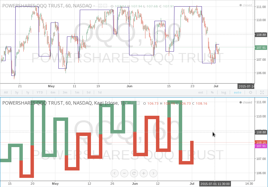
Please note that you cannot plot Kagi lines from Pine script exactly as they look. You can just get a series of numbers that are somewhat OHLC values for Kagi chart and use them in your algorithms.
For detailed reference see kagi.
pointfigure function
Point and Figure (PnF) chart type only plots price movements [1], without taking time into consideration. A column of X’s is plotted as the price rises — and O’s as the price drops.
Please note that you cannot plot PnF X’s and O’s from Pine script exactly as they look. You can just get a series of numbers that are somewhat OHLC values for PnF chart and use them in your algorithms. Every column of X’s or O’s are represented with four numbers, you may think of them as some imaginary OHLC PnF values. In Pine script you may request and get those numbers and plot them on chart.
study("Example 10", overlay=true)
pnf_t = pointfigure(tickerid, "hl", "ATR", 14, 3)
pnf_open = security(pnf_t, period, open, true)
pnf_close = security(pnf_t, period, close, true)
plot(pnf_open, color=lime, style=linebr, linewidth=4)
plot(pnf_close, color=red, style=linebr, linewidth=4)
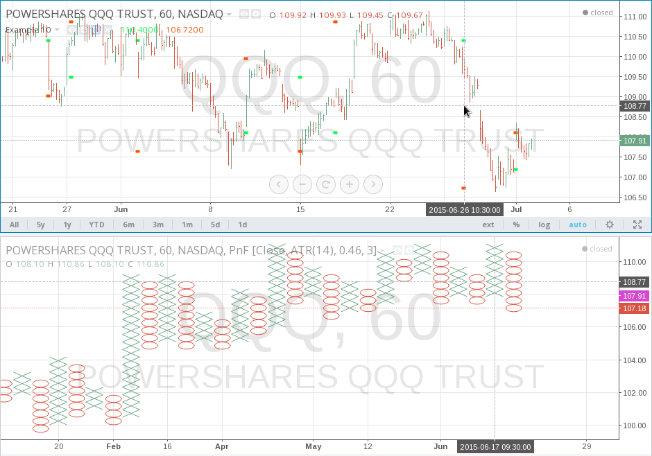
For detailed reference see pointfigure.
Footnotes
| [1] | (1, 2, 3, 4) On TradingView Renko, Line Break, Kagi and PnF chart types are built from OHLCV candles of a lower timeframe, which is an approximation of corresponding chart type built from tick data. |